
Todd Klein's Blog, page 237
September 16, 2014
And Then I Read: ROBERT A HEINLEIN Volume 2
 Image © William H. Patterson, Jr., art by Donato.
In many ways it’s impossible to review this 671-page biography, which is only the second half. But in one way, it’s easy: are you a fan of science-fiction writer Robert Heinlein? Are you interested in learning about his life? Then this two-volume tome is essential reading, and really the only accurate way to date to find out what the man and his life were all about. Heinlein is one of my favorite writers, and his writing is full of the personality, ideas and ideals of the man himself, so I found reading about him almost as fascinating has his work.
One thing that kept surprising me was how many health problems the man endured and struggled with, beginning before his writing career when he developed TB in the Navy, something that left him forever vulnerable to infections and viruses. After nearly every public appearance he got sick, but that didn’t stop him, particularly when he had a cause, like the series of blood drives he sponsored at conventions. The one time I saw Heinlein in person was at the 1976 World Science Fiction Convention in Kansas City. That was the beginning of his blood drives that did much to raise awareness and increase donation.
This book could only have been written after the passing of both Heinlein and his wife Virginia. He never liked analyzing his own work, and was very suspicious of others who did. He had a long-running feud with writher Alexei Panshin over the latter’s book and articles about Heinlein’s work. Another surprisingly antagonistic relationship was with early SF fan and would-be agent Forrest J. Ackerman. Forry clearly loved Heinlein’s work, and thought it should be spread more widely, but his method of doing that was highly unethical: representing himself as Heinlein’s agent to foreign publishers and movie companies without any permission, and making sales that Heinlein knew nothing about!
I first discovered Heinlein when I was a teenager, and I devoured his books for young readers. Soon after I began reading his more adult material in books and magazines. He seemed so impressive and successful, it was surprising to me to learn that he wasn’t financially secure until his novel “Stranger in a Strange Land” became a surprise paperback best-seller in the late 1960s, and kept on selling well for years. I think it’s probably his best novel, and I remember feeling gratified when the world finally caught on.
There are many more things I could say, but the bottom line is, if you’re a fan, you’ll want to read these. Don’t miss out.


September 15, 2014
And Then I Read: GREEN LANTERN 34
 Image © DC Comics, Inc.
This issue is a transitional one, it seems, before the next big storyline/battle. It begins with Hal Jordan trying to arrest a criminal who’s a sort of emotional sponge, able to feed off the “willpower” energy of his ring. That makes the arrest difficult, of course. Then there’s a rather odd sequence on the planet Mogo, the current GLC headquarters, where Hal, in the midst of dealing with his criminal captive, is joined by family members: brother Jim and Jim’s wife Susan and their two kids. Some family time follows for Jim and Hal as Susan and the kids explore. Their visit was the idea of Kilowog, and carried out by current Earth GL Simon Baz. Hal’s family seems unfazed by most of the strange world they’re visiting, and the entire sequence seemed odd to me. The issue ends with what looks like a preview of battles to come.
Mildly recommended.
September 14, 2014
Logo Study: SENSATION COMICS featuring WONDER WOMAN
 Images © DC Comics, Inc.
On Feb. 24, 2014 I received an email from DC editor Kristy Quinn commissioning this logo. She told me it was for a new digital-first title along the lines of ADVENTURES OF SUPERMAN or LEGENDS OF THE DARK KNIGHT, in that it would run online first, then be released in a print version, and the logo would need to serve both. Kristy wrote:
“This is going to be a BIG logo, both literally and figuratively. It needs to offer a lot of flexibility for placement while speaking to both the original SENSATION COMICS logo and a more modern sensibilty.
Goals:
1) can be used as two-three flat lines, or equally as well stacked into 5 lines
2) Something that reflects the original SENSATION COMICS logo & uses the WONDER WOMAN section to bring it forward in time.
Bonus points:
3) Since this will cover 90% of the real estate on any digital graphics, it needs to “read” at 600×600 pixels, so we can use it as the entire graphic if we need to.”
I was happy to accept the assignment, and I soon got to work making sketches.
I began by looking at the first issue of the original SENSATION COMICS from 1942. Kristy suggested the SENSATION part should reflect this one, and while there are things I like about it — it’s easy to read, for instance — there are definitely things I don’t like as well.
 For my sketch I followed the general style of the original but made the shapes thicker and closer together. I made the oval O more rectangular to match the rest, giving it just two rounded corners, then gave similar rounded corners to the large and small S. The original logo added serif-like extensions on the small S, but not the large one, which I thought was an interesting variation, so I kept that, as well as the extended right arm of the N.

For COMICS and FEATURING I used the style of COMICS on the old logo, which I liked. It has a slightly Art Deco feel most evident in the points on the M. I worked out the letterforms for FEATURING in a similar style.
 For WONDER WOMAN Kristy wanted something more modern. I thought I would work with upper and lower case letters that followed a similar angle and style I’d used for SENSATION and repeated the combination of some square corners with some rounded ones. This began to remind me of the eagle feather shapes on WW’s chest symbol, though they’re much more stylized (and sometimes squared off) today than they once were. I came up with two versions of the large W that I’d try with the lower case letters for the rest of the name. And since there are several repeating letters, I didn’t have to design as many letter forms for this part.
 Here’s a logo I designed for the character in the 1980s working off the chest symbol devised by the Milton Glaser Studio. There’s definitely some similarities to the new design, but lots of differences, too.
 In fact, my WW design is actually closer to the current AQUAMAN logo, something I didn’t notice right away, but again I felt there were enough differences that it would be okay. All my sketches were done in pencil and marker at my drawing board. When I’d finished, I scanned them and traced the forms in Adobe Illustrator, assembling the letters into sample designs.
 Here’s my assembled design for the first three words of the new logo, with the original version for reference. I made the first S taller, but otherwise it’s the same as the sketch.
 I planned to show WONDER WOMAN in two styles, using the different W’s, and each style in two versions. Here are the stacked ones, with each word on its own line. And, since there are so many words in the logo, I decided to add a large star as a visual element, tying to the ones on her headband and trunks, and an element used in many other Wonder Woman logos. I feel a logo is usually stronger with some kind of visual element tying it to the appearance of the character. This design has two, the star and the curved ends on the strokes suggesting the chest symbol.
 Version C puts the two logo ideas together, but I had a problem fitting COMICS FEATURING between them because of the ascending stroke of the D. I thought I’d try making the end of the D into the A in FEATURING. This kind of worked in black and white, but not in color, so I dropped it after this first attempt. Notice the first W has extended arms to fill the space in front of COMICS, making it different from the second W.
 Here’s the other W shape and a shorter D in WONDER. Again there are slight differences in the two W’s to make the shapes fit well.
 Kristy also wanted a version that would not be as tall as the stacked version, and these show the entire logo on two lines. While it was very wide, and would therefore appear smaller on a cover, this layout had more breathing space, and the three different word sizes gave the overall look a nice variety. Here the W’s on each version are the same.
 I thought the width of version E might be a problem, so I made this alternate where the letters are not slanted and WONDER WOMAN is considerably taller. I submitted all these samples to Kristy.
On March 10th I got feedback with a few suggestions and revisions requested: definitely NO on the A in FEATURING as part of the D in WONDER; COMICS should be larger than FEATURING; on the two line version, the slanted version was preferred, and the vertical W’s rather than the winged ones. With that in mind I made revised samples in black and white as well as color.
 Here’s the revised stacked version. A smaller FEATURING allowed me to put it right of the D, a better layout.
 Here it is in color with drop shadows for added depth and readability over cover art.
 And another version with black outlines on the larger words and star, a more traditional logo approach, and no drop shadow on the small words.

For the wide version COMICS is again larger than FEATURING, but this is otherwise about the same as the earlier sample. In color everything has a light yellow-orange drop shadow, a little hard to see here. These versions were all approved without further changes on March 19th, making this one of the easier logo assignments I’ve had from DC in a while. Kristy is great to work with.
 So far I’ve only seen the two-line version used on both the printed comic and the digital-first version, as above. Kind of small, but it works fine for me.
Hope you’ve enjoyed this look at a recent logo design, lots more can be found on my LOGO LINKS page.
September 13, 2014
And Then I Read: COMIC BOOK PEOPLE by Jackie Estrada
 Images © Jackie Estrada.
Here’s a book I backed on Kickstarter which arrived recently, and it’s a gem. Jackie Estrada has been involved in the San Diego Comic Con from its beginning in 1970, and she was wise enough to have a camera with her. This large book is her photo album from the first two decades, and it’s full of terrific photos. Though I got into comics in 1977, I didn’t start attending the San Diego Con until 1993, so this book allowed me to visit the show through Jackie’s eyes and words, and see so many of the people I met in the business as they enjoyed the show during those years. Jackie’s comments are mix of identifying people and why they’re known with personal memories of them and the time and place. It really is like looking through a photo album with the author at your side.
 While the vast majority of people shown are from the comics and comic strips world, there are also chapters on famous figures from science fiction, movies and TV. San Diego always presented a mix, and Jackie includes photos from a few other shows, as on this page featuring one of my favorite writers, Robert Heinlein. (And rest assured it looks much better than this scan!) It was interesting to learn that Jackie and I had both been at the 1976 World Science Fiction Convention in Kansas City where he was the guest of honor, but how about that photo of him in a Hawaiian shirt doing a sketch?
In addition to mainstream comics writers and artists, there are photos of people from underground comics, independent or small press, and animation. There are comic strip creators, and cartoonists. There are behind the scenes folks like editors, publishers and journalists. And while most of the photos were taken in black in white, there is a nice section of color photos as well.
In short, if you’re interested in the people behind the comics and media you enjoy, you’ll love this book. I can’t recommend it highly enough.
September 12, 2014
A Rare Sight
 Photo by Mike Crewe, © New Jersey Audubon.
I saw this bird today flying around over Bunker Pond in the Cape May Point State Park. It’s a Whiskered Tern, a species native to Europe, Asia and Africa, but it shouldn’t be here. It’s the third one ever seen in North America. All three sightings are from Cape May, New Jersey, the previous two were 1993 and 1998.
Fall migration is on now, but I’ve been so busy I haven’t had time to go birding yet. Today I was helping out at the Cape May Bird Observatory when word came of this rarity. The entire staff headed right for the door to go see it. I offered to hold the fort, and when the first staffer came back satisfied, I took the short drive to see it myself. The bird was easy to spot, a tern with mottled gray plumage, but my looks weren’t this good, CMBO staffer Mike Crewe is an ace photographer. Ten minutes of birding so far this fall, one new bird for my life list. (And the first in several years.) Pretty cool! Now I remember why we moved here…
September 11, 2014
And Then I Read: SWAMP THING 34
 Image © DC Comics, Inc.
Swamp Thing brought three past avatars of The Green back to life when he shut down the Parliament of Trees some time back, and they’ve given him nothing but trouble since. This time it’s Lady Weeds in the lead, and she’s a ruthless opponent who will stop at nothing to regain the position of Avatar for herself. As the trail of blood, revenge and cruelty continues — really, it’s never stopped on this title — the final page of the book hints at another option. Writer Charles Soule is holding the football for us, who wants to kick it? Both the writing and the art by Javier Pina are terrific on this title, even if the storylines are grim.
Recommended.
September 10, 2014
Pulled From My Files 26: Supreme samples
 Images © Rob Liefeld.
When I was lettering the Alan Moore issues of SUPREME, whenever I did some hand-lettering I thought I might want to use again, or at least refer to, I made a photocopy. My copier wasn’t the best, and sometimes, as above, the copies were dodgy, but good enough for reference.
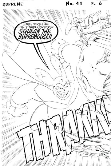
This one I copied in case I had further use for this style for Squeak the Supremouse. The sound effect was a bonus. Leave it to Alan to sum up what I loved about super-animals like Mighty Mouse as a kid in one choice panel!
September 9, 2014
And Then I Read: GREEN LANTERN CORPS 33
 Image © DC Comics, Inc.
In the final chapter of “Uprising,” just as the Durlans seem defeated…well, of course there’s one more. A powerful one who tricks John Stewart and succeeds in getting the immense energy to be had on the planet Zezzen, making it apparently unstoppable. But the Corps must find a way to defeat this Durlan, and that’s what the issue is about. Lots of fighting, but also lots of plot twists and some nice character moments. Well done overall, though the setup for the next struggle is waiting right at the end, which is a bit tiresome. A breather would have been welcome.
Recommended.
September 8, 2014
Baltimore Comic Con 2014 Sunday

Images © Todd Klein.
Sunday was mostly about talking to old friends for me, as well as selling prints at my table, where I did surprisingly well. When I arrived at the Con a little before 10 AM I walked around a while and first found Don Rosa at his table giving away hot peppers that he grows at home. Don is always doing something interesting and surprising. “I like to grow them,” he told me, “but I can’t eat most of them, so I give them away at Cons. When I go to Europe I pack an entire suitcase of them.” I asked if he had any trouble with customs. “No, they don’t care what you bring in!” he told me. Here he’s holding what he thinks is the hottest pepper he grows, a “Carolina Reaper,” if I remember correctly.
 Next I found Marc Hempel, here showcasing one of his stylish Sandman drawings featuring the raven Matthew, probably my favorite SANDMAN character. Marc and I chatted about lettering and fonts, among other things. I would have also talked to his studio-mate Mark Wheatley, but this and every time I came by their booth, Mark was deeply involved in other conversations. Next time.
 When I did finally get to my table, I was visited by world traveler and ace freelance editor (among many other talents) Marie Javins. I enjoy Marie’s Facebook posts immensely, she can make the most mundane things funny and interesting there. Marie is working on a top-secret project that sounds challenging, hope it goes well.

Here’s Richard Case, looking happy and healthy. He told me he’s been doing a lot of video game work, but is also doing a little comics work again lately.

A gentlemen I hadn’t seen in over thirty years, Fred Hembeck was great to talk to for a few minutes. He remembered a lunch we shared with Bob Rozakis and other DC staffers back when he was doing some spot illustrations for DC that I lettered.

I’m not sure if I’ve ever worked with Bob McLeod, he was largely a Marvel guy, but it may well have happened at some point. Bob said he’s mostly retired from comics, but still enjoys doing shows and taking commissions.

Another person I hadn’t seen in a very long time was John Totleben, I’m glad he made it to the show.
 Next to John was another partner in comics, Rick Veitch. I think we’ve only met in person a few times, but we talked on the phone a lot when we were working together on things like SUPREME (sample in hand), Greyshirt for TOMORROW STORIES, and many others. As artists often do, Rick bemoaned the fact that lettering is so seldom done right on the art these days. That’s the way he and I worked, and he was one of the last artists for whom I lettered pages on the boards regularly. It was great to see him.
That’s about it for my Con report. I packed up around 3 PM and drove home with less prints and lots of good memories. Thanks to everyone who stopped by my table, or who I chatted with elsewhere, it was great fun!
September 7, 2014
Baltimore Comic Con 2014 Saturday

Images © Todd Klein.
This year’s Baltimore Comic Con expanded to three days, but I wasn’t able to go on Friday. Early Saturday I drove from home to the Con hotel, and after checking in, walked over to the Baltimore Convention Center, arriving just after the show opened at 10 AM. Lots of others were going the same way.

This year the con is in a different, larger part of the Convention Center than previously, but the entry setup was the same: upstairs for panels and registration, downstairs to the large exhibit hall.

The Con graciously offered me a table this year, and I found it at “Fables Island,” our name for the grouping of a half dozen FABLES creators. Next to me was Bill Willingham, already chatting with fans and signing books. Behind us, on the other aisle were Mark Buckingham, Steve Leialoha, Andrew Pepoy and Barry Kitson. “I understand you’re under deadline pressure,” he said as we greeted each other, referring to an issue of FAIREST I’m lettering that has to go to the printer next week. “What else is new?” I answered. “But I’m ahead of the artist, so I’m fine.” The issue is being drawn by the terrific Russ Braun who was hard at work, not at the Con. I’d lettered all the pages he’d done layouts for, and would do the rest when I got them next week. After doing layouts, Russ goes back to produce finished tight pencils, so lettering over layouts gives me a way to get ahead of him a little.

Here’s my own table with my prints laid out for display. I sold 18 of them Saturday, and did lots of signing as well. The Con was busy, and quite a few folks came by to chat with me, so I had a fine time.

As an example, this charming father and daughter came by several times with things to sign, and I enjoyed talking to them, though I didn’t get their names. Each of them picked out a print to buy, too.

This gentleman came by early and asked if I would letter a title for his sketchbook, which I agreed to do. He was quite happy with it.

Comics reporter Heidi MacDonald stopped to say hi, I read her website “The Beat” often to find out what’s going on in the comics world.

As usual, many folks wore costumes, and this pair caught my eye, a modern Batman and (I think) Black Canary.

I stayed at my table most of the day, but did leave to walk around a little, stopping to say hi to artist Mike Manley, here showing off a commission piece. Though we’ve only met in person a few times, I feel like I know Mike pretty well from Facebook and a message board for comics folks he runs.

I should have packed a lunch, as the food area inside the exhibit hall had long lines, so instead I walked down to Baltimore’s Inner Harbor for a nice lunch outside with the U.S.S. Constitution as my view. Very hot and sunny. Then it was back to my table for a few hours.

The big event of the afternoon, and the main reason I wanted to be there, was the Last Fables Panel, which ran from 4 PM until after 6, and was well attended. Both FABLES and FAIREST will be ending next year, so this was to be the last of these popular panels. Bill explained two of his ideas for the panel had proved too expensive: a hot dog stand to feed everyone, and a TV chat show couch and desk setup instead of the usual long table, but he (with Mark Buckingham as co-host) first interviewed each other about how the Fables books had begun, then invited other guests to sit between them and talk. First up was FAIREST cover artist Adam Hughes. Adam is very funny, and I learned for the first time that he and Bill go back to their early days in comics working for the publisher Comico, where both also first met FABLES editor Shelly Bond. Shelly couldn’t be at the Con, but many nice things were said about her.

Paul Levitz was a surprise guest, at least to me, and talked about his support of Shelly’s vision for FABLES, and how, as publisher at the time, he felt strongly about supporting his creative teams. Paul also had other interesting things to say about running DC and working with everyone involved in making and selling comics.

Barry Kitson, occasional FABLES artist, talked about knowing Mark Buckingham in their early comics days in England, and his work on the book.

Another surprise guest was long-time DC marketing chief Bob Wayne, who Bill revealed was a key supporter of FABLES from the beginning, helping to promote the book, and getting it the support it needed to succeed, both at the company and from retailers. Bill described Bob as Shelly’s secret weapon in support of the book at DC.

Andrew Pepoy, the supporting inker on various Fables projects, talked about going from a fan talking to Bill at conventions to actually working on the books. Andrew gained a reputation as a fast and accurate inker able to help meet deadlines, as well as being a great guy we all enjoy working with.

Steve Leialoha, the main FABLES inker, talked about how he was hired to ink everyone on the book originally, when the plan was to have rotating pencillers. That plan fell through when, after finishing his pencils on the second story arc, “Animal Farm,” Mark Buckingham declared to Shelly that FABLES was HIS book, and he wanted to be the regular penciller from then on. Schedules being what they are, Steve has worked with other pencillers, and on the spinoff title JACK OF FABLES got to pencil and ink two issues himself, as well as illustrating the Fables novel “Peter and Max.”

I was the last one on the podium, and enjoyed talking about my work on the Fables books. And as Bill pointed out, I’m the only person other than Shelly Bond who has worked on every page of Fables comics, having lettered all of it, including the spinoffs that Bill didn’t write. Afterwards a fan was kind enough to get this group shot on my camera, which includes a rare photo of me that I actually like.
The big event of the evening was the Harvey Awards, but I had no reason to go this year, so I was able to have a quiet dinner and get to bed early. I appreciated that, as it had been a tiring if enjoyable day. I’ll report on Sunday when I can.
Todd Klein's Blog

- Todd Klein's profile
- 28 followers

