
Todd Klein's Blog, page 235
October 16, 2014
And Then I Read: HELLBOY IN HELL Volume 1
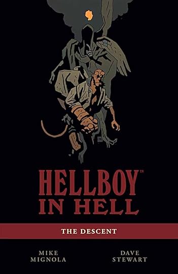 Image © Mike Mignola.
After the death of Hellboy, as it appeared, this was the logical place to go next with his story. He is, after all, a demon from Hell in the first place, though his origin is still not clear. Mignola’s Hell is quite different from those of classical writers such as Dante or even modern ones like Zander Cannon. It’s full of nightmarishly odd creatures and completely illogical situations that end up feeling very hellish indeed. Hellboy’s characteristic stoic and down-to-earth approach to any situation makes him feel like a fish out of water in some respects, but very human in others. Lots of the denizens of Hell have ideas about Hellboy and what he will do there, but of course the character himself doesn’t like to go along with anyone else’s plans. He wants to do the right thing, help others when he can, and be a good guy. Unfortunately, he’s in about the worst possible place for that.
Mike Mignola is still turning up gold and gems in his long dig in the Hellboy mine, and this series is full of them. The art remains deceptively simple, moody and effective, the writing is terrific even when not a lot happens. Wonderful work.
Highly recommended.


October 15, 2014
And Then I Read: DARK HORSE PRESENTS 33
 Image © Dark Horse Comics.
Keeping things brief this time. “Cruel Biology” begins a four parter that’s an interesting mix of “Catch-22″ and a horror movie, set on a remote Pacific island scouting outpost. I like the art more than the story of “Integer City,” but not a bad read. Brendan McCarthy’s psychedelic art and colors on “The Deleted” really brighten up this issue, but the story so far is somewhat predictable: drop a guy into the middle of a war he doesn’t understand and see what happens. A new “Mister X” serial by Dean Motter begins: stylish, classy noir. I read this issue out of order, so the “Nexus” chapter here is second to the conclusion, and it’s a strange a ride as ever. On the other hand, the first chapter of “Mr. Monster and the Brain Bats of Venus” helps me understand what I’d read in the second chapter already. Michael T. Gilbert’s art and story are frenetic and full of energy at all times, not to mention good fun. “Saint George” concludes in this issue with more nice art and a pretty good story. “The Many Murders of Miss Cranbourne” proves that you can do all new Agatha Christie Miss Marple stories in comics form. I don’t love it, but it’s worth a read. “Kill Me!” is a convoluted time travel story that concludes here. I like the idea of it, but the plot lost me.
In general, not a bad issue. Recommended.
October 14, 2014
And Then I Read: ASTRO CITY 15
 Image © Juke Box Productions.
The conclusion of the two-part story of Ellie Jimson, the somewhat simple and gullible robotics mastermind, reveals a back story of a partnership that went wrong, and perhaps why Ellie is as she is. It reminded me a bit of the back story of Reed Richards and Dr. Doom, but is quite entertaining and satisfying in its own right. The art is great, too, of course.
Recommended.
October 12, 2014
NYCC 2014 with Gaspar Saladino and friends
 This past Thursday, Oct. 9th, I arrived at the Jacob Javits Center on the west side of New York City around 1 PM and got my pro pass to the New York Comic Con. I’d hoped to get there sooner, but traffic delays between my home in southern New Jersey and my mom’s place closer to the city held me up. Another hour by train from her place brought me to New York’s Penn Station, a 20 minute walk from the con. Before even entering the show I needed to meet Shelly Bond and others for lunch at a nearby restaurant to discuss an upcoming project. That was fun, but got me back to the show around 3 PM. Then I was able to do some scouting and planning for the primary reason I was there: meeting up with my friend and inspiration, lettering master Gaspar Saladino on Friday.
I hadn’t seen Gaspar in person for about 30 years, but we keep in touch by phone, and last August he called me with surprising news. He had decided he wanted to attend the New York Comic Con this year, which would be his first comics convention EVER after more than 60 years in the business. Gaspar began working for DC Comics as a letterer in late 1949. Gaspar always tells people he started in 1951, but in a three-part article beginning HERE I believe I tracked down his first DC lettering work in ROMANCE TRAIL #5 cover-dated March-April 1950, which must have been done in 1949. His most recent work for DC was some cover lettering for the BATMAN ’66 title in 2013. I was surprised Gaspar wanted to go, I know he’d been invited to other cons and turned them down, but when he said he wanted to meet me there so we could go through the con together, I was delighted. I told him I’d see if I could get us passes. In a few days I had pro passes for Gaspar, his son-in-law Mitch, and myself courtesy of Andrew Marino at DC Comics Talent Relations, and as the show was already mostly sold out, we owe him thanks for that! Gaspar is elderly and not in the best of health, though he still sounds great on the phone and his mind is sharp. He told me his son-in-law Mitch would drive him to the show, and after some discussion with Mitch, we agreed they would bring a wheelchair for Gaspar, as we weren’t sure how much walking he could do. So, on Thursday at the show, I scouted out where the wheelchair elevators were, and planned out several places in the show where I thought Gaspar could meet people he knew and that knew him. I also put the word out among fellow letterers from my generation and later, ones I knew were fans of Gaspar’s work, to see if they’d like to join us. Many wanted to, and a half dozen planned to be there Friday.
 One person I ran into at the show Thursday was Alex Jay, a terrific logo designer in the 1980s-90s for DC, Marvel, and other companies, another person I hadn’t seen in person in decades, though we also keep in touch mainly by email. In addition to being a top-notch designer, Alex is an excellent researcher, and he’s often helped me with my blog posts covering comics history, so it was great to reconnect in person. Alex wanted to join our Gaspar group on Friday, too.
 I did a quick walk around the show, enjoying displays like the Weta Smaug sculpture towering over the 35th street entrance…
 …and chatted with friends and work partners like Charlie Kochman at Abrams. He and art director Chad Beckerman (above) had hired me to letter the cover titles on their handsome new book “The Art of the Simon and Kirby Studio,” and they had early samples on display. Looks great. That’s Joe Simon’s son Jim in the background, nice to meet him, too.
 It took a while to find the DC Comics area, it was on the lower level at the southeast corner, outside the main exhibit hall. The large bat in the window was my first clue…
 …and DC’s display focused on the 75th anniversary of Batman with statues of the various Batman movie costumes. Unfortunately I could only find one DC staffer I knew there, though I did chat with Andrew Pepoy and other friends.
 Next to DC’s area was Bob Chapman’s Graffiti Designs. It was kind of odd to see Bob in New York, as I usually see him in San Diego, but he wanted to show me a new book he’s produced collecting Batman stories with art by Kelley Jones, in the very large size pioneered by IDW’s Artist Editions, and reproducing detailed scans of the original art for as many pages as could be found. It looks terrific, and as I lettered the stories, I’ll be getting a copy when it’s released, thanks to Bob. Then I had to leave the show at 5 PM to get back for a dinner date with my Mom in New Jersey.

I arrived back at the con Friday around 11 AM. The first person I met up for our Gaspar group was letterer Clem Robins, at left above. Clem also keeps in touch with Gaspar regularly by phone, and like me, cites Gaspar as a major influence in his work. Soon we were joined by letterer Tom Orzechowski, next to Clem above, another veteran (in the business since 1973) and David Marshall. David has only lettered his own self-published work, but we’ve become friends on Facebook, and he wanted to join us. Clem and Tom traveled from Ohio, and David from Boston to join the group of Gaspar admirers. Oh, and that’s me at the right. We spent some time talking and looking around the con until I heard from Mitch by phone that he and Gaspar were parked and on the way to the show. Then we went outside to meet them.
 When Gaspar (at right) arrived, we shared warm greetings and brought he and Mitch inside to get their show passes. Gaspar was in good spirits and glad to see us. He was able to walk with a cane some of the time, and when he got tired, he used the wheelchair Mitch had brought. (And I don’t seem to have a photo of Mitch, sorry to say.) We brought Gaspar to the DC area, but again I wasn’t able to find any DC staffers I knew to introduce him, so we continued on to the main exhibit hall.
 There was one person in the main hall that I knew would enjoy seeing Gaspar, and that was Neal Adams. Gaspar worked with Neal on many projects for DC and elsewhere, and they saw each other often in the early days at the DC offices. Neal had some good stories for us. He said, when he was first at DC around 1967 they wanted him to do Bob Hope and Jerry Lewis stories, and to letter them “I wanted that Gaspar guy.” He felt Gaspar’s work had the bounce and personality that would work best for humor. In a few years Gaspar was lettering most of the covers for DC, including Neal’s, and plenty of stories like Neal’s “Superman Vs. Muhammad Ali” tabloid comic. Then Neal told us there was one job he did with Gaspar that the lettering master DIDN’T want his name on, and asked if we could guess what that might be. We couldn’t, so he told us. It was the “Son O’ God” stories for NATIONAL LAMPOON, a hilarious but shocking send-up of Jesus and Christianity. Neal said, “everyone involved with those stories was Roman Catholic,” and he finally talked Gaspar into putting his name on the work.
 We made our way to Artist’s Alley, where Gaspar enjoyed talking to writer Denny O’Neil about their work together…
 …and artists like Joe Rubinstein, above, Joe Staton and others.
 Howard Chaykin enjoyed seeing Gaspar, and quickly got into stories about Gil Kane and Alex Toth, both of whom Gaspar worked with in their early days at DC.
 We found letterer Chris Eliopoulos at the table he shared with artist Erik Larsen, and Chris was thrilled to meet Gaspar, as I think you might see in his expression here. We stood there for a while chatting and getting pictures.
 Soon we’d added a few more to Gaspar’s Posse, and here’s a photo of the entire group: Chris Eliopolous in front, and lined up left to right are Alex Jay, Clem Robins, Gaspar Saladino, Todd Klein, David Marshall, another lettering veteran Janice Chiang, and Tom Orzechowski. We had such a great time that the con staff had to eventually come and tell us to stop blocking the aisle.
 While we were in Artist’s Alley I chatted with writer Kurt Busiek about an upcoming project, and he also enjoyed meeting Gaspar. In the background of this picture is Len Wein who was about to pass us by when I called him over to say hi.
 A moment later Len’s jaw dropped when he saw the man with us who had lettered his legendary first run on SWAMP THING. It was really funny was when Gaspar started berating Len for all the extra work Len had given him on that book, the first one where the main character had not one but several special balloon styles. But they were both surprised and glad to see each other, as I think you can see in the photo.
By around 4 PM we were tired and we left the con to get a meal at a nearby diner I had checked out Thursday as a likely spot. Seven of us: myself, Clem, Gaspar, Mitch, Tom, Alex and David enjoyed another hour of stories, conversation and laughter before I had to head back to New Jersey and everyone went their separate ways. What a wonderful day, never to be forgotten. Thanks to everyone who participated!
October 8, 2014
And Then I Read: THE GRAVEYARD BOOK Volume 1
 Image © Neil Gaiman and P. Craig Russell.
Here is a new graphic adaptation by one of my favorite artists, P. Craig Russell of the award-winning book by Neil Gaiman. I loved every page and panel. Russell did the adaptation script and layouts, had them hand-lettered by ace veteran Rick Parker, then passed chapters on to an excellent group of artists to finish in their own styles, an approach with gives the chapters a little stylistic variety without drifting too far from Craig’s vision. Colorist Lovern Kindzierski pulls it all together nicely, and the result is a treat in all respects.
The story begins with a gruesome murder of an entire family in small-town England, all but the baby, who has a tendency to wander off. The toddler wanders into a nearby graveyard where the ghosts in residence (and a few others) agree to take him in and raise him. Bod (short for Nobody) Owens has perhaps the most unusual upbringing in modern literature since Mowgli and Tarzan, and there’s definitely a nod by Gaiman to the former Kipling stories here, but with lots of unique magic and wonder.
I have to admit I feel a little left out. I lettered the last such adaptation (of Gaiman’s Coraline), but at the time Craig wanted the pages lettered on the art, and I wasn’t able to do that. Too time consuming for me now that I’m no longer hand-lettering regularly, and out of practice. Rick Parker has done an excellent job for them, and I’m sure everyone who eventually buys a page of original art from this project will also be happy to have the lettering on it.
Volume 2 is just out in shops now, I believe, and I’m looking forward to that, too. I would have preferred the effort in one volume, but publishing full-color comics is an expensive business, and I understand the need of the publisher to go the two volume route. I imagine there will be a one-volume version later.
Highly recommended.
October 7, 2014
And Then I Read: RICHARD STARK’S PARKER, SLAYGROUND
 Image © Darwyn Cooke, Estate of Donald E. Westlake and IDW.
I generally prefer character driven stories over plot-driven ones, but there are exceptions. Certain kinds of thrillers, mysteries and crime stories with intricate plots that play out like clockwork revealing one clever turn after another, have their own special appeal, and this is one of those. It’s the fourth Parker adaptation by Darwyn Cooke, and he’s found the subject and series just right for him, clearly. The art is deceptively simple, in two colors: black and pearly blue-gray for most of the book, with a short section in black and orange at the end. It’s redolent of the 1950s, even though it takes place in 1969, but in an old-fashioned amusement park closed for the winter. Parker has been part of a armored car robbery that went bad, ending in a getaway car crash, but he’s escaped into the park with a large bag of cash. Trouble is, both police and local gangsters saw him go in, and Parker soon discovers there’s no other way out than over the front gate. With apparent calm resolution he sets about preparing the “slayground” for one-man combat. You know you’re in for a clever plot when you get to the fold-out map of the park, and it doesn’t disappoint. There’s little character development in this volume, the least of the series so far, but it doesn’t matter, you’ll keep turning the pages to see what Parker has planned for his opponents next.
Recommended.
October 6, 2014
And Then I Read: SWAMP THING FUTURE’S END 1
 Image © DC Comics, Inc.
I’m reading very few of the Future’s End one-shots, and none of the main series. The only thing I like about the series is that it will be over quickly and we can get on with regular story lines. This one is at least by the regular team of writer Charles Soule and artist Jesus Saiz, and gives new information about the realms of power Soule is developing on this title, adding two new ones. The Green was the first, Swamp Thing’s power base of all plants, and I’ve enjoyed how the rest have been developed along similar lines: Red for animals, Black for death and decay, Grey for fungus. New here are Divided for the microbial world and Metal for electronic power. The story is predictable if you’ve read any of the Future’s End books, as the name suggests it’s all about endings, but the tour of the realms is visually stunning and worth a look.
Recommended.
October 4, 2014
And Then I Read: THE RUNAWAYS by Zilpha Keatley Snyder
 Image © Zilpha Keatley Snyder, illustration by Daniel O’Leary.
At my age there are very few authors I started reading as a child who are still around. Snyder’s first book for young readers was published in 1964 when I was 13, her most recent came out in 2011. I own and have enjoyed most of them, this 1999 title is one I found recently.
Dani and her mother Linda are stuck in the small, poor desert town of Rattler Springs, Nevada in 1951, having been lured there by an inheritance that turned out to be essentially worthless land. Dani hates it and is determined to run away back to the northern California coast town where they used to live as soon as she can raise the bus fare. There are lots of complications, though, a primary one being Stormy, a learning disabled boy she’s befriended who lives with a much worse mother nearby and who wants to come with her. A husband and wife team of geologists come to town and offer to rent Linda’s property, giving them a real chance to get ahead of their debts, and their daughter Pixie soon joins Dani and Stormy in their runaway plans. Turns out her parents mostly ignore her, and she’s all for the adventure. Bully Ronnie Grabler does all he can to ruin their chances, and lots of other problems arise, but Dani is determined to make a break for it, especially after Stormy is badly beaten by his own mother.
Like all of Snyder’s books, this one has great characters and human insight and an engaging storyline. Recommended.
October 3, 2014
And Then I Read: GREEN LANTERN NEW GUARDIANS 34
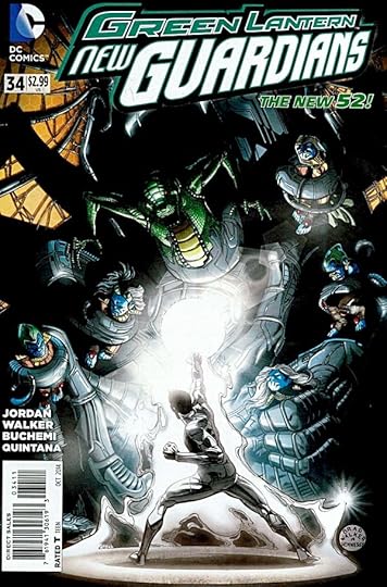 Image © DC Comics, Inc.
The New Guardians and their protectors Kyle Rayner and Carol Ferris are trapped by the Psions, those highly advanced lizards of great scientific knowledge. While the protectors wage a physical battle, the Guardians work from within, through the information systems of the vast Psion ship. The wrap-up to this storyline held no great surprises, but I enjoyed it. A nice mix of action and character bits, though I still have a hard time telling the Guardians apart. The writing by Justin Jordan and the art by Brad Walker and company is all good. One small thing in the lettering by Dave Sharpe that pleased me: telekinetic thought balloons. I miss those.
Recommended.
October 2, 2014
And Then I Read: AQUAMAN 34
 Image © DC Comics, Inc.
Since the departure of writer Geoff Johns, this title has had ups and downs. This issue is one of the weaker ones, it’s Aquaman against a sea chameleon of sorts who is also part human. The battle might be considered equal except that Arthur Curry is the smarter of the pair, and of course, the hero of the book. The issue is mainly fighting and posturing with a slightly interesting turn of events at the end. The guest artist team of Carlos Rodriguez and Bit (shortest inker name ever?) looks fine, and there’s an appealing flashback sequence made better by colorist Rain Beredo. That said, I can only mildly recommend it.
Todd Klein's Blog

- Todd Klein's profile
- 28 followers

