
Todd Klein's Blog, page 232
November 20, 2014
The Rise of Digital Lettering, Part 7
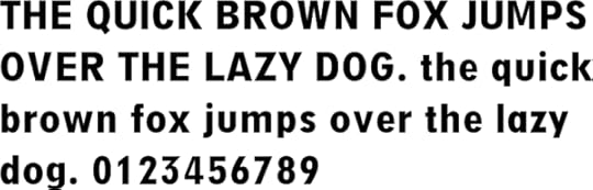
 A Lettering Sampler © Todd Klein, 1993.
I arrived at my first San Diego Comic-Con in July of 1993 with this print to sell. It’s something of a diatribe in favor of hand lettering over type, but despite what the print says, I had been using computers for some time, just not for lettering. I’d worked with very primitive computers in a non-comics job in the early 1970s, and in 1984 bought a KayPro II primarily for writing. It had no graphics capability at all, but when I needed lettering that looked just like typing, I could print out and paste down type from it. I considered getting the first Apple Mac computer instead, but at the time didn’t think I would use it for graphics, and the KayPro was cheaper. Like other letterers, in the early 90s I’d been watching the development of comics fonts by David Cody Weiss, John Byrne and Richard Starkings with interest, and came to believe it was the wave of the future, and one I should be surfing myself. I met JG and Rich of Comicraft at that 1993 San DIego con, as well as other letterers like Bill Oakley, and discussions of computer fonts for lettering were rampant and sometimes heated. More on that later.
 Todd Klein at the San Diego Comic-Con, 1994.
By the following year I was working on DEATHBLOW for WildStorm, and they were pressing me to create fonts from my hand lettering and supply them with digital lettering files for their all-digital workflow. I was coming around to the idea, as the book was always late, and often I would have to stay up all night to finish it so I could Fedex the lettering to California. I knew I had a steep learning curve ahead, but felt it would pay off later with time savings, once I got going. I think it was at San Diego in ’94 that I asked Richard if he would make fonts for me I could use on DEATHBLOW, and we agreed on a price. Some time in the fall I lettered up a bunch of samples for JG to scan and create the font from. Rich cautioned me not to be too precious about it, but just do the lettering as I would any other, and give them lots of each letter and symbol to choose from.
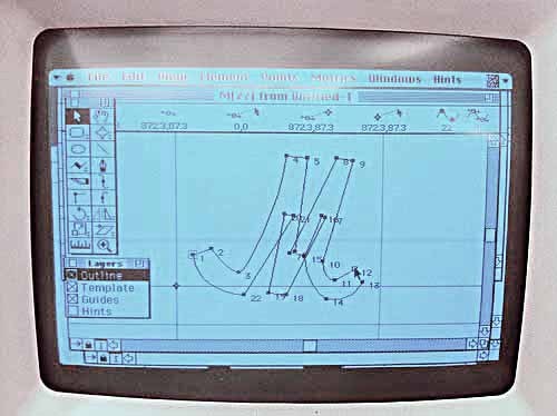
 Late in 1994 I purchased my first Mac, the original Power Mac with a whopping 1GB of disk space, as well as an Apple LaserWriter printer and Apple scanner. I also bought Adobe Photoshop and Illustrator, and lots more software would soon follow. Despite the time it took to learn it all, I found the world of desktop publishing fascinating and fun. I think it was January of 1995 when the above floppy disk arrived from Comicraft with my fonts on it. Rich had named my dialogue font “Todd Klone,” which I thought was quite funny, and it’s remained so ever since. I had Fontographer version 4.1 on hand, and I was soon under the hood of my fonts figuring out what JG had done, making lots of tweaks on the letter shapes, and creating new fonts of my own, using the Comicraft ones as a model. I knew I needed some display fonts for sound effects and titles, so created several of those, and many more fonts over the next years.
 Here’s part of the hand lettering I did to create an upper and lower case font, all lettered the same size I would have done it on comics art. Display fonts were lettered larger, but dialogue fonts work best with all the quirks and flaws of normal hand lettering rather than a more “perfect” and careful version.
 By early summer of 1995 I felt I was ready to tackle an entire issue of DEATHBLOW, and these are some samples lettered with my fonts from issue 20 dated Oct. 1995, the first book I lettered completely on the computer. It didn’t look entirely like my hand lettering, it lacked spontaneity and the display fonts were more regular and rigid than what I’d have done by hand, but I felt it was close enough. And the computer made doing effects like white lines on black and drop shadows easier. I’d already been using my display fonts for cover lettering for DC Comics, but DC wasn’t keen on digital lettering yet, and those had to be printed out and sent in to DC for scanning.
 From DEATH, THE TIME OF YOUR LIFE #1, 1996, © DC Comics, Inc.
I snuck my fonts in at DC here and there where it made sense, as in the examples above from the same page. The caption at left is hand-lettered, the one at right is my font. I think it’s a pretty good match, and I doubt many readers noticed, maybe none. Using the font at right, I could reverse it myself, white letters on black, to make sure it would look good when printed. DC held out for mostly hand lettering until 2003, when they made the transition to an all-digital workflow, and hand lettering was no longer wanted. Until then, I continued to do hand lettering for them, while also lettering books digitally for Image, Marvel and others. Gradually the percentage of my hand lettering work dwindled until, by the late 2000s it was nearly gone. Today I think the only publisher still regularly using hand lettering is Archie Comics.
The 1990s were definitely a era of turmoil for letterers in comics. Once digital lettering became possible, it was just a matter of time before comics publishers adopted it. An all-digital workflow offered many advantages for them, saving time, expense and materials. It also offered flexibility for reprints in other languages they hadn’t had before. Artists and especially inkers generally hated it, as it meant they had more to draw or ink on the page, once the lettering wasn’t there. It also hurt sales of comics art to fans. Without the lettering, comics art is just pictures, the story is missing. Letterers (and colorists) faced the hardest challenges though, needing to buy expensive computers and software and learn new working methods if they wanted to stay in the market. Letterers also had to create their own fonts, a difficult task, or use commercial comic book fonts, thereby making the work they did less likely to stand out from the crowd. Many feared the changes, and much anger and hatred were directed at the pioneers in digital lettering. Alan Moore once said, “You can always recognize a pioneer — he’s the one lying face down in the dirt, pointing the way with arrows in his back,” It was true for comics lettering, and there are still hard feelings from the 90s, when some letterers unwilling to go digital, or behind the curve, were pushed out of the business. Others came around later and reluctantly, often at a cost to their ability to find work.
 Ken Bruzenak and a sample of his lettering for AMERICAN FLAGG, © Howard Chaykin.
Ken Bruzenak began his career assisting artist Jim Steranko with a home renovation project, and worked his way into comics as a letterer for Steranko starting in 1981. In 1983 he began lettering Howard Chaykin’s AMERICAN FLAGG for First Comics, and soon gained attention and accolades for his clever use of type, and a wide variety of styles. His long association with Chaykin continues today. In recent correspondence, Ken told me:
By 1996 I was using the computer for credits and titles, and occasionally sound effects. I was toying with my own font, but the learning and software curve was pretty steep and I had a slow machine.
Chaykin’s CENTURY WEST for Disney Italia (2006) was the first whole book I used the computer on, then POWERS, and everything since. I use Photoshop because it is much more flexible, color friendly, and intuitive than Illustrator. Also, when you crunch down the lettering for shipping, it is essentially rasterized anyway, so why waste the time and eye-strain in Illustrator? I do logos in Illustrator, however, so they can be rescaled more easily if a poster is needed. Basically, I hate Illustrator vectors, but do see their usefulness at times. For the most part, Chaykin designs with the script and sound effects in mind, and he is an excellent page designer, so I can use lettering more imaginatively as a rhythmic device, pacing the way the words are absorbed, and most importantly, keeping the balloons in the background, not sprawling all over the characters and scenery.
 Mr. Monster from DARK HORSE PRESENTS #35, 2014, © Michael T. Gilbert.
MR. MONSTER is still hand-lettered, however, because Michael Gilbert still likes all-in-one comic pages. I hear from him every other year or so and have to dig out the pens and guides, and am always amazed at how much faster the hand-lettering is to produce. It is also more exciting to be part of the process, reacting to the original pencils. Computer lettering is much more sterile, and the font sizes are becoming microscopic for no particular reason than writer’s conceit — just a lot harder to read. And those upper and lower case balloons are sometimes indecipherable. Great way to attract new readers — books you can’t read on paper, and have to enlarge on a Nook or Kindle, completely destroying the page and panel sizing as a format for storytelling.
So, no, I don’t see the computer as having greatly “improved” lettering beyond making it possible for the unskilled to undercut pricing on the talented. It has made comics superficially slicker, reducing the appearance of amateurish ballpoint pen and crude fonts, but it has also made everything tiny and less legible, and easier to second-guess and move balloons around to cover up the art unnecessarily. And yet, I do love the comics format.
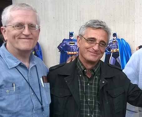 Todd Klein and Clem Robins, NYCC, 2014.
Clem Robins began lettering for DC comics in 1977, about the same time I did. His take on digital lettering is more positive than Ken’s. He wrote recently:
I bought Fontographer around 1997, I think, but didn’t actually put together a font for a couple of years. maybe 2000 or 2001. The first time I used it in something that got published was in 100 BULLETS, issue #34 I think. the “Counterfifth Detective” arc. I didn’t use it for the whole story, but I slipped it in on one page, just to see if it would be noticeable when it got published. I chose a page with nothing but captions, so that the mechanically perfect Illustrator ellipses wouldn’t appear, and be so obviously different from the balloons I drew with a pen and a template.
 Clem Robins hand lettering at left, and digital lettering right on HELLBOY, from volumes 6 and 9, © Mike Mignola.
Thirteen years later, I’ve got six different exclamation marks, six different question marks, four different commas and four different periods in my body copy fonts, just to introduce variety. When the whole DC procedure went digital in 2003, we were finishing up a strange Grant Morrison miniseries called THE FILTH. It had been hand lettered, but the final installment was late, and came in for lettering after DC had gone digital. so, much against everyone’s intentions, that last installment was done digitally. I must admit, after all these years, I’ve grown to love digital lettering. I don’t like it on covers or logos, but for interior work, it can be terrific. I think the work I’m doing now on a computer is far better than anything I ever did with a pen. Anyway, you can’t fight City Hall.
Clem goes to great lengths to make his fonts look just like his hand lettering by adding lots of variations on each letter, something made easier today with Opentype fonts, where ligatures can automatically replace chosen letter combinations, reinforcing the feel of variety. Case in point, Clem has been lettering HELLBOY since the series’ Volume 6 collection of 2006. Somewhere between Volumes 6 and 9 he made the transition to his fonts, but I can’t tell where!
 John Workman and some of his hand lettering on Thor #352, 1985, © Marvel.
John Workman began his multi-faceted comics career in the early 1970s as a writer and artist as well as letterer for Mike Friedrich’s STAR*REACH. He landed a staff job in the DC Comics production department in 1975, and began lettering for DC. That’s where we met, and where John helped me get started with lettering in 1977. John continues to letter comics by hand for artist Walter Simonson, as above, and Archie Comics, and has made some surprising adaptations to the digital process. He recently wrote:
As regular on-the-board lettering disappeared, I was bothered by the blandness of not all, but certainly the majority of computer lettering. During those times when I used a commercial comics typeface to letter comics (always the decision of the client) I went in and played with the available typefaces and tried to make them look more natural and human.
Cliff Chiang and some guys from a web-site called “Comic Geek Speak” urged me to cut out the middle man and to start doing hand-lettering on the computer by way of a Wacom tablet. At the time I’d been lettering stuff by hand on vellum at the original art size, basing that lettering on xeroxes of the penciled art. When I got scans of the inked art (down to printed size), I would scan the lettering that I’d done and reduce it to the printed size and then place it digitally on the scans. I found myself going in and “cleaning up” a lot of the hand-lettering that I’d done. It was a silly thing to do in most cases, since I was looking at the letters on-screen at a gigantic size that seemed to highlight wonky elements of that lettering. The same stuff reduced to printed size looked fine without any “fixing.” I was doing the lettering on some short TORCHWOOD stories for Titan, and editor Mark Eden was amenable to me experimenting a bit and lettering those stories by way of the Wacom tablet. It worked well and was faster per-page than the way that I had been doing my “hybrid” lettering.
 Lettering by John Workman with pen and ink, left, and using a Wacom tablet and stylus, right, from TURF #1 and #2, 2010, © Jonathan Ross and Tommy Lee Edwards.
A word about that…the trade-off is that the lettering I do with the Wacom takes longer to do than someone “typing” a comic font. It takes about the same time as lettering on-the-boards. If you look at the issues of Jonathan Ross and Tommy Lee Edwards’s TURF, I lettered the first issue on the boards using traditional pens and then did the rest of the issues with the Wacom. The later issues may be a bit more “precise” than the first one, but they’re pretty close in their look. That’s because, whether you’re lettering using a Wacom or drawing using it, there is a need to be “deliberately sloppy” in order to maintain a humanity to the work.
Walt Simonson’s new RAGNAROK is lettered on-the-boards in the traditional way. I love it. It’s kind of like walking on a tightrope with no net below. Of course, if I really mess up, there are always white-out and paste ups to save the day. I’ve never created a dialogue/narrative balloon typeface based on my own stuff. Maybe I will sometime, but I’m not sure. I do really enjoy creating logos on the computer. The “TURF” one is an example, as is the most recent “Hulk” logo. I’ve also done story titles using the computer for all the stories that I’ve lettered for the last 14 years or so.
 Ken Lopez, Nate Piekos and Pat Brosseau, photos found online.
As the 2000s progressed, more changes came to the comics lettering field. When DC Comics went to an all-digital workflow in 2003, letterer Ken Lopez joined the staff to help oversee a new in-house digital lettering group. Ken had begun his comics career at Marvel in 1986 in the bullpen, and soon was doing lots of freelance for the company. He switched to DC Comics in 1994, and once on staff, created new fonts for the company’s staff letterers. Ken continues at DC as their cover editor. The DC in-house lettering program is headed by Nick Napolitano, and handles many of the DC Universe titles, though over time staff letterers have left and become lettering freelancers, so while the DC freelance lettering market shrank in 2003, it has expanded again. Some who have come through the program, I believe, are Travis Lanham, Phil Balsman, Corey Breen, Steve Wands and Jared K. Fletcher. DC staffers who also letter for the company include Sal Cipriano, Dezi Sienty and Carlos Mangual.
 Blambot website logo and font samples, © Nate Piekos.
Comicraft has been supplying a wide variety of commercial comic book fonts since 1995, but in 2002 Nate Piekos entered the scene with Blambot. Piekos began lettering and designing fonts in 1998 for his own work. Both Comicraft and Blambot now offer a wide variety of comic book fonts for dialogue, sound effects and display lettering. Both have broadened their catalog by developing custom fonts for artists, letterers or properties, and putting them on sale with permission. They also do custom fonts that are not for sale.
 Pat Brosseau hand lettering for HELLBOY: WAKE THE DEVIL, © Mike Mignola.
Letterer Pat Brosseau is an example of the kind of varied career path some letterers needed to take in the last two decades to remain in the business. Pat began hand lettering for a number of companies in 1986. In 2000 he had fonts made from his hand lettering by Comicraft, and used them on some projects, but continued to hand letter books like HELLBOY. In 2004 he joined DC Comics as part of their in-house lettering department and worked there until 2012, mainly using fonts created by Comicraft other than his own, ones that were licensed by DC, as well as the in-house fonts created by Ken Lopez. In 2011 Pat had new versions of his fonts made by Blambot’s Nate Piekos, and is now using them as a freelancer again for a variety of companies.
Today new letterers are entering the field who have no experience with hand lettering, and find the idea of putting ink letters on comics art frightening. Most use commercial fonts from Comicraft and Blambot, or other similar sources. I collected a few comments from some of them.
Jim Campbell wrote: Pretty sure it was 1999, after hand-lettering a few strips I’d done for UK small press, I wondered if I could transfer my day-job graphic design skills to digital lettering. I put together my own dialogue font in Fontographer but, in all honesty, it was rubbish! I dabbled for a few years, but didn’t really move into pro lettering until 2008, when I started adding professional fonts to my collection.
Hde Ponsonby-Jones wrote: When I started lettering in 2008, it was after a LONG break from comics. In the early ’90s, I still saw comics that were hand lettered, but by the time I’d started freelancing, digital lettering was the long established standard. I still meet people today who seem oblivious to that fact, or mistakenly regard digital lettering as an inferior option. I learned early on that it wasn’t inferior at all, but another means of accomplishing a task, and another set of tools to get the best out of. As with any new tool set, proficiency with them requires practice.
Martin A. Pérez wrote: I started in 2009, and for real in 2011. I used Blambot free fonts, and learned a lot from Jim Campbell’s blog, as well as reading tutorials by others like Richard Starkings.
Jim Keplinger wrote: I started in 2001 when my letterer upped and joined the Navy. As a writer first, I was very slow in the beginning, editing and reading as I went. In time I learned to be a letterer (thank you Digital Webbing), eventually making my living at it full-time for several years.
One thing the ready availability of commercial comic book fonts has brought to the market is a flood of new would-be letterers. As with many things in comics, it’s harder to do well than it looks, but plenty of people are giving it a go. This has produced a buyer’s market and lowered rates for lettering substantially, making it harder to earn a living just with lettering. When I started at DC Comics in 1977, my page rate was $5. Like most comics jobs, freelance lettering has almost always been paid by the page. Lettering rates went up regularly until the comics boom of the mid 1990s, and then began to slide down again. Today I sometimes hear of publishers and creators offering that same $5 per page for lettering and finding takers. On average lettering rates are better than that, especially for those with a good track record, but new letterers are having to find ways to increase their working speed dramatically to make lettering worth taking on.
Does present day digital lettering reflect a general loss of quality since the hand-lettering days? Probably. But the worst lettering using a readable font is better than the worst hand lettering that’s unreadable, so perhaps it’s a wash. Has quality and craft been lost? No doubt. But then, the same thing could be said about the replacement of hand-lettered documents by typewriters in the 19th century. Progress is always a trade-off, and it’s rarely reversible. Hopefully the cream will rise to the top, and those doing the best work will be rewarded with more of it and more pay for it. Hopefully.

Rick Parker in the Marvel Bullpen, 1979, photo © Eliot R.Brown, and 2012.
 From THE GRAVEYARD BOOK Vol. 1 © Neil Gaiman, adapted by P. Craig Russell.
The move in recent years to reading comics online or on handheld devices? Digital lettering is perfect for that. Need the lettering larger, smaller, or reformatted for different platforms? It’s much easier when the lettering is separate from the art rather than part of it. So, I don’t see hand lettering making a large comeback, though for now it’s still there for those who really want it. For example, veteran letterer Rick Parker has lately hand lettered the work of P. Craig Russell (and his collaborators) on the art for Craig’s graphic adaptation of Neil Gaiman’s THE GRAVEYARD BOOK. Rick has never done any digital lettering, and had been away from the craft of hand lettering comics for many years, but his recent work with Russell, above, looks great. Like the current trend for new music on vinyl records, perhaps hand lettering can survive in a prestige niche market. And some artists and cartoonists that publish their own work still do everything on the art like the old days, and probably always will.
Hope you’ve enjoyed this series, I’ve spent lots of time doing it, and it couldn’t have happened without the help and cooperation of everyone quoted here. I thank each one of the letterers who participated. I also had research help from Maggie Thompson, John Wells, David Hopkins, Rick Marschall, Lou Mougin, Russ Maheras and Patrick Ford. I thank them as well.
Other parts of this article and more you might enjoy can be found on the COMICS CREATION page of my blog, and you might also enjoy the LOGO LINKS page too. Thanks for reading.


November 19, 2014
The Rise of Digital Lettering, Part 6
 Chris Eliopoulos, Michael Heisler and Jon Babcock, recent photos found online.
The gradually increasing presence of digital fonts on comics from many publishers was catching the attention of those who made their living hand lettering for the medium, and some responded by making fonts of their own. Image comics, particularly their WildStorm studio led by Jim Lee, were encouraging letterers to use fonts for their all-digital workflow by 1994. Marvel Comics, at first resistant to that idea, began following suit a few years later. In recent correspondence, Chris Eliopolous remembered:
My first font was made by someone else. My father knew this guy and he used Fontographer and made up a font based on my hand lettering. This was around 1991. I wasn’t totally happy with it, so I bought Fontographer and started playing with it myself. I eventually tweaked the font to something I could work with. Looking back now, it was absolutely horrible, but it worked well-enough. I think the first work I did on the computer was with WildStorm.
 Chris Eliopoulos lettering on THE STAND comics adaptation, 2008, © Stephen King.
Chris doesn’t remember the title where his fonts first appeared, but it was probably some time in 1993, and he was lettering entire books for WildStorm digitally by 1994. Chris used his fonts at other publishers like Marvel, and in 2002 then Marvel president Bill Jemas asked Chris to put together a studio to handle a large part of the Marvel Comics lettering. Chris was already getting some help with his workload under the name Virtual Calligraphy. He expanded that at Jemas’ request and his studio now handles most of Marvel’s lettering. VC has a staff of about a half dozen letterers. Some who have worked under the Virtual Calligraphy name are Joe Caramagna, Cory Petit, Rus Wooton, Dave Sharpe and Randy Gentile and all their lettering is with fonts created by Eliopoulos.
 Some recent digital lettering by Michael Heisler for STAR WARS #3, Dark Horse.
Letterer Michael Heisler moved to San Diego, CA in May of 1992 to work for WildStorm as well, and remembers creating his first fonts around the fall of 1993. He told me:
I know I had some iteration of Fontographer 3, when it was still being produced by Altsys. And I know that when I made them, we were still thinking of terms of printing out the lettering on vellum and pasting it up the traditional way. Sounds like the Stone Age now.
 Lettering by Jon Babcock from JOURNEY INTO MYSTERY #513, Oct. 1997, © Marvel.
Jon Babcock’s earliest lettering credits are from Caliber Press in 1991. He joined the Marvel Comics staff in the early 1990s, hand lettering for them from late 1991, and remembers creating his first fonts in 1993. Jon told me, “The first time I used my fonts, I hated them in print and revised everything.” Jon may have been the first Marvel staffer using Fontographer, and in 1994 or 95 he gave a training session in it for other Marvel staffers. He remembers:
The basic idea was “we need to create a system wherein you all retain your identities as letterers and can approach each page in a similar way to how you do now.” That started with how to scan in letters and how to build fonts, and only Janice Chiang was able to get past that into how to put pages together in illustrator. It was tough because we were all overworked at the time with hand lettering, and this was like school on top of that.
Others attending the training sessions were Michael Higgins, Bill Oakley, Jack Morelli and Phil Felix. Most developed their own fonts at some point.
 Janice Chiang, 2009, and her hand lettering from LIFE WITH ARCHIE #13, 2010.
Janice Chiang’s lettering career began at Marvel Comics, working in the bullpen, with a few credits in 1975, and lots more as a freelancer from 1981 on. She worked prolifically at Marvel, DC and other companies until the mid 1990s. When Marvel switched to an all-digital workflow in 1996, Janice’s computer fonts were not enough to keep her in favor, and her workload dwindled, but in the past years she’s gradually picked up more digital work from various publishers, as seen below, has done hand lettering for Archie Comics, and is now working for Papercutz.
 Janice Chiang’s digital lettering from JOHN CARPENTER’S ASYLUM VOL. 1, 2013.
As Janice told me when I saw her in New York this year, “We are survivors.” You can read more about her career in THIS interview.
 Kurt Hathaway with a sample of his hand lettering from 1993.
Kurt Hathaway began freelance lettering for DC and Marvel Comics in 1986. In the early 1990s he moved to California and as he remembers:
I joined Image Comics just after their first book hit the stands. My first book for them was YOUNGBLOOD #2 [cover dated July 1992]. In ’93 or ’94, when I was at Image, I discovered Fontographer and put my first font together. The first job I recall doing with it was GHOST RIDER ANNUAL #1 [dated Oct. 1993]. The editor was Fabian Nicieza. I brought the job in to Marvel to deliver it. As we talked about the computer in lettering, he mentioned that Richard Starkings was doing the same kind of thing. Fabian showed me some pages Starkings had done. Turns out we were using similar techniques–with a difference. I was printing out the balloon copy only on sticky paper, sticking them on the art, then inking the balloons around them. This was to simulate real lettering as much as possible for the inker. This would be on penciled boards. Later, if I got inked boards, I’d ink the balloons around the copy on the sticky paper, cut them out and paste them down. Richard was pasting down full balloons on the penciled page.
 Kurt Hathaway font from TROLL: ONCE A HERO #1, 1994, © Image Comics.
What I don’t recall is why I didn’t use it on an Image job right away. Probably since Image was my bread and butter at the time, I wanted to make sure it would work before I used it there; to make sure the inkers weren’t complaining, and it wasn’t a disaster. It worked and I started doing all my books that way. I liked the consistency (I was never crazy about my hand-lettering). It took a while for me to get fast. Finally, I went all digital about 15 years ago, and that was another learning curve.
Kurt did lots of work for Image, DC Comics and others, and while pursuing a writing and film career continues to letter for Avatar Press.
 Todd Klein and Tom Orzechowski, Dallas Fantasy Fair, 1990.
Letterer Tom Orzechowski got into comics through fandom, working with aspiring artists like Rich Buckler, Jim Starlin, and Al Milgrom beginning in 1968. His first professional lettering credits date from Marvel work in 1973, where he soon blossomed into one of their best letterers, especially the X-Men titles written by Chris Claremont. I admired Tom’s work there, and on Mike Friedrich’s STAR*REACH independent titles, so when we met in 1990, we had lots to talk about. In 1992 Tom began a long, celebrated run on Todd McFarlane’s SPAWN for Image Comics, and more recently hand lettered Erik Larsen’s SAVAGE DRAGON. While Tom remains a strong champion of hand lettering, he was also an early user of computer lettering, especially on the Japanese comics translated for the American market he worked on in the early 1990s. Tom remembers:
Toren Smith co-created Studio Proteus, an early manga translation and production company, in 1987-88, with translator Dana Lewis. Their plan was to acquire licenses for Japanese series, and provide translated and lettered material to existing U.S. publishers.
 NAUSICAA OF THE VALLEY OF THE WIND #1, Nov. 1988, Viz, hand lettered by Tom.
NAUSICAA was their first project, and [the first two series Tom lettered] ran from about ’88 to ’90. It was text heavy and sound effects intensive, and it was Toren’s suggestion that I consider developing a body copy font to help speed things along.
 As Tom worked on a PC, he used this software rather than Fontographer.
I believe it was in 1992 that I bought my first computer, a PC, to run the rather primitive Publishers’ Type Foundry software. It took a while to coordinate the font output with the Windows/DOS programming (via Windows 2.85) and actually print out a specimen sheet. I think it took a third version before I had something halfway acceptable. I tweaked that font family a few times over the next half dozen years, and [Tom's assistant] Susie Lee contributed her own version to the ongoing process.
 An early version of Tom’s font on ORION #6 dated July 1993.
Over the years, I’ve come up with half a dozen different fonts…my standard book font, a looser one evocative of the prevailing look of the ’70s, a fairly deco style that suggests the look of the Flash Gordon and Prince Valiant pages, a looser version of that one, a whispery one, and something disjointed & frantic. There’s also a rather understated sound effects font that works well in most situations because it’s bold and doesn’t draw attention by being overly quirky. I didn’t begin using my fonts extensively until returning to Marvel in 2000, and held off using it on SPAWN for a few years after that. The look always struck me as too rigid, and I was too busy to begin a new one from scratch.
The digital work has never been as enjoyable to me as the feeling of pen and ink. There’s a possibility of page design in our hands now, though, as the newer generations of pencilers don’t leave the tops of the panels essentially empty for our use. I find a lot of pleasure in balancing the priorities of script and art while placing the text and sound effects, approaching the page as a unit rather than as a set of discrete panels. When there’s an opportunity to work by hand, though, I’m right there.
Some of Tom’s work can be found on his WEBSITE.
 Susie Lee in a recent photo.
Tom has worked with other letterers over the years, including his partner Lois Buhalis, sometimes working as Task Force X at Marvel, to keep up with his workload. In 1993 he hired Susie Lee to assist him. Susie remembers:
My first job for Tom was the last chapter of Masumune Shirow’s ORION [as shown above]. The font was already in use. I’m reminded of a time I had to hand-letter a speech balloon for lack of bold letters and that didn’t go over so well. I believe that’s what lit a fire under me to learn the software and create a complete font family with the glyphs he already had. Basically if Tom didn’t hand letter it, the font was used.
 From OH MY GODDESS Volume 41, April 2012, lettered by Susie Lee with Tom’s font.
Tom had a sheet of vellum with hand lettering that he used to build his font. The glyphs of the original font were traced rather crudely and didn’t hold up very well in higher point sizes, so I retraced the letter forms. By the time I finished, Fontographer 1.0 (for Windows) was available and I generated Tom2K with that. Tom allowed me to use Tom2K on all of my Studio Proteus work and I still use it to this day on OH MY GODDESS! The version I’m using is probably not the most recent version of Tom’s font. I’m pretty certain that there’s a later version of it that Tom’s still poking at.
Susie’s work can be found on her Studio Cutie website.
 Thom Zahler and a sample of his computer lettering from Claypool’s ELVIRA.
Thom Zahler began hand lettering in 1992, and he told me recently:
I started digitally lettering in 1995, maybe 1996. I had a copy of Fontographer, and created by first font from a scanned version of my lettering. I remember constantly refining the shapes and especially the kerning on them. I used it on the Looney Tunes and Tiny Toons stories that I did that year, the Promethean Comics work I did, and all the Motown Comics stuff. I believe I started by pasting or printing on label paper the lettering alone and then doing the balloons by hand. This seemed to keep the balloons organic and helped me when I had special effects lettering, like bursts and chunky alien effects. The font had upper and lower case, bold and italic. I even had some alternate character sets so when I had two E’s together, I could make them look different. I called it “FontZee”.
 Thom is now best known for LOVE AND CAPES, the series he writes and draws for Image, where he uses Comicraft fonts. He said, “The volume of lettering I did was never so great that people really attached my particular style to me, so no one minded the switch.” LOVE AND CAPES is © Thom Zahler.
While hand lettering continued to be used in comics, it was beginning a gradual decline. Throughout the comics world, letterers were developing their own fonts, or investing in commercial ones to stay in business. I’ll continue next time with my own entry into the world of font creation and more. Other chapters of this article and further articles you might enjoy can be found on the COMICS CREATION page of my blog.
November 18, 2014
The Rise of Digital Lettering, Part 5
 Jeff Smith, 1991, photo from Wikimedia Commons.
Writer/artist Jeff Smith began creating BONE, his self-published comic in 1991. The art style was reminiscent of Walt Kelly’s POGO comic strip, but while the writing had lots of humor, it unfolded in a vast fantasy world more like that of J.R.R. Tolkien.
 From BONE #1 cover dated July 1991, BONE © Jeff Smith.
Smith did everything on the comic including the lettering, which again was roughly in the style of Walt Kelly with lots of large display lettering for emphasis. Smith began falling behind his publishing deadlines, and one way he found to save a little time was to create fonts from his own hand lettering.
 The fonts began appearing in BONE #6, above, cover dated November, 1992. Jeff used them whenever the speech balloons and captions required nothing special, and there were two fonts: a regular weight, and a bold weight for emphasis. Whenever the story called for larger display lettering or sound effects, Smith continued to do those by hand. There may have been other independent creators in the early 90s following the same plan, but Jeff Smith is the only one I’m aware of. A few years later, fonts sold by Comicraft and the Whizbang font from Studio Daedalus became the lettering solution for many self-publishers and small companies where the artist didn’t want to do all the lettering by hand, or hire someone to do it (more on each below). Jeff Smith continued to use his fonts on BONE and related spin-offs, helping preserve his unique style, and in 2012 Nate Piekos of Blambot reworked the fonts for Jeff, updating and improving them. Those custom fonts are not for sale.
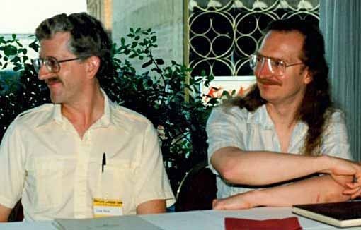
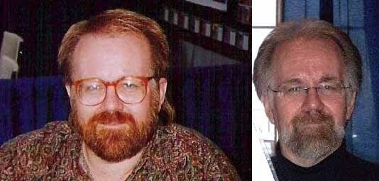
 John “JG” Roshell and Richard Starkings of Comicraft, 2007.
Born and raised in England, Richard Starkings began working for Marvel UK, the British division of Marvel Comics, in 1984, first as a freelance letterer, then as a staffer in a variety of positions, ultimately as a Group Editor. While on staff he continued to do freelance lettering for the company as well as 2000 AD and others. The first lettering credit I’ve found in the Grand Comics Database is a nine-page story in CAPTAIN BRITAIN #4 dated April, 1985.
 From BATMAN: THE KILLING JOKE, 1988, © DC Comics, Inc.
From his early hand lettering days, Richard is probably best known for lettering the Alan Moore/Brian Bolland graphic novel THE KILLING JOKE, a dream project for him. As the release date of the book was March, 1988, the work was probably done in 1987. In 1989 Richard relocated to America, working for a brief time in New York, then moving to Los Angeles. He continued to do hand lettering, mostly for Marvel, and in California began to work with graphic design programs like Adobe Photoshop and Adobe Illustrator on Macintosh computers. Richard had seen the computer lettering being done by David Cody Weiss and John Byrne, and at the San Diego Comicon in 1991 he talked to Byrne about how he was doing it. Later that year he bought Fontographer and, with encouragement from Marvel editor Marc Siry and help from “super genius Rand employee, Neil Sofge,” Richard created the first computer font based on his hand lettering, Letterbot. Richard remembers he worked on the font one day a week for about a year with Sofge.
 From WOLVERINE AND THE PUNISHER: DAMAGING EVIDENCE #3, 1993, © Marvel.
Richard recalls the first full book and series he used the font on was this one, with issue one dated Oct. 1993, though “there were some shorts in MARVEL SUPER- HEROES that preceded that.” Starkings lettered stories in issues 9-14 dated from April 1992 to Oct. 1993. Somewhere in there is the first appearance of his fonts.
 From MARVELS #1 dated Jan. 1994, © Marvel.
In December, 1992, Richard hired John “JG” Roshell (then Gaushell) to work with him on his growing comics lettering business. In a 2000 interview with Martin Strong, JG remembered:
I guess I was in junior high when it occurred to me that there were such things as typefaces; that it wasn’t a coincidence the lettering style on a record sleeve matched what I had seen on a store sign or in a magazine. I tried to mimic fonts like Eurostile and Gill Sans by hand, and then I discovered sheets of Letraset rub-on letters, and used those a lot for band flyers and student-council type stuff in high school. Once I got on a Mac for the first time, though, it was all over. The idea that I could just type stuff and change the lettering style instantly was mind-blowing. I went to UCLA and majored in design, though most of the practical knowledge I gained was from my on-campus job in the advertising department, designing all the printed materials for the student union under the supervision of a team of professional designers.
The job of actually designing type really just fell into my lap. After I graduated, I was doing freelance design work, and a friend of a friend of my girlfriend was looking for someone to help input comic lettering into his computer. I was always a big Spider-Man fan, so I jumped at the chance. Richard Starkings had been a hand-letterer in England and the U.S. for a couple of years, and had purchased his first Mac and created a basic font of his hand-lettering. I started working for him in the winter of ’92, inputting the type for low-selling books like CAGE and HELLSTORM. Pretty soon he was letting me make updates to the font in Fontographer, and before long I had created a more accurate version of his hand-lettering as well as fonts based on some of his sound effect and display styles.
 From MARVELS #4 dated April, 1994, © Marvel.
In recent correspondence, JG told me:
It was a gradual process. The first year, I made some tweaks to the font that Richard created, and made a couple of sound effects fonts (Zoinks, Clobberin Time, Phases On Stun). Late ’93 or early ’94 I created a new version of his pen lettering from scratch, which became Hedge Backwards. For better or worse, MARVELS remains a document of our process — Issue #1 is Richard’s original font, #2-3 are my tweaks, and #4 is the new version.
 Comicraft™ Logo by Starkings and Roshell, 2002.
By 1993, Starkings and Roshell were calling their lettering studio Comicraft, a name Richard came up with, and their workload was growing. The founding of Image Comics in 1992 provided them with a new market closer to home, and Image books often needed quick turnaround on both lettering and coloring.
 If you compare these charts you can imagine the savings in time, effort and money an all-digital comics workflow could provide. For one thing, the traditional workflow usually involved an entirely separate company to produce color separations, adding lots of time and expense. For another, once letterers and colorists were in the digital workflow, they could be required to make corrections on their own work instead of having it done by production staffers, usually with better results, and saving the company money. I suspect either Image’s WildStorm Studio or Malibu Comics were first to go all digital on at least some titles. Both were apparently heading there by mid 1994, with the help of in-house digital coloring staffs. WildStorm was using Comicraft for some of their lettering. Both companies were encouraging their freelance letterers to made digital versions of their fonts, or hiring letterers already using their own fonts like Roxanne Starr and Willie Schubert.
Edd Hendricks was hired by Malibu in 1992 initially to create a digital coloring system on Mac computers. In recent correspondence, Edd told me:
Once I had that up and running, and we had hired a staff to take care of that system, my next two tasks were to set up an in-house digital film department, so we could send finished film straight to the printers, and to create a digital lettering system. I’d say I started working on the lettering workflow in early 1994, and I developed three typefaces. The first one was based loosely on someone else’s work, and I changed things up so the differences between mine and theirs was significant enough. The other two were totally my creations. Funny how those take longer…
I’d guess I started putting the digital lettering in place in mid-1994, and I’m trying to recollect some of the titles I worked on. A couple issues of DEEP SPACE NINE, FIREFOX and Good Lord how my memory fails me from there. The change from hand lettering was gradual, and we still had some books that would continue to be hand-lettered (mostly the painted books, where the creator insisted on it). By the time Marvel bought us at the end of 1994, maybe 1/3 of the titles were all-digital, with plans in place to go completely all-digital in 1995. Marvel continued shrinking the Malibu staff month by month until everything was locked up toward the end of 1996. I left and opened a design shop, where I continued to letter comics, primarily for Rikki Rokket of Poison fame, although other jobs popped up here and there, but I never really gained traction with anyone else. And that’s my short story of lettering in the world of comics.
Back at Marvel, Comicraft initially met resistance to their computer fonts, and was often given low-selling books to work on, but in time their quick turnaround and quality led to lots more work. By 1996 they were doing 25 to 50 titles per month, and hiring additional staff, all working in the Comicraft style as directed by Starkings, using fonts largely created by Roshell from Richard’s hand lettering or JG’s own designs.
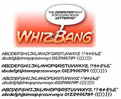 Whizbang Font by Studio Daedalus, © 1993 by Andre Kuzniarek.
In 1993 the first commercially available font with the look of comics hand lettering arrived on the market, Whizbang from Studio Daedalus. There’s very little information about the font available online.
 First classified ad for Whizbang in COMICS BUYER’S GUIDE, thanks to Maggie Thompson for the search and the scan.
It was apparently designed by Andre Kuzniarek and is copyright 1993. The first advertisement I know of was in the July 30, 1993 COMICS BUYER’S GUIDE, as seen above. I haven’t found any early examples in printed comics, but I know there are plenty out there.
 Here’s a larger sample I found online of the Bold Italic version, which suggests to me it was scanned from printed comics rather than original hand lettering, but that’s just a guess. The style reminds me of the work of letterer John Costanza, though he once told me he had nothing to do with it.
 For comparison, here’s some of John Costanza’s hand lettering from THE DARK KNIGHT RETURNS, 1986, © DC Comics, Inc.
 John Costanza, 1983, photo from Comics Interview #5.
John Costanza is a popular and prolific letterer whose first credits date to 1969. He worked on dozens of titles for DC, Marvel and others from that point on. Some time in the early 1990s Costanza created his own font from his hand lettering.
 I’ve been unable to contact John to ask him about it, but here’s a sample from CAPTAIN AMERICA #444, Oct. 1995, © Marvel. One thing to notice is the font does not have the serif I used in most comics fonts for personal pronouns, only the single vertical line version. John’s own font predates the release of Whizbang. This is the earliest printed example I discovered, but Costanza lettered a huge amount of comics, so I’m sure there are previous ones out there. John Workman recalls seeing signs designed by Costanza on a Mac computer and pasted into his art in 1988 (but using standard commercial fonts). Italian letterer Diego Ceresa corresponded with John about his font in 1992 after reading about it in a DC newsletter. A sample of John’s font in a letter to Diego dated Oct. 1992 shows he was certainly using it by then. More research is needed to find the first use of John’s fonts. Costanza continued to letter many comics by hand, as well as drawing comics in cartoon style for DC’s Warner Brothers cartoon titles, Disney Comics and SIMPSONS comics. He retired a few years ago.
Whizbang was quickly bought by many comics creators and companies, especially small ones, and was soon being seen everywhere. Many letterers hated the look of the font, including Richard Starkings, and he decided he should offer some of his own fonts for sale as a better alternative, and perhaps capture some of the Whizbang market. JG Roshell remembers:
In 1993 we licensed Richard’s lettering fonts to a software company that made screen savers (I can’t remember the name). Sharing them actually turned out to be really fortunate — our office was burglarized and all the computers taken, and they were able to send the fonts back to us!
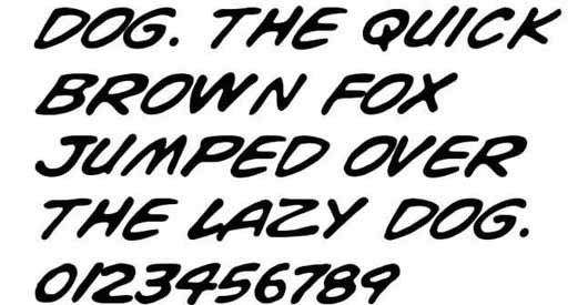
 We started selling Comicrazy [above] commercially at San Diego Comic-Con in [the summer of] 1995, then released a few more (Zoinks, Clobberin, Phases and PulpFiction) around Christmas of that year. (Comicrazy © Comicraft)
While Whizbang has been the only font from Studio Daedalus to date, Comicraft went on to become a major vendor of comic book fonts, and continues to release new ones regularly. Comicraft also currently letters comics like ASTRO CITY digitally, and has moved into publishing with the Starkings-written title ELEPHANTMEN.
 Dave Lanphear, with some early hand lettering samples, 1994.
Dave Lanphear began lettering for Malibu Comics in 1992. He told me recently:
In 1993, Albert Deschesnes and Edd Hendricks offered to digitize my hand-lettering to make a font the Malibu Art Department could use to do digital edits. Tim Eldred, Patrick Owsley and myself all demurred, though. We saw that as a prescription for trouble. A year later I was working at Comicraft. In 1995 or 96 I began making fonts for them starting with CCForked Tongue (I initially drew it for lettering I was doing by hand in EVIL ERNIE comics), and a calligraphic one for Jae Lee’s series, titled CCHellshock.
Dave went on to letter many comics for Marvel and other companies at Comicraft, and later was the in-house letterer and font designer for CrossGen. He continues to freelance for various companies. Dave is an example of the talented letterers employed by Comicraft in their boom years of the late 90s. Comicraft’s lettering output has declined considerably since then.
Next time, font creation by letterers increases in the mid 1990s. Other parts of this article and more that might interest you can be found on the COMICS CREATION page of my blog.
November 17, 2014
The Rise of Digital Lettering, Part 4
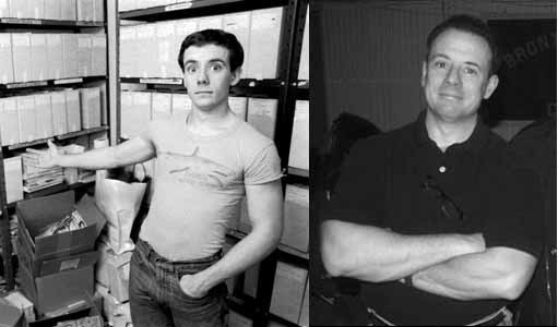
 John Byrne from 1992 and more recently, photos from Wikipedia Commons.
In 1990, writer/artist John Byrne added computer lettering to his tool set. Rather than use his own hand lettering to create fonts, Byrne worked with lettering by others. In a 2000 interview for Comic Book Resources, John said:
Getting a hand-lettering font for my computer was what really turned me into a letterer, full time. I’d lettered my work at Charlton, laboriously, the old fashioned way. By using a font and pasting in the lettering, I got not only better lettering than I could do, but an extra layer of control over the design of the panel and page. “Control” is the wrong word, really, as it has emotional baggage not applicable here, but it’s also the only word that seems to fit.
In recent correspondence, John said:
I think I used the lettering for the first time in NAMOR. The software I used was more antique than Fontographer, though. Fontastic was the name, if I recall correctly. Don’t recall there was a whole lot of process in front of actually using the fonts. I was eager to try them out as quickly as I could! I remember it took me a while to get the scale right!
 Byrne computer lettering from NAMOR THE SUB-MARINER #8, Nov. 1990, © Marvel.
The Grand Comics Database lists this issue of NAMOR as the first credited to Byrne as a letterer. The printing quality is poor on the book, so here’s another early Byrne computer lettering sample:  From BATMAN 3D, 1990, © DC Comics, Inc.
The lettering style is the same on these two examples. It works quite well imitating hand lettering, and is easy to read even with the poor reproduction. I had heard years ago from letterer Michael Heisler that Byrne had used his lettering to create an early font, so I contacted Mike, and he had this to say:
As best I can remember, it was sometime in 1990, and I was on staff at Marvel as Assistant Editor to Ralph Macchio. I was also lettering a handful of books, one of which was IRON MAN, at the time written by John Byrne with art by John Romita, Jr. and Bob Wiacek. One day Terry Kavanagh, the editor of NAMOR (written and drawn by Byrne), approached me to tell me that Byrne had decided to start lettering the book himself, using a computer font he had created from sampling my work. I’m not entirely sure what he used as a source; pages from IRON MAN seemed like an obvious guess.
 Hand lettering by Michael Heisler from IRON MAN #262, Nov. 1990, © Marvel.
Terry acknowledged that this was completely unprecedented, and he said that Marvel’s idea was to split the page rate for the lettering between Byrne and myself. I didn’t really know what to think, but it looked like something that was going to happen without any further input from me anyway, so I shrugged and said okay. I didn’t have any objections to his doing it; I was curious to see what it would look like.
The first time it was used was on NAMOR #8. I thought it looked…all right. The bold-italic version was clearly just the regular font beefed up, not sampled from my actual lettering. And Byrne’s approach to balloon shapes was obviously nothing like mine. But it was legible. I thought it worked.
After it was in print, I asked Terry how I should go about billing for the job, or if I even needed to. He said he would get back to me — and when he did, there was now a different story from Byrne. Apparently he hadn’t used my lettering as his only source, but that of a few other letterers too, and for that reason it wouldn’t be appropriate to split the lettering rate with me. It sounded like b.s. to me. I knew very little at the time about building fonts, but I had been a staff letterer in the Bullpen for over a year doing corrections over every letterer Marvel used, and I knew very well that none of us did our work at precisely the same weights or angles. It would have been an extremely complicated job for Byrne to sample work from a variety of letterers and make it all look consistent. Not saying he couldn’t or wouldn’t have done it, but in hindsight it seems far more likely that he simply created whatever missing characters he needed with his own hand. But the underlying point was: obviously no one had discussed splitting the lettering rate with him before this. I don’t blame him for balking, as I’m sure I’d do the same.
In any case, Byrne stopped using the font after that. He had begun lettering a Batman graphic novel with “my” font, and as far as I know, those were the only times it was used. I did call him at one point during all of this, but only left a voice mail and he never called back. He may have thought I was aggravated by the whole thing and simply didn’t want to deal with it. But I just wanted to ask him for a copy of the font!
 John Byrne lettering on NAMOR #9, Dec. 1990, © Marvel.
When I asked John recently whether he had used Michael Heisler’s lettering for his first font, he replied:
My earliest homemade font was adapted from POGO. (I took a lot of the “bounce” out of it — which, ironically, was what I really liked about the lettering!) Later I did fonts of some other folk, like Dave Gibbons and Fred Hembeck. Mostly, those were just goofing around and teaching myself how to do it. Then Jack Morelli asked what I would charge to make a font of his lettering. “I get to use it,” I said. That became pretty much my go-to lettering from then on.
 POGO by Walt Kelly Sunday page from 5/19/68, lettering by Kelly & Henry Shikuma, ©Walt Kelly estate.
The font used on NAMOR #9 and later issues is the one based on lettering from POGO, example above. The lettering was laid out in blue pencil by Kelly and lettered by his assistant Henry Shikuma. Kelly was a fine letterer, and the early years of the strip are all lettered by him, but Shikuma brought a precise calligraphy to the table that really stands out. John Byrne has continued to use this font on work like his series NEXT MEN for Dark Horse as recently as 2011. I think Byrne’s font version is excellent, by the way, though as with the Heisler font, the bold italic version is not scanned from POGO, but instead is a slanted, thickened version of the regular style.
 From HELLBOY: SEED OF DESTRUCTION #1, March 1994, © Mike Mignola.
The first HELLBOY mini-series was written and lettered by John Byrne using a new font he’d made from the lettering of Dave Gibbons. Dave had been lettering his own art for most of his career in an attractive open, readable style. Byrne’s font version first appeared in a preview of the story in SAN DIEGO COMIC CON COMICS #2 dated August, 1993. Gibbons saw it there, and was startled, as he knew nothing about it.
 WATCHMEN #1, 1986, lettering by Dave Gibbons, © DC Comics, Inc.
At the Great Eastern Con in New York, February 1994, Gibbons and Byrne were on a panel together, and Dave challenged John about using his lettering without permission, but in a good-humored way, as the two were friendly. Byrne took out a checkbook, and wrote Dave a check as payment, but Dave refused to take it. When I asked Dave recently if he had asked John not to use the font, Dave said:
I didn’t ask him to not use the font elsewhere. I think he’d used my font because, being on friendly terms, he didn’t think I’d object. When I did, albeit in a humorous way, he got the message! I dimly remember going to John’s hotel room at that con and him demonstrating digital lettering on his laptop. Although I was coloring on a computer back then, I wasn’t lettering.
He may have sent me my font on a disk. I do recall he sent me a pack of transparent, sticky back paper to print lettering out on and stick on the original page art; an odd hybrid of computer and traditional lettering.
 Dave Gibbons contemplates the fine art of lettering in a 1999 photo by Todd Klein.
Byrne continued to use his Dave Gibbons font on the HELLBOY miniseries, but as far as I know has not used it since. Dave later worked on his own computer fonts for some time and eventually had Gibbons fonts made for him by Comicraft, where they’re available for purchase.
 From X-MEN, THE HIDDEN YEARS #21, Aug. 2001. Lettered by John Byrne using his Jack Morelli font.
In a 1998 FAQ response on his website, John wrote:
The font I currently use in all my books is based on Jack Morelli’s lettering. Knowing that I had been experimenting with hand-lettering fonts, Jack asked me what I would charge to make one for him, of his own lettering. I said “I get to use it.” So Jack lettered up an alphabet, including all punctuation and special keys (like those little three line bursts that kinda look like > and
 Jack Morelli, in a 1982 photo © Eliot R. Brown from his website, used with permission and a 2011 photo from Wikimedia Commons.
Jack Morelli began working on staff at Marvel Comics in 1980, and his first lettering credits on the Grand Comics Database are from Marvel titles dated early in 1981. In recent correspondence, Jack Morelli remembered:
The first time I ever heard of computer lettering was around 1992, the year my twins were born. Jim Starlin had just come back from San Diego, and was over to dinner with his then wife Diana. He told me he had seen examples this new thing, and although it wasn’t quite there yet, I’d better get on top of it or I’d be out of work in a few years. The problem was, I didn’t have a computer and having just bought a house and fixed it up for my new family, I couldn’t really afford one.
A short time later I was at a party at John Byrne’s house and the subject came up. He had a then state-of-the-art computer and asked if I would make him an alphabet and he would do the rest. He’d get to use the font on his own books, pay me a small royalty for each book, and give a copy of the font to me for my own use. A little while later, Terry Austin and I drove back out to his place in Conn. and gave John the alphabet and the rest is the rest.
 Jack Morelli hand lettering from a recent ARCHIE comic, © Archie.
I never did use that font, and later, when forced by diminishing hand work, bought a computer and Fontographer and began figuring it all out. Had a lot of moral support from Janice Chiang, who was going through the same changes, and a lot of tech support from Jon Babcock, who had it down already. I eventually made a font of my own from an alphabet that I much preferred to the one I’d given John, and offered it to him for free. But, Byrne was happy with the one he had and so he continued to use that first one, and true to his word, never missed cutting me in.
Jack Morelli continues to letter many of the Archie Comics titles.
John Byrne’s computer lettering was probably the most widely recognized early use, but others were following right behind. We’ll continue with them next time. Previous parts of this article and more that might interest you can be found on the COMICS CREATION page of my blog.
November 16, 2014
The Rise of Digital Lettering, Part 3
 Like many aspects of publishing in 1980s, font creation was also undergoing radical changes at the time. The first commercially available digital fonts, like DigiGrotesk of 1968 (above) were the product of big firms like Linotype, and were made with machines and software that cost hundreds of thousands of dollars.
 By 1981-82 companies like Bitstream and Adobe were producing extensive catalogs of digital fonts, but it was the release of the program Fontastic by Altsys for the Mac in 1985 that first allowed desktop users to design their own fonts. Fontastic used only bitmap images to build fonts, which could be scanned on early Microtek desktop scanners from hand-drawn letters. As a result, fonts created by Mac users began to appear from all over, not just the big type companies. The designs ranged from elegant to awful, but the cost of font creation had plummeted, opening the door for plenty of new designers.
 In January, 1986 Altsys introduced Fontographer 1.0 for Mac, the first program that could create fonts using vector outlines and Bezier curves. This allowed for designs that were much more precise, and the vector outlines could be enlarged or reduced without any loss of edge quality. Fontographer was actually the first commercially available software that worked with vectors at all, predating Adobe Illustrator.
 The jagged edges of bitmaps could be avoided, depending on the resolution of the computer monitor and/or the printer the font was produced on. Now designers had the tools to produce the kind of high-quality fonts once only available to a few at large type houses, and font designers have never looked back.
 David Cody Weiss, images from his website.
As far as I’ve discovered, the first person to create comic book fonts on a computer was David Cody Weiss. In recent correspondence, David told me he started as a calligrapher, and did signage and name cards for the Seventh World Fantasy Con in Berkeley, CA in 1981. Tom Orzechowski saw his work there and mentored David on some commercial lettering. He then went to New York trying to break into comics and became a temp at Marvel. According to the Grand Comics Database, David’s first lettering credit is for Steve Ditko’s “Missing Man” story in PACIFIC PRESENTS #1 cover dated October 1982, and he began getting regular lettering assignments from Roy Thomas once he was back in California in the months after that. David’s style was very regular, with little of the “bounce” often seen in hand lettering, so it was perhaps ideal for adapting on the computer.
 Macintosh Plus (their third model) introduced Jan. 1986. Photo by Jeff Keacher.
In recent correspondence, David told me:
I bought the first Mac Plus sold at U.C. San Diego and from the beginning I wanted to work out how to use it for lettering. When Fontographer came out I was practically first in line. I didn’t have an option to scan a letter and auto-trace it, that feature came years later. Instead I built each letter onscreen using the drawing tools and then tweaking each one so it looked “blobby” at the ends of strokes. I spent weeks building the font.
 Working on a single letter in Fontographer on an early Mac.
I wanted the illusion of hand lettered art, so I made variants of each letter between lower case and upper case as well as with the option key characters. Typing the word bookkeeper would be keyed in as: bOokKeEper. That way each pair of letters would be different. I also adapted all of the accent marks and special characters. Then came the week of kerning every possible pair.
In a nutshell, David pioneered the method of creating comic book fonts used by many designers who followed him, and still prevalent today. The all upper-case style of comics lettering meant that the lower case and upper case letters could be slightly different from each other, adding to the illusion of hand lettering, especially when in pairs.
 GREY #1, Oct. 1988, © Viz Comics, hand lettered by David Cody Weiss.
David continues:
Viz Comics were the real reason to develop a digital font. The photo paper originals [they supplied me with] were so slick that I could hardly find tooth enough to feel my lettering, which came out too wobbly for my—and Viz’s—taste. With my font lettering portable on a floppy disk, I used a print service bureau to print out 600 dpi proofs.
 GREY #2, Dec. 1988, the first comic with David Cody Weiss’s computer lettering.
David’s working method for lettering:
Xerox original art pages down to 6X9, then scan them at 300dpi. Open the scan in Canvas—my preferred vector/bitmap drawing app, because it did layers before Photoshop did. There I scaled the scan back to original size.
 Example of on-screen digital lettering on a layer above grayed-down line art, lettering by Todd Klein on DEATHBLOW, 1996.
I’d position the cursor and type the copy. Then I did balloons and pointers with the vector tools. Next I’d do the SFX either in Canvas or in a great pioneering piece of software called Typestyler (which I beta-tested). [Todd here with a note that, in the examples from GREY above, I believe the balloon shapes were already in the art.]
When I finished a page I’d cut and paste all that work into a second document. This I filled with all the grouped balloons with as little space between them as possible. I’d print that on sticky-back paper at 300 dpi on my own LaserWriter or take it to the service bureau for 600 or 1200 dpi prints. An X-Acto knife cut later and I’d paste down the individual balloons in their proper places. More (real) cut and paste for the SFX or newspaper copy. Lastly, go over the work with a pen in one hand and Wite-Out in the other [to fill in and fix up where needed].
Note that, while the font and lettering were done on computer, the lettering still needed to be printed out and pasted onto the art, which was then handled like any comics art at the time, a method that continued for some years. The art would be photographed in “flats,” usually four pages per flat, colored by hand separations following color guides (unless the comic was black and white as with GREY), assembled into signatures with eight pages on each side, made into printing plates, printed on high-speed offset presses, folded, assembled and trimmed. In other words, the rest of the process remained unchanged from methods worked out in the middle of the 20th century.
David lettered comics for several companies, including DC, but in 1989 he joined the staff of Disney Comics as an assistant editor. At that time he began developing a writing career that continues today, with many projects relating to comics. You can learn more on his WEBSITE.
 Willie Schubert, Colorado Springs, CO, 1998, photo by Ellen Smiga Klein.
My research found the second person to develop his own comics lettering fonts was Willie Schubert. Willie began lettering on a fan project in Chicago with other future pros. It was submitted to First Comics editor Mike Gold, and while it wasn’t accepted, it led to Willie’s initial lettering work for First Comics in 1985. The Grand Comics Database lists his first credit as STARSLAYER #30 cover dated July, 1985. In recent correspondence, Willie told me:
I started putting together my own fonts in 1989. I did my first ‘font’ lettering by the end of 1989. This stuff appeared in work for First Comics. Initially, LONE WOLF AND CUB and a number of Classics Illustrated titles.
 Willie Schubert’s hand lettering on LONE WOLF AND CUB #30, Oct. 1989.
I was working on a Mac SE [first released in 1987] using Fontographer 3. I had to invest in an Apple Laserwriter so I could actually edit the letterforms, adjust spacing and work out an annoying number of kerning pairs.
 Willie’s font, first used on LONE WOLF AND CUB #31, Jan. 1990.
Once the font was made I used FreeHand to do the lettering. At the time that program made more sense to me than Adobe Illustrator. (And many things that annoyed me about Illustrator back then continue to annoy me in recent CS versions.) The biggest pain at the time was that programs (or the system) didn’t completely respect kerning pairs generated out of Fontographer. Wide gaps and/or letters slamming together erratically was a regular event. I was constantly tweaking letter spacing. The problem seemed to become “less worse” when I upgraded the RAM in my Mac to 2 MB (maxed out, actually). Anina Bennett was at First Comics in those days. Her assessment of my fonts were that they looked like my lettering, only “relentlessly consistent.”
I have to say that Willie’s fonts are remarkably similar to his hand lettering, I would have a hard time telling a difference between these two samples, except that the font lettering has each line perfectly centered.
Willie continued to letter comics by hand and on the computer for various companies. Like Weiss, his computer lettering was done on-screen, then printed out and often pasted onto overlays to send in as final work. For his hand-lettering, he used the computer for titles and credits. Willie added:
The first book I did that was truly digital was LEGENDS OF THE DARK KNIGHT #100 [Nov. 1997]. An experiment in going digital as much as possible. DC’s post mortem on the issue was…they didn’t save any time…they didn’t save any money.
Willie Schubert has been away from comics for a few years, but tells me he’s getting back to lettering with two projects for the revived First Comics, bringing him full circle, which I’m glad to hear.
 Roxanne Starr from the 1980s, and with Bob Burden and J.R. Mounts at the Atlanta Comic Con, July 2013.
From what I’ve learned, Roxanne Starr was the third person to have her comics fonts in print. After art training at the City College of New York and the School of Visual Arts in the 1970s, Roxanne moved to Atlanta, GA in 1980 and began working as a freelance graphic designer. She started lettering comics in 1982, and is perhaps best known as the letterer of FLAMING CARROT by writer/artist Bob Burden.
 Hand lettering by Roxanne Starr from FLAMING CARROT #15, Jan. 1987.
In recent correspondence, Roxanne told me:
I had been lettering The Flaming Carrot for a number of years in traditional fashion, by hand. Part of my job was also inking the word balloons, captions and panel borders. The work I did for Bob [Burden] was something that I did on the side of my regular job as a graphic designer. Because of my interest in computers, from time-to-time Bob had brought up his belief that of all the aspects of comic book production, the first that would go the way of the computer would be the lettering. Okay, I thought, but how exactly would this be done?
Then during the latter part of the 1980’s, in conjunction with my regular job, I attended a Macintosh seminar and heard about a new thing called Fontographer, software used for editing fonts. The rest, as they say, is history.
 Roxanne Starr computer lettering from FLAMING CARROT #24, April 1990.
The first published comic in which my computer lettering appeared was FLAMING CARROT #24 in 1990, and it was a mess. I was still trying to figure out how to use Fontographer and Bob had me on a tight deadline, so the kerning was very bad. I may have done the actual work in the year 1989 though. Then came FC #25, #26 and #27 (the Teenage Mutant Ninja Turtles trilogy) and the lettering looked a lot better. That was a year later.
 FORBIDDEN PLANET #3, Sept. 1992, © MGM.
Shortly after my computer lettering hit the stands in FLAMING CARROT, I was contacted by David Campiti at Innovation Comics to letter an upcoming FORBIDDEN PLANET series being painted by Daerick Gross. Vickie Williams was a regular letterer at Innovation, but couldn’t fit the series into her schedule, so David asked me to create a font imitating Vickie’s hand. Another offer of computer lettering work came from Paul Jenkins, who was then an editor at Tundra Publishing. He wanted me to create a font imitating Al Columbia’s hand. Al had just taken over the art duties from Bill Sienkiewicz on Alan Moore’s ill-fated BIG NUMBERS project. The next request for generating a new font came from Alan himself. He wanted me to create an Artie Simek font to be used in the Image project, “1963.” I always formed my letters from scratch and made them look KINDA like another letterer’s hand. The first comic where I was truly happy with my computer lettering was in FORBIDDEN PLANET in 1992.
Roxanne continues to live and work in the Atlanta area, and is still involved with Bob Burden’s comics projects.
Other letterers and artists were following close behind, creating and using their own digital fonts for lettering comics. We’ll continue there next time. Previous chapters of this article, and more that might interest you can be found on the COMICS CREATION page of my blog.
November 15, 2014
The Rise of Digital Lettering, Part 2
 Image from the website of Mark Simonson.
Some time in the 1950s Charlton Publications bought this or a similar model of Vari-Typer, a machine designed for small businesses to set their own type. It worked like a typewriter, and employed a single-use carbon ribbon that left a very clean impression on paper as large as 13 inches wide. The machine could hold two fonts on the central “Type Shuttle,” and many interchangeable fonts were available from Vari-Typer. In an article about Charlton In COMIC BOOK ARTIST #9, author Christopher Irving writes:
One unique aspect of the Action Hero books was in the lettering, often credited to “A. Machine.” In reality, the rather constipated lettering was done on a large comic-font typewriter called the typositor machine.
“Pat Masulli designed a comic typeface for a large typewriter,” [artist Frank] McLaughlin said. “The comic pages would fit in the typewriter and the copy would be typed right on the artwork. The results were a complete disaster that caused many more problems than it solved. It was a typical attempt to cut corners, but the finished product suffered greatly.”
Thanks to Scott Dutton who wrote about this on his blog. I think Irving has the Typositor machine (which produced large type for titles on a roll of photographic paper) confused with the Vari-Typer, but the idea of someone at Charlton having a font made for the Vari-Typer brings us a step closer to the perennial wish of being able to create comics lettering by typing. Pat Masulli was a comics artist who had begun working for Charlton in 1950 as a colorist, but by 1955 he was the executive editor. I think it’s likely he created the font for the Vari-Typer some time in the mid to late 1950s.
 On issue 60 of Charlton’s ATTACK cover-dated November 1959 are examples of large Typositor type (the open lettering at the top and bottom) and two blocks of the Masulli font typed on the Vari-Typer and then pasted on the art.
 Up close you can see what an odd font it was, with strangely shaped M and W characters, but at first glance it certainly does look like hand lettering, though very poorly spaced. The Vari-Typer 160 was able to adjust space between the letters using the dials above the keyboard, but it was a laborious practice that an article I found by Fred Woodworth (it starts on page 8 of that newsletter) says could slow production to 10 words per minute. I suspect whoever did the typing at Charlton didn’t bother with this at all, and that’s why there’s so much extra space around the letter I for instance. The uneven blackness of the letters suggests typewriting, too, the kind of effect manual typewriters have when some letters are struck at different strengths, or parts of letters impact the carbon ribbon with less strength. It’s still clear and readable. Notice that the numbers are in a different style, suggesting Masulli didn’t provide them, and when the font was made, Varityper used a font they already had for that. The article by Woodworth states:
“Vari-Typer fonts were made in about four sizes (usually 6 or 7 point, 8 or 9, 10 or 11 and 12 point, with a very few in 13 point size.) Besides the many printer-style fonts, there were scripts, mathematical fonts, fractions, and fonts having special characters for Spanish, Portuguese, Italian, German and other languages that utilize the western alphabet. For non-western languages there were fonts of Russian, Thai, Burmese, Cambodian, Korean, Kazak, Azerbaijani, Uzbek, Kirghiz, Tadjik, Amharic, Gurmukhi, Tamil, Arabic and Hebrew. In addition, some fonts included boxes, stars, diamonds and other elements of ornamentation. Also available were segments for drawing vertical and horizontal lines, and there were even ‘cartoon’ fonts for setting copy for comic strip balloons.”
Whether Charlton’s was the first of the “cartoon” fonts I don’t know, but the Masulli font showed up in many Charlton comics for some years. And you can see in the Vari-Typer approach many elements that would later be echoed in fonts for desktop computers.
 Blue Beetle © DC Comics, Inc.
The font credited to “A. Machine” that I remember seeing in Charlton comics was a different one, as seen in this 1967 issue of BLUE BEETLE, thanks to Maggie Thompson for the scan.
 A closer look shows there are two styles, a regular one for the balloons and a slanted one for the captions. This font looks less like hand lettering and has the same letter-spacing problems as the other one, with the sans-serif I the most obvious. All the letters are narrower, so it takes up less space on the page, but the overall look is more mechanical. Whether it was a font made by Vari-Typer for Charlton, or simply one of their existing “cartoon” fonts is unknown. As Frank McLaughlin said in his quote above, it might have saved time in some cases, but created lots of problems as well. Any mistake would have to be corrected by retyping and patching in a new section of lettering over the typed one, and if the artist got ink on the lettering or otherwise damaged it, that would have to be patched as well. It was a clever idea, but in the end not terribly successful, I think. No other comics company thought it was worthy of imitation as far as I know. More research is needed to pin down the earliest use of Vari-Typer comics lettering at Charlton.
 Typesetting was undergoing many changes itself at the time. Early typesetting was created with individual letters made of wood or metal (usually lead) set one at a time in rows, then composed into pages. The Linotype machine, above, a massive object usually found in newspaper offices and printing plants, was introduced in the late 1800s.
 It set paragraphs of type in large blocks using hot lead, as seen here. But as offset printing gradually replaced letterpress printing (with metal plates) through the first half of the 20th century, metal type was no longer needed or desirable, and photo-typesetting came into its own. That used film negatives of each letter that were exposed on photographic paper to create “cold type” in galley form, easy to paste onto a layout for printing on offset presses. The Vari-Typer was the small business version of cold type production. The earliest computer typesetting methods were hybrids that connected a computer terminal to a photo-typesetting machine.
 Image source: Rochester Institute of Technology.
Fonts used in typesetting have always begun as drawings of letters or glyphs by type designers. Above is a fine example by Frederic Goudy from his 1921 design of the font Garamond (the Italic version). The creation of a font with metal type was a long and complicated process beginning with very large letter drawings, but that got easier with the advent of phototypesetting where the drawn letters simply needed to be photographed precisely to create the font.
 Type design was largely still in the hands of a few talented designers working for type houses until the mid 1980s, but with the introduction of Macintosh desktop computers by Apple that could work with graphic images and fonts, things began to change. Above, the Macintosh 128K, the first all-in-one desktop computer with MacPaint graphics software got things rolling in 1984. By 1985 Aldus had released Pagemaker 1.0, the first page layout program, and work produced with it could be printed on Apple’s Laserwriter home printer in crisp print-ready black and white. With these elements, desktop publishing was born.
 SHATTER © First Comics.
It didn’t take long for the first all-digital comic series to arrive from writer Peter B. GIllis and artist Mike Saenz. SHATTER initially appeared in a one-shot from First comics in June of 1985, though a preview was featured in the March, 1985 issue of computer magazine BIG K, so the work must have been well underway in 1984. According to Wikipedia:
The Shatter artwork was initially drawn on a first-generation Apple Macintosh using a mouse, and printed out on an Apple dot-matrix Image Writer. The print-outs were then photographed like a piece of traditionally drawn black-and-white comic art, and the color separations were applied in the traditional manner for comics at the time.
 In this panel from the book you can see it featured black and white interior art using textures and tones with large dot patterns and lines. The lettering was typed in the Chicago font featured on the early Macs in oval balloons that certainly have the feel of comics lettering.
  Chicago was designed by Susan Kare for Apple along with a other fonts with city names, all registered trademarks of Apple. Chicago was used throughout the operating system on Mac computers, and has the advantage of being simple, bold and easy to read.
 This was particularly important at small sizes, where the font looked more like this on screen and nearly as bad when printed. The Apple fonts, like most digital fonts of the time, were “bitmap” fonts, built with square pixels. The smaller the size, the more abstract and jagged they looked. It wasn’t the most elegant font, and didn’t look much like traditional comics lettering, but it could be typed rather than drawn one character at a time, a plus for the artist. And on this series, the font Chicago seemed to match the look of the art quite well, both had a clunky squared-off feel. More traditional comics lettering probably would have seemed out of place. Russ Maheras, a friend of Saenz at the time, recently told me:
I got to see his whole Mac setup and a demo on how he would draw. There were no styluses or anything, and he drew with a mouse! I tried and the results were like a first grader’s drawing. He laughed and told me it took a while to get the hang of it. I thought he was nuts! But he sure went a long way with some crude technology!
 MARVEL GRAPHIC NOVEL #33, IRON MAN: CRASH © Marvel.
Mike Saenz went on to create the first digitally produced graphic novel, above, published in 1988, with a different font that appears less jaggy and more like traditional typesetting, therefore actually farther from the look of comics lettering. The upper and lower case seems hard to read here as well.
 BATMAN: DIGITAL JUSTICE © DC Comics, Inc.
Another comic following the same path was this one from 1990.
 It features a font that at least attempted to imitate traditional comics lettering, though it still looked rather mechanical. I don’t know anything about the font, and haven’t seen it used elsewhere, but it may have been created with computer software by or for the artist, Pepe Moreno. While the letters are a little more organic, they’re still very regular and square looking. The round-cornered rectangles of the balloon shapes push toward a more digital feel overall, but perhaps that was the intent. Notice the serif version of I is used at the beginning of the first line for the personal pronoun as in comics lettering, but not at the end of the first line, a lettering error.
The innovations led by Apple not only spawned desktop publishing, but desktop font creation as well. And fonts that looked more like hand lettering were on the way. We’ll continue there next time. More articles you might enjoy can be found on the COMICS CREATION page of my blog.
November 14, 2014
The Rise of Digital Lettering, Part 1
 Since the invention of written language, people have tried to find ways to reproduce it more quickly than the age-old method of copying with pen in hand. Writing is made of alphabets or glyphs that repeat in a myriad of combinations. The quest was to reproduce those glyphs reliably to order without having to create each one anew. This seven part series will explore that quest.
 Left, replica of the Gutenberg printing press. Right, the Sholes-Glidden Typewriter, the first commercially available model.
The first attempt was the printing press, and as that evolved, it gradually replaced the creators of hand-lettered book manuscripts —often monks in monasteries — with a new technology. Many things still needed to have hand-made copies, though, as in the case of the U.S. Constitution, above, lettered by Jacob Shallus, and many other kinds of legal documents. In the early 1800s the job of “engrosser,” “penman,” “scrivener,” or “copyist” was filled by legions of such letterers keeping records of all kinds for businesses, courts, and governments. The invention of the typewriter began to gradually replace those jobs with typists in the later 1800s as commercially successful machines were released. By 1900 or so, the majority of written documents were being typed rather than hand-copied. This undoubtedly put many scriveners out of work and was probably a source of tumult and outcry at the time.

 That worked for many documents, but not all. Music manuscripts had to be transcribed by “music copyists” from composer’s hand-written originals, a skill that required lots of musical knowledge as well as drawing skills. Printed music was usually made from steel engravings of what the music copyist produced by hand, but the engravers needed the clear, clean pen and ink drawings to work from. Interestingly, the job of transcribing music manuscripts by hand survived until the 1990s, when computer software was finally able to do it equally well, in the hands of the right person.
 The combination of pictures and words has often been another area where hand-made letters work best, as in this example from the Bayeux Tapestry created in England in the 1100s. It’s done in needlework, but any kind of art that includes letters, from paintings to sculpture, needed to have those letters created by the artists.
 From the earliest days of sequential art, cartoonists added text to their pictures with pen in hand, as in this example by Rudolphe Töpffler from “Histoire de M. Jabot” of 1833.
 When Töpffer’s work was first translated into English and released in America in 1842 as “The Adventures of Obadiah Oldbuck” (considered to be the first American comic book), the publisher found it easy enough to replace the artist’s hand-lettered text with type, especially since that text was usually in a box below the art. While less organic and interesting than the original script, the type did the job of getting the ideas across, and thus the effort to marry art with type was present in American comics from the beginning.
 Many of the comic strips that developed for newspapers continued to use hand-made lettering, as this example from “Little Nemo in Slumberland” by Winsor McCay from around 1910. The convention developed to use all sans-serif capital letters because they were easier to read at small sizes, something that has persisted to the present day in comic books.
 The styles varied greatly, here’s a looser one by Rube Goldberg from 1929…
 …and a more conservative style from Hal Foster on Tarzan in 1933, with an interesting unfinished lettering change at the end of the second line. (Tarzan © Edgar Rice Burroughs, Inc.)
 A few strips used type instead of hand lettering, like “Barnaby” by Crockett Johnson. The font seen here is probably Futura Demi Oblique, and in the 1940s when the strip ran, the type would have been set in galleys to Johnson’s specifications, then cut out and pasted onto his art. Even with that, it must have saved the artist time or he wouldn’t have used it. I think the simple linear style of the art makes it a better match for this font than, say, a typical adventure or humor strip. (Barnaby © Estate of Ruth Krauss.)

 Later uses of type in comics can be found in MAD Magazine (example above from 1979, art by Angelo Torres) and HIS NAME IS SAVAGE by Gil Kane from 1968. Personally I think it works less well with these styles of art. (Mad © EC, His Name is Savage © Estate of Gil Kane.)
 With the introduction of Wonder Woman in ALL-STAR COMICS #8 dated Dec. 1941 – Jan. 1942 a new kind of lettering entered the scene, one that looked more like type than hand lettering. (Wonder Woman © DC Comics, Inc.)
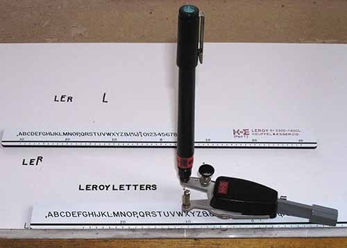 In fact, it WAS done by hand, but using the Leroy lettering system consisting of a scriber, technical drawing pen, and templates. The Leroy system was created for use in architectural and engineering drawings, and came to comics in the hands of Jim and Margaret Wroten. Jim was a salesman for Leroy, and quite proficient at using it. I’ve written an article about the Wrotens and their work HERE, and most of what I know about them can be found in THIS excellent blog post by Bhob Stewart.
 In addition to WONDER WOMAN, the Wrotens lettered many stories for EC Comics, as above… ( © EC)
 …and I believe for CLASSICS ILLUSTRATED, where they used upper and lower case templates much more often. The example is from Issue 165A, art by George Evans, from 1961.
While this was something the Wrotens could do well and quickly, it was still all hand work, and not really on the path toward the goal of making lettering in comics easier, except perhaps for them. And having tried the Leroy system myself, I can attest it’s a lot harder and more time consuming than regular hand lettering for everyone not named Wroten. The dream of comics lettering that could be produced by typing was instead developing at small publisher Charlton in the 1950s. I’ll continue with that next time.
More articles you might enjoy can be found on the COMICS CREATION page of my blog.
November 13, 2014
Incoming: 75 YEARS OF MARVEL
 Images © Marvel.
YEESH! This fershlugginer book is gigantic, and it comes in a cardboard carrying case with built in plastic handle that’s even bigger! The book is 12 by 16 inches, and 3 inches thick. I’m not sure how I’m going to read it, it weighs over 14 pounds. In small amounts, I imagine! I was asked to submit a design for the cover titles, but Taschen went with something else, so my only involvement is a few small year titles on the included but separate Marvel timeline:
 This one folds out five times to 55 inches wide! Cat for scale. I appreciate Taschen sending it to me, but I have no idea where I will have room to put it! A quick look through the book reveals all kinds of over-the-top design extras like foil printing and heavy cardstock on some pages. Who knew, when I was buying those cheap, poorly printed comics in the early 1960s it would come to this? Not me, that’s for sure!
November 12, 2014
Incoming: The Art of the Simon and Kirby Studio
Image © estates of Joe Simon and Jack Kirby.
I had it in my hands at the New York Comicon, now I have one to read and enjoy. I did the title lettering, so editor Charles Kochman was kind enough to send it to me. A few hundred pages of stories scanned from the original art, with commentary by Mark Evanier? Can’t wait. The pages are 9 by 12 inches, and I like the fact that they used the actual paper and ink colors rather than trying to make it look more like printed comics. Well done.
November 11, 2014
And Then I Read: SWAMP THING ANNUAL 3
 Image © DC Comics, Inc.
Writer Charles Soule makes good use of the Annual format here to focus on one character’s story, specifically the end of it. He introduced Capucine, the 1,000-year-old assassin and self-appointed bodyguard to Alec Holland in SWAMP THING #20 released in May of 2013, expanded on her life story over time, made her come to life and grow as a character, and now oversees her final adventure in this world. The story involves The Demon, Etrigan, created by Jack Kirby, and Soule’s handling of the hellish rhymer is the best I’ve seen in a long time. The art on the book is all excellent, with the main story by Javier Pina and Carmen Carnero, and chapters of Capucine and Swamp Thing’s pasts by Ryan Browne, Dave Bullock and Yanick Paquette (nice to see him back on this book briefly). A fine comic, satisfying and rewarding to read.
Recommended.
Todd Klein's Blog

- Todd Klein's profile
- 28 followers

