
Todd Klein's Blog, page 234
November 1, 2014
Rereading: STARSHIP TROOPERS by Robert Heinlein
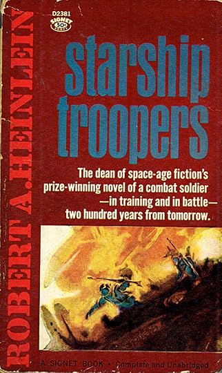
Image © estate of Robert Heinlein, art not credited.
This is the novel that put Heinlein into idealogical conflict with many of his faithful readers. It posits a future America where full voting rights are only granted to military veterans, and follows the life of Juan Rico from high school, to enlistment in the service, (which is strictly voluntary and the recruiters do their best to discourage recruits), then through basic training, advanced training, and combat action on distant planets. Juan is “Mobile Infantry,” which means he wears a powered armored suit that sounds like something out of Transformers, and his missions are against a hostile alien civilization nicknamed “Bugs,” as they are set up in communal hives rather like ants or termites.
Heinlein was a Naval Academy graduate, and Naval veteran, though he did not see combat, I believe. The ideas he presents are well thought-out, and even though they present life choices I would never make, I found those choices rational, admirable and believable as told. The military in the book is idealized, in that everyone is on the same page, works hard and well together, and there are almost no desk jobs, except for veterans with severe injuries like lost limbs. Human nature being what it is, both the military and the government as presented are never likely to happen in real life, but as ideas to strive for, they’re certainly worthy of thought and fun to read about. The book does get bogged down in idealogical and political discussions at times, but mostly it’s about a boy’s journey to manhood in an arena of great danger but even greater camaraderie. Despite the sniping Heinlein took from many left-wing writers and critics, the book won the Hugo Award for best novel, the highest honor in the science fiction field. It’s a fine read that will make you think, whatever your personal beliefs.
Note that if you’ve seen the movie, which I haven’t, expect the book to be different, and from what I understand, better.
Recommended.


October 30, 2014
And Then I Read: GREEN LANTERN 35
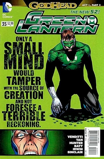 Image © DC Comics, Inc.
The New Gods have stolen some Green Lantern rings and are trying to use them to pierce the Source Wall and get the Life Equation. With typical arrogance, they did it violently, with no regard for the consequences to the ring holders. Hal Jordan leads a team to confront them at the Source Wall, and the battle is on. Both sides are sure of their power, but the Green Lanterns come up short in this round. You’d think the Corps would be getting used to being bested, as that’s happened a lot in recent times, but Hal seems ready to bull ahead…until he gets a look at the New Gods’ home base. And where is Darkseid, one wonders? The story is pretty good, the art is fine, and it’s not a bad show so far. My favorite thing remains the large type on the covers.
Recommended.
October 29, 2014
Marvel Movie Logos, A New Trend?
 All images © Marvel.
Recently Comicraft logo designer JG Roshell sent me a link to this image promoting six future Marvel films with the excited message, “Looks like they’re using my Inhumans logo and your Dr. Strange!” We were both happily surprised by this. Even though there’s no guarantee these logos will continue to be used going forward, it was cool to see.
 For many years most films based on comics have been promoted with logos that stay far away from the look of the comics themselves, like this 2011 Thor logo which uses the extremely popular and over-used font Trajan. Lately Marvel is really cranking up their film plans, and the newer logos give evidence that the company is looking to their comics logos more than they ever have before. Of course, many past Marvel films have been licensed out to other studios, where decisions about logos and promotion are made, so films franchises like Spider-Man and X-Men may not have had much input from Marvel itself.
For about the past 25 years, most action movie logos have included at least some of the following qualities: 1) metallic with glistening highlights, 2) three-dimensional, 3) distressed, 4) glowing, 5) must look good on a black background. You’ll see many of those qualities above.
 But over the past year or two, Marvel movie logos have been getting more varied and more interesting.
 While it doesn’t look like any of the logos on the comics, this one has, for me at least, the feel of a comics logo, or at least is in the same neighborhood. I like this trend, and really, it makes sense to avoid following the crowd of Trajan and Helvetica lovers and make Marvel movie logos more distinctive and memorable. So, let’s take a closer look at the new ones.
 The new Captain America film uses the logo style from the very first comic on the character’s name:
It was designed by Joe Simon, and the movie logo follows it closely, if not exactly. For “Civil War” they’re using tall but undistinguished block letters that actually are an improvement on the comics logo…
 …which is the font Trajan again. The previous Captain America film used another early Joe Simon logo as starting point, too.
 The Avengers movie logo, like the previous one, is based on this…
 …a design by Gaspar Saladino that first appeared on issue 96 cover dated Feb. 1972. It’s been modernized, but the idea is clearly the same. The rest of the movie logo looks like horizontally stretched Trajan, but this one gets high marks from me, and I think most comics fans.
 The Thor movie logos have gotten much more interesting since the first one, and while not based on any comics logo, it’s quite appealing to me, especially what looks like an elaborate decorative design inside the Thor letters.
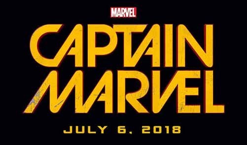 The Captain Marvel movie logo is the least metallic of the group, though it does have the distressed and three-dimensional check points.
 It’s also appearing on a new comics series that began this year. I don’t know who designed it, or whether it was designed for the comic first or the film, but it looks pretty good to me on both. Marvel’s Captain Marvel (as opposed to the Fawcett one) has had many logos over the years, and this is far from the worst.
 We’re looking pretty far into the future for this Inhumans release, which means there’s plenty of time to rethink the logo, but I really like this one, based on the 1998 design of Comicraft’s JG Roshell:
 Even with all the movie logo gimmicks, it still works great for me.
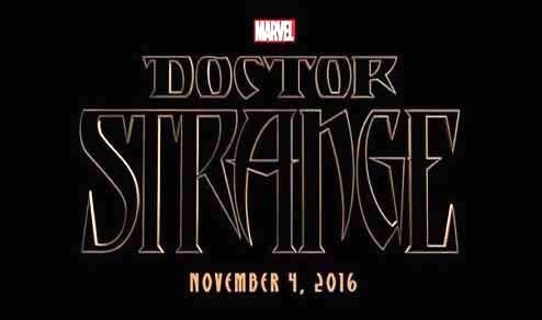 Finally there’s Doctor Strange, based on a 1988 design of mine:
 There are some strange things about the movie logo, though. By leaving off the drop shadow, and just tracing the inner open shape of the letters, they’ve made some parts look too short: the right leg of the R and N, the left leg of the A and all of the G. I admit that was true in my design, but it’s less obvious. This logo may well be just a place holder, there are several other Doctor Strange movie logos out there on the web already, so I suspect they’re still working on it. Cool to see it promoting the film, all the same. A first for me.
 JG also found this recent movie logo, which is again based on his design:
 Not an exact match but very close, and isn’t this much more interesting than the average action movie logo these days? JG and I sure think so! Good going, Marvel.
JG also commented, “Would be nice if we could get paid again…” Now that’s a real Hollywood fantasy, Mr. Roshell!
October 28, 2014
And Then I Read: GODHEAD 1
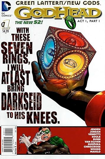 Image © DC Comics, Inc.
When The Source Wall from Jack Kirby’s Fourth World books showed up in a recent Green Lantern family arc, I suppose it was inevitable that Kirby’s New Gods would tangle with the Green Lantern Corps. It was even more likely once the White Lantern Kyle Rayner, possessor of the powers of the entire rainbow of rings, managed to pierce the Source Wall. That was bound to come to the attention of New Gods leader Highfather. If he can capture that power and duplicate it, he can at last achieve the Life Equation he needs to defeat Darkseid. This is comics, of course, so we can expect no final conclusive winner in the battle of good and evil. Thus, it’s all about the telling of the tale. In this opening chapter, the New Gods are explained, the stakes are described, and rings of each color are gathered, causing much trouble for the Corps. It’s not a bad opening, but aside from a few surprising ring-bearing victims, it didn’t offer a lot to engage me. The art and writing has a very “team” feel, it works fine, but I miss the individual story lines and character development that get minimized in such epics. I’ll read the Godhead crossover as it continues in the Corps books I follow, but without great enthusiasm. I do love the large type treatment on the covers, though.
Mildly recommended.
October 27, 2014
Cape May Birding Weekend
 This past weekend was New Jersey Audubon’s fall birding festival in Cape May, and I helped out on a few walks, though with other leaders who are better birders than I, so I didn’t have much to add. It was wonderful to be out early on Friday and Sunday, though, with nice weather and lots of birds around. The lighthouse never looked more dramatic than on Friday morning at sunrise!
 In fact, I didn’t take many pictures, as I was busy enjoying the birds with my binoculars most of the time, but here’s a shot from the Hawk Watch platform at the opposite edge of the Cape May Point State Park parking lot from the lighthouse, where watchers and official counters were enjoying hawks, eagles, ducks, geese, and some small birds as well.
 These American Coots on Bunker Pond next to the Hawk Watch were enjoying some breakfast of pond weed.
 On the park trails, Sweet Gum leaves were a rainbow of colors, and the trees held more small birds like Yellow-rumped Warblers and Ruby-Crowned Kinglets, but none close enough to photograph.
 Sunday’s walk a half dozen miles up the Delaware Bay shore at Cox Hall Creek Wildlife Management Area was equally fun, and we enjoyed lots more birds there, like Bald Eagles, Eastern Bluebirds, and many others.
 As usual, I was only able to get a good photo of a reliable Great Blue Heron as it posed in a pond for us. A good time was had by all!
October 26, 2014
Peter Yarrow in Concert
 Ellen and I are long-time fans of the folk trio Peter, Paul and Mary. I’d seen them twice in the 1980s, but Ellen hadn’t, so this past Friday, when she saw that Peter Yarrow of the group would be performing at nearby Stockton State College, she said, “Let’s go!” And we did. When we arrived, Peter was seated outside the Performing Arts Center signing his books for children (Including lovely picture-book and pop-up versions of “Puff the Magic Dragon”).
 There were about 200 people at the show, many our age or older, but also a contingent of high-schoolers, and many waited in line for a personal moment with the artist, who was enjoying meeting and talking to everyone.
 Inside, it was a fine, fun show. Peter is getting up there in age, doesn’t sing real well, but he clearly loves what he does, and his enthusiasm, sense of humor, and stories about his life and career greatly enhanced the experience. He did some new songs, including “Never Give Up,” a new personal anthem co-written with the Dalai Lama, and plenty of numbers from the Peter, Paul and Mary catalog, including Mary’s hit, John Denver’s “Leaving on a Jet Plane,” and Paul’s “Wedding Song,” written by Noel Paul Stookey for Peter’s own wedding, and still very popular at weddings today. (We had it performed at ours.) The highlight of the evening for many, including Ellen, was the chance to join Peter on stage to perform “Puff,” that’s her in the pink shirt in the back. Peter began by inviting all the children present to join him, but when it became clear there weren’t many in this audience (he’d done an afternoon show geared for kids), he broadened the invitation to “children under 60.”
Ellen with Peter Yarrow from Todd Klein on Vimeo.
Here’s an excerpt from that performance to give you the flavor. We had a wonderful time.
October 24, 2014
And Then I Read: SWAMP THING 35
 Image © DC Comics, Inc.
Swamp Thing butts heads with the avatar of a realm previously unknown to him, that of metal and machines. It occurs to me that this is kind of going the route of the Green Lantern franchise with their rainbow of rings, here we have an expanding number of “realms.” Writer Charles Soule makes it quite entertaining, though, so I’m for it thus far. The machine avatar has an interesting proposal for Alec Holland: he wants to “manage” The Green for him, freeing him to attend to other business. Alec is not buying this, and decides to investigate further. The art by Jesus Saiz is excellent, as ever, and the colors by Matt Hollingsworth and letters by Travis Lanham all help make this a winning package.
Recommended.
October 22, 2014
And Then I Read: AQUAMAN AND THE OTHERS 6
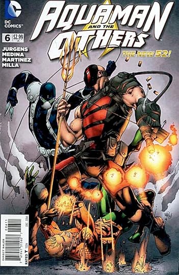 Image © DC Comics, Inc.
A new story arc begins with the team sorting things out with the “new” Vostok and then splitting to catch up with other responsibilities. An interesting breather, a chance to get to know the characters a bit better, and to see their new floating headquarters. This book still feels completely unconnected to the regular Aquaman title, but that’s not such a bad thing. The writing by Jurgens is fine, the art by Medina and Martinez looks good, there’s enough action to move things along, and of course a new threat arises toward the end. A slightly old-school team book, which is okay with me.
Recommended.
October 20, 2014
And Then I Read: JUSTICE LEAGUE 34
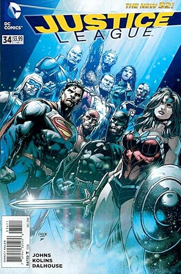 Image © DC Comics, Inc.
Rather than a large threat or battle, this issue has lots of small interesting character moments and interactions, my favorite sort. It begins with Captain Cold dealing with his new job as Lex Luthor’s security chief, then Superman and Luthor battling Gorilla Grodd, Shazam and Cyborg at S.T.A.R. Labs, Flash and the female Green Lantern at the JL Watchtower trying to work out how to deal with her evil power ring, Wonder Woman and Luthor delivering food aid in Africa, and Luthor and Bruce Wayne continuing their verbal sparring and counter-plotting. Great writing by Geoff Johns. I found the art by Scott Kolins not as effective, sometimes his sparse line work on the figures has them looking doll-like, but it wasn’t enough to pull me out of the story much.
Recommended.
October 19, 2014
And Then I Read: G.I. ZOMBIE FUTURE’S END 1
 Image © DC Comics, Inc.
The trouble with a line-wide event is that some books won’t fit into it well, and this is an example. G.I. Zombie has had two issues out. Here the writers and artist present what they suggest might happen to the series in five years. There hasn’t been enough time and story for me to know the characters well and/or care about them for that to work for me. Scott Hampton’s art looks great, and there’s lots of action, but connecting with all the new situations emotionally is too big a stretch. The final scene of the male and female lead characters saying goodbye comes closest to working, but it ends abruptly as if even the writers had a hard time with it. We’ve hardly said hello, it’s too soon for goodbye. I’ll put this comic aside and look for more of the regular story.
Not recommended.
Todd Klein's Blog

- Todd Klein's profile
- 28 followers

