
Todd Klein's Blog, page 184
October 22, 2016
Incoming: THE SANDMAN OVERTURE and THE MULTIVERSITY Trade Paperbacks

 Images © DC Comics.
Two series I did lettering for last year have just arrived in trade paperback editions. Both were in hardcover earlier. Years ago anything I lettered was published once and that was it. Things began to change with the SANDMAN trade paperbacks in the 1990s. Now most things I letter are reprinted in collected editions at least once, sometimes more than once. I like that trend!


October 21, 2016
Pulled From My Files #45: CABLE LOGO

This and all images © Marvel.
In 1992 I was asked by Marvel editor Lisa Patrick to submit logo sketches for Cable, an X-Men related character who was being given his own series. I did three marker sketches initially, all using thick letters and bold outlines. This one is the most traditional approach.

Sketch 2 puts the letters in a block and adds three-dimensional telescoping around it.
 Sketch 3 was going for a futuristic look which seemed to match the character, and utilizes more abstract shapes and an unusual double drop shadow.

After these sketches were sent in and reviewed by the editors, I was asked for more. I think it was suggested I do something similar to Alex Jay’s design for X-FORCE from 1991, a group which Cable was then part of, a sensible idea.

Here’s my fourth sketch using that idea. Some letter shapes are picked up from previous sketches, but I’ve added triangular elements to the A and E.
 Marvel liked sketch 4, but asked for another version using the Jim Steranko X-MEN logo from 1968 as a model.
 There must have been a sketch 5, but I don’t have it in my files, I only have this finished logo made from it. It would have been inked on Denril plastic vellum over the sketch.
 The logo first saw print on issue #1 of the series cover-dated May 1993. It has a gold foil and embossed treatment, and is partially obscured by the character, but is otherwise as I sent it in. Later covers show the logo more clearly. I also did the cover lettering for this cover, one of many I did for Marvel at the time.
October 20, 2016
And Then I Read: THE IMPROBABLE WONDERS OF MOOJIE LITTLEMAN by Robin Gregory

Cover art by Catrin Welz-Stein.
This story of a crippled boy with stubborn resilience and unusual abilities takes place in a small mountain community near the coast of California mostly in 1906. Moojie is twice abandoned by parents. First, he’s dropped on a doorstep as an infant and adopted by a local couple. Moojie’s new mother dies a few years later, and when Moojie’s handicap—a leg that won’t function right and a weak arm—become evident, the boy is dumped at the goat farm of his grandfather, Pappy, in the nearby hills, and Moojie’s adoptive father disappears. Pappy is not thrilled to have the boy, and at first threatens to put him in an orphanage, but over time the two form a grudging partnership as Moojie begins to learn how to help with the farm and its animals. Moojie’s real interest, though, is a group of natives hiding out in the nearby hills who show up at the farm periodically when Pappy is not around. Moojie is fascinated by them; their stories, their activities, and their mysterious ways. He longs to join the band, but they are wary. Moojie longs for a mother like their elder, Ninti, has a crush on the beautiful Babylonia, and is constantly threatened with violence by her boyfriend Sarru’kan. One thing about Moojie that he doesn’t understand greatly impresses the natives, a sort of psychic healing power he can manifest in times of great need, though not on demand. In Moojie’s many adventures with the natives, Pappy, and the townsfolk, he has need of it from time to time, and it always shocks everyone. What will become of this strange boy? Will he be sent off to live with his Irish aunt who he does not like? Will he succeed in joining the native tribe before they are swept up in the holy rapture they feel is coming? Will his father finally return to claim him? This coming of age book, delightfully written, tells the tale beautifully with humor, poetic grace, and surprising characters and situations.
Recommended.
October 19, 2016
And Then I Read: DOCTOR FATE #15
 Image © DC Comics.
Mummies from the Metropolitan Museum of Art are suddenly coming to life and wreaking havoc in Manhattan. Khalid’s girlfriend Shaya is among those being threatened, and Khalid is quick to take on the threat as Doctor Fate. These are more than mummies, they’re powerful, angry spirits, and the original Doctor Fate, Kent Nelson, comes to help. More is going on here that meets the eyes of the vigilant heroes, and the final page foretells.
We are nearing the end of the Paul Levitz and Sonny Liew run on this title, I have one more to read. I’ve enjoyed it a great deal.
Recommended.
October 17, 2016
And Then I Read: ASTRO CITY #38
 This one really is the cat’s meow. Cover artist Alex Ross, writer Kurt Busiek and interior artist Brent Anderson are in the groove and moving to the rhythm of heroine Jazzbaby and Romeyn Falls in 1928, when the living was good and the music was hot. Even letterers Roshell and Betancourt and colorist Pantazis are at the top of their game. Jazzbaby is delightfully airy and art deco, but when she feels evil lurking beneath the Alhambra Theatre, she doesn’t hesitate to take it on. The occultist Destiné has a special show planned for his audience, and the ancient evil he plans to unleash will not entertain them. Jazzbaby gets some help, but the forces against the heroes are powerful. Who will call the tune?
Highly recommended.
October 16, 2016
STAR SPANGLED Schnapp!
 This and all images © DC Comics.
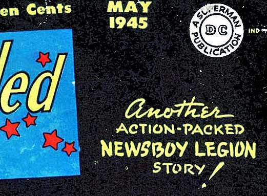
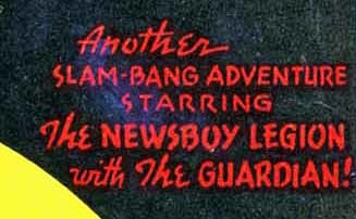
STAR SPANGLED COMICS began with the first issue cover-dated Oct. 1941 and ran 130 issues, the last dated July 1952. Early on it starred the Jerry Siegel creation Star-Spangled Kid, and he continued for a long run. Other features came and went until a new lead, Robin (often with Batman making a brief appearance) took over with issue #65 cover-dated Feb. 1947. Later the western character Tomahawk took the lead spot. And, as you can see above, other features like Simon and Kirby’s Guardian and the Newsboy Legion took the cover at times. The cover above for issue #42 is the first one I feel sure was lettered by the legendary Ira Schnapp, probably in late 1944, but let’s look back at some earlier ones.
 The cover blurb on issue #38 is definitely not by Schnapp, a very different style, as are all earlier covers.
 Issue #39 has a different lettering style that could be early Ira Schnapp work, but I think it’s by someone else. There are too many differences from the way Ira formed his letters. Issue #40 is by the same person, and issue #41 uses type instead of hand lettering. I don’t have a clear scan of the cover of issue #43, but it’s probably by Ira.
Issue #44 has cover lettering with Ira Schnapp elements like the script ANOTHER, but the rest is more like the lettering on issues 39 and 40, which confuses the issue. This could be Ira Schnapp still finding his way with cover lettering, and perhaps copying the style used on those earlier covers. I’d give this one a probable yes.
 Issue #45 is looking more like Ira Schnapp lettering, particularly the word ROBOTMAN at upper left. The rest is still not quite in Ira’s style, but a little closer.
 By issue 46, we see much more of Ira Schnapp’s typical upper and lower case, and the rest is also close to his regular cover style.

By issue #51 the Schnapp style is more evident in the very regular letters on the top two lines, and even the handling of the open letters, though with more bounce that he usually used later. The script is also typical of Schnapp.

By issue #56, the first of the solo Robin stories, the cover lettering is unmistakably by Ira Schnapp. I also think he might have lettered this Robin logo used on the splash page of all the Robin stories in this title, though that’s a guess I’m not sure about.
To sum up, I see Ira Schnapp lettering on the covers of the following issues:
42 to 80, 82 to 87, 89 to 93, 95-96, 98 to 120, 122 to 127 and 129-130. As with other titles I’ve looked at, Ira’s involvement seems to begin in late 1944.

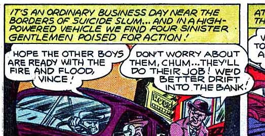
Moving on to interior story page lettering, I first see Ira’s work appearing on the Newsboy Legion feature credited to Joe Simon and Jack Kirby, but actually by others at this point. The lettering for the story in issue #40 is definitely NOT by Schnapp, a quite different style.

The story in issue #41 dated Feb. 1945 is much closer to Ira’s style.
 A closer look at part of the next page shows lettering I think could be by Ira, though it’s somewhat more curvy and uneven than his mature style. The balloon shapes are right, though. I’m not positive about this one, but I think it’s probably by Ira.
 By issue #42, the Newsboy Legion story lettering looks even more like Ira Schnapp’s work, and I feel sure it is. I have a very blurry scan of issue #43, but the lettering is probably by Schnapp. Issue #44 is by someone else.
 In issue #45, Ira Schnapp was definitely lettering the Newsboy Legion story, and he continued to do so in issues #46-49 and issues 54-55, 59-60, and 63-64.

With issue #55 dated May 1946, Ira Schnapp began lettering the Star-Spangled Kid stories, look at the tricky jigsaw puzzle title on this one. He also lettered the feature in issues #58-86.

When Robin solo stories began in issue #65 dated Feb. 1947, Ira Schnapp was the regular letterer. and continued to be so for years. Note the typical Schnapp open letters on the story title, and here’s a better look at the Robin logo Schnapp might have designed.
 When Tomahawk began appearing with issue #72 dated Sept. 1947, Ira Schnapp was lettering that too. By then he was lettering about two thirds of the book, which was still 52 pages then.

When a new nautical feature, Captain Compass, began in issue #84 dated Sept. 1948, Ira Schnapp was again the letterer, and worked on quite a few. Ira occasionally lettered other features like “Merry” and “A Perfect Crime Mystery,” but with issue #99 dated Dec. 1949, his involvement was cut back to just Robin stories, and not all of them.

By issue #123 dated Dec. 1951, STAR-SPANGLED was floundering, trying to recapture an audience with things like the supernatural series The Ghost Breaker. Schnapp lettered this and one other, and his lettering here is uncharacteristically shaky and uneven, perhaps due to being rushed or over-tired. I can certainly understand the latter! Ira’s last story lettering appeared in the penultimate issue #129 on Captain Compass.
So, here’s a complete list of the Ira Schnapp story lettering I’ve found in this title, which I’m supplying for future inclusion in the Grand Comics Database.
STAR SPANGLED #41 Feb. 1945: Newsboy Legion 10 pages
SS #42 3/45: Newsboy Legion 10 pp
SS #43 4/45: Newsboy Legion 10 pp
SS #45 6/45 to SS #49 10/45: Newsboy Legion 10 pp
SS #54 4/46: Newsboy Legion 10 pp
SS #55 5/46: Newsboy Legion 10 pp, Star-Spangled Kid 9 pp
SS #58 7/46: Star-Spangled Kid 8 pp
SS #59 8/46 and SS # 60 9/46: Newsboy Legion 10pp, Star-Spangled Kid 8 pp
SS #61 10/46 and SS #62 11/46: Star-Spangled Kid 8 pp
SS #63 12/46 and SS #64 1/47: Newsboy Legion 10 pp, Star-Spangled Kid 8 pp
SS #65 2/47 and SS #66 3/47: Robin 10 pp, Star-Spangled Kid 7 pp
SS #67 4/47: Robin 10 pp, Star-Spangled Kid 8 pp
SS #68 5/47: Robin 10 pp, Star-Spangled Kid 6 pp
SS #69 6/47: Robin 10 pp, Star-Spangled Kid 7 pp
SS #70 7/47: Robin 10 pp, Star-Spangled Kid 8 pp
SS #71 8/47: Robin 10 pp, Star-Spangled Kid 7 pp
SS #72 9/47 to SS #74 11/47: Robin 10 pp, SS Kid 7 pp, Tomahawk 10 pp
SS #75 12/47: Robin 10 pp, SS Kid 7 pp, Tomahawk 9 pp
SS #76 1/48: Robin 10 pp, SS Kid 7 pp, Tomahawk 8 pp
SS #77 2/48 to SS #83 8/48: Robin 10pp, SS Kid 7 pp, Tomahawk 10 pp
SS #84 9/48: Captain Compass 10 pp, SS Kid 7 pp, Tomahawk 10 pp
SS #85 10/48: Robin 10 pp, SS Kid 7 pp, Tomahawk 10 pp
SS #86 11/48: Robin 10 pp, Capt Comp 10 pp, SS Kid 6 pp, Tomahawk 7 pp
SS #87 12/48: Robin 10 pp, CC 10 pp, Merry 7 pp
SS #88 1/49: Robin 10 pp, Merry 7 pp
SS #89 2/49: Robin 10 pp, CC 10 pp, Merry 7 pp
SS #90 3/49: Robin 10 pp, CC 10 pp, A Perfect Crime Mystery 3 pp, Merry 6 pp, Tomahawk 10 pp
SS #91 4/49: Robin 12 pp, CC 8 pp, A Perfect C M 4 pp, Tomahawk 10 pp
SS #92 5/49: Robin 12 pp, CC 10 pp, Tomahawk 10 pp
SS #93 6/49: Robin 12 pp, Tomahawk 10 pp
SS #94 7/49: Robin 12 pp
SS #95 8/49: Robin 12 pp, CC 9 pp
SS #96 9/49: Robin 12 pp, CC 8 pp, Dover & Clover (humor) 4 pp
SS #97 10/49 and SS #98 11/49: Robin 12 pp, CC 8 pp
SS #99 12/49 and SS #100 1/50: Robin 12 pp
SS #101 2/50 and SS #102 3/50: Robin 10 pp
SS #103 4/50: CC 8 pp, Robin 10 pp
SS #108 9/50 to SS #110 11/50: Robin 10 pp
SS #112 1/51: CC 8 pp
SS #113 2/51: CC 8 pp, Robin 10 pp
SS #114 3/51 and SS #115 4/51: Robin 10 pp
SS #117 6/51 to SS #121 10/51: Robin 10 pp
SS #122 11/51: Robin 8 pp
SS #123 12/51: Ghost-Breaker 8 pp, Robin 8 pp
SS #124 1/52: Ghost-Breaker 8 pp
SS #129 6/52: Captain Comet 6 pp
Okay, if I’ve added correctly, that’s 1,247 pages lettered for this title (that I’m sure of), and not counting covers, house ads and public service pages. Impressive, but only a small part of what Ira Schnapp was lettering at the time. More to come! Many other articles about Ira Schnapp and his work can be found on the COMICS CREATION page of my blog.
October 14, 2016
Incoming: SHAME Hardcover
 Been wondering what painter/artist John Bolton has been up to the last few years? Here it is, the SHAME trilogy, now collected in a single deluxe hardcover edition. Written by Lovern Kindzierski, with about 200 pages of amazing painted art by Bolton, lettered by me, with lots of extra material as well. Lovern calls it a fairy tale. I think it has elements of allegory too. Certainly the characters and story line are appealing, and if you like the way John Bolton paints women, there are plenty here, along with creepy monsters, gentlemanly knights, horrible demons, and more. Available directly from the Canadian publisher, Renegade Arts Entertainment, or from your comics retailer.
October 13, 2016
Incoming: TROLL BRIDGE by Neil Gaiman & Colleen Doran

Just arrived from Dark Horse, a new entry in the “Neil Gaiman Library” of illustrated short stories by Neil. I lettered it over pencil scans, so most of the painted color was new to me, and Colleen Doran has done a magnificent job. The story by Neil is terrific, too. Also interesting to see that the cover design is completely different from the one released with previews last month, except for the cover art. Should be out by October 18th, if not sooner.
October 12, 2016
Title and Cover Design for Neil Gaiman’s ANANSI BOYS
 Printed copies of the third in a series of Neil Gaiman mass market paperbacks for which I did title and cover design work arrived yesterday. The release date is October 25th. Neil and I both love the cover painting by legendary illustrator Robert McGinnis, and I had a great time working with it. Here’s how it happened.
On April 12th, 2016 I received an email from Neil containing three McGinnis sketches for the cover art. Neil wrote: “If we are doing a late 50s early 60s cover, what are your thoughts? Fonts and design and such? And do you prefer any of the three?”
Here are the sketches:


My reply: “Thanks for letting me see these. I love them, it’s what McGinnis does best! I like the simpler composition and triangular shape of the first one best, though I do think it should be on a dark background. I see the type as the kind of looser, bouncier angular capital letters in the two attached examples. Very 50s Jazz. Your name and the title could go stacked at the upper left in the first image very nicely. It might be helpful if he left a little more room at the top of the painting, though, so we could get a top-line of text in there. I kind of like the sunglasses in the third one, too.”

Note that the above sketches are marked 1, 2 and 5. Later I was also sent this one by Neil, which seems to be marked 2, then that’s scribbled out. Probably from the same time, and perhaps an earlier version.

Here are the two paperback covers I had sent to Neil with my notes. Later I found two more for inspiration, both with Robert McGinnis covers:

 Hand-drawn titles were definitely in common use in the 1950s and 60s, often with a loose, rough-hewn feel.
 In mid-May I received this raw scan of the cover art, which I thought was terrific! This is actually a revised version, as Neil had asked for the woman on the right to have darker skin than McGinnis originally painted it. McGinnis also supplied this version showing a suggested crop for the cover showing the original skin tone for the woman on the left:
 Interesting to see he’s cropped off the feet at left and bottom. I went to work on the full painting in Photoshop to adjust the brightness, contrast and color balance, and I also added some to the top of the image using the clone tool because we needed room there, and the painting proportions did not quite work with the cover size I was given. Here’s my adjusted version:
 This is the version I used for my cover designs, and also the version that was eventually used by Harper-Collins for the printed book. They asked me to send it to them. I would need to crop the sides, but retained the full height to fit the cover size.
 On to the title design, here’s my first version. “Anansi Boys” from this ended up being the final choice. It had to fit in the available space right of the figure of Mr. Nancy, so all the designs follow this general shape.

Version 2, one I still like, but it did not fit the space as well, and was not used.

This one is getting too much like a 1960s concert poster rather than a paperback, and was not used.

Version 4. This was used for cover designs.

The first cover design submitted to Neil using the first hand-drawn titles. For the rest of the cover copy (supplied by Neil), I found a font I liked with a lot of quirky bounce. I chose two colors for the design elements, the green of Mr. Nancy’s hat and tie, and an off-white, which I thought should be a little darker than his white jacket.

Version B replaces the hand-drawn “Neil Gaiman” with one using the same font as the other text.

Version C used the fourth hand-drawn title and author name, and for the rest I found a compatible font used in the 1960s.
 Version D again replaces the hand drawn author name with the font.
I submitted these four versions to Neil, and he replied: “I like #2. Can we try leaving off the bestseller and awards stuff? And shrink the Anansi a little?”

Here’s that version, which I submitted to Harper-Collins as our preferred choice, along with the other versions. The publisher insisted we use the New York Times blurb at the top, but it could be smaller. Here’s that version:

Neil’s response to this one was: “Can we try going smaller and making it ‘The Magical #1 NYT bestseller’ or ‘The Rollicking #1 NYT bestseller’? I LOVE the typeface so much!”

I submitted versions with both words, and “Magical” was liked best. This is the version that was okayed and sent in, and matches the printed cover except that the bottom bulb was moved down some. Due to the normal variations in trimming, the champagne bottle is cut into on some of the copies I have, others it’s in the clear. I’m very happy with the finished product, and I think everyone involved is. Neil liked this painting so much that he bought it from McGinnis. I think it’s right up there with his celebrated work on the James Bond novels and films, myself, and it was a privilege to work with him.
Similar articles for the covers of AMERICAN GODS and STARDUST are at the links. I’ll write about “Neverwhere” when printed copies arrive.
October 11, 2016
And Then I Read: WONDER WOMAN #4
 Image © DC Comics.
I really like this book’s division into two separate story lines with the odd numbers in the present day and the even numbers retelling Wonder Woman’s origin from the beginning. Here’s the second part of that story. Having lettered Grant Morrison’s version of Diana’s origin in WONDER WOMAN EARTH ONE last year, it was interesting to compare his approach with Greg Rucka’s on this book, and DC has another version out now by Jill Thompson. Reminds me of the days when Superman and Batman’s origins were revamped every few years…oh, wait, that’s now. In this case, though, all three versions are being offered as alternatives without one lording it over the others, though Rucka’s version will continue in the monthly title, so be “new” longer.
Themyscira: Paradise Island has to deal with a man on their land for the first time in…ever, I guess. That man is Steve Trevor, whose plane has crashed on the island, all other crew are dead. Queen Hippolyta is worried that the armed men are part of an invasion force, and the guns the American’s brought are weapons never seen on Paradise Island. Diana is, of course, drawn to Steve, even though they don’t speak the same language. The Queen declares a champion must be chosen who is willing to take Trevor home. That champion will lose her immortality and never be allowed to return. Will it be Diana? Her mother, the Queen, hopes not, but fears so.
Nicely done, great art by Nicola Scott, looking forward to more.
Todd Klein's Blog

- Todd Klein's profile
- 28 followers

