
Todd Klein's Blog, page 181
December 6, 2016
THE DANNY CRESPI FILES Part 9

This and all images © Marvel.
Continuing my ongoing series about the cover lettering of Danny Crespi at Marvel Comics, mostly from 1974-1978. Photocopies of saved cover lettering from Danny’s files were compiled into a collection by letterer and friend Phil Felix during the 1980s when he worked with Danny on staff at Marvel, and Phil sent me copies. This time I’ll look at pages 33 to 36. Page 33, above, has many characteristic style points of Danny’s own work on covers, including thick caption borders that extend past the corners (those extensions were trimmed off when photostatted and pasted on the cover art), generally bouncy and somewhat rounded open letters, an upturned right leg on the open R in “Deathcry,” and very wide standard lettering, as seen here on “The menace of the.” Uses of these captions are below.
 Top caption from STRANGE TALES #178 featuring Warlock, cover-dated Feb. 1975. I love the star at the bottom of the exclamation point.
 Second caption from THE RINGO KID #24, Nov. 1975. Note that when Danny is identified as the letterer of one caption on a cover, it’s very likely he did all the cover lettering on it, including the Wanted poster on this one.

Third caption is at the bottom of this very type-heavy cover dated May 1975. The caption box is filled with black, and the small lettering is reversed to white. This eliminates Danny’s drop shadow, but still looks fine to me.

Final caption from page 33 is on this cover dated Dec. 1975. Could Marvel get away with publishing this today, I wonder?

Page 34. Note the rare production note to the right of the top caption calling for one positive photostat at 65%. That means this original lettering was reduced by one third for pasting on the cover art, and that art was reduced about another third for printing. The original lettering is 6.5 inches wide, so if my math is right, the printed caption should be about 2.75 inches wide. Danny worked quite large on much of his cover lettering. Uses below.

Top caption is on MARVEL TEAM-UP #39 dated Novl 1975. Again, the caption has been filled with black, eliminating the heavier outline on SLAY, but still works fine.

“Enter Psycho-Man!” is more lettering from the cover of GIANT-SIZE FANTASTIC FOUR #5, May 1975.
 “Fantastic First Issue!” from GIANT-SIZE SUPER-HEROES #1, June 1974. As you can imagine there are tons of similar captions, thanks to Nicholas Caputo for identifying this particular one! Danny’s burst captions were not usually this strongly pointed, so I suspect he was imitating Gaspar Saladino there.
 “The Hellcat Cometh!” from THE AVENGERS #144, Feb. 1976.
 And “Panic in New York!” from THE INHUMANS #3, Feb. 1976.

Page 35. Interesting to see that some of the open lettering in the first two captions leans backwards a bit, something I haven’t seen from Danny anywhere else. Uses below.
 “Red Raven Lives Again!” from X-MEN #92, Feb. 1975. Caption again filled black, still looks fine. The words LIVES AGAIN! are the only ones on page 35 that are laid out and inked with a ruler and triangle (for the angled sides), the rest is probably all freehand pencilling and inking with perhaps horizontal guidelines in pencil to keep it level. Danny did so many covers at this time any shortcuts would have helped.

Second caption on page 35 is from MARVEL TWO-IN-ONE #10, July 1975.
 Third caption from TOMB OF DRACULA #34, July 1975. Top line reversed, so the production request for that would have been “1 Neg.” Photostats could be positive or negative (reversed).

Last caption for THE AMAZING SPIDER-MAN #146, July 1975. Nice banner caption on this one.

Page 36, all this lettering for just three covers, seen below.
 The top third of page 36 is at the bottom of this cover from July 1975. Its a mess visually, with too many separate scenes and too much type and lettering. Danny was working hard for his money here! There’s a nice variety of lettering styles that go together well, but some of it dies visually when printed white on light green, a poor choice.
 “The Dead Don’t Sleep!” from UNCANNY TALES FROM THE GRAVE #11, Aug. 1975. I don’t love the green color choice, but this one looks great otherwise.
 “The Tomb of the Stalking Dead” from SUPERNATURAL THRILLERS #13, June 1975. Note that Danny’s exclamation point was removed to make room for added quotes around DEAD. Either that word was considered misleading or it was a change requested by the Comics Code Authority.
Hope you’ve enjoyed this look at Crespi cover lettering, previous parts of this series and more articles you might enjoy can be found on the COMICS CREATION page of my blog.


December 5, 2016
Title and Cover Design for Neil Gaiman’s NEVERWHERE

Illustration © Robert McGinnis.
Continuing my series on these covers, this is the fourth and last of the group I worked on this year. Links to the other articles will be at the end.
On June 28th, 2016 I received the image above from Harper-Collins, the raw scan of the cover painting for “Neverwhere” by illustration legend Robert McGinnis, who is still painting at 90 after a long and celebrated career on paperback covers, movie posters and related media images. Neil had this to say on an approach to the title and type design: “I think probably Gothic. ‘Secret House of Forbidden Danger’ kind of thing.”

To me it suggested gothic romance novels, and I found lots of examples online. I told Neil, “1970s gothic romance covers, our suggested model, often have elegant and swirly titles and heavily serifed type.” Neil agreed that was a good direction and I set to work on a title design.
 First I tweaked the painting image to improve the contrast and levels, and added a bit to the top of the image to get the shape I needed for the paperback cover. I left it pretty dark, as I thought that was a good thing. I just love the expression on the woman’s face, so haunting. Neil said about her, “Personally I suspect that it is Lamia and not Door at all.”

Here’s my first title sketch, on vellum laid over a printout of the cover art. I really liked this, and rather than do more, I decided to tighten up the letters I would need to trace in Adobe Illustrator (the W would be made from a doubled V, and the rest were repeats), scan it, and produce a finished design to send to Neil. Usually I start with three different designs, but sometimes the first one just seems to nail it. In this case, working with a friend, I thought I’d skip the extra work of more designs and see what Neil thought.

Here’s the resulting vector file in Adobe Illustrator. I tweaked some things from the sketch, adding another ball serif on the R and curving the center stroke of the H. I thought the result was fanciful yet slightly ominous, just what I wanted.

Here’s the title and author’s name on the cover art. For the latter, I found a font with large serifs that looked right for the 1970s, “Americana,” designed in 1965. Neil’s reaction:
“I think that’s gorgeous!!!
“We need to get the best typeface for the blurb line, whatever it is. But it feels just right. And weirdly dangerous.”

Harper-Collins also liked it, but asked for a brighter color for Neil’s name, as shown here. The hardest part of my job, the title design, was approved! Next I needed cover blurbs from Neil, and he provided a few to work with for more designs.


As you can see, I offered lots of variations. The yellow tone for Neil’s name and one of the blurbs was preferred, and of the two retro serif fonts I chose for the blurbs, the thicker one, seen just above in Version G, was liked best. Of the blurbs, Neil liked “Mind the Gap” best, and while I thought it was appropriate for the book, it seemed like something too puzzling for American audiences, the reference being what the announcers on the London Underground always say when passengers are entering or leaving the trains, referring to the gap between the train and the platform. Also highly symbolic of the gap the story’s protagonist falls into! But Harper-Collins also was not satisfied, and asked Neil to try another blurb.


Neil’s new and final blurb was more specific about what readers would find in the book, and everyone agreed it was the best choice. Version H2 was approved as the final design, and was sent in to Harper-Collins on August 1st.
 I received printed copies of the book last week, and I’m very pleased with the way it came out. The bottom blurb was moved up a little and now covers the McGinnis signature, which is unfortunate, but otherwise everything looks fine to me. The printed art is a little less green, so may have been tweaked further on their end, but I think it’s just fine. It was great fun working on these four new paperback editions of Neil’s work, and it’s possible there might be more in the future, though I have no definite information.
Previous articles:
December 3, 2016
No More Klein Overlays
 When I began lettering comics in 1977, nearly every interior page was lettered on pencilled original art. Cover lettering was done on separate paper, then photostatted and pasted on the cover art along with all the other trade dress.
Some time in the 1980s, art began to be lettered on vellum overlays at least some of the time. There were two main reasons for this. One, if it was painted art, there was no other option. Two, if the artist was running late (very common), the lettering could be done on vellum laid over photocopies of the pencilled art, allowing the lettering and the inking to be done at the same time. When the DC Production department had the finished art and the lettering overlays, they would photostat the lettering and paste it onto the art. This became more and more common as time went on. Originally a premium was paid for lettering on overlays, possibly as a way to discourage editors from doing it by adding extra cost to their budget, but that went by the wayside over time. By the early 1990s I would say at least half of my lettering was on overlays.
In the early years of overlay lettering, when asked if I wanted my lettering vellums back, I would say, “No, just throw them away.” Some time around 1993 I decided to start accepting them back as art returns with the idea that I could sell them at conventions or by mail. Over the next ten years or so I accumulated several thousand pages of these lettering overlays, and did sell some from time to time, though they were never in any kind of demand.
When the switch came to digital lettering, of course, hand-lettering on either original art or overlays declined, and I think the last ones I received were from around 2003. And I never made a point of asking for them, but if someone decided to return them to me, I’d take them.
When I launched my website in 2007, one of the categories on my BUY STUFF page was vellum overlays, in lots of 5 or 10 pages. Originally there were about a dozen titles offered, plus grab-bags of miscellaneous items. They sold steadily. As of yesterday I was down to two titles. Today I received a large order for these overlays that essentially wipes out my remaining stock. A few examples from DEATHBLOW #11 (cover dated Dec. 1994) are above. They’ll go out to the buyer Monday, and vellum overlays will no longer be offered on my website. End of an era!
December 1, 2016
And Then I Read: ASTRO CITY #40

Image © Juke Box Productions.
It’s no secret that I love this series, and here’s why: writer Kurt Busiek comes up with the most clever and interesting variations on superhero stories ever. This time, as an example, he’s found a compelling reason why a powerful magic-user would benefit greatly from the services of a good lawyer. Kurt’s reason makes perfect sense, but as far as I know no one has thought of it before. Marta, the lawyer from last issue, is featured again, and this time gets right up from her desk and into the cosmic, world saving action. Excellent guest art by Carmen Carnero, too.
Recommended.
November 29, 2016
And Then I Read: DOCTOR FATE #16
 Image © DC Comics.
Here’s the last issue of this title with art by Sonny Liew, whose work I’ve enjoyed a great deal. The story by Paul Levitz pits Khalid against another ancient god, and it’s entertaining and well-written, but this time I want to focus on the art, and see if I can decide why I like it so much.
First, it goes against type in almost every way. Doctor Fate was portrayed as a typical superhero visually for a long time. Artist Shawn McManus moved away from that when he drew the character, and I liked that too. Sonny Liew takes it even further away from skin-tight muscles into the realm of quirky indy comics, with characters that are somewhat cartoony, but with lots of personality, emotion and even humor at times.
What always appealed to me about Doctor Fate was his use of magic, and magic has played a large part in this series. Sonny does a fine job with all the magic images. His tendency to exaggerate things visually works quite well for that.
Sonny’s layouts and design abilities also made this book better. The two-page spread near the end of this issue is a great example of that: beautiful drawing and design both.
Next issue there will be another unusual take on the character by Brendan McCarthy, who did this issue’s cover, and I’ll be reading, but I will remember this run by Paul and Sonny.
Highly recommended.
November 28, 2016
Incoming: CLEAN ROOM Book 2: EXILE
 If you’re not reading CLEAN ROOM, you’re missing what I find a truly scary thrill ride. Astrid Mueller is one of the few people who can see the malicious otherworld beings whose main source of fun is torturing humans both physically and psychologically. Astrid’s crusade, born of personal pain, is to resist them in every way she can, with the help of her own agents and other sensitives like Chloe Pierce. Since the evil entities can do almost anything to humans, it seems an impossible challenge, but Astrid has learned a lot about them, and even as they try to destroy her, she finds ways to fight back.
This second collection contains issues 7 to 12. I recommend it. as well as the first collection.
November 26, 2016
And Then I Read: GLADIATOR by Philip Wylie

I’ve long known of this book because it is said to have inspired Jerry Siegel and Joe Shuster in the creation of Superman, and is often cited as inspiration for superheroes in general. I read a comics adaptation of it by Howard Chaykin and Russ Heath published in 2005, but until now I had never read the original novel.
Professor Abednego Danner teaches in a small college town in Colorado, but his obsession is his work to develop a serum to create animals with much greater strength and toughness than normal, proportionally as strong as ants and other insects. He succeeds, and after experimenting with animals he injects his pregnant wife, unknown to her. Their son Hugo Danner begins exhibiting great strength as an infant, but he is also a good and reasonable child that they are able to train and teach. At first Hugo’s parents hide him from the world, but once they have taught him the dangers of his abilities, and the importance of keeping them secret, he’s allowed to go to school. Hugo soon finds out that being different will ostracize him from other kids, and aside from a few mistakes, he’s able to get through school without too much trouble, but his strength and his secret are already making him feel alone in the world.
At college, Hugo is determined to fit and and get a fresh start. He reluctantly agrees to join the football team, even though the coach soon finds out at least some of his powers, but his teammates accept him and come to rely on him to win games. For his final game, he decides to sit out to give the rest of the team a chance to win on their own, but they’re unable to do so, and Hugo has to get in and take over. He gets angry at an opponent and accidentally kills the player from the other team, ending his college life and football career.
Hugo spends some time in New York City, and finds a girl there he likes, but he always feels unsatisfied. He wants some way to use his abilities that will seem worthwhile and perhaps make him a hero, but nothing seems to work out. He becomes a sailor for a while, and ends up in France at the beginning of World War One. Hugo knows he would make a nearly invincible soldier, and the cause seems just. While he’d rather do something creative, becoming an unbeatably destructive soldier seems to offer him a chance to finally realize his full heritage.
Hugo’s wartime exploits are covered in detail, as are the grim and gory realities of war, and it’s probably the most depressing part of the book, as Hugo finds even his great powers cannot save his friends or turn then tide, try as he might. In despair, he’s about to fly to Germany alone to take on the war leaders when the war is declared over.
Back in the United States, Hugo has more adventures, but finds little satisfaction, and is always in danger of his secret abilities making him an outcast. At last he heads to South America with a team of explorers hoping new adventures there will bring him satisfaction.
That’s probably too much of the plot, but there’s plenty more in the book. I enjoyed reading this even though it tends to become depressing and tragic. If this was an inspiration for Superman (never confirmed), one can see young Siegel and Shuster stayed well away from the grim realities of being super-strong as depicted so well in this novel. The writing and characters are vivid and smart, not as pulplish as I was expecting, and the portrait of America and humanity is thoughtful and insightful. Well worth your time.
Recommended.
November 21, 2016
And Then I Read: A SOLITARY BLUE by Cynthia Voigt
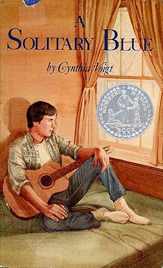
Cover art © James Shefcik.
This is the third book in the Tillerman series, but it’s not a sequel. Instead, it tells the life story of Jeff Greene, a boy living in Baltimore with his father, a college professor. Their relationship is distant, so much that Jeff calls his father “The Professor.” Jeff’s mother, Melody, who he remembers fondly, left the two of them when he was seven, and since then Jeff has struggled to keep things normal in their home, doing as much of the housework as he can, making things as easy as possible for his father. Emotionally both father and son are damped down, cut off. “It doesn’t matter,” is their byword. Both are clearly sad and hurt by the departure of their wife and mother.
Things change when Jeff is in high school and suddenly his mother gets in touch and invites him to stay with her in Charleston for the summer. Arrangements are made, and soon Jeff and his mother are reunited. At first all is wonderful, Jeff’s love for Melody is reawakened, and her charm and beauty are focused on him. Jeff meets her family for the first time, a matriarchal grandmother and others living in an old family home in Charleston. Jeff enjoys this, too, but after a while Melody has less and less time for him, and he takes to wandering Charleston on his own.
The following summer Jeff is invited again, but this time finds himself not very welcome. His great-grandmother has had a stroke, and is no longer interested in him. Melody has almost no time for him, involved with a boyfriend who is not friendly to Jeff. Jeff is devastated by Melody’s obvious lies, and is deeply hurt by her new betrayal. He takes to traveling to a distant shore town every day by bus where he rents a small boat and takes it out to a lonely, abandoned island where the atmosphere suits his own.
Back in Baltimore, Jeff struggles with guilt and depression. His schoolwork suffers, and soon he’s about to flunk out. This crisis finally brings him closer to his father than they’ve ever been. The Professor decides they need a change, and they rent a run-down summer house on the Chesapeake Bay and move there. At this point, Jeff meets the Tillermans and his story is joined with theirs.
Sorry to give so much of the plot, but it’s hard to explain the connection to the other Tillerman books without it. I enjoyed the writing and the characters, though this book is more depressing than “Dicey’s Song” or “Homecoming,” at least until the last third, when things improve for Jeff, even in the face of new crises. I plan to read more of the series, and continue to look for more books by Voigt.
Recommended.
November 19, 2016
Watching FANTASTIC BEASTS AND WHERE TO FIND THEM

Here’s where I stand on Harry Potter. I read all of the main series of books by J.K. Rowling and enjoyed them but didn’t love them, though I thought the writing improved over the course of the series. Probably if I first came to them as a teenager I would have loved them. I saw the first two or three films, and thought they were well done, but was not motivated to see the rest. I haven’t read the short book that sparked this new film or any other newer writings by Rowling. What got me to the theater for this film was the trailer, seen when viewing “Doctor Strange.” I liked what I saw, and I liked the idea of finding out what Rowling herself would put into a film she wrote and co-produced.
Newt Scamander (Eddie Redmayne) is a Hogwarts graduate who has become a specialist in magical beasts, traveling the world in search of them, and putting some of them into his magic suitcase which is MUCH larger on the inside. He comes to New York, where there is a well-developed society of wizards, but one which hides itself from the common people. (This reminded me of Bill Willingham’s FABLES.) Soon after his arrival, he meets Jacob Kowalski (Dan Fogler) a non-magic New Yorker with the dream of opening his own bakery. In the old switched suitcase gambit, Kowalski unwittingly allows some of Newt’s fantastic beasts to escape. Newt is soon collared by New York witch Tina Goldstein (Katherine Waterson) who tries to convince her superiors to help Newt regain his beasts, and failing that, decides to help him herself. Newt and Jacob end up at her apartment where Tina’s sister, Queenie (Alison Sudol) takes a shine to Jacob and wants to help, too.
Other plot lines involve a cult-like society out to destroy wizards and witches, a very dangerous evil force spawned by a mistreated child, a high-ranking New York wizard, Percival Graves (Colin Farrell) who is playing a deceptive game to gain power, and of course the beasts themselves, which are all made-up creatures of varying kinds. The one we see the most and earliest is a Niffler, which loves to steal and horde gold and jewelry. It looks something like a cross between a mole and a platypus, and is charmingly naughty. All the beasts are interesting and visually impressive, as are the effects in general. The true focus of the story, though, is people. The four heroic leads, some mistreated children, the devious wizard, and more. There’s plenty of action, plenty of magic and magical destruction, mentions here and there of Harry Potter connections, and all taking place in 1920s New York, adding historical charm of its own. There’s also a nifty reveal near the end.
I liked the film a lot. Not sure that I loved it, but I would certainly go see the next one. I’m generally impressed with Rowling’s work here. The emotional strings are pushed a bit harder than necessary, but I liked the characters, and would enjoy seeing more of them. I also liked the expansion of Rowling’s magical world both back in time and out to America, and further by implication. More of that, please.
Recommended.
November 18, 2016
Ira Schnapp in DETECTIVE COMICS Part 2
 This and all images © DC Comics.
While Ira Schnapp began lettering covers for DETECTIVE COMICS in 1945, the first interior story page lettering I see for him is the Batman and Robin story in issue #112 dated June 1946. The story title on the splash pages is very much his work, and the caption lettering, while still not quite settled into his later style, is right: very square and even.
 A closer look, and here are some of the clues I use to identify Schnapp story lettering (which is somewhat different from his cover lettering): the G is square on the right side, the M has vertical sides, the W and V lean a bit to the left, the C is evenly rounded, the B has loops of nearly even width and size, the U is square at the bottom.
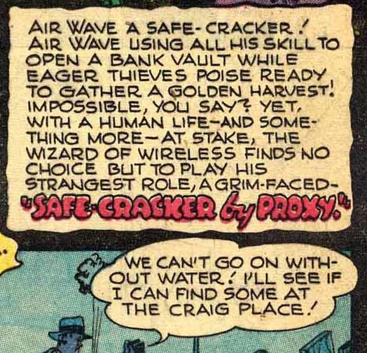 Identifying early Schnapp story lettering is made more difficult by the work of at least one other letterer with a very similar style. Here’s an example from the “Air Wave” story in issue #120 that I think is NOT by Schnapp, but looks quite similar. Clues I look for in this style: the letters are all slightly wider and curvier and a little less even. The loops of the B are often not joined to the left side. The right leg of the R is almost always curved rather than straight (though Ira did that too at times, perhaps imitating this other letterer). The V is more curved and does not lean left. The center stroke of the G is longer and higher. Generally the story titles are rounder and bouncier. I suspect Ira may have studied the work of this letterer when developing his own story lettering style, and at times seems to follow it more closely than others. This is what gives me major problems in identifying early Ira Schnapp story lettering. Sometimes I think this style is simply an alternate one from Ira, but if it is, I don’t think it’s likely he would be using both styles at the same time, as they appear in these comics. Once we get into 1947, Ira’s lettering is distinctly his own, but on early examples I can’t be as sure. It’s all guesswork based on style, and this article has my best guesses. I may have guessed wrong or guessed differently on some examples in my other blog articles on this topic. It’s a matter of what I saw that particular day.

Here’s another page from the Batman and Robin story in issue #112 to show more of what I think is Ira’s early work. His balloon shapes are distinctive, but also similar to that other letterer, as is the way he overlapped top panel borders at times. Ira’s question marks are also very small.

By far the most frequent work of Schnapp inside DETECTIVE is lettering the lead Batman and Robin story, I found his work on 60 of them, but he also worked on other features. Above is his first work on “Slam Bradley” in issue #116. Notice the word “FOR” in the story title, it’s pure Schnapp, and the title is very even and classic in general. Yet the balloon letters seem a little wider and curvier…is it by Ira? I think so, but just barely. I found 29 Slam Bradley stories I believe are lettered by Schnapp.

While the Air Wave story in issue #120 does NOT look like the work of Ira Schnapp to me, this one in issue #121 does. I find Schnapp lettering on 12 Air Wave stories.
 Ira first lettered “The Boy Commandos” feature in issue #121, above. The “spooky” title lettering is similar to what he did elsewhere, and I think it’s a style he was never particularly good at, but helps to identify his work here.
 A detail from a later page of the same story. Is this Schnapp or the other guy? Hard to be sure, but the letters are generally square rather than wider than square, and other clues suggest Schnapp to me. I find Ira’s lettering on seven Boy Commandos stories.

With issue #138, Aug. 1938, a new Robotman series began. At first I assumed this was not lettered by Ira because he didn’t letter any of the ones I’d already seen in STAR SPANGLED COMICS, but these are by a different writer and artist, and Schnapp lettered many of them. He probably designed that cool art deco logo at the top of the page, too. The story title is not typical of Ira, and may have been pencilled by the artist, but that’s just a guess. Every letterer does things that aren’t typical from time to time. I found 18 Robotman stories lettered by Schnapp.

Letterers in those days at DC often had an incredible amount of work to do on a page. Here’s a prime example from the Batman and Robin story in issue#161, July 1950. At least half that page is lettering! They weren’t all this bad, but man, I’m sure glad I didn’t have to do it…

This feature starred Roy Raymond, TV Detective, and the name of the series later changed to that, but in the early stories it was “Impossible But True.” The first one Ira lettered is in issue #173, July 1951. I found a total of nine of them with Schnapp lettering.

DC editors were always trying to fit in features that followed popular trends of the time, particularly in the 1950s when sales were dropping. “Pow-wow Smith, Indian Lawman” combined detective work, indians, and westerns. The only one that Schnapp lettered is in issue#194, above.

Perhaps the most successful backup feature in DETECTIVE was this one, giving rise to a character still around today, and currently in the “Supergirl” TV show: J’onn J’onzz. The first one Ira lettered was in issue #231, May 1956. He worked on six total.

As DETECTIVE came into the 1960s, Ira’s work for inside stories dwindled. This is the last of them, from issue #310, December 1962.

Written by Batman co-creator Bill Finger, it’s old-fashioned, too wordy, and features the silly character Bat-mite, but…kind of fun in its own way. Ira’s work is looking less skilled here. He was 68, and still doing lots of lettering, but perhaps not as well as he once had. The entire Batman series is looking pretty tired and old-fashioned, and the lettering was an element of that. Less than two years later, in 1964, all the Batman features got a “New Look” with art by Carmine Infantino and lettering by Gaspar Saladino.
Ira’s work in DETECTIVE was enjoyed by fans, even though he never received credit for it in his lifetime. Here’s a complete list of his story lettering as I see it, not counting house ads and public service pages that ran across the entire DC line.
DETECTIVE COMICS #112, June 1946: Batman & Robin 12 pages
TEC #114 & #115 8-9/46: Batman 12 pp
TEC #116 10/46: Batman 12 pp, Slam Bradley 6 pp
TEC #118 12/46: Batman 12 pp, Slam Bradley 7 pp
TEC #119 1/47: Slam Bradley 7 pp
TEC #120 2/47: Batman 12 pp
TEC #121 3/47: Batman 12 pp, Boy Commandos 11 pp
TEC #122 4/47: Batman 13 pp, Air Wave 8 pp
TEC #123 5/47: Batman 12 pp, Slam Bradley 7 pp, Boy Commandos 12 pp
TEC #124 6/47: Batman 12 pp, Air Wave 6 pp, Slam Bradley 7 pp, Boy Commandos 12 pp
TEC #125 7/47: Batman 13 pp, Air Wave 6 pp, Slam Bradley 6 pp
TEC #126 & #127 8-9/47: Batman 12 pp, Slam Bradley 7 pp, Air Wave 6 pp
TEC #128 10/47: Batman 12 pp, Slam Bradley 7 pp
TEC #129 11/47: Batman 12 pp, Air Wave 6 pp, Slam Bradley 7 pp
TEC #130 12/47: Batman 12 pp, Air Wave 6 pp, Slam Bradley 7 pp, Boy Commandos 11 pp
TEC #131 1/48: Batman 13pp, Slam Bradley 6 pp, Boy Commandos 12 pp
TEC #132 2/48: Batman 12 pp, Air Wave 6 pp, Boy Commandos 12 pp
TEC #133 3/48: Batman 12 pp
TEC #134 4/48: Slam Bradley 7 pp, Air Wave 6 pp
TEC #135 5/48: Batman 12 pp, Slam Bradley 7 pp
TEC #136 & #137 6-7/48: Air Wave 6 pp, Slam Bradley 7 pp
TEC #138 8/48: Robotman 6 pp, Slam Bradley 7 pp, Boy Commandos 12 pp
TEC #139 9/48: Robotman 6 pp, Boy Commandos 12 pp
TEC #140-142 9-11/48: Robotman 6 pp, Slam Bradley 7 pp
TEC #143 1/49: Batman 12 pp, Robotman 6 pp, Slam Bradley 6 pp
TEC #144-145 2-3/49: Robotman 6 pp, Slam Bradley 7 pp
TEC #146 4/49: Robotman 6 pp, Slam Bradley 6 pp
TEC #147 5/49: Slam Bradley 7 pp, Robotman 6 pp
TEC #148 6/49: Robotman 6 pp Slam Bradley 6 pp
TEC #149-151 7-9/49: Robotman 6 pp, Slam Bradley 7 pp
TEC #152 10/49: Batman 12 pp, Robotman 6 pp, Slam Bradley 7 pp
TEC #153 11/49: Batman 12 pp, Robotman 6 pp
TEC #154 12/49: Robotman 6 pp
TEC #155-165 1-11/50: Batman 12 pp
TEC #168 2/51: Batman 13 pp
TEC #169-172 3-6/51: Batman 12 pp
TEC #173 7/51: Batman 12 pp, Robotman 6 pp, Impossible But True 8 pp
TEC #174 8/51: Batman 12 pp, Impossible 8 pp
TEC #175-177 9-11/51: Batman 12 pp
TEC #178 12/51: Batman 10 pp
TEC #179, 181, 184, 186-190 1-12/52: Batman 12 pp
TEC #191 1/53: Impossible 6 pp
TEC #193 3/53: Batman 12 pp, Robotman 6 pp
TEC#194 4/53: Pow-wow Smith 8 pp
TEC #202 12/53: Batman 12 pp
TEC #229 3/56: Batman 12 pp
TEC #231 5/56: John Jones 6 pp
TEC #238 12/56: Roy Raymond TV Detective 6 pp
TEC #239 1/57: Batman 12 pp
TEC #241 3/57: John Jones 6 pp
TEC #251 & 260 1/58 & 10/58: Roy Raymond 6 pp
TEC #263-264 1-2/59: John Jones 6 pp
TEC #267 5/59: Roy Raymond 6 pp
TEC #269 7/59: Batman 12 pp, Roy Raymond 6 pp
TEC #280 6/60: Roy Raymond 6 pp
TEC #285 11/60: John Jones 7 pp
TEC #291 5/61: Roy Raymond 6 pp
TEC #303, 307 5-9/62: Batman 13 pp
TEC #308 10/62: John Jones 12 pp
TEC #310 12/62: Batman 13 pp
If my math and my picks are right, that’s 1,325 story pages lettered by Ira Schnapp on this title. More Schnapp research soon. Other articles you might enjoy are on the COMICS CREATION page of my blog.
Todd Klein's Blog

- Todd Klein's profile
- 28 followers

