
Todd Klein's Blog, page 180
December 21, 2016
Rereading: NEVERWHERE by Neil Gaiman
 Cover illustration by Robert McGinnis.
When “Neverwhere” was first published by BBC Books in 1996, Neil was kind enough to send me a signed copy.
 Interesting to see his inscription included “Mind the Gap!” which almost made it onto the cover of the new paperback that I helped design. I read it at the time, and enjoyed it. I also got the DVD of the TV series and enjoyed that, though it was clearly a low-budget production, but well done.
 In 2005 I lettered a comics adaptation written by Mike Carey with Neil’s approval. So, I’ve had lots of contact with this story, and didn’t plan to read it again until I opened my copy of the new paperback and saw Neil describe it as his preferred text, and a version not seen before. Good selling point, that, I now wanted to read it again!
Richard Mayhew is bumbling through a London life he doesn’t seem much good at or very interested in: a job in a cubicle, a girlfriend who abuses him emotionally, work friends who hardly know him. When an injured girl, Door, falls at his feet out of nowhere, Richard’s good heart tells him he must help her, and he does, even though it lands him in a world of trouble below London, one that most of us know nothing about. Door’s family has been murdered, and she’s likely to be next. Richard Mayhew is, at first, merely an obigation to her: she lets him tag along when it becomes clear to him he can never return to his old life. Richard, and we, are introduced to a rich and dangerous world where all the London Underground (subway) stations are real things of some sort rather than merely brick and mortar. Door gathers friends and allies around her, but danger is always nearby, and eventually Mayhew finds himself taking an important part in Door’s protection and survival, to the surprise of everyone.
I’ve just scratched the surface (no pun intended) of this highly imaginative dark fantasy. I had a great time rereading this version. I couldn’t say how it differs from the first one, but it certainly comes across here as a mature work in every way.
Highly recommended.


December 20, 2016
And Then I Read: FUTURE QUEST #6
 Image © DC Comics and Hanna-Barbera.
Okay, this title is going off my reading list. It was fun for a while, but as I don’t have any vested interest in these characters, and the comic is now mainly fighting and plot development, I no longer find that it entertains me. The only thing that caught my interest here was a clever connection between the main story with too many characters and the backup story featuring The Impossibles. Otherwise it’s all A teaming with B to rescue C before villain X gets them. Not my cup of tea. Your mileage may vary, and if you watched the HB cartoon shows the characters are from, it’s much more likely to appeal to you, I’m sure.
Not recommended.
December 18, 2016
And Then I Read: SHADE THE CHANGING GIRL 2
 Image © DC Comics, Inc.
While I’m not the target audience for this book, I did letter the previous series it’s somewhat based on, and therefore interested to see where it goes. This Shade has the Madness Vest from the last series, but is otherwise mostly new territory, and the birdlike creature who has come to Earth with the vest has taken over the body and life of a schoolgirl, Megan. Megan, as it turns out, was rather a mean girl, and Shade, as she’d rather be called, isn’t much better, just confused by her new life and environment. Megan’s thoughts and memories are also intruding on Shade’s reality, adding to her confusion. Despite that, Shade manages to find at least one ally at school even though most of her former “friends” are anything but. Meanwhile, back on Shade’s home world (home dimension?) an investigation is going on into how and why she stole the vest and where she might be. Trouble is bound to follow.
Interesting story and characters, even if Shade herself is not very likeable. I’ll stick with it for a while.
Mildly recommended.
December 14, 2016
And Then I Read: THE FLASH #5
 Image © DC Comics.
This series has many shared elements with the CW TV show of the same name, which I watch, but many differences, too. Here, Barry Allen is one of many new speedsters, and he’s partnered with a female speedster named Meena (costume name Fast Track) both in fighting crime and in his personal life. He’s also friends with Iris West (they have a breakfast meeting) and partners at his crime lab job with another speedster, Detective August Heart (they are all helping train new speedsters at S.T.A.R. Labs). Wally West is also a speedster, but one who hasn’t “come out” yet. Meena offers to train him on her own time, and Meena and Wally do an accident rescue together. There are moments and even bits of dialogue that echo the TV version, many other things that are quite different, including the physical appearance of the main characters, but I can see fans of each version enjoying the other. I do. The writing here by Joshua Williamson is fine, the art this issue by Felipe Watanabe and two inkers is also fine. Used to be TV versions of super-heroes could never match the special effects in the comics, but that gap has narrowed greatly. What the comic still has is great art and the chance to study it at your own pace. Also stories you can think about at your own pace, and go back to any time with the flip of a page, either real or digital. And reading lets you fill in elements from your own imagination in a way that watching TV doesn’t, though there are factors there such as good acting that enhance that experience. Both worthy mediums, and Flash is fun either way for me.
Recommended.
December 13, 2016
IRA SCHNAPP in ACTION COMICS Part 2
 This and all images © DC Comics.
In some 1940s National (DC) titles I’ve found Ira Schnapp story lettering beginning as early as 1945, but in ACTION COMICS I don’t see any until 1947. Many of the mid-40s stories are instead lettered by an unknown person I’m calling Proto-Schnapp for convenience, example above from ACTION #110, July 1947. Proto-Schnapp shares style similarities with Ira, and at first glance this could be Ira’s work. Notice the very regular and classic lettering and the balloon shapes with large scallops that sometimes overlap the panel above. My theory is this was an older letterer who Ira used as a model for his own work, but that’s just a guess. A closer look, and here are some style points I think indicate Proto-Schnapp. Most of Ira’s letters would fit into a square, these are often wider and would not. The right leg of the R is curved in most cases. On close examination, this lettering is somewhat less regular and even than Ira’s. Most of the letter shapes are very similar to Schnapp’s though.
 The Superman story in ACTION #113, Oct. 1947, is the first one I think is lettered by Ira Schnapp, despite the wobbly title treatment.
 Here’s a detail from the second page of the story, so you can more easily compare it to Proto-Schnapp. Less wide letters that would usually fit into a square. Very even and regular: all the matching letters look the same. Very small question marks. By my count, Ira Schnapp lettered 36 Superman stories in ACTION, beginning with this one.
The obvious question is, why couldn’t both styles be by Ira? My answer is, these styles appear at the same time here and in other titles, and I can’t think of any good reason why Ira would consistently use two different styles, at least in the 1940s when the only task was to get the words on the pages, not impress with style variations.
 Here’s another example from the Superman story in ACTION #114 of Proto-Schnapp lettering. Again, wider and a bit less regular than Ira, though similar. Notice the curved right legs on some of the R’s.
 The second story that might have Ira Schnapp lettering in ACTION is the Vigilante one from issue #115. Here a very rounded story title is suggesting Proto-Schnapp, but the width and shapes of the other letters say Schnapp to me.
 A detail from that story, and now I’m not so sure it IS by Ira! Some of these letters are too wide, and a few of the R’s have curved right legs, so perhaps it is by Proto-Schnapp after all. You see what I’m up against in these identifications.
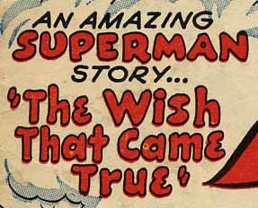
 The Superman story in ACTION #117, Feb. 1948, looks more like Ira Schnapp work, particularly the Old English style title.
 Some balloons from later in that story confirm for me this is Ira’s lettering and not that of Proto-Schnapp.
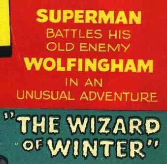
 The Congo Bill story in ACTION #117 also looks like it was lettered by Schnapp, and the title is a big clue. I see Ira’s lettering on 26 Congo Bill stories, following the adventures of an African explorer. He’d later become Congorilla, more on that below.
 Western crime-fighter Vigilante’s story in ACTION #118, March 1948, is the first one I think is lettered by Schnapp. I found four others I believe he did.
 The magician Zatara’s story in ACTION #122, July 1948, is the first one I think Ira lettered. He did ten more. As with most story lettering at the time, unless the artist was lettering himself, there were no regular assignments, and most features have lettering by several different people, probably whoever was available when the pencilled art came in from the artist.
 Issue #133, June 1949, has some very narrow Ira Schnapp lettering on this Superman story. I’m guessing the editor (Mort Weisinger, I think) asked him to try making the lettering more condensed. Ira’s work was already pretty narrow for the time, this is even more so. It seems to have been an experiment that only lasted for this one issue.
 Also in issue #133 is the first Tommy Tomorrow story lettered by Ira. He would eventually do 15 of them in all.
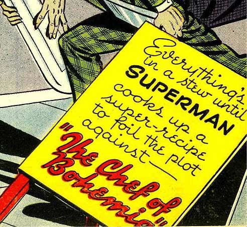
 In ACTION #248, Jan. 1959, Congo Bill became Congorilla for the first time, changing bodies with a golden gorilla temporarily. This added an element of fantasy to the strip, and kept it going for a while, as gorillas seemed to sell stories for DC. Ira Schnapp lettered this first Congorilla story (and logo) as well as two others.
 Ira Schnapp did not letter the first Supergirl story, but he did work on the second one in ACTION #253, June 1959. He lettered only one other, in issue #255. Note that the GIRL in the SUPERGIRL logo is Ira’s work, too.
 Ira Schnapp’s story lettering was rarely on the majority of pages in ACTION, and it dropped off quite a bit starting in 1952, probably because he was busy with other work. This Superman story from issue #283, Dec. 1961, is the last one he lettered for the title.
Here’s a list of all the stories I’ve found in ACTION COMICS lettered by Ira Schnapp.
ACTION COMICS #113, Oct. 1947: Superman 12 pages
ACTION #117, Feb. 1948: Superman 12 pp, Congo Bill 6 pp
ACTION #118, March ’48: Vigilante 9 pp
ACTION #119, April ’48: Superman 12 pp
ACTION #120, May ’48: Superman 12 pp
ACTION #121 June ’48: Vigilante 8 pp
ACTION #122, July ’48: Superman 12 pp, Zatara 7 pp
ACTION #123, Aug. ’48: Superman 12 pp, Zatara 7 pp
ACTION #124, Sept. ’48: Zatara 7 pp
ACTION #125, Oct. ’48: Superman 12 pp, Zatara 7 pp
ACTION #126, Nov. ’48: Superman 12 pp, Congo Bill 6 pp, Zatara 7 pp
ACTION #127, Dec. ’48: Superman 10 pp, Congo Bill 6 pp, Zatara 6 pp, Vigilante 8 pp
ACTION #128, Jan. ’49: Congo Bill 6 pp, Zatara 6 pp
ACTION #129, Feb. ’49: Superman 12 pp, Congo Bill 6 pp, Zatara 6 pp
ACTION #130, March ’49: Superman 12 pp, Congo Bill 6 pp, Zatara 6 pp, Vigilante 8 pp
ACTION #131, April ’49: Superman 13 pp, Congo Bill 6 pp, Zatara 6 pp
ACTION #132, May ’49: Superman 12 pp, Congo Bill 6 pp, Zatara 6 pp
ACTION #133, June ’49: Superman 12 pp, Tommy Tomorrow 8 pp, Congo Bill 6 pp
ACTION #134, July ’49: Congo Bill 6 pp
ACTION #135, Aug. ’49: Superman 12 pp, Congo Bill 6 pp
ACTION #136, Sept. ’49: Congo Bill 6 pp
ACTION #137, Oct. ’49: Superman 12 pp, Congo Bill 6 pp
ACTION #138, Nov. ’49: Superman 10 pp, Congo Bill 6 pp
ACTION #140, Jan. ’50: Tommy Tomorrow 8 pp
ACTION #141, Feb. ’50: Superman 12 pp, Congo Bill 6 pp
ACTION #142-143, March-April ’50: Superman 12 pp
ACTION #144, May ’50: Superman 12 pp, Congo Bill 6 pp
ACTION #145-146, 148-151, 153, June ’50 to Feb. ’51: Superman 12 pp
ACTION #154, March ’51: Congo Bill 6 pp
ACTION #156-157, May-June ’51: Superman 12 pp
ACTION #162, Nov. ’51: Superman 10 pp, Congo Bill 6 pp
ACTION #163, Dec. ’51: Tommy Tomorrow 6 pp
ACTION #176, Jan. ’53: Congo Bill 6 pp
ACTION #178 & 181, March & June ’53: Tommy Tomorrow 6 pp
ACTION #182, July ’53: Tommy Tomorrow 6 pp, Vigilante 8 pp
ACTION #183-184, 186, Aug.-Nov. ’53: Tommy Tomorrow 6 pp
ACTION #188, Jan. ’54: Congo Bill 6 pp, Tommy Tomorrow 6 pp
ACTION #211, Dec. ’55: Congo Bill 6 pp
ACTION #213, 215-217, Feb.-June ’56: Tommy Tomorrow 6 pp
ACTION #219, Aug. ’56: Congo Bill 6 pp
ACTION #221, Oct. ’56: Tommy Tomorrow 6 pp
ACTION #225, 227, Feb.-April ’57: Congo Bill 6 pp
ACTION #242, July ’58: Congo Bill 6 pp
ACTION #245, Oct. ’58: Superman 13 pp
ACTION #248, Jan. ’59: Congorilla 7 pp (first)
ACTION #249, Feb. ’59: Congorilla 6 pp
ACTION #250, March ’59: Tommy Tomorrow 7 pp, Congorilla 6 pp
ACTION #251, April ’59: Superman 13 pp, Congorilla 6 pp, Tommy Tomorrow 7 pp
ACTION #253, June ’59: Supergirl 8 pp
ACTION #255, Aug. ’59: Superman 12 pp, Supergirl 7 pp
ACTION #256, Sept. ’59: Superman 12 pp
ACTION #283, Dec. ’61: Superman 13 pp
If my guesses and math are right, that’s 846 story pages in ACTION lettered by Ira, not counting house ads and public service pages that ran across all the titles. Lots of work!
Hope you’re enjoying this research as much as I am, more articles about it and many more you might like can be found on the COMICS CREATION page of my blog.
December 12, 2016
IRA SCHNAPP in ACTION COMICS Part 1
 This and all images © DC Comics.
Continuing my research into the work of lettering legend Ira Schnapp, I’ll discuss cover lettering for ACTION here and interior lettering in Part 2. Many National Comics (now DC Comics) in the 1940s were “poster” covers rather than scenes relating to stories inside, but ACTION did buck that trend sometimes, as seen above, and used cover lettering more than many of the others. Issue #75 dated Aug. 1944 has the first example I think might be lettered by Schnapp.
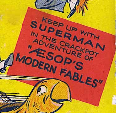 Ira’s cover lettering was usually very square and even, as seen here, and the use of the glyph combining A and E, to begin Æsop seems like something he might have done. This could be the earliest cover lettering for Schnapp that I’ve found, if I’m correct, but I’m not sure about this one and will keep a question mark on it.
 Issue #78 dated Nov. 1944 has another cover blurb that could be by Ira Schnapp, it has elegant script that could be his, but I’m not sure it is. The problem is, ACTION has lots of lettering at this time by another letterer with many style similarities to Schnapp. In fact, I think Ira may have used this unknown person as a model for his own work.
 Things that suggest that other letterer, who I’ll call Proto-Schnapp for the convenience, are the very rounded open story title, and the word SUPERMAN, which has unjoined loops on the P and R as well as a curved right leg on the R and a serif at the top of the S. Also, the script is more upright than what Schnapp usually did, his tended to be more italic. I think this is by Proto-Schnapp.
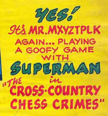
 This blurb from the cover of issue #80, Jan. 1945, doesn’t particularly look like either of them, though it could possibly be Ira Schnapp trying to be wild and crazy in this story about Mr. Mxyzptlk, but it’s probably by someone else.
 This cover blurb from issue #81, Feb. 1945, is definitely NOT by Ira Schnapp or Proto-Schnapp, it’s by another letterer who did lots of work on Superman stories in the early 1940s. His lettering is very wide, and the loop of the R is usually not connected.
 Issue #83, April 1945, has this cover blurb that could be by Ira Schnapp. The first word is in handsome italic script, and the rest is circus-type lettering. Not really enough of it to make a call, though, so it gets a question mark.
 On the other hand, issue #88, Sept. 1945, has a similar blurb that does look more like Ira Schnapp’s work to me, as does the word balloon.
 Issue #93, Feb. 1946, has a script banner that’s not typical of Ira Schnapp, but he did use a similar style on story titles occasionally. The caption above looks like Ira, so I’m calling this one his.
 Issue #95, April 1946, has lettering that is definitely NOT by Ira Schnapp.
 Issue #97, June 1946, does look like Schnapp lettering to me. Notice the italic script of ANOTHER and the very square letters of SUPERMAN, for instance.
 Issue #100, Sept. 1946, is definitely NOT Schnapp lettering, notice how rounded the blurb lettering is. Even the balloon lettering is too curvy. This could be by Proto-Schnapp.
 The blurb on issue #106 looks like Ira Schnapp work to me, despite the somewhat rounded open lettering of the title. Even that is very even and regular, not bouncy.
 Issue #109, June 1947, is a tough call. It could be by Schnapp, but I’m not sure. The solid letters seem too uneven for Ira, but the open title does look like his work. I’ll give it a question mark.
 Issue #110, July 1947, is, I think, by Proto-Schnapp, who also lettered the title story in a similar style. The open lettering here matches that, and is very rounded. The solid letters above don’t look like Ira’s work either.
 Issue #111, Aug. 1947, looks again to be by Proto-Schnapp with a very rounded title and other lettering not in Ira’s style.
 On the other hand, I think this blurb on issue #112, Sept. 1947 is by Ira Schnapp, despite the bounce in the story title. That open YES! is very much in his style, and even the bouncier letters are very regular and similar to each other. There are other small clues like the opening in the tops of the O’s in the story title.
 I think this one from issue #113, Oct. 1947, is by Proto-Schnapp, not Ira. Too rounded, and I don’t think Ira ever used that particular lower-case style.
 Issue #114’s blurb is very much Ira’s, everything square and even with his typical letterforms. Classic Schnapp work.
 Issue #115 is just the opposite, very rounded open letters, and I think a good example of the unknown person I’m calling Proto-Schnapp. Clearly there was no chosen favorite for cover lettering assignments on ACTION COMICS. Perhaps whoever was there when the art came in got the job.
 Issue #116, Jan. 1948 has another good example of Ira Schnapp cover lettering, and by now, his style is becoming the one we know from all his cover work hereafter, though the slightly drippy letters on the story title are not so typical.
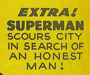
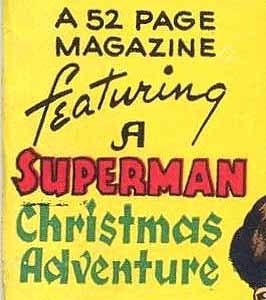 More classic Ira Schnapp cover lettering on issue #117, Feb. 1948, with the kind of Blackletter or Old English approach he liked on CHRISTMAS ADVENTURE.
 Issue #119 I think is the final example of cover lettering by Proto-Schnapp, whose work seems to dwindle away some time in 1948. Perhaps he was an older man who retired around then, making room for Ira on staff, but that’s just a guess.
 I have to be careful not to generalize about Ira Schnapp’s work too much, as there are always exceptions. This blurb on the cover of issue #120, May 1948, has a very bouncy title for Ira, but is still clearly his work to my eye.
 More typical Ira Schnapp work on the cover of issue #121…
 …and issue #122. After this, all or nearly all the cover lettering on ACTION is by Ira Schnapp for many years.
 Issue #131, April 1949, is classic Ira Schnapp. I particularly like the 4TH on this one.
 By issue #149, Oct. 1950, the cover art and lettering is settling into the style familiar across the DC Comics line in the 1950s: top line for backup feature or features, story title near the logo, word balloons for lead characters or villains.
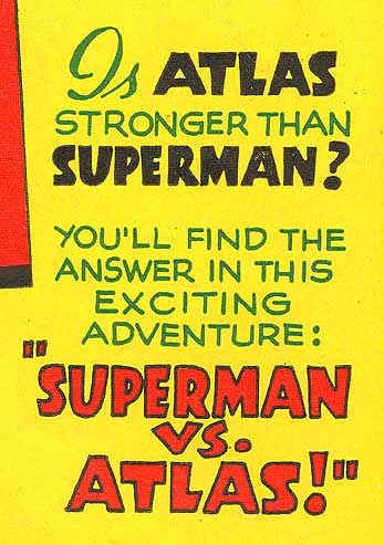
 Like the stories inside, some of the covers such as this one, #196, Sept. 1954, have lots of lettering. Here Ira had not only the cover blurb and balloons to do, but the billboard featuring a lengthy title and more word balloons! The lettering style here is now completely in Schnapp’s mature cover style, and I find it very appealing.
 More of Ira’s version of Old English style in the story title for issue #231, Aug. 1957.
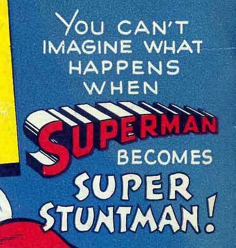
 Many of you may be familiar with this cover featuring the debut of Supergirl, issue #252 dated May 1959. Lots of great Ira Schnapp lettering here to help tell the story!
 By issue #317, Aug. 1964, both the stories and the cover lettering were going to some silly places, and beginning to look old-fashioned, but Ira’s style is still appealing to me.
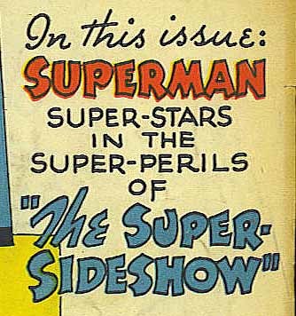
 The 80-Page Giant, an offshoot of the Annual format, often had covers like this broken into many panels about the different stories. I think this one is particularly well-designed and attractive, even if some of the story ideas are pretty lame. Issue #334, March 1966.
 The last ACTION cover with Ira Schnapp lettering is this one, #360, March-April 1968. What a great cover and loaded with fine Schnapp lettering. On this title at least, Ira went out in style. After this issue, most of the cover lettering was by Gaspar Saladino as Schnapp was eased into less visible work, and soon into retirement in 1968.
Here’s a list of the ACTION covers I believe were lettered by Ira Schnapp:
75?, 83?, 88, 93, 97, 106, 109?, 112, 114, 116-117, 120-122, 124-140, 142-143, 145-307, 309-344, 346-357, 359-360.
Not counting the three I’m not sure about with question marks, that’s 234 covers, an impressive number.
Next, in Part 2, I’ll look at Schnapp’s story lettering on this title. Many more Ira Schnapp articles, and others you might enjoy, are on the COMICS CREATION page of my blog.
December 10, 2016
My Most Challenging Two Pages
 Images © America’s Best Comics/DC Comics.
I don’t have anything prepared for my blog today, so I thought I’d reprint this from my website.
The most challenging and time-consuming two pages of the series PROMETHEA (written by Alan Moore, art by J.H. Williams III and Mick Gray), and in fact probably of any in my career, were the all-lettering spread in PROMETHEA #23. Alan’s script provided a list of about 30 “prayers” or the equivalent, and his instructions were to get these translated into as many languages as possible and fill the two pages with them. J.H. gave me the idea he had in mind for the layout: circular balloons gradually reduced in size radiating from a central point on the left side, and the rest was up to me.
The first challenge was getting the translations, and I enlisted the help of Assistant Editor Kristy Quinn, her friends, and some online contacts of my own, as well as online translation programs like Babelfish to come up with versions of Alan’s text, or parts of it, in over 50 languages. In some cases I had to invent shorter phrases or just use single words, and I added a few music examples as well. Once that was assembled, I began lettering, stopping often to consult the reference, as I was using languages and even alphabets that were new to me. The whole process took about two weeks. I’m sure there are mistakes, and a few were later pointed out to me by readers in the Hebrew translations. Mostly, though, my own personal prayer near the lower right corner, “God, I hope I’ve lettered this right…” had been granted, as far as I know.
A larger version of the two pages is HERE.
December 9, 2016
Rereading: DOCTOR DOLITTLE’S POST OFFICE by Hugh Lofting
 I’ve decided to try rereading the Doctor Dolittle books in what several online sites have said is internal chronological order. This is the third book published (in 1923) but the second in chronological order. Chronology is somewhat uncertain for the early books, though, but I’ll follow their lead.
While no years are given in this book, it probably takes place in the 1820s, and mostly in Africa. That Africa is, of course, very different from what we know today, very much a tribal society of small kingdoms with large areas of the interior controlled by animals rather than people. I feel Lofting handles the race issue pretty well overall, there is some stereotyping for humor, but not much, and his African men and women are of various personalities and abilities. Lofting reserves villain roles mostly for white pirates and thieves, with one warlike African chief as well.
While the book opens with action and adventure as the Doctor takes on some pirates almost single-handed, much of the story is about a postal system he sets up in the African kindgom of Fantippo using his many animal friends, largely the birds, to deliver mail from Fantippo to all parts of the world. Lofting is interested in process, and he makes the process of setting up this postal system interesting, with plenty of amusing and entertaining animal activities and comments. He has each species of bird under a leader or “king,” with Speedy, the leader of the Swifts, taking charge of long-distance mail delivery and Cheapside the Cockney sparrow from London brought in by the doctor with his brethren to handle city mail deliveries in Fantippo’s capital city. Once the system is set up, the Doctor gets involved in politics, war and government in neighboring countries with more action and adventure.
Perhaps the most interesting part of the book is near the end when the Doctor and his animal friends go on an expedition into an unknown part of central Africa to meet the world’s oldest animal, a very large and ancient turtle, Mudface. The journey is full of wonders, and Mudface himself has amazing stories to tell while the Doctor tries to help with his arthritis. Mudface’s story involved Noah and his Ark, adding a bit of religion to the mix, but there are so many fantasy elements in these books that it seems to fit right in.
Good fun, brought back happy memories of my childhood. Recommended.
December 8, 2016
And Then I Read: GREEN LANTERNS 3
 Image © DC Comics.
I know I’m far behind on a title when the cover date is September and this is December! When I get to it, I’m enjoying the antagonistic pairing of Simon Baz and Jessica Cruz, the two newest Green Lanterns of Earth, trying to cope with powers they don’t understand yet and situations way over their heads. Atrocitus and his Red Lanterns have invaded Earth and are setting it up as a new home base for Rage, infecting lots of Earth citizens in the process. Simon, a bit further along in his learning curve, confronts Bleez, the Red Lantern, and actually brings her out of the Rage for a while. Meanwhile someone unusual has appeared at Simon’s home. Jessica is frustrated by her inability to get the results she wants from her power ring. This leads to bad things for everyone.
Recommended.
December 7, 2016
Incoming: ABSOLUTE BATMAN YEAR ONE
 Image © DC Comics.
Just arrived is this two-book slipcased set, each book measuring 12.5 by 8.25 inches. This often-reprinted story ran originally as four issues of the monthly BATMAN comic (see example above right), in 1986-87.
Book One of this set is an excellent oversized reprint of the collected story with blue-line painted color by Richmond Lewis. I approve of it in every way. Lots of extra material including new forewords by editor Denny O’Neil and writer Frank Miller, and drawn afterword and comments by artist David Mazzucchelli, plus house ads, cover art, etc.
Book Two attempts to recreate the original newsprint comics version of the original issues larger, but in my opinion fails completely. The covers, on glossy stock, look great. The rest is on newsprint and each page is scanned from copies of the original comics. The result is mushy blacks (with four colors of ink dots in them) rather than the crisp, if grayed down, blacks of the original printings. The colors may be somewhat close to those seen in the original comics (and different from the ones in Book One), but the newsprint paper color is also in the scans, and the original large dot color separations are now mushy small dot separations that blur everything. The right way to do this would have been to reprint the original four-color separations on newsprint. Possibly they no longer exist, I don’t know, but this version is not very much like the original comics. Frankly, I hate it, and think it makes everyone involved look bad. The one saving grace of Book Two is the inclusion of every Miller script page and every Mazzucchelli pencilled layout, as well as some inked pages.
The suggested retail price for this box set is $125. I hope at some point DC will consider offering the contents of Book One with the added material from Book Two in a single volume. That one would be welcome on my own bookshelf.
Todd Klein's Blog

- Todd Klein's profile
- 28 followers

