
Todd Klein's Blog, page 187
September 14, 2016
And Then I Read: HAL JORDAN AND THE GREEN LANTERN CORPS REBIRTH 1

Image © DC Comics.
I’m behind on this one because I needed a break from the Green Lantern Corps. This relaunch is written by Robert Venditti, continuing from his earlier Corps writing, and carrying in some of the previous story lines, but most of the focus is on Hal Jordan, my favorite GL. Hal gets to return to the role and the costume. Plenty of characters and story threads are waiting, including an intriguing look at a very old Sinestro. As a reader, I hope the focus on character evident here continues rather than a return to massively complicated end-of-the-universe epics with dozens of characters, but I do feel a renewed fondness for the franchise, and will give it some continued reading. The art by Ethan Van Sciver is excellent, as always.
Recommended.


September 13, 2016
Rereading AMERICAN GODS by Neil Gaiman
 Cover art by Robert McGinnis, title and type design by me.
“American Gods” is, as you can see, a long and complex novel that is hard to summarize, but here are some highlights. The protagonist, Shadow Moon, is in prison as the story opens, and about to be released. He dreams of returning to his beautiful wife Laura and their home in a small midwestern town, where he has a job waiting, working for his best friend Robbie. Just before that release is due, he’s summoned to the warden’s office and learns that Laura and Robbie have been killed together in an auto accident. He’s given early release to attend the funeral.
On the way there, Shadow is diverted by a bearded con-man named Wednesday, who is in fact, as we gradually learn, the god Odin. Wednesday proves his power to Shadow, both to hurt him and to help him, and before long Shadow has agreed to work for Wednesday as his personal bodyguard/assistant/driver. When the two arrive together in Shadow’s home town, painful truths are revealed about the death of his friend and his wife. Shadow gives a bit of the power he’s unknowingly received through Wednesday to Laura, which brings her back to a semblance of life, but as a living corpse.
Before long, Shadow and Wednesday are traveling all over the US and Canada trying to recruit other old gods to Wednesday’s side in what he sees as a coming battle between those old gods, and new American gods spawned by the media, technology and finance. Those new gods harass and oppose them, while many of the old gods are reluctant to join Wednesday’s cause for their own reasons. Most are barely surviving on the scant bits of human worship they can still receive. Wednesday and Shadow have meetings with gods both obscure and familiar, and the reader is often left to figure out who they are through hints rather than directly.
When Shadow isn’t working for Wednesday, he’s hiding out in the small upper midwestern town of Lakeside, where he makes new friends and allies, and begins to build a new life that becomes increasingly important to him.
Encounters between Shadow and the new gods grow more violent, though Shadow’s wife Laura helps to protect him, and eventually he finds himself undergoing an ordeal that will probably end his life, an epic heroic gesture that is probably futile, but one he can’t resist trying in order to save the world and the friends he’s lately discovered after the hard knocks he received. It may mean his end.
I enjoyed rereading this, having read it when it first came out fifteen years ago. This is an expanded version containing the author’s preferred text. I can’t say what’s new in it, but there are about 12,000 new words, according to the introductory notes. Reading it again, I’m struck by similarities to the work of Roger Zelazny, work which both Neil and I love, and Zelazny is credit-checked in the dedication. While Zelazny can be epic in the same way, his work is generally less rich emotionally, at least to me. Neil’s characters are more real, more heartfelt, in my estimation. Setting this story mainly in real, if odd, American places helps to ground it so that fantasy elements are more balanced. The arc of the story is deep and long and satisfying. I may be too close to Neil’s work to be an accurate judge, but I find this novel to be one of his best. I would put it right behind my favorite, “Stardust.”
Highly recommended.
September 12, 2016
And Then I Read: UNFOLLOW #10
 Image © DC Comics.
We’ve already seen the 140 lead characters in this series shift from dreams of avarice, as they jointly inherited a vast fortune, to nightmares of death, as they are being killed off one by one. Most of that killing has been by the man seen on this cover, known as The Mask Not Rubinstein. He’s stalking further victims, ones that are easy targets. Some of the original 140 have fled to distant refuges (so they hope). A few are in the hands of Russian gangsters, who they hope will protect them for the monetary value they have. More are on the island retreat of Japanese guru Akira, where that guru seems to be having a breakdown of some kind. The bestower of the fortune is apparently dead, and having a celebrity funeral, but is he really in the coffin? Writer Rob Williams and artist Ryan Kelly continue to keep me intrigued and wanting more.
Recommended.
September 11, 2016
And Then I Read: BOOK OF CODES by J Richard Knapp
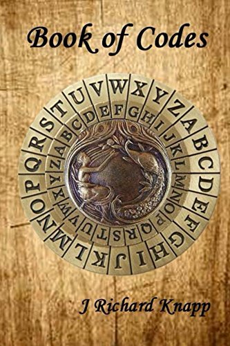 Twins Nick and Sam (Samantha?) are spending the summer on an archaeological dig being supervised by their parents, at a remote site which is proving to hold a large number of Triceratops fossils. Nick and Sam aren’t too interested in this, oddly, but they do enjoy camp life, and exploring. On a walk they discover a Caesar cypher wheel (similar to the one pictured above) carved into a cliff. One of the research volunteers, Becca, shows them how it works, and the twins begin a new search for something written in code that they can use the wheel to decipher. Before long they have found several code fragments, and eventually an entire book in code. Meanwhile, they are being threatened by a mysterious figure who seems to want what they’ve found. Becca and some friends from the nearby small town of Oak Creek seem to know more about the codes and other odd secrets that might lead to a lost underground town, if they can figure out where it is.
This was a fun read, but it has one major problem: Nick and Sam have things too easy. There is little conflict here, they go from one triumph or discovery to another with not much effort. They always get things right, or are helped at just the opportune moment. Yes, there is a mysterious threat, but it doesn’t bother them too much, and is eventually dealt with off-camera by others. I’m all for fun adventure stories, but when the protagonists have everything they want practically handed to them, it makes for a dull story.
Not recommended.
September 10, 2016
THE DANNY CRESPI FILES Part 8

All images © Marvel.
Continuing my exploration of Phil Felix’s photocopied pages of (mostly) cover lettering by Danny Crespi, with a few things by others, this time covering pages 29-32. Page 29, above is all lettered by Crespi. The bottom piece is a rare title from an interior text page (rare in this collection, at least). Sources follow.
 “Executioner” from MARVEL TWO-IN-ONE #7 dated Jan. 1975. I don’t like the layout of this caption, too much dead space. I think the top three lines could have fit on two: FEATURING: THE PULSE-POUNDING / POWER OF THE is how I would have done it.
 “Jeremiah” from MARVEL TEAM-UP #35 dated July 1975. Finding word balloons is tough, I had some help from Ray Bottorf Jr. on some of these.
 “Both of us” from CRYPT OF SHADOWS #18 dated July 1975. Small, but effectively creepy!

“A Day at the Circus of Crime” from SPIDEY SUPER STORIES #3 dated Dec. 1974. An unusual style for Crespi, but certainly circusy.

From GIANT-SIZE CONAN #1 dated Sept. 1974, pages 38 and 39. I might not have identified the letterer of this map as Danny Crespi if this title weren’t included in the collection. The serif letters are unusual for Danny, but ACHERON certainly looks like his work, and I’m sure it all is. Very nice scroll caption, too.

Page 30, all by Crespi, sources below.
 “Claws of the Cat” from MASTER OF KUNG-FU #38 dated March 1976. (British cover price version shown here.) CLAWS is reversed out of the red caption fill and colored yellow. I think this reads better than the red type on yellow in the burst caption above.
 The Man Who Wasn’t There” from TOMB OF DARKNESS #15 dated July 1975. Another layout I think has too much dead space. I would have made it: THE MAN WHO / WASN’T THERE! on two lines.Nice lettering otherwise, and the purple caption fill makes it work better.
 “Supernatural Mystery” from UNCANNY TALES FROM THE GRAVE #11 dated Aug. 1975. AS YOU LIKE IT is typeset. The caption is red and yellow to pop and attract the eye, but I feel there’s entirely too much red on this cover for a horror/mystery book.

Page 31, all by Danny Crespi. Sources below.
 “Silver Surfer” from MARVEL’S GREATEST COMICS #59 dated Oct. 1975. If you look closely at the first two lines, “Guest starring the sensational,” Danny has squared off the ends of most strokes. This takes more time, it has to be done with a separate smaller pen point, but it definitely looks different, and I think better, than leaving them rounded. More emphatic somehow.
 “Squadron Sinister” from THE AVENGERS #141 dated Nov. 1975. I really like this one. The contrast between the two words is effective, as is the coloring. VERSUS THE is type.
 “Unchained” from THE INCREDIBLE HULK #188 dated June 1975. Simple block letters on a slant to match that of the logo. Suddenly, much more interesting when tilted.
 “Attack of the Missing Link” from WHERE MONSTERS DWELL” #36 dated July 1975. I feel this is a weak effort on Danny’s part. Again too much dead space in the caption box, and the style of MISSING LINK is not right for a horror cover, in my opinion. He was turning out a ton of these, and they can’t all be great.
 Page 32, the top three are by Crespi, the bottom one is by Gaspar Saladino. The most obvious clue is the shape of the S. Gaspar’s starts with a small almost vertical semi-serif.
 “The Avengers” from GIANT-SIZE MARVEL TRIPLE ACTION #2 dated July 1975. The design of this cover is a cluttered mess that the lettering doesn’t do much to help, but if you wanted to read these stories, you had enough information.
 “Thirteenth Floor” from DEAD OF NIGHT #7 dated Dec. 1974. I like this lettering a lot, effectively spooky and stylish.
 “Carnival” from DEAD OF NIGHT #10 dated June 1975. More well-done spookiness from Danny.
 “Power Man” from THE DEFENDERS #17 dated Nov. 1974, lettering by Gaspar Saladino. The caption is cut off on the photocopy. Notice how thin the outlines are on POWER MAN, and they still read fine in color, something Gaspar was very good at judging.
There are plenty more pages, and I will show more once I have time to research them. Other parts of this article series and more you might enjoy are on the COMICS CREATION page of my blog.
September 9, 2016
And Then I Read: WONDER WOMAN #3
 Image © DC Comics.
Most of this issue explores the love/hate relationship between Wonder Woman and her foe Cheetah, in this revamp a troubled woman who is apparently part-animal rather than someone wearing a costume. I know it’s not a new idea, but seems more fully realized here. Diana addresses her by the name Barbara Ann, so their relationship extends back to a time when Cheetah was a normal human, it seems. Now Cheetah has her own domain in Africa with other beast-human followers. The bulk of this issue explores Cheetah’s struggle with her dual nature, torn between good and evil even within herself. It’s the kind of character exploration there is rarely time for in superhero comics, and well handled by writer Greg Rucka. The art by Liam Sharp is excellent. A sub-plot follows Steve Trevor, also in Africa, on the trail of outlaws who have terrorized a local village and taken hostages. Not sure (or I don’t recall) why this is Steve’s assignment, but he and Diana are surely on course to meet soon.
Recommended.
September 8, 2016
Incoming: ELSEWORLDS BATMAN Vol. 2
 Image © DC Comics.
This upcoming trade paperback I just got copies of collects three original graphic novels I lettered—BATMAN & DRACULA: RED RAIN, BATMAN: BLOODSTORM and BATMAN: CRIMSON MIST—with Doug Moench scripts, Kelley Jones pencils and inks by Malcolm Jones III or John Beatty. Moench, Kelley Jones, Beatty and I had a long run on monthly BATMAN issues, but these were separate projects that had more edgy material and more extreme art (Kelley Jones unleashed). I was able to do a lot of cool things with the lettering, too, all by hand. I haven’t read them since I lettered them, but they still look pretty good to me. Out soon.
September 6, 2016
Early Ira Schnapp DC House Ads
 All images © DC Comics.
Continuing my Ira Schnapp detective work, I decided to look through some of the late 1940s – early 1950s DC Comics issues I have digital files of searching for early Ira Schnapp house ads. Most of the ones I found, and all the ones I’m including here, were on either the inside front cover or inside back cover, printed in black and white, sometimes with added gray tones. That’s ideal for looking at the lettering. Above is the earliest ad I found by Ira, from BATMAN #53 dated July 1949. Most DC house ads from the time were template ads, meaning the were somewhat generic and could be reused over months or years by simply replacing the cover or covers of the comics. This one is specific to SUPERBOY #2, and probably only published at or around this particular month. That became the standard later, but is unusual for this time. Lots of great Schnapp lettering here, including his Superman and Superboy logos, several styles of large display lettering, and giant exclamation marks. What reader could help being intrigued? Not me. Many house ads from the late 1940s looked more like this, actually about a half page on the right of the National Comics (now DC) title list. This ad is not by Schnapp, and I don’t think he did the lettering on this version of the DC bullet symbol either. I think the top two lines are type, and the script below that is definitely not as well-crafted as what Ira could do. I don’t know who was doing DC’s ads at the time, it could have been more than one person, but many of them have lettering that resembles this. It’s likely to have been done by a production staffer rather than a freelancer.
 Here’s another ad probably by the same person from ACTION COMICS #154 dated March 1951. The one thing I do think is by Ira Schnapp is the revised DC bullet symbol, which is now much more polished and appealing. The rest of the ad has nice if somewhat cartoony art, and the open letters at the top are okay, but the lettering style is not as good as Ira’s in my opinion. This ad is about as generic as it gets, with no specific comics or characters in it.
 Another ad probably by the same person from the next issue of ACTION COMICS. This one is specific to TOMAHAWK, but could easily be reused later by putting a different cover in it. Again, the lettering is not bad, just not as good as Ira’s. Clearly this person was continuing to do some house ads at the same time as Ira.
 Compare it to this ad which ran the following month in DETECTIVE COMICS #171, dated May 1951. Here the lettering in the center is more polished and precise, and very much in Ira Schnapp’s style. The open letters at the bottom have been reused from the ad above, and are probably not by Ira, though they could be. Another template ad, this one could be reused any time by adding covers for a particular month. It may well have run earlier than this example.
 The following month, this ad not by Schnapp ran in DETECTIVE COMICS #172. Another template ad with multiple covers. I think it’s very likely this letterer and Ira were both working on house ads at the same time. Ira was on staff starting around 1949, and certainly there by 1951. I can imagine a scenario of Ira and the other production staffer sitting side by side, both working on house ads. Since this was likely to be staff work, and not freelance, there was probably no element of competition, just each of them doing a job as requested.
 But you have to imagine that other guy looking at this Schnapp house ad from SUPERBOY #17 dated Nov. 1951 and realizing he was out-classed. Weird and spooky lettering was never Ira’s strong point, but what he did here is quite effective. Look at all the different lettering styles he used, all gorgeous, and the stylized art in the background adds a great deal of mood and mystery. Are those very tall trees against the full moon? Man, this ad would sure have made me want to get my hands on that comic! Ira’s HOUSE OF MYSTERY logo was not particularly spooky or mysterious, but the rest of the ad and cover lettering sold it.
 And just to show his versatility, here’s a completely different approach from ACTION COMICS #170 dated July 1952. Ira does wacky humor! Okay, maybe his lettering was not all that wacky, but it sure reads well, and the layout and design of the entire page is exciting and appealing. It’s pretty obvious why nearly all the DC house ads would soon be lettered by Ira Schnapp.
I hope to look at more of these in the future. Other Schnapp articles and more you might enjoy can be found on the COMICS CREATION page of my blog.
September 5, 2016
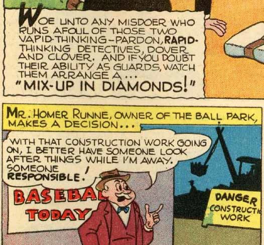
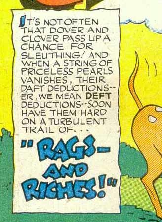
Ira Schnapp in ALL FUNNY COMICS
 ALL-FUNNY COMICS #1, Winter 1943. This and all images © DC Comics.
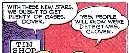
For some time I’ve been trying to figure out which DC comics from the 1940s were lettered by Ira Schnapp. I have no trouble with stories appearing from 1947 on because Schnapp’s style remained the same from then until the end of his career, but before 1947 that style is not yet settled, making identifying his work harder. In this article I’m going to examine the entire run of ALL FUNNY COMICS looking for Ira’s work. ALL FUNNY was a National Comics (now DC Comics) anthology about funny people (rather than funny animals) that ran for 23 quarterly or bimonthly issues from Winter 1943-44 to May-June 1948. There was never a lead or headline feature, it was a true anthology. Some features ran for many issues, some for just a few, with most stories ranging from four to ten pages plus some one or two page fillers, text pages and ads. The first issue was 60 pages, the rest were 52, but even with ads, that meant quite a few features and stories in each issue. Some features played up the humor, others were closer to adventure stories. Most of the Ira Schnapp lettering I’ve found is on the Dover and Clover feature written and drawn by Henry Boltinoff, a prolific and long-time cartoonist for DC whose brother was editor Murray Boltinoff. Dover and Clover are twins and detectives, rather bumbling ones. Let’s start with this story from issue #20 dated Nov.-Dec. 1947. Not only is the Ira Schnapp lettering style easy for me to recognize, the story title is in a classic Old English style he liked to use when he had the chance, and this issue’s title was perfect for it. Note the word balloon shapes that are made of large non-symmetrical scallops, and they often overlap the panel above, as seen here at lower right.
 Here’s a closer look at some of the lettering, and let’s see what we can point out that epitomizes Schnapp’s regular balloon and caption style. The lettering is very regular and even. Most letters would fit perfectly into a square. The horizontal strokes are very close to level, the vertical ones are very close to perfectly vertical. The rounded letters are very evenly round. This is work done by someone with a long career in hand lettering by the time he came to comics, and it shows. Characteristic letters: the S is generally rounded but tends to get straighter in the middle. Note that the S varies more than most letters, it’s one of the hardest to draw consistently because it changes direction in the middle. The G is rounded on the left and square on the right, where it ends in a high horizontal bar. The M has vertical sides. The W often begins with a narrow V followed by a wider V.
 Here are some more samples from the Dover and Clover story in ALL FUNNY #19. Note the very small question mark, like a tiny backwards S over a dot. Also note the longer curved right leg of the R’s here. And, while most of the straight strokes are quite straight, the left angled strokes on the Y and V are slightly curved.
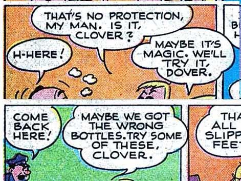
 For comparison, let’s look at lettering on the other stories in issue 20. The lead feature is Doc & Fatty. Notice how tight the spacing is between lines and between letters. The letters share some features with Schnapp’s style, but are much less even and regular. The letters vary in width and shape a lot, and the overall impression is quite different from Ira’s work.
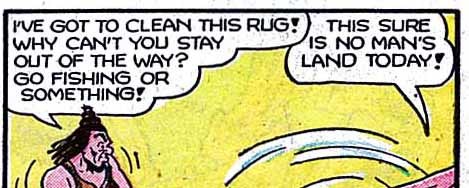
 Here’s a sample from Two Gun Percy, a humorous western with a talking horse. Again, some of the regular letters are similar to Schnapp’s, but are less even. The balloon shapes are quite different from Ira’s, and that large HEY is a style he never used. There’s a lot more of that style in the story.
 The lettering on Peaceful Phil tends to be wider than Schnapp’s. Many of these letters would not fit into a square. And they are more curvy and uneven than Ira’s work in general.
 Cave Man Curly resembles Schnapp’s work at first glance, but look at the more rounded G and S, the curves on the M and W, the very bold exclamation mark, and the balloon shapes with straight bottoms, all unlike Schnapp’s work.
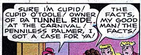 Penniless Palmer has lettering that is more angular, particularly the S, and a little too wide for Schnapp. The balloon shapes are also quite different. As you can see, all these stories follow a generally similar style, perhaps even a house style set by Ira, but each differs enough from Ira’s work to make it clearly not his once you’ve looked closely.
 Moving forward to issue 21 of ALL FUNNY, the Dover and Clover story has lettering that is definitely NOT by Ira Schnapp. Look at those curly C’s and rounded G as examples. I find no Schnapp lettering in this issue or in issue 22.
 The final issue of ALL FUNNY, #23, has a Clover and Dover story lettered by Schnapp, and he also did this one, an eight-pager with very nice poster lettering on the splash. Now lets start moving back to earlier issues.
 I believe all the Dover and Clover stories for issues 6 to 20 have Schnapp lettering, but as we move back into late 1946, there are small differences in style. Here’s the splash page from issue 14 dated Nov.-Dec. 1946.
 And a closer look at the title caption. Still clearly Schnapp, but everything is a little more curved, a little wider. The right leg of the R is often curved up, while later ones were often straight. On the B, the center stroke between the two loops does not quite touch the left vertical stroke. The overall look is very regular, but the title is definitely looser than most of Ira’s later ones. By the way, Schnapp also lettered a six page Hamilton and Egbert story in issue 14. It seems he had regular assignments, but if extra work was available and he had time to do it, he did. Likewise, if he wasn’t available for his regular assignments, they were given to someone else.
 Here’s the Dover and Clover story from issue 12 dated July 1946. Most of the balloon shapes are typical of Schnapp, but there’s one perfect oval at upper right, which Ira rarely did later.
 A closer look at the title caption, which is very similar to the style in issue 14, but possibly a little wider and loser. Many of Schnapp’s letter forms are here, but there are more unconnected bits on some R and P letters. The title is a style we haven’t seen before with more unconnected letters. Looking at the story as a whole I feel sure it’s Schnapp, but getting further from his later style.

ALL FUNNY #11 and #10, the latter shown here and dated March-April 1946, are lettered in the same style as #12, still Ira Schnapp I believe, with his typical balloon shapes.
Here’s a detail from the page above. Again, many of Schnapp’s letter forms are evident, but just looser, a little curvier, and sometimes wider than his later work.

Here’s the first page of the Dover and Clover story from ALL FUNNY #8 dated Fall 1945. Interestingly, the Schnapp style of this one is closer to what he was doing in later years, including a style of lower case script in the title that often turned up in his cover lettering.
This story is very wordy, which may have influenced Ira’s style choices.

Still looking like Ira Schnapp lettering in this story from ALL FUNNY #7.

ALL FUNNY #6, dated Spring 1945, has Schnapp lettering, though the first word balloon is oddly shaped, but that may have been redrawn to make more room for the series title. It would probably have been on the newsstand in early 1945, and lettered in the fall of 1944.

A detail from the next page of that story shows another very wordy script, and Schnapp lettering that is again less even in places and wider than Ira’s later work. There are some rounded G’s in the first balloon, though the others are his usual style. Compare it again with Ira’s work in issue 20:
 I would say the similarities outweigh the differences, though if you compared them without going through all the intervening issues, you might think these examples were from two different letterers. That’s what I thought myself at first.

The Dover and Clover story in ALL FUNNY #5 dated Winter 1944 has a very different lettering style. Here’s a closer look:
These letters are made with a different style of pen point, one with a wedge tip that creates thicker lines in some directions and thinner lines in others, most noticeable on the rounded letters. Few of Ira Schnapp’s characteristic letter forms are here, the lettering and the story title are quite different from his work. It may well be lettering by Henry Boltinoff, who wrote and drew the feature, and his name is in the lower right corner of the first panel. I see no Ira Schnapp lettering at all in issues 1 to 5 of ALL FUNNY. The Dover and Clover features in them has lettering just like this one.
To sum up, I believe Ira Schnapp lettered the following stories:
ALL FUNNY #6-20 & 23: Dover And Clover, 4 pages each.
ALL FUNNY #14: Hamilton & Egbert, 6 pages.
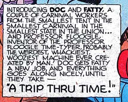
ALL FUNNY #23: Doc & Fatty, 8 pages.
If I’m correct, and I think I am, this comic has the earliest Ira Schnapp story page lettering I’ve found, with the first example being created in late 1944. I have other titles to examine to see if I can find still earlier examples, which I will get to when I have time. Hope you’ve enjoyed this article, others you might like can be found on the COMICS CREATION page of my blog.
September 3, 2016
Ira Schnapp story lettering, a sampler
 Images © DC Comics.
My focus is turned to lettering legend Ira Schnapp again today. One area of his career I want to know more about and have been researching is his lettering on story pages for DC Comics (then National Comics) in the 1940s. I have access to scans of many of the comics from that decade, but determining which stories were lettered by Ira is difficult. By 1947, his style is easy for me to pick out, it’s essentially the same one he used throughout the rest of his career. Before 1947, I suspect his style was not yet settled, and he may have gone through different versions of it. That makes finding his work much harder and probably more subjective. I hope to eventually come to firmer conclusions, but in the meantime, here are some examples of Ira’s story lettering from the late 1940s. Above is the lead story from ACTION COMICS #106, cover dated March 1947. The title of the story is in a style Schnapp used occasionally on covers, and the very square and regular lettering is his.
 BAMAN #41 cover dated June-July 1947 has Ira Schnapp lettering in the caption, as well as the signs.

Page 3 from that story has more typical Schnapp lettering styles. Notice the balloons with large scalloped edges, and one that extends over the panel above. Schnapp’s story lettering is not as carefully crafted as his cover lettering balloons (which were also done larger), but the letters are similar. Like most letterers, his S is distinctive, in this case very rounded with a tendency to get straighter across the middle horizontal stroke, and often with the top and bottom end points shorter than the center stroke.
 While Ira lettered a good number of super-hero stories, I’ve found many more humor stories by him, such as this one from A DATE WITH JUDY #2 cover dated Dec. 1947 – Jan. 1948. Here the story calls for some larger lettering that is even more like Ira’s cover lettering. The balloon shapes are distinctively his, as are the overlaps to the panels above. Ira’s question mark was always small and tight like a tiny backwards S over a dot.
 Schnapp lettered hundreds of short humor and funny animal stories like this one from ALL-FUNNY COMICS #14 cover dated Nov.-Dec. 1946. The style is very similar to the other examples above, but note that in this earlier example some letters look a little different, particularly the R, which in some places has a long curved right leg. This is the sort of clue I need to follow back to earlier examples.
 One more funny animal example from ANIMAL ANTICS #11 cover dated Nov.-Dec. 1947. In this case the feature title, “The Raccoon Kids” also looks like Ira Schnapp’s work to me. This sort of research is very time consuming, but I try to keep at it when I can. Hopefully I will be able to report more fully in the future.
Todd Klein's Blog

- Todd Klein's profile
- 28 followers

