
Todd Klein's Blog, page 186
September 27, 2016
And Then I Read: FUTURE QUEST 3
 Image © DC Comics/Hanna-Barbera.
Where can you find a new painted cover and 11 page story by the masterful Steve Rude? Right here, the first of two stories in this issue which steps back from the Hanna-Barbera crossover of issues 1 and 2 to explore the back stories and individual adventures of some characters in it. Both stories are nicely written by Jeff Parker. First up is Birdman with art by Rude, then The Herculoids with art by Aaron Lopresti. Birdman and his hawk friend are teamed with female agent Miss Sumadi to deal with monsters coming through a hidden gateway. In the other story, The Herculoids, an entertainingly diverse group of humanoids and non-humans are dealing with robot invaders from a neighboring planet. I have nothing invested in these characters, not having seen any of the cartoons they were in, but the art and writing made this a fun read and much more enjoyable than the previous issue. It’s mostly action but with enough character development to keep me interested. Looking forward to more.
Recommended.


September 25, 2016
And Then I Read: DRIFT HOUSE, THE FIRST VOYAGE by Dale Peck

Cover art © Martin Hargreaves.
In the aftermath of 9-11, three children living in New York City: Susan, Charles and Murray Oakenfeld, are sent to live with an uncle in Canada who they’ve never met. Uncle Farley’s new home there is a very unusual one shaped like a large ship, and not long after the children arrive there, it proves to be one, a magical ship that embarks with them on a voyage on the Sea of Time. Fortunately, the ship seems to provide all the needs of the children and their uncle. Unfortunately, Uncle Farley does not know how to steer or direct the ship, and he’s nearly as clueless about its origin and nature as the children, though he has been on one previous voyage in it.
Before long the four are deeply involved in a struggle for power on the high seas of Time between a group of powerful Mermaids, who want to stop time altogether to preserve their way of life (meaning no one would ever age or die or be born) and others, including pirates, who want to stop them. Each of the children undergoes unusual adventures and changes, danger is ever present, and so are amazing wonders and equally amazing creatures.
I enjoyed this inventive fantasy and its appealing characters and complex plot. My only caveat is that new ideas keep coming in to change things I thought I understood, ideas that seem to have occurred to the author as he wrote rather than being part of his plan all along. I could be wrong about that, and in any case, the creative world and its inhabitants make for entertaining reading. Recommended.
September 23, 2016
Title and Cover Design for Neil Gaiman’s STARDUST

I’ve just received advance copies of “Stardust,” the second in a series of new paperback versions of Neil Gaiman books with wonderful cover paintings by illustration legend Robert McGinnis and titles and type design by me. I wrote about the first one, “American Gods,” HERE. This book’s release date is Sept. 27th, so it will be on sale soon. Here’s how the final cover was achieved.
 On March 22nd, 2016 I received a scan of the painting by Robert McGinnis for the book. This is a raw scan, so it would need adjustments to make it look right. I was told there would be one change requested by Neil, but this was fine to start with.
 It turned out that Neil wanted the knife at the right edge to be black (obsidian) as in the story, so this revised version came to me soon after.

I made adjustments to the levels, brightness and contrast to get this version, which I felt worked well, and I think on this book the publisher’s art department made a similar adjusted version at their end. This was the scan I used for my design work, and is very close to the printed version.
 I had done title design work for an earlier edition of “Stardust” illustrated by Charles Vess and published by DC Comics in 1997, though the version shown here is from a 2007 reissue. I designed the title based on Vess’s hand-drawn one, and a font in similar style for the rest. I knew for this new paperback I wanted to do something quite different, but my first hand-drawn title does echo this version somewhat.
 Mainly it’s the shape of the S’s, the rest is different enough to give a fresh look, and I thought it suggested 1960s fantasy paperbacks, the style we were after.
 I did two more hand-drawn titles. This one seemed promising, but didn’t look that good on the art, so I never submitted it.
 This one was fun to do, but I felt too hard to read, so it never got beyond a sketch. I did like the Virgil Finlay stars, though.

Here’s the first version I submitted to Neil with my hand-drawn title. The rest of the cover copy came from Neil and Harper-Collins. I also chose how the cover art would be cropped as part of my design, the proportions were not quite right, and I felt the figures should be as large as possible.
 An alternate version with red on the author name.
 My second submitted title design started with a font that I manipulated to give it bounce.
 On this one I added those Finlay stars. (Many other artists have used similar ones, but Virgil Finlay is the first I’m aware of.) In retrospect, this is a little too “I Dream Of Jeannie.”
 The third submitted design started with another period font that I manipulated.
These designs went to Neil together, and he didn’t like any of them very much. He wrote, “Could we go a bit more Ballantine Adult Fantasy? Their “Worm Ouroboros” or “Voyage To Arcturus”? As if it’s a 1920s book someone is repackaging in 1969?”
That gave me a better idea of what he had in mind, and I own the entire run of Ballantine Adult Fantasy paperbacks (from the late 1960s through 1970s), so it was easy and fun to look there for ideas.
 Many of those books use standard type for titles, which was not particularly helpful, but “The Worm Ouroboros” by E.R. Eddison has a great hand-drawn title that I thought would be a perfect style for “Stardust.”
 I drew one up in the same style, scanned it, tweaked it in Photoshop, and thought it was just about perfect. I liked the slightly rough-hewn look that makes it unmistakably hand-drawn, and the uneven widths of the letters add to the charm.
 The next round of designs used it with new thinner font choices for the remaining copy to make a better match.
 As before, I sent versions using blue and red in the author name. Neil was very happy with the title design, so that was okayed, but we needed more work on the colors and cover copy.

For the next round, Neil suggested we try the hot pink of the star’s shoes as a color choice, and he supplied several new tag lines to try.

Another tag line.

The hot pink was not a success, but these two tag lines seemed popular with everyone, including myself. Neil suggested we try the lavender of Tristran’s vest as a color, and that worked better.

Harper-Collins suggested upper and lower case for the tag lines, giving us this version, which everyone liked.
 The final version added one more tag line at the bottom, and this version was approved. Let’s compare it to the printed book.
 I think it looks great, myself. There are slight differences in color, but that could be my scan. A few details you might not notice:
The trim is very close to the witch’s hand and dagger on the right edge. Some copies I received cut into them a little. Trimming any large print-run book is going to result in slight differences on the trim line, a good reason not to put anything important close to it. The copies I have are also trimmed slightly smaller than the specifications I worked to. The art should have been shrunk a little, but the proportions of the painting would have required extending the art a little at the top and bottom to make that work. I did that on later covers, but not this one, where I simply supplied the type and Harper-Collins put it on their adjusted cover art. It’s not a huge problem, but one I wish I had anticipated.
The lavender in the author name and some of the type is a spot color rather than being made up of red and blue dots. Adding that extra ink color increases the printing cost, but I think is well worth it in this case because it ensures those areas are as bright and precise as possible. The title and all the type on the cover are also varnished to add brightness.
The bottom tagline has a black drop-shadow to make it more readable. This was added by the publisher, and I certainly understand why, but I had decided not to do that on any of these covers because it was almost never done in the time periods we’re mimicking. Again, a very minor point that probably no one would notice but me!
In all, I’m very happy with the printed book, and hope readers will be, too. I will write about the next two when I receive printed copies.
September 22, 2016
Ira Schnapp in MORE FUN COMICS
 This and all images © DC Comics.
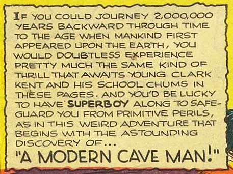
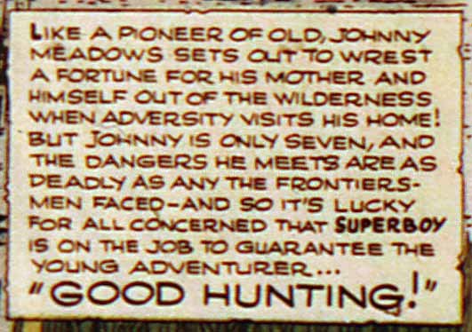
MORE FUN grew out of the first comic published by Major Malcolm Wheeler-Nicholson, NEW COMICS, begun in 1935. The title changed to MORE FUN with issue 7, then MORE FUN COMICS with issue 9 dated March-April 1936. When the Major’s comics were taken over by Harry Donenfeld and Jack Liebowitz, MORE FUN continued as the first title published by “Detective Comics, Inc.” now DC Comics. For many years it was an action-adventure anthology containing features of all types, with superheroes gradually filling the pages, including Doctor Occult, The Spectre, Doctor Fate, Congo Bill, Johnny Quick, Green Arrow and Aquaman. The title was edited by Mort Weisinger for a while, with Jack Schiff taking over with issue #83 in 1942. With issue #101 dated Jan.-Feb. 1945, a new feature, Superboy, was introduced, the stories of Superman as a boy. With issue #108 dated March 1946, all the superhero features moved to ADVENTURE COMICS, and the remaining issues of MORE FUN were mainly filled with humorous stories. Issue #121 dated April 1947 saw the introduction of a fantasy strip, “Jimminy and the Magic Book,” which was the lead feature until the series was cancelled with issue #127 dated Nov.-Dec. 1947.
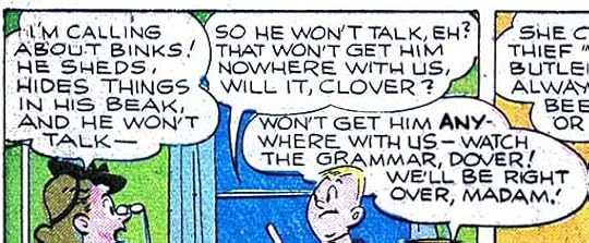
As with other 1940s National (DC) comics I’ve looked through, Ira Schnapp’s involvement begins with issues dated in early 1945, which means his work for it was begun probably in the fall of 1944. Starting with cover lettering, issue 105 dated Sept.-Oct. 1945, above, is clearly lettered by Ira, the script style of “Featuring” is unmistakable. Some of the other lettering is his early display style seen on other covers he did in this period. Let’s see if we can follow his style back through a few earlier covers. Issue 104 dated July-Aug. 1945 features Dover and Clover with Superboy. Dover and Clover, with art by Henry Boltinoff was a feature that Ira Schnapp usually lettered, and the word balloons here seem like his work, though the larger bold words are not yet in the style he settled on later. While this “Featuring” is different from the one on #105, I think it also looks like Ira’s lettering.
 Issue #103 dated May-June 1945 also features Dover and Clover. The balloons aare similar to the ones on #104, but with some differences too.
 A closer look. The balloon shapes and general size and proportions of the letters are right for Schnapp, or at least early Schnapp. While some letters are not typical of his work, considering that his style was not yet set at this point, I think it’s safe to call this Ira Schnapp cover lettering, and by far the earliest I’ve yet found.
 By comparison, the Dover and Clover balloons on issue #102 dated March-April 1945 are in a completely different style, I think that of artist Henry Boltinoff himself. I see no earlier Schnapp cover lettering on this title, but I do find it on all the MORE FUN covers after the ones shown here.
 There are a few with a very uncharacteristic treatment of the emphasized words, like this on issue #114, but I see enough Schnapp elements here to convince me this is just Ira trying something different.
 Issue #121 featured the beginning of a new fantasy series with art by Howard Post very much in the style of Walt Kelly on Dell comics like FAIRY TALE PARADE. Here the lettering on the book is probably by Post, while the lettering at upper right is by Schnapp. To sum up, I find Ira Schnapp lettering on all the covers of issues 104 to 127.
 Moving to interior stories, this Superboy story from #103 looks like early Schnapp lettering to me.
 A closer look shows letters that are mostly like Schnapp’s later work, but not as consistent or even, and with a few style differences like the B in the bold SUPERBOY where the center loop does not connect to the left stroke, but it does in most of the other examples of that letter.
 In issue #102 dated March-April 1945, the Superboy story is a little less like what I look for in Ira Schnapp lettering, but similar enough to the story in #103 to convince me it’s also by him.
 In this later page from that story, everything looks enough like Ira Schnapp work as well. It’s the earliest story lettering by him I see on this title.
 By comparison, the very first Superboy story from MORE FUN #101 dated Jan.-Feb. 1945 I’m less sure about.
 There are similarities to early Schnapp, but also some major differences, like the unconnected R’s. This could be Ira still finding his way with story lettering. I’m on the fence about this one, and will not claim it for Ira in my list at the end of this article.
 The scans I have of issue #104 are blurry, but the Superboy lettering again does not look as much like Schnapp to me, though it could be.
 Another panel from that story. Here it does look more like Schnapp to me, especially the way the first balloon goes over the panel borders, and the shape of the question mark. Okay, I’m giving this one to Ira too.
 The Dover and Clover story in #104 definitely looks like Schnapp lettering, and I also see it on the Johnny Quick story in this issue.
 The Superboy story in issue #105 is definitely by Schnapp, as are the Dover and Clover and Johnny Quick stories. From here forward it’s easier to tell which stories are Ira’s as his style settles into the one he used for a long time.
 By far the most interesting and unusual lettering in this title is on the feature “Jimminy and the Magic Book” beginning with issue #121. At first I thought it might have been lettered by the artist, Howard Post, and he may have done the logo, but looking closer…
 …I think this is Ira Schnapp trying out a fanciful style meant to suggest a fairy tale. The letters are mostly still his style with some extra curves and curls, and the balloon shapes are his. Perhaps artist Howard Post suggested this approach, and even pencilled it in that way for Ira to follow. Possibly he showed Ira some of Walt Kelly’s delightful lettering, the first few words of the caption are suggestive of that.
 A second Jimminy story in #121 is back to Ira’s usual style (perhaps the editor thought the other one too hard to read), except that the balloons are not his, and are instead likely drawn in by Howard Post. All the rest of the Jimminy stories use this style. I haven’t read these stories, but they certainly look charming. Editor Jack Schiff loved Jimminy, but apparently it did not sell well enough to keep MORE FUN alive.
To sum up, here are the stories I see Ira Schnapp lettering on.
MORE FUN #101 Jan.-Feb. 1945: first Superboy story 7 pages, possibly Ira, not sure.
MORE FUN #102 March-April 1945: Superboy 7 pages
MF #103 May-June ’45: Superboy 7 pages
MF #104 July-Aug. ’45: Superboy 7 pp, Johnny Quick 10 pp, Dover & Clover 4 pp
MF #105 Sept.-Oct. ’45: Superboy 7 pp, Johnny Quick 10 pp, Dover & Clover 4 pp
MF #106 Nov.-Dec. ’45: Green Arrow 10 pp, Superboy 7 pp, Dover & Clover 4 pp
MF #107 Jan.-Feb. 1946: Green Arrow 10 pp, Superboy 7 pp, Dover & Clover 4 pp
MF #108 – 110: Dover & Clover 4 pp
MF #111 May 1946: Dover & Clover 4 pp, Cunnel Custard 5 pp
MF #112 – 120: Dover & Clover 4 pp
MF #121 April 1947: Jimminy and the Magic Book 8 pp, Dover & Clover 4 pp, Jimminy (2nd story) 7 pp
(I do not have scans for issues 122 to 124, but the Jimminy and Dover & Clover stories there are probably lettered by Schnapp.)
MF #125 Aug. 1947: Jimminy 8 pp, Dover & Clover 4 pp, Jimminy (2nd) 7 pp
MF #126 Sept. 1947: Jimminy 8 pp, Dover & Clover 4 pp, Jimminy 7 pp
MF #127 Nov. 1947: Jimminy 8 pp, Jimminy (2nd) 7 pp, Jimminy (3rd) 6 pp, Dover & Clover 4 pp, Jimminy 7 pp, Jimminy 8 pp
Not a large amount of story lettering in this title for Ira Schnapp, but some interesting ones. Other articles about Ira’s life and lettering can be found on the COMICS CREATION page of my blog along with more posts you might enjoy.
September 20, 2016
And Then I Read: ASTRO CITY #37
 Image © Juke Box Productions.
Kurt Busiek’s unlikely short story host “The Broken Man” is back with two stories about the importance and impact of music in Astro City, one from the days before there was a city about a traveling minstrel, the other about a music-inspired hero from the poor, black part of town in the early 20th century. Both stories are well told and nicely illustrated, and the framing stuff about Broken Man is funny, sinister and wacky, with the cover by Alex Ross as exhibit A. I admire Kurt’s ability to get to the roots of power fantasies by the downtrodden and make them ring true, while putting them in such colorful and entertaining packages. I also admire the lettering of Comicraft’s John Roshell on this issue, always and here in particular. I know how time-consuming that lettering for Broken Man must be.
Recommended.
September 19, 2016
Ira Schnapp in WORLD’S FINEST COMICS Part 2
 This and all images © DC Comics.
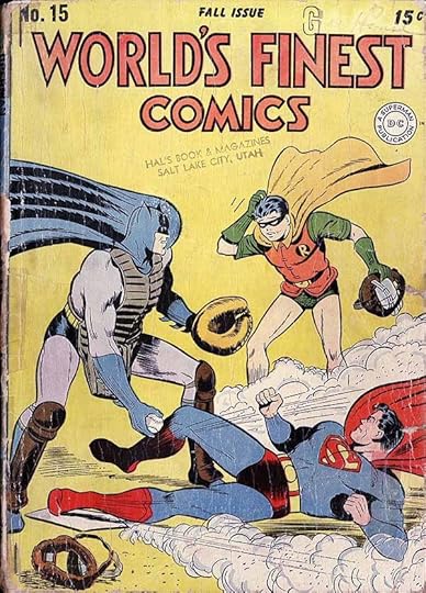
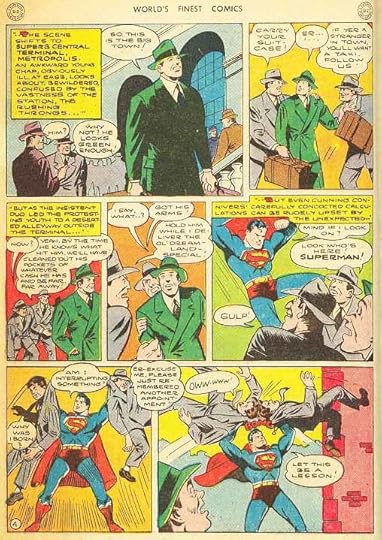
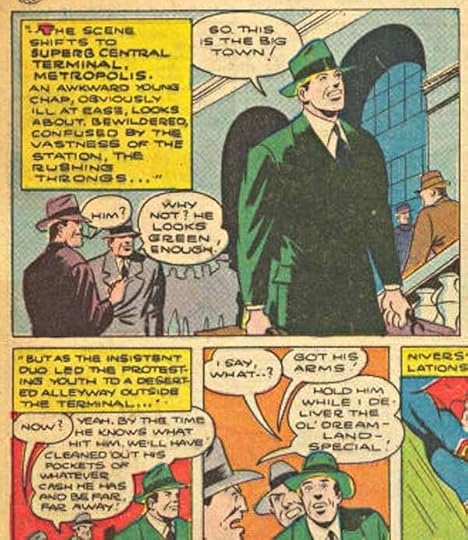
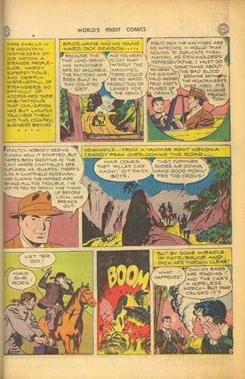
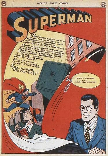
Determining which stories in WORLD’S FINEST were lettered by Ira Schnapp is the focus of this article, and on the early examples it’s not an easy task. For one thing, his style had not yet settled into the familiar one I see in many DC issues from 1946 on. For another, I don’t have great scans of some early issues. Let’s begin by looking at the story lettering for issue #15 dated Fall 1944, for which I do have good scans.
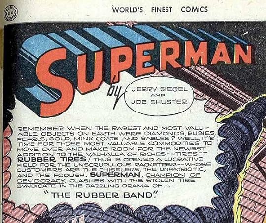 The first story in most issues features Superman, and here’s the lettering in the opening caption. Could it be by Ira Schnapp?
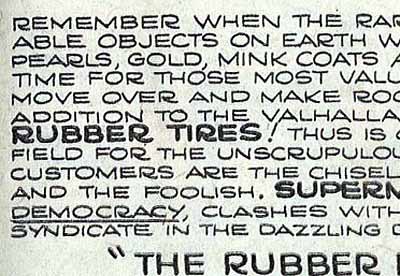 Here’s a closer look. It shares some letter shapes with Ira’s work, but in general it seems too wide. Further, the shape of the R with a very curved right leg and a loop that often doesn’t touch the left leg is quite different from what Ira usually did. So is the underlining on the word Democracy. There are other differences, too.
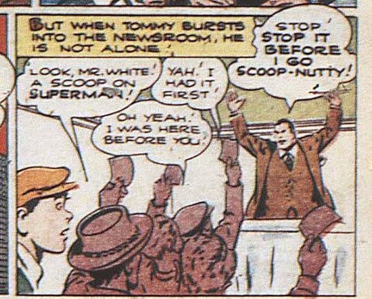
 Here’s a section of lettering from the second story page. Again, there are some elements shared by Ira Schnapp’s work like the scalloped balloon shapes that sometimes overlap the panel above, but other elements are not similar, like the question mark and open sound effect.
 Compare it to this Schnapp lettering from ALL FUNNY COMICS #6 dated Spring 1945. I have to say the Superman example above is NOT by Ira Schnapp. Too bad, as the same letterer handled many of the early Superman stories in WORLD’S FINEST. Possibly he was working at the Shuster studio in Cleveland.
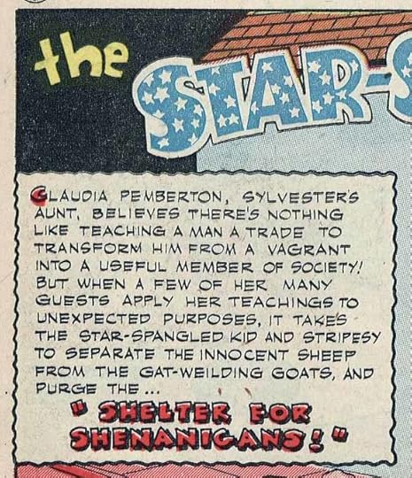 The second feature is The Star-Spangled Kid, and the lettering on it looks nothing like Ira’s work. First, it’s made with a different type of pen that gives much broader horizontal strokes than vertical ones. Second, that open title lettering is pretty awful and nothing Ira would ever do! And it’s generally too uneven.
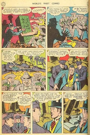
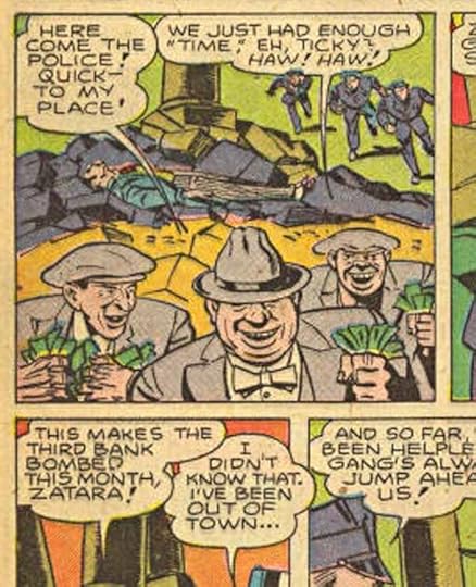
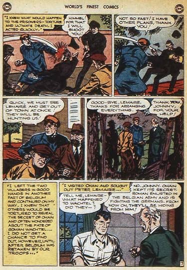
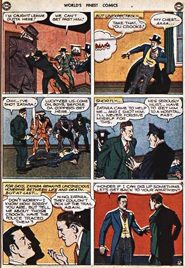
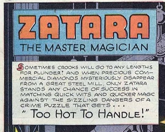 The third feature, Zatara, has lettering this is somewhat similar to Ira’s work, but most of the strokes are more curved, particularly on the N, M and W. Again, not Ira.
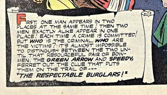 Next up is Green Arrow with more lettering that is definitely not like that of Ira Schnapp.
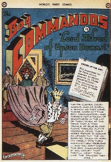
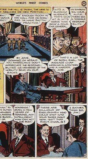
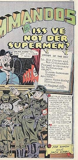 The fifth feature is The Boy Commandos by Joe Simon and Jack Kirby. The lettering on this story does not look like that of Ira Schnapp, and I think it’s by Simon and Kirby studio letterer Howard Ferguson.
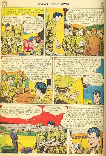
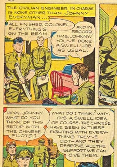
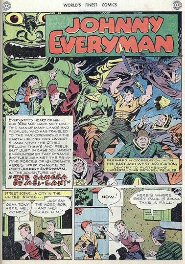 The sixth feature, John Everyman, is interesting because it’s written by editor Jack Schiff, so definitely produced out of the DC offices, and the feature is a precursor to the public-service one-pagers Schiff was later best known for. The lettering does not look like Schnapp’s work, though. It’s too uneven, it uses the thick and thin strokes, and the title is again not something he would do.
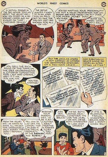
 The final feature in the issue stars Batman with Robin, and once more the lettering does not look at all like Ira Schnapp’s work. The art is by Jerry Robinson, who started working in Bob Kane’s studio but by this time was working directly for DC.
So, no Ira Schnapp lettering in WORLD’S FINEST #15, and I did not find any in issues 2 to 14 either. Let’s move forward from there.
 Here’s the Superman story from WORLD’S FINEST #16 dated Winter 1944. The scans I have of this issue are not as good, so a closer look is blurry, but…
 …compare this to the sample from issue 15:
 Looks pretty close. I think the story in issue 16 is by the same letterer as 15, not Schnapp.
 The Zatara story in issue !6: same letterer as issue 15? Maybe.
 A closer look shows some letters are more curved than what Schnapp usually did, and the exclamation marks are different, too. Pretty close in some ways, but probably not by Schnapp.
 The Boy Commandos story in issue 16 has lettering that’s completely different from issue 15, and I see a lot of Ira Schnapp in it. Yes, it’s wider than what he did later, and the R is different in that the loop is not joined, but many other elements suggest Ira to me, including the question mark, the balloon shapes and the sound effects.
 A closer look. Could be early Ira Schnapp lettering. The Grand Comics Database credits the art to Louis Cazenueve, probably working for the Simon/Kirby studio, so that makes lettering by Schnapp less likely, but still possible, since everyone was in New York.
 But here’s the John Everyman feature from issue 16, which was surely produced out of the DC offices. This lettering looks very much like Ira Schnapp’s work to me.
 Everything here seems right for Ira Schnapp, from the question mark to the R to the balloon shapes. It’s still not as regular or quite as square as his later work, but I think this is definitely lettered by Ira.
 The Batman and Robin story from #16 again has lettering very different from the same feature in #15.
 I see a lot of Ira Schnapp elements here, too. The art is again credited to Jerry Robinson, but since he was working directly for DC, Ira could easily have lettered it. I think it is by Schnapp.
 Moving on to issue #17 dated Spring 1945, I see a lot of Schnapp style in this Boy Commandos story, which has a similar style to issue 16.
 All the letters here, including the R, are very much like those Ira Schnapp used later. I think this is definitely lettered by him, and I now vote for his work on the Boy Commandos story in 16 too.
 On to issue #18 dated Summer 1945, is this Superman story lettered by Ira? It does not look like the work of the earlier Superman letterer, and the THE in the title is very Schnapp-like.
 A closer look at one panel from the story has me less sure. This is still looking too wide and the very long curved tails on the R seem wrong for Ira. Probably not him.
 On the other hand, the Boy Commandos story in #18 looks a lot like Ira Schnapp work, particularly the story title.
 Here’s part of another page of that story, and everything I see here looks like the work of Schnapp.
 As does the lettering on John Everyman. Definitely by Ira.
 The Superman lead story in WORLD’S FINEST #19 dated Autumn 1945 has an opening caption with a fanciful cloud border and script title that look very much like the work of Ira Schnapp to me.
 A detail from later in the story confirms for me that this is lettered by Schnapp. Everything is right, including the straight right legs of the R and very square letters.
 The Green Arrow story in #19 is also lettered by Ira Schnapp…
 …as is the Zatara story. Ira’s work is becoming more regular and even, probably from the increase in his workload around this time, and settling into the style he continued with for many years.
 The Batman and Robin story in #19 is also lettered by Schnapp, and look at the huge amount of work on this page, including newspaper headlines and a script letter! Man, that must have taken a while. Ira’s ability to handle just about anything must have been attractive to editor Jack Schiff, and he continued to give Schnapp lots of stories to letter.
 Rather than make this article much longer, I’m just going to list all the stories I believe are lettered by Ira Schnapp, many with very familiar and recognizable titles like the one above from the Superman story in issue #26 dated Jan.-Feb. 1947. For the record, here we go:
WORLD’S FINEST #16 Winter 1944: Boy Commandos 11 pages, Everyman 8 pages, Batman 12 pages.
(NOTE: this issue would have gone on sale around October or early November and the work would have been done a month or two earlier, bringing us back to late summer of 1944, now the earliest Schnapp story lettering work I’ve found.)
WF #17 Spring ’45: Boy Commandos 11 pages
WF #18 Summer ’45: Boy Commandos 10 pp, Everyman 8 pp
WF #19 Autumn ’45: Superman 12 pp, Green Arrow 10 pp, Zatara 8 pp, Batman 12 pp
WF #20 Winter ’45: Green Arrow 10 pp, Batman 12 pp
WF #21 March-April 1946: Boy Commandos 12 pp, Everyman 8 pp, Batman 12 pp
WF #22 May-June ’46: Superman 12 pp, Green Arrow 10 pp, Boy Commandos 12 pp, Everyman 8 pp, Batman 12 pp
WF #23 July-Aug. ’46: Superman 12 pp, Green Arrow 10 pp, Boy Comm. 12 pp, Everyman 8 pp, Batman 12 pp
WF #24 Sept.-Oct. ’46: Superman 13 pp, Zatara 8 pp, Everyman 8 pp, Green Arrow 10 pp (balloons by the artist), Batman 13 pp
WF #25 Nov.-Dec. ’46: Superman 12 pp, Boy Comm. 12 pp, Everyman 8 pp, Batman 12 pp
WF #26 Jan.-Feb. 1947: Superman 12 pp, Zatara 8 pp, Everyman 8 pp, Batman 12 pp
WF #27 March-April ’47: Superman 12 pp, Zatara 8 pp, Boy Comm. 12 pp, Batman 13 pp
WF #28 May-June ’47: Superman 12 pp, Boy Comm. 11 pp, Zatara 7 pp, Everyman 8 pp, Batman 13 pp
WF #29 July-Aug. ’47: Superman 12 pp, Green Arrow 10 pp, Boy Comm. 12 pp, Zatara 7 pp, Batman 13 pp
WF #30 Sept.-Oct. ’47: Superman 13 pp, Green Arrow 10 pp, Zatara 7 pp, Boy Comm. 13 pp, Everyman 8 pp, Batman 13 pp
WF #31 Nov.-Dec. ’47: Zatara 7 pp, Green Arrow 10 pp, Boy Comm. 13 pp, Batman 13 pp
WF #32 Jan.-Feb. 1948: Batman 12 pp, Green Arrow 10 pp, Zatara 7 pp, Superman 13 pp
WF #33 March-April ’48: Green Arrow 10 pp, Zatara 7 pp, Boy Comm. 12 pp, Batman 12 pp
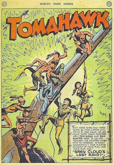 WF #34 May-June ’48: Superman 12 pp, Tomahawk 8 pp, Boy Comm. 12 pp, Green Arrow 10 pp, Zatara 7 pp
WF #35 July-Aug. ’48: Superman 10 pp, Tomahawk 8 pp, Boy Comm. 12 pp, Green Arrow 10 pp, Zatara 7 pp
WF #36 Sept.-Oct. ’48: Doc & Fatty 8 pp (humor, possibly inventory from ALL FUNNY COMICS), Boy Comm. 12 pp, Green Arrow 10 pp, Zatara 7 pp, Batman 12 pp
WF #37 Nov.-Dec. ’48: Superman 12 pp, All About People 8 pp (public service story), Boy Comm. 12 pp, Green Arrow 8 pp, Zatara 7 pp, Batman 12 pp
WF #38 Jan.-Feb. 1949: Green Arrow 10 pp, Doc & Fatty 8 pp, Zatara 6 pp
WF #39 March-April ’49: Make Way For Youth 8 pp (public service), Zatara 6 pp, Batman 12 pp
WF #40 May-June ’49: Superman 12 pp, Green Arrow 10 pp, Doc & Fatty 8 pp, Batman 12 pp
WF #41 July-Aug. ’49: Superman 12 pp, Green Arrow 10 pp, Doc & Fatty 8 pp, Zatara 6 pp, Batman 12 pp
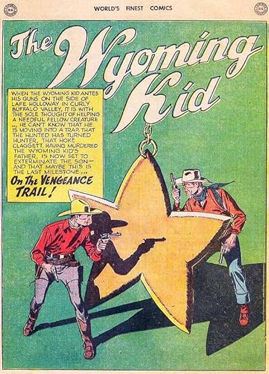 WF #42 Sept.-Oct. ’49: Superman 12 pp, Green Arrow 10 pp, Doc & Fatty 8 pp, The Wyoming Kid 9 pp, Batman 13 pp
WF #43 Dec. ’49 – Jan. ’50: Superman 12 pp, Wyoming Kid 10 pp, Full-steam Foley 10 pp (tugboat skipper), Green Arrow 8 pp, Batman 12 pp
WF #44 Feb.-March ’50: Superman 12 pp, Full-steam 10pp, Microbe Tamer 4 pp (science history), Batman 12 pp
WF #45 April-May ’50: Superman 12 pp, Green Arrow 10 pp, Renegade Train Boss 4 pp (historical), Zatara 6 pp, Full-steam 10 pp, Batman 12 pp
WF #46 June-July ’50: Superman 12 pp, Green Arrow 10 pp, Full-steam 10 pp, Batman 12 pp
WF #47 Aug.-Sept. ’50: Superman 12 pp, Full-steam 10 pp, Batman 12 pp
WF #48 Oct.-Nov. ’50: Superman 12 pp, Zatara 6 pp, Full-steam 10 pp
WF #49 Dec. ’50 – Jan. ’51: Green Arrow 10 pp, Batman 12 pp
WF #50 Feb.-March ’51: Batman 12 pp
WF #51 April-Many ’51: Batman 12 pp
WF #52 June-July ’51: Green Arrow 10 pp, Batman 12 pp
WF #53 Aug.-Sept. ’51: Wyoming Kid 8 pp
WF #54 Oct.-Nov. ’51: Superman 12 pp, Batman 12 pp
WF #55 Dec. ’51 – Jan. ’52: Batman 12 pp
WF #56 Jan.-Feb. ’52: Wyoming Kid 10 pp, Batman 12 pp
WF #57 March-April ’52: Batman 12 pp
WF #58 May-June ’52: Batman 12 pp
WF #59 July-Aug. ’52: Wyoming Kid 10 pp, Batman 12 pp
WF #60 Sept.-Oct. ’52: Batman 12 pp
WF #61 Nov.-Dec. ’52: Green Arrow 10 pp, Batman 12 pp
None in WF #62
WF #63 March-April ’53: Wyoming Kid 10 pp, Batman 12 pp
WF #64 May-June ’53: Wyoming Kid 10 pp
WF #65 July-Aug. ’53: Batman 12 pp
WF #66 Sept.-Oct. ’53: Batman 12 pp
WF #67 Nov.-Dec. ’53: Dover & Clover 4 pp (humor)
WF #68 Jan.-Feb. ’54: Green Arrow 10 pp, Two-gun Percy 5 pp (humor)
WF #69 March-April ’54: Two-gun Percy 5 pp
WF #70 May-June ’54: Jimminy 4 pp (fantasy, balloons by artist)
When the page count shrunk drastically with issue #71, Ira Schnapp’s story lettering mostly stopped. He lettered only a few stories after that, probably filling in for the regular letterers. Note that, while I checked all the lead stories, I didn’t check every backup story in those issues.
WF #95 July-Aug. 1958: Superman & Batman 12 pp
WF #116 March 1961: Superman & Batman 13 pp
WF #124 March 1962: Superman & Batman 13 pp
WF #129 Nov. 1962: Superman & Batman 13 pp, Green Arrow 7 pp
WF #130 Dec. 1962: Superman & Batman 13 pp, Aquaman 7 pp
Lead feature checks through 1965 did not turn up any later stories lettered by Ira in WORLD’S FINEST. Still, consider how much he did do. If my math is right, that’s 1,763 pages just on this title, and many of them with about twice the lettering of most of today’s comics. Hang on, folks, I’ve only scratched the surface of Ira Schnapp’s story lettering. In fact, I think he did far more in the humor and licensed titles than in the super-hero ones. Truly a prolific letterer!
Hope you’ve enjoyed this article, others you might like can be found on the COMICS CREATION page of my blog.
September 18, 2016
Ira Schnapp in WORLD’S FINEST COMICS Part 1
 This and all images © DC Comics.
WORLD’S FINEST COMICS began really as WORLD’S FAIR COMICS, two annual-sized issues released in 1939 and 1940 as promotional advertising at the New York World’s Fair of those years, though they may also have had newsstand distribution. There, for the first time, two of National (DC) Comics’ most popular characters, Superman and Batman (with Robin) appeared together for the first time, though only on the covers. Interior stories featured each separately, along with many other stories and characters. The idea was continued in 1941 with a similar comic, WORLD’S BEST COMICS, retitled WORLD’S FINEST COMICS beginning with issue #2. WORLD’S FINEST was issued quarterly for a few years, then switched to bimonthly (6 issues per year) for many years.
Until issue 71 (July-Aug. 1954) each issue had Superman, Batman and Robin together on the cover, but inside Superman had his own stories initially produced by Joe Shuster’s studio in Cleveland, and Batman and Robin had THEIR own stories initially produced by Bob Kane’s studio in New York. Other features came and went between these bookends at the front and the back of each issue. With issue 71, the page count was cut from 68 to 36 pages. In order to keep Superman, Batman and Robin prominent they then began appearing in the same lead story together, and did so for many years.
WORLD’S FINEST was edited initially by Whitney Ellsworth, then by Jack Schiff beginning with issue #8 dated Winter 1942-43. Schiff remained the editor until issue #140 dated March 1964. As the series went on, the Shuster and Kane studios had less to do with the stories featuring their characters. The same was true for the “Boy Commandos” feature by Jack Kirby and Joe Simon originally. World War Two was taking creators into military service for one thing, and keeping up with the amount of material needed to fill several titles for Superman (his own title and ACTION) and Batman (his own title and DETECTIVE) meant that Jack Schiff at the DC offices gradually took the lead in creating story ideas, and hiring writers and artists to produce them. On the stories he handled, Schiff also needed to hire letterers, and that’s where Ira Schnapp comes into the picture.
Ira Schnapp’s first work for National (DC) comics was the revamped Superman logo he created based on the earlier versions by Joe Shuster. It first appeared on SUPERMAN #6 dated Sept.-Oct. 1940. Ira continued to work for the company after that, but exactly what he did and when has not yet been defined. That’s what my research aims to find out.
 Let’s begin with Ira Schnapp lettering on covers. Until issue 71, most were “poster” covers featuring the three leads doing something together, but not related to any interior story. They were usually involved in some kind of sport or activity, or sometimes it was a gag cover played for humor. There were no word balloons, and cover lettering was rare except for occasional typeset lists of characters appearing inside. Issue #21 dated March-April 1946, above, has the first example of Ira Schnapp cover lettering, I believe. Ira’s style had not yet settled into the one that became so familiar later, but the word “Featuring” is very much in his script style. The rest resembles some of the lettering on his earliest House Ads (in-house advertising). Similar small amounts of Schnapp lettering are on the covers of issues 23, 28 and 40.
 Issue #42 dated Sept.-Oct. 1949 has the first more familiar Ira Schnapp cover lettering, including another handsome piece of script in “Introducing” and open display lettering for “The Wyoming Kid!”. I believe Ira was on staff at National (DC) by then, and soon would be lettering all their covers. But because so many of the WORLD’S FINEST covers were the poster type, lettering wasn’t always used on them. I see Schnapp lettering on issues 43 and 44 (the same lettering on both), 45, 49, 52, 62, 63, 69 and 70.
 On the cover of issue #71, we get more typical Ira Schnapp lettering not only telling us that the heroes were now appearing in the same stories together (finally), but what that issue’s story was about. The look of this cover lettering is familiar to anyone who has read DC comics from the 1950s and early to mid 1960s, nearly all by Ira Schnapp.
 Ira’s lettering is on issue #72, and Issue #73 features the first example in this series of Ira’s cover-style word balloons.
 While it resembles his interior story lettering, Ira’s cover lettering was drawn larger and produced with more care and precision, appropriate for a cover, the main on-site selling point for any comic.
 Thereafter, Ira’s lettering appeared on most of the WORLD’S FINEST covers until issue #171 dated Nov. 1967, above. I find it on issues 74 to 97 (issue 98 is by someone else), then issues 99 to 134 (135 again by someone else), then issues 136 to 161, 163 to 166, and 168 to 171.
 Thereafter most of the cover lettering is by Gaspar Saladino, except for this issue, #175, dated May 1968. That’s late for Ira Schnapp cover lettering, but this does look like his work, except for the balloon shapes, which may have been done by cover artist Neal Adams.
 There are three other areas I want to discuss before looking at Ira’s story lettering. First, there were a series of single page public service features written by Jack Schiff and often lettered by Ira Schnapp that appeared across the entire line of titles. The earliest one I can find in WORLD’S FINEST is this one from issue #42 dated Sept.-Oct. 1949.
 Here’s the second one in this title from issue #44 and featuring Batman. I see more of these lettered by Ira in issues 47-51, but have not looked further. There were plenty more, though not all lettered by Schnapp. Issue 46 has one on the inside back cover that does not look like Schnapp lettering, for instance.
 Second, DC House Ads also appeared simultaneously in many of their titles. I’ve already written THIS article about the earliest ones I see in WORLD’S FINEST that are lettered by Ira Schnapp. This one is from issue #28 dated May-June 1947. There are many others from then until the mid 1960s.
 Third, let’s consider the series logo. The first one could be by Ira Schnapp, though I don’t think it is because of the uneven shapes of some letters, particularly the S in COMICS. Other letters are also inconsistent in weight with some parts thicker than others. I don’t think that’s something Ira Schnapp would have done.
 I’m sure he did letter this later version that began appearing on the cover with issue #75. Above is Ira’s original lettering for it from the DC files.
 Ira also lettered the splash page titles that began appearing on issue #71: “Your Two Favorite Heroes” “and” “in One Adventure Together!” And, of course, that’s Ira’s revamped Superman logo, though not his work on the Batman one. This was used for many years.
In the second and concluding part of this article I’ll investigate Ira’s story lettering. Other Ira Schnapp articles you might enjoy can be found on the COMICS CREATION page of my blog.
September 17, 2016
And Then I Read: THE WILLOUGHBYS by Lois Lowry

Lois Lowry has written about 30 books for younger readers and is probably best known for harrowing dramas like “The Giver” and “Number the Stars.” This book is very different, and often funny. It sends up old-fashioned family stories like “Little Women” and “Anne of Green Gables” in a meta-fictional way that intentionally tries to turn everything upside down.
There are four children who are petty and mean to each other, with parents that are equally awful. There’s a nanny who is nothing like Mary Poppins, though she turns out to be a good sort. There’s an abandoned baby who the children callously pass on to a grieving widower. His wife and child have been buried in an avalanche in the Alps, and are surely dead…or are they? Lowry makes no bones about the fact that her characters are awful and nothing like the classic ones she keeps mentioning. You’d think that would put off readers, but I actually found it appealing. To me, it showed she really loved all those stories, and the fact that many of them are described and recommended in the back of the book suggests I’m right.
While the awful things that are said and done are funny, as the book progresses, nearly everyone goes through personal growth, except for a few who are too awful to be reformed. (Things don’t end well for them.) The nanny turns out to be a good influence on the children. The grieving widower takes in the abandoned child, which turns his life around. He also befriends the four children when their parents try to ditch them. In the end, I quite liked many of the characters, and found the story quite amusing and appealing. This is a short book, and I was kind of sorry when it ended.
Recommended.
September 16, 2016
A Cape May Morning
 This morning I was able to spend some time in Cape May, one of my favorite natural places. I began with an early morning walk at the Highbee Beach Wildlife Management Area. I was looking for birds, but not expecting many migrating ones, as the winds had been from the east for a few days, not conducive to migration here. Still, it was a beautiful morning for a walk.
 I went north from the main parking lot along this sand road.
 There are some huge willow oaks there I enjoyed seeing, though only a few birds turned up.
 Where that road emerges from the trees, there’s a small observation platform, but instead of going there, I climbed up on the dike on the other side of the road for this excellent view of the platform and Delaware Bay.
 Then I head back to the parking lot and walked south on the trail that goes through several open fields. There I joined a Cape May Bird Observatory tour being led by Roger and Kathy Horn, among others. They were finding some good birds, including a fall plumage Scarlet Tanager (mostly yellow) and a few warblers.
 Thanks to a tip from another birder, we were able to spot two Common Nighthawks sleeping on branches in full view from the trail. They may be common, but they’re hard to see, especially in the daytime, where they blend in very well with the branches they sleep on. As the name suggests, they are active at night, catching insects on the wing.
 Here’s the other bird, and the best picture I was able to get. You can see just the tip of its very large bill (the rest is hidden in feathers) and closed eye. I’ve seen a few of these at Higbee over the years, but it’s always a rare treat to find them.
 Later I went to the Cape May Bird Observatory in Cape May Point to do some volunteer time. The Monarch Butterfly migration is on, too, and the Monarch Monitoring Project, as one of their tasks, looks for Monarch caterpillars in the area, feeding on Milkweed. They bring them back to live in the terrariums at the Bird Observatory, with all the Milkweed they can eat (it’s a lot!) until they turn into chrysalises, beautiful green gemlike objects that hang from what look like black threads. The Monarch interns have taped all the chrysalises to these tree branches to make an amazing chrysalis tree. When each one hatches, it will be tagged and released.
 Here’s a closer look at a few chrysalises. Hard to believe they were once caterpillars, and will turn into butterflies, but you can sometimes see it happen here.
A great morning in Cape May.
September 15, 2016
More and Earlier Ira Schnapp House Ads
 All images © DC Comics.
Ira Schnapp is known to have produced beautiful and enticing in-house advertising for DC Comics for many years. These were ads for DC titles that ran across the entire line, and Ira’s work on them in the 1950s to mid 1960s is celebrated and memorable. In my PREVIOUS article on this subject, I had found some Schnapp ads from the late 1940s, the earliest one for SUPERBOY #2, running in July 1949 issues. Today, while researching Ira Schnapp story lettering in WORLD’S FINEST COMICS for an upcoming article, I found quite a few more running back to this one. It appeared in WORLD’S FINEST #28 cover-dated May-June 1947, more than two years earlier than that Superboy ad. There’s no question it’s by Ira, the open lettering at the top in particular is very recognizable from his later covers and house ads. The rest of the lettering shows some elements he rarely did later, such as a W made from two crossed V’s, and other strokes that extend past strokes, as in FAVORITE ACTION TEAM, but it all looks like Schnapp work to me, including that TOMAHAWK logo.
 WORLD’S FINEST #29 dated July-Aug. 1947 had this 2/3-page ad with more very familiar Ira Schnapp open lettering, and showing his ability to draw attention with it. I also like the script lettering lower down.
 This ad in WORLD’S FINEST #30 dated Sept.-Oct. 1947 is one I’m less sure of. There are some elements that are not at all typical of Ira, particularly the lettering at the bottom. On the other hand, the top banner and the balloon lettering do look like Schnapp work, so perhaps this was a collaborative effort with another letterer, or more likely it’s just Ira trying styles that he later abandoned. The lettering on the cover of REAL FACT COMICS #10 might also be by Ira, I have to look into that another time.
 WORLD’S FINEST #31 dated Nov.-Dec. 1947 has this ad by Ira, and I believe the logo is also by him. Again, some of the styles here are familiar Schnapp ones, others are not, so I’m thinking Ira was still finding his way with house ads. Incidentally, Ira lettered most of the stories in A DATE WITH JUDY from the first issue through issue 20, and most of the lead stories through the rest of the run of 79 issues. (I’ve only looked at lead stories beyond issue 20.) It seems no matter what DC title I’ve looked at from the mid 1940s on, there’s Schnapp work in it.
 A second ad by Ira also ran in WF #31, and this one exhibits his flare for adding drama, excitement and action to his work…literally! Again, some of the display lettering is not typical of Schnapp’s later work, but much of it is.
 WORLD’S FINEST #32 dated Jan.-Feb. 1948 has this Schnapp ad that is specifically for A DATE WITH JUDY #3, and includes boasts about how well the first two issues sold. Most of the company ads up to this time were template ads that could be reused by updating the cover or covers used, but here we see an ad that would only work for a month or two. Clearly DC was making good use of Ira’s talents, and recognizing his selling ability.
 WORLD’S FINEST #33 dated March-April 1948 had this Schnapp ad with more explosive impact. Note that on his ads, Ira was designing the entire page, much as he would have done for a movie show card, something he’d produced a lot of in the 1930s. This was a departure for DC house ads, as most previous ones were not generally well designed, more a collection of random elements.
 Also in WF #33 was this 2/3-page ad for the fourth issue of A DATE WITH JUDY, another specific ad that would only work for a month or two.
 Ira was on a roll with ads for A DATE WITH JUDY, this one specific to issue 5 appeared in WORLD’S FINEST #34 dated May-June 1948. I can only imagine the book was selling well, and management felt Ira’s house ads were helping. Notice how graphic elements really enhance this ad, from the vertical bars in back to the curved shape at lower left. The open lettering at lower right is particularly graceful and appealing.
 The next few issues of WORLD’S FINEST have house ads by another person, but #38 dated Jan.-Feb. 1949 has this one by Ira. Notice how the open lettering suggests music notes in places, an idea enhanced by the five lines suggesting music notation swirling through the background.
 Finally we come to this specific ad for the first issue of SUPERBOY that ran in WORLD’S FINEST #39 dated March-April 1949. Like the ad for SUPERBOY #2 that begins the previous article on this topic, it’s a graphic delight with great used of negative space and huge exclamation points to add excitement. A winner on all counts!
So, this extend’s Ira’s house ad work back to at least early 1947, and begs the question: did he actually start working on staff then rather than two years later, as had been my previous guess? Sure, this may all have been freelance work, but I have to wonder. There are no records of when Ira started working in the office, but I’ve always tied it to the major increase in his house ad and cover lettering work. Further research is needed, but it’s now looking like that started a few years earlier than I previously realized.
More Ira Schnapp articles to come! Others you might enjoy can be found on the COMICS CREATION page of my blog.
Todd Klein's Blog

- Todd Klein's profile
- 28 followers

