
Todd Klein's Blog, page 171
April 24, 2017
And Then I Read: CAVE CARSON #5
 Image © DC Comics.
Cave and his crew are in the underground kingdom of the Muldroog, the people from which Cave’s wife came many years ago. Cave’s daughter, Chloe, is here too, and both of them are learning new things about the history of the Muldroog, the ancient evil force known as The Whisperer that they imprisoned and guard, and why that force is about to become a threat again. Cave and Chloe are rejoined by their wife and mother, who had returned long ago to her people. Also here are another crew of underground explorers from the EBX company, bent on freeing The Whisperer and destroying the Muldroog, as well as capturing Cave and his team. When the two groups meet up, trouble happens.
I liked this issue better than the last one. The back story and characters have me interested again, even though I’m still not loving the art. It’s full of cool effects, but very abstract at times and sometimes hard to “read.” Perhaps it will grow on me. I don’t yet know why Wild Dog is in this book, but at least he fights well, so that may be it.
Recommended.


April 23, 2017
And Then I Read: THE BEE AND THE ACORN by Paula Susan Wallace
 Cover art by Emily Isabella.
This is a non-fiction book, an account of the conception, founding, and development of the Savannah College of Art and Design by the woman who conceived it, was one of the four founders, and is its President today. SCAD, as it’s long been known, is one of the largest and best colleges in the world for education and career-training in arts of all kinds, with over 100 degree programs and over 12,000 students. In addition to their home base in Savannah, Georgia, they have satellite schools in Atlanta, Hong Kong, Lacoste, France, and online. The reason I read it? Ellen’s nephew is a freshman there, and next week she and I will be visiting SCAD along with Ann and Dave, the parents of student Zack. We’re looking forward to the trip, and Ann gave us this book to read about the school and the people behind it.
Paula Wallace’s story is, indeed, inspiring and amazing. She was an elementary education teacher with a big dream: to start a school for the arts. One that would be different from every other art school and university program out there: it would focus on the students, not only developing their skills and talents, but teaching them how to sell themselves and find careers. There would be no giant lecture halls, no teaching aides drawn from the student body. Classes would be small, and each taught by full professors. It would be inclusive rather than exclusive, it would spread the classroom out to the larger world, and help the community as much as the students.
Paula shared that dream with her family, and her husband Richard as well as her parents, May and Paul Poetter, agreed to help. With little money except May and Paul’s retirement nest-egg, they bought a derelict Armory in downtown Savannah in the late 1970s, a time when that part of Savannah was itself derelict and dying. They were beset with many serious difficulties: a hurricane that struck the town a few weeks before they planned to open, skepticism and distrust from some locals, doubt and disbelief in their dream from the accrediting groups that needed to approve them, and lots more. Somehow they made it work, and this book is a testament to that effort through Paula’s memories and stories. Yes, it’s slanted toward their successes, but also explains the ideas and attitudes that made the school attractive to students and successful in the long run, even with many roadblocks.
It’s a great story, and if you have any interest in the topic, or perhaps know someone who might be thinking about an arts education, I highly recommend it.
April 22, 2017
The World Series of Birding 2017, please help!

My special message and request for Earth Day! Two weeks from today, Saturday May 6th, is the annual outdoor escapade and fundraiser known as The World Series of Birding. I’ve signed up with the Cape May Bird Observatory Century Run team as I have many times in the past. It’s the only fundraiser I participate in. Along with lots of other teams we will attempt to spot as many bird species as possible on that day. The top teams will go from midnight to midnight, and cover the entire state of New Jersey. Our Century Run team’s goals are a little more relaxed: we go from 5 AM to about 10 PM and stay within Cape May County. It’s still an exhausting marathon to test one’s determination and stamina, but usually a lot of fun, too. Each participant pledges a minimum of $1 per species seen, which one can supplement with pledges from friends and family. And that, gentle readers, is where you can participate!
As in the past, I’m encouraging you to make a pledge for my WSB big day, to help me raise funds for the Cape May Bird Observatory, part of New Jersey Audubon, and their valuable mission of conservation, education and research. Current and proposed trends in our government do not bode well for environmental issues and groups, or for the birds, animals, insects and plants we share the planet with, so causes and organizations like this are more important now than ever. You can pledge any amount, but the usual method is to pledge per species seen. Last year our total was 134 species, a little better than average. A more typical total is 130 species. If we tally 130 species, a pledge of 50 cents per would result in a monetary gift of $65. A pledge of $1 per species would mean a gift of $130. As a bonus, I’m offering any of my Signed Prints as incentives: for a pledge of 50 cents per species, the print of your choice, for $1 per species, any two! Higher pledges are welcome and will garner more prints in the same ratio. Pledges lower than 50 cents will get you a signed comics trade paperback that I lettered, my choice, if you would like that. Pledges of any amount down to 10 cents per species are welcome, or if you’d rather make a flat rate donation, that’s fine, too. All pledges will support education about and preservation of New Jersey wildlife and natural resources, as well as garner my enduring gratitude!
Here’s a LINK to my blog about last year’s WSB Century Run, if you’d care to read it. And if you’d like to pledge, click the CONTACT ME link here or in the right column of this page and let me know by email. I’ll be collecting pledges until May 5th. Or, if you’d prefer, an easy way to pledge is right on our TEAM PAGE, just let me know if you’ve done that. Our team will be out there tallying on the 6th, rain or shine, hoping for good weather and lots of migrating birds. Who knows, maybe this year we’ll hit the ever elusive goal of 150 species. That would be amazing!
April 21, 2017
Incoming: SUICIDE SQUAD Vol. 6
 Image © DC Comics.
Perhaps thanks to the successful movie and probable sequels, this reprint series keeps rolling along. Though I lettered most of them, I have to admit I don’t recall very much about it. I know there were characters I liked, and I enjoyed the writing by John Ostrander and Kim Yale. Looking at them now, the art seems pretty average for the time, and I don’t like the coloring very much, often too dark, but that may be caused by using the original colors on brighter, less absorbent paper. There isn’t much in my lettering that I would boast about. A few nice sound effects and titles, but most of it is pretty average too. I have to put the success of the series (and the reprints) squarely on the writing in this case. The on-sale date is May 15th.
April 20, 2017
THE DANNY CRESPI FILES Part 11

This and all images © Marvel.
Continuing my ongoing series about the cover lettering of Danny Crespi at Marvel Comics, mostly from 1974-1979. Photocopies of saved cover lettering from Danny’s files were compiled into a collection by letterer and friend Phil Felix during the 1980s when he worked with Danny on staff at Marvel, and Phil sent me copies. This time I’ll look at pages 41 (above) through 44. Everything on this page is by Crespi except “The Trial of Colossus,” which is by Gaspar Saladino. Sources follow.
 “The Thing from the Black Belfry” from KULL THE DESTROYER #14, June 1974. From the cut marks visible between each line of this cover blurb, it was probably lettered in a rectangle, and then reworked to fit on a circle, which better fills the available space.
 “Enter Salem’s Seven” from FANTASTIC FOUR #186, Sept. 1977. I like the bounce on these letters.
 “Guest-starring the Uncanny X-Men” from POWER MAN $57, June 1979. Cut lines around X-MEN suggest it was a second try. Perhaps it was solid letters first, and then made into an outline version to pop the word in color.
 “Scarlet Scarab” from THE INVADERS #23, Dec. 1977. The character letters are curvy and graceful on this one, and the reverse color treatment of the rest makes it more “villainous.” Very effective.
 “The Trial of Colossus” from X-MEN #122, June 1979, by Gaspar Saladino. Note the color error under the SUS in COLOSSUS, which should be red. The perspective on that word is faked, it has no vanishing point, which is something Gaspar often did, and I bet no one noticed.
 “First Issue” from GIANT-SIZE INVADERS #1, June 1975. The yellow letters on green don’t stand out or read well, but the key words are FIRST ISSUE, which read fine.

“Face of Fear” from CRYPT OF SHADOWS #18, July 1975. I like this, especially the word OF. Nice scroll caption, too. I haven’t found a source for the last word on the page, NIGHTMARE.
 The Crespi Files page 42. “Tomb of Blood” and “Doctor Doom” are by Gaspar Saladino, “Space Gods” is probably by Jim Novak. The rest are by Danny Crespi. Sources follow except for “The Raging Fire Demons,” which I can’t find. That might not have been used.
“Tomb of Blood” from CAPTAIN AMERICA 253, Jan. 1981 by Saladino. No one could top Gaspar for creepy lettering, and BLOOD here is a good example. A personal aside: in the artist credit box, I think the lettering of the inker’s name RUBINSTEIN is by me. I was at a convention somewhere also attended by Joe Rubinstein, and he asked me to letter it in for him. Not positive this is that one, but it sure looks like it. My first Marvel cover lettering.
 “Memory’s End” from BATTLESTAR GALACTICA #12, Feb. 1980.
 “Shoot on Sight” from WESTERN GUNFIGHTERS #30, July 1975. Texture in the word SHOOT makes it more effective, to my eye. Nice ragged-edged caption.
 “Doctor Doom” from IRON MAN #150, Sept. 1981 by Saladino. You can imagine that this favorite Marvel villain had his name on many covers. I find this version very appealing. Note that Gaspar made the I in IRON a crossbar version, something I would never do, and generally dislike, but it works okay here.
 “Prisoners of the Space Gods” from Fantastic Four #224, Nov. 1980 probably by Jim Novak. Jim was the best Gaspar imitator, and this could be by Saladino, but there are a few clues it’s not: the shapes of each S in PRISONERS, and the mix of round and square corners in SPACE GODS. Gaspar usually stuck to one or the other.
 “Evil is the Orb” from GHOST RIDER #28, Feb. 1978. When is texture inside open letters too much? It’s a tough call, and color makes a difference. This one is a little hard to read, perhaps should have been less textured.
 “The Beetle and the Badge” from SPECTACULAR SPIDER-MAN #16, March 1978. Thanks to Ray Bottorf Jr. for finding it. I love the color, tying to the character’s hands.
 The Crespi Files page 43. The top two and “Checkmate” are by Gaspar Saladino, “Satan had a Son” is by Irv Watanabe, and the rest are by Danny Crespi. I can’t find “Bloodbath.” Sources for the rest follow.
 “Red Ronan” from AVENGERS #198, Aug. 1980 by Saladino. This reads fine, but the dark purple hides the drop shadow on RAMPAGE, making it look uneven. Note how Gaspar adds interest by extending the right legs on each R in RED RONAN.
 “Death Race” from MARVEL TWO-IN-ONE #80, Oct. 1981 by Saladino. Great texture and roughness add interest, and the dull orange color allows the moon to work as the light source.
 “Satan had a Son” from CONAN THE BARBARIAN #113, Aug. 1980. I first thought this was by Crespi, but the shapes of each S made me unsure. The Grand Comics Database credits it to Irv Watanabe, so I’m going to assume that’s right.
 “Disaster Area” from ETERNALS #15, Sept. 1977. The letters above DISASTER AREA are very narrow for Crespi, but everything else looks like his work, so either he had to do that to make it fit, or it’s patched in by someone else.
 “Startling Suspense” from MARVEL CLASSICS COMICS #25, 1977. Early issues of this title had no cover blurbs promoting the story inside, but I suspect sales were not great, so lettering like this tying them to the rest of Marvel’s comics became the norm later in the run. Danny may have done the logo as well.
 “Transylvania” from GIANT-SIZE WEREWOLF #3, Jan. 1975. Another case where a combination of texture in the letters and a relatively dark color makes TRANSYLVANIA hard to read. Note the word NEW was done separately, but can be partially seen in pencil form on the original lettering.
 “Checkmate” from INCREDIBLE HULK ANNUAL #9, 1980. Beautifully lettered by Gaspar, and the dropped box caption is very effective. Thanks to Ray Bottorf Jr. for finding this one.
 The Crespi Files page 44. Only two of these are by Danny Crespi: “Thing in the Dungeon” and “Shanna teams with Spidey.” The rest are by Gaspar Saladino except “World of Dinosaurs” (someone trying to imitate Gaspar and doing it badly, don’t know who) and “Assassins in the Night” which is probably by Jim Novak. Sources follow.
 “Terrible Toymaster” by Saladino from MICRONAUTS ANNUAL #2, 1980. One clue that Crespi didn’t letter this is the cover date. Danny rarely lettered covers after 1979. The style is pure Gaspar, too.
 “Thing in the Dungeon” by Crespi from KULL THE DESTROYER #25, Feb. 1978. Nicely done, but there are rather large spaces on either side of the second line.
 “Cults and Robbers” by Saladino from SPIDER-WOMAN #14, May 1979. This was a tight fit, and CULTS has been moved away from the rest to make room for the dagger. Still reads well.
 “World of Dinosaurs” by an unknown letterer from MARVEL TWO-IN-ONE #73, March 1981. The letters of DINOSAURS aren’t bad, but the rest is a mess of oddly-matched letters and poor spacing. No doubt done by someone on staff in Production.
 “Green Goblin Returns” by Saladino from SPIDEY SUPER-STORIES #48, Sept. 1980. Gaspar’s thin outlines work very well against the black caption background. Beautifully done.
 “Shanna teams with Spidey” by Crespi from SPIDEY SUPER-STORIES #14, Dec. 1975. I like this one, very classy and strong. As a letterer, you love when the words even out in length like this.
 “Assassins in the Night” from MASTER OF KUNG-FU #102, July 1981. Probably by Jim Novak. It doesn’t look like Gaspar’s work, but is similar in some ways.
“Together Again” by Saladino from CAPTAIN AMERICA #261, Sept. 1981. The color is really too dark for open letters, but it’s readable. Gaspar made it work.
That’s all this time, more when I have a chance to research them. Other parts of this series are listed on the COMICS CREATION page of my blog, where you can find more articles you might enjoy.
April 19, 2017
And Then I Read: ASTRO CITY 42
 Image © Juke Box Productions.
Black Manta was an aquatic super-villain with lots of high-tech gear he invented, a gang of minions, and the intelligence to run a string of successful high-seas robberies. Then, during an encounter with the aquatic heroine Mermaid, he crash-landed on a deserted island far from shipping lanes, where he struggled to survive, gradually building a home for himself, and using the scant tools and materials at hand to rebuild his equipment. That was years ago. He’s the Robinson Crusoe of the series, living alone on his island, plotting and planning for his triumphant return, if he can just get his equipment working right. When a distress call from a cruise liner comes through his radio, it looks like time for action…but Manta has been out of the game, and out of the world for so long. Will he be able to do what he’s been dreaming of?
A great story by Kurt Busiek with excellent art by Matthew Clark and Sean Parsons, all under a fine cover by Alex Ross.
Recommended.
April 17, 2017
Traditional Easter Eggs 2017
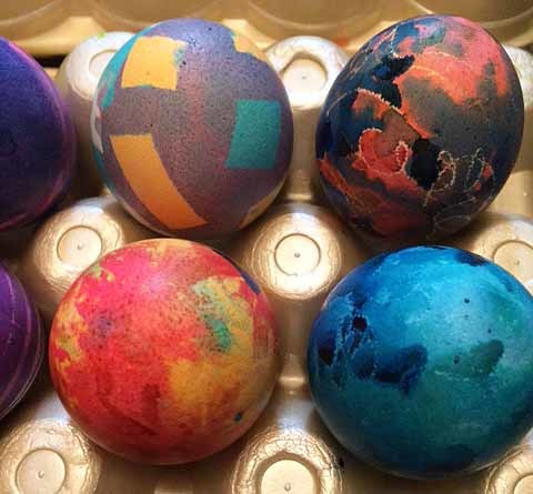
 We were kind of mentally exhausted from the psanky egg decorating on Saturday, but we wanted to do the traditional hard-boiled eggs too, so we’d have some to eat. Also, the egg decorating has become a tradition and a fun competition in our family group of Ann, Dave, Ellen, Tim, Ina and myself (Zach is away at college this year). We took a dinner break and then colored the hard-boiled eggs in the evening. I didn’t get any pictures of the process this time, but past years have plenty of that, I’ll add some links at the end of this article. Each of us dyed about a half dozen eggs, and then we judged them as a group this time rather than appointing one person to judge. It worked out fine, we arrived at a consensus. Fortunately Ann had saved the winner categories from past years, and we used those. Above is the entire winner group.
 Ann and Ina made almost identical eggs that we deemed Most Beautiful, so they shared the award. The deep greens came from brushed on food coloring over traditional egg dye. This adds strong color, but it’s not attached well, so tends to come off on your fingers when you handle the eggs. Dave did the Most Unusual winner, which is meant to be a chicken, which he calls “the ugliest chicken you ever saw.”
 The Judge’s Choice award went to a blue egg of mine which includes strips made with masking tape and squiggles made with blue food coloring. Tim’s Funniest winner was meant to be someone on TV, he told us. There was a lot of talk about TV news while we were coloring.
 An egg of mine won Most Creative. I used new technique that I thought of on the spot, sandpaper to give a mottled look. Ellen won Most Colorful with her egg using masking tape to create the pattern.
 Tim’s giant polka-dot egg won Most Traditional, using circles cut from masking tape. My egg using strips of masking tape won the Technical Achievement award. We had a new kind of masking tape that Tim brought this year which worked much better than the Scotch tape we’d usually used in the past. Unfortunately I don’t have the brand name, but he called it “automotive masking tape.”
 More masking tape decorating from Ellen for Most Abstract and Tim for Most Eggzact.
 Finally we have Ann’s stars and stripes egg for Cutest and Tim’s egg won E for Effort, decorated with wax crayon and tape.
 As often happens, the non-winners are just as interesting and colorful as the winners, and winner choices are subjective, so here are the rest of the eggs we colored. I can’t identify them by creator, though.
 Closer views of non-winners. Again the very dark colors are from full-strength regular food coloring.
 More non-winners. Some of these are as dark as the psanky eggs, though of course without the black color option.
 More non-winners, using wax crayon and tape.
 Final group of non-winners, but they’re all winners really. Fun to do, and fun to eat! Here are some links to previous years that include more process and how-to information.
Finally, to get everything on one page, here’s what I wrote about this year’s psanky egg decorating:
More next year, hopefully.
April 16, 2017
Pysanky Easter Eggs Part 2
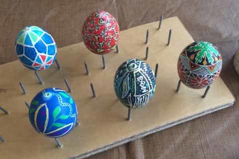
 Here’s our pysanky egg-decorating group at work at Ann and Dave Greene’s kitchen table. Left to right are Ann, my friend Tim, Dave, and my wife Ellen. I sat at the near end. It took each of us many hours to create one pysanky egg. Mine was the most ambitious and took the longest, over six hours. Here’s the entire process described.
 You begin by drawing a design on a raw white egg that hopefully hasn’t been scrubbed or treated with chemicals, handling the egg itself with your fingers as little as possible. I had found farm eggs at our supermarket that worked well for Ellen and I previously, so I bought and brought more. On my first egg I had made up my own geometric design, but wasn’t too happy with the result.
 This time I followed a design from the how-to book that came with our set by Luba Perchyshyn. Her Ukrainian Gift Shop website is the source of the starter kit and other tools we used. Luba is 93 this year, and lives in Minnesota. She’s been doing this a very long time, and her book and tools worked well for us. You can read about her HERE. Though I followed one of Luba’s designs, I ended up changing some details either by accident or intent, so the end result is about 90% from the original design. Ann had ordered some circle templates in a wide variety of sizes from Luba, and I tried using these for the horizontal circles. It helped some, but they are printed on thin cardboard. Plastic circle templates that I have at home would have worked better if I’d thought to bring them. Luba’s templates did help me divide the egg into six equal sections, though.
 Next I began going over the pencil lines with the medium-size writing tool or kistka, filling the reservoir with beeswax, holding the writing tip in the edge of a candle flame until it was hot and the wax flowed out of the small hole evenly. I did better with the wax flow and line control this time, and I can see where it’s something that would improve with practice. Always testing the flow on a tissue first helped prevent big blobs, and we used thin strips of black wax this time rather than cut-up chunks of untinted wax. The latter does get a color from the candle soot, but having the color already in the wax made it easier to always see where you’d put the lines down. A small quarter-inch length of the wax strip was perfect to fill the reservoir and fits right in, much easier. When it’s the right temperature, the wax flows rather like a fountain pen or a technical drawing pen, but you need to keep warming it in the candle flame and testing the flow as you go. There are several rounds of this. All the lines drawn on the white egg will, of course, be white lines on the final design. You need to think in reverse, sort of like scratchboard art.
 The first layer of wax drawing further along. I’ve finished all the main design lines with the medium kistka and am now using the smallest kistka for the crosshatching in the triangles. Those textured areas add a lot of detail and interest to the design. I did make a few mistakes by going too fast, and one large wax blob that I was able to mostly remove carefully with a pen-knife, but generally it went much better this time.
 After finishing the first and largest set of wax drawings on the white egg, it went into the yellow dye for five to ten minutes. Then the egg was taken out and dried with tissues. When it was all dry, the second round of wax drawing was done. Those lines would all be yellow at the end. Next the egg went into the light green dye, and more areas were waxed. This was mainly a matter of covering up areas that should remain green, so I used the largest kistka to do that more quickly. The leaf pattern at each end of the egg was the largest area that would be solid green.
 The next color was orange, which surprisingly removed nearly all of the green dye. One of those things you wouldn’t expect, so following the step-by-step was key. More lines drawn and areas covered, then it went into the scarlet dye, and the process continued. The photo shows all the wax now applied over the scarlet dye. The star and triangle shapes would have the red color preserved. One final color was added as a final dyeing step, black. This is the coolest one because it’s so very different from anything you can do with regular edible egg dyes. It wasn’t in Luba’s design, but I wanted to do it anyway. So, everything not wax covered in this photo would become black.
 The next step is to remove all the wax by holding the egg very close to, but not right over, the candle flame to melt the wax. then you wipe it off with a tissue. This takes a long time, but is the most fun part as you get to see the final design gradually revealed. If you get the egg right over the flame, soot will form on the surface, not a good thing, but it does wipe off, though not easily. When you’ve melted off all the wax you can, there’s still a thin layer that is removed with mineral spirits.
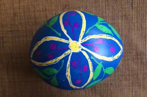
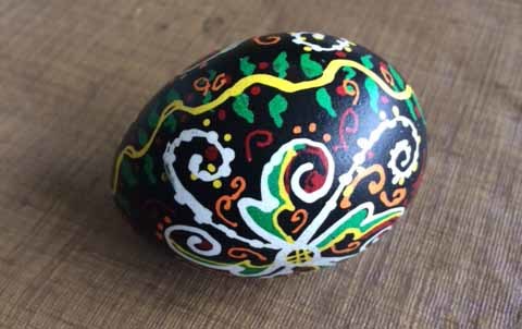
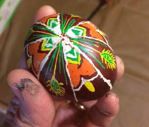
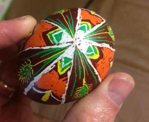
 Here’s my egg with all the wax removed, and I’m very pleased with the way it turned out. Sure, some lines are a little off-model, and there are a few mistakes on the other side, but in all it’s impressive.
 A view of the leaf and stem design at the top. Luba’s design had more detail in the stems, but only four leaves. Mine left less room between the leaves, so the stems were simpler. I added extra elements to the triangles, though.
 The star shapes are my favorite part, they worked out very well. I added the orange lines in them.
 The next step for a shell you want to keep is to make small holes in each end so you can remove the egg. I found the best way to do this was to gradually scratch and gouge out a tiny hole with a very sharp sewing needle, then enlarge it with a nail. Tim used a hammering method with the needle which worked okay, too, but made me too nervous to try. After all that work, you really don’t want to crack the shell.
 We had a tool from Luba that Ann bought, Aunt Marge’s Egg Blower that uses a rubber bulb to pump air into the egg and push the raw egg contents out the other end. The pin is to break up the yolk first. This worked fine. Tim also tried the older method of blowing out with air from his mouth, kissing the egg. That worked, too.
 The empty shells were put on this drying rack Tim made. They have to dry completely inside and out before you do the final step, coating the shells with polyeurythane varnish. Ann’s egg had a mishap, so is not here, it was out in the garage getting some repair work. Below are all the finished eggs.
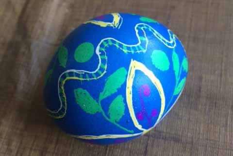 Ellen’s egg used the royal blue background color, very pretty. It’s a design she made up using ideas from the book or other psanky books Tim brought.
 Here’s the full flower design on one side.
 Ann’s egg uses a design she got from a YouTube video how-to. She had the video on her laptop and would do a layer, then run the video to show the next layer, until it was all done. It’s a Ukrainian design, but a looser and less geometric one, that I think turned out great
 Ann had some trouble with blobs in the wax, so she added more to make a feature out of them rather than a mistake. Ann is clever that way!
 Dave winged it with a freeform design he made up as he went along, and Ann gave him advice on color choices. This has a modern-art feel that we all liked.
 Another view of Dave’s design. The dark colors is a mix of royal blue and black, I think, very effective.
 Tim used a design from one of the egg-decorating books he brought that has a somewhat art deco feel, geometric shapes but less rigidly organized and symmetrical. We liked it, too. We liked all the designs, and everyone thought it was a fun project and wants to do it again next year. We might even get some electric kistkas, which are supposed to be easier to use than the ones we have. We’ll see how we feel about it next Easter.
This took most of the day, but we also did traditional egg coloring of hard-boiled eggs after dinner. I’ll have a full report on that tomorrow. Happy Easter, everyone!
Psanky Easter Eggs Part 2
Here’s our Psanky egg-decorating group at work at Ann and Dave Greene’s kitchen table. Left to right are Ann, my friend Tim, Dave, and my wife Ellen. I sat at the near end. It took each of us many hours to create one psanky egg. Mine was the most ambitious and took the longest, over six hours. Here’s the entire process described.You begin by drawing a design on a raw white egg that hopefully hasn’t been scrubbed or treated with chemicals, handling the egg itself with your fingers as little as possible. I had found farm eggs at our supermarket that worked well for Ellen and I previously, so I bought and brought more. On my first egg I had made up my own geometric design, but wasn’t too happy with the result.
This time I followed a design from the how-to book that came with our set by Luba Perchyshyn. Her Ukrainian Gift Shop website is the source of the starter kit and other tools we used. Luba is 93 this year, and lives in Minnesota. She’s been doing this a very long time, and her book and tools worked well for us. You can read about her HERE. Though I followed one of Luba’s designs, I ended up changing some details either by accident or intent, so the end result is about 90% from the original design. Ann had ordered some circle templates in a wide variety of sizes from Luba, and I tried using these for the horizontal circles. It helped some, but they are printed on thin cardboard. Plastic circle templates that I have at home would have worked better if I’d thought to bring them. Luba’s templates did help me divide the egg into six equal sections, though.
Next I began going over the pencil lines with the medium-size writing tool or kistka, filling the reservoir with beeswax, holding the writing tip in the edge of a candle flame until it was hot and the wax flowed out of the small hole evenly. I did better with the wax flow and line control this time, and I can see where it’s something that would improve with practice. Always testing the flow on a tissue first helped prevent big blobs, and we used thin strips of black wax this time rather than cut-up chunks of untinted wax. The latter does get a color from the candle soot, but having the color already in the wax made it easier to always see where you’d put the lines down. A small quarter-inch length of the wax strip was perfect to fill the reservoir and fits right in, much easier. When it’s the right temperature, the wax flows rather like a fountain pen or a technical drawing pen, but you need to keep warming it in the candle flame and testing the flow as you go. There are several rounds of this. All the lines drawn on the white egg will, of course, be white lines on the final design. You need to think in reverse, sort of like scratchboard art.
The first layer of wax drawing further along. I’ve finished all the main design lines with the medium kistka and am now using the smallest kistka for the crosshatching in the triangles. Those textured areas add a lot of detail and interest to the design. I did make a few mistakes by going too fast, and one large wax blob that I was able to mostly remove carefully with a pen-knife, but generally it went much better this time.
After finishing the first and largest set of wax drawings on the white egg, it went into the yellow dye for five to ten minutes. Then the egg was taken out and dried with tissues. When it was all dry, the second round of wax drawing was done. Those lines would all be yellow at the end. Next the egg went into the light green dye, and more areas were waxed. This was mainly a matter of covering up areas that should remain green, so I used the largest kistka to do that more quickly. The leaf pattern at each end of the egg was the largest area that would be solid green.
The next color was orange, which surprisingly removed nearly all of the green dye. One of those things you wouldn’t expect, so following the step-by-step was key. More lines drawn and areas covered, then it went into the scarlet dye, and the process continued. The photo shows all the wax now applied over the scarlet dye. The star and triangle shapes would have the red color preserved. One final color was added as a final dyeing step, black. This is the coolest one because it’s so very different from anything you can do with regular edible egg dyes. It wasn’t in Luba’s design, but I wanted to do it anyway. So, everything not wax covered in this photo would become black.
The next step is to remove all the wax by holding the egg very close to, but not right over, the candle flame to melt the wax. then you wipe it off with a tissue. This takes a long time, but is the most fun part as you get to see the final design gradually revealed. If you get the egg right over the flame, soot will form on the surface, not a good thing, but it does wipe off, though not easily. When you’ve melted off all the wax you can, there’s still a thin layer that is removed with mineral spirits.
Here’s my egg with all the wax removed, and I’m very pleased with the way it turned out. Sure, some lines are a little off-model, and there are a few mistakes on the other side, but in all it’s impressive.
A view of the leaf and stem design at the top. Luba’s design had more detail in the stems, but only four leaves. Mine left less room between the leaves, so the stems were simpler. I added extra elements to the triangles, though.
The star shapes are my favorite part, they worked out very well. I added the orange lines in them.
The next step for a shell you want to keep is to make small holes in each end so you can remove the egg. I found the best way to do this was to gradually scratch and gouge out a tiny hole with a very sharp sewing needle, then enlarge it with a nail. Tim used a hammering method with the needle which worked okay, too, but made me too nervous to try. After all that work, you really don’t want to crack the shell.
We had a tool from Luba that Ann bought, Aunt Marge’s Egg Blower that uses a rubber bulb to pump air into the egg and push the raw egg contents out the other end. The pin is to break up the yolk first. This worked fine. Tim also tried the older method of blowing out with air from his mouth, kissing the egg. That worked, too.
The empty shells were put on this drying rack Tim made. They have to dry completely inside and out before you do the final step, coating the shells with polyeurythane varnish. Ann’s egg had a mishap, so is not here, it was out in the garage getting some repair work. Below are all the finished eggs.
Ellen’s egg used the royal blue background color, very pretty. It’s a design she made up using ideas from the book or other psanky books Tim brought.
Here’s the full flower design on one side.
Ann’s egg uses a design she got from a YouTube video how-to. She had the video on her laptop and would do a layer, then run the video to show the next layer, until it was all done. It’s a Ukrainian design, but a looser and less geometric one, that I think turned out great
Ann had some trouble with blobs in the wax, so she added more to make a feature out of them rather than a mistake. Ann is clever that way!
Dave winged it with a freeform design he made up as he went along, and Ann gave him advice on color choices. This has a modern-art feel that we all liked.
Another view of Dave’s design. The dark colors is a mix of royal blue and black, I think, very effective.
Tim used a design from one of the egg-decorating books he brought that has a somewhat art deco feel, geometric shapes but less rigidly organized and symmetrical. We liked it, too. We liked all the designs, and everyone thought it was a fun project and wants to do it again next year. We might even get some electric kistkas, which are supposed to be easier to use than the ones we have. We’ll see how we feel about it next Easter.
This took most of the day, but we also did traditional egg coloring of hard-boiled eggs after dinner. I’ll have a full report on that tomorrow. Happy Easter, everyone!
April 15, 2017
Pysanky Easter Eggs Part 1
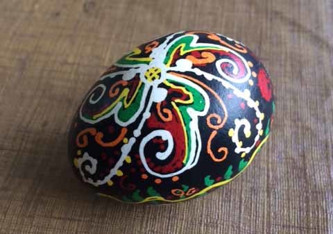
 For years Ellen and I and Ellen’s sister Ann and her family have made a ritual and contest of dyeing Easter eggs when we visit them for Easter. We’ve always used hard-boiled eggs and traditional dyes, but sometimes have talked about trying the more difficult and involved Pysanky egg dyeing, example above found online, which uses raw eggs and non-edible colors as well as hot wax for the shapes and lines. This year we are finally trying it. My friend Tim, who’s joined in the Easter egg coloring the last few years, bought Ellen and I a pysanky starter kit for Christmas, and Tim and Ann each bought additional supplies and tools. Two weeks ago, Ellen at I tried out our set at home, results below.
 The first thing we did was to mix the twelve colors that came in dried powder form in packets. As instructed, I bought a set of 12 pint canning jars and put the colors in each one. To the powder we added 1.25 cups of boiling water and a small amount of distilled vinegar, EXCEPT for the orange, which gets no vinegar. Above, I kept the packet under that jar to remind me. I also labeled the jars to avoid confusion later.
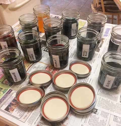 Here are the colors mixed. They had to cool completely, then could be closed up and stored. They’re supposed to be good for about a year.
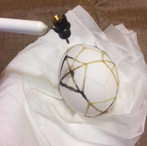 The next day we got started with the wax and dyeing. You use a writing tool that has a reservoir for the hot wax which feeds down into a tiny tube and emerges like ink from a fountain pen. With these writing tools, the cheaper kind, you heat them over a candle flame, melting a tiny amount of beeswax in the reservoir. As one might expect, this is a lot harder than it looks in the YouTube videos you can find on the subject. There’s a much more expensive electric version of the writing tool, but since we don’t know if we’ll continue with this, we didn’t get that. Common problems are: too hot writer and too much wax, which then comes out in large blobs, you can see some above. Of course, not enough heat and nothing comes out. Getting it just right is one issue, which I only began to reach toward the end. The other problem is that I was using way too much wax. There is some color in the wax from soot (and you can buy it colored black, too), so you can at least see it pretty well, and a very thin layer is all you need. I was piling it up too much, going over the lines several times.
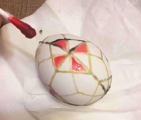 I did a geometric design of my own rather than following one of the samples in the starter kit. One trick from there I liked was to fill some areas with color using a q-tip, then covering those areas with wax to preserve them before dipping the entire egg in a color jar. You can already see my lines are quite thick and uneven. It’s a learning curve to get them even and thinner which I hope to advance on today.
 After coloring and covering some areas, I dipped the egg in the light blue dye. They call it light, but it’s more of a medium blue. The color went on well on these farm eggs I found at the supermarket. You want eggs that haven’t been scrubbed with chemicals, and you should handle them as little as possible, so you hold them with a tissue.
 I then added some spiderweb and curly shapes with the smallest writing tool (we got three sizes), finally getting a handle on the wax flow, but still not getting even lines, then dipped the egg again in the royal blue dye. Once that was done and dry it was time to remove the wax by holding the egg close to a candle flame to melt it, and wiping the wet wax off with a tissue. Since I had so much wax on the egg, this took about a half hour, and probably cooked the egg inside somewhat, not a good thing if you want to remove it later.
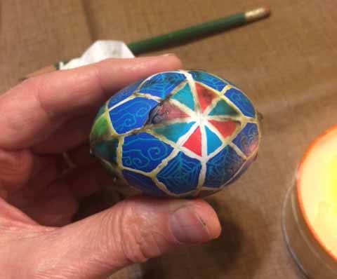
 With all of the wax off except a thin, clear layer, the egg looks pretty good color wise, though not well done technically.
 Another view. This was a good practice try, and I hope I can do better today, when we’ll be trying again, along with Ann, Dave and Tim, I think.
 Unlike me, Ellen followed one of the step-by-step examples that came with our starter kit. Her egg looks pretty good too, again with uneven lines, but not as thick as mine.
 Another view. As I said, more today, and I’ll report on it here. We also plan to do traditional egg coloring as well, so we have hard boiled eggs to eat, so we’ll do that this evening if we can. I decided not to try removing the egg from the shells on these. Okay as long as they don’t fall and break! If we were going to keep them forever, I’d need to first remove the last bits of wax with paint thinner, then remove the egg inside (we do have tool to help with that), washing out as much as possible, let it dry completely, then coat the empty shells with polyeruthane varnish. They can last for many years that way. These aren’t worth saving, though Tim wants to keep mine, and I’ll give it to him. More later!
Todd Klein's Blog

- Todd Klein's profile
- 28 followers

