
Todd Klein's Blog, page 172
April 15, 2017
Psanky Easter Eggs Part 1
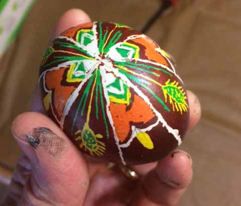
 For years Ellen and I and Ellen’s sister Ann and her family have made a ritual and contest of dyeing Easter eggs when we visit them for Easter. We’ve always used hard-boiled eggs and traditional dyes, but sometimes have talked about trying the more difficult and involved Psyanky egg dyeing, example above found online, which uses raw eggs and non-edible colors as well as hot wax for the shapes and lines. This year we are finally trying it. My friend Tim, who’s joined in the Easter egg coloring the last few years, bought Ellen and I a psanky starter kit for Christmas, and Tim and Ann each bought additional supplies and tools. Two weeks ago, Ellen at I tried out our set at home, results below.
 The first thing we did was to mix the twelve colors that came in dried powder form in packets. As instructed, I bought a set of 12 pint canning jars and put the colors in each one. To the powder we added 1.25 cups of boiling water and a small amount of distilled vinegar, EXCEPT for the orange, which gets no vinegar. Above, I kept the packet under that jar to remind me. I also labeled the jars to avoid confusion later.
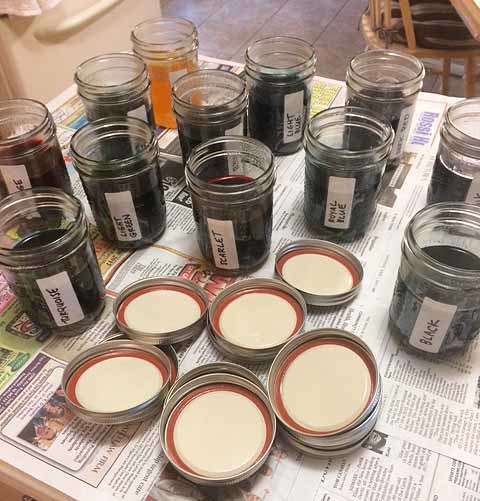 Here are the colors mixed. They had to cool completely, then could be closed up and stored. They’re supposed to be good for about a year.
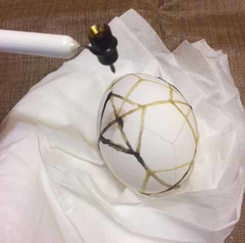 The next day we got started with the wax and dyeing. You use a writing tool that has a reservoir for the hot wax which feeds down into a tiny tube and emerges like ink from a fountain pen. With these writing tools, the cheaper kind, you heat them over a candle flame, melting a tiny amount of beeswax in the reservoir. As one might expect, this is a lot harder than it looks in the YouTube videos you can find on the subject. There’s a much more expensive electric version of the writing tool, but since we don’t know if we’ll continue with this, we didn’t get that. Common problems are: too hot writer and too much wax, which then comes out in large blobs, you can see some above. Of course, not enough heat and nothing comes out. Getting it just right is one issue, which I only began to reach toward the end. The other problem is that I was using way too much wax. There is some color in the wax from soot (and you can buy it colored black, too), so you can at least see it pretty well, and a very thin layer is all you need. I was piling it up too much, going over the lines several times.
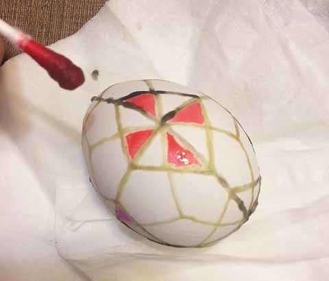 I did a geometric design of my own rather than following one of the samples in the starter kit. One trick from there I liked was to fill some areas with color using a q-tip, then covering those areas with wax to preserve them before dipping the entire egg in a color jar. You can already see my lines are quite thick and uneven. It’s a learning curve to get them even and thinner which I hope to advance on today.
 After coloring and covering some areas, I dipped the egg in the light blue dye. They call it light, but it’s more of a medium blue. The color went on well on these farm eggs I found at the supermarket. You want eggs that haven’t been scrubbed with chemicals, and you should handle them as little as possible, so you hold them with a tissue.
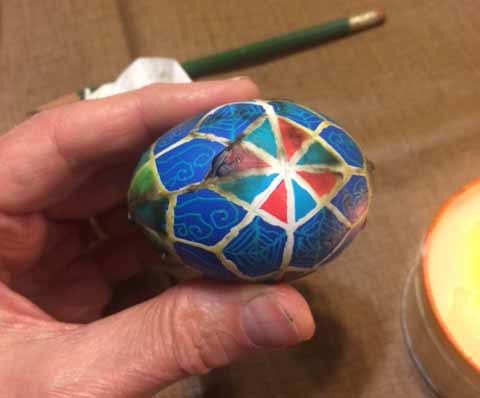 I then added some spiderweb and curly shapes with the smallest writing tool (we got three sizes), finally getting a handle on the wax flow, but still not getting even lines, then dipped the egg again in the royal blue dye. Once that was done and dry it was time to remove the wax by holding the egg close to a candle flame to melt it, and wiping the wet wax off with a tissue. Since I had so much wax on the egg, this took about a half hour, and probably cooked the egg inside somewhat, not a good thing if you want to remove it later.
 With all of the wax off except a thin, clear layer, the egg looks pretty good color wise, though not well done technically.
 Another view. This was a good practice try, and I hope I can do better today, when we’ll be trying again, along with Ann, Dave and Tim, I think.
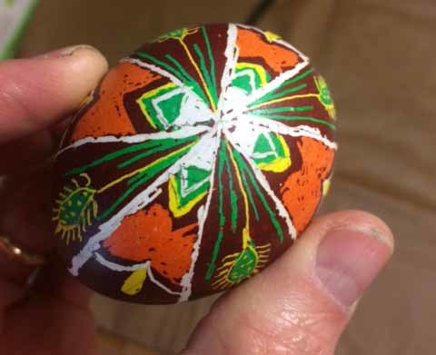
 Unlike me, Ellen followed one of the step-by-step examples that came with our starter kit. Her egg looks pretty good too, again with uneven lines, but not as thick as mine.
 Another view. As I said, more today, and I’ll report on it here. We also plan to do traditional egg coloring as well, so we have hard boiled eggs to eat, so we’ll do that this evening if we can. I decided not to try removing the egg from the shells on these. Okay as long as they don’t fall and break! If we were going to keep them forever, I’d need to first remove the last bits of wax with paint thinner, then remove the egg inside (we do have tool to help with that), washing out as much as possible, let it dry completely, then coat the empty shells with polyeruthane varnish. They can last for many years that way. These aren’t worth saving, though Tim wants to keep mine, and I’ll give it to him. More later!


April 13, 2017
And Then I Read: ATLANTIC CIRCLE by Kathryn Lasky Knight
 You’d think someone writing a travel book about sailing across the Atlantic Ocean twice in a small boat as well as through the waterways and canals of Europe would be enthusiastic about it. Not so much in this case. Kathryn’s husband Chris loves sailing, and comes from sea-faring families. Kathryn is from the midwest and happiest on land. Despite that, she agrees to Chris’s plan to sail from Massachusetts to Europe in their thirty-foot ketch. Once there they will explore the waterways of England and Europe over three summers (leaving the boat to fly home between) and finally sailing back across the ocean to the Caribbean in the fall of their third year.
Kathryn continues to tell us she is not suited for a life on the water, doesn’t like it, doesn’t want to be there. When preparing for the trip she is more concerned about how many kinds and amounts of Pepperidge Farm cookies she can pack aboard, as well as other comfort foods than preparing in other ways. Her husband Chris does all the hard work of preparing the boat, charting their course, and getting everything ready. The entire first two sections of the book, which delve deeply into family history and their relationship, and are full of complaints and denial from Kathryn, get pretty tiresome, and I almost gave up on the book several times.
Finally, in Chapter 14, page 80, they get sailing. Kathryn continues to hate the Atlantic crossing, which is admittedly rough and scary, but does write about it well. And once they arrive in England in Chapter 20, the book becomes much more fun to read. River and canal sailing are clearly much more the thing for Kathryn, and she writes appealingly about the places they go, always being sure to include lots about the food and people they meet. Travels through Europe don’t always run so smoothly, particularly in the rivers, where their small boat is often in danger of being run down and swamped by much larger ones, but the travel experience is fascinating, and well worth reading. The final Atlantic crossing goes much better than the first one, and the continued story of their lives after the epic voyage is entertaining too.
In all, I’m glad I read this, but I do prefer travel adventure books where the writer wants to be there. Kathryn and Chris are still together, surprisingly, as I learned on her website. The book was published in 1985, and the author has written many more books, mostly for children, under the name Kathryn Lasky.
Recommended.
April 12, 2017
And Then I Read: WONDER WOMAN #13
 Image © DC Comics.
Diana and Steve Trevor are stuck on a remote island that shouldn’t even be there. Diana is having hallucinations that she’s back in her home, Themyscira. Trevor knows the truth, but can’t get through to her. He calls his home base for backup, but that’s been compromised, and only serves to tell a mysterious group of mercenaries where they are. All he can do now is prepare for their arrival as best he can.
I like this storyline better than the previous one, even though Wonder Woman is essentially missing from the issue (at least mentally). The stakes are higher, nothing can be assumed, and I can’t see where it might be going, all good things. The art by Renato Guedes is fine. Looking forward to more.
Recommended.
April 11, 2017
And Then I Read: MIDNIGHT MAGIC by Avi
 Cover illustration by Laurel Long.
It’s 1491 in the small Italian kingdom of Pergamontio. Fabrizio, a twelve-year-old servant boy to Mangus the Magician answers a knock on the door of their humble home one stormy night to find that Mangus has been summoned to the royal castle. Mangus does magic of the stage trickery kind, but recently he was arrested and tried for witchcraft. Since then, his career in ruins, Magnus and his wife, and Fabrizio, have been struggling to survive. A summons to the castle can’t be good news. Fabrizio is determined to go with the old man and help him however he can.
It turns out the King and his chief advisor, the powerful Count Scarazoni, want Mangus’s help and advice with a family problem. The King’s daughter, Princess Teresina, has been seeing a ghost at midnight in the hallway near her bedroom, and declares it an omen of dread, and perhaps a sign from her missing older brother. The King, who is superstitious, wants Mangus to investigate and prove the ghost is some kind of trick. Count Scarazoni wants the same thing, as he has convinced the King to agree to his marriage to Teresina, but the King will not allow the wedding until the ghost problem is solved.
Magnus and Fabrizio take up residence in the castle, and are soon embroiled in all kinds of court intrigue. Teresina befriends Fabrizio, and together the two of them see her ghost. It’s very convincing, but Mangus remains sure it can’t be real. Before long, Fabrizio is haunting the castle himself at night, using the many secret passages shown him by Teresina…until the first murder happens. Then Fabrizio is arrested and thrown into the dungeon. Who will help him now, and who will help his master, Mangus?
An excellent read with great characters and a plot and story worthy of the stage, full of clever turns and witty dialogue. I’ve only read a few books by Avi (pen name for Edward Irving Wortis), and enjoyed all of them. I should look for more, and I will.
Recommended.
April 10, 2017
My Work By The Numbers, a Career Summary
 Image © Mike Voiles.
Not long ago, lists of top comics creators in various categories from the website Mike’s Amazing World were being passed around and commented on in Facebook. It’s a site which lists and indexes American comics, with the main focus being DC and Marvel, and the lists come with lots of caveats such as: these lists represent items currently in their database, but are not complete; publishers other than DC and Marvel may be missing or not well represented; credits prior to the 1960s are often not available.
 Image © Marvel
When exactly did letterers start getting printed credit at the big two? The earliest super-hero story example I could find at Marvel was on FANTASTIC FOUR #9 cover-dated Dec. 1962. There might have been earlier examples I missed, or credits in other genres, I seem to recall Artie Simek’s name showing up on some mystery stories earlier than that, but letterer credits became the norm by early 1963.

Image © DC Comics
At DC, books with October, 1977 cover dates seems to be when letterer credits first appeared routinely, as found in a brief survey of likely suspects such as SUPERMAN #316, above, and BATMAN #292.
So, one criteria for letterers placing high on the list at Mike’s Amazing World is to have a lot of work published with printed credits after those dates. John Costanza, in the number one spot, was a prolific letterer mainly for DC and Marvel who I think began in 1968, making his placement easy to understand. Richard Starkings, in second place, started lettering in England around 1985, and did his first American work for DC in 1987, according to the Grand Comics Database. Richard went on to co-found Comicraft, a lettering studio that did huge amounts of work mostly for Marvel in the following two decades, and Richard’s name was on much of their work, though he only did some of it. I, in the third spot, began lettering for DC Comics in the fall of 1977, so right after lettering credits became the norm there. In fact, nearly all my lettering work for DC, Marvel and other companies has been credited. I started at just the right time and place for such lists!
Casting a wider net, there are other names I think should be near the top. Ira Schnapp did a huge amount of story lettering for DC, though he only received two printed credits at the very end of his career. I’m gradually documenting his lettering on this blog, and credits are working their way into the Grand Comics Database, but there’s a long way to go. Gaspar Saladino was equally prolific and worked longer, over 50 years, but the first half of his career, when he was probably the busiest, was not credited in the books, another thing I hope to address in the future. Gaspar does show up at #28 on the list. Ben Oda was another prollific letterer who I think should place higher than #21, but again much of his career took place when credits were not given in the comics, and Ben also did lots of work on newspaper strips, outside the scope of the list. If we looked further at companies like Archie, Harvey, Dell, and even pre-credit Marvel/Atlas/Tiimely for instance, I’m sure there would be other letterers at or near the top if all stories were able to be credited.

This got me thinking about my own body of work. I’ve always kept records of what I did, though for the first few years they were not that complete. When I put together my website in 2007, I included the Klein Lettering Archives, screen shot above, where I listed everything as accurately as I could. I hadn’t updated it since 2011, though, so over the past few days I’ve been bringing it up to the end of 2016, and also trying to fix things that were wrong or incomplete. There’s a separate page for this HERE, and thanks to better search options on the Grand Comics Database and Google than I had in 2007, I was able to take about two-thirds of the items off that list and put them on the main Archive. You can go to the Archive at the link and get my yearly details and current totals, but I thought I’d write more thoroughly about my work and career here, since it’s been on my mind.
One issue I had to address when I set up the Archive was what to include and where to put it. In the early years I kept records based on cover-dates of the comics. Around 1980 I switched to when I completed and billed for the work. Another issue is which items qualified as Inside Pages. I did not include house ads and some licensing projects, putting them under Other Stuff. I did the same for the “World’s Greatest Super-Heroes” newspaper strip I lettered at times for DC, though Gaspar Saladino was the main letterer. More things in Other Stuff could be considered page lettering, and if you added all of those, it would probably increase my totals by about 200 pages. I DID include pages and logos in the Incomplete Archives, even though some of them were probably never printed. That amounted to 99 pages and 14 logos, so perhaps that evens things out a bit. Total work numbers are always going to be approximate, but I think my records are generally accurate and pretty close to reality. Let’s look at the numbers and work year by year.
I was hired by DC in the summer of 1977. I had come in with a portfolio looking for comics art work, and it wasn’t deemed good enough by then art director Vince Colletta (he was right), but he brought me in to see Jack Adler, the head of the Production Department. Jack liked my samples enough to offer me a two-week staff position to fill in for a vacationing staffer. I jumped at the offer, and when that staffer returned, he gave notice, so I was given the job permanently, the luckiest break of my career. Working on staff, I learned how to do art and lettering corrections, and did paste-ups on text pages and letter-columns. I helped out on cover paste-ups, special projects, and everything needed to get comics work ready for printing. The staff pay was not great, and many staffers did freelance work for the company in their off-hours. I was soon doing that too. I tried lots of things, but lettering seemed the best fit, and I did that most often. Fellow staffer John Workman gave me advice, and I studied the work of Gaspar Saladino, John Costanza and others.
1977: There was only one published story with a 1977 cover date, the very first one, a five-page “Star Wars” parody by Dave Manak for SICK magazine #118, titled “Star Bores.” I met Dave at DC when he was freelancing there, and he was the first to give me lettering work. I did other DC freelance lettering in 1977, but all of it was for books with 1978 cover-dates. Note that, as a staffer, I was only allowed to letter for DC, though exceptions were made for magazines like SICK, which was considered non-competitive. DC didn’t publish anything similar. (Mad magazine was a separate company then.)

Image © DC Comics
1978: 443 pages, 3 logos, 34 covers
Cover lettering is an area that was once a large part of my income, and now is almost nonexistent. We’ll see at the end how adding cover lettering to my page total might raise the numbers. It was a long-standing tradition at DC to have covers lettered with word balloons and captions enticing readers to buy and read the comics. Ira Schnapp was the master of it for over 20 years, then Gaspar Saladino did most of it, but I had a gradually increasing share. Covers paid more than regular pages, another plus. My first DC page lettering, going by cover-date, was a 12-page Lois Lane story for SUPERMAN FAMILY #187, Feb. 1987. My second was the first issue of FIRESTORM, March 1987, 18 pages. I don’t know what they were thinking giving me, a raw newbie, a job of that importance, but I did my best with it, as always. My first logo was for DC COMICS PRESENTS, above. Of course I just added the banner part to the existing DC bullet symbol designed by Milton Glaser’s studio.
1979: 358 pages, 11 logos, 62 covers
Keep in mind that I had a full-time day job in the Production Department, and all this freelance work was done at home in the evenings or on weekends. There was a big incentive to learn to letter as quickly as possible, and that came with practice, but there were still late nights, and even a few all-nighters to meet deadlines. Weekends were for catching up with personal stuff, unless there was a special licensing project for Sol Harrison, which often came to us on Friday afternoon. He would say, “You’ve got 48 hours…!” It paid the bills.

Starstruck © Michael Wm. Kaluta and Elaine Lee
1980: 859 pages, 10 logos, 88 covers
As said above, this was the year I switched record-keeping methods, so there are some extra listings. It was the year I started working on STARSTRUCK directly for Michael Wm. Kaluta and Elaine Lee, which was published first in Spain, then by HEAVY METAL in 1982-83. Fun and challenging, lots of styles, my first big non-DC project, and one where I was encouraged to try new things. HEAVY METAL was, again, considered non-competing with DC, so okay to work for. More about working with Michael Kaluta is HERE.
 Image © DC Comics
1981: 612 pages, 17 logos, 25 covers
I was also doing a little comics writing, short stories for the mystery titles, as well as trying background inking, coloring, and whatever came my way. One very cool project in 1981 was logo and background inking on 32 pages of the DC Style Guide, art by José Luis García-López, none of which shows up in these totals, it’s under Other Stuff.
1982: 741 pages, 40 logos, 30 covers
Though I couldn’t letter comics for other publishers, I could and did design logos for them. In this year I designed a number of logos for Gary Groth/Fantagraphics. I think trying to get logo work from Marvel would have caused me problems, though, and I didn’t attempt it.
1983: 641 pages, 29 logos, 40 covers
I lettered a few stories for NATIONAL LAMPOON in this year, and was pleased to be able to letter my own stories for “Tales of the Green Lantern Corps” in GREEN LANTERN, some with artist Dave Gibbons. That was the beginning of a long-term creative partnership and friendship that I wrote about HERE. I also wrote some stories for NEW TALENT SHOWCASE, but my participation in that title caused grumbling, as I wasn’t considered a new talent then by some readers and creators, one reason I didn’t do more. I lettered my first Alan Moore story, SAGA OF THE SWAMP THING #22, and couldn’t believe how great it was. That was the beginning of another creative partnership that continues today. More on working with Alan is HERE.

Image © DC Comics
1984: 552 pages, 33 logos, 41 covers
In the fall of this year I became the regular writer of THE OMEGA MEN with issue #26, above. I had a great time working on it with artist Shawn McManus and editor Alan Gold, after doing two fill-in issues on the book earlier. I also lettered and earlier had designed the logo. More about my comics writing is HERE. Other lettering work included BLUE DEVIL and NEW TEEN TITANS.
1985: 282 pages, 111 logos, 26 covers
Writing was taking a toll on my lettering time, and most of the pages lettering in this year were ones I wrote. There’s a big jump in logo design, but many were interior character logos for WHO’S WHO IN THE DC UNIVERSE, which were produced faster than usual. I sometimes did five or six in an evening. One time art director Richard Bruning said to me, “A lot of these logos kind of look the same.” I replied, “That’s because one person is doing them, and quickly!” He agreed, and kept giving them to me anyway.

BATMAN #404, © DC Comics
1986: 841 pages, 87 logos, 32 covers
OMEGA MEN and my comics writing career were about over by now. I enjoyed writing comics, but it was harder for me than lettering, and when OMEGA MEN was cancelled, I decided to concentrate on lettering, which I felt I did best. At first I met some resistance from DC Editorial Coordinator Pat Bastienne when I asked for more lettering work. “You gave most of it up,” she said. “Now you have to wait in line behind those who replaced you.” But artists and editors kept asking for me, so I did okay. It was the year I lettered “Batman: Year One” by Frank Miller and David Mazzucchelli as just another four issues of the monthly BATMAN comic. Unlike most of what did in those staff years, it’s still in print.
1987: 966 pages, 39 logos, 36 covers.
In the fall of this year, after being on staff for ten years, I went freelance full-time. It was a little scary, but also liberating. Instead of commuting from Highland Park, NJ to the DC offices in Manhattan every day, I just went in once a week to deliver work, and usually lettered some covers while there. Work was a little slow at first, but it soon picked up. While on staff, I had seen many comics creators (letterers, colorists, writers, inkers, pencillers) take a staff job at DC for a few years, then move to full-time freelancing before they were financially ready. Then they found themselves living from check to check, and always struggling to make ends meet. I knew I didn’t want to go that route, and it’s one reason I stayed on staff for ten years, the second half as Assistant Production Manager under Bob Rozakis and Joe Orlando. By 1987, I was financially ready, and I had met my wife-to-be Ellen the year before, so I had a growing personal life that I wanted more time for, too. Plus, I was tired of spending my days fixing everyone else’s mistakes, and knew it was time to concentrate on my own freelance work.

Image © Marvel
1988: 1,952 pages, 32 logos, 113 covers
As I was no longer on staff at DC, and had no exclusive contract (never have), I was able to take work from other companies starting in this year. I did a few stories and logos for Marvel, and my work for them increased over the next few years. Freelancing full time gave me many more hours to letter, not only the time I would have been on staff, but commuting time too. That’s reflected in the large jump in page lettering from here on. This was the year I began working with Neil Gaiman on BLACK ORCHID and THE SANDMAN, a partnership that continues to this day, and one I cherish. Working on staff at DC gave me lots of great contacts that have kept me employed ever since, but the creative partnerships were often even more important. More about working with Neil is HERE.
1989: 1,840 pages, 24 logos, 168 covers
When I left staff at DC I had an agreement to letter about four covers a week. That gradually increased over time. Regular assignments included DETECTIVE COMICS, HELLBLAZER, SUICIDE SQUAD, TAILGUNNER JO and THE WANDERERS. It was also the year Ellen and I got married and bought a house, two more important relationships! We moved close to the southern end of New Jersey, so weekly visits to the DC offices in Manhattan ended, and I only came in once or twice a year. Fortunately the many friends and contacts I’d already made through my staff time continued to help send work my way.
[image error] Sandman #19, © DC Comics
1990: 2,744 pages, 28 logos, 157 covers
For some reason, this year has the largest number of pages lettered in my records. In addition to THE SANDMAN, I was the regular letterer on DETECTIVE COMICS, DR. FATE, LEGION OF SUPER-HEROES, and SUICIDE SQUAD, and there were plenty of other stories, including some for Marvel, Disney and Dark Horse. Being a husband and home owner were good work incentives!
1991: 2,493 pages, 28 logos, 238 covers
Cover lettering increased this year, mostly for DC, and I was doing page lettering and logo work for DC, Disney Comics, Dark Horse, Marvel, Tundra and others. After years of declining sales and dire predictions, comics were a growing market again, and I was happy to be a part of that.

Image © Neil Gaiman and Michael Zulli
1992: 2,149 pages, 47 logos, 237 covers
THE SANDMAN continued to roll along, getting my work noticed, and I was also the regular letterer on BATMAN: SHADOW OF THE BAT, THE DEMON, SHADE: THE CHANGING MAN, THE SPECTRE, and many other shorter efforts, including the above, which only had one chapter completed. There was also work for Byron Preiss, Tundra, Dark Horse, Marvel and more. After being nominated for three years, I received my first lettering honor, the 1992 Harvey Award for Best Lettering for THE SANDMAN, work done the previous year. It was the first of many awards, and though this may sound coy, I was honestly always surprised when I won. Looking at my own work, I always saw the flaws and things I wished I’d done better, and I never understood why work I thought far superior by letterers such as Gaspar Saladino and Tom Orzechowski was rarely even nominated. A complete list of my awards is HERE.
1993: 2,625 pages, 22 logos, 282 covers
My second-highest year for page lettering. To most of the titles from 1992 I added work with Don Rosa on “The Life and Times of Scrooge McDuck” for Gladstone, various Lobo titles, and more for Dark Horse and Byron Preiss. I’ve written about working with Don HERE. I was also gradually picking up more and more cover lettering for Marvel. This year I began making an annual trek to the San Diego Comic-Con where I was given many Eisner Awards. I always had a great time there, renewing old friendships and making new ones. Occasionally I found work there, but that was never the main reason to go, it was the people, the programs, the cool stuff, and even the delightful weather.
1994: 2,531 pages, 51 logos, 327 covers
In this year I began lettering DEATHBLOW for WildStorm Studios (Image Comics), a new client. I also lettered pages for Malibu, did lots of covers and logos for Marvel, and logos for Todd McFarlane, Tekno Comix, Malibu and Toy Biz. Digital lettering had slowly been making inroads in comics since the mid 1980s, and took off in a big way when Comicraft was formed by Richard Starkings and JG Roshell. WildStorm was an early adopter of digital production, and they were asking me to create digital lettering for DEATHBLOW. I met Starkings and Roshell in San Diego, and at the end of this year bought my first Apple computer and jumped into the digital lettering world, with help from Richard and JG, who created my first digital fonts for me. I used those as a template to make many more, and over the next ten years gradually moved from all hand-lettering to all digital lettering. I’ve written extensively about the rise of digital lettering beginning HERE.
 Image © Marvel
1995: 2,247 pages, 70 logos, 339 covers
In this year I lettered two titles for Tekno Comix, as well as BATMAN, DEATHBLOW, THE SANDMAN, THE SPECTRE and more. Lots of covers for Marvel and Malibu as well as DC, and logos for many American publishers. It was a boom time in comics that would soon crash, but I enjoyed the work when I got it, and the phone seemed to be ringing a lot.
1996: 1,864 pages, 86 logos, 297 covers
The peak year for my logo designs, at least those on covers. I did plenty for DC, Marvel, WildStorm, Extreme (Image), Tekno, Todd McFarlane, and DC Licensing. The boom was about over, but the companies were still trying to throw out as many titles as possible. One good thing about designing cover logos: it happens at the beginning of the process, long before sales figures come in, so chances of being paid well and quickly are excellent. An important project and another creative partnership with artist Alex Ross began when I lettered KINGDOM COME for DC. More about working with Alex HERE.

Cover lettering for BATMAN 544 & 554, © DC Comics
1997: 2,361 pages, 39 logos, 445 covers.
The peak year for me in cover lettering. That’s over 8 covers a week, and as they generally paid more than double my page rate, an important part of my income. I had begun doing cover lettering and logos on my first Apple computer in 1995, building up a library of my own and commercial fonts for that, and by this year most were done that way, though the logos sometimes still began as hand-drawn sketches. As digital production on covers became the norm, traditional hand-lettering on covers was eased out, and I got the majority of cover work at DC.

Promethea #1 © America’s Best Comics
1998: 2,118 pages, 26 logos, 409 covers
My work on America’s Best Comics began in this year with the first issues of TOM STRONG, PROMETHEA, and TOMORROW STORIES. I was also working with Alan Moore on SUPREME at Awesome Entertainment. My creative partnership with Alan paid off in a big way when editor Scott Dunbier of WildStorm contacted me to say that Alan wanted me to letter nearly all of the ABC line. I was happy to do so, and loved the many creative challenges.
1999: 1,836 pages, 32 logos, 411 covers
In addition to page lettering for the ABC books, I was doing most of the design work on covers, including new logos for most issues of PROMETHEA and TOM STRONG. This took a lot of time, but was great fun. Working with Alan and the artists was rewarding, and best of all, I was usually given a free hand to do what I liked. I’m afraid that rather spoiled me! I wasn’t sure I could handle the job at first, and talked to Alan about it. “This sort of thing is usually done by art directors at the company,” I told him. Alan replied, “Well, you could do it, couldn’t you?” After some thought, I realized I could, using my desktop computer. More about my design work for the ABC line is HERE. And working with J.H. Williams III on PROMETHEA is HERE.

Top 10 Book Two Hardcover, © America’s Best Comics
2000: 2,012 pages, 28 logos, 340 covers
By this time Marvel had cut back drastically after the speculation market crashed, and I was doing very few covers for them, but still some logos. I was lettering CAPTAIN AMERICA and EARTH X projects for Marvel, as well as all the ABC stories and was the regular letterer for DC on THE DREAMING and DETECTIVE COMICS, among others. I was also lettering CASTLE WAITING for Linda Medley, a great series. As the ABC titles were collected in hardcover, I was doing lots of interior and cover design work for those as well, stretching my design skills into new areas. I’m very proud of that work.

Fables #1, © Bill Willingham & DC Comics
2001: 2,107 pages, 20 logos, 228 covers
In this year I began lettering FABLES, which turned out to be the largest and longest-running franchise I was ever a part of. In addition to 150 issues of the main series, there were many spin-offs and specials that kept me busy over the next ten-plus years. I loved the writing by Bill Willingham, and all the art, especially that of Mark Buckingham, who became the main artist. More about working on FABLES is HERE.
2002: 2,134 pages, 19 logos, 258 covers
My logo work was declining, and I found I really didn’t mind. Fine new designers were being used at DC and elsewhere whose work I admired. I didn’t miss the long approval process, and many versions I often needed to do for cover logos. Plus, as I said, my work on the ABC books had spoiled me. There I rarely needed approval from anyone other than Alan Moore and editor Scott Dunbier for any logo or cover design, and usually got it on the first try, so no wasted time or effort. That made multiple rounds of design sketches and revisions, and sometimes many weeks of back-and-forth, much less appealing.
2003: 2,119 pages, 16 logos, 306 covers
My favorite new project in this year was “1602” at Marvel, with Neil Gaiman and Andy Kubert. Marvel super-heroes in Elizabethan England, a pleasure to work on. I also greatly enjoyed SUPERMAN: SECRET IDENTITY with Kurt Busiek and Stuart Immonen. Design and lettering continued on the ABC books, but that would begin tapering off soon as Alan gradually removed himself from the imprint.

Promethea #32 © America’s Best Comics
2004: 1,971 pages, 14 logos, 340 covers
Some highlights of this year were working with writer Grant Morrison on SEAGUY, working with writer Greg Rucka on WONDER WOMAN, and producing the final issues of TOM STRONG and PROMETHEA. The latter was a mind-blowing and extremely difficult job where the entire book could be unstapled and laid out to form two huge posters. Weeks of work for J.H. Williams III and myself, but it’s always good to go out on a high note.
2005: 2,216 pages, 17 logos, 6 covers
DC Comics was the last large publisher to embrace digital production, but they finally made that move around 2003. Soon after that they began putting together an in-house digital lettering department, and at the end of 2004 I was told that all the DC cover lettering was being brought in-house. This was a large blow to my income, as my cover lettering dropped to almost nothing. As another cost-cutting measure, my page rate had been reduced 20% in 2003. My rate was probably the highest at the company, and competition from new digital lettering providers was putting downward pressure on lettering rates, so that was understandable, but my income dropped a lot after those moves. Ellen and I economized where we could, and I picked up extra lettering work from Marvel, WildStorm, and Top Shelf. I also increased my eBay sales. For the first fifty years of my life, I’d been a collector of many things, including comics, and when I could afford it, comics art. Around 2001 I realized I’d never have the time or interest in rereading all those comics, and started selling them, a process that continues today, though all the old ones are long gone now. No regrets, and the income helped.
 Image © DC Comics.
2006: 2,179 pages, 6 logos, 1 cover
Regular assignments this year included 1602: FANTASTICK FOUR, AQUAMAN, CROSSING MIDNIGHT, THE ETERNALS, FABLES, JACK OF FABLES, JUSTICE, NEIL GAIMAN’S NEVERWHERE, TESTAMENT, and THUNDERBOLT JAXON. Work for America’s Best Comics was nearly done except for THE LEAGUE OF EXTRAORDINARY GENTLEMEN, where I continued to letter and do design work for Alan Moore and artist Kevin O’Neill. A fun side project was eleven Superman-related logos/art images for DC Licensing. I don’t think they ever used them, but I enjoyed doing them, example above. I also did a rewrite on the script of a comics adaptation of the Neil Gaiman short story, “The Facts in the Case of the Departure of Miss Finch” for Dark Horse.

Image © Alan Moore and Todd Klein
2007: 2,013 pages, 8 logos
In addition to some of the regular assignments from 2006, I added CAPTAIN MARVEL for Marvel, and HOUSE OF MYSTERY and SIMON DARK for DC. This was the year that I designed and launched my website and this blog. I thought I should have something to offer for sale on the website, so I began a series of self-published 11 by 17-inch prints featuring my hand-lettering and made in collaboration with friends. The first two, with Alan Moore and Neil Gaiman were very successful, and gave my income a nice boost over the next few years. Later prints were less successful, and I haven’t done a new one since 2013, but they do continue to provide a small but steady income. You can see and purchase most of them HERE.
2008: 2,063 pages, 10 logos, 14 covers
A highlight this year was the launch of a new Batwoman series by Greg Rucka and J.H. Williams III in DETECTIVE COMICS. Other than that, most of my DC work from here on was for the Vertigo line, where editors Karen Berger and Shelly Bond continued to give me lots of work, and projects I liked. I also lettered several titles for Marvel, HERCULES for Radical Comics, and a few issues of NEXUS for Steve Rude.
2009: 2,454 pages, 8 logos, 3 covers
My third-highest year for lettered pages. Regular assignments included AVENGERS/INVADERS, ETERNALS, STRANGE and TORCH for Marvel, HERCULES for Radical, and Batwoman in DETECTIVE COMICS, CINDERELLA, FABLES, GREATEST HITS, HOUSE OF MYSTERY, iZOMBIE, JACK OF FABLES, JOE THE BARBARIAN, THE LITERALS, SEAGUY, SIMON DARK, and THE UNWRITTEN for DC. A busy year!
Image © Alan Moore and Kevin O’Neill
2010: 2,132 pages, 3 logos, 1 cover
A highlight of this year was a new series of THE LEAGUE OF EXTRAORDINARY GENTLEMEN titled CENTURY. Above is a panel from the second issue, “1969.” Lots of psychedelic weirdness. New lettering assigments included DRIVER FOR THE DEAD for Radical, and SHIELD for Marvel.
2011: 1,914 pages, 2 logos
In addition to regular series, DC often asked me to letter one-shot graphic novels, which were always a nice change of pace. This year I did CITY OF ANGELS for Vertigo and BATMAN: NOEL for the DC Universe. Batwoman moved to her own title now written by J.H. Williams III (with Haden Blackman) as well as drawn by him. I lettered DAMAGED for Radical and the first issue of SHAME for Renegade Entertainment. A new FABLES spin-off began, FAIREST, and a new CINDERELLA miniseries.
2012: 2,265 pages, 1 logo
New projects this year were a FABLES graphic novel, WEREWOLVES OF THE HEARTLAND, another Vertigo one-shot GET JIRO, the third and final part of CENTURY, and the first part of a new League of Extraordinary Gentlemen series, NEMO: HEART OF ICE. I also lettered the PUNK ROCK JESUS miniseries for Vertigo and SEVEN AGAINST CHAOS, Paul Chadwick’s adaptation of a Harlan Ellison story. Finally, there was SHADE, a new miniseries for the DC Universe about the character from STARMAN and for Renegade, a historical graphic novel, THE LOXLEYS AND THE WAR OF 1812.
2013: 1,518 pages, 2 logos
The big project that began this year was THE SANDMAN: OVERTURE, a new six-issue series bringing together two of my favorite creators, writer Neil Gaiman and artist J.H. Williams III. I also began lettering DEAD BOY DETECTIVES, featuring lead characters from THE SANDMAN. Then there was the graphic novel from the UNWRITTEN series, TOMMY TAYLOR AND THE SHIP THAT SANK TWICE, and the FABLES graphic novel FAIREST: IN ALL THE LAND. Despite having lots of work from DC, work from Marvel had pretty much ended, as they were getting nearly all their lettering from Chris Eliopolous’ studio, Virtual Calligraphy. My page count went down, even though I seemed to be as busy as ever. I’m guessing age had slowed me down some!

Image © Electricomics
2014: 1,544 pages, 10 logos, 6 covers
Cover lettering made a brief comeback for me when Shelly Bond at Vertigo decided to begin many Vertigo stories on the covers for one issue. Logos had an upsurge when Alan Moore and his daughter Leah tapped me for their new online comics project, as seen above. I also did logos for Abrams, First Comics, Renegade and Marvel. New lettering assignments were MULTIVERSITY for the DC Universe and THE ILLEGALISTS for writer/publisher Stefan Vogel.
2015: 1,540 pages, 4 logos
New projects for this year included ART OPS, CLEAN ROOM, LUCIFER, NEW ROMANCER and RED THORN for Vertigo, as Shelly Bond, now in charge of the imprint, launched a new lineup. I also began BLACK HAMMER, my first ever continuing series for Dark Horse, and began relettering MIRACLEMAN by Neil Gaiman and Mark Buckingham at Marvel. Finally there was WONDER WOMAN EARTH ONE by writer Grant Morrison and artist Yanick Paquette. Grant is another writer I’ve worked with many times over the years, and whose work I admire.
2016: 1,395 pages, 14 logos
Last year my page count dropped a little more, but logos had a surge due to work done for ENTERTAINMENT WEEKLY’s Comic-Con preview issue (8 logos) and title designs for four new paperback printings of Neil Gaiman novels by HarperCollins, for which I also did the cover designs. As you might guess, Neil brought me in for that. New projects included DOOM PATROL and EVERAFTER for DC, and work on that career perennial STARSTRUCK for Elaine Lee and Michael Wm. Kaluta. Some of that was relettering over others, some was new pages. The result is being published by IDW as STARSTRUCK: OLD PROLDIERS NEVER DIE this year.
That’s my work by the numbers, as far as I’ve indexed it, though I’ve already done more in 2017, of course. What does it all come to? If my math and my little hand-held calculator are right, I’ve lettered about 66,788 pages through the end of 2016. That includes items in the Incomplete Records Archive, but not items from Other Stuff. If you wanted to include those (about 200 pages) and also consider covers as pages lettered, my grand total would be about 72,334 pages of lettering. Whew! Even stretched over nearly 40 years, that’s a lot, over 1,800 a year on average.
There are digital letterers working today who can produce work a lot faster than me, and may well end up leading the pack on most pages lettered in years to come, and they kind of have to to make a living at it. The ready availability of comic book fonts from vendors like Comicraft and Blambot have made it much easier for new letterers to get started, and there are now far more people who want that work than work available. This has driven down rates a great deal. When I started at DC in 1977, my lettering page rate was $5. That went up slowly but steadily, plateauing around 2000, and then began declining. Today I’ve heard of new work being shopped around for as low as $5 a page, and new letterers essentially working for even less than that as way to get started. Established letterers get more, but the pay rate in today’s world is still much lower for lettering than in most of my working years in general. All I can say is, I’m very grateful to have made a career in comics mostly with lettering that paid well enough to support me and my wife for four decades. As I begin to gradually cut back on assignments and ease into semi-retirement, I have many fond memories of the work and the people, but I wouldn’t want to be starting out today. It’s a much tougher way to make a living now if that’s all you’re doing, and one I wouldn’t recommend.
Hope you’ve enjoyed reading this post, which somehow became a career synopsis. More articles you might like can be found on the COMICS CREATION and LOGO LINKS pages of my blog and on my website.
April 6, 2017
And Then I Read: UNFOLLOW #12
 Image © Robert Williams and Michael Dowling.
I haven’t read one of these in a while, and find I’ve lost track of some characters, but the main plot line is clear: a billionaire has given a huge fortune to a collective of 140 people. It’s a tontine, so as members of the group die, there’s more for the survivors. We’re well into the middle game now, where aggressive group members are killing off other less aggressive or less prudent ones. As this issue opens, we are down to 129 survivors, and that number will shrink drastically by issue’s end. Motives for the scheme as a whole are scarce, we don’t know much. A new motivator for the shape of the scheme emerges this time, but does it really matter? Lots of blood and violence. Not really my kind of fun. I find there’s no one in the issue I’m rooting for, and quite a few I don’t feel any connection to at all. I may look at future issues, but I didn’t enjoy this one very much.
Barely recommended.
April 5, 2017
Incoming: EVERAFTER: THE PANDORA PROTOCOL

Image © Bill Willingham and DC Comics, Inc.
When I was asked to letter this FABLES follow-up, I didn’t think I wanted to. I loved working on the original series, all 150 issues, plus lots of spin-offs, and didn’t think a revisit would be as much fun. DC sent me the art and script for the first issue, and I was sold. I’ve been enjoying working on it ever since. It has a different flavor from what came before, but the writing and art are excellent, and some characters continue from the previous work, like Connor Wolf (son of Bigby and Snow, now grown and on his own), as well as Peter Piper and Bo Peep. All are covert agents here trying to save us Mundys from dangerous new outbreaks of magic and magic users. I see a release date of May 3rd, so if you’re a FABLES fan, look for it then, or preorder now at your local comics outlet.
April 4, 2017
And Then I Read: SHADE THE CHANGING GIRL #4

Image © DC Comics.
As seems appropriate for the Young Animal imprint, this book has lots of teen angst and confusion overlaying elements of fantasy, horror, and things from the original Vertigo SHADE, THE CHANGING MAN series. The title girl is a psychic composite of human and a birdlike creature from Meta. Madness is part of the deal, in the form of the madness cloak or coat, which seems to morph all the time like the book and the character. The human story is interesting: a mean girl who terrorized her school friends and swim-team classmates had a not-so-accidental accident and went into a coma. This left her available for the insertion of the Metan consciousness, but elements of the girl’s mind keep intruding. In this issue, the Metan is trying to understand human emotions and human guilt, something many teens go through. As a story, it’s loose and elusive, but individual scenes are interesting. The Vertigo series had a similar nightmarish feel at times, and stories that wandered around, so in that way it’s kind of similar. I don’t love or hate this book. I like it enough to keep reading, but can’t get up much enthusiasm for the writing, the art or the characters. That’s my take.
Mildly recommended.
April 3, 2017
And Then I Read: HAL JORDAN & THE GL CORPS 10
 Image © DC Comics.
In my opinion there are good and bad ways to mix elements of the DC Universe. Putting Brainiac into this book seems like a good one to me. John Stewart, Guy Gardner and many others have been entrapped by Brainiac and added to his collection of creatures and cities, and so far they don’t seem to be able to do much about it. Meanwhile, Kyle Rayner has been drafted by the two remaining members of the old Guardians of the Galaxy to try to bring Hal Jordan back to life. Hal is in a sort of charming Valhalla for deceased Green Lanterns, where he gets to have interesting conversations with those who have passed before him. This is a fine new idea by writer Robert Venditti that I also approve of, as long as it doesn’t get used too often.
Good stuff, Green Lanterns are fun to read about again. Recommended.
April 1, 2017
And Then I Read: SWIFT RIVERS by Cornelia Meigs
 Cover illustration by Tim Tanner.
About 70 years ago, Cornelia Meigs was a big name in books written for children. She won the Newbery Award for her biography of Louisa May Alcott, “Invincible Louisa,” and three of her other novels were Newbery runners-up. Now her books are often hard to find and out of fashion, but I like them. This is one of her Newbery Honor Books I bought recently.
Chris Dahlberg lives in the recently settled area of north-central America which is now the state of Minnesota. He’s been raised by his Uncle Nels, who is very hard on Chris, and the two don’t get along. Chris is much happier when he can be with his grandfather further up in the mountains, helping the old man now struggling with arthritis, but Uncle Nels has a claim on Chris that he must honor. At least until that claim is broken when Nels throws Chris out of his house. Soon the boy and his grandfather are reunited, but only after some difficult winter travels for Chris. While in the mountains, Chris meets Pierre Dumenille, a river pilot on the Mississippi who gives Chris an idea of how to make enough money to support hhimself and his grandfather: by cutting prime timber and floating it down the small river nearby all the way to the Mississippi, and then to be sold to timber buyers. This plan is carried out through many adventures and difficulties in which Chris and another new friend, Stuart, nearly meet their own deaths several times. When the logs are successfully brought to the place where they can be made into huge rafts and floated down the Mississippi, Chris and Stuart decide to stay with them, hiring on as raft hands with their pilot friend, Pierre. More adventures and dangers follow in this exciting story, and Chris learns a lot about America and his own place in it on the way.
A fine read, recommended.
Todd Klein's Blog

- Todd Klein's profile
- 28 followers

