
Todd Klein's Blog, page 174
March 19, 2017
Mourning the loss of Bernie Wrightson
 Image © DC Comics, from HOUSE OF SECRETS 99, Aug. 1972.
My Facebook feed is full of mourning for the passing of Bernie Wrightson, one of the all time greatest comics artists, one of the greatest of any kind with brush and ink. I met Bernie a few times, including at The Studio (which he shared with Michael Wm. Kaluta, Barry Windsor Smith and Jeff (Catherine) Jones), but never talked to him much or really knew him. Loved his work. Sad at his passing from brain cancer. Condolences to his family, and especially our mutual good friend Michael Wm. Kaluta. Above is the only Wrightson art I ever owned, since sold. I lettered over Bernie just a few times, the logo for THE CULT comes to mind, and was amazed by his work. His illustrations for “Frankenstein” will remain one of the most incredible accomplishments of a long and legendary career, though his work on the original SWAMP THING is what I remember best. Rest in peace.


March 18, 2017
Pulled From My Files #51: FATE Logo

This and all images © DC Comics.
Some time in 1994 I was asked by Curtis King at DC Comics to design a logo for a new series about Doctor Fate to be simply called FATE. I did four sketches (increased from three) in marker over pencils on typing paper, my usual pre-computer method. This one include the ankh symbol I was told the character would have on his face.

Version 2 used shapes that now remind me of a scimitar or curved sword. don’t know if I thought of that then. A note, probably from talking to Curtis, says to thicken the outline to 3/16 inches, but I think I did that right on this sketch already.
 Version 3 goes even further down the “pointy and dangerous” road that was the hot style of the time, adding bevels to the outside.
 Version 4, which I probably added in case they didn’t want curved shapes, is still pointy. The A looks very odd to me now.
 Word came from Curtis that they liked version 2, and once I thickened the outlines I should go ahead to a final version, which would have been done on Denril plastic vellum over the sketch. This is a photocopy of the final. It’s exactly like the version 2 sketch.

Proportionally it’s a tall logo, and consequently was usually used this way, running a little over halfway across the width of the cover. I think it worked out well otherwise, and I still like it. The series ran to 23 issues, all using this logo.
March 17, 2017
And Then I Read: THE MYSTERIOUS EDGE OF THE HEROIC WORLD by E. L. Konigsburg
 Cover photograph by Michael Frost, cover design by Russell Gordon.
Amedeo Kaplan has just move to a new town and school in rural Florida, and though he’s used to being a loner, he finds a new friend in William Wilcox when William happens to get off at Amedeo’s bus stop. William’s mother is an estate sale handler, and is working at the home of Amedeo’s neighbor, Mrs. Zender, an eccentric older woman who used to be an opera singer. William is helping his mother, and soon Amedeo is helping, too. He and Mrs. Zender seem to hit it off well, and Amedeo and William spend much of their free time at her home going through her collection of things accumulated in a long and busy life. Amedeo is even asked to go on errands with Mrs. Zender, where she sometimes embarrasses him with her strange behavior, but generally they seem to understand each other. Meanwhile, Amedeo’s mother, an artist, has a friend, Peter Vanderwaal, who is putting together an exhibit of modern art that was banned by the Nazis in Germany, and through his research, we learn much about that troubled time, and some of the people caught up in Nazi raids of German galleries that showed modern art.
One item in Mrs. Zender’s home is a small original drawing by Modigliani, one of the German artists whose work was banned. Before long a surprising connection emerges between this drawing and the exhibit being curated by Peter Vanderwaal. Old secrets are uncovered, unhappy memories explored, and Amadeo and William learn some surprising things in this heartfelt story of persecution and sacrifice in the past intertwined with events in the present.
I read Konigsburg’s first two books when they were published in 1967. One, “From the Mixed-Up Files of Mrs. Basil E. Frankweiler,” won the Newbery Medal in 1968. I’ve read and enjoyed many of her other books, including her second to win the Newbery Award in 1997, “The View From Saturday.” All her books are great and thought-provoking reading. She tends to tackle subjects that are uncomfortable and not typical of books for children, and does so extremely well. This is the last published book by Konigsburg, who died in 2013, it came out in 2007. I still have a few titles of hers to find and read, and I plan to do that.
Recommended.
March 16, 2017
Incoming: FABLES, VIGILANTE, BATMAN
 This and all images © DC Comics.
I loved this series, and loved working on it. The only thing I didn’t care for was the cheap paper the original comics were printed on which made the colors muddy and dull. This deluxe series fixes that nicely, and the art is a little larger as well, always a good thing. Book 14 covers issues 130-140, and I expect there will be just one more to finish up the line. Wonderful cover by Daniel Dos Santos.
 On the other hand, I don’t recall much about this series, though I lettered a fair number of issues. This volume collects #1-11 and the NEW TEEN TITANS ANNUAL #2, which introduced the character. Vigilantes are nothing new in comics, but Marv Wolfman’s take was pretty grim and brutal, not unlike Marvel’s Punisher. I actually hate my lettering seen here, but that’s just me. This is toward the end of the period when I was doing all my balloons freehand, and it looks awful to me now. Soon after I began using oval templates, and I like that look much better.
 And they keep rolling in…this massive tome, 2.5 inches thick, collects the crossover story from BATMAN #484-500, BATMAN: SHADOW OF THE BAT #16-18, BATMAN: VENGEANCE OF BANE #1, DETECTIVE COMICS #654-666 and SHOWCASE ’93 #7-8. I lettered only the SHADOW OF THE BAT issues, so my work is a small part of this collection, and I will eventually be putting my three copies on eBay. I don’t get royalties on lettering, never have except in a few rare cases, and that’s fine with me, it was always the deal. But with all the reprints sent my way, and the extra money I make selling them, I do get a royalty in an unorthodox way, and it’s appreciated. This book retails for $99.99. If I get half that for them, I’ll be delighted.
March 15, 2017
And Then I Read: GREEN LANTERNS 9
 Image © DC Comics.
Writer Sam Humphries begins a new arc this time in an excellent way, by focusing on the life story of a previously unseen character, Frank Laminski. Frank’s early ambition was to be a pilot, and when given the chance to test-pilot a new jet, he hoped it would make his career. Instead, his flight was a disaster, and his life was only saved by the intervention of Green Lantern Hal Jordan. Frank was so impressed by Hal that he turned to a new ambition: to become a Green Lantern himself. This issue focuses on Frank’s efforts to become noticed and chosen as one of Earth’s Green Lanterns, which was not an easy endeavor. He did get noticed eventually, though, and it seems his ambition might be achieved after all. Excellent writing and outside-the-box storyline here, and I was also very impressed with the art by penciller Robson Rocha and inker Jay Leisten. They manage to capture a wide variety of body types and expressions well, and the page layouts and storytelling are great, making this issue fun to look at. Well done, all!
Recommended.
March 14, 2017
And Then I Read: THE FLASH #10
 Image © DC Comics.
Beginning a new storyline here about a man made of darkness. This looks like the long-time villain turned somewhat heroic character The Shade, but he’s not named. If it is him, things have not gone well. Most of the issue is about the new Kid Flash who is Iris West’s nephew, as seen above. He has the speed force, Barry Allen has been training him, and he thinks he’s ready to tackle a new criminal who has turned up in Central City. Barry and Iris think otherwise, particularly because he’s skipping school to do it, and breaking his training agreement with Barry. The new villain, Papercut, has his moments, but doesn’t seem a major threat to The Flash. Apparently his usual Rogues Gallery has left town, leaving room for new criminals and villains to step in. I’m actually more interested in the man of darkness, so we’ll see where that goes.
Mildly recommended.
March 13, 2017
And Then I Read: ASTRO CITY #41

Image © Juke Box Productions.
You’d think after 99 issues writer Kurt Busiek would be running out of surprises, but issue 100 has an excellent one: the story of the man Astro City is named for. If you imagine Douglas Fairbanks playing an aviator with the inventing skills of Thomas Edison and the altruism of…well, every hero you can think of, that’s Roy Virgil. His story is told through the eyes of his friend, city councilman Joe Greenwald. Virgil has no intention of becoming a crime-fighter, the Astro-Naut, but the acclaim he gets when he captures a powerful villain appeals to him, and soon he and Joe are working together to help their city, Romeyn Falls, recover from the depths of the Great Depression with more crime-fighting and heroic deeds, ones that attract and inspire others to become costumed heroes. Yet, when World War Two arrives, Roy Virgil is not willing to give his help and inventions to the U.S. Military. He’s been traveling to distant parts of our galaxy and seen what happens there when too much power is put into the hands of those who aren’t ready for it. So, how does the tarnished hero recover his reputation and ultimately become the symbol of the city? You’ll have to read the issue to find out, and you’ll have a fine time doing it. Congrats to Kurt, cover artist Alex Ross, interior artist Brent Anderson, letterers/designers John Roshell and Jimmy Betancourt, colorists Pete Pantazis and Alex Sinclair, and everyone along the way who helped create this wonderful series.
Highly Recommended!
March 12, 2017
And Then I Read: NORSE MYTHOLOGY by Neil Gaiman
[image error]Cover illustration by Sam Weber.
Myths and legends have continually been reinterpreted for new audiences throughout human history, and this has been one of the threads running through Neil Gaiman’s writing career, from SANDMAN to “American Gods” to “The Ocean At The End Of The Lane.” Here he turns to the Norse myths that fascinated him as a child, and still do (some of the Norse gods appear in the first two of the titles just mentioned). In his Introduction, Neil writes that he first encountered Norse gods in the pages of THOR, the comic series largely by Stan Lee and Jack Kirby that began as lead stories in JOURNEY INTO MYSTERY before Thor and took over that title completely.

Image © DC Comics.
I also found the Norse gods in comics, first in BATMAN #127, cover-dated Oct. 1959, one of the first comics I ever owned. It’s not much of a story, 8 pages in which the apparent actual Hammer of Thor, in a museum of curiosities, is struck by a meteor, giving it the power to turn its owner into the god of thunder and become a powerful thief, until Batman tricks Thor into throwing his hammer at an electrical circuit box, where the surge of electricity cancels out its magic powers and returns the owner to his normal self. A silly story, but the visuals of Thor were impressive and exciting to me at the age of nine.


The next place I found the Norse gods was in a ten-volume set of stories for young readers, “The Junior Classics,” published by Collier & Son in 1918, given to us by my father’s parents. Some volumes didn’t interest me too much, but the ones on myths and legends I read over and over. Above is the contents page for the Norse myths included, not many, but enough to get a feel for the scope and depth of Norse mythology. These stories were not as appealing as the ones about Greek and Roman gods and myths, but I liked them nearly as much.
[image error]Image © Marvel.
So when I discovered Lee and Kirby’s THOR in the pages of JOURNEY INTO MYSTERY, probably with this issue from 1964, the characters resonated with me, even though the comics versions were fairly different from the ones in my book of myths. The exciting and dynamic art and the clever stories helped make these comics appealing, even though elements from the original myths were often few and far between.
As time went on I enjoyed later comics about the Norse gods, such as Walt Simonson’s run on THOR, but I don’t think I ever read any more about the original myths and legends, and certainly didn’t read any of the source texts, like the Poetic Edda and the Prose Edda from the 13th century, which collected many of those tales previously handed down only in the telling. Seems to me the Norse myths did not get as much attention in modern media as those of Greece and Rome, though they certainly influenced writers like J.R.R. Tolkien, who incorporated Norse ideas about goblins, trolls and elves into his work, but did not write about the Norse gods themselves.
So, back to the Gaiman book. Neil has gone to the original sources and retold many Norse myths with his own unique style and approach that gives them a contemporary feel while retaining all the mystery and magic of the sources, or so it seems to me. His gods are quite human in some ways; quarrelling, boasting, scheming, and lusting, but also have the powers and magic, the uncanny strength and appetites, that set them apart from the common man. Odin is wise, but also at times petty and cruel. Thor is not terribly bright, no matter his vast strength, and Loki is always scheming and making trouble. These gods are fun to read about, and can be impressive one moment and unwittingly foolish the next, but they often have tragic stories in the long run. Neil’s telling adds dry humor, thoughtful insight and modern perceptions that help us relate to the characters even in their wildest moments. Let’s compare a section from one of my favorite stories, which the Collier book calls “How Thor Went to Jötunheim.” From the text there by A. and E. Keary:
Once upon a time, Asa Thor and Loki set out on a journey from Asgard to Jötunheim. They travelled in Thor’s chariot, drawn by two milk-white goats. IT was a somewhat cumbrous iron chariot, and the wheels made a rumbling noise as it moved, which sometimes startled the ladies of Asgard, and made them tremble; but Thor liked it, thought the noise sweeter than any music, and was never so happy as when he was journeying in it from one place to another.
They travelled all day, and in the evening they came to a countryman’s house. It was a poor, lonely place; but Thor descended from his chariot, and determined to pass the night there. The countryman, however, had no food in his house to give these travellers; and Thor, who liked to feast himself and make everyone feast with him, was obliged to kill his own two goats and serve them up for supper. He invited the countryman and his wife and children to sup with him; but before they began to eat he made one request of them.
“Do not, on any account,” he said, “break or throw away any of the bones of the goats you are going to eat for supper.”
“I wonder why,” said the peasant’s son Thialfi to his sister Roska. Roska could not think of any reson, and by-and-by Thialfi happened to have a very nice little bone given him with some marrow in it. “Certainly there can be no harm in my breaking just this one,” he said to himself; “it would be such a pity to lose the marrow;” and as Asa Thor’s head was turned another way, he slyly broke the bone in two, sucked the marrow, and then threw the pieces into the goat’s skins, where Thor had desired that all the bones might be placed.
As soon as Asa Thor rose in the morning he took his hammer Miölnir, in his hand, and held it over the goat-skins as they lay on the floor, whispering runes the while. They were dead skins with dry bones on them when he began to speak; but as he said the last word, Thialfi, who was looking curiously on, saw two live goats spring up and walk toward the chariot, as fresh and well as when they brought the chariot up to the door Thialfi hoped. But no, one of the goats limped a little with his hind leg, and Asa Thor saw it.
Now the same section from Neil’s book, where the story is called “Thor’s Journey to the Land of the Giants.”
Thialfi and his sister, Roskva, lived with their father, Egil, and their mother on a farm at the edge of wild country. Beyond their farm were monsters and giants and wolves, and many times Thialfi walked into trouble and had to outrun it. He could run faster than anyone or anything. Living at the edge of the wild country meant that Thialfi and Roskva were used to miracles and strange things happening in their world.
Nothing as strange, however, as the day that two visitors from Asgard, Loki and Thor, arrived at their farm in a chariot pulled by two huge goats, whom Thor called Snarler and Grinder. The gods expected lodging for the night, and food. The gods were huge and powerful.
“We have no food for the likes of you,” said Roskva, apologetically. “We have vegetables, but it’s been a hard winter, and we don’t even have any chickens left.”
Thor grunted. Then he took his knife and killed both his goats. He skinned their corpses. He put the goats in the huge stewpot that hung above the fire, while Roskva and her mother cut up their winter stores of vegetables and dropped them into the stewpot.
Loki took Thialfi aside. The boy was intimidated by Loki: his green eyes, his scarred lips, his smile. Loki said, “You know , the marrow of the bones of those goats is the finest thing a young man can eat. Such a shame that Thor always keeps it all for himself. If you want to grow up to be as strong as Thor, you should eat the goat bone-marrow.”
When the food was ready, Thor took a whole goat as his portion, leaving the meat of the other goat for the other five people.
He put the goatskins down on the ground, and as he ate, he threw the bones onto his goatskin. “Put your bones on the other goatskin,” he told them. “And don’t break or chew any of the bones. Just eat the meat.”
You think you can eat fast? You should have seen Loki devour his food. One moment it was in front of him, and the next it was gone and he was wiping his lips with the back of his hand.
The rest of them ate more slowly. But Thialfi could not forget what Loki had said to him, and when Thor left the table for a call of nature, Thialfi took his knife and split one of the goat’s leg bones and ate some of the marrow from it. He put the broken bone down on the goat skin and covered it with the undamaged bones, so nobody would know.
They all slept in the great hall that night.
In the morning, Thor covered the bones with the goatskins. He took his hammer, Mjollnir, and held it up high. He said, “Snarler, be whole.” A flash of lightning: Snarler stretched itself, bleated, and began to graze. Thor said, “Grinder, be whole,” and Grinder did the same. And then it staggered and limped awkwardly over to Snarler, and it let out a high-pitched bleat as if it were in pain.
“Grinder’s hind leg is broken,” said Thor. “Bring me wood and a cloth.”
He made a splint for his goat’s leg, and he bandaged it up. And when that was done, he looked at the family, and Thialfi did not think he had ever seen anything quite as scary as Thor’s burning red eyes.
Neil’s skill as a storyteller is everywhere in this passage, as it is throughout the book. He tells it from the viewpoint of the children, to draw in the reader and give a human perspective. The gods are scary and powerful, and their appetites are equally frightening. He makes use of Loki to play tempter and to cause the trouble, though of course Thialfi did the wrong thing. The magic is more believable, and Thor’s concern for his goats takes first place when one is injured. Even the goats seem more real in this telling.
I doubt I will ever need to read any of the source material Neil drew on for these fine retellings of the Norse myths. His version is perfectly satisfying and wonderful in every way, and will remain my version henceforth. I highly recommend it!
March 10, 2017
IRA SCHNAPP in BATMAN Part 3
 This and all images © DC Comics.
Concluding my research into the work of Ira Schnapp on interior stories for BATMAN, issue #34, April-May 1946, has no work by Ira. There are three Batman stories credited in the Grand Comics Database by comics historians Michael O’Hearn and Joe Desris to Joe Letterese with a question mark, making it a guess. I worked with Joe, and I know he was on staff in the Marvel bullpen in the early to mid 1950s. I don’t know what he was doing in the 1940s, so it’s conceivable he could have worked for DC as a freelance letterer, but the Batman lettering on this story, sample above, has the distinctive exclamation marks of Dick or Laura Sprang (working as Pat Gordon). All three stories are drawn by Sprang.

Issue #35 has three Batman stories that are all lettered in the same style. It matches the look of issue #33 which I decided must be the work of Ira Schnapp using an alternate style, since is name is on a sign in one of those stories. It’s similar to what I think of as Ira’s regular style, but with some differences: wider and somewhat curvier letters, for instance. Is this the other, older letterer I’ve called “proto-Schnapp” because I suggest his work might have been imitated by Ira, or is this Ira himself? I guess I will go with the suggestion of O’Hearn and Desris and call it Ira’s work, but with a question mark, as I’m not sure.

Issue #36, Aug.-Sept. 1946, has three Batman stories with the letterer identified by O’Hearn and Desris as Ira Schnapp. The third story, title page above, looks very much like Ira to me, reinforced by the Old English title.

The other two stories, sample above from the first one, have lettering like this that I don’t think is much like Ira’s regular work. The letters are very wide, and more curvy, The S is more rounded, the R has those curved right legs, and even the question marks are larger and differently shaped from what Ira usually did. Is this once again Ira using an alternate style, or is this the unknown letterer I’ve called “proto-Schnapp”?

A detail from the third story. These letters are less wide, generally square, and notice the smaller question mark, but there are a few curved-right-leg R’s. I have to put a question mark on the first two stories.
 Issue #37, Oct.-Nov. 1946, has only one story credited to Schnapp, the second Batman story, detail above, and it’s very much in Ira’s standard style.

Issue #38 has three Batman stories, all in Ira Schnapp’s standard style. And from here on, it remains so, and is easy to identify. Ira became the regular Batman letterer, often doing all three Batman stories until issue #68 dated Dec. 1951 – Jan. 1952, though he missed a few issues completely.

Issue #40, for instance, has three stories drawn by Dick Sprang and probably lettered by either him or his wife Laura (as Pat Gordon). Note the distinctive exclamation marks.

The same is true for issue #46. These stories are attributed to Joe Letterese, but I think that’s unlikely. Again, some of the exclamation marks suggest Pat Gordon (Laura Sprang).
 Issue #69, Feb.-March 1952, has two stories attributed to Joe Rosen, sample above from the second. An interesting idea, and I haven’t studied Joe’s work enough to know if I agree, but the title does have a Marvel look to it. The third Batman story is attributed to Joe Letterese, but I’m sure Joe was on staff at Marvel then.

Ira Schnapp continued to letter some Batman stories from 1952 to 1962, example above from issue #70, though his participation dwindled in favor of other letterers like Pat Gordon (who, if the attributions of O’Hearn and Desris are correct, gave up using that distinctive exclamation mark) and then Stan Starkman beginning in 1958, another letterer who came over from Marvel when work there dried up for him.
 With issue #164, June 1964, the debut of the new-look Batman spearheaded by Carmine Infantino (though drawn here by Sheldon Moldoff and Joe Giella), Gaspar Saladino became the regular letterer on BATMAN for some years. Ira Schnapp’s lettering was then only seen on reprints of old stories, or 1940’s Batman newspaper strips he also lettered.

Ira Schnapp made one final appearance as BATMAN letterer on issue #197 dated Dec. 1967. This was a 23-page Catwoman story, a nice way for him to close out this chapter of his work.
Here’s a list of all the interior stories I believe are lettered by Ira Schnapp in BATMAN, with question marks on the early ones I’m not sure about.
BATMAN #27, Feb.-March 1945: 3rd Batman story 12 pages
BATMAN #28, April-May ’45: all 3 Batman stories, 12pp, 12pp, 12pp
BATMAN #31, Oct.-Nov. ’45: 1st Batman story, 12 pp, 2nd? 11pp, 3rd? 12pp, Alfred? 4 pp. Only sure about the first story.
BATMAN #32, Dec. ’45 – Jan. ’46: Alfred 4 pp
BATMAN #33, Feb.-March ’46: all 3 Batman stories, 12pp, 13pp, 12pp
BATMAN #35, June-July ’46: all 3 Batman stories? Not sure, but all the same style. 12pp, 13pp, 13pp.
BATMAN #36, Aug.-Sept. ’46: 1st Batman story? 12pp, 2nd? 12pp, 3rd 12pp. Only sure about the third one.
BATMAN #37, Oct.-Nov. ’46: 2nd Batman story 12pp
BATMAN #38, Dec. ’46 – Jan. ’47: all 3 Batman stories, 12pp, 11pp, 13pp
BATMAN #39, Feb.-March ’47: all 3 Batman stories, 12pp, 13pp, 13pp
BATMAN #41, June-July ’47: all 3 Batman stories, 12pp, 12pp, 13pp
BATMAN #42, Aug.-Sept. ’47: all 3 Batman stories, 12pp, 13pp, 13pp
BATMAN #43, Oct.-Nov. ’47: all 3 Batman stories, 12pp, 13pp, 13pp
BATMAN #44, Dec. ’47 – Jan. ’48: all 3 Batman stories, 12pp, 13pp, 13pp
BATMAN #45, Feb.-March ’48: all 3 Batman stories, 12pp, 13pp, 12pp
BATMAN #47, June-July ’48: all 3 Batman stories, 10pp, 12pp, 13pp
BATMAN #48, Aug.-Sept. ’48: all 3 Batman stories, 12pp, 12pp, 11pp
BATMAN #49, Oct.-Nov. ’48: all 3 Batman stories, 12pp, 12pp, 12pp
BATMAN #50, Dec. ’48 – Jan. ’49: all 3 Batman stories, 12pp, 12pp, 13pp
BATMAN #51, Feb.-March ’49: all 3 Batman stories, 13pp, 12pp, 12pp
BATMAN #52, April-May ’49: all 3 Batman stories, 12pp, 12pp, 13pp
BATMAN #53, June-July ’49: all 3 Batman stories, 12pp, 12pp, 12pp
BATMAN #54, Aug.-Sept. ’49: all 3 Batman stories, 12pp, 12pp, 12pp
BATMAN #55, Oct.-Nov. ’49: 2nd & 3rd Batman stories, 13pp, 12pp
BATMAN #56, Dec. ’49 – Jan. 50: 2nd & 3rd Batman stories, 13pp, 10pp
BATMAN #57, Feb.-March ’50: 2nd & 3rd Batman stories, 12pp, 12pp
BATMAN #58, April-May ’50: all 3 Batman stories, 12pp, 12pp, 12pp
BATMAN #59, June-July ’50: all 3 Batman stories, 12pp, 10pp, 12pp
BATMAN #60, Aug.-Sept. ’50: all 3 Batman stories, 12pp, 12pp, 13pp
BATMAN #61, Oct.-Nov. ’50: all 3 Batman stories, 12pp, 12pp, 12pp
BATMAN #62, Dec. ’50 – Jan. ’51: 1st & 2nd Batman stories, 12pp, 12pp
BATMAN #63, Feb.-March ’51: 1st & 3rd Batman stories, 12pp, 12pp
BATMAN #64, April-May ’51: 2nd & 3rd Batman stories, 12pp, 12pp
BATMAN #65, June-July ’51: 1st & 2nd Batman stories, 12pp, 12pp
BATMAN #66, Aug.-Sept. ’51: 1st & 2nd Batman stories, 12pp, 12pp
BATMAN #67, Oct.-Nov. ’51: all 3 Batman stories, 12pp, 12pp, 13pp
BATMAN #68, Dec. ’51 – Jan. ’52: all 3 Batman stories, 12pp, 12pp, 10pp
BATMAN #70, April-May ’52: 1st Batman story, 12pp
BATMAN #71, June-July ’52: 1st Batman story, 12pp
BATMAN #72, Aug.-Sept. ’52: 3rd Batman story, 12pp
BATMAN #73, Oct.-Nov. ’52: 2nd & 3rd Batman stories, 10pp, 12pp
BATMAN #74, Dec. ’52, – Jan. ’53: 2nd & 3rd Batman stories, 10pp, 10pp
BATMAN #75, Feb.-March ’52: 1st & 3rd Batman stories, 10pp, 12pp
BATMAN #76, April-May ’52: 2nd Batman story, 10pp
BATMAN #77, June-July ’52: 3rd Batman story, 10pp
BATMAN #78, Sept.-Oct. ’52: 3rd Batman story, 10pp
BATMAN #97, Feb. ’56: 3rd Batman story, 8pp
BATMAN #99, April ’56: 3rd Batman story, 8pp
BATMAN #105, Feb. ’57: 2nd Batman story, 6pp
BATMAN #118, Sept. ’58: 1st & 2nd Batman stories, 10pp, 6pp
BATMAN #121, Feb. ’59: 2nd Batman story, 8pp
BATMAN #122, March ’59: 2nd Batman story, 8pp
BATMAN #140, June ’61: 1st & 2nd Batman stories, 9pp, 8pp
BATMAN #147, May ’62: 2nd Batman story, 8pp
BATMAN #151, Nov. ’62: 1st & 2nd Batman stories, 17pp, 9pp
BATMAN #197, Dec. ’67: 1st and only Batman story, 23pp
There are also reprints of Ira’s lettering in issues 176, 187, 193 and 198.
So, adding up all those pages except for the ones I’m not sure about, that’s 1340 pages lettered by Ira Schnapp on this title. Plenty more titles to look at, and his total is mounting!
Other parts of this article and many others on Ira Schnapp can be found on the COMICS CREATION page of my blog.
March 9, 2017
IRA SCHNAPP in BATMAN Part 2
 This and all images © DC Comics.
As I mentioned in Part 1 of this article, the Grand Comics Database has many of the lettering credits for this title filled in, some confirmed by the people who did them, a great help to me in identifying the work of Ira Schnapp. This time my focus will be on Ira’s lettering on Batman stories inside the books, but let’s start with a few other identified letterers.
George Roussos had a long career in comics. He’s best remembered today as a prolific colorist for Marvel, but he began in comics as an artist and letterer in 1939. In 1940, according to his Wikipedia entry, George was hired by Bob Kane and Bill Finger to assist Jerry Robinson on Batman stories, beginning with BATMAN #2, cover-dated Summer 1940. George did background pencils, inks and lettering for many of the stories produced by Bob Kane’s studio over the next few years. Eventually he and Robinson went to work directly for DC (National) Comics. Above is an example of his lettering from BATMAN #22, April-May 1944. As you can see, it’s nothing like Ira Schnapp’s work. It uses a wedge-tipped pen point, giving the lines different amounts of thickness depending on the direction of the stroke. Also, many of the letter shapes are unlike those of Ira. Roussos confirmed all his lettering credits on BATMAN, and is the most credited letterer in the first five years of the book.
 The second most-credited letterer in those years is Betty Bentley. A sample of her work from BATMAN #20, Dec. 1943 – Jan. 1944, is above. Betty was the sister of comics artists Jack and Ray Burnley, and she assisted them as a letterer, and also worked for others. The GCD does not say who credited her on BATMAN, but perhaps it was George Roussos. Her style is pretty similar to his, with a slightly wider pen point and somewhat less regular and even letters. Confirmed lettering credits on the first issue of BATMAN are for Jerry Robinson and Sheldon Moldoff.
 The first time Ira Schnapp’s name is credited (with a question mark, so a guess) is for this story in BATMAN #16, April-May 1943. It does have many similarities to Ira’s work, though I’m not convinced it’s by him. Unlike the examples above, Ira used an even-weight line on his lettering, and his letters are very square, regular and even. That applies here. But many of the letter shapes are not typical of Schnapp, including the S, which is more evenly rounded, and the M, which has slanted sides, but it’s pretty close. For me, the story title rules out Ira, it’s much too uneven, unlike anything Schnapp did, so in my opinion the letterer of this story remains a mystery.
 Two of the Batman stories in issue #26, Dec. 1944 – Jan. 1945, are credited to Pat Gordon with a question mark. Pat Gordon was the pen name of Laura Sprang, the wife of Dick Sprang, the artist on both these stories. Like Betty Bentley, Laura began assisting her husband, then went on to letter for others. These stories could be lettered either by Dick or Laura, their styles are about the same, from what I can see. I think both used those distinctive exclamation marks. This uses a wedge-tipped pen, and some letters are wider than square. Again, nothing like Ira Schnapp’s work.

BATMAN #27, Feb.-March 1945, has the first two Batman stories identified with certainty (no question mark) as lettered by Ira Schnapp. The first one, “Voyage Into Villainy!”, sample above, does not look like Ira’s work to me. The letters are too wide, the pen seems to be a wedge-tipped one, and many of the letter shapes are unlike Ira’s. This is a style I’ve seen often on other DC books of the time, but I don’t have a name to put with it.
 The other story, “A Christmas Peril!” does look to me like Ira Schnapp lettering, and the use of Old English in the title and caption here, a favorite Schnapp style, adds to my conviction, as does the look of the regular lettering: even line weight, very square and regular, typical Schnapp S shape, square sides on the M in most examples. Perhaps it’s no coincidence that the cover of this issue is the first one I believe was lettered by Ira, and also uses one of his Old English styles.
 Another detail from that story. Ira’s lettering had not yet settled into the familiar style we know from a few years later, and this is a little more uneven than his usual work, but I do think it’s by Schnapp, the first one on this title. Note the loop of the R is often unconnected to the left side. I’ve used that as an indication of lettering NOT done by Schnapp in the past, but am now thinking it’s just an early variation of his style. By 1944, when this story was done, many Batman stories were being produced directly from the National/DC offices, where Ira Schnapp was getting work, rather than in Bob Kane’s own studio.
 Issue #28, April-May 1945, has three Batman stories, and all seem to match the style of Ira Schnapp as seen in #27. Above is a detail from the first story. The Grand Comics Database identifies them all as lettered by Ira Schnapp, as cited by comics historians Martin O’Hearn and Joe Desris. Clearly Ira wasted no time adding BATMAN to his assignment list!

There is no Schnapp lettering in issues 29 and 30, but the first Batman story in issue #31, Oct.-Nov. 1945, is very much so, with Ira’s elaborate Old English title clinching the deal. On these early stories, Ira sometimes makes his M with vertical sides, and sometime slanted. Later they would almost always be vertical. Note the R loops are connected here.
 Another detail from the same story. Schnapp’s tendency to fit large balloons by overlapping the panel above is evident here, as are his very small question marks.
Here’s the title caption of the third Batman story in issue #31, and the regular lettering looks a little different. Here the right leg of the R is usually curved and the letters are a little wider. Is this still Ira, or could it be another letterer? I’m not sure. In other research I’ve suggested there might have been someone with a similar style that Schnapp used as a model for his own lettering, a person I’ve called “proto-Schnapp.” Could this be him? Or is it just Ira trying something a little different?

Another detail from that story. The more I look at this, the less it seems like the same letterer. Of the three Batman stories in this issue, and one four-page Alfred story, all but the first one look like this, and not so much like the “Punch and Judy” story. Perhaps O’Hearn and Desris had some information I don’t have that would confirm this is Ira Schnapp using a slightly different style, but I have a hard time accepting this as Ira’s work.

In issue #32, Dec. 1945-Jan. 1946, O’Hearn and Desris have identified only the four-page Alfred story as lettered by Schnapp. This does look like Schnapp to me, but…here the right leg of the R is curved in many places, something Ira didn’t usually do, and never did a few years later. These older stories sure are confusing me!
 There are three Batman stories in issue #33, Feb.-March 1946, and O’Hearn and Desris credit them all to Ira Schnapp. The title caption of the first story, above, has a title that certainly looks like Ira’s work, but the regular lettering has those wide letters and curved R right legs that I don’t think of as Schnapp style, but that wasn’t set in stone yet, so it could be him.

A page from the second Batman story, “The Looters!” looking very much like Schnapp lettering, even with some curved R legs.

Page 13, the final page of “The Looters,” and one that contains an important clue in the wide central panel.
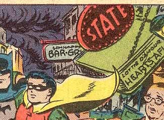
One of the signs says “Schnapps Bar-Grill,” or as much of that as you can see! Okay, I can’t imagine any reason for that name to be there unless Ira put it in himself, so I have to concede that this slightly different style is also the work of Ira Schnapp. All three Batman stories in this issue match and therefore must be lettered by Ira, and perhaps some of the stories in other books that I’ve been assigning to “proto-Schnapp” are just Ira using a variant style. I wish I could be sure, but I’m really on the fence about this!
I’m going to look at the rest of the interior Batman lettering next time in the concluding part of this article. Part 3, and more posts you might enjoy can be found on the COMICS CREATION page of my blog.
Todd Klein's Blog

- Todd Klein's profile
- 28 followers

