
Todd Klein's Blog, page 175
March 8, 2017
IRA SCHNAPP in BATMAN Part 1
 This and all images © DC Comics.
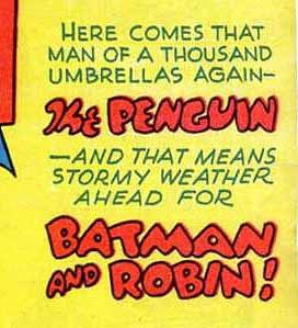
Continuing my research into the lettering work of Ira Schnapp, I’ve gone to my usual sources: digital copies of the actual comics, and the Grand Comics Database. I was surprised and happy to find that, on BATMAN, unlike the other early DC titles I’ve researched, lettering credits are often filled in, thanks to researchers like Joe Desris and Martin O’Hearn, and sometimes verified by the letterers themselves! This made my job much easier on this title, even though I don’t always agree with their attributions. More on that as we go along. The cover of BATMAN #27, Feb.-March 1945, is very much in Ira Schnapp’s style, especially the Old English style of SEASON’S GREETINGS.
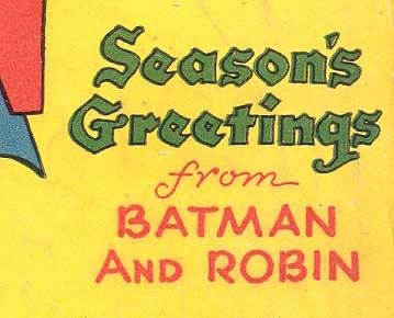
A closer look. While the script style of FROM and the shape of the B in BATMAN AND ROBIN is not typical of Ira’s later work, the style of the first two words is so familiar that I’m sure this is one of his, and it’s made me reconsider at least one of the ACTION COMICS covers from the same time that I now feel is by Ira, where before I didn’t think so. Ira’s style took time to develop to the one we know from the 1950s, and this is on that road.
 Without information found in the GCD, I would have given this cover lettering from issue #24 to Ira with a question mark, but it’s actually by George Roussos, and confirmed by him! George had a long career in comics, and began as a letterer. It’s wonderful he was able to confirm his work on this title. While many of the earliest BATMAN covers used typeset or had no cover copy, George did letter a few others.

Issue #29, June-July 1945, is the second BATMAN cover lettered by Ira Schnapp.
 While the single-line letters are again not typical of Schnapp’s later style, the open letters definitely are.
 Issue #32, Dec. 1945 – Jan. 1946 is again by Ira with the lettering inside a handsome scroll caption.

There are Old English elements in the story title that Schnapp used whenever he could, and notice that, in the regular lettering, the right leg of the R is curved, something Ira did early and only occasionally in his story lettering, I think an influence of another letterer he used as a style model.
 Lettering on the cover of issue #34, April-May 1946 is credited by Desris and O’Hearn to Ira Schnapp. At first glance, I didn’t agree.
Looking closer, I think it probably is by Ira, but using styles he later abandoned or modified. Note that all this lettering would have been created in black ink, but parts of it were moved to the various color plates by the color separator to create this effect.
 The lettering on issue #35, June-July 1946 is definitely not by Schnapp, and I think is probably by cover artist Dick Sprang.
 There’s no mistaking Ira Schnapp’s Old English lettering on issue #36, Aug.-Sept. 1946, here given many additional curls and flourishes. What could be better for the subject matter? The shape of the F in FEATURING is one we wouldn’t normally recognize today, but in context it reads fine.
 This blurb on the cover of issue #37, Oct.-Nov. 1946, is one I would have had trouble with, but the GCD identifies it as by George Roussos, confirmed by him. It looks to me like George was following Schnapp’s lead for cover lettering style here.
Ira Schnapp has become the regular cover letterer with issue #38, Dec. 1946 – Jan. 1947, above, and missed very few covers for the next twenty years. 38 to 45 are all by him. Issue #46 is by George Roussos.
 Issue #47, June-July 1948, shows Ira’s style beginning to solidify into the one he used for the rest of his career. I particularly like the exclamation point on its own line, something that wouldn’t fly today, but it looks perfectly fine here.

By issue #51, Feb.-March 1949 we see a typical Schnapp word balloon on the cover. In the blurb, some of the lettering was knocked out in white from the blue background, but the printing smeared some of the blue ink across it, making it hard to read.
 Issue #54, Aug.-Sept. 1949, feature’s Ira’s story title lettering in a major role. By this time Ira’s contributions were clearly appreciated and planned for.
 In the early days of the title, cover copy played a minor role, but as time went by, it grew in importance as an element to intrigue readers and make sales. Ira’s elegant lettering styles undoubtedly added to the appeal, as here on issue #70, April-May 1952. Notice the Batman symbol in a circle at upper left, balancing the DC symbol on the right, something the company used for a while.

A typical Schnapp lettering job on the cover of issue #87, Oct. 1954, as BATMAN drifted into ever sillier stories.

Issue #88 is credited by O’Hearn and Desris as a combined effort: Ira Schnapp on the blurb under the logo and Pat Gordon on the balloon. Well, maybe. I’m not completely convinced the open lettering is by Schnapp. The word FEATURING is, but could have been picked up from another cover. As for the word balloon, it’s unlike Pat Gordon’s style on the interiors, but it could be hers.

On issue #112, Dec. 1957, we see the sort of heavy display letters Ira Schnapp gradually went to for story titles from this period on.
 Issue #122, March 1959 is another example, and a favorite cover of my youth, one of the first Batman comics I ever owned.
 When BATMAN took on a new style with issue #164, June 1964, courtesy of artist Carmine Infantino (not the artist here, but the influence), Ira Schnapp continued to letter the covers for a while.
 Issue #169, Feb. 1965, saw the first appearance of cover lettering by Gaspar Saladino. Gaspar had been working alongside Ira Schnapp for fifteen years at this point, and Carmine Infantino preferred his more dynamic style. Over the next few years, the cover lettering gradually shifted from Ira to Gaspar, as Carmine rose in the company and made his preferences felt.
 But Ira Schnapp continued to letter some of the covers until he left the company in 1968. When BATMAN went to occasional all-reprint issues, his older style was particularly appropriate, and what a lot of work for him on this cover of issue #176, Dec. 1965!
 In some cases, even in these later issues, Schnapp’s lettering became as important as the work done by the artist. Remove the lettering from this cover, and it would be rather dull and pointless! No doubt it was designed with the lettering in mind by Carmine Infantino for issue #184, Sept. 1966.

The last new cover lettering on BATMAN by Ira Schnapp appeared on issue #200, March 1968, allowing him to go out on a high note. His blurb at the center of the figures by Neal Adams looks great, and might have been requested by Adams, who befriended Ira when they worked together in the DC offices. Some of the reprinted covers in the background also feature Ira’s lettering.
Here’s a list of the issues on which I find Ira Schnapp cover lettering:
27, 29, 32, 43, 36, 38-45, 47-56, 58-87, 89-155, 158-168, 170-172, 174-181, 184-188, 190-192, 194-196, 199-200.
That’s 155 covers, if my arithmetic is right, quite a long and impressive run.
Next time I’ll discuss Ira’s lettering inside the pages of BATMAN. Similar articles on other titles, and lots more about Ira Schnapp, can be found on the COMICS CREATION page of my blog.


March 6, 2017
Remembering Dave Hunt
 Dave Hunt and Todd Klein, 2013, photo by Ron Jordan.
I was very sad to learn yesterday evening that my friend Dave Hunt lost his battle with cancer that morning. He’d been battling stage 4 cancer for over a year. Our mutual friend Ron Jordan wrote: “Phyllis, Dave’s long time friend, called to let me know that Dave peacefully passed away at 4:30 AM in his sleep, at home with Phyllis and his nurse at his side.”
I first met Dave in my early days on staff at DC Comics, around 1978, probably when he was visiting the offices. We discovered we lived in adjoining towns, and became friends, visiting each others’ homes occasionally, and enjoying time and talk together. I don’t recall us talking much about our personal lives, mostly it was about comics, the comics business, artists we liked, movies and TV, and some of Dave’s hobbies like cave exploring, painting, and building models and miniatures. “The good stuff,” as Dave would say. I met Dave’s son Ben, and his long-time companion Phyllis in those days.
 From Dave’s Facebook page, his son Ben on an exploration of Floyd Waggy Cave in the 1980s.
When I married and moved to southern New Jersey, I lost touch with Dave for some years, but gradually got back in touch through a mutual friend, Ron Jordan.

Ron Jordan wrote: “I met Dave more than 20 years ago at a Superman Comic Show I ran in Woodbridge, NJ with guests Murphy Anderson, Curt Swan and Kurt Schaffenberger. Dave came by just to say hi to the artists he had worked with, who he had not seen in years. Dave became a frequent guest at my shows, and a good friend.”
Above is a tribute to artist Curt Swan pencilled and inked by Dave for one of Ron’s program books in 1996, courtesy of Ron. Dave didn’t often pencil, but when he did the results were charming.
When Dave joined Facebook in 2010, we connected there as well. In the spring of 2013 I saw Dave and Phyllis in person for the first time in many years at the Asbury Park Comic-Con, a meeting engineered by Ron Jordan, where we were also joined by John and Cathy Workman. In the fall of 2013, Ron brought Dave to my house for a visit, which I wrote about HERE. While slowed by health issues, Dave was still great to talk to and be with.
Over the last two years I followed Dave’s health issues through Ron. He had a rough time with the chemo and other treatments, but by last fall got through that and seemed to be feeling better. Ron brought Dave to our house for a second visit in October, 2016, and we once again enjoyed talking about comics and all kinds of things for a few hours. It was the last time we spoke or saw each other, and a visit I will always treasure, as I think we all felt then that Dave’s time was probably growing short.
 Dave in 1966 with a recently completed painting, from his Facebook page.
Dave was born in New Jersey in 1942, and his father, an amateur artist, encouraged him to draw and instilled in him a love of art. But Dave also loved geology and first thought he wanted a career as a research scientist, which he pursued at New Jersey’s Kean University, graduating magna cum laude. Dave later realized art was his true calling. At first he pursued a painting career, and was in some shows in the 1960s.
 In the Marvel bullpen, 1973, Dave Hunt, Linda Lessman, Don McGregor, published in CREEM magazine.
Dave also loved comics, and in 1972 he was hired by Marvel to work in their bullpen doing art and lettering corrections alongside Danny Crespi and Morrie Kuramoto among others. As with most comics production people at the time, he was soon augmenting his low salary with freelance work of all kinds.

At first he mainly did lettering, see above, though Dave told me he never liked lettering very much.

Dave also did quite a bit of coloring for Marvel, but eventually settled on inking as the job he liked best. Above, a story he inked and colored.
 In late 1976, now inking full-time, he was teamed with penciller John Byrne on MARVEL TEAM-UP, and garnering attention for his fine work. Dave might have stayed with Byrne when he moved to the recently relaunched UNCANNY X-MEN, but took another opportunity instead.
 In 1978, Dave was offered an exclusive inking contract and a higher page rate by DC Comics, and made that career change. At first he picked up random assignments as they became available. The first one I’ve found on the Grand Comics Database is a Robin story in BATMAN FAMILY #18, June-July 1978. I lettered that story, the first time we worked together, and perhaps the reason for our meeting. Dave was soon inking two of his favorite artists, Curt Swan and Kurt Schaffenberger on Superman-related titles, a period he always spoke of fondly. An example of Swan and Hunt is above.
 Dave loved the Captain Marvel characters as well as the Superman ones. Here’s another rare example of his pencil and ink work, for a 1980 fanzine.
In 1987, Dave was one of a group of artists, including Swan and Schaffenberger, called to a meeting by then DC editor-in-chief Dick Giordano, where they learned to their surprise and shock that the Superman titles were to undergo a major revamp headed by John Byrne, and, to quote Dave, “None of us would ever work on Superman again.” The company wanted new, younger artists on Superman, and the old guard was moved to lower profile projects. Released from his exclusive contract, Dave continued to get work from DC, and also returned to Marvel on titles like TRANSFORMERS, worked on MR. HERO at Tekno, and did lots of animation-related comics for Disney in the 1990s. In 1997 he became the regular inker on DC’s SCOOBY-DOO. The last credit for new work I see for Dave on the Grand Comics Database is for SCOOBY-DOO #94, May 2005. I think Dave was still doing work on DC licensed products after that, but he retired from comics around 2007 and began a new career, writing articles for caving and other magazines and returning to painting in a major way.
 Here’s one of Dave’s paintings, which he showcased on his Facebook page, that includes a favorite comic book from his collection.
 Some of Dave’s paintings were remarkably detailed and photo-realistic, like this one. Dave enjoyed interacting with fans and colleagues on Facebook, and there were also photos of him having fun with his grandchildren, Ben’s children. Dave was still interested and enthusiastic about many things, and his page is worth a visit.
While I always liked and enjoyed Dave’s art, it’s Dave the person I treasured most. He was always a kind and welcoming person, and a good friend, who will remain in my thoughts, as will his family.
Ron Jordan wrote: “Dave had a lot of fans of his artwork and many friends, too. I had the pleasure of knowing Dave as an artist and close friend who will be greatly missed and always remembered by many.”
Rest in peace, Dave.
March 5, 2017
Pulled From My Files #50: Marvel’s LEGION
 Image © Marvel.
Something different this time, here’s a scan of a photocopy of a logo I designed for Marvel in 1994. It’s hand-drawn, probably on Denril plastic vellum. I have no sketches for it in my files, though there must have been at least one. I was paid a logo fee, so this must have been the final version I sent in, but I have no idea where it was used, or if it was ever used. I haven’t seen the new TV show based on the X-Men character, but I’m sure this was designed for him, and when I came to this in my files, I wondered. Do any of you faithful readers recall seeing it in print? Please let me know. Thanks!
ADDED: mystery solved by several people, thanks all! It was used on issues 1 to 3 of X-MEN ARCHIVES, all dated Jan. 1995. I also did the title logo and the word FEATURING.

March 3, 2017
Incoming: STARSTRUCK ARTIST’S EDITION
 Images © Elaine Lee & Michael Wm. Kaluta.
Another gigantic book has arrived showcasing Michael Kaluta’s wonderful art on the early pages of STARSTRUCK, as well as Elaine Lee’s fine writing, and some lettering that I am mostly quite proud of. I knew the early chapters of this were large, I’d forgotten quite how large. The book, seen here on the drawing board where it was lettered, is about 15.5 by 20.5 inches. The art pages of the early chapters measure about 14.5 by 19.5 inches. I recall when I was lettering them, it was sometimes a challenge to get things done at the top of the page without bending the art!

Here’s most of my favorite panel and favorite lettering included in the collection. This is as much fun to read as it is to look at, it’s complete as far as it goes, I believe, though STARSTRUCK continues to evolve, so additional pages might have been added later. I’m credited as the only letterer, but it’s not so. About the last 20 pages were lettered by John Workman. Some of the pages before that were originally lettered by Ken Bruzenak, and relettered by me. Probably only I would notice the small bits of his work that remains, like some of the balloon borders and sound effects.
This is a wonderful thing. No idea when you can get it, or how much it costs, but I highly recommend it.
March 2, 2017
And Then I Read: TRIGGER JOHN’S SON by Tom Robinson

What caught my eye in the used book store was the cover illustration, which I knew immediately to be by Robert McCloskey, whose work I know from his own books, most famously “Make Way For Ducklings,” but also two books of funny stories for older readers, “Homer Price” and “Centerburg Tales.” He also illustrated the Henry Reed books by Keith Robertson, which I love. I’d never heard of Tom Robinson, and all I’ve found about him online is that he wrote two other children’s books for younger readers. This one was originally published in 1934, and this edition illustrated by McCloskey was first published in 1949. The copy I found is the eighth printing from 1966, so it must have sold well.
Trigger John’s Son, known as Trigger to his friends, is an orphan, and as the book opens he’s been sent to a new foster home in Pennsylvania by train. Trigger has been shuffled through several homes, and is not sure he wants another one, so he sneaks off the train and arrives in the town later by hopping a freight train. He’s soon found new friends, a feisty group of boys known as the Goosetown Gang. After getting to know each other with a fight, they help him hide outside town in the home of “The Englishman,” a elderly loner who the boys have befriended. As Trigger gets to know more about the town and the husband and wife who have sent for him, George and Myrtle Smith, he decides they’re not so bad, and reveals himself. George Smith turns out to be a friend and ally. Myrtle is less sure of him, having lost her own son to illness, and she’s very strict with the boy, but in the end they get on okay.

Much of the book involves Trigger and the Goosetown Gang’s adventures, along the lines of Tom Sawyer and Huck Finn, with some baseball and a circus involved. There’s the secret clubhouse ritual, the hideout in the woods, raising money to help The Englishman regain his hearing, making trouble for the school principal after he makes trouble for them, a rival gang, a tomboy who wants to join them, and more, all good fun, and greatly enhanced by McCloskey’s many charming illustrations. I’m surprised I haven’t run into this book before, but I enjoyed it a great deal now.
Recommended.
March 1, 2017
And Then I Read: GREEN LANTERNS #8
 Image © DC Comics.
I’m trying to catch up on this title, but failing, as this review of a Halloween issue indicates. Earth’s two Green Lanterns, Jessica and Simon, are looking for a rogue Guardian of the Galaxy who was, until recently, hiding out with them. Then that Guardian learned he was being sought by two of the dangerous aliens called Dominators, which spooked him, so he went deeper into hiding. The Dominators are after his Phantom Ring, the only one of its kind. Unlike all the other power rings, this one can be used by anyone who picks it up. With such a powerful weapon, not a great feature.
The issue gives Simon and Jessica time to go trick-or-treating with some of their young relatives, while searching, and that makes for fun and funny reading. When the Lanterns finally find the Guardian, things get serious quickly.
This is one of the best comics from DC I’ve read in some time. It hits a lot of bases and adds to GL history, yet is pretty self-contained and easy to understand. The character interplay is excellent, the plot clever and unpredictable, and the art is perfect for this story. Great job by Sam Humphries and Ed Benes, looking forward to more.
Highly recommended.
February 28, 2017
And Then I Read: THE FLASH #9
 Image © DC Comics.
The cover of this issue is a nice homage to the cover of issue #123 of the Silver Age Flash from 1961, see below.
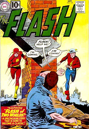 While I like the idea, I have to say I like the original better. It’s cleaner and clearer.
The issue in hand has a guest artist on the inside, Jorge Corona, whose style is somewhat like that of the regular artist, Carmine Di Giandomenico, but with more exaggerated faces and figures, almost caricatures, that I didn’t care for very much. His storytelling is fine, but the faces kept pulling me out of the story. That story is one of two Kid Flashes, as you can see from the cover, and I’ve lost track of how that all works, but the visiting one is also in TEEN TITANS, and there’s discussion of plot lines there that I’m not reading, though no real crossover. There’s plenty of action in the book, and some nice character moments, but in all I can’t say I enjoyed this issue as much as usual.
Mildly recommended.
February 27, 2017
And Then I Read: CAVE CARSON #3

Image © DC Comics.
This book is an interesting mix of things. The story is somewhat traditional in structure but with odd moments and characters that make it seem fresh. The traditional characters from the original Cave Carson comics are sort of familiar, but with equally odd variations, like the cybernetic eye of the title. This time we finally have Cave and his daughter (with Wild Dog, for some reason) finally in the mole car heading underground (always the best thing in the original comics) here being chased by a monster and another mole car. The art by Michael Avon Oeming is pretty cartoony, so it’s kind of like seeing the story through a Saturday Morning animation filter. It works at times, though on occasion the simplified art style fights the story for me. But mostly it’s a fun read and it keeps me entertained and wondering where it will go next.
Recommended.
February 25, 2017
Pulled From My Files #49: X-MEN MUTANTS EVENT

All images © Marvel.
In 1994 (I believe) I was contacted by Marvel editor Bob Harras about designing three connected logos for an upcoming X-Men three-title event. The lead line was to be MUTANTS with the individual titles below that. I suggested we start with that word, and develop the rest to match. All these sketches are drawn in pencil and inked in markers.


Above are the five versions I sent in for MUTANTS, and they chose version 3 to go further with.

The chosen version of MUTANTS was beveled, and I did the main word of each book title to match.


By using bevels on all the large words I could utilize different styles while still having them seem to go together. My note on this set of sketches suggests the logos are too tall, and I can make the word MUTANTS less so. That led to three more sketches.

Still really too tall for a comics logo, but less tall, at least.


That’s all I did on this project. The three connected books came out in 1995, each a mini-series, without the word MUTANTS, and as part of an even larger crossover event, “Age of Apocalypse.” These three titles had logos and cover lettering by Comicraft. I did some of the other logos for the event.
Lots of work here, and none of it saw print, which is disappointing, but that’s the way logo design goes sometimes. I would have been given kill fees for each title.
February 24, 2017
And Then I Read: ARTHUR, THE SEEING STONE by Kevin Crossley-Holland
 Generally I steer away from retellings of the Arthurian legends because I so love the version by T.H. White that others pale by comparison. This book, the first of a trilogy, seemed a different enough approach to be worth a try, and I enjoyed it.
The Arthur of this story is Arthur de Caldicot, living with his family in their manor house/castle on the English side of the Welsh border in 1199. Arthur’s father is the lord of the small village and nearby territory. One of the members of his village is an old man named Merlin who is revered for his wisdom, but in many ways seems no more than an old man. Arthur’s life is troubled by the jealousy of his older brother, and the treatment of some of the lower class people in his village. He longs to become a Knight like his father, but in fact shows little aptitude for it.
All that changes when Merlin secretly gives him a shiny black stone that in time becomes a window into the past. A window into the time of another Arthur who is the one we know of in the legends. This story’s Arthur sees many parallels in that Arthur’s life to his own, and as mystery of the seeing stone reveals ever more of the past, the Arthur of 1199 finds his secret knowledge gives him insights into those around him he never had before. Soon secrets in his own life begin to unravel, opening up new possibilities for the boy, all against a well-researched backdrop of mediaeval life of the time.
Well done, I will look for the rest of the trilogy. Recommended.
Todd Klein's Blog

- Todd Klein's profile
- 28 followers

