
Todd Klein's Blog, page 167
June 16, 2017
And Then I Read: SUMMERLONG by Peter S. Beagle
 Cover illustration by Magdalena Korzeniewska.
I have long admired the writing skill of Peter S. Beagle, and this new novel is a prime example.
Abe is an elderly writer living on Gardner Island in Puget Sound, Washington. He’s in a long-term serious relationship with Joanna, an aging stewardess, who keeps her own apartment on the mainland when not with Abe. Joanna’s daughter Lily is single, and can’t seem to hold on to a relationship, though she’s tried with many women. All three of their lives, and the very world around them, are changed by the arrival of Lioness Lazos to Gardner Island. Lioness takes a waitress job at the local diner where Abe, Joanna and Lily are all struck by her timeless beauty, her sweet yet mysterious ways, and the sudden panic attacks that bring her to live in Abe’s garage. Strange weather has arrived with Lioness that brings an early spring to the island, one that never seems to leave. Lioness has dark secrets, and is being sought by powerful beings who know her true story. It’s one that will draw Abe, Joanna and Lily into the world of myth and magic slowly and surely, and change all of them forever.
If you’re a fan of Neil Gaiman’s novels, Beagle is an author you should explore, and this is a good place to start. If you’re already a Beagle fan, don’t miss this one.
Highly recommended.


June 15, 2017
And Then I Read: SHADE THE CHANGING GIRL #7
 Image © DC Comics.
My favorite issue of this title so far, even though it’s a fill-in art team: Marguerite Sauvage with some help from Dan Parent. Here we finally get some significant back-story on the Avian, Loma, inhabiting the body of the Earth girl, Megan. Loma’s own story and childhood are explained and her interest in Earth and Rac Shade, the protagonist of the original series this is spun from. Loma meets Shade at his poetry reading and book signing, a fun idea, and even though Rac’s face is hidden here, we learn more about HIS story too. I liked that. Some of Loma’s odd and off-putting behavior in this book is now made more understandable by her background, and even as we learn that, Loma is struggling with the love/hate relationship she has with Earth and the new friends she’s found there. I even read and liked the backup strip this time, as I now get how and why it relates to the main one. My only quibble is, this material should have been in the first three issues, not issue 7. Oh, and the art and coloring is different and delightful.
Recommended.
June 14, 2017
Incoming: WONDER WOMAN BY GREG RUCKA Vol. 2
 Image © DC Comics.
Just received my advance copies of this trade paperback, collecting WW issues 206-217 and the crossover issue 219 of THE FLASH. I really enjoyed working on this run with Greg, pencillers Drew Johnson and Rags Morales, and cover artist J.G. Jones. I think it still looks and reads great. I’m happy that the success of the Wonder Woman film is getting much of her past comics work back into print, including some I worked on. There should be enough Rucka issues for a third collection. This one is out July 5th, looks like.
June 13, 2017
And Then I Read: HAL JORDAN & THE GL CORPS #13
 Image © DC Comics.
What a charming and fun issue this is! Writer Robert Venditti has tapped into the superhero as myth by telling the events of the previous few issues as a bedtime story to two young children forty years in the future, as seen through the eyes of a Xudarian grandmother, then a young girl herself. Through her telling, we see the attack by Starro the Conqueror on Xudar, then the arrival of the Green Lantern Corps to help and protect. Later the Xudarian city as well as the GLs are held prisoner by Brainiac and Larfleeze. There are also some wonderful two-page spreads of heroes and villains in action suggesting the long battle between good and evil among the stars, but it comes back to the grandmother and her grandchildren, their feelings, hopes and dreams, and the surprising true identity of the Xudarian storyteller. This is mining from the rich vein that Kurt Busiek often digs from in ASTRO CITY, and a welcome respite from the usual melodrama and constant fighting in this and many other superhero titles. I loved it. The art by penciller V Ken Marion and inkers Paul Neary and Dexter Vines is great as well. A winner all around.
Highly recommended.
June 12, 2017
And Then I Read: GREEN LANTERNS #13
 Image © DC Comics.
I admire the range and depth of Green Lantern lore that writer Sam Humphries is playing with in this series and storyline. We have a flashback to Volthoom, the First Lantern, which includes Rami, the maker of the first GL power rings, and both confronting each other in the present, where Rami’s last creation, the Phantom Power Ring, is in the hands of a human who can’t control it and creating all kinds of havoc. Then we have Simon and Jessica, Earth’s current GLs in residence, fighting Frank Laminski, the wielder of that Phantom Ring, and having no easy time of it as the ring’s power keeps shifting from one color and type of emotion to another, with shifts in powers that entails.. Humphries is using all the toys, and handling them well here, with fine art by Ronan Cliquet. Yes, much of the issue is fighting and arguing, but it’s compelling all the same. Well done.
Recommended.
June 11, 2017
Pulled From My Files #55: NIGHTWATCH LOGO
 This and all images © Marvel.
In 1993 I was asked by Marvel to create a logo for their character Nightwatch, a superhero appearing in some Spider-man titles that was planned as a new series. I don’t have all the marker sketches I did at the time, the first one that survives is #2, above. This is actually my favorite of the surviving sketches, but I can see why it wasn’t wanted, not very appropriate for a superhero.
 Sketch 3 is more like it, and I think works pretty well, but the W is a bit hard to read.
 Version 4 is even harder to read, a problem compounded by the length of the word and all the vertical strokes in its letters.

Version 5 simply fills in and deepens the drop shadow. This increases readability, but puts an awful lot of black in the logo.
 Version 6 is missing, but from the notes on version 7, it was quite similar to this one with differently shaped W and C. I think this manages to be pretty readable and bold, and it was the design Marvel approved.
 Here’s the finished logo probably drawn on Denril plastic vellum over the sketch above with no changes that I can see.
 As printed on the first issue, and with red in the outer shape, I think it reads fine. Very much in the pointy and dangerous style that Marvel was looking for at the time, and it fills the logo area well. The book did not last too long, perhaps a victim of the industry downturn that began in 1994, when the the series saw print.
June 8, 2017
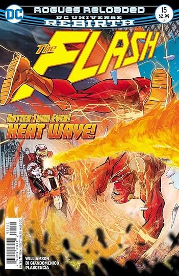
And Then I Read: THE FLASH #15
 Images © DC Comics.
I’m enjoying this return of THE FLASH to characters I loved in my youth, the Rogues Gallery, particularly enjoying the retro covers by Dave Johnson with the Silver Age logo by Ira Schnapp and cover copy in his style. (I think I could have done it better, but no one asked…)
The Rogues have lured Barry Allen to the small European country of Corto Maltese, itself a comics insider joke, look it up. There they are robbing a museum of a priceless gold statue, and The Flash is determined to stop them, even so far away from his home base. As one might expect, the Rogues are tricky, and things in Corto Maltese might not be what they seem. Nicely written by Joshua Williamson, well drawn by Carmine De Giandomenico, well colored by Ivan Plascencia and expertly lettered by Steve Wands.
Recommended.
June 6, 2017
IRA SCHNAPP in ADVENTURE COMICS Part 2
 This and all images © DC Comics.
I’ve had a tough time trying to decide which early stories in ADVENTURE COMICS were lettered by Ira Schnapp. I’m sure there were none in issues 1 to 102. In issue 103, Superboy begins as the lead feature, and it seemed likely to me that at least some of those would be lettered by Ira. He had an association with the character: he designed the first and second logos, and of course an association with Superman as well. Above is a page from the Superboy story in issue #103, and it doesn’t look anything like Ira’s work.
 A closer look at the story’s title caption confirming it’s definitely not by Ira. It’s by another letterer who often worked on Superman stories, I don’t know his name. His letters are very wide, and on his R the right leg is very curved and the loop sometimes does not join the left side. That’s also true of the center line between the loops of the B. This letterer continued to work on some Superboy stories in this title until the early 1950s.
 Elsewhere in issue #103, I found this story title on the Shining Knight feature and thought it must be by Ira Schnapp, it’s in an open Old English style that he liked to use. Yet the rest of the lettering did not look right.
 A closer look. The regular letters are wide, but not as wide as in the Superboy story, and while the right leg of the R is curved, the loop is always connected. Many of the letter shapes here are similar to those of Ira Schnapp, but still generally wider than his, which tend to fit into a square. Other letters, like the V are more curved than Ira usually did them. I believe this is the work of the unknown letterer I call “Proto-Schnapp.” I think he was an older letterer, perhaps working in the National (DC) Comics bullpen, who befriended Ira and who Ira used as a role model for his own comics lettering style. At times, I’ve been tempted to think this was early work by Ira, but in my research I’ve often found this style in the same issues as Ira’s work throughout the 1940s. Since there’d be no reason for Ira to have two different lettering styles (even if he could), I’m sure this is the work of someone else. What makes it tricky is that Ira imitated Proto-Schnapp’s style points and titles at times, or possibly they influenced each other and Proto-Schapp imitated some of Ira’s title styles. Another difficulty in this series is that the scans I have of many issues from 103 on are very poor ones made from microfilm, and the lettering is too blurry to pick out the finest details of style. A few weeks ago I went through the entire run and made a list of all the stories I thought were lettered by Schnapp. Then I got busy with other things, and put the project aside. Last weekend I started looking again, and this time about half of the stories from the 1940s I had down as lettered by Ira I now think are by Proto-Schnapp instead. It’s that tough a call on many of them, and if I went through them again I might change my mind on a few one way or the other! Below are my best guesses and some of the better examples I could find on both sides of the argument.
 Here’s the kind of blurry scan I have for many of the issues in question. While it’s hard to be sure, this page from the Superboy story in ADVENTURE #104 seems to be by Proto-Schnapp. I think he also lettered the Shining Knight story in this issue, and other stories in issues 105 to 110, where I now think there’s no Schnapp work.
 The earliest story I think is lettered by Ira Schnapp in this series is the Johnny Quick story in ADVENTURE COMICS #111, Dec. 1946. Notice how much narrower the letters are, most would fit into a square. There are a few curved right legs on the letter R, but most are straight, as Schnapp did them all later. There’s a little more air in the balloons around the lettering as compared to Proto-Schnapp, above. This matches what Ira was doing in other titles at the time.
 I have a much better scan of issue #112, and here’s a panel from the Superboy story in that issue, lettered by Proto-Schnapp. Note all the style points I gave earlier: wide letters, curved right leg of the R, more curved diagonal strokes. Proto-Schnapp’s question marks are also a little different than ira’s.
 The Superboy story in ADVENTURE #114, March 1947, is the second one I think is lettered by Ira. Again, note the narrower letters, the straighter diagonals, and a little more air in the balloons around the letters.
 The splash page of the Superboy story in ADVENTURE #115, April 1947, is a puzzle. The title caption looks like it could be Ira’s work, while the rest of the lettering on this page and the rest of the story is by Proto-Schnapp. I can’t think of a good reason why that would happen, but here it is. Possibly the title caption was a last minute change Ira did when the main letterer wasn’t available.
 The Superboy story in issue #116 looks like Ira Schnapp’s work to me. Note the art deco sign in panel 3: Perfume.
 A typically poor microfilm scan from issue #117, I think the only story lettered by Ira Schnapp. The title style is not typical for him, but I have seen it on other stories.
 From the splash page of the Superboy story in ADVENTURE COMICS #120, Sept. 1947. That title definitely looks like Ira Schnapp’s work, as does the rest of the lettering in this story.
 By comparison, the Johnny Quick story in the same issue has the wider letters and style points of Proto-Schnapp. Another example of why it’s so unlikely these are all by the same letterer.
 The Superboy story in issue #121 again looks like Ira’s work. Many of the other stories in these issues are by Proto-Schnapp. That letterer and Ira seemed to both be lettering whatever stories were available, so in issue #122 they are all Proto-Schnapp, in issue #123 the Superboy, Aquaman and Johnny Quick stories are by Schnapp, with only the Green Arrow story by Proto-Schnapp.

In issue #124, most stories are by Proto-Schnapp except possibly the Johnny Quick story, above. This one could be by Ira, but…
 …I’m not sure. Here’s the title caption. That very elaborate and graceful border looks more like Proto-Schnapp to me, and some of the letters are pretty wide. I’m calling it for him. You see what I’m up against, these are tough calls.
 I already showed the splash page from the Superboy story in issue #133, Oct. 1948 in the first part of this article, calling it for Ira Schnapp, but looking again now, I see a lot of very wide letters, and balloon shapes that aren’t quite right. Now I think it’s by Proto-Schnapp.
 By comparison, the Shining Knight story in issue #139 has very narrow letters and a title that’s more like something Ira would do than Proto-Schnapp, so I would definitely put this one down as Ira’s work.
 Typical Ira Schnapp lettering on the Johnny Quick story in issue #150, March 1950…
 …and here’s what I think is the last Proto-Schnapp lettering in this series, the Aquaman story also from issue #150. This would have been done in late 1949, and so far I haven’t found any work by Proto-Schnapp later than that. My guess is that he either retired, moved to another job, or died around that time. I have to say it makes identifying Ira’s work on the rest of the series much easier, though there isn’t a lot of it. Ira seems to have been largely replaced on this title by other letterers in the 1950s. He was very busy elsewhere!
 I can’t resist showing a page from the Shining Knight story in ADVENTURE COMICS #151, art by Frank Frazetta, lettering by Ira Schnapp. If only it were reproduced better!
 Here’s a rare team-up of Superboy and Green Arrow from issue #258, March 1959, lettered by Ira.
 Schnapp mostly missed the Legion of Super-Heroes appearances in ADVENTURE, but his very last work on the title was this four-page feature in issue #316, Jan. 1964 with not a lot of lettering, but all of it distinctively Ira’s. The first two pages of this feature are reprinted from SUPERMAN ANNUAL #4, Feb. 1962. The last two seem to be newly done, or at least newly assembled.
Finally, a complete list of all the ADVENTURE stories I think are lettered by Ira, at least today. It may not be right, but it’s official, as they say. Note that in some cases, where the penciller and inker were the same person (often George Papp), the artist drew in the balloons, Ira only did the lettering in them.
ADVENTURE COMICS #111, Dec. 1946: Johnny Quick 10 pages
ADV #114, March 1947: Superboy 7 pp
ADV #116, May 1947: Superboy 8 pp
ADV #117, June 1947: Johnny Quick 9 pp
ADV #120, Sept. 1947: Superboy 10 pp
ADV #121, Oct. 1947: Superboy 10 pp
ADV #123, Dec. 1947: Superboy 10 pp, Aquaman 7 pp, Johnny Quick 9 pp
ADV #125, Feb. 1948: Aquaman 7 pp
ADV #126, March 1948: Johnny Quick 9 pp
ADV #128-130, May-July 1948: Superboy 10 pp, Johnny Quick 8 pp
ADV #131, Aug. 1948: Superboy 10 pp, Aquaman 6 pp
ADV #133, Oct. 1948: Superboy 10 pp
ADV #135, Dec. 1948: Johnny Quick 8 pp
ADV #137-138, Feb.-March 1949: Superboy 10 pp
ADV #139, April 1949: Shining Knight 6 pp, Johnny Quick 8 pp
ADV #142, July 1949: Shining Knight 6 pp
ADV #143, Aug. 1949: Superboy 10 pp, Shining Knight 6 pp
ADV #145, Oct. 1949: Aquaman 6 pp
ADV #146, Nov. 1949: Green Arrow 10 pp
ADV #147, Dec. 1949: Aquaman 6 pp, Green Arrow 10 pp
ADV #148-150, Jan.-March 1950: Johnny Quick 8 pp
ADV #151, April 1950: Aquaman 6 pp, Shining Knight 8 pp
ADV #157, Oct. 1950: Johnny Quick 8 pp
ADV #159-160, Dec. 1950 – Jan. 1951: Green Arrow 10 pp
ADV #164, May 1951: Green Arrow 10 pp
ADV #172, Jan. 1952: Superboy 12 pp
ADV #176, May 1952: Aquaman 6 pp
ADV #181, Oct. 1952: Johnny Quick 6 pp
ADV #188, May 1953: Aquaman 6 pp
ADV #189, June 1953: Aquaman 6 pp, Johnny Quick 6 pp
ADV #195, Dec. 1953: Aquaman 6 pp
ADV #208, Jan. 1955: Aquaman 6 pp
ADV #235, April 1957: Superboy 12 pp
ADV #245, Feb. 1958: Aquaman 6 pp
ADV #257, Feb. 1959: Aquaman 6 pp
ADV #258, March 1959: Superboy 13 pp, Green Arrow 7 pp, Aquaman 6 pp
ADV #259, April 1959: Superboy 13 pp, Aquaman 6 pp
ADV #262, July 1959: Aquaman 6 pp, Green Arrow 7 pp
ADV #263, Aug. 1959: Aquaman 6 pp
ADV #264, Sept. 1959: Green Arrow 7 pp
ADV #266, Nov. 1959: Aquaman 7 pp
ADV #290-291, Nov.-Dec. 1961: Tales of the Bizarro World 11 pp
ADV #316, Jan. 1964: Origin and Powers of the Legion of Super-Heroes 4 pp
That’s a total of 530 pages, if my math is right, a good amount of work from Ira.
Other articles in this series and more you might enjoy can be found on the COMICS CREATION page of my blog. More Ira Schnapp research when I have time to do it!
June 5, 2017
IRA SCHNAPP in ADVENTURE COMICS Part 1
 This and all images © DC Comics.
Continuing my research into the DC Comics lettering work of Ira Schnapp, this part will cover Ira’s lettering on the covers of ADVENTURE COMICS. Prior to issue 103, above, dated April 1946, the title featured Simon and Kirby’s Sandman for several years, and few of the covers had any hand-lettering. What did appear was not like the work of Ira Schnapp. Issue 103 began a long run featuring Superboy as the lead character (Superman as a boy), and Ira lettered most of the covers from this issue on, when they had cover lettering at all, some did not. The word NOW! is very much in a style that Ira used throughout his cover lettering career (about 1944 to 1968). The rest of the lettering is typical of early Schnapp cover lettering, not quite like what he used a few years later, but similar.
 Ira also designed the Superboy logo seen on this and many later covers and stories, derived from his revamp of the Superman logo from 1940 (itself based on the original logo designs of Superman co-creator Joe Shuster). It’s interesting to note that while the P and R loops are rounded, the B and O in BOY have square corners that match the U. Ira designed a very different Superboy logo for the character’s own title a few years later.
 Issue #105, June 1946, has the first examples of Ira’s word balloon lettering on the title. Again, this is not exactly like what he was doing a few years later, but similar.
 Issue #107, Aug. 1946. As you can see, the blurb in the upper right corner is the same as issue #105, and it was reused a number of times. The blurb at lower right is new, and features some of Ira’s stylish script. I particularly like the Q in AQUAMAN.
 The cover of issue #113, Feb. 1947, gave Ira a chance to use one of the Old English styles he liked for SEASON’S GREETINGS, though unfortunately it doesn’t show up well on the dark blue background.
 Issue #121, Oct. 1947, has the first example on this title of the kind of open semi-script story title lettering Ira sometimes used. I would guess Ira also lettered the giant postage stamp, which features the most awkward flying pose I’ve ever seen!
 In addition to a slight variation of the blurb at upper right, issue #123, Dec. 1947, has an early example of another style Ira often used in the sign at left, Art Deco block letters.
 Issue #131, Aug. 1948 has a rare example from the time of cover lettering that I think is NOT by Ira Schnapp, but instead by someone else trying to imitate his style, and not getting it right. The biggest indication is the use of type for the story title, a shortcut Ira would never have taken.
 Issue #133, Oct. 1948, has an odd cover where the lettering is a mix of type and hand-lettering. Some of this might have been put in by the artists. The open story title is a bit rough and uneven for Schnapp, but could be by him on an off day.
 Much of the same art and lettering appears on the first story page inside.Both might have been lettered by Ira Schnapp or another letterer with a similar style (more on that in Part 2), but probably with some or all of the report card done by the art team of Al Wenzel and George Roussos (also a letterer) as credited by the Grand Comics Database.
 Issue #139, April 1949, was the first to feature a new and much improved ADVENTURE COMICS logo by Ira Schnapp. In fact, I think this is the best logo the title ever had. The editors and staff must have thought so too, it lasted until issue #397, Sept. 1970, over thirty years, and off-and-on after that until 1978. Longer than Ira himself, who left the company in 1968 and died in 1969. It also has a small version of the new Superboy logo Ira designed for the character’s own magazine.

 Issues #155 and #159, Aug. and Dec. 1950, are, I think, two more rare exceptions that are NOT by Ira Schnapp. These do not look like Ira’s work.
 By issue #163, April 1951, Ira Schnapp’s fully-developed cover lettering style is on display, including his typical word balloons and open titles, as well has his handsome script. This look would unify and brand the entire DC Comics line from about 1950 to 1967. Note that the balloon lettering style Ira used on covers was different from the one he used on story pages. It was done larger, and more carefully for one thing. The most obvious difference is that the S is more perfectly rounded.
 Issue #192, Sept. 1953, has a particularly beautiful story title in one of Ira’s favorite Old English styles. Notice how the balloon lettering has become more condensed and has heavier lines.
 Issue #210, March 1955, added Superboy’s super-dog to the mythos, with nice lettering by Ira.
 By comparison, Krypto’s second appearance in issue #214, July 1955, has cover lettering definitely NOT by Ira Schnapp.
 Perhaps the most famous ADVENTURE cover is issue #247, April 1958, which introduced the Legion of Super-Heroes, with fine lettering by Ira, including the name plates and voting signs.
 Issue #255, Dec. 1958, features early cover lettering by Gaspar Saladino, who would become the main cover letterer about a decade later, replacing Ira.
 Issue #290, Nov. 1961, has way too much lettering, but Ira Schnapp makes it work anyway, managing to keep it off the characters and action.
 The Legion of Super-Heroes was very popular, and eventually pushed Superboy into an almost supporting role. Ira Schnapp was asked to add them to the cover logo, and that version first appeared here on issue #317, Feb. 1964.
 As ADVENTURE rolled into the second half of the 1960s, the covers seemed to be trying too hard with too much lettering, very gimmicky stories, and poor trade dress design epitomized by those awful “go-go checks” at the top. DC, run by aging men, trying to hip, and failing miserably! Ira Schnapp did his best, but he and his style were also aging. Ira was 71 years old when he lettered this cover of issue #343, April 1966. His work was just as precise and accomplished as ever, but getting further and further out of date.
 Ira’s final cover lettering on this title was for issue #366, March 1968, so done in 1967. It’s over art by Neal Adams, who befriended Ira when they worked together at DC, and he may have asked for Ira’s lettering here. From this point on, most of the cover lettering is by Gaspar Saladino over the next decade or two.
Here’s a list of all the covers I believe were lettered by Ira Schnapp. Note that the existing credits for cover lettering in the Grand Comics Database are mostly correct from issue 300 on.
ADVENTURE COMICS 103-116, 119-130, 132-135, 137-154, 156-158, 160-213, 215-243, 245-253, 256-307, 309-315, 317-321, 323-327, 330-333, 335-338, 340-351, 353-356, 358-362, 365-366
That’s 243 covers if my math is right, quite an accomplishment! In Part 2 I’ll examine Ira’s work inside ADVENTURE COMICS. Other parts of this research and more articles you might enjoy can be found on the COMICS CREATION page of my blog.
June 4, 2017
Incoming: DARK NIGHT Trade Paperback
 Image © DC Comics.
I’ve been unable to determine a release date for this trade paperback version of the wonderful original graphic novel I lettered that arrived here this week. The hardcover came out on June 15, 2016, so I expect the softcover version will be out some time in the next few weeks. It’s much more than a Batman story, telling an autobiographical tale of events that happened to writer Paul Dini that changed his life and came near to ending it. The hardcover is nominated for an Eisner this year for Best Reality-based Work. I highly recommend it.
Todd Klein's Blog

- Todd Klein's profile
- 28 followers

