Patrick David Reinhart's Blog: Ongoing Illustration Adventures., page 8
January 11, 2013
Herringbone Hugo! Yes, yes… still working to finish Hugo....
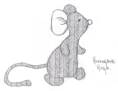
Herringbone Hugo! Yes, yes… still working to finish Hugo. But since he’s originally a Russ Berrie creation (of the Home Buddies line, and his given name was Sniffy), I figure I might want to tweak his design a little, make it unique, my own, without messing too much with his natural charming personality. Thus the herringbone pattern. And possibly I shall give him a horizontally-striped turtleneck to wear to make him even more graphically distinctive… and keep him warm.


Couple of sketches pertaining to the fairy tale that’s...
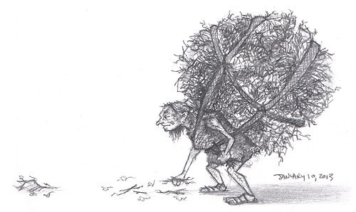
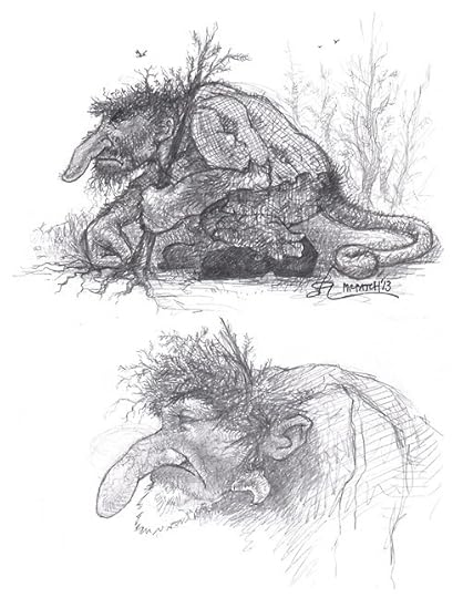
Couple of sketches pertaining to the fairy tale that’s been percolating in my brain for so long. The good news is that I finally discovered a solid beginning that should give it more of a coherent structure. These are only preliminary sketches, but convey the sense of what I want. A child-size old crone gathering twigs and an ancient, hill-like troll.
December 31, 2012
The King Of The Polar Bears by L. Frank Baum (11:42) and read to...
The King Of The Polar Bears by L. Frank Baum (11:42) and read to you by me. Listen to a handful of other stories I’ve read for Librivox. I posted this along with a bunch of the others together in a handy little player a while ago, but MixPod has since closed down, so that post is useless… Haven’t listened to this one for a while, hope it’s not toooo amateurish!
A colorized panel from the HUGO book. Seriously considering...
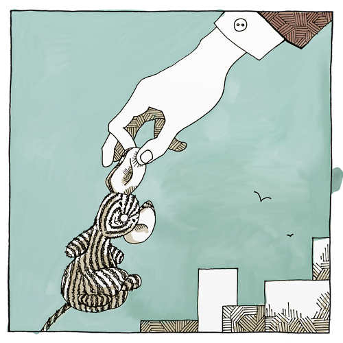
A colorized panel from the HUGO book. Seriously considering sprucing it up, finishing it up, and publishing it independently.
December 11, 2012
A mock-up of the cover design I did for Ishwori by Terri...
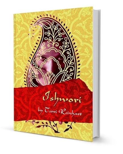
A mock-up of the cover design I did for Ishwori by Terri Reinhart, due out probably in January or February. Read more about the book on its facebook page.
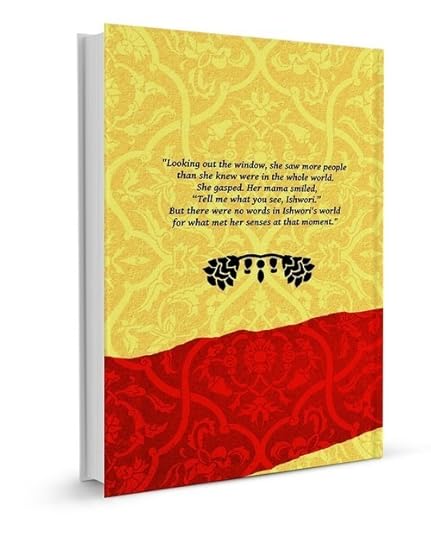
A mock-up of the cover design I did for Ishwori by Terri...

A mock-up of the cover design I did for Ishwori by Terri Reinhart, due out probably in January or February. Read about the book and get updates on its facebook page.
~
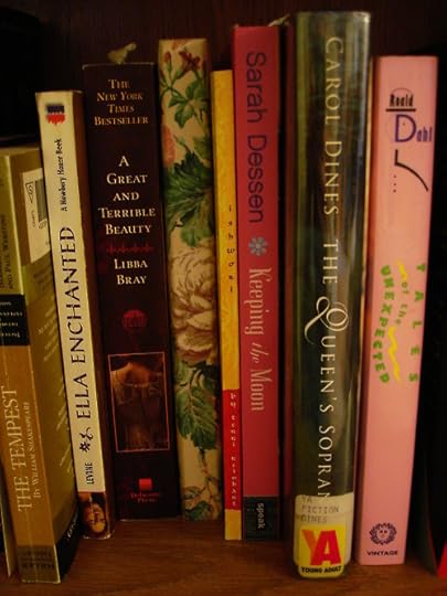
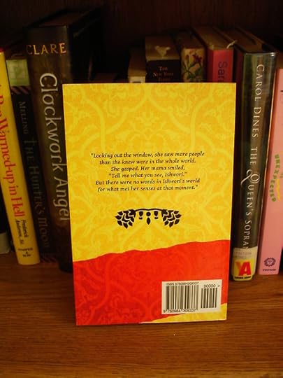
Update: Received proofs! As expected they’re not quite exactly right, even though we followed the specs as close as humanly possible. BUT! I got the text actually on the spine, the printing itself is everything I hoped, it’s just that there’s about an 1/8th of an inch less border then there should be.
Hey hey! Rotoscoped crow walk cycle. Pretty much just to see if...
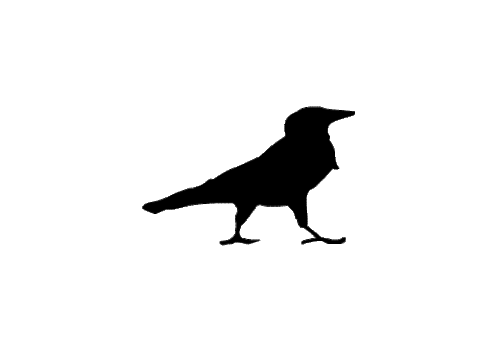
Hey hey! Rotoscoped crow walk cycle. Pretty much just to see if I could, and how well it would work. Not perfect (those freakin’ legs—there should probably be one more frame in there as the swing past each other) but not too shabby neither. I’ll try not to turn this site into a bunch of super-simple animation experiments…
November 7, 2012
Paper cut-out animation of a rocket ship blasting off. Extremely...
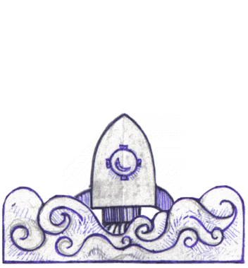
Paper cut-out animation of a rocket ship blasting off. Extremely basic, but it’s nice to see what it looks like in action!
October 9, 2012
A font I call Fontenay-aux-Roses, and the poem A Minor Bird by...
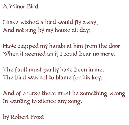
A font I call Fontenay-aux-Roses, and the poem A Minor Bird by Robert Frost. See my others: Otterloop, FriedrichWilhelm, DonAllen and MumsyMine.
Based on the type in this 1903 edition of Joris-Karl Huysmans’s A rebours.
October 7, 2012
Obsessing over another handwriting font. This one I call...
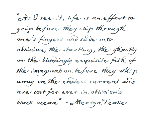
Obsessing over another handwriting font. This one I call Friedrich Wilhelm, after the guy who’s handwriting it was back in 1880. It’s all about the kerning, I tell thee. It still lacks a few of the lesser used capital letters, a dollar sign, but I did make an @ symbol. The ampersand is not “&”, it is “and”. Gives a tiny extra touch of inconsistency—the main problem with handwriting fonts. Anyway, this one has worked out light years better than I thought it would. Now if only this were MY handwriting…