Phil Simon's Blog, page 78
April 7, 2014
Upcoming Webinars
Over the next few months, I’ll be giving some webinars on Big Data and data visualization. Here they are:
06.10.2014 - I’ll be giving a webinar for Harvard Business Review on how to actually use Big Data. Link coming.
04.09.2014 - I’ll be hosting a webinar on HR and Big Data for the Conference Board – Canada. Click here to register.
04.08.2014 - I’ll be a guest on HigherEdLive. I’ll be talking about Big Data and my last two books.
The post Upcoming Webinars appeared first on Phil Simon.


April 5, 2014
The Visual Organization Book Tour: Seattle

My San Francisco book tour went really well and I’m thinking of adding a Seattle leg to it for mid- to late-May. I’ve always been a big fan of Seattle and I know that it sports a vibrant tech scene.
I’d come to Seattle for three to four days with the intent on speaking at as many places as possible. I’d ask that the talks be recorded and that the organization purchases a small number of books.
If you’re interested or know an organization that might be, leave a comment or connect with me.
The post The Visual Organization Book Tour: Seattle appeared first on Phil Simon.
April 4, 2014
Autodesk Talk: The Visual Organization

I recently gave a 32-minute talk at Autodesk about the new book, Netflix, and data visualization. You can watch it below.
The post Autodesk Talk: The Visual Organization appeared first on Phil Simon.
The Visual Organization Slides
A few people have asked to see some of the slides from the book tour. Yes, they are visible during my talks. I used the deck below as the template for a few of my talks. Knock yourself out.
Introducing The Visual Organization from Phil Simon
The post The Visual Organization Slides appeared first on Phil Simon.
April 3, 2014
Highlights from The Visual Organization Book Tour
I’m sitting in SFO waiting for my flight to arrive. I have just concluded my San Francisco tour for The Visual Organization. By all accounts, it was a successful four days. All in all, I gave nine talks at the following places:
Autodesk – I saw my first 3D printer in person and generally speaking geeked out on the second floor. What amazing designs!
Netflix – Two words: Tech Emmy. See selfie in slideshow below. The hosts also gave me some very cool schwag.

Tableau – Right before speaking, I received without question the best news of the tour: Tableau purchased quite a few books. It was the second largest order of books of my writing career. Bulk sales rule.
eBay – Before going on, I was able to speak to some folks making the magic happen at eBay. Theory is fine, but being able to learn from people putting ideas into practice never disappoints.
Visier – An interesting Q&A on Big Data and the need for HR to adapt to changing times.
CMU Silicon Valley Campus – Fantastic campus and very smart cookies. I like to say that if you’re the smartest one in the room, you’re in the wrong room.
CollabWorks – By this point, I was really warmed up. This might have been my best talk of the tour. I finally met CMU alumni Terri Griffith and Andrew Karpie in person.
Trifacta – Excellent new digs. We set some type of record for number of Apple doohickeys required to make a presentation work.
Platfora – Fantastic Q&A and a slew of copies of the book to sign. Very hip workplace with amazing data visualizations on the walls. While most startups sport the obligatory ping pong table, Platfora one-ups them with an actual gong.
Data
Here are a few numbers from the tour:
Total events: 9
Lectures: 7
Interviews: 2
Books signed: 132
Number of talks in which I mentioned Breaking Bad: 7
Tomatoes thrown: 0 (always a good sign)
Misc.
I also got to meet up with Datahero founder Chris Neumann for drinks and an interesting talk about, well, data stuff. Finally, my hotel sported a #Rush door sign (see slideshow). I, er, borrowed that for home.
Here are some pics:
Click to view slideshow.
To watch the Netflix talk, click below:
Finally, thank you to all of the companies and people who helped make the tour happen.
The post Highlights from The Visual Organization Book Tour appeared first on Phil Simon.
Netflix Talk: Twitter, Katy Perry, and The Visual Organization

I recently gave a talk at Netflix about the new book, Twitter, and data visualization. You can watch it below.
The post Netflix Talk: Twitter, Katy Perry, and The Visual Organization appeared first on Phil Simon.
April 2, 2014
Who’s Tweeting at Whom? A Fascinating Twitter Dataviz
Santiago Ortiz is a very talented and curious guy. I met the self-described visual data scientist while researching The Visual Organization. A few days later, the two of us chatted over Skype about how progressive companies were using dataviz in interesting ways. While this yarn didn’t make it into the book, it’s just too good to keep to myself.

A few years ago, Twitter maintained a public list of its employees’ accounts. That list contained 1,250 accounts. I use the past tense here because Twitter retired it. Perhaps that data made it too easy for recruiters to poach software engineers, data scientists, and senior executives.
As I know from personal experience, management at many hidebound companies considers social media and tweeting nothing less than a waste of time. I’d posit that, for a variety of reasons, Twitter looks at things a bit differently. In fact, I’m hard-pressed to think of another large public company with a higher rate of tweeting during work hours. And, as you’ll see below, this can be a source of very valuable data on how and which employees communication.
Ortiz was curious about how Twitter employees used the service. Did they eat their own dog food? Using a bot, he collected data from one week of Twitter conversations. He then corralled the tweets sent from members of the aforementioned Twitter list. At a high level, his data included two types of tweets:
those directed at others on the list
those mentioning members on the list
Ortiz wound up with roughly 100,000 total tweets. With that data, he built a network of 1,250 nodes and around 10,000 relationships (read: whenever one node tweets another at another node or nodes). To create the interactive dataviz (presented below), Ortiz used a forces-driven algorithm based on a simple physics simulation.
Note that the relationships between and among nodes above reflect nodes are based upon multiple tweets. (No tweet means no relationship).
The potential to discover new insights via interactive data visualizations has never been greater.
As you can see above, Ortiz’s tool manifested thousands of real conversations and relationships. You can check out the entire interactive data visualization here. (To read a conversation, press a node for half a second and drag it to another node. A line between the two will appear and the conversation will be featured in the right panel.)
Findings
Interestingly, Ortiz’s tool reveals a slew of clusters–i.e., groups of nodes that tend to engage in what appear to be intense conversations among Twitter employees. And these clusters are often informative, piquing the user’s curiosity. For instance, it’s possible to recognize international Twitter teams such as Japan and the UK. Beyond countries, one can view interactions within individual departments such as marketing.
A couple of years ago, Ortiz visited his friends at Twitter after releasing his project. They told him that more than a few Twitter employees found his dataviz intriguing and had played around with it. They found a few interesting things of their own. For instance, they had used Ortiz’s tool to view data generated by employees of two small companies that Twitter had bought. They could easily see how those employees were interacting with employees in different departments. What’s more, the acqui-hires continued to be visible as clusters in the visualization.
Simon Says
As I write in The Visual Organization, there’s only so much that any organization can do with a static data visualization tools based upon relational data. The potential to discover new insights via interactive data visualizations has never been greater.
Originally published on Wired.
The post Who’s Tweeting at Whom? A Fascinating Twitter Dataviz appeared first on Phil Simon.
April 1, 2014
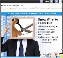
Making Sense of Big Data
Baseline Magazine recently ran a slideshow with some of the more salient points front he new book. Here’s an excerpt from the write-up:
As big data grows constantly bigger, IT organizations must come up with better ways to depict and make sense of it by using data visualization. We’ve come a long way from simple pie and bar charts, but the book The Visual Organization: Data Visualization, Big Data, and the Quest for Better Decisions (Wiley, March 2014) cautions that technology professionals and designers can stray too far in attempting to “dazzle the eye.”
Click here or on the image below to access the slides.
The post Making Sense of Big Data appeared first on Phil Simon.
The Case for Data Discovery
As someone who does a decent amount of networking, I’m often asked “What do you do?” or “What’s your book about?” With regard to each, I’ve become pretty adept at giving soundbites. If people want to know more, they’ll ask. If not, they won’t. The pour soul who doesn’t have a quick response to questions like those isn’t doing himself any favors.
So, what’s The Visual Organization about in a nutshell?
In five words, visualizing data promotes data discovery.
 Short enough for you? Good. If I’ve done my job, then I’ve piqued your interest and you are asking yourself questions like:
Why does data discovery matter?
Do existing reporting tools like dashboards and KPIs lend themselves to data discovery?
On Dashboards and Data Discovery, and Likelihoods
With regard to the first question, the case is fairly straightforward. Data discovery mattered less in previous decades because there was, quite simply, less data and less to discover. Yes, companies could survey their customers about their experiences after the fact, not that many of us like answering cold calls or filling out forms. Grocery stores could send coupons in the mail based on prior purchases. That seems so quaint today.
Today, at least in most industrialized countries, the majority of us walk around with a Web-enabled smartphone. This is doubly true for the most attractive demographic: young people. It’s not hard to reach a customer in real time and make contextual offers. This wasn’t remotely possible even ten years ago.
It’s precisely because of the data deluge that discovery matters so much.
And it’s precisely because of this data deluge that discovery matters so much.
A decade ago, Walmart famously discovered that customers during hurricanes were more prone to buy strawberry Pop Tarts and beer. Some of the traditional applications and methods that have worked well for years will continue to bear fruit. Dashboards summarize structured enterprise information, allowing employees to see what’s taking place. They enable some degree of curiosity.
Many Eyes, Tableau, d3.js, and the other contemporary data visualization tools that I discuss in The Visual Organization up the ante. No, they don’t guarantee any customer or employee revelations but, when used correctly, they increase the chances that employees discover new things about their customers. Case in point: Netflix using the color of movie and TV show jackets as part of its matching algorithm.
Simon Says
Look, I get it. Employees (especially senior managers) don’t have all day to play with data. What’s more, in many cases, organizations have yet to deploy the tools to encourage the very exploration that would benefit them most. Still, organizations that fail to embrace data discovery and exploration are limiting themselves.
Feedback
What say you?
 This post was written as part of the
IBM for Midsize Business
program, which provides midsize businesses with the tools, expertise and solutions they need to become engines of a smarter planet. I’ve been compensated to contribute to this program, but the opinions expressed in this post are my own and don’t necessarily represent IBM’s positions, strategies, or opinions.
This post was written as part of the
IBM for Midsize Business
program, which provides midsize businesses with the tools, expertise and solutions they need to become engines of a smarter planet. I’ve been compensated to contribute to this program, but the opinions expressed in this post are my own and don’t necessarily represent IBM’s positions, strategies, or opinions.

The post The Case for Data Discovery appeared first on Phil Simon.
March 28, 2014
The Visual Organization – Media Roundup
 The Visual Organization has been out for about a week now. At present, there are five Amazon reviews. Here’s a current list of mentions, excerpts, reviews, and interviews on the new book;
All Analytics
Analytics Bridge
Barry Moltz Interview
Breakthrough Business Radio
Duct Tape Marketing Podcast
Forbes’ interview with Dorie Clark
InformationWeek
Michele Price Interview
Steigman Communications Review
TechCocktail interview
Terri Griffith review
Wired piece on Netflix and Dataviz
University of Cal-Berkeley Interview
Visually book review
Wedgies’ excerpt
ZDNet interview
The post The Visual Organization – Media Roundup appeared first on Phil Simon.