
Jordan Castillo Price's Blog, page 38
December 30, 2012
Photoshop - masking with gray
Another followup for
 lou_harper
! I like things like glasses because they give me a chance to really make the subject look integrated. It's also an opportunity to be creative with the layer mask. When painting on a layer mask "white reveals, black conceals" but you can get a lot of mileage out of your gray tones, which result in transparency in your mask.
lou_harper
! I like things like glasses because they give me a chance to really make the subject look integrated. It's also an opportunity to be creative with the layer mask. When painting on a layer mask "white reveals, black conceals" but you can get a lot of mileage out of your gray tones, which result in transparency in your mask.
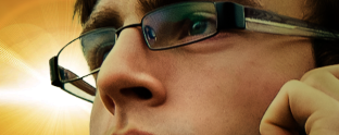
Normally I'd mask out the glasses lens with a very dark gray, however in this instance the lighting source right behind the lens looked like it needed to really shine through at full strength. I did get fancy masking the ARM of the glasses, though, which was translucent. I hand-painted a gray strip to allow the background color to partially come through.
The reflections in his lenses were picking up color from the gradient overlay so those blended in to the composition without a problem. I will actually be adding subtle reflection in cover #7 because due to the angle of the model's head, the frames look empty to me, and Paul's glasses are his trademark.
lou_harper
! I like things like glasses because they give me a chance to really make the subject look integrated. It's also an opportunity to be creative with the layer mask. When painting on a layer mask "white reveals, black conceals" but you can get a lot of mileage out of your gray tones, which result in transparency in your mask.
Normally I'd mask out the glasses lens with a very dark gray, however in this instance the lighting source right behind the lens looked like it needed to really shine through at full strength. I did get fancy masking the ARM of the glasses, though, which was translucent. I hand-painted a gray strip to allow the background color to partially come through.
The reflections in his lenses were picking up color from the gradient overlay so those blended in to the composition without a problem. I will actually be adding subtle reflection in cover #7 because due to the angle of the model's head, the frames look empty to me, and Paul's glasses are his trademark.


December 28, 2012
Photoshop Friday - clipping layers
Main idea: You can choose whether an adjustment layer will affect only one layer, or all visible layers below it.
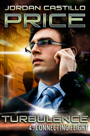
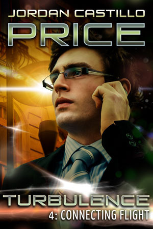
In Connecting Flight, my Paul model was shot in blue daylight. I wanted him to appear as if he was being lit by a streetlamp, and also to pick up some greens since these colors would be in the foreground lighting.
I created a layer and filled it with a gold-to-green gradient, shown here with other lighting effects layers above it visible.

I set the gradient layer’s mode to multiply and took its opacity down to 67%. This was the effect I wanted for the flesh tones, but I wanted the background to stay exactly like it was before. Now it’s all murky. The adjustment that made Paul look greeny-gold only intensified the greeny gold of the background. That's not what I want.
This is solved by clipping the adjustment layer to the layer I want to affect. In the layers menu, hover the cursor between the two layers and alt/op-click. Your cursor will change (to a box in CS6 or two circles in CS5—my screen capture isn’t picking up the cursor symbol change).
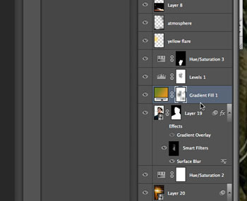
Once you’ve clipped the layers together, you’ll see a downward pointing arrow on the left to indicate the clipping.
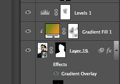
Now it's clipped, and the background's contrast is back the way I want it. Here's the final cover:
You can also clip a photo into text this way.
Type your text:

Place a photo layer above it
Clip the photo to the text. The text remains editable. The photo can be
repositioned too. This was how I did the gore-filled lettering effect in
The Starving Years.

I suspect this will work with layer groups, however I don't usually group my layers because it messes up my blending modes.
Find out more about the Turbulence series or download my free cover art gallery at JCP Books!
In Connecting Flight, my Paul model was shot in blue daylight. I wanted him to appear as if he was being lit by a streetlamp, and also to pick up some greens since these colors would be in the foreground lighting.
I created a layer and filled it with a gold-to-green gradient, shown here with other lighting effects layers above it visible.
I set the gradient layer’s mode to multiply and took its opacity down to 67%. This was the effect I wanted for the flesh tones, but I wanted the background to stay exactly like it was before. Now it’s all murky. The adjustment that made Paul look greeny-gold only intensified the greeny gold of the background. That's not what I want.
This is solved by clipping the adjustment layer to the layer I want to affect. In the layers menu, hover the cursor between the two layers and alt/op-click. Your cursor will change (to a box in CS6 or two circles in CS5—my screen capture isn’t picking up the cursor symbol change).
Once you’ve clipped the layers together, you’ll see a downward pointing arrow on the left to indicate the clipping.
Now it's clipped, and the background's contrast is back the way I want it. Here's the final cover:
You can also clip a photo into text this way.
Type your text:
Place a photo layer above it
Clip the photo to the text. The text remains editable. The photo can be
repositioned too. This was how I did the gore-filled lettering effect in
The Starving Years.
I suspect this will work with layer groups, however I don't usually group my layers because it messes up my blending modes.
Find out more about the Turbulence series or download my free cover art gallery at JCP Books!
December 24, 2012
Eye reflection
For
 lou_harper
, here's the example of the white of the eye picking up the color cast of the background, with a nice shiny white highlight to offset it. I see the bluishness is also picked up in the lips, which makes sense if they're a little wet.
lou_harper
, here's the example of the white of the eye picking up the color cast of the background, with a nice shiny white highlight to offset it. I see the bluishness is also picked up in the lips, which makes sense if they're a little wet.
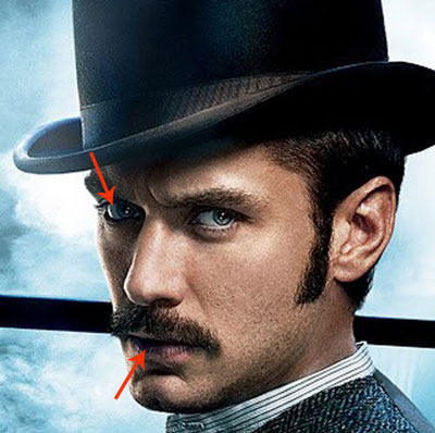
And any time I can stare at Jude Law's face is time well spent.
lou_harper
, here's the example of the white of the eye picking up the color cast of the background, with a nice shiny white highlight to offset it. I see the bluishness is also picked up in the lips, which makes sense if they're a little wet.
And any time I can stare at Jude Law's face is time well spent.
Da Puff
Just a little Puffy to brighten everyone's day. Gray cats are so tough to photograph.

December 21, 2012
Photoshop Friday - shine off
In m/m covers, it can be jarring when two characters are composited who obviously don’t belong together. Sometimes it’s a matter of the scale being off-kilter, or the light source hitting each character from a different direction, or the light temperature being different on each of them, or the focus being different on each of them. But one of the more disturbing things to me is when one character is matte and evenly lit, and the other is glistening with shiny hot spots!
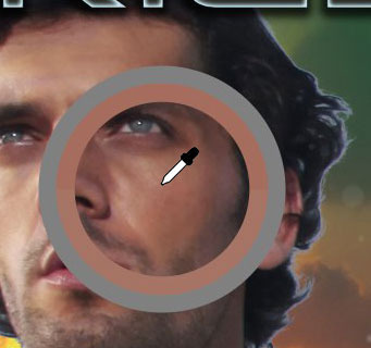
I recently needed to calm down the glisten on one of my own covers. I adore the Marlin model; I think he’s absolutely perfect. But in his outdoor photoshoot, once I zoomed in on him, it became apparent that his skin was unappealingly sweaty. This is often a problem in flash photography too, where the flash blows out the face’s highlights. In this particular instance, though, I think the model just happened to be glistening.
It turned out this was a really easy problem to fix.
1. Create a new blank layer over the photo to paint on. This is a nondestructive working method, in other words, you are not altering the pixels of your original. This is useful because if you do something wrong, you don’t actually lose anything, you can keep erasing, going back, changing the opacity of your corrections, etc.
2. Sample the model’s skin tone near the hotspot with the eyedropper tool. Grab a tone that is darker than the hotspot. This tone becomes your foreground color.
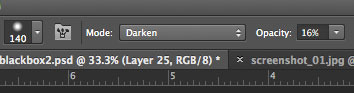
3. Choose a soft brush. Set the brush mode to darken and lower the brush opacity somewhere around 10-15%
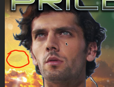
4. Working on your new blank layer, gently paint over the hotspot areas to blend them in to the surrounding skin. (You see an arrow cursor here where my paintbrush would be…I couldn’t take a screenshot of my brush!!) Because you’re in darken mode, this is easier than you’d think. In this composition, I paid particular attention to the sweatiest looking parts, like the cleft above his lip right below his nose, his cheeks, and his brow. I dabbed a little paint to the side so you could see the transparency of the coverage. In this case I wanted to be subtle and leave some highlights, because after all highlight and shadow are what gives something form and dimension. I just didn't want him looking quite so moist.
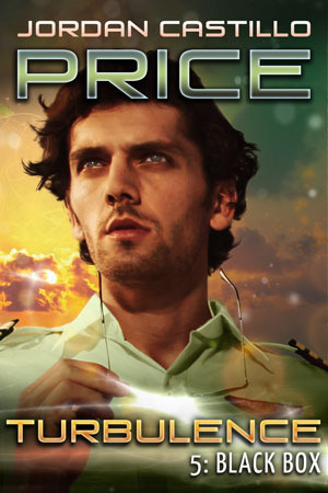
Here’s my final cover with hotspots taken care of, edges blended in, blemishes retouched, stubble evened out and colors adjusted. Also note, I've positioned the light source in the background to match the direction of the light on his face. Too many m/m covers take place in crazy-light-source-land and they just look fake.
Find the Turbulence Series at JCP Books!
I recently needed to calm down the glisten on one of my own covers. I adore the Marlin model; I think he’s absolutely perfect. But in his outdoor photoshoot, once I zoomed in on him, it became apparent that his skin was unappealingly sweaty. This is often a problem in flash photography too, where the flash blows out the face’s highlights. In this particular instance, though, I think the model just happened to be glistening.
It turned out this was a really easy problem to fix.
1. Create a new blank layer over the photo to paint on. This is a nondestructive working method, in other words, you are not altering the pixels of your original. This is useful because if you do something wrong, you don’t actually lose anything, you can keep erasing, going back, changing the opacity of your corrections, etc.
2. Sample the model’s skin tone near the hotspot with the eyedropper tool. Grab a tone that is darker than the hotspot. This tone becomes your foreground color.
3. Choose a soft brush. Set the brush mode to darken and lower the brush opacity somewhere around 10-15%
4. Working on your new blank layer, gently paint over the hotspot areas to blend them in to the surrounding skin. (You see an arrow cursor here where my paintbrush would be…I couldn’t take a screenshot of my brush!!) Because you’re in darken mode, this is easier than you’d think. In this composition, I paid particular attention to the sweatiest looking parts, like the cleft above his lip right below his nose, his cheeks, and his brow. I dabbed a little paint to the side so you could see the transparency of the coverage. In this case I wanted to be subtle and leave some highlights, because after all highlight and shadow are what gives something form and dimension. I just didn't want him looking quite so moist.
Here’s my final cover with hotspots taken care of, edges blended in, blemishes retouched, stubble evened out and colors adjusted. Also note, I've positioned the light source in the background to match the direction of the light on his face. Too many m/m covers take place in crazy-light-source-land and they just look fake.
Find the Turbulence Series at JCP Books!
December 17, 2012
Photoshop Friday - art history brush
It's Monday, not Friday! But I just did a five-minute experiment that seems so promising I was eager to share. Pete Collins demonstrated the use of the art history brush and the history brush on the latest episode of Photoshop User TV. I wondered how it might look as a way to add interest to text.
My steps:
1. Type out the text
2. Render the text under Type>Rasterize Text Layer
3. Take a snapshot of the document by clicking the camera icon in the History panel; click the check box next to the snapshot to "tell" the History Brush that's the document state you'd like it to work with
Now select the Art History brush (beneath the History brush in the tools) and start scrubbing out your lettering, then switch to the History brush to bring back clarity where you want it. Keep working back and forth between the two brushes to reveal and conceal parts of your text.
Keep in mind: there are MULTIPLE styles of Art History brush to choose from at the top. You might use one type for your initial pass, bring back some undistorted pixels with the History brush, then go for another pass with a different style Art History brush.
Also: you can choose between ALL YOUR BRUSH TIPS for this function. I used a misty, soft, cloudy brush for my History brush to bring back the image with a dreamy haziness. Increasing and decreasing your brush size and opacity also varies the effect.

This is simple black and white. If you had the text over a copy of your background it would appear to emerge from that background. I could probably play with this for a week and never exhaust the potential.
My steps:
1. Type out the text
2. Render the text under Type>Rasterize Text Layer
3. Take a snapshot of the document by clicking the camera icon in the History panel; click the check box next to the snapshot to "tell" the History Brush that's the document state you'd like it to work with
Now select the Art History brush (beneath the History brush in the tools) and start scrubbing out your lettering, then switch to the History brush to bring back clarity where you want it. Keep working back and forth between the two brushes to reveal and conceal parts of your text.
Keep in mind: there are MULTIPLE styles of Art History brush to choose from at the top. You might use one type for your initial pass, bring back some undistorted pixels with the History brush, then go for another pass with a different style Art History brush.
Also: you can choose between ALL YOUR BRUSH TIPS for this function. I used a misty, soft, cloudy brush for my History brush to bring back the image with a dreamy haziness. Increasing and decreasing your brush size and opacity also varies the effect.
This is simple black and white. If you had the text over a copy of your background it would appear to emerge from that background. I could probably play with this for a week and never exhaust the potential.
December 16, 2012
How to Email to your Kindle device or app
Since I recently figured this out myself, and some of my pals didn't know how to do it either, I figured a post was in order! It has a permanent home on the JCPBooks.com Kindle Help Page.
I tried to email a mobi file to myself and open it on my new Kindle Fire, and got a whole lotta nothing. What the heck?
It turns out that I needed to email the file to the KINDLE’S email address. Not my personal email address. Once you figure that out, it’s really convenient to send files to your Kindle.
1. To find out what the address is, log in to the Manage Your Kindle page. In the sidebar under the YOUR KINDLE ACCOUNT heading, click the Personal Document Settings link (A). The Kindle’s name and email address will be shown (B). If the address is long or clunky, you can change it to something easier by clicking “edit” in the Send-to-Kindle E-Mail Settings(C). I changed mine so it didn’t start with “jcp” like most of my addresses do, to prevent myself from accidentally sending test files to my yahoo group.
2. On the same page, authorize your Kindle to accept emails from your normal account (D) - there's a link at the bottom of the list, not shown here. This is something you have to do to keep spam from showing up on your Kindle. Add your personal email address to the Approved Personal Document E-mail List.
That’s it! Now you’re set to email ebooks to your device without hunting around for cables and hooking it up! You’ll be able to send mobis or prcs, Word docs and PDFs.
EXTRA SPECIAL BONUS - if you email a PDF to yourself with the word CONVERT in the email’s subject line, it will convert the fixed-text PDF file to a flowable text ebook with reasonably good accuracy.
EVEN MORE GOODNESS - if you use a Kindle app on an iPad or other device, and you have THE LATEST version of the app, you can also send stuff to your app this way.

If you prefer to send the files with an app rather than email, check out the "Send to Kindle" app Amazon mentions in the first paragraph! It lets you drag and drop files from your computer.
ETA
Your cost: as of this writing, transferring files while connected to wi-fi network is free. Transferring via Whispernet incurs a charge based on the file size and your country.
I tried to email a mobi file to myself and open it on my new Kindle Fire, and got a whole lotta nothing. What the heck?
It turns out that I needed to email the file to the KINDLE’S email address. Not my personal email address. Once you figure that out, it’s really convenient to send files to your Kindle.
1. To find out what the address is, log in to the Manage Your Kindle page. In the sidebar under the YOUR KINDLE ACCOUNT heading, click the Personal Document Settings link (A). The Kindle’s name and email address will be shown (B). If the address is long or clunky, you can change it to something easier by clicking “edit” in the Send-to-Kindle E-Mail Settings(C). I changed mine so it didn’t start with “jcp” like most of my addresses do, to prevent myself from accidentally sending test files to my yahoo group.
2. On the same page, authorize your Kindle to accept emails from your normal account (D) - there's a link at the bottom of the list, not shown here. This is something you have to do to keep spam from showing up on your Kindle. Add your personal email address to the Approved Personal Document E-mail List.
That’s it! Now you’re set to email ebooks to your device without hunting around for cables and hooking it up! You’ll be able to send mobis or prcs, Word docs and PDFs.
EXTRA SPECIAL BONUS - if you email a PDF to yourself with the word CONVERT in the email’s subject line, it will convert the fixed-text PDF file to a flowable text ebook with reasonably good accuracy.
EVEN MORE GOODNESS - if you use a Kindle app on an iPad or other device, and you have THE LATEST version of the app, you can also send stuff to your app this way.
If you prefer to send the files with an app rather than email, check out the "Send to Kindle" app Amazon mentions in the first paragraph! It lets you drag and drop files from your computer.
ETA
Your cost: as of this writing, transferring files while connected to wi-fi network is free. Transferring via Whispernet incurs a charge based on the file size and your country.
December 15, 2012
Photoshop Friday - rotating with ruler tool
This is a two-part tip on using a tool in conjunction with a command. It's not obvious unless you know about it.
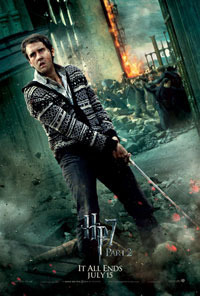
I use the ruler tool a lot. It's probably a holdover from when "straighten" commands weren't automated years ago. I was studying movie posters recently and I notice that a hyperskewed background was being used in many of them. What a great way to create a sense of unease and urgency in a composition! Plus, it's also a great way to demonstrate this use of the ruler tool.
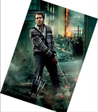
Let's pretend this skewed background isn't intentional...and maybe we were falling down drunk when we took this photo and just want it to look "normal." (Hi, Neville! My, how you've grown. Sorry I'm so wasted when I'm taking your photo in front of the burning rubble.)
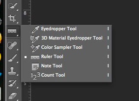
We could grab a corner and start rotating, but it's really hard to tell when the photo's straight when you're all up in there. That's where the ruler tool comes in. The ruler is located beneath the eyedropper (click and hold on the eyedropper to reveal it.)
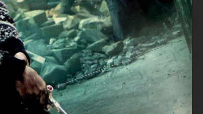
I click on the point where you see the croshairs by the sword's pommel, and I drag a line that matches the tilt of the horizon, best that I can tell. (Easier to do when you have a straight element there rather than rubble.)
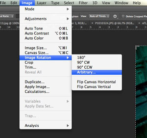
Release. Then, under the image menu, select Image Rotation>Arbitrary...
Here's the secret part you may not have known. The dialog box pops up with the angle of your ruler already filled in.
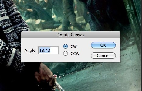
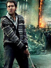
I hit "OK" and rotate the image. Heck, nothing looks straight to me here. The edges of the image are fooling my eyes.
But then when I crop out the edges...I can see the image is now straight.
I use the ruler tool a lot. It's probably a holdover from when "straighten" commands weren't automated years ago. I was studying movie posters recently and I notice that a hyperskewed background was being used in many of them. What a great way to create a sense of unease and urgency in a composition! Plus, it's also a great way to demonstrate this use of the ruler tool.
Let's pretend this skewed background isn't intentional...and maybe we were falling down drunk when we took this photo and just want it to look "normal." (Hi, Neville! My, how you've grown. Sorry I'm so wasted when I'm taking your photo in front of the burning rubble.)
We could grab a corner and start rotating, but it's really hard to tell when the photo's straight when you're all up in there. That's where the ruler tool comes in. The ruler is located beneath the eyedropper (click and hold on the eyedropper to reveal it.)
I click on the point where you see the croshairs by the sword's pommel, and I drag a line that matches the tilt of the horizon, best that I can tell. (Easier to do when you have a straight element there rather than rubble.)
Release. Then, under the image menu, select Image Rotation>Arbitrary...
Here's the secret part you may not have known. The dialog box pops up with the angle of your ruler already filled in.
I hit "OK" and rotate the image. Heck, nothing looks straight to me here. The edges of the image are fooling my eyes.
But then when I crop out the edges...I can see the image is now straight.
If you enjoyed my stories this year...
 I'd love your vote in the following categories at the GR M/M Romance Group Member Choice Awards
Favorite All Time M/M Romance Book
Among the Living
Favorite All Time M/M Series
PsyCop
Favorite All Time M/M Author
Jordan Castillo Price
Favorite All Time M/M Character(s)
Vic and Jacob - Among the Living
Best Cover
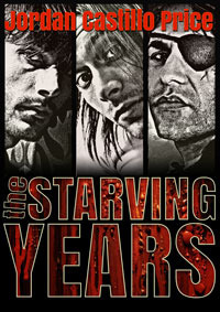
The Starving Years
Hottest M/M/M
The Starving Years
Best World Created
The Starving Years
Persistence of Memory - Mnevermind 1
Best Free Story
Into the Bermuda Triangle
Best Side Character
Larry - Mnevermind
Most Surprising/Unique Plot Device
The Starving Years
Funniest Quotes/Best Lines
Into the Bermuda Triangle
"I couldn't take your--"
"Oh, but I insist." Dallas whisked a pair of black AVA uniform slacks out of his roller bag in the blink of an eye, then held them up with his pinkies extended, and said, "Besides, I'd be crushed if I thought you didn't want to get into my pants."
Best Book of the Year
The Starving years
Best Anthology
Lashings of Sauce
Best SciFi/Futuristic/Post Apocalyptic Story
Mnevermind
vote here!
December 10, 2012
Special Newsletter Prize
Every time I send out a newsletter, I randomly select someone who's opened it to win a free ebook. But this month I'm making the prize even tastier. Get your inbox ready -- December's JCP News is coming this Saturday, and the winner can pick either a JCP ebook of their choice, or a signed print copy of PsyCop: Property or Camp Hell!
You can sign up for the newsletter here if you're not already subscribed :-)
You can sign up for the newsletter here if you're not already subscribed :-)


