
Jeremy Keith's Blog, page 128
February 18, 2013
Strong Layout Systems by Eric Meyer
Eric is at An Event Apart in Atlanta talking about Strong Layout Systems. Following on from Brother Jeffrey’s presentation, he begins with a reading…
In the beginning Sir Tim created the server and the browser. And the web was without form. And the face of Tim moved over the web. Tim said “Let there be markup.” And there was markup. And he saw that it was good. And he divided structure from appearance.
That decision is quite striking. Think about other mediums. The structure of a book is bound to its appearance.
Here’s a screenshot, courtesy of Grant Hutchinson, of the preferences in the original Mosaic browser. You could define the appearance of any HTML element …as a user. As an author, you couldn’t do that. HTML didn’t support that: it created structure.
As with all creations, there was a fall. As usual, a reptile was involved. In this case it was Mozilla, known by its ancient name of Netscape. They added presentational elements like isindex and presentational attributes e.g. on the hr element. And then there was the table element. Inevitably, it was used for layout. David Siegel wrote the book on this, Creating Killer Websites. It was tables all the way down: tables inside of tables inside of tables, all to create visual appearance.
The backlash came from the Web Standards Project. It got dogmatic there for a while. But we got past that, and we started using CSS. The promise of CSS was visual presentation, for authors and users. We talk about “controlling” presentation with CSS, but remember that theoretically that can be over-ridden by user styles.
But CSS was an appearance system; not a layout system. It wasn’t that complex. You could print out all of CSS1. The only thing in it in any way suited for layout was floats …and that’s not what they were created for: it was basically the CSS equivalent of the align attribute that Netscape had introduced to HTML. So we used floats because that’s all we had. It wasn’t a layout system but we made it one anyway. There were a lot of bugs, but we dealt them in clever—sometimes deranged—ways.
For CSS2, they realised that designers really liked to lay things out (who knew?) so they introduced positioning. But you have to be careful with positioning. It was great …sort of. You can indeed position an element wherever you want …and overlap them.
The first major site to launch with CSS for positioning was Doug’s redesign of Wired.com (it didn’t use floats). The limitations of positioning forced us into certain design patterns. Note the footer on the old Wired site: it sits at the bottom of the central column, not the whole page. That was to avoid overlap. But Eric remembers talking to Doug and it turns out they actually wanted a full-width footer, but they had to work with the tools they had. Positioning lacked the equivalent of clear that you get with floats.
These were hacks. Hacks aren’t a bad thing; they’re often very clever. But hacks limit us. Neither floats nor positioning had the concept of equal height (but tables did).
We’re now getting to the point where can start to revisit our assumptions about what is and isn’t possible with CSS.
We’ve got viewport units: vh and vw—viewport height and viewport width (in percentages relative to the viewport, not the parent element). This is really useful for handheld devices. There’s also the vmin unit that you can use on font sizes so that text scales in relation to viewport size.
Flexible boxes is more commonly called flexbox. Take a horizontal navigation (in an unordered list) and declare it as a flexible box. Then declare that the elements within should “flex” to each use an equal amount of space. There’s a variant justify-content: space-around which will share out the space between the elements equally.
Flexbox comes out of XUL, Gecko’s layout language for browser chrome. This is real layout. It’s not a hack. As an author, you’re declaring how you want things to be laid out, and the browser does it. It’s a good feeling.
You can also use flexbox to make sure that elements within a shared parent have the same height. In fact, that’s the default behaviour. You can also get your flexible boxes to reflow instead of being trapped on the same line. The new “line” will also share out space for the elements equally.
You can set your flexible boxes with whatever units you want, and mix and match them: percentages and ems, for example. You can have flexible and fixed elements together.
Remember The Holy Grail of Layout on A List Apart? It followed soon after the One True Layout. Now you could do it with just a few quick flexbox declarations.
main { display: flex; }
nav { width: 13em; flex: none; }
article { width: auto; flex: none; }
aside { width: 20%; flex: none; }
You can also rearrange the visual ordering (using order). You could make the article appear as the third column within main even though it appears second in the markup. The structure is truly separated from the layout.
Flexbox alignments are really interesting, especially baseline, which will vertically align columns according to the first baseline in each column — very handy.
You aren’t restricted to horizontal layout: you can arrange things vertically. We finally get vertical centring.
Beyond flexbox, we have grids. They’re not quite as stable right now, but the basic idea is that you can set up grid lines to “control” page elements and the space between them: grid-definition-columns: (4em) gives you a repeating grid with a grid unit of four ems.
You can have flexbox inside grids and visa-versa: within a grid unit, you can still display: flex. Within a flexible box, you can define grid lines.
But please don’t go and read the grids specification right now. It’s an amalgamation of three different authors’ texts, one of whom has never written a spec before, and one of the examples is completely misleading about how grids work.
There’s a fraction unit—fr—that you can use to define widths, but you can also use it in combination with min-content which is based on the longest piece of content in a unit. This is complicated stuff and even Eric doesn’t quite get it completely. Maybe min-content is better for non-text content.
And remember you can mix and match these modules. Same with CSS regions. Regions aren’t here yet, but they will completely up-end the way we think about document structure: you put all of your content in one element, and you have some empty elements as well. Then you use CSS regions to define how the content from the first element flows into the others. Effectively your document has a structural portion and a skeleton layout portion.
These layout modules are truly new. You might think that we’re familiar with using CSS for layout, but that was always hacking: using tools for a purpose other than that for which they were created. This new modules were created specifically to allow us to create layouts. That really is new. And Eric can’t wait to see what we do with these new tools.
Tagged with
aeaatl
aea
aneventapart
atlanta
conference
event
css
layout
liveblogging


10 Commandments of Web Design by Jeffrey Zeldman
I’m at An Event Apart in Atlanta, the first show of the year.
Jeffrey is opening the show with a talk called 10 Commandments of Web Design. He jokes that the W3C asked him to change it to 10 Recommendations of Web Design.
1. Thou Shalt Entertain
Have fun. We spend a lot of time thinking about accessibility, usability, performance, all that good stuff …but we sometimes forget about making it delightful and entertaining—the kind of thing that TV people have to think of all the time.
Take Panic Software, for example. Their logos—designed by Icon Factory—look beautiful, unlike your typical logo. Think about every website you’ve ever visited with a corporate philosophy or mission statement that nobody reads or is interested in …well, Panic’s personality is embodied in their design, their typeface choices, and their icons.
A List Apart uses Kevin Cornell’s illustrations to make technical-sounding articles into something more fun. It’s a lesson learned from the advertising world: the headline and the visual play together (and don’t forget: James Thurber wasn’t a good illustrator, but his work became immensely popular and is often emulated).
Jeffrey shows an example of a 404 page from Rdio, which doesn’t entertain. It just states the facts: page not found. Not very fun. Style-architects, on the other hand, refer to their missing page as a wardrobe malfunction. You don’t have to be Louis C.K., but try to be a bit witty. A Canadian political party’s 404 page states: “Ottawa’s broken. And so is this link. We’re working to fix both.” Nice. The New York Daily News website has a great illustration for its 404 page.
Gnu bars are fibre bars …that help you go to the bathroom. This could have been the worst website assignment ever, but they worked hard to get the joy of going to the bathroom in there. They have a Gnusletter (groan). On their serious medical pages, however, the tone isn’t so playful.
Flickr has its greeting in different languages. There’s no real point to this feature apart from providing some delight. A little touch, a little detail that didn’t need to be there, but it’s fun. But you probably wouldn’t want to do it on a military site about how to launch atomic weapons.
2. Test Everything (including assumptions)
“Who here has a test suite of devices?”, asks Jeffrey. You need one. Brad Frost has written a great post to get you started. There’s also technology like Remote Preview. Ryan Irelan wrote an article about putting together the Happy Cog device lab by getting a bunch of used equipment.
But let’s also test our assumptions. On the redesign of An Event Apart, there were some decisions that went against the accepted best practices. So they wrote about why they made those decisions, such as deciding to have empty alt text on photos in author bios because the author’s name (which would have been the alt text) is already in the headline. There were lots of comments, and many of them were really angry.
To get meta, Cennydd wrote a post about challenging the assumption that we should challenge our assumptions. Inception! Sort of. It was challenging the accepted wisdom that user-centred design is always the superior approach (compared to, for example, genius design). So, if Luke Wroblewski is putting a form together, given his years of experience, maybe he doesn’t need to test every little thing this time. Pushing user-centred design was important in the wild-west days of the web, but now we’re in a position to question it.
3. Thou Shalt Iterate
The website for A List Apart looks quite different from the original design ideas. Milton Glaser once said that the way he designs is by “moving stuff around on the page until it looks right.”
A List Apart used to have sharing links at the bottom of its articles. Logical, right? Who would want to share before reading the article? In the new design, those links are at the top of the page, and they got rid of the pretty buttons. You’d think they’d get less usage. In fact, they get much more usage: the Twitter link is just a simple link with pre-filled text. It turns out that users share and retweet before reading—they want to be the first to share. Jeffrey jokes that, as an experiment, he’d like to put something awful half-way through an article just to see if everyone would still share it (and I’m sitting next to Rey Bango who says, “That’s my fear!” “You share before reading?”, I ask him. He nods).
Amazon is constantly iterating, but in very small, subtle ways. And they test those changes.
4. Thou Shalt Ship
Good is the enemy of great …but great is the enemy of shipping. Sometimes we get so hung up on making something great, it gets in the way of shipping.
Jeffrey used to work at a company that had a perfectionist as a president, which is good in some ways, but they never shipped their product. Then the competition shipped. The company went out of business. They were so concerned about being great, they forgot to ship.
A friend of Jeffrey’s raises his rates when his clients don’t ship. The client questions, “Why does this now cost this much?” “Because you were supposed to have launched by now — and that’s preventing me from moving on to the next project.”
5. Engage Thy Community
Instagram did a poor job of relating their change of terms of service. This was actually pretty good for Flickr, who had just launched their great iPhone app.
Big companies buy small companies to get the cachet that the small companies have. “Isn’t that right?”, Jeffrey asks Rey. “Yes.”
Fonts.com are beginning to get more playful and engage with the type community. It’ll never be as cool as something like Dribbble (because fonts.com is a big company) but they can still push things forward.
The Happy Cog website has comments via Twitter (because, hey, who comments on blogs anymore?). A List Apart has embeddable comments: you can take a comment with you and embed it on your own website.
6. Love Thy User As Thyself
The first five commandments are really about this: knowing your user, and making sure they have a good experience, regardless of browser or device. Be responsive — not just in the technical definition of responsive web design, but in your mindset. Don’t make dumb assumptions just because someone is using a phone.
7. Remember The Content
Jeffrey brings up my blog post about Content First. And, of course, Mark has been writing about A Richer Canvas. Jeffrey took our words and wrote about them thusly: put the content first always. Instead of asking “Where should we put the sidebar?”, ask “Do we need a sidebar?”
Karen McGrane talks about content strategy for mobile and how it is literally becoming the law of the land: governments are mandating that content must be accessible on mobile. You don’t want to be the test case in a law suit.
8. Ignore Workflow At Thy Peril
Instagram nailed the workflow of sharing images. It starts uploading the picture in the background, even while you’re still futzing around with titles and descriptions. There are other things they don’t do particularly well, and it was more of a walled garden for a long time, but they prioritised the workflow of uploading images. Which leads us nicely to…
9. Thou Shalt Prioritize
Github allows you to label bugs and to-dos according to how important they are. That helps you nail the most important stuff without stopping you from shipping.
Kevin Hoffman wrote a great article about meetings, of all things. It’s all about coming to agreement on priorities.
10. To Thine Own Self Be True
Ah, the old Hay.net site: have hay, need hay. The site has since changed, but it’s still about hay. It didn’t “pivot.”
Smart talented people get promoted to being directors, but they might not be as good or as happy at that.
11. Think For Yourself
A bonus eleventh commandment. Don’t be a lemming.
Tagged with
aeaatl
aea
aneventapart
conference
atlanta
event
liveblog
design
content
February 15, 2013
Counting down to the Responsive Day Out
The Responsive Day Out is only two weeks away. Exciting!
If you have a ticket, just print it out (or bring along an electronic version on some kind of screen) and you’re good to go. If you didn’t get your Eventbrite ticket, let me know and I can resend it.
If didn’t get a ticket, sorry. But all is not lost. In my experience, it’s at this time—in the final run-up to the event—that ticket-holders start to bail, for whatever reasons: clashing events, work duties, illness, or whatever. We’re not offering any refunds, but people can swap tickets. So if you can’t make it, give a shout-out on Twitter: I can guarantee that there are plenty of people willing to take that ticket off your hands.
Remember, this isn’t going to be a typical Clearleft conference: a lot of the things that you would expect to get as standard at a conference won’t be on offer. No badges. No lanyards. No banners. No sponsor stands. And if you want to get a tea or coffee from the bar in the Brighton Dome, you’ll have to pay for it (although we will have coffee cart from Small Batch Coffee on hand to dish out free flat whites).
Here’s how I’ve got the day planned:
9:00 – 10:00Registration
10:00 – 10:20Sarah Parmenter
10:20 – 10:40David Bushell
10:40 – 11:00Tom Maslen
11:00 – 11:15Chat with Sarah, David, and Tom
11:15 – 11:45Break
11:45 – 12:05Anna Debenham
12:05 – 12:25Andy Hume
12:25 – 12:45Bruce Lawson
12:45 – 13:00Chat with Anna, Andy, and Bruce
13:00 – 14:30Lunch break
14:30 – 14:50Richard Rutter and Josh Emerson
14:50 – 15:10Laura Kalbag
15:10 – 15:30Elliot Jay Stocks
15:30 – 15:45Chat with Richard, Josh, Laura, and Elliot
15:45 – 16:15Break
16:15 – 16:35Owen Gregory
16:35 – 16:55Paul Lloyd
16:55 – 17:15Mark Boulton
17:15 – 17:30Chat with Owen, Paul, and Mark
It’s going to be a frenetic action-packed day! Then (after a suitable interval to grab some fish’n’chips or a curry or something) we can head on over to The Loft on Ship Street for the after-party from 7:30pm.
If the Responsive Day Out isn’t enough brain food for you, you might like to know that Remy is running a workshop the day before on mobile web apps. So if you’re coming down to Brighton anyway, you can kill two web technology birds with one stone.
Tweakpoints
Mark has written down some thoughts on breakpoints in responsive designs. I share his concern that by settling on just a few breakpoints, there’s a danger of returning to the process of simply designing for some set canvases: here’s my “mobile” layout, here’s my “tablet” layout, here’s my “desktop” layout.
In my experience, not all breakpoints are created equal. Sure, there are the points at which the layout needs to change drastically in order for the content not to look like crap—those media queries can legitimately be called breakpoints. But then there are the media queries that are used to finesse page elements without making any major changes to the layout.
When I was working on Matter, for example, there was really only one major breakpoint, where the layout shifts from one column to two. That’s the kind of breakpoint that you can figure out pretty easily from the flow of your content; just resizing your browser window is usually enough to settle on the point that feels right. But there are lots of other media queries in the Matter stylesheet. Those are there to make smaller adjustments to margins, font sizes …the kind of changes that came about from testing on phones and tablets in the device lab.
It feels a bit odd to call them breakpoints, as though the layout would “break” without them. Those media queries are there to tweak the layout. They’re not breakpoints; they’re tweakpoints.
Tagged with
responsive
design
mediaqueries
breakpoints
tweakpoints
layout
February 13, 2013
A question of style
I’ve just a written a post over on the Clearleft blog about the way we’re currently nailing down some front-end design principles.
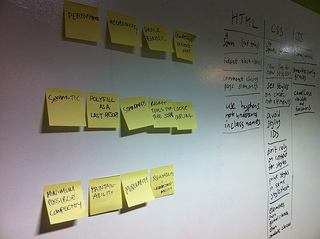
I’m a big fan of design principles for many reasons, not least of which is they way they can help to quickly resolve debates and arguments. They become a kind of higher authority to appeal to, taking opinion and ego out of the equation.
They can also lead to specific design patterns. This is something I’ve talked about in the past: the goals of a project inform its principles, which in turn inform the patterns that are used.
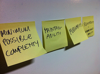
In the case of front-end design principles, they are informed by some higher-level goals. As I wrote on the Clearleft blog, some of those goals are user-centric, and some are developer-centric:
The user-centric goals include:
performance,
accessibility, and
device-agnosticism.
While the developer-centric goals include:
maintainability,
readability, and
modularity.
In turn, the final patterns produced—the actual markup and CSS and JavaScript—should be influenced by the resulting principles: the code should be maintainable, readable, and modular. So at the same time as we were figuring out high-level principles, we are also defining an in-house coding style.
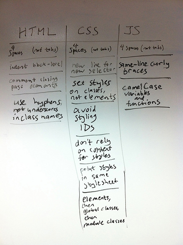
Now here’s the thing about coding style: while it should ideally be informed by your design principles, there’s another factor that overrides everything else—what coding style is preferred by the developers who will be inheriting your code?
When it comes to things like tabs vs. spaces, or indentation, or naming variables, what matters is not which style you use, but that everyone is using the same style.
So, for example, I favour tabs over spaces. And I don’t tend to camelCase variable names in JavaScript. And I don’t like indenting my markup (I make judicious use of new lines instead). But I’m in the minority. I could try to force my style on everyone else at work but that wouldn’t be very productive. It’s far more important that everyone settles on the same style—any style—than it is for a coding style to be “correct.” The only “correct” coding style is the one that everyone is agreeing to use.
Mind you, people who write JavaScript functions with the opening curly brace on a new line are just plain wrong.
Tagged with
coding
style
writing
principles
development
css
javascript
html
February 6, 2013
Open device labs
It’s been just nine months since I threw open the doors to the device lab in the Clearleft office. The response in just the first week was fantastic — people started donating their devices to the communal pool, doubling, then tripling the amount of phones and tablets.
The idea of having a communal device lab wasn’t new; Jason had been talking about setting up a lab in Portland but the paperwork involved was bogging it down. So when I set up the Brighton lab, I deliberately took an “ah, fuck it!” attitude …and that was new:
There are potential pitfalls to opening up a testing suite like this. What about the insurance? What about theft? What about breakage? But the thing about potential pitfalls is that they’re just that: potential. I’m treating all of them as YAGNI issues. I’ll address any problems if and when they occur rather than planning for worst-case scenarios.
So far, so good.
Since then I’ve been vocally encouraging others to set up communal devices labs wherever they may be—linking and tweeting whenever anybody so much as mentioned the possibility of getting a device lab up and running. Then the Lab Up! site was established to help people do just that.
Now there’s a brand new site that’s not just for people setting up device labs, but also for people looking a device lab to use: OpenDeviceLab.com.
Help people to locate the right Open Device Lab for the job,
explain and promote the Open Device Lab movement,
attract Contributors and Sponsors to help and donate to ODLs.
It’s an excellent resource. Head on over there and find out where your nearest device lab is located. And if you can’t find one, think about setting one up.
I really, really like the way that communal device labs have taken off. It’s like a physical manifestation of the sharing and openness that has imbued the practice of web design and development right from the start. View source, mailing lists, blog posts, Stack Overflow, and Github are made of bits; device labs are made of atoms. But they are all open for you to use and contribute to.
Tagged with
devicelabs
devices
testing
sharing
community
February 4, 2013
When is a link not a link?
Google has a web page for its Chrome browser. This page provides information about the browser, but its primary purpose—its call-to-action, if you will—is to encourage you to download the browser. Hence the nice big blue button-like link that says “Download Chrome.”
Tech bloggy publication thingy The Next Web posted some words pointing out that, for a while there, the link wasn’t working. At all. There was no way to download Chrome from the page created for the purpose of letting you download Chrome.
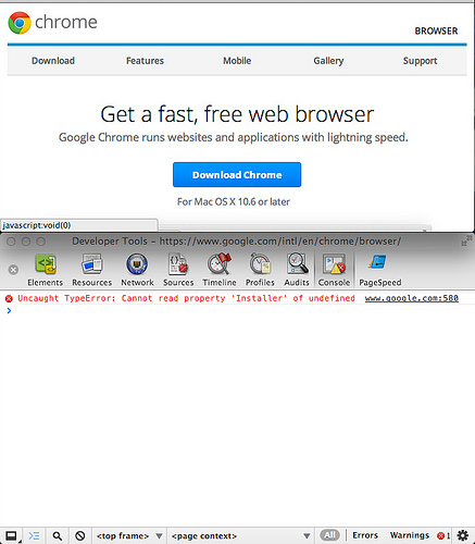
The problem was that the link isn’t a real link. I mean, technically it’s an A element, and it does have an href attribute …but the value of that attribute isn’t a resource (like say, an installer for a web browser, or terms of service for downloading a browser). Instead it uses the JavaScript pseudo-protocol—meaning: not actually a protocol—to point to void(0).
Download Chrome
So when there was a problem with the JavaScript, the link stopped working:
Uncaught TypeError: Cannot read property 'Installer' of undefined
HTML has a very fault-tolerant way of handling errors: if it sees an element or attribute it doesn’t understand, it just ignores it—it doesn’t break the page, it just moves on to then next element. Likewise with CSS. Unknown selectors, properties, or values are simply ignored. Not so with JavaScript. A syntax error stops execution of the script. That’s actually quite handy when you’re trying to debug your code, but no so handy when it’s out on the web.
Given the brittleness of JavaScript’s error-handling, it seems unwise to entrust the core functionality of your page/app/site/whatever to the most fragile part of the front-end stack …especially when that same functionality is provided by a native HTML element.
I don’t want to pick on Google in particular here—there are far too many other sites exhibiting the same kind of over-engineering:
By all means add all the JavaScript whizzbangery to your site that you want. But please make sure you’re adding it on a solid base of working markup. Progressive enhancement is your friend. Just like any good friend, it will help you out when unexpected bad things happen.
Tagged with
javascript
html
standards
google
chrome
markup
links
progressive
enhancement
January 31, 2013
The main issue
The inclusion of a main element in HTML has been the subject of debate for quite a while now. After Steve outlined the use cases, the element has now landed in the draft of the W3C spec. It isn’t in the WHATWG spec yet, but seeing as it is being shipped in browsers, it’s only a matter of time.
But I have some qualms about the implementation details so I fired off an email to the HTML working group with my concerns about the main element as it is current specced.
I’m curious as to why its use is specifically scoped to the body element rather than any kind of sectioning content:
Authors must not include more than one main element in a document.
I get the rationale behind the main element: it plugs a gap in the overlap between native semantics and ARIA landmark roles (namely role="main"). But if you look at the other elements that map to ARIA roles (header, footer, nav), those elements can be used multiple times in a single document by being scoped to their sectioning content ancestor.
Let’s say, for example, that I have a document like this, containing two header elements:
Page header
Page main content starts here
Section header
Section main content
Page main content finishes here
…only the first header element (the one that’s scoped to the body element) will correspond to role="banner", right?
Similarly, in this example, only the final footer element will correspond to role=”contentinfo”:
Page header
Page main content starts here
Section header
Section main content
Section footer
Page main content finishes here
Page footer
So what I don’t understand is why we can’t have the main element work the same way i.e. scope it to its sectioning content ancestor so that only the main element that is scoped to the body element will correspond to role="main":
Page header
Page main content starts here
Section header
Section main content
Section footer
Page main content finishes here
Page footer
Here are the corresponding ARIA roles:
Page header
Page main content
Page footer
Why not allow the main element to exist within sectioning content (section, article, nav, aside) the same as header and footer?
Section header
Section main content
Section footer
Deciding how to treat the main element would then be the same as header and footer. Here’s what the spec says about the scope of footers:
When the nearest ancestor sectioning content or sectioning root element is the body element, then it applies to the whole page.
I could easily imagine the same principle being applied to the main element. From an implementation viewpoint, this is already what browsers have to do with header and footer. Wouldn’t it be just as simple to apply the same parsing to the main element?
It seems a shame to introduce a new element that can only be used zero or one time in a document …I think the head and body elements are the only other elements with this restriction (and I believe the title element is the only element that is used precisely once per document).
It would be handy to be able to explicitly mark up the main content of an article or an aside—for exactly the same reasons that it would be useful to mark up the main content of a document.
So why not?
Tagged with
html
main
standards
html5
semantics
aria
accessibility
browsers
specification
January 30, 2013
Figuring out
A recent simplequiz over on HTML5 Doctor threw up some interesting semantic issues. Although the figure element wasn’t the main focus of the article, a lot of the comments were concerned with how it could and should be used.
This is a subject that has been covered before on HTML5 Doctor. It turns out that we may have been too restrictive in our use of the element, mistaking some descriptive text in the spec for proscriptive instruction:
The element can thus be used to annotate illustrations, diagrams, photos, code listings, etc, that are referred to from the main content of the document, but that could, without affecting the flow of the document, be moved away from that primary content, e.g. to the side of the page, to dedicated pages, or to an appendix.
Steve and Bruce have been campaigning on the HTML mailing list to get the wording updated and clarified.
Meanwhile, in an unrelated semantic question, there was another HTML5 Doctor article a while back about quoting and citing with blockquote and its ilk.
The two questions come together beautifully in a blog post on the newly-redesigned A List Apart documenting this pattern for associating quotations and authorship:
It is the unofficial force—the Baker Street irregulars.
Sherlock Holmes, Sign of Four
Although, unsurprisingly, I still take issue with the decision in HTML5 not to allow the cite element to apply to people. As I’ve said before we don’t have to accept this restriction:
Join me in a campaign of civil disobedience against the unnecessarily restrictive, backwards-incompatible change to the cite element.
In which case, we get this nice little pattern combining figure, blockquote, cite, and the hCard microformat, like this:
It is the unofficial force—the Baker Street irregulars.
Sherlock Holmes, Sign of Four
Or like this:
Join me in a campaign of civil disobedience against the unnecessarily restrictive, backwards-incompatible change to the cite element.
Jeremy Keith, Incite A Riot
Tagged with
markup
standards
semantics
html5
figure
blockquote
microformats
quotation
The test
There was once a time when the first thing you would do when you went to visit a newly-launched website was to run its markup through a validator.
Later on that was replaced by the action of bumping up the font size by a few notches—what Dan called the Dig Dug test.
Thanks to Ethan, we all started to make our browser windows smaller and bigger as soon as we visited a newly-launched site.
Open link to post on cool new site. Resize browser window—tiny, huge, tiny. Don’t read essay. Realize. Hang head in shame.I blame @beep.
— Frank Chimero (@fchimero) January 29, 2013
Now when I go to a brand new site I find myself opening up the “Network” tab in my browser’s developer tools to count the HTTP requests and measure the page weight.
Just like old times.
Tagged with
browsers
standards
performance
responsive
validation
testing
Jeremy Keith's Blog

- Jeremy Keith's profile
- 55 followers

