
Jeremy Keith's Blog, page 127
July 15, 2013
Eventful
The weather is glorious right now here in Brighton. As much as I get wanderlust, I’m more than happy to have been here for most of June and for this lovely July thus far.
Prior to the J months, I made a few European sojourns.
Mid-may was Mobilism time in Amsterdam, although it might turn out that this may have been the final year. That would be a real shame: it’s a great conference, and this year’s was no exception.
As usual, I had a lot of fun moderating a panel. This time it was a general “hot topics” panel featuring Remy, Jake, Wilto, and Dan. Smart, opinionated people: just what I want.
Two weeks after Mobilism, I was back on the continent for Beyond Tellerrand in Düsseldorf. I opened up the show with a new talk. It was quite ranty, but I was pleased with how it turned out, and the audience were very receptive. I’ll see about getting the video transcribed so I can publish the full text here.
Alas, I had to miss the second day of the conference so I could down to Porto for this year’s ESAD web talks, where I reprised the talk I had just debuted in Germany. It was my first time in Portugal and I really liked Porto: there’s a lot to explore and discover there.
Two weeks after that, I gave that same talk one last spin at FFWD.pro in Zagreb. I had never been to Croatia before and Jessica and I wanted to make the most of it, so we tagged on a trip to Dubrovnik. That was quite wonderful. It’s filled with tourists these days, but with good reason: it’s a beautiful medieval place.
With that, my little European getaways came to an end (for now). The only other conference I attended was Brighton’s own Ampersand, which was particularly fun this year. The Clearleft conferences just keep getting better and better.
In fact, this year’s Ampersand might have been the best yet. And this year’s UX London was definitely the best yet. I’d love to say that this year’s dConstruct will be the best yet, but given that last year’s was without doubt the best conference I’ve ever been to, that’s going to be quite a tall order.
Still, with this line-up, I reckon it’s going to be pretty darn great …and it will certainly be good fun. So if you haven’t yet done so, grab a ticket now and I’ll see you here in Brighton in September.
Here’s hoping the weather stays good.
Tagged with
conference
europe
mobilism
btconf
esad
amsterdam
porto
dusseldorf
ampersand
dconstruct
event
brighton


July 14, 2013
A Gov Supreme
I’ve been doing some workshopping and consultancy at a few different companies recently, mostly about responsive design. I can’t help but feel a little bad about it because, while I think they’re expecting to get a day of CSS, HTML, and JavaScript, what they actually get is the uncomfortable truth that responsive design changes everything …changes that start long before the front-end development phase.
I explain the ramifications of responsive design, hammer on about progressive enhancement like a broken record, extoll the virtues of a content-first approach, exhort them to read A Dao of Web Design, and let them know that, oh, by the way, your entire way of working will probably have to change.
Y’see, it’s my experience that the biggest challenges of responsive design (which, let’s face it, now means web design) are not technology problems. Sure, we’ve got some wicked problems when dealing with non-flexible media like bitmap images, which fight against the flexible nature of the web, but thanks to the work of some very smart and talented people, even those kinds of issues are manageable.
No, the biggest challenges, in my experience, are to do with people. Specifically, the way that people work together.
Old waterfallesque processes where visual designers work entirely in Photoshop before throwing PSDs over the wall to developers just don’t cut it any more. Old QA testing processes that demanded visual consistency across all browsers and platforms are just ludicrous.
The thing is …those old processes were never any good. We fooled ourselves into thinking they worked, but that was only because we were working from some unfounded assumption: that everyone is on broadband, that everyone has a nice big screen, that everyone has a certain level of JavaScript capability. The explosion in diversity of mobile devices (and with it, the rise of responsive design) has shone a light on those assumptions and exposed those old processes for the façades that they always were.
When I’m doing a workshop and I tell that to designers, developers, and project managers, they often respond by going through the five stages of grief. Denial, anger, bargaining, depression …I try to work with them through those reactions until they ultimately get to acceptance.
Somewhere between the “bargaining” and “depression” phase, somebody inevitably passes the buck further up the chain:
“Oh, we’d love to do what you’re saying, but our clients would never go for it.” Or “You’ve convinced me but there’s no way our boss will ever agree to this.”
I’ve got to be honest: sometimes I think we use “the client” and “the boss” as a crutch. I’m also somewhat bemused when people ask me for advice to help them convince their client or their boss. I don’t know your boss—how could I possibly offer any relevant advice?
Still, I’ve written about this question of “How do I convince…?” before:
Something I’ve found useful in the past is the ability to point at trailblazers and say “like that!” Selling the idea of web standards became a whole lot easier after Doug redesigned Wired and Mike redesigned ESPN. It’s a similar situation with responsive design: clients are a lot more receptive to the idea now that The Boston Globe site is live.
When it comes to responsive design, there’s one site that should thoroughly shame anyone who claims that they can’t convince their boss to do the right thing: GOV dot UK.
It’s responsive. It puts user needs first. It’s beautiful. It even won the Design Museum’s design of the year, for crying out loud.
This isn’t some flashy lifestyle business. This isn’t some plucky young disruptive startup. This is the British government, an organisation so stodgy and bureaucratic that there are multiple sitcoms about its stodginess and bureaucracy.
Gov.uk is an inspiration. If the slowest-moving organisation in the country can turn itself around, embrace a whole new way of working, and produce a beautiful, usable, responsive site, then the rest of us really have no excuse.
Tagged with
responsive
design
development
process
gov.uk
July 8, 2013
CERN dev days
I went to CERN last year. It was amazing.
Don’t you wish that you could go to the birthplace of the web and the home of the most ambitious science project in the history of humanity? Well now you can!
On September 19th and 20th, a small group of developers will get together at CERN to hack on a project to recreate the first line-mode web browser. You can be part of that group. Fill out this form to apply. You’ll get a bursary to cover travel and accommodation. What are you waiting for?
In case you’re thinking “but what could I possibly contribute?” …welcome to my world. Through some clerical error, I’ve managed to get myself on the roster, but I have no idea how I’ll be able to help. Perhaps I can provide some experience from Hack Farm, which was a similar kind of gathering. Although Hack Farm never had a Giant. Hadron. Collider!
Do you know CSS? JavaScript? Node? Anything web-related? Get your application in before Monday, July 15th.
See you in Geneva.
June 20, 2013
Tickets for dConstruct 2013
dConstruct tickets have been on sale for one month now. So far, so good. Three quarters of the tickets are already gone.
Now, every year I keep telling myself I should track how ticket sales went the year before so that I can tell whether this year’s sales are similar. So I had a look back at last year’s ticket sales on Eventbrite and it looks like it was pretty much exactly the same: one month after tickets went on sale, about 75% of them were gone.
There’s always a big, big spike on the day the tickets go on sale (somewhere between half and two thirds of all the tickets go on the first day), then a pretty big churn for the next couple of days after that, and then it settles down into a steady stream of a few tickets a day.
So if this year is following much the same trajectory as last year, how much time have you got left to grab a ticket? Well, last year’s event sold out just under a month before the conference. If the same holds true for this year, then you’ll still be able to get a ticket up until the first week of August—five or six weeks from now.
Of course now that I’ve said that, I’ve effectively changed the parameters of the experiment. If you know that tickets will be sold out in five or six weeks, you’ll be sure to get a ticket before then …and if enough people do that, then it will sell out in less than five or six weeks. BWAMP!
Anyway, my advice is to play it safe and get a ticket while you can. Seriously, don’t come crying to me in August if you still haven’t got your name down for what’s going to be a bloody brilliant day.
One thing though: I want to reiterate what I wrote last year:
But before you slap your virtual money down via the Herculean challenge of Google Checkout, let me reiterate what I wrote on the dConstruct website: dConstruct is not a conference of practical web design and development tutorials.
Obviously I want people to buy tickets for dConstruct, but I want to make sure that those people know what they’re going to get …and crucially, what they’re not going to get. This event isn’t for everybody. Yes, it’s entertaining, but it’s also challenging. And if you need to convince your boss that you’ll learn lots of useful, practical stuff …well, I’m sorry—it’s not that kind of conference. But you will have a great day and you will hear super-smart stuff from super-smart people.
It’s going to be good!
Tagged with
dconstruct
tickets
conference
brighton
June 17, 2013
Battle for the planet of the APIs
Back in 2006, I gave a talk at dConstruct called The Joy Of API. It basically involved me geeking out for 45 minutes about how much fun you could have with APIs. This was the era of the mashup—taking data from different sources and scrunching them together to make something new and interesting. It was a good time to be a geek.
Anil Dash did an excellent job of describing that time period in his post The Web We Lost. It’s well worth a read—and his talk at The Berkman Istitute is well worth a listen. He described what the situation was like with APIs:
Five years ago, if you wanted to show content from one site or app on your own site or app, you could use a simple, documented format to do so, without requiring a business-development deal or contractual agreement between the sites. Thus, user experiences weren’t subject to the vagaries of the political battles between different companies, but instead were consistently based on the extensible architecture of the web itself.
Times have changed. These days, instead of seeing themselves as part of a wider web, online services see themselves as standalone entities.
So what happened?
Facebook happened.
I don’t mean that Facebook is the root of all evil. If anything, Facebook—a service that started out being based on exclusivity—has become more open over time. That’s the cause of many of its scandals; the mismatch in mental models that Facebook users have built up about how their data will be used versus Facebook’s plans to make that data more available.
No, I’m talking about Facebook as a role model; the template upon which new startups shape themselves.
In the web’s early days, AOL offered an alternative. “You don’t need that wild, chaotic lawless web”, it proclaimed. “We’ve got everything you need right here within our walled garden.”
Of course it didn’t work out for AOL. That proposition just didn’t scale, just like Yahoo’s initial model of maintaining a directory of websites just didn’t scale. The web grew so fast (and was so damn interesting) that no single company could possibly hope to compete with it. So companies stopped trying to compete with it. Instead they, quite rightly, saw themselves as being part of the web. That meant that they didn’t try to do everything. Instead, you built a service that did one thing really well—sharing photos, managing links, blogging—and if you needed to provide your users with some extra functionality, you used the best service available for that, usually through someone else’s API …just as you provided your API to them.
Then Facebook began to grow and grow. I remember the first time someone was showing me Facebook—it was Tantek of all people—I remember asking “But what is it for?” After all, Flickr was for photos, Delicious was for links, Dopplr was for travel. Facebook was for …everything …and nothing.
I just didn’t get it. It seemed crazy that a social network could grow so big just by offering …well, a big social network.
But it did grow. And grow. And grow. And suddenly the AOL business model didn’t seem so crazy anymore. It seemed ahead of its time.
Once Facebook had proven that it was possible to be the one-stop-shop for your user’s every need, that became the model to emulate. Startups stopped seeing themselves as just one part of a bigger web. Now they wanted to be the only service that their users would ever need …just like Facebook.
Seen from that perspective, the open flow of information via APIs—allowing data to flow porously between services—no longer seemed like such a good idea.
Not only have APIs been shut down—see, for example, Google’s shutdown of their Social Graph API—but even the simplest forms of representing structured data have been slashed and burned.
Twitter and Flickr used to markup their user profile pages with microformats. Your profile page would be marked up with hCard and if you had a link back to your own site, it include a rel=”me” attribute. Not any more.
Then there’s RSS.
During the Q&A of that 2006 dConstruct talk, somebody asked me about where they should start with providing an API; what’s the baseline? I pointed out that if they were already providing RSS feeds, they already had a kind of simple, read-only API.
Because there’s a standardised format—an list of items, each with a timestamp, a title, a description (maybe), and a link—once you can parse one RSS feed, you can parse them all. It’s kind of remarkable how many mashups can be created simply by using RSS. I remember at the first London Hackday, one of my favourite mashups simply took an RSS feed of the weather forecast for London and combined it with the RSS feed of upcoming ISS flypasts. The result: a Twitter bot that only tweeted when the International Space Station was overhead and the sky was clear. Brilliant!
Back then, anywhere you found a web page that listed a series of items, you’d expect to find a corresponding RSS feed: blog posts, uploaded photos, status updates, anything really.
That has changed.
Twitter used to provide an RSS feed that corresponded to my HTML timeline. Then they changed the URL of the RSS feed to make it part of the API (and therefore subject to the terms of use of the API). Then they removed RSS feeds entirely.
On the Salter Cane site, I want to display our band’s latest tweets. I used to be able to do that by just grabbing the corresponding RSS feed. Now I’d have to use the API, which is a lot more complex, involving all sorts of authentication gubbins. Even then, according to the terms of use, I wouldn’t be able to display my tweets the way I want to. Yes, how I want to display my own data on my own site is now dictated by Twitter.
Thanks to Jo Brodie I found an alternative service called Twitter RSS that gives me the RSS feed I need, ‘though it’s probably only a matter of time before that gets shuts down by Twitter.
Jo’s feelings about Twitter’s anti-RSS policy mirror my own:
I feel a pang of disappointment at the fact that it was really quite easy to use if you knew little about coding, and now it might be a bit harder to do what you easily did before.
That’s the thing. It’s not like RSS is a great format—it isn’t. But it’s just good enough and just versatile enough to enable non-programmers to make something cool. In that respect, it’s kind of like HTML.
The official line from Twitter is that RSS is “infrequently used today.” That’s the same justification that Google has given for shutting down Google Reader. It reminds of the joke about the shopkeeper responding to a request for something with “Oh, we don’t stock that—there’s no call for it. It’s funny though, you’re the fifth person to ask today.”
RSS is used a lot …but much of the usage is invisible:
RSS is plumbing. It’s used all over the place but you don’t notice it.
That’s from Brent Simmons, who penned a love letter to RSS:
If you subscribe to any podcasts, you use RSS. Flipboard and Twitter are RSS readers, even if it’s not obvious and they do other things besides.
He points out the many strengths of RSS, including its decentralisation:
It’s anti-monopolist. By design it creates a level playing field.
How foolish of us, therefore, that we ended up using Google Reader exclusively to power all our RSS consumption. We took something that was inherently decentralised and we locked it up into one provider. And now that provider is going to screw us over.
I hope we won’t make that mistake again. Because, believe me, RSS is far from dead just because Google and Twitter are threatened by it.
In a post called The True Web, Robin Sloan reiterates the strength of RSS:
It will dip and diminish, but will RSS ever go away? Nah. One of RSS’s weaknesses in its early days—its chaotic decentralized weirdness—has become, in its dotage, a surprising strength. RSS doesn’t route through a single leviathan’s servers. It lacks a kill switch.
I can understand why that power could be seen as a threat if what you are trying to do is force your users to consume their own data only the way that you see fit (and all in the name of “user experience”, I’m sure).
Returning to Anil’s description of the web we lost:
We get a generation of entrepreneurs encouraged to make more narrow-minded, web-hostile products like these because it continues to make a small number of wealthy people even more wealthy, instead of letting lots of people build innovative new opportunities for themselves on top of the web itself.
I think that the presence or absence of an RSS feed (whether I actually use it or not) is a good litmus test for how a service treats my data.
Instagram doesn’t provide an RSS feed of my uploaded photos.
Findings doesn’t provide an RSS feed of my clippings of quotations.
Twitter doesn’t provide an RSS feed of my tweets.
Facebook doesn’t provide an RSS feed of my band’s updates
It might be that RSS is the canary in the coal mine for my data on the web.
If those services don’t trust me enough to give me an RSS feed, why should I trust them with my data?
Tagged with
api
rss
web
technology
culture
startup
data
information
business
twitter
facebook
google
open
May 14, 2013
By any other name
I’m not a fan of false dichotomies. Chief among them on the web is the dichotomy between documents and applications, or more broadly, “websites vs. web apps”:
Remember when we were all publishing documents on the web, but then there was that all-changing event and then we all started making web apps instead? No? Me neither. In fact, I have yet to hear a definition of what exactly constitutes a web app.
I’ve heard plenty of descriptions of web apps; there are many, many facets that could be used to describe a web app …but no hard’n’fast definitions.
One pithy observation is that “a website has an RSS feed; a web app has an API.” I like that. It’s cute. But it’s also entirely inaccurate. And it doesn’t actually help nail down what a web app actually is.
Like obscenity and brunch, web apps can be described but not defined.
I think that Jake gets close by describing sites as either “get stuff” (look stuff up) or “do stuff”. But even that distinction isn’t clear. Many sites morph from one into the other. Is Wikipedia a website up until the point that I start editing an article? Are Twitter and Pinterest websites while I’m browsing through them but then flip into being web apps the moment that I post something?
I think there’s a much more fundamental question here than simply “what’s the difference between a website and a web app?” That more fundamental question is…
Why?
Why do you want to make that distinction? What benefit do you gain by arbitrarily dividing the entire web into two classes?
I think this same fundamental question applies to the usage of the term “HTML5”. That term almost never means the fifth iteration of HTML. Instead it’s used to describe everything from CSS to WebGL. It fails as a descriptive term for the same reason that “web app” does: it fails to communicate the meaning intended by the person using the term. You might say “HTML5” and mean “requires JavaScript to work”, but I might hear “HTML5” and think you mean “has a short doctype.” I think the technical term for a word like this is “buzzword”: a word that is commonly used but without any shared understanding or agreement.
In the case of “web app”, I’m genuinely curious to find out why so many designers, developers, and product owners are so keen to use the label. Perhaps it’s simply fashion. Perhaps “website” just sounds old-fashioned, and “web app” lends your product a more up-to-date, zingy feeling on par with the native apps available from the carefully-curated walled gardens of app stores.
In his recent talk at Port 80, Jack Franklin points to one of the dangers of the web app/site artificial split:
We’re all building sites that people visit, do something, and leave. Differentiating websites vs. web apps is no good to anyone. A lot of people ignore new JavaScript tools, methods or approaches because those are just for “web apps.”
That’s a good point. A lot of tools, frameworks, and libraries pitch themselves as being intended for web apps even though they might be equally useful for good ol’-fashioned websites.
In my experience, there’s an all-too-common reason why designers, developers, and product owners are eager to self-identify as the builders of web apps. It gives them a “get out of jail free” card. All the best practices that they’d apply to websites get thrown by the wayside. Progressive enhancement? Accessibility? Semantic markup? “Oh, we’d love to that, but this is a web app, you see… that just doesn’t apply to us.”
I’m getting pretty fed up with it. I find myself grinding my teeth when I hear the term “web app” used without qualification.
We need a more inclusive term that covers both sites and apps on the web. I propose we use the word “thang.”
“Check out this web thang I’m working on.”
“Have you seen this great web thang?”
“What’s that?” “It’s a web thang.”
Now all I need is for someone to make a browser plugin (along the lines of the cloud-to-moon and cloud-to-butt plugins) to convert every instance of “website” or “web app” to “web thang.”
Tagged with
website
webapp
webthang
language
terminology
May 13, 2013
Cheap’n’cheerful
I occasionally get sent some devices for the Clearleft device lab (which reminds me: thank you to whoever at Blackberry sent over the “Dev Alpha B” Blackberry 10).
Last week, an interesting little device showed up.

I had no idea who sent it. Was it a gaming device ordered by Anna?
The packaging was all in Chinese. Perhaps some foreign hackers were attempting to infiltrate our network through some clever social engineering.
It turns out that Rich had ordered it, having heard about it from Chris Heathcote who mentioned the device during his UX London talk.
It’s an S18 Mini Pad. You can pick one up for about £30. For that price, as Chris pointed out, you could just use it as an alarm clock (and it does indeed have an alarm clock app). But it’s also a touchscreen device with WiFi and a web browser …a really good web browser: it comes with Chrome. It’s an Android 4 device.
It has all sorts of issues. The touchscreen is pretty crap, for example. But considering the price, it’s really quite remarkable.
We’ve got to the point where all the individual pieces—WiFi, touchscreen, web browser, operating system—can be thrown together into one device that can be sold for around the thirty quid mark. And this is without any phone company subsidies.
Crap as it is, this device really excites me. A cheap mobile web-enabled device …I find that so much more thrilling than any Apple keynote.
dConstruct bulletin
I have some dConstruct news for you. First and foremost, mark your calendar:
Tickets for dConstruct go on sale at 11am on Tuesday, May 21st.
That’s just eight days from now. In some previous years, tickets went very quickly. I don’t think we’ll see a repeat of those heady days of selling out within 24 hours this year, but it’s still worth grabbing your ticket nice and early. At £135+VAT, it’s a steal (as usual).
If you want to be all set next Tuesday, the Eventbrite page for tickets will be dconstruct2013.eventbrite.com. Speak, friend, and enter.
If you’re wavering about whether or not to come this year, dispel your doubts. Just look at how much people enjoyed last year’s dConstruct—it was truly awesome, as you can hear for yourself on the dConstruct archive. This year’s line-up continues the tradition of blowing minds with brilliance.
On the subject of this year’s line-up, it is now complete with the addition of Simone Rebaudengo who will share his tells of neurotic network-enabled toasters. He was a huge hit at this year’s UX London and it became clear to me that I had to have him for dConstruct. I mean, the theme is “Communicating With Machines”, for crying out loud!
I’ve also been rounding up the finest and brightest teachers for full-day workshops that will precede the conference. The workshop tickets also go on sale next Tuesday. A workshop costs £395+VAT and that includes a complementary ticket to the conference day as well. Your choices are:
Seb: CreativeJS,
Aaron: Planning Adaptive Interfaces, and
Luke: Designing Mobile to Multi-Device Experiences.
(Speaking of workshops, if you fancy a full day of responsive design with me, I’m doing a workshop on a workshop right before Ampersand in June and you can grab a 20% discount before the end of this month—‘twould be lovely if you could join me.)
In case you can’t tell, I’m getting very excited indeed about this year’s dConstruct. It’s going to be a lot of fun! Hope to see you there.
Tagged with
dconstruct
conference
brighton
dconstruct2013
May 9, 2013
Mobilism hot topics panel
The programme for this year’s Mobilism conference in Amsterdam looks hot, hot, hot! It will wrap up with that hottest of hot things: a hot topics panel. Hot!
By the way, there are still tickets available. I suggest you grab one if you haven’t already. It’s a great gathering but for some reason it’s not selling as well this year, which means this could be your last chance to attend.
I’ve really, really enjoyed the previous two Mobilisms, and I always get a kick out of moderating panels so I’m pretty chuffed about getting the chance to host a panel for the third year running.
The first year, the panel was made up of Mobile browser vendors (excluding Apple, of course). Last year, it was more of a mixed bag of vendors and developers. This year …well, we’ll see. I’ll assemble the panel over the course of the conference’s two days. I plan to choose the sassiest and most outspoken of speakers—the last thing you want on a panel is a collection of meek, media-trained company shills.
Mind you, Dan has managed to buy his way onto the panel through some kind of sponsorship deal, but I’m hoping he’ll be able to contribute something useful about Firefox OS.
Apart from that one preordained panelist, everything else is up in the air. To help me decide who to invite onto the panel, it would be really nice to have an idea of what kind of topics people want to have us discuss. Basically, what’s hot and what’s not.
So …got a burning question about mobile, the web, or the “mobile web” (whatever that means)? I want to hear it.
If you could leave a comment with your question, ‘twould be much appreciated.
Tagged with
mobilism
conference
amsterdam
panel
mobile
May 8, 2013
Inspiration calling
Someone sent an email to Clearleft recently pointing out what they thought was a certain similarity between our website and the website for a company called Kent Web Host.
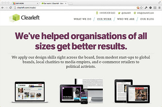
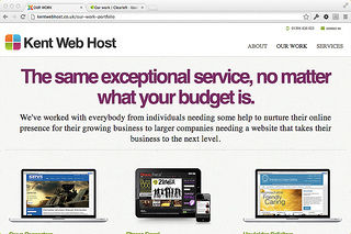
I can’t see it myself. But I can’t guarantee that we weren’t somehow unconsciously influenced by these guys.
Just to set the record straight, I gave them a call.
Chatting with Kent Web Host on Huffduffer
Jeremy Keith's Blog

- Jeremy Keith's profile
- 56 followers

