
Jeremy Keith's Blog, page 126
August 8, 2013
The dConstruct 2012 website
I got an email recently from the guys at Cyber Duck asking me about the process behind the dConstruct 2012 website, beautifully designed by Bevan. Ethan actually used it as an example in his An Event Apart talk earlier this week. Anyway, here’s what I wrote…
The dConstruct conference takes place on the first Friday of September every year, and every year the conference has a different theme. That theme then influences the visual design of the site. To start with, we throw up a quick holding page and then, once we’ve got our speakers all set, we launch the site proper, usually a month or so before tickets go on sale.
At Clearleft, we believe very strongly in the universality of the web. We wanted the information on the 2012 dConstruct website to be available to anybody with an internet connection, no matter what kind of device or browser they’re using. That does not mean that the site should look and behave exactly the same in every browser or on every device. That isn’t practical. Nor is it desirable, in my opinion. Better browsers should be rewarded with a better experience. But every browser should be able to access the content. The best way to achieve that balance is through progressive enhancement. Responsive web design—when it’s done mobile first—is an excellent example of progressive enhancement in action.
The theme for dConstruct 2012 was “Playing With The Future”. It would be easy to go overboard with a visual design based on that theme, so we made sure to reign things in a bit and keep it fairly subtle. The colour scheme evolved from previous years, going in a more pastel direction. The use of Futura for headline text was the biggest change.
Those colours (muted green, red, and blue) carried through to the imagery. In the case of a conference website, the imagery is primarily photographs of speakers. That usually means JPEGs and sometimes those JPEGs can get pretty weighty. In this case, the monochrome nature of the images meant that we could use PNGs. Not only that, but through a little experimentation, we were able to get away with sometimes using as few as 16 colours for the PNG. That meant the file sizes could be nice and small. The average speaker photo was around 12K in weight.
Each speaker photo is 200x200 pixels in size. Now, you might think that we’d want to make those bigger as we moved up from small screen sizes to larger, desktop sizes. But actually, because the layout changes to put more of the photos side-by-side as the viewport gets larger, there was no need to do any clever responsive image-swapping. Instead, we spent that time getting the images as small in file size as we possibly could. The ImageOptim app for Mac is very handy for helping with this.
There are also some background images (for social media icons, background textures, and the like). These were all Base 64-encoded into the stylesheet to avoid extra HTTP requests.
The priority was very much on keeping things speedy. When talking about responsive design, there’s a lot of emphasis on layout but actually that was a relatively straightforward part of the 2012 dConstruct site: there’s nothing too complicated going on there. Instead, the focus was on performance balanced with a striking visual design.
On the individual speaker pages, there’s a bit of conditional loading going on. For example, most pages include a link to a video on YouTube or Vimeo. On larger screen sizes, there’s a bit of JavaScript to pull in that video and display it right on the page. Crucially, this JavaScript runs after the rest of the document has already loaded so it won’t block the rendering. The end result is that everyone has access to the video: on smaller screens, it’s available by following a link; on larger screens, it’s available in situ.
JavaScript is only ever used to enhance, never as a requirement for core functionality. The navigation, for example, has a nice toggle-to-reveal behaviour on small screens if JavaScript is available. But if JavaScript isn’t available or doesn’t load for some reason, then the navigation is simply visible by default. It’s important to consider safe defaults before adding behavioural enhancements.
In retrospect, it probably would’ve made more sense to simply inline the JavaScript at the bottom of each page: the external file isn’t very big at all, and that extra HTTP request could’ve been saved.
There were some other things that could’ve been done better: some of the images might have been better as SVG (the logo, for example). But all those lessons were carried forward and so the site for dConstruct 2013 is even snappier and more performant.
Tagged with
dconstruct
responsive
design
performance
images
dconstruct2012
conference


August 7, 2013
August in America, day five
This morning, Jessica and I left Alexandria, but not by plane. No, we travelled by a more elegant transport from a more civilised age. We took the train. In just a few short, fairly comfortable wifi-assisted hours, we arrived in Philadelphia.
Ah, Philadelphia! It’s my first time in the city of brotherly love, though of course I’ve seen it depicted in many films. Why, the very train station we arrived at was the scene of the opening murder in Witness. Then there’s Rocky, Mannequin, National Treasure, everything ever made by M. Knight Shyamalan, and of course, Philadelphia.
Jenn showed us around her neighbourhood, and we grabbed a coffee at a suitably hipsterish café where the music was either from the 80s or completely new but heavily inspired by the 80s.
The plan for the evening was to go to a baseball game. When in Rome. But alas, the weather was too treacherous to trust so we went to a bar and participated in a pub quiz instead, ably assisted by the internet’s Kevin Cornell.
During the course of the quizzical proceedings, we all partook in a round of picklebacks. Jenn had previously familiarised me with the concept. A pickleback consists of a shot of Irish whiskey followed by a shot of pickle juice. The theory is that the pickle juice completely erases any trace of the whiskey you’ve just knocked back. I, however, was very sceptical of the whole idea. It just sounded disgusting to me. I mean, Irish whiskey? Really? Ugh!
The pickle juice, on the other hand, was delicious.
Tagged with
americanaugust
philadelphia
america
pickleback
August 6, 2013
August in America, day four
Today was day two of An Event Apart DC and I opened up the show. I was very nervous because this was a brand new talk. I wasn’t sure whether I would come in way under time, or way over time, or whether anybody would be interested in the subject matter.
As it turned out, the timing was okay. I got through a lot of stuff faster than I was expecting, so that left me time for a good ol’ rant towards the end of the talk. I ranted about progressive enhancement. I ranted about digital preservation. I ranted about “the cloud”. I guess I shouldn’t be surprised that people think I’m an angry person (I’m really not; honest).
It seemed like people really enjoyed the talk. There were lots of positive tweets and lots of people came up to me to tell me how much they enjoyed the “big picture” nature of my talk. But I’m not going to be complacent about it: a few years ago at An Event Apart in Boston I gave a less technical talk than usual and it seemed like people really liked it (positive tweets, kind words, etc.) …but then when the feedback surveys were totted up, I ended up getting the lowest rank I had ever received. So time will tell what the audience really thought of my talk today.
In any case, I enjoyed it. As usual, I just got up on stage and geeked out for an hour to a captive audience about stuff that really excites me. How cool is that?
I was glad to have the talk done. Afterwards I could relax and enjoy all the other talks, and have a bit of a chat with some of the smart and friendly attendees.
Now that the conference is over, it’s time for me to depart Alexandria. Next stop: Philadelphia.
Tagged with
americanaugust
america
alexandria
aea
aeadc
aneventapart
conference
speaking
August 5, 2013
August in America, day three
It was a beautiful day today but I spent most of it indoors. Today was the first day of An Event Apart DC here in Alexandria. As usual, the standard of talks was ludicrously high.
An Event Apart often feels like getting a snapshot of the current state of web technologies and best practices. I really like it when themes emerge from multiple talks—those emergent themes are usually the hot topics of modern web design and development. Today I felt like there were two prominent themes:
process and
devices.
Both Samantha and Jason talked about process and workflow from different perspectives. I had seen Jason’s talk at New Adventures in Nottingham but he’s such a joy to listen to, I gladly soaked it up again. Listening to Samantha reinforced my opinion that she’s one of the smartest designers working today. I found myself nodding my head enthusiastically during both talks.
Luke and Grigs both showed us what an amazingly diverse set of devices we have to deal with these days. I know that some people find this situation depressing, but I find it quite energising. Let’s face it, the web was getting pretty boring there for a while a few years back. You certainly can’t say that about the current browser/device landscape.
Rounded out with Jeffrey and Karen’s content-focused calls-to-arms—one at the start of the day and the other at the end—it was a great day one.
I’m speaking first thing tomorrow. That’s right; I’ve got the hangover slot.
This is a brand new untested talk. I had planned to give a run-through to the guys at Clearleft but somehow that never happened, so tomorrow will literally be the very first time I’m giving this talk. That gives it a certain frisson and adds an air of excitement and tension. It also means I’m very, very nervous.
I think it’s a good talk …but I’m not sure how it’s going to go down with this crowd. While it will have some practical tips scattered throughout, it’s mostly going to be a fairly personal talk about a personal project that I’m using as a lens to look at long-term web design and development. That might put some people off, who would rightly argue that it isn’t directly applicable to their day-to-day work, but I’m just going to have to accept that. It’s going to be interesting to see what people make of it.
I’m excited and nervous. I probably won’t get much sleep tonight.
Tagged with
americanaugust
travel
america
alexandria
virgina
aea
aeadc
aneventapart
conference
speaking
August 4, 2013
August in America, day two
Once I knew I was going to be speaking at An Event Apart DC, I got in touch with my dear friends Dan and Sue in Baltimore to see if we could figure out a way to meet up while I was relatively nearby. I went to art college with Dan over two decades ago. I haven’t kept in touch with many (any?) people from back then, but Dan and I have remained firm friends, sadly separated by an ocean.
Dan told me his plan for today was for him and Sue to take the kids down to his Dad and stepmother’s place in Calvert county, and he asked if Jessica and I wanted to join them. “Absolutely!”, I said, without knowing anything about Calvert county or what a trip there might involve.
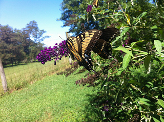
As it turns out, this particular place in Maryland was a little piece of paradise: a beautiful pastoral setting where the green landscape and blue sky is interrupted only by the flitting by of the occasional gorgeous-looking butterfly. Also, it has a pool.
This setting was already perfect, but we made it the quintessential Maryland experience by feasting on crabs for lunch. Sure, you’ve got to work to get at the flesh, but oh, what tasty flesh it is, redolent with Old Bay seasoning.

It was a perfect afternoon: eating crabs, swimming in the pool, and most of all, catching up with old friends.
I was still basking in the glow of it all when we got back to Alexandria in time for the traditional pre-conference speaker’s dinner for An Event Apart. I never even had the chance to freshen up before heading out for the meal: as soon as we got back to the hotel, we spotted Ethan, Kristina, and Karen in the hotel bar and that was it. We joined them, then Jason joined us, then one-by-one everyone else showed up. The whole thing coalesced into the gang of speakers and off we went for a meal in old town. Once again, it was all about the company.
Tagged with
americanaugust
travel
america
maryland
August 3, 2013
August in America, day one
It’s Pride weekend in Brighton but alas, I wasn’t able to stick around for the festivities. I made my way to Heathrow for the flight to Washington to kick off my American trip.
The flight from Heathrow to Dulles takes just about eight hours. The average in-flight film is just under two hours, so you might think that this would be a four-film flight. But when you factor in the take-off and landing phases, it’s actually more like three films with a little bit of TV to top it off.
I have some ideas about what makes a good airplane movie. You don’t want to watch anything that’s too good; you’ll just be annoyed that you saw it on a little screen on an airplane seat instead of on a big screen in a cinema. But you don’t want to watch anything that’s too crap because, well, it’s crap. So what you want is a down-the-middle three-star pleasingly mediocre movie.
I watched Oblivion, Iron Man Three, and The Incredible Burt Wonderstone. Pretty good airplane films, all around. Actually, I ended up enjoying Oblivion far more than I was expecting (probably because my expectations had been quite low).
With the flight time whiled away nicely, Jessica and I arrived into Dulles at six in the evening, and what a nice warm evening it was too.
The lovely people running An Event Apart really know how to take care of their speakers and that includes a car service to pick us up at the airport and take us to the hotel. That makes such a big difference after a long transatlantic flight.
In this case, the ride from the airport to the hotel was a fairly lengthy one: Dulles is a good forty minutes away from Alexandria. So we settled in and enjoyed the scenery …what there was of it. The route was mostly filled with “nothing to see here” buildings. I’m guessing that Virginia has more than its fair share of windowless bunker-like buildings—this is, after all, the Lothlorien of the internet in America, where the backbone meets the server farms. Looking for “The Cloud”? It’s probably somewhere in Virginia.
As we’re being driven to our destination, I turn to Jessica and I say:
Chicken wings.
You have to understand, I have this weird travel-triggered craving. Whenever I fly to the United States of America, I get the urge to have my first meal on American soil be …yes, you guessed it, chicken wings. I have no idea why this is or when it started. And it’s not like I usually crave chicken wings all that often (not that I’d be able to get proper Buffalo style wings in the UK anyway).
Once we’re settled into our hotel room, we do a little bit of research and start walking the streets of Old Town Alexandria in search of the Hard Times Cafe. We find it. We get a table. We get some beers. I get my wings. They taste good. They taste really, really good.
I should have just left it at chicken wings, but they specialise in chili. I couldn’t resist.
So now I’m back at the hotel, and I’m stuffed full of beer, chicken wings, and chili. This strikes me as an eminently suitable way to begin my American sojourn.
The United States of August
I’m going to be in the States for most of this month.
See, I’m speaking at An Event Apart DC in a couple of days, which is the first week of August. I’ll also speaking at An Event Apart Chicago in the last week of August. With such a short span of time between the two of events, I figured it wasn’t really worth flying across the Atlantic, flying back, flying over again, flying back again…
I looked around to see if there were any other events going on in between the two Events Apart and saw that UX Week was happening in San Francisco right before the Chicago AEA. I offered my services for a workshop, they readily accepted, and that sealed the deal: August was definitely going to be spent stateside.
My travel plans within the States look like this:
Alexandria, Virginia;
Philadelphia, Pennsylvania;
Sierra Vista, Arizona;
San Diego, California;
San Francisco, California;
Chicago, Illinois.
If you’re going to be in any of those locations, let me know and maybe our paths can cross.
Bye, bye, Brighton. See you again for the first week of September.
Tagged with
america
travel
conference
aea
uxweek
August 2, 2013
Brighton in September
dConstruct is now exactly five weeks away. To say that I am excited would be quite an understatement.
I am insanely excited about this year’s dConstruct. I think the line-up is quite something—a non-stop parade of fantastic speakers. And the speakers themselves are equally excited, spurred on by the excellent company they’ll be keeping. Seriously, this is going to be an amazing day.
I’m also excited about all the other events happening around dConstruct as part of the Brighton Digital Festival.
The first week of September will kick off with the Reasons To Be Creative conference: three days of three tracks of all sorts of design and code.
Reasons finishes on Wednesday, September 4th, which is the same day that Seb will be running his fantastic CreativeJS workshop. I took this workshop myself a few months back and I can’t recommend it highly enough—you’ll come away feeling like you’re superpowered. Seb is a great teacher. And don’t be put off by the whiff of coding; this workshop is for everyone. In fact, I think designers with very little experience of code would be best served by it.
There are still some tickets available for Seb’s workshop and remember that booking onto the workshop also gets a complementary pass to the dConstruct conference day as well.
In between Seb’s workshop and the dConstruct conference proper, there’s Improving Reality, that wonderful conference on technology and culture curated by Lighthouse in Brighton. I’ve really, really enjoyed the last two years so I’m going to be there again this time ‘round on Thursday, September 5th.
Then right after dConstruct, there’s a weekend of good stuff happening over the Saturday and Sunday:
Brighton Mini Maker Faire — a day of interactive exhibitions on the Saturday followed by a workshops and panels on the Sunday. There’ll be talks and panels on the Saturday too, including a panel moderated by Maggie Philbin!
The Big Sussex Market will be running all weekend as part of the Brighton and Hove Food Festival. This will be on New Road, right by the Brighton Dome where Maker Faire will be happening.
Indie Web Camp will also be running all weekend, just round the corner at Lighthouse. This little gathering is something very dear to my heart. I was talking about just the other day on the Breaking Development podcast.
Phew! That’s quite a full dance card.
If you’ve got a ticket for dConstruct, remember that as per the terms and conditions, if you need to cancel or transfer the ticket you’ve only got one more week to do so.
If you haven’t got a ticket for dConstruct, what are you waiting for?
See you in Brighton in September.
Tagged with
dconstruct
dconstruct2013
brighton
conference
bdf
makerfaire
indiewebcamp
events
July 26, 2013
An Event Alarm
I’m at An Event Apart. Somewhere. It’s in a room in a hotel. The room is smaller than the usual ballroom-sized venue, but I know it’s An Event Apart because Luke Wroblewski is giving a talk. I think it’s a talk about how he led a group of people who were trapped in the desert to safety. Somehow he saved them with data.
I’m speaking next. But there’s a pressure on my bladder that I need to relieve. I’ve got another ten or fifteen minutes ‘till my talk so I reckon I have enough time. I go out into the corridor in search of a toilet. I find one and do what I need to do.
But when I go back out into the corridor, I can’t immediately find the room that the conference is in. That’s okay, I think. I’ve still got time. But as I wander the corridor more and more, I start to panic. I’m supposed to be on in five minutes! Now the hotel building seems to be cavernous, like one of those Las Vegas hotel-casino hybrids that contain a labyrinthine mini-city. I’m supposed to be on stage now! Up escalators, down stairs …I can’t find the room. I’m really panicking now. I was supposed to be on stage five ago …Jeffrey’s going to kill me. I grab someone who looks like a hotel employee and beg him to help me: I was supposed to be on stage ten minutes ago! But he can’t help me. I’m really freaking out.
Then I woke up. I don’t think if I’ve ever had the classic “final exam” dream, but I think this is the closest equivalent.
An Event Apart DC is ten days away. I’m giving a new talk. I thought I was prepared for it. My subconscious begs to differ.
Tagged with
dream
nightmare
aneventapart
aea
aeadc
conference
presentation
July 21, 2013
Progresponsive
Brad has done a great job in documenting navigation patterns for responsive designs. More recently I came across Erick Arbé’s similar collection of patterns for responsive navigation. And, of course, at the Responsive Day Out, David gave a presentation on the subject.
David Bushell: Responsive Navigation on Huffduffer
As I mentioned in the chat after David’s talk, choosing a pattern doesn’t need to be an either/or decision. You can start with a simple solution and progressively enhance to a more complex navigation pattern.
Take the footer-anchor pattern, for example. I really, really like this pattern. It doesn’t require any JavaScript whatsoever; just a simple hyperlink from the top of the page that links to the fragment identifier of the navigation at the bottom of the page. It works on just about every device.
But you don’t have to stop there. Now that you’ve got a simple solution that works everywhere, you can enhance it for more capable browsers.
Take a look at this example that applies the for browsers capable of handling the JavaScript and CSS required.
You can see the two patterns in action by looking at the source in JS Bin. If you toggle the “Auto-run JS” checkbox, you can see both behaviours. Without JavaScript you get the footer-anchor pattern. With JavaScript (and a capable browser) you get the off-canvas pattern.
I haven’t applied any media queries in this instance, but it would be pretty straightforward to apply absolute positioning or the display: table hack to display the navigation by default at wider screen sizes. I’ll leave that as an exercise for the reader (bonus points: apply the off-canvas from the right of the viewport rather than the left).
Feel free to peruse the somewhat simplistic code. I’m doing a bit of feature detection—or cutting the mustard—to test for querySelector and addEventListener. If a browser passes the test, a class is applied to the document root and some JavaScript is executed on page load to toggle the off-canvas behaviour.
On a recent project, I found myself implementing a number of different navigation patterns: off-canvas, overlay, and progressive disclosure. But each one began as an instance of the simple footer-anchor pattern.
Progressive enhancement, baby. Still not dead, still important.
Tagged with
responsive
navigation
development
footer
anchor
offcanvas
javascript
behaviour
interaction
design
progressiveenhancement
Jeremy Keith's Blog

- Jeremy Keith's profile
- 56 followers

