
Muthulakshmi Mahesh's Blog
October 19, 2024
My greatest gift is my mum
My mother’s love is the greatest gift I’ve ever received. Even as I navigate my twenties, her presence remains as steady and comforting as a lighthouse in a storm. She’s more than just a parent; she’s my protector, teacher, and biggest cheerleader.
I’ve always been aware of her quiet strength. She’s the gentle push I need when I doubt myself, the reassuring pat on the back after losing my balance. Her love is a warm blanket, shielding me from the world's harsh realities. Her unwavering belief in me is my greatest defense when I'm faced with jealousy or cruelty.
She has taught me invaluable lessons: the importance of honesty, the power of confidence, and the courage to stand up for what’s right. Her guidance has shaped me into the woman I am today. She has instilled in me a strong work ethic, a passion for learning, and a relentless pursuit of my goals.
One of the most profound lessons she’s taught me is the value of education. Even though she sacrificed her own dreams to provide for my brother and me, her unwavering support for our education has been instrumental in our success. Seeing her determination to give us the opportunities she never had has motivated us to strive for our own goals and make her proud.
I’m eternally grateful for her unwavering support, her sacrifices, and her unconditional love. She’s more than a mother; she’s my mentor, my confidante, and my greatest inspiration.
[image error]

February 27, 2024
Bridging the Gap Between Trends and User-Centricity
Introduction:
The world of product design is ever-evolving, and UX design sits at the forefront of this dynamic landscape. As aspiring and experienced designers, we constantly encounter new trends and technologies that promise to revolutionize the user experience. However, navigating this exciting yet overwhelming terrain requires a balance between embracing innovation and staying true to the core principles of user-centricity.
The Allure of Trends:
New design trends emerge at a rapid pace, each claiming to be the next big thing. From gamification and microinteractions to augmented reality and voice interfaces, these trends hold the potential to enhance user engagement and create novel experiences. However, it’s crucial to remember that trends are temporary and often driven by hype rather than user needs. Simply incorporating a trendy element into your design without understanding its purpose and impact on the user can lead to an unintuitive and frustrating experience.
Prioritizing User Needs:
At the heart of successful UX design lies a deep understanding of the user. This involves conducting thorough user research, understanding their needs, analyzing their pain points, and building solutions that cater to their specific requirements. User-centered design ensures that your product is not just visually appealing or trendy, but also usable, accessible, and ultimately, beneficial to the target audience.
Finding the Perfect Balance:
So, how do we, as designers, strike the perfect balance between staying relevant with the latest trends and remaining focused on user-centricity? Here are some key strategies:
Evaluate trends critically: Don’t jump on the bandwagon just because something is popular. Analyze each trend through the lens of user needs and ask yourself: “Does this trend solve a real problem for my users?” “Will it enhance their experience, or simply add unnecessary complexity?”Use trends strategically: If a trend aligns with your user research and solves a specific user need, consider incorporating it into your design. However, ensure it’s implemented thoughtfully and seamlessly, without overshadowing the core functionality and user flow.Focus on user research: Dedicate time and resources to user research throughout the design process. This will equip you with the knowledge and insights needed to prioritize user needs over fleeting trends.Embrace continuous learning: The landscape of UX design is constantly evolving, so ongoing learning is essential. Stay updated on emerging trends, but remember, the foundation of your learning should always be user-centered design principles.Conclusion:
In the ever-changing world of UX design, staying relevant and creative while remaining user-centric is an ongoing challenge. By critically evaluating trends, prioritizing user needs, and adopting a continuous learning approach, we can navigate this dynamic landscape and create products that are not just trendy, but truly user-centered and successful.
[image error]Bridging the Gap Between Trends and User-Centricity was originally published in Bootcamp on Medium, where people are continuing the conversation by highlighting and responding to this story.
February 22, 2024
Avoiding Common Mistakes in Your UX/UI Design Transition
The excitement to get started in UX/UI design is undeniable as it encourages creative problem-solving, shaping user experiences, and wielding visual magic. But transitioning into this vibrant field isn’t always a smooth stroll across a pixel-perfect interface.
Aspiring designers often stumble on hurdles that hinder their progress. Let’s shed light on some common mistakes and offer tips to help you navigate the bridge to UX/UI design mastery.
Mistake #1: Falling for the "I think" assumption trap.
You might have an eye for aesthetics, but relying solely on personal assumptions is a recipe for disaster. User research is the bedrock of UX/UI. Conduct interviews, surveys, and usability testing to understand your target audience, their needs, and their pain points. Remember, design serves the user, not your ego.
Mistake #2: Neglecting the power of iteration.
Your first drafts won’t be masterpieces. Embrace the iterative process! Gather feedback from peers, mentors, and most importantly, users. Analyze, refine, and iterate. This continuous loop is how you transform rough sketches into intuitive interfaces that sing.
Mistake #3: Confusing UI with UX. While visually appealing interfaces are crucial, remember the "U" in UX/UI. Don’t let aesthetics overshadow usability. Focus on information architecture, clear navigation, and user-friendly interactions. Visuals should enhance, not hinder, the user experience.
Mistake #4: Neglecting the human touch.
UX/UI design isn’t just about pixels and design. It’s about empathy, understanding human behavior, and anticipating user needs. Develop your soft skills: communication, collaboration, and storytelling. These will help you connect with users on a deeper level and create designs that resonate.
Mistake #5: Being afraid to ask for help. The UX/UI community is incredibly supportive. Don’t hesitate to reach out to mentors, join online forums, and attend workshops. Asking questions and seeking feedback is a sign of growth, not weakness.
Remember, the bridge to UX/UI mastery is built on user-centricity, continuous learning, and a healthy dose of perseverance. By avoiding these common pitfalls and honing your skills, you’ll soon be crafting delightful experiences that leave users saying, "Wow, this just works!"
[image error]Avoiding Common Mistakes in Your UX/UI Design Transition was originally published in Bootcamp on Medium, where people are continuing the conversation by highlighting and responding to this story.
February 13, 2024
How AR/VR can revolutionalise fashion retail
Imagine: Trying on clothes virtually, exploring immersive stores, and shopping with friends in VR — all within the Myntra app. AR/VR promises to revolutionize fashion retail, and Myntra is poised to lead the charge. But how can they do it with a focus on UX and ethical considerations?
From Fitting Room Frustration to AR Bliss:
Personalized Try-On: Superimpose clothing models onto users in real-time, considering size, body data, and diverse models for inclusivity.Accessibility Matters: Offer clear instructions and alternative options for users with visual impairments or limited technical knowledge.VR Shopping: Gamified & Immersive:
Curated Virtual Stores: Tailor store environments to individual preferences, showcasing relevant collections and recommendations.Interactive Product Exploration: Zoom in on textures, see fabric flow, and even examine clothing in detail within the VR space.Social Shopping Spree: Enable virtual shopping with friends, fostering community and encouraging peer recommendations.Ethical Considerations: The Mirror with a Conscience:
Data Privacy & Security: Ensure user data collected through AR/VR experiences is used ethically and transparently with user consent.Body Positivity & Inclusivity: Promote realistic beauty standards by avoiding filters perpetuating narrow ideals and showcasing diverse models.Accessibility for All: Make VR experiences accessible to users with disabilities through alternative control methods and addressing potential sensory overload.By embracing these innovations responsibly, Myntra can transform fashion retail, making it more personalized, convenient, and ethical for all. Remember, the future is not just about looking good, it’s about feeling good about how you get there.
[image error]August 28, 2023
Visual Hierarchy is the map for user attention
Picture yourself browsing a website or navigating through a mobile app. Your eyes effortlessly move from one element to another, almost as if following an invisible path. This journey is meticulously crafted by the principles of visual hierarchy. At its core, visual hierarchy is the practice of arranging design elements in a deliberate manner, ensuring that users' attention is directed to the most important content.
Large, bold headings instantly command your focus, providing a roadmap for understanding the structure of the information. Subtle color contrasts and varying font sizes subtly nudge you to explore further, while strategic placement of images and interactive elements influences your next move. The clever interplay of size, color, spacing, and alignment orchestrates an experience that feels intuitive and guides you through the digital landscape.
From the bold headline to the understated elegance of whitespace, visual hierarchy crafts a symphony of user experience. Its harmonious rhythm transforms complexity into clarity, chaos into order, and fragments into a cohesive narrative.
In the ever-evolving world of digital design, mastering the delicate art of visual hierarchy remains a cornerstone for creating experiences that resonate. By acknowledging its power and applying its principles, designers can ensure that users embark on journeys that are not only visually appealing but also intuitive, engaging, and ultimately unforgettable.
[image error]June 21, 2023
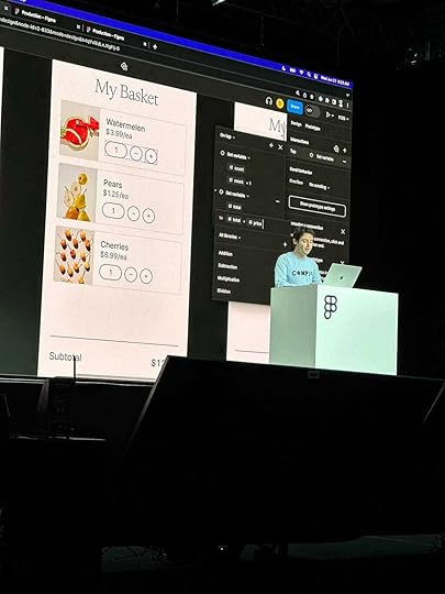
Figma Config 2023: Unleashing the Power of Design and Development Collaboration

In the fast-paced world of design and development, staying ahead of the curve is important. Imagine a tool that not only streamlines collaboration between designers and developers but also revolutionizes the way we create, iterate, and communicate our ideas.
Figma Config 2023, is the game changer that is set to redefine the landscape of design and development workflows. Packed with a lot of exciting updates and new features, Figma Config 2023 empowers designers and developers to work seamlessly together, resulting in faster iterations, enhanced productivity, and stunning end products.
#1 Dev Mode: Bridging the Gap Between Design and DevelopmentOne of the standout features of Figma Config 2023 is the introduction of Dev Mode. Designers and developers can now easily mark screens as “ready for development,” creating a clear and efficient communication channel. Dev resources are readily available, reducing the back-and-forth and allowing for a smoother handoff process. This breakthrough functionality eliminates the guesswork, enabling both parties to collaborate effortlessly.
 Figma#2 Variables: Making Adaptable Changes a Breeze
Gone are the days of tedious manual adjustments. Figma Config 2023 brings the power of variables to the forefront, allowing designers to switch between different corner radius sizes, light and dark modes, and even densities. This newfound flexibility empowers designers to create adaptable designs that can be modified with a few simple clicks, saving valuable time and effort.
 #3 Advanced Prototyping: Elevating User Experience in a Few Steps
Figma Config 2023 takes prototyping to the next level. With the introduction of prototyping variants and conditionals, designers can now create interactive experiences that respond intelligently to user actions. Whether it’s directing users to different screens based on specific conditions or dynamically updating the content based on user input, the possibilities are endless. This streamlined prototyping process enables designers to iterate rapidly, resulting in more refined and user-centric designs.
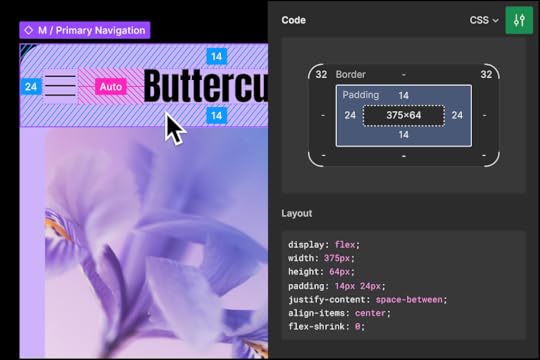
 Conditional prototyping#4 Auto Layout Updates: Responsive Components and Layouts
With the wrap autolayout feature, Figma Config 2023 ensures that your designs are responsive and adaptable across various screen sizes. No more manual adjustments or repositioning of elements! Components now effortlessly resize and rearrange themselves based on the screen’s dimensions, providing a consistent user experience across different devices. This powerful enhancement simplifies the design process and ensures that your creations look stunning, regardless of the platform they’re viewed on.
Designers can now wrap elements to the next line and set minimum and maximum widths and heights. This streamlines the design process, saving time on manual resizing and allowing for more creativity. With responsive designs that adapt to different devices and screen sizes, Figma Config 2023 empowers designers to focus on crafting visually stunning interfaces with ease. It’s time to embrace these Auto Layout updates and unlock the full potential of your design workflow.
 #5 Font Picker: Previewing Fonts for Perfect Typography
Typography plays a crucial role in design, and Figma Config 2023 recognizes its significance. The introduction of the font picker feature allows designers to preview different fonts before incorporating them into their frames. This intuitive functionality facilitates informed decision-making, helping designers choose the perfect font to convey the desired tone and enhance the overall aesthetics of their designs.
 #6 File Browser Glow-Up: Spending Less Time Searching, More Time Creating
Finding the right files has never been easier! Figma Config 2023 introduces an upgraded file browser, streamlining the search process and enabling users to quickly locate the assets they need. Spend less time digging through folders and more time focusing on creativity and innovation.
 Conclusion:
Figma Config 2023 has undoubtedly raised the bar for design and development collaboration. With features like Dev Mode, Variables, Advanced Prototyping, Auto Layout Updates, Font Picker, and the revamped File Browser, designers and developers now have a unified platform that caters to their needs.
These features emerge as an indispensable tool, setting new standards and enabling seamless collaboration. This game-changing update empowers designers and developers to push boundaries, iterate swiftly, and deliver captivating digital experiences. With Figma Config 2023, creativity and innovation know no limits. Embrace it to unlock a world of collaborative design and development possibilities.
[image error]June 20, 2023
How Can Tiny Interactions Create a Huge Impact on User Engagement and Delight?
In the vast digital landscape, where countless websites and apps compete for our attention, it’s often the little things that truly make a big impact. We might not pay much attention to them, but these small interactions within a digital product, known as microinteractions, have the power to significantly enhance our overall experience.
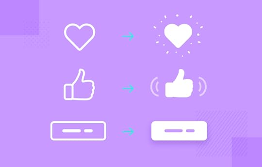
Imagine you’re scrolling through your social media feed and you come across a post that resonates with you. You instinctively tap the heart-shaped button to show your appreciation, and suddenly, a delightful animation appears — a burst of tiny hearts spreading across the screen. In that moment, you feel a sense of satisfaction and connection. It’s these subtle microinteractions that surprise and delight us, leaving a lasting impression.
But microinteractions are more than just moments of delight. They serve a practical purpose too. Have you ever hovered your mouse over a button and noticed it change color? Or felt a subtle vibration when you entered an invalid input? These are microinteractions providing feedback and guidance, making our interactions more intuitive and informative. They help us understand the system’s response to our actions, reducing uncertainty and empowering us to navigate through the interface effortlessly.
Microinteractions also create a sense of progress, particularly when we’re waiting for something to happen. Loading animations, progress bars, or even a simple spinning wheel — they all communicate to us that our action is being processed. Instead of feeling frustrated or anxious during these moments, we’re reassured that something is happening behind the scenes. These subtle cues keep us engaged and alleviate any sense of impatience.
But perhaps the most powerful aspect of microinteractions is their ability to build emotional connections. Imagine visiting a website for the first time and being greeted by a warm, friendly welcome message. Or interacting with an app that responds to your actions with playful animations. These small interactions humanize the digital experience, making us feel seen and valued. By infusing personality and empathy into microinteractions, designers can create a bond between users and the interface, forging a stronger emotional connection.
To create effective microinteractions, designers need to consider the context, purpose, and target audience. It’s important to align these interactions with the overall brand identity and user expectations. Consistency in visual and auditory cues, as well as timing and responsiveness, is crucial for a seamless and cohesive user experience. User testing and feedback play a vital role in refining and optimizing microinteractions to ensure maximum engagement and usability.
In conclusion, while they may be small in scale, microinteractions have a significant impact on our engagement and experience as users. They provide feedback, guidance, and moments of delight. They create a sense of progress and establish emotional connections. By harnessing the power of microinteractions, designers can transform a mundane digital experience into a delightful and memorable one. So let’s embrace these little interactions and elevate our designs to new levels of user engagement and satisfaction.
[image error]The Role of Accessibility in Digital Design
Designing with accessibility in mind is essential for creating inclusive user experiences that empower all individuals. By understanding the importance of accessibility and implementing practical strategies, we can ensure equal access and provide a seamless digital environment for everyone.
The Power of Inclusive Design: Inclusive design goes beyond legal requirements — it embraces empathy and diversity. By considering the needs of users with disabilities, we can create experiences that serve all individuals, fostering equality and inclusivity.Designing with Empathy: Empathy is the key to inclusive design. Through user research and engaging with users with disabilities, we gain valuable insights that shape our designs. Understanding their perspectives and challenges helps us create interfaces that meet their specific needs.Adhering to Accessibility Guidelines: Following established accessibility guidelines, such as WCAG, ensures our designs meet recognized standards. By designing interfaces that are perceivable, operable, understandable, and robust, we provide equal access to information and functionality.Visual and Interaction Design: Considering factors like color contrast, legibility, responsive design, and keyboard navigation enhances accessibility. Our designs should accommodate various devices and assist users with visual impairments or mobility limitations.Content and Communication: Clear and concise language aids users with cognitive disabilities. Including alternative text, captions, and audio transcripts ensures access to visual and auditory content for users with disabilities.Testing and Iteration: Testing our designs with users who have disabilities helps identify areas for improvement. Conducting accessibility audits and gathering feedback ensure continual refinement and better accessibility.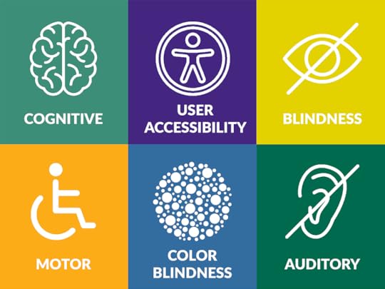
Designing for accessibility creates inclusive user experiences that empower all individuals. By embracing empathy, adhering to guidelines, and considering diverse user needs, we can break barriers and foster equality in the digital realm. Let’s design inclusively, making a positive impact on the lives of users everywhere.
[image error]Building Trustworthy User Experiences
Imagine you’re a user exploring the online realm, faced with countless options. One question echoes in your mind: Can I trust this platform? As a UX designer, how can you create an environment that not only meets users’ needs but also fosters deep trust?

We embark on a quest to uncover the elements that form the foundation of trust in user experiences. We discover the importance of trust, and understanding how it shapes user decisions and affects their overall satisfaction.
As our adventure unfolds, we encounter the first step toward trust: visual design. Consistency, branding, clear navigation, and compelling imagery guide users, instilling a sense of professionalism and reliability.
Continuing our journey, we explore user interfaces, where transparency and information become vital. We learn about privacy and security, protecting users’ sensitive data. And in moments of frustration, we discover the importance of graceful error handling, showing empathy and understanding.
Moving forward, we delve into the power of content and copy. We witness the impact of clear and concise language tailored to users’ needs. We learn how authoritative content builds credibility, and how helpful error messages can reassure and guide users.
But our story doesn’t end there. In the world of e-commerce, trust takes on new significance. We discover the importance of accurate product information, detailed descriptions, and trust signals like certifications. User reviews and ratings become beacons of trust, empowering users to make informed decisions.
Throughout our journey, we embrace the art of measurement and iteration. User feedback becomes our guide, revealing areas for improvement. By analyzing user behavior, we gain insights to enhance the user experience and further build trust.
In this reading, we’ve unveiled the power of trust in creating user confidence through engaging experiences. Trust connects users to the digital realm, and as UX designers, we hold the key to building trust. So let’s embark on this journey together, empowering users with confidence, authenticity, and the belief that their digital experiences will always be fulfilling.
[image error]January 21, 2023
Why Empathy is Important for Good UX Design
In order to create user-centered designs that actually meet the requirements of the people who will be using them, it is essential to have empathy, which is the ability to understand and share the experiences of others.
I had the chance to do user research and interview users during my period of training to learn more about their needs and pain points. Through this method, I was able to comprehend the viewpoints of the users and provide solutions that would simplify their lives.
Through user research, I came to the unexpected realisation that people regularly have different requirements and opinions than I had first thought. I was able to build a better solution by placing myself in the users’ shoes and comprehending their goals, challenges, and pain points.
I also learned that empathy should be a constant practise all throughout the design process, not just during the research stage. As a designer, I make it a point to consider the user’s standpoint and make sure the finished product is valuable, usable, and accessible to them.
I think the secret to developing designs that genuinely serve consumers’ needs and enhance their lives is empathy. As a UX designer, I always work to increase my empathy and comprehension of consumers so that I can produce designs that genuinely change the world.
[image error]

