
David Kudler's Blog, page 18
April 24, 2014
1 Thing That SHOULDN’T Go at the Front of Your Ebook
 So I’ve written about what you should put at the back of your ebook. Over on LinkedIn, Denise Wakeman raised the issue, sparking an excellent discussion. (She suggested a great possibility that I hadn’t thought of: an opt-in link for your newsletter/mailing list.)
The discussion then turned to what should go at the front of an ebook.
You know those pages at the front of a print book that get lowercase roman numerals instead of regular arabic page numbers — the boring stuff that you usually flip through so you can start reading? That’s called the book’s front matter.
Now, tradition has set the front matter of print books fairly rigidly for a while now. According to my trusty Chicago Manual of Style, it runs something like this, with each item given a separate page or section: half-title page, series title or frontispiece, title page, copyright page, dedication, epigraph, table of contents (TOC), list of illustrations, list of tables, foreword, preface, acknowledgements, introduction (unless it’s part of the body of the book). Then you get, you know, the book. (Except for the title page and copyright page, these are all optional, by the way.)
In an ebook, where navigation can be non-linear, we often move some of the less essential, bulkier bits (i.e., TOC, lists of illustrations and tables) to the back, trusting that the reader will be able to find them easily using the Contents button. (I often link to the appropriate entry in the list of illustrations from the image’s caption.) The half-title page (the one often signed by authors and gift-givers) has been jettisoned. Not too many ebook signings.
You’ll notice, however, that there’s a commonly used section that’s missing from that list, and it became a major topic of debate in the LinkedIn discussion: blurbs.
Blurb pages are commonly used as a way to let a bookstore peruser know what reviewers or other early readers have had to say about the book. “Best book ever!” “I laughed. I cried. It was better than Ulysses.” That sort of thing. Most commonly used in low-priced second paperback editions, they usually appear immediately after the half-title page — in other words, they’re the second thing the person riffling through the pages sees after they open the book.
Do such pages make sense in a print book? Sure. I find them annoying, the publishing equivalent of the irritating ads you sometimes have to wait through before watching a video on YouTube, but it’s a way of putting the marketing material at the dilettante readers’ fingertips, giving them another reason to go from potential purchasers to buyers.
How about in an ebook?
The thing to consider is when exactly potential readers are going to be looking through the front matter of an ebook: in an online store, where all of the reviews are already displayed — not just the ones from that site, but, hopefully, the juicy ones from elsewhere, which the author and/or publisher can almost always add either to a separate dedicated “Editorial Reviews” section or, at worst, to the description. So if you add a blurb section, those reviews are redundantly taking up room in the preview.
Remember that (except for Apple and Smashwords) bookseller sites don’t give any control over how much or what parts of a book to include in a preview. Usually it’s the first 20%–25%. If you fill that up with what a reader may justifiably see as filler and they barely get to “thumb through” the book, reading only a few pages’ worth instead of a chapter or two, then adding those reviews will have had the opposite effect from what you’re shooting for. This is especially true in a shorter book, where the cover, title page, and copyright page are already taking up valuable space.
That’s why I almost always put the TOC, etc., at the back of the book — so they don’t needlessly take up space.
So not only are front matter blurbs redundant — potential readers already have access to them before they download a sample or “read inside” — but they they may hurt sales because they delay the reader’s entry into the text, and because they take away from the amount of the actual book the reader can peruse before buying. I’d rather give the reader a quicker, longer taste of what the book is about.
However, that’s MY reasoning. I decided to test that against the practices in the best sellers on Amazon’s Kindle Store. I went to the bestseller lists for fiction, non-fiction, and short story collections (since I’m in the process of publishing a few of those). Using the Read Inside feature, I perused the first half dozen or so ebooks on each list — most were corporate published, but a couple of the stories were indie titles. I didn’t find a single blurb in the front matter. Cover, title page, copyright page, TOC, text. (A couple had short dedications or epigrams.)
Those are the BEST sellers — books that, in print, often carry multiple blurb pages. So I’ll stand by my conviction regarding the needlessness of blurb pages in the front of ebooks.
(I was surprised to find so many contents pages in the front, I will admit, especially in novels, where they generally serve little purpose to a potential reader, except as a tease. As I said, I generally place the TOC at the back, since it’s easily accessible to the reader by clicking a nav link.)


April 12, 2014
6 great file formats to send to ebook designers (and 2 awful ones)
 So you’ve decided to have an ebook designer convert your book into ePub (iBooks/Nook/Kobo) and mobi (Kindle) formats. Great! What formats are best to send?
I mentioned in a rant a couple of weeks ago how not to do it. However, what should you do?
The designer/conversion house will hopefully tell you how they want the book delivered. Well, an ebook is essentially web pages in a box, so if you hand the designer clean HTML, she or he will want to kiss you; it’s very simple to turn that into an ebook. Beyond that, a good ebook designer should be able to work with whatever format you give them, whether it’s an InDesign or Quark file, a Word or Pages or OpenOffice doc, a PDF (see more below, however) — heck, I’ve managed to work from a copies of the print book, and typed or handwritten manuscripts. Still, it’s good to be prepared.
What are the best formats to send, in terms of keeping your cost low and your quality high?
Well, I gave you my preferences in order, in that list above: HTML, InDesign/Quark, Word/Pages/OpenOffice/etc, PDF from the print designer, PDF made from a scanned copy of the book, hard copy of the book, long-hand. Whew.
Whether another ebook designer wants the InDesign or Quark file depends on whether she or he also works on print — and has a recent copy of the software (not an inexpensive piece of software). The last couple of iterations of ID in particular (CS6 and CC) have gotten the ePub export feature to the point that it’s actually worth using. It also depends on whether the formatting of the book is complicated, including lots of images and tables, say.
Word is useful in that it’s the lingua franca of text documents — almost everyone works in Word (or can export to .doc or .docx files), and so the workflow is predictable. For me, Word is quite acceptable, but less so than InDesign, because the workflow to turn that Word doc into clean HTML that retains the formatting takes more steps. Does that make sense? OpenOffice and Pages both have their own ePub export functions — the files they create are messes, from a coding point of view, but no worse than the HTML exported by Word.
By the way: a piece of advice for folks working in Word (or Pages or…) who are submitting to either a print or ebook designer: don’t mess around too much with the formatting of your manuscript. Italics and boldface are fine, but if you’re going to have repeated stylistic elements, such as chapter heads, epigrams (quotes at the beginning of a book or chapter), extracts (extended quotations within a chapter) or whatever, use the Styles feature in the app to label those elements consistently. It doesn’t matter what those styles look like in the manuscript — the designer’s going to change that. But if you apply styles consistently so that all of the body text is one style, all of the chapter heads another, etc., then it’s simpler to import the file into either InDesign or into HTML that can then be imported easily into an ePub document. It will make your life and the designer’s much, much easier, and will save you headache and money in the long run.
I think you can understand why I don’t love having to start with a print copy of the book — or a raw manuscript. It takes a lot of time and effort to turn paper and ink into bits that a computer can use. But sometimes, that’s what you’ve got.
So what is my least favorite file format to work from? PDFs from the print designer. Unless the PDFs are properly tagged, it’s difficult to convert them into HTML that’s clean and looks nice, and even if they are tagged you’ll often end up with the kinds of print-only weirdness that I mentioned in my earlier rant. I spent about thirty hours last month cleaning up extra spaces and line breaks from a PDF that had created a beautiful print edition — but made a mess out of creating the ebook. It was a job that I’d expected to take about two hours, because I’d been told I’d be getting the InDesign file. Eesh.
Actually, my LEAST favorite files to work from are PDFs scanned from the print book, which I’ve had to deal with on a few occasions when I was converting an out-of-print paper-and-ink book into digital format. The fun and games in tracking down OCR artifacts — “clay” instead of “day” or “fim” instead of “firm,” for example — and in teasing out the difference between hard line breaks and paragraph breaks is only the beginning.
Does that make any sense? Any questions? Any thoughts?
Photo: Express Delivery by Kamyar Adi/flickr.com. Used through a Creative Commons license.
6 great file formats to send to ebook designers (and 2 awful one)
So you’ve decided to have an ebook designer convert your book into ePub (iBooks/Nook/Kobo) and mobi (Kindle) formats. Great! What formats are best to send?
I mentioned in a rant a couple of weeks ago how not to do it. However, what should you do?
The designer/conversion house will hopefully tell you how they want the book delivered. Well, an ebook is essentially web pages in a box, so if you hand the designer clean HTML, she or he will want to kiss you; it’s very simple to turn that into an ebook. Beyond that, a good ebook designer should be able to work with whatever format you give them, whether it’s an InDesign or Quark file, a Word or Pages or OpenOffice doc, a PDF (see more below, however) — heck, I’ve managed to work from a copies of the print book, and typed or handwritten manuscripts. Still, it’s good to be prepared.
What are the best formats to send, in terms of keeping your cost low and your quality high?
Well, I gave you my preferences in order, in that list above: HTML, InDesign/Quark, Word/Pages/OpenOffice/etc, PDF from the print designer, PDF made from a scanned copy of the book, hard copy of the book, long-hand. Whew.
Whether another ebook designer wants the InDesign or Quark file depends on whether she or he also works on print — and has a recent copy of the software (not an inexpensive piece of software). The last couple of iterations of ID in particular (CS6 and CC) have gotten the ePub export feature to the point that it’s actually worth using. It also depends on whether the formatting of the book is complicated, including lots of images and tables, say.
Word is useful in that it’s the lingua franca of text documents — almost everyone works in Word (or can export to .doc or .docx files), and so the workflow is predictable. For me, Word is quite acceptable, but less so than InDesign, because the workflow to turn that Word doc into clean HTML that retains the formatting takes more steps. Does that make sense? OpenOffice and Pages both have their own ePub export functions — the files they create are messes, from a coding point of view, but no worse than the HTML exported by Word.
By the way: a piece of advice for folks working in Word (or Pages or…) who are submitting to either a print or ebook designer: don’t mess around too much with the formatting of your manuscript. Italics and boldface are fine, but if you’re going to have repeated stylistic elements, such as chapter heads, epigrams (quotes at the beginning of a book or chapter), extracts (extended quotations within a chapter) or whatever, use the Styles feature in the app to label those elements consistently. It doesn’t matter what those styles look like in the manuscript — the designer’s going to change that. But if you apply styles consistently so that all of the body text is one style, all of the chapter heads another, etc., then it’s simpler to import the file into either InDesign or into HTML that can then be imported easily into an ePub document. It will make your life and the designer’s much, much easier, and will save you headache and money in the long run.
I think you can understand why I don’t love having to start with a print copy of the book — or a raw manuscript. It takes a lot of time and effort to turn paper and ink into bits that a computer can use. But sometimes, that’s what you’ve got.
So what is my least favorite file format to work from? PDFs from the print designer. Unless the PDFs are properly tagged, it’s difficult to convert them into HTML that’s clean and looks nice, and even if they are tagged you’ll often end up with the kinds of print-only weirdness that I mentioned in my earlier rant. I spent about thirty hours last month cleaning up extra spaces and line breaks from a PDF that had created a beautiful print edition — but made a mess out of creating the ebook. It was a job that I’d expected to take about two hours, because I’d been told I’d be getting the InDesign file. Eesh.
Actually, my LEAST favorite files to work from are PDFs scanned from the print book, which I’ve had to deal with on a few occasions when I was converting an out-of-print paper-and-ink book into digital format. The fun and games in tracking down OCR artifacts — “clay” instead of “day” or “fim” instead of “firm,” for example — and in teasing out the difference between hard line breaks and paragraph breaks is only the beginning.
Does that make any sense? Any questions? Any thoughts?
Photo: Express Delivery by Kamyar Adi/flickr.com. Used through a Creative Commons license.
March 29, 2014
A Plea to Book Designers: InDesign Is Not a Linotype Machine
 This is a plea from the heart to all of the page-layout/book-design folks out there on behalf of us lowly ebook designers, but it’s also, I’m afraid, a bit of a rant. Bear with me.
Here’s the gist: PLEASE DON’T USE THE SPACE BAR OR THE RETURN KEY TO MAKE YOUR LINES LOOK PRETTY!
I’ve worked on two ebook conversions recently where the designers had used spaces (or possibly hairspaces) and line feeds to make the pages flow cleanly and attractively on the printed page. They would use the hairspace/space between letters in a word and resize it to make the letters space out attractively — this was usually in the chapter heads or subheads, since spacing in display type can sometimes be tricky. And they’d use the return key (or possibly the shift-return combination) to force a line break in the middle of the paragraph — to avoid hyphenation, for example.
The problem is that when an ebook designer takes your book and converts it into HTML (since ebooks are just self-contained web pages), those little adjustments lose their meaning and are treated for what they are: spaces in the middle of words or paragraph breaks in the middle of sentences.
So, for example:
CHAPTER HEADER
becomes
C H A P T E R H E A D E R
– and –
It is a truth universally acknowledged, that a single man in possession of a good fortune, must be in want of a wife.
becomes
I t is a truth universa lly ackno wle dged, that a sin gle
man in pos sessio n of a good fort une, must be in want
of a wi fe.
It’s annoying in one sentence. Now imagine an entire book like that. Imagine, if you will, having to pick through sixty thousand words line by line to remove those. Search-and-replace will only help so much.*
For the love of Garamond, please: use the letter-spacing/kerning function in InDesign or Quark to give your words the proper room to breathe. Do not add superfluous spaces and line breaks.
Why would master book designers who have been doing their jobs for years do something so mind-bogglingly stupid? Because they’ve been doing their job for years. The practice goes back to lead type and the early days of desktop publishing.
Back when printing was done with movable type, when you wanted to play with the spacing between two letters or words, you could add thin little brass shims to adjust the distance. Well-designed typefaces — a font, by the way, is a variation on a typeface (i.e., italic, bold, etc.), not the typeface itself — would have versions of some of the letters that allowed for them to overlap or kern with the letters that came before them if you wanted to decrease the space. If you wanted more space, you added more shims (or, as my print shop teacher occasionally did in a pinch, a penny). Some letter combinations that could be connected would have a single two-letter slug created called a ligature.
As for line breaks… Well, in lead type, all line breaks were manual; when poured type became the medium, it worked like a typewriter: hit return at the end of a line, hit return-tab at the end of a paragraph.
Those methods were adopted as metaphors by early page-layout software — and still survives in a way to this day in the dominant applications, InDesign and Quark.
But the HTML-based ePub and mobi/Kindle standards don’t know anything about that.
When you export from the programs, the resultant HTML will at least show those line breaks as
tags. The hairspaces (or sixth-spaces or en-spaces or em-spaces or whatever) are simply… spaces. This means having to hunt for all of those lit tle sp aces i n t h e mi d dle o f w or ds.
When an ebook designer has to work from the print PDF (since designers aren’t always willing provide a copy of the design file), the line breaks translate as full paragraph breaks that have to found and removed manually — a head-bangingly frustrating task, since it’s absolutely unnecessary.
So please, beloved print designers: don’t treat your twenty-first century page-layout application like a 1948 Lino machine. Save the desk of the poor ebook designer.
Thank you.
* Okay. So if you’re willing to use regular expression (regex/GREP) searches, you can do a bit. After some head-banging, I came up with an expression that allowed me to look for paragraph breaks that appeared to be mid-sentence by looking for places where a paragraph ended on a lowercase letter, comma or semicolon:
([a-z]|,|;)
\s+The problem with this was that there places where the books had legitimate breaks in such places — Dear John, for example.
Still, better than nothing, right?
The same problem holds true for using spellcheck to find errant spaces in the middle of words. Some words wouldn’t trip the spellcheck: because becoming be cause won’t show up, for instance.
Photo: Lead Type by Andre Chinn (andrechinn) @flickr.com. Used through a Creative Commons license.
Mirrored from Stillpoint Blogs.
March 27, 2014
Laura English by Lynn Arias Bornstein — Now at a Bookstore Near You!
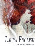 Stillpoint Digital Press has released Laura English, the debut novel of glamour, intrigue, and heartbreak by author Lynn Arias Bornstein.
A fairy tale of Hollywood glamour that shows that even the most blessed lives may not have the happily-ever-after that we would expect, Laura English follows the life and loves of a young British actress who rises to fame and yet struggles to find what she actually needs. By turns heart-warming and heart-wrenching, funny and tragic, this novel takes you on a journey around the world and into the deepest recesses of the human heart.
This is a book of joy, loss, rejection, as well as fear and happiness. The author weaves a complicated web of intrigue, passion, and profound loss, which I found captivating. Definitely a must-read. – Patricia Day for Readers’ Favorite
Laura English is available in trade soft-cover and ebook formats through Stillpoint Digital Press, through IndieBound and independent bookstores, Amazon, Barnes and Noble. Apple’s iBooks Store, and wherever else you buy books.
Lynn Arias Bornstein is a fifth-generation native San Franciscan. She was educated at the Convent of the Sacred Heart and the Katherine Delmar Burke School. Her interest in the arts led her to pursue a degree in graphic design from the San Francisco Art Institute. She continued her studies in Mexico City in the early 1960’s, at a time when that city was a world center of culture and new ideas. Soon after her return to San Francisco, she met and married her first husband. The couple settled in Marin County, where they raised their two children in the historic town of Mill Valley. A community volunteer for over forty years, one of Bornstein’s main interests is awakening children to an appreciation of literature and the visual arts. In writing Laura English, her goal was to “create a tale in which the characters and settings would provide a pleasurable escape for the reader.” Lynn lives in Marin County, California. She is currently writing a memoir.
Stillpoint Digital Press (StillpointDigital.com) is a publisher and publishing services provider that creates fine ebook, audiobook, and print editions in genres from fiction to literary nonfiction, from memoir to poetry. It aims to provide digital publishing with a human face, offering a full range of editorial services, from editing, layout and ebook conversion to distribution and marketing.
March 4, 2014
Advice for the Self-Publisher
Last week, I gave an interview to Inkspokes, a website dedicated to independent authors and their readers. The interviewer, Nelson Suit, who is one of the editors at Inkspokes, asked me a number of questions about my own experiences as an author who published his own work, but then asked me — as both a writer and a publisher of others’ writing — what would be my advice for folks who were looking at self-publishing. Well, a lot of people who are smarter than I am have given thought to that subject, but after considering the question for a bit, here’s what I came up with:
DK: My two biggest pieces of advice will both seem a bit heretical.
The first is that self-publishing doesn’t mean that you have do everything yourself — or that you should. The chairman of Penguin/Random House doesn’t copyedit every book, nor does he try to design his own covers. He’s your competition. Budget in the time and (if you can) the money to outsource the parts of the work of publishing that you really can’t (or as I said shouldn’t) handle yourself.
The places where you will really serve yourself best by finding someone else to help out? Highly technical processes like print layout and cover design. It’s possible to create your own ebooks if your work is narrative and doesn’t include much in the way of complicated formatting or images.
“Shlomo Travels to Warsaw” by David Kudler and Maura Vaughn.You should absolutely have editors at each of the three stages of editing — development (before the “final” draft is finished); copyediting (after you’re done developing the book but before you’ve had it laid out); and proofreading (after layout/conversion and just before publication). Do you have to hire professionals? I’m not unbiased, I recognize, but I highly recommend it.
Having said that, not every book needs a developmental edit; if it’s been through lots of workshopping or peer review, then you might be able to minimize or even skip this step. It is essential, however, to have someone professional or at least very knowledgeable in the finer points of language and publishing look the writing over before you start to transform the manuscript into a book. Language that makes perfect sense to you and your family may turn out to be absolutely incomprehensible to someone who doesn’t know you or the subject.
A good copyeditor will not only fix errors of style and mechanics, but will also ask the kinds of questions that you don’t want your readers to have to ask — Isn’t the Golden Gate Bridge red? Wasn’t Bill’s wife named Rebecca the last time we saw him — is he divorced and remarried, or is this the same woman? Are you sure you want her to scream in ALL CAPS for three paragraphs? It’s an essential part of the process.
The same with proofreading, which happens after the designer(s) have finished converting the book into its various formats. Not only is a good proofreader amazingly good at actually seeing what you’ve actually written (as opposed to what you THINK you’ve written — missing words that our minds fill in, homonyms, etc.) but they will see where the design has created problems that weren’t in the manuscript — technical fine points like rivers, widows, and orphans, as well as gross formatting errors — missing paragraphs, improperly formatted pages and the like. They are the difference between a book that looks like a book and one that you’ve thrown together in Microsoft Word.
So: look at what you’ve got, and find people who can help you make it as clean and as polished as you can.
The other advice will seem not only counterintuitive, but counter to my last suggestion: don’t wait until it’s perfect to publish.
Books are infinitely perfectible. The traditional publishing process and a bazillion MFA writing programs have conditioned us to think that no book is ever ready — that they must be workshopped and rewritten and workshopped again. And again.
Each book that you create must be (as I said above) as polished as you can make it — well thought-through and as well crafted as you can manage, and then as well honed as you can get the help to achieve.
But that doesn’t mean that you should wait for Apollo to come down from Olympus and award your manuscript a laurel crown before you can publish it.
Writing is a craft. What is the best way to learn a craft? By practicing it. If the Beatles had sat in their families’ flats in Liverpool waiting until their sound was just right rather then heading off to Hamburg and just playing and writing and playing and writing… where would popular music be today?
Most authors think only of their first book. But honestly? Once you’ve written that one, you will look up and think of other things to write about. (Many authors have to hold those ideas at bay until they have the room to address them.) At the very least, you will have learned much from the process of publishing that first book that you really owe it to yourself to try to put back into practice.
One way that you can help yourself: divide and conquer. That mammoth manuscript, covering five generations of a single family’s battle to survive? See if there are places where you can cut it into pieces, and then develop the pieces as fully as you can, publishing them serially. Hey. It worked for Dickens. And Tolkien. And thousands of other authors.
I suggest this for a couple of reasons. The first is that it’s easy to bite off too much; my own first novel manuscript stalled at about 40,000 words before I realized that what I really had was the first part of a three- or possibly four-part series. (It’s now with an agent; I told you I still respect traditional publishers! Also, she turns out to be an excellent developmental editor.)
The second part is purely business: it’s hard to market a single title. But once you have a series — or even a number of unrelated titles — there’s a critical mass that becomes easier and easier to reach. Each title sparks off of the others. A reader who enjoys one book will find another. A positive review for one book will benefit the rest.
So don’t wait. Publish. Publish. Publish.
NS: What piece of advice might you give to a person starting out as an independent publisher that you wish you had when you started out?
DK: Following up on what I said above: do everything as well as you possibly can — but don’t try to be perfect. There’s never been a book that didn’t need at least a little more editing. To paraphrase Cyrano de Bergerac,* shoot for the moon, but don’t be disappointed when you find that you’ve fallen among the stars.

* I’ve since looked up this quote and have discovered that I was mixing up a bit of Cyrano and a bit of a quote attributed to a number of folks, among them Les Brown. Should have used an editor. 
March 3, 2014
Smidget for Smashwords (and MS Word)
My post on how to add social media and review links to your ebook has remained one of my most popular — no surprise, when every author and publisher (and author/publisher) is trying to make it as easy as possible for readers to share what they think about the book!
Someone asked recently if it were possible to use the same technique in a Microsoft Word document that was going to be uploaded to Smashwords and put through the dreaded Meatgrinder. The answer, of course, is yes!
Here’s how you do it:
The first thing you need to do is find images for the buttons. In most cases, the stores/social media companies have such icons available for the purpose on their sites. In my case, my own site (like just about every site out there) has a line of such icons across the bottom of every article; I right-clicked on each icon (that’s control-click on a Mac) and selected Save Image as…, downloading each of the icons to my computer as an image file — in each case either a JPEG file or a PNG file, either of which will work in an ebook.
The larger Amazon and Goodreads images I found on their websites. You could just do a web search for “Amazon icon” or “Goodreads icon” and find the ones that you want. (If you’re uploading to Smashwords, however, don’t include the Amazon icon and link — they’ll kick the book back to you. The only links they’ll allow are back to your own page or to Smashwords.)
To get them into your Word document, go to the Insert menu, and select Photo and then Picture from File…. (I’m using Word for Mac 2011 — I believe it’s the same in most versions of Word created in the last decade.) Find the image files wherever you downloaded them to, and hit the Insert button. The images will now be loaded into your Word doc.
You can play around with formatting them however you like — in a single row, in a tower, in a pyramid, whatever.
Now select each image one by one. The easiest way to do that is to place the cursor down right next to the image, then hold down the Shift key and the left or right arrow key. The icon will now be highlighted (on my computer, it turns bright yellow). Now go up to Insert menu again and select Hyperlink… (or hit Command-k on a Mac or control-k on a Windows computer). Take the hyperlink for that site that you’ve created using the directions I gave above, and then paste them into the field provided in the dialog box and (once again) hit the Insert button. Voilà! You should have a working link.
Now try clicking on the link you’ve just created. Does it behave the way that it should, creating a dialog to post a Tweet, update or review? If not, double-check the code and make sure that everything is as it should be. (The sites all occasionally change their code, and so some of these links may not be workable in a year or five — but they all work now.)
Repeat that for each of the icons, and you should have a working widget. Upload to Smashwords, and watch the book start to sell itself.
February 20, 2014
Interview — David Kudler on Independent Publishing
 I had the opportunity to talk recently with Inkspokes, a site for indie authors and their readers — we discussed some of the joys (and pitfalls) of independent publishing. The interview is out, and I think it’s pretty interesting, if I do say so myself!
Here’s a snippet to whet your appetite:
Books are infinitely perfectible. The traditional publishing process and a bazillion MFA writing programs have conditioned us to think that no book is ever ready — that they must be workshopped and rewritten and workshopped again. And again.
Each book that you create must be (as I said above) as polished as you can make it — well thought-through and as well crafted as you can manage, and then as well honed as you can get the help to achieve.
But that doesn’t mean that you should wait for Apollo to come down from Olympus and award your manuscript a laurel crown before you can publish it.
January 28, 2014
The Journey to Goddesses
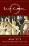 It may surprise you to know that Joseph Campbell (1904–1987) has come out with a new book: Goddesses — Mysteries of the Feminine Divine. The story of how this book came to be is a testament both to the enduring power of the late American scholar’s work and of the power of the subject itself.
In 1980, Campbell and his editor, Robert Walter, were in the process of creating Campbell’s magnum opus: The Historical Atlas of World Mythology (a work Campbell sadly never completed). The book would be published by a new company that they were setting up for the purpose; Alfred van der Marck, the publisher with whom they were working, pointed out that you couldn’t have a publishing company with just one book, and so Campbell and Walter sat down and drew up a list of books that they felt should be part of this new venture.
The first book on the list was a book on a subject that Campbell’s friend and colleague Marija Gimbutas had brought to the academic fore: the study of the feminine divine in all of its historical and cultural forms.
Robert Walter
When Campbell died, Walter made that list the founding document for the keystone project of the fledgling Joseph Campbell Foundation: The Collected Works of Joseph Campbell. Drawing on Campbell’s lectures and uncollected and unpublished writing, the Collected Works has endeavored to keep Campbell’s work very much alive.
In 1990, just after JCF’s creation, Walter hired a former student of Campbell’s to collect the mythologist’s work on the Goddess, but the piece that she submitted was too fragmented to publish, and so the project was shelved in favor of more pressing concerns. In 1997, he hired another scholar; this time, the work was much more coherent, but less than half of it was actually written by Campbell. The project languished once more.
When I took over the publications program of the foundation in 1999, that checkered history was clear in the files. But I couldn’t help but be excited about the prospect of a new book by Campbell on the subject of Goddess mythology. Not only was it a topic noticeably absent from Campbell’s then-published work, but Campbell was being criticized (unjustly, it seemed to me) for having neglected the feminine aspects of myth. Every time I broached the subject, however, Bob Walter would groan, would point out that we had plenty of other projects to work on, and would, if pressed, say that we needed to find the right editor for the job.

Dr. Safron Rossi
Fast forward to 2010. With Bob, and JCF community-maven Stephen Gerringer, I went to Santa Barbara to deliver a large cache of material into OPUS Archives‘ Joseph Campbell Collection. There I met the OPUS staff, including Safron Rossi, who had just completed her doctorate in mythology and begun working there as an archivist. Safron was and is a serious, passionate scholar, whose main focus of study had been, in fact, the feminine divine. Bob, Stephen, and I had a wonderful time getting to know the OPUS staff, and we were all deeply impressed by Safron.
The following year, at JCF’s annual Esalen Mythological Toolbox seminar (a workshop that continues a tradition begun by Campbell, who would celebrate his birthday every year by teaching at the beautiful retreat on the Central California coast), Bob approached Safron about taking on the moribund Goddess project. He encouraged her not to look at the two previous drafts, but to go to the source material (which she, as the archivist for the Campbell Collection, knew better than anyone), and to see if she could find the material for a book there.
Working around her duties at OPUS — she was serving at the time as the organization’s acting executive director — Safron spent a year ascertaining that, yes, Campbell had provided the structure and the material for a book; she then spent most of 2012 assembling that mass of raw material into a coherent narrative. I helped her polish the text and find images. We worked with New World Library to transform what had been a mass of lecture transcripts and notes into a beautiful new book, which New World Library released just this past November.
From that first conversation between Campbell and Bob Walter, more than a third of a century had passed. I believe the end result, however, was worth the wait.
For more on the creation of Goddesses, see:
An interview with Dr. Rossi
A video interview with Robert Walter
January 23, 2014
What’s an Independent Publisher?
 So, I was astonished earlier this month to find myself elected president of BAIPA — the Bay Area Independent Publishers Association.
You may call me Mr. President.
Born in the early, heady days of the desktop publishing revolution, BAIPA is a wonderful collection of folks involved in various parts of the non-corporate end of the publishing industry who get together to swap knowledge and offer services and listen to expert speakers give information about the esoterica of the publishing craft. We’ve got authors, editors, designers, publicists — if it’s got to do with the creation of books (in whatever form) and their sale, there’s someone there who can help. The collective is capable of creating books that are every bit as polished and attractive as those put out by the Big Five publishers. (Is it still five, by the way?)
I’ve learned a lot at BAIPA meetings. I’d like to think I’ve also managed to share some helpful information.
Meetings always start off with a free-form Q&A session. It gives people the chance to ask whatever burning question they may have up front; the BAIPA hivemind then sets about answering the question.
A few weeks ago, at the first meeting that I ran as president, no one had any questions to ask up front. This sometimes happens, so I threw out a question that I hoped would spark some interesting conversation: What exactly is an independent publisher?
Members gave a number of very interesting, insightful responses, but in every case it was clear that their actual answer to my question was someone who publishes his or her own books. Self-publishers, that is.
Well, that didn’t quite sit right with me, but I didn’t want to make a big deal about it — a large percentage of our members are in fact self-publishers. Self-publishing has become a huge industry in recent years, accounting for a large and growing percentage of the new books produced and sold.
These folks are all indeed independent publishers. But that’s not the whole answer.
I’m an independent publisher — or rather Stillpoint Digital Press, which I own, is one, though we publish books by nearly twenty authors in addition to a couple of titles of mine.
The Joseph Campbell Foundation, the small not-for-profit with which I’ve worked for the past decade and a half, is an independent publisher as part of its mission, putting out ebooks and recordings of lectures by the late mythologist.
So is New World Library, who publish all of the Campbell print books that I’ve worked on, and whose offices are about a mile from BAIPA’s meeting space, though NWL put out over thirty books a year, have a budget in the millions, and have a building full of (very nice) staff.
So what the heck is an independent publisher, anyway?
It’s a publisher not affiliated with any large corporation or conglomerate. That’s it.*
What makes independent publishers special — what makes them the life blood of the publishing industry — is that independent publishers are independent. They make their own decisions. When it comes to publishing, that’s very important, both as a matter of freedom of the press, and as a matter of insuring that tastes can’t be defined solely by small groups of decision makers whose only concern is maximizing profits.
As several BAIPA members pointed out, they are publishing out of a passion — whether that’s a passion for a particular subject, or a particular story, or even a particular style.
Now, as we discuss regularly at BAIPA meetings, that passion must be tempered with a good sense of the business of publishing. Creating books is hard; selling them is even harder.
But still, the current marketplace allows independent publishers the same access to sell their books internationally as the subsidiaries of huge multinationals. With the ebook explosion and the proliferation of lower-risk printing options, anyone with a passion and a book can join the swelling ranks.
Come on in, the water’s fine!
* * *
* Cf. from the website of the Independent Publishers Assocation: https://www.ibpa-online.org/what-is-an-independent-publisher/


