
David Kudler's Blog, page 15
January 8, 2016
In the Picture: Prepping Images for Your Ebook
Last month I discussed how to clean up your manuscript to prepare it for ebook conversion. This time I’m going to be looking at how to do the same thing with images.[1]
There’s one big difference, however: where the advice that I gave you about getting your text squeaky clean was equally valid for preparing to convert your words to either print or ebook format, these suggestions are ebook-only.
What’s the difference?
Well, in either case, you’re going to start by finding the perfect picture to go with your words. You’re going to crop the picture (cutting out any extraneous bits) and enhance it (or get someone who knows how to do so) so that it looks beautiful.
However, there are two enormous differences between the image files you want to use in an ebook and ones you’re going to get printed on paper:
In a print book, color is expensive, while in an ebook beautiful color costs (essentially) the same as black and white.
On the other hand, in print, you want the image file that goes off to the printer to be as high quality (that is to say, large) as possible, while in an ebook, every kilobyte costs you (I’ll explain how below).
Use color — please!
As someone who’s been around the publishing industry for a while, this concept was one of the hardest things for me to wrap my head around when I first started creating ebooks: that using color wasn’t verboten.
As you probably know, printing a book using even a single color image often more than doubles the production cost of the book. Why? Well, you know that your desktop printer has four colors of ink: cyan, magenta, yellow, and black (CYMK). And unless you tell it not to, it will print every page — even one with only black letters — using all four inks.
A professional offset printing press is essentially the same, though with the ability to use many more (or fewer) colors if needed.[2] A commercial print-on-demand press is exactly like your inkjet — except it’s built to work with much higher volume and with much more consistency.
So unless you do something really special (and expensive) like getting the printer to insert a single plate by hand into each book before it is bound, you’re going to be printing the entire book in full CYMK+ color. Ouch!
With ebooks, none of that is an issue at all! Many dedicated ereaders and all ereader apps used on computers, tablets, or smart phones display in three colors (red, green, and blue — RGB). There is no black pixel! And if you remember your high school science, white light is made up by shining all three colors at once. So color is (in most cases) the default. Why not take advantage of that?
Okay, so some Kindles and other ereader devices use an eInk screen that’s not in living color. These devices’ screens use much less energy, and many people find them easier to read, so there will be folks who will be viewing your beautiful, fully saturated snapshot as if it were being displayed on a 1984 Macintosh. As with those trailblazing computers, the eInk devices are still capable of displaying your picture beautifully — just not in color.

So one word of warning: do make sure that you look at every image in both color and grayscale before you convert it. A picture that looks crisp and clear in brilliant color can lose its contrast when seen in black and white.
Also, make sure that it’s saved as an RGB (screen) image, not a CYMK (print) image.
Stepping on the scale
What ebooks give us in color, they take away in file size. When you send an image off to a printer or print designer, the idea is to send it at the highest possible quality, in a lossless format like TIFF (Tagged Image File Format, if you care). The print files for my 36-page illustrated children’s book The Seven Gods of Luck weigh in at a healthy 128 megabytes (MB).
Many ebook retailers won’t even allow you to upload a file larger than 20MB. And even with those that do, such as Apple, you need to consider how many of your readers will be accessing your masterpiece: on a wireless device, where download speeds are slow, and empty space is taken up by cat videos and audio recordings of a niece’s singing recital. Nothing frustrates a reader more than buying your book — but not being able to download it.
On top of that, our favorite elephant in the room, Amazon, deducts fifteen cents per megabyte from every royalty payment as a “transport fee.”[4] (I always imagine a group of burly truckers carrying floppy disks with your ebook on them from a storage locker to the download bay on the other side of Jeff Bezos’s kingdom.)
So for a 20MB book, that would be $3.00. If you’re charging $9.99 (a high price by indie-published ebook standards), you’ve just lowered your royalty from 70% to 40%. If you’re charging less, the damage is even worse.
What can we do to avoid this catastrophe? What is the cause of all of this bloat?
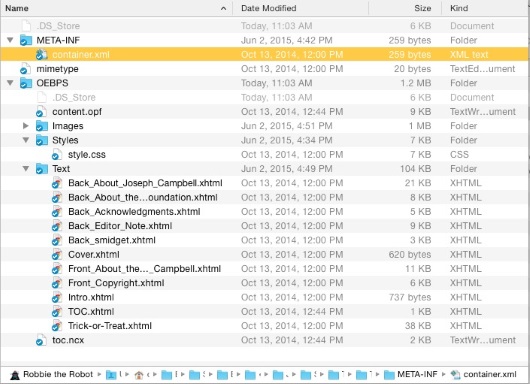
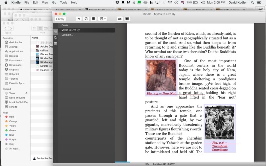
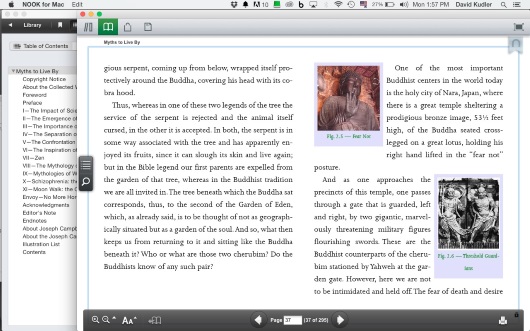
Well, you’ll need to trust me on this: it isn’t your words. If you don’t believe me, look at this picture of the innards of an ebook:
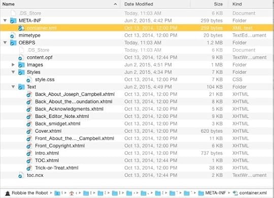
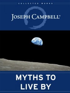
These are the files that make up the text portion of an average-sized book (Joseph Campbell’s Myths to Live By; my paperback copy is 288 pages). See those numbers in the third column, the column headed size? They range from under a kilobyte to 21KB — the total, including the front and back matter, is 104KB, or just over a tenth of a megabyte.
If you were to buy the ePub file of this ebook, you’d see that the file is actually somewhere around 4.2MB.
So where did the other 4.1MB come from?
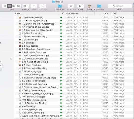
A few kilobytes of it can be found in the stylesheets, navigation files, and such.
But most of it came from the ninety-odd lovely pictures that I added when I was creating the ebook edition.[5]
Ouch. That’s sixty cents off the top of every Amazon sale. But the images were integral to the new edition, the first put out by the Joseph Campbell Foundation. So in they stayed.
So what’s a body supposed to do?
Taking a byte out of file size
Before we start our pictures on their weight-loss program, I need to explain something about images in ebook files: they have to be either JPEG or PNG (portable network graphics) files. No bitmap (.bmp) files, no vector (.eps or .ai) files,[6] no Photoshop (.psd) files, no raw camera (RAW or Exif) files. Just .jpg and .png files.
This turns out to be a good thing, because these two formats allow the most control over the final size of your image file.
We’re almost ready to start working with the images — but remember: never work with the original file. Always work with a copy, so that if something goes horribly wrong, all you’ve lost is a little time. Rename your working files. Put them in a different folder. On a different computer. In a different city. (And make sure that there’s a backup of the…. Oh, you know the drill.)
One of the most important, most technical jobs involved in designing an ebook is massaging the images so that they don’t take up too much space, but at the same time still display beautifully.
There are three parts to making that happen:
Sizing (making sure that the height and width of the image are in the right range of pixels)
Compression (using software to make the file as small as possible without losing quality)
Optimization (getting rid of some unnecessary bloat that your image carries around with it needlessly)
Sizing
The easiest way to decrease the file size of your image is to decrease the number of pixels — in other words, simply making the picture smaller.
At this point most phones (let alone dedicated cameras) are capable of taking pictures over 10 megapixels — that is, ten million little collections of red, green, and blue dots. The native dimensions of a picture taken on an iPhone 5s like mine is 3264×2448 pixels.
Guess what?
Even an high-resolution Retina iPad can’t squeeze that many pixels onto its screen. Neither can a Retina MacBook 15”.
So, I ask, why include pixels that will never actually be seen by anyone not reading your ebook on a super-high-definition 30” computer monitor?
In this next section I’m going to assume that you’re used to working with a basic image editing program like PhotoScape, GIMP, or Apple Preview — if you can find your way around Adobe Photoshop (even an old version), this should be easy.
So. Open the file.
Wait — you aren’t going to work with the original image, are you? Good. Just checking.
In your app, find the menu item to resize the picture. In Photoshop, it’s under the Image menu: Image Size… In Preview, it’s under the Tools menu. In PhotoScape, click the Resize Photo button at the bottom of the window.
You’ll be shown a box that looks something like this (from PhotoScape):
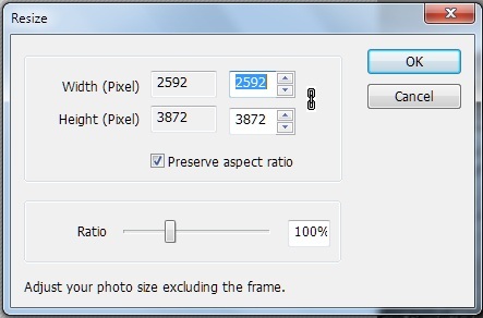
You’ll see the existing width and height (in pixels, inches, centimeters, or whatever), with a box next to it to fill in a new measurement. Somewhere there will be something like that little check box in the picture above that reads “Preserve aspect ratio”; this will keep the height and width of the image proportional. Which is, usually, a good thing.
So what size should you set your image to?
It depends on a number of criteria:
How important is the fine detail of the image?
How many total images are there in the book?
Are the pictures primary, or are they secondary to the text?
How sharp is the image to begin with?
Is the image a photograph, a painting, or line art?
If the ebook is a picture book or a collection of photographs that you expect readers to examine closely, then by all means, keep the image as close to full-sized as you can. Still, there’s no point in making the image bigger than can be viewed on the device.
The short side on the largest current tablet screens (including the iPad and Kindle Fire HDX) is around 1600 pixels.
If you’re trying to keep your image as large as possible, then set the short side of your image to that size.
If, on the other hand, your picture is more decorative or illustrative than central, you might consider setting that short-side size to something closer to a standard smart phone or ereader width — between 600 and 800 pixels.
Click the “OK” button.
Suddenly, your picture will look tiny on screen. Don’t worry — you can zoom in to see it as it really is. Make sure that you don’t see any “jaggies” (ragged, pixelated lines instead of smooth, flowing ones), and that the important detail is all still visible. If you aren’t happy with the size you chose, go up to the Edit menu and select Undo — then try it again, until you’re happy.
Another way to decrease your file size by a whopping 25%? If your file is still in CYMK color (intended for use on a printer), convert it to RGB (intended for display on a screen). There are no black pixels, remember? In Photoshop’s Image menu, select Mode>RGB, and watch those kilobytes drain away.
Compression
Once you’re happy, you’re going to save the file, and when you do, you’re going to apply software compression — basically squeezing out the unneeded detail from the image, with the emphasis on unneeded.
At this point, I almost always save files in the JPEG format, since it is very, very good at compressing images.
We’re going to go up to the File menu and select Save As… (in Mac OS X Yosemite, they changed the label to “duplicate” for some reason). You’ll be confronted with a dialog box that looks something like this :
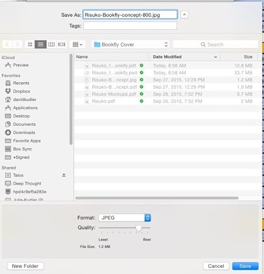
See that slider labeled “Quality”? That’s going to do the magic for us.
How much should you compress the image? As much as you can without compromising the quality of the image. Unfortunately, that scale isn’t calibrated uniformly — different software uses different compression algorithms at different settings. So you’re going to need to play it by ear.
I started out being very conservative in compressing images — close to the right-hand, “Best” side of the slider. At this point, I am often extremely aggressive, around the second tick mark from the left. If I’ve got multiple images in the book, I aim for each to be under 50KB, if I can help it. If this is the only, or one of the few images, I shoot for a file size in the 100–150KB range.
I then type in a new name — so that I still have the previous version, if I want to go back. Generally, I take the width that I choose in step 1 and add that at the end of the file name (that’s the -800 in the file name above) — oh, and I take out any spaces and replace them with hyphens or dashes, since ePub doesn’t like spaces in file names.
Then open the new photo — if it isn’t opened automatically — and see what the compression gods have wrought. Look for lines of gradation in smooth color bands (posterization), or jaggies. See if the detail in the image is still acceptable.
If not, or if the file is still too big, go back to the previous version (this is why you saved it!) and start again.[7]
Optimization
Now we get into some real black magic. Sort of.
Each image carries in it a bunch of metadata — information about when and how the picture was taken, the camera, the date and time, maybe the geolocation. If you’re trying to put together a slide show, this sort of information can be invaluable.
Locked inside of an ebook, it’s useless. And it can add as much as 20KB to an image.
There are several ways to strip this last bit of dead weight away. I use an open source (aka freeware) utility app called ImageOptim that gets rid of the metadata, as well as some other crud, without further compressing the file — Mac only, I’m afraid.
In Windows, however, you can simply right click on the image file in Windows Explorer, click on the Properties tab, and then select the link at the bottom of the tab that reads “Remove Properties and Personal Information.” That should help — and it ought to slim down the file at least a bit.
If you’re a Linux user, you can use the command line utility JPEGRescan (one of the ones on which ImageOptim is based).
Once you’ve gone through the whole process with each of your images (including the cover art), you’ll be ready to start making your ebook!
[1] Note that I’m not going to be talking about choosing images to accompany the text. I’m going to assume that you’ve spent a lot of time finding the perfect pictures to illustrate what you’re saying — and that you’ve made absolutely sure that you have the right to include them in your book.
[2] Okay. There are many more differences between a home printer and a large web press. Work with me here.
[3] Image: Kindle vs. iPad by Zhao ! (@flickr.com) used through a Creative Commons license.
[4] This $0.15/MB fee applies only if you’re using the Kindle Direct Publishing 70% royalty rate, which you can choose for ebooks priced between $2.99 and $9.99. Go with the other option and you can charge whatever you’d like (well, $0.99–$199.99), and you won’t get charged a fee — but you’ll only make 35%.
[5] And that’s 4.1MB after I did all of the things I’m about to tell you to do. When I first converted the book, the Images folder was a bit under 14MB. And that’s not including another 15MB of lovely but ultimately unusable video. By the way, the 1MB that shows up attached to the Images folder? I forgot when I took this screenshot that I’d partially emptied the folder.
[6] You can, in theory, use Scalable Vector Graphics (SVG) files to do all sorts of nifty things in ebooks — but it’s a very difficult format to work in, and the format isn’t fully supported in all ereaders. Likewise, you can, in theory, use Graphics Interchange Format (GIF) files — even animated ones. However, Apple is the only retailer that will accept them.
[7] Be careful not to compress the same image too many times — if you open a JPEG and then select Save As…, you’re going to apply a whole new round of compression. Do that often enough, and your beautiful photo will start to look awful.
FYI — I’m having another giveaway of my YA historical adventure novel Risuko over on Goodreads! Go check it out — enter for a chance to win a signed copy of your very own.
Goodreads Book Giveaway

Risuko
by David Kudler
Giveaway ends January 15, 2016.
See the giveaway details at Goodreads.
The post In the Picture: Prepping Images for Your Ebook appeared first on Stillpoint Digital Press.


December 18, 2015
MS to Ebook: A Cleaning Guide
This is the third installment in my series of posts about ebook creation. Like the others, it was originally posted on Joel Friedlander’s wonderful resource for indie publishers, TheBookDesigner.com
Over the last couple of months, I’ve been talking about just what an ebook is, and four basic methods for creating them.
This month, I’m going to get a bit more into the nitty-gritty — how best to prepare your manuscript for conversion.
Whichever of the methods you use to create your ebook, it’s essential to have the original file be as clean as possible.[*]
What do I mean by that?
Basically, it comes down to one thing:
Keep It Simple with Styles
The most important thing you need to do to your text is to makes sure that all of the formatting is simple and consistent. By simple and consistent, I don’t mean minimalist — I just mean that all of the body paragraphs look the same, and all of the chapter titles and section heads look the same.
Most manuscripts that come to me don’t look that way. Sometimes, they look as if they’ve been fed through a wood chipper.
As we write, we pull text from various sources — quotes from the internet, snippets of text that we typed into the phone, chapters written in different apps. Or perhaps we play around with how the text looks: sometimes paragraphs begin with an indent, sometimes with a tab, sometimes with four spaces, and sometimes with two returns in a row. Maybe we try out different fonts to see how they look; if a project has taken a long time, our tastes may change and the typeface we used for the body text may have changed, sometimes more than once: Palatino, Times, Times New Roman, Cochin, Helvetica, Comic Sans. Maybe you found that your eyes were getting tired and so you upped the font size from the standard 12 points to 14; maybe a line was too long and so you decreased it to 11 points. I’ve seen all of this.
Unless you’re looking closely, this can make your book look like a crazy quilt.
Here’s the thing: we don’t want our font changes to be local. We want them to be global — uniform throughout the book. And so we don’t want to tag each paragraph with a typeface, size, and weight (i.e., bold, semi-bold, regular, or light). If we do that, once it gets imported into the ebook, if we want to change how the text looks, we have to make the change for each individual paragraph — even if most of the paragraphs are the same, if just a few are different, they’ll stand out like the proverbial sore thumb.
Styling with Styles
The way to avoid this is by using the Styles function in whatever app you’re using to get the manuscript ready.[†][‡]
In Word, the Styles tool is part of the pop-up Toolbox:
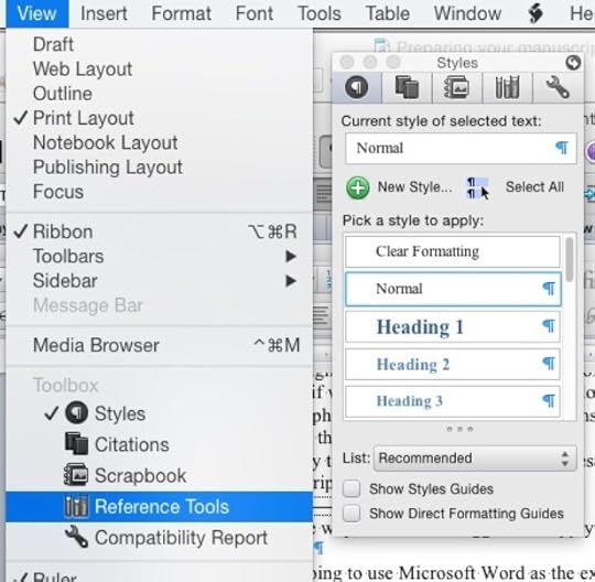
See that list on the right? Each one of those items is a style — a global set of choices about what kind of font to use where. If you’ve worked with HTML at all, this is something like a stylesheet.[§]
So here’s the first thing we are going to need to do: make sure that all of the text is the same typeface and size, with the same margins.
Yeah, I know: painful. You spent hours getting those Zapfino captions looking just right.
Sorry.
Here’s the truth: none (or close to none) of the formatting that you’ve done will translate properly to an ebook. Remember: there’s no way to predict what size screen your reader is going to be reading on. And if whatever conversion technique you choose does manage to make the ePub version of the text look more or less like the Word (or Pages or OpenOffice or InDesign or…) document, if you’ve used local formatting, the text will be difficult to style later, and won’t display consistently across different platforms — on a Kindle Fire, say, or an iPhone, or a 27” monitor.[**] So we’re going to strip back the text to the bare studs. The only formatting you’ll want to keep is italics and boldfacing.[††]
First, before we destroy all of your beautiful fonts, save. Now save the file again under another name — add clean at the end of the filename, or something to let you know which version to use.
Now, select the whole manuscript (press ctl-A in Windows and command-A on Macs). In the Styles tool, select the Normal style.
Yeah. Sorry.
This will have gotten rid of most of the formatting — though not those character style changes I talked about: italics, bold, etc.
Now select the whole text again and make sure that it’s all the same font and size — choose a common font like Times or Helvetica so that it will display all of the character styles correctly. Then click on the New Style… button at the top of the Styles tool, and name the style something like Body or Text. Then, with all of the text still selected, click on the Body style button that has appeared in the Style tool, so that the entire manuscript is formatted as Body paragraphs.
Why have we done this? Because the huge majority of your book is going to be regular body text. We’re going to add the other styles back in a minute.
You probably don’t need to worry about the way that the style looks. If you want to play with the side or bottom margins or the first-line indent, go for it[‡‡] — but don’t get too fine about typefaces, letter-spacing, line-spacing, etc. We’re probably going to have to set a lot of those after the conversion anyway — and here’s a difficult truth: many of the styles you specify will be overridden by the reader’s user preferences. The typeface and size, the background color — unless you know what you’re doing (and sometimes not even then), the font display preferences that a reader chooses will trump many of the design choices you’ve made.
Adding Styles Back In
Now, you’re going to need to go through your whole book and set the style for each paragraph that isn’t a body paragraph. Word has some of those styles built in:
Title
Subtitle (You can also use this for the author and publisher names)
Chapter title (aka Heading 1)
A-Head (aka Heading 2)
B-Head (aka Heading 3)
And so on.
To help you find paragraphs that you want to style, open your old version of the manuscript. (This is one reason that folks like me like to have two monitors.)
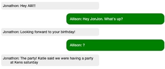
You may find that there are styles that aren’t accounted for in Word’s standard style library — perhaps you want extended block-quotes (aka extracts) where the font size is smaller and the side margins wider. Perhaps you have call-out quotes or sidebars. Perhaps you need captions, or your characters exchange letters, or there are text conversations and you want to make them look as if they’re being conducted on an iPhone:[§§]
Select the paragraph you want to add the style to. If it’s something simple (a wider margin and smaller font-size, for example), make the change. Don’t get too typeface-happy! If you use more than a couple of basic typefaces (one family — typically a serif typeface — for the body text and another — typically sans-serif — for the headers, not only will they probably disappear after the conversion, but if they don’t, your book will look like a ransom note.
Now click on the New Style… button, name your style, apply the style to the current paragraph (don’t forget this step!), and move on. The next time you find a paragraph that needs to fit that style, just select the text and click on the new custom style in the Style tool. Voilà! Your paragraphs are now formatted consistently.
Once you’ve gone through the whole manuscript, go through it again — make sure that all of the block-quotes have the Block-Quote style applied, that you haven’t styled any chapter titles as Heading 2 instead of Heading 1, and that the whole thing looks consistent. (You may also see some errors now that the typeface is different.)
You know what? If you have the time, it’s okay to go through it a third time. 
December 15, 2015
Goodreads Risuko Giveaway!
This week, you have the opportunity to win a free copy of Risuko on Goodreads! Author David Kudler has made a paperback ARC (advance review copy) available on the world’s biggest book review site:
Goodreads Book Giveaway
Risuko
by David Kudler
Giveaway ends December 18, 2015. See the giveaway details at Goodreads.
Sign up now to win your free copy!
Can One Girl Win a War?
Risuko: A Kunoichi Tale
Author: David Kudler
Publisher: Stillpoint Digital Press
Release Date: June 15, 2016
Ebook ISBN: 1938808339
Hardcover ISBN: 1938808320
Paperback ISBN: 1938808347
LCCN: 2015918899
Preorder: Stillpoint Digital Press
Amazon / Smashwords
iBooks / Kobo
Google Play
My name is Kano Murasaki, but everyone calls me Risuko. Squirrel.
I am from Serenity Province, though I was not born there.
My nation has been at war for a hundred years, Serenity is under attack and the Kano family is in disgrace, but some people think that I can bring victory. That I can be a very special kind of woman.
All I want to do is climb.
My name is Kano Murasaki, but everyone calls me Squirrel.
Risuko.
—
Though Japan has been devastated by a century of civil war, Risuko just wants to climb trees. Growing up far from the battlefields and court intrigues, the fatherless girl finds herself pulled into a plot that may reunite Japan — or may destroy it. She is torn from her home and what is left of her family, but finds new friends at a school that may not be what it seems. Magical but historical, Risuko follows her along the first dangerous steps to discovering who she truly is.
Kano Murasaki, called Risuko (Squirrel) is a young, fatherless girl, more comfortable climbing trees than down on the ground. Yet she finds herself enmeshed in a game where the board is the whole nation of Japan, where the pieces are armies, moved by scheming lords, and a single girl couldn’t possible have the power to change the outcome. Or could she?
YOUNG ADULT HISTORICAL ADVENTURE
COMING JUNE, 2016!
A sneak preview of the opening chapters of Risuko
Read about Kunoichi and Risuko’s world
The post Goodreads Risuko Giveaway! appeared first on Stillpoint Digital Press.
November 10, 2015
Veteran’s Day: Jack Beritzhoff talks about the Merchant Marine
96-year-old World War II veteran Jack Beritzhoff, author of Sail Away: Journeys of a Merchant Sailor, spoke with NBC Bay Area recently, seeking to right a historical wrong: the continued lack of recognition to the Merchant Marine for its service during the war.
“I wrote a story about it.”
It is a phrase Jack Beritzhoff says a lot. And when you consider the San Rafael resident, and former Merchant Mariner, is about to celebrate his 97th birthday, that adds up to a lot of stories.
In fact, Beritzhoff compiled many of his favorite one into a book he published in 2012: Sail Away, Journeys Of A Merchant Seaman.
Still, there is one story he is most eager to share these days, about an oversight of history he would like to see corrected.
“I think it’s an injustice,” said Beritzhoff.
Beritzhoff is referring to the fact members of the Merchant Marine were never included in the GI Bill, signed into law by President Franklin Roosevelt in 1944. The law provided a wide range of financial and educational benefits to returning World War II veterans. The GI Bill covered all members of the military service, but not the Merchant Marine.
President Roosevelt indicated at the time he’d like to see the benefits extended to the mariners, but it never happened.
“He died and nobody took up the torch, you might say,” Beritzhoff said.
The Merchant Marine, established even before the United States Navy, is a fleet of commercial ships that, in time of war, are pressed into service delivering supplies to aid the military. Beritzhoff served in the Merchant Marine from 1942 to 1952, participating in both World War II and the Korean War.
While Beritzhoff never came under enemy fire, thousands of his fellow mariners died in WWII.
“They had more casualties percentage-wise than any branch in the service,” Beritzhoff said.
Beritzhoff believes it is a disservice that such sacrifices have never been adequately rewarded by the government.
He has recently written an editorial titled “The Sailors The Country Forgot” to bring attention to it.
Beritzhoff is not without his allies in his mission, though. In January 2015 a bill was introduced in the United States House of Representatives that would “grant our surviving WWII Merchant Seamen a modest financial benefit for their bravery and sacrifice.”
At his age, Beritzhoff said, any benefit would be mostly symbolic, but greatly appreciated.
Story by Garvin Thomas on NBCBayArea.com: Bay Area Proud
The post Veteran’s Day: Jack Beritzhoff talks about the Merchant Marine appeared first on Stillpoint Digital Press.
October 15, 2015
Get your Joseph Campbell here, and keep it coming!
 As you may know, I’ve had the pleasure and privilege of serving as the managing editor of the Collected Works of Joseph Campbell since 1999. It’s been hard work, but it’s also been very satisfying — in the years that I’ve been at the JCF, we’ve produced fifteen books (closing in on thirty if you include the ebooks), over forty audio recordings and a really wonderful fifteen-hour video series. Of those books I was talking about, seven were brand new, posthumous titles — on three of which I was the titular editor. (You know. The guy on the title with the author.)
Now, the JCF is a not-for-profit, but it hasn’t been run the most such groups are. We’ve tried to the best of our ability to have the work pay our way. We don’t have an office, nor are there any employees — all of the work is done by a handful of independent contractors (like me) and volunteers. We’ve always taken donations, and sometimes we’ve had to be a little more forceful in our appeals due to a cash crunch, but there haven’t been any major donor campaigns, no chasing after grants, no bake sales. The idea was not to let the tail wag the dog.
There comes a time, however, when a major capital expenditure is bound to come up. In the case of the JCF, we’ve been getting by on a jury-rigged website for about eight years. It’s never been perfect — but at this point, the plaster is falling off the walls. We’ve tried to find low- or no-cost ways to create the kind of vibrant, useful site that our associates need, but finally came to the realization that we needed to raise :gulp: $65,000 in order to make that happen.
So this is where I turn to you — I know that you’re shocked — and ask that you help us continue to fulfill our mission to “preserve, protect, and perpetuate the groundbreaking work of Joseph Campbell.”
Click here to go to our Fundrazr crowdfunding page.
And when you do, remember all of those books and audio and video I told you about?
Guess what! If you donate, you can choose some or all of those as our thank you!
The post Get your Joseph Campbell here, and keep it coming! appeared first on Stillpoint Digital Press.
October 12, 2015
Giveaway! Win a free advance copy of Risuko: A Kunoichi Tale
We’re holding a giveaway on Goodreads to win an advance copy of Risuko: A Kunoichi Tale by author/publisher David Kudler!
Goodreads Book Giveaway

Risuko
by David Kudler
Giveaway ends October 16, 2015.
See the giveaway details
at Goodreads.
Enter to be one of the first to read this exciting young-adult historical adventure story.
 Can one girl win a war?
My name is Kano Murasaki, but most people call me Risuko. Squirrel.
I am from Serenity Province, though I was not born there.
My nation has been at war for a hundred years, Serenity is under attack,
my family is in disgrace, but some people think that I can bring victory.
That I can be a very special kind of woman.
All I want to do is climb.
My name is Kano Murasaki, but everyone calls me Squirrel.
Risuko.
Though Japan has been devastated by a century of civil war, Risuko just wants to climb trees. Growing up far from the battlefields and court intrigues, the fatherless girl finds herself pulled into a plot that may reunite Japan — or may destroy it. She is torn from her home and what is left of her family, but finds new friends at a school that may not be what it seems. Magical but historical, Risuko follows her along the first dangerous steps to discovering who she truly is.
Kano Murasaki, called Risuko (Squirrel) is a young, fatherless girl, more comfortable climbing trees than down on the ground. Yet she finds herself enmeshed in a game where the board is the whole nation of Japan, where the pieces are armies, moved by scheming lords, and a single girl couldn’t possible have the power to change the outcome. Or could she?
YOUNG ADULT HISTORICAL ADVENTURE
230 pages; ISBN 978-1-938808-34-0; paperback, 6″x9″
COMING JUNE, 2016
Enter now to win a free advance copy of Risuko!
The post Giveaway! Win a free advance copy of Risuko: A Kunoichi Tale appeared first on Stillpoint Digital Press.
October 2, 2015
4 Ways to Create an Ebook
This is the second in my series of blog posts about ebook creation. It was originally posted on Joel Friedlander’s wonder resource site, TheBookDesigner.com.
Last time I talked about just what an ebook is — a website in a box. Ebooks come in a number of flavors, but for the purposes of this discussion I’m going to stick with the most common and most malleable format of ebook, the ePub file that is the basis of all of the major retailers’ ebook offerings.
There are four basic ways to create an ebook (that is, an ePub file):
From scratch
Saving from a word-processing or page-layout application into ePub format
Using a conversion app or online service
Hiring a designer
The trade-off among these methods involve quality, time, and price. As the old saying goes, you can generally pick two. In order to get all three, you’re going to need to become an ebook maven yourself, which will take a fair amount of time, but which will allow you to control all of the variables yourself. Let’s look at the options, and you can see whether that’s the road you want to take.
Option 1: Create the Ebook from Scratch
An ePub file, as I’ve said, is simply a website in a box. The box is nothing more than a ZIP archive that’s been given the file extension .epub. If you want to test this statement do this:
Find an ePub file (it can’t have DRM — digital rights management — attached)
Duplicate it so that you still have your original ebook to read and enjoy
Change the extension (the last three or four letters in the file name after the last period) of the duplicate to .zip
Double-click on the file
Voilà! You’ll have a folder containing all of the files that make up the ebook:
Those files and folders are Joseph Campbell’s Myths to Live By — unpacked.
Most of these files — the .xhtml files (a.k.a. web pages) and .css (a.k.a. stylesheet) file — are just what you’d find if you looked at the files building a fairly straightforward website.
The container.xml file serves one purpose: to tell the ereader where to look for the OPF file — that’s the one called content.opf here. That’s the heart of the ebook. It tells the ereader where to find all of the rest of the files in the ebook, what order to display them in, and what role each item serves (e.g. cover image, table of contents, etc.)
The toc.ncx file is a specialized navigation file; it contains the information that your ereader displays when you click on the contents or chapters button.
You can create all of this from scratch using text-editing software, or XML editing software, or a web-page editing app like Adobe Dreamweaver.
I don’t recommend it. The amount of labor involved is huge, and the places where you can make mistakes are many; computers are literal-minded, and a missing space or semi-colon that the human eye would fix without our even being aware of it will break an ebook.
However, it is possible to use those apps to edit an ebook after you created it using the techniques laid out below. There are even apps that allow you to do this without un-ZIPping the file, so that you can see the ebook as you edit it. Every day I use two open-source apps (Sigil and Calibre) to refine ebooks that I’ve generated.
What you see inside one of the xhtml files that make up the body of the ebook will look something like this:
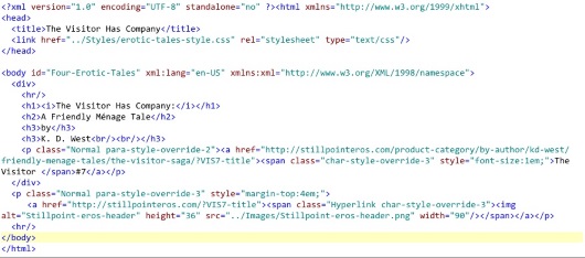
That’s the title page of a book that I’m preparing for publication. If you’ve poked around web pages at all, that will all look fairly familiar — HTML tags, style attributes, image calls, a hyperlink or two. For what it’s worth, this is what the page looks like when it’s displayed by an ereader:
If all of that code looks scary to you — don’t worry. Though it’s essential to know some basic HTML if you want to get under the hood of your ePub file, there are other ways to create ebooks. And I’ll be talking some more about what all of that gobbledygook actually is in coming months. (If you’d like to jumpstart that process, I highly recommend Liz Castro’s excellent introduction, ePub Straight to the Point. It’s a few years old, but still does an great job of covering the basics.)
Option 2: Use an App That Exports ePub Files
So if you don’t want to go the DIY route, there are a number of applications that currently export directly to the ePub format:
Apache’s OpenOffice has a plug-in called Writer2ePub that allows you to save files as ebooks (open source office suite)
Scrivener (commercial writing app)
Apple’s Pages for OS X or iOS (commercial word-processing/page-layout app)
Adobe’s InDesign (high-end commercial page-layout app)
QuarkXpress (high-end commercial page-layout app)
The last two are particularly helpful if you are also preparing a book for print publication.
There are many more options — including add-ons and plug-ins to existing commercial and open-source apps.
All of these will create ePub files that work, and that should be accepted by most retailers.
What’s the downside? Well, there are a couple of things.
First of all, none of the files created by these apps will display quite the way that you expect them to in various ereaders, especially if you’ve got an ebook that’s got any complicated formatting such as drop-caps, tables, inset images, fancy typography, etc. The apps will try to reproduce on the screen what you were trying to create for the printed page, but often the style rules that the apps try to create make an incredible mess in one or more ereader. Everything may display as plain text on a Nook, while small images may fill the page on an old Kindle, while no images display at all on the Kindle app on your computer.
Here’s the same page displayed on different ereaders:
iBooks

Kindle
Nook
Adobe Digital Editions

Note that on the Nook app, the captions (which are hyperlinks) display as blue rather than red. And notice that in Adobe Digital Editions, the image doesn’t display at all. (I was eventually able to get them to — by rewriting the stylesheet specifically for ADE and all of the apps based on it.)
Also, all of these programs have idiosyncrasies; most create ePub files that are very difficult to customize, since they treat any style change (italics, font size, indents, etc.) as a unique case, rather than applying a document-wide style. If you use the Styles formatting rules that all of these apps allow — apply a Body style to all body text paragraphs, for example, rather than formatting them as 12pt. Palatino and hitting the tab at the beginning of every paragraph — the results will be better, but inevitably the ePub file produced this way contain WAY too much code, enough to swell the file size. This is a problem when you upload the file to Amazon’s KDP, which will deduct a “transport fee” of $0.15 per megabyte of file size on each download from your royalty. (I’ll be speaking to all of these challenges more in coming months. I’ll also say why it’s probably not worth your time to create files in Apple’s wonderful iBooks Author. iBooks Author is now more of an option than it was when I wrote this originally; still, not for the feint of heart.)
Option #3: Converting to ePub Using an App or Online Service
Most of us start with a manuscript — a Microsoft Word, ODF (OpenOffice Document File), or RTF (Rich Text Format) doc that we’re looking to turn into an ebook. Now, as I said last month, a Word doc isn’t an ebook. But you can format the text and even insert images, hyperlinks and the other paraphernalia that make up an ebook, and then use an app to convert the document into ePub format.
There are many, many such apps, both open-source and commercial, but I’ll only bother telling you about one that I’ve already mentioned: Calibre.
Calibre was created to convert between an impressive variety of ebook and manuscript formats, including HTML, RTF, DOCX, mobi, AZW3, and, of course, ePub. It has a number of controls that allow you to fine-tune the conversion — but if you’re document’s simple, the standard settings will probably do.
And of course, as I mentioned above, Calibre contains a WYSIWYG ebook editor that allows you to clean up your ePub file after the conversion.
There are also a number of ways to upload a Word document and get an ePub file. (Most of them fall under the paid conversion option, which comes below.) Many of the retailers allow you to upload a Word document directly.
Smashwords actually prefers Word docs — and will allow you to download your converted file in ePub format after they’ve run it through their famous “Meat Grinder” conversion tool (it’s actually a customized version of the software at the heart of Calibre). Amazon’s Kindle Direct Publishing does a pretty good job of converting simple Word files. Kobo’s Writing Life and Barnes and Nobles’ Nook Press have online ebook editing tools.
The downside here is the same as in Option #2 — the conversions are rarely perfect. And in most cases, there’s little that you can do about it, since the conversion is automated, and handled completely by the retailer.
If you go this route, it is essential that you check your ebook out, not just on the retailer’s “preview” or “Look Inside” widget, but on an actual ereader.
Option #4: Use an Ebook Designer or Company to Handle the Conversion
A quick disclaimer here: I’m an ebook designer, so I’m a bit biased toward this option.
Still, I know it’s not the option for everyone.
There are thousands of companies and individuals who create clean, attractive ebooks that will display properly across a variety of ereaders. Here are some reasons to use them:
You’ve got complex design elements (tables, lots of images, sidebars, endnotes, drop capitals, etc.) that will require special care.
You’re trying to create a fixed-format ebook (again, this is not a PDF.)
You want to add a read-aloud track, video, or other enhancements.
Your book contains non-Latin characters.
You’ve got complex chapter headers.
You want the ebook to look good, whatever device it’s read on, and you don’t want to spend the time learning how to make that happen.
The idea of looking at HTML makes you break out in hives.
Using a conversion expert or company obviously will involve some cost. It’s up to you to decide whether the expense is worth it.*
Next time, I’m going to talk about how to prepare your manuscript for conversion — whether by you or by someone else.
Please share your questions and comments below!
* NOTE: I had a couple of the readers of the original post grumble because I didn’t say how expensive it would be. Here’s what I told them:
There are a huge number of factors that go into the cost of a conversion, from the state of the book (digitized? format?) to its complexity (footnotes/endnotes? tables? number of images? relationship of images to text? sidebars?) to any desired enhancements (audio/read-aloud? video? animation? scripting/widgets?) that giving a range of costs would be a bit meaningless.
I’ve charged as little as $50 for a straightforward conversion to around $2,000 for a children’s picture book with animation, a read-aloud track (recorded by me) and a bunch of custom scripting. There are folks who charge more and some who charge less. I didn’t feel as if I could give a meaningful range.
If you’d like to get a sense of the costs involved, you could check out Joel’s site ebookconversiondirectory.com. Some of the entries are out of date, but it’ll give you a sense of the range of services and costs. And it’ll offer a few hundred possible services — including mine.
The post 4 Ways to Create an Ebook appeared first on Stillpoint Digital Press.
September 25, 2015
Which Ebook Format Should I Choose, ePub or PDF?
I was asked recently which file format was better, ePub or PDF. (Just as well that the Kindle-only mobi format was left out! It’s easy to convert from an ePub file anyway.)
Which is better depends on what purpose the file is going to serve.
A PDF file is a representation of a print document. It’s brilliant at that. No matter what device I look at the file on, each page will look exactly the same as if I had the paper-and-ink copy in my hand. It’s the format that designers have been sending to printers for decades, so, strictly speaking, every book you’ve read that was published since the turn of the century was almost certainly a PDF before it was printed. What you see when you open the file is exactly what you’d see on the printed page. Same margins, same fonts, same line height, same font size…
That’s wonderful — if you’ve got a printer or a full-sized monitor. On a phone or a small tablet? Not so much.
ePub files — in most circumstances — organize the text not around the page but around the screen. Like a web page (which is basically all that an ePub file is), it is re-flowable, or, in web terms, responsive. The “page” breaks change with the size of the screen that the ebook is read on — or the size of the text that the reader chooses in his or her preferences. If the ePub has been well designed, the images will resize proportional to the screen/window, and the text will flow properly around them.
So if you’re trying to show someone exactly what a particular physical document looked like, PDF is the way to go.
If, on the other hand, you’re trying to share a document without knowing what the reader is going to be viewing the file on — and the content is more important than the appearance — stick to ePub.
Postscript: Each of those answers has a big “but” attached to it.
PDFs can’t be uploaded to any of the major ebook commercial retailer sites and distributors (Amazon, Apple, Nook, Kobo, Smashwords, etc.), so if you want to sell your ebook, you’ll have to create an ePub file.
If, however, the relationship of words to images is essential (as in a children’s picture book, a cookbook, etc.) or the page breaks are essential, a reflowable standard ePub file won’t work. At that point, if you want to sell your book through the normal channels, you need to create a “fixed format” ePub.
(The advantage to fixed-format ePub to PDFs, aside from being able to upload them to most of the major retailers, is that, if you know your way around the inside of an ePub file, you can convert them to standard, reflowable ePubs in a fairly straightforward process, instead of having to go back to the original file from which the PDF was created and convert from that.)
The post Which Ebook Format Should I Choose, ePub or PDF? appeared first on Stillpoint Digital Press.
September 21, 2015
Is Big Brother watching what you read?
Earlier this year, at the Digital Book World conference, a company called JellyBooks announced what it called “Google Analytics for ebooks.”
For some readers, this raised the specter of Big Brother — or his corporate brethren — reading over their shoulders. Should we be worried about what we’re reading being tracked?
It depends on how paranoid you are, but at this point, probably not.
The only tracking of commercial ebooks that’s currently done is by the retailers — when you ask them to sync the “furthest read” point between devices, à la Amazon’s WhisperSync, you give them permission to check that much. And they do keep track — not because they’re interested in you, particularly, but because it’s helpful for them to know what makes people stop reading, or keep reading, and what kind of thing they keep reading over and over.
So no — no one at Amazon or Apple has noticed that you keep going back to that particular chapter of 50 Shades of Grey, I promise.
Another reason that some retailers need to keep track of how much of a book has been read (if not who’s read it) is that subscription services like Oyster and ScribD pay the publisher based on a percentage of the book that was read, while KindleUnlimited pays about half a penny per “page.” No one is watching who reads what, but everyone needs to know how much of the book was read (or not).
Having said that, it is theoretically possible to place JavaScript code in an ePub3 ebook file — this is probably how JellyBooks’s (pre-retail) system works. However most retailers don’t yet accept enhanced ebooks (that is, those with added audio, video, and/or scripting) yet, and even those that do are very picky about the kinds of data that can be collected and sent (in fact, they currently allow none of the latter — the scripts are allowed to pull data in from the Internet or keep it within the book itself but cannot transmit to anyone but the retailer). So in practical terms, no one is tracking you.
Anyone who’s run a website knows how helpful analytics can be — telling you where people came in, where they left, what paths they took, what pages were “sticky” and encouraged visitors to check out some more, and which were dead ends. It isn’t about tracking individuals; it’s about looking at aggregate data (“big data”) that tells web publishers what does and doesn’t work, and that then gives them an idea of why.
Ebook stores (like Amazon’s Kindle Store, Apple’s iBooks Store, etc.) have long gathered that kind of data about ebook reading habits, and publishers have long wanted it for themselves. Books are far more linear creatures than web sites, but, after all, they’re just boxed-up web pages, and it would be helpful to know, for example, what points in a book cause readers to stop reading, or which sections readers reread over and over again. In a collection of essays or stories, or a cookbook, what sections garnered the largest number of views, and which led to the most subsequent views (in web terms, which pieces had the lowest bounce rate)? And then of course there’s demographic info: does a particular book do better with women in their thirties? men in their fifties? teens?
This information would be helpful in making editorial, design, and marketing choices for the next book — or for a new version of the current book. (Digital publishing means never having to say you’re finished!)
There are all sorts of privacy and security issues that need to be addressed before this kind of data gathering can become a reality. The JellyBooks platform counts on Javascript running within the ePub files, both accepting and transmitting outside data — a major security loophole in any tablet, phone, or ereader. Still, there are ways of making it work. The big ebook sellers already have these sort of analytics because we ask them to keep track of how far we’ve read. None of us wants anyone else watching what we read, and we certainly don’t want that data floating over the internet without any precautions! JellyBooks’ idea as I understand it is to launch their system to be used in “beta testing” ebooks — before commercial release. The readers would be informed of the presence of information gathering scripts, and could opt out. For a large-scale release, that actually makes a lot of sense. Whether it’s something that will work for run-of-the-mill independent publishers is another question.
But the future of ebook analytics is wide open.
Image (“CCTV camera“) by Mike Fleming.
Used through a Creative Commons license.
The post Is Big Brother watching what you read? appeared first on Stillpoint Digital Press.
September 17, 2015
Review: The Shepherd’s Crown by Terry Pratchett
 The Shepherd’s Crown: the final Discworld novel
It is difficult to know whether the elegiac mood I felt while reading The Shepherd’s Crown was due to the book itself or to the fact that the fifth Tiffany Aching novel (and forty-first Discworld novel) was in fact the late Sir Terry Pratchett’s final work.
The Shepherd’s Crown focuses on the young witch Tiffany Aching as she comes fully to find her place both in the non-hierarchy of the witches’ world, in the land of her birth (the Chalk), and in her own life. She finds herself pulled between two steadings, the districts for which, as a witch, she is responsible for doing “what needs to be done” — whether visiting the old and sick, birthing babies, or protecting the inhabitants from supernatural invasion. And, as the book begins, a supernatural invasion does in fact loom: Nightshade, Queen of the Faeries (whom a nine-year-old Tiffany defeated in the first book in the series) finds that the boundaries between her world and Tiffany’s are weak, and she is planning large-scale revenge. Discworld faeries have much more kinship to the Celtic sidhe than to the cute winged creatures of most children’s books or than to Tolkien’s aristocratic elves: they are (literally) glamorous, pitiless creatures who take delight in mayhem ranging from spoiling beer and stealing sheep to kidnap, torture, and murder.
Much of The Shepherd’s Crown centers on Tiffany and her allies (the other witches, the six-inch-tall Nac Mac Feegle) preparing for and ultimately dealing with the elvish incursion.
The characters were always the strong suit of Pratchett’s novels — that and the wild humor. Throughout, we meet up of some of the most memorable characters from the previous forty Discworld novels, particularly the women — Eskarina Smith, Agnes Nitt, Queen Magrat, Nanny Ogg, and of course the indomitable Granny Weatherwax.
In fact, Granny Weatherwax has what I found to be the most memorable scene in the book, a somber, quiet passage that set the tone for the whole novel.
At the same time, we meet a few new characters, most notably a young pacifist named Geoffrey Swivel and his goat Mephistopheles. As Eskarina Smith wished to become the first female wizard in Equal Rites (one of the earliest Discworld books), so Geoffrey decides to become the first male witch, and turns to Tiffany for tutelage.
Most of Pratchett’s writing was notable for its biting satire and wild humor. While there is definitely humor in The Shepherd’s Crown, it feels very subdued. Nanny Ogg and the Nac Mac Feegle crack jokes, but there’s definitely a whistling-in-the-graveyard feel to them. Even the author’s notoriously random footnotes feel more wistful than riotously funny.
There’s one other thing that sets The Shepherd’s Crown apart from Pratchett’s other books. Riotous could well describe the plotting in the earlier volumes in the Discworld series; some of them felt like improvised affairs, held together by brilliantly funny prose, wonderful characters, and fascinating explorations of social themes. In the last decade-plus of his life, the author seemed to be wrestling the chaos of his plots into submission. The plotting in the first four Tiffany Aching books, for example, is tight and well-paced while continuing to be surprising — a masterful balance of Aristotle’s formula that the perfect plot lead to an ending that is both inevitable but unexpected.
In his final novel, there’s much less of the unexpected. Events unroll in a satisfying manner, but rarely do they surprise.
This leaves me to wonder whether Pratchett’s late-found discipline with regard to narrative form might have come as a result of his struggles with early-onset Alzheimer’s disease — that as his memory became less reliable, he was forced to tame his myriad-minded genius for invention. This, however, is probably a pointless speculation, and finally irrelevant.
Pratchett was a brilliant, insightful satirist who happened to turn to fantasy as his medium, but whose novels and stories constantly pushed the reader to re-examine assumptions and prejudices. As such, The Shepherd’s Crown may not have been his crowning achievement, but it is a fitting and satisfying cap on an magnificent career.
The post Review: The Shepherd’s Crown by Terry Pratchett appeared first on Stillpoint Digital Press.


