
Koriana Brackson's Blog
July 5, 2022
A Month of Sales during July!
*|MC:SUBJECT|* p{ margin:10px 0; padding:0; } table{ border-collapse:collapse; } h1,h2,h3,h4,h5,h6{ display:block; margin:0; padding:0; } img,a img{ border:0; height:auto; outline:none; text-decoration:none; } body,#bodyTable,#bodyCell{ height:100%; margin:0; padding:0; width:100%; } .mcnPreviewText{ display:none !important; } #outlook a{ padding:0; } img{ -ms-interpolation-mode:bicubic; } table{ mso-table-lspace:0pt; mso-table-rspace:0pt; } .ReadMsgBody{ width:100%; } .ExternalClass{ width:100%; } p,a,li,td,blockquote{ mso-line-height-rule:exactly; } a[href^=tel],a[href^=sms]{ color:inherit; cursor:default; text-decoration:none; } p,a,li,td,body,table,blockquote{ -ms-text-size-adjust:100%; -webkit-text-size-adjust:100%; } .ExternalClass,.ExternalClass p,.ExternalClass td,.ExternalClass div,.ExternalClass span,.ExternalClass font{ line-height:100%; } a[x-apple-data-detectors]{ color:inherit !important; text-decoration:none !important; font-size:inherit !important; font-family:inherit !important; font-weight:inherit !important; line-height:inherit !important; } #bodyCell{ padding:10px; } .templateContainer{ max-width:600px !important; } a.mcnButton{ display:block; } .mcnImage,.mcnRetinaImage{ vertical-align:bottom; } .mcnTextContent{ word-break:break-word; } .mcnTextContent img{ height:auto !important; } .mcnDividerBlock{ table-layout:fixed !important; } body,#bodyTable{ background-color:#FAFAFA; } #bodyCell{ border-top:0; } .templateContainer{ border:0; } h1{ color:#202020; font-family:Helvetica; font-size:26px; font-style:normal; font-weight:bold; line-height:125%; letter-spacing:normal; text-align:left; } h2{ color:#202020; font-family:Helvetica; font-size:22px; font-style:normal; font-weight:bold; line-height:125%; letter-spacing:normal; text-align:left; } h3{ color:#202020; font-family:Helvetica; font-size:20px; font-style:normal; font-weight:bold; line-height:125%; letter-spacing:normal; text-align:left; } h4{ color:#202020; font-family:Helvetica; font-size:18px; font-style:normal; font-weight:bold; line-height:125%; letter-spacing:normal; text-align:left; } #templatePreheader{ background-color:#FAFAFA; background-image:none; background-repeat:no-repeat; background-position:center; background-size:cover; border-top:0; border-bottom:0; padding-top:9px; padding-bottom:9px; } #templatePreheader .mcnTextContent,#templatePreheader .mcnTextContent p{ color:#656565; font-family:Helvetica; font-size:12px; line-height:150%; text-align:left; } #templatePreheader .mcnTextContent a,#templatePreheader .mcnTextContent p a{ color:#656565; font-weight:normal; text-decoration:underline; } #templateHeader{ background-color:#FFFFFF; background-image:none; background-repeat:no-repeat; background-position:center; background-size:cover; border-top:0; border-bottom:0; padding-top:9px; padding-bottom:0; } #templateHeader .mcnTextContent,#templateHeader .mcnTextContent p{ color:#202020; font-family:Helvetica; font-size:16px; line-height:150%; text-align:left; } #templateHeader .mcnTextContent a,#templateHeader .mcnTextContent p a{ color:#007C89; font-weight:normal; text-decoration:underline; } #templateBody{ background-color:#FFFFFF; background-image:none; background-repeat:no-repeat; background-position:center; background-size:cover; border-top:0; border-bottom:2px solid #EAEAEA; padding-top:0; padding-bottom:9px; } #templateBody .mcnTextContent,#templateBody .mcnTextContent p{ color:#202020; font-family:Helvetica; font-size:16px; line-height:150%; text-align:left; } #templateBody .mcnTextContent a,#templateBody .mcnTextContent p a{ color:#007C89; font-weight:normal; text-decoration:underline; } #templateFooter{ background-color:#FAFAFA; background-image:none; background-repeat:no-repeat; background-position:center; background-size:cover; border-top:0; border-bottom:0; padding-top:9px; padding-bottom:9px; } #templateFooter .mcnTextContent,#templateFooter .mcnTextContent p{ color:#656565; font-family:Helvetica; font-size:12px; line-height:150%; text-align:center; } #templateFooter .mcnTextContent a,#templateFooter .mcnTextContent p a{ color:#656565; font-weight:normal; text-decoration:underline; } @media only screen and (min-width:768px){ .templateContainer{ width:600px !important; } } @media only screen and (max-width: 480px){ body,table,td,p,a,li,blockquote{ -webkit-text-size-adjust:none !important; } } @media only screen and (max-width: 480px){ body{ width:100% !important; min-width:100% !important; } } @media only screen and (max-width: 480px){ .mcnRetinaImage{ max-width:100% !important; } } @media only screen and (max-width: 480px){ .mcnImage{ width:100% !important; } } @media only screen and (max-width: 480px){ .mcnCartContainer,.mcnCaptionTopContent,.mcnRecContentContainer,.mcnCaptionBottomContent,.mcnTextContentContainer,.mcnBoxedTextContentContainer,.mcnImageGroupContentContainer,.mcnCaptionLeftTextContentContainer,.mcnCaptionRightTextContentContainer,.mcnCaptionLeftImageContentContainer,.mcnCaptionRightImageContentContainer,.mcnImageCardLeftTextContentContainer,.mcnImageCardRightTextContentContainer,.mcnImageCardLeftImageContentContainer,.mcnImageCardRightImageContentContainer{ max-width:100% !important; width:100% !important; } } @media only screen and (max-width: 480px){ .mcnBoxedTextContentContainer{ min-width:100% !important; } } @media only screen and (max-width: 480px){ .mcnImageGroupContent{ padding:9px !important; } } @media only screen and (max-width: 480px){ .mcnCaptionLeftContentOuter .mcnTextContent,.mcnCaptionRightContentOuter .mcnTextContent{ padding-top:9px !important; } } @media only screen and (max-width: 480px){ .mcnImageCardTopImageContent,.mcnCaptionBottomContent:last-child .mcnCaptionBottomImageContent,.mcnCaptionBlockInner .mcnCaptionTopContent:last-child .mcnTextContent{ padding-top:18px !important; } } @media only screen and (max-width: 480px){ .mcnImageCardBottomImageContent{ padding-bottom:9px !important; } } @media only screen and (max-width: 480px){ .mcnImageGroupBlockInner{ padding-top:0 !important; padding-bottom:0 !important; } } @media only screen and (max-width: 480px){ .mcnImageGroupBlockOuter{ padding-top:9px !important; padding-bottom:9px !important; } } @media only screen and (max-width: 480px){ .mcnTextContent,.mcnBoxedTextContentColumn{ padding-right:18px !important; padding-left:18px !important; } } @media only screen and (max-width: 480px){ .mcnImageCardLeftImageContent,.mcnImageCardRightImageContent{ padding-right:18px !important; padding-bottom:0 !important; padding-left:18px !important; } } @media only screen and (max-width: 480px){ .mcpreview-image-uploader{ display:none !important; width:100% !important; } } @media only screen and (max-width: 480px){ h1{ font-size:22px !important; line-height:125% !important; } } @media only screen and (max-width: 480px){ h2{ font-size:20px !important; line-height:125% !important; } } @media only screen and (max-width: 480px){ h3{ font-size:18px !important; line-height:125% !important; } } @media only screen and (max-width: 480px){ h4{ font-size:16px !important; line-height:150% !important; } } @media only screen and (max-width: 480px){ .mcnBoxedTextContentContainer .mcnTextContent,.mcnBoxedTextContentContainer .mcnTextContent p{ font-size:14px !important; line-height:150% !important; } } @media only screen and (max-width: 480px){ #templatePreheader{ display:block !important; } } @media only screen and (max-width: 480px){ #templatePreheader .mcnTextContent,#templatePreheader .mcnTextContent p{ font-size:14px !important; line-height:150% !important; } } @media only screen and (max-width: 480px){ #templateHeader .mcnTextContent,#templateHeader .mcnTextContent p{ font-size:16px !important; line-height:150% !important; } } @media only screen and (max-width: 480px){ #templateBody .mcnTextContent,#templateBody .mcnTextContent p{ font-size:16px !important; line-height:150% !important; } } @media only screen and (max-width: 480px){ #templateFooter .mcnTextContent,#templateFooter .mcnTextContent p{ font-size:14px !important; line-height:150% !important; } } *|MC_PREVIEW_TEXT|* View this email in your browser
 Welcome to the Bijou Bugle Newsletter! So glad you've subscribed.
 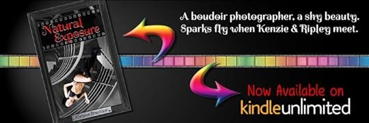 Natural Exposure FREE on KU!
Welcome to July, where there's Sales, sales and more sales!
First off, Natural Exposure remains FREE on Kindle Unlimited for the next 2 months. Get it while you can!
Next up is the 14th Annual Smashwords Summer/Winter Sale for the month of July. Natural Exposure is NOT listed on Smashwords at this time (because of it being FREE on Kindle Unlimited) but you can get the rest of my Bijou books there on big discounts! 5 books - less than $10! Negative Exposure sale price: $1.99 (75% off) Elemental Exposure sale price: $1.99 (75% off) A Discovery of BDSM FREE (100% off!) An Exploration of BDSM sale price: $0.99 (75% off) A Double Dose of BDSM sale price: $0.99 (75% off) And finally, in addition to being FREE on Kindle Unlimited, Natural Exposure will be on SALE on Amazon for only $0.99 - not once, but TWICE during this month.
IHS Reading Challenge BDSM category Sale - 7/11 thru 7/15 IHeartSapphic's 99-cent Sale - from 7/22 thru 7/26
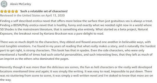
Uncertain if you should give Natural Exposure a try? Check out these WONDERFUL reviews it's received.
Natural Exposure FREE on Kindle Unlimited!


----------
If you read any of my books, I would be grateful for some reviews as they have stalled out a bit for me. Reviews are everything for an author, even if it's simply a star rating.
If you read AND review Natural Exposure, send me a link to your review (Goodreads and/or Amazon preferred) and I'll send you a copy of Negative Exposure FREE as a thank you!
 Lesbian fiction fans rejoice!
First Sips is a new anthology of lesbian fiction that promises to get your heart racing. With extracts from novels by established authors as well as exciting new voices, this collection has something for everyone.
Curl up with a good book and lose yourself in another world where love knows no bounds. Whether you’re looking for romance, adventure or mystery, First Sips has it all.
Click here to download your free copy today!
With samples provided by: Lucy Bexley | Koriana Brackson | Elizabeth James | Skye Kilaen | Nina Maderson | Edie Marr | Jamey Moody | Niamh Murphy | Riley Rose | Dierdre Winter
 Reading - The Hourglass Throne by K.D. EdwardsRecently completed - Match Game (Expeditionary Force #14) by Craig Alanson Ready Player One (re-read) by Ernest ClineWatching - The Boys season 2Playing - Tiny Tina's Wonderlands The Witcher 3 If you'd like to review my books (on Amazon and/or Goodreads, along with any other retailer or book site) then please contact me at KorianaBrackson@gmail.com with the subject title "Review" for a free copy of my first book, Natural Exposure.
Please give a little detail in the body of the email (no emails with review in the title and nothing else - that's not really the type of interaction I like) such as what format (mobi / epub / ect) you'd like and when you'd hope to read it by.
If you'd like to chat about books, games, or anything else, feel free to message me. I enjoy meaningful interactions with my readers! My books are now sold at most major retailers!
Natural Exposure Amazon Smashwords A Discovery of BDSM Amazon Smashwords Barnes & Noble Kobo Google Play
Negative Exposure Amazon Smashwords An Exploration of BDSM Amazon Smashwords Elemental Exposure Amazon Smashwords

 Need scents for your home? Help out my friend Kim's new endevor and try out Pink Zebra today!


 Copyright © *|CURRENT_YEAR|* *|LIST:COMPANY|*, All rights reserved.
*|IFNOT:ARCHIVE_PAGE|* *|LIST:DESCRIPTION|*
Our mailing address is:
*|HTML:LIST_ADDRESS_HTML|* *|END:IF|*
Want to change how you receive these emails?
You can update your preferences or unsubscribe from this list.
*|IF:REWARDS|* *|HTML:REWARDS|* *|END:IF|*
My Books
Natural Exposure on Amazon - FREE on Kindle Unlimited
Natural Exposure on Goodreads
Negative Exposure on Amazon
Negative Exposure on Smashwords
Negative Exposure on Goodreads
Elemental Exposure on Amazon
Elemental Exposure on Smashwords
Elemental Exposure on Goodreads
A Discovery of BDSM on Amazon
A Discovery of BDSM on Smashwords
A Discovery of BDSM on Goodreads
An Exploration of BDSM on Amazon
An Exploration of BDSM on Smashwords
An Exploration of BDSM on Goodreads


June 2, 2022
It's Pride Month
*|MC:SUBJECT|* p{ margin:10px 0; padding:0; } table{ border-collapse:collapse; } h1,h2,h3,h4,h5,h6{ display:block; margin:0; padding:0; } img,a img{ border:0; height:auto; outline:none; text-decoration:none; } body,#bodyTable,#bodyCell{ height:100%; margin:0; padding:0; width:100%; } .mcnPreviewText{ display:none !important; } #outlook a{ padding:0; } img{ -ms-interpolation-mode:bicubic; } table{ mso-table-lspace:0pt; mso-table-rspace:0pt; } .ReadMsgBody{ width:100%; } .ExternalClass{ width:100%; } p,a,li,td,blockquote{ mso-line-height-rule:exactly; } a[href^=tel],a[href^=sms]{ color:inherit; cursor:default; text-decoration:none; } p,a,li,td,body,table,blockquote{ -ms-text-size-adjust:100%; -webkit-text-size-adjust:100%; } .ExternalClass,.ExternalClass p,.ExternalClass td,.ExternalClass div,.ExternalClass span,.ExternalClass font{ line-height:100%; } a[x-apple-data-detectors]{ color:inherit !important; text-decoration:none !important; font-size:inherit !important; font-family:inherit !important; font-weight:inherit !important; line-height:inherit !important; } #bodyCell{ padding:10px; } .templateContainer{ max-width:600px !important; } a.mcnButton{ display:block; } .mcnImage,.mcnRetinaImage{ vertical-align:bottom; } .mcnTextContent{ word-break:break-word; } .mcnTextContent img{ height:auto !important; } .mcnDividerBlock{ table-layout:fixed !important; } body,#bodyTable{ background-color:#FAFAFA; } #bodyCell{ border-top:0; } .templateContainer{ border:0; } h1{ color:#202020; font-family:Helvetica; font-size:26px; font-style:normal; font-weight:bold; line-height:125%; letter-spacing:normal; text-align:left; } h2{ color:#202020; font-family:Helvetica; font-size:22px; font-style:normal; font-weight:bold; line-height:125%; letter-spacing:normal; text-align:left; } h3{ color:#202020; font-family:Helvetica; font-size:20px; font-style:normal; font-weight:bold; line-height:125%; letter-spacing:normal; text-align:left; } h4{ color:#202020; font-family:Helvetica; font-size:18px; font-style:normal; font-weight:bold; line-height:125%; letter-spacing:normal; text-align:left; } #templatePreheader{ background-color:#FAFAFA; background-image:none; background-repeat:no-repeat; background-position:center; background-size:cover; border-top:0; border-bottom:0; padding-top:9px; padding-bottom:9px; } #templatePreheader .mcnTextContent,#templatePreheader .mcnTextContent p{ color:#656565; font-family:Helvetica; font-size:12px; line-height:150%; text-align:left; } #templatePreheader .mcnTextContent a,#templatePreheader .mcnTextContent p a{ color:#656565; font-weight:normal; text-decoration:underline; } #templateHeader{ background-color:#FFFFFF; background-image:none; background-repeat:no-repeat; background-position:center; background-size:cover; border-top:0; border-bottom:0; padding-top:9px; padding-bottom:0; } #templateHeader .mcnTextContent,#templateHeader .mcnTextContent p{ color:#202020; font-family:Helvetica; font-size:16px; line-height:150%; text-align:left; } #templateHeader .mcnTextContent a,#templateHeader .mcnTextContent p a{ color:#007C89; font-weight:normal; text-decoration:underline; } #templateBody{ background-color:#FFFFFF; background-image:none; background-repeat:no-repeat; background-position:center; background-size:cover; border-top:0; border-bottom:2px solid #EAEAEA; padding-top:0; padding-bottom:9px; } #templateBody .mcnTextContent,#templateBody .mcnTextContent p{ color:#202020; font-family:Helvetica; font-size:16px; line-height:150%; text-align:left; } #templateBody .mcnTextContent a,#templateBody .mcnTextContent p a{ color:#007C89; font-weight:normal; text-decoration:underline; } #templateFooter{ background-color:#FAFAFA; background-image:none; background-repeat:no-repeat; background-position:center; background-size:cover; border-top:0; border-bottom:0; padding-top:9px; padding-bottom:9px; } #templateFooter .mcnTextContent,#templateFooter .mcnTextContent p{ color:#656565; font-family:Helvetica; font-size:12px; line-height:150%; text-align:center; } #templateFooter .mcnTextContent a,#templateFooter .mcnTextContent p a{ color:#656565; font-weight:normal; text-decoration:underline; } @media only screen and (min-width:768px){ .templateContainer{ width:600px !important; } } @media only screen and (max-width: 480px){ body,table,td,p,a,li,blockquote{ -webkit-text-size-adjust:none !important; } } @media only screen and (max-width: 480px){ body{ width:100% !important; min-width:100% !important; } } @media only screen and (max-width: 480px){ .mcnRetinaImage{ max-width:100% !important; } } @media only screen and (max-width: 480px){ .mcnImage{ width:100% !important; } } @media only screen and (max-width: 480px){ .mcnCartContainer,.mcnCaptionTopContent,.mcnRecContentContainer,.mcnCaptionBottomContent,.mcnTextContentContainer,.mcnBoxedTextContentContainer,.mcnImageGroupContentContainer,.mcnCaptionLeftTextContentContainer,.mcnCaptionRightTextContentContainer,.mcnCaptionLeftImageContentContainer,.mcnCaptionRightImageContentContainer,.mcnImageCardLeftTextContentContainer,.mcnImageCardRightTextContentContainer,.mcnImageCardLeftImageContentContainer,.mcnImageCardRightImageContentContainer{ max-width:100% !important; width:100% !important; } } @media only screen and (max-width: 480px){ .mcnBoxedTextContentContainer{ min-width:100% !important; } } @media only screen and (max-width: 480px){ .mcnImageGroupContent{ padding:9px !important; } } @media only screen and (max-width: 480px){ .mcnCaptionLeftContentOuter .mcnTextContent,.mcnCaptionRightContentOuter .mcnTextContent{ padding-top:9px !important; } } @media only screen and (max-width: 480px){ .mcnImageCardTopImageContent,.mcnCaptionBottomContent:last-child .mcnCaptionBottomImageContent,.mcnCaptionBlockInner .mcnCaptionTopContent:last-child .mcnTextContent{ padding-top:18px !important; } } @media only screen and (max-width: 480px){ .mcnImageCardBottomImageContent{ padding-bottom:9px !important; } } @media only screen and (max-width: 480px){ .mcnImageGroupBlockInner{ padding-top:0 !important; padding-bottom:0 !important; } } @media only screen and (max-width: 480px){ .mcnImageGroupBlockOuter{ padding-top:9px !important; padding-bottom:9px !important; } } @media only screen and (max-width: 480px){ .mcnTextContent,.mcnBoxedTextContentColumn{ padding-right:18px !important; padding-left:18px !important; } } @media only screen and (max-width: 480px){ .mcnImageCardLeftImageContent,.mcnImageCardRightImageContent{ padding-right:18px !important; padding-bottom:0 !important; padding-left:18px !important; } } @media only screen and (max-width: 480px){ .mcpreview-image-uploader{ display:none !important; width:100% !important; } } @media only screen and (max-width: 480px){ h1{ font-size:22px !important; line-height:125% !important; } } @media only screen and (max-width: 480px){ h2{ font-size:20px !important; line-height:125% !important; } } @media only screen and (max-width: 480px){ h3{ font-size:18px !important; line-height:125% !important; } } @media only screen and (max-width: 480px){ h4{ font-size:16px !important; line-height:150% !important; } } @media only screen and (max-width: 480px){ .mcnBoxedTextContentContainer .mcnTextContent,.mcnBoxedTextContentContainer .mcnTextContent p{ font-size:14px !important; line-height:150% !important; } } @media only screen and (max-width: 480px){ #templatePreheader{ display:block !important; } } @media only screen and (max-width: 480px){ #templatePreheader .mcnTextContent,#templatePreheader .mcnTextContent p{ font-size:14px !important; line-height:150% !important; } } @media only screen and (max-width: 480px){ #templateHeader .mcnTextContent,#templateHeader .mcnTextContent p{ font-size:16px !important; line-height:150% !important; } } @media only screen and (max-width: 480px){ #templateBody .mcnTextContent,#templateBody .mcnTextContent p{ font-size:16px !important; line-height:150% !important; } } @media only screen and (max-width: 480px){ #templateFooter .mcnTextContent,#templateFooter .mcnTextContent p{ font-size:14px !important; line-height:150% !important; } } *|MC_PREVIEW_TEXT|* View this email in your browser
Welcome to the Bijou Bugle Newsletter! So glad you've subscribed. ILYJ. IMY. CM. CU!
Natural Exposure FREE on KU!
It's Pride Month.
For you, that means Natural Exposure is FREE on Kindle Unlimited for the next 3 months. As a reminder: You can grab Natural Exposure on KU and then read it at anytime. It's available to you, even if I take it back off KU, so grab it to have for anytime it might strike your fancy.
Meet Kenzie, Jarrett, and Ripley along with a huge cast of characters. Visit Bijou Basin, an LGBTQ founded town in Central Florida.
It’s business as usual for Kenzie in her boudoir studio. Every day, fascinating people of all genders stroll through and Kenzie has the privilege of making them shine. She’s photographed the gamut: sultry brides-to-be seeking a naughty gift for their spouse, the confidant trans person showing the world their true self, and triads locked in passion, each moment of their tender lovemaking on display.
Kenzie’s been a part of it all, but never has a client captivated her so completely, until SHE steps through the door.
Ripley never recuperated from the relationship that irrevocably changed her. Desperate to forget the past, she moves to the progressive town of Bijou Basin, pursuing a fresh start. While acquainting herself with her new life, she notices an advertisement for an erotic nude photographer. On a whim, she books a session, hoping the experience will help her reclaim her identity.
Sparks fly for both women, but Ripley discovers there’s more to Kenzie than meets the eye. Can Ripley accept Kenzie as she is, and does she want to date someone so complicated? Can Kenzie prove she’s worth it?
Authors Note: This book features adult themes and language. Themes include: BDSM, Polyamory, and LGBTQ+ characters.
SOME of the LGBTQ+ Rep within Natural Exposure (even if it's not entirely clear): Kenize (Bi / Pan) Ripley (Pan) Felicity (Bi / Pan) Devon & Audra (Lesbian) Melinda (Demi) April (Bi / Pan) Leigh & Graham (Bi) Bianca (Pan) Corbin & Antoine (Gay)
Uncertain if you should give Natural Exposure a try? Check out these WONDERFUL reviews it's received.
Natural Exposure FREE on Kindle Unlimited!
Current things I'm working on:
1 - Continuing my re-writes of RoE, my Sapphic psychological thriller. Due to some life-stuff, it's been slow going, but I'll get back to it soon enough. I hope.
----------
If you read any of my books, I would be grateful for some reviews as they have stalled out a bit for me. Reviews are everything for an author, even if it's simply a star rating.
If you read AND review Natural Exposure, send me a link to your review (Goodreads and/or Amazon preferred) and I'll send you a copy of Negative Exposure FREE as a thank you!
Lesbian fiction fans rejoice!
First Sips is a new anthology of lesbian fiction that promises to get your heart racing. With extracts from novels by established authors as well as exciting new voices, this collection has something for everyone.
Curl up with a good book and lose yourself in another world where love knows no bounds. Whether you’re looking for romance, adventure or mystery, First Sips has it all.
Click here to download your free copy today!
With samples provided by: Lucy Bexley | Koriana Brackson | Elizabeth James | Skye Kilaen | Nina Maderson | Edie Marr | Jamey Moody | Niamh Murphy | Riley Rose | Dierdre Winter
Reading - Nothing (sadly)Recently completed - In Times Like These by Nathan Van CoopsWatching - Not muchPlaying - Ditto If you'd like to review my books (on Amazon and/or Goodreads, along with any other retailer or book site) then please contact me at KorianaBrackson@gmail.com with the subject title "Review" for a free copy of my first book, Natural Exposure.Please give a little detail in the body of the email (no emails with review in the title and nothing else - that's not really the type of interaction I like) such as what format (mobi / epub / ect) you'd like and when you'd hope to read it by.
If you'd like to chat about books, games, or anything else, feel free to message me. I enjoy meaningful interactions with my readers! My books are now sold at most major retailers!
Natural Exposure Amazon Smashwords A Discovery of BDSM Amazon Smashwords Barnes & Noble Kobo Google Play
Negative Exposure Amazon Smashwords An Exploration of BDSM Amazon Smashwords Elemental Exposure Amazon Smashwords
Need scents for your home? Help out my friend Kim's new endevor and try out Pink Zebra today! Copyright © *|CURRENT_YEAR|* *|LIST:COMPANY|*, All rights reserved.*|IFNOT:ARCHIVE_PAGE|* *|LIST:DESCRIPTION|*
Our mailing address is:
*|HTML:LIST_ADDRESS_HTML|* *|END:IF|*
Want to change how you receive these emails?
You can update your preferences or unsubscribe from this list.
*|IF:REWARDS|* *|HTML:REWARDS|* *|END:IF|*
My Books
Natural Exposure on Amazon - FREE on Kindle Unlimited
Natural Exposure on Goodreads
Negative Exposure on Amazon
Negative Exposure on Smashwords
Negative Exposure on Goodreads
Elemental Exposure on Amazon
Elemental Exposure on Smashwords
Elemental Exposure on Goodreads
A Discovery of BDSM on Amazon
A Discovery of BDSM on Smashwords
A Discovery of BDSM on Goodreads
An Exploration of BDSM on Amazon
An Exploration of BDSM on Smashwords
An Exploration of BDSM on Goodreads
May 2, 2022
A FREE Sapphic Sampler for you!
*|MC:SUBJECT|* p{ margin:10px 0; padding:0; } table{ border-collapse:collapse; } h1,h2,h3,h4,h5,h6{ display:block; margin:0; padding:0; } img,a img{ border:0; height:auto; outline:none; text-decoration:none; } body,#bodyTable,#bodyCell{ height:100%; margin:0; padding:0; width:100%; } .mcnPreviewText{ display:none !important; } #outlook a{ padding:0; } img{ -ms-interpolation-mode:bicubic; } table{ mso-table-lspace:0pt; mso-table-rspace:0pt; } .ReadMsgBody{ width:100%; } .ExternalClass{ width:100%; } p,a,li,td,blockquote{ mso-line-height-rule:exactly; } a[href^=tel],a[href^=sms]{ color:inherit; cursor:default; text-decoration:none; } p,a,li,td,body,table,blockquote{ -ms-text-size-adjust:100%; -webkit-text-size-adjust:100%; } .ExternalClass,.ExternalClass p,.ExternalClass td,.ExternalClass div,.ExternalClass span,.ExternalClass font{ line-height:100%; } a[x-apple-data-detectors]{ color:inherit !important; text-decoration:none !important; font-size:inherit !important; font-family:inherit !important; font-weight:inherit !important; line-height:inherit !important; } #bodyCell{ padding:10px; } .templateContainer{ max-width:600px !important; } a.mcnButton{ display:block; } .mcnImage,.mcnRetinaImage{ vertical-align:bottom; } .mcnTextContent{ word-break:break-word; } .mcnTextContent img{ height:auto !important; } .mcnDividerBlock{ table-layout:fixed !important; } body,#bodyTable{ background-color:#FAFAFA; } #bodyCell{ border-top:0; } .templateContainer{ border:0; } h1{ color:#202020; font-family:Helvetica; font-size:26px; font-style:normal; font-weight:bold; line-height:125%; letter-spacing:normal; text-align:left; } h2{ color:#202020; font-family:Helvetica; font-size:22px; font-style:normal; font-weight:bold; line-height:125%; letter-spacing:normal; text-align:left; } h3{ color:#202020; font-family:Helvetica; font-size:20px; font-style:normal; font-weight:bold; line-height:125%; letter-spacing:normal; text-align:left; } h4{ color:#202020; font-family:Helvetica; font-size:18px; font-style:normal; font-weight:bold; line-height:125%; letter-spacing:normal; text-align:left; } #templatePreheader{ background-color:#FAFAFA; background-image:none; background-repeat:no-repeat; background-position:center; background-size:cover; border-top:0; border-bottom:0; padding-top:9px; padding-bottom:9px; } #templatePreheader .mcnTextContent,#templatePreheader .mcnTextContent p{ color:#656565; font-family:Helvetica; font-size:12px; line-height:150%; text-align:left; } #templatePreheader .mcnTextContent a,#templatePreheader .mcnTextContent p a{ color:#656565; font-weight:normal; text-decoration:underline; } #templateHeader{ background-color:#FFFFFF; background-image:none; background-repeat:no-repeat; background-position:center; background-size:cover; border-top:0; border-bottom:0; padding-top:9px; padding-bottom:0; } #templateHeader .mcnTextContent,#templateHeader .mcnTextContent p{ color:#202020; font-family:Helvetica; font-size:16px; line-height:150%; text-align:left; } #templateHeader .mcnTextContent a,#templateHeader .mcnTextContent p a{ color:#007C89; font-weight:normal; text-decoration:underline; } #templateBody{ background-color:#FFFFFF; background-image:none; background-repeat:no-repeat; background-position:center; background-size:cover; border-top:0; border-bottom:2px solid #EAEAEA; padding-top:0; padding-bottom:9px; } #templateBody .mcnTextContent,#templateBody .mcnTextContent p{ color:#202020; font-family:Helvetica; font-size:16px; line-height:150%; text-align:left; } #templateBody .mcnTextContent a,#templateBody .mcnTextContent p a{ color:#007C89; font-weight:normal; text-decoration:underline; } #templateFooter{ background-color:#FAFAFA; background-image:none; background-repeat:no-repeat; background-position:center; background-size:cover; border-top:0; border-bottom:0; padding-top:9px; padding-bottom:9px; } #templateFooter .mcnTextContent,#templateFooter .mcnTextContent p{ color:#656565; font-family:Helvetica; font-size:12px; line-height:150%; text-align:center; } #templateFooter .mcnTextContent a,#templateFooter .mcnTextContent p a{ color:#656565; font-weight:normal; text-decoration:underline; } @media only screen and (min-width:768px){ .templateContainer{ width:600px !important; } } @media only screen and (max-width: 480px){ body,table,td,p,a,li,blockquote{ -webkit-text-size-adjust:none !important; } } @media only screen and (max-width: 480px){ body{ width:100% !important; min-width:100% !important; } } @media only screen and (max-width: 480px){ .mcnRetinaImage{ max-width:100% !important; } } @media only screen and (max-width: 480px){ .mcnImage{ width:100% !important; } } @media only screen and (max-width: 480px){ .mcnCartContainer,.mcnCaptionTopContent,.mcnRecContentContainer,.mcnCaptionBottomContent,.mcnTextContentContainer,.mcnBoxedTextContentContainer,.mcnImageGroupContentContainer,.mcnCaptionLeftTextContentContainer,.mcnCaptionRightTextContentContainer,.mcnCaptionLeftImageContentContainer,.mcnCaptionRightImageContentContainer,.mcnImageCardLeftTextContentContainer,.mcnImageCardRightTextContentContainer,.mcnImageCardLeftImageContentContainer,.mcnImageCardRightImageContentContainer{ max-width:100% !important; width:100% !important; } } @media only screen and (max-width: 480px){ .mcnBoxedTextContentContainer{ min-width:100% !important; } } @media only screen and (max-width: 480px){ .mcnImageGroupContent{ padding:9px !important; } } @media only screen and (max-width: 480px){ .mcnCaptionLeftContentOuter .mcnTextContent,.mcnCaptionRightContentOuter .mcnTextContent{ padding-top:9px !important; } } @media only screen and (max-width: 480px){ .mcnImageCardTopImageContent,.mcnCaptionBottomContent:last-child .mcnCaptionBottomImageContent,.mcnCaptionBlockInner .mcnCaptionTopContent:last-child .mcnTextContent{ padding-top:18px !important; } } @media only screen and (max-width: 480px){ .mcnImageCardBottomImageContent{ padding-bottom:9px !important; } } @media only screen and (max-width: 480px){ .mcnImageGroupBlockInner{ padding-top:0 !important; padding-bottom:0 !important; } } @media only screen and (max-width: 480px){ .mcnImageGroupBlockOuter{ padding-top:9px !important; padding-bottom:9px !important; } } @media only screen and (max-width: 480px){ .mcnTextContent,.mcnBoxedTextContentColumn{ padding-right:18px !important; padding-left:18px !important; } } @media only screen and (max-width: 480px){ .mcnImageCardLeftImageContent,.mcnImageCardRightImageContent{ padding-right:18px !important; padding-bottom:0 !important; padding-left:18px !important; } } @media only screen and (max-width: 480px){ .mcpreview-image-uploader{ display:none !important; width:100% !important; } } @media only screen and (max-width: 480px){ h1{ font-size:22px !important; line-height:125% !important; } } @media only screen and (max-width: 480px){ h2{ font-size:20px !important; line-height:125% !important; } } @media only screen and (max-width: 480px){ h3{ font-size:18px !important; line-height:125% !important; } } @media only screen and (max-width: 480px){ h4{ font-size:16px !important; line-height:150% !important; } } @media only screen and (max-width: 480px){ .mcnBoxedTextContentContainer .mcnTextContent,.mcnBoxedTextContentContainer .mcnTextContent p{ font-size:14px !important; line-height:150% !important; } } @media only screen and (max-width: 480px){ #templatePreheader{ display:block !important; } } @media only screen and (max-width: 480px){ #templatePreheader .mcnTextContent,#templatePreheader .mcnTextContent p{ font-size:14px !important; line-height:150% !important; } } @media only screen and (max-width: 480px){ #templateHeader .mcnTextContent,#templateHeader .mcnTextContent p{ font-size:16px !important; line-height:150% !important; } } @media only screen and (max-width: 480px){ #templateBody .mcnTextContent,#templateBody .mcnTextContent p{ font-size:16px !important; line-height:150% !important; } } @media only screen and (max-width: 480px){ #templateFooter .mcnTextContent,#templateFooter .mcnTextContent p{ font-size:14px !important; line-height:150% !important; } } *|MC_PREVIEW_TEXT|* View this email in your browser
Welcome to the Bijou Bugle Newsletter! So glad you've subscribed.  It's been quiet for me, so I hadn't wanted to bother you all with boring non-updates. I'm back to give you a FREE sampler. 10 Sapphic authors have come together and given samples of their books in this free book so that you might find someone you like. More info below.
Camp NaNo didn't go as I hoped. I PLANNED on a new project, but life didn't agree, so instead, I worked on my psychological thriller - "RoE". I worked each day until the last week of the month, so it was pretty productive.
If anyone is interested in Beta Reading RoE - feel free to get in touch. I'm looking for those who will provide information about how the story is (or isn't) working for them, what you like/don't, and so on. Word only (no google docs or other online apps). There's no official blurb yet - but here's a little about it:
Jasmine and Kaitlyn, best friends since birth, go on a Route 66 road trip to escape Kait's abusive husband and evil follows. TW include: talks of suicide/abuse, graphic violence, drugging of dogs (they're fine), destruction of books (not fine).

Current things I'm working on:
1 - Continuing my re-writes of RoE, my Sapphic psychological thriller. Nearly finished the 2nd re-write when I started on the 3rd. Coming together (I think).
What's upcoming?
1 - Started a series of short sexy stories for Kindle Vella based around Kenzie's studio. Only have the concept and the start of the first one, so may not get back to this one for a while, but it's on the agenda. (Do you read Vella stories? - let me know here.)
----------
If you read any of my books, I would be grateful for some reviews as they have stalled out a bit for me. Reviews are everything for an author, even if it's simply a star rating.
If you read AND review Natural Exposure, send me a link to your review (Goodreads and/or Amazon preferred) and I'll send you a copy of Negative Exposure FREE as a thank you!
Lesbian fiction fans rejoice!
First Sips is a new anthology of lesbian fiction that promises to get your heart racing. With extracts from novels by established authors as well as exciting new voices, this collection has something for everyone.
Curl up with a good book and lose yourself in another world where love knows no bounds. Whether you’re looking for romance, adventure or mystery, First Sips has it all.
Click here to download your free copy today!
With samples provided by: Lucy Bexley | Koriana Brackson | Elizabeth James | Skye Kilaen | Nina Maderson | Edie Marr | Jamey Moody | Niamh Murphy | Riley Rose | Dierdre Winter
Reading - Aces Wild by Amanda DeWitt These Deadly Games by Diana UrbanRecently completed - One Impossible Labyrinth by Matthew Reilly A Catalogue of Catastrophe by Jodi TaylorWatching - PICARD!!! (LOOOOVE) Masked SingerPlaying - Diablo 3 (with Hubby) Hearthstone If you'd like to review my books (on Amazon and/or Goodreads, along with any other retailer or book site) then please contact me at KorianaBrackson@gmail.com with the subject title "Review" for a free copy of my first book, Natural Exposure.Please give a little detail in the body of the email (no emails with review in the title and nothing else - that's not really the type of interaction I like) such as what format (mobi / epub / ect) you'd like and when you'd hope to read it by.
If you'd like to chat about books, games, or anything else, feel free to message me. I enjoy meaningful interactions with my readers! My books are now sold at most major retailers!
Natural Exposure Amazon Smashwords A Discovery of BDSM Amazon Smashwords Barnes & Noble Kobo Google Play
Negative Exposure Amazon Smashwords An Exploration of BDSM Amazon Smashwords Elemental Exposure Amazon Smashwords
Need scents for your home? Help out my friend Kim's new endevor and try out Pink Zebra today! Copyright © *|CURRENT_YEAR|* *|LIST:COMPANY|*, All rights reserved.*|IFNOT:ARCHIVE_PAGE|* *|LIST:DESCRIPTION|*
Our mailing address is:
*|HTML:LIST_ADDRESS_HTML|* *|END:IF|*
Want to change how you receive these emails?
You can update your preferences or unsubscribe from this list.
*|IF:REWARDS|* *|HTML:REWARDS|* *|END:IF|*
My Books
Natural Exposure on Amazon - FREE on Kindle Unlimited
Natural Exposure on Goodreads
Negative Exposure on Amazon
Negative Exposure on Smashwords
Negative Exposure on Goodreads
Elemental Exposure on Amazon
Elemental Exposure on Smashwords
Elemental Exposure on Goodreads
A Discovery of BDSM on Amazon
A Discovery of BDSM on Smashwords
A Discovery of BDSM on Goodreads
An Exploration of BDSM on Amazon
An Exploration of BDSM on Smashwords
An Exploration of BDSM on Goodreads
March 6, 2022
Smashwords SALE!! 3/6 - 3/12
*|MC:SUBJECT|* p{ margin:10px 0; padding:0; } table{ border-collapse:collapse; } h1,h2,h3,h4,h5,h6{ display:block; margin:0; padding:0; } img,a img{ border:0; height:auto; outline:none; text-decoration:none; } body,#bodyTable,#bodyCell{ height:100%; margin:0; padding:0; width:100%; } .mcnPreviewText{ display:none !important; } #outlook a{ padding:0; } img{ -ms-interpolation-mode:bicubic; } table{ mso-table-lspace:0pt; mso-table-rspace:0pt; } .ReadMsgBody{ width:100%; } .ExternalClass{ width:100%; } p,a,li,td,blockquote{ mso-line-height-rule:exactly; } a[href^=tel],a[href^=sms]{ color:inherit; cursor:default; text-decoration:none; } p,a,li,td,body,table,blockquote{ -ms-text-size-adjust:100%; -webkit-text-size-adjust:100%; } .ExternalClass,.ExternalClass p,.ExternalClass td,.ExternalClass div,.ExternalClass span,.ExternalClass font{ line-height:100%; } a[x-apple-data-detectors]{ color:inherit !important; text-decoration:none !important; font-size:inherit !important; font-family:inherit !important; font-weight:inherit !important; line-height:inherit !important; } #bodyCell{ padding:10px; } .templateContainer{ max-width:600px !important; } a.mcnButton{ display:block; } .mcnImage,.mcnRetinaImage{ vertical-align:bottom; } .mcnTextContent{ word-break:break-word; } .mcnTextContent img{ height:auto !important; } .mcnDividerBlock{ table-layout:fixed !important; } body,#bodyTable{ background-color:#FAFAFA; } #bodyCell{ border-top:0; } .templateContainer{ border:0; } h1{ color:#202020; font-family:Helvetica; font-size:26px; font-style:normal; font-weight:bold; line-height:125%; letter-spacing:normal; text-align:left; } h2{ color:#202020; font-family:Helvetica; font-size:22px; font-style:normal; font-weight:bold; line-height:125%; letter-spacing:normal; text-align:left; } h3{ color:#202020; font-family:Helvetica; font-size:20px; font-style:normal; font-weight:bold; line-height:125%; letter-spacing:normal; text-align:left; } h4{ color:#202020; font-family:Helvetica; font-size:18px; font-style:normal; font-weight:bold; line-height:125%; letter-spacing:normal; text-align:left; } #templatePreheader{ background-color:#FAFAFA; background-image:none; background-repeat:no-repeat; background-position:center; background-size:cover; border-top:0; border-bottom:0; padding-top:9px; padding-bottom:9px; } #templatePreheader .mcnTextContent,#templatePreheader .mcnTextContent p{ color:#656565; font-family:Helvetica; font-size:12px; line-height:150%; text-align:left; } #templatePreheader .mcnTextContent a,#templatePreheader .mcnTextContent p a{ color:#656565; font-weight:normal; text-decoration:underline; } #templateHeader{ background-color:#FFFFFF; background-image:none; background-repeat:no-repeat; background-position:center; background-size:cover; border-top:0; border-bottom:0; padding-top:9px; padding-bottom:0; } #templateHeader .mcnTextContent,#templateHeader .mcnTextContent p{ color:#202020; font-family:Helvetica; font-size:16px; line-height:150%; text-align:left; } #templateHeader .mcnTextContent a,#templateHeader .mcnTextContent p a{ color:#007C89; font-weight:normal; text-decoration:underline; } #templateBody{ background-color:#FFFFFF; background-image:none; background-repeat:no-repeat; background-position:center; background-size:cover; border-top:0; border-bottom:2px solid #EAEAEA; padding-top:0; padding-bottom:9px; } #templateBody .mcnTextContent,#templateBody .mcnTextContent p{ color:#202020; font-family:Helvetica; font-size:16px; line-height:150%; text-align:left; } #templateBody .mcnTextContent a,#templateBody .mcnTextContent p a{ color:#007C89; font-weight:normal; text-decoration:underline; } #templateFooter{ background-color:#FAFAFA; background-image:none; background-repeat:no-repeat; background-position:center; background-size:cover; border-top:0; border-bottom:0; padding-top:9px; padding-bottom:9px; } #templateFooter .mcnTextContent,#templateFooter .mcnTextContent p{ color:#656565; font-family:Helvetica; font-size:12px; line-height:150%; text-align:center; } #templateFooter .mcnTextContent a,#templateFooter .mcnTextContent p a{ color:#656565; font-weight:normal; text-decoration:underline; } @media only screen and (min-width:768px){ .templateContainer{ width:600px !important; } } @media only screen and (max-width: 480px){ body,table,td,p,a,li,blockquote{ -webkit-text-size-adjust:none !important; } } @media only screen and (max-width: 480px){ body{ width:100% !important; min-width:100% !important; } } @media only screen and (max-width: 480px){ .mcnRetinaImage{ max-width:100% !important; } } @media only screen and (max-width: 480px){ .mcnImage{ width:100% !important; } } @media only screen and (max-width: 480px){ .mcnCartContainer,.mcnCaptionTopContent,.mcnRecContentContainer,.mcnCaptionBottomContent,.mcnTextContentContainer,.mcnBoxedTextContentContainer,.mcnImageGroupContentContainer,.mcnCaptionLeftTextContentContainer,.mcnCaptionRightTextContentContainer,.mcnCaptionLeftImageContentContainer,.mcnCaptionRightImageContentContainer,.mcnImageCardLeftTextContentContainer,.mcnImageCardRightTextContentContainer,.mcnImageCardLeftImageContentContainer,.mcnImageCardRightImageContentContainer{ max-width:100% !important; width:100% !important; } } @media only screen and (max-width: 480px){ .mcnBoxedTextContentContainer{ min-width:100% !important; } } @media only screen and (max-width: 480px){ .mcnImageGroupContent{ padding:9px !important; } } @media only screen and (max-width: 480px){ .mcnCaptionLeftContentOuter .mcnTextContent,.mcnCaptionRightContentOuter .mcnTextContent{ padding-top:9px !important; } } @media only screen and (max-width: 480px){ .mcnImageCardTopImageContent,.mcnCaptionBottomContent:last-child .mcnCaptionBottomImageContent,.mcnCaptionBlockInner .mcnCaptionTopContent:last-child .mcnTextContent{ padding-top:18px !important; } } @media only screen and (max-width: 480px){ .mcnImageCardBottomImageContent{ padding-bottom:9px !important; } } @media only screen and (max-width: 480px){ .mcnImageGroupBlockInner{ padding-top:0 !important; padding-bottom:0 !important; } } @media only screen and (max-width: 480px){ .mcnImageGroupBlockOuter{ padding-top:9px !important; padding-bottom:9px !important; } } @media only screen and (max-width: 480px){ .mcnTextContent,.mcnBoxedTextContentColumn{ padding-right:18px !important; padding-left:18px !important; } } @media only screen and (max-width: 480px){ .mcnImageCardLeftImageContent,.mcnImageCardRightImageContent{ padding-right:18px !important; padding-bottom:0 !important; padding-left:18px !important; } } @media only screen and (max-width: 480px){ .mcpreview-image-uploader{ display:none !important; width:100% !important; } } @media only screen and (max-width: 480px){ h1{ font-size:22px !important; line-height:125% !important; } } @media only screen and (max-width: 480px){ h2{ font-size:20px !important; line-height:125% !important; } } @media only screen and (max-width: 480px){ h3{ font-size:18px !important; line-height:125% !important; } } @media only screen and (max-width: 480px){ h4{ font-size:16px !important; line-height:150% !important; } } @media only screen and (max-width: 480px){ .mcnBoxedTextContentContainer .mcnTextContent,.mcnBoxedTextContentContainer .mcnTextContent p{ font-size:14px !important; line-height:150% !important; } } @media only screen and (max-width: 480px){ #templatePreheader{ display:block !important; } } @media only screen and (max-width: 480px){ #templatePreheader .mcnTextContent,#templatePreheader .mcnTextContent p{ font-size:14px !important; line-height:150% !important; } } @media only screen and (max-width: 480px){ #templateHeader .mcnTextContent,#templateHeader .mcnTextContent p{ font-size:16px !important; line-height:150% !important; } } @media only screen and (max-width: 480px){ #templateBody .mcnTextContent,#templateBody .mcnTextContent p{ font-size:16px !important; line-height:150% !important; } } @media only screen and (max-width: 480px){ #templateFooter .mcnTextContent,#templateFooter .mcnTextContent p{ font-size:14px !important; line-height:150% !important; } } *|MC_PREVIEW_TEXT|* View this email in your browser
Welcome to the Bijou Bugle Newsletter! So glad you've subscribed. SMASHWORDS Read an Ebook Week Sale! March 6 - March 12 Get all SIX of my books for under $10!!Natural Exposure - FREE - 100% off Negative Exposure - $1.99 - 75% off Elemental Exposure - $3.99 - 50% off A Discovery of BDSM - $0.99 - 75% off An Exploration of BDSM - $0.99 - 75% off A Double Dose of BDSM - $1.99 - 50% off Hello everyone!
There wasn't a mid-month newsletter last time as I had nothing really to update you on. February was a slow month for me. I didn't get very much done at all, but it wasn't completely my fault. It was his ---> Meet Joker!

Pretty good reason to not work much, don't you say? :) We got this (now 8 month old) beast at the end of January and we're all still adapting, but it's been fun. Anyone good at verifying breeds by sight? His mama was a pit bull (which is what we wanted). We think he's mixed with a Harlequin Great Dane! He's about 80 pounds already, has grown at least an inch since we got him, and he has the temperament of a Great Dane, not of the pit bull.
March has been more productive so far, and I hope to keep up the pace. Next month is Camp NaNo, and I plan on 50k of a new project - like I do for any other NaNos I do - because I like it - it pushes me. I do have a project in mind - but keeping it close to the vest at this point. It is, once again, a new genre.
Speaking of writing different genres, I appreciate those of you who would read anything I wrote - regardless of genre. THANK YOU! If you haven't taken the poll about it (would you read genres other than erotic romance), I'd love to know your thoughts. Take this poll.
Current things I'm working on:
1 - Continuing my re-writes of RoE, my Sapphic psychological thriller. I'm about 3/4ths of the way through this re-write and I know it needs at least another. I had been having alternating POVs but I'm going to try an 'Omni' POV rather than close. I'm hoping it'll help with the flow. I want to get it finished before I start with that though. Beta feedback has been good so far - thankfully. :)
What's upcoming?
1 - Camp NaNo in April. I know what I'm writing though I have no other details as of yet. I may come up with a few names beforehand, but not sure. I've had a couple ideas flit into my head here and there, so I've jotted those down, but that's it. Hoping it goes well when the time comes.
2 - Considering trying to do a series of short stories for Kindle Vella. It doesn't seem to do well (do you read Vella stories? - let me know here) and I'm not good with "short" but I like to change things up. I do want to get more Bijou Basin content out there, but my thriller has my attention at the moment. We'll see, I suppose.
----------
If you read any of my books, I would be grateful for some reviews as they have stalled out a bit for me. Reviews are everything for an author, even if it's simply a star rating.
If you read AND review Natural Exposure, send me a link to your review (Goodreads and/or Amazon preferred) and I'll send you a copy of Negative Exposure FREE as a thank you!


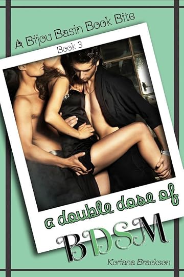
 In the six months since Kenzie and Jarrett began An Exploration of BDSM, they've learned a lot about themselves. They continue to grow as a couple and as their D/s evolves from a bedroom-only kink, to a 24/7 lifestyle.
With their one year anniversary approaching, Jarrett sets up a surprise for Kenzie. She has several items on her 'really want to experience' list, and he's more than willing to give her what she yearns for with A Double Dose of BDSM.
Reading - Risen by Benedict JackaRecently completed - Abandonment in Death by J.D. RobbWatching - PICARD!!! (LOOOOVE) Only Murders in the Building waiting on Masked SingerPlaying - God of War (PC) Hearthstone If you'd like to review my books (on Amazon and/or Goodreads, along with any other retailer or book site) then please contact me at KorianaBrackson@gmail.com with the subject title "Review" for a free copy of my first book, Natural Exposure.Please give a little detail in the body of the email (no emails with review in the title and nothing else - that's not really the type of interaction I like) such as what format (mobi / epub / ect) you'd like and when you'd hope to read it by.
If you'd like to chat about books, games, or anything else, feel free to message me. I enjoy meaningful interactions with my readers! SMASHWORDS Read an Ebook Week Sale! March 6 - March 12 Get all SIX of my books for under $10!!
Natural Exposure - FREE - 100% off Negative Exposure - $1.99 - 75% off Elemental Exposure - $3.99 - 50% off A Discovery of BDSM - $0.99 - 75% off An Exploration of BDSM - $0.99 - 75% off A Double Dose of BDSM - $1.99 - 50% off My books are now sold at most major retailers!
Natural Exposure Amazon Smashwords A Discovery of BDSM Amazon Smashwords Barnes & Noble Kobo Google Play
Negative Exposure Amazon Smashwords An Exploration of BDSM Amazon Smashwords Elemental Exposure Amazon Smashwords
Need scents for your home? Help out my friend Kim's new endevor and try out Pink Zebra today! Copyright © *|CURRENT_YEAR|* *|LIST:COMPANY|*, All rights reserved.*|IFNOT:ARCHIVE_PAGE|* *|LIST:DESCRIPTION|*
Our mailing address is:
*|HTML:LIST_ADDRESS_HTML|* *|END:IF|*
Want to change how you receive these emails?
You can update your preferences or unsubscribe from this list.
*|IF:REWARDS|* *|HTML:REWARDS|* *|END:IF|*
My Books
Natural Exposure on Amazon - FREE on Kindle Unlimited
Natural Exposure on Goodreads
Negative Exposure on Amazon
Negative Exposure on Smashwords
Negative Exposure on Goodreads
Elemental Exposure on Amazon
Elemental Exposure on Smashwords
Elemental Exposure on Goodreads
A Discovery of BDSM on Amazon
A Discovery of BDSM on Smashwords
A Discovery of BDSM on Goodreads
An Exploration of BDSM on Amazon
An Exploration of BDSM on Smashwords
An Exploration of BDSM on Goodreads
February 14, 2022
IHeartLesfic Sapphic Books Sale

#IHeartLesfic's Sapphic Fiction Sale ends tomorrow 2/15 .
Over 100 Sapphic Reads each for only $0.99! So so many good books and authors in this sale, including Natural Exposure.
=====
NATURAL EXPOSURE by Koriana Brackson
It’s business as usual for Kenzie in her boudoir studio. Every day, fascinating people of all genders stroll through and Kenzie has the privilege of making them shine. She’s photographed the gamut: sultry brides-to-be seeking a naughty gift for their spouse, the confidant trans person showing the world their true self, and triads locked in passion, each moment of their tender lovemaking on display.
Kenzie’s been a part of it all, but never has a client captivated her so completely, until she steps through the door.
Ripley never recuperated from the relationship that irrevocably changed her. Desperate to forget the past, she moves to the progressive town of Bijou Basin, pursuing a fresh start. While acquainting herself with her new life, she notices an advertisement for an erotic nude photographer. On a whim, she books a session, hoping the experience will help her reclaim her identity.
Sparks fly for both women, but Ripley discovers there’s more to Kenzie than meets the eye. Can Ripley accept Kenzie as she is and does she want to date someone so complicated? Can Kenzie prove she’s worth it?
Authors Note: This slow burn erotic romance features adult themes and language. Themes include: graphic sex, BDSM, Polyamory & LGBTQ+ Characters.
=====
My Books
Natural Exposure on Amazon - FREE on Kindle Unlimited
Natural Exposure on Goodreads
Negative Exposure on Amazon
Negative Exposure on Smashwords
Negative Exposure on Goodreads
Elemental Exposure on Amazon
Elemental Exposure on Smashwords
Elemental Exposure on Goodreads
A Discovery of BDSM on Amazon
A Discovery of BDSM on Smashwords
A Discovery of BDSM on Goodreads
An Exploration of BDSM on Amazon
An Exploration of BDSM on Smashwords
An Exploration of BDSM on Goodreads
February 2, 2022
Upcoming Sale & Release
*|MC:SUBJECT|* p{ margin:10px 0; padding:0; } table{ border-collapse:collapse; } h1,h2,h3,h4,h5,h6{ display:block; margin:0; padding:0; } img,a img{ border:0; height:auto; outline:none; text-decoration:none; } body,#bodyTable,#bodyCell{ height:100%; margin:0; padding:0; width:100%; } .mcnPreviewText{ display:none !important; } #outlook a{ padding:0; } img{ -ms-interpolation-mode:bicubic; } table{ mso-table-lspace:0pt; mso-table-rspace:0pt; } .ReadMsgBody{ width:100%; } .ExternalClass{ width:100%; } p,a,li,td,blockquote{ mso-line-height-rule:exactly; } a[href^=tel],a[href^=sms]{ color:inherit; cursor:default; text-decoration:none; } p,a,li,td,body,table,blockquote{ -ms-text-size-adjust:100%; -webkit-text-size-adjust:100%; } .ExternalClass,.ExternalClass p,.ExternalClass td,.ExternalClass div,.ExternalClass span,.ExternalClass font{ line-height:100%; } a[x-apple-data-detectors]{ color:inherit !important; text-decoration:none !important; font-size:inherit !important; font-family:inherit !important; font-weight:inherit !important; line-height:inherit !important; } #bodyCell{ padding:10px; } .templateContainer{ max-width:600px !important; } a.mcnButton{ display:block; } .mcnImage,.mcnRetinaImage{ vertical-align:bottom; } .mcnTextContent{ word-break:break-word; } .mcnTextContent img{ height:auto !important; } .mcnDividerBlock{ table-layout:fixed !important; } body,#bodyTable{ background-color:#FAFAFA; } #bodyCell{ border-top:0; } .templateContainer{ border:0; } h1{ color:#202020; font-family:Helvetica; font-size:26px; font-style:normal; font-weight:bold; line-height:125%; letter-spacing:normal; text-align:left; } h2{ color:#202020; font-family:Helvetica; font-size:22px; font-style:normal; font-weight:bold; line-height:125%; letter-spacing:normal; text-align:left; } h3{ color:#202020; font-family:Helvetica; font-size:20px; font-style:normal; font-weight:bold; line-height:125%; letter-spacing:normal; text-align:left; } h4{ color:#202020; font-family:Helvetica; font-size:18px; font-style:normal; font-weight:bold; line-height:125%; letter-spacing:normal; text-align:left; } #templatePreheader{ background-color:#FAFAFA; background-image:none; background-repeat:no-repeat; background-position:center; background-size:cover; border-top:0; border-bottom:0; padding-top:9px; padding-bottom:9px; } #templatePreheader .mcnTextContent,#templatePreheader .mcnTextContent p{ color:#656565; font-family:Helvetica; font-size:12px; line-height:150%; text-align:left; } #templatePreheader .mcnTextContent a,#templatePreheader .mcnTextContent p a{ color:#656565; font-weight:normal; text-decoration:underline; } #templateHeader{ background-color:#FFFFFF; background-image:none; background-repeat:no-repeat; background-position:center; background-size:cover; border-top:0; border-bottom:0; padding-top:9px; padding-bottom:0; } #templateHeader .mcnTextContent,#templateHeader .mcnTextContent p{ color:#202020; font-family:Helvetica; font-size:16px; line-height:150%; text-align:left; } #templateHeader .mcnTextContent a,#templateHeader .mcnTextContent p a{ color:#007C89; font-weight:normal; text-decoration:underline; } #templateBody{ background-color:#FFFFFF; background-image:none; background-repeat:no-repeat; background-position:center; background-size:cover; border-top:0; border-bottom:2px solid #EAEAEA; padding-top:0; padding-bottom:9px; } #templateBody .mcnTextContent,#templateBody .mcnTextContent p{ color:#202020; font-family:Helvetica; font-size:16px; line-height:150%; text-align:left; } #templateBody .mcnTextContent a,#templateBody .mcnTextContent p a{ color:#007C89; font-weight:normal; text-decoration:underline; } #templateFooter{ background-color:#FAFAFA; background-image:none; background-repeat:no-repeat; background-position:center; background-size:cover; border-top:0; border-bottom:0; padding-top:9px; padding-bottom:9px; } #templateFooter .mcnTextContent,#templateFooter .mcnTextContent p{ color:#656565; font-family:Helvetica; font-size:12px; line-height:150%; text-align:center; } #templateFooter .mcnTextContent a,#templateFooter .mcnTextContent p a{ color:#656565; font-weight:normal; text-decoration:underline; } @media only screen and (min-width:768px){ .templateContainer{ width:600px !important; } } @media only screen and (max-width: 480px){ body,table,td,p,a,li,blockquote{ -webkit-text-size-adjust:none !important; } } @media only screen and (max-width: 480px){ body{ width:100% !important; min-width:100% !important; } } @media only screen and (max-width: 480px){ .mcnRetinaImage{ max-width:100% !important; } } @media only screen and (max-width: 480px){ .mcnImage{ width:100% !important; } } @media only screen and (max-width: 480px){ .mcnCartContainer,.mcnCaptionTopContent,.mcnRecContentContainer,.mcnCaptionBottomContent,.mcnTextContentContainer,.mcnBoxedTextContentContainer,.mcnImageGroupContentContainer,.mcnCaptionLeftTextContentContainer,.mcnCaptionRightTextContentContainer,.mcnCaptionLeftImageContentContainer,.mcnCaptionRightImageContentContainer,.mcnImageCardLeftTextContentContainer,.mcnImageCardRightTextContentContainer,.mcnImageCardLeftImageContentContainer,.mcnImageCardRightImageContentContainer{ max-width:100% !important; width:100% !important; } } @media only screen and (max-width: 480px){ .mcnBoxedTextContentContainer{ min-width:100% !important; } } @media only screen and (max-width: 480px){ .mcnImageGroupContent{ padding:9px !important; } } @media only screen and (max-width: 480px){ .mcnCaptionLeftContentOuter .mcnTextContent,.mcnCaptionRightContentOuter .mcnTextContent{ padding-top:9px !important; } } @media only screen and (max-width: 480px){ .mcnImageCardTopImageContent,.mcnCaptionBottomContent:last-child .mcnCaptionBottomImageContent,.mcnCaptionBlockInner .mcnCaptionTopContent:last-child .mcnTextContent{ padding-top:18px !important; } } @media only screen and (max-width: 480px){ .mcnImageCardBottomImageContent{ padding-bottom:9px !important; } } @media only screen and (max-width: 480px){ .mcnImageGroupBlockInner{ padding-top:0 !important; padding-bottom:0 !important; } } @media only screen and (max-width: 480px){ .mcnImageGroupBlockOuter{ padding-top:9px !important; padding-bottom:9px !important; } } @media only screen and (max-width: 480px){ .mcnTextContent,.mcnBoxedTextContentColumn{ padding-right:18px !important; padding-left:18px !important; } } @media only screen and (max-width: 480px){ .mcnImageCardLeftImageContent,.mcnImageCardRightImageContent{ padding-right:18px !important; padding-bottom:0 !important; padding-left:18px !important; } } @media only screen and (max-width: 480px){ .mcpreview-image-uploader{ display:none !important; width:100% !important; } } @media only screen and (max-width: 480px){ h1{ font-size:22px !important; line-height:125% !important; } } @media only screen and (max-width: 480px){ h2{ font-size:20px !important; line-height:125% !important; } } @media only screen and (max-width: 480px){ h3{ font-size:18px !important; line-height:125% !important; } } @media only screen and (max-width: 480px){ h4{ font-size:16px !important; line-height:150% !important; } } @media only screen and (max-width: 480px){ .mcnBoxedTextContentContainer .mcnTextContent,.mcnBoxedTextContentContainer .mcnTextContent p{ font-size:14px !important; line-height:150% !important; } } @media only screen and (max-width: 480px){ #templatePreheader{ display:block !important; } } @media only screen and (max-width: 480px){ #templatePreheader .mcnTextContent,#templatePreheader .mcnTextContent p{ font-size:14px !important; line-height:150% !important; } } @media only screen and (max-width: 480px){ #templateHeader .mcnTextContent,#templateHeader .mcnTextContent p{ font-size:16px !important; line-height:150% !important; } } @media only screen and (max-width: 480px){ #templateBody .mcnTextContent,#templateBody .mcnTextContent p{ font-size:16px !important; line-height:150% !important; } } @media only screen and (max-width: 480px){ #templateFooter .mcnTextContent,#templateFooter .mcnTextContent p{ font-size:14px !important; line-height:150% !important; } } *|MC_PREVIEW_TEXT|* View this email in your browser
Welcome to the Bijou Bugle Newsletter! So glad you've subscribed. Natural Exposure FREE on Kindle Unlimited!*
*LAST CHANCE - Comes off KU Feb 5th, 2022
Double the Pleasure, Double the Fun
The great Dominique Wild and I BOTH have a MFM coming out on Feb 14th. Total coincidence, especially since it's my first MFM (rather than FFM). Click on the banners above, or on the books below to get our respective links.
A Double Dose of BDSM is available for pre-order on Amazon, and pre-sale on Smashwords - which means you can read it now through Smashwords! A Double Dose of BDSM can be read as a standalone or as part of the arcing prequel story.
Natural Exposure will be on a $0.99 sale again upcoming - February 11th - 15th. I hope you'll grab it then, if you haven't already! This will be the only newsletter about it - so make a note!
Appreciate those of you who would read anything I wrote - regardless of genre. THANK YOU! If you haven't taken the poll, I'd love to know your thoughts. Take this poll.
Current things I'm working on:
1 - Doing re-writes of RoE, my psychological thriller. A couple betas are reading the start of it and I'm about half way through the first re-write. It'll probably take a couple as I'm already planning a change to the beginning.
What's upcoming? Two things, for now. :)
1 - Camp NaNo in April. I know what I'm writing though I have no other details as of yet. I may come up with a few names beforehand, but not sure. Hoping it goes well when the time comes.
----------
If you read any of my books, I would be grateful for some reviews as they have stalled out a bit for me. Reviews are everything for an author, even if it's simply a star rating.
If you read AND review Natural Exposure, send me a link to your review (Goodreads or Amazon preferred) and I'll send you a copy of Negative Exposure FREE as a thank you!
Does the good girl who always plays by the rules dare to walk on the wild side and make her deepest wish come true?
Sarah has the hottest boyfriend on campus. Mike is the University’s star quarterback and he’s got the hard abs and killer smile any girl would swoon over. And he’s totally devoted to Sarah.
So why can’t she get over her secret love for his best friend, Peter? Peter makes her laugh, and he brings the kink to her life that she never knew she wanted. She should forget him and focus on her smoking hot, sweet boyfriend – but a moment of weakness during her twenty-first birthday party makes that impossible.
When Mike finds out will that be the end of their relationship? Or is there a way for Sarah to have both of them without a scandal that would ruin her in the process?
One thing’s for sure: Sarah’s tired of playing by other people’s rules.
In the six months since Kenzie and Jarrett began An Exploration of BDSM, they've learned a lot about themselves. They continue to grow as a couple and as their D/s evolves from a bedroom-only kink, to a 24/7 lifestyle.With their one year anniversary approaching, Jarrett sets up a surprise for Kenzie. She has several items on her 'really want to experience' list, and he's more than willing to give her what she yearns for with A Double Dose of BDSM.
Reading - The Kaiju Preservation Society by John Scalzi The Ten Thousand Doors of January by Alix E Harrow Recently completed - Vox Machina: Kith & Kin by Marieke NijkampWatching - Book of Boba Fett (meh) Campaign 3 of Critical Role Alice in BorderlandPlaying - God of War (PC) Hearthstone If you'd like to review my books (on Amazon and/or Goodreads, along with any other retailer or book site) then please contact me at KorianaBrackson@gmail.com with the subject title "Review" for a free copy of my first book, Natural Exposure.Please give a little detail in the body of the email (no emails with review in the title and nothing else - that's not really the type of interaction I like) such as what format (mobi / epub / ect) you'd like and when you'd hope to read it by.
If you'd like to chat about books, games, or anything else, feel free to message me. I enjoy meaningful interactions with my readers! My books are now sold at most major retailers!
Natural Exposure Amazon (Currently FREE on Kindle Unlimited) A Discovery of BDSM Amazon Smashwords Barnes & Noble Kobo Google Play
Negative Exposure Amazon Smashwords An Exploration of BDSM Amazon Smashwords Elemental Exposure Amazon Smashwords
Need scents for your home? Help out my friend Kim's new endevor and try out Pink Zebra today! 
 Copyright © *|CURRENT_YEAR|* *|LIST:COMPANY|*, All rights reserved.
*|IFNOT:ARCHIVE_PAGE|* *|LIST:DESCRIPTION|*
Our mailing address is:
*|HTML:LIST_ADDRESS_HTML|* *|END:IF|*
Want to change how you receive these emails?
You can update your preferences or unsubscribe from this list.
*|IF:REWARDS|* *|HTML:REWARDS|* *|END:IF|*
My Books
Natural Exposure on Amazon - FREE on Kindle Unlimited
Natural Exposure on Goodreads
Negative Exposure on Amazon
Negative Exposure on Smashwords
Negative Exposure on Goodreads
Elemental Exposure on Amazon
Elemental Exposure on Smashwords
Elemental Exposure on Goodreads
A Discovery of BDSM on Amazon
A Discovery of BDSM on Smashwords
A Discovery of BDSM on Goodreads
An Exploration of BDSM on Amazon
An Exploration of BDSM on Smashwords
An Exploration of BDSM on Goodreads
January 19, 2022
New Year, New Idea, and Upcoming Release
*|MC:SUBJECT|* p{ margin:10px 0; padding:0; } table{ border-collapse:collapse; } h1,h2,h3,h4,h5,h6{ display:block; margin:0; padding:0; } img,a img{ border:0; height:auto; outline:none; text-decoration:none; } body,#bodyTable,#bodyCell{ height:100%; margin:0; padding:0; width:100%; } .mcnPreviewText{ display:none !important; } #outlook a{ padding:0; } img{ -ms-interpolation-mode:bicubic; } table{ mso-table-lspace:0pt; mso-table-rspace:0pt; } .ReadMsgBody{ width:100%; } .ExternalClass{ width:100%; } p,a,li,td,blockquote{ mso-line-height-rule:exactly; } a[href^=tel],a[href^=sms]{ color:inherit; cursor:default; text-decoration:none; } p,a,li,td,body,table,blockquote{ -ms-text-size-adjust:100%; -webkit-text-size-adjust:100%; } .ExternalClass,.ExternalClass p,.ExternalClass td,.ExternalClass div,.ExternalClass span,.ExternalClass font{ line-height:100%; } a[x-apple-data-detectors]{ color:inherit !important; text-decoration:none !important; font-size:inherit !important; font-family:inherit !important; font-weight:inherit !important; line-height:inherit !important; } #bodyCell{ padding:10px; } .templateContainer{ max-width:600px !important; } a.mcnButton{ display:block; } .mcnImage,.mcnRetinaImage{ vertical-align:bottom; } .mcnTextContent{ word-break:break-word; } .mcnTextContent img{ height:auto !important; } .mcnDividerBlock{ table-layout:fixed !important; } body,#bodyTable{ background-color:#FAFAFA; } #bodyCell{ border-top:0; } .templateContainer{ border:0; } h1{ color:#202020; font-family:Helvetica; font-size:26px; font-style:normal; font-weight:bold; line-height:125%; letter-spacing:normal; text-align:left; } h2{ color:#202020; font-family:Helvetica; font-size:22px; font-style:normal; font-weight:bold; line-height:125%; letter-spacing:normal; text-align:left; } h3{ color:#202020; font-family:Helvetica; font-size:20px; font-style:normal; font-weight:bold; line-height:125%; letter-spacing:normal; text-align:left; } h4{ color:#202020; font-family:Helvetica; font-size:18px; font-style:normal; font-weight:bold; line-height:125%; letter-spacing:normal; text-align:left; } #templatePreheader{ background-color:#FAFAFA; background-image:none; background-repeat:no-repeat; background-position:center; background-size:cover; border-top:0; border-bottom:0; padding-top:9px; padding-bottom:9px; } #templatePreheader .mcnTextContent,#templatePreheader .mcnTextContent p{ color:#656565; font-family:Helvetica; font-size:12px; line-height:150%; text-align:left; } #templatePreheader .mcnTextContent a,#templatePreheader .mcnTextContent p a{ color:#656565; font-weight:normal; text-decoration:underline; } #templateHeader{ background-color:#FFFFFF; background-image:none; background-repeat:no-repeat; background-position:center; background-size:cover; border-top:0; border-bottom:0; padding-top:9px; padding-bottom:0; } #templateHeader .mcnTextContent,#templateHeader .mcnTextContent p{ color:#202020; font-family:Helvetica; font-size:16px; line-height:150%; text-align:left; } #templateHeader .mcnTextContent a,#templateHeader .mcnTextContent p a{ color:#007C89; font-weight:normal; text-decoration:underline; } #templateBody{ background-color:#FFFFFF; background-image:none; background-repeat:no-repeat; background-position:center; background-size:cover; border-top:0; border-bottom:2px solid #EAEAEA; padding-top:0; padding-bottom:9px; } #templateBody .mcnTextContent,#templateBody .mcnTextContent p{ color:#202020; font-family:Helvetica; font-size:16px; line-height:150%; text-align:left; } #templateBody .mcnTextContent a,#templateBody .mcnTextContent p a{ color:#007C89; font-weight:normal; text-decoration:underline; } #templateFooter{ background-color:#FAFAFA; background-image:none; background-repeat:no-repeat; background-position:center; background-size:cover; border-top:0; border-bottom:0; padding-top:9px; padding-bottom:9px; } #templateFooter .mcnTextContent,#templateFooter .mcnTextContent p{ color:#656565; font-family:Helvetica; font-size:12px; line-height:150%; text-align:center; } #templateFooter .mcnTextContent a,#templateFooter .mcnTextContent p a{ color:#656565; font-weight:normal; text-decoration:underline; } @media only screen and (min-width:768px){ .templateContainer{ width:600px !important; } } @media only screen and (max-width: 480px){ body,table,td,p,a,li,blockquote{ -webkit-text-size-adjust:none !important; } } @media only screen and (max-width: 480px){ body{ width:100% !important; min-width:100% !important; } } @media only screen and (max-width: 480px){ .mcnRetinaImage{ max-width:100% !important; } } @media only screen and (max-width: 480px){ .mcnImage{ width:100% !important; } } @media only screen and (max-width: 480px){ .mcnCartContainer,.mcnCaptionTopContent,.mcnRecContentContainer,.mcnCaptionBottomContent,.mcnTextContentContainer,.mcnBoxedTextContentContainer,.mcnImageGroupContentContainer,.mcnCaptionLeftTextContentContainer,.mcnCaptionRightTextContentContainer,.mcnCaptionLeftImageContentContainer,.mcnCaptionRightImageContentContainer,.mcnImageCardLeftTextContentContainer,.mcnImageCardRightTextContentContainer,.mcnImageCardLeftImageContentContainer,.mcnImageCardRightImageContentContainer{ max-width:100% !important; width:100% !important; } } @media only screen and (max-width: 480px){ .mcnBoxedTextContentContainer{ min-width:100% !important; } } @media only screen and (max-width: 480px){ .mcnImageGroupContent{ padding:9px !important; } } @media only screen and (max-width: 480px){ .mcnCaptionLeftContentOuter .mcnTextContent,.mcnCaptionRightContentOuter .mcnTextContent{ padding-top:9px !important; } } @media only screen and (max-width: 480px){ .mcnImageCardTopImageContent,.mcnCaptionBottomContent:last-child .mcnCaptionBottomImageContent,.mcnCaptionBlockInner .mcnCaptionTopContent:last-child .mcnTextContent{ padding-top:18px !important; } } @media only screen and (max-width: 480px){ .mcnImageCardBottomImageContent{ padding-bottom:9px !important; } } @media only screen and (max-width: 480px){ .mcnImageGroupBlockInner{ padding-top:0 !important; padding-bottom:0 !important; } } @media only screen and (max-width: 480px){ .mcnImageGroupBlockOuter{ padding-top:9px !important; padding-bottom:9px !important; } } @media only screen and (max-width: 480px){ .mcnTextContent,.mcnBoxedTextContentColumn{ padding-right:18px !important; padding-left:18px !important; } } @media only screen and (max-width: 480px){ .mcnImageCardLeftImageContent,.mcnImageCardRightImageContent{ padding-right:18px !important; padding-bottom:0 !important; padding-left:18px !important; } } @media only screen and (max-width: 480px){ .mcpreview-image-uploader{ display:none !important; width:100% !important; } } @media only screen and (max-width: 480px){ h1{ font-size:22px !important; line-height:125% !important; } } @media only screen and (max-width: 480px){ h2{ font-size:20px !important; line-height:125% !important; } } @media only screen and (max-width: 480px){ h3{ font-size:18px !important; line-height:125% !important; } } @media only screen and (max-width: 480px){ h4{ font-size:16px !important; line-height:150% !important; } } @media only screen and (max-width: 480px){ .mcnBoxedTextContentContainer .mcnTextContent,.mcnBoxedTextContentContainer .mcnTextContent p{ font-size:14px !important; line-height:150% !important; } } @media only screen and (max-width: 480px){ #templatePreheader{ display:block !important; } } @media only screen and (max-width: 480px){ #templatePreheader .mcnTextContent,#templatePreheader .mcnTextContent p{ font-size:14px !important; line-height:150% !important; } } @media only screen and (max-width: 480px){ #templateHeader .mcnTextContent,#templateHeader .mcnTextContent p{ font-size:16px !important; line-height:150% !important; } } @media only screen and (max-width: 480px){ #templateBody .mcnTextContent,#templateBody .mcnTextContent p{ font-size:16px !important; line-height:150% !important; } } @media only screen and (max-width: 480px){ #templateFooter .mcnTextContent,#templateFooter .mcnTextContent p{ font-size:14px !important; line-height:150% !important; } } *|MC_PREVIEW_TEXT|* View this email in your browser
Welcome to the Bijou Bugle Newsletter! So glad you've subscribed. Natural Exposure FREE on Kindle Unlimited!*
*LAST CHANCE - Comes off KU Feb 5th, 2022
CLICK HERE for the Elemental Exposure
After a little time off around the end of the year (and playing/beating Deathloop, which I LOVED) I've been back to writing and editing, and oddly enough, already came up with my Camp NaNo idea.
Which brings up the question of, would you (as a follower and reader) only read my erotic romance books, or would you read anything else I'd write, even if under a different pen name? I'd love to know, if you want to take this poll.
When it comes to Bijou Basin I haven't started on anything new, and I don't plan on starting anything new at least until the middle of the year. But, Book 3 of the Bijou Basin Book Bites - A Double Dose of BDSM - is with Betas and I'm hoping for a February 14th release if all goes well. It's currently available for pre-order. Cover, and blurb below.
Natural Exposure will be on a $0.99 sale again upcoming - February 11th - 15th. I hope you'll grab it then, if you haven't already!
So, what am I working on? Two things, for now.
1 - My Cruise mystery - Murder on the Marianas Majesty - is in the hands of beta readers. It needs a LOT of work, including some help with some parts of it. I love the book and the story and the characters but I have a lot to figure out with it.
2 - In the meantime, I've been doing re-writes for my psychological thriller - RoE - which is my 2021 NaNo project. It's much more straight forward, to a point, and I'm about 20 chapters into a re-write, though I have no idea how many chapters there will end up being. If anyone would like to beta read either, please get in touch.
What's upcoming? Two things, for now. :)
1 - Edits and tweaks of DDofBDSM when I get notes back from the beta readers. Then formatting the paperback too. They rarely get purchased, but I love having them for myself.
2 - Camp NaNo in April. This time, I know what I'm writing and once again it's going to be different. And hard, and detailed. And it may *gasp* require some planning. My pantser heart can barely take it, but I'll survive because it'll be worth it. :D
Thank you! To those who have bought one of my books, or are reading Natural Exposure on Kindle Unlimited. I really appreciate it so very much. I hope you're enjoying Kenzie, Jarrett, and Ripley's stories.
----------
If you read any of my books, I would be grateful for some reviews as they have stalled out a bit for me. Reviews are everything for an author, even if it's simply a star rating.
If you read AND review Natural Exposure, send me a link to your review (Goodreads or Amazon preferred) and I'll send you a copy of Negative Exposure FREE as a thank you!
-----
Don't forget about Natural Exposure being FREE on Kindle Unlimited. Will only remain on Kindle Unlimited through February.
In the six months since Kenzie and Jarrett began An Exploration of BDSM, they've learned a lot about themselves. They continue to grow as a couple and as their D/s evolves from a bedroom-only kink, to a 24/7 lifestyle.With their one year anniversary approaching, Jarrett sets up a surprise for Kenzie. She has several items on her 'really want to experience' list, and he's more than willing to give her what she yearns for with A Double Dose of BDSM.
Reading - The Kaiju Preservation Society by John Scalzi Breakaway by Craig AlansonRecently completed - Lost Time by Nathan HystadWatching - Book of Boba Fett (meh) Campaign 3 of Critical Role ARCANE!!! (2nd and not last re-watch)Playing - God of War (PC) If you'd like to review my books (on Amazon and/or Goodreads, along with any other retailer or book site) then please contact me at KorianaBrackson@gmail.com with the subject title "Review" for a free copy of my first book, Natural Exposure.Please give a little detail in the body of the email (no emails with review in the title and nothing else - that's not really the type of interaction I like) such as what format (mobi / epub / ect) you'd like and when you'd hope to read it by.
If you'd like to chat about books, games, or anything else, feel free to message me. I enjoy meaningful interactions with my readers! My books are now sold at most major retailers!
Natural Exposure Amazon (Currently FREE on Kindle Unlimited) A Discovery of BDSM Amazon Smashwords Barnes & Noble Kobo Google Play
Negative Exposure Amazon Smashwords An Exploration of BDSM Amazon Smashwords Elemental Exposure Amazon Smashwords
Need scents for your home? Help out my friend Kim's new endevor and try out Pink Zebra today! Copyright © *|CURRENT_YEAR|* *|LIST:COMPANY|*, All rights reserved.*|IFNOT:ARCHIVE_PAGE|* *|LIST:DESCRIPTION|*
Our mailing address is:
*|HTML:LIST_ADDRESS_HTML|* *|END:IF|*
Want to change how you receive these emails?
You can update your preferences or unsubscribe from this list.
*|IF:REWARDS|* *|HTML:REWARDS|* *|END:IF|*
My Books
Natural Exposure on Amazon - FREE on Kindle Unlimited
Natural Exposure on Goodreads
Negative Exposure on Amazon
Negative Exposure on Smashwords
Negative Exposure on Goodreads
Elemental Exposure on Amazon
Elemental Exposure on Smashwords
Elemental Exposure on Goodreads
A Discovery of BDSM on Amazon
A Discovery of BDSM on Smashwords
A Discovery of BDSM on Goodreads
An Exploration of BDSM on Amazon
An Exploration of BDSM on Smashwords
An Exploration of BDSM on Goodreads
January 7, 2022
Upcoming on the Blog, Final month of Natural Exposure on Kindle Unlimited, and More
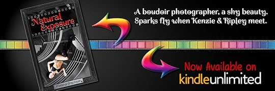
Hello world!
I haven't kept up with my blog as I have wanted to. Back in May of 2020, I decided I was going to really go full steam with this blog and tell you all the juicy tidbits about my books, and like a dufus, I posted every. single. day. of the month. I got burnt out, FAST. SMH. I really REALLY wish I hadn't done that. Did I think I had the amount of stuff to talk about to do it? Sure. Did I want to take the time to do so every. single. day? No - not really.
So, let's try again. This time - once a week. That should be MUCH better, don't you think? It will be for me for sure and maybe (hopefully) it'll build up a little bit of a following here. I know I have Twitter - but I really hate Twitter. I set up an Instagram too.
These things aren't me because I talk WAY too much for them. With my blog, I can ramble all that I want without stupid character limits. And so, I shall. It'll be up to you on if you want to read or not.
So, be on the lookout for more things to come. I may repeat a few of my better earlier posts, to get more people up to date. Do people go back and read old posts? (Would love to hear if you do or not.) I'm doubting it so hopefully no one will mind a few reused posts.
As for my books, Natural Exposure will only remain on Kindle Unlimited for the next MONTH. It comes off of it Feb 5th, so if you'd like to read it for FREE, jump on that.
I'd hope KU would work for me and while I have seen a good amount of pages read - it's no where near the amount of books I sell. It just hasn't been worth it to me. I'd consider extending it, or bringing it back if I had a more steady readership - so if you get your friends to start reading - maybe it'll stay. :)
The THIRD book in my novelette companion series - Bijou Basin Book Bites is in the hands of Beta readers and I'm aiming for a 2/14/22 release. You can pre-order on Amazon now, as well as add it to your Goodreads list. Clicking on the cover below will take you to Amazon, and the blurb is listed below that.
That's it for me for now. Hope your 2022 is starting off to a good start.

The Blurb:
In the six months since Kenzie and Jarrett began An Exploration of BDSM, they've learned a lot about themselves. They continue to grow as a couple and as their D/s evolves from a bedroom-only kink, to a 24/7 lifestyle.
With their one year anniversary approaching, Jarrett sets up a surprise for Kenzie. She has several items on her 'really want to experience' list, and he's more than willing to give her what she yearns for with A Double Dose of BDSM.
My Books
Natural Exposure on Amazon - FREE on Kindle Unlimited
Natural Exposure on Goodreads
Negative Exposure on Amazon
Negative Exposure on Smashwords
Negative Exposure on Goodreads
Elemental Exposure on Amazon
Elemental Exposure on Smashwords
Elemental Exposure on Goodreads
A Discovery of BDSM on Amazon
A Discovery of BDSM on Smashwords
A Discovery of BDSM on Goodreads
An Exploration of BDSM on Amazon
An Exploration of BDSM on Smashwords
An Exploration of BDSM on Goodreads
December 18, 2021
Sales, Sales, More Sales & a New Release
*|MC:SUBJECT|* p{ margin:10px 0; padding:0; } table{ border-collapse:collapse; } h1,h2,h3,h4,h5,h6{ display:block; margin:0; padding:0; } img,a img{ border:0; height:auto; outline:none; text-decoration:none; } body,#bodyTable,#bodyCell{ height:100%; margin:0; padding:0; width:100%; } .mcnPreviewText{ display:none !important; } #outlook a{ padding:0; } img{ -ms-interpolation-mode:bicubic; } table{ mso-table-lspace:0pt; mso-table-rspace:0pt; } .ReadMsgBody{ width:100%; } .ExternalClass{ width:100%; } p,a,li,td,blockquote{ mso-line-height-rule:exactly; } a[href^=tel],a[href^=sms]{ color:inherit; cursor:default; text-decoration:none; } p,a,li,td,body,table,blockquote{ -ms-text-size-adjust:100%; -webkit-text-size-adjust:100%; } .ExternalClass,.ExternalClass p,.ExternalClass td,.ExternalClass div,.ExternalClass span,.ExternalClass font{ line-height:100%; } a[x-apple-data-detectors]{ color:inherit !important; text-decoration:none !important; font-size:inherit !important; font-family:inherit !important; font-weight:inherit !important; line-height:inherit !important; } #bodyCell{ padding:10px; } .templateContainer{ max-width:600px !important; } a.mcnButton{ display:block; } .mcnImage,.mcnRetinaImage{ vertical-align:bottom; } .mcnTextContent{ word-break:break-word; } .mcnTextContent img{ height:auto !important; } .mcnDividerBlock{ table-layout:fixed !important; } body,#bodyTable{ background-color:#FAFAFA; } #bodyCell{ border-top:0; } .templateContainer{ border:0; } h1{ color:#202020; font-family:Helvetica; font-size:26px; font-style:normal; font-weight:bold; line-height:125%; letter-spacing:normal; text-align:left; } h2{ color:#202020; font-family:Helvetica; font-size:22px; font-style:normal; font-weight:bold; line-height:125%; letter-spacing:normal; text-align:left; } h3{ color:#202020; font-family:Helvetica; font-size:20px; font-style:normal; font-weight:bold; line-height:125%; letter-spacing:normal; text-align:left; } h4{ color:#202020; font-family:Helvetica; font-size:18px; font-style:normal; font-weight:bold; line-height:125%; letter-spacing:normal; text-align:left; } #templatePreheader{ background-color:#FAFAFA; background-image:none; background-repeat:no-repeat; background-position:center; background-size:cover; border-top:0; border-bottom:0; padding-top:9px; padding-bottom:9px; } #templatePreheader .mcnTextContent,#templatePreheader .mcnTextContent p{ color:#656565; font-family:Helvetica; font-size:12px; line-height:150%; text-align:left; } #templatePreheader .mcnTextContent a,#templatePreheader .mcnTextContent p a{ color:#656565; font-weight:normal; text-decoration:underline; } #templateHeader{ background-color:#FFFFFF; background-image:none; background-repeat:no-repeat; background-position:center; background-size:cover; border-top:0; border-bottom:0; padding-top:9px; padding-bottom:0; } #templateHeader .mcnTextContent,#templateHeader .mcnTextContent p{ color:#202020; font-family:Helvetica; font-size:16px; line-height:150%; text-align:left; } #templateHeader .mcnTextContent a,#templateHeader .mcnTextContent p a{ color:#007C89; font-weight:normal; text-decoration:underline; } #templateBody{ background-color:#FFFFFF; background-image:none; background-repeat:no-repeat; background-position:center; background-size:cover; border-top:0; border-bottom:2px solid #EAEAEA; padding-top:0; padding-bottom:9px; } #templateBody .mcnTextContent,#templateBody .mcnTextContent p{ color:#202020; font-family:Helvetica; font-size:16px; line-height:150%; text-align:left; } #templateBody .mcnTextContent a,#templateBody .mcnTextContent p a{ color:#007C89; font-weight:normal; text-decoration:underline; } #templateFooter{ background-color:#FAFAFA; background-image:none; background-repeat:no-repeat; background-position:center; background-size:cover; border-top:0; border-bottom:0; padding-top:9px; padding-bottom:9px; } #templateFooter .mcnTextContent,#templateFooter .mcnTextContent p{ color:#656565; font-family:Helvetica; font-size:12px; line-height:150%; text-align:center; } #templateFooter .mcnTextContent a,#templateFooter .mcnTextContent p a{ color:#656565; font-weight:normal; text-decoration:underline; } @media only screen and (min-width:768px){ .templateContainer{ width:600px !important; } } @media only screen and (max-width: 480px){ body,table,td,p,a,li,blockquote{ -webkit-text-size-adjust:none !important; } } @media only screen and (max-width: 480px){ body{ width:100% !important; min-width:100% !important; } } @media only screen and (max-width: 480px){ .mcnRetinaImage{ max-width:100% !important; } } @media only screen and (max-width: 480px){ .mcnImage{ width:100% !important; } } @media only screen and (max-width: 480px){ .mcnCartContainer,.mcnCaptionTopContent,.mcnRecContentContainer,.mcnCaptionBottomContent,.mcnTextContentContainer,.mcnBoxedTextContentContainer,.mcnImageGroupContentContainer,.mcnCaptionLeftTextContentContainer,.mcnCaptionRightTextContentContainer,.mcnCaptionLeftImageContentContainer,.mcnCaptionRightImageContentContainer,.mcnImageCardLeftTextContentContainer,.mcnImageCardRightTextContentContainer,.mcnImageCardLeftImageContentContainer,.mcnImageCardRightImageContentContainer{ max-width:100% !important; width:100% !important; } } @media only screen and (max-width: 480px){ .mcnBoxedTextContentContainer{ min-width:100% !important; } } @media only screen and (max-width: 480px){ .mcnImageGroupContent{ padding:9px !important; } } @media only screen and (max-width: 480px){ .mcnCaptionLeftContentOuter .mcnTextContent,.mcnCaptionRightContentOuter .mcnTextContent{ padding-top:9px !important; } } @media only screen and (max-width: 480px){ .mcnImageCardTopImageContent,.mcnCaptionBottomContent:last-child .mcnCaptionBottomImageContent,.mcnCaptionBlockInner .mcnCaptionTopContent:last-child .mcnTextContent{ padding-top:18px !important; } } @media only screen and (max-width: 480px){ .mcnImageCardBottomImageContent{ padding-bottom:9px !important; } } @media only screen and (max-width: 480px){ .mcnImageGroupBlockInner{ padding-top:0 !important; padding-bottom:0 !important; } } @media only screen and (max-width: 480px){ .mcnImageGroupBlockOuter{ padding-top:9px !important; padding-bottom:9px !important; } } @media only screen and (max-width: 480px){ .mcnTextContent,.mcnBoxedTextContentColumn{ padding-right:18px !important; padding-left:18px !important; } } @media only screen and (max-width: 480px){ .mcnImageCardLeftImageContent,.mcnImageCardRightImageContent{ padding-right:18px !important; padding-bottom:0 !important; padding-left:18px !important; } } @media only screen and (max-width: 480px){ .mcpreview-image-uploader{ display:none !important; width:100% !important; } } @media only screen and (max-width: 480px){ h1{ font-size:22px !important; line-height:125% !important; } } @media only screen and (max-width: 480px){ h2{ font-size:20px !important; line-height:125% !important; } } @media only screen and (max-width: 480px){ h3{ font-size:18px !important; line-height:125% !important; } } @media only screen and (max-width: 480px){ h4{ font-size:16px !important; line-height:150% !important; } } @media only screen and (max-width: 480px){ .mcnBoxedTextContentContainer .mcnTextContent,.mcnBoxedTextContentContainer .mcnTextContent p{ font-size:14px !important; line-height:150% !important; } } @media only screen and (max-width: 480px){ #templatePreheader{ display:block !important; } } @media only screen and (max-width: 480px){ #templatePreheader .mcnTextContent,#templatePreheader .mcnTextContent p{ font-size:14px !important; line-height:150% !important; } } @media only screen and (max-width: 480px){ #templateHeader .mcnTextContent,#templateHeader .mcnTextContent p{ font-size:16px !important; line-height:150% !important; } } @media only screen and (max-width: 480px){ #templateBody .mcnTextContent,#templateBody .mcnTextContent p{ font-size:16px !important; line-height:150% !important; } } @media only screen and (max-width: 480px){ #templateFooter .mcnTextContent,#templateFooter .mcnTextContent p{ font-size:14px !important; line-height:150% !important; } } *|MC_PREVIEW_TEXT|* View this email in your browser
Welcome to the Bijou Bugle Newsletter! So glad you've subscribed. Natural Exposure FREE on Kindle Unlimited!
CLICK HERE for the Elemental Exposure Pre-Order
End of the year means SALES for you - a chance for you to pick up my books for the first time, or grab another one at a discounted price! Here's what sales I have going on -
12/17 - 1/1 -- Smashwords Sale:
FREE - A Discovery of BDSM - FREE
An Exploration of BDSM - $0.99 (75% off)
Negative Exposure (Bijou Basin #2) - $3.99 (50% off)
12/26 - 12/30 -- IHeartLesfic $0.99 Sale:
Natural Exposure (Bijou Basin #1) - $0.99 (80% off) (also available on KU)
12/27 - Elemental Exposure releases:
Available now for pre-order!
This will be the only newsletter with the sales. For further updates and reminders, visit my blog or my Twitter.
What's next for me? While ideas percolate for Book 4, I'm taking a bit of a break from the series and working on two other projects, though one has stepped in front of the other for now.
I had hoped to get back to my NaNo2020 project - a 'Mystery set on a cruise ship with secrets of it's own' but I'm a bit stumped on parts of it at the moment. If anyone is good at brainstorming and wants to read a partial draft and help me move it forward - get in touch.
In the meantime, I'm re-writing my NaNo2021 project. It's a Sapphic Road Trip psychological thriller and it's going well, though I hope it has enough thriller in it.
----------
If you read any of my books, I would be grateful for some reviews as they have stalled out a bit for me. Reviews are everything for an author, even if it's simply a star rating.
-----
Don't forget about Natural Exposure being FREE on Kindle Unlimited. Will only remain on Kindle Unlimited through February.
 Reading - The Kaiju Preservation Society by John ScalziRecently completed - Critical Mass by Craig AlansonWatching - Steelers Football Campaign 3 of Critical Role ARCANE!!! (2nd and not last re-watch)Playing - Hearthstone
Elemental Exposure Chapter 1 Sneak Peek
CLICK HERE for the Elemental Exposure Pre-Order
Reading - The Kaiju Preservation Society by John ScalziRecently completed - Critical Mass by Craig AlansonWatching - Steelers Football Campaign 3 of Critical Role ARCANE!!! (2nd and not last re-watch)Playing - Hearthstone
Elemental Exposure Chapter 1 Sneak Peek
CLICK HERE for the Elemental Exposure Pre-Order“What’s wrong, Ripley? You’ve been quiet the entire evening.” I pause the movie, shifting positions on the couch until I face her. She won’t meet my gaze, so I brush a strand that’s fallen from her braid over her ear and tug on her chin until her bright green eyes settle on mine.
It’s our regular Sunday get-together. When she arrived, I noticed something was off, but I asked, and she assured me all was well, so I dropped it. As the night continued, Jarrett and I could tell her mind wasn’t on the movie, remaining elsewhere. We watched half of The Secret Life of Pets 2, but when another funny part didn’t elicit a giggle from her — I knew I couldn’t bite my tongue any longer. She hasn’t been engaging as usual, wholly unlike her.
“It’s… it’s nothing,” she says.
He and I exchange glances. She’s leaning against him but not cuddling, free arm resting limply in her lap. Something is wrong, and it’s time to resort to old tactics.
“Do you want to stop seeing us?”
“What?” Her head whips my way. “No, of course not.” She stares at me, aghast, which makes me laugh, and she cracks the slightest hint of a smile. “Stop that, Kenzie. You only do that when you want to get a reaction out of me.”
“Well, yeah,” I admit without shame. “At least now you’re looking at me, and I saw that grin.” She tries resisting, but laughs.
“You can tell us anything. Surely you know that,” Jarrett says.
“I do. It’s…” She huffs in apparent agitation, sitting up and away from him, fixing her gaze on her hands, twisting in her lap. “Neither of you have brought it up, so I wasn’t sure what to do. I don’t want to be the stupid, terrified northerner.”
“Terrified northerner? What… Oh…” A light bulb goes off. “Are you worried about the hurricane, Ripley?” She responds with a jerky head nod, biting her lip. “Damn, I’m sorry. I didn’t think.” I take her hands in mine and rub out the tension that seizes them. “You should have said something.”
“I… Well, I assumed one of you might, but it’s been business as usual. You hadn’t mentioned it. So I thought I was being ridiculous and hesitated bringing it up, in case I worried about nothing, even though I’ve been freaking out. But now…”
Now the track tightens for Hurricane Esel, and the latest projections show the storm coming across the state. In the prior days, the path was erratic, but as it nears the shore, the cone shrinks and solidifies. We’re inland, but we could still experience serious weather, as we have during past storms.
I didn’t realize she might be fearful, and it makes me feel terrible. I should have been more sensitive concerning her shifting moods.
“It is business as usual for us,” Jarrett says, “since hurricane forecasts are notoriously all over the place. That doesn’t imply we haven’t kept an eye on it. We’re used to it, and won’t prepare until if, and when, the path remains steady. Even if it’s projected to hit here head on, the coast slows it and could divert it completely, so we’ll have ample warning.”
“And if it does, reach the town? I mean, what will you do? What do I need to do? Why aren’t you more wigged out?” Ripley’s voice starts as a whisper and rises in pitch; she’s freaked.
“Hey, hey,” I croon. “Come here.” She hesitates, but shifts and lays against me, still rigid, but closer. “Do you know of the 2004 storms?” At the shake of her head, I continue, “That year, three hurricanes came through the center of the state, with each intersecting in Polk, the county below us. The eyes of each were less than fifty miles from here.”
“And that was a bunch?”
“A damn bunch. It was a crazy season, and they did major damage everywhere.”
“Here? Did you have any problems?”
“We weren’t here yet, moved here in 2009,” Jarrett says, “but the house was here, minus the additions we made, and there was no studio. We’re told that there was a hole in the spare bedroom’s ceiling, so the roof needed replacing, and there were downed trees, but that was the extent of the damage. Minor, considering.”
“Where did you live then? Was your place damaged?”
“We were in Minneola. We had a screened-in pool, which sloshed water everywhere like crazy,” I say with a chuckle, recalling the insanity of a year. “The screen was in shambles from a tree limb that fell, tearing through it. We replaced it, but the house itself held up well.”
Ripley’s eyes widen as I relay the destruction. “And… you weren’t frightened?”
“I was during the first one, Charley. It came the closest, caused the most damage, and barreled through during the night. When they hit overnight, I get… apprehensive. I dislike not knowing what’s happening. If it’s daylight, and I’m able to watch the effects of the wind and rain, I’m not too scared.”
“Were you?” Ripley asks Jarrett, peering at him. I can virtually see the wheels of his mind turning as he considers his answer.
“Nah,” he says. “I grew up here, in Polk County; they’re second nature to me. Been through many, though I’ve always lived inland, so there never have been huge issues. Saw our fair share of damage, sure, but not the magnitude that they receive on the coast.”
A good response, as she’s spooked. In truth, he loves them. Extreme weather never bothers him and he enjoys the gamut: hurricanes, tornadoes, thunderstorms; they fascinate him. He’ll watch for hours as mother nature throws a tantrum. CLICK HERE for the Elemental Exposure Pre-Order If you'd like to review my books (on Amazon and/or Goodreads, along with any other retailer or book site) then please contact me at KorianaBrackson@gmail.com with the subject title "Review" for a free copy of my first book, Natural Exposure.
Please give a little detail in the body of the email (no emails with review in the title and nothing else - that's not really the type of interaction I like) such as what format (mobi / epub / ect) you'd like and when you'd hope to read it by.
If you'd like to chat about books, games, or anything else, feel free to message me. I enjoy meaningful interactions with my readers! My books are now sold at most major retailers!
Natural Exposure Amazon (Currently FREE on Kindle Unlimited) A Discovery of BDSM Amazon Smashwords Barnes & Noble Kobo Google Play
Negative Exposure Amazon Smashwords An Exploration of BDSM Amazon Smashwords Elemental Exposure Amazon Smashwords
Need scents for your home? Help out my friend Kim's new endevor and try out Pink Zebra today!  Copyright © *|CURRENT_YEAR|* *|LIST:COMPANY|*, All rights reserved.
*|IFNOT:ARCHIVE_PAGE|* *|LIST:DESCRIPTION|*
Our mailing address is:
*|HTML:LIST_ADDRESS_HTML|* *|END:IF|*
Want to change how you receive these emails?
You can update your preferences or unsubscribe from this list.
*|IF:REWARDS|* *|HTML:REWARDS|* *|END:IF|*
My Books
Natural Exposure on Amazon - FREE on Kindle Unlimited
Natural Exposure on Goodreads
Negative Exposure on Amazon
Negative Exposure on Smashwords
Negative Exposure on Goodreads
Elemental Exposure on Amazon
Elemental Exposure on Smashwords (coming soon)
Elemental Exposure on Goodreads
A Discovery of BDSM on Amazon
A Discovery of BDSM on Smashwords
A Discovery of BDSM on Goodreads
An Exploration of BDSM on Amazon
An Exploration of BDSM on Smashwords
An Exploration of BDSM on Goodreads
The Erotic Writer's Planner
December 3, 2021
Elemental Exposure Pre-Order Now LIVE!
*|MC:SUBJECT|* p{ margin:10px 0; padding:0; } table{ border-collapse:collapse; } h1,h2,h3,h4,h5,h6{ display:block; margin:0; padding:0; } img,a img{ border:0; height:auto; outline:none; text-decoration:none; } body,#bodyTable,#bodyCell{ height:100%; margin:0; padding:0; width:100%; } .mcnPreviewText{ display:none !important; } #outlook a{ padding:0; } img{ -ms-interpolation-mode:bicubic; } table{ mso-table-lspace:0pt; mso-table-rspace:0pt; } .ReadMsgBody{ width:100%; } .ExternalClass{ width:100%; } p,a,li,td,blockquote{ mso-line-height-rule:exactly; } a[href^=tel],a[href^=sms]{ color:inherit; cursor:default; text-decoration:none; } p,a,li,td,body,table,blockquote{ -ms-text-size-adjust:100%; -webkit-text-size-adjust:100%; } .ExternalClass,.ExternalClass p,.ExternalClass td,.ExternalClass div,.ExternalClass span,.ExternalClass font{ line-height:100%; } a[x-apple-data-detectors]{ color:inherit !important; text-decoration:none !important; font-size:inherit !important; font-family:inherit !important; font-weight:inherit !important; line-height:inherit !important; } #bodyCell{ padding:10px; } .templateContainer{ max-width:600px !important; } a.mcnButton{ display:block; } .mcnImage,.mcnRetinaImage{ vertical-align:bottom; } .mcnTextContent{ word-break:break-word; } .mcnTextContent img{ height:auto !important; } .mcnDividerBlock{ table-layout:fixed !important; } body,#bodyTable{ background-color:#FAFAFA; } #bodyCell{ border-top:0; } .templateContainer{ border:0; } h1{ color:#202020; font-family:Helvetica; font-size:26px; font-style:normal; font-weight:bold; line-height:125%; letter-spacing:normal; text-align:left; } h2{ color:#202020; font-family:Helvetica; font-size:22px; font-style:normal; font-weight:bold; line-height:125%; letter-spacing:normal; text-align:left; } h3{ color:#202020; font-family:Helvetica; font-size:20px; font-style:normal; font-weight:bold; line-height:125%; letter-spacing:normal; text-align:left; } h4{ color:#202020; font-family:Helvetica; font-size:18px; font-style:normal; font-weight:bold; line-height:125%; letter-spacing:normal; text-align:left; } #templatePreheader{ background-color:#FAFAFA; background-image:none; background-repeat:no-repeat; background-position:center; background-size:cover; border-top:0; border-bottom:0; padding-top:9px; padding-bottom:9px; } #templatePreheader .mcnTextContent,#templatePreheader .mcnTextContent p{ color:#656565; font-family:Helvetica; font-size:12px; line-height:150%; text-align:left; } #templatePreheader .mcnTextContent a,#templatePreheader .mcnTextContent p a{ color:#656565; font-weight:normal; text-decoration:underline; } #templateHeader{ background-color:#FFFFFF; background-image:none; background-repeat:no-repeat; background-position:center; background-size:cover; border-top:0; border-bottom:0; padding-top:9px; padding-bottom:0; } #templateHeader .mcnTextContent,#templateHeader .mcnTextContent p{ color:#202020; font-family:Helvetica; font-size:16px; line-height:150%; text-align:left; } #templateHeader .mcnTextContent a,#templateHeader .mcnTextContent p a{ color:#007C89; font-weight:normal; text-decoration:underline; } #templateBody{ background-color:#FFFFFF; background-image:none; background-repeat:no-repeat; background-position:center; background-size:cover; border-top:0; border-bottom:2px solid #EAEAEA; padding-top:0; padding-bottom:9px; } #templateBody .mcnTextContent,#templateBody .mcnTextContent p{ color:#202020; font-family:Helvetica; font-size:16px; line-height:150%; text-align:left; } #templateBody .mcnTextContent a,#templateBody .mcnTextContent p a{ color:#007C89; font-weight:normal; text-decoration:underline; } #templateFooter{ background-color:#FAFAFA; background-image:none; background-repeat:no-repeat; background-position:center; background-size:cover; border-top:0; border-bottom:0; padding-top:9px; padding-bottom:9px; } #templateFooter .mcnTextContent,#templateFooter .mcnTextContent p{ color:#656565; font-family:Helvetica; font-size:12px; line-height:150%; text-align:center; } #templateFooter .mcnTextContent a,#templateFooter .mcnTextContent p a{ color:#656565; font-weight:normal; text-decoration:underline; } @media only screen and (min-width:768px){ .templateContainer{ width:600px !important; } } @media only screen and (max-width: 480px){ body,table,td,p,a,li,blockquote{ -webkit-text-size-adjust:none !important; } } @media only screen and (max-width: 480px){ body{ width:100% !important; min-width:100% !important; } } @media only screen and (max-width: 480px){ .mcnRetinaImage{ max-width:100% !important; } } @media only screen and (max-width: 480px){ .mcnImage{ width:100% !important; } } @media only screen and (max-width: 480px){ .mcnCartContainer,.mcnCaptionTopContent,.mcnRecContentContainer,.mcnCaptionBottomContent,.mcnTextContentContainer,.mcnBoxedTextContentContainer,.mcnImageGroupContentContainer,.mcnCaptionLeftTextContentContainer,.mcnCaptionRightTextContentContainer,.mcnCaptionLeftImageContentContainer,.mcnCaptionRightImageContentContainer,.mcnImageCardLeftTextContentContainer,.mcnImageCardRightTextContentContainer,.mcnImageCardLeftImageContentContainer,.mcnImageCardRightImageContentContainer{ max-width:100% !important; width:100% !important; } } @media only screen and (max-width: 480px){ .mcnBoxedTextContentContainer{ min-width:100% !important; } } @media only screen and (max-width: 480px){ .mcnImageGroupContent{ padding:9px !important; } } @media only screen and (max-width: 480px){ .mcnCaptionLeftContentOuter .mcnTextContent,.mcnCaptionRightContentOuter .mcnTextContent{ padding-top:9px !important; } } @media only screen and (max-width: 480px){ .mcnImageCardTopImageContent,.mcnCaptionBottomContent:last-child .mcnCaptionBottomImageContent,.mcnCaptionBlockInner .mcnCaptionTopContent:last-child .mcnTextContent{ padding-top:18px !important; } } @media only screen and (max-width: 480px){ .mcnImageCardBottomImageContent{ padding-bottom:9px !important; } } @media only screen and (max-width: 480px){ .mcnImageGroupBlockInner{ padding-top:0 !important; padding-bottom:0 !important; } } @media only screen and (max-width: 480px){ .mcnImageGroupBlockOuter{ padding-top:9px !important; padding-bottom:9px !important; } } @media only screen and (max-width: 480px){ .mcnTextContent,.mcnBoxedTextContentColumn{ padding-right:18px !important; padding-left:18px !important; } } @media only screen and (max-width: 480px){ .mcnImageCardLeftImageContent,.mcnImageCardRightImageContent{ padding-right:18px !important; padding-bottom:0 !important; padding-left:18px !important; } } @media only screen and (max-width: 480px){ .mcpreview-image-uploader{ display:none !important; width:100% !important; } } @media only screen and (max-width: 480px){ h1{ font-size:22px !important; line-height:125% !important; } } @media only screen and (max-width: 480px){ h2{ font-size:20px !important; line-height:125% !important; } } @media only screen and (max-width: 480px){ h3{ font-size:18px !important; line-height:125% !important; } } @media only screen and (max-width: 480px){ h4{ font-size:16px !important; line-height:150% !important; } } @media only screen and (max-width: 480px){ .mcnBoxedTextContentContainer .mcnTextContent,.mcnBoxedTextContentContainer .mcnTextContent p{ font-size:14px !important; line-height:150% !important; } } @media only screen and (max-width: 480px){ #templatePreheader{ display:block !important; } } @media only screen and (max-width: 480px){ #templatePreheader .mcnTextContent,#templatePreheader .mcnTextContent p{ font-size:14px !important; line-height:150% !important; } } @media only screen and (max-width: 480px){ #templateHeader .mcnTextContent,#templateHeader .mcnTextContent p{ font-size:16px !important; line-height:150% !important; } } @media only screen and (max-width: 480px){ #templateBody .mcnTextContent,#templateBody .mcnTextContent p{ font-size:16px !important; line-height:150% !important; } } @media only screen and (max-width: 480px){ #templateFooter .mcnTextContent,#templateFooter .mcnTextContent p{ font-size:14px !important; line-height:150% !important; } } *|MC_PREVIEW_TEXT|* View this email in your browser
Welcome to the Bijou Bugle Newsletter! So glad you've subscribed. Natural Exposure FREE on Kindle Unlimited!
I'm glad to be able to say Elemental Exposure pre-order is now live on Amazon! Release set for Dec 27th. CLICK HERE for the Elemental Exposure Pre-Order
This one has been a long time in coming. I'd hoped it would be out mid-year but we had a crappy year this year (like many) and I don't push things when I'm not feeling them. I got some stuff done this year, but not all on Elemental Exposure and not all I wanted, but we've finally arrived nonetheless.
Elemental Exposure is still with two beta readers but I heard from them both and I should hear back soon. Other than final edits and tweaking of the last chapter - it's ready for you all. I'm excited for it to be out there.
After it's released, I plan on working on one of my non-erotic titles, probably my mystery. If that's your cup of tea, watch this newsletter when I mention that, because I'll likely only mention it once as it'll be a new pen name. We'll see what happens with it.
And, if you haven't yet read any of my books, my first, Natural Exposure, will be on SALE Dec 26 - 30th for $0.99! If you don't have Kindle Unlimited - it'll be the perfect time to snatch it and give it a try. CLICK HERE for the Elemental Exposure Pre-Order
----------
If you read any of my books, I would be grateful for some reviews as they have stalled out a bit for me. Reviews are everything for an author, even if it's simply a star rating.
-----
Don't forget about Natural Exposure being FREE on Kindle Unlimited. Will only remain on Kindle Unlimited through February.
Reading - Valkyrie by Craig AlansonRecently completed - Armageddon by Craig AlansonWatching - Steelers Football Campaign 3 of Critical Role Masked Singer Prodigy / Lower Decks Alice in BorderlandsPlaying - Jurassic World Evolution (again) Hearthstone
Elemental Exposure Chapter 1 Sneak Peek
CLICK HERE for the Elemental Exposure Pre-Order“What’s wrong, Ripley? You’ve been quiet the entire evening.” I pause the movie, shifting positions on the couch until I face her. She won’t meet my gaze, so I brush a strand that’s fallen from her braid over her ear and tug on her chin until her bright green eyes settle on mine.
It’s our regular Sunday get-together. When she arrived, I noticed something was off, but I asked, and she assured me all was well, so I dropped it. As the night continued, Jarrett and I could tell her mind wasn’t on the movie, remaining elsewhere. We watched half of The Secret Life of Pets 2, but when another funny part didn’t elicit a giggle from her — I knew I couldn’t bite my tongue any longer. She hasn’t been engaging as usual, wholly unlike her.
“It’s… it’s nothing,” she says.
He and I exchange glances. She’s leaning against him but not cuddling, free arm resting limply in her lap. Something is wrong, and it’s time to resort to old tactics.
“Do you want to stop seeing us?”
“What?” Her head whips my way. “No, of course not.” She stares at me, aghast, which makes me laugh, and she cracks the slightest hint of a smile. “Stop that, Kenzie. You only do that when you want to get a reaction out of me.”
“Well, yeah,” I admit without shame. “At least now you’re looking at me, and I saw that grin.” She tries resisting, but laughs.
“You can tell us anything. Surely you know that,” Jarrett says.
“I do. It’s…” She huffs in apparent agitation, sitting up and away from him, fixing her gaze on her hands, twisting in her lap. “Neither of you have brought it up, so I wasn’t sure what to do. I don’t want to be the stupid, terrified northerner.”
“Terrified northerner? What… Oh…” A light bulb goes off. “Are you worried about the hurricane, Ripley?” She responds with a jerky head nod, biting her lip. “Damn, I’m sorry. I didn’t think.” I take her hands in mine and rub out the tension that seizes them. “You should have said something.”
“I… Well, I assumed one of you might, but it’s been business as usual. You hadn’t mentioned it. So I thought I was being ridiculous and hesitated bringing it up, in case I worried about nothing, even though I’ve been freaking out. But now…”
Now the track tightens for Hurricane Esel, and the latest projections show the storm coming across the state. In the prior days, the path was erratic, but as it nears the shore, the cone shrinks and solidifies. We’re inland, but we could still experience serious weather, as we have during past storms.
I didn’t realize she might be fearful, and it makes me feel terrible. I should have been more sensitive concerning her shifting moods.
“It is business as usual for us,” Jarrett says, “since hurricane forecasts are notoriously all over the place. That doesn’t imply we haven’t kept an eye on it. We’re used to it, and won’t prepare until if, and when, the path remains steady. Even if it’s projected to hit here head on, the coast slows it and could divert it completely, so we’ll have ample warning.”
“And if it does, reach the town? I mean, what will you do? What do I need to do? Why aren’t you more wigged out?” Ripley’s voice starts as a whisper and rises in pitch; she’s freaked.
“Hey, hey,” I croon. “Come here.” She hesitates, but shifts and lays against me, still rigid, but closer. “Do you know of the 2004 storms?” At the shake of her head, I continue, “That year, three hurricanes came through the center of the state, with each intersecting in Polk, the county below us. The eyes of each were less than fifty miles from here.”
“And that was a bunch?”
“A damn bunch. It was a crazy season, and they did major damage everywhere.”
“Here? Did you have any problems?”
“We weren’t here yet, moved here in 2009,” Jarrett says, “but the house was here, minus the additions we made, and there was no studio. We’re told that there was a hole in the spare bedroom’s ceiling, so the roof needed replacing, and there were downed trees, but that was the extent of the damage. Minor, considering.”
“Where did you live then? Was your place damaged?”
“We were in Minneola. We had a screened-in pool, which sloshed water everywhere like crazy,” I say with a chuckle, recalling the insanity of a year. “The screen was in shambles from a tree limb that fell, tearing through it. We replaced it, but the house itself held up well.”
Ripley’s eyes widen as I relay the destruction. “And… you weren’t frightened?”
“I was during the first one, Charley. It came the closest, caused the most damage, and barreled through during the night. When they hit overnight, I get… apprehensive. I dislike not knowing what’s happening. If it’s daylight, and I’m able to watch the effects of the wind and rain, I’m not too scared.”
“Were you?” Ripley asks Jarrett, peering at him. I can virtually see the wheels of his mind turning as he considers his answer.
“Nah,” he says. “I grew up here, in Polk County; they’re second nature to me. Been through many, though I’ve always lived inland, so there never have been huge issues. Saw our fair share of damage, sure, but not the magnitude that they receive on the coast.”
A good response, as she’s spooked. In truth, he loves them. Extreme weather never bothers him and he enjoys the gamut: hurricanes, tornadoes, thunderstorms; they fascinate him. He’ll watch for hours as mother nature throws a tantrum. CLICK HERE for the Elemental Exposure Pre-Order If you'd like to review my books (on Amazon and/or Goodreads, along with any other retailer or book site) then please contact me at KorianaBrackson@gmail.com with the subject title "Review" for a free copy of my first book, Natural Exposure.
Please give a little detail in the body of the email (no emails with review in the title and nothing else - that's not really the type of interaction I like) such as what format (mobi / epub / ect) you'd like and when you'd hope to read it by.
If you'd like to chat about books, games, or anything else, feel free to message me. I enjoy meaningful interactions with my readers! My books are now sold at most major retailers!
Natural Exposure Amazon (Currently FREE on Kindle Unlimited) A Discovery of BDSM Amazon Smashwords Barnes & Noble Kobo Google Play
Negative Exposure Amazon Smashwords An Exploration of BDSM Amazon Smashwords Elemental Exposure Amazon Smashwords (coming soon)
Need scents for your home? Help out my friend Kim's new endevor and try out Pink Zebra today!  Now on Sale - 50% off. With blank months, use any time of the year, or for your novels!
An Erotic Writer’s Planner for the Erotic Writer by an Erotic Writer.
Designed for writers, this planner has the staples of a normal planner, such as habit trackers, yearly and monthly goals, two-page calendar spreads and more.
For the writer, it contains pages for tracking Beta and ARC readers, project planning, word counts and more.
And to appeal to the visual minded, the planner features nude photos and drawings. Like your own erotic works, this planner is not safe for work.
**Female Edition** --- Note: This planner features nude images of females, both drawn and photos. No discernible faces with breasts and buttocks shown.
Copyright © *|CURRENT_YEAR|* *|LIST:COMPANY|*, All rights reserved.*|IFNOT:ARCHIVE_PAGE|* *|LIST:DESCRIPTION|*
Our mailing address is:
*|HTML:LIST_ADDRESS_HTML|* *|END:IF|*
Want to change how you receive these emails?
You can update your preferences or unsubscribe from this list.
*|IF:REWARDS|* *|HTML:REWARDS|* *|END:IF|*
My Books
Natural Exposure on Amazon - FREE on Kindle Unlimited
Natural Exposure on Goodreads
Negative Exposure on Amazon
Negative Exposure on Smashwords
Negative Exposure on Goodreads
Elemental Exposure on Amazon
Elemental Exposure on Smashwords (coming soon)
Elemental Exposure on Goodreads
A Discovery of BDSM on Amazon
A Discovery of BDSM on Smashwords
A Discovery of BDSM on Goodreads
An Exploration of BDSM on Amazon
An Exploration of BDSM on Smashwords
An Exploration of BDSM on Goodreads
The Erotic Writer's Planner


