
Emily Henderson's Blog, page 230
February 13, 2020
The 7 Ways I Use Social Media to Help My Career While Doing Less Harm To My Depression & Anxiety


I am an editor of a blog run by a social media influencer, which may be the most LA career choice there is. If you’ve been around here for a while (and if not – welcome!) you know that my boss is not just an influencer. No. She also happens to be a super talented interior designer, writer, and CEO. But because of the wild west world that is digital media, “influencer” is a new word that can also accurately describe what Emily does.
In case you are wondering, being an editor of a blog that is run by an influencer means that my job is often social media focused, even though I don’t work on the social media team directly. We’re a small business and that means everyone wears multiple hats, so social media is on everyone’s brains. It is a marketing tool that is highly important and effective for our business. So, my job and career as a whole benefit from being on social media and understanding how to capitalize on its potential.
But it’s not that simple. As someone who suffers from depression and anxiety, I am hyper-aware of how social media affects my mental health. At its worse, it promotes junk values and blind consumerism, as well as perpetuates a facade of authenticity that leads to unrealistic comparisons and severe loneliness. At its best, it’s an outlet for connection, creativity, and self-expression (though probably not connection, creativity, or self-expression in their most pure, honest form). It is hard to find the sweet spot between enjoying social media and avoiding its harmful effects.
So, back in October, I decided to take a break. Or more accurately, I needed to take a break. I’d heard and read about people doing 30-day social fasts and they all preached how life-changing it is. In general, I find that kind of hyperbolic language annoying but I knew I needed to get out of this constant rut of self-loathing. I was starting to get exhausted by my relationship with these apps and was generally just feeling really bad a lot of the time, so instead of rolling my eyes at the notion, I decided to try it. I imagined quitting social media for a month would be hard, something similar to quitting caffeine or going on a diet-things I’ve tried to do in the past but failed considerably fast. Due to the addictive nature of social media, I thought I might fail at this too.
But I didn’t. I stayed off the apps for 30 days (actually, 32 to be exact), just like I promised I would. I haven’t received my award yet, but I am sure it’ll be coming in the mail any day now. Honestly, I was surprised by how easy it was (besides being out of the loop as it relates to my job). It turns out the “out of sight out of mind” concept really does work. Once I deleted the apps off my phone, a week into my little hiatus the mindless impulse to grab my phone and open an app nearly disappeared. If I did grab my phone out of habit, it would only take a few seconds to realize that there was nothing to look at, so I’d put the phone down and continue with whatever I was doing. Not surprisingly, by the second week, my screen time went from an average of 4.5 hours a day to less than 2 hours. By the third week, my screen time was down to an hour a day, sometimes less. I don’t have to tell you that my productivity increased significantly.
Overall the experience was more constructive and illuminating than I thought it would be, but a permanent social media fast is not a cure nor is it realistic for the world I work in. So what now? Well, if it’s alright with you I’d like to share what has worked for me in terms of enjoying and gaining something positive from these apps now that I am back in this wild social media world. Let’s get to it.

Be Mindful of Who You Follow
I have found so much relief when I unfollow people whose content does not serve me in a positive way. If I am going to be on social media, it only makes sense to create a space where I’ll see the things I want/care to see – things that will educate me, inspire me, or give me joy. Good people to unfollow are models that contribute to a negative personal body image, people you no longer talk to or haven’t seen in over 10 years, and anyone/account that makes you feel less than in any way. Another helpful way to sensor your feed is by using the mute feature. Maybe someone you know posts a little too much about their vacations and overall “perfect” life, but you don’t want to or feel like you can unfollow. They won’t know you muted their posts and you will not miss their content. Everybody wins.
Set Boundaries
When I returned to social I made a rule to set alarms when I do go on it, so I don’t get lost in a mindless scroll. I also promised to not check my phone when I am eating dinner or watching TV or movies. And lastly, as a good rule of thumb, I don’t allow social media to be the last thing I see before I fall asleep or the first thing I put in front of my face when I wake up. But I will be honest. I am a flawed human being and have not been great at sticking to these boundaries. I sometimes forget and sometimes ignore the rules knowingly. But I am trying! And when I do adhere to these rules I feel better.
“Like” More.
I consider it extending a “thank you” to the person who posted. It gives them acknowledgment and support and makes me feel good, too. In the past, I had this awful habit before where I would bookmark a post but not actually “like” it. At one point I realized I was doing that as if I was hoarding my likes and it felt so gross. Why shouldn’t I give that person credit if I am enjoying their posts? They likely put a good amount of thought and effort into it, so giving them that “hey, I see you and I like what you’ve done here” is just good social media ethics. I also engage in general more, in ways that feel positive. I comment and respond to IG stories even to people I don’t know personally and this has helped me make connections with people I would otherwise never speak to. One time I responded to a girl who works at Manrepeller and we had such a nice little convo AND she followed me back. It was great.
An Emotional Check-In with Yourself Yields The Best Results
I suffer from depression and anxiety, but I know that even those who don’t also have a hard time navigating the negativity that circles around social media. I have found that when I feeling particularly down or out of sorts, going on social media is like jumping in shark-infested waters with a gaping bloody wound. It feels like I am drowning whilst being attacked by happy people clinking glasses and enjoying a life that is WAY more fulfilled that my own. That is generally the story we tell ourselves when we are not at our best, but it is widely inaccurate and harmful. Just allowing yourself to step away when harmful thoughts creep in is majorly effective.
Pay Attention to Your Intentions
Before this experiment, I was not in control of my impulses. There was an impulse to both mindlessly consume content and post the “best” aspects of my life. Not only was I not sure why I was engaging on it so much, but I also was unsure what my motives were for posting. Was I posting for me or was I posting to show some version of myself that I think others will like? Most often it was the latter.
Using and posting anything on social media is going to come with a sliver of vanity because it is designed to make us crave more entertainment and seek out validation. I believe it is completely acceptable to post a great photo of yourself just because you like the way you look, and it is also completely acceptable not to post photos of yourself at all. Knowing that you can post what you want but not allowing other’s opinions to be the reason you post is extremely valuable. Now, when I simply ask myself why I am posting just to check in with my emotions and intentions, it makes all the difference. In short, when I am more mindful I am less of a millenial-social-media-fueled-robot. I am more me.
Make Social Media Work For You
There is a reason being an influencer can be a fulltime job. Whether we agree with it or not, social media is a part of our lives and for a lot of people, it is a part of our careers. I like writing and telling stories and sharing my human experience. I’d love this to be what I do forever, and social media can help me continue doing so even if it isn’t my career. It’s a creative outlet and also, a great place to network. It is not unusual or strange to slide into your hero’s DM’s or hit that follow button and who knows, in doing so you may end up working with that person someday. You can think of your profile as if it is a portfolio you’d present at a job interview if that suits you. It is your profile, make it work for you.
Create Your Own Narrative
I believe that social media is what you make it. Why should we willingly give a non-sentient networking platform so much power that it invades our psyche and harms our point of view? It isn’t always easy, but it is something we can strive towards. With mindfulness and exercising general kindness to ourselves and others, I think it is possible for social media to be educational, fun, illuminating, thoughtful, hilarious, inspiring, and good. For me, social media now more than ever reminds me of the world I want to help create and be apart of, who I want to be, and what art I want to create. It is what I make it.
As always, I’d love to hear your thoughts on all of this and if you have any helpful tips for creating a positive digital world, please do tell. xx
The post The 7 Ways I Use Social Media to Help My Career While Doing Less Harm To My Depression & Anxiety appeared first on Emily Henderson.


February 11, 2020
Our Bedroom Update (Also How I Feel About Having A TV In The Bedroom)

It’s been 3 years since we moved into this room and of all the rooms in the house, this one has changed the least. Same bed, nightstands, lighting, dresser, rug, and window treatments. But as we were shooting an IGTV on how to make a bed, we realized that there were enough changes to shoot a little update post (plus there is one new friend in the room that a lot of you have been asking about).
That’s right, we put a TV in the bedroom. We know that the bedroom should be for sleep and sex, as told to us by many a self-help article. But here’s the deal, we don’t really have a TV in the house besides the projection screen in the living room and while it’s easier than you’d think to operate, sometimes it just feels super weird to be by yourself in a room at night with a massive projection of say, Chris Harrison. What must the neighbors think? Brian is gone a lot at night performing in plays and I just want to be able to put the kids to bed, cozy up, write and pin while watching something meaningless. FYI that’s literally how I started this blog and truly how I work best – it makes it feel like fun to be able to do it while watching something with a glass of wine. So not having a TV was truly affecting my career (which was my plea to Brian).
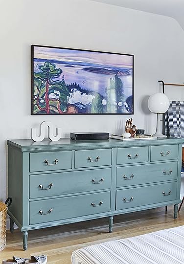
After much convincing (and a heated debate on social media) I convinced Brian to let me do it. Let me be very clear, if we had a TV room or literally any other room or wall that we could put a TV in the house we would have done that instead. But we don’t, and I’m alone 3-4 nights a week when Brian is in a play so it only seemed fair to have some company.
We bought The Frame because a couple of years ago I worked as its spokesperson, and I kinda can’t go back to a normal TV (it’s that good). No, I didn’t get it for free (although I tried). I have yet to download/purchase some of my favorite art so you are getting some Gustav Klimt 
February 10, 2020
Are We Done With Gray? We Explore + A “How Do You Pick The “Right” Gray Paint” Tutorial

 photo by bethany nauert | from: fdr chic – a dude’s mix of antique, mid-century and bohemian style
Here’s what happened. The ’90s were a blur of beige. That particular “beige” had a yellow undertone and when mixed with the other ’90s elements of shabby chic and faux finishes it was bad. After that we as a people were ready for a big shift, a rejection really of that warm and dated tone. So 2000 rolled around and we celebrated a new millennium by ushering in a decade (if not more) of “gray”. For whatever reason, we considered this neutral more “modern,” “fresh,” and “masculine” (this was also a decade that valued “masculine” and “feminine” differently – bu-bye).
In an attempt to be more sophisticated I started painting everything gray. I even wrote a whole post about it, with an oddly entertaining reference to Ryan Gosling. I didn’t take a ton of great photos back then but I found a few.
For the pilot episode of Secrets From A Stylist, I chose this gray grasscloth for (and the cheapest gray wall to wall carpet ever) and it was cold in every way.
 from: before & after of glee creator’s ian brennan’s comfy tv room
After the show, we switched out to this warm camel color which we still love 10 years later.
 photo by bethany nauert | from: before & after of glee creator’s ian brennan’s comfy tv room
 photo by bethany nauert | from: before & after of glee creator’s ian brennan’s comfy tv room
Again on Secrets, I painted this dark room gray…
 from: ’70s funky elegance
  from: ’70s funky elegance
By mixing it with hot pink (Woah, those roses – can you say ROMANCE?) and brass it was actually kinda great and trust me if it had been white it would have been so flat – that room had very very little natural light (read about how to avoid that big mistake here). If I could go back in time I probably would select a powdery blue paint for that plaster or just a warmer, lighter gray.
But I wasn’t all wrong. Ten years ago I painted Gray Owl in Ian’s living room and still love it.
photo by bethany nauert | from: fdr chic – a dude’s mix of antique, mid-century and bohemian styleWe painted my friend Scott’s bedroom Pavilion Gray and we still love it.
 photo by tessa neustadt | from: master bedroom refresh with parachute home
Again, with Gray Owl in the bedroom, and again I still love it.
 photo by bjorn wallander | from:
 Our bedroom in LA is painted Ammonite (a warm gray) and I LOVE it.
photo by bethany nauert | from: fdr chic – a dude’s mix of antique, mid-century and bohemian styleSo what makes one gray depressing and another gray like a big hug?? How do you choose the right gray paint?
We aren’t done exploring…
A few years ago, Brady wrote a whole post about his “Choosing the Perfect Gray’ journey and he tried out 12 different paint colors on swatches before painting his living room.
 from: brady picks a gray paint
He selected Pavilion Gray (same as Scott’s bedroom) with the help of our audience and in photos, it looked beautiful.
 photo by zeke ruelas | from: brady’s living room reveal
He thought he chose the right one… but after he lived with it he realized it was actually dark and depressing in his space – although it looked so pretty in photos. He painted it to Super White (and also switched out the sofa and his “garbage” chairs – his words – that were literally falling apart).
 photo by sara ligorria-tramp | from: brady’s living room refresh with the citizenry
Now a good gray, like a good ANYTHING will always be in style. This isn’t a declaration, we aren’t announcing the demise of one of our only true neutrals. So what’s my problem?
It’s so easy to go too “cold” and a cool gray can indeed feel depressing. When I was designing the one of my best pieces of advice from locals is don’t paint anything gray. There is already enough up there. The same goes for the English who want happier colors that can also be moody, but not gray (or grey in the UK).
Here’s how to choose a good gray paint color:
Look at the overall color tone of the whole paint strip to help determine what the undertone of the color is. Then make sure you like that undertone color. It might be blue, gray, purple, brown – this will indicate more of what it will feel like.
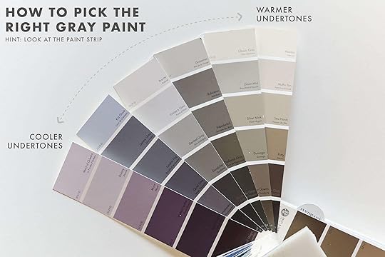
Go for a warmer undertone if you want it to feel like a hug. It’s easy to go too beige and thus create taupe or what some might call “greige,” so we’ve rounded up our favorites below:

Modern Gray | 2. Ammonite | 3. Gray Owl | 4. Pale Oak | 5. Pediment | 6. Soapstone | 7. Skyline | 8. Heron Plume | 9. Pavillion Gray
Please paint a piece of paper and live with it on multiple walls throughout the day (like Brady did). Every paint color reacts differently based on your natural light (or lack thereof).
Know that even if you go slightly blue, it will look blue. The amount of times I’ve tried to choose the perfect “blueish gray” is embarrassing, only to end up with baby – mother-effing – blue. We are on the hunt for the perfect blue/gray right now so stay tuned for that when we find it.
The other colors in the room can shift your gray. It can either pull out more warm or cool tones OR it can contrast it and push it in another direction. I wish I went to design school and had more of a solid color theory scientific answer for you, but sometimes something will reflect on the walls and shift it entirely which is frustrating.
 photo by sara liggoria-tramp | from: the new (luxury) bed in a bag with brooklinen
So, in conclusion, are we done with gray???? NO, but we are certainly only using it where it’s actually appropriate and recognizing that it’s not for every room or every location. It became a go-to that we went to too often. The ’00s ushered in a decade of white walls and we are similarily questioning that popularity. Both can be great neutrals and great backgrounds for any style, and we will always use and highlight our favorites. But like anything, we are being more purposeful and asking ourselves “WHY?” before selecting any color.
So those are my current thoughts and feelings about gray. I would love to know yours (and please recommend other grays in the comments – I’ve only used what I’ve used and we too need more recommendations).
The post Are We Done With Gray? We Explore + A “How Do You Pick The “Right” Gray Paint” Tutorial appeared first on Emily Henderson.
February 9, 2020
The Link Up: The $30 Pants Sara Immediately Bought Two Of, Mallory’s Blonde Hair Secret, & The New Bench We All Love
 design by jake alexander arnold | photo by trevor tondro | via elle decor
Hello friends and welcome back. If you are experiencing the Sunday scaries, we hear you and we hope this little link up can give you a little relief. Let’s get to it:
First things first. We NEED to talk about Sophia Bush’s new home that was designed by one of our favorites, Jake Alexander Arnold. It’s neutral but full of texture and her office is a must-see…go please, go now.
Speaking of home tours, Emily’s friend, Victoria (aka SFgirlbybay), just revealed her wonderful new home in Laguna Beach. It’s eclectic and full of soul…just like her. So do yourself a favor a check out her oceanside oasis.
From Veronica: If you’re a hot sleeper (even in those winter months) like me, you know how hard it is to find a comforter that’s equal parts cool and warm. So, here I am to ask you guys — has anyone here tried a Buffy comforter or duvet? I’ve been looking into them for months now, so please leave a comment below if you have any advice on them or other brands!!
It’s no secret Team EHD loooves using black to add a dramatic punch to a room. Julie was particularly inspired by these ideas from Article. She’s designing a secret new space and has fallen hard for this amazing bench. It’s got the perfect balance of drama and airiness. Consider it a little sneak peek from her to you:)
Jess’ new favorite lifestyle site (with serious substance) is Cinnamon Mag. One of their current favorite pieces was a feature on designer, Carlos Anthony Lopez. Despite Jess dining in almost every one of Carlos’ projects, she didn’t know the man behind the genius and loved getting an inside look on his story. FYI Bar Caló is a must-see and must-drink if you are in LA:)
Caitlin is OBSESSED with the new Pieces Home by An Aesthetic Pursuit home tour. Her favorite part is the lavender modular sofa paired with the tufted coffee table.
From Mallory: For all my blondies out there that want their hair to look brighter, lighter, and less orange/brassy, THIS is the shampoo to use.
From Sara: “This podcast titled 1619 and produced by the New York Times, is an intensely illuminating education on how the introduction of slavery to America in 1619 has shaped every facet of our modern American lives. There are only 6 episodes, and each one is riveting and packs a better racial history education than all my American history classes ever.”
Sara also wore two versions of the same pant this week, and now we’re pretty convinced we need them too (Julie already bought a pair). She says they’re the perfect way to try out the wide leg pant trend – they’ve got a structured high waist that’s flattering, they’re made of thick material that helps hide wrinkles or folds from tucked-in shirts, and come in a great selection of colors. Oh, and they’re from Target and only $30. She has both the rust color and the pinstripe versions.
Ryann recently bought this pullover in off white and she is so happy with it. It is so simple yet well made and surprisingly goes with a lot of her outfits. 10/10!
There you have it. We hope you have a lovely Sunday and don’t forget to come back tomorrow. xx
The post The Link Up: The $30 Pants Sara Immediately Bought Two Of, Mallory’s Blonde Hair Secret, & The New Bench We All Love appeared first on Emily Henderson.
February 8, 2020
What Guys Really Want For Valentine’s Day – We Asked 9 Men In Relationships
 photo by sara ligorria-tramp | from: prioritizing your partner – in design and life
In the name of journalistic research, we asked the men in our lives what they really want for Valentine’s Day (beyond the obvious – see yesterday’s post). I will be referencing this blog post for years to come. Brian, my brother Ken, my friend Derik (Dbone! He happens to have an album literally called “Man” that is awesome by the way – listen at happy hour to get PUMPED) weighed in. As well as Sara’s Mac, Mallory’s Chase, and even Jess’ Dad. Basically we have a wide age range. So ladies, here you go.

1. Concert Tickets: “Tickets to a concert of a band we both like.” – Brian
2. Something that tells them you really know them: “I feel like once you’re in a relationship for a couple of years, at least for me, what I love in a Valentine’s Day gift is a nod that you realllllyyyy know that person. You know what interests them in a book, their favorite color of wrapping paper, the types of clothes they like to wear, what they casually mention is sweet. I love getting a little surprise that reminds me, ‘ya this person gets me’.” – Chase (This is a book he LOVED and is perfect for anyone who loved the show Breaking Bad.)
3. An Engraved Zippo: “After my dad passed away I kept his and I cherish it.” – Derik
4. Picnic Backpack: My brother Ken wanted to make sure that we put this on here. And it’s not a basket, it’s a BACKpack, thus for “MEN”. *insert eye roll, but also very into the idea of Ken planning a picnic*
5. Record Player + records: It can really be personalized and it’s cute to give them their fav record. Then you can be romantic and listen to your record over a candlelit dinner. I a record player for Brian for Christmas and we love it. Mac is also a big, big fan of the record player (an anniversary gift from Sara).
6. Surprise Dinner: “It would be nice to be taken out to a surprise dinner (or cooked a special dinner) and not have to plan one. I feel like I do most of the research/booking.” – Brian (Ok Brian, I’ve been publicly shamed now, but I got you).
7. A note in their lunch, or in a pocket on the way out of the door: Technically no man said this, we added it because it’s likely something we’d like. Ha. We had to get one in there and these are so cute
February 7, 2020
10 Ways To “Enhance” Your Romance In The Bedroom: From Us (And Our Friends And Partners)…Anonymously
 image source
Welcome to our first anonymously written post, mostly because our partners made us promise. We’ve toyed with doing this at EHD as a way to keep our privacy (and privacy of our partners/family/friends) while being able to dive into what we really talk about in the office. Valentine’s Day is approaching and most of us don’t want diamonds, all we really want is a way to connect more. You know, to feel in love with our partner. And a side of butterflies wouldn’t hurt. Rumor has it that sex can get stale. It can even start to feel like an obligation, another box to check, after years of marriage and especially after having kids. But intimacy is SO important, and sex is how a lot of couples feel that intimacy. So in addition to the usual “For Him/For Her” gift guide (stay tuned), this year we’ve crowdsourced from all the women we know (and some men) ways/ideas/products to help bring some romance back, excite us a bit, and to help us “connect” more with our partners in the bedroom. Life is long so why not put some effort in and keep having some fun.
*Please note that these are direct quotes from our ANONYMOUS friends and selves about stuff they/we LOVE and have worked for them/us. Everyone will be anonymous, mostly to save partners from embarrassment from their moms who likely read this blog.
**And a warning – While we think these suggestions are about getting romantic, connecting and having fun in healthy consensual relationships, we also suggest that Emily’s parents (or those that might feel uncomfortable talking about sex) stop reading right here.
February 6, 2020
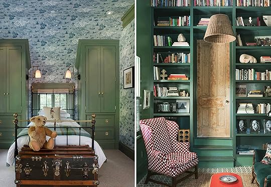
New (Old) “Trend” Alert – “The Eccentric English Grandma” and How I’m Going To Use It in Our Home
 design by katharine howard | via living etc
It was 7:30 am on a Sunday morning. I waited to make the announcement until Brian was fully pacified by a cup of coffee, had two news articles under his belt, and the kids properly fed and watching cartoons. I started out with, “Brian, I need to tell you something”.
Brian: “Uh-huh?”
Me: “I think we need a floral sofa.” (pause) “A floral sofa would solve all my problems.”
Brian: “Uh…HUH…”
 design by g.p. schafer architect and rita konig | via coco kelly
I’m not going to bore you with our relationship history because it’s fraught and tedious, but we have been fighting since day one stylistically and I’ve never walked in and said: “Hell, yes.” Just to be clear, I’m talking about the relationship between me and my living room (not Brian). I previously thought that I went too traditional in this 100-year-old house, and have been trying to pull myself back ever since. Now realize that I didn’t go far enough. If I really want to channel my inner “Eccentric English Grandma” (and I do) then I need to get far more eclectic and odd. This is not the Grandmillenial trend that has been popping up – although I will always regret that I didn’t come up with that term myself. It’s cooler than that, weirder, and yet more modern (no offense to all you millennial grandmas (??)).
So what is “Eccentric English Grandma?” Well, it’s super eclectic, very collected, full of stories – some safe, some inappropriate. There is an “I don’t care because I’m on my way out” vibe about it, which you could also interpret as brave, risky, and full of confidence. It does not look “designed,” only lived in and loved. I picture her just a touch senile, with a dirty martini in her hand, perhaps some sort of old Hollywood headpiece, and head to toe in patterned clothes. She freely tells us about her affair with Wes Anderson (a younger man! Grandma!) and maybe she has tons of cash hidden around the house. But she’s a little old world too – she loves a floral print, she’s always ready to put the kettle on and share some well earned life experience, and her shelves are stuffed with souvenirs from decades of travel. My friends love her, and my kids can’t wait to visit her because surely she will tell them something they are far too young to hear.
She’s cool.
So how do you define such uniqueness? I am going to try. Let’s break down the elements of what I’m calling a new/old trend – “Eccentric English Grandma”.
Mixing Multiple Patterned Furniture Pieces
 design by soane britain & duro olowu | photo by alexander james | via t magazine
You walk into her home and you are excited because the lady is either colorblind or BRAVE. She mixes so many patterns and has zero rules. But despite it seeming like she is patterning with reckless abandon, she does have some tricks up her sleeves. Let’s dive into what they are.
Delicate Prints
 design by nicola harding | photo by paul massey | via architectural digest
While she isn’t opposed to bolder graphic patterns, she is pretty into the smaller, more delicate patterns and prints. Small prints are back and it’s been a while. Since the ’80s I’d say (perhaps since her heyday).
 design by nick olsen | photo by thomas loof | via house beautiful
Just because they are delicate doesn’t mean she uses them delicately. She repeats the SAME pattern while mixing in others. If you like something, why not love it even more?
So Many Florals
 design by heidi caillier design | photo by haris kenjar photography
 While delicate prints and patterns are king, florals are the crowned jewels. And it feels about time (if you ask grandma and me). Finally, florals are having a modern moment in furniture, and I want more, and more, and more. Who would have guessed this would be THE trend of 2020? Granda could have.
 design by g.p. schafer architect and rita konig | via coco kelly
Here the designers played with mixing floral scales in the same color palette. It keeps your eye happy and interested. EEG (Eccentric English Grandma) APPROVED.
 design by reath design | photo by laure joliet
This is true modern floral perfection. So now what we have our prints locked down, let’s move on. Grab your martini.
Decorative Lampshades
Whether pleated, fabric, patterned or tapered, she uses lampshades as an opportunity to add some serious texture, dimension, color, and pattern. She always says, “lampshades are like the rug of the face”. Oh, Grandma. That is utter nonsense. Let’s see if we can decode what she’s talking about, yes?
Pleated Shades
 design by beata heuman
I’m ordering one of these right now. Pleated shades had a breakout moment last year, but now they are a 2020 staple. Bu-bye drum and hello seemingly unnecessary, decorative shade. Remember when minimalism was so big like two years ago? HA.
 left: design by brandon schubert | photo by paul massey | via house & garden | right: design by hay
They evoke feelings of yesterday and yet are so stunningly fresh and modern. Ok, next up…
Patterned Fabric Shades
 design by g.p. schafer architect and rita konig | via cafe design
 It takes bravery to go so old world with a patterned fabric shade. But there is something so warm, inviting, eclectic and just weird about it.
 design by ash nyc, nathalie jordi, & studiowta | photo by alex yeske
I want to be in that room so badly. I feel happier just looking at it. Gingham on gingham, guys. Gingham. On. Gingham.
 design by ellen niven | photo by simon watson | via house beautiful
While I’m not yet into monogramming pillows, I sure do like the Wes Anderson vibe of the headboard/wall/lampshade fabric. Grandma would be very into this as it is a true design rule breaker. And she loves a hit of animal print. That’s probably where we divide.
Pleated and Patterned Fabric Shades
 left: design & photo by harding & read | right: design by heidi caillier design | photo by haris kenjar photography
Why not take both of these awesome looks and put them together. As grandma says, “more is more is best.” Grandma, how many martinis have you had and can I have one?
Ruffles/Fringe/Skirts
 design by beata heuman
Nobody here is shocked that I love a ruffled bed skirt (or a good couch skirt). Sure, the screamed simplicity with the architecture and neutral decor, but as a style polygamist this granny was screaming, “why so boring???” (FYI, I don’t think it’s boring, just a different vibe for the function of that house which is calm and relaxation. Shut it, grandma).
 design by suzanne demisch | photo by stephen kent johnson | via surface
A bed or couch skirt is innately whimsical and I am highly considering one for the house. Can you guess which room??
Color: Via Painted Walls Or In The Furniture
 design by g.p. schafer architect and rita konig | via coco kelly
The all-white wall movement still works in the right space, but in an old house (specifically in a grayer climate like England, or say Portland) you want and need cozy and moody colors. The stimulation and mood-enhancing properties of said colors will change your day to day attitude. Plus, bold colors are so fun.
 left: image source | right: image source
Take these two rooms for example. They still would have been pretty if the cabinetry and walls were white but with the green they are serious showstoppers.
 design by pappas miron | photo by david land | via architectural digest
Now, it’s no secret that I love red, and it’s not going away. It’s my full-time job right now to try to find the right room to paint red in my house. Perhaps the kid’s room door and trim? Half wall? It’s an absolute burst of energy and bravery… right, grandma?
 design by robert kime | photo by simon upton | via house & garden
Colorful walls, check. Now it’s time to top off those drinks and get into my last EEG topic…
Antique Frames For Art
 design by heidi caillier design | photo by haris kenjar photography
While I love the simple grid of art and all matching frames, for the right place, the antique frames and seemingly randomness of the art certainly makes it feel forever lived in. Also, please note the plaid sofa with a ruffle skirt. Also please note the white walls with the gray trim just like Sara did and wrote about this week. Ok, let’s look at more awesome vintage frames.
 design & photo by anna haines
You can go for the same colored vintage frame like those gold-gilded guys in the photos above. OR you can mix and match frame materials, frame widths and obviously sizes. Also, always be sure to mix up the types of art. Use photos, drawings, paintings, etc. Grandma would NOT approve of the “one medium” look.
 left: design by g.p. schafer architect and rita konig | via coco kelly | right: design by heidi caillier design | photo by haris kenjar photography
Now that you have all the info of where I am headed (design-wise) I have a fun fact about me that I haven’t told you (I don’t think). My great Aunt Flossy moved in with us when I was 8, she was 88 years old. My parents barely knew her but we were the only relatives she had. She lived through the great depression, served in World War 1 and 2 as a nurse, went to college and taught elementary school for decades, never having kids herself. By the time she came to us, she had Alzheimer’s, a lot of facial hair, and spit on the floor all day. At the time I was a child, then a teenager, so my understanding of her life was immature at best. She lived with us until she was 101 YEARS OLD. I had already left for college. She wasn’t the eccentric grandma that I’m writing about today, but she had stories. She didn’t care what other people thought. She lived far more, worked far harder, and endured far more than my muse today. I would have liked to know her before she had Alzheimer’s. And while I don’t think she cared about decor (she was more into hoarding away every penny in case of emergency), this is for her. I see you now, Aunt Flossy and I’ve started telling my kids the story of your life. I’m grateful for your strange but now positive impact on my life.
SO. Like I said this is the direction we are going and I want your thoughts.
Are you into this wacky, eccentric English grandma (Aunt Flossy?)… I’m headed fast and hard into this for our 100-year-old English Tudor. It feels so good to be SO excited again about this living room, and honesty the whole house. Expect an English accent in my insta stories soon…
The post New (Old) “Trend” Alert – “The Eccentric English Grandma” and How I’m Going To Use It in Our Home appeared first on Emily Henderson.
New (Old) “Trend” Alert – “The Eccentric (And Perhaps Senile) English Grandma” and How I’m Going To Use It in Our Home
design by katharine howard | via living etcIt was 7:30 am on a Sunday morning. I waited to make the announcement until Brian was fully pacified by a cup of coffee, had two news articles under his belt, and the kids properly fed and watching cartoons. I started out with, “Brian, I need to tell you something”.
Brian: “Uh-huh?”
Me: “I think we need a floral sofa.” (pause) “A floral sofa would solve all my problems.”
Brian: “Uh…HUH…”
design by g.p. schafer architect and rita konig | via coco kellyI’m not going to bore you with our relationship history because it’s fraught and tedious, but we have been fighting since day one stylistically and I’ve never walked in and said: “Hell, yes.” Just to be clear, I’m talking about the relationship between me and my living room (not Brian). I previously thought that I went too traditional in this 100-year-old house, and have been trying to pull myself back ever since. Now realize that I didn’t go far enough. If I really want to channel my inner “Eccentric English Grandma” (and I do) then I need to get far more eclectic and odd. This is not the Grandmillenial trend that has been popping up – although I will always regret that I didn’t come up with that term myself. It’s cooler than that, weirder, and yet more modern (no offense to all you millennial grandmas (??)).
So what is “Eccentric English Grandma?” Well, it’s super eclectic, very collected, full of stories – some safe, some inappropriate. There is an “I don’t care because I’m on my way out” vibe about it, which you could also interpret as brave, risky, and full of confidence. It does not look “designed,” only lived in and loved. I picture her just a touch senile, with a dirty martini in her hand, perhaps some sort of old Hollywood headpiece, and head to toe in patterned clothes. She freely tells us about her affair with Wes Anderson (a younger man! Grandma!) and maybe she has tons of cash hidden around the house. But she’s a little old world too – she loves a floral print, she’s always ready to put the kettle on and share some well earned life experience, and her shelves are stuffed with souvenirs from decades of travel. My friends love her, and my kids can’t wait to visit her because surely she will tell them something they are far too young to hear.
She’s cool.
So how do you define such uniqueness? I am going to try. Let’s break down the elements of what I’m calling a new/old trend – “Eccentric English Grandma”.
Mixing Multiple Patterned Furniture Pieces
design by soane britain & duro olowu | photo by alexander james | via t magazineYou walk into her home and you are excited because the lady is either colorblind or BRAVE. She mixes so many patterns and has zero rules. But despite it seeming like she is patterning with reckless abandon, she does have some tricks up her sleeves. Let’s dive into what they are.
Delicate Prints
design by nicola harding | photo by paul massey | via architectural digestWhile she isn’t opposed to bolder graphic patterns, she is pretty into the smaller, more delicate patterns and prints. Small prints are back and it’s been a while. Since the ’80s I’d say (perhaps since her heyday).
design by nick olsen | photo by thomas loof | via house beautifulJust because they are delicate doesn’t mean she uses them delicately. She repeats the SAME pattern while mixing in others. If you like something, why not love it even more?
So Many Florals
design by heidi caillier design | photo by haris kenjar photography While delicate prints and patterns are king, florals are the crowned jewels. And it feels about time (if you ask grandma and me). Finally, florals are having a modern moment in furniture, and I want more, and more, and more. Who would have guessed this would be THE trend of 2020? Granda could have.
design by g.p. schafer architect and rita konig | via coco kellyHere the designers played with mixing floral scales in the same color palette. It keeps your eye happy and interested. EEG (Eccentric English Grandma) APPROVED.
design by reath design | photo by laure jolietThis is true modern floral perfection. So now what we have our prints locked down, let’s move on. Grab your martini.
Decorative Lampshades
Whether pleated, fabric, patterned or tapered, she uses lampshades as an opportunity to add some serious texture, dimension, color, and pattern. She always says, “lampshades are like the rug of the face”. Oh, Grandma. That is utter nonsense. Let’s see if we can decode what she’s talking about, yes?
Pleated Shades
design by beata heumanI’m ordering one of these right now. Pleated shades had a breakout moment last year, but now they are a 2020 staple. Bu-bye drum and hello seemingly unnecessary, decorative shade. Remember when minimalism was so big like two years ago? HA.
left: design by brandon schubert | photo by paul massey | via house & garden | right: design by hayThey evoke feelings of yesterday and yet are so stunningly fresh and modern. Ok, next up…
Patterned Fabric Shades
design by g.p. schafer architect and rita konig | via cafe design It takes bravery to go so old world with a patterned fabric shade. But there is something so warm, inviting, eclectic and just weird about it.
design by ash nyc, nathalie jordi, & studiowta | photo by alex yeskeI want to be in that room so badly. I feel happier just looking at it. Gingham on gingham, guys. Gingham. On. Gingham.
design by ellen niven | photo by simon watson | via house beautifulWhile I’m not yet into monogramming pillows, I sure do like the Wes Anderson vibe of the headboard/wall/lampshade fabric. Grandma would be very into this as it is a true design rule breaker. And she loves a hit of animal print. That’s probably where we divide.
Pleated and Patterned Fabric Shades
left: design & photo by harding & read | right: design by heidi caillier design | photo by haris kenjar photographyWhy not take both of these awesome looks and put them together. As grandma says, “more is more is best.” Grandma, how many martinis have you had and can I have one?
Ruffles/Fringe/Skirts
design by beata heumanNobody here is shocked that I love a ruffled bed skirt (or a good couch skirt). Sure, the screamed simplicity with the architecture and neutral decor, but as a style polygamist this granny was screaming, “why so boring???” (FYI, I don’t think it’s boring, just a different vibe for the function of that house which is calm and relaxation. Shut it, grandma).
design by suzanne demisch | photo by stephen kent johnson | via surfaceA bed or couch skirt is innately whimsical and I am highly considering one for the house. Can you guess which room??
Color: Via Painted Walls Or In The Furniture
design by g.p. schafer architect and rita konig | via coco kellyThe all-white wall movement still works in the right space, but in an old house (specifically in a grayer climate like England, or say Portland) you want and need cozy and moody colors. The stimulation and mood-enhancing properties of said colors will change your day to day attitude. Plus, bold colors are so fun.
left: image source | right: image sourceTake these two rooms for example. They still would have been pretty if the cabinetry and walls were white but with the green they are serious showstoppers.
design by pappas miron | photo by david land | via architectural digestNow, it’s no secret that I love red, and it’s not going away. It’s my full-time job right now to try to find the right room to paint red in my house. Perhaps the kid’s room door and trim? Half wall? It’s an absolute burst of energy and bravery… right, grandma?
design by robert kime | photo by simon upton | via house & gardenColorful walls, check. Now it’s time to top off those drinks and get into my last EEG topic…
Antique Frames For Art
design by heidi caillier design | photo by haris kenjar photographyWhile I love the simple grid of art and all matching frames, for the right place, the antique frames and seemingly randomness of the art certainly makes it feel forever lived in. Also, please note the plaid sofa with a ruffle skirt. Also please note the white walls with the gray trim just like Sara did and wrote about this week. Ok, let’s look at more awesome vintage frames.
design & photo by anna hainesYou can go for the same colored vintage frame like those gold-gilded guys in the photos above. OR you can mix and match frame materials, frame widths and obviously sizes. Also, always be sure to mix up the types of art. Use photos, drawings, paintings, etc. Grandma would NOT approve of the “one medium” look.
left: design by g.p. schafer architect and rita konig | via coco kelly | right: design by heidi caillier design | photo by haris kenjar photographyNow that you have all the info of where I am headed (design-wise) I have a fun fact about me that I haven’t told you (I don’t think). My great Aunt Flossy moved in with us when I was 8, she was 88 years old. My parents barely knew her but we were the only relatives she had. She lived through the great depression, served in World War 1 and 2 as a nurse, went to college and taught elementary school for decades, never having kids herself. By the time she came to us, she had Alzheimer’s, a lot of facial hair, and spit on the floor all day. At the time I was a child, then a teenager, so my understanding of her life was immature at best. She lived with us until she was 101 YEARS OLD. I had already left for college. She wasn’t the eccentric grandma that I’m writing about today, but she had stories. She didn’t care what other people thought. She lived far more, worked far harder, and endured far more than my muse today. I would have liked to know her before she had Alzheimer’s. And while I don’t think she cared about decor (she was more into hoarding away every penny in case of emergency), this is for her. I see you now, Aunt Flossy and I’ve started telling my kids the story of your life. I’m grateful for your strange but now positive impact on my life.
SO. Like I said this is the direction we are going and I want your thoughts.
Are you into this wacky, eccentric English grandma (Aunt Flossy?)… I’m headed fast and hard into this for our 100-year-old English Tudor. It feels so good to be SO excited again about this living room, and honesty the whole house. Expect an English accent in my insta stories soon…
The post New (Old) “Trend” Alert – “The Eccentric (And Perhaps Senile) English Grandma” and How I’m Going To Use It in Our Home appeared first on Emily Henderson.
February 4, 2020
Designing our Laundry “Room” + The 7 Things Our Contractor (and Plumber) Told Us To Consider
 image via delikatissen
WE’RE BAAAAAACK. Yes. Somehow we are not done with (that’s an inspo photo), and I want to celebrate its return with one of the more boring but useful rooms to talk about – the laundry closet. While I truly want to avoid spending one more penny or creating any more dust, it seems silly that we never finished the proper laundry closet. How are we living up there now you ask? With this cute little laundry closet on the bedroom/second floor (best decision I ever made – all sheets, clothes and most bath towels reside on this floor).

She is little, but it’s pretty great, thus the procrastination to put in the real one on the first floor. We rarely have more than one family up there at a time (it’s a rule) and well, being on that floor makes it SO easy. But a larger one is needed because we have nowhere to fold clothes and often just dump them on the floor, getting mixed in with the dirty clothes. Plus during the summer the beach towels do pile up (although our neighbors might tell you that we let them dry on the front porch railing, but we would NEVER do that. They are liars).
Currently, the first-floor laundry closet looks like this:
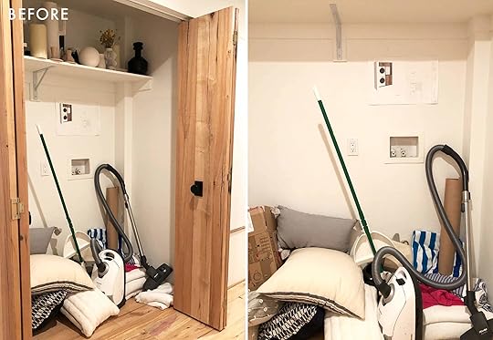
It’s pretty cool. And no, we don’t need the storage – we have a big garage. I just haven’t organized it because I don’t feel like it. Hot Tip – you can just shut the door on all your problems if you don’t want to look at them and they simply go away!
So there are some challenges that we have to deal with but nothing too annoying –
The hookups are a bit high which my contractor did intentionally to make them easy to access (smart) but of course we don’t want to have to see them and they are in prime backsplash position.
There is a bump-out on that side that makes it slightly challenging.
So we asked our contractor to help us give you guys some tips to avoid some sort of inevitable mistake. Here’s what he said:

Ok, that’s the technical stuff, let’s get back to laundry closet porn.
 image & design via tidbits
Laundry closets are already at a deficit, and it’s hard to compete with the (ideal) bigger and better laundry room. Generally, the needs are more storage for cleaning supplies, space to hang clothes, and a place for a laundry bin (duh). But also we want it to look good.
Here are some inspiration photos we went off of:
 image via magzhome
I love the access of the open shelving but fear the visual mess (so does Brian)…
 image via rengusuk
As we were designing this space we considered these seven design elements – consider these potential missed opportunities that you should implement if you can.
7 Laundry Room Design Elements to Consider:
– A place for laundry bins or a custom cabinet pull-out with a detachable canvas bag.
– A hanging rod or built-in drying rack.
– Surface to fold your laundry (question: does anybody actually fold clothes in their laundry closet?)
– Storage for all your laundry needs (ie. detergent, wool drying balls, bleach, etc.)
– A fold-down ironing board or somewhere it can tuck away.
– If you have a larger space consider a sink to pre-soak items.
– A good place for all those extra household items: broom, mop, step ladder, or cleaning supplies.
OK. Back to MY design.
We have three (fine, maybe four) different design options:
Option #1: Pull-Out Hamper and Detergent Rack

In this option, there is a pull-out hamper and a pull out “spice rack” style detergent drawer, with an awning cabinet on top. There is a counter for folding, although I know that we likely will do it in front of the TV. However, I really like the option to hopefully keep my clean and dirty clothes separate:)


I love this version the most, visually, but the problem is that you need a liner for the pull-out hamper because of wet clothes/towels, and that liner would need some sort of track to keep it in place. So as Julie and Velinda were working on this we realized that spending the money/time to customize the track seemed like an over-design. We could put in basically a plastic garbage can insert, which is something we are exploring, but again – is this necessary?? If anyone has any suggestions for this please let us know.
Option #2: Empty With Space to Put a Rolling Hamper

I really want “the laundry bin” to be easy to throw dishtowels and beach towels in. This seems like a potentially good option.
Option #3: Cabinets to Hide Rolling Basket

As I am writing this I’m realizing that if we put a cabinet front on it then it would look better, eliminate any visual chaos and still be easy to access. But look at all the valuable space under the actual bin. Not the best use of space, right? This leads me to my next option…
Option #4: Lower Cabinet with Two Shelves (With or Without a Door Front) & One Large Basket

Ok, I really like the added shelf to maximize the space. But the other thing to think about here is that the laundry closet already has pretty doors, so I’m adding another step of having to open cabinets in order to throw dirty clothes/towels in. Is that just silly? So while it would look better to have the cupboards, it’s technically not necessary. Brian is also concerned about the visual chaos and wants a lower cabinet door. I’m torn because it feels like it adds an unnecessary “extra step” to get to the bin and let’s be honest… it’s more expensive.
So here are my questions – many to those of you more experienced than we are with laundry closets:
Is this the best design for function? We could add more shelves of course, but then not have anywhere to hang clothes…
What is our general feeling of top-loading versus front loading? Our washer/dryer in LA is front loading, side by side and we have to keep the washer open to help it dry out so it doesn’t grow mold which I guess is typical of front loaders (also our plumber told us that we are ALL using far too much liquid detergent in. Once we cut it back to about 1/4 as much, it helped). This is why we did a stacking washer/dryer with a top-loading washer for our upstairs laundry closet. Please do tell…
What is your favorite brand of washer/dryer? We can also go smaller in size than this up there, which I’m tempted to do and then free up some more space for folding and storage. Do we NEED a big washer/dryer? I suppose not since we’ve lived with just that small one all summer. Thoughts?
Ok guys, let’s talk laundry.
The post Designing our Laundry “Room” + The 7 Things Our Contractor (and Plumber) Told Us To Consider appeared first on Emily Henderson.
February 3, 2020
The Painted Trim – High Impact, Low Cost (One Girl’s Journey + All The Tips & Tricks)
 photo by matthew williams | via country living
I’d never had to make a decisions about trim before in my life. At least, not until Mac and I bought our house. And to be totally honest, I had never really considered the trim in a room before. I’d painted a few apartment walls in the past, but I’d always taped off the trim. It’s just what I thought you did *shrugging emoji*. That all changed recently. Owning our own home meant we were finally able to do whatever we wanted, without being at the mercy of a landlord. Our ideas were only limited by our own determination to make them a reality (and I guess money, but BORING).
But as soon as the renovation got started in the front part of the house (before we had even moved in), it moved FAST. Like, having to make 1 million decisions every day fast. We only had about 5 weeks to get the house in good enough shape for us to move in, and we had decided to basically gut the place. Those days slipped by like too hot jello. Suddenly we were ready to paint the first rooms in the house (the living room, dining room, and front bedroom), and we had to make a decision real quick. SO… we went with white.

A lot of people had said to me “paint it white, live with it, see how you feel in a few months.” Which is good advice. And when my dad asked me what we were doing with the trim I quickly said “white, just the same thing all over… right?” White walls, white trim, white baseboards. I don’t regret it – those rooms feels so happy and bright. But once the initial renovation slowed down, we got to take time more time to think about how we wanted to rest of the house to look.
And we didn’t want the whole house to be white.
I started pinning all sorts of dark moody rooms. Maybe we’d do a black bathroom, with brass fixtures and green cabinets. A monochromatic gray kitchen, with lime washed walls and art ledges for vintage oil paintings. Or a deep navy library, with aged leather furniture and vintage sconces emitting a warm glow (a version of this is actually happening!!). Mac was on board, and even floated the idea of a dark accent wall in our master bedroom. I agreed and started pinning inspiration for that too. I’m a very decisive person. You don’t even have to use the (truly offensive) “gun to your head” metaphor with me. Just ask me a question and I’ll have an answer. And if I don’t know the answer, I’ll make one up on the spot. My decisions making process moves fast, and my fingers move faster often clicking “purchase,” “order,” or “send” before my emotions have a chance to even join the race.
But if I’m given too much time to think about something, I flip flop like a fish on a boat deck. I had done all this dark accent wall and moody room pinning way back in January of 2019 when we didn’t even have drywall up yet. The longer I had to think about it and the closer we got to actually painting, the more I nervous I got about my dark paint plans. Would it work in our home? I actually love a bright, airy room and the front part of our house was fine all white. Not to mention, our house is a bungalow craftsman. A style of home based on open floor plans, breezy airflow, and huge windows to let in all that California sunlight. It wasn’t a mysterious Victorian, begging for dramatic wallpaper and heavy drapes.
Finally, back at the start of January 2020, it was time to make some real decisions about how the TV room and master bedroom were going to look. I still really wanted to try something dark, but I was also sacred. I’m not a designer, so maybe making a super bold choice like an a dark room was a mistake. We compromised and decided to look for a dark-ish sage green to paint the TV room. But I was having all sorts of uncomfortable feelings about the dark accent wall I had agreed to in the master bedroom. In the end, I nixed the dark accent wall because it didn’t feel period to the home. Instead we talked about doing a medium gray all over. Secretly, I didn’t feel good about that either. If I was being really honest with myself, I didn’t want to wake up in dark room every day. I wanted to acquiesce badly, because I knew Mac didn’t want another white room. But something still didn’t sit right with me about the master bedroom, and so I was scouring Pinterest trying to understand what it was.
The more I stared at photos of rooms, the more I realized something about each room – the trim mattered. I was seeing that trim wasn’t just a “white” afterthought in a lot of the rooms I was pinning. The colors and treatments chosen for them were intentional and coordinated. It was kind of a breakthrough moment for me. A warm trim against white walls made a room feel traditional, a light wood trim gave off Scandi vibes, and a dark room with intentionally dark trim created drama.
That’s when the TV room went from being a dark-ish sage green to a dark, deep green. And the trim wasn’t going to stay white either. Nope, it was gonna follow the walls down this dark and twisted path.
 left to right: livingetc magazine | design: emily henderson, photo: tessa nuestadt | craftberry bush | mia ahlskog
Meanwhile, the idea of light grey walls with white trim felt like it hit a more traditional note in the bedroom that brought me a lot of comfort.
We ended up choosing Sherwin William’s Rookwood Shutter Green for the TV room (a dark, almost black, green). Then we picked Heron Plume for the walls of the master (a soft warm gray), and Greek Villa (a creamy, warm white) for the trim. I was feeling really confident about our decisions and was ready to get paint.
The day before picking up paint I had a spiral moment in the office. I had taped up all the paint chips on my office wall, and I was suddenly washed in doubt about the decision to go gray on the walls. I don’t know what it was, but it was messing with my peaceful bedroom vision. I begged Julie to come into my office and stare at the paint chips with me. “I don’t know if I’m making a mistake going with a darker tone on the wall in the bedrooms… I don’t know why, but it feels a little too traditional maybe?” And then, in all her Julie genius she simply said, “why don’t you swap them? White on the walls, grey on the trim.” I could suddenly breathe again. Then I remembered this photo from her own bedroom inspiration.
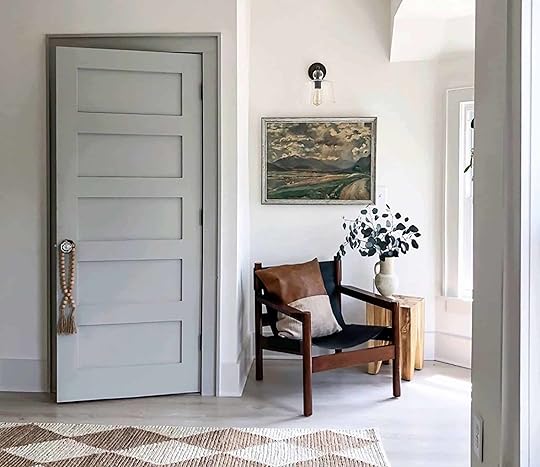 photo & design by i spy diy
It sealed the deal for me. A creamy white wall to catch all that warm morning light, and subtle grey trim and pocket doors to give the room a bit more “life” than going all white. Paint order placed, decision made.
The white went up in the bedroom and I loved it. Still do. (SO much, in fact, that we’ve repainted the entire living room and dining room the same white. I hadn’t truly been happy with the white color I’d originally chosen back in January of last year – it felt just a touch too cool and sterile. As soon as I saw Greek Villa up on the bedroom walls I made the, admittedly INSANE, decision to repaint the entire living room and dining room. Luckily it was white on white, and didn’t take more than two coats.)
But then the first coat of Heron Plume trim went up in the bedroom… and the doubt came back fast. It was subtle. And I mean, subtle. I had wanted a soft contrast, nothing black or bright, but I wanted SOME contrast. And it just wasn’t enough for me. Heron Plume is a beautiful color, but it wasn’t giving me enough when up against my new romance with Greek Villa. I knew that switching trim colors at this point was going to slow us down and put the renovation behind schedule, but I also knew this was my only chance to switch paint colors. I didn’t have time to go back to Sherwin Williams and get new samples, so I rummaged through the samples I already had (I had brought home PLENTY when we were trying to choose the gray for the wall). Luckily I had a sample of Modern Gray – a darker, but still soft and warm gray that someone on Instagram had suggested. I brushed it on one section of door frame and knew it was the right choice. I immediately ordered new trim paint, and haven’t looked back since.

I (very stupidly), didn’t take a photo of the Heron Plume up. But I photoshopped a before and after comparison that feels pretty accurate. See, SUBTLE.
My story is one of pure insanity, I know. When you’re project managing your own renovation you do tend to feel a little (lot) crazy. But my gut hesitation led to some very quick decisions, and I’m relieved I made a change. See below for a badly taken iPhone photo that makes me actually very, very happy.
And now I’m truly #teamtrim. Trim can be a great way to bring in a little contrast, color, or mood to a room without making the walls yell. Plus, taking a risk with your trim can be a budget-friendly way to refresh a space. You really only need about 1 gallon of paint to cover the trim of a large room, while you could go through 3-5 gallons to cover the walls of a large room. And there are lots of different trim options to choose from. I found so many different variations while I was going through my mid-renovation crisis.
All The Ways To Trim
The “Light On Light”
 left: photo by siobhan mcfadden | right: photo by amanda kirkpatrick, design by hendricks churchill, via society letters
First up, you’ve got your traditional light walls next to light trim. This is the route we went with for our master bedroom and I think it’s a pretty classic approach to trim. Think of this style as the “highlight” of the trim world. It’s gently enhancing your doors and windows, like a 13-year-old desprately putting lemon juice on their hair at summer camp because their mom refused to pay for real highlights at the salon.
The “Light Wall, Dark Trim”
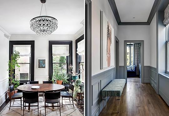 left: photo by jessica gylnn, design by blair harris, via hunker | right: design by cwb architects
Next is the style that still goes for a light wall color, but gets some serious contrast from a darker trim. If you want a modern, graphic pop, this could be the style for you. You don’t have to go clean white and dark black, but there’s clearly nothing wrong with that classic combo.
The “Dark Wall, Light Trim”
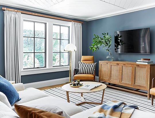 photo by sara ligorria-tramp | from: the ultimate family-friendly media room + wet bar
This is where I thought we were going in our TV room before we made a serious turn to dark and dramatic. It’s a nice way to add a touch of deep tone, without going full “dark side.” The light trim keeps things fresh and classic, while the walls do the major acting.
The “Light Monochrome”
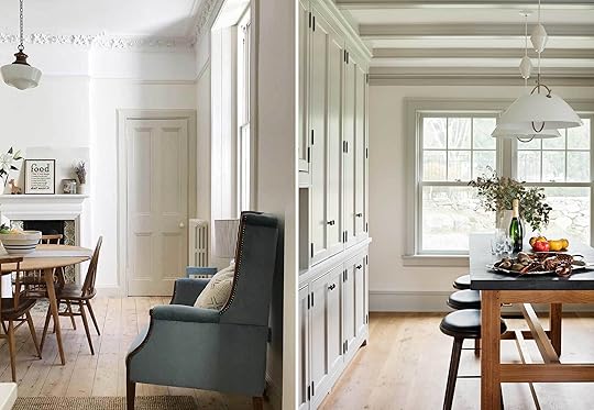
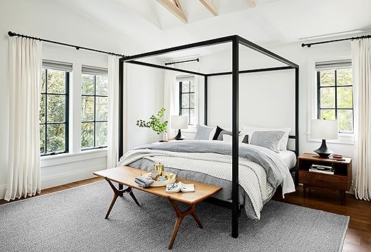 photo by sara ligorria-tramp | from: portland master bedroom reveal (and how to pull together your own dreamy suite
This is what we have going on in our living room and dining room, and I’m not mad at it. It’s an airy, light style that Em’s used several times (like in the Portland Master Bedroom). This is honestly the one style I see used most often, and it’s timeless.
The “Dark Monochrome”
 photo by gieves anderson | design by jam architecture & nina garbinas
The true inspiration for our TV room! We’re going all dark, all the time. DRAMA. This is for the risk-takers, the bold leaders, or the people who make really fast decisions despite many people telling them “no.” My dad, brother, and a handful of friends all said, “Sara, no.” While I kept chanting “Sara, YES.” Followed by a legitimate spiral on Instastories the first day after painting (the spiral begins 14 slides from the end of that highlight), and the subsequent soothing of the internet assuring me to keep pushing forward with the dark color. Either because they really do think an all dark room is cool, or because it’s not their room and they just want to see what happens (I get that).
The “Subtle Two-Tone”
 left: design by satoria design | right: design by the victorian rectory, via devol kitchens
I came across this for the first time while doing research, and it’s stunning. I suppose it’s more than just the trim in these two photos, but it could easily be translated into some subtle two-tone trim action. With this style, you’re picking a wall color and trim color that are very similar, but just different enough that it’s noticeable for a deliberate gradient effect.
The “Wallpaper, Trim Meet-Cute”
 left: styled by olivia gregory | via drummonds bathrooms | right: photo by carley summers | design by veronica hamlet
One day I will create the powder bathroom of my dreams using this technique. The trim color is sourced right from the wallpaper, to create a seamless transition, almost like the monochrome styles from above. But the pattern of the wallpaper brings a whole new flavor.
The “Statement Door”
 left: design by imperfect interiors, via decoist | right: design by nicole balch
In our master bedroom, we’re treating our pocket doors just like our trim, for a mini-monochrome effect. But if you’re not ready to paint all the trim in your room (do it, take that risk), or you just want a pop of color, the statement door & trim is ready to elevate your space.
The “Au Naturel”
 photo by sara ligorria-tramp | from: mountain house “reveal”: the dining room built-in dilemma (+ the 3 mistakes we made)
I grew up with unpainted wood trim and doors in my home, and love them. But Emily really took it to the next level when she chose to use light, unstained wood as the trim up in . A light wood is reminiscent of modern, Scandi design, while a darker wood could go more cabin-y or traditional (like in my childhood bedroom).
Trim Tricks & Tips
Throughout this whole renovation, I’ve painted my fair share of trim, and I have just a few tips I’d like to leave with you with. Some of them may seem “common knowledge,” but to trim newbies they could be helpful:
If you’re painting your trim, it’s worth taking some time to look it over and see if there is any old paint build-up that you could sand-down, using a putty knife to clean out build-up in tight corners, and seeing if there are any big nicks worth filling in with plaster before you paint. And if you do sand, make sure you vacuum up after your bad self. Doing so will give you the freshest, smoothest trim possible.
For your walls, you’ll probably use a matte or eggshell finish, but for your doors and trim you should use a semi-gloss. Your window frames, doors, and door frames are more likely to get a whole lot more skin to skin than your walls, so having the ability to easily clean them is essential. We painted our entire fireplace mantle and built-in shelves with eggshell, and I immediately regretted it. Any dirt or dust didn’t wipe away and just got smudged into the paint more permanently. And our cats use that fireplace mantle like it’s their own private living room freeway. So we re-painted with a semi-gloss and it’s so much easier to keep clean. Whichever paint store you go to will have a good recommendation!
Rollers for the walls, brushes for the trim. Brushes will allow you to get into all the cracks and crevices that rollers won’t, plus brushes will help you get a smoother finish with a semi-gloss paint.
If you’re taping off walls, wait until your paint is completely dry and then use a straight razor to go along the edge of the tape before you pull it up. Otherwise, the dried paint that’s on the tape could end up pulling up sections of dried paint on your trim. I have made this mistake plenty. And if I’m being honest, I’m usually lazy enough that I usually make it several times before I finally cave and go get the box cutter.
 photo by gieves anderson | design by jam architecture & nina garbinas
If you’ve got more trim painting tips, I’m ready for them. We still have plenty more rooms to paint in our house over the next few years (the front bedroom, the master bathroom, the kitchen, the guest bathroom…). And has anyone painted their trim a bold color they love? Or tried the all dark monochrome (please, tell me I’m not alone).
If you want to see real-time progress check out my stories on Instagram. And, feel free to catch up on my entire home renovation series (you know, if you’re bored): Sara Buys A House Part I: Six Tips For First Time Home Buyers | Sara Buys A House Part II: The Renovation | The Designing Begins: A Floor Plan Design Agony | The Designing Continues: Time To Pick Furniture | The Final Design Plan | A Fireplace Design Agony | How Much It Really Costs To Work With A Designer: The Final Tally Of Sara’s Project | Sara’s Moody TV Room
The post The Painted Trim – High Impact, Low Cost (One Girl’s Journey + All The Tips & Tricks) appeared first on Emily Henderson.
Emily Henderson's Blog

- Emily Henderson's profile
- 10 followers

