
Emily Henderson's Blog, page 179
February 25, 2021
We’ve Hit The Halfway Mark On Our Mentee’s First Partnership – Here’s how It’s Going (+ An Ask The Audience)

Emily here – today, I’m so excited to share Keyanna’s office progress with you. She’s such a talent with so many exciting ideas (uhh, rope partition? Incredible!) and it’s been so fun for myself and my team to work with her, cheer her on, and see this room unfold in real-time. Before we get too in the weeds, I just wanted to say a quick ‘thank you’ to KILZ, a brand that heard the story of this room and its oil-based paint nightmare, said ‘yikes, let’s fix that,’ and gave Key their blessing to freely design a bright, happy, personal retreat (a dream for any blogger). So without further ado, I’ll let Key fill you in on how far this room has come…and stick around to the end because of course, we have a big design dilemma for you. Keyanna, take it away 
Well, that escalated quickly! It feels like just yesterday I was here introducing my office makeover project and now, here we are just a few weeks away from the final reveal post. In all honesty, I’m not as far along with the progress as I’d hoped, which has kind of been a recurring theme in my life lately (#PandemicProblems). But, I want to give you guys a little update and have you help me with the most important design decision, yet!
 design and photo by studio mcgee
First, I just have to say THANK YOU for sharing all your suggestions, tips, and advice on my last post. This was my first time having a huge community of folks weigh in on my design ideas. Initially, I thought having a ton of eyeballs examine my (novice) work with a fine-tooth comb would be nerve-wracking… and it was! BUT, overall I loved hearing all your suggestions and gained so much insight and direction for the design plan. So if it turns out bad, you guys are to blame  I kid…
They say it takes a village to raise a child. Perhaps that’s also true when it comes to design, because the EHD village is definitely helping me “grow up” this office (or as the cool kids say “glow up”)! So needless to say, I’ll be soliciting more of your advice later in this post.
When we last spoke, I was having a bit of a design identity crisis, having newly discovered an interest in more colorful, maximalist design styles, yet being born and raised a neutral, minimalist. Shout out to reader RachieT who diagnosed me as “design-poly”. There is no cure.

Also, another one you made an interesting analysis that the reason I/people may be craving more color in their home is because of quarantine, and prior to the pandemic we would get visual stimuli out in the world, so we wanted our houses to be calm and serene. But now since we’ve been trapped inside (with less stimuli), we crave color.
I’m not sure if that’s been scientifically proven, but it makes complete sense to me and can totally be the cause of my “design-schizophrenia” (diagnosed by reader, Meredith).
Who needs WebMD when you have EHD readers for a consult!

In my quest for answers, I created a bootleg “I Design You Decide” series on my blog, and asked you guys to vote between the two different (yet somewhat similar) mood boards: Organic Coastal Cottage VS Understated Maximalist.
Organic Coastal Cottage resembled my tried and true, neutral, California casual’esque aesthetic that I know, love, and trust. While Understated Maximalist embodied my newfound attraction to color, pattern, and layers of styling.

I spent hours (exaggeration) tallying up all your votes. I doubled, tripled, and quadruple-checked my count. And to my surprise, Understated Maximalist won by a landslide!
A lot of you guys mentioned that although Organic Coastal Cottage was “pretty,” it’s a very popular style, which makes it start to feel “generic” and “overdone.” But Understated Maximalist felt more “inviting” and “unique”. Which I completely agree!
I should have left it there and just went with UM, but in attempts to be a star EHD Blog School student, I decided to also do a poll on Instagram (like I’ve seen Em do)… and then I forgot to save the results so I could share it here (rookie blogger mistake). But strangely enough, Organic Coastal Cottage took the lead on IG.
Not sure how/why my Instagram audience votes were polar opposite from my blog audience? Are you guys even on Instagram? Or is everyone on Clubhouse now… (sigh: I can’t keep up)
All that said, what was intended to be a solution to determine a design direction for the space, led me right back to indecision. So in true bipartisan fashion, I decided to combine the two mood boards (as some of you suggested) to create a room that can appeal to both my love of neutral and colorful, generic and unique design.
I hereby introduce you to Understated Organic Coastal Maximalist Cottage!

I’m still tweaking, but the plan is to keep the foundational pieces neutral and then add in (bright?) pops of color with textiles and art. I want the space to have a bit of a boho vibe and feel fun and playful (but not juvenile). And of course, no (understated) maximalist space is complete without plants. Lots of plants. Which makes me question if someone with a black thumb, like myself, can even be a maximalist.
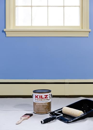
Now for some real-life progress. THE WALLS ARE PRIMED! That may not seem like a big feat for some, but this has been a task I’ve been dreading because 1: all the trim, windows, doors were painted with oil-based paint and 2: blue is notorious for being a hard color to paint over/conceal. But KILZ came to the rescue, yet again!
For those who don’t know (because I surely didn’t until a painter told me), you cannot put latex/water-based paint over oil-based paint without preparing the surface and using a special bonding primer.

Take a look at exhibit A…and exhibit B… and exhibit C. All areas in my home with peeling paint because the previous painter did not prep the surface and/or use a good bonding primer. I’m also working on making over my living room (and will be revealing that space over on my blog in a few weeks #ShamelessPlug) and had to spend hours scraping peeling paint off the fireplace before I could (re)paint it. ::insert expletives here::
 hours…
To anyone else dealing with this, I feel you. I’m here for you. And I’m making it my life’s mission to educate as many people as possible on how to properly paint over oil-based paint so no one has to go through what I went through.
But, before I get into the steps you first need to check whether you have oil-based paint on your walls/trim. All you need is rubbing alcohol and a cotton pad or cloth. Rub it on the surface and if the paint does NOT come off, that means it’s oil-based paint (proceed to prep steps below). If the paint does come off that means it’s latex/water-based paint (proceed to enjoy your stress-free paint life).
Disclaimer: I am not a professional painter or paint expert, but I scoured the interwebs and this is what Bob Villa says is the proper way to paint over oil-based paint:
Step 1: Sand/De-gloss the Surface
Use 180-220 grit sandpaper and lightly sand down the surface. You’re not seeking to remove all the paint, you just want to rough up the surface some for better adhesion.
Non-expert Key popping in. Ol’ Bob-O didn’t mention this, but if your home was built before 1978, there could be lead-based paint, so be sure to take any necessary precautions before sanding surfaces. Also, fun fact: although I’m not a professional painter, I’m actually Lead-Paint Certified. I used to work for a construction company and it was required for employees to be EPA certified in lead-paint removal.
Okay now back to Bob…
Step 2: Deep Clean with TSP
You want to make sure the surface is free from dust, dirt, and grime (all of which reduce adhesion) so wipe down the surface with TSP. Be sure to follow manufacturer’s instructions and safety guidelines.
Step 3: Prime with a Bonding Primer (Read: KILZ 3 Premium Primer)
KILZ 3 is specifically formulated to cover all types of paint, which I love. Being able to use the same product on my trim and walls made the whole process so much easier. It also helps adhesion, so my top coat of paint will stick better. I followed these steps when I painted my kitchen bedroom and living room and so far so good, no peeling! I like to use two coats on all the trim to ensure maximum stickage.
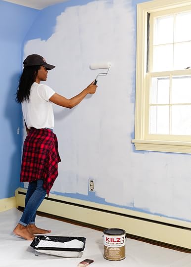
Thankfully, the walls in my office are not oil-based, but boy are they blue! I had already witnessed the “power of primer” on Chandler’s living room reveal, so I felt confident that covering these blue walls would be no battle for KILZ. I obviously also used the same KILZ 3 Premium Primer here and as soon as I poured it into the tray I knew this was a quality product. It wasn’t thin and runny like other primers, but very thick and glided on with ease. And similar to Julie, I was shocked by the coverage of just one coat! It’ll also help my new paint color stick better and it’ll block any medium or heavy stains. Win/win/win.


Look how much better the room looks with just primer!
Now that I have a blank canvas to work on, it’s time for me to make my toughest decision, yet. WHAT COLOR DO I PAINT THE WALLS???
There were a few comments/concerns that the room doesn’t get enough natural light to paint the walls white. But contrary to popular belief, the room (and really the whole house) gets a good amount of sunlight. Obviously not as light-filled as some of the inspo photos, but enough to not make white walls look drab and dreary.
 design and photo by keyanna bowen (me!)
Last year, I painted our bedroom (which is adjacent to the office and receives the same amount of natural light) white, and I love how light and airy that room feels. And I just painted my living room white (did I mention that reveal is coming to my blog soon? ;-)). And my kitchen is also white. Although I can’t deny my love of all-white spaces, I think 3 white rooms in one house is enough! Or is it?
 top left: design by kai ethier, photo by jason stickley via house & home | top right: design by virginia howard, photo by paul massey | bottom left: design and photo by lizzie green | bottom right: design and photo by anna haines
Lately, I’ve really been drawn to subtle peach/salmon/blush hues. Even Orlando’s vibrant peachy pink gym gave me heart eyes, although I don’t think I’m ready to clad my walls in that much color, yet.

KILZ has some really pretty options in that color family. I got a few samples and made swatches on white paper (in true EHD fashion).

And now I need your help (again)! Initially, the plan was to paint the walls white/off-white and then load in color with art and textiles. But now I’m thinking maybe I should paint the walls one of these pink/ peachy hues.

It’s so hard to get the color to read accurately in these early swatch photos, but some of the swatches are a very close match to the above inspo photos that I’m so drawn to! What do you guys think, do I stick with the original plan and just paint the room a shade of white or do I shake things up a bit and go with color? I’ve narrowed it down, and I think these 6 are my front runners.

1. Family Heirloom | 2. Blushing White | 3. Cameo Coral | 4. Arizona Clay | 5. Conch Pink | 6. Angelic Pink
But would love to know which one of the above colors on the wall speaks to you! Would the swatches on the top left make a nice, neutral base for some bright and maximalist layering? Or should I just dive in with the color? What do you think??? xx
Em again. OH WOW. Get a load of those gorgeous peachy pink picks – they look so warm and glowy in Key’s space! As always, a huge thank you to Keyanna for letting us into your creative process, for working on this project alongside us, and for being so darn talented. And thank you to KILZ, our favorite primer, for helping us bring this makeover to life – we literally could not have done this without you. (Like, literally – this room would have been periwinkle and butter forever.) And last but not least, thank you to YOU for reading, commenting, and for supporting the brands who help us bring new room reveals to your eyeballs – we are so, so, so grateful. Now hop down and fill us in – what say you?? Xx
Opener Image Credit: Design and Photo by Laura Resen
The post We’ve Hit The Halfway Mark On Our Mentee’s First Partnership – Here’s how It’s Going (+ An Ask The Audience) appeared first on Emily Henderson.


February 24, 2021
Design Conundrum: Do You Design For What You Want to Look At or How You Want to Feel? Arlyn Explores


Hey there EHD family. Arlyn here, back to discuss the mushy gushy side of design, as I’ve been known to do. If you missed my last post around these parts, you can read that here to see what I mean. That post is also where I gave you a sneak peek into the moodboard I put together for my bedroom MOTO (Makeover Takeover for anyone not familiar). And guess what, friends? Not much has changed since then.
Quick recap: My living room and dining room have been good and designed for, oh…two years now. Invigorated by the rocket fuel that is a room that’s finally “done,” I dove right into my bedroom that was essentially a hodgepodge of furniture pieces leftover from my cross country move a few years back and well, in full transparency, a bunch of junk. I’m talking a set of four unfinished dining chairs—I’m proud to say I finally gave up on that now inhabit a new loving home—numerous pieces of luggage, empty storage containers (why?!?), shelves turned on their side I never got around to hanging anywhere, a box for an old memory foam mattress topper size full…I have a queen bed…I welcome you to do the math there. I digress. The room was a sizzlin’ hot mess. Or should I say, the room IS a sizzlin’ hot mess. The years pass quickly when you’re pinning, folks, and sidestepping decision making.
But when the pandemic hit and weekends went from game nights with friends to binge-watching Top Chef tucked into my bed, phone in one hand and a bowl of Annie’s mac and cheese in the other, I looked around and said ENOUGH. Not of my actual Top-Chef-watching-mac-and-cheese-eating behavior, but of the giant WOMP WOMP that floated around the room, visible only to me. So I got to work, mining through my Pinterest boards, bookmarks on Instagram, reconnecting with the designer that had gone dormant inside me. I moodboarded, I blogged about it, I had a design existential crisis, I moodboarded some more. And then I arrived. Here’s a reminder of where I landed:

Bed | Plug-in Sconce | Nightstands | Cabinet | Dresser | Paint | Mirror | Curtains | Fabric Swatch | Rug | Lumbar Pillow | Duvet Cover | Quilted Set
And then guess what happened? I thought too hard about it. Who could blame me, after all? There was NOTHING ELSE TO DO. My eyes started drifting… “oooh look at that neutral room over there” and “wait! Green walls!” and “Am I already tired of peach before I even decided on a peach?”
But I do this. I know this about myself, so I forged onward. I ordered paint samples, got them up at my wall, stared at them day in and day out. I played the part of “good designer” and “tested” the paint colors…checked them out at different times of day, held fabric samples up to them. All the while fighting my inner design demons. “What if I end up hating this?” that testy little voice kept whispering, just loud enough not to ignore. “Ah, but what if you love it?” the other little voice said, sometimes louder, sometimes not.
Here’s the thing: That moodboard up there. I want to LOOK at that every day. I think if I walked into my bedroom and saw that, I’d think “Oh! So fun!” Fleshy pink wall! Burlwood accents! Rust-colored velvet! Yes! I’d “Pin” that bedroom, absolutely. But when my mind wanders and I stop to wonder how I’ll feel in the room, or rather how I want to feel in the room, I’m conflicted. If I had to pick the one thing the EHD community does best, I’d say it’s helping to psychoanalyze along with the writer to land at the best decision, even if that looks a bit different than where the writer thought they’d end up.
So, 600 words in, this is where I ask you for help. I’m going to walk you through a few different versions of my room I moodboarded that I put together to scratch a few itches I had. I needed to know what a full-color version of my room could look like, what a neutral version could look like, and then a middle ground. I’ll explain what I like about each, throw in a little inspo to show you where I’m coming from, and then either convince myself along the way of what direction to move in or plead at the end for your genius advice. Deal? I hope so because that’s precisely what I’m about to do. I hope you’ll come along ::grab’s your hand, giving you no choice in the matter:: and help me answer the big, juicy question: How exactly do you decide between what you want a room to look like/what you want your eyeballs to see, and how you want that room to make you feel, particularly if both of those options are actually very different things? Look, no one said this would be easy, but I hope you’re up to the challenge. I am!
Arlyn’s Bedroom: Full-Color EditionHere it is again, so you don’t have to scroll back up:
Bed | Plug-in Sconce | Nightstands | Cabinet | Dresser | Paint | Mirror | Curtains | Fabric Swatch | Rug | Lumbar Pillow | Duvet Cover | Quilted Set
There is so much about this room that I love. The paint color, which I’m still deciding on, is warm and glowy. The light in my bedroom is so soft and nice that I think a hue like this would look wonderful at all hours of the day. I had the idea in my mind of juxtaposing it with an earthy rust velvet—that bed would be the statement of the room, surely. The fabric would catch the light just so. What’s not to like here?
I’ve been staring at this moodboard for months on end, and then I saw this room that Dabito of Old Brand New designed recently and I thought “yes! This is what I’m going for…it works!” (It’s also the space in the lead of this post.) Take a look:
 design and photo by dabito for old brand new
 design and photo by dabito for old brand new
His peach is a bit pinker than I’m going for. The white wall appears to be there as a balance, perhaps? In fact, I might like this room even more if it were enveloped in that peachy pink, instead of broken up with the white. This image makes my heart sing. This is who I am in my heart, in my soul. Also, this:
 home of jacquetta wheeler | photo by isabel parra for architectural digest
My affinity for pink-toned rooms lately catches me by surprise. I spotted this perfect little sitting room over on Bobby Berk’s Instagram account, though it originally was featured in Architectural Digest, and thump thump went my heart again. While anyone who follows me over on my personal blog might know, I’ve been dealing with some personal health struggles lately. I spent the majority of August through December in bed. I did everything there: ate, worked, slept, “relaxed” whatever that means when your body feels like a stranger to you.
Being surrounded by boring beige walls, a mess, and not a lick of design can really make you feel even worse, so these happy blush rooms, with their hits of ochre and rust and blue and sage make me feel alive. This is why I don’t want my wandering eye to pull me too far from this, to be honest. It feels good right there in the center of my chest.
But the head and the heart can sometimes be at odds with one another.
Had I never looked at another photo on the internet, I’d probably already be slathering a fleshy apricot paint all over my walls, waiting on my rust-velvet bed to arrive. There’s something to be said about making a decision and just going for it, surely.
However, while I was brushing nice little squares of peach and blush and dusty pink on my walls in the daytime, I found myself regularly bookmarking rooms that had almost no color at all at night. Which brings me to…
Arlyn’s Bedroom: Neutral Edition design and photo by studio mcgee
 design and photo by studio mcgee
This bedroom, by Studio McGee, just brings so much peace to me. While my original bedroom design kept the blood pumping through my veins, these lower my blood pressure. Yet ANOTHER little voice in my head says “isn’t that how you want to feel in your bedroom?” Yes, okay little voice, YES. However, it cannot go unsaid that my bedroom has absolutely zero architectural interest (you can see it here). Where the front of my 1920s Mediterranean apartment has plaster walls, arched pass-throughs, coved ceilings and original oak floors, my bedroom has beige carpet, beige orange peel walls, and very standard ceilings. Truly, the only nice thing about the room is the light it gets through the original casement windows.
If I go this neutral route, the whole thing may fall flat as adding any kind of molding or paneling to jazz things up isn’t an option (this is a rental…I hopefully didn’t lose you there because I realize I may be overthinking all of this for a “temporary” space; however, I believe in loving the space your in no matter how long or short of a time you plan on spending there).
But let’s play the game, alright? Here’s a neutral moodboard option I put together, just to say that I did:

Bed | Plug-in Sconce | Nightstands | Cabinet | Dresser | Paint | Mirror | Curtains | Fabric Swatch Color | Rug | Lumbar Pillow | Duvet Cover | Quilted Set
I like this. It’s very soothing. I could go to bed and wake up here quite happily, mind you. So could my husband Charles. He’s a factor in all of this (though he likes all versions of these rooms, by the way). A subtle blush on the walls—Farrow & Ball Dimity—just enough color via an ochre velvet I’d use to reupholster an old French armchair I have, mostly neutrals throughout with a grounding mossy green linen duvet.
It reminds me of this room I pinned a while back of Molly Madfis’ home that was featured on Camille Styles’ website:
 home of and design by molly madfis | via camille styles
Ahhhh…didn’t you just breathe a deep sigh of relief? I sure did. IS THIS WHAT I NEED?!? HALP!
Of course, both ends of the spectrum are not the only answer. There is a middle ground. “Arlyn, please say you did a potential ‘Goldilocks’ moodboard!” Why yes, yes I did.
Arlyn’s Bedroom: The “Middle Ground”Before showing it, though, I want to share a photo from Brooke Wagner Design that might be that happy place between color-on-color and all-in-neutral:
 design by brook wagner design
I like this for a few reasons:
It’s warm and interesting. It has plenty of texture to keep the eye moving without overwhelming it with a barrage of color. It pulls in those earthy hues I’ve been so in love with lately.So, taking all those things I liked about the above room and marrying them with my first and second moodboards, I get something like this:

Bed | Plug-in Sconce | Nightstands | Cabinet | Dresser | Paint | Mirror | Curtains | Fabric Swatch | Rug | Lumbar Pillow | Duvet Cover | Quilted Set
Not bad, right? It brings in rust and mustard and ochre and blush, it feels textural but easy on the eye. But…is it just me placating myself?
Design doesn’t need to be this heady. I promise you. Had I been designing this space for someone else, I could have helped them decode their innermost desires and delivered a plan on a beautiful burlwood platter. But this is a room I have to live in every day. That I spend so much of my life in. Do I want to feel ALIVE, do I want to keep my pulse at a nice, soft 60 bpm, or do I want a little jig in the ol’ ticker but maybe not enough to feel like I’m being true to who I am as a designer/person?
I have a lot to think about, and while I’m leaning toward an answer, I want to pass the mic to you, dear EHD readers. Not really knowing me, but kind of knowing me…what do you see for me that possibly I’m not seeing for myself? Do I design my room for my eyeballs and my heart, or do I design it for deep breaths and my head? So curious to hear what you all think. Who will win? Colorful Arlyn? Neutral Arlyn? Somewhere in the middle Arlyn?
Oh and, uh, Emily, when you read this, please feel free to ALSO chime in…you’ve got my number…I expect a text.
Opening Image Credits: Design and Photo by Dabito for Old Brand New
The post Design Conundrum: Do You Design For What You Want to Look At or How You Want to Feel? Arlyn Explores appeared first on Emily Henderson.
Design Conundrum: Do You Design For What You Want to Look At or What You Want to Feel? Arlyn Explores
Hey there EHD family. Arlyn here, back to discuss the mushy gushy side of design, as I’ve been known to do. If you missed my last post around these parts, you can read that here to see what I mean. That post is also where I gave you a sneak peek into the moodboard I put together for my bedroom MOTO (Makeover Takeover for anyone not familiar). And guess what, friends? Not much has changed since then.
Quick recap: My living room and dining room have been good and designed for, oh…two years now. Invigorated by the rocket fuel that is a room that’s finally “done,” I dove right into my bedroom that was essentially a hodgepodge of furniture pieces leftover from my cross country move a few years back and well, in full transparency, a bunch of junk. I’m talking a set of four unfinished dining chairs—I’m proud to say I finally gave up on that now inhabit a new loving home—numerous pieces of luggage, empty storage containers (why?!?), shelves turned on their side I never got around to hanging anywhere, a box for an old memory foam mattress topper size full…I have a queen bed…I welcome you to do the math there. I digress. The room was a sizzlin’ hot mess. Or should I say, the room IS a sizzlin’ hot mess. The years pass quickly when you’re pinning, folks, and sidestepping decision making.
But when the pandemic hit and weekends went from game nights with friends to binge-watching Top Chef tucked into my bed, phone in one hand and a bowl of Annie’s mac and cheese in the other, I looked around and said ENOUGH. Not of my actual Top-Chef-watching-mac-and-cheese-eating behavior, but of the giant WOMP WOMP that floated around the room, visible only to me. So I got to work, mining through my Pinterest boards, bookmarks on Instagram, reconnecting with the designer that had gone dormant inside me. I moodboarded, I blogged about it, I had a design existential crisis, I moodboarded some more. And then I arrived. Here’s a reminder of where I landed:
Bed | Plug-in Sconce | Nightstands | Cabinet | Dresser | Paint | Mirror | Curtains | Fabric Swatch | Rug | Lumbar Pillow | Duvet Cover | Quilted Set
And then guess what happened? I thought too hard about it. Who could blame me, after all? There was NOTHING ELSE TO DO. My eyes started drifting… “oooh look at that neutral room over there” and “wait! Green walls!” and “Am I already tired of peach before I even decided on a peach?”
But I do this. I know this about myself, so I forged onward. I ordered paint samples, got them up at my wall, stared at them day in and day out. I played the part of “good designer” and “tested” the paint colors…checked them out at different times of day, held fabric samples up to them. All the while fighting my inner design demons. “What if I end up hating this?” that testy little voice kept whispering, just loud enough not to ignore. “Ah, but what if you love it?” the other little voice said, sometimes louder, sometimes not.
Here’s the thing: That moodboard up there. I want to LOOK at that every day. I think if I walked into my bedroom and saw that, I’d think “Oh! So fun!” Fleshy pink wall! Burlwood accents! Rust-colored velvet! Yes! I’d “Pin” that bedroom, absolutely. But when my mind wanders and I stop to wonder how I’ll feel in the room, or rather how I want to feel in the room, I’m conflicted. If I had to pick the one thing the EHD community does best, I’d say it’s helping to psychoanalyze along with the writer to land at the best decision, even if that looks a bit different than where the writer thought they’d end up.
So, 600 words in, this is where I ask you for help. I’m going to walk you through a few different versions of my room I moodboarded that I put together to scratch a few itches I had. I needed to know what a full-color version of my room could look like, what a neutral version could look like, and then a middle ground. I’ll explain what I like about each, throw in a little inspo to show you where I’m coming from, and then either convince myself along the way of what direction to move in or plead at the end for your genius advice. Deal? I hope so because that’s precisely what I’m about to do. I hope you’ll come along ::grab’s your hand, giving you no choice in the matter:: and help me answer the big, juicy question: How exactly do you decide between what you want a room to look like/what you want your eyeballs to see, and how you want that room to make you feel, particularly if both of those options are actually very different things? Look, no one said this would be easy, but I hope you’re up to the challenge. I am!
Arlyn’s Bedroom: Full-Color EditionHere it is again, so you don’t have to scroll back up:
Bed | Plug-in Sconce | Nightstands | Cabinet | Dresser | Paint | Mirror | Curtains | Fabric Swatch | Rug | Lumbar Pillow | Duvet Cover | Quilted Set
There is so much about this room that I love. The paint color, which I’m still deciding on, is warm and glowy. The light in my bedroom is so soft and nice that I think a hue like this would look wonderful at all hours of the day. I had the idea in my mind of juxtaposing it with an earthy rust velvet—that bed would be the statement of the room, surely. The fabric would catch the light just so. What’s not to like here?
I’ve been staring at this moodboard for months on end, and then I saw this room that Dabito of Old Brand New designed recently and I thought “yes! This is what I’m going for…it works!” (It’s also the space in the lead of this post.) Take a look:
design and photo by dabito for old brand newdesign and photo by dabito for old brand newHis peach is a bit pinker than I’m going for. The white wall appears to be there as a balance, perhaps? In fact, I might like this room even more if it were enveloped in that peachy pink, instead of broken up with the white. This image makes my heart sing. This is who I am in my heart, in my soul. Also, this:
home of jacquetta wheeler | photo by isabel parra for architectural digestMy affinity for pink-toned rooms lately catches me by surprise. I spotted this perfect little sitting room over on Bobby Berk’s Instagram account, though it originally was featured in Architectural Digest, and thump thump went my heart again. While anyone who follows me over on my personal blog might know, I’ve been dealing with some personal health struggles lately. I spent the majority of August through December in bed. I did everything there: ate, worked, slept, “relaxed” whatever that means when your body feels like a stranger to you.
Being surrounded by boring beige walls, a mess, and not a lick of design can really make you feel even worse, so these happy blush rooms, with their hits of ochre and rust and blue and sage make me feel alive. This is why I don’t want my wandering eye to pull me too far from this, to be honest. It feels good right there in the center of my chest.
But the head and the heart can sometimes be at odds with one another.
Had I never looked at another photo on the internet, I’d probably already be slathering a fleshy apricot paint all over my walls, waiting on my rust-velvet bed to arrive. There’s something to be said about making a decision and just going for it, surely.
However, while I was brushing nice little squares of peach and blush and dusty pink on my walls in the daytime, I found myself regularly bookmarking rooms that had almost no color at all at night. Which brings me to…
Arlyn’s Bedroom: Neutral Editiondesign and photo by studio mcgeedesign and photo by studio mcgeeThis bedroom, by Studio McGee, just brings so much peace to me. While my original bedroom design kept the blood pumping through my veins, these lower my blood pressure. Yet ANOTHER little voice in my head says “isn’t that how you want to feel in your bedroom?” Yes, okay little voice, YES. However, it cannot go unsaid that my bedroom has absolutely zero architectural interest (you can see it here). Where the front of my 1920s Mediterranean apartment has plaster walls, arched pass-throughs, coved ceilings and original oak floors, my bedroom has beige carpet, beige orange peel walls, and very standard ceilings. Truly, the only nice thing about the room is the light it gets through the original casement windows.
If I go this neutral route, the whole thing may fall flat as adding any kind of molding or paneling to jazz things up isn’t an option (this is a rental…I hopefully didn’t lose you there because I realize I may be overthinking all of this for a “temporary” space; however, I believe in loving the space your in no matter how long or short of a time you plan on spending there).
But let’s play the game, alright? Here’s a neutral moodboard option I put together, just to say that I did:
Bed | Plug-in Sconce | Nightstands | Cabinet | Dresser | Paint | Mirror | Curtains | Fabric Swatch Color | Rug | Lumbar Pillow | Duvet Cover | Quilted Set
I like this. It’s very soothing. I could go to bed and wake up here quite happily, mind you. So could my husband Charles. He’s a factor in all of this (though he likes all versions of these rooms, by the way). A subtle blush on the walls—Farrow & Ball Dimity—just enough color via an ochre velvet I’d use to reupholster an old French armchair I have, mostly neutrals throughout with a grounding mossy green linen duvet.
It reminds me of this room I pinned a while back of Molly Madfis’ home that was featured on Camille Styles’ website:
home of and design by molly madfis | via camille stylesAhhhh…didn’t you just breathe a deep sigh of relief? I sure did. IS THIS WHAT I NEED?!? HALP!
Of course, both ends of the spectrum are not the only answer. There is a middle ground. “Arlyn, please say you did a potential ‘Goldilocks’ moodboard!” Why yes, yes I did.
Arlyn’s Bedroom: The “Middle Ground”Before showing it, though, I want to share a photo from Brooke Wagner Design that might be that happy place between color-on-color and all-in-neutral:
design by brook wagner designI like this for a few reasons:
It’s warm and interesting. It has plenty of texture to keep the eye moving without overwhelming it with a barrage of color. It pulls in those earthy hues I’ve been so in love with lately.So, taking all those things I liked about the above room and marrying them with my first and second moodboards, I get something like this:
Bed | Plug-in Sconce | Nightstands | Cabinet | Dresser | Paint | Mirror | Curtains | Fabric Swatch | Rug | Lumbar Pillow | Duvet Cover | Quilted Set
Not bad, right? It brings in rust and mustard and ochre and blush, it feels textural but easy on the eye. But…is it just me placating myself?
Design doesn’t need to be this heady. I promise you. Had I been designing this space for someone else, I could have helped them decode their innermost desires and delivered a plan on a beautiful burlwood platter. But this is a room I have to live in every day. That I spend so much of my life in. Do I want to feel ALIVE, do I want to keep my pulse at a nice, soft 60 bpm, or do I want a little jig in the ol’ ticker but maybe not enough to feel like I’m being true to who I am as a designer/person?
I have a lot to think about, and while I’m leaning toward an answer, I want to pass the mic to you, dear EHD readers. Not really knowing me, but kind of knowing me…what do you see for me that possibly I’m not seeing for myself? Do I design my room for my eyeballs and my heart, or do I design it for deep breaths and my head? So curious to hear what you all think. Who will win? Colorful Arlyn? Neutral Arlyn? Somewhere in the middle Arlyn?
Oh and, uh, Emily, when you read this, please feel free to ALSO chime in…you’ve got my number…I expect a text.
Opening Image Credits: Design and Photo by Dabito for Old Brand New
The post Design Conundrum: Do You Design For What You Want to Look At or What You Want to Feel? Arlyn Explores appeared first on Emily Henderson.
February 23, 2021
Our New Favorite Large-Scale Art Solution (Why It Works & 8 of My Picks)


FOLKS, I HAVE FOUND THE SOLUTION TO YOUR LARGE SCALE ART WOES. (Well, I guess that technically Bowser found the solution – thank you, Bowser – but I want to break it down for you, show you a few of my favorites, and explain why it works.) Now buckle up, because this may be a wild turn for all of you long-time readers, but hear me out: it’s the diptych. GASP!
I know. I know! Historically, I have been a little apprehensive when it comes to the diptych – they can be hard to get right – but that’s where the Fine Art Duo (aptly named, TBH) from Minted comes in to play. Guys, these pieces STUNNED me. They’re created by incredible artists – a few of whom I’ll introduce to you below – and the finished product just looks so luxe, expensive, and special.
 what ACTUALLY makes this work? sit tight, answers below…
First, though, I want to talk about how my diptych-revelation came to be. We’re long-time lovers of Minted here – you’ve seen them in Arlyn’s home, in Jess’ home, and most recently, in my home – so when they reached out about highlighting their art in a new space, it was perfect timing.
We’d long been waiting to shoot Bowser’s guest room/office/gym, but it just needed the finishing touches (i.e. the art. A final zhuzh, if you will.) The spot over the bed had been a particular problem area – it needed something large, but we worried that a solid piece would be too overpowering or fussy.
Boswer, the brilliant stylist that she is, ended up selecting this Fine Art Duo (again, somehow feels more fitting than “diptych”) and it really was the finishing touch we needed so we could shoot and share with you. We gave Bowser a gift card, she bought the art to finish the space, and the rest is history. THANK YOU, MINTED. So let’s take a second to break down what changed my mind, why this style of art works in this space, and how it can work in yours, too – ok?
 study up before we break it down
 So now, I present to you the tiny (but official) breakdown for why this art makes this space sing:
It’s grounding and intentional: In Bowser’s multi-functional space, this diptych clearly defines that THIS area is the cozy, serene, relaxing space. It’s symmetrical: Well, yeah. Duh, I guess. But look at how the symmetry is echoed in the daybed’s styling below. Can you bring this into your own home? It’s well-scaled: Everything here has a bit of breathing room. It’s not a minimalist room by any stretch of the imagination, but it doesn’t feel cluttered, either. Making the art smaller would have felt dinky and making it larger would have felt cluttered.It doesn’t compete: Sure, the art is the star of the show, but things are really working together here. The diptych lets the paint shine – I love the way we still get the pop of deep green between the frames – and the paint lets the art pop.Since I was so inspired by Bowser’s space, I obviously ended up poking around and pinning a few of my favorite works. Here are the Fine Art Duos that I’ll be hoping to use in a future project… (New year, new me, new diptychs.)

Rosy Tomorrow I | Rosy Tomorrow II
I mean, how could I NOT want these after seeing them styled so beautifully at Bowser’s? They’re calm and serene, especially with that natural wood frame.

At The Door I | At The Door II
A lot of folks ask about the vintage art that hangs in my dining room, but this has a really similar energy. It’s graphic and interesting but it’s also neutral, which can be hard VERY hard to find. I’d love to see these above a credenza with some sculptural wooden objects on top.

Step Up / Step Out I | Step Up / Step Out II
Playing around on the framing for this one is SO fun. The work looks totally different and new colors jump out depending on which frame you pair with it. (I am partial to the white, walnut, matte brass, or natural wood option for this one.)

Nature, You and Me N.4 I | Nature, You and Me N.4 II
This is a great compromise if your partner really wants to hang a Joy Division poster in the record area and you really don’t agree. This duo is bold and tension-filled and dynamic, but it’s also still really light and beautiful and easy to digest. ADD TO CART.

Birthday Bouquet I | Birthday Bouquet II
How sweet would this be in a (very cool, very stylish) kids’ bedroom? Or in the entryway of a mid-century home that’s filled with beautiful wood paneling? Or in a warm, cozy, rust-colored dining room? I just really like how it’s saturated, but not overpowering.

Oh my, I just really like Jennifer Daily’s work! Y’all know I love a collage (like in that Sotheby’s room a few years back, or like the few I have in the mountain house) but these are next level. Just so, so, so interesting to look at. Would be an incredible jumping-off point for those getting ready to start designing a new space!

Abstract Botanical Navy Shadows #2 | Abstract Botanical Navy Shadows #1
Oh, modern abstract and a new take on a timeless subject matter. I also just really like the color palette here – the soft baby blue, the deep rusty oranges, and the mossy brown leaves. Would love to see this fully styled out in a really vintage-inspired study or library.

Divergent Journey I | Divergent Journey II
GUYS. You can actually customize your colors on this one – the above is variant is called “day dream,” but they also offer this work in “rainforest,” “out to sea” (my personal favorite, I think, after a lot of flipping through all the options for a few days), and “sedona.” I’ve just really been enjoying a mountain/nature motif lately and the torn tissue paper is a really light, pretty take on the theme.
 us too, daffy
And there you have it: my transformation from wary to totally-in-love with the diptych, including a brief on how to pull off the look in your home and all the pieces I pinned for future use. As a quick reminder, you can grab pieces from Minted:
As a print OR as a canvas (we’ve done both for EHD projects and can vouch that they’re both awesome quality)With a frame or without a frame (but it’s incredibly affordable when compared to custom framing – only $99 for an 18″x24″ frame, which is a REALLY good deal) With custom borders or matting (hello, float mount)And with specialty UV-coated glass and archival materials (if you want!)Bonus: you can get free shipping and returns with the code SHIPFREE (huge savings!)
Geometric Piece | Portrait Piece | Landscape Piece
That’s it from me, a newly changed woman, for today. A million thank yous to Bowser for letting us show off her space, to Minted for partnering with us as the art provider for this room (yes, those 3 pieces above the TV are also from Minted and are linked above!); and to you, our readers and friends, for reading and for supporting the brands that keep EHD running. Thank you. Now, what say you – have you also been sold on the diptych? Let’s chat. xx
Opener Image Credit: Photo by Sara Ligorria-Tramp | Design by Emily Bowser
The post Our New Favorite Large-Scale Art Solution (Why It Works & 8 of My Picks) appeared first on Emily Henderson.
Emily Bowser’s BEAUTIFUL Hardworking, Multipurpose Room Reveal (+ Get Ready For Her DIYS)


HI EVERYONE!! It’s been a minute. I am so excited to talk to you about this random room that has taken me So. Dang. Long. to figure out. We are going to talk about its evolution from Psycho Parkway to The Bad Boi Room to The Foster Room to Andrew’s Dungeon to my Recovery Space to its present, multipurpose, hardworking, 100 square foot room everyone (including the cats) want to be in 24/7.
Let’s start at square one, the day we closed on the house:


And now you know why we called it Psycho Parkway.
The footprint of this room has remained pretty much the same. We removed the closet, seen here on the left, in order to make space for a bed in the primary bedroom (my headboard is on the other side of this wall). We also lowered the left window to even them out and replaced them. Other than the living room, this was the only other room with original wood floors and as you can see, not in the best condition (Water damage! Termites! Woohoo!). The drywall had to be removed throughout the house in order to replace all the electrical and install AC/heat.
 my husband, andrew, a monster you’ll hear about later
 shooting towards the room from the front door/living room
If you haven’t read the financially insane saga of buying this house, you can read it here. The short story is that we were almost completely financially ruined by the “end” of the reno (is it ever really over?). The point is, by the time we were living in the house, we didn’t have ANY money to do, well, anything. Before living here we actually have lived in bigger apartments (square footage wise) but never in a 2 bedroom. We simply didn’t have anything to put in this space. I couldn’t even find a picture of it finished because what ended up happening is, they fixed the floors, closed up the walls, painted them the same color as the rest of the house (Polar Bear by Bher) and we shoved a dresser we owned previously that didn’t fit anywhere else and everything that we didn’t want our cat Puck to get into. This is when the room was dubbed “The Bad Boi Room”. Puck is our difficult baby that we love dearly. He has a lot of…quirks? He’s gotten a bit better with age, but when we moved here he was still pretty young and if he can find even the tiniest piece of plastic, he will eat it, vomit and then pee in/on it. Also he generally will treat anything he can get inside of like a litter box (ask my friend Ashlee who had her suitcase used as one). ALSO any pile of things. Vague, I know. But if it resembles a pile, he would pee on it (ask my friend Jenna, her jacket was tossed on a chair and sort of was like a pile?)
They are super fun quirks and only a mother could love him. Truly. Good thing when you move to a new place and nothing can go into your garage that’s flooding, you definitely don’t have any plastic or boxes or piles. You also have a TON of patience when said garage is flooding and you owe your contractor $80,000 and have zero dollars. It was also November of 2016. It was a dark timeline.
So, this room became the room we were able to put sh%t in and shut the door – which of course made Puck all the more obsessed with it and he would sneak in whenever possible, all he wanted to do was go in there and be BAD. This lasted…a year? I don’t know, time is weird. Eventually we were able to get one of those pull out couch situations from IKEA and it was a pretty sad, but completely fine guest room. And by guest room, I mean cat room. Cats were the main guests. In fact, we were fostering the best cat in the world in February of 2019 when we used the space (because it was basically an empty room) to shoot a removable wallpaper project for Target.
 photo by sara ligorria-tramp | from: a home office makeover with threshold removable wallpaper by target
(Sherman pictured in window. He was “the one who got away”. Not literally. He’s happy in a home, just not mine, which is sad, for me.)
This wallpaper isn’t exactly my personal style vibe, but shooting in this space made me realize a few things: 1. The more stuff that was in the space, the bigger it somehow felt. I don’t know if I mean literally bigger, but I was surprised by how much could fit in there which made it FEEL bigger, if that makes sense (?). It definitely felt cozier and more welcoming. I wanted to be in it. 2. I really liked that high shelf moment and wanted to incorporate that into my design. 3. I wanted the walls to make a statement like this wallpaper.
About a month after the shoot, my husband went freelance and needed a proper office. I had our friend Shade paint the room Laurel Woods by Sherwin Williams which is an INTENSELY dark green. I didn’t know it at the time but it’s also the color of the exterior of the Mountain House. I went. for. it. I had him paint the trim, the inside of the door and the ceiling. My dream was to turn this into a guest room/office/workout space/TV room and it was all in my head. I wanted it DARK for lots of reasons, Andrew likes it dark when he edits videos (he’s not an editor but has to do edit passes regularly), for TV watching, and also I prefer a dark room when I work out (cardio specifically because it makes me zone in).
We had to trash the IKEA couch. During the wallpaper shoot it rained, no, it POURED – and my trusty-most-floodingest garage (where we were storing the couch) did its thing and flooded, like, A LOT. On the bright side, this made us have to make some decisions about furnishing the space fast, which isn’t really my MO. I had a vision of this custom wrap around desk that incorporated a bed which we did DIY but then, crickets. 2019 was CRAZY. We produced SO much at EHD AND I finally pulled together my primary bedroom, bathroom, living room, and dining room for reveals. THEN in November, I left EHD to work on Orlando’s HGTV show, Build Me Up, and worked on that literally into the beginning of the pandemic. “THE SHOW MUST GO ON, no, literally it must – we can’t just leave these people without houses!” Cut to me, maskless, going into every store as the world was shutting down. “GET OUT OF MY WAY I NEED THROW PILLOWS.” Ironically, by the time I was in quarantine, we didn’t have any toilet paper. Why I couldn’t navigate my 2 carts full of tchotchkes to the toilet paper aisle? I’ll never know.
Suffice to say, the office was pretty low on my priorities. I felt like I was barely home the entire year. Like, I know I slept there just about every night but it really didn’t feel like it. Andrew, however, was home ALL the time and if there’s one thing I’ve learned by being with Andrew since the summer of 2000 (yes, you read that correctly) – Andrew should never, ever, be left to his own devices. No, seriously, forget the before from before and BRACE YOURSELVES.
 WTF
WTFY’alllllllllll. This is what happens if you let Andrew loose. He brought WFH to a whole new level. I mean, you could spend a long time finding all the gems in this photo, but my favorites include: 1. the robe being used as a window treatment on the left 2. the monster hands on the ground, and 3. the Elvira pin up on the wall. He never turned off that bat light or the red light so when you got up to pee in the middle of the night (the bathroom is directly across the hall) whatever that thing is that’s wearing a fez would stare at you while you were relieving yourself. TERRIFYING. He is constantly creating so that room was pretty much always in a state of chaos even though I made him “pick up” regularly. But I mean, if you can imagine this picked up, it’s still WILD.
Rewind for just a sec…another fun thing that happened in 2019 (riiiiiight as I was starting the show) was that I found out I had fibroids. Not your run of the mill fibroids (not sure what that means) but a fruit basket of fibroids. Well, I liked to call them that because doctors LOVE describing sizes as fruit like we’ve never heard of a centimeter before  . I had a grapefruit, an orange, a lemon, a kiwi, and a grape. Cute right? (Shoutout to Arlyn for making me go to the doctor!). If you aren’t aware, uterine fibroids are noncancerous growths in or on your uterus. Not much is known about why they occur and I won’t get into it because honestly, this isn’t my field and this post is already long enough, but let’s just say gender and race factors around this particular health condition are very much so WHY we don’t know much. Unfortunately, I was one of the women where a myomectomy was my only option. But fortunately, I was able to pull together enough money to pay for my health insurance out of pocket (as I was now freelance). The doctor was all, “Damn. How’d you NOT know about these? They should come out PRONTO” and I was all “Uh. No. Gotta work. V poor. Paying for insurance out of pocket, bought a house, it’s a long story…ALSO DOCTOR HAVE YOU SEEN I DIDN’T KNOW I WAS PREGNANT???? DON’T @ ME”. And then the pandemic started right before I was supposed to take them out (April) which kinda threw a wrench in things.
I digress. The reason I’m telling you this really personal information is that knowing I had a major surgery coming up as soon as hospitals weren’t completely overrun made me pull the space together a bit more. A myomectomy has an 8 week ~mostly~ bedridden recovery. You are supposed to move around a little bit after a couple of weeks but you have to be crazy careful. It’s like having a c-section but “worse” (according to the doctor) because you have the incision, plus all the other internal incisions. Ugh. I wish it was socially acceptable to post pics of them, you KNOW I made the doctor take pics. Ok, now I’m sharing TMI just for funsies. I wanted my TV room dream for my recovery where I could watch every documentary on NXIVM and Scientology, take edibles, watch everything vampire (missed the bus a decade ago) and fill my glorious museum on Animal Crossing.
Spoiler Alert: I did all those things
In a stroke of luck, our former tenants moved out in August and the newbies that moved in didn’t want/need their side of the garage. The words were barely out of their mouths before I started moving Andrew’s office down there.
 Here he is, living his best, creepy, gross life.
Daffy and I simply cleaned up the space and moved in…

At first, it was nothing crazy. Daffy and I made the bed, Daffy and I patched the walls (the monster had used gaff tape to hang things, you can guess how that turned out), and Daffy and I bought this handy dandy bolster off of Etsy. I bought the king size in “Toast”. (Pro Tip: the length of a full mattress is the same as the width of a king bed) and – voila! Take it off for guests to sleep at night and during the day…wait is that why it’s called a daybed? It actually makes a HUGE difference in the comfort level of using a bed like a couch. Highly recommended. Really, and I #paidforthis.
During Amazon’s Prime day in mid-October, I finally bought myself a Samsung Frame and we had it installed right in time for my surgery in mid-November (I was very lucky to get in right before the holiday Covid surge). The rest of the room stayed as is and I got to spend a lot of time dreaming up what I wanted to do to the place.
 took this one special, just for you all. me: living my best life in recovery with cats, toilet paper, and syrup(?)
 my view, every single day for 8 weeks, but imagine leah remini on the tv and me, sobbing.
 Let’s get to some reveals already!
OK – so there’s a lot going on in this room so I’ll break it up and go through my favorite parts.
The Wrap Around Desk/Shelf/Bed
Rug (vintage) | Chair (vintage | Woven Basket | Wall Color
I wanted something that made the most of the small amount of space in this room. It’s a simple construction, doesn’t really warrant a tutorial because it would vary based on the space you have. I used the cheapest wood I could get at Lowe’s (I think it’s pine?), a lot of Matte Black Stain, quite a few L brackets (big ones to hold the desk to the wall and smaller ones to attach the sides and shelves) and some 2x4s to help secure the desk to the wall. I could have bypassed this and just gone for more L brackets but I liked the idea of being able to attach the whole back piece all the way around. In retrospect, not sure if I would do the 2x4s again. It’s definitely secure but maybe overkill? I was making this up as I went so I think there’s better and more refined ways to do this for sure. I decided to make the desk 18” deep (two 9” wide pieces of wood connected to each other) on the right side. The part that wraps around (under the windows) is just one 12” wide piece of wood. The right side ends so there’s about a foot of breathing room for the door to open all the way, which is even with the end of the bed, making the desk/shelf/bed sitch an imperfectly perfect U shape with the area rug (HELLO JEAN PALMER HOME), my $50 vintage chair (that is in desperate need of an upholstery job – recs?), and my “Trashcan” sitting in the center of the U.

Table Lamp | Diffuser | Vase | Wooden Tray | Lidded Dish | Knot/Checkered Tray | Stapler | Ladder (Vintage)
I put shelves on the right side of the desk (by the door). The top shelf holds the box for the Frame TV, the two other shelves have vintage Hearth and Hand faux leather bins (no longer available) with workout gear in the top one, and our Peloton shoes in the bottom. On the desk, I keep my favorite lamp ever by Human Home. It gives off good diffused light for this dark space and has a built-in dimmer (a must for me). My Terracotta Vitruvi Stone Diffuser is among my favorite purchases for my recovery time. The Grove scent is my personal favorite. (reminder: I #paidforallllllthis) Because of the very limited storage, I keep office supplies in creative spaces. We always say this at EHD, but a good tray is hard to find and this Rounded Wood Tray by West Elm is gooood. It’s a great size, has handles, and the rounded edges gives it that detail that makes it not too basic. Love this Studio Mcgee for Target vase, I use it in practically every shoot I do because it’s neutral, versatile (is it a vase or the perfect crock?), and luckily for you, still available. The Trinket Dish I pulled from my prop collection and it lives here now because it’s so cute while holding receipts that need to be scanned (a regular part of my life). That checkered tray holding my tape dispenser, stapler, and vintage ruler is none other than Tramp Ceramics, as is the knot on the wall hanging above it!


Natural Woven Box | Cement Head
The “shelf” that wraps under the windows is the perfect side table for the Daybed as well as where I keep my box of small office supplies (extra pens, pencils, erasers, clips, washi tape, etc), my mancala board, and a cement head (obvs). The smokey globe light is IKEA. I’ve had it forever and it’s lived just about everywhere in my house which is good since it’s just a placeholder for a vintage lamp I have coming.

The bedframe is the cheapest wood IKEA frame, with stained wood pieces screwed in around the side and bottom, making it look continuous with the desk. It *may* be the Neiden but it didn’t have a headboard at all so I’m not sure? There’s a shelf on the side that is even with the bedframe (so slightly lower than the mattress). I have a stack of our favorite games and puzzles, along with 2 of my favorite Target coiled rope bins. In one I keep extra bedding and the other is a catch-all for things I use on the reg. But when not in use I want them out of sight/mind eg: laptop, iPad, journal, a pouch with misc chargers, and the current book I’m reading (Zen and the Art of Motorcycle Maintenance if you were wondering). In the back corner of the shelf and on The Citizenry side table on the other side, I have 2 power strips that are running from a plug that is directly in the middle of the bed, behind the bolster and impossible to get to. Honestly, I have to share because having a plug for laptops and a phone charger at arm’s reach is so clutch when there is a sleeping cat on top of you, which for me is basically always. On the side table, I also have a vintage container where I keep the oils for my diffuser and a tray to corral my clickers.
The vintage sconce above the side table is actually Sara’s. I had bought my dream sconce, the Le Klint 204 Mushroom Wall Lamp and it didn’t arrive in time. Actually, quite a few things didn’t arrive because of covid/storms across the US, which was sad but I guess it just means I’ll have to do another photoshoot??
Comforter | Stripe Pillowcases | Quilted Sham (similar) | Quilt (similar) | Faux Leather Lumbar
As far as bedding, I went with mostly solids with different textures. The grey comforter base is Hearth and Hand. I decided for the shoot to purchase 2 king pillows because I realized that the length of the daybed wanted longer pillows. I purchased these terracotta linen stripe pillowcases to bring a little interest. I thought about purchasing a different quilt/sham set so that both sets of pillows were king, but honestly, I like what I have, they are vintage West Elm and I’ve had them for yearsss. They are no longer available but it’s very similar to this quilt and this sham set from Casaluna. I think because it’s supposed to feel like a couch I don’t mind that there are different sized pillows? What do you think? Should I spend $$ so that they match?

My favorite part of the bedding, however, is the throw blanket from heaven. I told Sara that I love it so much that I can’t tell if it is ugly or not, it’s beautiful to me! Of course, we all know and love the faux leather lumbar from Target.

Before moving on, I would be remiss to not mention my FULL COVID HAIR. WHOA. I mean, I knew it was intense but this pushed me over the edge. DIY haircut coming to my insta soon! At least I gave you all a middle part that all the young people think they invented…
Shelf Brackets | Wood Shelf | Planter | Bookend | Potted Faux Eucalyptus
Not too much to say here, just that I’m a huge fan of a high shelf, especially in smaller spaces that need storage. I’m about to do something similar in my kitchen. If you don’t have a lot of floor space, go up! I bought three 12” brackets from this Etsy shop (currently partially shut down because of weather) and used a beautiful piece of white oak from Ross Alan Reclaimed, cut it to size (from the corner to the end of the bed), made sure to adhere the brackets to studs because this thing is HEAVY and styled away with mostly books (because I don’t have space for a bookshelf and I have so. many. books. My big trick for this shelf is faux plants. 1. It’s dark in here and 2. That shelf is high – I will for sure forget about any plant that is up there and it will die. The one on the right is this super convincing fake by CB2, the one on the left is real from another part of my house because this one hadn’t arrived from Target. I actually previously owned this Hearth and Hand fake but I had to buy it AGAIN because every time I bring it to set someone wants to keep it because it looks that good. I just cut the hang-y things off and cheated it inside of that same planter. I returned the asparagus fern to my bedroom and the shelf is now safe from becoming a plant graveyard. Cutie bookend by West Elm. Wood object is vintage.
Magazine Rack
I know there are going to be questions. This DIY may be the best DIY I’ve ever come up with and made Shade build for me hahahaha. This was one of the first things I envisioned for the space and it turned out SO DAMN NICE and honestly, I didn’t exactly wield the tools myself but I’m gonna make it seem sooooo easy.
These were some of my inspo pics:

 left: wall rack | right: carson magazine rack
I had some leather from the Casaluna Shoot That we did at Sara’s a few months ago so I wanted to try my best at recreating something similar. I looked at these pics and I was like, sure, wood? Screws? Nails? Easy enough. And guess what? It kinda was!
HOW TO BUILD THE SWEETEST MAGAZINE HOLDER OF ALL TIME
Step 1: Buy wood. I went fancy and bought Walnut wood from my friendly neighborhood Home Depot. 2.5” wide x 0.75” – a few long pieces and one piece of 1.5” x 0.75? (just make sure the pieces are longer than what you need so you can cut them down
Step 2: Determine size. For mine, I wanted it to fit nicely between the two windows with a little breathing room – 44”, and I wanted it to be tall enough to hold some larger magazines I sometimes have – 14”
Should you do step 1 and 2 be swapped? Probably. This is how we did it. I mean, I had an idea of how long I wanted it *holds arms out* This long! Like I said, making it up as I go (an Emily Bowser Story).
Step 3: Cut Wood (see cut pieces above). I had two, 2.5”, cut to 44” for the length. Two 2.5” in cut 13.25” (the 0.75” will be made up by the 13.25” sitting on top of the bottom piece of wood) and one 1.5” cut to 42.5” (this will hold the magazines in at the bottom, sit on top of the bottom piece and between the two side pieces, when next to the side pieces it will be 44” wide. 42.5”+0.75”+0.75” = 44” Stay in school kids! *We used my table saw to cut the pieces.
Step 4: Be an overachiever like our friend Shade and lightly sand the pieces before you put them together (I tried to make him skip this step)! He used my orbital sander with a fine grit paper.


Should fit together like this! Top and very bottom – 44”, sides – 13.25”, mini piece sitting on top of bottom piece – 42.5”
Step 5: Nail gun that ish together!
Step 6: Realize Emily’s nail gun is not as nice as your fancy one (speaking from Shade’s perspective) and walnut is HARD. Drive a half-hour home and a half-hour back.
Step 7: NOW nail that ish together while Emily runs to the closest hardware store to get wood filler because is it really a DIY project if you only had to go to the hardware store ONCE??
Step 8: Fill nail holes and wait 30 mins or so.

Step 9: Lightly sand, wipe with dry cloth
Step 10: Oil, you know, if you want. We used Feed-N-Wax
Step 11: I found the same nails that I *think* may be for laying carpet. I honestly just liked the look of them, they were matte and raw looking. I checked on a spare piece of wood that it wouldn’t split it, I marked the spot I wanted, pre-drilled teeny tiny holes to help the nail along, and carefully nailed one side of the leather in (I used 2” wide), measured to make sure it was level and nailed the other side in. It’s helpful to have someone to hold the leather taught while you do this. And yes IIIII actually did do this part.
Step 12: Carefully drill holes for attaching to wall. We used gold screws I had, with anchors of course, and they blended in pretty well.
Step 13: Attach to wall! YAY!
Window Treatments
If you’re interested in a window treatment tutorial, I may be documenting (made them at night, horrible lighting). They are basically the outside mount version of the ones Orlando made with his mom, and very similar to the ones Julie and I (ok, mostly Julie) made for the mountain house kid’s room but without a liner. They are the same fabric that I used for the temporary wallpaper post and underneath them, I have inside mount, light-blocking roller blinds for when people sleep here or if we are watching TV during the day. The roller blinds are practical, but not cute. When rolled up, the DIY shades act as a valence for covering up the roller blind unsightliness. When down they offer more privacy while still letting light in.
Wall Decor
Above the magazine holder, I have a simple wall grid for pinning my REAL LIFE inspo board. I’m a visual person (obviously) and I’m also tactile. I prefer things I can touch to the digital and flipping through magazines and cutting things out that catch my eye is very relaxing to me. I like how the grid disappears into the wall making the clippings look like they are floating.
The Gym Nook
Wood Hooks | Bala Power Ring | Yoga Rug
Behind the door, I came up with a simple way to store more of my workout stuff. I bought some simple wood hooks and have my resistance bands, yoga rug, and bala power ring (a cute and more versatile version of a kettlebell). It’s nice that it tucks behind the door but I don’t get mad about it when I have to see it either. Little known fact about me, I was a Bar Method instructor for a number of years and actually early in my assisting days with Emily I would teach the very very early morning classes (5:30 WHAT) and then go work on set. The space between the desk and the bed is perfect for teaching myself some classes (with the desk as my makeshift “bar”) or for taking online classes with my former Bar Method bosses who have started their own fitness studio, Chrysalis, when they needed to pivot during the pandemic.

I am also a Peloton spokesperson. Well, unofficially, but, I’m open – HMU. We’ve had ours since the end of 2018 because I was looking for something that wouldn’t take up too much space or be an eyesore. It’s one of the reasons that I like the reason the room is dark, the bike sort of disappears. I have a tray that attaches to the top of it and I will free ride and check emails for about 20 mins in the am and then do a quick 15 min climb with my BFFs Ally Love or Emma Lovewell. It’s a good workout, low impact, doesn’t have a big footprint, and isn’t ugly. If you can finance it, it costs less than a gym membership for 2 people (in LA anyway) and ours is now paid off.
Wait, MORE ArtOf course, I can’t NOT mention the beautiful Minted art (the only items in this room that were gifted). When picking out this art I had a conversation with my friend Orlando about how and when to choose to have something put on canvas and framed vs not (traditional framed art with glass). I had chosen this art and I felt like I wanted it on canvas but wasn’t sure if that was ok. He gave a simple answer that felt like a “duh” moment but I didn’t think of it until he said it. He said, if framing art that looks like it could be painted on canvas, like this “painting” it makes sense to put it on canvas, whereas if it were a modern print that was obviously made digitally, it should not be. I like that rule but also, rules are arbitrary do what you want

Rosy Tomorrow I and Rosy Tomorrow II by Stephanie Goos Johnson
I actually have a headboard DIY planned (of course I do) but for now, this diptych is holding its place, because we all know how long I take to get to projects. I think they will just relocated next to the Peloton to pretty up that naked corner in the future.

Drop the Ball by Keren Toledano | After the Bath by Patricia Robitaille | Wetland Wall by Field and Sky
The other 3 pieces of art in this shoot are also from Minted. My original idea (to cover up the mess that was made of my walls – thanks gaff tape) was to get the Frame TV and surround it with an entire gallery wall full of art, objects, and vintage mirrors perhaps? Because this is my space and I can take my time, I’m using this as an excuse to slowly build a small art collection. Art (and framing!) is pricey though so this will take a while. As my collection grows I will have no problem integrating the gifted Minted art because the colors and textures are very “me”. In the meantime, I’m really digging this asymmetrical look. I feel like it’s balanced with the flowers, knot, and vintage bird ladder on the opposite side but I feel like it may be controversial. What do you all think?

Alright friends, it’s been fun. Let’s talk about cats, fibroids, my monster of a husband, Pelotons, cats that (figuratively) got away, fuzzy blankets, the solutions to life’s biggest problems, cults, Vampire Diaries (problematic! But Ian Somerhalder!), mancala and I guess design stuff.
Until next time!
Xx
*Photos by Sara Ligorria-Tramp
** Design by Emily Bowser
The post Emily Bowser’s BEAUTIFUL Hardworking, Multipurpose Room Reveal (+ Get Ready For Her DIYS) appeared first on Emily Henderson.
February 22, 2021
The First Layer Of Our Farmhouse Style – A Deep Dive Into The Modern Shaker Style To Find Our Design Direction (And Trust Me It’s Not Just Peg Rail)

It might be said that the inspirational design process of this house (and this post) is an emotional convergence of my three biggest interests – history, interior design, and religion. It’s a personal journey that ended in my own Oprah/Tom Cruise/couch jumping ‘Aha moment’ with a few extra excited expletives, and even some tears. I also don’t want anyone to get worried when they see the pics in this post. It’s again a part of the design journey and boy is it interesting! This is just the first of two design direction posts so you can come on the FULL ride with me:) Let’s start at the beginning – well, 5 weeks ago…
Five Weeks Ago… What Style Is Our House Anyway??
Early on Anne from Arciform informed me that our house was a classic foursquare (a box with two floors – bedrooms on top, kitchen/living on bottom) with a lot of PNW Craftsmen elements. When I sheepishly asked her if I had to stick to the Craftsmen trim/molding, knowing that we had to replace them anyway, she said ‘nope’. As you can see above this wasn’t some architectural masterpiece by one of the greats. It was a wonderful, sweet house with basic finishes of the era (and a lot of updates not original to the house). So while we wanted it to feel era-appropriate, we could also reimagine it.
Four Weeks Ago: Our Design Mission Statement – “A Good But Average Saturday Morning – 24/7”Despite my slight attraction towards romantic Victorian everything, this is the Henderson family farm and the foundation and architecture of it needs to feel like “us on an average Saturday morning”, not a Bridgerton corseted ball in the 1890s (that comes in the accessories and novels on my nightstand). We want this house to be full of warm quiet energy, casual finishes, and a lot of soul. We want to feel at ease, relaxed and casual, grounded yet light and airy, with high-quality materials done in a humble way – aka not fancy, but beautifully executed.
 image sourceThree Weeks Ago: “I Think You Want Shaker”
Like most of you, I THOUGHT I was highly familiar with Shaker style. But after Anne pointed out that all my ideas were very “Shaker” i.e. simplicity, natural light, interior windows, interior shutters, etc I realized she was right.
 image sourceTwo Weeks + 6 Days Ago: Researching The Shakers – A Religious Sect Founded By A Woman
I went on a 3-hour wine-fueled research rabbit hole needing to know more, followed by a documentary and many books from eBay. Now as the foremost historian on the Shaker religion, it’s clear to me that not only was the Shaker style already what we were going for, but there is SO MUCH more to that ‘style’ and religion than you would think. It’s not just peg rails, ladder back chairs, and nesting boxes, friends – it goes deep and far beyond all of that. And for a religion that didn’t value beauty, they sure made some stunning architectural spaces.
 photo by erin little | via remodelista
Cliff-notes history coming at you. I was riveted so hopefully you are interested, too. The ‘Shaker religion’ (A sect of Quakers that danced erratically, thus the name) was founded by a woman, Mother Ann Lee. That’s right, a religion founded by A WOMAN… but not without a sad origin story. As a girl, Mother Anne had been forced to marry really young in England (early 1700s) and had four children, all of them died – how they passed is not documented. But I think regardless, we can presume that it was tragic, every. single. time. I’m going to editorialize and psychoanalyze a bit by saying that I wonder if the deaths of her children, by way of an older man, led her to later in life leave the Quakers in England to create a celibate religion in America, dedicated to redemption and repentance, but with no sex and no childbirth. Maybe I’m reaching, but what I really want to do is go back 300 years and give that sweet girl a huge hug and say, “that shouldn’t have happened to you. It wasn’t your fault“. Talk about trauma. If that happened to me I would either do the obvious or start a no-sex/no-birth religion, too. But maybe I’m just projecting. We don’t know too much about her – she never wanted to be documented, by photograph, portraiture, or writing, so we know very little about what a special woman she was to have such a legacy, even if the religion was short lived.
 image sourceA Totally Egalitarian Religion – God Was Both Man And Woman
Perhaps despite, or because of what happened to Anne, the Shaker sect was completely egalitarian. First and foremost they believed that God was dual in nature – both a man and a woman. They believed in social, economic, racial, and spiritual equality (they believed that anyone could talk to God, even non-Shakers). They were pacifists, conscientious objectors to war, and total feminists. I suppose if you take away the power of sex and thus the patriarchy that indeed society would feel more equal. HUH.
They were 100% communal – shared everything, lived together but separately and everyone worked every day for the common good. Men on one half, women on the other – but designed completely the same (i.e. symmetry + equality).
 image source“Hands To Work, Heart To God”
The Shakers believed that the harder you worked, and the better job you did at this work, the closer you are to God. Perfectionism isn’t exactly a trait I value, but they strived for perfection not out of personal performance or wanting credit (not one person signed one chair) but they communed with God through their attention to working hard and doing it right. Not unlike many people of their time (reminds me so much of Mormons, holla) they bought very little and made most everything they needed from scratch.
 image source
Fun facts that impressed me:
A Shaker woman invented the circular saw. The Shaker vegetable seeds were what all farmers bought across the US pre-1900 (millions of seeds, all pre-industrialism). Shaker furniture is now worth hundreds of thousands, not just because of its rarity but also its handmade perfectionism. It’s so beautiful. They make HIGH QUALITY, perfect pieces, in the most understated way. I’m into it, knowing that I can’t do it myself. They even invented the first wrinkle-proof fabric and rain-resistant clothing. They turned the round broom into our flat one! What Happened? Where Are Our Shakers??The whole celibacy thing really screwed them, ironically and not surprisingly. Growing their population was always going to be a problem without sex. They adopted many orphaned children (also many widowed dads dropped off kids) as well as wayward adults with whom they gave so much love. But once those kids were 21 years old they left and didn’t come back for the religious part of it. And not shockingly, most men weren’t that into the whole ‘never ever having sex again for the rest of your life’ thing. Then the industrial revolution began and the factories made their goods harder to sell as cheaper products were machine-made so their economy collapsed (Ring a bell?). So basically they just died off (I believe there are two alive now). You can see below how near the end there really weren’t any men left.
 image sourceBut Listen…
 Thomas Jefferson once said, “If the principals they (the Shakers) maintain and sustain were joined with the practical (having sex) it is destined to overthrow all other religions.” The egalitarian, hardworking, and self-reliant principals are obviously awesome and ones that I admire and would love to lean on for our family (and very much like my upbringing). It was utopian yet totally flawed, not dissimilar to a lot of other religions. But listen, that doesn’t mean it can’t still be an inspiration. Its egalitarianism, simplicity, hard work, and joy are pretty great things to bring into our lives and homes. Whatever this is hits me hard in the parts of my brain that hadn’t felt touched in a while – design-wise. I think I need to go back to church.
The Shakers wanted to create chairs perfect enough for angels to sit on. Literally. How sweet is that? Whey wanted rooms that transformed earth into heaven. They wanted to worship God without ornamentation. I don’t know what I believe but I want chairs that angels feel comfortable sitting on and yes to a ‘heaven on earth’ feeling. These are big goals, and saying they are ‘lofty’ would be an understatement. But when your spiritual and personal worlds combine in the form of designing your home maybe this is a rectification you are ready for? WHO KNOWS, I just love this convergence, and it’s bringing me all sorts of good vibes.
Everything Had To Be NecessaryFirst and foremost they were the original American minimalists. Sure other people back then didn’t have “stuff”, but this was their pure intention not just out of ‘lack’. The Shakers rejected ornamentation and didn’t believe in beauty (“beauty was absurd, order was of heaven”). So you’ll see no extra details for beauty’s sake – everything was simple, practical, and had to have a purpose.
Abundance Of Natural Light photo by erin little | via remodelista
This is part of the whole ‘heaven in home’ thing. I had already planned a ton of interior windows to bring light into the rooms that don’t get enough so when I read that they were big into interior windows I freaked out. Here’s why – because their homes were also their meeting houses they were really big, but the middle of the house (the meeting room) got very little light. Enter interior windows. I’m a big fan and have used them twice (dining room and our main closet) and planned on a lot of these in the design of the farm before even realizing they are indeed a staple of Shaker design.
They also employed windows on the ceiling (yes, that’s right – the OG SKYLIGHTS), So while I was nervous that bringing in some skylights would be odd with the vintage nature of the house, I feel like this gave me permission.
Symmetry, Literally Everywhere image source
I love this fact. So the men and women lived in different (but equal) sides of the home so they basically just repeated the halves, mirroring each other. And Symmetry goes along with ‘order’ obviously so they employed this everywhere they could.
Painted Trimwork photo by john stones photography
It seemed most of the color that they brought in was through the trimwork – something I was planning on doing, but in a softer way (with less contrast). You can see up there the doors/peg rail and high baseboard brought in the only color in the whole space.
Interior Shutters photo by erin little | via remodelista
This was another thing that I was already designing into the house, so when I read the Remodelista article that included their use of interior shutters I was so happy/surprised. I’ll be writing all about how and why to do this, stay tuned. I love how simple those are above.
 photo by erin little | via remodelistaDesigned To Be Easy To Clean
They designed not just for practical living but focused on how easy it was to clean. This is where the peg rail came in – they could hang their chairs while they swept and mopped. They could hang all their tools to have easy access. By having a peg rail literally around the whole room they could design their cupboards to be hung (so not have to be installed permanently). They even designed many of their dining chairs to be the same height as the table so you can push it in and not have to move around each chair as you wipe. I’ll be honest that I never really designed a house to be easy to clean before because for the last few years I wasn’t the one doing the deep cleaning. I feel like a real privileged dummy, but now that I do all the deep cleaning you bet I’m going to take this into consideration.
 photo by erin little | via remodelistaMuted Color Palette
 photo by erin little | via remodelista
They employed all neutrals with varying shades of blues, greens, and yellows to make it feel calm and cohesive. Same! I’ve never ever ever painted with yellows before but I’m like maybe there is a way to bring it in as it’s such a happy color to make sense for our family.
Incredible Storage Solutions photo by erin little | via remodelista
ALL CLOSED, no clutter (because they didn’t have anything they didn’t NEED). They created so many built-ins instead of furniture to take up less space. Their peg rails even housed their candlesticks and medicine cabinets (something I want to copy for sure).

 left & right: image sourcePerfectly Designed Iconic Furniture
The ladderback chair is certainly iconic and designed and built to be ergonomic in every way. For a group of people who denounced beauty, they sure did make beautiful tables, dressers, and cabinets. And my goodness the railing on their stairs were stunning.

 left image source | right image sourceDoes This Mean You Are Doing Shaker Everything?
 Nope! It’s an incredible intention and inspiration but I’m not locking myself into it completely. I LOVE LOVE LOVE having this foundational inspiration, rooted in history. It gives a really strong direction that I can go back to with every single permanent decision to make sure it aligns. But I also want flexibility to play with color, other styles, and texture for the rest of my life (or however long we live here). I also need far more comfort than the Shaker furniture can provide. So when I say the house is going to be heavily ‘Shaker’, I’m talking mostly in the architecture and all the permanent finishes – not the furniture or accessories and of course, I’m still allowing myself to have fun anywhere I want to. We have this super quiet foundation of muted pretty tones, a lot of natural light, so much function and practicality. Then I can layer on my pieces that do have decorative details. I mean my art is certainly not ‘necessary’ and my layered bedding for ultimate softness isn’t ‘required’ for sleeping but obviously, our house will be filled with meaningful art and very cozy beds. It’s also just awesome that I have a connection to the style, through the spiritual aspect of it. I’m hoping it can just become this positive guide to make the home what it can be to help my whole family thrive. It’s helping me be more purposeful and always check back with my “intention”. You know how at the beginning of yoga class how they ask you to set an intention, I think that for this house it aligns so much with what the Shakers did – both in how they lived their life and their timeless design.
So there you have it – the Hendersons Shaker Farm (with a big dose of eclecticism on top), and you bet there will be dancing, in every form.
Stay tuned for inspirational interior photos of what this will actually look like (the research part of this post took over – hopefully, you history enthusiasts enjoyed it), as well as a roundup of Shaker pieces you can buy now, all the other elements (we haven’t even talked about Shaker cabinetry!) and how I’m layering ‘Victorian’ on top of it all. Because if there is one group of people who the Shakers didn’t agree with aesthetically it was the Victorians… THERE WILL BE DRAMA.
Opening Image Credit: Image Source
The post The First Layer Of Our Farmhouse Style – A Deep Dive Into The Modern Shaker Style To Find Our Design Direction (And Trust Me It’s Not Just Peg Rail) appeared first on Emily Henderson.
February 21, 2021
The Link Up: Emily’s At-Home Hair Coloring Product, Jess’ Favorite Sweatshirt (Psst It’s $18), And The Non-Painful Hair Removal Tool We’re Obsessed With


Hi everyone! Welcome to another Sunday full of some really great links. But before we dive into it, we wanted to say our hearts go out to everyone in Texas. If you’re looking for ways to help you can click here, which is a spreadsheet via Jessica Yellin’s #NewsNotNoise, on where you can donate and help (plus it’s constantly being updated). Stay safe and know we are sending our love and support xx
Now let’s get into the links for this week…
Our home tour for this week single-handedly found a tone of purple we can ALL get behind. Not an easy feat. That purple drenched office, by Heidi Caillier Design, made us stop scrolling on Instagram full stop and we knew we had to check out the whole home…little did we know we’d fall in love with the kitchen and bedrooms. Check this space out –– it’s VERY good.
From Emily: It’s been a year since a professional touched my hair (I’m planning an appointment soon). Over the summer, I used lemon or sun-in, mixed with the sun, it does work (I know it’s not great for your hair but pretty sure neither is highlighting or going to an indoor salon a few months ago). Then I discovered this product which did make a subtle but noticeable difference and was super easy to use. It’s only for blondes and only for the areas where the sun would hit, but after applying it and blow drying it definitely brightened up the strands around my face that were looking super dull. It only lasted a few rounds and it is pretty expensive compared to sun-in ($28) but I love DP hue’s products in general so I trust it.
From Jess: I have found my perfect sweatshirt and it’s only $18!! Why is it my favorite? Well, it’s the perfect amount of cropped (and also doesn’t have that not always flattering waistband), looks real cute a little baggy, soft, comes in a bunch of colors, makes me look cool (at least I think so), and again is only $18! I first bought the gray and then ordered a black and red one:)
From Caitlin: I NEED TO SING THE PRAISES OF THE PAPIER WELLNESS JOURNAL. I just got another one of these – in snake print, if you must know, though I did consider bright marble or this minimalist colorblock – and I love them so, so, so much. There’s a two-page spread for every day with sections to track your sleep, your water intake, your mood for the day, meal planning, self-care goals, intentions, gratitude…IT’S ALL IN HERE. These journals have been so good for my mental health and I’m in love with all the new designs and GAH. 10000000/10! PS. I also ordered these fine liner colored pens to test out since I left most of my gel pens in LA – ew I’m so sorry for recommending pens this many times this year – and the 5 star reviews all speak for themselves. So bright, so fine, so beautiful!!! (I wonder if I’d have a boyfriend if I actually left my house and stopped writing sentences like that about pens every week!!)
Also From Caitlin: Does anyone have a recommendation for a super-hydrating daily body moisturizer? I use this one right now and I loooooove it, but it also has retinol in it so I try to only use it at night, which isn’t super convenient as I’m normally a morning shower gal. (Also it feels kind of expensive because I am a dry AF and my body just soaks up all lotion instantaneously like an old, cracked, tough sponge so I think I need a bigger container. #beauty) I love butters and am open to any scent – please advise!!!
From Mallory: I’ve been on a major hunt to find “my scent” for over a year now. I thought I had the perfume of my dreams locked down into place (and I do still use it often because it’s really the most fabulous smelling perfume), but apparently, it’s HIGHLY well known…you guessed it…it’s Santal 33 by Le Labo… if you google the word “perfume” it’s like the first or second one to come up so that’s how you know. I thought I didn’t care that it was “basic” and I was fully prepared to make it “my scent” until a year ago when I was at a bar (remember those?) and I met this cool girl standing next to me (remember friends?). She was one of those really cool girls that for some reason you desperately want to like you upon meeting. The first thing she said to me was “omg is that Santal 33 you’re wearing??” I was like “yes it is!” and then she said, “I used to wear that but then I realized everybody had it so I switched to a different Le Labo perfume.” I was like okay, that’s a little backhanded and I KNOW she didn’t have bad intentions, but I’ve never felt the same about wearing Santal 33 ever since that fateful night. I guess it’s a good conversation starter? Regardless I’m moving on and the hunt to find my new sent has been in full swing. I’ve been trying out lots and lots of perfume samples, but none of them have felt right. I’m discovering that I’m a sandalwood or cedarwood or some kind of wood girl, because I want to smell a lil smokey & sexy versus super floral-y and sweet. I recently got this perfume sample in the mail with one of my skincare purchases and was SHOCKED at how good it smells. I spritzed it all over my body and then all over my house because I think I love it. Then when I went to check out the price I was like ouch…is it worth it?? I’m gonna keep wearing this sample for a few days to see how I feel about it before I pull the trigger, and of course, I wanted to get your valuable opinions first. Has anyone tried this perfume??? Do you like it? What other perfumes should I try if not?? Thanks everyone for coming to my ted talk.
From Ryann: I wish I had this painless hair remover in my life when we did our recent skin care essentials post because it has become the MOST important step in my routine. It is not your typical skin care tool but hear me out. Usually, when my mustache starts to get out of hand I run to the nearest drug store and buy these waxing strips which A) hurt and B) irritate my skin. That is all in the past my friends since my future MIL introduced me to this baby. It has a circular electric razor that removes hair so flawlessly and doesn’t tug or hurt AT ALL. I don’t need to use it every day, don’t worry, but I like using it at least once a week because I recently heard that electric razors like this one are also great for removing dead skin!
Thanks for joining us this week and listening to our rants and reviews. We’ll see ya tomorrow
Opening Image Credit: Design by Heidi Caillier Design | Photo by Haris Kenjar
The post The Link Up: Emily’s At-Home Hair Coloring Product, Jess’ Favorite Sweatshirt (Psst It’s $18), And The Non-Painful Hair Removal Tool We’re Obsessed With appeared first on Emily Henderson.
February 19, 2021
8 Awesome DIY Reader Home Gyms To Inspire You… And Us!

About a month ago and approximately 47,638,980 days since quarantine began, I caved and bought an exercise bike. Up until the day it arrived I was burning roughly 6 calories a day–moving from one work station to another and walking my dog was the extent of my daily physical activity. Motivation to work out just wasn’t there and when I would think about the idea of putting on an exercise video or even having to squeeze into leggings, I would get extremely irritated. Put simply, I DID NOT WANT TO DO IT. My lack of motivation resulted in anger towards myself and towards a society that was making me feel like if I wasn’t exercising during quarantine I was doing something wrong. This anger fueled me to rebel and go the opposite direction by eating what I wanted and drinking wine instead of moving my body because I am a rebel girl who doesn’t care about society’s expectations!!! (spoiler alert: I totally do).
Eventually, I started feeling like I wasn’t doing enough (of course) so I bought the bike because it seemed like the best avenue to get me to start moving again. When it arrived, my bike and I spent two glorious weeks together. I would wheel it out into the living room every morning and bike 5 miles while watching TV then I would leave it out to hop on throughout the day when I needed to move around. The best part? I actually wanted to do it!

 my short lived “gym nook” lol
 I was loving my new workout regime until the bike proved to be exactly what I paid for. It was very cheap and pretty soon the pedals completely broke off making it unusable. I sent it back, got a refund (phew), and found myself right where I started (despising exercise). I reverted back to resenting working out and this idea that if I wasn’t trying to lose the extra “quarantine pounds” I was a bad, lazy person.
Then I saw the light once again when I read Orlando’s post about his home gym and exercising journey. I felt so seen, I even cried. He articulated the shame I feel around exercise and how it shapes how I view myself and my body. In short, I always wonder if I am committed to exercise, does that mean I can’t love my body the way it is? That I must want it to be something else? How can I trick my brain to enjoy exercise, view it as a way to be healthier, and not judge myself if I don’t lose weight? It’s a different journey for everyone, sure, but once I began to reframe my intentions around exercising, I felt 10x more motivated. Am I ever going to run 5 miles a day or be able to do more than 10 pushups? Maybe not, but at least now I feel more positive about the ways I chose to move my body and why I do it. More importantly, I learned that having good exercise equipment close by was the key to get me excited about working out, so when I saw all the real home gyms and gym nooks from our readers I was inspired even more.
So wherever you are in your health journey, I want you to know that you are enough and there is no judgment here and certainly no pressure to exercise at all. That said, if you want some gym inspiration and great product recommendations, today we have 8 inspiring home gym ideas sent in by 8 of our lovely readers. Let’s get into it:
Reuse Old Decor To Cozy Up The Space
First up, this basement turned home gym designed by one of our readers, Aimee, is a great example of repurposing unused space and old decor. She happened to have an unfinished portion of her basement which almost always had gym equipment in it but was also a storage room. She decided to officially make it into a gym last year and probably only spent $100 on decor. She repurposed items from other parts of her home that weren’t being used to make the space feel welcoming (plus she added plants which always does the job). They already had most of the gym equipment besides the indoor rower (which is so cool!) that cost around $1,000.
I love how she incorporated things she already owned to make the space more relaxing and enjoyable to be in. A gym is perhaps a really great place to use old decor that you may have grown out of in your more lived-in spaces. For example, if you are sick of a piece of art or decor in one room, try using it to liven up your workout space. We all like pretty things to look at even when sweat is dripping into our eyeballs, right?
Combine Your Home Office/Gym

Pelaton | Yoga Mat | TV | Mount | Weights | Yoga Blocks
Home offices/gyms are a 2020 trope that is not going anywhere. Many of us are working from home for the foreseeable future so carving out a designated workspace is key. Nowadays, while we are stuck inside even more than usual, many home offices are also home to workout nooks.
One of our readers, Melody, sent in her office/gym space that she started putting together a few months into quarantine. At the time her hours at work were cut back, so this project and a couple of others helped keep her sane/busy during unexpected days off. Now is an inspiring place she can go to work or work out.
From Melody: “I wanted the area to feel like my home but be a little more fun! I needed the space to bring me joy since everything outside was a little stressful, to say the least. I work in a creative field so it also needed to strike the right balance of inspiring for work and to workout.”

Here’s another home office/gym mashup from Jess’s dear friend Casey. Before quarantine, it was an awkward rectangular space that wasn’t getting any use but when a stay-at-home order comes along, using every inch of an apartment is essential.
From Casey: “Shortly after the city went into lockdown my roommate Kaia and I knew we wanted to create a space at home to be able to work out in. Pre pandemic, both of us would take classes at boutique fitness studios but we knew the “equipment” we had would not suffice what we were used to in our workout routines. We had an old pair of 2-pound weights, a foam roller, and a yoga mat. That’s it! So we kept adding”


Gym Flooring | Weights | Bands | Ball | Weight Rack | Mirror
For Casey and her roommate, it started with weights, then a mirror, and slowly but surely they created this totally functional (and cute) home office and gym nook. I think this is one of the few positives coming from the pandemic–we are all looking for ways to make the most out of our spaces and beginning to stop taking things for granted.
Keep It Simple And Light
Not a big gym person? Me either! This is why I really appreciate the simplicity of this home yoga studio by Trini From Nayley Home. It’s calm, bright, and airy making it an ideal space to meditate, do yoga, or even get some cardio exercises in if you are into that.
From Trini: “We like to call it our “studio” to alleviate the pressure of “GYM”. I still feel accomplished if I just go in there to do some morning stretching or meditation and not necessarily a sweaty workout. ”
I, of course, love this sentiment and hope to one day carve out a space in my home as relaxing as this looks.
Use Up Vertical Wall Space

Mirrors | Flooring | Foam Roller | Step | Weight Set | Dumbbells | Long Resistance Bands
Here we have another basement turned home gym designed by Holly of Sunderland House. She started the project a week after gyms closed and pulled it all together within a few days–so impressive! At the time, of course, we were all told places would only be closed for three weeks so needless to say, creating this space definitely paid off over the last year.
What I love most is how she really utilized wall space for storage so no floor space was wasted (so much room for activities!). This is a really great hack if you have a small awkward room or nook that you want to make into a gym or workout area.
Split A Room Into A Workout Zone
One of our readers, Julie, turned this upstairs room into a makeshift gym and says it gets a ton of use as it is much easier to workout at home with two kids than it is to go to a gym. This is definitely what my gym nook would look like if I had exercise equipment and I love how relaxed it is. Honestly, I am not opposed to a sofa or comfy chair close by after a workout and I appreciate how Julie separated the space into two zones by adding a rug and facing the chairs towards the windows instead of toward her exercise equipment.
Add Lots Of Color

No one wants to work out in a boring box with blank walls, so decor and color can go a long way which is exactly what Jenny was going for when designing this space.
From Jenny: “This room was my former art studio, but got a makeover because it is a magical room with a door, which is prime real estate when you are remote schooling and trying to work from home. After a lot of paint, rearranging, and Ikea curtain tracks all over the place to divide the zones, it is now a home office to two people (complete with a zoom background), a pilates studio with a reformer, a place to weight train and do some yoga (when the reformer is stood up on the wall), oh and an art studio. It is the hardest working space in our home and I love how happy it looks. The curtains help to divide all the zones and help reduce the echo for zoom calls and podcast interviews.”

In another part of Jenny’s home, she shows a prime example of making it work wherever you have the extra space. If your closet can also house an exercise bike, then a closet/exercise bike station it shall be!
From Jenny: “We left the space at the end free and tucked in our wannabe peloton under the window. I love that we do not have exercise equipment in our bedroom, but you can slither from bed to the bike in a couple of steps (which is helpful when you don’t want to get out of bed). It is also nice to have it by the window to get some fresh air while you are riding.”
Transform That Extra Bedroom design by and photo by erin wheeler of sunny circle studio
Chandelier | Hex Dumbbells | Dumbbell Rack | Large Floor Mat | Exercise Bench | Bench | Rebounder
Oh yes. I would definitely feel motivated to move my body around in here. This home gym designed by Erin Wheeler of Sunny Circle Studio was once an office space that wasn’t being used anymore, so she set out to make it a gorgeous and functional home gym.
From Erin: “The room was formerly my office/lounge area and it currently wasn’t in use all that much as I had moved my home office to a different room in the house. I did think it a bit odd/unusual to transform the first room you see when you enter our home to a home gym but I have zero regrets as it feels very much connected to the style of the house.“

 design by and photo by erin wheeler of sunny circle studio
I love a room that is both functional and beautiful and this right here is IT, folks. She clearly took the time to envision how she could make the most use out of this room and completely nailed it. I am not even a huge fan of working out but I want to spend A LOT of time here.
 design by and photo by erin wheeler of sunny circle studio
Start With Yes Print | Storage Bins
By now, you all know I love a good storage angle right? Well, I can’t end this post without mentioning that storage for your gym is key. Even Orlando says so, so you know it’s true, and a great option for a gym is using a bookshelf like Erin did here. You can use baskets and hooks and also pepper in decor to make the space more beautiful.
Alright my friends, that is all for now. How are you feeling about gyms and working out in general? Do you find having a home gym makes working out easier? Tell me everything. xx
Opener Image Credit: Design by and photo by Erin Wheeler of Sunny Circle Studio
The post 8 Awesome DIY Reader Home Gyms To Inspire You… And Us! appeared first on Emily Henderson.
February 18, 2021
What Do You Do With That Awkward Space Above Your Kitchen Cabinets?
Here’s a real design debacle for you: what do you do with that little space above your kitchen cabinets??? Do you do anything with it? I had lots of questions about this space when I accidentally discovered the power it has to bring your eye upward (trust me it’s powerful). Let me tell you the backstory –– it all started with a bowl…
I live in a studio apartment that has about 5 kitchen cabinets total. It’s the perfect little space for my boyfriend and I, but there’s one little problem: we LOVE to cook and do it often. Well, that’s really just the root of the problem, the main issue is we don’t have enough storage for our pots, pans, and portable pizza ovens/grills (that’s a real thing). As birthdays, Christmases, and anything else that could possibly involve a gift comes around, our cookware collection grows stronger, better, and faster. While we love our huge collection of random kitchen appliances, we’re getting more and more desperate for storage. Well 2 months ago it officially outgrew these 5 cabinets and we were desperate.
Here’s where the bowl comes in. We realized we didn’t have a good, big salad bowl (and we love making big salads as full meals) so I thought, no worries I’ll grab a big, deep, bowl for our salad needs. I found a classic white one from CB2, brought it home, found a perfect spot for it in cabinet #3, went to shut the cabinet door and *CLUNK* the cabinet door was stopped in its tracks by my large bowl (and it was only about .3 inches from it shutting all the way). Have you been there before??? It’s demoralizing to say the least. So I did what anybody would do, I threw it at the awkward space above my cabinets because unless I wanted my bowl in my “bedroom” closet, I had NO other option. It was a “for now” kind of temporary solution until (to my surprise) I realized, “wait a minute I think I like this.” It IMMEDIATELY brought my eye upward (which in a small space is beyond critical. So I started throwing random items up there like it was basketball season. It was a whole new world of opportunity. I could have tall, wide, long items up there that would have never fit inside my cabinets in 1 million years. PLUS the space felt BIGGER. Was I dreaming? I thought I was until…
This Happened
Once I got all my random bowls and serving dishes up, I realized it looked like sh*t thrown together with no rhyme or reason. And the best part? I don’t know how to make it look good. So welcome to my design agony where we do what I love doing most…figuring it out with you guys
Let’s start by doing some homework (FUN!!) aka collecting inspiration photos that will give us an idea of what’s been done before so we can copy, I mean recreate, the things we like. Let’s start with Emily’s kitchen in her first house:
Style Minimally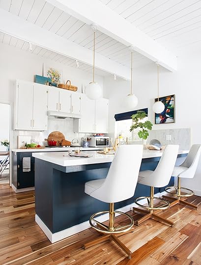
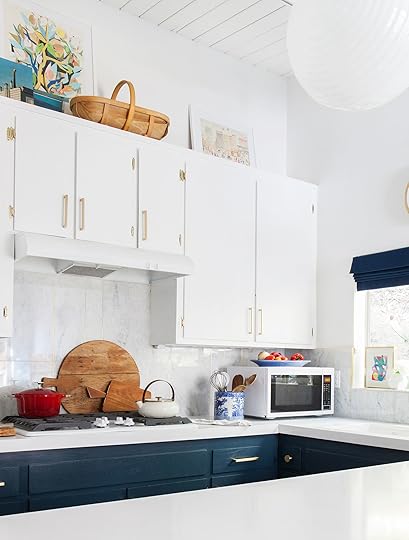 photos by tessa neustadt | from: emily’s kitchen reveal
Okay, let’s dissect why this works and what we can take away from this. There’s lots of artwork, which looks great because it adds a lot of color to an otherwise white space, and it can add some depth if you want to layer things in front of it. It offers height too, which if you have A LOT of space between the top of your cabinets and your ceiling like Em does here, then it fills up that vertical space really well. I want to incorporate more color into my styling, so this could be a good area to do that in. There are 2 other things I want to point out about this styling specifically: 1. the wood basket adds a lot of warmth and helps to sprinkle around a wood tone that would only otherwise be on the floor and the counter in that cutting board –– we love spreading the color palette around in a room and this is a great area to add more of the colors you already have (even if wood TECHNICALLY isn’t a color, you should treat it as such :)). The second thing I want to mention is that this above cabinet styling job is pretty minimal. Now I’m rethinking if I should style the entire wall of cabinets or if I should just do a small section like in these photos…what do you guys prefer?
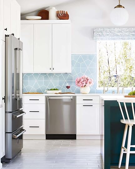 photo by zeke ruelas | from: the casa soria kitchen reveal (+ 5 things i would have done differently if it were my kitchen
Ah, I love this kitchen Orlando renovated for his parents (it’s sooo sweet). This is an interesting inspo picture because he was dealt an awkward nook card and he slapped it down, crushed it, and won the game. I like how he used a really minimal color palette in his decor, but kept the visual interest by adding in that really fun sculptural thing on the right…I don’t even know what it is but I love it and want it desperately.
Go Green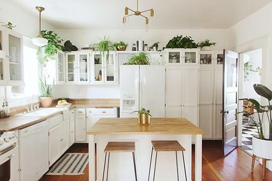 home by branchabode | via schoolhouse
Plants!? Plants. This photo definitely solidifies that plants can work above your kitchen cabinets and make your home feel like a cute little earthy greenhouse if you want it to. I’m not nearly skilled enough to keep this many plants up here because I would in fact forget about them and let them die (I’m not a good plant mom and that’s okay). I might opt to put one or two easy going plants like, I don’t know, a succulent?? Or maybe something that would make it feel a little more bright, happy, and just all around alive up there, but I don’t think I could physically handle this many…
Repeat One Design Element photo by ngoc minh ngo | via architectural digest
 home by honey n hydrangea | via honey n hydrangea
We’re all about the power of repetition in a space, and this area seems to be no exception. This is an especially great option if you have a collection that you want to display. For example, this would be a great spot to display a collection of plates (my grandma has a plate collection and it’s very cute) or vases or even something like candle holders. Remember though, this is probably best if you’re looking for pretty over function and would be best served in kitchens that already had ample storage space for your needs.
Make It Your Cookbook Library home of trudy gould and seamus mccartney | photo by eve wilson | via the design files
First off, I love the way they styled this…it looks SO effortless, cozy, and casual. It’s definitely making me rethink things. If you don’t have the space to stack your books vertically (I definitely don’t) then you can also stack them horizontally and incorporate them in with your cookware storage.
If you’re interested in taking a stab at styling above your kitchen cabinets, I thought I’d give you a little roundup of our favorite decor items on the internet right now to make it look the best it can look!
1. Chevron Flow Print | 2. Tara Serving Bowl | 3. Vintage Dough Bowl | 4. Colorway Pot | 5. Cake Stand | 6. Tobi Taper Candle Holder | 7. Pillar Sculpture | 8. Form Ceramic Candle | 9. Pool Party for Two | 10. Soft Shapes IV Framed Art Print | 11. Black Waxed Metal Vase Set | 12. Waverly Wall Mirror | 13. Wooden Hand | 14. Wicker Wall Clock | 15. Kati Stash Box | 16. Shaped Taper Candle – Set Of 2 | 17. Wood Chain | 18. Whitney Vase
My Next Steps…These inspiration photos definitely got me thinking and I have a few key things I know I’m going to change after researching and writing this post. Now we’re all aware that due to the space limitations I explained in great detail before, I’m most definitely here for storage, so having some bowls and random vase storage up there is going to be critical for me (I’m really driving this storage point home). I’m thinking I should pair back a bit on the AMOUNT of stuff up there. For example, I probably don’t need 2 of the same pitcher styled directly next to each other like I have now (lol). So some rearranging and minimizing may be in order. The last thing I’m thinking about is incorporating more of my cookbooks up there (probably horizontally with a little box or something on them), just to break up the glass vase/bowl museum and give myself some more cookbook storage space (yup, that collection is growing quickly too). What are your thoughts?? Any wisdom or styling advice for this area before I take a real stab at making it look nice?? Thanks for reading and I’ll meet you in the comments below
Opening Image Credit: Photo by Tessa Neustadt | From: Emily’s Glendale Kitchen Reveal
The post What Do You Do With That Awkward Space Above Your Kitchen Cabinets? appeared first on Emily Henderson.
The 4 Reasons Why Our Historical Architect/Build Team Says We Can Let Go Of Our Original Window Frames Despite Public Protest…

I love a good ‘Save the Moulding’ protest and subsequent rowdy debate, despite its seemingly benign subject. Maybe it’s refreshing that after the drama of 2020 this is our collective beef? But like all of life, there aren’t two clear opposing sides here, it’s not that clear-cut. Here’s what I know: Y’all really want me to keep the original window and door casings/trim. I hear you. If only it were that easy.
This post is dedicated to all of you who are renovating and wondering what elements you should/could try really hard to keep, and what original elements are ok to forego in the name of safety, modernity, cost-effectiveness, and well, common sense all while keeping the future of the planet top of mind. As a recap… most of the window and door casing and mouldings are original, with a heavy 1905-1920s craftsman vibe. I really want to keep as much original architectural elements as possible so I planned on just painting them to lighten them up. But if I asked myself the honest question, which I did: Is this the trim work I would put in now? The answer is: Probably not. Please let this be clear – I LIKE the window and door casings, stylistically they are GREAT and if you have them know that I think they are beautiful and appropriate for the style and era. Also to be the most clear, we are keeping the windows. I love those diamonds so much and they can be removed without getting damaged (or very little).
What’s my problem? They are just a bit fancier and heavier than I would choose for the vibe of the house that we want (casual, paired back, humble, shaker). Yes, I am kinda trying to fit a simpler style into an older home which is a challenge, but one that I think if well executed will have a more interesting result that is better for our family. We are removing almost all of the windows on the first floor because we are opening the living room up to the backyard (those are the only original windows on that floor) and the 60s addition obviously doesn’t have original windows. So it’s really just the upstairs bedrooms/bath and the landing that are in question.
So when we were up there last week I asked Arciform (Anne – lead design and Adam – GC) to break it down for me – WHAT SHOULD WE DO? In case you didn’t read my love letter to them – see here – Arciform specializes in restoring historic homes – it’s quite literally why people (like me) hire them. I joke that they are here to protect me from myself, or to more bluntly state “to help me not ruin this house”. It’s like having a bodyguard for the integrity of a home. I don’t think they would call themselves any sort of ‘preservationists’ because while they specialize in historic homes, they design and build for the family/client to actually use the house the best way in their current season of life. They renovate to work well for now, with a huge understanding of and respect for the past. So I asked them bluntly after our last blog post about it, opinions flying, confusion afloat ‘should we keep these window and door frames??’ They clearly and firmly rattled off these reasons to, well, NOT KEEP THEM.
 1. They Will Get Badly Damaged When We Remove Them For Wall Demo
We have to demo out all of the plaster for all new electrical and insulation. It’s not in good shape and it’s going to be down to the studs. That means we need to take the window and door casing out which will damage them unless the demo team is painstakingly careful (more time = more money). They will likely have to be repaired because it’s old wood in order to reinstall them (again – cash, money).
2. They Will Need To Be Carefully Labeled And Stored (Because They Aren’t All The Same)This isn’t a real reason to not do it, but it does sound like a chore and there will likely be a lot of troubleshooting. Old homes mean that each one is slightly different, not just the tops and sills but the sides, etc. Reassembling them is a puzzle, unless documented very carefully. Also, that will take time.
 3. The New Drywall Isn’t The Same Depth As The Plaster – Weirdness Will Happen
The original lath and plaster are less deep than the new drywall. So when it gets installed we’ll have to troubleshoot it to make it work. Maybe we’ll have to add wood behind the frames and they won’t look seamless. Again, all doable, but every bit of troubleshooting takes rounds of decisions, which will take time and money to make sure that it looks good. My eyes started glazing over at this point…
4. The Window Frames Are Chipped And Painted With Lead Paint
DEAL SEALED. Not everything original is good, and we are talking vintage lead paint. The window frames aren’t in great shape and are chipped all over – they need a total body job. Plus once we got the lead report I was like, done. It was however explained to me that lead can actually be ok if it’s sealed and not touched. But… people touch windows a lot and air comes in through them – they are kinda more ‘active’ than say a baseboard or door casing that no one really touches. They have so many layers that they can’t really be stripped safely so we’d be painting over chips and while I like a little jank in an old house, I don’t want this house to be this janky. There’s keeping soul, and then there’s keeping wear and tear that could be updated in a more beautiful way (or in a way that lets other things shine, like the actual windows themselves).
So in conclusion it will be much, much, much more expensive to demo out carefully, store carefully, restore carefully, reapply carefully, and even then they may just look old and janky. At a certain point it stops making sense, especially when I’d rather have a simpler profile to help pair the house back in decorative detail. Don’t worry – we aren’t entering ‘new build’ world, the quality and details of the finishes will make the house sing even if the decorative nature is stripped back a bit.
The post The 4 Reasons Why Our Historical Architect/Build Team Says We Can Let Go Of Our Original Window Frames Despite Public Protest… appeared first on Emily Henderson.
Emily Henderson's Blog

- Emily Henderson's profile
- 10 followers

