
Cameron Moll's Blog, page 15
August 10, 2011
Apple to Reduce Fifth Avenue Cube to 15 Glass Panes
Currently there are 90 panes in Apple's iconic Fifth Avenue store. Core77's take on the consolidation of the panes is fitting for Apple and its admirers alike:
There's no hard business reason to replace the Cube. It wasn't falling down, tourists weren't looking at it dismissively, and it won't lead to an immediate increase in profits. Apple is replacing it for no reason other than that they found they could push the boundaries of glass and have chosen to manifest that innovation. That's what we love, and soon—date TBD—that's what Cube-goers will get to see.


Elliot Jay Stocks' Mac Setup
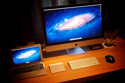
His setup is almost identical to mine, as are his sentiments regarding the Air:
As I said when I originally blogged about my plans for a cloud-centric Mac set-up, it's all about the extremes: the biggest possible iMac and the smallest possible Air. Many people can't understand why I went with an 11" Air, but in my opinion, a 13" defies the point of getting an Air in the first place. People forget that the 11" Air has a horizontal resolution of 1366 pixels, which is just 74 pixels narrower than my old friend, the 15" MacBook Pro.
Amazon's Kindle Cloud Reader
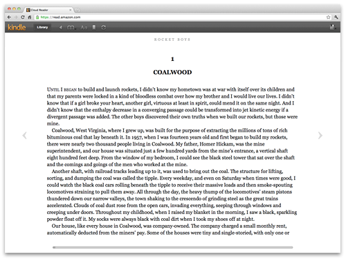
Neato. An in-browser reader. Now I can read my Kindle books on every piece of Apple hardware I own.
August 8, 2011
Redesigning the Browser Window
Henrik Eneroth:
Most screens today are widescreens, so why are we not putting the left and right hand sides of the screen to better use, instead of forcing everything into a bar on the top of the window?
/via Hacker News
August 4, 2011
MOVE
Footage from 11 countries combined as if filmed in a single location. Imagine the coordination it took to pull this off. See also LEARN and EAT.
/via @scottharrison
August 3, 2011
10K Apart, Responsive Edition

Same as last year's contest (10k of data total per app submitted), but with an additional rule this year: must be responsive. Site design by the responsive savants at Paravel.
Film Sessions II

Film Sessions vol. II is now available for listening. I'm really pleased with how it came together, much the same as vol. I.
Here's the description I provided with the mix:
This mix paints a narrative as if it were the score to a single movie. Dreams yield to mystery and suspense and then evolve into hope.
That really was the intent with this second volume. Not only have I selected compositions from some of my favorite scores, but they've been arranged to tell a story. And once again, a photo from my Instagram stream was used as the cover artwork. (Taken in my backyard even, if I recall correctly.) The typeface is H&FJ's Knockout, which has an impressive array of weights.
Have a listen and see what story it paints for you.
P.S. You knew Designers.MX is now an Authentic Jobs listing partner, right? Check for featured listings in the footer as you thumb through the site's mixes.
August 2, 2011
Vimeo PRO
Yesterday Vimeo unveiled its PRO account for businesses. They've had a long-standing policy against commercial videos on the site, though many have slipped past the radar if they were creative or artistic enough. Now they welcome business accounts, but with a catch:
Vimeo PRO lives as a separate service — invisible to the Vimeo.com world…. Vimeo PRO accounts do not have access to the Vimeo community by default, meaning PRO accounts' activity and videos will not show up on Vimeo.com, and they do not have the ability to like or comment. We've taken this step to keep commercial content hidden and maintain the current Community Guidelines.
Commercial videos are housed in customizable portfolio pages, and the Vimeo player can be fully customized to your liking (including company logo). But the message seems clear: Pay us to host your commercial videos, but don't mess with the incredible community we've cultivated.
I think it's a bold, austere approach, and it's the right one. I plan on becoming a PRO user myself, but I would hate for that to trample the Vimeo community — one of the most respected creative communities anywhere online.
July 29, 2011
A Word About Unsolicited Redesigns
Khoi Vinh, former design director for NYTimes.com:
Unsolicited redesigns are terrific and fun and useful, and I hope designers never stop doing them. But as they do so, I also hope they remember it helps no one — least of all the author of the redesign — to assume the worst about the original source and the people who work hard to maintain and improve it, even though those efforts may seem imperfect from the outside. If you have good ideas and the talent to execute them and argue for them, the world will still sit up and pay attention even if you take care in your language and show respect to those who don't see things quite the way you do.
Consider this my public apology for so quickly embracing one side of the argument and failing to contemplate the other.
Update: Some of you are suggesting I shouldn't apologize. Aside from that being a matter of my own choosing, I believe we sell ourselves short if we consider only one side of an argument, especially in matters of design and UX. I'm fortunate to know both Khoi and Andy quite well, and to fail to consider both their opinions — very experienced opinions, at that — would not be fair to them nor to myself.
Cameron Moll's Blog

- Cameron Moll's profile
- 4 followers

