Elizabeth Lunday's Blog, page 6
May 1, 2012
Random skimmings from my New York Museum tours
Y’all, I am wiped out.
I got in last night from New York about 10:00, and while it was lovely to get a good’s night sleep in my own bed, I am still so tired I can hardly think straight.
The conference was fantastic. If you’re a writer of the nonfiction/journalistic variety, or you want to be a writer of same, hie thyself to the ASJA conference because they are producing some seriously great content. Just as good as the sessions are the people you meet. These are the pros, and they know what they’re talking about.
ASJA also provides an opportunity for me to OD on art. It’s so meaningful to see all this work in in person. I barely dipped a toe in the waters of New York Museums–I only had time for the Met and MoMA–but I saw enough fantastic work to inspire multiple lines of thought.
I’ve got several blog posts planned, but today I’m just going to hit some highlights. This is a completely personal selection of What I Saw at Museums–paintings and sculptures that caught my eye and inspired me to linger a little longer. (They’re also the ones that came out OK in my photographs. I was using my phone, which for a phone camera is pretty good, but neither it nor I are capable of producing first-class art photography. If you’re intrigued by any of these works, I encourage you to try to find them on the museum websites so you can get a better look.)
Where to begin? Maybe the past:
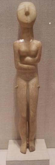
Marble female figure, Cycladic Greek, Ca. 2700-2600 BC
It’s so ancient it could be modern.
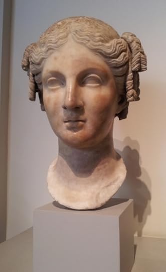
Marble Head of a Woman, Roman-Imperial Period, ca. 1st Century A.D., Copy of a Hellenistic Statue, ca. 3rd or 2nd Century BC
I didn’t have enough time to spend much in the ancient art. I just bopped into the Greek and Roman section for a few minutes–but the elegance of this sculpture amazes me.
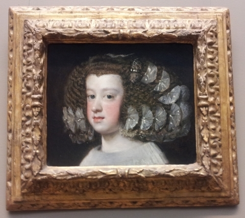
Diego Velazquez, "Maria Teresa, Infanta of Spain," ca. 1651-54
Skipping ahead several centuries, I adore this Velazquez. That hairstyle looks incredibly uncomfortable, but look at the masterful execution of the ribbon butterflies in her hair.
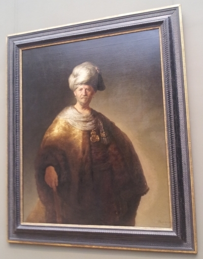
Rembrandt van Rijn, "Man in Oriental Costume," 1632
The presence of this painting is far vaster than its size only could convey. It dominates its space.
I spent the most time this visit with the Impressionists, Post-Impressionists and moving into Moderns this trip, because that’s where my research has been focused lately.

Paul Cezanne, "Still Life with Apples," ca. 1895-98
Cezanne and his apples are a bit bewildering–he painted so darn many of them. In fact these apples had a huge impact on the history of art and the development of modernism. Cezanne used the simple form of apples to work out his ideas about perspective and color; they are endless experiments in finding a new way to paint.

Paul Cezanne, "Still Life with Apples and Pears," ca. 1891-92
People often walk right by the apples, but they’re worth hanging out with for a while. Pay attention to the details, the lines, the color. It’s fascinating to see what’s wrong with the paintings–the lines that aren’t straight, the perspective that’s wonky, the way tables tip or sway, the way the apples seem tipsy. That’s how you start to understand what Cezanne was doing and why he was so important.
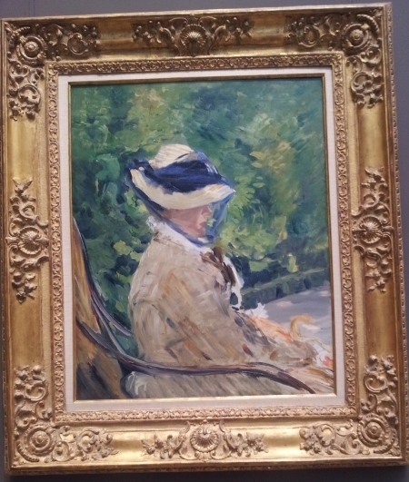
Edouard Manet, "Madame Manet at Bellevue," 1880

Vincent Van Gogh, "Starry Night," 1889
The colors in this painting simply can’t be captured in a photograph. It’s mesmerizing.
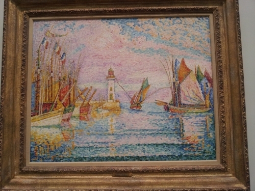
Paul Signac, "Lightouse at Groix," 1925
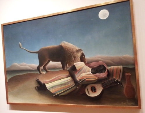
Henri Rousseau, "The Sleeping Gypsy," 1897
Rousseau was an odd duck, and so are his paintings. In one sense, he had no idea how to paint, but in another, wow, that guy knew how to paint.
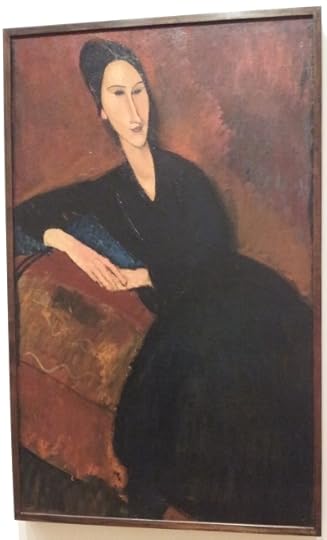
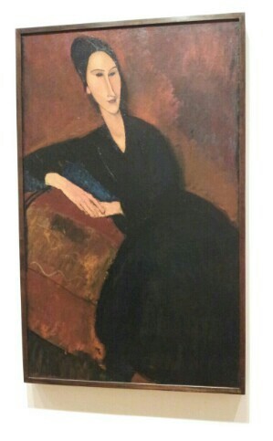
Amedeo Modigliani, "Anna Zborowska," 1917
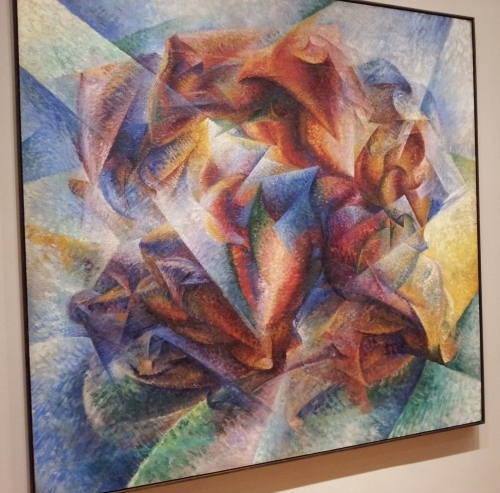
Umberto Boccioni, "Dynanmism of a Soccer Player," 1913
The Futurists are a problematic bunch–the association with Fascism is troubling. But their mastery of color was fantastic.
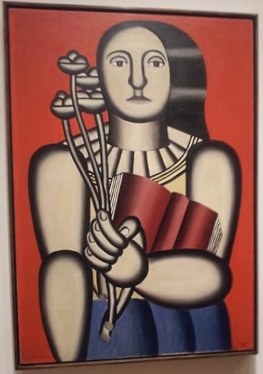
Fernand Leger, "Woman with a Book," 1923
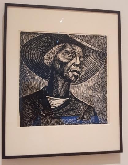
Elizabeth Catlett, "Sharecropper," 1952
That’s one random group of works, my friends. I saw pieces that were more recent, as well as ones that were far, far older. Although the fact of the matter is that the Met is too darn big. At some point as I collapsed on a bench somewhere in between one thing and another while surrounded by Medieval statuary I thought, “My god, they’re trying to kill us! With art!” MoMA is big but not HUGE and so more manageable–and even then I didn’t see everything.
I will become more thematic in the next few days as I get rested up and start to assemble my thoughts into coherence.
But one last photo before I go–a sculpture that never fails to make me grin in sheer delight:

Pablo Picasso, Detail from "She-Goat," 1950
My photo of the entire piece didn’t turn out, but even the detail of the head is so absurd and silly and strong and enduring all at the same time.
And that one piece can be so many things–so many seemingly contradictory things–at once is part of what makes art amazing.
April 28, 2012
Art overload!
Exciting day, my friends. I’m in New York for a conference–or rather, I’m in New York to visit the museums with the conference as an excuse.
Today: the Museum of Modern Art. And fantasticness. Which isn’t a word. But whatever.
I’ve got lots to say–art is something you’ve really got to see in person. No reproduction can capture the scale, the colors, the experience of art. So many times I’m most surprised by paintings and sculptures that I think I know the best.
And then there are the artists I’ve never heard of. The works that come out of nowhere.
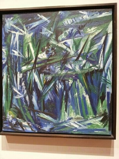
It was an awesome trip. But ya know the totally most WOW moment?

Finding my own book in the bookstore. It doesn’t get any better than that. I’m humbled and amazed and delighted.
April 23, 2012
The Art of the Bard
Literature has always served as an inspiration for art. From the earliest days of Western civilization, the Greeks were depicting their myths on their pottery, in their sculptures and, presumably, in their paintings.
So it’s no surprise that the plays of William Shakespeare have inspired great outpourings of art. On this, his presumed birthday (we only know the date of his baptism, so his birth date has to be assumed), I decided to take a look at some of paintings based on his plays.
Most of this art is by English artist, which is logical–he’s their compatriot, after all. Artists inspired by Shakespeare aren’t exclusively English–the French Eugene Delacroix did some work based on the plays, for example–but England predominates.
One of the earliest I found is by William Hogarth, from 1735:

William Hogarth, "A Scene from the Tempest," 1735.
The painting draws on the late, hard-to-classify and yet marvelous The Tempest. (The preferred term among scholars would be “problematic.” In grad school, I took one seminar on Renassiance drama, and we said things were “problematic” a lot.) The lovely Miranda sits on a throne of coral and shells, her magician father Prospero behind here hovering anxiously. To one side is the beseeching Ferdinand, the genteel castaway who will eventually win her hand. Behind and looking jealously at the beautiful maiden is the hideous Caliban. As Prospero’s servant (slave?) he hauls wood, the only laborer among these cheerful lie-abouts, and in his brutish clumsiness he crushes underfood one of a pair of linked doves.
Hogarth had high hopes for this painting, which he completed for his patron the Early of Macclesfield; he wanted to paint a whole series on scenes from Shakespeare, but no one came begging with commissions, so Hogarth presumably shrugged and went on to the next thing. The painting has Hogarth’s particularly narrative, moralistic slant. The artist said that his creative innovation was “painting and engraving modern moral subjects.” He had resolved early in his career to “treat my subjects as a dramatic writer; my picture was my stage.”
A very different type of artist from the commercially successful Hogarth was the mystical William Blake, who painted this work inspired by Shakespeare:

William Blake, Oberon, "Titania and Puck with Fairies Dancing," ca. 1785
Blake was, to put it politely, a weirdo. He was a printmaker and poet possessed of such a unique creative vision that he spent most of his life bankrupt. Most of his prints depict his unique vision and philosophy (and are correspondingly wackily compelling), but he also created illustrations–he was at work on a massive project to illustrate Dante’s Divine Comedy at his death. In the 1780s, illustrations of Shakespeare were popular, and scholars have suggested this work was an attempt by Blake to break into this market.
The scene depicts a moment toward the end of A Midsummer Night’s Dream when the fairy queen Titania calls upon her fairy court:
Hand in hand, with fairy grace,
Will we sing, and bless this place.
Titania embraces her husband Oberon, their relationship restored after the confusion of the previous night, and Puck, the mischievous instigator, stands at their side with ivy in his hair. The figures have the characteristic Blakean lack of anatomy–he was a visionary who didn’t worry about things like musculature or, you know, bones–and the space is ill-defined. But there’s a lilting quality to the dancers that is charming. In fact, the dancers remind me of Matisse’s famous dancers–I wonder if he knew this work?
The depiction of Shakespeare really got going during the Victorian period with the Pre-Raphaelite artists. The Pre-Raphaelites just loved them some Shakespeare, and just about all of them took him as as inspiration at one point or another.
One of the earliest is this famous work by John Everett Millais:

John Everett Millais, "Ophelia," 1851-52
The detail of the flowers and plants is simply astonishing. The Pre-Raphaelites really believed in detail, and every leaf is lovingly correct. The scene shows Ophelia, maddened from the murder of her father by her lover Hamlet, lying in a stream singing nonsense shortly before her death by drowning. I’ve talked about this painting before–in particularly how the model, Elizabeth Siddal, caught pneumonia from posing for hours in chilly bathwater. It’s a work remarkable in its clear pity for its subject–look at the detail of the upraised hand, palm open in a gesture of innocent frailty.
Another early Pre-Raphaelite Shakespearean work is this one by William Holman Hunt:

William Holman Hunt, "Claudio and Isabella," 1850
There’s an excellent discussion of this work here; it depicts a scene from Measure for Measure, one of the more, er, problematic “comedies.” Claudio is imprisoned (notice the shackles) for impregnating a young woman to whom he is not married. Unfortunately, the judge Angelo then ruling the city of Vienna in the absence of the Duke, sentences him to death for his immorality. His sister Isabella, a novice nun, goes to Angelo to beg for her brother’s life, and Angelo, overcome by lust for her beauty, offers to free Claudio in exchange for her virginity. The virtuous Isabella naturally refuses. In this scene, Isabella has gone to Claudio to tell him what happened. He expresses his fear–in fact, his horror–of death, and she expresses sympathy for his fears, although clearly she herself believes in Heaven. This is the moment depicted here, and in the next breath Claudio will beg his sister to sacrifice her honor for his life.
As ever with the Pre-Raphaelites, the details are meticulously executed. Hunt visited a prison to get the background right. The vivid reds of Claudio’s clothing stands in contrast to the muted colors of Isabella’s, symbolic of his riotous, immoral life and her simple, pure one.
Not to be left out of the Shakespeare party, Dante Gabriel Rossetti got in on the game in 1858 with this pen and ink drawing:

Dante Gabriel Rossetti, "Hamlet and Ophelia," 1858
The scene is of Ophelia attempting to return Hamlet’s letters and tokens of affection. Since his father’s death, he has grown distant, and now Ophelia’s meddling father has insisted she return his letters to force the issue. Rossetti captures the pained look on Hamlet’s face–a face that belies his harsh words, while Ophelia turns away, unwilling to look at him. The beautiful Ophelia is again portrayed by Elizabeth Siddal, by then Rossetti’s wife.
The details of the wood carvings are elaborate and symbolic–there’s an excellent discussion of them here. As with most of Rossetti’s work, the perspective is wonky–he never mastered it. The background has some weird and wild architecture going on. But the faces are magnificent, and capture a painful moment within the play.
Holman Hunt, Rossetti and Millais were the official members of the official Pre-Raphaelite Brotherhood (PRB), but several other artists became associated with the style as the years went on. For example, here’s Ford Madox Brown:

Ford Madox Brown, "Romeo and Juliet," 1867
Brown was older than the other members of the PRB; Rossetti saw his work in the 1840s and begged the artist, the highly unpopular and a commercial failure, to be his tutor. He has the same hyper-attention to detail and narrative emphasis as the Pre-Raphaelites, as well as the same preference for painting beautiful women.
Here he depicts Romeo and Juliet after their one night of wedded bliss. Juliet is disheveled, not yet dressed, while Romeo has flung one leg over the balcony railing in preparation for departure. He steals one last embrace, the conflict in his body represented by the contrast between the out-thrust arm moving away from Juliet and the other than clings to her bare shoulder. Dawn is breaking over the town, and he must flee for his life.

Sir Lawrence Alma-Tadema, "Antony and Cleopatra." 1883
Born in the Netherlands, Alma-Tadema moved to England in 1870 at the outbreak of the Franco-Prussian war. He had always painted historic scenes, but meeting the Pre-Raphaelites and friends in England encouraged his to brighten his palette and refresh his themes. His work became lush, bright and ever-more detailed.
His Cleopatra is seen riding on her barge down the river Nile, a scene described in magnificent verse:
The barge she sat in, like a burnish’d throne,
Burn’d on the water: the poop was beaten gold;
Purple the sails, and so perfumed that
The winds were love-sick with them; the oars were silver,
Which to the tune of flutes kept stroke, and made
The water which they beat to follow faster,
As amorous of their strokes. For her own person,
It beggar’d all description: she did lie
In her pavilion–cloth-of-gold of tissue–
O’er-picturing that Venus where we see
The fancy outwork nature: on each side her
Stood pretty dimpled boys, like smiling Cupids,
With divers-colour’d fans, whose wind did seem
To glow the delicate cheeks which they did cool,
And what they undid did. . . .
Cleopatra doesn’t look particularly Egyptian, but look at the fall of the leopard-skin, the sheen on the silk curtains, the clusters of roses. Europeans were obsessed with the exotic Orient at this time, and this work manages to combine that obsession with a love Shakespeare for a perfect double-play of Victorian fantasies.
Finally, there’s this late work by the latest of the Pre-Raphaelites:

John W. Waterhouse, "Ophelia," 1910
Waterhosue painted Ophelia three times over the years, and this is the last version. (He planned a fourth painting but died before he could attempt it.) She is on her way to her death, gathering flowers by a stream. By 1910, most artists had abandoned the hyper-realism of the Pre-Raphaelites, but Waterhouse continued it, and the detail of the embroidered gown, the flowers, and the river grasses are impeccable.
What makes the work fascinating to me is the expression on Ophelia’s face, which is pained and distracted, Waterhouse’s indication of her madness. Two children watch her from the footbridge over the stream, their expressions revealing their puzzlement and pity.
There are dozens and dozens more Shakespeare-inspired works, many by the Pre-Raphaelites. If you’re curious, check out this site from Emory, which features primarily British works, or this collection from Flickr, which includes a wide range of works from all nationalities.
So happy birthday, William Shakespeare! And thanks to the artists who made his works come alive in new ways.
April 18, 2012
If up’s the word: spring and e.e.cummings
 When I was in high school, I developed an absorbing interest in the poetry of e.e.cummings. My mom, herself an English major, had a book of his poetry that I happened upon one day. I was captivated. This was nothing like the poetry they forced us to read in school. This was new, different, fascinating.
I wrote my junior term paper on cummings, using as my thesis the scintillating argument “e.e.cummings used unusual language and punctuation in his poetry.” I then proceeded to prove this point with endless examples. It must have been excruciating to read.
For my 17th birthday, when my grandmother took me to buy my traditional gift of a book, I selected the collected works of cummings and then carried it around with me almost anywhere. (Why, yes, I was a raging dork, although I would have called myself an “outsider.” I was emo before emo was invented, goth before anyone called it that. I had a long black trenchcoat that I wore in all weather.) (Except when I was wearing my letter jacket and dance team uniform. I was part-time emo–and kind of psychophrenic about my outsider status.)
Anyhoo, I read cummings with passionate intensity. I memorized what I could–which wasn’t much, I’m a terrible memorizer. I was particularly fond of this short piece, which I inscribed everywhere as a sort of theme statement:
seeker of truth
follow no paths
all paths lead where
truth is here
I went to college fully expecting to study cummings more intently, but it didn’t take me long to realize that e.e. was sadly out of fashion. Interest in his work had peaked in the 1950s, when he toured college campuses speaking to halls filled with hundreds of students. Since his death in 1962, his reputation had declined. No one ever mentioned him when I was in college in the 1990s, and when I went to grad school in the early 2000s, he was completely ignored.
Now I understand why. For all the insistence of my junior thesis that cummings was new, different, progressive, modern, he is in fact a highly traditional poet. Yes, he avoided capitalization and scattered his words all over the page, but these irregularities were glosses over conventional work. The man wrote sonnets. Uncapitalized sonnets, but sonnets. His themes are rooted in the history of poetry–love, nature, beauty. His expression of them, while unconventional, lacks the precision or clarity of the greatest modern poetry. For all the arm-waving and de-capitalizing, he is the least modern of modernists.
It took age and sophistication on my part to realize this. The uncapitalized “i” in cummings’ poetry is an affectation, as contrived as my black trenchcoat. He might as well have been writing in green ink or wearing sunglasses in the dark. It was a put on, and therefore in many ways adolescent. Hence the appeal to me as an adolescent. I frequently wrote in green ink, although I can’t remember resorting to sunglasses.
Yet I can’t regret my passion for cummings, and as the years have gone by I have returned to him. For one thing, while cummings was a lousy modernist, he provided an excellent introduction to good modernists. My love of cummings made me more interested in other works of the period, which led me to Yeats. His inventiveness paved the way for the greater inventiveness of Gerard Manley Hopkins. By reading cummings, I was preparing myself to read Eliot.
And I’ve come to love–again–some of his work. Today I appreciate it for what it is, and I feel the strongest for his most traditional poems. Cummings is at his best when he sticks to the themes of love and nature. He can bring to these works a joy and delight that are infectious.
He is above all a poet of spring. And every spring I remember him. I remember this, one of his earliest works:
in Just-
spring when the world is mud-
luscious the little
lame balloonman
whistles far and wee
and eddieandbill come
running from marbles and
piracies and it’s
spring
when the world is puddle-wonderful
the queer
old balloonman whistles
far and wee
and bettyandisbel come dancing
from hop-scotch and jump-rope and
it’s
spring
and
the
goat-footed
balloonMan whistles
far
and
wee
I love “eddieandbill,” friends so inseparable they are one name. I love the words “puddlewonderful” and “mudluscious.” And I love the dated innocence of it–for who today plays marbles, and what mom would let her kids run around after a goat-footed balloon man?
There’s this lovely work:
Spring is like a perhaps hand
(which comes carefully
out of Nowhere)arranging
a window,into which people look(while
people stare
arranging and changing placing
carefully there a strange
thing and a known thing here)and
changing everything carefully
spring is like a perhaps
Hand in a window
(carefully to
and fro moving New and
Old things,while
people stare carefully
moving a perhaps
fraction of flower here placing
an inch of air there)and
without breaking anything.
I love the tentative quality of it, “like a perhaps”–for don’t you feel that way, on the days you awake and you’re not entirely sure if winter is over?
This poem, however, is my favorite for spring days so glorious that the universe itself seems to be bouncing in joy:
if up’s the word;and a world grows greener
minute by second and most by more-
if death is the loser and life is the winner
(and beggars are rich but misers are poor)
-let’s touch the sky:
with a to and a fro
(and a here there where)and away we go
in even the laziest creature among us
a wisdom no knowledge can kill is astir-
now dull eyes are keen and now keen eyes are keener
(for young is the year,for young is the year)
-let’s touch the sky:
with a great(and a gay
and a steep)deep rush through amazing day
it’s brains without hearts have set saint against sinner;
put gain over gladness and joy under care-
let’s do as an earth which can never do wrong does
(minute by second and most by more)
-let’s touch the sky:
with a strange(and a true)
and a climbing fall into far near blue
if beggars are rich(and a robin will sing his
robin a song)but misers are poor-
let’s love until noone could quite be(and young is
the year,dear)as living as i’m and as you’re
-let’s touch the sky:
with a you and a me
and an every(who’s any who’s some)one who’s we
“And a climbing fall into far near blue.” God, I love that. I love the swoop of this poem. Try reading it out loud and see if you aren’t swaying by the end. It rushes and jogs and leaps. “In even the laziest creature among us / a wisdom no knowledge can kill is astir” –and it’s right, somehow. We find this strange wisdom in spring, especially if digging in the dirt, planting flowers, cleaning beds. We know something we didn’t know we knew, we are connected to a deeper understanding through our very bodies.
I get why we didn’t bother to read cummings in my American modernism graduate class. No offense to the man, but he’s a lightweight among Eliot, Yeats, Frost et. al. His poetry is all emotion and aesthetics, while they prompt far more complex reactions, intellectual and philosophical as well as emotional and aesthetic. Eliot could be beautiful and impossibly deep at the same time in a way that cummings simply didn’t have in him. On the other hand, Eliot could never be as unselfconsciously joyous as cummings at his best.
Today was a gorgeous spring day in Texas–a lilting day, an e.e. cummings kind of day. I found myself thinking of that line, “a climbing fall into far near blue.” The sky was a far near blue out my back window. Up’s the word, and the world grows greener, minute by second and most by more. Enjoy your spring.
April 16, 2012
Survival of the most elegant: Élisabeth Vigée-Le Brun
I’ve never cared for Rococo art. It’s too . . . silly.

Jean-Honoré Fragonard, "The Swing," 1767
Rococo dates to the early- to mid-18th century and closely assocated with pre-Revolutionary France. Versailles is the epitome of Rococo architecture, just as Fragonard is the epitome of Rococo art. The whole movement’s got a sort of fragile prettiness about it–an over-exuberant lushness combined with self-consciousness. It makes me feel queasy, as if I’ve eaten one too many chocolate truffles.
Just look at this painting: it’s a portrayal of wealth and immorality. The silk-swathed lady is being pushed in the swing by her husband as her lover hides in the bushes to catch a glimpse up her skirt. There’s nothing condemnatory about it–the artist is giggling along with the participants. The stone cupids at the bottom are shocked, but the one to the far left simply holds a finger to his lips for silence.
I don’t mean to be Puritanical, but it’s just too, too much. Rococo was the art movement of the French aristocracy, and I can’t help thinking of the 99 percent starving as the 1 percent lived in their over-decorated palaces in their over-befrilled silks and bought this over-fanciful art. (If you think income disparity is a problem today, take a look at 1780s France.)
But for all my distaste for Rococo, I adore one of its major players: Louise Elisabeth Vigee-Le Brun.

Elisabeth Louise Vigée-Le Brun, "Self-Portrait," ca. 1781
Partly it’s because her art has a freshness that most Rococo lacks. Her work is pretty without being coy. This has something to do with the fact she mostly painted portraits, which automatically lack the ridiculousness of Fragonard’s scenes. Even so, her women don’t simper, which other Rococo female portraits seem to do.
The other thing about Le Brun is her story. She was a survivor, who persisted through the ups and downs of history while keeping her dignity–and her elegance–intact.
Le Brun was the daughter of a moderately talented portrait painter, who taught her the basics of her craft. (Art historians have noted that many female artists prior to the late 19th century were the daughters of artists. It seems to have been about the only way to ensure access to materials and instruction as well as familial support.) He died, however, when she was 12, of an infection following surgery to remove a fish bone lodged in his throat. Let us all now pause to thank history for the development of antibiotics.
Despite her grief, the girl continued to refine her painting skills, and by the time she was 15 she was painting society portraits and largely supporting her family. Her mother hoped to take the pressure off her daughter by marrying a wealthy jeweler, but he turned out to be a skinflint who kept his wife in penury and demanded every penny made by his daughter-in-law. Friends were outraged, but Elisabeth had few options as long as she lived at home–even though her reputation was soaring. In 1774, at age 19, she was admitted to the Academy of St. Luke, cementing her status as an established artist.
Through the Academy, Elisabeth met the art dealer Jean-Baptiste-Pierre Le Brun, who soon proposed marriage. Elisabeth wasn’t enthusiastic about marriage, but her mother was worried she would end up an old maid and pushed the match. In any case, marriage was the only way to escape from her demanding step-father. So she married Le Brun.
The Vigee women really didn’t know how to pick ‘em. Le Brun turned out to be as cheap as Elisabeth’s stepfather, although with more expensive tastes. He had already run through his own money and now proceeded to run through his wife’s.
Nevertheless, Vigee-Le Brun’s reputation only grew, and in 1779 she was invited to paint Queen Marie Antoinette. She became the queen’s favorite artist and painted most of the royal family and aristocracy. She portrayed the Queen in all of her fashionable glory:

Elisabeth Vigee-Le Brun, "Portrait of Marie Antoinette," 1783
Look at the fall of the silk and the detail of the lace. Luscious. The textures are really remarkable.
Soon Vigee-Le Brun was painting the most important and well-known people in France, including the mistress of the previous king:

Elisabeth Vigee-Le Brun, "Portrait of Madame du Barry," 1781
and the Queen’s best friend, the Duchess de Polignac:
[image error]
Elisabeth Vigee-Le Brun, "Portrait of the Duchess de Polignac," ca. 1782
Time was marching on, however, and the sins of the aristocracy were catching up with them. The Revolution broke out in 1789, and soon many of the people Vigee-Le Brun had painted were exiled, imprisoned or dead. She knew she would be condemned by the mob as well, so in October 1789, she dressed herself, her young daughter and her maid as working women and fled on the public night coach to Switzerland. She left her husband behind, probably relieved to be free of his presence.
The years of terror and war in France saw Vigee-Le Brun travel all over Europe, painting the rich and royal wherever she went. She met some of the most fascinating figures of her day, including Catherine the Great of Russia and Lady Hamilton, the wife of the English Ambassador to Naples and famous as the mistress of Lord Nelson and one of the most beautiful women in Europe.

Elisabeth Vigee-Le Brun, "Lady Hamilton as a Bacchante," ca. 1792
In 1800, Vigee-Le Brun returned to Paris, now under the rule of Napoleon as First Consul. The Bonapartes were generally happy to hire artists formerly associated with the former aristocracy, and Vigee-Le Brun painted some members of the new elite, including Napoleon’s sister Caroline:

Elisabeth Vigee-Le Brun, "Portrait of Caroline Murat and her Daugher Letizia," 1807
However, Vigee-Le Brun’s association with the hated Marie-Antoinette was too strong for her to regain her position in Paris. She moved about again, spending three years in England and painting the Prince of Wales.
At least she was secure and wealthy and able to avoid her annoying husband. Unfortunately, her relationship with her daughter was troubled. This adorable little girl:
Elisabeth Vigee-Le Brun, "Self-portrait in a Turban with Julie," 1786
grew up to be a willful, spoiled woman who married a Russian nobleman twice her age against her mother’s wishes at age 17. The marriage failed, and Julie wound up back in Paris in 1800s but refused to associate with her mother. The last blow was Julie’s death in 1819, which devastated Vigee-Le Brun.
Vigee-Le Brun lived to be 87, dying in 1842, many decades after Rococo art had passed away and new movements come and gone.
I admire her persistence, her buoyancy in face of numerous travails. Many people, it’s true, have unfortunate marriages and troubled relationships with their children. Others survive war and revolution. Not many do it all while creating luminous art.
Today would be Vigee-Le Brun’s 257th birthday. Happy birthday, Elisabeth, and well done.
April 5, 2012
Stormy weather: Wind, rain and lightning in art
It's been a wild week here at Chez Lunday. On Tuesday I was sitting at my desk when I noticed the tornado sirens going off. Now, they test the sirens the first Wednesday of the month at 1:00, and my brain automatically thought, "There goes the siren test." Then some other part of my brain popped up to nervously remind me that a) it wasn't Wednesday and b) it wasn't 1:00.
I have no reason to bemoan the next few hours–we got nothing more than heavy rain at my house. Spring storms wreak havoc across a large scale, but they're also capricious and hyper-local. Nothing particularly scary got within miles of me and mine.
Nevertheless, it's nerve-wracking. I had this totally irrational urge to go get my son from school and lie on top of him in the bathtub, even though he's far safer at school, a big concrete building, than in our frame house, and certainly safer anywhere inside than driving around the neighborhood with me.
But the whole atmosphere stirs up memories. Everyone who lives in Texas for any length of time has an experience with a spring storm burned into his or her brain. I vividly recall standing in the courtyard of my office building in Austin watching the wall cloud move south. It was still, hot, and the sky was pea-green–a shade that only comes in tornado weather and instantly sets off alarms the next time you see it. (The sky was that color Tuesday.) That day in Austin, we knew the storm was coming and went outside to watch it for a few minutes before it arrived. We then went back in, I remember reading a book on learning HTML (it was the 90s) in my office with one ear listening for the rain to start. Then the power went out and we all hunkered down in an inside hallway. That was the day that an F5 tornado destroyed Jarrell, Texas, a storm so bad that when emergency vehicles reached the path of the storm nothing was there. No houses. No trees. No roads. The wind had lifted the asphalt and concrete off the ground; the grass and dirt were gone down to 18 inches. A co-worker had a friend who lived there; his entire family of five simply–vanished.
So yeah, when the sky turns green, my instincts tell me to lie on top of my son in the bathtub with a mattress over our heads.
Today, my friends, it is 68, sunny and simply stunning, and I'm meeting a friend for lunch on a patio. This is why we live here. The storms, alas, are what we pay for it.
As I tweeted about the weather (because it's 2012), an online friend popped up with a great question: "How have storms been treated in the history of art, I wonder?" Timely! So let's find out.
The answer: sometimes not well at all!

Pierre August Cot, "The Storm," 1880
Cute, huh? And not particularly realistic. But pretty. Cot was a French Academic, very popular, very fond of women in diaphanous gowns. This is at the Met, and it's got the brittle charm that you find in Academic art of this era.
Let's back up a little. Some of the earliest depictions of storms in Western art are found in paintings of Christ calming the waters, a popular Biblical story. I like this version, from a manuscript:

"Storm on the Sea," Hitda Codex, ca. 1000-1020
You may remember from the story that Jesus fell asleep in the boat and didn't wake even though a storm was raging. The terrified disciples–an they look pretty freaked out here!–go and wake him. He reproached them for their lack of faith and stills the storm. I think it's fascinating that the boat looks (to me, at least) like a Viking warship, which were very much rampaging Europe in the 11th century. The Hitda Codex was created in Germany, which suffered greatly.
Beyond that, most artists weren't particularly interested in painting the weather. Renaissance and Baroque painters stuck to sunny skies. Rembrandt, of course, is the exception to every rule, and did this landscape under a stormy sky:

Rembrandt van Rijn, "Stormy Landscape," 1638
Ominous. I'd like to see it person–I couldn't find a very large version online, but I'd be curious to take a look at the details of the town and figures.
Beyond that, you don't see much weather painting until you get to the 1800s and artists who were interested in depicting the atmosphere in all of its mood. J. M.W. Turner painted some magnificent storm paintings:

It's probably not surprising that there aren't many paintings of tornados. They're a highly regional phenomenon, after all. So it took a Regionalist to finally paint one. Curry was a native Kansan and used his home state as his subject. Any Kansas family would any sense would have a storm cellar–and you would know this if you've seen "The Wizard of Oz." The details are fantastic–the frantic rush, the baby in the blanket, the older son trying to carry an armful of wiggling puppies as the mama dog dances at his feet, the younger son trying to keep hold of the black cat, who tries to leap away. The chicken, of course, looks unperturbed. The horses are panicking in the background, but you can't save your horses when you're desperately trying to save your family–a hard reality on a farm. You can almost hear the father, with that muscled, tanned arm, shouting "Forget about the damn cat! Get in the cellar, NOW"
And look at the sky. You know how I talk about the sky turning green? Curry got it right. It's a color you never forget.
I hope this family made it. I hope the horse and the chicken and the cat made it.
What's really remarkable about Tuesday's storms is that no one died. I was watching TV when a half-mile wide tornado blazed through a subdivision. I saw it when the wind flipped tractor-trailers in the air like matchsticks. The whole time I was thinking, "People are dying there. Right now, people are dying."
But no one did. Some people were injured, a few seriously. The property damage, of course, is bad bad bad. Some people's lives will never be the same. But no one died.
And for that we must all be thankful. Because, as Curry knew, that isn't always the case.
March 26, 2012
Aesthetics versus ideas: Ligon, Paterson, Mucha and Duchamp, who somehow nosed his way in again
Alphonse Mucha, "Poetry," 1898
It was so thoughtful of Pinterest and Pinterest-users to make my point for me. I pinned Mucha's Spring from last week's post and it promptly began shooting around the Pinter-verse and was repinned 17 times–not, perhaps, an astounding number, but a record for me.
People really like Mucha.
And why not? Look at that drooping hair? The flowing gown? The flowers in the upper corners? It's luscious.
And it couldn't be more different than the art I saw a few weeks at the Fort Worth Museum of Modern Art.
I love that museum–it's a fascinating piece of architecture, for one. Without ever getting in the way of the art, that building manages to surprise you at every turn. My mother always talks about "her" staircase and manages to go down it every visit–it's a staircase at the far end of the building–as far as you can get from the entrance–that skims down the structure along the huge windows looking across the pond. It's not deliberately hidden, but you could certainly miss it if you didn't know it was there. Walking down it lifts my heart.
My mom is a docent at the Modern, so I have an "in." Every time I'm curious about a particular exhibit, I con her into taking me to lunch there (she gets a discount!) and then going through the exhibit (on her free pass!) with her guidance (a private tour!) She had been talking a lot about the current exhibition of the work of Glenn Ligon, and I wanted to see it, too.

Glenn Ligon, "Stranger Drawing #5," 2004
Ligon (there's a good summary bio here) is a contemporary (born 1960) New York-based artist who has dealt throughout his career with themes of race and society. It's charged, fascinating stuff. He's particularly drawn to text, text either by African-American writers such as Zora Neale Hurston or about blacks in America. He reproduces key texts using an unvarying stencil on large canvases. As he moves from top to bottom, the stencil picks up more and more paint on the back, so that by the bottom you can't read the words–they're a jumbled blur. Other times he begins with the stencil already gummed up, so the words emerge from a haze and never coalesce into meaning.
.jpg)
Glenn Ligon, Untitled, 2002
In other works, the text is totally obscured as Ligon works in black on black, raised black lettering on a deep black surface. The canvases, which he covered with coal dust, have a velvety, glittering blackness–a sort of deep blackness that seems to suck in light. It's impossible to capture the effect on a computer screen–you have to see them in person.
In other Ligon works he works with themes and images from history. One room is full of wooden packing cases, referring to the story of Henry "Box" Brown, a 19th century Virginia slave to escaped to freedom but having himself nailed into a wooden crate and shipped to Philadelphia. Ligon has created beautifully lettered signs in the format used by slave-owners to report and describe their lost slaves; in the works, Ligon himself is the slave, and he asked friends for the verbal description.

Glenn Ligon, "Notes on the Margin of the Black Book," 1991-93
The most potentially inflammatory portion of the exhibition (signs all over the exhibit warned about the content) is from a series where Ligon reproduced photographs by Robert Mapplethorpe of African-American gay men. Some of the photos are nude and a few are quite explicit. Below each photo Ligon positioned a quote–from the models, from Mapplethorpe, from cultural commentators, from black writers. The overall effect is complicated, sometimes confusing, always confounding. The images themselves are often quite beautiful, but the images are not Ligon's; what Ligon created was the juxtaposition of images and words, all arranged on a gallery wall. The effect is raise questions about black identity and who defines it. As you move from quote to quote you can see different "fears and fantasies" (in the words of a Guggenheim article about the piece) projected onto the photos, then shift and resolve into yet more visions of the black male. It's a powerful exhibition, and I recommend it.

Katie Paterson, Detail from "All the Dead Stars," 2009
We also saw a small "Focus" exhibition–taking up only one room–of the work of a young Scottish artist, Katie Paterson. This was fun. Paterson is fascinated by astronomy, and her works combine science and art in unexpected ways. One work, All the Dead Stars," is a sky map of the all of the identified dead stars in the universe. Each point is laser-etched on black, anodized aluminum. From the distance, you can barely see an texture on the surface at all–after all, a dead star would be hard to see, wouldn't it?–but up close you can see pinpricks of light from behind the flat black surface. As you stand before the work, you think about the unimaginable distances, the unfathomable time that separates these points of barely perceptible light. You imagine the cold, the waste, the nothing implied by a dead star.
[image error]
Katie Paterson, "Light Bulb to Simlulate Moonlight," 2008
Another work on display was a lightbulb hanging in a dimly lit corner of the studio. The light from the lightbulb was an exact reproduction in terms of color temperature, wavelength and amperage given off by a full moon. Since lighbulbs are themselves impermanent, Paterson worked with a manufacturer to produce a lifetime set of identical bulbs; when one bulb goes out, it can be replaced with a new one. The piece includes a total of 289 bulbs, which should last 66 years, as well as log book that tracks the movement of the work from place to place as well as when bulbs where replaced, where and by whom.
All in all, it was a great trip to the Modern–thought-provoking as always. And the art we saw bore so little relationship to Mucha that it's hard to realize they both are properly called "art."
As Mom and discussed it, we decided it came down to how much thought and background and discussion was required for the Ligon and Paterson works. Ligon's art is meaningless without an understanding of race relations in America over the last several centuries. If you don't know who Zora Neale Hurston was and all the associations that come with her name (Harlem Renaissance, etc.), seeing her quote in black stencil on a white background is meaningless. A room of Robert Mapplethorpe photos of gay African-American men juxtaposed with quotes from a variety of sources–how much cultural background do you have to bring into that room to even begin for it to have meaning?
(Incidentally, my mom said all that background made this a really tough exhibit for school kids. She does tours for classes almost every week and there isn't a set of fifth graders alive who could begin to appreciate what was going on with Ligon. They simply lack the context.) (Oh, and the kids skip the Mapplethorpe room. It's for the best.)
Similarly, the Katie Paterson works only make sense when you read the accompanying information that explains it. If you walk into the room and just look around, you see a lightbulb and a shelf full of other lightbulbs. You'd likely turn around and walk back out. Explain this is the light from the moon, and people perk up. It charges their imagination. Same with the dead stars. Just the phrase "dead star" sparks the mind with so many associations.
So without background, context and detail this art makes no sense. It has no meaning. What makes a lighbulb art and not just a lightbulb is an idea. The same could be said by much of the art at the Modern. The appeal–the hook–the meaning–comes from the ideas behind the work, or associated with it, or communicated in some other way. There's a movement called "Conceptual Art," which is defined as "art in which the concept(s) or ideas(s) involved in the work take precedence over traditional aesthetic and material concerns." I don't know if Ligon and Paterson would accept the category for themselves–these things are tricky–nor do I mean to suggest that they are only Conceptual Artists. Perhaps it would be better if I talked about conceptual art in the lower case just to mean art in which the concept or the idea or the context is essential to understanding the work.
[image error]
Marcel Duchamp, "Fountain," 1917
As with so many things, the credit (or the blame, take your pick) goes back to Marcel Duchamp. Duchamp displayed a urinal and called it art, and by re-labeling that urinal he transformed it into something different, a different idea of a urinal. Some people approach his Fountain expecting they are supposed to see the urinal in a different way–that they are supposed to notice the curve of the basin, the cool whiteness of the porcelain, the feminine form of this masculine object, blah blah blah. Duchamp meant nothing of the sort. He disdained all considers of aeshetics. He had no interest (or at least he said he had no interest–this has been questioned) in what things looked like. His interest was in how we we thought of them. Concept, not vision.
So for nearly a century, artists have created works driven by concept–by ideas, history, context. Some (true Conceptual Artists, in uppercase) went so far as to "design" works of art that either were never created, could be created by anyone or were created by machine. The point of the art was to put an idea in your head.
I don't think that Ligon and Paterson go that far–Ligon's black-on-black stencil paintings have a magnificent texture that couldn't be accidental. But nevertheless without the ideas behind their works, the works become obscure to the point of meaningless.
[image error]
Alphonse Mucha, "Dance," 1898
Now let me ask you this: what is the meaning or concept behind Mucha's Dance? Presumably something about movement, joy, effortless motion.
But what if we removed the title altogether? What if you didn't know this work was called Dance or had anything to do with dance?
If that sounds like a stretch, I can assure you that as of this moment this image is all over Pinterest, and most pins have only the name of the artist, not the name of the work. Thousands of people could look at this image today and have no idea it's about dance.
And they would still like it.
I'm not knocking conceptual art in favor of aesthetic art–the term I invented just now on the spot for art that appeals primarily to aesthetic qualities and is only slightly dependent on context, concept, or background for meaning. I'm not anti-modern or anti-contemporary.
But I am making case for aesthetic art. The path of modern art, as I discussed last week, has been toward increased simplicity of form, reduced decoration and ornamentation, and simultaneously increased reliance on concept and idea. Look at Alfred Barr's timeline from last week and you see a steady movement toward concept being more important to understanding art than just looking at it. By this point, there's a disdain for the aesthetic. Making what might be called "pretty pictures" is dismissed as unworthy of real artists. Art is more than that, better than that, has a higher calling than that. Those yahoos who just want to look at pretty pictures are dismissed as uninitiatied and uncouth, even unworthy of the greatness that is Art. This is why contemporary art purist won't got to art fairs or festivals–it's just pretty pictures designed to appeal to the market.
And to that I say, oh, get over yourself.
Of course people like looking at pretty pictures. People throughout human history have enjoyed looking at pretty pictures. Why shouldn't they? We are a species who craves beauty. Why else flock to gorgeous beaches, stunning waterfalls, soaring mountains? Why else prefer butterflies to moths? Attempting to create objects of beauty with our own hands is one of the key markers of the modern human mind. When archaeologists find art, they know they're dealing with homo sapiens.
Nor does appreciation for beauty mean lack of appreciation for conceptual art. It's entirely possible to thoroughly study and ponder and discuss Glenn Ligon's art and then to walk across the street to the Kimbell Art Museum and drink in the gorgeous aesthetics of all the Renoirs on display. They are two different kinds of appreciation, but they are equally valid. One does not diminish the other.
[image error]
Alphonse Mucha, "Princess Hyacinth," 1911
So, keep it up, Ligon and Paterson. I'm glad to have been introduced to your work and hope to see more of it.
And keep it up, Pinteresti, with your fascination for Mucha. He was a master of the aesthetic, and he deserves credit for some epically pretty pictures.
March 20, 2012
Alphonse Mucha and different ways of looking at art history
I signed up for Pinterest a few months ago, and if you haven't checked it out, it's really a blast (and is not, as my husband once asked, a cult.) I love pinning images of amazing art that I find all over the web, but even more I love seeing what art other people pin.

Alphonse Mucha, "Spring," 1896
One thing I noticed right away was the enormous popularity among the Pinteresti of Alphonse Mucha.
Mucha (the name is pronounced "moo-ha") was a Czech artist who spent the majority of his career in Paris. He is famous for his distinct style that has come to characterize Art Nouveau.
His paintings, drawings and illustrations has a luscious organic quality. They swirl, slip, twist, curve, spiral. There's not a straight line to be seen.
Mucha is best known for his paintings of women, and they're all stunning beauties, usually draped with rippling hair. There's a curious lack of gravity in his works–look at the figure in "Spring:" what is she standing on? Her feet seem poised just above the ground. This is a very Mucha trait, a sort of weightlessness to his settings.
Mucha trained in Moravia (part of what is now the Czech Republic) and worked in theatrical design and decorative art. He attended the Munich Academy of Fine Art, then moved to Paris in 1887, where he studied at esteemed art schools such as the Academie Julien. His breakthrough came in 1894, when on a visit to a print shop he learned the Theater de la Renaissance was in desperate need of a poster to promote an upcoming appearance of the great actress Sarah Bernhardt. Mucha volunteered to create a poster within two weeks, and right on schedule the poster was printed and displayed around the city. It attracted immediate attention and secured Mucha's reputation as a cutting-edge decorative artist. He became the go-to guy for posters, advertisements, book illustrations–even theater sets and wallpaper.

Alphonse Mucha, "Cycles Perfecta," 1902
He popularized what was known in France as Art Nouveau, in Germany as Jugendstil, in Russia as Modern, and in Austria-Hungary as Secession art. There were regional differences, of course, but all of these movements arose about the same time and all shared an interest in organic, flowing forms. Art Nouveau sought harmony between the modern world and the natural world. This was an era of rapid technological progress and the tail end of the Industrial Revolution, the first time in history that people could live their lives with little concern for nature or connection to natural rhythms. Art Nouveau, like the related Arts and Crafts movement in Britain and North American, called for a renewal of ties to nature.
What's odd about Art Nouveau in general and Mucha in particular is that despite the movement's popularity at the time and it's renewed popularity today, you can make it through any number of art history classes and hear absolutely nothing about it.
There's a sense that Mucha isn't fine art–that Art Nouveau isn't fine art. The movement usually gets skipped right over. Look at an art timeline for 1880-1910, the time period for Art Nouveau, and you'll see the tail end of Impressionism, Post-Impressionism, Symbolism, and the beginnings of Modernism, particularly Fauvism.
Why is this?
Partly it's because Art Nouveau was so popular and was used so widely in commerical art. Mucha produced ads, posters, illustrations. He was a commercial artist for most of his career. He also created non-commercial works–serious art, you might say–and claimed he preferred works that didn't sell anything but rather communicated a spiritual message, but nevertheless it's his posters for Sarah Bernhardt and ads for bicycles and Nestle that people remember. There's a long-standing preference for non-commercial art over commercial, I suppose for good reason. One is more "pure" than the other. On the other hand, the preference often veers into pure snobbery and takes a selective view of the artistic evidence. Toulouse-Lautrec designed posters at the same time Mucha did, but Toulouse-Lautrec isn't considered primarily a commercial artist.
I think, however, that the biggest reason Mucha is ignored is that he falls outside of the narrative of 19th and 20th century art that we've been taught. Most people have probably come across this Alfred Barr timeline at some point:

Alfred Barr, "Cubism and Abstract Art," 1936
It's famous because it captures the story of the rise of Modern art as we like to tell it. Alfred Barr was the first direct of the Museum of Modern Art and an influential critic and art historian. He deserves a lot of credit for promoting modern art in the United States and making it accessible to wide audiences. He prepared this timeline when the museum put together a major exhibition in 1936 of Abstract and Cubist art; the timeline, which was the cover of the exhibition catalog, was his way of making sense of the different strains of modernism and their relationships to one another.
That story begins with Impressionis (which would be just above Barr's timeline), moves through Post-Impressionism (called Neo-Impressionism on the timeline) with Cezanne, Van Gogh and Gauguin, to Fauvism, Cubism, Futurism and Expressionism.
This is a completely true and valid way of understanding and explaining 19th and 20th century art–but only one strain of 19th and 20th century art. This is the strain rooted in the rebellion of Impressionism that moves to increasing abstraction. The subject is increasingly downplayed–fractured by the Cubists, approached purely through emotion by the Expressionists, imagined by the Surrealists, rejected altogether by the Abstract Expressionists (who would be further down the timeline, around 1945.) In this timeline, art becomes increasingly intellectual, cerebral, theoretical.
But there was another strain of art in this same period that didn't make it on to Barr's timeline nor into your average intro to Art History course. That strain would begin with Neoclassicism, feed in the art of the Pre-Raphaelites and the Arts and Crafts Movement, and arrive at Art Nouveau, Jugendstil and Secession. German and Austrian art would get more attention in this timeline–Gustav Klimt, another Pinterest favorite, would get a prominent place. I'm not sure entirely where this timeline would go from there–I'd have to think about it's windings, but in the U.S. it would probably include Regionalism. It would end up today at the imaginative art of painters such as Daniel Merriam.
This would be the timeline for art and artists that rejected abstraction–that chose to continue to explore the subject and retained allegiance to aesthetics. This is the timeline for art that isn't as intellectual or dependent on theory or concept.
In my opinion, both timelines–Barr's real one and my imaginary one–are valid. Both tell a true story about art. I think that's been overlooked–in the art world's embrace of the legacy of Picasso, Matisse, Pollock et. al. it's given William Morris, Mucha and Klimt short-shrift.
It's the average art lover, the person just putting pictures he or she likes onto Pinterest, where interest in these artists remains.
I've got more to say about this–I've got a lot swirling in my head, including a recent trip to the Modern Art Museum of Fort Worth and the difference between the art at arts festivals and the art at museums. I didn't realize Mucha would open such an intellectual can of worms! And I'm liking the idea of an alternate timeline–I'm going to have to see if one exists, and if not, maybe create one.
So look to see more on this topic. And let me know what you think. Have we been unfair to Mucha, and are the Pinterest-ers right? Or have art historians been right to give more attention to the movements Barr emphasized? Let me know what you think!
And meanwhile, enjoy one more Mucha–credit where it's due, this is a lovely work:

Alphonse Mucha, "Woman with Daisies," 1898-99
March 12, 2012
Looking at Art: Michelangelo’s “Last Judgment,” Part I
Whew!
I have dipped my toe in to the waters of multimedia, and lo! it was a roaring pain in the patootie, although also oddly addicting.
My husband kept wandering by my office today and saying, “Are you still working on that?” I just quit answering after awhile.
The sad part is that I still have buckets of things to say about The Last Judgment–I haven’t even got to the bit where Michelangelo took revenge on an important Vatican official by turning him into a demon! So there will have to be a Part II. I’m hoping that at least partially knowing what I’m doing will make the whole process go faster.
And this first attempt is by no means perfect. I’m satisfied, considering it’s my first try, but I can see lots of room for improvement. That’s what life is all about, right? Please let me know what you think, where you think I could do better, what you like and don’t like.
So without further ado, I present Looking at Art: Michelangelo’s Last Judgment:
Looking at Art: Michelangelo's "Last Judgment," Part I
Whew!
I have dipped my toe in to the waters of multimedia, and lo! it was a roaring pain in the patootie, although also oddly addicting.
My husband kept wandering by my office today and saying, "Are you still working on that?" I just quit answering after awhile.
The sad part is that I still have buckets of things to say about The Last Judgment–I haven't even got to the bit where Michelangelo took revenge on an important Vatican official by turning him into a demon! So there will have to be a Part II. I'm hoping that at least partially knowing what I'm doing will make the whole process go faster.
And this first attempt is by no means perfect. I'm satisfied, considering it's my first try, but I can see lots of room for improvement. That's what life is all about, right? Please let me know what you think, where you think I could do better, what you like and don't like.
So without further ado, I present Looking at Art: Michelangelo's Last Judgment:

