
Chris Gavaler's Blog, page 44
February 19, 2018
Comic-in-Progress (or My Latest 33 Steps of Mourning)
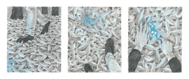
The word “process” has changed meaning since my mother’s death. As I mentioned in a previous post, the creative areas of my brain seem to prefer comics for processing mourning–I think because I have a distrust of words. As a fiction and essay writer I exploit their slipperiness, how selection of details and tilts of connotation control a universe of impressions. I would be naive to think images are different, let alone their yet-more-slippery intersection with words, but images are new to me creatively, so that newness gives me something to hold onto as climb through this namelessness.
Earlier this month I posted a short comic about my mother’s death, which I called “The Swimmer.” The juxtaposition was part happenstance since I’d already created the swimmer image for a different project. I’ve since extended that impulse into a 33-image sequence of the swimmer, who now also climbs, dives, floats, and walks. I had thought to end with the floating imagery–a page of the same figure repeating–but the corpse-like quality felt wrong, so now she emerges from the water, strolls onto land, and begins climbing again, repeating the whole process. I’m not sure if the connotation is circle of life or Sisyphus in the underworld, but I’m apparently content with both. I have complicated plans for these figures, so this is a quick window into my process, a circuitous grief-in-progress.


February 12, 2018
Anatomy of Melancholy: The Best of a Softer World
Beginning weekly in February 2003, the website asofterworld.com began publishing a hybrid comics form that combined webcomics, poetry comics, and photocomics. The creators, Joey Comeau and Emily Horne, continued their collaborative project through June 2015, before making a selection available in book form. Anatomy of Melancholy: The Best of a Softer World features roughly 230 of the 1,248 comics previously archived on the website.
Most follow the standard newspaper comic strip format of three square panels arranged in an even row, though some are instead double rows of six—sort of like Sunday editions. All of the images are photographs, and all of the text is typeset in a black courier font and placed across the photos in thin white caption boxes shaped to the words—as if each phrase has been hand cut from a newspaper like a ransom note. The words combine haiku-like brevity with dark comic wit. Arranged as standard free verse, they might look like this:
I wonder how many
hauntings go
unreported
because wailing and
the clank of chains
are still better than
an empty house.
But Horne and Comeau arrange their phrases in fragments across the panels. Rather than a traditional left border, the panels serve as stanza units that move a reader’s eye left to right, usually with further shifts within each panel, producing even greater rhythmic effects.

Unlike the photocomics creators of Italian fumetti, Horne and Comeau use no speech bubbles or thought balloons. As a result, the speaker seems slightly aloof, an observer of the image rather than a direct participant of its depicted moment. And rather than placing captions at the top or bottom of panel edges, the creators always superimpose their phrase strips across their photographs, blocking some of the image content and so adding to the speaker’s indifferently sharp tone.
The photographs tend to feature individuals in varied locations, sometimes indoors, sometimes outside on streets or around trees or both. Other times they focus on pets or inanimate objects or architecture or landscapes. Whether color or black and white, the images have the feel of snapshots, as if culled from family photo albums rather than a collection of professional art prints. This helps to create the illusion that we are dipping briefly into the mundane particularities of strangers’ lives, sometimes exposing a specific character’s acerbic thoughts, other times pausing for an unidentified speaker to opine omnisciently before continuing to the next random intersection of passing interests.
Horne and Comeau’s most striking visual effects are through framing. They often reproduce the same photograph three times, cropping it differently in each panel. Rather than repetition, the new croppings either reveal new information that alters first impressions or emphasizes previous content in new and scene-altering ways. Sometimes the progression zooms slowly in, emphasizing certain aspects by eliminating others.

Other times the progression zooms slowly out, deemphasizing initial content by expanding its surroundings.

Still other times, the cropping progresses sideways, both revealing new and eliminating old content. In “I could never deny her anything,” the first image centers a young man pushing his apparent bride on a swing.

The second and third iterations move him incrementally out of frame until the bride is alone and centered and he is missing entirely. The progression, interesting in itself, resonates even more in combination with the text, since neither the text nor the images alone communicate the full effect of their combinations. The groom’s visual absence in the last panel is more meaningful because of his declaration that the relationship is over in the first, and the bride’s insatiable wish is selfishly destructive only because it removes him.
The croppings are inventive rather than formulaic, with many progressing orderly as described above, while many others fluctuate unexpectedly.


Horne and Comeau are also masters of gestalt effects. While most panel juxtapositions in comics require readers to fill in conceptual gaps—usually time leaps and changes in point of view—gestalt closure requires a more literal filling in of gaps by extending a single image across two panels as if the gutter between them erases an unseen middle portion. Horne and Comeau literally erase those gutter segments from their photographs, surprising a reader’s eye by offering no conceptual leap.

Usually they combine re-cropping and gestalt techniques within the same strips.

As with most comics, neither Horne and Comeau’s words nor images would work effectively in isolation. Most comics, however, don’t temp a reader to isolate their components, but poetry and photography often do stand alone. Here the combinations are happily everything. Though nothing like “Peanuts” and “Garfield” or even “Calvin and Hobbes” and “The Far Side,” they also conjure an imaginary universe in which “A Softer World” is just one daily strip on a newspaper page of dark and genre-disturbing funnies.

[The original version of this and my other recent comics reviews appear in the comics section of PopMatters.]
February 5, 2018
Judy Gavaler (1939 – )
My mother died last month, so I can now fill in the open space in those horrifying parentheses. She suffered from advanced Alzheimer’s for the last year and a half, so that gap, that blank area within her closed identity, felt especially apt, an absence at her purgatorial core. Which is why my first reaction after her death was relief.
My second was to make comics. I’ve spent my life composing in prose, but the interplay of words and pictures and the peculiar gaps and overlays of the comics form feels right for working through the meanings of my mother. I began exploring image-texts after her diagnosis too, so the form is already infused with the fragmented logic of Alzheimer’s for me. All memories are simplified and warped. Cartoons make that literal. And gutters are the defining structure of sequences, the bottomless open spaces readers have to endlessly bridge.
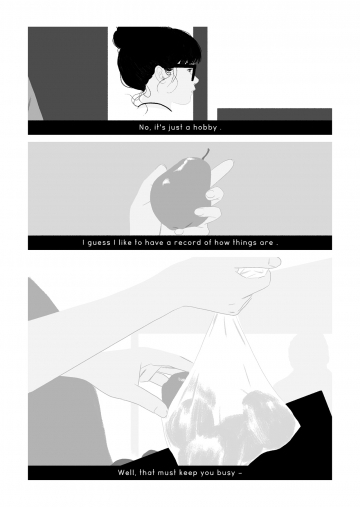
So below is a three page comic I made after driving to Williamsburg to clean out her assisted living apartment with my sister and brother-in-law. Her body had already been cremated. The text may be difficult to read in this format, so I’ll include it first as a free-standing block of prose.
“After the funeral home picked up her body, my brother-in-law took snapshots of the room, in case something went missing, like the TV or the paintings. He showed them to me while we were looking at her ashes on their kitchen table. I asked him to email them, and my sister thumbed keys on his new phone until they all sent. I had needed to take the plastic bag out and hold its weight between my hands. The ash looked exactly like ash, so of course I thought of the lifetime of cigarettes she had exhaled. I shouldn’t have been surprised when someone said the white specks were bone, obviously not pebbles, not sea shells.”
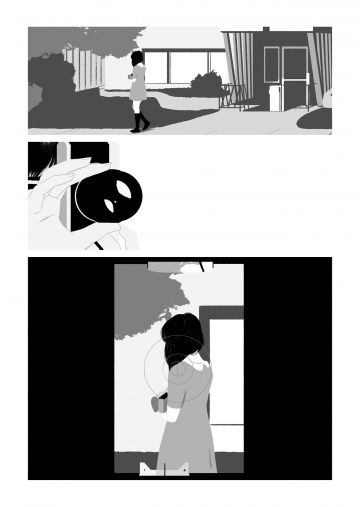
It’s perfectly fine in itself, but I wrote it while also developing the visual elements it would interact with. So for me, reading it in isolation makes it seem not just incomplete, but haunted, or rather emptied. Not only are the intended images not there, but the words are less ambiguous, are more, well, prosaic, without the visual referents leveraging more possibilities from each phrase, like the words themselves have been stripped out. Stripping out is literally how I make my images. I had already been working with a photograph of a swimmer, digitally culling it down to outlines. I repurposed it for this sequence:
I don’t believe my mother’s soul went anywhere when she died, because I don’t believe my mother had a soul. I don’t believe anyone does. I find the word painful, an impossible amalgam of bad science and desperation. I could not write something describing anything close to what these images imply: some inexplicable other-wordly essence bisecting ours and swimming off to deeper waters. It’s not something I can believe through words. But pictures? Or better still, pictures and their slippery interactions with words–apparently I can get on board with that.
Apparently I’m better at mourning my mother in comics.
January 29, 2018
Blue is the Warmest Color
When my university store misordered some of my winter books, I had to rethink my 21st Century North American Fiction syllabus. I originally intended to include a graphic novel, but then I added three new novels (Station Eleven, Mongrels, The Underground Railroad) and thought that was plenty. So when Allende’s Zorro didn’t come in, I figured the comic book gods were intervening. I’d mentioned GG’s I’m Not Here as my favorite new novel, graphic or otherwise, on the first day of class, but I needed one other to fill the syllabus gap. Though Julie Maroh is French, I went with her anyway, especially since I organized the counter-traditions course around issues of othering and was teaching no other gay authors.
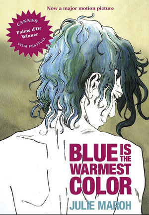
Julie Maroh’s Blue is the Warmest Color (Arsenal Pulp 2015) was originally published in French in 2010 and English in 2013, the same year as the English film adaptation. Maroh sets the coming-of-age story in the homophobia of the 1990s, compounding the lesbian love plot with political reverberations that offset its otherwise intimate focus. While the Abdellatif Kechiche adaptation won the Cannes’ Palme d’Or award, its source material may be the more compelling work of art—one intricately crafted with features unique to the comics form.
[image error]
Morah’s use of color is its most immediately striking feature. As established by the title, blue is the central visual motif, one suggesting pleasure, usually romantic, often erotic—though a child’s balloon or a diary can possess the same glow. Initially Clementine’s adolescent world is a wash of browns and grays—until punctuated by her first glimpses of desire: first a boy’s blue shirt, then a girl’s blue hair. Unclothed though, Thomas, Clementine’s first boyfriend and almost lover, returns to his undifferentiated dank shades. Emma, however, literally haunts her dreams, her blue hands exploring Clementine’s white body.
The simple color binary breaks down in the framing story though, when the adult Emma is visiting Clementine’s now elderly parents. The contemporary world is a colorful one. Emma’s turtleneck is blue, but her hair has grown back blonde, Emma’s mother wears a red sweater, and oranges and greens permeate the bed and walls. Though Clementine’s old diary is still blue, the color no longer produces the same effect and meaning in the altered context. Despite the difficulties of Clementine’s identity-searching adolescence, its two-tone impressionism was a product of her own inexperience. After her father disowns her and she is forced to leave her childhood home, a naked but now realistically skin-toned Clementine curls as if three-dimensionally above the panel layout. She turns thirty a page later. Her worst moment, a brutal break-up fight with Emma after Clementine confesses to adultery, Mahor infuses with the novel’s most vibrant watercolors. Though the greens of Clementine’s hospital deathbed scenes are both literally and metaphorically darker, the effect is muted by Emma’s renewed devotion. When Emma stands alone looking into a gray ocean, the final image is the novel’s largest and most realistic watercolor.
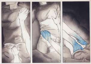
For all of Mahor’s attention to color, her skill with panel effects unique to the comics form is arguably greater. By establishing a book-length norm of three- and four-row layouts of one to three panels, Mahor creates opportunities for variations. Atypically wide horizontal gutters suggest a scene-breaking time leap or, when placed within an otherwise continuous scene, a psychological break—as when Clementine first glimpses Thomas from her cafeteria seat. When they first kiss, Mahor eliminates frames and so gutters entirely, instead floating the two figures in an implied full-width panel at the bottom margin of the page. Their unframed background communicates the momentousness of her first kiss by placing it in the same timeless white as the gutters. But when Clementine later flees back home after nearly having sex with Thomas, her two darkened panels instead float unaligned in one of the novel’s widest expanses of white space. Mahor repeats the two-step narrative technique with Emma, but in reverse and with intensified effects. After hanging up angrily on Emma, the lone figure of Clementine and her phone float in even wider unframed white space, and after the two have sex for the first time, their two unaligned panels float too, only now suggesting their time-escaping joy in a still wider expanse.
Mahor is equally masterful with juxtapositional effects between panels separated by standard width gutters. While Mahor varies her left-to-right reading paths with brief, two-panel sub-columns on roughly a fifth of the novel’s 156 pages, in two cases the stacked panels do more than shift reading direction. At arguably the most significant moment in the narrative, when Emma and Clementine make eye contact for the first time, Mahor draws Emma’s face in what could be a single panel but instead is divided into two thinner strips with a centered gutter separating her eyes from her lower face.
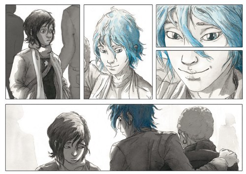
The result is closer to the original meaning of visual closure, in which the two parts are perceived as a single whole. The framing not only emphasizes Emma’s eyes, but, by also fracturing a single moment in half, Mahor disrupts the flow of perceived time too. She repeats the technique at another pivotal moment. When her closest male friend reveals that her circle of friends are avoiding her because they think she’s gay, Mahor divides his face too, but here the emphasis is on his mouth and talk balloon: “Actually … I think it’s more about you.” The next three-panel row features the novel’s only metaphorical sequence, as the ground literally cracks beneath Clementine’s feet and she plunges into crosshatched darkness. Two pages later, even her panel frames collapse around her limp body.
Mahor also employs insets with the same thematic skill. While caption box insets appear on most pages, often breaking panel frames, Mahor draws only a total of six image insets, all within a 17-page, mid-story sequence, and all intimately framing Emma’s and Clementine’s hands or eyes. The first overlays panel content for a closure effect similar to the examples described above, but here, when Emma touches Clementine’s hair for the first time, the inset breaks the gutter alignment of both bordering panels, as if the moment cannot be contained by the standard rules of their world. A row lower and the inset of their clasped hands break four more borders. Two pages later Clementine’s inset eyes challenge Emma for never inviting her to her apartment. When she finally does, the next inset frames Clementine’s eye and a single, joyful tear as she has her first orgasm, while the next is still more explicit—Clementine’s hand between Emma’s legs for the first time. The final two, however, move from easy eroticism to harder emotions. When Clementine touches Emma’s hair, the inset, while misaligned with the closest panel border, fails to bridge the gutter to the adjacent image—including the next in which Emma pulls her hand away, followed by her breaking off their affair. The novel’s last inset reverses the pattern of intimate touch to show Clementine shoving away a plate of food that Emma is serving her—prompting Emma’s confession that she is keeping Clementine at an emotional distance to protect herself. When they overcome that distance, Mahor literally closes the door on their next sex scene, content instead with a visually more meaningful row of layout-breaking panels as the two move out of view.
The story’s nudity and sexual content would likely conjure an exploitive male gaze if the images were not drawn by a lesbian author—a quality that complicates the film adaptation. Mahor’s hand, however, is deft in so many ways, producing a visually and emotionally complex tale of coming-of-age love uniquely grounded in the comics form.
[The original version of this and my other recent comics reviews appear in the comics section of PopMatters.]
January 22, 2018
Ferris Bueller’s Missing Sex Scene
[image error]First off, yes, there’s a sex scene missing from the 1986 teen film classic Ferris Bueller’s Day Off. Secondly, no, the scene isn’t posted here. It’s not posted anywhere. I seriously doubt it was ever shot. But I suspect it was written–or that it at least existed in writer/director John Hughes’ head while he was filming. I think the actors figured it out too, especially Mia Sara who played Ferris’s girlfriend.Mathew Broderick and Alan Ruck may have been clueless.
Since I’m co-teaching a “Making Comics” course this coming spring term again, as well as revising a requested book proposal on the same subject, I thought I ought probably to try my hand at making some comics of my own. I’ve been experimenting extensively with single-page comics, so I thought it was time to expand to multi-page. The working draft of “Ferris Bueller’s Missing (Sex) Scene” is currently nine. It’s an odd choice for subject matter, though since I started it the day after my mother died, I suspect it’s secretly about the deleted scenes of death and Alzheimer’s–or will be as I continue making it.
For now, there’s page one at the top of the screen. Or actually page two, since there’s a splash page I’m not including here. In fact, I’m not including anything here but this page. I’m more interested in the process of creating it, since that’s the topic of both the course and book I’m re-working. Last time I taught “Making Comics,” I had my students write scripts–a step I now think is antithetical to the comics form. Prose is made of words, and so prose writers draft on paper, thinking in and discovering their stories through words. Comics are made of images, and so the drafting process needs to be image-based. A comics creator needs to think on paper too, just not the same kind.
So here’s my drafting-in-images process:
1. Order the film online and snip three frames from the scene when Cameron is catatonic for fear of angering his father and Ferris is monologuing about how Cameron’s life will be ruined because he’s a virgin. Like the rest of the film, the actual scene includes a lot of close-ups of Matthew Broderick talking to the camera, but I focused only on the supporting cast. [image error]
2. Paste into Word Paint and start digitally wood-cutting. Get weird with Sloane’s hair. [image error]
3. Admire the pleasant oddness of the stripped down elements juxtaposed with the remaining photos. Spend a lot of time perfecting Cameron’s hair too.
4. Recall that a standard comics page has a 2:3 ratio and space accordingly. Add a talk balloon simply because it looks cool spatially. Fill it with blue sky, because that might look cool too.
5. Experiment with a movie poster overlay to suggest how annoying it must to be Ferris Bueller’s best friend and girlfriend. Decide against it.
6. Add a border, because, wow, that’s easier to keep track of live space, and then drop in the lines of Ferris’s monologue. To avoid a typeset look, drop each word in separately. Oh, also see what happens if Sloane’s weird hair design is in her talk balloon too.
7. Try several word arrangements. Also, overlay Ferris’s blown-up vest as font color, same as the border.
8. Drop in a very subtle subtext background.
9. Realize that sticking to the same font looks better, even if you did waste a half hour perfecting those hand-drawn spray-paint letters.
10. Settle on a final arrangement, pleased by how the center of the “X” focuses attention on Cameron’s head in Sloane’s hands.
11. Reflect on how even the unwritten “script” in your head for this page would have produced nothing like this actual page. Which was really my only goal, and one I happily if idiosyncratically achieved. Yeah for me.
12. Start the next page.
(To be continued … ?!?)
January 15, 2018
Daishu Ma’s Not-so-dystopic Dystopia

Artist Daishu Ma was born in China, studied in England, and lives in Spain. Her first graphic novel, Leaf, was published in China in 2014 and since in France, Sweden and recently the U.S. The wordless narrative explores the paradoxical role of nature in an urban setting as a nameless protagonist studies a mysterious, glowing leaf. Daishu Ma achieves this without using a single word—even though her images convey not only the fact that characters are speaking to each other but the content of their undrawn words too. She even conveys the content of a flashback story told by a leaf expert about the pioneering founder of the city.

Wordlessness aside, it is tempting to read the novel as a dystopia, but the genre would be both reductive and misleading. Though the labyrinths of buildings and machines might recall Metropolis at times, these city-dwellers are not dehumanized cogs in an industrialized underworld. Daishu Ma peoples her world with women and men of all ages, including playing children, doting parents, and smiling grandparents, all individualized through meticulously rendered patterns in the fabrics of their scarves, shawls, hats, and other clothes. None wear uniforms of any kind, and so the unnamed city is free not only of police and military but of any suggestion of government control. The most overt city employee—an older man who disposes of leaves and switches off the lights of a public art display—wears the most personalized clothing of any character.
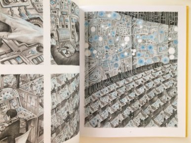
Most of the population seems to be employed in a vast industrial complex where each sits in an identical cubicle operating control panels before an enormous map of their city. Though all wear their own individualized clothing patterns, together they form a larger weave, each part of the collective action. Though they lose their individuality in the process, they regain it at the end of the work day when Daishu Ma draws them once again in street-level activity as detailed and personalized as before. They are also free to leave the city and wander in the surrounding forests, which Daishu Ma establishes from the opening pages. Though city life is imperfect, it is maintained through individual choice.
When the protagonist gains access to a more foreboding industrial complex where leaves are incinerated, he faces no human opposition. He must navigate a maze of ducts and stairs and ladders, while opening heavy grates and decoding complex control panels to prevent the automated scoops from destroying his leaf, but no guards or people of any kind stand in his way. As a result, Leaf is a story without not only a central antagonist, but any antagonists at all. Even the leaf sweeper only briefly resists the protagonist before becoming his primary helper, revealing how the city machinery works and showing him how to access its hidden areas.
The novel’s dystopic expectations may be a connotation of Daishu Ma’s gray-based pencils. The precision of her layered crosshatching produces a dark tone, one contrasted by the wide white gutters and their regularity. The layouts fluctuate between 3×3 and 2×2 grids, sometimes implied by combined panels, producing a formal constraint that echoes the grays’ dystopic connotation. But Daishu Ma does not offer simple binaries between natural goodness and urban badness. Though the opening page depicts autumnal leaves falling from a soon-barren branch, the images are constrained by the same window-like grid as the city images. When the city dwellers wander back home, Daishu Ma merges natural and urban motifs with tree roots beneath leaf piles transforming into pipes. And the city includes trees planted along sidewalks, and the novel’s largest tree centers the city’s largest outdoor space.

Despite the pencil grayness, the novel is most striking in its use of colors and its vying plot between blue and yellow pencil highlights. Again the two colors are not aligned along a simple nature/city dichotomy. The autumnal leaves are blue-tinged, and when the protagonist returns home the city is infused with blue light fixtures, blue windows, and once even blue open flames. But the protagonist has discovered and brought back a special leaf: one entirely blue but for white spots that appear to glow like light sources.
When he drifts asleep with it in his hand, he has a brief, one-panel vision of gray leaves with white glowing circles. It is Daishu Ma’s first use of yellow, and the color does not return until over twenty pages later when the protagonist glimpses a glowing yellow light fixture outside an apartment building. When he approaches, many other lights and windows are glowing similarly, including the candle on the table of the leaf expert he meets. When he pulls out his special leaf in these lighting conditions, it appears yellow too—though the circles remain white as before. After studying the leaf, the expert places it in a jar and transforms it into a yellow glowing circle, which recalls a photo album image of her father standing in a jungle among similar glowing yellow circles.

The next morning, the sun rises yellow, and the protagonist purchases leather straps to carry his glowing yellow jar everywhere with him. Now other sources of light are yellow too—until the jar shatters and the leaf is carried up the disposal duct. When its glow fades, the city is blue-highlighted again, including the night moon, city windows, and the flashlight the protagonist uses to track down the leaf to the enormous disposal compartment which is filled with not just leaves, but countless floating yellow circles. He eventually releases them all through the industrial smokestacks, and they float everywhere in the forests and city, including the leaf expert’s windowsill where she places a tiny potted tree. In the final image, a bird lands on the sill, surrounded by a budding branch, the city background, and the yellow circles.
Page two featured a bird departing its nest to fly away with its flock, so the last image is a return of spring and nature, but now in an urban environment. Clearly too yellow is the superior color, contrasted to the autumnal blue of the opening page. Yet blue is also associated with nature and light and even warmth and joy as the community gathered around the blue light of the city center tree. Again, the novel is not a simple tale of goodness and light triumphing over darkness and evil. Just as the tyranny- and victim-free community challenges dystopia norms, Daishu Ma’s color motif creates a more nuanced visual plot struggle. The absence of life-or-death consequences lowers the stakes while raising the novel’s quiet complexity. Her protagonist doesn’t save the world. He just improves it.
[The original version of this and my other recent comics reviews appear in the comics section of PopMatters.]
January 8, 2018
How to Make a One-Panel Feminist Comic

I’ve been drafting chapters for a comics craft textbook and also rethinking my co-taught ENGL-ARTS Making Comics course for spring term, both of which have me experimenting with image-text art. Not all image-texts are comics and not all comics are image-texts, but the overlap in the center of that Venn diagram is massive. I’ve been particularly intrigued by the possible ways words can be incorporated into images, which has led me away from most comics conventions (thought balloons, talk bubbles, caption boxes, sound effects) and into what I think of as poster art–or at least single-panel comics (which by some scholarly definitions, including my own, isn’t a “comic”). I created the above art over winter break. It’s titled “nevertheless” and combines three generations of feminist imagery. It’s hard to be sure, but I think that’s FEMEN leader Inna Shevchenko being arrested in the background.
In case it’s of interest to anyone, here’s my process:
STEP 1: Select a photograph of members of the Ukrainian activist organization FEMEN striking a 1940s Rosie the Riveter pose. [image error]
STEP 2: Isolate one figure and white-out everything but outlines, then eyes, nose, and mouth. I work in Word Paint because I’m an idiot and also because there’s something appealing to me about its pixellated simplicity–the digital equivalent of wood-cutting.
STEP 3: Experiment with words.[image error]STEP 4: Experiment with the female symbol that represented feminism in the 70s and 80s.[image error]STEP 5: Flip the image (because the original Rosie faces right) and add the word “nevertheless” to evoke Senate Majority Leader McConnell’s silencing of Senator Elizabeth Warren last year: “Sen. Warren was giving a lengthy speech. She had appeared to violate the rule. She was warned. She was given an explanation. Nevertheless, she persisted.”[image error]STEP 6: Experiment with placement and negative space.
[image error]
STEP 7: Try it in pink (because of the Women’s March)
[image error]STEP 8: Try it with flag stripes (because America).
[image error]STEP 9: Simplify.[image error]
And that’s probably where I should have stopped. I’d say that’s a fairly decent poster image, and if you like it, feel free to use it (I’ll even email you the artwork). But then I got another idea …
STEP 10: Try overlaying it onto protest photographs.
STEP 11: Go in a completely different direction.
STEP 12: Try historical photos instead.[image error]STEP 13: Think that you’ve settled on a “Votes for Women” c. 1904-14.[image error]STEP 14: But then have your artist friend Carolyn Capps look through your drafts and pick this one as the best. Carolyn liked how the flying background hair becomes the hair of outline face too, and how the cop’s hand seems to be on her neck, with his thumb pressing her throat. And how his holstered baton ends the image in the bottom right corner–which is how comics artists think too. Since comics juxtapose images, “nevertheless” is also a comic. But instead of placing images side-by-side, it combines its five elements in layers: Rosie the Riveter figure, female symbol, “nevertheless,” U.S. flag, and the photo background.
January 1, 2018
Judging My Book By Its Covers
That’s me Christmas morning beside the framed enlargement of my latest book cover. Definitely not my most photogenic moment, but thank you, Lesley, for taking the shot and, more importantly, conspiring with Santa and our local frame shop for the Christmas gift. It will join its siblings on my office wall as soon as it’s warm enough to carry across campus. As my kids noticed, apparently my name should always appear in a burst bubble on the right side of a cover design:
I owe many thanks to the graphic design folks at Bloomsbury for what turned out to be a brilliant save. Both the book title and cover were decided before I joined the project (long story) and so the original cover proof looked like this:
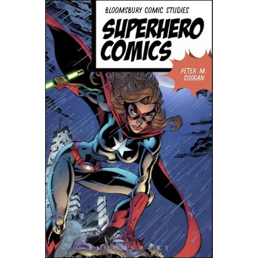
When I showed it to the superheroes class I was teaching that semester, they were not impressed by the anatomy–and not just those circular, weirdly insect-like hips. I emailed a friend (a fellow Bloomsbury author and the top name in superhero gender analysis) to say I was “concerned.” She responded something like: “Why, because each breast is the size of her head?”
It didn’t help that my chapter “The Gendered Superhero” critiques this sort of image, specifically “head, breast, waist and thighs drawn in similar proportion” (190). So I was thrilled when my editor forwarded the cropped version, a solution I never considered. The female face (despite still sporting what one of my students called “babydoll lips”) now seems to emphasize gender and the importance of female characters but without gratuitous sexualization. The detail isn’t clear enough here, but I also like how the close-up reveals some of the artist’s brushstrokes, implying (to me at least) that the book is all about close reading.
But before the revision, I used the problematic cover as an excuse to experiment with some designs of my own. This was over a year ago, so my attempts already look archaic to me, but I will share the mock-ups anyway. Happily, I wasn’t quite stupid enough to share them with my editor, because even I know publishers who employ graphic designers aren’t interested in authors who think they can design too. Still, I had fun trying.
The first focuses on simplified symbols, some specific to superheroes, some emblematic of time periods, again suggesting (to me at least) close analysis of genre:
Then I started thinking about simplified superhero faces, specifically female:
The Comics Code plays a significant role in the book (I use it to divide the genre into historical periods), so I manipulated some public domain images from the 50s next:
Next up, doctored photos of Olympic athletes (bonus points if you can name any):
And finally there’s “Punch,” which I used as an illustration inside the book–minus all of the tiny comic book covers that make-up the background. I didn’t work up a full cover design for this one, which is just as well since my fonts tend to look amateurish (not sure precisely why, which is probably the mark of an amateur):
So, as you can see, good thing Bloomsbury employs professional graphic designers.
Thank you, Santa.


December 26, 2017
Best Graphic Novel of 2016
Yeah, I know it’s the last week of 2017, but I’m a little behind. After immersing myself for several years in the history of comics, I started reviewing new and recent graphic novels last spring. Things have come a long long way since Action Comics #1, but one of my all-time favorite creators is an artist who started in the superhero genre before leaping over formal and genre boundaries.
Comics fans likely know Dave McKean from his The Sandman covers, though his collaborations with Neil Gaiman began earlier with their 1988 Black Orchid mini-series and arguably peaked in 1989 with the graphic novel Signal to Noise. McKean also famously paired with Grant Morrison for Arkham Asylum the same year, before venturing into his solo series Cages. Black Dog: the Dreams of Paul Nash is an even more successful solo venture, one commissioned by the UK to commemorate 100-year anniversary of the First World War. Paul Nash enlisted at the start of the war, served two and half years, was injured, and returned home to become a Modernist painter renowned for his surreal battlefield landscapes. The Tate recently featured an exhibition of his four-decade career.
“If you want your work to have any value in such a chaotic world,” says a cartoonishly proportioned art critic at the onset of the First World War, “you’re going to have to engage with it. Comment, criticize it, take it apart, and remake it in your own image.” The words appear in a translucently white talk balloon—only one of the innovations Black Dog introduces to the graphic novel form as artist Dave McKean actualizes his character’s apocalyptic advice.

While no imitator, McKean shares kindred tastes, creating a fictionalized memoir and dream journal of Nash’s experiences. The fifteen chapters range from 1904 to 1921, pivoting in time between Nash’s childhood and the war years, while always opening with a photo-based frontispiece on the left-hand page. Though chapter lengths vary, they average five pages before later chapters intensify the use of two-page spreads. The orderly structure is welcome. McKean often follows standard comics layouts, but the effects of his arrangements are strikingly non-standard. This is partly due to the book’s twelve-by-nine inch dimensions—atypically large for a comic but common for an art book—as well as McKean’s eclectic approach to image-making. The novel incorporates pencil sketches, full-color paintings, paper cut-outs, photographs, digital art—often transforming at chapter breaks, but at other times with page turns, within a single page, and even within a single panel. When McKean writes “the scene shifts,” the literal fabric of reality shifts too. While expressing the world-altering chaos of the Great War, the continually changing multi-media styles also suggest Nash’s own search for the right materials to realize or at least evoke the otherness of his dreams.

The novel opens with a first-person account of Nash waking from his earliest dream and attempting to draw it as the impressions fade and are replaced by a succession of later sketches that inevitably both refine and distort. McKean’s images accordingly shift in levels of refinement and distortion too. After two opening chapters of finely textured gestural paint strokes and flat Matisse-like cut-outs, he shifts to a fittingly cartoonish mode as the third chapter begins with Nash’s father’s attempt at dream analysis (“Well, I should have thought it was obvious. YOU are the black dog”), as the two sport slightly enlarged heads and features. Human figures grow grotesquely disproportionate as German bombing interrupts Nash’s wedding and a two-page zeppelin morphs into a painterly precise fish above a cityscape devolving into gray-green abstractions. McKean’s figural exaggerations peak with a violent bully of a teacher who literally towers above the adolescent Nash before slapping him into a sequence of blood-red panels suggesting the war carnage yet to come. When Nash falls injured into a trench, his body combines cartoonish proportions with the fine detail of naturalism—a discord that defines the novel if not McKean’s style generally.

After a sniper attack, a young soldier’s corpse morphs panel by panel into Picaso-esque abstraction While McKean depicts the warfare along widely fluctuating stylistic spectrums, a middle chapter juxtaposes panels of warped but largely naturalistic images with the pure abstraction of watercolor strokes in adjacent columns. Because the superimposed text describes grass growing between the sandbags in the trenches, the otherwise non-representative green swirls and splashes evoke that new life. According to Nash’s narration, even nature “is dynamic, constantly changing, fluxing, complex chaos.”

While digitally rendered words are another of the novel’s media, Nash states in the second chapter: “words fail me,” suggesting that language cannot capture his nightmares either. The book’s words are also appropriately dwarfed by the artwork surrounding them, as if the pages but not their print expanded to fit the book’s dimensions. When he does not incorporate printed text directly into the art, McKean frames it in translucently colored talk balloons and caption boxes that do not fully block the images digitally layered underneath. While visually effective, the technique also suggests that even when literally forwarded, words are not the novel’s primary language. When Nash’s brother imagines the skull of a German soldier speaking to him, its talk balloons are computer-rendered outlines; when his brother dies and his jawless skull speaks to Nash, the outlines become roughly hatched circles; and when Nash next turns to look at a skull in a war-ravaged dreamscape, McKean gouges an empty circle above it, its paradoxical silence speaking volumes.
Some graphic novels read like illustrated narration, but Black Dog is comfortable with an eight-page wordless sequence, and though words appear on the vast majority of pages, their meanings mingle with the artwork, as when a roughly cross-hatched Nash balances uncertainly along a trench boardwalk and his narration describes “the artist’s balancing act” and the danger of tipping into metaphorical mud. When he later describes feeling “the texture of the air” in his childhood woods, the referent is also the imagined texture of the collaged image beneath the words.

McKean’s image-texts are examples of the “hybrids” and “collisions” that also describe Nash’s dreams. His pages often feature two worlds, two styles, colliding. When Nash dreams during his recovery, he wanders from the subdued greens of his hospital room into the thorny reds of an internal forest of capillary-like tendrils. When Nash recounts his first dream about his future wife Margaret, their figures are composed of different elements; though Nash’s cut-out self holds Margaret’s finely detailed hand, the image also suggests their separation, the impossibility of the two ever fully coming together. When Nash dreams of his estranged parents, McKean evokes their literal and emotional distance through an exponentially expanding chessboard, the black and white squares combining and dividing a puzzle of family fragments.

The novel creates the “sensory overload” that a war vet describes as “shellshock.” It is also its own cure, “expression as catharsis,” as when Nash’ brother takes up sketching to cope with life in the trenches. “When you draw,” he says, “or just look at the world with an artist’s eye, you detach, you abstract.” Ultimately Nash chooses to abandon the abstractions of his dreamscapes and awaken from a coma to rejoin post-war life. His reunion with his wife concludes the narrative well—but as narrative, Black Dog is less fully realized. Though we follow Nash through his vacillating dreams, as he in turn follows the black dog of his nightmares, an evolving metaphor for himself, the war, and his isolation, the cast of mostly unnamed characters do not achieve the psychological depth of narrative realism. That flatness arguably suits Nash’s broken psyche, while further emphasizing the novel as a tour de force of McKean’s artwork—that is a sequence of self-consciously constructed images on paper. I only wish that, for a work responding to a painter’s rich body of art, Black Dog included an afterword to discuss and reproduce several of Nash’s actual paintings.
Here’s his Spring in the Trenches, Ridge Wood, 1917:

And Wire from 1919:

And note how We Are Making a New World influenced McKean’s cover art:


December 18, 2017
Best Graphic Novel of 2017
Okay, the year’s not quite over yet, and, no, I haven’t read nearly all of the new graphic novels published this year, but from my personal perusal here’s by far my favorite.
GG—the pseudonym of a presumably female, Asian-Canadian comics creator living in an undisclosed prairie city—is little known except to her community of followers on Patreon and visitors to her website ohgigue.com, which includes about a half dozen of her comics short stories, several also published in other venues. They range from the early sequences of rough, hand-drawn 8-pagers in her 2014 “Five Stories” to the sharply digital 48-page “I’m Crazy.” Her equally excellent 14-page “Don’t Leave Me Alone” appeared in the 2016 Best American Comics, but I prefer “Semi-Vivi,” another 14-pager that defines GG’s signature cropping effects and gutterless 4×2 grid. Judging from the content of her website alone, I would predict that GG will be a major comics voice of the next decade. And now she is already realizing that potential with her first full-length graphic novel I’m Not Here, released in September from Koyama Press.
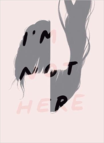
The novel is one of the richest and gently disturbing I’ve read in recent years. It’s young female protagonist goes unnamed as she navigates the streets and hallways of her and her aging parents’ suburban homes and the memories of her second-generation immigrant childhood. No narrating voice grounds the story, so events move from the present to various moments of the past and possibly future without guiding explanations. By speaking only in dialogue, the main character seems to have no more insight about herself and her troubled situation than does the reader. We travel with her, suffering the same confusions that define her life. All we know for sure is the isolating distance she feels from her increasingly estranged mother.

I’m Not Here builds on GG’s earlier short works by approaching the long form in discrete, almost stand-alone units. The novel consists of eight closely linked vignettes, most between six and eleven pages, though the longest extends for twenty-four and the shortest five. Initially black and then gray two-page spreads divide all but the concluding vignette which is separated instead by two non-facing blank white pages. The movement toward white, though literally brightening, is paradoxical since GG’s use of white space within the narrative suggests loss as margins widen around the daughter’s isolated figure as she knocks at her mother’s door and the repeating image of the mother’s younger, cropped face fades until indistinguishable from the page. The novel also opens with two blank pages before a similar progression of panels darkens into grays and then eventually blacks. But if white is oblivion, black is no better. The dementia-suffering father concludes the second vignette by driving into the black of the margin, leaving the figure of his silhouetted daughter merging with the shadows of the street at night. The father never reappears.
The confining quality of the gray palette is reinforced by GG’s layout. Instead of her previous gutterless 4×2 panels, the novel’s physically smaller proportions suit her rigid 4-row grid of full-width panels. When the grid is not overt, it is implied, with the top two, middle two, or bottom two panels merged to create a double-sized panel. More often both the top and bottom panels merge to create two-panel pages. GG is especially adept at using her gutters in relation to the black and white shapes within panel images—the white frame of a photograph, the white rectangle of a bandage, the horizontal line of a grocery shelf, the vertical lines of a window pane—sometimes merging gutter and panel content to further augment her cropping effects.
Like the unframed panels, her internal images consist almost exclusively of opaque shapes with no contour lines separating them. Each shape is defined only by its internal and uniform gray gradation. The style produces a stark and simplified world devoid of not only color but texture too, with each figure and object precisely isolated—effects that express the novel’s overall narrative tone. Though often reduced to absolute simplicity in terms of image density, the contours of GG’s shapes also evoke real-world subject matter as if derived from photographic sources. The result is not the simplification of cartoons but a brutally stripped-down realism.
GG’s use of words is stripped-down too. She wisely ignores the conventions of thought balloons, talk balloons, and even conventional caption boxes. Words appear only at the bottom of panels in panel-wide strips. Sometimes the strips merge with the black of the panel or the white of the gutter, with words rendered in either black or white. GG never varies font or font style, and, since the novel includes no narration, she forgoes quotation marks for dialogue too. She draws no sound effects within images, but includes the “knock knock” of a door in her caption strips, marking it typographically with brackets. Voices on answering machines are bracketed too. When GG uses dialogue it is effective, but the majority of the novel is visual only. Fifty-six pages—over half of the novel— are wordless, and another dozen feature only one line of text. Like GG’s visual simplicity, the linguistic silence adds to the novel’s stark reality—especially during moments of literal silence, as the daughter and mother pass a wordless meal together.
GG’s austere realism plays well against the novel’s narrative content. While the situation of a daughter feeling estranged from her aging parents is realistic, GG disturbs that baseline reality with moments of inexplicable surrealism. After a comparatively mundane opening sequence of the daughter tying back her hair and preparing to go for a walk to take photographs, she finds her mother sitting in her bedroom with one of her arms detached. “Can you help me tape this back on?” she asks.

The daughter applies bandages to her mother’s back too, but GG draws no wounds or stumps, so it is intentionally unclear how the severed but apparently bloodless parts attach. GG’s stark style obscures the would-be details of her characters’ reality, flattening the world into dream-like imprecision. No like incidents follow this brief, unreal moment, but by placing it in the first vignette, GG colors the rest of the narrative with its potential. Is the father literally driving around the block in search of his house forever? Is this dementia or an afterlife variation on Sisyphus? Does the daughter literally become another woman or does the woman’s landlady simply mistake her when she lets her into the apartment and later hands her the lease? Is the daughter literally knocking at her mother’s locked door or is this a metaphor of her dreaming mind? GG leaves such reality-defining questions unanswered, leaving her main character drifting between realities too.
Like most graphic novels and stories in general, I’m Not Here could be reduced to a summary of its story content—though GG’s fractured plotting resists even that narrative norm. But aside from its surreal plotting and striking stylistic qualities, the novel is significant for GG’s way of expressing its content visually and so overcoming the limitations of script-based comics storytelling. I doubt GG began by describing her plot and panel content in words and then executing those descriptions in images. Instead, her story emerges from the images themselves, and so they and their intricate relationships cannot be simply summarized. The page, for example, of silhouetted tree tops and street lamp below a full moon and vast evening sky does not mean anything linguistically or even narratively, but its placement after the mother criticizes the daughter is emotionally evocative. Such images do not tell a story but are the story—a fact true of all comics but rarely so well achieved as here. And I’m looking forward to more such stories from one of the most exciting new voices of 21st century comics.
[The original version of this and my other recent comics reviews appear in the comics section of PopMatters.]


Chris Gavaler's Blog

- Chris Gavaler's profile
- 3 followers

