
Chris Gavaler's Blog, page 42
July 9, 2018
What If?

What if an evil genius is tricking you into believing that the world around you is real when it really isn’t?
What if on an alternate Earth everything is identical but for one almost undetectable detail?
What if trying to travel to the past transported you to a different universe instead?
What if a mad scientist removed your brain and is keeping it alive in a vat of nutrients?
What if lightning struck a dead tree in a swamp and transformed it into The Swampman?
Any of these fantastical plots could be the premise of a superhero comic book. Stan Lee sometimes gave artists at Marvel little more to work with—just a note on a piece of paper or a plot point mentioned on the way to his desk. Jack Kirby or Steve Ditko would work out the details.
Except none of those scenarios comes from comics. They’re all thought experiments written by highly regarded philosophers: René Descartes (1641), Hilary Putnam (1973), David Lewis (1976), Hilary Putnam (1981), and Donald Davidson (1986), respectively. Like comics, fantastical tales are a staple of philosophy. Philosopher Peg Tittle includes 126 in her 2005 What If … Collected Thought Experiments in Philosophy. But superhero comics were well ahead of her. Marvel published its first What If? in 1977, and DC published a range of “Imaginary Tales” in the 1950s and included two “Just Suppose” tales in one of its first 1936 titles.
Philosophers could fill volumes too. David Chalmers writes about zombies, Laurence BonJour about clairvoyants, and Frank Jackson about a scientifically all-knowing woman who’s never seen color. The list of “What If?”s seems endless:
What if your body slowly transformed into rock, but no one around you noticed?
What if a god were stripped of his memories and forced to live as a crippled human?
What if a time traveler returned to his childhood and told his past self about the future?
What if you could save the world but had to sacrifice millions of people first?
What if you and all the universe were just the thoughts of a small child?
Except those scenarios don’t come from academic philosophy. They’re all from superhero comics: The Fantastic Four (1961), The Mighty Thor (1968), The Defenders (1975), Watchmen (1987), and Heroes Reborn: The Return (1997). And they are no more fantastical than scenarios philosophers have been dreaming up for centuries. Not just What If and “Imaginary Tales,” but arguably all superhero comics contain thought experiments. While philosophy’s most amazing thought experiments could be adapted into a limited series of illustrated superhero comics titled Thought Experiments, the reverse is true too. Writers and artists of Marvel and DC can be understood as philosophers and their comics as works of philosophy.
And what if they actually are read that way?
That’s the fantastical “what if” premise of What If? Philosophical Thought Experiments of Superhero Comics, a manuscript I’m co-authoring with my W&L colleague Nathaniel Goldberg. I’m happy to report that a university press has given us a green light, and so Nathaniel and I are spending part of our summer revising for an August deadline. You’re currently reading a condensed draft of the introduction.
Each chapter presents puzzles, or philosophical thought experiments, derived from superhero comics. We then select tools from philosophers—Kant’s Categorical Imperative, Descartes’ evil genius, Dennett’s intentional stance, and others—to help solve that puzzle by helping to understand the thought experiments themselves. Our goal isn’t necessarily to explain philosophy. It’s to use superhero comics to illustrate philosophical thought experiments, and then in turn to use philosophy to explain superhero comics. So unless you’re already well-versed in philosophy, you’ll learn about philosophy too.
Philosophers who identify as analytic—which the majority of English-speaking philosophers do—spend a great deal of time analyzing concepts and defining terms. Though literary critics’ attempts at analysis and definition tend to be limited to literary concerns—including in recent years comics—that’s where philosophy and literary criticism happily collide. For the authors of this book, the collision took place in front of Washington and Lee University’s English department photocopier. Nathaniel Goldberg had descended from the philosophy floor because their machine was on the fritz. Chris Gavaler, himself in the English department, was doing some copying of his own. Nathaniel struck up a conversation about Chris’s superhero blog. Superheroes are not the most typical focus for literary criticism, but Nathaniel assured Chris that philosophers wrote about weird things too. In fact, Nathaniel was an expert on Donald Davidson’s The Swampman, a thought experiment Chris noticed resembled Alan Moore’s own Swamp Thing. A conference paper in Iceland soon followed and now this book. In the process, Nathaniel learned MLA citation norms and Chris learned what is now one of his favorite phrases, “necessary and sufficient,” as in “What are the necessary and sufficient conditions of being a comic?”
Chris answers this question in his recent essay “Refining the Comics Form” where he defines a comic as
a static, spatial field with recurrent elements perceived as conceptually discrete images in juxtaposition with other conceptually discrete images, in which the images are pictorial, abstract, typographic, and/or linguistic, but not linguistic and typographic only.
If you prefer a shorter answer, we recommend Scott McCloud’s pioneering 1993 definition: “juxtaposed pictorial and other images in deliberate sequence, intended to convey information and/or produce an aesthetic response in the viewer.” And if you prefer a really short answer, Will Eisner gets it done in two words: “sequential art.” Many comics scholars, including Chris and several philosophers, take issue with McCloud and Eisner for a range of reasons: what about one-panel “comics” like The Far Side and The Family Circle? What about the moving images juxtaposed in film and TV? What about physical panels displayed on a gallery wall? What about juxtaposed images in mediums that pre-date the 20th-century and so the term “comics”? While these questions are good ones, they and others like them are not the focus of this book. This volume includes “Superhero Comics” in its subtitle, and the superhero genre squats near the center of the definitional zone. Our reading list includes only multi-paneled works printed on paper, bound in units of typically twenty-two pages, and published after 1937.
“Superhero,” as naming both a genre and a character type, also presents a range of definitions, which variously include and exclude marginal cases such as Harry Potter, Buffy the Vampire Slayer, and Nick Fury of Avengers fame. Chris takes a different, “no-common-denominator approach” in On the Origin of Superheroes, arguing instead that the category “superhero” has no single necessary or sufficient condition but only a list of potential ones, with different characters demonstrating different combinations with potentially no overlap (3). Twentieth-century philosopher Ludwig Wittgenstein might argue that examples of different superheroes share a “family resemblance.” Just as there many be no single necessary or sufficient physical condition of all members of a family, individual members do share some with at least some others, and through a series of overlaps the family can be picked out as a whole. No matter, since instead of exploring border cases to further test and refine definitions, we again stake our analysis at the genre’s and medium’s centers.
Defining “philosophy” presents challenges too. But enough philosophers think that some sort of analyzing concepts and defining words is what philosophy amounts to that we accept that as our working definition. That helps explain why philosophers often trade in conceptual or definitional work. One common philosophical tool is to try to conceive of or define situations that are not real but that instead reveal lessons for us. In a word, philosophers “experiment” in thoughts, rather than, as scientists do, in labs. These conceived or defined situations are thought experiments, the “What if?”s mentioned above.
Generally, thought experiments involve conceiving of or defining a situation where a few key details are changed from how they ordinarily are to test particular philosophical views. What if an evil genius did trick you into believing that the world around you were real when it really wasn’t? Does imaging that reveal anything interesting about the nature of knowledge? What if your body were slowly transformed into rock and no one around you noticed? Does imagining this reveal anything interesting about the nature of personal identity?
As we know from above, the first thought experiment is from an academic philosopher. The second is from a comic book writer. Each could be developed by either sort of person. Plato wrote semi-fictionalized dialogues, which encouraged readers to imagine themselves in particular situations. Most academic philosophers, before and since, write essays, treatises, or technical books—which are arguably less engaging than Plato’s work. While typical thought experiments, unlike Plato’s, are not presented in fiction, they can be. As philosopher Ross P. Cameron explains, “a typical fiction tends to be much longer than your typical thought experiment and hence can present you with a more detailed scenario” (31). Philosophers Jonathan Jenkins Ichikawa and Benjamin Jarvis even call philosophical thought experiments “mini-fictions” as opposed to the standard-sized ones. Likewise, philosophers Johan de Smedt and Helen de Cruz argue that, though both typical philosophical thought experiments and fiction rely on similar cognitive mechanisms, fiction “allows for a richer exploration of philosophical positions than is possible through ordinary philosophical thought experiments” (59). The exploration is richer not only because it’s more developed but also because, as cognitive research shows, readers of fiction are immersed in a way that readers of philosophy usually aren’t. Smedt and Cruz continue: “Regardless of whether they are outlandish or realistic, philosophical thought experiments lack features that speculative fiction typically has, including vivid, seemingly irrelevant details that help to transport the reader and encourage low-level, concrete thinking” (64). Readers take the scenarios more seriously.
These scholars contrast typical philosophical thought experiments with the longer scenarios in traditional science fiction and fantasy novels, but their points may apply even better to comics. Novels employ words to express ideas, while comics employ both words and images, and so reading a comic operates on an additional cognitive level. It can therefore be both more immersive and more challenging due to its multi-media form.
Of course, neither science fiction and fantasy novels, nor superhero comics, treat their scenarios explicitly as thought experiments. They don’t usually examine the assumptions involved and don’t draw broader lessons from them. And they certainly don’t consider whether the experiments were done under the appropriate conditions, say, by changing only a few features here and leaving the rest as is. There are no appropriate conditions, other than those that make their stories enjoyable. Superhero comics in particular aim first and foremost to entertain. Actual analysis is done better by academic philosophy, just as we’d expect.
Combining superhero comics and philosophy could be a powerful way to explore thought experiments because it merges the strengths of each.

[The paintings at the top and bottom of this post are by SANDRA CHEVRIER, and they’re currently at the top of my “What if we can use for the cover of What If?” list.]


July 2, 2018
Hinged Panels ( or, Closure Takes a Vacation)
Viewers tend to imagine the simplest solution to the puzzles created by placing two images next to each other. Since Scott McCloud published Understanding Comics in 1993, those puzzle-solving inferences have been called “closure.” To apply it to comics, McCloud focuses on the gutter, “that space between the panels,” as the site where “human imagination takes two separate images and transforms them into a single idea.”
McCloud borrowed the term from Gestalt psychology, which describes how, for example, a viewer mentally fills in the gaps between dots to perceive a dotted line as a “line” and not simply disconnected dots. In comics, viewers fill in gaps in a metaphorical sense—even though there’s usually a literal gap between the images too. But filling that conceptual space doesn’t involve imagining more images. We don’t mentally draw new panels. We just understand the implied content. The information is image-less.
In other visual arts, diptychs often create the Gestalt effect of closure by dividing a photograph in half or painting across two abutting canvases to create one visual field that is then physically framed in two sections and hung side by side. Medieval diptychs include literal panels joined by hinges—another metaphor for the gutter (which is itself a metaphor). Since “closure” has been the working term for three decades, I’m giving it a vacation this week and using “hinges” instead.
So in comics, hinged panels are any two-side-by-side images that connect in the viewer’s mind. Usually that connection is spatiotemporal. Unless forced to think otherwise, we tend to assume that the second image depicts the same setting after the shortest likely interval has passed. I was on vacation with my family in Europe last month, so I”ve created some hinged panels to illustrate. We were in the Czech Republic, Slovakia, and Austria–though in Italy these might be called “fumetti,” the Italian term for photo comics.
The first four provide a typical spatiotemporal hinge, sometimes with the viewer’s point of view remaining stationary and sometimes moving forward through the setting or shifting angles, as the subjects of the images move too:
The expected forward-moving hinge is so strong that it doesn’t matter what order the images occurred in reality. The next four hinged panels actually reverse the order that I snapped the photos, but the effect is the same. Time still seems to be moving forward–mainly because nothing within the images prevent that assumption:
The temporal hinge also helps to explain the spatial hinge, especially when the setting doesn’t repeat any overt elements. A viewer probably makes sense of the next pairing by inferring that the figures in the first image walked until they arrived at the cafe in the second–even though the backgrounds don’t have much in common.
But how much time passes in the hinge? Usually the shortest possible. So a viewer would assume that the above daytime images occur on the same day. But what about the next hinged panels? Unlike walkers wearing the same clothes as they walk and then later sit, the mannequins don’t give any action clues. Is this an hour later, a day, a month?
In addition to that forward-moving temporal hinge, the next hinge also connects the images by their internal shapes: the triangle of the first person’s body followed by the triangle of the next person’s arms. There’s a thematic hinge too. Both are photographs of people taking photographs of a Klimt painting. I wonder if that thematic effect overrides the temporal hinge so that a viewer doesn’t necessarily assume the two panels are in chronological order?
And what about this statue? The change in background quality and silhouette might imply a temporal hinge of several hours–or is that just because of the change of angle?
These next panels reverse angles too. And if you assume the point-of-view represents a character (the photographer), then you assume that they depict the central building at different moments in time. But without that assumption, would they instead appear to be simultaneous from two angles of an omniscient visual narrator?
And these panels are hinged by an effect very near to the original meaning of “Gestalt.” The two panels almost line-up, the second revealing that the cemetery in the first is raised. And to the degree that they do line-up, they probably also appear to be simultaneous. The gestalt hinge eliminates the forward-moving temporal hinge.
Things get even stranger here. Two versions of a Klimt: the original and a fake. Which is which? Which was photographed first? I suspect the hinge in this case doesn’t trigger any temporal inferences–or rather the two version are understood to exist simultaneously, and so their image here do too.
And what now? Two windows, but not quite the same window. Is this only a thematic hinge and so temporally the two can be read in either order? Or do you understand the figure in the second image as having stepped into the frame after the first image–and so a forward-moving temporal hinge despite the windows not matching?
The front of a painting and the back of a painting–or really a different work of art pretending to be the back of the first painting. Accepting the illusion though, the front and back of a painting obviously exist simultaneously, so do the images too? Or do you imagine someone flipping the painting over during a hinged moment?
And last and least: is there any spatiotemporal relationship between these two images? Or is the hinge entirely thematic: oddly placed mannequins? The actual temporal leap of the photos is about a year, and the spatial leap is continental, but the hinge doesn’t imply that.
You’re now free to return to your regularly scheduled terminology. But I do wish we could toss out the unnecessarily convoluted “closure” and replace it with a clearer term like “hinges.”
June 25, 2018
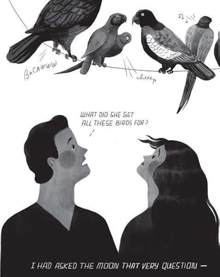
Unferth and Haidle’s I, Parrot

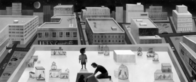
The graphic novel I, Parrot combines two unquestionable talents. Deb Olin Unferth is a major new literary voice, whose award-winning short prose has appeared in a range of top literary journals, and her book-length work includes two story collections, a novel, and a memoir, all published by prestigious independent presses. Elizabeth Haidle is creative director of Illustoria, a visual storytelling magazine for children, and she brings a smart, cartoon energy to Unferth’s writing. Together the two tell the story of their narrator Daphne’s struggles to win custody of her son, maintain her relationship with her boyfriend, and care for 42 exotic parrots. The three goals interweave since the parrots belong to her boss, and she is taking care of them to earn money to pay her lawyer, while also proving to the court that “inappropriate abusive men” are not “loitering the household,” a fact made increasingly clear as her boyfriend, Laker, takes on the positive role of step-father to little Noah. Despite dominos of mishaps, the fragmented family and their 42 adoptive pets pull through together.
Although Unferth’s family-oriented plot and Haidle’s style sometimes evoke children’s illustrated books, the occasional “fuck” in Laker’s dialogue clarifies the target audience. This is for grown-ups—and yet the intentionally simplistic rendering is more than surface details. While always expressive, Haidle’s faces are more geometric than human: circle cheeks, triangle noses, blocks of hair. The effect is counterweighted by the subtle gradations of her interior shading, which look brush-stroked in gray wash.
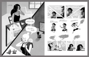
Her page layouts are playful and evolving, varying from traditional gutters to open panels to maze-like circles, with a recurring motif of diagonal divisions.

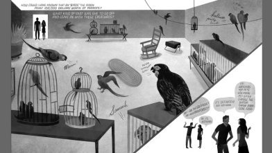
The overall effect creates the sense of a children’s world inhabited by adults—which also describes Daphne. The core of her life is not her job or her boyfriend but her son. Haidle’s art makes that fact palpable by rendering every element of Daphne’s story in a style most suited to a child. Even when Noah isn’t on the page, he is still his mother’s cartoon heart.
As the authors describe in a Comics Alternative interview, the project originated with Unferth’s stick-figure sketch of the novel, which earned her a contract with her publisher who then introduced her to Haidle. The two worked together long-distance, via email, Skype, Dropbox, and one extended visit. While most comics collaborations begin with a written script, Haidle instead adapted Unferth’s visuals, while Unferth in turn revised to include not only Haidle’s input but her personal experiences—including her own son’s insights into the character of Noah.
While the relationship of writer and artist is always complex, the complexity is even greater here. Typically an artist receives verbal descriptions only, often with complete control of layout. But any given image choice may or may not have originated with Unferth, with Haidle translating rather than wholly inventing visual qualities. I suspect this somewhat reduced Haidle’s role as author. It also implies that Unferth is the primary author, and Haidle her illustrator, a common credits division, which the cover and title page resists by listing both creators side by side and without attribution. It is Unferth’s first graphic novel, a form she said was different and harder to work in than she expected. She calls I, Parrot “a plot-heavy book,” something she strived for since her wide experience in prose writing gave her expertise in plot but not image. She also gives Daphne’s voice a sharp but believable eloquence from the opening page, describing, for example, “relentless errands over a churning earth” and “the roar of the unhappy mind.”
The novel is less successful at exploring the intersections of word and image that define the uniqueness of the comics form. Often a panel’s figures and its narrated or spoken language overlap in ways that duplicate each other rather than provide independent information that combines in unexpected ways. Page one, for example, opens with the narration: “I finally found a job,” followed by a smaller script statement, “That’s me, Daphne,” and an arrow pointing at a woman smiling and waving as if at the reader. Daphne as drawn includes additional information (she has long black hair, etc.) but the image-text relationship is rudimentary. When Haidle draws Daphne slumped in a chair, Unferth’s talk balloon “Sigh” adds nothing the image did not already convey. While the redundant style further implies a children’s book aesthetic consistent to the novel’s theme, Unferth and Haidle rarely challenge those visual norms and so don’t use other effects available to literary graphic novelists.
Since Unferth drafted the novel in sketch form and it is her first graphic novel, it’s not surprising that she hasn’t plumbed the form’s full potential yet. While I, Parrot is a solid entrance into the field, I predict Unferth’s future graphic work will go further.

[A version of this post and my other recent comics reviews appear in the comics section of PopMatters.]
June 18, 2018
A surreal exploration of narrative ambiguity—or maybe not
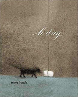
While wordless comics date back to the woodcut novels of Frans Masereel and Lynd Ward of the 1920s and 1930s, and Max Ernst’s 1934 A Week of Kindness, “A Surrealistic Novel in Collage,” revealed the non-naturalistic potential of sequential art, one of the most successful explorations of wordless surrealism in graphic form is the more recent H Day (PictureBox 2010) by Renée French. Though French also publishes children’s picture books under a pseudonym, H Day is hardly for children. There is no overtly violent or sexual content, and while the imagery sometimes evokes children’s genres—a cute dog, a round-headed main character—the sequence is quietly disturbing in tone, with a narrative logic that teeters provokingly on the inexplicable.
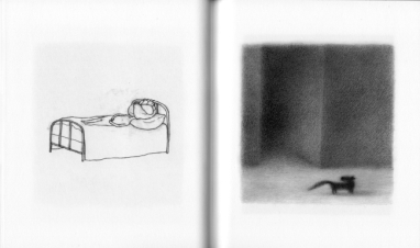
French divides the novel into seven sections or, as she subtitles all but the first, “stages.” The shortest is five pages, the longest twenty-four. After an initially and especially ambiguous introductory set of single images, each stage consists of full-page images paired on facing pages. The pages are atypically small, 6” x 7”, and so well suited to single images. (French worked with even smaller pages for her earlier Micrographica.)
The spine divides the novel in half both physically and narratively. left-hand pages feature unframed white spaces with a recurrent human figure composed almost entirely by outline. Its only interior marks are dots for nipples, a curved line for ambiguous genitalia, and occasional curved lines for knees. The figure has no ears, hair or facial features. It appears on roughly eighty pages. For the first thirty, the figure stands in empty white space, interior and exterior defined only by its outline. Shortly before the novel’s midpoint, French draws a lone bed, and on the subsequent page, the figure reappears and soon lies across it, where it remains until the sequence’s penultimate page in which the figure stands to leave, after which the bed is featured alone again in the concluding image.

The figure, both while standing and lying, undergoes a range of surreal metamorphoses. An undefined circle appears within the figure’s head on its second page. Though composed of the same kinds of lines that indicate exterior body features, the circle suggests a physically interior element, as if the head, unlike the rest of the body, is viewed in cross-section—an effect created by the absence of facial features. The circle might also be understood as metaphorical, until it takes on overtly physical qualities, soon expanding beyond the outline circle of the head itself. The figure punctures the circle with its hand and extracts a ribbon-like object that possesses more interior shading lines than anything else on the page. The ribbon retracts soon, leaving a pucker mark from which a straw extrudes, wrapping itself around the head-replacing object. A range of even more extreme transformations follow: pillowy worm-like objects grow from the head and crawl about the bed; cage-like tendrils wind from the head to form a lattice of ropes with the headboard—all while the figure remains otherwise motionless. Because the setting is also stationary, the left-hand pages create a partial flip-book effect, with each metamorphosis occurring incrementally.
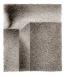
Right-hand pages feature a radically different narrative, both in content and style. Where left-hand pages use stark open space, all right-hand pages create fully defined rectangular panels. Though frameless, the panels establish borders through meticulous pencil shading that also defines rich spatial environments of ocean, sky, clouds, curving hills, and, most prominently, a city-like landscape of uniformly shaded building-like monoliths creating street-like spaces between them. Though this ambiguous world is initially peopled by darkly shaded human figures, the protagonist of the sequence is a small, dark dog who possess the only facial features in the novel. It wanders alone, struggling against a set of antagonistic forces: swirling black smoke emitted by an industrial-sized chimney, swirling gray water emitted by a sewer-like drainage pipe, and swirling, ant-like dots that either swarm around dead bodies or emerge from them to merge with the smoke.
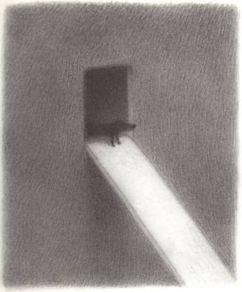
Though surreal, the narrative effect is still largely naturalistic as the dog makes various attempts at escape. But French at times undermines even this quality when figures, including the dog, transform between pages into similarly shaped objects that appear to be formed of wound string—with no contextually implied explanations. “stage 5” also abandons the dog and its environment entirely to depict a sequence of transforming birdcage-like objects with no earlier presence in the right-hand sequence. “stage 6,” however, returns to the surreal worldscape as a new monolith sails toward the dog to open a door-like passage and extend a plank which the dog walks to vanish within the monolith’s unknown interior before it sails away.
The final right-hand page features a version of the bed from the left-hand sequence, only rendered in the more finely detailed style of the right-hand drawings and with cross-hatched walls and floor of a more fully naturalistic space. The effect is not only a surprising merger of the two otherwise unrelated sequences, but it retroactively suggests a metaphorical link between them throughout. Because the bed does not appear earlier on right-hand pages, it is understood to be the left-hand bed, which, given its concluding primacy, refigures the entire righthand sequence as an expression of the left-hand sequence. The dog and its worldscape are not “real,” but are figurative representatives of the transformations of the left-hand character. Though those transformations may themselves be understood as metaphorical, within the logic of the two-sequence pairing, they are the novel’s baseline reality and so are “real” in that sense.
 Despite all of the surreally ambiguous imagery, the two-fold narrative concludes clearly enough: the dog’s sailing away and the human figure’s leaving the bed are linked, positive outcomes. H Day has a happy ending. And while the imagery is open to interpretation—are the shapes that extrude from the human figure’s head visual embodiments of “thoughts” and the dog’s narrative the content of those thoughts?—French’s not-entirely-wordless novel does provide one unavoidable interpretation. The back covers states: “the artist illustrates her struggles with migraine headaches and argentine ant infestation.” While I appreciate the pleasures of a narrative hook, I wish the marketing team who wrote the summary did not include so reductive an explanation.
French has made similar statements in interviews; she told WOW x WOW: “My book, H Day (the version in France is called Céphalées, and it’s silent so that only affects the title) is an attempt to show what it’s like to have a migraine, from the outside and the inside. There’s an ongoing series of drawings on the left hand pages that take you through the pain part of it, showing a character who eventually merges with the bed in a pretty violent way. And then on the right hand pages there’s a story that I’d visualized for years, in order to distract me from the headaches. Even with that entire book, I still go back to that subject. Most of the portraits with things exploding out of the face or the skin warping around the head, are based on the migraines.”
But the back-cover summary, even aside from its erroneous emphasis on an ant infestation, does the novel a disservice. French’s decision not to include her explanation in an introduction or afterword establishes the novel as independent of the creative history that produced it. Yes, French suffered migraines and those migraines led to these images, but the novel is more than that personal chronicle. It both contains those autobiographical facts and exceeds them—an aesthetic effect undermined by the back cover.
And yet, while the title H Day is inherently ambiguous, the French title, Céphalées, means simply “headaches.” The difference of a single word—the novel’s only word—overwhelmingly defines its content. Where Céphalées is the impressionistic tale of a migraine attack, H Day is a surreal study in narrative ambiguity.
I recommend H Day.
[A version of this post and my other recent comics reviews appear in the comics section of PopMatters.]
June 11, 2018
Creating Comics: Photo Research
I’m happy to report that Bloomsbury has green-lighted my and my co-author Leigh Ann Beaver’s book proposal: Creating Comics. It’s based on our hybrid creative-writing/studio-arts course, which we taught for the second time in spring. We’re busy drafting and illustrating now, plus we asked our students if we could include some their work in the book too. They said yes. So I’ll be happily posting work-in-process material on and off for probably the next year.
Working with Leigh Ann has been a massive learning experience for me, especially since I (like some of our more hesitant student) have uttered the dreaded sentence: “But I can’t draw.” So a lot of our first chapter is about building skill and confidence–mine included. Here’s the best trick:
Working from photographs, preferably your own, gives a comic real-world specificity. Comics creators from a full range of genres and styles begin by staging a photo shoot. Robyn Warhol describes graphic memoirist Alison Bechdel’s “practice of taking snapshots of herself posing for each of the characters in every frame, then draw from the snapshots … to get every bodily gesture, every wrinkle in the clothing, every angle just right” (7). Bechdel does not reproduce every wrinkle in her actual drawings—her style in Fun Home is relatively sparse—but the poses add realism to what might otherwise appear cartoonish in its simplicity. Working in the Kirbyan dialect and subgenre of horror fantasy, artist Bernie Wrightson created the premiere Swamp Thing episode in House of Secrets #92 (July 1971) by posing friends in the roles of villain, damsel, and hero-monster. Bechdel dressed in a man’s suit and tie looks a lot more like her father than Wrightson’s friend looks like a mud-encrusted swamp creature, but the photographs still provided the necessary gestures and angles to give the comic a naturalistic edge. For his comics adaption of the silent film classic M, Jon J. Muth takes the photographic approach to its extreme:
All of the scenes in M were enacted by people in character. I cast friends, family, and strangers, gathered clothes and props, and decided where each scene would be shot… After directing and photographing a scene, I would make my drawings from the photographs… If I took a poor photograph—one that was over- or underexposed or blurry—then I did a drawing of a poor photo. I didn’t correct anything…. When I duplicated a photograph by drawing it, the drawing extracted a different range of emotions than the photo. This happened though I tried to be as faithful to the photograph as possible… This was a discovery, and not by design.” (192)
And this is the kind of discovery possible only through image making. No script can produce it.
The above illustration demonstrates a range of photo research examples. Each includes an original photograph and a drawing made from it. The goal isn’t fidelity—unless that’s your particular style. Sometimes the drawn image varies significantly, referencing the photo for general ideas. Other times the references are exact but edited—like Leigh Ann’s sparsely arranged bricks. Some of the images are traced on a light board; others are freehand. Chris made the tree and fence in Word Paint. Some of the images add details—Leigh Ann invented those beach balls but copied Godzilla from a website. She also photographed a colleague to copy in brushwork, showing the differences of media too. Our student Anna pulled a photo from her phone to use in her memoir about running, and Mims snapped pictures of her own hands while in class to use for a character. The four-panel strip at the bottom was taken from a class photo shoot with students posed with instruments and in animal masks. Your camera is an invaluable drawing tool. You’ll use it to refine images as well as create original content through your own photo shoots.
Below is my process of turning a photograph into a comics panel (which I definitely won’t be including in the book). I started with an image Lesley forwarded me from her phone.
The part of the photograph I liked most was also the easiest and most fun to draw, so I started there:
[image error]Those ground plants were my next favorite:
[image error]And once I have a base pattern, it’s easy to manipulate and insert multiple times:
[image error]Like everything else, the tree is just a crosshatch of intersecting straight lines:
[image error]There’s no sidewalk in the photo, but I could picture it and liked how the lines interacted with the geometry of the fence:[image error]Another base pattern for the smaller tree:
[image error]And drop it in:[image error]Fill in spaces in the bark for more texture:[image error]And why not expand the fence another lopsided wrung?[image error]
Sadly, the perspective on the cenral tree was off, so even though I like how the tree in the photo loops in and out of the fence, I rearranged:
[image error]And I hoped some invented roots might help with perspective too:[image error]My image is hardly photorealism, but the differences are at least interesting:
June 4, 2018
Wally & Egon in Cafe Korb
Students in my spring term class “doodled” characters and then redrew them a few dozen times in different positions and actions untill their lines came almost effortlessly. I decided to follow my own lesson plan and created two characters while on vacation last week:
Our family vacation included Prague, Bratislava, and Vienna, so I Word-Paint doodled while in trains, airports, and early mornings in rental apartments. Central European art museums are crammed with Klimt and Schiele, and I think their distortions were a happy influence. I named the skeleton “Wally,” after Klimt and Schiele’s favorite model and Schiele’s lover, and the demonish character “Egon,” Schiele’s first name.
I’ve also been toying with the idea of placing cartoons inside photographed environments. Our last breakfast was in Vienna’s Korb Cafe, which had the most amazing basement:
The room was closed for breakfast, so I was able to snap a dozen unpeopled pictures on my phone–more than enough for Wally and Egon. I didn’t have a story, so I just started drawing, seeing what gestures and positions emerged. I didn’t have any dialogue in mind either, but I like talk bubbles as a graphic element, so I matched styles to each character. Wally’s body and bubbles are made of squiggly lines, Egon’s are straight-edged.
If you applied for a writing job at Marvel in the 1960s, you were handed four pages of a Fantastic Four issue with all the words removed and told to fill in the captions and bubbles. Feel free to do the same with these:
Personally, I’m not sure words are needed. David Byrne says, “Singing is a trick to get people to listen to music for longer than they would ordinarily.” Maybe words can be a way to get readers to look at pictures too, but I think in comics they can distract from the images. I may experiment with words later, but first here’s the one-page version:
May 28, 2018
Pieter Coudyzer’s Outburst

At first glimpse, Pieter Coudyzer’s graphic novel Outburst fits firmly in the revenge genre defined in the mid-70s US by the Stephen King best-seller and Brian De Palma box office adaptation Carrie: a sympathetically hapless but unsuspectingly powerful victim of teen bullying is finally pushed too far. Though Coudyzer is a Dutch author, and so his pop culture references are likely different, he narrates from his protagonist Tom’s point of view, establishing reader sympathy from the opening pages. The flashback structure anticipates the promised outburst of the title too, with the police arriving to arrest Tom as he begins to narrate his past.
After pages of schoolyard pranks and mockery, there’s no surprise when Tom finally loses control. As in Carrie, his victims are his school’s most popular couple and the source of his worst suffering.

Coudyzer literally draws Tom sympathetically, rendering his eyes in colored close-ups that contrast the black-dotted faces of his classmates. Tom’s popular love interest Aure’s eyes are colorless, but Coudyzer draws her black pupils distinct from their surrounding whites. The other characters, especially the most bullying boys, look at Tom and the reader through disturbing black smears. Even when “what’s-her-name, the least popular girl in class” refuses to share a kayak with Tom during a class outing, she looks at the ground with the same scribbles. Though Coudyzer sometimes draws Tom’s eyes similarly, they are always framed and tinted by his glasses. The bully Yves tells him, “those glasses sure come in handy obscuring your dumb ugly mug”, but they also make Tom seem human.
But Tom isn’t human. In the Poe-like opening, he calls himself a “madman” and describes a forest growing inside him. While a metaphor for his tamped down suffering, the forest is also literal. His arms and legs have become branches and roots. The physical transformation began after he was tricked into writing Aure a love letter. Now instead of laughing at him, the class stares silently as dropped leaves appear around his feet. In the next pages, Coudyzer draws Tom in silhouette as branches protrude all around him. The images are oddly metaphoric though, since Tom’s simultaneous narration explains that the forest “slithered out of me, along my fingers, my toes … Fortunately, the rest of my body was spared.”
If Outburst followed the typical bullying plot, Tom’s life would have grown much worse afterwards, but instead Tom tells us “I grew accustomed to my new body” and even achieved a “sense of belonging” when he enrolled in university. No one comments or flinches when his cluster of branches accepts the diploma handed to him on stage. Though he wears sacks to disguise his former arms and legs, he is “content”. His boss briefly questions his “handicap”, but doesn’t care. His deepest challenge is the solitude he seeks. After his first shift as a lone night guard, “the forest inside of my head doubled” and soon his “dreams faded”.
Though unarticulated, those dreams are not of the forested “island of your dreams” he described to his school psychologist, but their opposite, the false promise of Aure’s love that motivated him to return from the school outing instead of remaining hidden and alone within a hillside forest. When he sees the now adult Aure in a grocery store with the former bully Yves, Tom literally “CRAAAAAAACKS!!!” His forest explodes across the building, killing Aure and Yves both. Though nominally a horror scene, Coudyzer avoids blood until afterward, when one of Tom’s countless branches drips red dots across the floor.

The more disturbing image is of Aure’s face as a cluster of Tom’s branches push into her mouth. The violent penetration suggests not only murder but rape too, and it is the last we see of Aure. But in her final close-up, Coudyer renders her one unobscured eye as distinct and colorful as Tom’s. When she first appears in the grocery store, her eyes are colored too — a fact Coudyzer emphasizes by inserting a flashback panel of her younger face, now with the smeared black eyes of her classmates. Though her bully of a husband appears smear-eyed in a similar flashback panel on the following page, the adult Yves is human-eyed now too.
They are not villains. Coudyzer’s visual narration suggests that even though many children can be inhuman in their cruelty, even the worst eventually grow into human beings. It’s unclear whether Aure was ever cruel. She stuck her tongue out at Tom once, and her reaction to his love letter was merely annoyed: “Tom, I want a word with you. What’s this supposed to mean?”
In the present scene, Aure initiates the conversation, pleased to have bumped into Tom. It’s only when she mentions the love letter that Tom’s “true home finds” him. Though a sexually-motivated double-murderer, Tom is arguably a victim too. But Coudyer’s choice of names complicates even that reading. Tom admits he was “Always looking where I ought not to. Always peeping.” It’s unclear whether the peeping Tom reference originated from the Dutch version of the novel or was introduced by translator Peter Mennen, but it further suggests that Tom is not simply a victim who got his just revenge. In the end, he finds complete isolation in his forest — an ending that is both escape and punishment.

[A version of this post and my other recent comics reviews appear in the comics section of PopMatters.]
May 21, 2018
Comics 215: Spring Term Festival 2018!
Leigh Ann Beavers and I just finished teaching our combined ENGL-ART 215 “Making Comics,” which ended with a display at the library during the spring term festival. I’m wildly biased, but I think our students are amazing. You can see that for yourself. Here’s their selection of pages–many many thanks to the library staff for the awesome enlargements.
Hung Chu:
Maddie Geno:
Daisy Kelly:
Henry Luzzatto:
Anna Nelson:
Kate Paton:
Mims Reynolds:
Coleman Richard:
Grace Roquemore:
Emily Tucker:
Plus we have a logo:[image error]
May 14, 2018
Abstract Plots
Last week I offered a principle of closure specific to abstract comics: they don’t have any. When you look at a sequence of abstract images, you see the complete story, with nothing left to infer. No closure.
I also theorized that plot points in abstract comics are determined by image order, not image content. I’ll make those rules explicit here:
1) An abstract sequence begins in balance and ends in balance:
2) If there are three images, the middle image is imbalance:
3) If there are four or more images, the second is disruption and the penultimate is climax:
4) If there are five or more images, the middle images are imbalance:
This week I’m testing those ideas. And there’s no better place to find abstract comics online than Andrei Molotiu’s blog, Abstract Comics. But not every abstract comic tells a story. Sometimes abstract images are juxtaposed and so connected but not in a narrative sense. For example, this page from Gareth Hopkins’ “Found Forest Raw” is divided into traditional comics panels, but the content doesn’t make me want to read them in a traditional left-to-right, top-to-bottom z-path. Instead I find my eye wandering randomly:

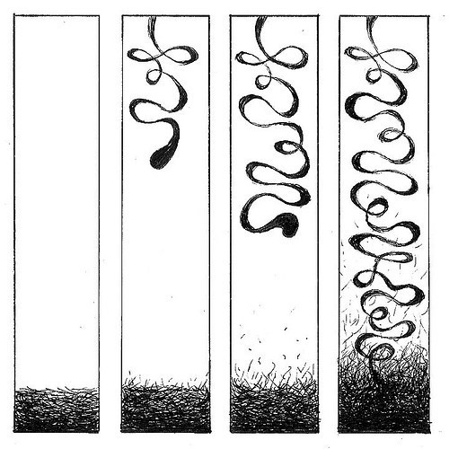
To create a story experience, the images have to trigger a sense of ordered sequence that is read–rather than a set of images that can be appreciated in any order. This one (created by a Russian high school student during an abstract comics workshop) does that for me:
I experience a story because I read each ink blot as the same blot that is undergoing a sequence of changes. The blots all represent the character “blot.” In terms of plot points, I see this:[image error]
Alternatively, I see three subplots. Images 1-4 are straight-forward growth, images 5 and 6 are about the blot dividing, and then in image 7 and 8 it shrinks to nothing. Noting that ending balances become opening balances of next subplots, it plots like this:
Whether divided into subplots or not, the ending balance is nothingness. “Blot” is gone. But after looking at the final image, I find myself inferring the same state prior to the first image, making the first drawn image not balance but disruption:
I only infer that after studying the whole sequence, so it’s a kind of mental revision, but it still means I’m experiencing undrawn story content. There was blankness before there was “Blot.”
So I just contradicted the first half of my first rule of abstract plots: the first image is always balance.
Things get more complicated with the next example (by another student in the same workshop):  This strikes me as not one sequence but four, with the first spanning the first three rows. That story is about string-like lines gathering and amassing into a ball and then traveling and finally vanishing into the distance. I read the first image as a disruption of what to me is an undrawn but implied panel of uninterrupted white. I infer a similar image after the last panel in row three, making that last image a climax:
So in addition to violating the first half of my first rule of abstract plots, I just violated the second half too. This abstract comic doesn’t begin or end with an image of balance.
One more:
At least this time the first image is balance. But not only is the last image not a new balance, it doesn’t feel like a climax to me either. It feels like imbalance with not only the resolution but also the implied climax leading to the resolution yet to come:
That’s a lot to infer from abstract images, and it seems to decimate my proposed principle that closure only occurs with representational images. I made very similar inferences about a rolling snowball in Peanuts strip in a previous post:
But I think these abstract comics actually support my argument.
Each example of inferred plot points occurs because I experience representational qualities in the not-entirely-abstract images. Because “Blot” ceased to exist at the end of its story, I retroactively inferred that it must also not have existed prior to the first image. The first image is now its birth–a state that necessarily implies a pre-birth state. I’m understanding “Blot” to exist (and to have once not existed) in a sense not constrained to the world of its physical canvas but as part of a conceptual story world beyond it.
While I experienced story-world time in the first comic, in the second I experienced both time and story-world space. Those string-like lines, while literally two-dimensional, evoke a three-dimensional world. Otherwise I couldn’t perceive the ball of strings as vanishing into the distance–it would instead be shrinking.
The third comic implies not only time and space, but also gravity and physics. The abstract object is an object, one abstract in shape but that exists three dimensionally as it extends downward, and the grass-like lines begin at rest before flying up to it through some kind of magnetic-like attraction. The story ends on a kind of cliffhanger (imbalance) because the trajectory of drawn action implies to me greater interaction yet to come.
None of that is “abstract.” All of my inferences, all of the closure I perceived, comes from my applying norms of my world to the world of the images–which is no longer just the canvas. All of the above abstract comics have story worlds. And a story world is where the imagined but undrawn events experienced through closure take place.
So abstract and representational aren’t cleanly divided categories. They’re opposite poles on a spectrum. And a more precise term for that spectrum is mimesis, or real-world imitation. “Blot” is clearly not of our world, but its world is like our world to the degree that time passes there and objects like “Blot” exist only for a certain duration. Though the ink marks that represent the string-like characters in the second comic are two-dimensional, their world is seemingly three-dimensional. And the story world of the third comic even evokes our familiar laws of physics.
So this round of tests refines my earlier claim to this:
Closure is mimetic.
Non-mimetic images don’t produce it.
[If you’re interested, this is part of a four-part sequence. It begins here and continues here and here and ends right here.]
May 7, 2018
Occam’s Abstraction Axe
Two weeks ago I introduced an approach to plot that harmonized Freytag, Todorov, and Neil Cohn:
Last week I used that approach to formulate Occam’s closure, a principle for determining the inferences produced by juxtaposed images:
The undrawn story content between representational images is only the minimum required to satisfy missing plot points.
The key word there is “representational,” images that, in addition to being ink or pixels, create the impression of something else, something that exists beyond the page, subjects in the real world or a story world or both. This week I’m looking at abstract images, ones that don’t represent anything else and so are just ink or pixels.
So two question:
Can a sequence of abstract images have plot?
Can abstract comics produce closure?
First, plot usually involves characters and settings and actions and events–things not found in abstract images. But a sequence of abstract images–what you can call an abstract comic–does have a set order. That’s the definition of “sequence.” A set of abstract images that doesn’t channel you down a correct viewing order isn’t a sequence. And the thing that turns a set into a sequence is, I would argue, plot.
Look at these three abstract images:
Since you apparently read English, I’m guessing you “read” them left to right. I’m also guessing you experienced them as a progression, as a sequence of transformations:
Reverse the order and you still experience a left-to-right sequence of transformations:
[image error]I suspect it’s that perception of transformation that makes it a sequence and not merely a set. So the first image is a kind of “character” and the “actions” or “events” are its changes, which is a plot. But unlike representational plots, abstract plots have no story world other than the page or screen they physically appear on. They should, however, have plots points. Image content determines those points in representational comics. What determines them for abstract comics?
Recall that Todorov divides plot into three primary sections: equilibrium, disequilibrium, equilibrium. Or what I simplify as: balance, imbalance, balance. The other two points, disruption and climax, are hinge points that bridge those major states. That makes the plot of a three-image abstract comic clearer:
But what happens if there are four images?
Is the second image now a disruption? Is the third a climax? And what if there are five images?
[image error]Is the middle image now an imbalance? What happens with six?
Are both middle images imbalances? I could keep expanding the sequence in both directions and also insert new intermediate images between the current ones. But each sequence still produces the same story: the first image becomes the last image.
Note the “first image” and the “last image” is different in each sequence, and the intermediate positions are determined by the number of images between them. This is true even if there are only two. The first image always defines the initial balance, and the last image always defines the concluding balance, regardless of how many images there are in total, including only two:
Technically Todorov has one state too many. A story only requires two: equilibrium, new equilibrium. An abstract story always begins in balance and ends in balance because that is the plot curve of all stories. But in a representational comic, opening or closing balance can be implied by image content. Look at the Peanuts example from last week:
The two-panel sequence begins with a disruption and ends with a climax, leaving the beginning, middle, and end implied. Look at the three-panel sequence of the rolling snowball:
Shultz doesn’t draw the snowball coming to a stop and then remaining at rest. We infer it. The plot positions of representational images are determined by their content because we imagine undrawn events occurring in the story world. But the only story world of an abstract comic is the surface of its page or screen. There’s no other place beyond it. A drawing of Charlie Brown is a representation of the character Charlie Brown who exists in a story world and so as a concept in the viewer’s head. An abstract character exists only on the page. The drawing doesn’t represent it. The drawing is it. There’s no undrawn content either. In abstract comics, what you see is all that exists, both physically and conceptually.
That means that closure doesn’t exist in abstract comics. There’s literally no place for it. Look at Occam’s rule of closure again:
The undrawn story content between representational images is only the minimum required to satisfy missing plot points.
Closure is the inferences produced by two juxtaposed images. But if plot requires a minimum of only two states–old balance, new balance–then two sequenced abstract images have no missing plot points to satisfy. When applied to abstract comics, Occam’s razor is more like an axe. It chops out closure entirely. Closure applies only to representational comics. Viewers don’t infer anything between abstract images.
Chris Gavaler's Blog

- Chris Gavaler's profile
- 3 followers

