
Chris Gavaler's Blog, page 41
September 17, 2018
Foucault Comics
Comics are supposed to be funny so I’ll start with a punchline:
“A comics page is a panopticon atop a hereotopia.”
If that sounds like the least funny joke ending ever, hears the beginning:
“A superhero, a French philosopher, and a prisoner designer walk into a bar.”
Or maybe:
“Batman, Michel Foucault, and Jeremy Bentham walk into a bar.”
Except there’s no bar. It was an email from an academic journal asking me to peer-review an article submission. I almost said no–does anyone really need to hear my opinion about a Foucaultian reading of the batcave?–but then I started writing a reader’s response in my head, gently critiquing the article for not addressing the formal qualities of the comics and their relationship to Foucault’s ideas. I didn’t actually know the author didn’t do this; it was just my very strong guess based on the abstract. So if only to satisfy my curiosity, I clicked ACCEPT and started reading.
Yep, no formal analysis. This is (to me) surprisingly common: discussions of comics that explore only their literary (textual and narrative) content while ignoring their visual qualities. It’s probably a result of comics studies growing out of English departments instead of Art departments–where comics are still struggling for a foothold. And in this case, the theoretical framework seemed especially well-suited to the comics form–so much so that Foucaultian interpretations started popping into my head.
I’m not a particular fan of Foucault, and certainly no expert, but here’s my first draft of panopticomix theorizing.

First, the panopticon. Since surveillance cameras were not a late 18th century option, Jeremy Benthan designed circular prisons that gave a single watchman the ability to observe an entire complex of cells from one location. The term roughly translates “all seen.”
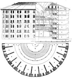
Foucault analyzed the panopticon as an embodiment and a metaphor for institutional power in his 1977 Discipline and Punishment. He begins by describing a parallel system for how a city copes with a plague threat: “First, a strict spatial partitioning” producing an “enclosed, segmented space, observed at every point.” The prison panopticon achieves similar results architecturally: “The panoptic mechanism arranges spatial unities that make it possible to see constantly and to recognize immediately.” It also works regardless of who sits at the center: “Any individual, taken almost at random, can operate the machine.”
A comics page is a similar kind of visual system, one operated by a single viewer positioned in front of its multiple panels, or “cells.” Like a prison guard, the viewer perceives the range of available angles, while attending to only one at a time. Unlike a film audience, the comics viewer is in control, speeding up, slowing down, backtracking, and pausing at will. Prose readers have a similar degree of control, but prose is not subdivided into units as discreet as conventional panels. Framed art in a gallery exhibition is similarly subdivided, and the viewer does have similar control, but the gallery viewer must move to take in all of the art. In contrast, comics viewers, like panopticon watchmen, are stationary.
Foucault also discusses his own term “heterotopia,” literally “other world,” which further relates to the comics form. He writes in 1967:
“The present epoch will perhaps be above all the epoch of space. We are in the epoch of simultaneity: we are in the epoch of juxtaposition, the epoch of the near and far, of the side-by-side, of the dispersed. We are at a moment, I believe, when our experience of the world is less that of a long life developing through time than that of a network that connects points and intersects with its own skein.”
He outlines six characteristics, two of which are especially applicable: “The heterotopia is capable of juxtaposing in a single real place several spaces, several sites that are in themselves incompatible,” and “Heterotopias are most often linked to slices in time.”
A comics page, the blank and so typically white background on which panels are superimposed, functions similarly. While existing outside of the spatiotemporality of the story world contained in the panel images, the gutters–the typically undrawn white space that is the page background visible between panels–are how comics arrange and juxtapose the images that create their stories. The content of each panel is spatially incongruent, with each displaying a different slice of story time, but the gutters and margins of the (seemingly) underlying page allows them to function together.
Foucault later writes that hetertopian spaces “have the curious property of being in relation with all the other sites, but in such a way as to suspect, neutralize, or invert the set of relations that they happen to designate, mirror, or reflect.” Those relations are the comics panopticon, the layout of panels that is orderly and understandable–but only because it appears to be superimposed onto a non-place, the undrawn and literal negative spaces that allow the spatiotemporal progression of the panel images while existing outside of their logic.
In comics, the “other world” encloses the “all seen.”
Now consider French comics theorist Thierry Groensteen in The System of Comics:
“What is put on view is always a space that has been divided up, compartmentalized, a collection of juxtaposed frames, where, to cite the fine formula of Henri Van Lier, a “multi-framed aircraft” sails in suspension, “in the white nothingness of the printed page.” A page of comics is offered at first to a synthetic global vision, but that cannot be satisfactory. It demands to be traversed, crossed, glanced at, and analytically deciphered. This moment-to-moment reading does not take a lesser account of the totality of the panoptic field that constitutes the page (or the double page), since the focal vision never ceases to be enriched by peripheral vision.”
While Van Lier’s lyric description of a white nothingness that suspends but is not part of the compartmentalized content echoes Foucault’s heterotopia, Groensteen’s “synthetic global vision” and its continuous reliance on the viewer’s “peripheral vision” is the key to Benthan’s prison design. And of course Groensteen uses the adjective “panoptic” (or, like Foucault, the French equivalent).
Since Foucault’s panopticon focuses on the state’s system of power and discipline, a full Foucaultian application to the comics form would involve an analysis of the viewer as operating a system designed to give her power over the page’s partitioned content that she maintains in a fixed peripheral relationship as she inspects individual panels. The viewer is especially empowered since the comics form’s juxtaposed images co-produce inferences in her thoughts that allow the static, isolated images to flow as a narrative. The orderly power of the comics page then is also dependent on undrawn and so unviewable story events that emerge from the murky non-place of the gutters. The all-seeing panopticon layout paradoxically requires the unseeable heterotopia of the page background.

I could go on about prison bars and the bars of a comics grid–while circling back to the bar that Batman, Foucault and Bentham were walking into.
But I think you get the picture.


September 10, 2018
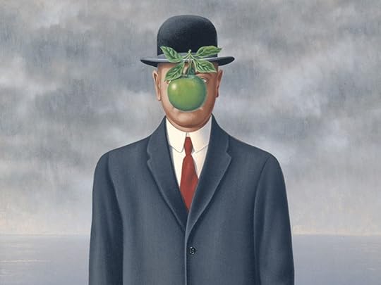
Magritte: This is not a Biography
Rene Magritte is an ideal subject for a graphic novel. His paintings explore the same terrain that the comics form is built on, one that writer Vincent Zabus scripts into a Twilight Zone adventure for artist Thomas Campi to explore in his own surrealist variations.
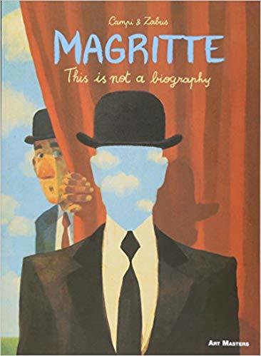
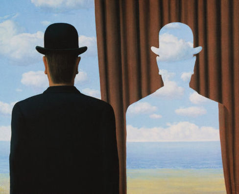
Campi’s cover for Magritte: This Is Not a Biography recreates one of Magritte’s self-portraits in which the painter appears to have cut out the shape of his own head to reveal not the curtain behind him but the clouds behind the curtain. The layered illusion heightens both the appearance of depth in the painted image and yet also the flatness of the two-dimensional canvas. That kind of illusion runs through a range of Magritte’s paintings. It is also the defining illusion of comics.
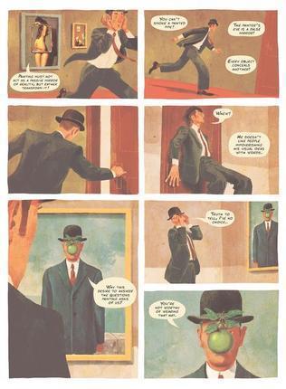
Like the vast majority of comics artists, Campi places rectangular panels on the white backdrop of each page, creating the impression of windows that look into three-dimensional scenes situated just beyond the panel frames.

If a panel’s image includes a white object—a cloud, a wall, even the letters of captioned narration—that white is understood to be different from the white of the page visible between panels, even though both are literally identical. And while a comics page is like a gallery wall of independent paintings, it also combines its panels into layouts that emphasize page unity.

Campi, like Magritte, exploits these weirdnesses, at one point drawing a figure who not only breaks panel frames, but even appears to climb their edges like scaffolding. Zabus’s story is a kind of scaffolding too, giving Campi a narrative structure to hang his Magritte-inspired watercolors and oil paintings. Charles, Zabus’s stereotypically straight-laced narrator, accidentally dons what turns out to be Magritte’s bowler hat and so stumbles into an alternate universe fueled not only by the painter’s images but his personal history, allowing Zabus to sprinkle the nominal plot—will Charles ever escape this strange world?!—with a range of biographical facts, the way Campi sprinkles the same pages with visual references to Magritte’s art.
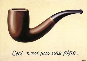
Zabus’s title echoes probably Margritte’s most famous work, The Treachery of Images, a painting of a pipe with the French words for “This is not a pipe.”
While the pun is entertaining, the resulting not-a-biography is also a not-an-entirely-engaging-story. It is difficult to care about the cartoonishly drawn Charles or his less cartoonishly drawn love interest, a Magritte expert he conveniently meets during his mission to comprehend the artist and so be allowed to remove his haunted hat. Arguably, that story is of secondary importance, but it occupies as much if not more page space than the cut-outs of Magritte’s life it indirectly provides.
At some level Zabus is lampooning the idea of biography, that it is even possible to encapsulate a person’s life events and psychological complexities. That partly explains Magritte’s two-dimensional characterization and stock summaries: “He was a sort of instinctive anarchist, a wild man who liked to play the dandy,” or “As a teenager, Rene was racked by a hyperactive and tortured libido. It was Georgette who channeled his urges, lent his incoherent life structure.” Yet when Charles exclaims, “The more I learn about Magritte, the more complicated he seems,” the opposite seems true. At times it seems Zabus is simplifying Magritte for a young audience, as if the graphic novel is targeting a children’s market, but the occasional nude breasts and one of Magritte’s few bits of dialogue, “The artist will now fuck his model!” eliminates that possibility.

The book’s best moments are its most playful ones, as when Magritte’s “biographer” appears as a tiny man on a miniature train and Charles complains, “The font’s too small. I can’t hear you,” or when the biographer dies of an arrow wound even as he acknowledges that his blood is only paint—which of course it literally is. The meta approach predictably places the book itself into the story, with an unnamed character reading a copy and warning Charles what will happen on the page’s bottom panel. Although he does eventually remove the bowler hat and escape Magritte’s world, Charles then chooses to abandon his normal life and reenter the novel’s final painting to float hand-in-hand with his beloved Magritte expert.

Happily, the actual book does not end there, but with several pages of additional paintings by Campi. Though Charles still appears in them all, Campi is finally free of Zabus’s dialogue and plot structure. This is perhaps the freedom that Charles and Magritte himself longed for too. As Zabus has Magritte say earlier in the narrative: “Like my paintings, do you? Then look at them! There are no answers, you know! Just images…”

While the not-a-biography approach is more entertaining than a standard biography, Zabus and Campi might also have explored other not-a-story approaches too, ones that might further realize the spirit of Magritte’s paintings by unlocking them from a conventional narrative structure. Still, the graphic novel’s overall playfulness, especially its visual riffs on Magritte’s paintings, is a fitting tribute to the artist, and one perfectly suited to the comics form.

[A version of this post and my other recent comics reviews appear in the comics section of PopMatters.]
September 3, 2018
My Colonnade
My university’s website includes the timeline “African Americans at Washington and Lee.” The 1826 entry begins:
“Jockey” John Robinson dies and leaves his entire estate to Washington College. An Irish immigrant who had himself been an indentured servant, Robinson had amassed a considerable fortune as a horse trader, whiskey distiller, and plantation owner. He lived on about 1,000 acres of land at Hart’s Bottom, which would become the site of Buena Vista. Proceeds of the bequest, which was nearly as large as George Washington’s gift of canal stock, included “all the negroes of which I may die possessed together with their increase shall be retained, for the purposes of labour, upon the above Lands (Hart’s Bottom) for the space of fifty years after my decease.”
A trustee’s letter lists “between 70 & 80 negroes worth at a very low estimate forty thousand dollars.” A lawyer advised selling the land and enslaved people, despite Robinson’s explicit directions not. So in 1836:
“the Washington College trustees conclude “a sale of negroes to Samuel Garland” of Lynchburg, Virginia, Garland co-owned a plantation in Hinds County, Mississippi, and indicated that he planned to send the slaves there. In addition to the approximately 55 enslaved people it sold to Garland, the college also sells five other slaves to individuals in Lexington and Rockbridge County and retains six men and one woman.”
Robinson isn’t mentioned again in the timeline until 2016 when:
“the University formally introduced a historical marker, “A Difficult, Yet Undeniable, History,” recognizing the enslaved men and women owned by Washington College in the 19th century. The marker is located in a memorial garden between Robinson and Tucker halls. It includes the two lists of those men and women who were bequeathed to the college by John Robinson.”
The timeline has not been updated to include the creation of the Commission on the Institutional History and Community in August 2017, the release of the Commission’s Report last May, or our president’s official response to it last week. One of the Commission’s thirty-one recommendations was:
“Re-name Robinson Hall immediately. The hall’s association with slavery at Washington College – i.e., that the Robinson bequest included enslaved persons who labored at the institution until the institution sold them to others – gives special urgency to this proposal.”
The president did not respond to this recommendation. He only responded to the Commission’s recommendation to rename and repurpose Lee Chapel as a museum no longer used as a gathering place for school events. Even as he rejected it, he acknowledged its rationale:
“Others experience [Lee Chapel] as an exaltation of the Confederacy that divides us by making some members of our community feel unwelcome… Those concerned about the symbolism of the chapel object that the recumbent statue and the portrait of Lee in uniform make it difficult to participate fully in the life of W&L without also feeling that one is worshipping at a shrine of the Confederate South.”
Instead of converting the chapel to “a teaching museum in which no other university activities would occur,” our school will hire a new a Director of Institutional History, whose duties will include “making it clear that university assemblies, which would continue to take place in the chapel, have nothing to do with venerating the Confederacy.” I presume this new administrator will also be in charge of eventually responding to all of the other recommendations, including those of special urgency.
When the president responded to the Unite the Right rally in Charlottesville last year by creating a committee to study the issues for an academic year, I tried to be optimistic. As he told the Washington Post last October: “I haven’t put any constraints on what the commission can think about, talk about, or recommend.” He also said: “People are all very eager to take action, and to know what action is going to be taken. I think the most important action is to spend some time learning and thinking.” I suspect that comment was in part a sub-tweet at my department. As the Washington Post article explains:
A month after torch-bearing white supremacists marched at the University of Virginia, some members of the English department at Washington and Lee took their own stand. “This community has profited by slavery,” they wrote online. “We are complicit in its harms.”
The college, they wrote, “is named after two slaveholding generals with powerful legacies. . . . If it were ever right to celebrate the contributions of Robert E. Lee as an educator, that time is past. Lee’s primary association, to many Americans and across the world, is with white supremacy.”
That prompted heated backlash.
The release of the Commission’s Report has prompted even more. Outraged alums have been threatening to cut off donations. One of the more eloquent wrote:
“As I suppose is the case with most of our alumni, I strongly oppose the most radical of the recommendations: the renaming and repurposing of Lee Chapel. I believe such a move would be a grave error, one that may do irreparable damage to the university, dramatically altering its future, and one which may have potentially devastating financial consequences as current and future donors reassess their willingness to support an institution that has sacrificed its traditions and history in favor of political expediency and moral signaling.”
Others have been less eloquent. Members of the Virginia Flaggers commented on their Facebook page:
“Leave the chapel alone! That committee needs to be disbanded for trying to have it removed”
“Remove comitee fanatics comunists”
They also applauded the president’s decision:
“Thank you, Mr. Dudley!”
“Gonads still exist.”
“God answered my prayers.”
“It shall ALWAYS be a CONFEDERATE SHRINE. All that General Lee honored with his service is hallowed ground.”
Our president has also consistently stated that his top priority is to increase student and faculty diversity. According to collegefactual. com:
Washington and Lee University is ranked #2,235 [out of 2,718] in ethnic diversity nationwide with a student body composition that is below the national average.
82% of students are white, and 85% of faculty are white. It would seem that having the name of the leading Confederate general in your institution’s name and his tomb at the metaphorical if not geographic heart of your campus isn’t an attraction for nonwhites. Perhaps worse, it likely is an attraction for individuals who agree with or at least are willing to overlook the racial ideology of the Confederacy.
Creating a commission to study problems and recommend solutions and then rejecting that commission’s most prominent recommendation while putting off discussion of all of its other recommendations–what kinds of prospective students and faculty members will those actions attract? What kinds will they repel?
We’ll have to wait to see how the “African Americans at Washington and Lee” timeline continues.
Meanwhile, I made the six-panel comic “My Colonnade” over a year ago. Like most comics, it doesn’t suffer from subtlety. It features a cartoon (meaning a highly simplified rendering) of W&L’s historic colonnade constructed over and incrementally obscuring an excerpt from a 1836 document describing the deaths of two of the enslaved people bequeathed to the college. Robinson Hall is on the right. My office window is behind the pillars on the left.
I had hoped that a year after Charlottesville this comic would be too dated to post here.
August 27, 2018
Word Containers
Probably the best known comics convention is the word container. It’s also the most wide-spread outside of comics. Look at your phone the next time you’re texting:

Those are talk balloons. Read as a panel from a comic book, it’s as if you’re standing just out of frame on the right and the other person is just out of frame on the left. Though are you really “talking”? Maybe the containers should be psychic thought bubbles instead?
Conventionally, words of speech are arranged inside circular talk balloons, thought inside cloud-like thought bubbles, and narration inside rectangular caption boxes. Thought bubbles fell out of popular use in mainstream comics in the 80s, and so characters’ thoughts also often appears in caption boxes. Speech containers date to at least medieval manuscripts that include “speech scrolls” arranged near figures’ mouths:
Talk balloons usually have tails or pointers directed at the speaking character. For Doonesbury, Garry Trudeau often draws only single-line pointers with no container around the spoken words:

No word containers are necessary, but mainstream comics included them in part to make revision easier and so speed production. 1960s Marvel artists Steve Ditko and Jack Kirby would draw a large number of word containers per page, with only a general sense of the dialogue, thoughts, and narration that Stan Lee would later compose for a letterer to add.

If Lee composed less than the containers implied, the letterer could draw the words larger, creating the impression that a character was shouting—an effect independent of the drawn image. That’s because the containers, unlike the words, are an integral part of the artwork. Like sounds effects, they are a drawn element to be balanced in each panel composition. Speech bubbles rarely contain more than thirty-eight words. While entire comics and certainly sections of comics can be wordless, a word-heavy page might include as many as 230—though under 200 is more common.
Like word rendering, the lines and shapes of a word container are expressive. Jagged, smooth, rounded, angular—the visual qualities imply aural qualities, especially of speech. Dotted lines often indicate whispering, and thick jagged lines shouting. In 1925, Soviet graphic designer Aleksandr Rodchenko produced a now-iconic poster for a publishing house that featured a woman in profile cupping her hand to her mouth and shouting the Russian word for book, with the letters contained and shaped by a bullhorn-like triangle extending from her open mouth.

Since speech is a character-defining quality, just the shape of a talk balloon can establish a person’s personality. The speech of Marvel’s android character The Vision first appeared in white, oval talk balloons in 1968, but by 1972 later artists and colorists converted them to yellow, round-edged rectangles to suggest a robotic voice:

When designing text containers, artists consider whether the lines of the container match the lines of the words or if they meaningfully contrast. Does the container have a background color or texture that carries a connotation too? Is the container simply a framing line, leaving the background image visible—or does the container appear to be cut out of the image, exposing the white of the page beneath? And do all containers follow the same design, or do they vary according to type or character or situation or mood?
For Elektra: Assassin (1987), Bill Sienkiewicz and Frank Miller place the title character’s narration in white rectangles with sharp corners and her partner’s in blue rectangles with flattened corners. When Elektra assumes the persona of an innocent romantic, her rectangles are pink with bubbly corners. In Red Winter (2018), Anneli Furmark contrasts her typical oval talk balloons with rectangular ones with zigzag lines for voices on the phone. The talk balloon around a voice on the television is oval, but its frame cuts off parts of the words, making the container into a kind of window into a different plane. When two characters speak the same words simultaneously in Asterios Polyp (2009), David Mazzuchelli draws their two talk containers, an oval and a square, overlapping with the shared words in their centers:
Though they are not composed and set as lines of poetry, words lettered inside containers resemble stanzas. The containers function like pages in prose texts, forcing arbitrary line breaks, but the units are brief compared to a page of prose, so the containers also create units distinct from sentences and paragraphs or lines and stanzas. They create rhythms unique to comics, and so a writer needs to weigh how to group words into container phrases. Jennifer Egan’s story “Great Rock and Roll Pauses” in A Visit from the Good Squad (2011) was composed in Powerpoint and consists of typeset words and word containers—and so might be considered a comic:
These last three examples use human figures as word containers for three different types of text.
Narration (“You have the right to remain silent”):
Speech (“SHUT UP!”):
Thought (“You don’t know what I’m thinking”):
Though word containers are comics best known convention, there doesn’t have to be anything conventional about them.
August 20, 2018
The Art of Words
Characters are printed symbols made of letters, of letterforms, which exist as ink on paper or pixels on screen. In this sense, words are images, no different from any other kind of image. The fact is easy to overlook when reading a prose-only book where letters are typeset in a single font and color with uniform margins. Chapter titles might be larger, bolder, and isolated within a larger area of white space, but then the typesetting reverts back to its undifferentiated norms. That uniformity tells readers that word rendering doesn’t matter. And since it communicates no meaning, it becomes invisible.

Words are also characters in the sense that Black Panther, Charlie Brown, Doonesbury or any comics character is a character. Each is represented by a specific set of lines in a sequence of panels, but each also exists beyond those images as a concept or cluster of ideas in a reader’s head. That’s how we typically understand words, as free-floating definitions and connotations that are triggered when an image of a word appears on a page.
Because prose writers focus on words as concepts and ignore words as images, they lack the range of possibilities open to comics creators. “What we are looking at when we read,” explains Mendelsund, “are words, made up letterforms, but we are trained to see past them—to look at what the words and letterforms point toward. Words are like arrows—they are something, and they point toward something” (322).
Prose-only writers attend only to what words point toward, the network of meanings that a word’s history of usage accrues. Since they leave word rendering to typesetters and printers, word rendering doesn’t matter. Comics script writers don’t render words either, and so they sometimes adopt a similar attitude. “Lettering,” insists Marvel’s Brian Michael Bendis, “should be invisible. You shouldn’t notice it unless it is a determined piece of storytelling in graphic design” (2014: 43). Bendis is right, but only because words in a comic are always a determined piece of graphic design.
“To read,” continues Mendelsund, “is: to look through.… There is very little looking at” (334-5). William Faulkner challenged that norm by wanting to print The Sound and Fury in colored fonts to mark time shifts: “If I could only get it printed the way it ought to be with different color types for the different times in Benjy’s section recording the flow of events for him, it would make it simpler, probably. I don’t reckon, though, it’ll ever be printed that way” (Flood).

Aside from an edition of 1,480 colored copies published long after his death, the words of the novel are printed in a uniformly rendered format, their black ink signifying nothing. If Faulkner had been a comics creator he would also have known that the different time periods could be signified by different fonts or font sizes or word containers or areas of the page. Any of these approaches could create additional meaning by drawing attention to how the words are also images on paper.
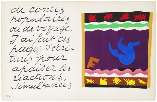
Henri Matisse takes word image to its most extreme. He begins his 1947 Jazz:
I’d like to introduce my color prints under the most favorable conditions. For this reason I must separate them with intervals of a different character. I decided handwriting was best suited for this purpose. The exceptional size of the writing seems necessary to me in order to be in a decorative relationship with the character of the color prints. These pages, therefore, will serve only to accompany my colors, just as asters help in the composition of a bouquet of more important flowers. Thus, their role is purely visual.
Matisse frames each two-page print with two to four pages of text, treating his hand-drawn letters as paint strokes. The words’ visual qualities don’t add meaning to the text—they replace it. Matisse likens the content to the unread court decisions he filled with fables as a law clerk because the importance of a trial was marked by the volume of paper it produced, regardless of content. For Matisse, his letterforms are shapes only, images free of linguistic meaning.


Words in comics are not purely visual, but, like Matisse’s handwritten letters, they are compositional. They are part of the artwork.
They can also be the artwork, the ink objects we look at instead of through. Here are a drafts of some of my own words-as-image comics art, consisting entirely of letterforms. The first is Shakespeare’s sonnets 1-28:
The second repeats a passage from an Edgar Allan Poe story paradocially describing the cut-up technique a century before William S. Burroughs: “I anointed a sheet of foolscap with the white of a gander’s egg; then, shredding the thing to be reviewed as I had previously shredded the books- only with more care, so as to get every word separate- I threw the latter shreds in with the former, screwed on the lid of the castor, gave it a shake, and so dusted out the mixture upon the egged foolscap; where it stuck. The effect was beautiful to behold.”
And the third is a page from “Queer Arrangements” in the upcoming issue of Sequentials (due to go online later this month I think).
August 13, 2018
How to Create a Comic Book Character
On the first day of our comics class, Leigh Ann told our students to draw a kangaroo in a rocking chair in front of a window. She said a kangaroo because people tend not to have a clear picture of one already in their heads, so they can’t draw a generic “idea.” The top half of the next illustration includes six of their first drafts, ranging from students with plenty of art studio experience to students who had never picked up a drawing pencil before. The bottom half are the same students’ revisions. It doesn’t matter what drawing experience you’ve had. Everyone can produce interesting art through revision:
Revising requires image research. Since we there were no rocking chairs and kangaroos in the art studio, students googled “kangaroo” and “rocking chair” on their phones and found images that appealed to them, studied them, sketched variations, redrew their first drafts, and inked them. Further revision is always possible, but they all became much more specific and so much more interesting. A comics artist can follow this process with all of her panels, identifying objects, researching images, and revising for specificity.
Now unless you’re making a comic about a kangaroo in a rocking chair, this assignment won’t help you create a character. But the process will. The next illustration breaks it into five steps:
Begin by “doodling.” Draw anything in any style anywhere on the page. Let your hand do what it wants. This can teach you some of your own preferences for both style and subject matter. What do you like to draw? If the shapes of fish or robots come easily off your pencil tip, fish or robots probably belong in your comic. If you doodle flowers or geometric shapes, that might tell you something about your settings.
Our students doodled for fifteen minutes before stopping and looking over their pages. They all included rough drafts of their first characters. Some included many characters, but everyone chose one to develop. Henry began by drawing a fantastical semi-human creature with wings and bird feet. He added more reality to that fantasy by going online and selecting related images: bird talons, bat wings, a male torso. If you drew a fish, search for fish—and study their tails and gills and fins and mouths. If you drew a robot, search for machines and study their hinges and wheels and bolts and wires.
Now draw your character again, using your research to give more specificity. Experiment with distortion and detail—how little, how much, where and where not. Once you’re satisfied with the general arrangement of the image, revise it, giving the specific details more depth, more value, more line variation. When you’re satisfied, pen over your pencil marks to finalize the image.
You now have a character. You’re going to be spending a lot of time with them, so you need to know them well. Our students drew them fifty times in fifty different poses and angles and activities.
What does yours look like from behind, from the side, from above, from below? How do they look sitting, jumping, walking, running, falling, swimming, diving, flying, sleeping, crouching, dancing, punching, kicking, slouching, yawning, stretching, shaking, laughing, screaming, whispering, kneeling, crawling, climbing, eating, sneezing, squinting? Include objects if you like: tennis racket, unicycle, ten-ton weights. Or partial environments: cliffside, jail bars, operating table. Zoom in for close-ups of their face and hands at different moments. Draw them big—filling in new details because of the extra internal spaces that creates. Draw them tiny—what are the minimal details that distinguish them from a distance? And draw them with different expressive lines: light, dark, thin, thick, fast, slow, long, choppy, bumpy, straight. Let the lines create their personalities.
Look over your drawings. What do the images say about your character? What information do they convey? What possibilities about their lives and pasts and preferences and goals might they suggest? Write a list of possible facts about them. If you were working from a script, this list might have been your starting point, but now all of this character content can originate from the images themselves.
We asked our students a range of specific questions and learned facts not only about each character, but their larger world and life story too. Begin with these questions, responding in bullet points or in a steam-of-consciousness paragraph, expanding and moving between questions however you like:
Describe your character’s appearance.
What are their most striking physical characteristics?
How does it feel to be their body?
How old are they?
What physical activity do they most enjoy?
What activity do they avoid?
What is their full name?
What does their signature look like? Sign their name as they would.
Do they have parents and siblings?
Name a fact about a grandparent.
Describe their worst fight with a family member.
Describe an odd childhood memory, one they’re not even sure why stays with them.
Do they have any birthmarks, scars, tattoos, injuries, or recent wounds?
Where do they live now? What sort of dwelling? Do they own or rent it?
What do you smell when you walk in?
Do they live alone or with others?
Do they have a pet?
What sort of animals do they come in contact with?
What sort of bed do they sleep in? What is their sleeping position?
What is on the bedside table or near them when they sleep?
Describe a fragment from a dream they had last night.
Name five items in their medicine cabinet.
What clothing do they own other than what they’re currently wearing?
What is their clothing made of? Describe their shoes. Do they wear underwear?
Where do they get their clothes?
Do they wear a ring or other specific piece of jewelry? Where did they get it?
What do they eat? Do they cook? What is their favorite food? Where do they get it?
What is the best meal they ever had?
How would neighbors describe their personality? Would the neighbors agree?
Are there any people or places they avoid?
When they want to be alone, where do they go?
When they want to be with others, where do they go?
List ten actions they perform daily.
What happened yesterday at work?
Describe their workplace—the physical structure, the quality of light, the noise level. How do they feel when they’re there?
What is the last lie they told?
Name something they lost and how they lost it.
Describe a secret they’ve told only once.
Name two of their regrets, one big, one small.
What is the most violent event they ever witnessed or experienced?
What was the highpoint of their week?
Describe an odd way they have of killing time and the first and most recent times they did it.
Describe a smell, taste or texture they hate and why.
Describe the last time they laughed.
Describe something contradictory about them.
Describe an ambition they no longer have.
When they close their eyes, what do they picture?
Name two things they worry about, one small, one big.
What is one of their biggest goals? Name something specific they would sacrifice to achieve it. Name something they would not sacrifice. Name something they’re not sure they could sacrifice or not.
What do they think will happen to them when they grow older?
They have a nagging feeling that they forgot something. What was it?
Reach into one their pockets and pull something out.
What are they doing right now? Describe the location.
Are they having a good time?
What do they most want at this moment?
Describe your character in one sentence.
August 6, 2018
Words Are Images
The appearance of a word affects how a reader understands its meaning. Even typeset fonts aren’t neutral. Each differs in line thickness, shape, and ornamentation, evoking an overall tone or personality. If the words are character speech, font is voice, whether in dialogue, thought, or narration. Even if words are not linked to a character, their style still communicates information. A caption box that includes only a time stamp and a location has to be rendered in a certain style and so with certain visual connotations. The most generic, no-frills, corporate-looking font communicates exactly those qualities. Retype that same information in Bauhaus or Broadway or Brush Script and feel the differences.
For Wonder Woman #20 (1988), George Pérez draws his narrator’s text in a font similar to courier news, because the narrator is a reporter seated at a typewriter in an opening panel. Dialogue and third-person narration still appear in standard hand-lettered style, differentiated from the character’s first-person narration as he types.

When a character in Can’t We Talk About Something More Pleasant? (2014) reads aloud the ingredients listed on a bottle, Roz Chast switches from curving lines of hand-drawn letters to typeset words arranged in choppy lines.
Comics lettering, whether hand-drawn or mechanical, typically features letterforms with no serifs and consistent line thickness. While sizing and spacing are usually uniform, typesetters can add bolding and italics to suggest the rhythms and emphases of speech. Comics lettering tend to use bolding more often, and letter sizes vary—as an inevitable aspect of hand-drawn imprecision, but for targeted emphases as well. Typesetting creates the impression of invisible lines holding the evenly spaced words and letters in uniform rows, an effect that can clash on a page that otherwise consists of hand-drawn images. Unless you have a targeted aesthetic reason to typeset, draw your letters.
In Skim (2008), Mariko and Jillian Tamaki’s main character passes a road sign announcing a town named “Scarborough,” and her narrating self respells it “Scarberia” in a gothic font unlike any other word in the graphic novel:
Word style can vary for a range of such story reasons. Should a narrating character “speak” to the reader in the same font as she does in her dialogue with other characters? Should characters’ words differ too, perhaps echoing their visual qualities, so that the lines of their bodies and their lines of their words visually relate? Or if characters share a single font, perhaps their words differ in color or sizing or some other characteristic?
Mainstream comics traditionally include sound effects, usually onomatopoeia words drawn in expressive lines, shapes and sizes that visually suggest the quality of the sounds they’re evoking: Ka-Pow! ZAP! Even when there’s a separate lettering artist, these words are drawn as part of the initial artwork. In Walking Dead #1 (2003), Tony Moore renders the words of his sound effects, BOOM! and WHUMP!, in sharp lines and shapes that contrast the looser style of his other images, a stylistic difference that parallels their physical difference in the story world:
Mariko and Jillian and Tamaki play with the sound effect convention by placing drawn words within images even though the verbs aren’t always sound-related: “clench” beside toes, “stir” and “stab” beside a straw, and even “apply” beside a bar of deodorant a character rubs in her armpit. In their second graphic novel collaboration This One Summer (2014), the words “Slut. Slut. Slut. Slut.” trails behind a character’s flip-flops as she walks. The insult is in her thoughts after hearing older boys use it to flirt with older girls, so rather than a sound identical to all listeners, it’s filtered through just one character’s unmarked consciousness.
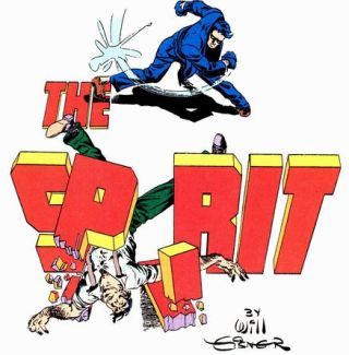
Sounds effects, like most letters on a comics page, are paradoxical because from the perspective of a drawn character they don’t exist. A character can’t “see” a “BOOM!” even though the lines of its letters might overlap with the lines of her own body. But she can see words tattooed on her arm or glowing on a computer screen because they are part of the story world. The division isn’t always clear. Will Eisner established a splash-page norm of words that playfully merge with the story world. The letters of The Spirit might be blocked by a passing ship, or form from the smoke spewed from chimneys, or appear on a card held by a character, or provide an object for characters to climb.
Because it breaks the baseline naturalism of most mainstream genres, such effects are usually limited to opening titles—but not always. After a young woman agrees to go out with the main character in American Born Chinese (2006), Gene Luen Yang draws the repeating word “YES.” in a column above the narrator’s bed, with the last “YES.” shaped to the contours of his bed. In Hannah K. Lee’s Language Barrier (2017), the letters of the one-page “You Don’t Owe Anyone Anything” consist of variously stretched, yellow smiley faces:

In “Student Loans,” the letters of the second word are darker, thicker, and drawn in front of and blocking the letters of the first word. The artistic potential of words has been explored outside of comics too. Glenn Ligon’s How It Feels to be Colored Me (1989) and Kay Rosen’s The Ed Prints (1998) are paintings that consist entirely of rendered words.

However a word is rendered, evaluate how that style relates to the word’s meaning. Does the style support the meaning or does it contrast it? Imagine the word “thin” drawn in thin letters and then in thick ones. Imagine the word “red” in red ink and then in blue ink. Comics titles are often drawn in letterforms that reflect the title character: Bob Wiacek and Todd McFarlane’s design for The Incredible Hulk #340 (1988) appears to be constructed from blocks of stone; Bernie Wrightson and Gaspar Saladino’s letters for Swamp Thing #1 (1972) might have grown from an actual swamp. The title design for the film Hulk instead uses metallic lettering, and after the character of Swamp Thing is revealed to be a kind of universal god, the lettering changed accordingly:
The appearance of letterforms can contradict word meaning too, as with this dilapidated billboard:
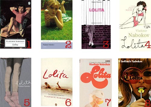
Browse magazine ads and cover designs for other examples of word rendering outside of comics. Lolita: The Story of a Cover Girl (2013), includes over a hundred variations on Nabokov’s novel, many consisting only of letters:
Beginning with its January 2018 issue, the covers of Poetry magazine include only the six letters of the word “poetry” arranged in a 3×2 grid and rendered in a different style each month.

Any word can be designed in countless different styles:
July 30, 2018
Hinged Panels
A few weeks ago I suggested using “hinge” to replace McCloud’s ubiquitous yet frustratingly ambiguous “closure.” While McCloud’s term has related meanings in Gestalt psychology and narrative analysis, hinge is a comparatively simple metaphor: it’s what joins two images together. I’ve identified eleven kinds:
Recurrent: two images represent the same subject.
Spatial: two images represent different aspects of a shared space.
Temporal: two images represent different moments of a shared timeline.
Causal: a common quality of temporal closure in which an action is understood to have occurred between images.
Embedded: one image perceived as two images.
Non-sensory: non-spatiotemporal differences between two representational images.
Associative: two dissimilar images represent the same subject.
Gestalt: two images perceived as a single image interrupted by a visual ellipsis.
Pseudo-gestalt: two physically continuous but representationally non-continuous images.
Linguistic: two images relate primarily through accompanying text.
I offered some photographic examples earlier, but now I want to show off work by students from my and Leigh Ann Beavers’ spring term course. The following illustration will appear in our Creating Comics (Bloomsbury 2020):
1) Emily juxtaposes two identical images. The spatial hinge is obvious: we’re looking at the same cube on the same shelf from the same angle. The temporal hinge is harder. How much time passed between the images: an hour, day, minute, week, second, month? Or did no time pass, and the images are the same because they show the same moment? Or how do we know the second image doesn’t happen first in the story world and the images are arranged to reverse chronology? Technically we don’t, but comics norms imply a forward movement in time—unless something drawn prevents that assumption.
2) Emily’s second pairing repeats the same spatial hinge, and though it’s still ambiguous how much time passes between them, the appearance of a hand means that the two images are not showing the same moment. A causal hinge also explains why the block is gone in the second image: after grabbing it (as drawn in the first image), the hand then removed it (not drawn), leaving the shelf empty (drawn in the second).
3) Mims’ first two panels use spatial, temporal, and causal hinges too. We don’t know how far apart the sidewalk in the first panel and the sand in the second are, but we infer they’re in walking distance and that minutes pass between them. We also assume that the person wearing the shoes in the first panel removed and discarded them during that same period of time. We make similar inferences between the second and third panels—though note the addition of a gestalt hinge: the water line appears at the bottom of the second panel. So spatially the second and third panels are continuous—though time passes between them to allow the figure to have stepped into the water. An astute viewer might also notice that the figure’s shadow changes—in ways that could confuse things and so might then be ignored, either consciously or unconsciously.
4) Anna draws a figure on a bed surrounded by giant, writhing centipedes. Though it’s possible to see this as a single image, the bed is more likely a panel inset placed “over” the image of the centipedes—which, if understood as a close-up, means the centipedes aren’t giant. Though the centipedes could exist somewhere in the same room as the bed, the spatial hinge is ambiguous. That’s because the centipedes are most likely not real. This is the dreamed or otherwise imagined fear of the figure in the bed—and so an example of a non-sensory hinge.
5) Hung draws no panel frames, and so his image has no gutters either. Is this an image of three players practicing soccer? Probably not. First, all three are drawn so similarly, they create a recurrent hinge. Plus each figure implies a different angle of perspective on the undrawn field or fields, and so three different moments in time. Though the figures overlap and are in a sense one image, they create the impression of three images through embedded hinges. Notice that the third figure includes a half-outline, a kind of partially embedded image that suggests movement. But if it’s understood as a blur—like the movement lines of the ball—then it’s experienced as one moment in time and so is not embedded.
6) The corner of a house viewed from outside and an off-centered close-up on an interior doorknob–how do these relate? Presumably they’re parts of the same house—but why are they side-by-side? Any spatial hinge doesn’t tell us much. But if you read Coleman’s two captions, the images take on a clearer relationship, including the presence of multiple undrawn characters at the center of the story. But without the words there is no story. The images relate primarily through linguistic hinges.
7) Lindsay’s two images require a spatial hinge to understand that the second is a close-up of the driver operating the car in the first. Though a temporal hinge might suggest either two consecutive moments or a single moment, the effect is roughly the same. More interestingly, she lines up the edges of the road to the edges of the driver’s head, creating a pseudo-gestalt effect. The road and head have no close spatial relation within the story, but they’re drawn as though they’re connected—suggesting something about the driver’s character too. Since Lindsay uses no gutter, just a single line framing and dividing both images, the pseudo-gestalt hinge is even stronger. She also draws the driver’s sunglasses breaking the second frame, further connecting the two images.
8) Finally, Grace connects her two panels with a gestalt hinge. It’s as if the gutter interrupts a single image, imposing a break where we understand there is none in the story world. Though the story context would tell us more, the half-empty picnic blanket in the left panel and the lone figure on the right are suggestive—more so than if the gutter didn’t highlight her isolation and imply the absence of someone beside her.
July 23, 2018
What is Style?
Roughly speaking, style isn’t what you draw but how you draw it. It’s the idiosyncratic quality that distinguishes a drawing from a replica. Roland Barthes calls a photograph “a mechanical analogue of reality” because it translates reality with the least transformation; but every reproduction, including photography, contains “a supplementary message, in addition to the analogical content itself (scene, object, landscape), which is what is commonly called the style of the reproduction,” something that even photorealism contains since “there is no drawing, no matter how exact, whose very exactitude is not turned into a style” (1977: 17, 18).
Photorealism is relatively rare in comics (Bill Sienkiewicz and Dave McKean are occasional exceptions), but even photo comics (including Dave Crossley’s black and white “Christopher’s Punctured Romance” in HELP! in 1965 or the recent A Softer World webcomics of Emily Horne and Joey Comeau, as well as the entire genre of Italian fumetti) support W. J. T. Mitchell’s claim that not even “photographs have a special causal and structural relationship with the reality that they represent” (1994: 282).
Though photos are not “real,” they do feel more realistic than drawings. Transforming reality into a set of lines is itself a stylistic distortion, and those lines may be thick or thin, dark or light, short or long, angular or rounded, straight or squiggling, curved or jagged, continuous or broken, consistent or variable. The choice of line controls the overall image which defines the overall story world.
Leigh Ann has drawn twenty-four panels with different styles of lines:
Since everything in the world of a comic book is composed of lines and every line is an expressive line, every object has an expressive quality that an artist can manipulate. Douglas Wolk calls a comics artist’s line:
“an interpolation, something the cartoonist adds to his or her idea of the shape of bodies in space. In a cartoon, every object’s form is subject to interpretive distortion … A consistent, aestheticized distortion, combined with the line that establishes that distortion, adds up to an artist’s visual style . . .” (2007: 123)
While lines can be described independently of their subject matter, they also control how a viewer experiences that subject. A character composed of short, thick, jagged lines would be different from the same character if composed of long, thin, curving lines. Those details are another window into his character. They create impressions about his emotional state. Is he calm or agitated? An artist might ask that question in advance and then choose a style to capture it. Or she might simply start sketching and, noticing the agitated feel of her short, thick, jagged lines, decide how upset the character must be—and how much he is trying to repress it given the contrastingly calm shape of his posture. These choices may feel more like discoveries than inventions, but they can only happen if the story is developed visually.
The lines that compose a character also have overall shapes that are understood to be the actual shapes of the character’s body. If the style is naturalistic, those shapes will fall within the range of human beings. Many comic images are well outside them. If, for instance, the head is more than a seventh or eighth of his height or is more rounded than a human skull, then he will appear less naturalistic and more cartoonish. If his head is a third or more of his height and perfectly round, he will be extremely cartoonish, probably resembling Charlie Brown or a character from South Park more than an actual person. A naturalistic character will also include more lines to create the illusions of shadows and depths through cross-hatching. In 99 Ways to Tell a Story, Matt Madden illustrates differences in line quantity by drawing the same one-page scene in “Silhouette,” “Minimalist,” “Maximalist” and even “No Line” styles, all with the same objects using the same contours but varying the number of internal lines (2005: 176-183).
Cartoons tend to be composed of fewer lines, with less internal shading to indicate musculature or the complexities of fabric folds in clothing. They’re “flat.” A naturalistically drawn character might produce an expectation that his internal world is similarly complex, that he has the same psychological depth as a three-dimensional person. A cartoon character is more ambiguous. His emotions may seem simpler. When creating stories through images, external qualities and internal qualities are the same qualities.
“Cartoon” originally referred to a cardboard-like paper used for preliminary sketches. When England’s Punch magazine published a series of “cartoons” lampooning Parliament’s planned murals in 1843, the word became associated with both satire and a specific drawing style: simplified and exaggerated. A cartoon has fewer details than a naturalistic drawing, and those details—the contours of the lines—are distorted. Naturalism requires more lines—more depth-creating crosshatching, for example—and the contours of those lines align more closely to their subject matter. Images that combine those two categories are harder to classify. An exaggerated but detailed image isn’t naturalistic, but it might not connote “cartoon” to a viewer either, and image made of very few but observationally accurate lines might strike some viewers as a cartoon and others as naturalistic.
Leigh Ann has drawn our student Henry nine times:
The top row is realistic in the sense that the line shapes of the image match the photograph they’re based on. But as you move left to right, each image changes in terms of detail. The first is heavily cross-hatched; the second uses value blocks of uniformly rendered black; and the third includes only contour line. The second row follows the same progression, but the figure is distorted. Leigh Ann exaggerated Henry’s feet, hands, and head. She could exaggerate different features instead, and to any of a range of possible levels. She could also alter the shapes themselves, making the head rounder, the feet squarer, the hands longer, etc. Simplification—meaning the reduction—of details can vary more too, with different areas of an image, foreground and background for instance, contrasting. As far as style, the top left image is the most naturalistic, and the bottom right is the most cartoonish.
Few outside of comics would call the reduction and alteration of details “cartooning,” but Picasso’s eleven-lithograph Bull series demonstrates the same two qualities. Though his final minimally detailed and maximally distorted image is not a cartoon in the sense of a shared set of drawing norms, it is expressed in a set of instantly recognizable visual norms. It is a Picasso bull. It is drawn in a Picasso style. Neil Cohn analyzes style as sets of customs or “dialects.” The “‘mainstream’ style of American Visual Language [that] appears most prevalently in superhero comics” he terms “‘Kirbyan,’ in honor of the historical influence of Jack ‘King’ Kirby in defining the style.” (2013: 139). He names the “Barksian” dialect after Scrooge McDuck artist Carl Barks. Manga and underground comix have their own dialects too, making individual works dependent on a language-like system of generic symbols. A face drawn in a Manga style resembles other drawings of Manga-style faces more than it resembles any actual face. This affects a viewer’s understanding of the character and situation at yet another level. A manga character creates a very different impression and set of expectations than a character drawn in the style of Robert Crumb. Both styles tell viewers what kind of world they’re entering, and so what norms are in play.
July 16, 2018
The Smell of Starving Boys

Though the Western is the only genre uniquely set in North America, it has diminished in U.S. fiction. Only a few American films and novels of recent decades depict the late 19th century period of colonial expansion across the so-called frontier. But the West—or at least a fantastical version of it—continues to expand in France, where Laos-born writer Loo Hui Phang and acclaimed bande dessinée artist Frederik Peeters published The Smell of Starving Boys in 2016. London’s Self Made Hero released the first English version earlier this year.
Phang imagines a privately funded propaganda campaign into the “Comancharia” for the purpose of photographing the landscape and attracting settlers who will then mine its mineral riches. But one member of the expedition adds, “I’d have loved to believe in something impossible,” a desire seemingly shared by the authors. Though the post-Civil War setting is nominally historical, Phang’s characters quickly shift from the unusual to the fantastical: a gay photographer whose fake spiritualist photos turn real; a cross-dressing teen who speaks the secret language of horses; a cadaverous-looking bounty hunter who sucks horses dry of blood. Even the pot-bellied, colonial capitalist stops wearing pants and envisions founding a utopian civilization free of women and sexuality. A tribe of Comanche populates the periphery of the plot, with an unnamed old man following the explorers and silently delivering tokens of apparent magic: a double-exposed horse head on a photographic portrait plate, a severed horse head that serves as a soul-summoning bull-horn to herds of stampeding horses.
Oscar, who has fled sexual scandal in Manhattan, wears an aristocratic boy’s portrait inside his locket. Peeters renders Milton, the party’s farmhand servant, with nearly identical features, substituting a white wig for cropped blonde curls. Milton, however, is no boy, but a virginal young woman named Weather fleeing a father trying to sell her into marriage. Oscar, apparently transformed by her boyish looks and the whimsical west, falls in love. The two have sex for the first time while her father’s zombie-like bounty hunter searches outside their secret cavern chalk-marked with magic runes by the old man.
Peeters renders Phang’s world in a consistent, loosely naturalistic style, with the occasional cartoonish feature reserved for the racist capitalist, the caricature of Phang’s social critique. Peeters’ layouts are similarly consistent and feature a four-row base with one to three panels per row. His vertical gutters occasionally align but typically avoid rigid grids in favor of shifting patterns, including a dozen sub-columns in which the novel’s reading path briefly moves top-to-bottom rather than left-to-right. When the effect is achieved through combined panels, the image content tends to be panoramic, with expansive vertical views of the western landscapes. When Peeters divides a panel into thinner, horizontal strips, the content is accordingly cropped, usually of facial close-ups reduced to eyes or mouth. Panels are almost invariably rectangular, with the exceptions appearing near the novel’s end and coinciding with moments of violence: an arrow through a neck, a bullet into a gut. Peeters abandons his base layout for the four-page climax, including the novel’s only two-page spread and full-page bleeds. The striking visual shift evokes the simultaneous splintering of the story’s reality as physical and seemingly spiritual worlds collide. When Peeters reprises the base layout for the epilogue, the world is stable again but permanently altered as Weather and Oscar ride off into their ambiguous afterlife together.
The contributions of Edward Gauvin, the French translator, are even more ambiguous. It’s unknowable whether Phang’s original French included the equivalent of the clichés “in the blink of an eye” or “There’s the welcoming committee.” Since such phrases cluster in the dialogue of the expedition leader, the most two-dimensional and satirically broad character, the effect mostly works. But when Oscar’s speech includes the novel’s title, the intent is less clear. While giving oral sex to Weather, Oscar reminisces about the sexual delights of boys: “if you only knew the smell of starving boys … I’ve never felt that way about girls … But you. Goddamn. You awaken it.” Oscar presumably means “starving” to be erotic, perhaps intending something closer to “skinny” or even “emaciated,” but “starving” has a more distressing connotation. If he actually finds starving boys arousing, then he’s turned on by a sex partner’s desperation for food, which then implies domination and coercion. Though I doubt that was Phang’s intended meaning, it’s equally difficult to believe she and Gauvin would not have worked through the semantic nuances of the novel’s title.

I also wonder about the amount of nudity of the novel’s only female character. Phang and Peeters find multiple opportunities to strip Weather of her clothes: a bath in a stream, a sex scene, an order at gun point, another sex scene. While Oscar is sometimes naked, and Peeters draws the capitalist’s mushroom of a penis more than once too, the eye of the novel roams longest on Weather’s adolescent body, including on the cover. The Western frontier, as romanticized by the French authors, is largely a sexual frontier, a border between genders and sexualities—what the story’s moralistic villain would eliminate. While it’s difficult not to root for the romance, it’s unclear why a female body, even a female body briefly understood to be a male body, should receive greater attention. It’s also unclear why the lone and unnamed native character should care about let alone magically aid Oscar and Weather’s romance, especially given the threat that their expedition poses. As her name implies, is Weather close to nature and so, as the cliché goes, like an Indian?
Despite these questions, the graphic novel’s mix of fantasy and Western tropes is involving, and Peeters renders Phang’s story with subtle craft. Phang also emphasizes the nature of image-making from the first panel: an upside landscape as viewed through the inverting lens of Oscar’s camera. The authors repeat the motif twice more, including on the novel’s final page, reminding readers that The Smell of Starving Boys is itself a set of inverted images too, ones that alter as much as reveal their subject matter.

[A version of this post and my other recent comics reviews appear in the comics section of PopMatters.]
Chris Gavaler's Blog

- Chris Gavaler's profile
- 3 followers

