
Did You Notice Something a Little Different?
UPDATE: Thanks for all the feedback! For those of you who were having issues with blurriness, we have good news: we pushed out an update this afternoon that improves the sharpness of the font for users who were affected. We’re monitoring all the comments and will keep you posted on any further updates.
If you’re a frequent visitor to Goodreads, you've probably noticed a few tweaks we’ve made to the fonts and colors on the desktop site today. Our goal with these small-but-important changes was to consolidate and refresh our visual styles and lay the groundwork for some design improvements that we’re planning in the future.
What’s different?
To enhance the readability of text on Goodreads, we’ve adopted two new open-source fonts. Lato, our sans-serif font, was designed by Warsaw-based designer Łukasz Dziedzic (“Lato” means “Summer” in Polish). Merriweather, our serif font, was created by Eben Sorkin and was designed to be pleasant to read on screens.
To make it easier to scan the page for information you need, we’ve touched up and modernized the design of common page layout elements like section headers, tabs and links.
To simplify and modernize our visual design, we’ve reduced the number of link colors we use, removed gradients from buttons and the site navigation, and applied a more harmonious color palette to interactive elements such as buttons, stars, and links.
Before:


Comments Showing 2,001-2,050 of 3,113 (3113 new)
 If any site needs an update, it's obviously Goodreads... so keep at it and all... but you do realize how hard this font is on the eyes, don't you? Or have you been staring at it so long you can no longer tell?
 In addition to the awful font and the white background that is killing my eyes and making me have to adjust my screen's background every time I use goodreads, a huge pain, has anyone mentioned that the pages are too wide? There's a big empty white band on the right of the home page and the book pages at least that is messing up screen sizing.
 The new colour gives the site a very cold look which makes me uncomfortable while reading. The font is not bad per se, I guess I could get used to it, but I don't like the different sizes.
Old version was better. Hope it will be back or we get at least a choice. I want the warm feeling back when I am on GR.
 I still have difficulty to read with the new font, a bit better than last night. My eyes have an hard time to focuse on the text. You might want to simply change it back since we have a hard time to read the text.
 I have to be honest. I can't stand the new font. Please give us some way to change it!
 The fonts are iffy - especially the serif. I like the buttons and the streamlining, though. But the font is hard to read most of the time.

 It's really difficult to read. Please change it back.
In the feeds there's a big error. It has a link to "read more of this review" and "see review" but they both take you to the review page. I'm sure other people already said this. "Read more of this review," which was previously just the "more" button, should drop down the review on the feed page without having to leave the page. That's an important time saving feature. It's weird that there are three links to the review now, I just noticed that the "hidden" links that you can't see also have one to the review. And you can link to the book twice, one hidden link that you can't see and one new very obvious link. It seems unnecessary to have all of that, just have the old links and make them not the wrong hidden color. And "preview book" is a weird term for going to the book page, what does that mean? Preview? There has to be a better option for that,
It's really difficult to read. Please change it back.
In the feeds there's a big error. It has a link to "read more of this review" and "see review" but they both take you to the review page. I'm sure other people already said this. "Read more of this review," which was previously just the "more" button, should drop down the review on the feed page without having to leave the page. That's an important time saving feature. It's weird that there are three links to the review now, I just noticed that the "hidden" links that you can't see also have one to the review. And you can link to the book twice, one hidden link that you can't see and one new very obvious link. It seems unnecessary to have all of that, just have the old links and make them not the wrong hidden color. And "preview book" is a weird term for going to the book page, what does that mean? Preview? There has to be a better option for that,
 I also don´t like the new buttons. They look so small and unpersonal.
 It appears they're making some adjustments. On my iPad, the font looks darker/bolder than it first appeared, though it's still small and more difficult to read than the original. To be fair, the site looks good on my (Mac) laptop.
 Will take a bit to get used to, but I think it looks pretty nice. :)
 Don 't like it, it sucks. Put it back to the way it was.
 Everithing is good, the desing is more clear.
 BUT THE FONT, I HATE THE SIZE OF THE FONT. I'm gonna end up blind.
 The font is harder to read and the the various sections are more difficult to identify. Not everyone is using mobile devices to check GR. People are still using desktop PCs and, to put it simply, it looks bad. I'm quite disappointed in today's experiences. At least, give us some features we can customize. The way it is now, it isn't working.
 While I definitely appreciate the design update (love the clean, simplistic look!), I agree with everybody who says the serif font is difficult to read. The sans-serif is much better but wouldn't probably work with bigger text. It'd be nice to have an option to change fonts.
Please change the font back to Times New Roman. This new layout is godawful.

 I DON'T LIKE IT. IT'S REALLY HARDER TO READ THIS WAY. BLURRY!

 I like it. The change is pretty subtle anyways, not sure what all these people are on a tirade about...
If you keep it this way, there's NO WAY I can keep on reviewing as I've been doing and even though I'm in love with the mobile version, it's hard to write reviews on a mobile phone screen so.. Hope you read the comments here change it back.
I like it. The change is pretty subtle anyways, not sure what all these people are on a tirade about...
If you keep it this way, there's NO WAY I can keep on reviewing as I've been doing and even though I'm in love with the mobile version, it's hard to write reviews on a mobile phone screen so.. Hope you read the comments here change it back.
 On the iPad (Retina Display) the new look seems good. On the PC (no Retina Display) the background is too bright, the new font makes the text more difficult to read, the type seems out of focus. It gives me headache.
Please, fix it.
 It literally hurts my eyes.
 The background is too bright, please give us a darker one. It's impossible for my eyes to look for a long time around this new goodreads.
 Gina wrote: "Thanks!
But, I cannot install on a work computer. :(
Oh man, I'm sorry to hear that. I don't know of another way.
Callie wrote: "It literally hurts my eyes."True story. It's impossible to stay here.

 I find the new font very difficult to read. Very blurry, too small, hard to read. (And that's on my big wide-screen monitor at work.)
 Please bring back the list of shelves/tags to Currently reading:
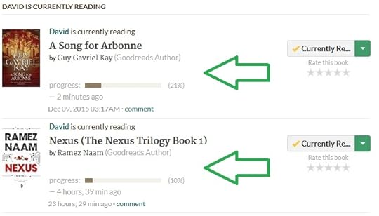
 Neutral here. Fonts are a tad less legible, especially on smaller tablet/laptop screens, but not to the point of rendering the site useless. Speaking of which, improvements in usability, making things more intuitive (how many links must I click through to access a particular version of one of my books?) might be worth more of an effort.
 Overall I really like the look, however I have to admit, I don't like the font either. I find it difficult to read quickly without feeling like my eyes are working.
 The text in generel is... different, guess it is possible to get used to, but it is so different from most fonts I usually see on the web. I don't really mind the change that much.
The other changes are fine except one thing... You turned off the sweet graphic of the buttons? Without the gradient, they look very ugly, I don't really think that google did the right thing when switching away from it, their icons looks bad to me as well. Windows started with it in Vista, and they took it away in windows 8, but that doesn't mean that it looks nice... it is more clear, so it is more practical.. it is however not eye candy!
 Attention Chrome users! From another comment I learned that you can add an extension "Stylish". Then go to userstyles.com and select Goodreads Fix. It does not change back to the old style, but it has a cream background vs. stark white and the fonts are much easier to read! Aaaaah!
 Is anyone else getting a frequent 'unexpected error' page when navigating pages?
 Erma wrote: "Is anyone else getting a frequent 'unexpected error' page when navigating pages?"
Yep
 Erma wrote: "Is anyone else getting a frequent 'unexpected error' page when navigating pages?"
I did, and then I had an issue posting a comment in one of my group threads. It seems okay now, though.
Matthew wrote: "I like it. The change is pretty subtle anyways, not sure what all these people are on a tirade about..."With all due respect, I don't think "tirade" is appropriate. People are allowed to voice opinions.
 Anybody else getting "error" or "page not found"? Cause that has been popping up a lot for me....
and the background color... r u TYRING to blind me??
 The font is still too narrow, I am not sure if the update on the update helped at all. How difficult is that to understand? The narrowness + something with serif/sans serif is what makes it a strain on the eyes. This font just won't work, sorry. The rest of the changes are still fine.
 The "stylish" extension on chrome has made a huge difference. The comments (published) in threads can be viewed in Georgia and it is much easier to read. Even with the teal links. Unfortunately it doesn't seem to carry through to the main feed... I'm cool with just staying in my groups though!
Oddly enough as I type the comments they're in the new font and it does strike home how much easier the old font is easier to read.
 Andrea wrote: "Everithing is good, the desing is more clear.
 BUT THE FONT, I HATE THE SIZE OF THE FONT. I'm gonna end up blind."
Where specifically is the font too small? Could you point out a couple of locations?
David wrote: "Please bring back the list of shelves/tags to Currently reading: "
Thank you for reporting - we'll look into this.
Cathy wrote: "In the feeds there's a big error. It has a link to "read more of this review" and "see review" but they both take you to the review page. I'm sure other people already said this. "Read more of this..."
Hey Cathy - thanks for letting us know! We will look into the link issue you mentioned. To clarify the question about Preview, this is an option to "Preview" the first few pages of a book, like you can do on Kindle.
Christina wrote: "Anybody else getting "error" or "page not found"? Cause that has been popping up a lot for me....
and the background color... r u TYRING to blind me??"
We just had a minor outage, which is now over. You should be fine now.
 Thanks for those mentioning this Stylish extension for chrome. Thankfully I didn't have to figure anything out using it, as I am not good in website stuff. Just install and now the backround is much less glaring and most important, the font is darker.
 I am still struggling with the blue/teal links and some other parts, but at least I can read again mostly on the site.
Really should't have to do that though, just to make a website that was just fine, readable. I guess I am glad I am using Chrome that has this extension. Its the only browser I use.
Its still not as it was, but I see this a lot on websites. Readability takes back seat to what someone thinks looks "cool".
 I haven't been getting notifications for some of the likes and comments I've been getting on my status updates. And I, and some of my friends, are not seeing our friends' reviews showing up in our update feeds.
 Am I correct in assuming that GR did not test this update on all valid platforms with all browsers prior to rollout? From the comments there appear to be many users (a) on less-popular browsers (Mozilla), and/or (b) with less popular OS's (non-current Mac OS's) who are having significant issues.
 Perhaps a rollback is in order until the issues can be fixed from the GR side? It's nice there's a fix for Chrome users: what about the rest of us?
Oh my gosh! I just did the Chrome stylish fix and it's waaayyyy better now! Hooray!
Emily wrote: "Andrea wrote: "Everithing is good, the desing is more clear. BUT THE FONT, I HATE THE SIZE OF THE FONT. I'm gonna end up blind."
Where specifically is the font too small? Could you point out a co..."
Could you mention the Chrome extension Stylish in an update - they have a style Goodreads Fix? The light shade and smallness of the font on Chrome was virtually unreadable for me, especially against the stark white background. I learned about the extension in a comment and it fixed the problem! I think this would be welcome news for Chrome users who are having a hard time reading GR in their browser.

 I am still blinded by the background and really don't like the blurry font. Is there a proper explanation anywhere for this userstyle fix? I tried to open the homepage userstyles.com which is a domain up for sale. Frankly, I hate that I am the one who has to fix this. If this won't get better I will have to look around for another solution.

Why fix something that isn't broken?????
This is an EPIC FAIL GR!!!!