
(Not) The Leader of the Pack, Again: Wisconsin and Her Neighbors
Political Calculations criticizes me for comparing Wisconsin economic performance against Minnesota, but not other neighbors.
Normally, we’re entertained by Chinn’s analysis, since it frequently involves comparisons of the job growth between Wisconsin and its western neighbor Minnesota since Walker was sworn into office in January 2011, which we find funny because of all the states surrounding Wisconsin, the composition of Wisconsin’s economy is much less similar to Minnesota than it is to any of the states with which the state shares waterfront footage on Lake Michigan, which is something that one might think an economics professor at the University of Wisconsin-Madison would know.
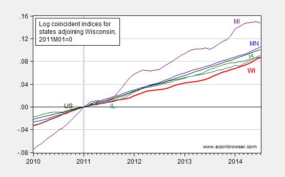
Gee, I think I’d done this comparison, somewhere in the dim past. Oh, it was August 20, 2014, a full five months ago. In Figure 2 of that post, Wisconsin lagged all her neighbors.
Perhaps the choice of states was in dispute. I used adjoining states; Political Calculations appears to favor the region defined by this map (Census region Great Lakes).
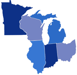
Source: Political Calculations (February 26, 2015).
So, let’s examine the relative performance of Wisconsin against the neighbors, defined by Political Calculations. (Side note: Ohio does not have waterfront on Lake Michigan.)
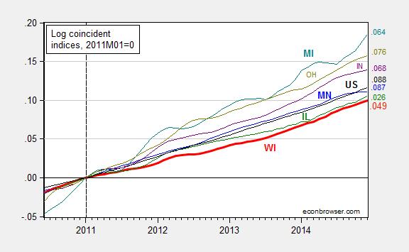
Figure 1: Log coincident indices for Wisconsin (bold red), Minnesota (blue), Illinois (green), Michigan (teal), Indiana (purple), Ohio (chartreuse), United States (black), all normalized to 2011M01=0, seasonally adjusted. Numbers on right hand side (color coded) refer to log-differences relative to NBER defined peak of 2007M12. Source: Philadelphia Fed, and author’s calculations.
If my eyes do not deceive, the bold red line (Wisconsin) lies below all other series. Had I included Kansas, well, you know where that state’s index would lie. (Hint: as of December, it is 1.5 percentage points below that of Wisconsin’s.) As indicated in the notes to Figure 1, the Philadelphia Fed data are readily available for download in Excel spreadsheet should one want to check my calculations.
More on other indicators, from Flavelle/Bloomberg View.
Oh, here is the latest on the Quarterly Census on Employment and Wages, which astute readers will recall (e.g., here) is the series that Governor Walker was for before he was against: Wisconsin’s job creation remained sluggish in latest 12-month report:
Turning in another laggard job-creation report, Wisconsin gained 27,489 private-sector jobs in the 12 months from September 2013 to September 2014, according to data released Tuesday by the state Department of Workforce Development.
The QCEW is a census while the BLS household survey series that Political Calculations displays in this graph is based on a survey (I think; the graph identifies the source as Census, while I have an identical series that is sourced from BLS). That is why the Walker Administration originally favored the QCEW over the establishment survey (Apparently that viewpoint is now “inoperative”, since I no longer hear the QCEW lauded by Walker administration officials.)
So, in summary, the data I have indicate that Wisconsin’s economic performance since 2011M01 has been lackluster. I would welcome actual data indicating otherwise. (Side question: Why are almost every series plotted in the Political Calculations post reporting in nominal terms? The sole exception is tax collections per employee, which would seem to drift upward over time with real per capita income. Curious and curiouser…)


Menzie David Chinn's Blog


