
Charts & Sparklines in Excel
 Combined Chart
You can display and compare two sets of data using a combined line and bar chart or line and area chart. This type of chart gets its information from two sources and displays them together. Often the chart contains different colours for each source so comparing and contrasting the data is made easier.
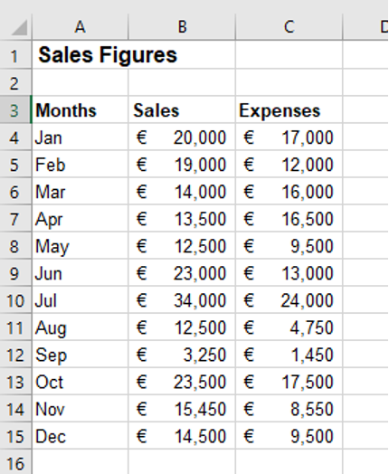
1. Create the following table:
2. Highlight cells A3:C15
3. On the Insert tab in the Charts group, click on Combo Chart
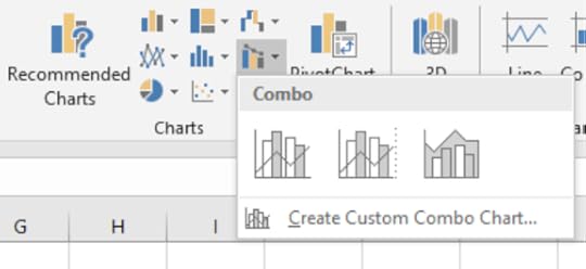
4. Select Clustered Column – Line
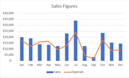
5. Change the Chart Title to “Sales Figures”
6. Save the workbook as “Combo Chart”
SparklinesSparklines are mini charts placed in single cells representing data from a single row. This can be useful to show information in chart form in a single cell.
1. With the “Combo Chart” still open, highlight the range of cells A4:C4
2. On the Insert tab in the Sparklines group, select Line
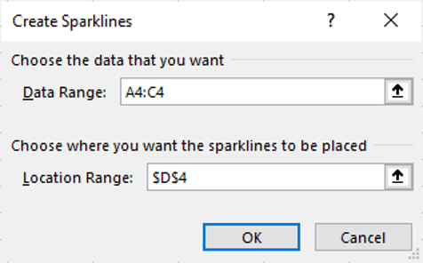
3. In the Location Range text box, select cell D4
4. Click OK
Changing a Sparkline1. On the Sparkline Tools – Design tab in the Type group, select Column
2. Use the Fill Handle to copy the Sparklines from D4:D15
Delete a Sparkline1. With cells D4:D15 selected, on the Sparkline Tools – Design tab in the, select Clear
Learn more about Excel features at www.digidiscover.com/books


Conor Jordan's Blog


