
Kendra Tierney's Blog, page 17
May 27, 2015
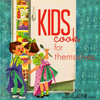
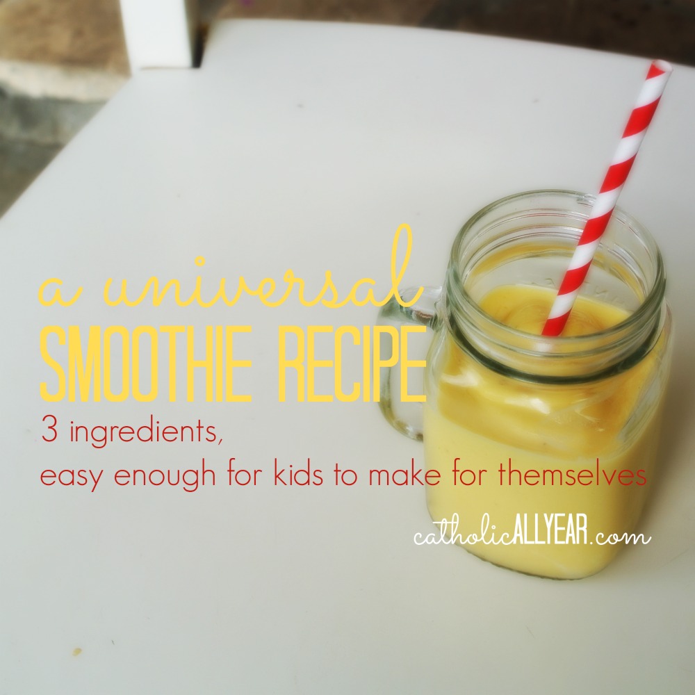
Kids Cook for Themselves: A Universal Smoothie Recipe
I am, in general, a big advocate of kids doing stuff for themselves. It's like they say, give a kid a fish . . . no, wait, that doesn't seem like a good idea. Maybe don't do that.
Anyway. My desire to have my big kids be able to cook, is often at war with my desire to NOT have it take three times as long for me to cook dinner. And, let's face it, letting kids help cook makes it take MUCH longer. But I've found it IS worth it in the long run, because eventually they can do it on their own and I don't have to suffer watching them do it not exactly how I would do it.
We started small, for my benefit as much as for theirs, and now all of my kids older than seven are capable of warming up leftovers, or cooking simple things like scrambled eggs, all by themselves.
And my three oldest are able to follow recipes and make meals from scratch. And they even like it! With a new baby coming in a couple of months, the big kids are planning to do quite a bit of the cooking for our family this summer. I've been helping them compile the recipes that they've made successfully, and I figured I'd share a few of them with you, every once in a while.
First up . . .


I'm a big fan of smoothies because they combine healthy, tasty, and NOT THROWING AWAY FOOD into one easy recipe that's appropriate for any time of day.
Any time our fresh fruit starts to get past its prime, I peel it, cut it into chunks, throw it into a ziploc bag, and put it in the freezer. And the kids use it to make smoothies. (When necessary, I buy some already frozen.)
It turns out that a very easy, three ingredient recipe works for pretty much any type of smoothie, and that my kids eight and over are all capable of making it completely on their own.
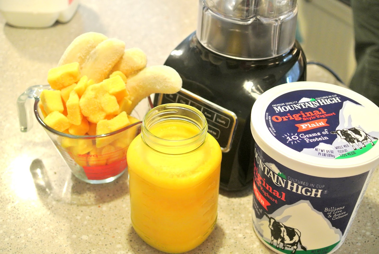
All it takes is any kind of frozen fruit, any kind of juice, and yoghurt (I always use Mountain High whole milk plain in the super giant Costco size, 'cause that's how we roll).
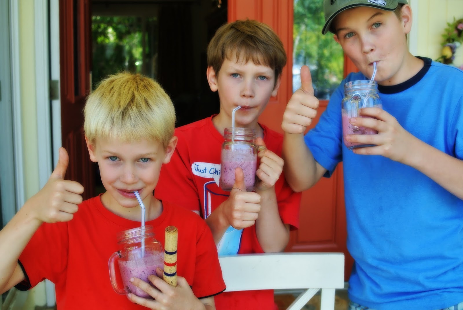
Betty (11) has graciously agreed to walk us through how to make one. Take it away Betty . . .
Okay, here goes.
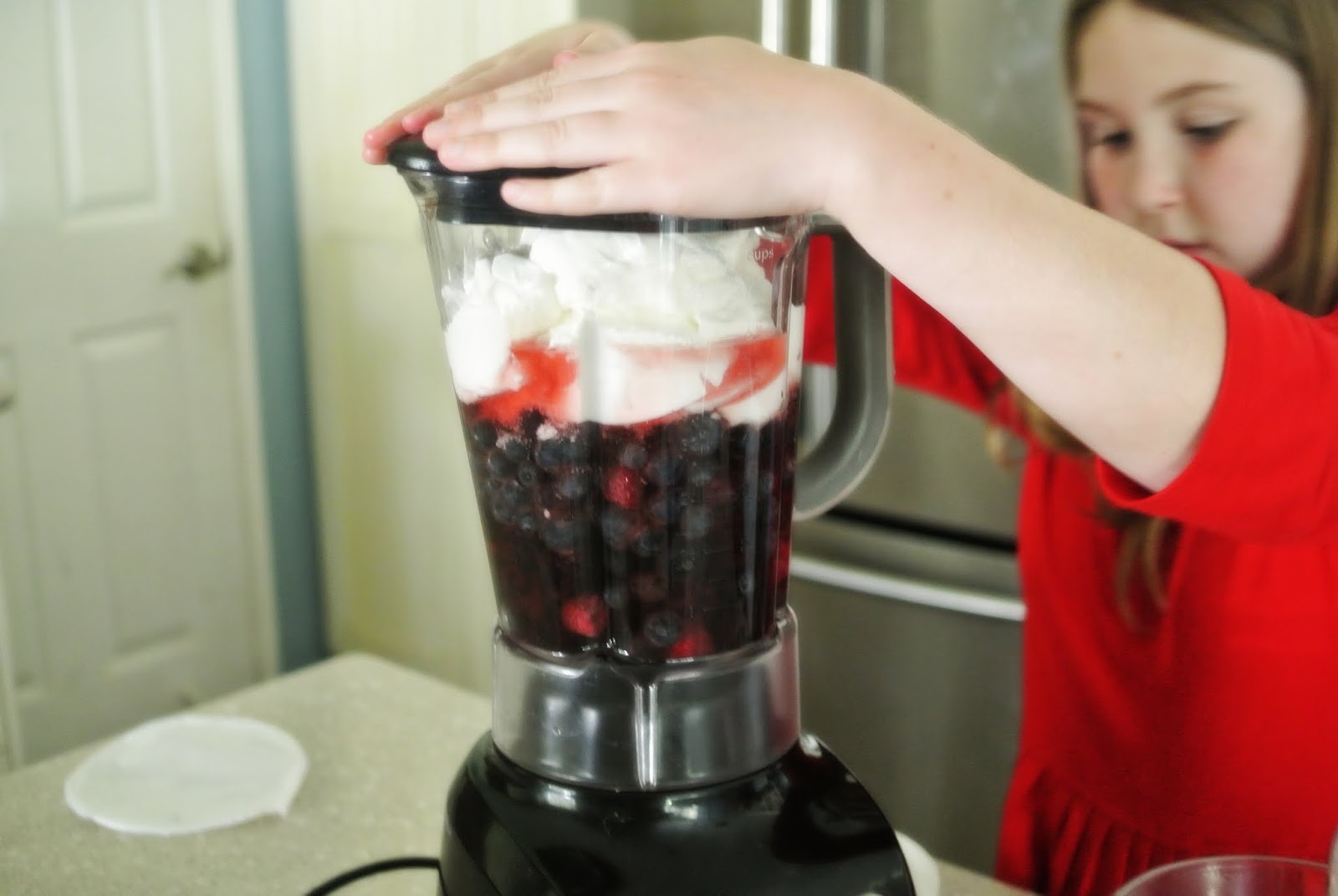
Get your ingredients together: some frozen fruit, some juice, and some yoghurt. This time I used a mix of frozen berries, cranberry juice, and plain whole milk yoghurt.

You can make your smoothie in a blender, food processor, or right in a cup if you've got a hand blender. Whatever you're using, fill your container two-thirds full of frozen fruit.

Then, pour in juice until it covers the fruit.

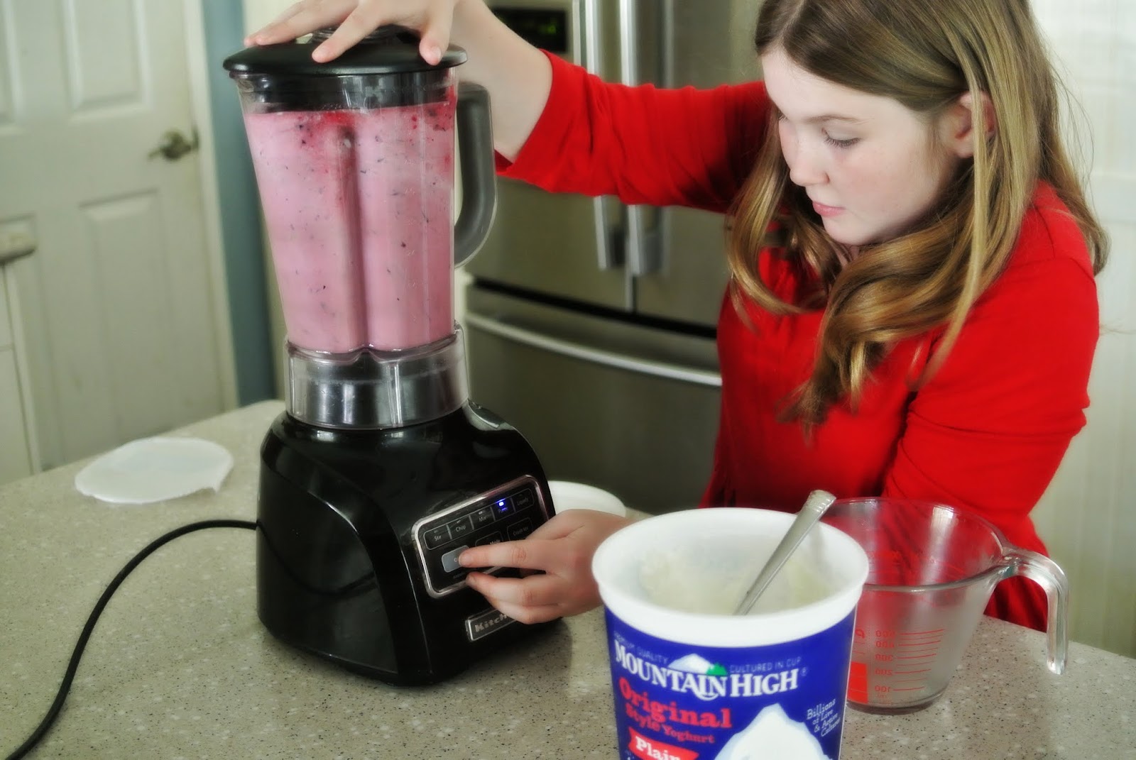
Scoop in yoghurt until the container is almost full, but not completely full, because there needs to be room for it to blend.

Put the top on and hold it tight.

Blend on medium-high (I use "puree") until it's all mixed up.

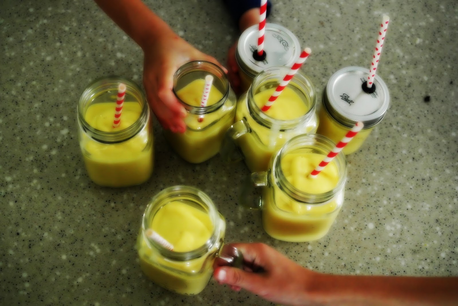
And pour into glasses to serve.

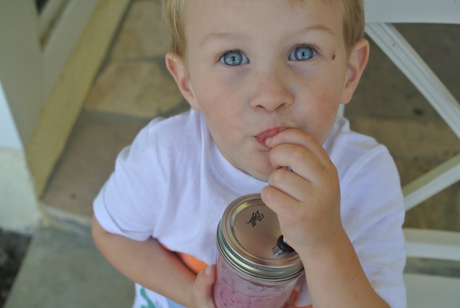
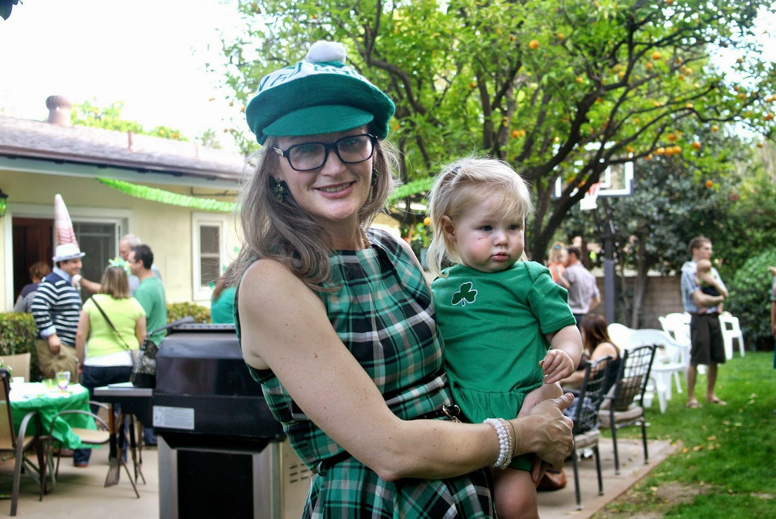
Babies like it.
 Mason Jar Straw Top is from an Etsy shop called Blue Ridge Crafts. I put them right in the dishwasher and they've lasted us for years.
Brothers like it.

Even FRANKIE likes it.

And I like it too!


Another good one is frozen bananas (I don't even like bananas, but you can't really taste them) and mango, leftover fresh squeezed orange juice from our Sunday breakfast, and yoghurt.

It's even better with cute straws.

Lulu approves.
It's really easy. All kids should give it a try!

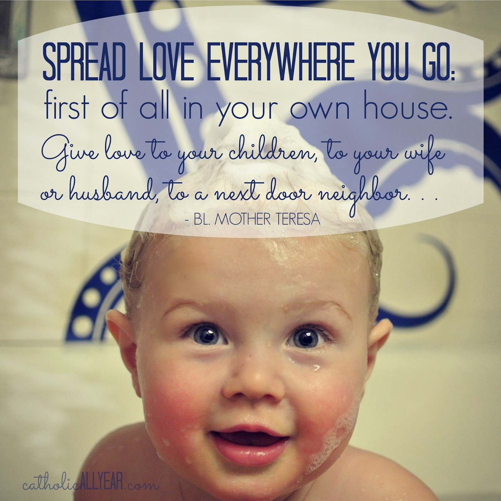
Me again . . . Thanks to Betty for helping out with this post, and to Mountain High Yoghurt for sponsoring it. You can go here to sign up for a dollar off coupon, if you're into that sort of thing.
In case you want to pin it, you can use the link at the bottom of the post, and I made this image to go with it . . .

Stay tuned for over the next few weeks for more real recipes kids can cook themselves! And if you've got any smoothie combinations you love, please let me know in the comments.
Anyway. My desire to have my big kids be able to cook, is often at war with my desire to NOT have it take three times as long for me to cook dinner. And, let's face it, letting kids help cook makes it take MUCH longer. But I've found it IS worth it in the long run, because eventually they can do it on their own and I don't have to suffer watching them do it not exactly how I would do it.
We started small, for my benefit as much as for theirs, and now all of my kids older than seven are capable of warming up leftovers, or cooking simple things like scrambled eggs, all by themselves.
And my three oldest are able to follow recipes and make meals from scratch. And they even like it! With a new baby coming in a couple of months, the big kids are planning to do quite a bit of the cooking for our family this summer. I've been helping them compile the recipes that they've made successfully, and I figured I'd share a few of them with you, every once in a while.
First up . . .
I'm a big fan of smoothies because they combine healthy, tasty, and NOT THROWING AWAY FOOD into one easy recipe that's appropriate for any time of day.
Any time our fresh fruit starts to get past its prime, I peel it, cut it into chunks, throw it into a ziploc bag, and put it in the freezer. And the kids use it to make smoothies. (When necessary, I buy some already frozen.)
It turns out that a very easy, three ingredient recipe works for pretty much any type of smoothie, and that my kids eight and over are all capable of making it completely on their own.
All it takes is any kind of frozen fruit, any kind of juice, and yoghurt (I always use Mountain High whole milk plain in the super giant Costco size, 'cause that's how we roll).
Betty (11) has graciously agreed to walk us through how to make one. Take it away Betty . . .
Okay, here goes.
Get your ingredients together: some frozen fruit, some juice, and some yoghurt. This time I used a mix of frozen berries, cranberry juice, and plain whole milk yoghurt.

You can make your smoothie in a blender, food processor, or right in a cup if you've got a hand blender. Whatever you're using, fill your container two-thirds full of frozen fruit.

Then, pour in juice until it covers the fruit.

Scoop in yoghurt until the container is almost full, but not completely full, because there needs to be room for it to blend.

Put the top on and hold it tight.
Blend on medium-high (I use "puree") until it's all mixed up.
And pour into glasses to serve.

Babies like it.
 Mason Jar Straw Top is from an Etsy shop called Blue Ridge Crafts. I put them right in the dishwasher and they've lasted us for years.
Brothers like it.
Even FRANKIE likes it.
And I like it too!


Another good one is frozen bananas (I don't even like bananas, but you can't really taste them) and mango, leftover fresh squeezed orange juice from our Sunday breakfast, and yoghurt.
It's even better with cute straws.
Lulu approves.
It's really easy. All kids should give it a try!

Me again . . . Thanks to Betty for helping out with this post, and to Mountain High Yoghurt for sponsoring it. You can go here to sign up for a dollar off coupon, if you're into that sort of thing.
In case you want to pin it, you can use the link at the bottom of the post, and I made this image to go with it . . .

Stay tuned for over the next few weeks for more real recipes kids can cook themselves! And if you've got any smoothie combinations you love, please let me know in the comments.


May 26, 2015
Using PicMonkey to Create Images that Win On Pinterest
Hey all! We are back home after a truly amazing ten days of family fun and hands on history on the East coast. I've got a bunch of upcoming posts I'm excited to share with you, including the big trip recap, my latest Netflix binge watch, and the beginning of a new series on the blog called "kids cook for themselves" featuring recipes that big kids can can make all by themselves, freeing you up to spend more time reading blogs.
But FIRST . . . I know I said I was done with the PicMonkey posts, but I was wrong.
Nancy from Do Small Things With Love saw my earlier posts and offered to give us all some tips on using PicMonkey for Pinterest. And since I KNOW I'm not using Pinterest as well as I could be . . . I accepted.

Hi, my name is Nancy, I blog at www.dosmallthingswithlove.com, and I am addicted to Pinterest traffic. As bloggers we all know that any sort of traffic is good--but I get about 80% of my traffic from Pinterest. Because of that traffic I have been able to turn my blog into a business that is actually contributing to my family financially right now. And here's the thing ladies, more Catholic Bloggers need to join me on Pinterest because it can be such a powerful way to share your content. There is only one social media network with the sole and absolute purpose of sharing content. Pinterest. Sure, more people use Twitter, but for all sort so reasons, only one of which is sharing content. Sure, Facebook is more personal, but with the constantly changing logarithms it often feels impossible to reach all of your followers. And so, it is time to give Pinterest another try. We do this through creating Pinnable Images. Before you tune me out hear this: Pinterest is used to share all sorts of content--not just recipes and crafts. In fact some of the all-time most popular pins have nothing to do with food or hot glue. No matter what you blog about you should be adding pinnable images to most of your posts. Not all of your posts (we'll cover this in a minute). Kendra has laid out exactly how to use PicMonkey to make your photos great. Now it's time to add just a few details to this so that your images can win on Pinterest as well. Before I dive in I just want to note that, as with all social media networks, there can be a lot of strategy that goes into using Pinterest as a blogger. I am not going to cover growing your pinterest following, group boards, rich pins, scheduling pins, switching to a business account or promoting pins. If you are serious about using pinterest to grow your blog I recommend googling these topics as the internet is rich with information on Pinterest. The following 10 tips will make your images "Pinnable"--and all of this can be done using PicMonkey.
1. Is This Post Pinnable?Start here and ask yourself is this post pinnable? To be pinnable a post has to be:
Evergreen--meaning it is timeless. A post recapping your family's trip to San Francisco is, um, not timeless. However, Kendra's post on the Mommy Wars is totally timeless (cause we will always be flawed), and therefore pinnable.Intended for the Masses--Pinterst is impersonal. We are all just scrolling through and clicking on pretty images that catch our eye, so in order for a post to be pinnable any one and everyone should be able to jump into this post, having never been on your blog before, and enjoy it.A Problem Solver--This is the most important question to answer. In what way are you offering help to those that read? Are you offering tips, tricks, a recipe or advice? Are you sharing a personal story others can learn from? Are you answering a question lots of people have? If you answered yes to any of these questions, your post is pinnable and needs a pinnable image. 2. Vertical Images are a MUST on Pinterest
Just check out a normal Pinterest feed and you will see why vertical images on Pinterest are a must Simply put, vertical pictures get more real estate on Pinterest. Just check out that Ultimate BLT pin! On the flip side, Facebook does better with horizontal images. I know this sounds like a lot work, but for the posts I have really worked on and really want to take off, I often edit and create 2 images--one for pinterest and one for Facebook. Once you get this in your routine it really doesn't take that much more time, just moving the text, cropping and saving the same image twice. Here are the 2 images I created for a post I recently wrote about waiting to have sex until marriage:
For Pinterest

And for Facebook:
 3. Crop Closer

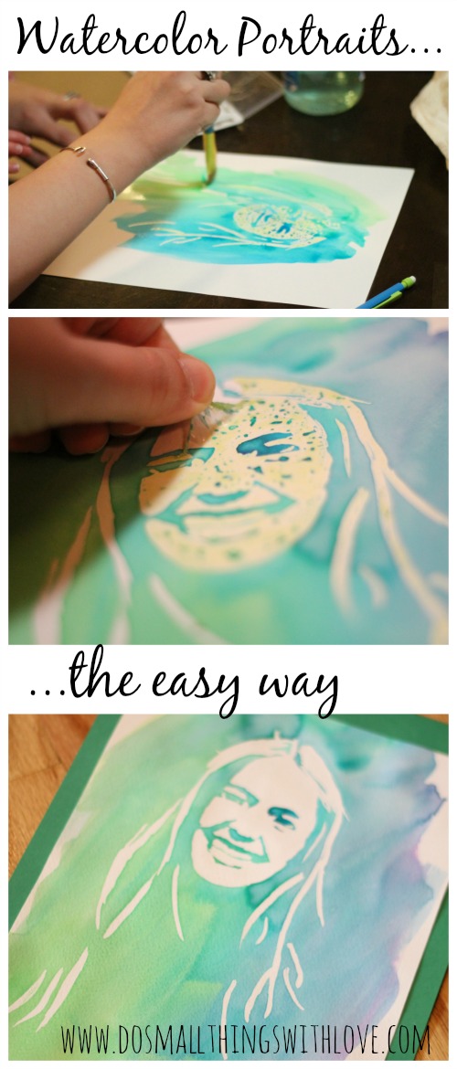
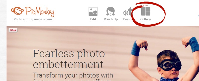
When creating pinnable images always keep in mind what a Pinterest feed looks like: image after image after image. For this reason you really want yours to stand out! Don't waste space on background or scenery. Use PicMonkey to crop your image in nice and tight, without loosing any of the picture's quality. Here is one of my most pinned posts ever, Easy Watercolor Portraits. As you can see I used several images for this "Pinnable Image", but each one is cropped nice and close so you can see exactly what is happening. Creating a collage like this is also something you can do in PicMonkey. Simply select the collage option on the front page. Then, upload the pictures you'd like to use and drop them into place. After you have them collaged your pictures you can easily click over to do some basic edits on the collage as a whole.

Once again--just make sure your collage "Pinnable Image" is vertical!
4. Create Images that are WARM and BRIGHTLoads and loads of research has been done to see which pins on Pinterest get interaction, and which don't. Over and over the pins that were BRIGHT and WARM got clicks and repins, so when selecting your image look for one that is nice and bright--and by that I mean "true white". Kendra did an excellent job discussing how to brighten images with PicMonkey, so I won't go into that but it is well worth it to spend a few minutes in the editor brightening up your pinnable image. Also, opt for images with warm colors, like reds and yellows, over pictures with cool colors like blues.
5. Leave Room For WordingA pinnable image is 2 things--an image and words--not an image under words. Although I already stressed cropping your pictures nice and close, make sure you don't crop too close. You want to leave room for your wording. Check out this example:

Because I knew this post had a long title I left lots of space for wording and added an overlay so that my wording stood out a little bit better.
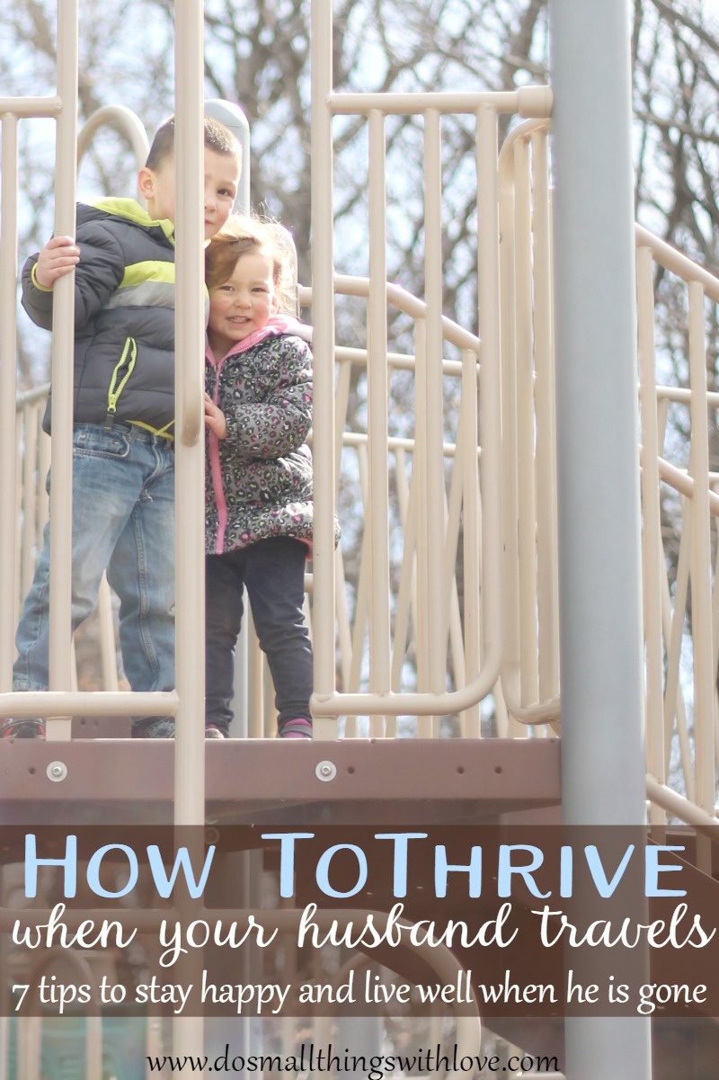
6. Keep Wording Brief and CLEARRemember that Pinterest is all about IMAGES--so don't go overboard with the wording. Pick fonts that stand out and write a title that will engage your audience immediately! For example, instead of writing, "when your husband is traveling it is possible to stay happy," I wrote, "How to Thrive when your husband travels." The title I choose offers something to the reader and uses more emotional words--making it more likely to pull in a reader.
7. Add a By-LineMost of my pinnable images offer a title and a by-line. The title is intended to pull people in and the by-line works as a tiny preview of the article. Once again, keep it simple and direct. As both a reader and a writer I am attracted to lists and so very often my by-line is something like "7 Lessons on Motherhood I Learned from Mary". Or, sometimes the by-line simply explains the title further. I recently shared a post called "Bonded Through Work" with the by line, "Creating A Family That Works Together"
8. Create a Word-Only Image
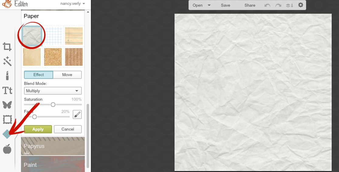
Sometimes adding a picture as the pinnable image for a post just doesn't seem quite right. For these situations I simply use the tricks Kendra covered in THIS POST and create a word-only image (or word art). Here is an example of a word-only pinnable image I made. To make a word-only image, start with the "design" option on the front page of PicMonkey.


From there I often select a "texture" to add to my image. There are lots of great options here. In the above pinnable image I used a "chalkboard" texture. Below I have selected a crumpled paper look. After I have the background I'm after (sometimes I even layer textures for a unique look) all that is left is adding wording and Kendra has done an excellent job covering this already.
9. Be Consistent in Your EditingWhen you set to work creating "Pinnable Images" you are really working to create beautiful images--images that communicate who you and your blog are. Chances are you have put considerable time and energy into styling your blog in terms of fonts, colors and images--and you should work to let that style show through in your images. All I am trying to say here is that you should deliberately choose which fonts to use in your pinnable images and work to use those fonts in each image. Each pinnable image won't be the same, but they should have traces of the same style. Also, try to use the same sorts of overlays. Ideally (and likely a ways down the road) a reader should know it's your image before they see your logo.
10. Save Images as Your Pin DescriptionIf you get nothing else from this post, get this--Save Your Image as The Description You'd Like It To Have on Pinterest. If your image is saved as "IMG123456" than that will likely be the default description Pinterest will use. Sure, a pinner might take the time to write a wonderful description for you, but they might not. So, take a minute to write a description in that "save as" box, even if it is long and obnoxious. The habit of naming your pictures this way is something you should really work to do as it will also help boost your SEO, but that's another topic entirely. Okay, did I cover everything? I hope this isn't overwhelming--but just helpful. Serious Catholic bloggers belong on Pinterest too and I hope that these tips help you take advantage of this powerful social network. Thanks to Kendra for letting me be with you today! I'd love to connect with you either at my blog, on facebook or (of course) on pinterest.
Whew! Thanks Nancy. I've got a lot to work on.
In case you missed any of the earlier PicMonkey posts, you can catch up on them here . . .
Using PicMonkey to Make Word Art Using PicMonkey to Make Graphic Designs and Pinnable Images Don't Make These Mistakes Using PicMonkey to Make Shareable Images Using PicMonkey to Make Good Photos Great and Bad Photos Pretty GoodAnd if you'd care to see my sub-optimal use of Pinterest with your own two eyes, you'll find me here.
But FIRST . . . I know I said I was done with the PicMonkey posts, but I was wrong.
Nancy from Do Small Things With Love saw my earlier posts and offered to give us all some tips on using PicMonkey for Pinterest. And since I KNOW I'm not using Pinterest as well as I could be . . . I accepted.

Hi, my name is Nancy, I blog at www.dosmallthingswithlove.com, and I am addicted to Pinterest traffic. As bloggers we all know that any sort of traffic is good--but I get about 80% of my traffic from Pinterest. Because of that traffic I have been able to turn my blog into a business that is actually contributing to my family financially right now. And here's the thing ladies, more Catholic Bloggers need to join me on Pinterest because it can be such a powerful way to share your content. There is only one social media network with the sole and absolute purpose of sharing content. Pinterest. Sure, more people use Twitter, but for all sort so reasons, only one of which is sharing content. Sure, Facebook is more personal, but with the constantly changing logarithms it often feels impossible to reach all of your followers. And so, it is time to give Pinterest another try. We do this through creating Pinnable Images. Before you tune me out hear this: Pinterest is used to share all sorts of content--not just recipes and crafts. In fact some of the all-time most popular pins have nothing to do with food or hot glue. No matter what you blog about you should be adding pinnable images to most of your posts. Not all of your posts (we'll cover this in a minute). Kendra has laid out exactly how to use PicMonkey to make your photos great. Now it's time to add just a few details to this so that your images can win on Pinterest as well. Before I dive in I just want to note that, as with all social media networks, there can be a lot of strategy that goes into using Pinterest as a blogger. I am not going to cover growing your pinterest following, group boards, rich pins, scheduling pins, switching to a business account or promoting pins. If you are serious about using pinterest to grow your blog I recommend googling these topics as the internet is rich with information on Pinterest. The following 10 tips will make your images "Pinnable"--and all of this can be done using PicMonkey.
1. Is This Post Pinnable?Start here and ask yourself is this post pinnable? To be pinnable a post has to be:
Evergreen--meaning it is timeless. A post recapping your family's trip to San Francisco is, um, not timeless. However, Kendra's post on the Mommy Wars is totally timeless (cause we will always be flawed), and therefore pinnable.Intended for the Masses--Pinterst is impersonal. We are all just scrolling through and clicking on pretty images that catch our eye, so in order for a post to be pinnable any one and everyone should be able to jump into this post, having never been on your blog before, and enjoy it.A Problem Solver--This is the most important question to answer. In what way are you offering help to those that read? Are you offering tips, tricks, a recipe or advice? Are you sharing a personal story others can learn from? Are you answering a question lots of people have? If you answered yes to any of these questions, your post is pinnable and needs a pinnable image. 2. Vertical Images are a MUST on Pinterest

Just check out a normal Pinterest feed and you will see why vertical images on Pinterest are a must Simply put, vertical pictures get more real estate on Pinterest. Just check out that Ultimate BLT pin! On the flip side, Facebook does better with horizontal images. I know this sounds like a lot work, but for the posts I have really worked on and really want to take off, I often edit and create 2 images--one for pinterest and one for Facebook. Once you get this in your routine it really doesn't take that much more time, just moving the text, cropping and saving the same image twice. Here are the 2 images I created for a post I recently wrote about waiting to have sex until marriage:
For Pinterest
And for Facebook:
3. Crop Closer
When creating pinnable images always keep in mind what a Pinterest feed looks like: image after image after image. For this reason you really want yours to stand out! Don't waste space on background or scenery. Use PicMonkey to crop your image in nice and tight, without loosing any of the picture's quality. Here is one of my most pinned posts ever, Easy Watercolor Portraits. As you can see I used several images for this "Pinnable Image", but each one is cropped nice and close so you can see exactly what is happening. Creating a collage like this is also something you can do in PicMonkey. Simply select the collage option on the front page. Then, upload the pictures you'd like to use and drop them into place. After you have them collaged your pictures you can easily click over to do some basic edits on the collage as a whole.
Once again--just make sure your collage "Pinnable Image" is vertical!
4. Create Images that are WARM and BRIGHTLoads and loads of research has been done to see which pins on Pinterest get interaction, and which don't. Over and over the pins that were BRIGHT and WARM got clicks and repins, so when selecting your image look for one that is nice and bright--and by that I mean "true white". Kendra did an excellent job discussing how to brighten images with PicMonkey, so I won't go into that but it is well worth it to spend a few minutes in the editor brightening up your pinnable image. Also, opt for images with warm colors, like reds and yellows, over pictures with cool colors like blues.
5. Leave Room For WordingA pinnable image is 2 things--an image and words--not an image under words. Although I already stressed cropping your pictures nice and close, make sure you don't crop too close. You want to leave room for your wording. Check out this example:
Because I knew this post had a long title I left lots of space for wording and added an overlay so that my wording stood out a little bit better.
6. Keep Wording Brief and CLEARRemember that Pinterest is all about IMAGES--so don't go overboard with the wording. Pick fonts that stand out and write a title that will engage your audience immediately! For example, instead of writing, "when your husband is traveling it is possible to stay happy," I wrote, "How to Thrive when your husband travels." The title I choose offers something to the reader and uses more emotional words--making it more likely to pull in a reader.
7. Add a By-LineMost of my pinnable images offer a title and a by-line. The title is intended to pull people in and the by-line works as a tiny preview of the article. Once again, keep it simple and direct. As both a reader and a writer I am attracted to lists and so very often my by-line is something like "7 Lessons on Motherhood I Learned from Mary". Or, sometimes the by-line simply explains the title further. I recently shared a post called "Bonded Through Work" with the by line, "Creating A Family That Works Together"
8. Create a Word-Only Image
Sometimes adding a picture as the pinnable image for a post just doesn't seem quite right. For these situations I simply use the tricks Kendra covered in THIS POST and create a word-only image (or word art). Here is an example of a word-only pinnable image I made. To make a word-only image, start with the "design" option on the front page of PicMonkey.

From there I often select a "texture" to add to my image. There are lots of great options here. In the above pinnable image I used a "chalkboard" texture. Below I have selected a crumpled paper look. After I have the background I'm after (sometimes I even layer textures for a unique look) all that is left is adding wording and Kendra has done an excellent job covering this already.
9. Be Consistent in Your EditingWhen you set to work creating "Pinnable Images" you are really working to create beautiful images--images that communicate who you and your blog are. Chances are you have put considerable time and energy into styling your blog in terms of fonts, colors and images--and you should work to let that style show through in your images. All I am trying to say here is that you should deliberately choose which fonts to use in your pinnable images and work to use those fonts in each image. Each pinnable image won't be the same, but they should have traces of the same style. Also, try to use the same sorts of overlays. Ideally (and likely a ways down the road) a reader should know it's your image before they see your logo.
10. Save Images as Your Pin DescriptionIf you get nothing else from this post, get this--Save Your Image as The Description You'd Like It To Have on Pinterest. If your image is saved as "IMG123456" than that will likely be the default description Pinterest will use. Sure, a pinner might take the time to write a wonderful description for you, but they might not. So, take a minute to write a description in that "save as" box, even if it is long and obnoxious. The habit of naming your pictures this way is something you should really work to do as it will also help boost your SEO, but that's another topic entirely. Okay, did I cover everything? I hope this isn't overwhelming--but just helpful. Serious Catholic bloggers belong on Pinterest too and I hope that these tips help you take advantage of this powerful social network. Thanks to Kendra for letting me be with you today! I'd love to connect with you either at my blog, on facebook or (of course) on pinterest.
Whew! Thanks Nancy. I've got a lot to work on.
In case you missed any of the earlier PicMonkey posts, you can catch up on them here . . .
Using PicMonkey to Make Word Art Using PicMonkey to Make Graphic Designs and Pinnable Images Don't Make These Mistakes Using PicMonkey to Make Shareable Images Using PicMonkey to Make Good Photos Great and Bad Photos Pretty GoodAnd if you'd care to see my sub-optimal use of Pinterest with your own two eyes, you'll find me here.
May 22, 2015
Using PicMonkey to Make Word Art
We're out of town, so I thought I'd take this week to share with you some of the tips and tricks I use on PicMonkey to make this blog prettier. This is installment four of four, also see Lesson 1: Using PicMoney to Make Good Photos Great and Bad Photos Pretty Good, Lesson 2: Don't Make These Mistakes Using PicMonkey to Make Shareable Images, and Lesson 3: Using PicMonkey to Create Graphic Designs and Pinnable Images. PicMonkey is an online photo editing and design site. The basic version is free, but you can also choose a yearly subscription to "Royale" that gets you more options, and no ads. This is not a sponsored post, I just like PicMonkey. This post contains affiliate links.

In previous posts, I've discussed how I use PicMonkey for photos and graphic images, but sometimes, you just want to let the words do the talking.
I know *I* do. Quite often.
For examples of all the different types of text-focused images I've made with PicMonkey, check out my Printable Prayers board on Pinterest.
But for today, let's take a step-by-step look at two word art images I made recently.
As with the graphic images I make, it's all just trial and error, and lots of fiddling around with it until I get something with which I am happy. Mostly, you just have to try it and see what happens.
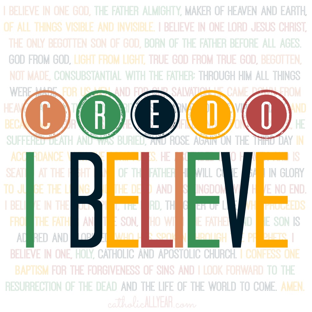
- Credo: I Believe -
I made this one at the request of my friend Molly, from Molly Makes Do, and The Credo Project. The Credo Project is a simple way for Catholic bloggers to give their readers a quick, easy, non-pushy way to find out more about the Catholic faith, with just one click of a button on their blog sidebar.
The only direction I got was, that it should say Credo: I Believe.
After brainstorming for a bit, I decided I couldn't do better than putting the text of the Nicene Creed behind the words, since that is what we as Catholics profess to believe.
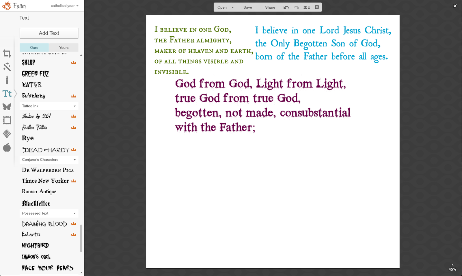
1. Step one was to put in the text, which I began to do by cut and pasting chunks of it.

2. I thought I'd have different sections in different fonts and colors. But it looked lame. And wasn't going to fit.

3. So I just did it all in one block and one font.

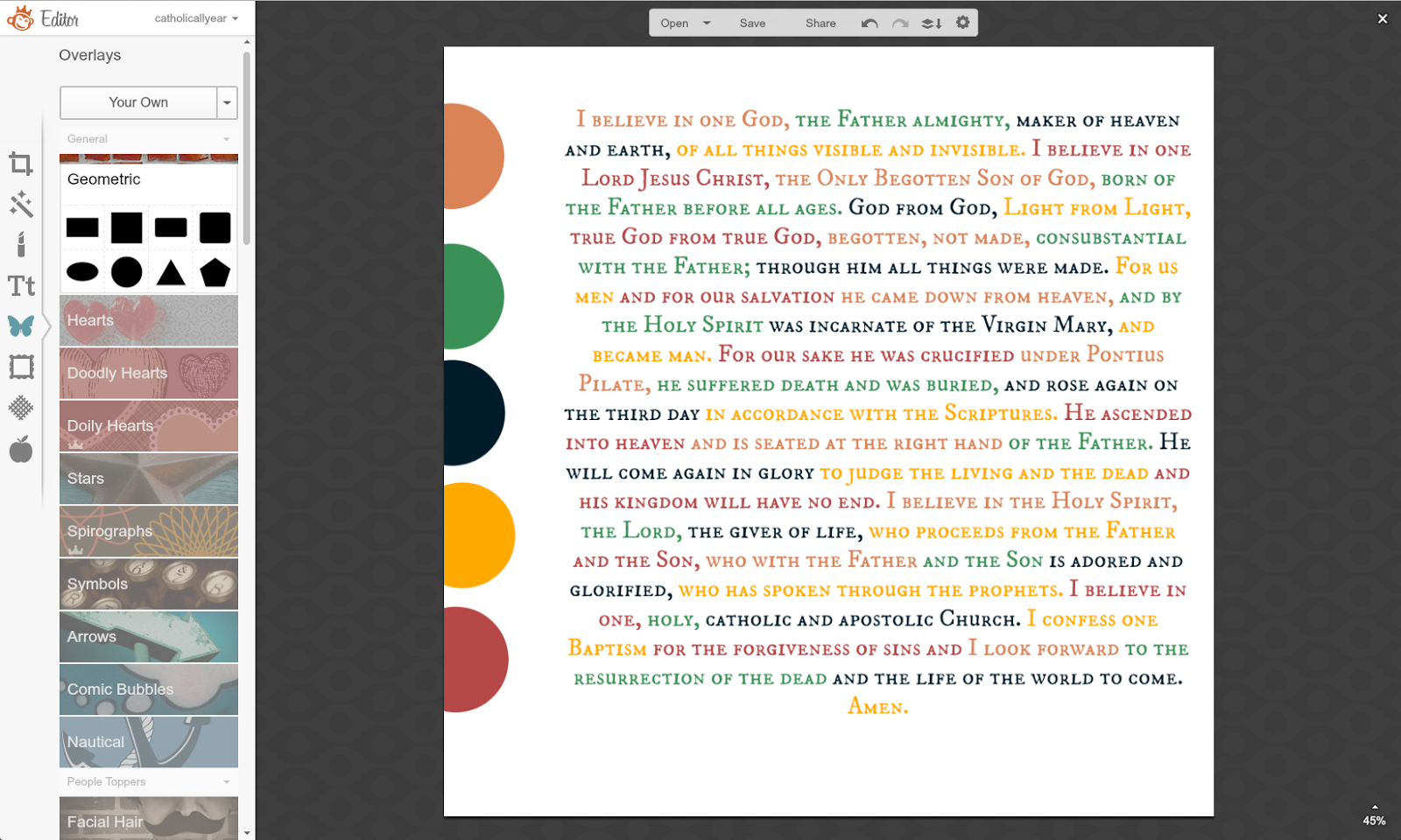
4. Then I made myself a color palate. From the Overlays Menu, I went to Geometric. I wanted five colors, so I put five circles onto my image, then I selected a different color for each circle, playing around with it until I had a group that I liked together. Then I shoved them way over to one side. I also resized my text box a bit, so I could get to the whole thing.

5. I selected little chunks of the text, and using the Eyedropper Tool, selected the color from one of my five color spots. I went through the whole text, changing the text colors bit by bit in order of my color spots.

6. I moved my color spots over off of my image, but they are still there (you can see the square outline there of the orange one) because I'm going to pull them back over and use them again later. And I faded my text to create a more subtle background.

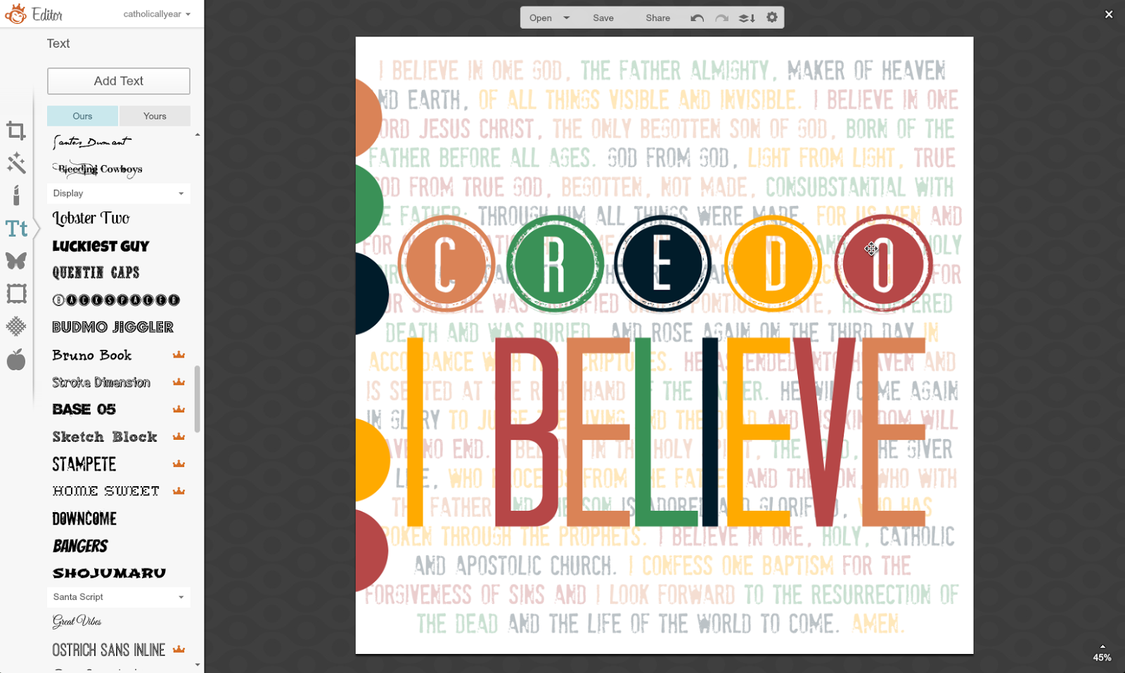
7. Then I made my foreground text. On that little horizontal menu above the image there is an option to "combine all image elements." If I did that before I started adding the foreground, I wouldn't have to worry about layers and trying to select which text box I'm working on. But I really, really hate to do it, because then it becomes the permanent background and I can't fiddle with it any more. So I pretty much never do that. What I do instead, is drag my foreground text boxes out over the edge of the image, so I can go out there and easily grab the edge of the text box I want to edit.

8. I changed the colors of the foreground text. More fiddling.

9. Then I wasn't loving the background font and started messing with it. This one was too hard to see.

10. Too round.

11. Too busy.

12. Close but no.

13. I ended up going with a different font entirely, adding more text to the version for the button, and adding my watermark for the printable prayers version. I moved the color spots off the image again and saved it and it's a done deal.

As with all my printables, you are welcome to right click on the image and save it to your computer for your own personal use. You may print the images and / or upload them and have prints made for your personal use or to give as gifts. (These are sized for 8x10 or square but will print well much bigger.) You may use my images on your blog, just please link back to my blog. If you would like to sell my images, please contact me first.
For LOTS MORE free printable prayers, check out my Pinterest board.
If you'd like to get the html code to put the button on your blog sidebar, go to the bottom of this post.
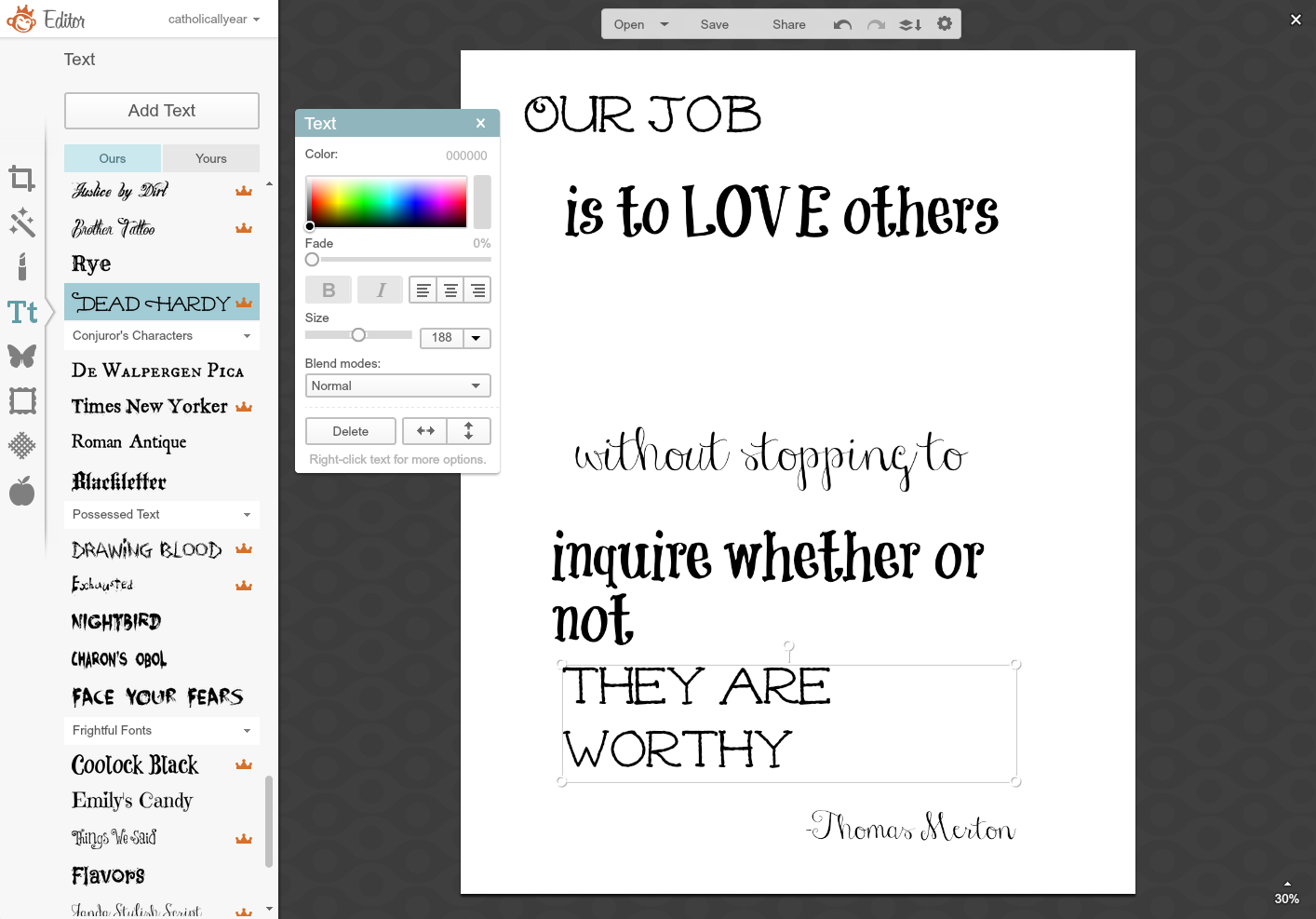
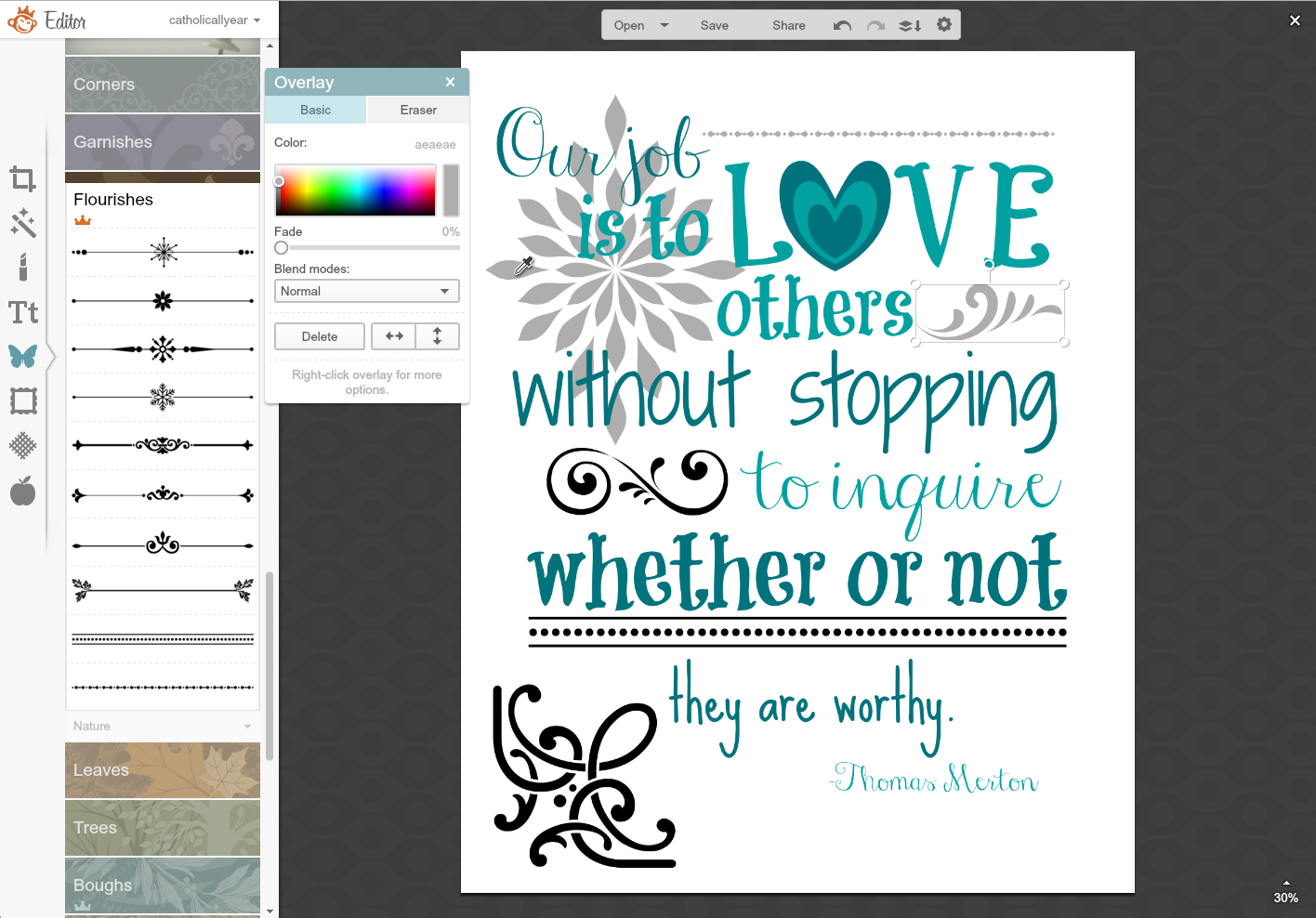
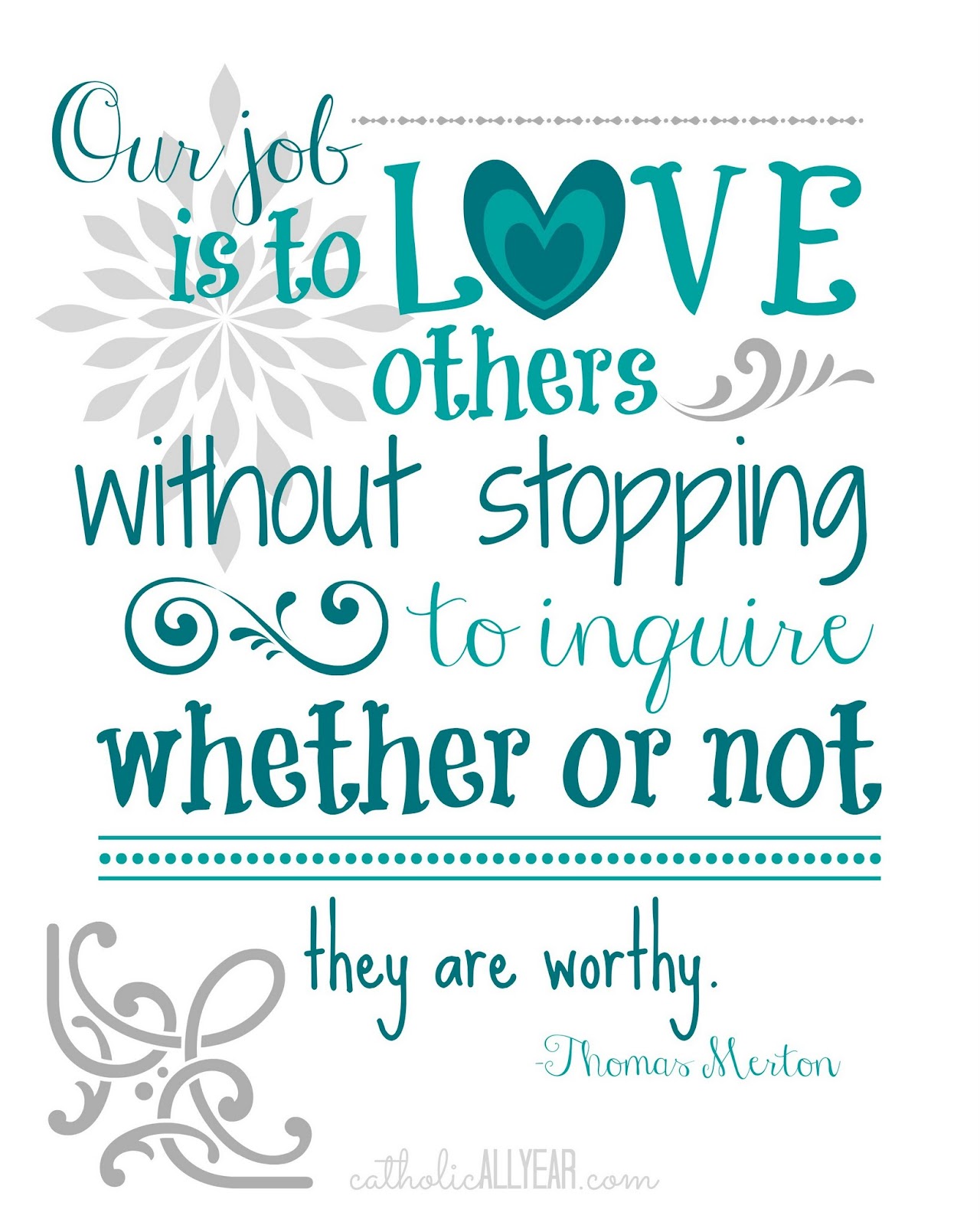
- Thomas Merton Quote -
This one was a request from reader Theresa M, whose older brother is a novice entering the Abbey where Thomas Merton lived and is buried. Pretty. Awesome. She wanted it to look kinda like the Grace Before and After Meals prints I made, but be in teal or turquoise on a light background.
1. As always, the first step is to put the text of the quote on there and start messing about with it.

2. I kinda can't help myself with the making the "o" in "love" a heart instead. It's how I roll.

3. I just kept changing the fonts around until I liked it.

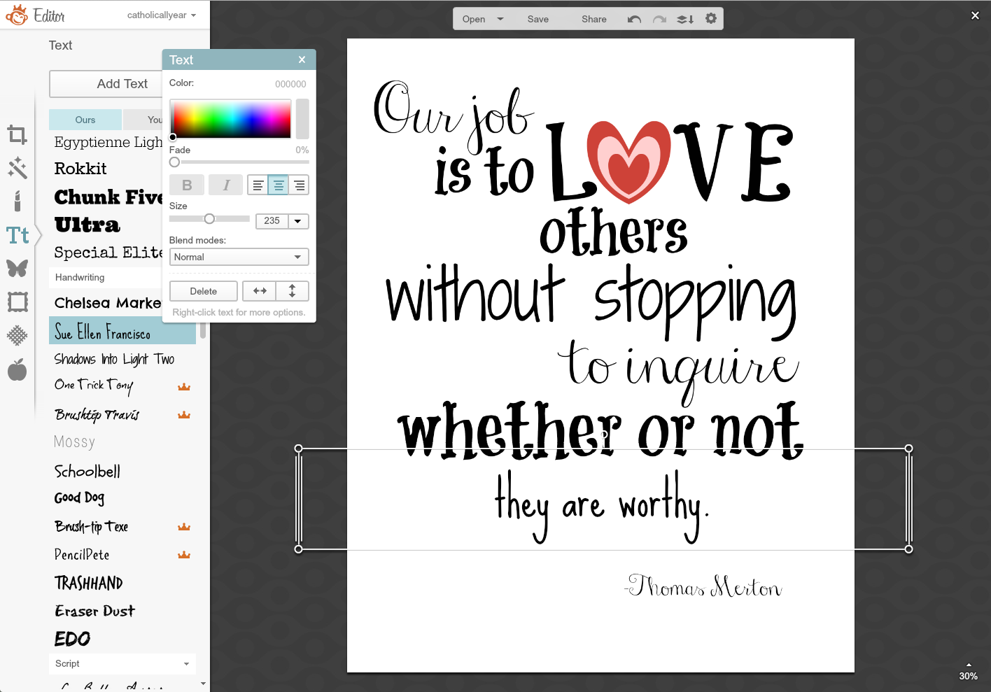
4. Then I started messing with the colors.

5. And messing.

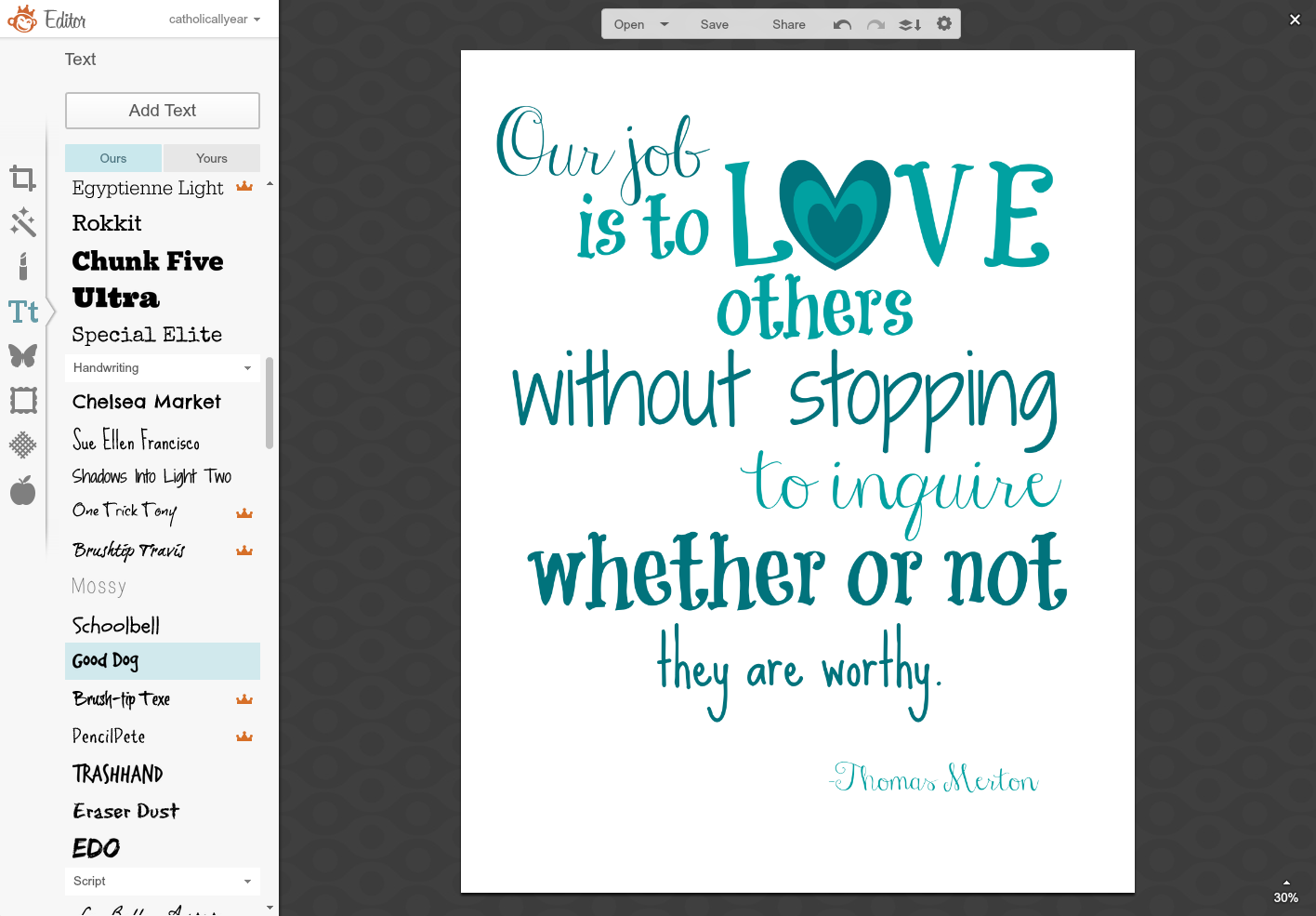
6. And messing. Until it looked right.

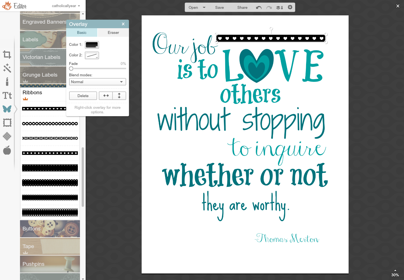
7. When a quote or prayer doesn't have enough words to fill the space, I add Overlays.

8. And, if necessary, right click on them to open up this little menu, which allows me to Send to Back, so it's behind the text.

9. I selected colors for the overlays, using the Eyedropper Tool when I wanted to match colors in other parts of the image..

10. I used the fade bar on some of the overlays, to make sure the text was visible. And this one I liked, so I saved it.

11. I wanted to have another version with a colored background, so once it was saved, I went to the Basic Edits Menu, selected Canvas Color, and tried to find a color I liked. NOT this one.

12. This one I liked. But then I wasn't feeling the gray in the overlays.

13. So, using the Eyedropper tool, I made them the blues of the text, and then faded them down to different levels. For variety. And then I saved this one.

14. But then I was feeling like all that love really needed a little pink. So I used the little "undo" arrow in the horizontal menu over the image and backed it up until the canvas was white again. I started clicking on overlays and making them shades of pink, to give me one more version. And I saved that one, too.

And here they are:


 There are a ton of other things you can do with PicMonkey, of course. You can make collages, and Facebook headers, and all sorts of other things. But this has got to stop somewhere, right? So I'm stopping it here.
I hope you found the series helpful. Let me know if you have any burning PicMonkey questions that weren't answered this week. We'll be back to regularly scheduled programming next week.
Have a blessed Pentecost and a fun Memorial Day!

In previous posts, I've discussed how I use PicMonkey for photos and graphic images, but sometimes, you just want to let the words do the talking.
I know *I* do. Quite often.
For examples of all the different types of text-focused images I've made with PicMonkey, check out my Printable Prayers board on Pinterest.
But for today, let's take a step-by-step look at two word art images I made recently.
As with the graphic images I make, it's all just trial and error, and lots of fiddling around with it until I get something with which I am happy. Mostly, you just have to try it and see what happens.
- Credo: I Believe -
I made this one at the request of my friend Molly, from Molly Makes Do, and The Credo Project. The Credo Project is a simple way for Catholic bloggers to give their readers a quick, easy, non-pushy way to find out more about the Catholic faith, with just one click of a button on their blog sidebar.
The only direction I got was, that it should say Credo: I Believe.
After brainstorming for a bit, I decided I couldn't do better than putting the text of the Nicene Creed behind the words, since that is what we as Catholics profess to believe.
1. Step one was to put in the text, which I began to do by cut and pasting chunks of it.

2. I thought I'd have different sections in different fonts and colors. But it looked lame. And wasn't going to fit.
3. So I just did it all in one block and one font.

4. Then I made myself a color palate. From the Overlays Menu, I went to Geometric. I wanted five colors, so I put five circles onto my image, then I selected a different color for each circle, playing around with it until I had a group that I liked together. Then I shoved them way over to one side. I also resized my text box a bit, so I could get to the whole thing.

5. I selected little chunks of the text, and using the Eyedropper Tool, selected the color from one of my five color spots. I went through the whole text, changing the text colors bit by bit in order of my color spots.
6. I moved my color spots over off of my image, but they are still there (you can see the square outline there of the orange one) because I'm going to pull them back over and use them again later. And I faded my text to create a more subtle background.

7. Then I made my foreground text. On that little horizontal menu above the image there is an option to "combine all image elements." If I did that before I started adding the foreground, I wouldn't have to worry about layers and trying to select which text box I'm working on. But I really, really hate to do it, because then it becomes the permanent background and I can't fiddle with it any more. So I pretty much never do that. What I do instead, is drag my foreground text boxes out over the edge of the image, so I can go out there and easily grab the edge of the text box I want to edit.

8. I changed the colors of the foreground text. More fiddling.

9. Then I wasn't loving the background font and started messing with it. This one was too hard to see.

10. Too round.

11. Too busy.

12. Close but no.
13. I ended up going with a different font entirely, adding more text to the version for the button, and adding my watermark for the printable prayers version. I moved the color spots off the image again and saved it and it's a done deal.
As with all my printables, you are welcome to right click on the image and save it to your computer for your own personal use. You may print the images and / or upload them and have prints made for your personal use or to give as gifts. (These are sized for 8x10 or square but will print well much bigger.) You may use my images on your blog, just please link back to my blog. If you would like to sell my images, please contact me first.
For LOTS MORE free printable prayers, check out my Pinterest board.
If you'd like to get the html code to put the button on your blog sidebar, go to the bottom of this post.
- Thomas Merton Quote -
This one was a request from reader Theresa M, whose older brother is a novice entering the Abbey where Thomas Merton lived and is buried. Pretty. Awesome. She wanted it to look kinda like the Grace Before and After Meals prints I made, but be in teal or turquoise on a light background.
1. As always, the first step is to put the text of the quote on there and start messing about with it.
2. I kinda can't help myself with the making the "o" in "love" a heart instead. It's how I roll.

3. I just kept changing the fonts around until I liked it.
4. Then I started messing with the colors.

5. And messing.

6. And messing. Until it looked right.
7. When a quote or prayer doesn't have enough words to fill the space, I add Overlays.
8. And, if necessary, right click on them to open up this little menu, which allows me to Send to Back, so it's behind the text.

9. I selected colors for the overlays, using the Eyedropper Tool when I wanted to match colors in other parts of the image..
10. I used the fade bar on some of the overlays, to make sure the text was visible. And this one I liked, so I saved it.

11. I wanted to have another version with a colored background, so once it was saved, I went to the Basic Edits Menu, selected Canvas Color, and tried to find a color I liked. NOT this one.

12. This one I liked. But then I wasn't feeling the gray in the overlays.

13. So, using the Eyedropper tool, I made them the blues of the text, and then faded them down to different levels. For variety. And then I saved this one.

14. But then I was feeling like all that love really needed a little pink. So I used the little "undo" arrow in the horizontal menu over the image and backed it up until the canvas was white again. I started clicking on overlays and making them shades of pink, to give me one more version. And I saved that one, too.

And here they are:

 There are a ton of other things you can do with PicMonkey, of course. You can make collages, and Facebook headers, and all sorts of other things. But this has got to stop somewhere, right? So I'm stopping it here.
I hope you found the series helpful. Let me know if you have any burning PicMonkey questions that weren't answered this week. We'll be back to regularly scheduled programming next week.
Have a blessed Pentecost and a fun Memorial Day!
May 20, 2015
Using PicMonkey to Make Graphic Designs and Pinnable Images
We're out of town, so I thought I'd take this week to share with you some of the tips and tricks I use on PicMonkey to make this blog prettier. This is installment three of four, also see Lesson 1: Using PicMoney to Make Good Photos Great and Bad Photos Pretty Good, and Lesson 2: Don't Make These Mistakes Using PicMonkey to Make Shareable Quotes on Images. PicMonkey is an online photo editing and design site. The basic version is free, but you can also choose a yearly subscription to "Royale" that gets you more options, and no ads. This is not a sponsored post, I just like PicMonkey. This post contains affiliate links.

PicMonkey is great for photos (um, obviously), but I also use it quite a bit to create easy graphic design images.
These can be used for cards and posters, party decorations, or to give a blog post an image when you don't have any photos to go along with it.
The trouble with trying to create graphic images is that the possibilities are pretty much infinite.
I have exactly zero training or professional experience doing this. My main technique is to play around with stuff and move it around and switch it out until I like the way it looks. I've refined my "style" a lot over time. I think you have to be willing to make some mediocre images at first, while you figure out what you actually like.
I'm going to share some examples of things I've made, and explain a bit about how I make each type of image.
- Using PicMonkey Overlays -
You never have to leave the PicMonkey site to create some pretty cool looking graphic designs with options right there in their Overlays or Themes menus.
I don't always have photos to go along with posts I write. But I'm a very visual person, and I just can't bring myself to hit publish on just a bunch of words. Plus, if you want a post to be pinnable and sharable on Facebook, or show up in related post widgets, it really helps to have an image. So, if I don't have any photos, I make a graphic image of the title of the post in PicMonkey.
 Themes Menu, School U Theme (here's this post)
 Themes Menu, Santa Land (here's this post)
I created this image for a little social media game I did last year:
 Themes Menu, School U
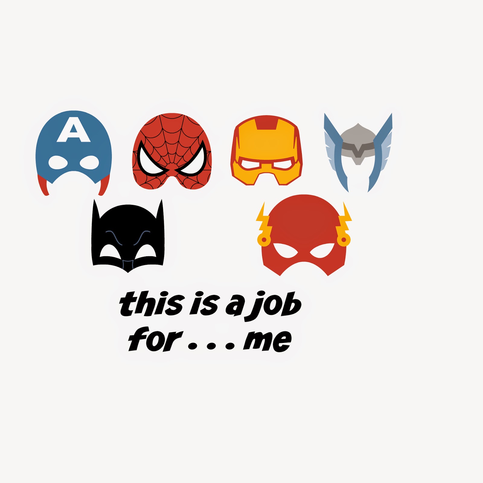
This is an image Jack (12) made to print on an iron-on transfer and put on a t-shirt for one of his brothers for Christmas:
 Themes Menu, Comic HeroesAt our recent CWBN CA Conference, the fabulous Jenna Guizar advised us to create a "brand" by using consistent colors, fonts, and overall look on images on our blogs, in order to make them more recognizable. I think it's really good advice, but I have a hard time following it. SO MANY CHOICES!
I do try to stick with three main fonts (recently anyway), and supplement with a couple others, but I think that's the best I can manage for now.
 Overlays Menu, Critters (here's this post)This one is probably my favorite of the bunch. PicMonkey has a lot of choices, but they did NOT have any castles or invading armies. So I made them myself . . . out of shapes:
 Overlays Menu, Geometric & Banners / Themes Menu, Cupidity (for the arrows)
- Using Images You Find Yourself -
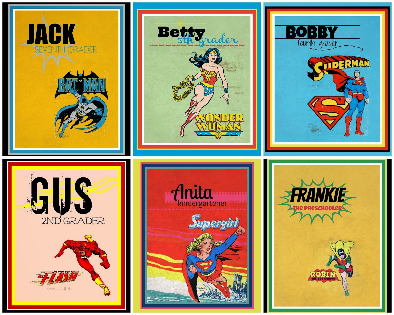
I made these notebook covers for the kids at the beginning of the school year.
I found the vintage superhero images online, saved them to my computer, then opened them in PicMonkey. I put Simple Borders around the images, matching the color of the original background using the Eyedropper Tool, then cropped the images to put the superhero where I wanted it on the page. Wonder Woman and Superman had an antiqued background that I matched in the Texture Menu, using one of the Smudge options, faded way down. For Supergirl, I went to the Effects Menu, and used Draw to fill in the background across the page. Then I added text, overlays, and a few thin colored borders.

To make my most-shared image EVER, I found this pleased looking beef cow online and saved him to my computer. I opened up a blank square canvas under Design, then went to the Overlays Menu, and selected Computer from the Your Own dropdown menu. I selected the cow, and made him the size I wanted, then added my text. If the edges of my overlay had been visible, I would have used Draw, and with a soft brush, blurred the edges. (You have to combine the image elements on the menu above the image you're creating to be able to draw on an overlay.) Then I added text. Since I planned to use the image on Facebook, rather than as a printable, I saved it at 1000x1000 pix, which is still plenty big.

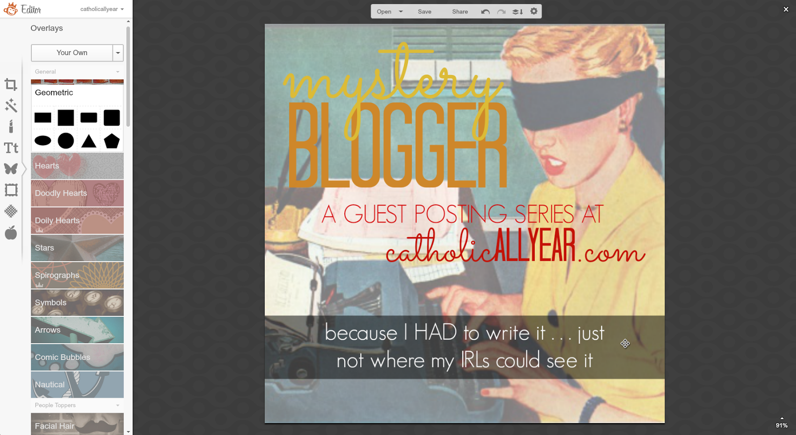
And now, I'm going to take you -- step by step -- through how I created a graphic image for a guest posting series I'll be hosting on the blog during my "maternity leave" in August.
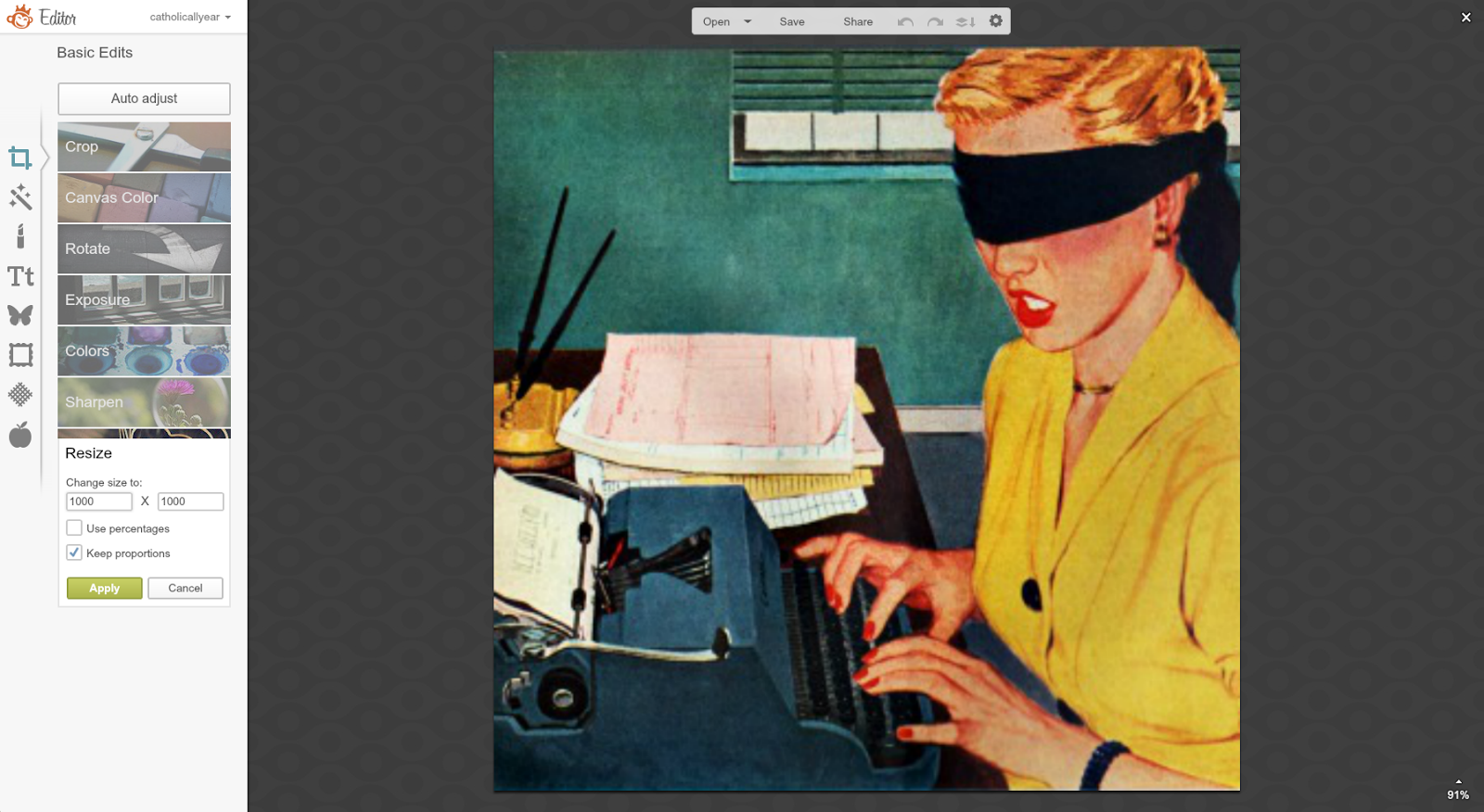
1. I looked through a TON of vintage images, until I found one I liked, that I thought would work with the title of the series. I saved it to my computer, then opened it in PicMonkey.

2. From the Basic Edits Menu, I cropped the image to square.

3. Also on Basic Edits, I resized the image to 1000x1000.

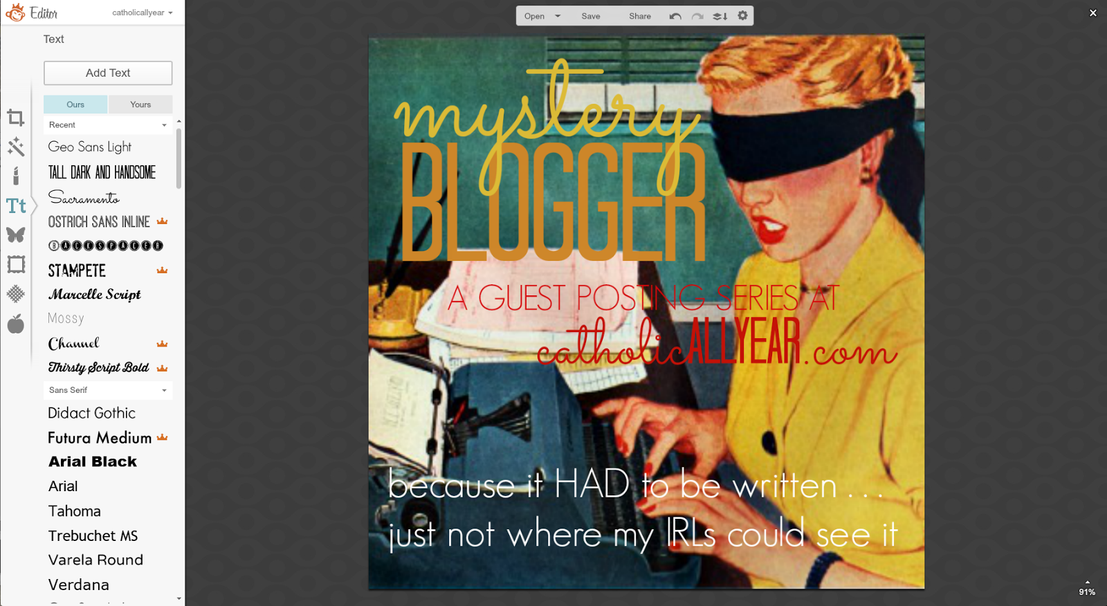
4. I started adding text, matching the colors to coloring in the image using the Eyedropper Tool. By right clicking on "mystery" I could select to bring that word to the front of the stack of text, so the y's were visible.

5. I added the rest of the text I wanted on the image, but was having trouble with the visibility on the bottom part.

6. To make it more visible, I selected a banner from the Overlays Menu, stretched it across the bottom of the image so that the indented edges weren't visible, and faded it so the the original image shows through.

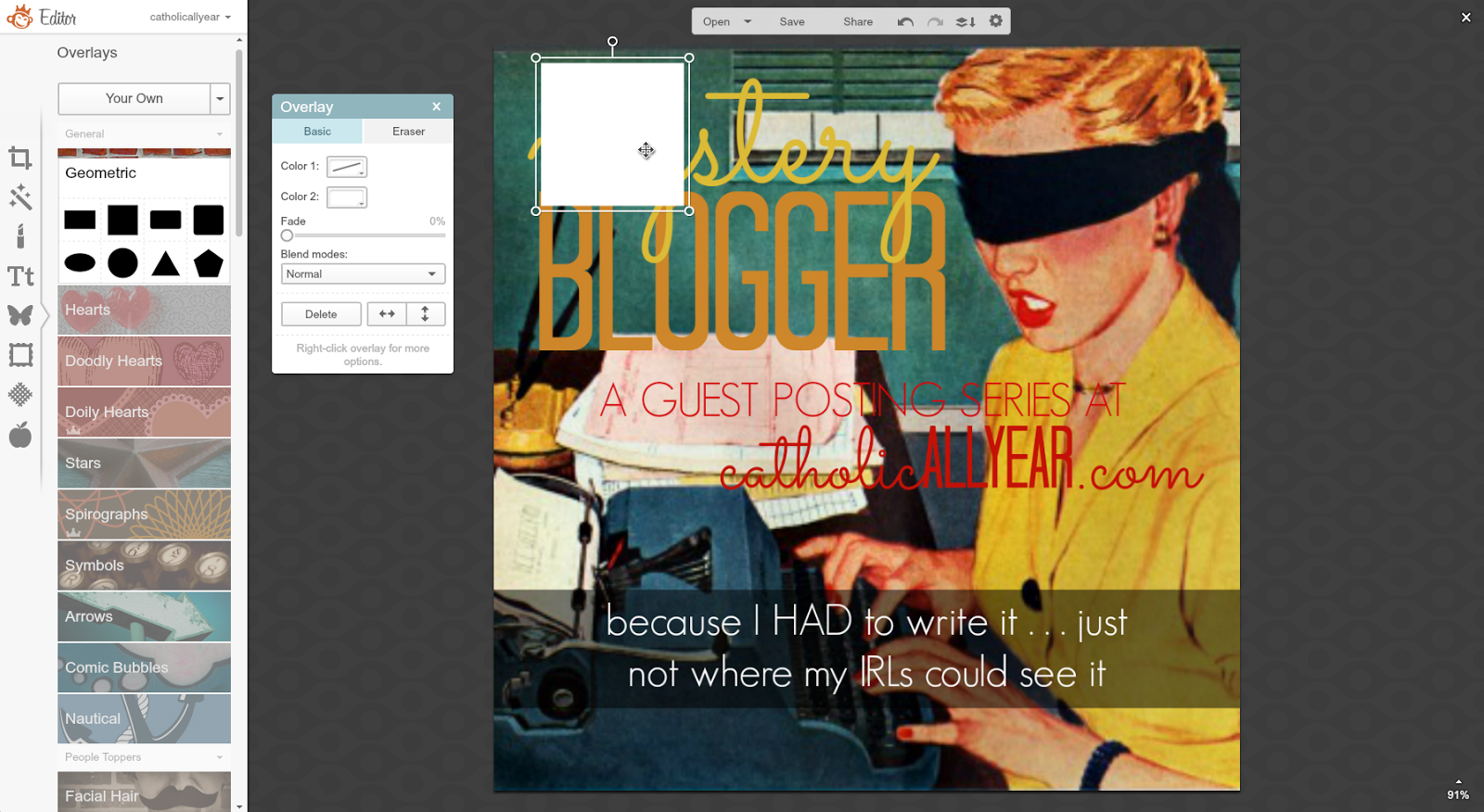
7. But I wasn't quite feeling it. So I decided to try putting an overlay over the whole image, to make the text stand out. I selected a square from Overlays, Geometric.

8. I made it white and faded it way down on the little pop-up menu.

9. And I stretched it to cover the whole image, then right clicked and sent it to the back, behind all the text, and the banner.

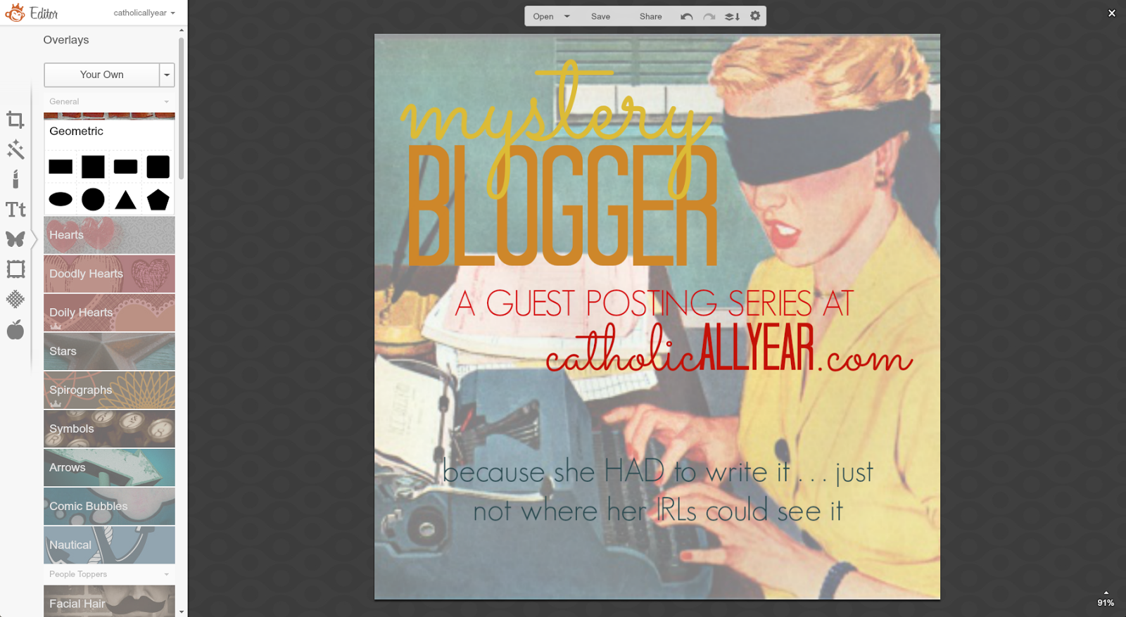
10. But then the tag line was TOO visible.

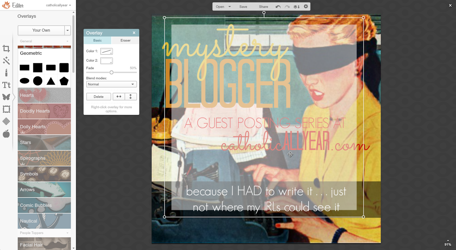
11. So I got rid of the banner. But I still didn't like it as much with the muted background. So I resized the square overlay into a white banner behind the (now teal-colored) tagline text. And I was happy with that.

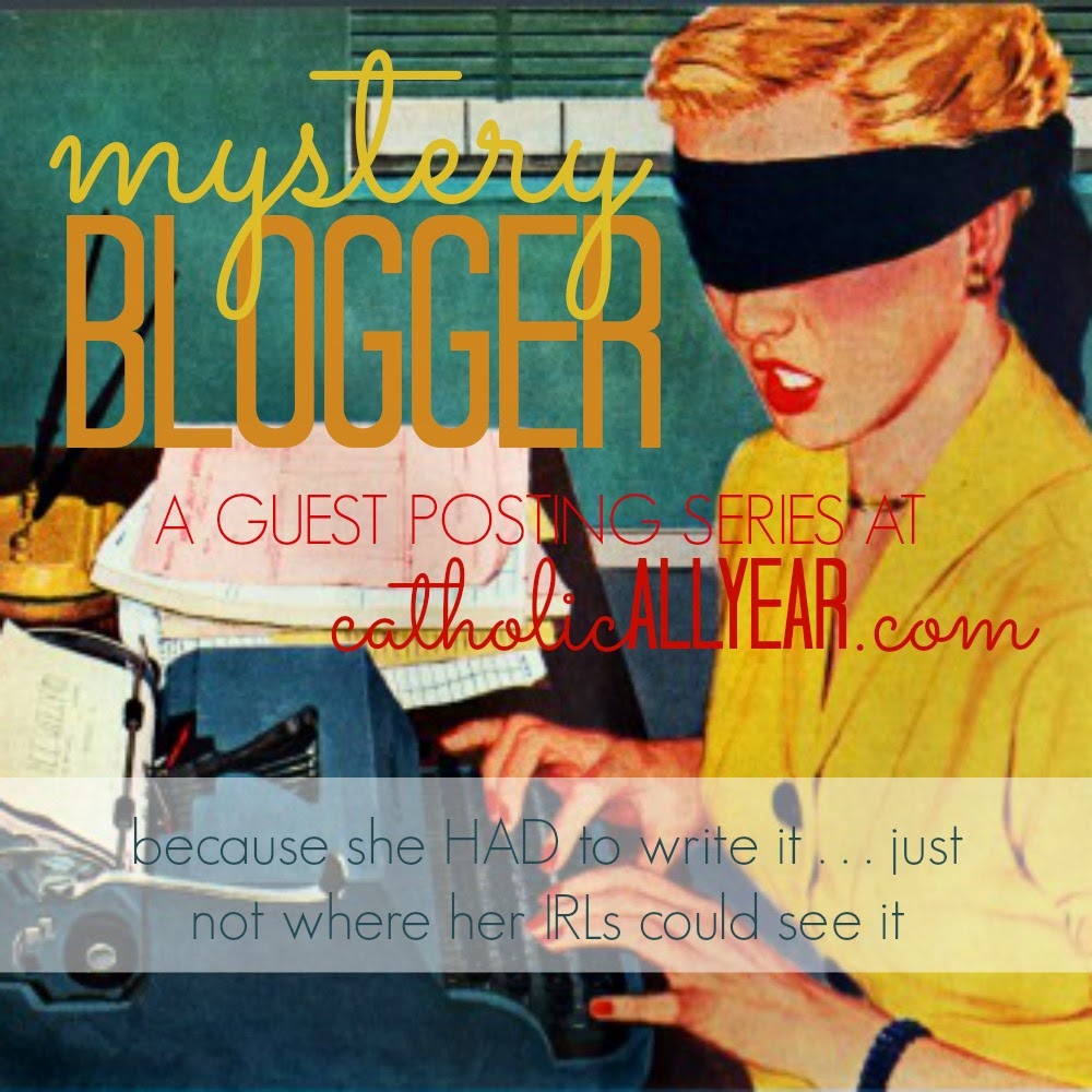
And that's that. Now you have to wait all the way until August to read the posts. But I hope you'll be able to keep yourself occupied with your awesome PicMonkey skills until then.
Don't be afraid to make lame stuff. Making lame stuff is the first step toward making awesome stuff.
If there are any of you left who haven't died of boredom or sprained a finger with all the scrolling, there's one installment of this series still to come . . . Using PicMonkey to make word art.

PicMonkey is great for photos (um, obviously), but I also use it quite a bit to create easy graphic design images.
These can be used for cards and posters, party decorations, or to give a blog post an image when you don't have any photos to go along with it.
The trouble with trying to create graphic images is that the possibilities are pretty much infinite.
I have exactly zero training or professional experience doing this. My main technique is to play around with stuff and move it around and switch it out until I like the way it looks. I've refined my "style" a lot over time. I think you have to be willing to make some mediocre images at first, while you figure out what you actually like.
I'm going to share some examples of things I've made, and explain a bit about how I make each type of image.
- Using PicMonkey Overlays -
You never have to leave the PicMonkey site to create some pretty cool looking graphic designs with options right there in their Overlays or Themes menus.
I don't always have photos to go along with posts I write. But I'm a very visual person, and I just can't bring myself to hit publish on just a bunch of words. Plus, if you want a post to be pinnable and sharable on Facebook, or show up in related post widgets, it really helps to have an image. So, if I don't have any photos, I make a graphic image of the title of the post in PicMonkey.
 Themes Menu, School U Theme (here's this post)
 Themes Menu, Santa Land (here's this post)
I created this image for a little social media game I did last year:
 Themes Menu, School U
This is an image Jack (12) made to print on an iron-on transfer and put on a t-shirt for one of his brothers for Christmas:
One note: see how it looks kind of dingy? While the image above, also made on a white background looks . . . white? I don't know why that happens, and I've only noticed it as an issue putting the images on the blog. For some reason, if you save the image, then open it in PicMonkey again, then save it again, that seems to fix it. I don't know why. But it works.
 Themes Menu, Comic HeroesAt our recent CWBN CA Conference, the fabulous Jenna Guizar advised us to create a "brand" by using consistent colors, fonts, and overall look on images on our blogs, in order to make them more recognizable. I think it's really good advice, but I have a hard time following it. SO MANY CHOICES!
 I do try to stick with three main fonts (recently anyway), and supplement with a couple others, but I think that's the best I can manage for now.
 Overlays Menu, Critters (here's this post)This one is probably my favorite of the bunch. PicMonkey has a lot of choices, but they did NOT have any castles or invading armies. So I made them myself . . . out of shapes:
 Overlays Menu, Geometric & Banners / Themes Menu, Cupidity (for the arrows)
- Using Images You Find Yourself -
I made these notebook covers for the kids at the beginning of the school year.
I found the vintage superhero images online, saved them to my computer, then opened them in PicMonkey. I put Simple Borders around the images, matching the color of the original background using the Eyedropper Tool, then cropped the images to put the superhero where I wanted it on the page. Wonder Woman and Superman had an antiqued background that I matched in the Texture Menu, using one of the Smudge options, faded way down. For Supergirl, I went to the Effects Menu, and used Draw to fill in the background across the page. Then I added text, overlays, and a few thin colored borders.
To make my most-shared image EVER, I found this pleased looking beef cow online and saved him to my computer. I opened up a blank square canvas under Design, then went to the Overlays Menu, and selected Computer from the Your Own dropdown menu. I selected the cow, and made him the size I wanted, then added my text. If the edges of my overlay had been visible, I would have used Draw, and with a soft brush, blurred the edges. (You have to combine the image elements on the menu above the image you're creating to be able to draw on an overlay.) Then I added text. Since I planned to use the image on Facebook, rather than as a printable, I saved it at 1000x1000 pix, which is still plenty big.

And now, I'm going to take you -- step by step -- through how I created a graphic image for a guest posting series I'll be hosting on the blog during my "maternity leave" in August.
1. I looked through a TON of vintage images, until I found one I liked, that I thought would work with the title of the series. I saved it to my computer, then opened it in PicMonkey.

2. From the Basic Edits Menu, I cropped the image to square.
3. Also on Basic Edits, I resized the image to 1000x1000.
4. I started adding text, matching the colors to coloring in the image using the Eyedropper Tool. By right clicking on "mystery" I could select to bring that word to the front of the stack of text, so the y's were visible.

5. I added the rest of the text I wanted on the image, but was having trouble with the visibility on the bottom part.
6. To make it more visible, I selected a banner from the Overlays Menu, stretched it across the bottom of the image so that the indented edges weren't visible, and faded it so the the original image shows through.

7. But I wasn't quite feeling it. So I decided to try putting an overlay over the whole image, to make the text stand out. I selected a square from Overlays, Geometric.
8. I made it white and faded it way down on the little pop-up menu.
9. And I stretched it to cover the whole image, then right clicked and sent it to the back, behind all the text, and the banner.
10. But then the tag line was TOO visible.
11. So I got rid of the banner. But I still didn't like it as much with the muted background. So I resized the square overlay into a white banner behind the (now teal-colored) tagline text. And I was happy with that.
And that's that. Now you have to wait all the way until August to read the posts. But I hope you'll be able to keep yourself occupied with your awesome PicMonkey skills until then.
Don't be afraid to make lame stuff. Making lame stuff is the first step toward making awesome stuff.
If there are any of you left who haven't died of boredom or sprained a finger with all the scrolling, there's one installment of this series still to come . . . Using PicMonkey to make word art.
May 18, 2015
Don't Make These Mistakes Using PicMonkey to Make Shareable Images
We're out of town, so I thought I'd take this week to share with you some of the tips and tricks I use on PicMonkey to make this blog prettier. This is installment two of four, see Lesson 1: Using PicMoney to Make Good Photos Great and Bad Photos Pretty Good. PicMonkey is an online photo editing and design site. The basic version is free, but you can also choose a yearly subscription to "Royale" that gets you more options, and no ads. This is not a sponsored post, I just like PicMonkey. This post contains affiliate links.

I make a lot of shareable images. Which means putting saint quotes or other sayings on a photo, and sharing them on Facebook and the blog. Getting shared on social media is a great way to increase visibility of the blog, and it's also been an easy way for me to share my love of the saints and of celebrating their feast days.
I make almost all of my shareable images with PicMonkey. (In a pinch, when I can't get to my desktop, I use an iPad app called Rhonna.) The free version of PicMonkey has tons of great options, but I've upgraded to the Royale membership, to get all the bells and whistles with no ads.
I've learned some tips and tricks over the past couple of years on how to make readable, visually appealing images, that probably won't get me sued. I'm going to share how I do it with you today.
And I'm going to do that by sharing with you some mistakes I've made, so you can avoid them.
-Mistake 1: Using Photos Without Permission-
Google image search has made finding a picture of just about anything very, very easy. But, if you want to USE the pictures you find, on your blog or website or Etsy shop or whatever, you've got to be careful. Most of those images are copyrighted, and if you use them without permission you are running the risk of getting sued, not to mention wronging a photographer.
There are plenty of cautionary tales out there. Here are two:
Blogger Beware: You CAN Get Sued For Using Photos You Don't Own on Your BlogThe $8,000 Mistake That All Bloggers Should BewareOne sure way to avoid trouble is to use your OWN photographs.
Like here:

In this image I used the filter Orton from the Effects Menu, and added Sunglow from the window. I also used an Overlay, to make the text more visible, more on that later.
You can also pay a license fee for the right to use a particular image, sometimes it's as little as a dollar or two per image, for really great photos or cool clipart like these guns:

Or you can find images that are in the public domain.21 free public domain image websites (use with care)Or, use Google image search, just use it right:
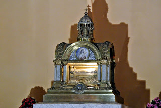
Find Reusable and Public Domain Images With GoogleI found this image at Wikimedia Commons, in the public domain because the photographer designated it with a creative common license:

From the Filters Menu under the Effects Tab, I selected Daguerrotype, then Shiro:

And this engraving is over 95 years old, which means the copyright is expired:

Or don't use images at all, just make the words pretty. But that's going to be another post.
Okay, so now we know how to GET the photos. In an earlier post, I showed you how I use PicMonkey to improve the look of photographs. So I'm going to assume all your photos already look amazing. Now, let's talk about how to put words on there.
And MORE mistakes to avoid.
-Mistake 2: Using Discordant Fonts-
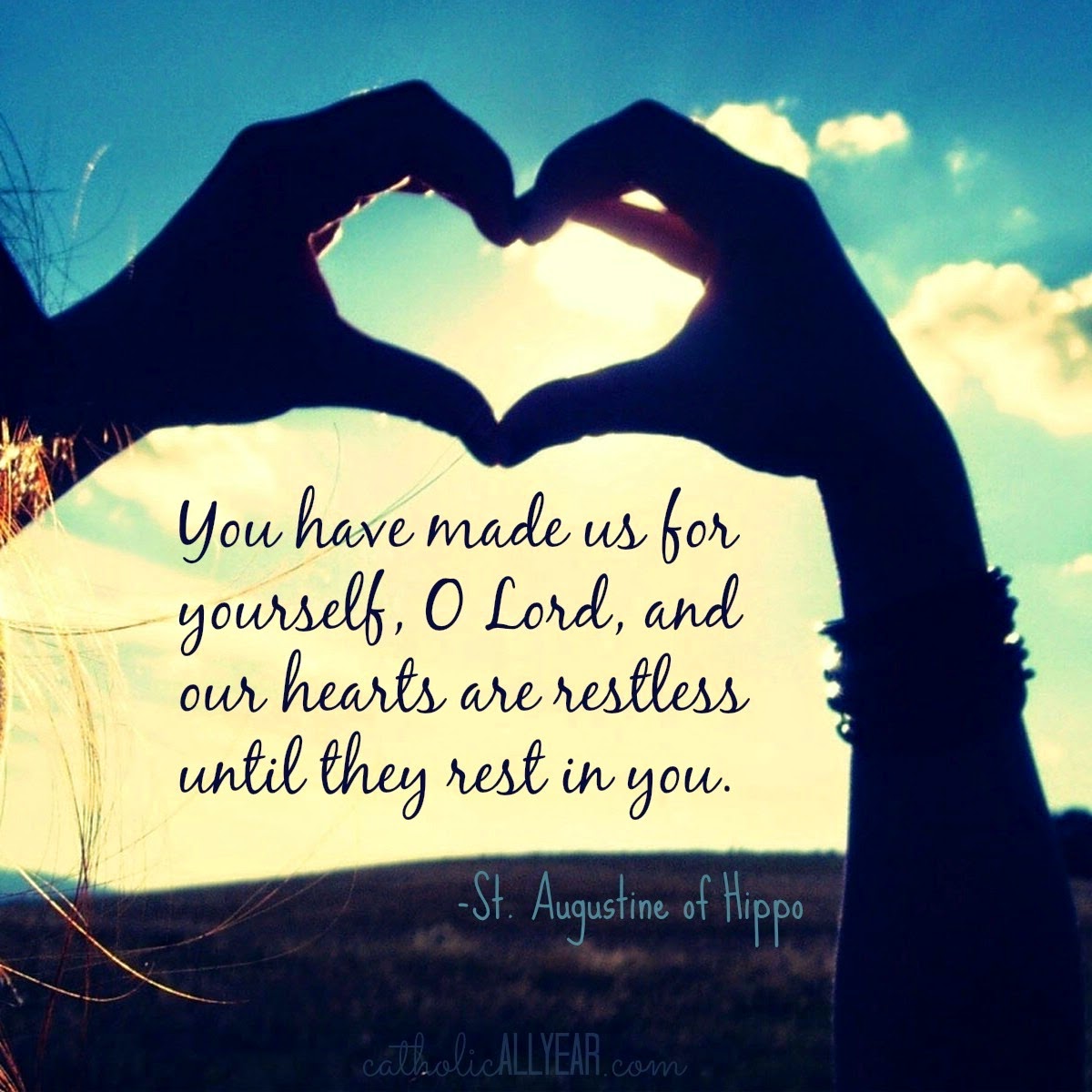
I started with this quote: "You have made us for yourself, O Lord, and our hearts are restless until they rest in you." -St. Augustine of Hippo
And this image:
And ended up with this sharable quote image:

There was already a filter on the image, so I just PicMonkey to crop the image to square, and put text on it. Pretty easy.
It's a good image. Looking at it now though, I notice that I would probably make different font choices if I were making this today. The quote text font is very clean-edged, and the "St. Augustine of Hippo" font is a handwriting-type font with less-clean edges. I love using a few different fonts, but I now prefer to use clean-edge fonts together, handwriting-type fonts together, stamping-look fonts together, etc. I think it just gives a more cohesive look to the finished product. More about font choices here.
Like this. All clean-edged fonts:

I started with this image:
From the Effects Menu, I selected Draw. I used the little Eyedropper Tool to select the color of the wall, and used the Draw Effect to get rid of most of the background. Then I added Bokeh Shapes.
Or this. All stamped-look fonts:

I probably use too many different fonts, myself. If you are trying to bring more people to your blog, you want them to be able to recognize an image as your work right away. The best way to do that is to have a consistent look to your shareable images, and only use two to four different fonts.
-Mistake 3: Text Doesn't Stand Out Enough-
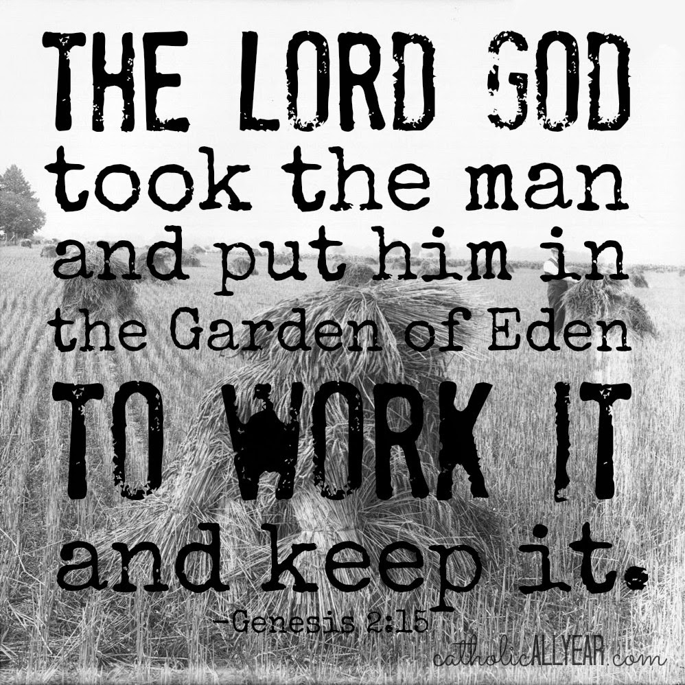
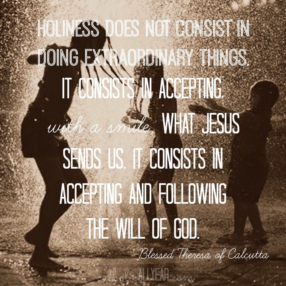
I started with this quote: "Holiness does not consist in doing extraordinary things, it consists in accepting, with a smile, what Jesus sends us. It consists in accepting and following the will of God." -Blessed Teresa of Calcutta
And this photo:

In PicMonkey, I went to the Filters Menu under the Effects Tab, and selected Daguerrotype, then Shiro. It creates MORE contrast between the background and the text. But I still think this one is kinda hard to see.

To make the text stand out more, you can put something behind it. From the Overlays Menu, I selected a Label, made it white, Faded it to 50%, and using the Right Click Menu, sent it to the back, behind the text.

On this image, I did the same thing, but I selected a square from the Shapes Menu, faded it, and stretched it to cover the entire photo.

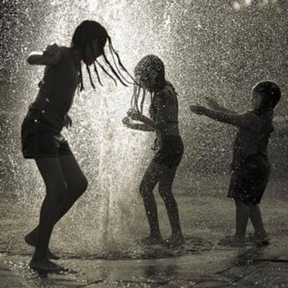
This is the photo I started with:
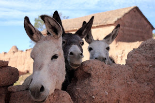
I used the Draw Effect from the Effects Menu. Using white, I scrubbed out the background and the extra donkey, then from the Frames Menu, I selected Simple Edge, and kept putting white frames around the edge until I had plenty of room above the donkeys, then I cropped the image square, added the overlay, faded it, and added the text.
- Mistake 4: Not Watermarking Your Images -
A watermark is just a small, often faded logo or text telling everyone that it was YOU who made that image.
I do not watermark all of the photos I put on my blog. Some folks do, it's a judgement call. Not putting a watermark on the image doesn't mean you don't still own it.
I DO, however, watermark all my pinnable or sharable images, so that anyone who likes what they see will know how to find me.
You can just type your name or the name of your blog or organization, make it a reasonable size, fade it, and put it someplace visible yet not distracting. That's what I do.
You can also use PicMonkey to create a watermark on a transparent background that you can save as a .png file (.jpg won't have a transparent background) and then drop onto any photo from the Overlays Menu. Once you've created the watermark (see a tutorial here) you can click Your Own from the top, and then Computer, and select any saved photo or image to drop right on top of whatever you're working on.
Okay, I'm sure there's more. But that's already a ton. I hope it made sense. A little? Now get out there and make yourself some shareable quotes!

I make a lot of shareable images. Which means putting saint quotes or other sayings on a photo, and sharing them on Facebook and the blog. Getting shared on social media is a great way to increase visibility of the blog, and it's also been an easy way for me to share my love of the saints and of celebrating their feast days.
I make almost all of my shareable images with PicMonkey. (In a pinch, when I can't get to my desktop, I use an iPad app called Rhonna.) The free version of PicMonkey has tons of great options, but I've upgraded to the Royale membership, to get all the bells and whistles with no ads.
I've learned some tips and tricks over the past couple of years on how to make readable, visually appealing images, that probably won't get me sued. I'm going to share how I do it with you today.
And I'm going to do that by sharing with you some mistakes I've made, so you can avoid them.
-Mistake 1: Using Photos Without Permission-
Google image search has made finding a picture of just about anything very, very easy. But, if you want to USE the pictures you find, on your blog or website or Etsy shop or whatever, you've got to be careful. Most of those images are copyrighted, and if you use them without permission you are running the risk of getting sued, not to mention wronging a photographer.
There are plenty of cautionary tales out there. Here are two:
Blogger Beware: You CAN Get Sued For Using Photos You Don't Own on Your BlogThe $8,000 Mistake That All Bloggers Should BewareOne sure way to avoid trouble is to use your OWN photographs.
Like here:

In this image I used the filter Orton from the Effects Menu, and added Sunglow from the window. I also used an Overlay, to make the text more visible, more on that later.
You can also pay a license fee for the right to use a particular image, sometimes it's as little as a dollar or two per image, for really great photos or cool clipart like these guns:

Or you can find images that are in the public domain.21 free public domain image websites (use with care)Or, use Google image search, just use it right:
Find Reusable and Public Domain Images With GoogleI found this image at Wikimedia Commons, in the public domain because the photographer designated it with a creative common license:
From the Filters Menu under the Effects Tab, I selected Daguerrotype, then Shiro:

And this engraving is over 95 years old, which means the copyright is expired:

Or don't use images at all, just make the words pretty. But that's going to be another post.
Okay, so now we know how to GET the photos. In an earlier post, I showed you how I use PicMonkey to improve the look of photographs. So I'm going to assume all your photos already look amazing. Now, let's talk about how to put words on there.
And MORE mistakes to avoid.
-Mistake 2: Using Discordant Fonts-
I started with this quote: "You have made us for yourself, O Lord, and our hearts are restless until they rest in you." -St. Augustine of Hippo
And this image:

And ended up with this sharable quote image:
There was already a filter on the image, so I just PicMonkey to crop the image to square, and put text on it. Pretty easy.
It's a good image. Looking at it now though, I notice that I would probably make different font choices if I were making this today. The quote text font is very clean-edged, and the "St. Augustine of Hippo" font is a handwriting-type font with less-clean edges. I love using a few different fonts, but I now prefer to use clean-edge fonts together, handwriting-type fonts together, stamping-look fonts together, etc. I think it just gives a more cohesive look to the finished product. More about font choices here.
Like this. All clean-edged fonts:

I started with this image:

From the Effects Menu, I selected Draw. I used the little Eyedropper Tool to select the color of the wall, and used the Draw Effect to get rid of most of the background. Then I added Bokeh Shapes.
Or this. All stamped-look fonts:
I probably use too many different fonts, myself. If you are trying to bring more people to your blog, you want them to be able to recognize an image as your work right away. The best way to do that is to have a consistent look to your shareable images, and only use two to four different fonts.
-Mistake 3: Text Doesn't Stand Out Enough-
I started with this quote: "Holiness does not consist in doing extraordinary things, it consists in accepting, with a smile, what Jesus sends us. It consists in accepting and following the will of God." -Blessed Teresa of Calcutta
And this photo:
In PicMonkey, I went to the Filters Menu under the Effects Tab, and selected Daguerrotype, then Shiro. It creates MORE contrast between the background and the text. But I still think this one is kinda hard to see.
To make the text stand out more, you can put something behind it. From the Overlays Menu, I selected a Label, made it white, Faded it to 50%, and using the Right Click Menu, sent it to the back, behind the text.
On this image, I did the same thing, but I selected a square from the Shapes Menu, faded it, and stretched it to cover the entire photo.
This is the photo I started with:

I used the Draw Effect from the Effects Menu. Using white, I scrubbed out the background and the extra donkey, then from the Frames Menu, I selected Simple Edge, and kept putting white frames around the edge until I had plenty of room above the donkeys, then I cropped the image square, added the overlay, faded it, and added the text.
- Mistake 4: Not Watermarking Your Images -
A watermark is just a small, often faded logo or text telling everyone that it was YOU who made that image.
I do not watermark all of the photos I put on my blog. Some folks do, it's a judgement call. Not putting a watermark on the image doesn't mean you don't still own it.
I DO, however, watermark all my pinnable or sharable images, so that anyone who likes what they see will know how to find me.
You can just type your name or the name of your blog or organization, make it a reasonable size, fade it, and put it someplace visible yet not distracting. That's what I do.
You can also use PicMonkey to create a watermark on a transparent background that you can save as a .png file (.jpg won't have a transparent background) and then drop onto any photo from the Overlays Menu. Once you've created the watermark (see a tutorial here) you can click Your Own from the top, and then Computer, and select any saved photo or image to drop right on top of whatever you're working on.
Okay, I'm sure there's more. But that's already a ton. I hope it made sense. A little? Now get out there and make yourself some shareable quotes!
May 15, 2015
Using PicMonkey to Make Good Photos Great and Bad Photos Pretty Good
We're out of town, so I thought I'd take this week to share with you some of the tips and tricks I use on PicMonkey to make this blog prettier. This is installment one of four. PicMonkey is an online photo editing and design site. The basic version is free, but you can also choose a yearly subscription to "Royale" that gets you more options, and no ads. This is not a sponsored post, I just like PicMonkey. This post contains affiliate links.

I enjoy photography, but I'm an amateur.
I have a camera I like , but it's not high end, and I don't know how to shoot in manual. I don't have photoshop or any professional editing software.
I try to follow the basic photography rules of using natural light, creating interesting angles and perspectives, and not always centering the subject of the photo.
And, when that's not enough, I head over to PicMonkey and try to fix it there.
I'll walk you through what I do.
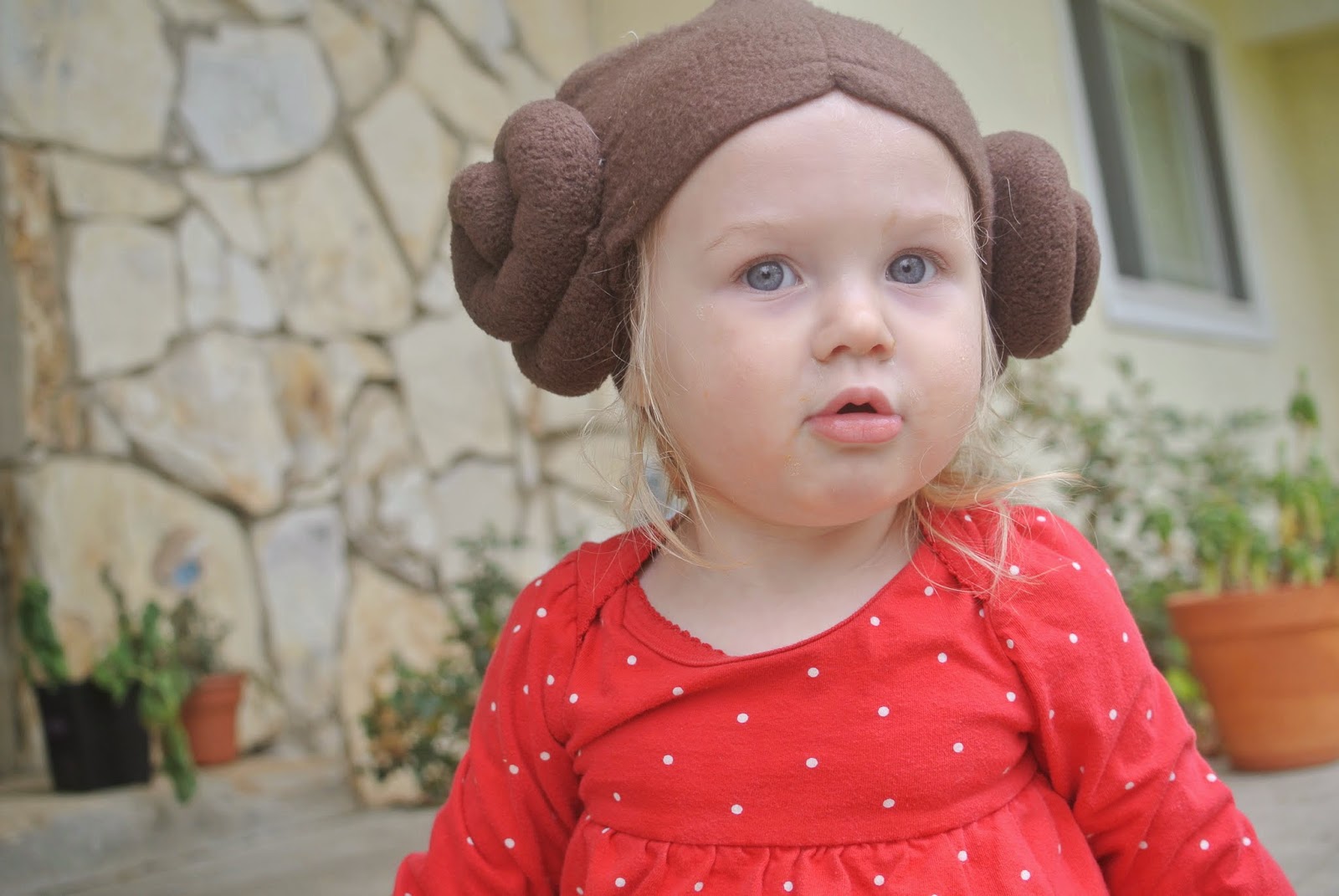
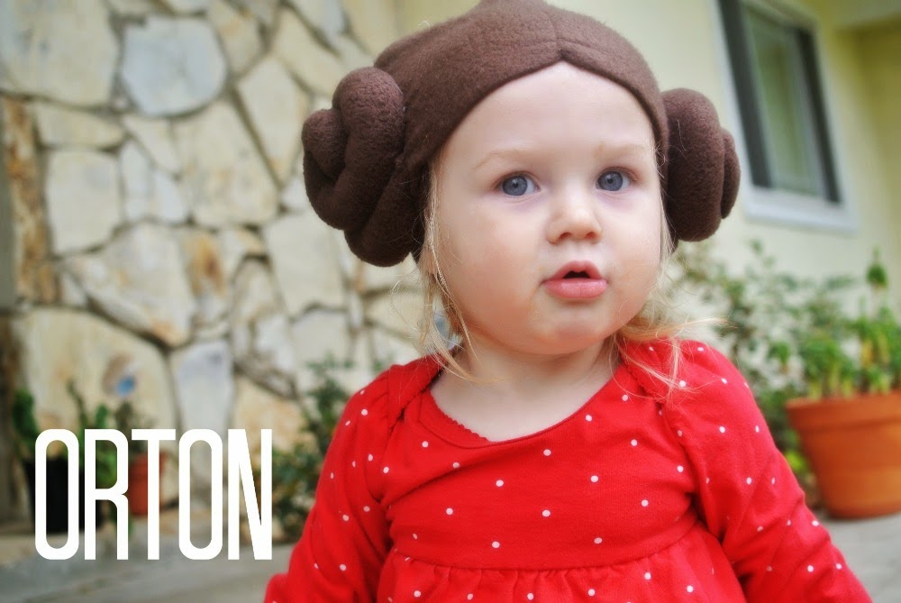
Here's a photo of Lulu on Star Wars Day. It is, clearly, awesome. But a bit bland somehow.

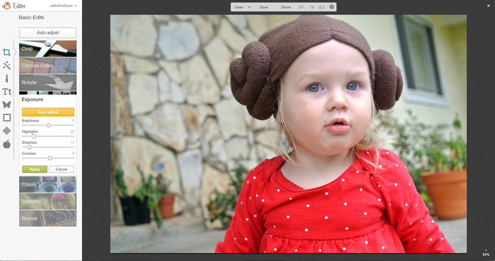
I go to the PicMonkey site, and open the photo.
Step one is in Basic Edits.
I make small adjustments in the brightness, highlights, shadows, and contrast until the photo looks more vibrant.
All of this is a part of the free version, and already, you can see how much better it looks. We could totally be done here.

But, since I am a royale member, I'm going to keep going.
From the Touch Up menu, I select Eye Brighten, adjust the size of the brush, and brighten up the eyes. All of a sudden, her eyes become the focus of the photo. I'll also sometimes make VERY subtle use of the blush and lip tint, just to bring a little more color to the photo. Obviously, it would look terrible if it was noticeable.

Again, we could be done. But, in this case, I also went to Airbrush, to get rid of some of the crud that's always all over my kids' faces. Snot crud around the nose, eye crud around the eyes, food crud around the mouth, all gently fades away.

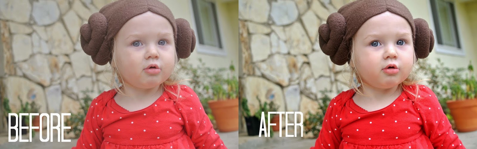
And voila! It looks like I'm a better photographer than I am, but doesn't have an obvious filter look (although PicMonkey does have all of those filters) or a super-airbrushed unnatural look.


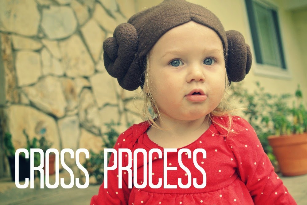
If you're looking for a one click fix, you can always apply a filter instead of doing all the tweaking yourself.
I like Orton, it's the closest to the look I try to achieve on my own, but I still don't think it's quite as good as doing it yourself.


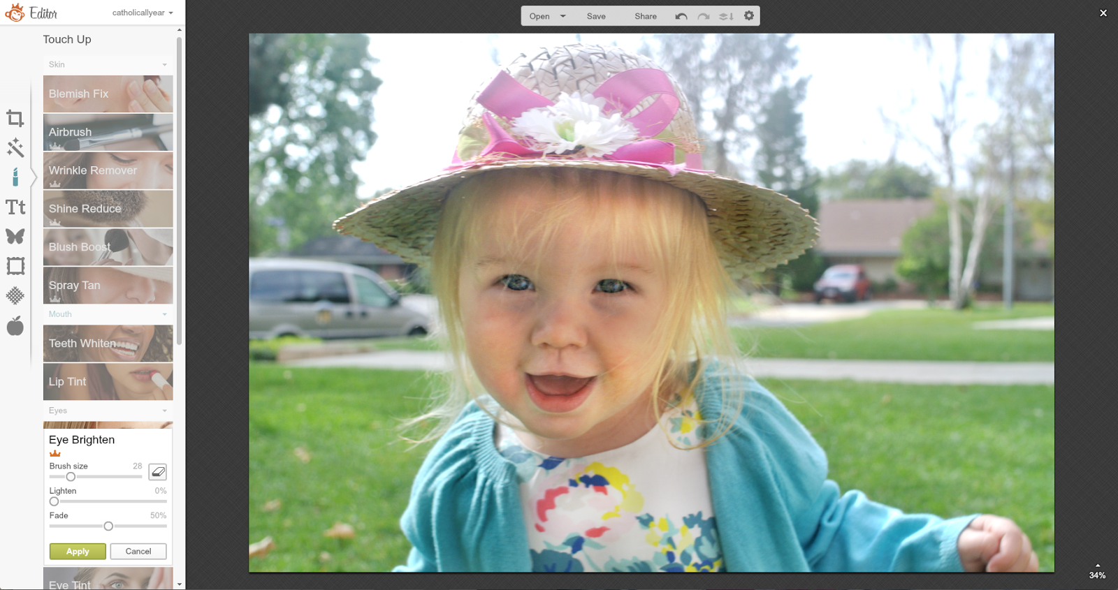
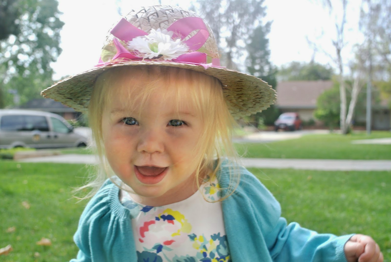
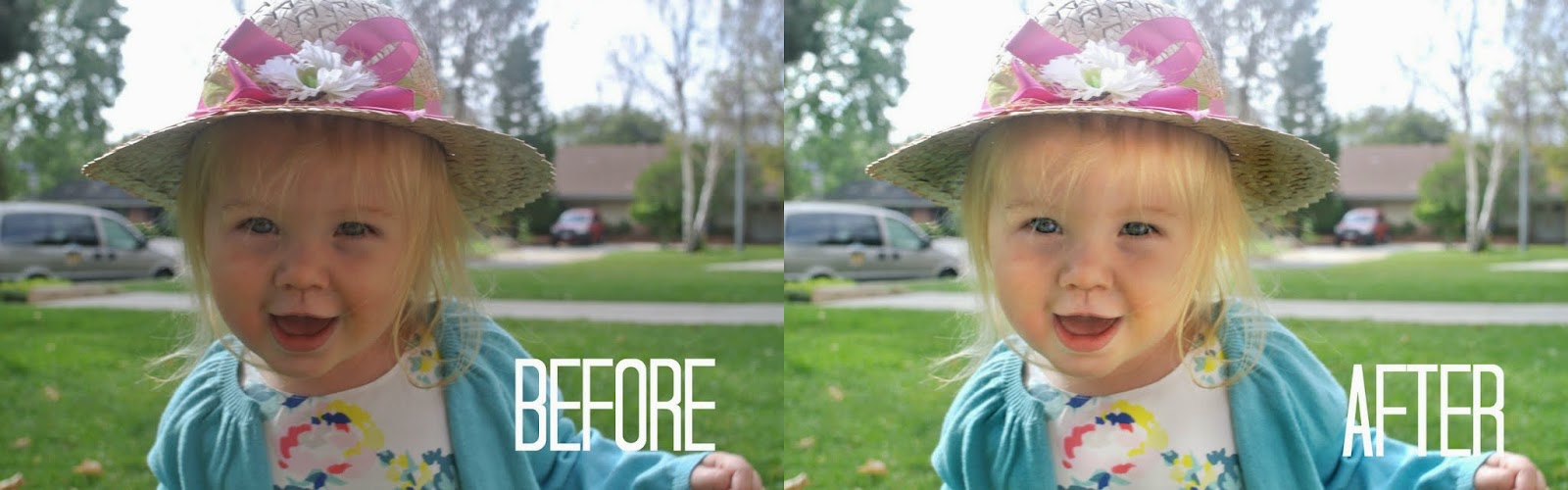
Here's another example, from Easter. I like this photo, but the lighting is not good.

First, I adjusted the exposure.

Then, because her face was still a bit dark, I went to the Effects menu, and scrolled all the way down to Dodge. I selected Light, and used the brush to lighten the photo just on Lulu's face and the bow of the hat.

Then I went to Burn to darken her sweater and the underside of the hat.

Then, Eye Brighten from the Touch Up menu.

And a little Airbrush to remove face crud.

And, done.


Finally, just to show you. Let's look at a bad photo. Our faces are completely shadowed, we blend into the background. It's just not a great shot.

And it never will be. But using all the same steps, we can adjust it to the point that it becomes useable.


The PicMonkey Blog has some great video tutorials on rescuing and improving your photos.
Okay, that's it for today. But stay tuned all week for lessons on how I create Pinnable Images, Sharable Quotes, and Printable Prayers.

I enjoy photography, but I'm an amateur.
I have a camera I like
, but it's not high end, and I don't know how to shoot in manual. I don't have photoshop or any professional editing software.I try to follow the basic photography rules of using natural light, creating interesting angles and perspectives, and not always centering the subject of the photo.
And, when that's not enough, I head over to PicMonkey and try to fix it there.
I'll walk you through what I do.
Here's a photo of Lulu on Star Wars Day. It is, clearly, awesome. But a bit bland somehow.
I go to the PicMonkey site, and open the photo.
Step one is in Basic Edits.
I make small adjustments in the brightness, highlights, shadows, and contrast until the photo looks more vibrant.
All of this is a part of the free version, and already, you can see how much better it looks. We could totally be done here.
But, since I am a royale member, I'm going to keep going.
From the Touch Up menu, I select Eye Brighten, adjust the size of the brush, and brighten up the eyes. All of a sudden, her eyes become the focus of the photo. I'll also sometimes make VERY subtle use of the blush and lip tint, just to bring a little more color to the photo. Obviously, it would look terrible if it was noticeable.

Again, we could be done. But, in this case, I also went to Airbrush, to get rid of some of the crud that's always all over my kids' faces. Snot crud around the nose, eye crud around the eyes, food crud around the mouth, all gently fades away.

And voila! It looks like I'm a better photographer than I am, but doesn't have an obvious filter look (although PicMonkey does have all of those filters) or a super-airbrushed unnatural look.

If you're looking for a one click fix, you can always apply a filter instead of doing all the tweaking yourself.
I like Orton, it's the closest to the look I try to achieve on my own, but I still don't think it's quite as good as doing it yourself.

Here's another example, from Easter. I like this photo, but the lighting is not good.

First, I adjusted the exposure.

Then, because her face was still a bit dark, I went to the Effects menu, and scrolled all the way down to Dodge. I selected Light, and used the brush to lighten the photo just on Lulu's face and the bow of the hat.

Then I went to Burn to darken her sweater and the underside of the hat.

Then, Eye Brighten from the Touch Up menu.
And a little Airbrush to remove face crud.

And, done.
Finally, just to show you. Let's look at a bad photo. Our faces are completely shadowed, we blend into the background. It's just not a great shot.

And it never will be. But using all the same steps, we can adjust it to the point that it becomes useable.

The PicMonkey Blog has some great video tutorials on rescuing and improving your photos.
Okay, that's it for today. But stay tuned all week for lessons on how I create Pinnable Images, Sharable Quotes, and Printable Prayers.
May 12, 2015
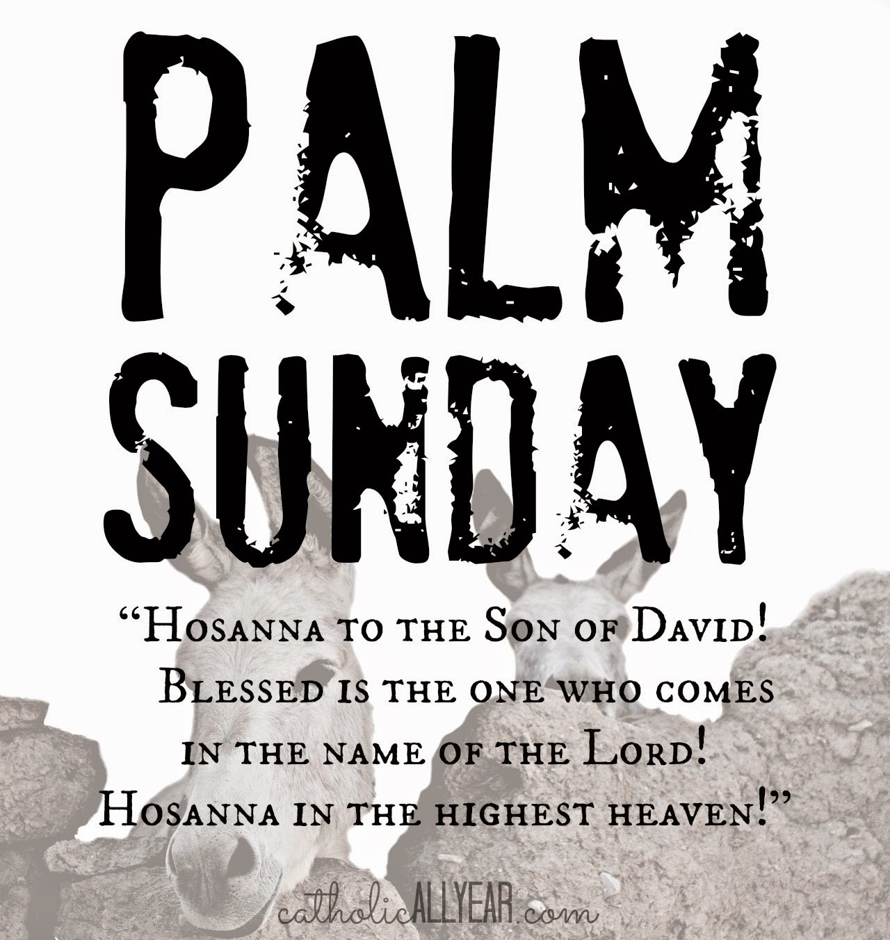
Pentecost is Coming: Celebration Ideas and Free Printables
Before Pentecost can happen, of course, we have to have the Ascension. The kids and I will be observing Ascension Thursday by flying from Los Angeles to Washington D.C. to meet up with the husband who is there for business all this week. It seems somehow fitting to be traveling by air on the feast of the Ascension, but not as good as, say, going to Mass. Technically, we're cool, since the observation of the Ascension is moved to Sunday in both the LA and the DC dioceses, so it isn't a Holy Day of Obligation for us.
I really do prefer the historical accuracy of a Thursday Ascension, but this year, we're going with it.
After the Ascension (be it Thursday or Sunday), comes Pentecost, when the Holy Spirit descended upon Mary and the Apostles. If you are not in the habit of celebrating Pentecost, and for a very long time, *I* was not, you just might want to consider starting, because, as it turns out . . .
Pentecost is Bigger Than ChristmasCheck out that post for all about how I learned that Pentecost is the second most important celebration of the liturgical year, my suggestions for some really complicated and fancy celebrations we might want to consider adopting, and the simple yet memorable way our family actually celebrates Pentecost. It totally involves fire. Kids love fire.
And I made you some new printables.
As with all my printables, you are welcome to right click on the image and save it to your computer for your own personal use. You may print the images and / or upload them and have prints made for your personal use or to give as gifts. (These are sized for 8x10 or square but will print well much bigger.) You may use my images on your blog, just please link back to my blog. If you would like to sell my images, please contact me first.
For LOTS MORE free printable prayers, check out my Pinterest board.
Come Holy Spirit, square, on white with dove:
Come Holy Spirit, 8x10, on white with dove:

Come Holy Spirit, 8x10, on red with fire:

Come Holy Spirit, 8x10, on white with globe:

And speaking of the Holy Spirit . . . I'm also at Blessed in She today, waxing philosophical about the sheer muttonheadedness of the apostles of the gospels and the inspiring wisdom and courage of the apostles of the acts of the apostles.
What changed?
Pentecost.
Pentecost changed everything. And THAT is worth celebrating.
---------
One more thing . . . for my fellow Catholic bloggers.
Inspired by some of the beautiful conversion stories we've heard at local Catholic blogging conferences, I'm excited to be a part of a new initiative among Catholic bloggers called The Credo Project. We're going to add a button to our sidebars that will allow our readers to easily click through to Catholics Come Home: a beautiful, faithful Catholic website where they can learn more about the Catholic faith. I designed the image, and Molly from Molly Makes Do made it do stuff when you click it.
So, if you've got a blog, please feel free to grab the code and share the love.
125x125

200 x 200
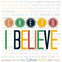
300 x 300
I really do prefer the historical accuracy of a Thursday Ascension, but this year, we're going with it.

After the Ascension (be it Thursday or Sunday), comes Pentecost, when the Holy Spirit descended upon Mary and the Apostles. If you are not in the habit of celebrating Pentecost, and for a very long time, *I* was not, you just might want to consider starting, because, as it turns out . . .
Pentecost is Bigger Than ChristmasCheck out that post for all about how I learned that Pentecost is the second most important celebration of the liturgical year, my suggestions for some really complicated and fancy celebrations we might want to consider adopting, and the simple yet memorable way our family actually celebrates Pentecost. It totally involves fire. Kids love fire.
And I made you some new printables.
As with all my printables, you are welcome to right click on the image and save it to your computer for your own personal use. You may print the images and / or upload them and have prints made for your personal use or to give as gifts. (These are sized for 8x10 or square but will print well much bigger.) You may use my images on your blog, just please link back to my blog. If you would like to sell my images, please contact me first.
For LOTS MORE free printable prayers, check out my Pinterest board.
Come Holy Spirit, square, on white with dove:

Come Holy Spirit, 8x10, on white with dove:

Come Holy Spirit, 8x10, on red with fire:

Come Holy Spirit, 8x10, on white with globe:
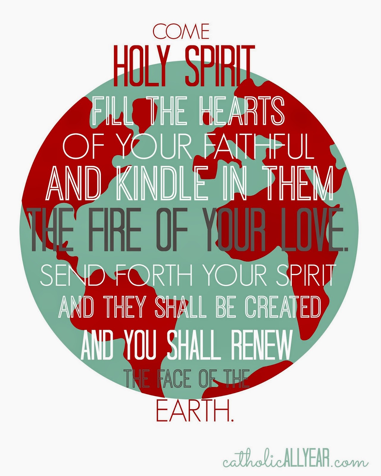
And speaking of the Holy Spirit . . . I'm also at Blessed in She today, waxing philosophical about the sheer muttonheadedness of the apostles of the gospels and the inspiring wisdom and courage of the apostles of the acts of the apostles.
What changed?
Pentecost.
Pentecost changed everything. And THAT is worth celebrating.
---------
One more thing . . . for my fellow Catholic bloggers.
Inspired by some of the beautiful conversion stories we've heard at local Catholic blogging conferences, I'm excited to be a part of a new initiative among Catholic bloggers called The Credo Project. We're going to add a button to our sidebars that will allow our readers to easily click through to Catholics Come Home: a beautiful, faithful Catholic website where they can learn more about the Catholic faith. I designed the image, and Molly from Molly Makes Do made it do stuff when you click it.
So, if you've got a blog, please feel free to grab the code and share the love.
125x125
200 x 200
300 x 300
May 10, 2015
Opting Out of Mommy Angst in Three Easy Steps
The week leading up to Mother's Day was certainly brightened for me by the news of the birth of baby Princess Charlotte Elizabeth Diana. I'm a proud American and whatnot, but my love of babies, fanciness, and tradition can't help but rejoice in a royal baby announcement.
I also, personally, got a kick out of the fact that Her Royal Highness Catherine, Duchess of Cambridge, was in just as big a hurry to get out of the hospital as I always am.
 The British Monarchy
So, I shared this article on the Facebook page:
How did Kate Middleton look this amazing 10 hours after having a baby?and was intrigued by the resulting discussion in the comments.
Some moms agreed with me that hospitals are a terrible place to get some rest after having had a baby, what with all the constant taking of one's blood pressure and the wanting to know how much one peed.Some moms had needed to stay in the hospital for a long time whether they liked it or not, because of c-sections, or other complications.Some moms had loved every minute of their hospitals stays and lobbied for an extra day or two if they could get it, to enjoy not having to cook or clean or look after the other kiddos.Some moms said that it was fine for Kate to go home, because she has "all that help."Some moms agreed with me that Kate looked just lovely, and that I really need a dress a LOT like that.Some moms had had the experience of looking and feeling pretty darn good right after having a baby.Some moms reported feeling NOT glamorous OR comfortable after childbirth.Some moms said of course Kate looked like that, because she has professionals to work on her.Some moms said that obviously Kate felt horrible and gross but was being forced by the royal family to have her hair and makeup done and pose for reporters even though she should get to be relaxing in her hospital bed in stretchy pants.One mom thought we shouldn't rule out the possibility that Kate's whole pregnancy had been fake.
It was like a tiny little microcosm of the "Mommy Wars." All over a picture of a baby princess.
It made me think of all the other angsty combox mommy debates: epidurals, co-sleeping, homeschooling, cooking from scratch, pinterest projects, working outside the home. Moms don't lack for things to worry about.
If I may, I'll just share my personal experience for a moment. . .
My labors have run the gamut from 50 hours of silly sputtering to an hour and a half of intense intenseness. Labor hurts, but it's been manageable for me without interventions each time. The husband and I have always been able to talk and laugh right up until the transition to pushing at which point I kinda lose it. But, hey, it's almost over by that point anyway.
Then, it IS over, aaaannnnddd . . . I have always felt pretty good. I've always been physically able to get up and walk right away, and get to the bathroom all by myself. I'd walk to the recovery room, but they never let me.
I think the longest I've ever stayed in the hospital after giving birth is fifteen hours, the shortest was six.
I do not like hospitals. I don't like being bossed around by nurses. I don't like being woken up by nurses. I feel uncomfortable there. Giving birth in a hospital is the solution that works best for our family, because reasons. But I don't want to stay there any longer than I have to.
I have never looked as cute as Kate did leaving the hospital. But I always bring "real" clothes to wear home.
And while I don't know the Duchess personally, it seems reasonable to assume that she also had a manageable time of labor and delivery, and was perfectly comfortable leaving the hospital, and is not one to let having a baby interfere with being her very fashionable self.
So here's the thing. And I hope the Duchess will forgive my impertinence, but I'm going to go ahead and speak for her too when I say that we both totally believe that your labor and delivery was the WORST and that there was NO WAY you were going anywhere for many days.
We are totally cool with that.
YOU love the hospital. You want to stay there until it's closing time and they kick you out. We are cool with that.
I will go so far as to say that we are cool with the other childbirth, sleep-system, schooling, crafting, and career-type mothering decisions you've made as well. Even if they are different than the ones we've made.
Mothering is hard. It takes a level of dedication and sacrifice my younger self wouldn't have even thought was a possibility for me. I've spent a lot of time figuring out how I do this, and there was a time when I worried if how I was doing things was the best way, or worried if people around me were doing things differently. But I really think most of that worrying and wondering was just my own insecurity. These days, I'm confident in what works for my family. And that means I don't have to spend time concerned about how other people do it. Advice and ideas? Yes. Comparisons and angst? Nope.
Because:
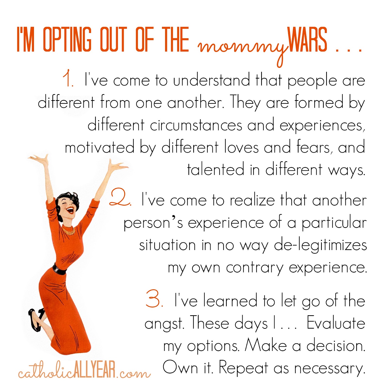
1. I've come to understand that people are different from one another. They are formed by different circumstances and experiences, motivated by different loves and fears, and talented in different ways.
2. I've come to realize that another person’s experience of a particular situation in no way de-legitimizes my own contrary experience.
3. I've learned to let go of the angst: These days, I . . . Evaluate my options. Make a decision. Own it. Repeat as necessary.
I'm opting out of the Mommy Wars. And I'm hoping that this blog is a place where I share what works for me, but don't de-value what works for you.
So, there ya go. Now that that's all taken care of I will wish you and yours the happiest of Mother's Days. Own it.

p.s. If this is a sad day for you because you struggle with infertility, subfertility, or miscarriages, or you have given a baby up for adoption, or you've had an abortion, or you have a difficult relationship with your mother or your children, or you've lost your mother, or you've lost a child . . . please know that lots of people are praying for your comfort and healing today.
Updated to add a Little What I Wore Sunday . . .
We had breakfast at home, then went to Mass, then hit up Krispy Kreme.

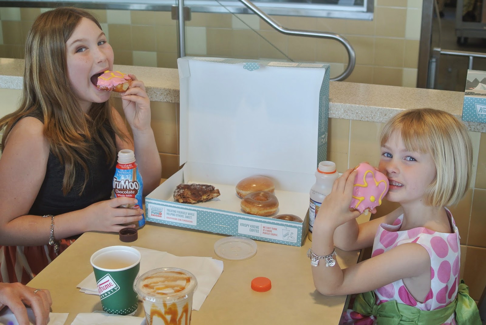
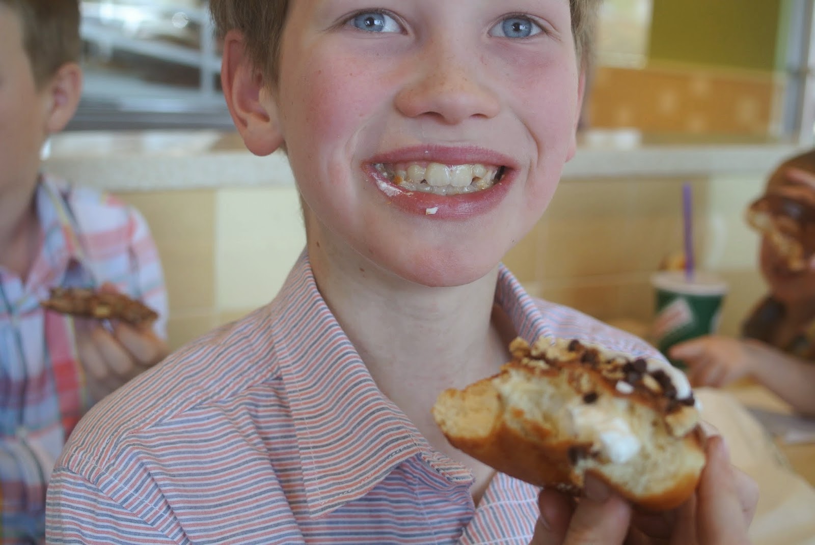


Betty made me this necklace! Isn't it awesome? And speaking of Betty, her black eye (from getting hit right in the eye by a pitch last week) has a Pinterest-worthy smoky-eye thing going on.
This was yesterday, it's even deeper today.

Anyway, Happy Mother's Day all!
May 8, 2015
Seven Quick Recaps of That Conference I Hosted
The Catholic Women's Blogging Conference: California Convention, was a couple of weekends ago now. If you follow me on Facebook or Instagram, you already had a peek at the proceedings. But it was just so lovely, that I don't want to let it go by without a little mention here on the blog.
 Here we are on Day 3: Mass & Family Brunch, doing a little What I Wore Sunday
Here's the cast of characters . . .
The conference was conceived and organized by: Micaela of California to Korea.Photographed by: Jiza of Olive & Cyprus.Hostessed by: Yours truly. Speakers: Jenna Guizar (Blessed is She), Andrea Boring (Andrea Boring), Kristin Sanders (This Inspired Life Podcast), Jenny Cook (Life in the Cookie Jar), and Micaela and I.
It was attended by thirty awesome ladies from all walks of life and all types of blogs. And from as far away as Arizona and Oregon! Also in attendance were six babies out and four babies in, in case you were wondering if it was a CATHOLIC women blogger's conference.
My favorite part of the weekend was getting to put a name and a personality to all the tiny little photos I know so well from blog-land. But I also had a great time giving away my PicMonkey secrets, and answering question in our panel discussions. And making the cookie name tags, of course. Come back next week and I will share them all with YOU, too :D)

The talks were all great. Kristin makes me want to be a podcaster, but only if she does all the behind the scenes work. Maybe I'll just stick to being a guest on HER podcast.
Jenna's social media talk convinced me to join Twitter, which I really didn't think would EVER happen. But she is THAT good.
Micaela gave us all a beautiful reminder that Catholic blogging isn't about the numbers. And Andrea and Jenny shared their touching stories of how blogs and social media helped bring them into the Catholic Church.
Jiza took a whole bunch of very lovely photos of the weekend.
A few of the attendees have written up some fabulous posts all about it. Check 'em out!

1. Micaela at California to Korea . . .
CWBN // CA: The redux plus all the feels

2. Laura Rose at Roses for MommyCatholic + Women + Bloggers + Community = CWBNCA 2015
3. Bobbi at Revolution of Love Blog
CWBNCA Conference 2015: Journal & Recap

4. Ronni at The Screenwriter's Wife
What April 2015 Did to My Blog. And How I’m Better Off For It.
5. Amber at Laundry is Never Done
Walking with Mary through my fears… right to the CWBN Conference!
6. Mary at Sew Travel Inspired
A Day of Inspiration and Learning
7. Jiza at Olive & Cyprus
Choosing Impact Over ‘Likes': A Re-Cap on Catholic Women Blogging Network

Linking Up with my pal Kelly at This Ain't the Lyceum for 7 Quick Takes!
 Here we are on Day 3: Mass & Family Brunch, doing a little What I Wore Sunday
Here's the cast of characters . . .
The conference was conceived and organized by: Micaela of California to Korea.Photographed by: Jiza of Olive & Cyprus.Hostessed by: Yours truly. Speakers: Jenna Guizar (Blessed is She), Andrea Boring (Andrea Boring), Kristin Sanders (This Inspired Life Podcast), Jenny Cook (Life in the Cookie Jar), and Micaela and I.
It was attended by thirty awesome ladies from all walks of life and all types of blogs. And from as far away as Arizona and Oregon! Also in attendance were six babies out and four babies in, in case you were wondering if it was a CATHOLIC women blogger's conference.
My favorite part of the weekend was getting to put a name and a personality to all the tiny little photos I know so well from blog-land. But I also had a great time giving away my PicMonkey secrets, and answering question in our panel discussions. And making the cookie name tags, of course. Come back next week and I will share them all with YOU, too :D)
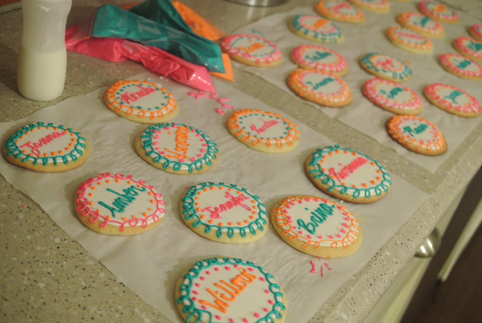
The talks were all great. Kristin makes me want to be a podcaster, but only if she does all the behind the scenes work. Maybe I'll just stick to being a guest on HER podcast.
Jenna's social media talk convinced me to join Twitter, which I really didn't think would EVER happen. But she is THAT good.
Micaela gave us all a beautiful reminder that Catholic blogging isn't about the numbers. And Andrea and Jenny shared their touching stories of how blogs and social media helped bring them into the Catholic Church.
Jiza took a whole bunch of very lovely photos of the weekend.
A few of the attendees have written up some fabulous posts all about it. Check 'em out!

1. Micaela at California to Korea . . .
CWBN // CA: The redux plus all the feels
I wanted to post this on Saturday evening. My arms ached from holding a fussy baby, my feet were on fire from standing all day, and I was about to pass out from exhaustion, but my heart was full to bursting with joy. I was dying to type it out. Alas, there were casseroles to be made for Sunday, so I cooked instead. Then last night I fell asleep putting the boys to bed and never really made it back to consciousness. Post I will tonight, however, come waking baby or dirty dishes. You WILL read about how wonderful this weekend was, because if there is any way you can get yourself some of that community goodness, I highly encourage you to do so.
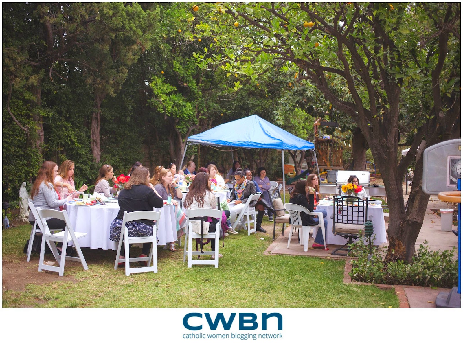
2. Laura Rose at Roses for MommyCatholic + Women + Bloggers + Community = CWBNCA 2015
The long and short is that I came away with blogging tips and tricks, yes, but even more than that, I came away with a true sense of community and support. I came home ready to say YES to the Holy Spirit in a bigger way in my life. I came home asking God how I could serve Him better. I came home seeking to grow more in holiness, and support these incredible women and others in their walks as well. I came home filled to overflowing.
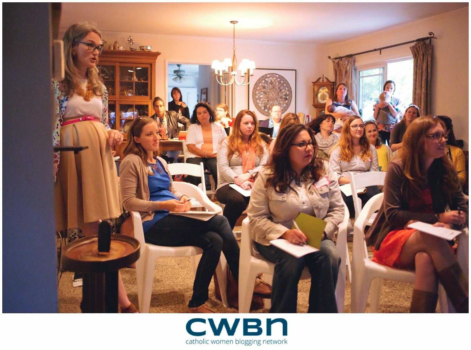
3. Bobbi at Revolution of Love Blog
CWBNCA Conference 2015: Journal & Recap
There was a directory of participants (smart!), a beautiful print from Blessed Is She and a pretty notebook to take notes. As I walked around, it was the oddest sensation to see faces I recognized and to have people come up and hug me and say they felt like they already know me. I am big on family and sisterhood and the level of sisterhood at the event was incredible. I never felt so comfortable with a group of Catholic women in all my life. Even with the ones, I did not know well, there was already an instant connection.
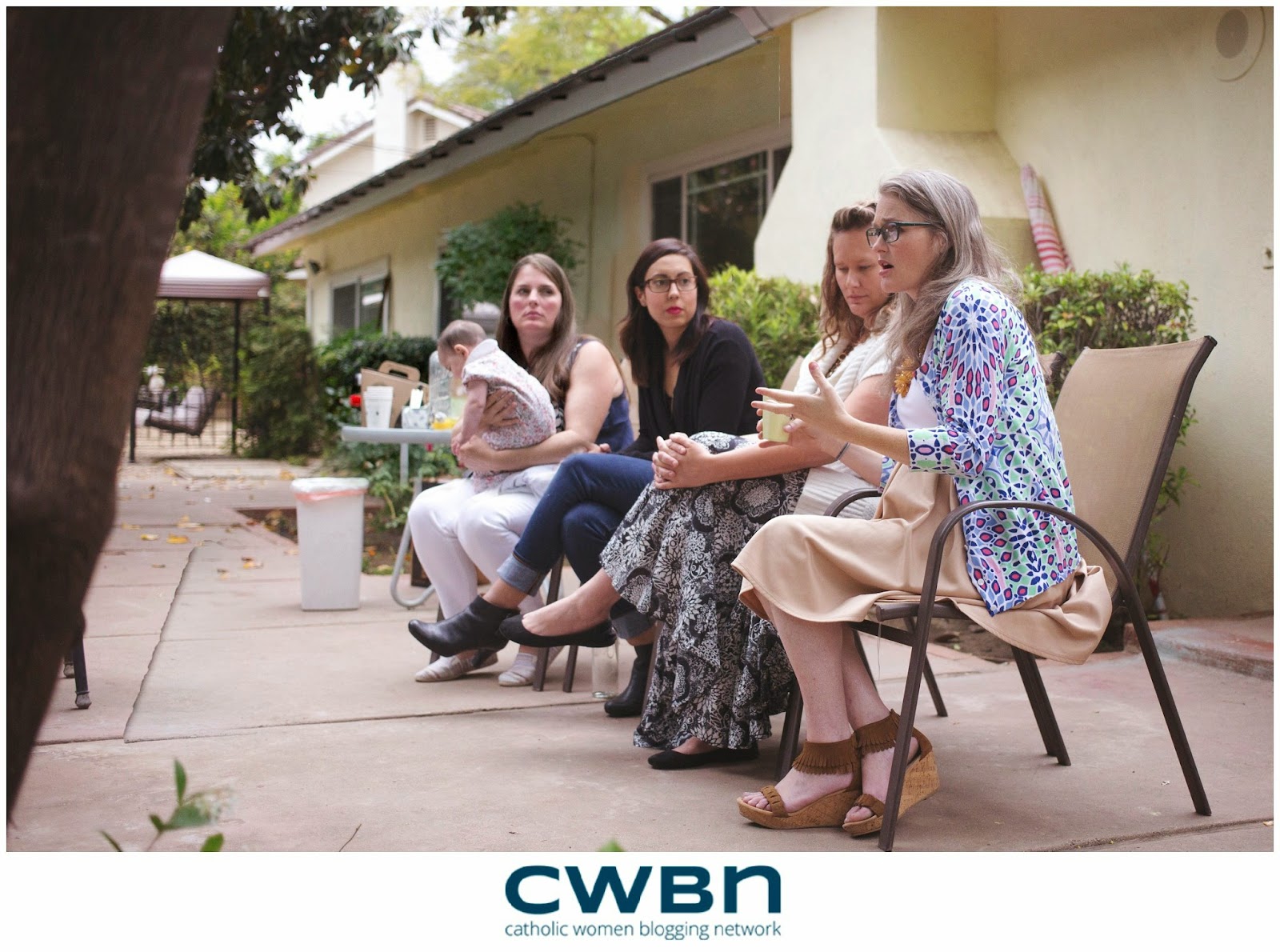
4. Ronni at The Screenwriter's Wife
What April 2015 Did to My Blog. And How I’m Better Off For It.
On 4/2/15, my post about living in a small house was featured on a large blog that I frequent. As a result, I had 16,485 hits in a single day. Sixteen THOUSAND. It was totally surreal, but kind of awesome. I know that in the grand scheme of things it’s nothing to get excited about and large blogs wouldn’t blink an eye at those numbers, but for me it was pretty freaking exciting. My 15 minutes of blogger fame. On 4/25/15, I attended a small local women’s blogging conference being put on my some bloggers I’d recently begun reading. The timing of things, y’all. The timing. Sometimes, things have a way of working out so fittingly that it just makes you wonder.
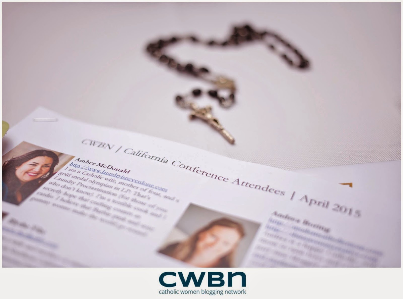
5. Amber at Laundry is Never Done
Walking with Mary through my fears… right to the CWBN Conference!
I tell you about this prayer not to say, "Hey look at me! I'm so humble cuz I'm prayin'!" QUITE the opposite!!! I struggle immensely. But what I am reminded of is God's desire for us to share our struggles and help each other carry our crosses. I tell you about this prayer because The Litany of Humility is life-changing. It has changed my life, is changing my life and I pray that it continues to change my life. The more I have said this prayer the more I noticed how it directly correlates to all of the things (i.e. situations/people/relationships) that I struggle with the most. *Disclaimer: please know that the more one says this prayer the more, ahem, opportunities arise to grow in humility. Some days haven't been pretty. Yeah . . . back to that painful but necessary stuff. Somewhere in the middle of all the things going on in my life I heard about the Catholic Women’s Blogging Network California Conference.
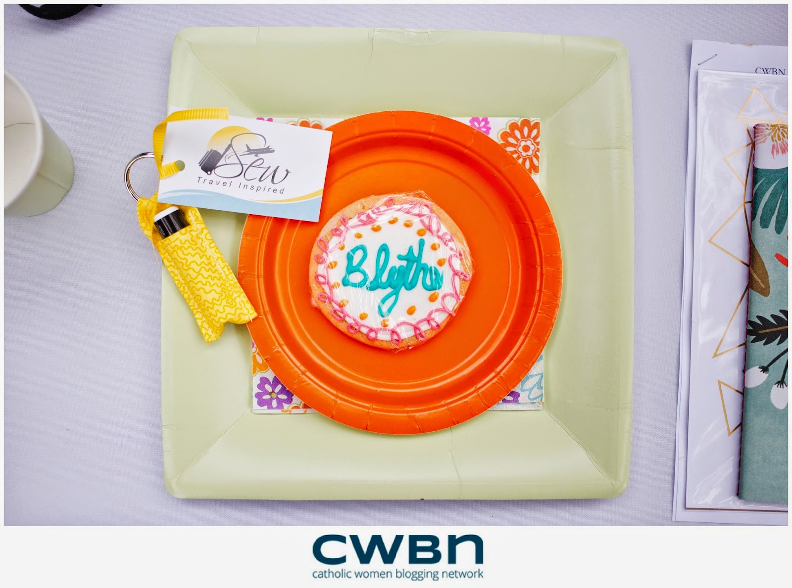
6. Mary at Sew Travel Inspired
A Day of Inspiration and Learning
I spent today attending a Catholic Women’s Blogging Network blogging conference and I must say, my head is spinning with everything that I've learned. I am a cradle Catholic and probably the least overtly Catholic women there. There were about 35 amazing women present. Many of them were converts to Catholicism and they were all passionate and verbal about their passion. I was also the oldest. I refused to let these things make me feel uncomfortable. I had the best time and learned so much.

7. Jiza at Olive & Cyprus
Choosing Impact Over ‘Likes': A Re-Cap on Catholic Women Blogging Network
I remember the day I lost 6 followers on Instagram. Social media is such a little thing in the grand scheme of life, but for me that week, I took it hard. Initially from a small business standpoint, I questioned where I was lacking in “marketing to potential clients”. I became bitter and harsh on myself. I started comparing myself to other creatives. The pride. The self-loathing. The envy. The negative train wreck bombarded me all at once. After a few days, I finally stopped myself and invited grace to enter & speak to my heart.
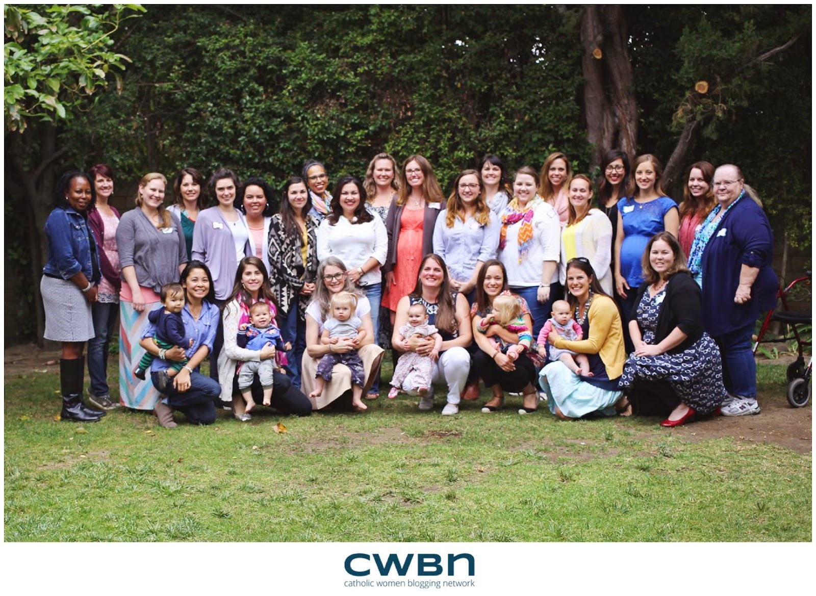
Linking Up with my pal Kelly at This Ain't the Lyceum for 7 Quick Takes!
May 6, 2015
In Case I Get Arrested Today . . .

This article is the scariest thing I've read in a long time. A zombie apocalypse has nothing on "good" Samaritans hell-bent on protecting children from the reasoned decisions of their parents.
“What a horrible mother:” How a call from a “good samaritan” derailed these mothers’ livesReally, you should head over and read it, but if you are a parent who enjoys making informed parenting decisions based on your particular circumstances at that moment, it will ruin your day.
As a mother, I spend the majority of my time assessing situations. All day long . . . I decide if giving my kids a snack now will ruin their dinner. If letting them decide not to bring a coat will be a good lesson in natural consequences, or a genuine inconvenience or risk. If leaving them in the car for a few minutes is actually safer than having them walk across the parking lot with me.
And that last one, as it turns out, is the game changer. Because that article is the story of three women who determined that, in their particular circumstance, their children could be safely left in the car for a few moments, but ended up facing serious and lasting legal repercussions because of it.
The stories are horrifying. And the experiences of these women is actually worse than my worst fears. I always figured, hey, someone might call the police on me someday. I would explain why my children were not in danger and that I had actually made an informed parenting decision based on my particular circumstances. I would make a point of being polite and respectful even though I was mad, and the policeman would be reasonable. Or, worse, the prosecutor would be reasonable. Or at the very least, worst case scenario, I'd have to go to court and the judge would be reasonable. It seems like that did not happen in any of these cases.
I'm still not going to make what I believe are bad parenting decisions because of bad laws and bad samaritans. I won't be bullied. But it is deeply, deeply scary. And it could absolutely happen to me.
We live in this bizarro world of perfect connectedness and complete anonymity where some people would happily call the police before asking a question or offering to help. A world where expectant mothers can choose to kill their unborn babies, but are vilified for having a glass of wine or a ham sandwich.
We live in a world where people are so disconnected from the facts that they honestly believe that a nine year old child walking to the park will probably get kidnapped by a stranger and that a two year old asleep in a car will immediately die if his mother walks more than five feet away. Maybe it's ten feet. But he will die. For sure.
I understand that these laws and policies have been made in response to very real tragedies. But arresting reasonable parents who have made reasonable parenting decisions appropriate to their particular circumstances isn't going to save all children from accidental death.
My child could be killed because I left him home. Or he could be killed because I brought him with me in the car. My child could be killed because I left him inside the car. Or he could be killed walking across the parking lot at my side. There is not a law that can guarantee that my child will be safe. It is unsettling, but true. And no one is better suited to make decisions for the safety of a child in a particular situation than his parent.
These laws and the people who enforce them are deeply misguided, and the way they undermine a parent's ability to make decisions for her own child should concern everyone.
I am going to continue to be a person who makes decisions based on real life and not on one-size-fits-all laws. I am going to continue to hope that someone who worried about the safety of my children would take a moment to really assess the situation, or stand by my car to keep an eye on my kids until I got back, then leave with a smile, or come search me out and gently express concern (although this one would certainly be my least favorite in practice, I would take it).
I am going to continue to hope that my fellow citizens and those in positions of civil authority would make reasonable decisions based on the facts of a particular case.
And I'm going to figure that if I get arrested, you guys will have my back, and maybe bring my family some meals.
You might enjoy these other times I have poked the internet with a stick:
There's Not a Rule Book for This JobHey America, Pregnancy: You're Doing it Wrong
Kendra Tierney's Blog

- Kendra Tierney's profile
- 42 followers
Kendra Tierney isn't a Goodreads Author
(yet),
but they
do have a blog,
so here are some recent posts imported from
their feed.

