
Stacia Misner's Blog, page 3
February 9, 2018
Using Parameters in an R Script for a Power BI Query
In my last post, I described a problem I had working with an R script in Power BI for which the cause was not obvious (at least to me). In this post, I want to share with you what I was doing with R in the first place that led me to that particular problem.
Nothing particularly earth-shattering. As part of my latest Pluralsight course, I was preparing a demo to show how you can use R in Power BI. One way is to use an R script to get data into Power BI for analysis and another way is to use it to generate a visualization.
For my demo in the course, I used National Oceanic and Atmospheric Administration (NOAA) data to compare average afternoon temperatures by month for two different years and created a script to grab the necessary data by using the rnoaa package.
For the Pluralsight course, the R script uses hard-coded values for the location (which happens to be my home town, Las Vegas) and time period. If I want to view data for a different place or different years, I need to modify the R script.
It’s not difficult, but the cool thing about Power BI is that I can use parameters to dynamically change the report visualization without opening up the script. To do this:
Open the Query Editor in Power BI
Click Manage Parameters, and then click New Parameter.
Set the parameter properties – Name, Type, and Current Value.The Name is how I will reference the parameter my R script, the Type is the data type, and Current Value is the initial value that I want to set (if any).
I set up 3 parameters as follows:
Name
Type
Current Value
Station
Text
724846
WBAN
Text
53123
Years
Text
“2016”, “2017”
Here’s the Parameters dialog box showing all 3 parameters, with the details for Station.

And here’s the Years parameter, which includes a description:

Parameters can be used in many different ways in Power BI – to change a data source or change filter values or even replace values in a query based on parameter. You can also reference query parameters in DAX expressions and you can use query parameters in report filters. In this case, I’m going to plug the parameter values into the R script. The easiest way to do this is to open the Advanced Editor and replace the hard-coded values with parameter names.
Here’s the beginning of the script as it appears in the Advance Editor:
let
Source = R.Execute(“library(“”rnoaa””)#(lf)#(lf)station
Notice in the R.Execute function that the R script is just a big long string with new lines appearing as #(lf). To use the parameters, I simply need to concatenate the script and the parameters together, as shown below. (I’ve used bold font to show the changes I made.)
let
Source = R.Execute(“library(“”rnoaa””)#(lf)#(lf)station ” & Station & ““”)#(lf)wban “& WBAN & ““”)#(lf)years & Years & “)…
Now when I close the editor and view the report, everything works just as if I had hard-coded the values in the script. But now the fun part. To change the values, I click Edit Queries on the ribbon and then click Edit Parameters to open the dialog box shown below in which I can now type in new values. The parameter for which I added a description has a little symbol next to it that displays the description when I hover the cursor over the symbol.

This is all well and good, as long as I know the station and WBAN values that I want to use. I have a document I downloaded from the NOAA site to look them up, but I could set up other R scripts to get the full list of possible values from which I could choose. That will be another post!


February 2, 2018
Power BI: R Home Directory vs Library Trees
Although I’ve been writing the last few weeks about Power BI, the rest of my time during the last month has been focused on wrapping up my latest course for Pluralsight, “Getting Started with R in the Microsoft Data Platform,” which will hopefully release later this month.
The final module of this course, however, covers working with R in Power BI, so I have had a lot of Power BI on the brain lately, plus a couple of client projects for good measure!
Because this latest Pluralsight production is a “Getting Started” style of course, I can’t cover absolutely everything there is to know about Power BI and R. Just the basics, but enough to get you started. But I wanted to explore a capability in some more detail, so I thought I’d add a little bonus material for the course as one or more blog posts.
What’s the problem?
As I was putting together an example of using an R script as a Power BI data source, I ran into some issues on my development machine that was frankly driving me crazy. When I tried to run the query in Power BI with my R script (that ran successfully in the IDE, by the way), I kept getting this message:
DataSource.Error: ADO.NET: R script error.
Error in loadNamespace(i, c(lib.loc, .libPaths()), versionCheck = vI[[i]]) :
namespace 'scales' 0.3.0 is being loaded, but >= 0.4.1 is required
Error: package or namespace load failed for 'rnoaa'
Execution halted
How to troubleshoot?
I had correctly set my R home directory in the Options dialog box.

I uninstalled and reinstalled the scales package to get a newer version. I tried to install from a different repository. No change.
I confirmed that I had installed the correct version of the scales package on which my R script indirectly relied:

Then I decided to try a super simple R script in Power BI to see exactly what library path Power was using:

Note carefully the R home directory displayed at the bottom of the dialog box: c:\program files\microsoft\r_client\r_server. Unsurprising, really, as this is what I configured in the R Scripting options.
And yet – look here! A clue!

So I resolved my problem by adding in a line at the top of my script:
.libPaths(.libPaths()[3])
Problem solved!
You might need a different index in your environment, but the key here is to specifically set the path you want Power BI to use explicitly.
The moral of the story is that despite the home directory setting, the default libPaths value might not be what you expect and affects whether your R script can execute. Maybe I’m unusual because I have a variety of environments on my computer, for a variety of reasons, but hopefully this little tidbit is useful to someone!
January 25, 2018
Crushing Your Goals with Power BI: Visualizing Progress
Now that I have data both for my goals and for my subsequent goal-related activity as described in my first post in this series, and I have added calculations to quantify my progress as I described in my previous post, I’m ready to start visualizing that progress, which is where Power BI really shines.
For visualizing my goal progress, I want to use visualizations that either show me over time by day whether I’m hitting my target or whether cumulatively I’m above or below my goal for a point in time. In this post, I’m going to use three styles of Power BI visualizations to achieve the “at a glance” assessment of my goal progress that I want: a line and column chart, a KPI, and a clustered column chart.
Line and clustered column chart
While most of my goals are tasks I want to perform x number of times in a week or quarter, my Move goal is daily. For this reason, I want to visualize my daily result to see whether I’m actually hitting my goal on a daily basis.
A line and column chart is a good way to see this information. I can have the days display along the horizontal (or x-) axis and use columns to represent the number of calories I expended on that day, as measured by the Actual value in my data model. I can then use a line superimposed on the same chart to represent the target value.
To set up the chart, I perform the following steps:
Anywhere on the report page in Power BI, I click an empty area just to make sure I don’t have something already selected and then I select the fields that I want to use in my chart: Date (from the Date table), Actual (from the Actual table) and Target (from the Target table).
Power BI assumes that I want to compare Actual and Target side by side and creates a clustered column chart.
It also assumes that I want to drill from year to quarter to month to day and sets up a hierarchy for the horizontal axis, which I can see in the visualization pane.
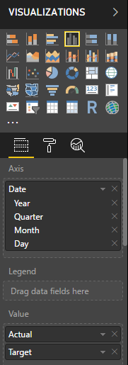
I can click the arrow button in the top left corner of the visualization. This lets me drill down to individual dates, but a faster way to get what I want is to fix the Axis definition in the Visualizations pane, just like I did in my last post– clicking the arrow to the right of Date in the Values well in the Visualizations pane, and then selecting Date.
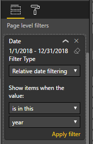
Now my chart is super messy because it’s showing target values from January 1, 2018 to December 31, 2018. I can place a filter on the page to restrict the dates to a range from January 1, 2018 to today.
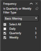
Scrolling down the Visualizations pane, I can locate the Page Level Filters section and drag the Date field from the Fields pane into the box labeled Drag Data Fields Here. In the drop down list I’ll switch from Basic Filtering to Relative Date Filtering and then set a range.
Because I’ll be looking at this report throughout the year and don’t want to change this filter all the time, I’ll set the filter to “is in this year”. I need to click Apply Filter for the change to update the chart.
Next I don’t need to see the target value repeated as a column next to each actual value. Instead, I can use a line to give me a benchmark against which I can compare the actual value. So I’ll select the Line and Clustered Column Chart in the Visualizations pane.
I need to be sure that the chart I’m fixing is already selected (I can tell by the border around it) before I change the visualization type, or else I’ll create a separate new chart. If that happens, I click the ellipsis (…) in the top right corner of the visualization and select Remove to get rid of it.
My next step is to move the target value from the Column Values well to the Line Values well.
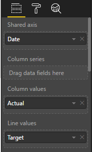
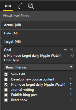
And then I need to apply a visual level filter because this data is for all my goals, and I only want to display the data for my Move goal. To fix this, I drag the Goal field from the Target table and drop it below Target in the Visual Level Filters section of the Visualization pane. Then I select the goal I want to focus on, Hit move target daily (Apple Watch).
One last little step to make it clear which goal I’m looking at here. In the Visualization pane, just below the visualizations to select, I can go to the formatting for this visualization by clicking the little Paintroller icon. (I still need to be sure to have my visualization selected.)
When I expand the Title section, I can modify the Title text to Move. I also have the option to get fancy by changing colors, alignment, text size, and font family, but I’m just aiming for simple changes today! There are a lot of other formatting changes that are possible to make here.

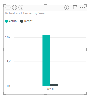
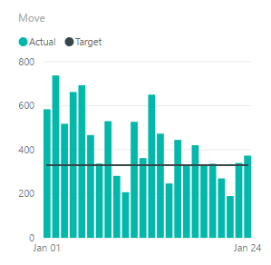
Tada, I can see how I’m doing, and um… apparently, I’ve been trending downward the last couple of weeks as compared to the first week of January, and missed my goal a few times. But at least not MOST of the time. (I’ve been busy recording a new Pluralsight course – that’s my excuse and I’m sticking to it!)
KPI
Another interesting way to look at goal tracking for a goal in which time is an important element, such as my daily Move goal, is to use a KPI visualization.
Just as many businesses use KPIs, which is an abbreviation for key performance indicators, I can use a KPI to see my current metric value, as of the last date for which I have collected data. In Power BI, not only can I see this value, but I can also see how it compares to the target at a glance, through the use of color. Red is bad and green is good, by default, but I can use the formatting options to change this. And I can see how the value trends over time, much like my current line and clustered column chart does.
To create my KPI visualization:
Click an empty spot in my report to clear any existing selections and then click the KPI visualization in the Visualizations pane.
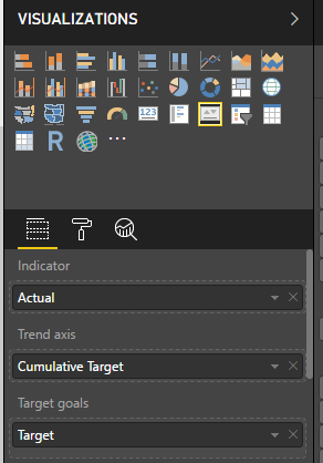
I’ll add fields to each well for the KPI. Actual goes into the Indicator well, Cumulative Target goes into the Trend Axis well, and Target goes into the Target Goals well.
And to finish off, I’ll change the title on this visualization to Move, just as I did in the previous example.
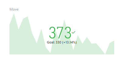
The final visualization shows the Indicator as a color-coded value for the latest date in my source data. Because this value is above my goal, the target value shown in smaller text below the indicator, the indicator value is green. Next to the goal value, I can also see a percentage of how far above my goal the current value is. Yay, me!
In the background, I can see an area chart that plots how my actual value compares to my cumulative target. It looks a lot like the columns in the first chart I created. I don’t see axis labels here because the idea is to show direction and not precision. If the current indicator were below my daily goal, this area chart would display in red.
Clustered column chart
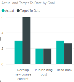
With the exception of journal-writing, the remaining goals are not daily goals, so I only want to see how actual compares to my target to date at this point in time.
A clustered column chart allows me to do this comparison easily:
I click a new spot in my report and click the Clustered Column chart in the Visualization pane.
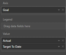
I then add fields to the Value well, Actual and Target To Date, and then drag Goal from the Target table to the Axis well.
I need to filter goals here because the Move goal is so high relative to the others that I can’t see my progress and I already have two other visualizations dedicated to that goal. When I scroll down to Visual Level Filters, I select the Select All check box and then clear the Hit Move Target Daily (Apple Watch) check box.
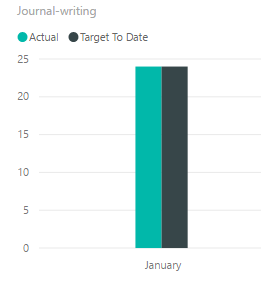
Journal writing is a daily goal and its cumulative value is high relative to the other goals. I think it would probably look better if I made a separate visualization for it, so I’ll clear its check box also.
With regard to my journal-writing goal, I think monitoring my goal on a monthly basis is satisfactory. Daily doesn’t really help as either I did or didn’t. It’s not like the Move goal which has an Actual value that varies by day. Again, a clustered column chart works here.
I can short-cut the process by copying my existing clustered column chart and pasting it to another area on the page. I just click the chart to select it, click Copy on the Home tab of the ribbon, click Paste on the ribbon, and drag the new chart to a clear spot on the page.
Then I can adjust the Visual Level Filter by clicking Select All to clear all the check boxes, and then clicking Journal-writing.
Now I want to put Date on the Axis. The date hierarchy appears again but I want Month this time so I’ll click the X next to Year, Quarter, and Day, respectively, to leave only Month.
Next I remove the Goal field from the chart by clicking the x to the right of Goal in the Axis field.
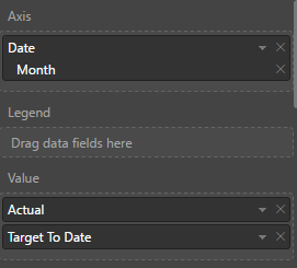
Last step is to adjust the title in the formatting options.
As more months get added, I’ll be able to see whether I’m keeping up with my journal-writing goal. So far, so good. (Of all the things I do in a day, that’s probably the easiest!)
With these four visualizations, I have a good perspective of my progress on each goal. I can rearrange the visualizations and resize them on the page to suit my taste, and then all I have to do from now on is keep my data up-to-date in Excel, and then open Power BI Desktop and click Refresh.
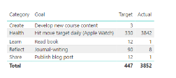
I’m doing ok on most of my goals, except for new course content. That course isn’t due until April, so I’ve got some time to make up for it, but I don’t want to lag too far behind my target. Next week I’ll start catching up!
On the other hand, I’m slightly ahead on reading. I’ve been finding pockets of time waiting on something (or someone), and I can use that time effectively by popping into my Kindle app and reading until my wait is over. Unfortunately, content creation is not as compatible with these random pockets of time.
Hopefully, you’ve learned something about Power BI by following along with me on this journey and are inspired to go crush your own goals, business or personal, this year!
January 15, 2018
Crushing Your Goals with Power BI: Measuring Progress
In my previous post in this series, I explained how to capture and load goals data into Power BI and produced a very simple report that compares actual to target values for individual goals. But already I know there are a couple of problems with it.
Understanding the problems
First, the actual data represents the accumulation of data by day from the beginning of the year, whereas the target data represents the final tally at the end of a defined period. Each goal has a different frequency: daily, quarterly, and weekly. Currently, the comparison between actual and target data makes it appear that I’m falling way short of my goals. However, even if I were making solid progress on my goals on a daily basis, the comparison of the two values will never meet until the end of the defined period for any given goal. I need a way to prorate the target data so that I can more reasonably measure my progress.
Second, displaying the actual and target values in a table requires me to do mental math to determine how close (or not) I am to achieving my goals. Now, I’m pretty good at mental math, but a better way to see progress is to use data visualizations. I’m sure you’ve heard the saying… A picture is worth a thousand words.
Solving the problems
Power BI makes it very easy for me to solve both of these problems! In this post, I’ll focus primarily on the calculations. In next week’s post, I’ll start working with the data visualizations.
The addition of the necessary calculation to the model requires several steps:
Creating a date table. This step is necessary because I’ll be using some functions that understand how to work with dates and I need a complete set of dates to work with. My Actual table may or may not include dates for every day of the year, so I need to make a table dedicated to dates.
Creating some new columns in the Actual and Target tables. A column is a calculation which gets evaluated row by row and adds data to the table just as if it had existed in the original source.
Creating a new measure in the table. By contrast, a measure is calculated when you use it in a table or some other visualization.
These steps will make more sense when you see how I create and use these objects. In each case, I’ll be creating these objects by using a formula language called DAX, which stands for Data Analysis Expression language. I can’t teach you everything you need to know about DAX in a single article, so I’ll just provide the formulas I use (including links to the official explanation) and explain a bit about each one.
Creating a date table
This step is super easy. On the Modeling tab of the ribbon, I use the New Table command.

A new table appears in the Fields list and the formula bar is waiting for me to provide a name and a formula for it. (By the way, I refreshed my report which now includes two weeks of data, so now I have new values in the Actual column.)

In the formula bar, I need to type the following formula:
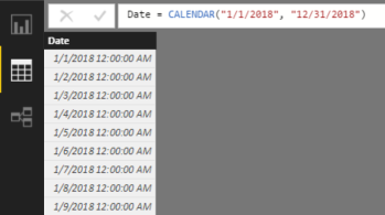
Date = CALENDAR(“1/1/2018”, “12/31/2018”)
The CALENDAR function takes a start date and an end date to use for building out a table of dates. For now, I’ll work with a single year, but I can easily change this next year.
After pressing enter to save the formula, I’ll go to the Data view by clicking the middle icon in the navigation panel on the left side of the screen. Then I click the Date table in the Fields list on the right to view the table created by the Calendar function.
Right now, the date values in the table display using both date and time. I’d rather just see dates. To fix this, I can click on the Date column, click the Format drop-down list in the middle of the ribbon, point to Date/Time, and select 3/14/2001 (m/d/yyyy) to adjust the formatting.
I also want to create a relationship between the Date table and the Actual so that I can apply filters to these tables by Date and to perform date calculations correctly. I explained how to set up relationships in my previous post.
On the ribbon, I click the Manage Relationships button. Then I perform this series of steps:
Click New in the Create Relationship dialog box.
Select Date in the first drop-down list.
Select the Date column.
Select Target in the second drop-down list.
Select the Due Date column.
Click OK.
Click Close.

Creating new columns
Next, I need a column to produce a value that I can use to prorate by day, week, or quarter. Specifically, I need to divide the target value by the number of days for the time period referenced in the Frequency column. To create it, I’ll use the New Column command in the ribbon.

This command allows me to add a calculation that prorates my target value according to the designated frequency:
Before I click the button for the command, I click the Target table in the Fields list on the right so that my new column gets added to this group of fields.
When I click the button, a new generic column appears in the Fields list and the formula bar is waiting for me to provide a name and a formula for it.

Here is what I type into the formula bar:
Daily Target = SWITCH([Frequency], “Daily”, [Target], “Weekly”, [Target] / 7, “Quarterly”, [Target] / 90)
When I press Enter, the new column appears in the Target table with a name of Daily Target. In addition, the expression is evaluated row by row and stored in the Power BI data model, just as if I had imported it in from my source Excel spreadsheet. This means also that Power BI requires more memory from your computer to store this value when you have the file open. Not a big deal for a small amount of data like this, but something to consider when creating Power BI files with millions of rows of data in a table.
To interpret the SWITCH function, Power BI looks at the first argument, [Frequency], and then uses its value to determine what value to store in the column”
The pair of arguments, “Daily” and [Target], are used to compare with the value of [Frequency] in a given row. If it is “Daily”, then the value found in the [Target] column on the same row is stored in the [Daily Target] column.
The next two arguments, “Weekly” and [Target] / 7, are used similarly, except that the [Target] value is divided by 7 to turn a weekly goal into a daily goal value.
Last, the “Quarterly” and [Target] / 90 results in a daily goal value for a quarterly value in the [Target] column.
Next, I need a cumulative target value for some of my goals. As an example, consider the goals that are not daily, such as Publish Blog Post or Read Book. When I’m tracking my progress towards these goals, I want to compare how many times I did the task to the number of times I expected to do the task between the beginning of the year and the time I last did the task.
That is, I need to translate my quarterly goal of 12 posts to a daily goal and then multiply that by the number of days from January 1 to today (January 15). That means my target at January 15 is 1.95, calculated by multiplying .13 (the daily goal) by 15 (the number of days since January 1).
I want this calculation in my Actual table, so I click that table in the Fields list, and then click New Column in the ribbon, and type the following formula in to the new column’s formula bar:
Cumulative Target = SUMX(DATESBETWEEN(‘Date'[Date], “1/1/2018”, ‘Actual'[Finish Date]), RELATED(‘Target'[Daily Target]))
This is more advanced DAX than the previous calculation. Let me break it down for you. The first argument of the SUMX function is DATESBETWEEN(‘Date'[Date], “1/1/2018”, ‘Actual'[Finish Date]). This expression looks at the Date table and creates a mini-table in which the first row is January 1, 2018 and the last date is whatever the Finish Date is for the current row.
Remember that column expressions get evaluated row by row. So in row 1 of the Actual table, the [Finish Date] is January 1, 2018, so the mini-table has only 1 row containing January 1, 2018.
The second argument of the SUMX function is RELATED(‘Target'[Daily Target]). This is evaluated by “traveling” along the relationship between the Actual table and the Target table, which is the reason I created a relationship as described in my last post. Power BI looks at the common column between the two tables—Goal, in this case. And then it finds the [Daily Target] column value for the matching row in the Target table.
In other words, in row 1 of the Actual table, the Goal is Journal-writing. Power BI finds the corresponding row in the Target column, and returns the [Daily Target] value, 1.
Now Power BI evaluates the SUMX function itself. The way to think about this is to say to yourself – for each row in the first argument (the mini-table of dates) – what is the Daily Target? Once it gets this value for each row in the table, it adds together (sums) these values.
Now wait a minute, the Date table is not related to the Target table, so how does this work? Admittedly, this looks confusing, but remember where the calculation occurs… inside the Actual table, row by row. There’s a technical term for this—row context.
The row context of row 1 is Journal-writing, and this is the context that applies when the RELATED function is evaluated. There is only one date between January 1 and the Finish Date in row 1, so the sum of one Daily Target here is… 1.
Then for row 2, there are two dates in the mini-table, January 1 and January 2. Therefore, the Daily Targets are 1 and 1 respectively, which sum as 2, and so on.
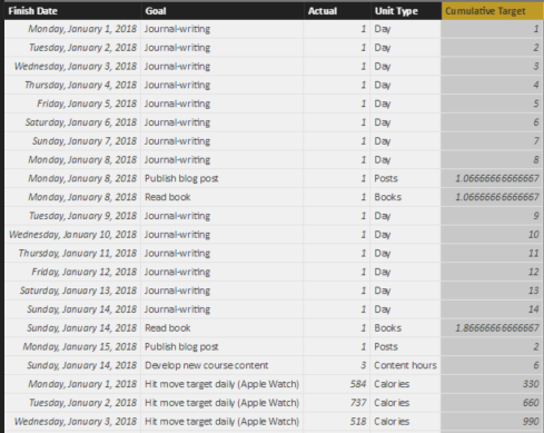
I can go back to my Report view (by clicking the first icon on the left side of the screen) and select the existing table. I do this by clicking anywhere in the screen real estate that “belongs” to the table, and I can tell it’s selected by the rectangle that appears around the table. Then I can select the Cumulative Target and Date check boxes to add the column to the table, as shown below.

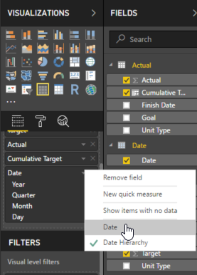
Power BI recognizes the Date column as a date data type, so it breaks out the date into Year, Quarter, Month, and Day, which I don’t find particularly helpful for this table. I can change this by clicking the arrow to the right of Date in the Values well in the Visualizations pane, and then selecting Date, as shown below.
The table shows individual dates now. However, in its current form, it still doesn’t show data the way that I would like.
Some goals are daily goals, so comparing Actual to Daily Target is fine. But I want a separate table for the goals that aren’t daily. I can make a copy of the current table and paste it into the same page so that I can use the tables as starting points for more meaningful visualizations. To do this, I make sure the table is selected, click Copy (on the Home tab of the ribbon), and then click Paste in the ribbon.
A second table displays in the report, but it might be hard to tell that there are two because one is right on top of the other. I can drag the new table by placing my mouse on the two lines above the table and, while holding down my left mouse button, dragging the table to a clear spot in the report as shown below.

I can now apply a filter to the bottom table (the one currently selected) to display only goals that are not daily goals. I do this by dragging Frequency from the Target table to the Filters list in the Visualization page, as shown here.
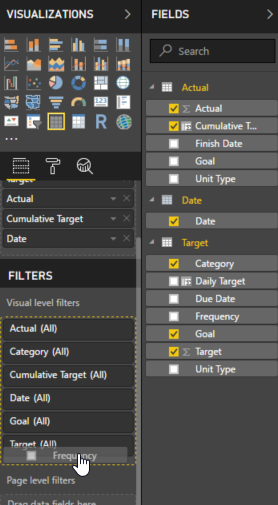
Then I select the Weekly and Quarterly check boxes, as shown here, to apply a filter to the selected table.
Next, I select the top table, add the Frequency filter to the visualization as I did above, but this time I select the Daily check box. Then I click the X next to Cumulative Target in the Values well for this table to remove the field from the table, because I don’t need it for my daily goals. I simply want to compare each day’s actual value to the daily target, and that’s it.
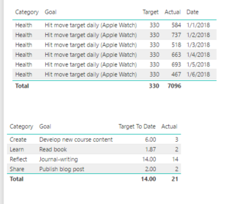
I want the bottom table to show only the Cumulative Target and Actual values without dates. This time, I click the X next to Date and Target in the Values well to remove the fields. My report now looks like this:

Notice the scrollbar to the right of the top table. That means there are more rows to display, but Power BI is honoring the boundaries of the table on the report. Otherwise, it would overlap the bottom table.
Hmm, something is little funky there with Journal-writing because the cumulative target is 105 and that’s not right. It’s taking the sum of the individual Cumulative Target values for each date – 1 for January 1, 2 for January 2, 3 for January 3, and so on. Really what I want to see here is the last value. There’s a way to do that, but that means I need to do something new…
Creating a measure
On the ribbon, I make sure to click the Actual table in the Fields list, and then click New Measure to open up the formula bar.

The formula to use is:
Target To Date = MAX(‘Actual'[Cumulative Target])
This tells Power BI to use the highest Cumulative Target value, which will also be the last, for the current filter context. Filter context is a subject I’ll tackle another day, but suffice it to say for now that all the filters in the panel to the right as well as what you see in the visualization for a given row affect the measure calculation. It’s a little more complicated than that, but… another day.
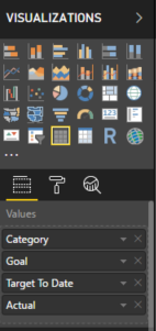
Adding a new measure is much like adding a new column, but the behavior is different. If you were to look at the data page, you won’t see a new column showing your measure values row by row. The only way to see a measure’s value is to include it in a table or other visualization. So… I’ll add the measure to the bottom table and remove the Cumulative Target field.
Now the report displays the values that I want:
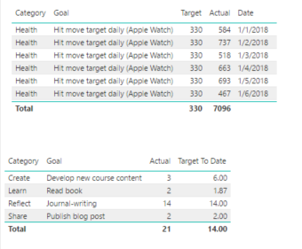
The grand totals don’t really make sense in this report, but I’m going to turn these into charts later, so I’ll ignore those for now. But the inconsistency in layout is bothering me with Target first in the top table and second in the bottom table. I’ll fix that by clicking the bottom table, and then dragging the Target To Date field above the Actual field in the Values well, like this:
Success!
In my next post, I’ll explore different ways to show this data.
In general, as I review my goals, I can see I’m mostly on track for the first two weeks of January, except for the Develop New Course Content. I better get cracking…
January 8, 2018
Crushing Your Goals with Power BI: Getting Started
It’s that time of year when (almost) everyone around you is talking about New Year’s Resolutions, goal-setting, vision boards, new beginnings, bucket lists… well, you get the idea. Any time of year is a good time to reflect on where you want to go and how you want to get there, but goal-setting at the start of a new year has been a tradition for centuries.
According to a 2017 study by Statistic Brain Research Institute, almost as many Americans usually make New Year’s Resolutions as those who absolutely never do, and only 9% of resolution-makers felt successful.

There are lots of reasons why people succeed or fail at achieving their goals. Edwin Locke, a psychologist whose research established modern goal-setting theory in the late 1960s, identified feedback as one vital component to success. Fifty years later, his theories are still highly regarded.
As I was thinking about this relationship between goals and feedback, I thought Microsoft Power BI would be a great tracking tool. It’s free, so use it! In years past, I used spreadsheets or checklists in journals or OneNote, any of which is a fine way to accumulate a comprehensive list of all that a person wants to do. However, I never measured progress, thereby denying myself feedback. Consequently, I’d let myself get sidetracked during the year.
This year I promised myself I’d try a different approach and thought I’d share the process with you through a series of blog posts. Although I’m going to discuss goal-tracking from a personal point of view, you can also use the same techniques for your business-oriented goals. Either way, I hope you learn something about Power BI along the way and are inspired to do some goal-setting of your own.
Defining targets
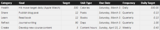
There is no shortage of information on the Internet to help you determine your goals. That’s not my area of expertise, so I’ll leave you to figure that part out on your own. Regardless of which method you use, it’s important that each goal has a measurable component and a deadline.
Here’s an example of some goals that I set for the first part of 2018. I am using Excel in this case, but I could have set this up in Google Sheets. In that case, I would need to download the result as an XLSX file to use it with Power BI. Or I could have created a simple text file and used commas to separate each column. (Or I could use Access if I wanted to drive my data professional friends crazy.) Whatever keeps the process simple and easy.

As I thought about my targets, I decided I wanted to have categories for my goals because eventually I could expand this structure and add more goals per category. Furthermore, I might want to compare my progress across categories in the future. I also identified a frequency for each goal to differentiate between those I would track daily, weekly, or quarterly. I’ll use the frequency to create a calculation to measure my progress cumulatively over time. (I’ll describe how to do that in a future post.)
Capturing goal-related activity
With most of my goals, I don’t have a formal data source that I connect to Power BI to keep my data up-to-date. That is, I don’t have some fancy app for goal-tracking that I can use to automate the process of updating Power BI. Therefore, I have to create my own data source and log my data for almost everything.
For my Health goal, I can use the Health app on my iPhone to see the data captured by my Apple Watch. There’s probably more than one way to get this data out without copying it manually, but I want to keep this process simple. I found a way to export Apple Health data without writing code by using the QS Access app for iPhone.
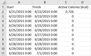
Before committing to a structure for tracking my activity for all goals, I downloaded my Active Calories data by day to see what I could use as a starting point. (I saved it to a Dropbox folder, but I have other options available such as emailing it to myself.) As you can see below, it’s pretty basic (and apparently I didn’t move at all for a while in June 2015 – I think I ditched the watch while I was recovering from SQLCruise in the Mediterranean… and a honeymoon). This data contains only a start and finish date/time and the number of active calories for each day.
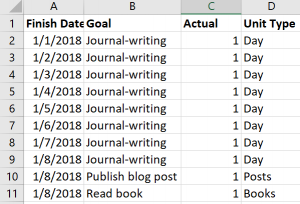
Now I need to capture the data for my other goal-related activities. In Excel, I’ll add another sheet to the workbook containing my goals data. I’ll use a Finish Date column, a column for the goal measurement (which I named Actual in this case), and a column for the Unit type, as shown below. As I complete an activity each day, I add a new row. If I didn’t do something, I don’t add it to the spreadsheet.
Importing and wrangling the data
Now I’m ready to import data into Power BI using Power BI Desktop, which is free to download. Also, my two sets of activity data don’t match exactly in terms of structure and I want to produce a single set of data for the goal activities, so I need to do some data wrangling. Fortunately, Power BI is very good at that task.
First, import the target data:
Click Get Data on the startup screen if it appears. Otherwise, click the Get Data command on the ribbon.
Either of the above options leads to the Get Data dialog box where I can select the source type. I’m using Excel so that’s the source I select. I then navigate to the folder containing my file, click Open, and then select the checkbox for the sheet containing my target values.

There’s nothing to change here, so I click the Load button.
Next, I repeat the above steps with some minor changes:
With Power BI already open, I can only use the Get Data command on the ribbon.
Then I import the data on the Actual sheet, but this time I click the Edit button instead of the Load button because I need to make some changes to the data before I use it.
Because I had entered some data on my Actual sheet before I finalized the structure, Power BI brought in some additional columns that are empty and useless to me. This might not happen to you, but if it does, it’s easy to fix:
Click the Finish Date column, hold down the Shift key, and click the last column with data (Unit Type in my case).
Right-click any of the selected columns, and then select Remove Other Columns on the context menu that displays. That way, you’re left with four columns only.
Now I can import the health data. Because I’m still in the Query Editor screen of Power BI, I choose New Source on the ribbon and then perform the following steps:
Click Text/CSV, navigate to the CSV file containing the health data, click Open, and then click OK.
I do not want the Start column in the final results, so I right-click the Start column, and select Remove.
I also do not need the Finish Date to have midnight included with the date. To fix this, I change the Data Type in the ribbon from Date/Time to Date as shown below.

Also, I don’t care about activity until 2018. Unfortunately, the QS Access app doesn’t let me filter out the unwanted dates, but Power BI does! I click the arrow that appears on the right-edge of the Finish column, click Date Filters in the context menu, click After, click “is after or equal to” in the first drop-down list, and then set the date using the calendar picker, as shown here. Then click OK.

Now I need to get my health data to look more like the Actual data from the Excel workbook. I need to add a column to hold the goal name. To do this, I click the Add Column tab on the ribbon, and then click Custom Column. In the Custom Column dialog box, I change the column name to Goal and then add an expression in the custom column formula box for static text that matches the goal name in the Target sheet, Hit move target daily (Apple Watch), as shown below. Notice I put double-quotes around the static text. Click OK when finished.

Now I need to move the column to the left to match the sequence of columns that I have for the Actual data. To do this, click the Transform tab on the ribbon, click the Move command, and select Left.
I need one more column for the Unit Type. I again click the Add Column tab on the ribbon, click Custom Column, set the column name to Unit Type, type “Calories” as the custom column formula, and click OK.
Last, I need to make the column names consistent with Actual, so I right-click the Finish column, select Rename, and then type so the column becomes Finish Date, and then I do the same to rename the Active Calories (kcal) column as Actual, as shown below. (I exported the data before the end of the day on January 7, so I really did hit my goal… for the record!)

My last data wrangling step is to combine the Actual and Health Data queries.
In the Query Editor, I click the Actual query in the Queries panel on the left side of the screen.
On the Home tab of the ribbon, I click Append Queries.
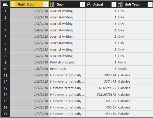
In the Append dialog box, I choose Health Data in the Table To Append drop-down list, and click OK. If the columns match up properly, both data sets appear as a single query, like this:
But… in the Actual column, some of my values are integers and some are decimal numbers, so I need to fix that and make the data type consistent across all rows by clicking the Actual column, clicking Data Type in the ribbon (on the Home tab), and selecting Decimal Number.
All the data wrangling is complete for now. I click Close & Apply on the Home tab of the ribbon to move the data from my source files into my Power BI file. That is, Power BI makes a copy of the data that it stores in the PBIX file that it creates when you use the File / Save option .
Enhancing the data model
The steps I’ve performed thus far produce a Power BI data model that becomes a source for reports, but it needs some additional work before it’s useful. When I import and wrangle the data, I use the query editing capabilities of Power BI to consolidate multiple sources, perform transformations, and combine different files into a single query. Powerful stuff!
Now I need to enhance the model to tell Power BI how the target and actual data are related, which is to say I need to define what columns they have in common. By doing so, I can compare my actual performance to the target performance by goal.
To define the relationship between Actual and Target, I click the Manage Relationships button in the ribbon. In this case, I see that there are already active relationships defined, which means Power BI automatically detected the related columns. This usually works, but not always. Having related columns with the same names in each table helps. I can check the relationship by selecting the row that has Actual as the From table and Target as the To table and then clicking Edit at the bottom of the Manage Relationships dialog box to view the relationship:

If the relationship wasn’t detected, I can select the applicable table names (which is the same thing as a query name in the Query Editor) with Actual in the top drop-down list and Target in the bottom drop-down list and select the Goal columns in each table. The cardinality should be set as many to one, which means I have many rows of data in the Actual data table that relate to a single row of data in the Target data table. In other words, I can have many rows that reference Journal-writing in the Actual table but only one row for Journal-writing in the Target table.
Close the dialog boxes.
Another enhancement is to hide the Health Data table. Because I combined that data with the Actual table, I don’t need to see it in the model view as a separate table. On the right side of the screen is the Fields list with each table listed. When I expand a table, I can see the individual fields (also known as columns) contained in each table. To hide the Health Data table, I right-click the table name and click Hide on the context menu. Done!
There are more enhancements to make by adding calculations, but that’s a topic for another blog post.
Viewing progress
Even though there’s more I can do to enhance the model, I still have enough in the current model to work with for now.
As one example, I can simply list my goals with target and actual values. To do this, I need to be in the Report view of Power BI. The Report view displays the Page 1 tab at the bottom of the report. (If you don’t see that tab, click the top-most icon in the panel along the left side of the screen.)
Then I can select fields from tables to display. From the Target table (which might need to be clicked to view and access its fields), select the following checkboxes: Category, Goal, and Target. From the Actual table, select the Actual text box. The default visualization for a report is a table, which now looks like this:
Power BI automatically sums up the Actual values for each goal. The “problem” is that my Actual value for the health goal is for a week, but the target is for a single day. I’ll explain how to handle this in my next post.
There many different ways to represent, or visualize, this data, which… you guessed it… is coming in another post. By then, hopefully you can come up with your own goal list, gather your activity data, and start monitoring your progress on your way to crushing your own 2018 goals!
When you update your spreadsheet with Actual values, which you can do as often as necessary, you do not need to repeat the steps to import the data into Power BI. Just click the Refresh button on the Home tab of the ribbon when viewing your report. Power BI reads the data directly from the source (assuming you don’t move it to a new location) and updates the data model with the latest and greatest data.
Learning more about Power BI
Although I covered several Power BI concepts in this post, I didn’t cover them in depth. If you’d like to learn more, I have a few resources for you to explore these concepts in more depth:
If you’re the type of person who likes to read product documentation, check out these topics from Microsoft:
Power BI can connect to a variety of data sources, not just spreadsheets or CSV files. In fact, the list of data sources you can use keeps growing!
Power BI also supports many different ways to wrangle data, otherwise known as the steps to transform and shape data.
Data modeling takes the wrangled data to the next step by defining calculations (which I have yet to explain) and defining relationships between tables.
The fun part is creating reports in Power BI to view your data from various perspectives. In this post, I barely scratched the surface of possibilities, but I promise there is more to come.
If you prefer to read a whole book on the topic, I can recommend these books written by my friends from Italy, Alberto Ferrari and Marco Russo. (They also provide a ton of materials at https://www.sqlbi.com.)
Introducing Microsoft Power BI (Kindle Edition)
Analyzing Data with Power BI and Power Pivot for Excel (paperback edition, but there is a Kindle version available, too)
If you’re a visual and auditory learner, check out my Pluralsight course, Getting Started with Power BI. It’s one of my most popular video courses ever! If you’re new to Pluralsight, you can even sign up for a FREE 10-day trial (up to 200 minutes).
Featured image copyright: alonastep / 123RF Stock Photo
March 27, 2017
Spring Training
 Every year around this time, I start thinking about Spring Training.
No, not THAT Spring Training, the other Spring Training that I’ve been teaching for many years now in the ‘burbs of Chicago as a partner of the incredible SQLskills team, IEBI: Immersion Event on Business Intelligence. The next IEBI is scheduled for May 1 – 5 2017, and I can’t wait!
After many years of teaching this course following much the same format, with periodic updates to reflect the features in the version of SQL Server current at the time, I decided to do a more significant overhaul this year.
It’s not that people didn’t love the course, but sometimes other experiences lead you to rethink what’s important to teach and whether there’s a better way to go about it. If something works well in the course, why does it work? If it doesn’t work, what’s the reason for that? Feedback at the end of IEBI is always welcome and drives improvements in the next version of the course, but fundamentally its structure has not changed much over time. Until this year…
You see, I recently finished writing Exam Ref 70-768: Developing SQL Models to help people prepare for a certification exam that tests their knowledge of building, querying, and administering multidimensional and tabular models. (The book is due out in June 2017 at this point.) This style of book has certain requirements that I had to fulfill, such as aiming for a certain page count while covering the subject matter as thoroughly as possible.
As an author that normally has free rein over the structure (although page count is always a limiting factor), I found these restrictions to be quite a challenge. The overarching requirement was to structure the book to match the objective domain, which is the outline of the skills measured by the exam.
Because there are four top-level skills in the objective domain, I had to write four chapters at roughly 100 pages per chapter. (That’s an incredibly long chapter, I know, but those are the rules for this series.) Now, you must remember that the book is intended to be a study guide to confirm your knowledge of important topics and point you to additional resources rather than to be your first exposure to the information covered by the exam. This caveat is included in the book’s introduction if anyone reads that section…
Nonetheless, while I was writing, I kept thinking that I would not teach these topics in a classroom in this sequence. And even though I’ve taught these topics many times over many years in many ways, this recent experience led me to re-evaluate the IEBI course and consider new ways to explain important material succinctly and in the sequence that I think is most conducive to learning.
Therefore, I restructured the IEBI to accommodate these ideas. But IEBI isn’t limited to learning about multidimensional and tabular models. It includes related topics to give you the knowledge to put many pieces together across the Microsoft data platform so that you can build a viable, end-to-end solution. Our spring training week includes the following game plan:
Lay a foundation with data warehousing concepts
Learn how to shortcut the ETL process by using Biml
Understand how to select the BI semantic model that’s right for each situation
Review key steps to build and query both types of BI semantic models
Learn how to communicate with data effectively by using the right tools in the right way
Develop a plan to secure, manage, and monitor your end-to-end solution
IEBI is not like any class you can find in a traditional learning center that provides 6.5 hours of training per day and it’s much more personalized than anything you can learn from a book. It’s intense, it’s immersive, and it’s incredible! We spend long days together in the classroom (8:30 am – 5:45 pm) and we often spend time in the evenings talking over dinner about your specific challenges.
There’s still time to register. Come get your spring training on, and be in tip-top shape for your next big BI game!
January 5, 2017
The Evolution of BI: One Perspective
This time of year people often write about their reviews of the past year, but I’m going to take a slightly different tack by going for a long view of the past by sharing with you a recent interview I gave to SyncSort regarding the evolution of BI. You can read the interview published yesterday here:
Expert Interview Series: Stacia Varga of Data Inspirations on Improving Business Intelligence
I started my official BI career in 1999, but I had been “doing BI’ for much longer before that. I just didn’t know it had a special name before then! And prior that point, I didn’t know a thing about star schemas or OLAP or ETL. With nearly 20 years of BI under my belt, and a few books written, several conference presentations delivered, many projects with customers undertaken, and tons of classes taught in-person and online, I have seen ideas and products come and go, but the business problems haven’t changed much. Technology has been changing by leaps and bounds meanwhile. There were things we could only dream of in 1999 that are relatively accessible capabilities in today’s BI landscape. I don’t have a crystal ball about the future of BI, but I do know that we as data professionals need to continue to evolve, adding new skills to our repertoire and helping others use the newer technologies successfully. That’s pretty exciting to me! Here’s to another 20 years!
July 26, 2016
PostScript to a Gentle Introduction to Data Analytics
For the most recent 24 Hours of PASS, the topic was Evolution of the Data Platform and I was honored to present A Gentle Introduction to Data Analytics in SQL Server 2016. (The recording is available here.)
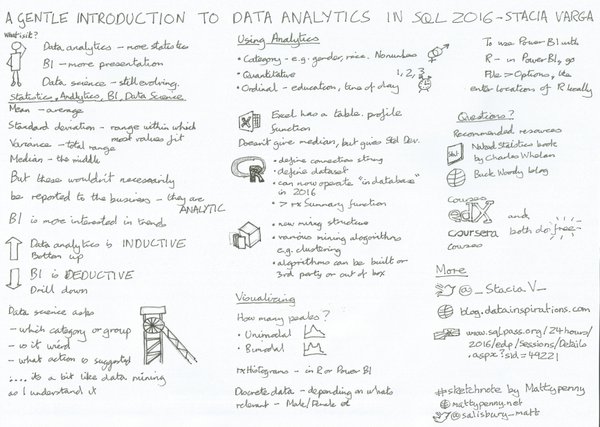
The gist of my presentation was to describe analytics in general and how it compares and contrasts with business intelligence. I also covered some new capabilities that SQL Server 2016 brings to the table, including the ability to use R on data stored in SQL Server, and introduced Analytics in related technologies such as Power BI, data mining, and Azure Machine Learning. Here’s an awesome Sketchnote created and tweeted out by Matt Penny during the presentation which sums up the content very well.
I had been through the R demonstration several times on my computer before the day of the 24 Hours of PASS broadcast, having first worked up the R Script (which you can download here) for a preconfernce workshop on data analytics at SQL Saturday Nashville in January 2016. The night before the live presentation for 24 Hours of PASS, I confirmed that all was working well. And yet, lo and behold – demo fail during the presentation! The R script that I was trying to run in RStudio didn’t work!
Each time I tried to execute a RevoScaleR function (part of the R distribution available in SQL Server 2016), I got errors. For example, I tried to show documentation using help(RevoScaleR) and got the following message:
No documentation for ‘RevoScaleR’ in specified packages and libraries.
Or when I tried to show how to create a SQL Server data source object using the RxSqlServerData function, I got this message:
Error: could not find function “RxSqlServerData”
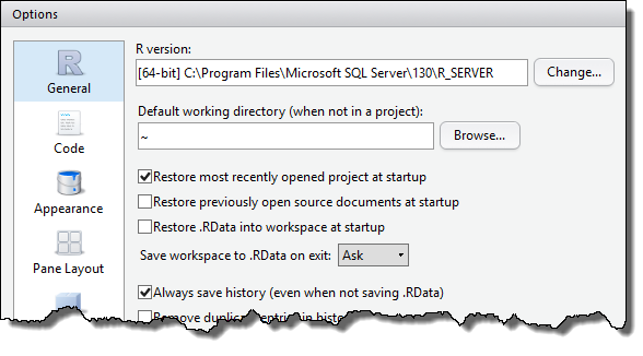
What the…? There was no time to sort it out on the spot, so I just carried on. Afterwards, however, I figured out what had happened. I had in fact changed ONE thing in my environment between the last run through of the demonstration and the presentation. Something I had no idea would have such a major effect.
You see, in RStudio, there is a setting for the R Version that you want to use. You access this on the Tools menu by selecting Global Options which I had originally set to C:\Program Files\Microsoft SQL Server\130\R_SERVER like this:
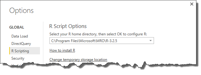
 This had changed auto-magically when I decided that I wanted to demonstrate that you could use R inside Power BI Desktop. In that application, you open the File menu, select Options and Settings, select Options, and then R Scripting to set your R home directory as shown here.
Note the link “How to install R” which I had clicked and then used the link on that page to download Revolution Open (aka Microsoft R Open available for download here).
When I performed R Open installation, unbeknownst to me, the Global Options in RStudio changed to the path for R Open and consequently all the functions that required RevoScaleR packages weren’t available to RStudio. Had I thought about this possibility during the demonstration that failed, I could have fixed it quickly and carried on, but it would have been a wild guess and could have led down rabbit holes that I didn’t need to waste time on, so I made do by reviewing the results which I had thankfully already captured on slides.
As a follow-up to the presentation, here are questions posed by viewers followed by my responses:
Q: Is there a cost associated for front end user licenses to be able to access the power BI tool in Excel, or is it a free download?
A: You can download Power BI Desktop for free from http://powerbi.microsoft.com. To use comparable functionality inside Excel, you must have a license for Excel (standalone, Professional Plus, or Office 365 ProPlus).
Q: Is Data Analytics and sample db available for downloading on [the] Microsoft site?
A: I’m not sure specifically which samples you’re requesting with regard to “data analytics”, but.. here’s what I used in my demonstrations:
AdventureWorksDW2014 – which I renamed as AdventureWorksDW to simplify my demos and make it easier (sort of) to re-use my scripts as versions change. You can download different versions at http://msftdbprodsamples.codeplex.com. The specific version doesn’t really matter because they all contain the vTargetMail view which I used throughout many of the demonstrations.
I also used RStudio which is available for download from https://www.rstudio.com/products/rstudio/download2/ as a free tool. You can use any integrated development for R instead – such as R Tools for Visual Studio.
I created an R Script that you can download here.
For the data mining in Analysis Services, I had created a project based on the vTargetMail view and built out the project manually, but you can find a similar example in the sample database “Adventure Works Multidimensional Model SQL 2014 Full Database Backups.zip” which you can download here from Codeplex.
I output the data from the vTargetMail view as a CSV file and then used Azure Machine Learning Studio online to explore the data visualization capabilities there as part of a logistic regression demo (not shown) to compare the results of machine learning to Analysis Services data mining among others.
Q: How should be a DBA prepared for R support in SQL2016? What all should they know?
A: I’m not a DBA so I asked Joey D’Antoni (one of my co-authors of Introducing Microsoft SQL Server 2016, a free download from Microsoft) for his suggestions:
Reduce the memory for SQL Server – you need to leave more memory on the server for R than you usually would because R is a memory hog. You’ll need to experiment with this to find the right balance.
Troubleshooting performance is challenging. Do analysis in R Studio (or IDE of choice) before moving code to SQL Server.
Be aware that a lot of Windows users get created on the server in order for R to run – don’t worry about it.
Also, Books Online has information about setting up R Services and supporting it: monitoring, resource governance, installing and managing R packages, configuration, and security.
Q: How is data analytics on SAS different from R support for SQL2016?
A: I’ve not used SAS (although I did go to their campus to teach MDX to their engineers once upon a time… beautiful campus!), so I can’t say with any specificity. SAS also has multiple products so it would be difficult to describe differences. In general – and please understand there may be something new in SAS that I don’t know about – I think the difference is that R in SQL 2016 allows you to run functions on data inside the database, thereby leveraging database resources and also server resources for parallelization. I’d love to get input from readers to expand on this topic.
Q: Recommend any good books/blogs/courses to get into data analytics? I’m a DBA wanting to see if data science is for me. Thanks!
A: There are so many options these days that it’s difficult to narrow down, but a good blog that I would start with is Buck Woody’s Backyard Data Science https://buckwoody.wordpress.com. I particularly like the book Charles Wheelan’s Naked Statistics for some great explanations of statistical concepts. For courses, you can find a lot of free content at Coursera and EdX. Many of these are meaty courses – not fluffy, but you can poke around a bit to see what they cover and see if anything sparks your interest. Because the courses are free, you don’t have to stay committed if you find that it isnt’ for you. And Microsoft recently announced the Microsoft Professional Degree in Data Science. You can sign up here to be notified when the program opens.
Q: Data mining has only been available in SSAS multidimensional cubes, and not Tabular models – not sure if I missed it, but will data mining become available in Tabular model?
A: I doubt that it would ever be, but I have no insight into the future on this point. There’s no benefit in particular to bundle data mining with Tabular when it’s already available on the same installation media. The end result is that you wind up with two instances of SSAS on a server (if you were to install both on the same server), but I can’t see that as a huge problem. If it were, then a distributed deployment would be the next option.
July 24, 2016
Happy Birthday, Power BI!
Today Power BI… the application as a service available at PowerBI.com … is a year old and the Power BI community is celebrating with a very special video produced by Adam Saxton and Paul Turley. I’d like to contribute to the bestowment of birthday wishes with a few thoughts of my own today.
For much of my BI career, most of the Microsoft BI stack has been packaged with SQL Server and has changed only with a new release of SQL Server—sometimes subtly, sometimes hugely. However, Power BI is unique in the Microsoft BI stack with its frequency of updates. Each month brings something new and it’s exciting to see new features extending the capabilities of Power BI at such a rapid pace! (You can find a complete list of monthly updates here.)
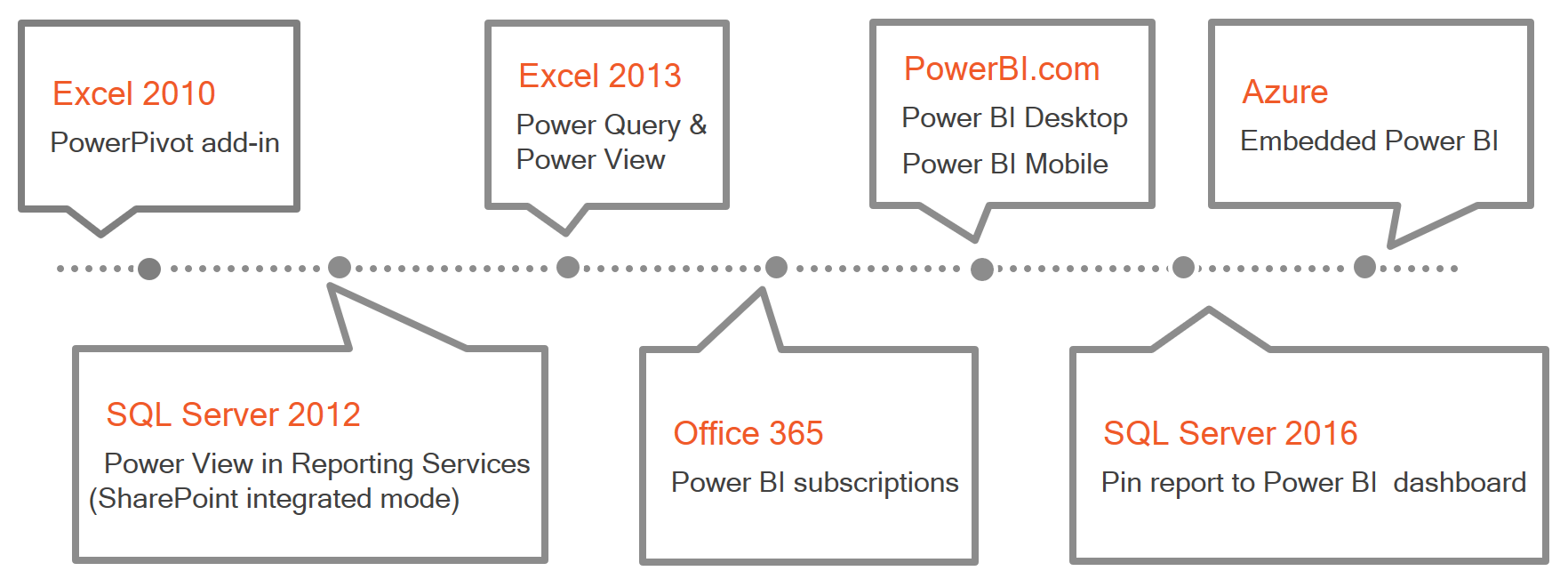
The past year’s success for Power BI is built on a foundation of many years of work and dedication from a variety of teams at Microsoft, all of whom deserve big congratulations on this achievement! As part of my latest Pluralsight course, Getting Started with Power BI (released last month), I included a high-level review of the evolution of Power BI as shown below. Creating this timeline brought back a lot of memories ranging from my first experiences with PowerPivot in Excel 2010 to my recent work with a client to embed Power BI into an application.
My earliest memory happens to be my fondest memory. I was attending a Birds of a Feather session at TechEd 2010 led by Andrew Brust in which there was a lively discussion among the participants. Many of those present were DBAs who were horrified by the thought of people gaining access to data with few controls and little oversight. I mentioned that although DBAs understandably want to control access to data, they could go to the extreme by only allowing them to view data in a PDF. Even then, people will still go to the trouble to manually input it into a spreadsheet to do the analysis they need. Therefore, we need to find ways to support responsible data usage, and PowerPivot was a great first step.

But that’s not the fond memory. I’m only setting the scene. The best part of that session was a comment made by a guy sitting in a corner of the room. He was wearing a Hawaiian shirt and (probably) Birkenstocks. He reminded me of a surfer dude. Actually, he wasn’t so much sitting as he was draped across a couple of chairs, looking very relaxed and very bemused by the conversation. He finally piped up and said, “Hey man, let the data be free!”.
I love that memory and share it often when introducing my students to Power BI in its current form. (Of course, we need to remain mindful of internal policies and regulatory requirements when allowing users to get their data. But that needs to be managed at the database level anyway, so carry on.)

Fast forward to 2016 and the current incarnation of Power BI, the DBAs that I know personally are more supportive of Power BI models and my clients are super excited about enhancing their applications to finally truly support self-service BI. As I work on a variety of projects, I am adding several new memories to my repertoire to share in the future. Thanks, Power BI, and may we share many more happy birthdays to come!
Photo credits:
FreeImages.com/goodmorph-50365 – hawaiian fabric
FreeImages.com/melodi2 – cake
May 14, 2016
All (too) Quiet on the (South)Western Front
Well, sort of…. This blog has been quiet for nearly a year ever since I announced my name change, but my life has been less than quiet meanwhile. I’ve been caught up in a whirlwind of activities:
Working on customer projects in which I pushed the envelopes of Biml, Master Data Services, and Analysis Services (the good old-fashioned multidimensional kind which I assure you is not dead yet) and some Power BI thrown in for good measure. I’m currently taking a close look at Power BI Embedded which looks promising for one of my customers.
DevConnections and PASS Summit conferences in the fall, 24 Hours of PASS online last fall (and coming up in a couple of weeks on May 25-26, 2016), and SQLSaturday events in Las Vegas (which I organized with @mr_stacia), Southampton UK, and Slovenia, and the PASS Business Analytics conference.
Teaching an Immersion Event for Business Intelligence as a SQLSkills partner.
Producing a Pluralsight course: Building Blocks of Biml.
Figuring out what’s new in SQL Server 2016 so that I could work with Denny Cherry and Joey D’Antoni to write a book: Introducing Microsoft SQL Server 2016. It’s available now as a free ebook from Microsoft Press but currently is half done. We’ve finished writing the book, but need to wait until SQL Server 2016 is released in June so that we can retest everything and update screenshots. The final version of the book will released soon after we complete that step so stay tuned!
During this past year, I’ve been teaching @mr_stacia how to help me get things done at Data Inspirations and I’m happy to say I am now reaping the benefits! One of those benefits is gaining some time to start blogging more than once a year. There are so many exciting developments in SQL Server coming soon… where should I begin?
Stacia Misner's Blog

- Stacia Misner's profile
- 2 followers

