
Stacia Misner's Blog, page 2
April 19, 2018
Boxes and Lines…Er, Whiskers
I had to cut short my last dabbling in distribution post because I had to get to Game 2 of Round 1 of the playoffs between the Vegas Golden Knights and Los Angeles Kings, which was am amazing game with not one, but two, overtime periods! That made for a very long night.
Hmm.. I’m going to have to poke through the data another day to ask my next question – how many times does a game go that far? Meanwhile, since that night, the Golden Knights swept the round, winning a stunning four games in a row and knocking the Kings out of the playoffs! But if you follow these things, you already knew that, didn’t you?
But today I still want to continue exploring visualizations for distributions using the dataset that I introduced in my first post in this series if you need to catch up with what I’m up to here. So far, I’ve used a histogram on a single value and both a histogram and a density plot for comparing two values. For these visualizations, I used R scripts to easily and quickly visualize the distribution.
The problem with that approach, however, is that R visuals don’t play nicely when I want to embed Power BI into a web page, or share with someone who is using only the free version of Power BI.
Fortunately, I can use the Box and Whisker visual which is a compact way to get a lot of information about my data. In the example below, I have set up slicers to focus on a single season, a league, and two teams–the Golden Knights and the Kings. Then I added the Box and Whiskers custom visual by Jan Pieter Posthuma – whom I met once long ago and “adopted” at SQLBits X in London. (If you’re not familiar with the steps to do this, see my first post on distribution in which I describe the process.)
If you want to compare other teams, go ahead. This is an interactive report! Change the season, league, and teams any way you like!
Here’s an example of how I configured the visual:

The Category determines how many boxes appear in the visual, the Sampling determines the individual rows that get used for determining the distribution, and the Values is the numerical variable used to compute the box-and-whisker plot.
So, how to interpret all this?

That’s a lot of information packed into one little visual! The box contains the boundaries of the second and third quartiles – a sort of broad middle, if you will, as well as the mean and median. The lines representing the minimum and maximum are the whiskers.
And by setting up multiple categories, I can easily do some comparisons. In fact, I think for “at a glance” comparative analysis of distributions, I prefer this layout instead of the histogram or density plot. Don’t get me wrong. Those are useful also, because they give me an idea of the shape of the data. However, the box-and-whisker plot lets me easily see and compare the edges and the middles.
And a quick little bonus if you go to page 5 of the report above. The R visual doesn’t display, but… at the top of the page is another way to view distributions. Here is a simple count using the Heat Streams custom visual:
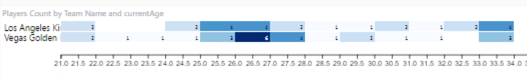
This is a quick and easy way to see where values are concentrated. Here I can see that most of the Golden Knights are in the 26-27 age range and then plus or minus a year, whereas the Kings ages are distributed differently. The visual is intended to work for time on the horizontal axis, but it also works with continuous values like age as you can see above.
The moral of this story is that different styles of distribution visualizations provide different types of insights into the data. Try them all and see what your data tells you!
Feel free to download the PBIX file if you want to play with the data yourself.


April 13, 2018
Dabbling in Distributions Part 2
One playoff game down, three to go. So far, so good for my Vegas Golden Knights! Not only did we win the first game, but it was also a shutout! No score for the Kings!

(And no doughnuts for me – I’ve been focused on cutting out carbs and sugar this year…. sad trombone.)
Which got me to thinking about comparing my team with the opposition at the player level. I’m still focused on distribution analysis as I was in my previous post, but now I want to evaluate the numerical variables for specific combinations of teams. (You can start at the beginning of the series here.)
In a more practical business scenario, this comparison of distributions could instead be product groups or regions or whatever categorical variable exists in your data. I’m going to focus on comparing two categories (teams), but the examples that I describe in this post can take as many comparisons as you choose to include.
I chose a few different visualizations to highlight in this example in which I compare the player statistics for the players of the Golden Knights and the Kings.
Category Selection
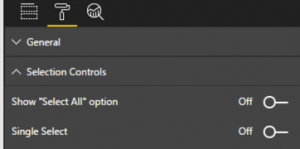
I’m using a slicer to pick the two teams for my analysis. By default, the slicer allows only a single selection. I can change this after adding the slicer visual to the page by opening the format panel and adjusting the toggle switch to disable Single Select.
Take 1
The custom histogram does not allow me to visualize multiple categories, so I’m going to create an R script that uses the ggplot2 library to display a selected numeric variable by team. I have added a filter to focus on this past season. I add the R visual to my report and add Team Name (from teams), fullName (from players), and goals (from statistics)
I update the script like this:
if (!("ggplot2" %in% rownames(installed.packages()))) {
install.packages("ggplot2")
}
library(ggplot2)
df
And I’ll start with goals by player.
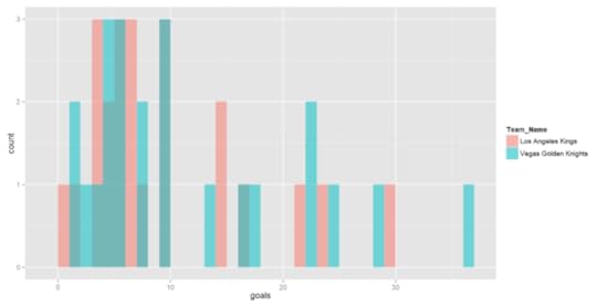
Well, yuck. I’m not crazy about this histogram. It’s really hard to see the comparisons when there’s overlap between the two teams.
Take 2
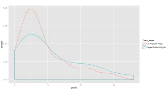
I can change it up by using a density plot instead of a histogram, changing up the last few lines of my R script slightly :
ggplot(df, aes(x=df[,numeric_col],
color=Team_Name))
geom_density(alpha=0.5)
labs(x=xLabel)
Now I get this result:
Conclusion
Both visuals give me similar information, but it’s easier to see the shape of the data in the density plot. Specifically, both teams have a lot of players with about 5 goals for the season, some less, and a smaller number of players with more goals. I can also see that the Golden Knights have more players with a high number of goals for the season than the Kings. (Go Knights!)
I’ve got more to say about other ways to visualize data distributions, but… there’s another playoff game tonight and I gotta go! Until next time…
April 7, 2018
Dabbling in Distribution
Hockey season is almost over and I’m very excited to see my home team, Vegas Golden Knights, not only make it to the playoffs, but also earn the Pacific Division Championship! An accomplishment no one predicted at the beginning of the season. It’s their inaugural season after all. Who does that? (Go Knights Go!) I’m curious what the data has to say, but I’m jumping ahead of myself.


After a fair amount of hockey data wrangling and some sanity-checking of the data in Parts 1 through 5 of this series (which starts here if you need to figure out what I’m up to and why), I’m ready to start using data visualizations to continue the data exploration process–this time by focusing on the data distribution.
What’s Distribution?
When I began the first pass through my data, I built tables to explore the “middles” and “ends” and promised that I would explain more about distribution in a future post. Well, that post has arrived!
Let’s start by reviewing where we’ve been. For each of the tables in the Power BI model, I isolated the numeric variables and created table visualizations to display the minimum, maximum, mean (average), and median values for each variable.

My purpose at the time was to sanity-check the data. And indeed I found some flaws which I need to figure out how to handle because the source data has missing pieces. But the missing data is for a single year and for pre-season games, so for now I’m going to live with it. I’m more interested at the moment in other things, but I have it noted as a to-do item for the future.
By reviewing these four values, I learn about the distribution of the data. In other words, I learn about the range of possible values in my data and how often certain values occur (also known as frequency). The minimum and maximum values tell me about the boundaries of the data values, and potentially clue me into outliers. The mean (average) and median values tell me something about central tendency. That is, what is a “typical” value in this data?
The mean is a commonly used descriptive statistic. It is calculated by summing up all the values in the data set and then dividing the result by the count of all the values.
Median is something you might hear about in demographic statistics – the median home value, the median salary, the median age, etc. It’s calculated by dividing the values into groups where half the values are above a point known as the median and the other half are below this point.
Let’s take a super simple example using a set of values:
1 2 3 4 5
The mean is (1 + 2 + 3 + 4 + 5) / 5 = 3.
And with 5 values, clearly 4 and 5 are in the top half and 1 and 2 are in the bottom half, and 3 straddles the middle. That’s’s the median. Easy peasy.
The value 3 is both mean and median, which tells me there is no skew in this data. It’s symmetrical with values congregating neither at the higher or lower edges of the range of possible values.
Now let’s take another example:
10 11 12 13 14 100
The mean is now 26.67, while the median is 12.5. We have 10, 11, and 12 in the bottom group and 13, 14, and 100 in the top group. The value 12.5 is halfway between 12, the top of the bottom group, and 13, the bottom of the top group.
The difference between the mean and the median also tells me something about the data distribution:
In the first example, the mean and median values are the same, which indicates there is no distortion in my data. Values are represented relatively equally from low to high.
In the second example, there is quite a spread between mean and median, which tells me there is some distortion. Some value (or values) is “pulling” the mean in some direction. That’s the outlier’s fault. In this case 100 is a significantly higher value than all the others and it affects the mean. On the other hand, the median of 12.5 discounts that outlier and better reflects the middle of the pack. (Try calculating the mean without the 100 value and you’ll see how much closer the mean and median get.)
When you analyze data by using mean and median, both numbers are useful because they provide clues about the potential presence of outliers. And by looking to see whether mean or median is the higher value of the two, you know something more about the data:
Mean > Median: A few high values exist while the true middles are lower.
Mean < Median: A few low values exist while the true middles are higher.
Visualizing Distribution with Histograms
I can get all this information about my data by creating tables and looking at the comparisons one by one. But my brain has to work harder at making the comparisons.
Visualizations to the rescue! A common way to visualize data distribution is to use a histogram.
Power BI does not include a histogram visualization out-of-the-virtual-box. I could create one with some gyrations that would require me to decide how I want to group data and count up the frequencies, but that would be overly tedious for every combination that I want to review.
In this post, I’m going to introduce two options: a custom visual and an R visual. In addition, I’ll describe the pros and cons of each.
Custom Histogram
Power BI provides easy access to visualizations that have been created by Microsoft and third parties. In the videos below, I’m using a cleaned up version of my previous PBIX file – I removed all the report pages in which I was exploring the anomalies discussed in my last post and the post prior to that.
The key steps:
Add the Histogram visual to the report
Add Total Goals as Value and Count of Game Name as Frequency to the new visual
Adjust the number of bins as desired
Adjust the decimal places on the x-axis to set bins as whole numbers
The pros of using this custom visual:
It’s easy to install and use
It behaves like native Power BI visuals
It allows you to format many (but not all) of the features of the visual
It responds to filters and slicers like native visuals as shown below
It can cross-filter other visuals on the page when you click on a bar
It works fine on the Power BI service
The cons of using this custom visual:
You cannot format everything you possibly might want to format
You cannot add other features such as mean and median lines, for example
You cannot fine-tune the bin definitions
R Histogram
If you know how to use R to generate a histogram, you can create your own code and produce exactly what you want.
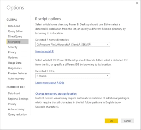
Before you start, you do need to configure Power BI options to set your path to the R libraries and the R IDE that you want to use:
In my report, I decided that I want to be able to generate one or more histograms based on the number of numeric fields that I pass to the script. And I want to show mean and median on the histograms. And I want to include summary statistics as well.
I have a lot of wants. With R, I can handle those wants!
The key steps:
Add the R visual to your report
Add the fields to pass to the script to the R visual. In my example, I illustrate how to get multiple histograms in one visual by choosing all the numeric fields, Total Goals and Goals Spread, plus the frequency basis, Game Name.
Launch the R IDE from Power BI to send the selected fields as a dataset
Test the R script in the R IDE
I can then paste the script into the editor for the R visual in Power BI and run it view the results in my report:
The pros of using the R visual:
It can be set up in any way that you like by generating multiple items, applying formatting, or adding additional features.
You can fine-tune the binning any way you like.
It responds to filters and slicers like any other visual.
It resizes automatically to fill the allocated space.
The cons of using the R visual:
You must know some R to be able to use it.
It cannot take advantage of any custom theme that you might use in the report to standardize color schemes, fonts, etc.
It cannot be used to cross-filter other visuals on the same page.
It is not visible in shared reports on the Power BI service unless you and the other users have Power BI pro.
Not all packages are supported. You can find the current status of R package support here.
Viewing the visuals in the Power BI service
Everything looks fine (mostly) when I publish my report to the Power BI service. (I say mostly because it looks like I stumbled across a bug in the numeric slicer.) Here’s the proof of working visuals:
All is well and good (assuming you’re sharing with Power BI Pro users), unless you want to embed your report in a Web page – whether internally within your organization or externally in a publicly accessible location. If it includes an R visual, you have a problem.
Jump to page 18 to see what I mean. Hint: a fast way to do this is to click the 4 of 18 at the bottom of the report, scroll through the page titles until you see Duplicate of Game Numerical Values, and click that page.
Conclusion
There’s not right or wrong answer regarding which choice you make for adding a histogram to a report. You just need to know the pros and cons of each choice and go from there.
As for distribution analysis, a histogram is not the only option. There are other types of visualizations that I’ll explore in my next post!
Meanwhile, you can download the PBIX file containing the histograms and the R code if you want to take a closer look.
March 30, 2018
Yet Another Investigative Iteration
A little this… a little that. The processes involved in a data analytics project require some alchemy, “a seemingly magical process of transformation, creation, or combination.”
As I work on my data project this week, I find more to explore and investigate and wrangle which is all necessary before I can get into more advanced techniques. Yet, while this little project of mine focuses on hockey data, the steps I need to perform and decisions I need to make are the same ones that would be necessary in a business-oriented project.
If you’re new to data analytics, you can learn the tricks of the trade by following along with me through this series to “see” a project in action. You can rewind to the beginning of the series by starting here and then following the pointers at the end of each page to the next post in the series.
What now?
For now, Power BI continues to my tool of choice for my project. My goals for today’s post are two-fold: 1) finish my work to address missing venues in the games table and 2) to investigate the remaining anomalies in the games and scores tables as I noted in my last post.
To recap, I noted the following data values that warranted further investigation :
Total Goals minimum of 0 seems odd – because hockey games do not end in ties. I would expect a minimum of 0 so I need to determine why this number is appearing.
Total Goals maximum of 29 seems high – it implies that either one team really smoked the opposing team or that both teams scored highly. I’d like to see what those games look like and validate the accuracy.
Record Losses minimum of 0 seems odd also – that means at least one team has never had a losing season?
Similarly, Record Wins minimum of 0 means one team has never won?
Record OT minimum of 0 – I’m not sure how to interpret. I need to look.
Score minimum of 0 seems to imply the same thing as Total Goals minimum of 0, which I have already noted seems odd.
One last “fix” for missing venues
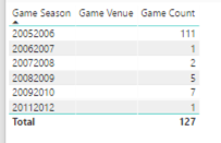
In my last post, I created the Alt Venue column in the games table to display the the home team’s venue, but the Game Venue column still shows 127 games with a missing venue. I decide to clean up my data model a bit to “hide” these columns and create a new column called Arena because that’s the normal name by which we hockey fans call the place where we go to watch hockey.
Tip: This is an important part of reviewing your work with users in a business setting – make sure you’re using terms that people use, not the terms that are in the data structure.
To provide a value for this calculated column, I use the following DAX formula with the IF function to use the value in the Game Venue column, but use the Alt Venue value if the Game Venue is empty (or blank in DAX parlance):
Arena = if(isblank([Game Venue]), [Alt Venue], [Game Venue])
Then I can hide the Game Venue and Alt Venue columns and leave only the Arena column visible in the Fields list. To do this, I click the ellipsis button to the right of these columns and select Hide. I have the option of viewing the hidden fields or not by respectively selecting or clearing the View Hidden command on the context menu.
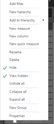
Tip: This capability is helpful when you have “supporting” columns that are used in calculations, but not necessary for reporting. It just shortens up the list of available fields to make it easier to find what you want as you’re creating a visual.
I adjust the table on the Games Categorical Variables page of my report by replacing Game Venue with Arena and confirm there are no blank values remaining.
More detective work
To analyze the anomalies mentioned above, I need to work through each table separately.
Min of Total Goals is 0
My first task is to figure out why Min of Total Goals is 0. This is weird to me because my understanding is that hockey games keep going until a team scores. Therefore, the Total Goals value can never be 0.
I start by setting up a page in which I can explore the details behind the summaries:
I duplicate the Games Numerical Variables page (just right-click the page tab and select Duplicate Page) and rename it as Minimum Total Goals.
Next, I remove the bottom table containing the Goals Spreads values.
I then removed all the columns except Min of Total Goals.
Then I add Game Name to get a detailed list of games.
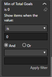
However, this list contains all games. I only want to focus on those with Min of Total Goals = 0 so I add a filter.
A lot of games still appear in the table. Hmm…
I know I have a table that shows the scores for each team on the Total Goals page. I can click on that table, click Copy in the ribbon, go back to my Games Analysis page, and click Paste on the ribbon.
Now when I select a game in the table containing Total Goals, I can see the scores by home and away teams in the newly pasted table. And indeed the two teams scored 0. Double hmm…
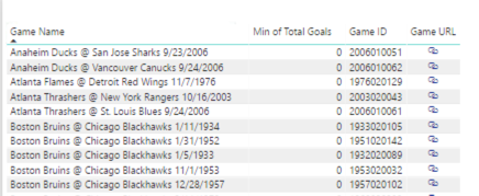
As a sanity check (a common practice I need to do for myself frequently, I confess!), I want to look at the NHL stats, but I need to put together the URL. However, I don’t want to have to remember how to put together the URL all the time, so I’ll create a calculated column in the Power BI model to construct it for me:
Game URL = “https://statsapi.web.nhl.com/api/v1/g...” & [Game ID] & “/feed/live”
Note: I could also have done this – the end result is the same:
Game URL = https://statsapi.web.nhl.com & [Game Link]
And then check this out! I can have Power BI convert this into a clickable URL for me by changing the Data Category to Web URL.

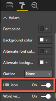
But wait – there’s more. I don’t really care what the URL is. I just want to click on it. So I can apply formatting to the table by setting the URL Icon toggle to On like this:
That way, I can save some screen real estate!
When I click the link, I get to the game page which lists a lot of data, but I can search for the terms “score” and “goal”. As far as I can see, there was in fact a tied score of 0. Hmm.. I can’t seem to find any official data online from NHL or other sports sites on this particular game because it’s preseason.
Note: I decided to add a Season URL to my model also, using the same approach as described above.
Season URL = “https://statsapi.web.nhl.com/api/v1/s...” & [Game Season]
Continuing on my sanity check quest, I pick a regular season game (one that’s begins later than September) such as the Atlanta Thrashers vs New York Rangers on 16 October 2003 and lo… it’s true. There CAN be a 0-0 score! Hmm.

But as I investigate further, I discover that this situation was true only until 2005 when the shootout was introduced.
“The new shootout rule guarantees a winner each game; ties have been eliminated.”
Therefore, the rule that there cannot be a 0-0 game is true now. Because this was my first season, I had not idea that the rule had changed at a previous point in time. I now know this rule does not apply to seasons prior to 2005-2006.
Tip: This is a perfect example of characteristics in the data that lead to questions which lead to discovery of new rules of which you may not be aware.
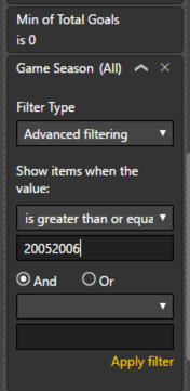
Now I can set up a table to view my data differently to determine if anomalies exist based on this new information:
I need to add add a season filter, but now I discover I don’t have data types set correctly for Game Season, Season Start, and Season End.
I decide to change the data types from text to whole number in the Query Editor because I might decide to reuse the query at a later date and want to have all my transformations in one spot rather than divided between the query and the model.
In the model, I set the Default Summarization to Do Not Summarize for these three fields so that Power BI doesn’t try to do aggregations (sum, min, max, count, etc) on these values every time I include them in a visual.

Now I add a filter to view seasons from 2005-2006 and later.
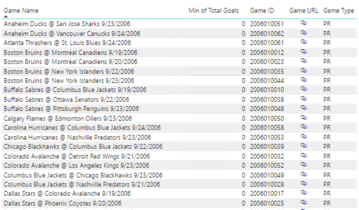
After adding a filter, I still see a bunch of games with Min of Total Goals = 0. Can we have a triple hmmm?
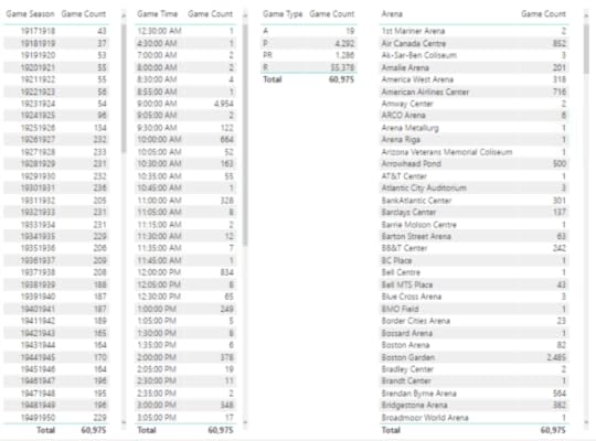
They look like preseason games for the 2006-2007 season. I add the Game Type column to the table to confirm, and yes – they are all preseason. Here’s a partial list:
So far, I haven’t turned up any reason via Internet search for this situation. Maybe they didn’t bother with shootouts in preseason games that year? I’ll file this away as a notation on my data and maybe someday I’ll learn the truth.
This analysis also explains the Min of Score = 0 also. So two anomalies “solved” for the investigative price of one.
Moving on to Max of Total Goals
I use a similar technique to explore the next scenario:
I duplicate the Minimum Total Goals page and rename it as Maximum Total Goals.
Then I adjust the table containing Total Goals and change the aggregation setting on the Min of Total Goals value so that it displays the maximum of Total Goals:
I then clear the filters on the table.
Next, I sort the Max of Total Goals in descending order:

The teams did indeed appear to collectively score 29 points with a score of 17-12. It’s a Game Type of A, which I haven’t decoded yet. I do know it’s not preseason (PR) or regular season (R). A little research uncovers that this is an All-Stars game. Aha!
Looks like the majority of games are All-Star games – and that means the Total Goals value seems logical. A game of stars is likely to have more scoring action than the normal mix of players. The exception seems to be Edmonton Oilers @ Chicago Blackhawks on 11 December 1985 which is a regular season game that apparently made history for having the most goals in a game. And still holds that distinction!
Ok – data validated on that front. Next…
Record Losses, Record Wins, and Record OTs
I duplicate the Scores Numerical Variables page and follow the procedure I describe above for the minimum total goals. When I see the detailed data, I see how to interpret this information and how I need to look at the data:
At the time that a particular game was played, at least one of the teams had not yet lost to other teams in prior games.
This scenario would not apply to an All-Star game, so I filter those out.
Looking again – I see by the dates that Game Type P must be Playoffs, so I filter those out too.
Same idea for Record Wins – at least one team had not won any games prior to the listed game.
And for Record OTs – at least one team had no overtime scores prior to that game.
Here’s the result of my work so far – check out pages 14 to 17:
Recap
I have now completed my first pass through the data which required the calculation of summary statistics, a little data cleaning, and a lot of investigation to understand the “true” rules rather than rely on my rather limited knowledge of hockey. My investigation also allowed me to get a little closer to the data and understand the meaning of the statistics that I have so far.
Some key thoughts about the process described in this post that relate to any type of data analysis:
Rename terms to match users’ “mental map” of the data. Don’t keep terms just because they come from the data.
Don’t assume business rules apply equally to all the data all of the time. Rules have a way of changing. Not everyone remembers that they did or why. Document it when you find it!
Dig into the detailed data behind the summarized values that look odd by confirming the details in your model match the source data. Do some research, ask questions. Be prepared where possible to explain why an unusual value is valid. What then? Clean it, delete it, ignore it, etc. It depends. How you use this information is situation-specific.
Also this post demonstrates several techniques you can use in Power BI:
Clean up the fields visible in the model – hide them!
Display a value conditionally using the IF function
Concatenate static and dynamic values
Convert a string of text to a Web URL
Display a Web URL as an icon instead of text
In my next post, I plan to take another pass at the numeric statistics by analyzing the distribution of values.
March 23, 2018
Exploring Data is an Iterative Process
As much as I would like to barrel ahead and do super cool exciting analytics with the hockey data that I’ve been exploring in the last several posts, I’m simply not ready yet. The exploration process is not complete and I discovered (so far) one problem that requires me to enhance my data a bit. But that’s to be expected. Most data has flaws of one sort or another, so the trick is to find and fix those flaws where possible.
In today’s post, I have two objectives. First, I have covered a lot of ground in the last few posts, so I want to step back and restate the overall exploration process that I’m focused on right now. In addition, I want to more narrowly define my data analytics goals for my first project. Second, I want to start digging into the details of data that I thought appeared unusual when I created my first round of simple statistics.
You can rewind to the beginning of the series by starting here and then following the pointers at the end of each page to the next post in the series.
The Data Exploration Process
As I mentioned in my last post, I am currently in an exploratory phase with my data analytics project. Although I would love to dive in and do some cool predictive analytics or machine learning projects, I really need to continue learning as much about my data as possible before diving into more advanced techniques.
My data exploration process has the following four steps:
Assess the data that I have at a high level
Determine how this data is relevant to the analytics project I want to undertake
Get a general overview of the data characteristics by calculating simple statistics
Understand the “middles” and the “ends” of your numeric data points
Step 1: Assessing the data
For my analytics project, I’ve decided to limit myself to the data that I can obtain freely by using the NHL statistics API (https://statsapi.web.nhl.com/api/v1). There are other data sets out there with additional data points, but I’m happy to work with official data right now and see how far I can get.
Here’s what I have cobbled together so far in Power BI:

Each rectangle in the diagram above represents a query that forms a table in the Power BI model:
statistics – Information about a player’s statistics by season, such as number of goals scored or games played. The majority of this data appears to come from season 2009-2010 and later, with the 1993-1994 as the earliest season.
players – Information about each player and his position in the current season.
teams – Information about each team, its location, and association with a particular division and conference.
scores – Final scores for each game since the first season, 1917-1918. This data has not been evaluated for completeness.
games – Information about each game, including date, time, teams, and calculated values for total goals and goal spread, since the first season, 1917-1918.
I know that I can still go back to the NHL statistics API and get team level statistics and play details from games, but I’ll save that analysis for another day. For now, I think that I have enough to work with in a variety of ways from visual analysis to predictive analysis, machine learning, and pattern-finding.
Step 2: Determining which data is relevant to my question
There’s a lot of data to use here. It can get overwhelming to try to explore it all at once. So I need to narrow down what I want to do with the data to determine which is relevant for each type of analysis that I want to perform.
As an example, the initial question that launched me into a search for hockey data and to learn what I could do with it began with an assumption about whether or not a particular game was high-scoring. To help answer this question, I need to know what a typical score looks like, what’s low, and what’s high over time.
The calculation of an “average” in my first post is one way to find out what’s typical. (I know… averages are not always the right measurement to use. More on that in a future post.)
By using analytics, I can answer multiple related questions. By knowing what an average score looks like, I know by extension whether a score is high or low. And then I can use that information to discover whether certain teams have a propensity for high scores or low scores and whether that changes over time, and so on.
For these types of questions, I only need the teams, scores, and games data sets. The player and player statistics data isn’t helpful for those types of questions… yet. Later, I could incorporate this other data to try to determine to what extent the players and their statistics influence high scores, but… baby steps.
Clearly I could go off in a zillion directions, so it’s important to define scope for each project. For now, I’m limiting the scope of my analysis to game scores. And Power BI makes this process pretty easy.
Step 3: Review the characteristics of the data with simple statistics
I began this process in my last post in which I introduced the initial group of simple statistics—counts for categorical variables and minimum, maximum, average (mean), and median for numerical variables. I set up tables of these simple statistics organized by data set and reviewed the results in Power BI which you can also see in that post.
Data is sometimes dirty. Or reveals something unexpected. The initial review process using simple statistics can help you figure out what needs to be fixed, what new avenues for exploration might be beneficial, and whether the unexpected is actually a new insight.
To review, here is the list of anomalies I’ve already noted in the categorical variables in the games table:
• There are 127 games without a venue.
• The number of games per season seems to be increasing over time. Probably more teams were added over time which resulted in more games. However, as I scroll through the values, I see a significant drop in the number of games in the 1994-1995 and 2012-2013 seasons.
• There is an interesting spread of start times for games, such as 12:30 am or 4:30 am. Really?
• There are venues for which only 1 game was played, or a really low number.
Also, I noted the game types have abbreviations that I don’t understand. I needed to look those up and add the full name for the game type at some point.
Step 4: Review the “middles” and the “ends” of numeric data
Distribution of data can be quite informative about your data set. I’ll get more deeply into distribution in a future post. For now, I want to focus on the middles – which are the average and mean values for the games and scores tables as described in the previous post.

Here I’m again looking for reasonableness of the values and thinking about what these values suggest, that further analysis would confirm or refute.
The other two statistics, average and median, tell me a bit about the middle parts of the data from two different perspectives. The official term for the middles is central tendency.
I notice these values are fairly close together numerically which tells me that the data isn’t heavily skewed. I’ll explain more about skew in a future post, but in general it tells me that I don’t have a lot of rows in the data set that have a value significantly higher or lower than the average value.
Next, I’m interested in assessing the “ends”, also known as the extremes:
Total Goals minimum of 0 seems odd – because hockey games do not end in ties. I would expect a minimum of 0 so I need to determine why this number is appearing.
Total Goals maximum of 29 seems high – it implies that either one team really smoked the opposing team or that both teams scored highly. I’d like to see what those games look like and validate the accuracy.
Record Losses minimum of 0 seems odd also – that means at least one team has never had a losing season?
Similarly, Record Wins minimum of 0 means one team has never won?
Record OT minimum of 0 – I’m not sure how to interpret. I need to look.
Score minimum of 0 seems to imply the same thing as Total Goals minimum of 0, which I have already noted seems odd.
Or maybe it’s just me and my relative newbie-ness to hockey that finds some of this data odd. I’ll find out eventually as I put on my detective hat!
Data Investigation: Missing Venues
Now I want to use Power BI to dig more deeply into the details of my data to determine its accuracy and decide whether I need to take additional steps to clean the data. Today I’ll take on the case of the missing venues.
My quick approach to analyzing Venues is to duplicate the Games Categorical Variables page in my report
and then I delete the tables except the one showing the game count by venue. Next, I apply a Visual Level filter to the visualization to include only the blank venues and add in the Game Season field to see what’s up with the data.
I notice that the majority of issues are in the 20052006 season. I wonder why?
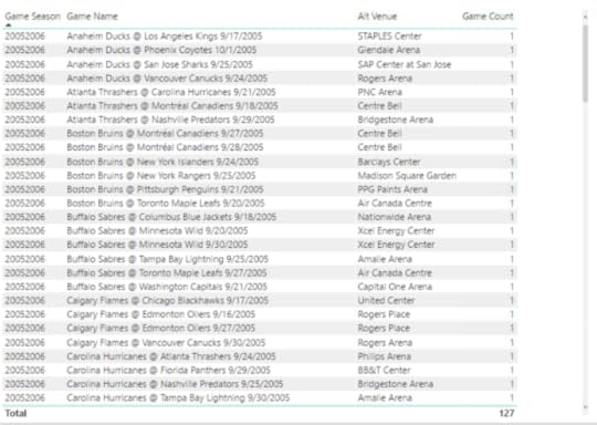
Then I add the Game Name field to see the games, such as Anaheim Ducks @ Los Angeles Kings 9/17/2005. (In fact, I notice all the games look like preseason games by the dates. Hmmm.) My assumption is that this game should be at the Los Angeles Kings venue, and that each missing venue is the venue associated with the home team.
First, I want to validate that the venue data is missing from the source, and yeah, the venue information is indeed missing. I still don’t know why. I’d have to understand how the NHL statistics API compiles its data, but at least I know at this point that nothing that in my process created this problem.
A little search on the Internet confirms that this particular game was in fact played at the home arena for the Kings, Staples Center. I’m not inclined to look up every single game, but I’m okay with going out on a limb and assuming that the home team’s arena should be inferred. I’m also going to add this information as a separate column so that I can use either the original data from the NHL or my inferred data.
To fix the missing venues by populating a value based on the home team, I performed the following steps:
In the Query Editor, I created a getVenue function to use the teams query, filter by a specific team id, and return the team’s venue.
I discovered during this process that two teams from the 2005-2006 season no longer exists, Phoenix Coyotes and Atlanta Thrashers. So I manually entered the Team ID and Team Venue for both teams into a table called other teams. Later I discovered some pre-season games were played in the 2008-2009 and 2009-2010 seasons and added those arenas as well. I found the relevant Team IDs in the API for schedule.
I modified my function to include a step that appends the manually created table to the intermediate table used in the function. I thought the final code for the function would look like this:
(teamid as number) as table =>
let
Source = teams,
#”Removed Other Columns” = Table.SelectColumns(Source,{“Team ID”, “Team Venue”}),
#”Appended Query” = Table.Combine({#”Removed Other Columns”, #”other teams”}),
#”Filtered Rows” = Table.SelectRows( #”Appended Query”, each [Team ID] = teamid),
#”Removed Columns” = Table.RemoveColumns(#”Filtered Rows”,{“Team ID”})
in
#”Removed Columns”
I wanted to update the getGames function to call this function so that it returns an additional venue column, but… I ran into a problem. I cannot call a function that itself calls a function. If I do, I get the following error:
Formula.Firewall: Query ‘getGames’ references other queries or steps, so it may not directly access a data source. Please rebuild this data combination.
Now what…? I removed the step in the getGames function that removes the id.1 column (as I demonstrated in the first post in this series although it was just a table at that time). The id.1 particular column represents the home team id. End result – the id.1 column is included in the results when the getGames function is called.
Then I updated the games query to ensure the id.1 column is in the results when the table returned by getGames is expanded.
Next I added a step to call the getVenue function in a custom column called Alt Venue, then expanded the table that the function returns to include the result in the games query. But then I got that error again about referencing other queries or steps and needing to rebuild the data combination… Grrr! When I created the getVenue function, I was referencing the teams query for efficiency, but that’s an indirection that isn’t allowed either.
So, I replaced the line of code referring to the teams as the source with the entire code of the teams query and kept all the other lines of code in place.
I then updated the #”Removed Other Columns” to a new name and changed the argument in the RemoveColumns function…The relevant portions of code now look like this:
(teamid as number) as table =>
let
Source = Json.Document(Web.Contents(“https://statsapi.web.nhl.com/api/v1/t...”)),
. . . . . .
#”Removed Columns3″ = Table.RemoveColumns(#”Changed Type12″,{“franchiseId”, “active”}),
#”Removed Other Columns” = Table.SelectColumns( #”Removed Columns3″,{“Team ID”, “Team Venue”}),
#”Appended Query” = Table.Combine({#”Removed Other Columns”, #”defunct teams”}),
#”Filtered Rows” = Table.SelectRows( #”Appended Query”, each [Team ID] = teamid),
#”Removed Columns4″ = Table.RemoveColumns(#”Filtered Rows”,{“Team ID”})
in
#”Removed Columns4″
Last I removed the id.1 column from the games query. I don’t need it anymore. Whew! Done!
Although I wrote the steps above sequentially, the process was really iterative process. Find a little, fix a little, find some more… round and round we go.
After my first attempt at a fix, I still saw games with missing venues. It turns out these were all exhibition games that were pre-season. Most of them were out of the country, with one exception – the Dallas Stars @ Texas Stars game. I had think about how I want to handle this situation. My options:
I might consider deleting these rows from the data set and just be done with them altogether.
Or I might come up with a flag to denote them as different in some way, and then I can filter them out on demand. I’m not inclined to delete data too early in the process.
Or I can look up the arenas and manually update the other teams table. This is what I decided to do. And now I have arenas for each game listed in the Alt Venue column.
But… I can see if I add Game Venue back to the table that the Alt Venue column doesn’t always match when Game Venue is not null. Hmm – more to think about how I want to handle.
For now, here’s a link to the PBIX file if you want to take a closer look.
In the next few posts, I’ll tackle the other anomalies and likely continue making adjustments to my data set queries and the Power BI model. Stay tuned!
March 17, 2018
Exploring a Data Set with Simple Statistics in Power BI
The goal of my last two posts was to gather data published by the NHL for hockey teams and players, including the basic statistics available at the team, player, and game level. I was able to put together some tables and charts to answer a burning question I had about what constituted a high-scoring game and to present a player’s career statistics.
If you read my last post in which I discuss acquiring and displaying player statistics, you might be wondering what’s the point? Isn’t this data already available at NHL.com? Well, sure – but that was just a stepping stone to the deeper analysis that I want to do.
As a hockey newbie, I have lots of questions! And now I have some data. I plan to use this curiosity about hockey and my data analytics skills to answer questions and understand the data. Even though my examples in this series focus on hockey data, you’ll see that the tools, techniques, and concepts that I cover are also applicable to all sorts of data, business or otherwise. For now, there’s a lot I can do with Power BI, so that’s the tool I’ll continue to use for a while.
So what is data analytics anyway?
When I started my career eons ago, I had never heard of business intelligence (BI), let alone data analytics. But I did spend a lot of time helping people use data to answer questions about their business which ultimately led me to my formal BI career that started in 1998. Even then, I didn’t hear the phrase “data analytics” very often, if ever.
I don’t have any concrete evidence, but my general feeling is that analytics crept into more common usage around the time that the phrase Big Data became more commonplace. Still, I encounter a lot of confusion about what it means.
What does Wikipedia say?
Data analysis, also known as analysis of data or data analytics, is a process of inspecting, cleansing, transforming, and modeling data with the goal of discovering useful information, suggesting conclusions, and supporting decision-making.
Techopedia gets a bit more specific with this definition:
Data analytics refers to qualitative and quantitative techniques and processes used to enhance productivity and business gain. Data is extracted and categorized to identify and analyze behavioral data and patterns, and techniques vary according to organizational requirements. Data analytics is also known as data analysis.
I see my work in business intelligence over the years as enabling processes to ask and answer known questions repeatedly (with varying potential answers over time). Questions like…how much did we sell last month and how does that compare to the prior month, or which customers (or products) are most profitable?
Whereas BI tends to be historical in nature (although one could argue this point), I see work in data analytics as enabling processes to discover interesting patterns in the data that we might not have thought about. These discoveries can then be used to improve upon something, like a business process, or to predict something, such as future sales trends, to name just two opportunities made possible by using data analytics.
With regard to applying data analytics on hockey data, I expect to learn something about the sport that isn’t obvious to me as a newbie when I look at the NHL’s stats page. Today, I’m going to start with the most basic of basic data analytics, exploration.
More tweaks to the Power BI model
Oh – one more thing. Before beginning this post, I made more modifications to the PBIX file I had at the end of the last post.
First, I added in games for all seasons for the past 100 years, using a variation of the technique described in Part 2 in which I loop through a set of rows and call a function. Yes, hockey is 100 years old! Can you believe it?
After converting my games query to a function, I set up a list of values from 1917 to 2017, added a custom column to add 1 to the value, and then concatenated the two values to come up with a string to represent a season, such as 19171918.
In addition to getting games for all seasons, I also added a new custom column to calculate the difference between the away team and home team score and named it Goals Spread. I thought it would be a good value to explore later.
I also updated the scores away and scores home tables to reflect the data for all available seasons instead of using just season 2017-2018. You can review the PBIX file to see how I set up the queries.
I discovered that when I tried to create a relationship between games and scores based on Game ID, I got an error message:
You can’t create a relationship between these two columns because one of the columns must have unique values.
I checked my data in the games table by counting the rows and the number of distinct game IDs and found the numbers matched – 60,884. Very puzzling. Then I looked at the data itself, sorting the Game ID column in ascending order and discovered the culprit – a null Game ID for season 2004-2005. I removed the row and then I was able to create the relationship.
It turns out that season 2004-2005 had no games at all. The entire season was cancelled due to a labor dispute.
Although I didn’t get a similar relationship error for the statistics table, I did note a null category when setting up the report page for the statistics table. After I sorted the table in the Query Editor by season, I found and eliminated the null row for player ID 8480727.
Introducing exploratory data analytics
Technically speaking, I should have started my data analytics project with some basic exploration. But my excitement about getting the data and a burning question at the time that I acquired it led to my first post in this series. Then I needed to validate that I had put together the data correctly by viewing player statistics (as shown in my second post) that I could compare to the official stats.
I’ve poked around a bit in my data enough to have a general sense of what it contains, but now it’s time to do the official exploration. Whenever I get my hands on a new data set, I need to be able to identify specific characteristics about the data.
What is its structure?
In this case, I have transformed JSON documents into a set of tables:
teams
scores
players
statistics
games
Each table contains multiple rows and columns. My next step is to evaluate the columns by type.
Which columns represent numerical variables?
A numerical variable (also known as a quantitative variable) is a set of values that first and foremost are numbers. The numbers can represent counts of things, dollar amounts, or percentages, to name a few.
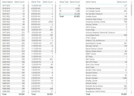
In the games table, I have two numerical variables—Total Goals and Goals Spread.
Which columns represent categorical variables?
A categorical variable is one in which there are a distinct number of values. Often, a categorical variable is a string of characters. The tricky part sometimes is identifying categorical variables that contain numeric values, but really represent a category. These are values that you wouldn’t add up together, such as Season. We can get more nuanced about categorical variables, but that will come in a future post.
The games table has the following categorical variables:
Game Date
Game Time
Game ID – although this is really of no analytical value because it’s a unique identifier for the game that has no meaning to me as an analyst
Game Link – this also has no analytical value to me right now. I might use the game link later to get detail data for the plays of a game, but I’m not ready for that yet.
Game Type
Game Season
Season Start
Season End
Game Venue
Game Name
Simple statistics
Once I know whether a variable is numerical or categorical, I can compute statistics appropriately. I’ll be delving into additional types of statistics later, but the very first, simplest statistics that I want to review are:
Counts for a categorical variable
Minimum and maximum values in addition to mean and median for a numerical value
To handle my initial analysis of the categorical variables, I can add new measures to the model to compute the count using a DAX formula like this, since each row in the games table is unique:
Game Count = countrows(games)
Then I can set up a series of tables to list the counts for each category applicable to a categorical variable:
For the numerical variables, I need to add the variable to a table visualization. Then I can right-click on the field name assigned to a visualization and change the aggregation from the default of Sum to something else, like Minimum.
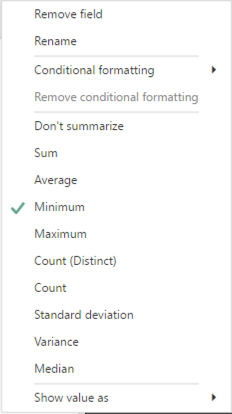
Next, I add the same measure to the visualization three more times and then reset the aggregation function for each addition so that I can also see its Maximum, Average (another name for Mean), and Median.
The main thing I want to do with this first pass at simple statistics for the games table is to perform a sanity check:
Does anything look odd?
Do I have fewer or more categories than expected?
Is the range of numeric values reasonable or could there be outliers?
Here’s what I notice immediately:
There are 127 games without a venue.
The number of games per season seems to be increasing over time. Probably more teams were added over time which resulted in more games. However, as I scroll through the values, I see a significant drop in the number of games in the 1994-1995 and 2012-2013 seasons.
There is an interesting spread of start times for games, such as 12:30 am or 4:30 am. Really?
There are venues for which only 1 game was played, or a really low number.
These characteristics mean I need to look at the game table specifically to determine whether I think the data is accurate. If I find an issue, I’ll need to determine how best to fix it. “Best” really depends on how I intend to use the data.
I’ll repeat this process of creating table visualizations of categorical and numerical variables for the other tables in the Power BI model. You can review the results here on pages 3 through 12 of my report:
Some fields I didn’t evaluate – such as birthdate, names, and player id in the players table because the number of categories is either the same as the number of players or very close to that number. These are referred to as high cardinality categorical features, which are probably not useful for analytics in the current set of data.
On the other hand, current age is a useful substitute for birthdate. Furthermore, it’s interesting to review both as a categorical and a numerical variable.
In the statistics table, there are variables like evenTimeOnIce and powerPlayTimeOnIce that are also high cardinality. I’m going to evaluate these time-based variables differently in a future post.
I’ll introduce an alternative method for initial exploratory data analytics in my next post. Stay tuned!
March 9, 2018
New Pluralsight Course: Getting Started with R in the Microsoft Data Platform
I’m pleased to announce the release this week of my newest course at Pluralsight, Getting Started with R in the Microsoft Data Platform. If you’re not sure why you would need R in SQL Server or how you would go about implementing it, this course is a great introduction that explores various nooks and crannies. Sometimes it’s just easier to see how it’s done rather than simply read about it.
Full disclosure…the course is not free. Unless you’ve never used Pluralsight before, in which case, you can sign up for a free trial of up to 200 minutes over 10 days. My course is 173 minutes, just under the upper limit of the trial. If you already have a Pluralsight subscription and are R-curious, please go check it out.
Today I’d like to explain who the intended audience for this course is and what the course covers (and doesn’t).
Who is this course for?
My course is NOT going to teach you R. At least that’s not its explicit goal. There are plenty of R resources at Pluralsight available to cover this topic at various levels. The good news is that you don’t already need to know R in order to understand the key points of the course. So who is it for?
If you’re a DBA that needs to support R implementations, you’ll see where R fits into the stack and understand what configuration tasks need to be performed on the server to support R functionality. You’ll also get a taste of what the R folks are going to do to your server, so that you can plan accordingly.
If you’re a data professional that hasn’t yet learned R, you’ll see a variety of working examples to give you a sense of what’s possible across the stack.
On the other hand, if you’re a seasoned R practitioner and have access to SQL Server or Power BI in your environment, you’ll see how you can leverage these tools to process and analyze data and to share your results with others.
R in SQL Server
While R has been a tool for data analysts for over 20 years, it’s a technology that has long been constrained by hardware limitations of a user’s computer which typically doesn’t have the CPU or memory of a server. In 2010, Revolution Analytics released an R distribution that lifted these constraints and enabled parallel processing to improve performance of processing very large data sets. Several years later, Microsoft acquired Revolution Analytics and embedded this technology into SQL Server 2016.
As I was developing my Pluralsight course, the SQL Server 2017 changed R Services to Machine Learning Services which enhanced the R library and added Python support. I did add some coverage of implementation and configuration tasks specific to SQL Server 2017 as well as specific new features such as native and real-time scoring.
RevoScaleR Functions
After exploring the configuration of SQL Server to ensure you have all the components necessary for using the R capabilities added with R Services or Machine Learning Services, the course highlights the functions in the RevoScaleR package (created originally by Revolution Analytics) that enable you to load data into SQL Server, perform operations on SQL Server data, or to extract data from the server.
This section of the course also shows you how to operationalize your R scripts for execution on SQL Server. Specifically, you learn how to encapsulate your R code into a T-SQL script.
If you use R to explore data by using visualizations, you’ll be interested in the section that explains how to generate image files on SQL Server. And if anyone out there is still using Reporting Services (which I sincerely hope because it’s near and dear to my heart!), you’ll learn how to display an R visualization in a report by calling an T-SQL stored procedure.
R is not just about exploring or visualizing data. A powerful capability is predictive modeling, which of course is supported by many different RevoScaleR functions. I briefly describe the range of modeling support available, and then demonstrate how to perform predictive modeling on SQL Server by using RxDForest, a decision forest algorithm. I also show you to evaluate the model.
R in Integration Services
There are several ways that you can use in Integration Services. One way is to call an R script directly by using an Execute Process task. Or you can call a T-SQL stored procedure that runs an R script, either by using an Execute SQL Task in the Control Flow or in an OLE DB data source component in the Data Flow. I show you all the options in the course.
R in Power BI
Power BI can do so much, and of course it can do R, too! One option is to use an R script as a query to bring data into the model. I’ve done all kinds of crazy things with this feature. In this course, I show you how to get and transform some weather data for a specific time and place (which is not the craziest thing I’ve ever done with R), but also I show you how to parameterize the query so that you can customize the results to whatever you want.
Of course, the techniques that I describe can be used for any other type of data. The key is that you see what’s necessary to use a script, how the data is handled by Power BI, and how to use arguments in an R script to pass in variable values dynamically.
Also, I explain how to use R visualizations in Power BI. There are a few gotchyas that I explain as well. While Power BI has some pretty cool ways to visualize your data, the ability to use R really expands your options.
As I was working on the last module of this course, I had an environment with a mix of R libraries on it which led me to encounter an issue in Power BI that puzzled me for a bit. The Home Directory setting didn’t behave as I expected, which led me to write a post that describes how to determine which R library tree is in use.
Go Watch!
Hopefully something in this course description sparks your interest enough to go watch some or all of the course. The Pluralsight platform makes it easy to go through a course from beginning to end (and you can speed it up to get through it faster) or to jump into a particular topic of interest.
If you have any questions about using R in the Microsoft Data Platform, please leave a comment below. And if you have any suggestions for future Pluralsight courses, I’d love to hear those too!
March 1, 2018
Getting Started with Data Analytics in Power BI – Part 2
The hockey data that I started exploring in Part 1 of this series is just the tip of the iceberg. I have so many questions that standard hockey statistics reporting cannot answer for me.
I’m interested not only in the current wins and losses for a team or a player, but also in the history that brought them to their current state. Can I see any interesting patterns? Which characteristics about teams or players matter more than others? Is this possible to identify?
More data!
To answer these and other questions, I need to put together the data a different way. I need more data.
Even if your job doesn’t require you to analyze hockey data, there are probably plenty of questions that you could answer if only you had the data and knew what to do with it.
My goal through this series of posts is to use hockey data as a backdrop for a discussion of technologies, concepts, and techniques for data analytics that you can apply to the types of data that are more applicable to you.
The technology du jour is Power BI again, because I’ve only just begun building up my data. It’s a great tool for exploring new data sources quickly and easily before committing myself to a full-blown enterprise-scale solution if that were my long-term goal.
In today’s post, I need to get more detail into the Power BI file that I started in my last post. Currently, I have general team data and high-level game statistics, but now I want to add in player data as well as their statistics. To do this, I need to generate dynamic queries to retrieve player and player statistics.
Getting the Player Data
The structure of the data available in the NHL API (which I described in my last post) requires me to construct a query first to get all the players on a team. For example, I know that the Team ID for the Vegas Golden Knights is 54, so the endpoint to get the team roster need to look like this:
https://statsapi.web.nhl.com/api/v1/teams/54/roster
That query returns an array of person objects. Here’s an example of a person:
{ “person” : { “id” : 8476448, “fullName” : “William Karlsson”, “link” : “/api/v1/people/8476448” }, “jerseyNumber” : “71”, “position” : { “code” : “C”, “name” : “Center”, “type” : “Forward”, “abbreviation” : “C” } }
I need to dynamically construct the endpoint to be able to get players for all the teams. But this information is only some of the information available about a player. To get other details, I need to use the use the player id link like this:
https://statsapi.web.nhl.com/api/v1/people/8476448
{ “id” : 8476448, “fullName” : “William Karlsson”, “link” : “/api/v1/people/8476448”, “firstName” : “William”, “lastName” : “Karlsson”, “primaryNumber” : “71”, “birthDate” : “1993-01-08”, “currentAge” : 25, “birthCity” : “Marsta”, “birthCountry” : “SWE”, “nationality” : “SWE”, “height” : “6′ 1\””, “weight” : 189, “active” : true, “alternateCaptain” : false, “captain” : false, “rookie” : false, “shootsCatches” : “L”, “rosterStatus” : “Y”, “currentTeam” : { “id” : 54, “name” : “Vegas Golden Knights”, “link” : “/api/v1/teams/54” }, “primaryPosition” : { “code” : “C”, “name” : “Center”, “type” : “Forward”, “abbreviation” : “C” } }
The data from the api/v1/people query has the level of detail per person that I want in a table of players. To get all players from all teams, I need to dynamically generate all these links. Fortunately, I’ve dealt with this type of problem before. It’s just a variation on a technique I described recently regarding dynamic JSON requests.
In general, I start with a query to get the teams which I can loop through to get the rosters which in turn I can loop through to get the players. To do this, I do the following:
Get a static page for roster: https://statsapi.web.nhl.com/api/v1/teams/54/roster
Convert this query to a function for which the team’s id is a parameter
Repeat the previous two steps for a player using https://statsapi.web.nhl.com/api/v1/people/8476876
Create a query to get the team ids and add a custom column to call the roster function, expand the results, and then add a custom column to call the player function.
Want to see the details? (I’ll update this post with a video in a day or so.)
Getting Player Statistics
My last data acquisition step is to get statistics data for each player. I just need to build a function to dynamically get data by team like I did above using this endpoint as my base structure:
http://statsapi.web.nhl.com/api/v1/teams/54?hydrate=roster(person(stats(splits=yearByYear)))
It turns out there are many different kinds of statistics that I can get in addition to these statistics by season. I’ll probably get them all added into my model eventually, but the process is the same. For a list of other available statistics to use instead of yearByYear, see http://statsapi.web.nhl.com/api/v1/statTypes.
Viewing Player Statistics
Today I don’t have a particular question to answer. I just want to have an easy way to view information about a player. I’ll enhance my model with more data and my own calculations later. For now, I can create a report to that displays selected information about a player and get basic career statistics. In fact, you can explore this yourself below – just click the arrow under Team Name to switch teams, select a checkbox to choose a player, and use the drop-downs to select one or more leagues or teams to view the player’s career statistics. When you point to the list of players, a scroll bar appears to allow you to find players not currently visible in the list.
If you use the left arrow at the bottom of the page, you can switch to the first page of my report that I created in Part 1 of this series.
You too can embed a Power BI report in a website. But be sure you’re careful about the data you’re exposing! The data in my report is freely available NHL data.
I validated my data against the NHL statistics online. For example, William Karlsson’s data is at https://www.nhl.com/player/william-karlsson-8476448. (Oh look, there’s that player ID I have in my data results!) And so far, so good.
What’s Next?
In future posts, I plan to explain how to use various techniques to explore, enhance, and understand this data. I have enough data now for Part 3 of this series in which I can start performing some basic data exploration to begin to understand what I have gathered thus far. Stay tuned!
Here’s a link to the final PBIX file if you want to take a look at the queries and reports yourself.
February 24, 2018
Getting Started with Data Analytics in Power BI
I’m a relatively new hockey fan. And I love data. Come join me on a series of posts as I see explore where a combination of these two interests leads.
Even if you’re not a hockey fan, along this journey I’ll introduce technologies, concepts, and techniques for data analytics that you can apply to the types of data that are more applicable to you.
In this post, I’ll use Power BI to start getting familiar with available data and answer a simple question. You can download a copy of the Power BI file that I created to see for yourself how I put together the data and the report.
Why Hockey?
My husband Dean is originally from Detroit and has long loved the Detroit Red Wings. When we started dating, he would encourage me to sit and watch games on TV which seemed almost constant because hockey has an incredibly long season compared to other sports. I watched, but I have to confess I didn’t have a lot of interest at the time. (Sshhh, don’t tell him I said that!)
One of the ways that I’m inclined to interpret the world is through data. And sports is rife with data! Ever hear of Moneyball? These days it’s common practice for a sports team to have an analytics team. I’ve not worked on a project with any of these teams (yet), although I did have a data analyst from the NFL in one of my classes years ago.
A Hockey Fan is Born
Fast forward a few years and I am a convert! My home town of Las Vegas got its first professional sports team and amazingly the first sport is hockey! Yes, hockey in the desert, go figure… The 2017-2018 season is the inaugural year for the Vegas Golden Knights, and oh what a year it has been! Far better and far more exciting than most people here ever imagined.
Dean and I bought season tickets hoping to enjoy a few good games (and see Dean’s beloved Red Wings whenever they come to town), but I must say most games have been more than good. And live NHL hockey is much more exciting in person than it is on TV. Now that I’m more familiar with the sport, I concede that watching on TV is now more appealing to me as well. My new goal (cough) is one day to meet not only the players, but also the analysts for the Vegas Golden Knights!
Where’s the Hockey Data?
During the games, I often think up questions that could be answered if only I had the data. So I went on a mission to find it and perform my own analyses. I’ve stumbled on a few databases that I need to find time to explore, but these database limit me to looking up information whereas I want to explore the raw data. The best way I have found so far is to use the free NHL statistics API: https://statsapi.web.nhl.com/api/v1. It’s undocumented, but I did find a YouTube video that provides an overview. Thanks to Kevin Sidwar (b|t), who produced that video, I now know that I can use access data by using the following API endpoints:
All teams: https://statsapi.web.nhl.com/api/v1/teams
A specific team (Vegas Golden Knights, in this case): https://statsapi.web.nhl.com/api/v1/teams/54
A team’s current roster: https://statsapi.web.nhl.com/api/v1/teams/54/roster
A player, such as our famous goalie, Marc Andre Fleury (getting the link from the roster): https://statsapi.web.nhl.com/api/v1/people/8470594
A specific game (our February 21 game against the Calgary Flames): https://statsapi.web.nhl.com/api/v1/game/2017020929/feed/live
A team’s current statistics: https://statsapi.web.nhl.com/api/v1/t...
Statistics for each player of a team: http://statsapi.web.nhl.com/api/v1/teams/54?hydrate=roster(person(stats(splits=statsSingleSeason)))
And that’s not all I can do… but it’s more than enough for today! I just have a simple question to answer, but at least I know I have a rich treasure trove to explore in future posts!
Gathering the Team Data
My first step is to use a Web data source using the URL https://statsapi.web.nhl.com/api/v1/teams to see what I have to work with. Then I’ll go through the following steps which I only highlight here (but I’ve included a video below each section if you’re new to Power BI):
Because the result is JSON, the query returns a list that I can then use the Convert Into Table transformation that appears on the ribbon.
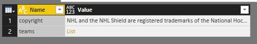
And I need to remove the copyright from the query (but I copy and save it somewhere because I want to give attribution later in my report). I use the Remove Top Rows transform with a value of 1 to get rid of it.
My JSON values are still a list in my query results, so I expand the list and then expand the records.
In Power BI, a list is a structure that has a single column and multiple rows. If I were to create a list manually, it would look like this: {“item 1”, “item 2”, “item3”, 4}. Looks like an array to me. The elements in the list do not need to have the same data type, by the way. I’ll use lists in future posts to build out query parameters for dynamic reporting.
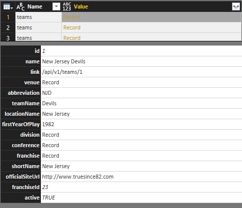
A record is a structure that has a single row and multiple columns. Just like a row in a relational table. When I click on a record in one of the rows, the user interface shows me the columns as rows below the table like this:
When I expand the records in the query (by clicking the Expand button to the right of the column name), I get columns in the table like this:
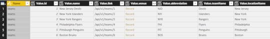
I still have some more expansions to do to get data for each team’s venue, division, conference, and franchise details. Part of me wants to normalize this data a bit and break these out into separate tables. For now, I’ll leave the data as is, other than renaming the columns for clarity.
In a few clicks, I was able to get all of this information into a single table. Nothing statistical here to analyze yet, but definitely the base information for each team that I can use to slice and dice later.
Gathering Game Scores and Team Records
 One of my feelings at the game I attended this past week between the Knights and the Calgary Flames (on February 21, 2018) was that it was a pretty high scoring game as hockey goes. But I’m a newbie, so what do I know? I want to find the data to support (or refute) this hypothesis.
To keep things simple for now, I’m just going to analyze the scores for the current season and tackle other seasons later. The URL I need is https://statsapi.web.nhl.com/api/v1/schedule?season=20172018 which I use to create another query in Power BI.
Ooh, there’s so many things in here I want to explore, but I’ll save that for another day. I can always modify my query later. For now, I’m going to focus only on scores for the home and away teams for each game of the season.
Cleansing and Transforming the Data
Right now, the data is not ideal for analysis. Keeping in mind how I want to use the data, I need to perform some cleansing and transformation tasks. Any time I work with a new data source, I look to see if I need to do any of the following:
Remove unneeded rows or columns. Power BI stores all my data in memory when I have the PBIX file open. For optimal performance when it comes time to calculate something in a report and to minimize the overhead required for my reports, I need to get rid of anything I don’t need.
Expand lists or records. Whether I need to perform this step depends on my data source. I’ve noticed it more commonly in JSON data sources whenever there are multiple levels of nesting.
Rename columns. I prefer column names to be as short, sweet, and user friendly as possible. Short and sweet because the length of the name affects the width of the column in a report, and it drives me crazy when the name is ten miles long, but the value is an inch long—relatively speaking. User friendly is important because a report is pretty much useless if no one understands what a column value represents without consulting a data dictionary.
Rearrange columns. This step is mostly for me to look at things logically in the query editor. When the model is built, the fields in the model are listed alphabetically.
Set data types. The model uses data types to determine how to display data or how to use the data in calculations. Therefore, it’s important to get the data types set correctly in the Query Editor.
Add custom columns. This step is optional and depends on whether I want to create a new column in the query itself or in my model only. If I build the column in the query, the data is persisted in memory while I have the PBIX file open. If I have a lot of rows of data, that’s a lot more memory that is required. However, subsequent calculations in my reports are likely to perform faster. Therefore, if I have a lot of data, it might be better to create a DAX calculation in the model instead. The only way to decide is to try it out and see what happens. Given a choice, I lean towards building the custom column in the query.
In this case, I’m adding two new columns:
Game Name, to concatenate the away team and home team names in addition to the date so that I have a user-friendly unique identifier for each game to use in my reports.
Total Goals, to calculate the sum of the away team score and the home team score. This is the key to answering my first question, what constitutes a high-scoring game?
Apply filters. This step is similar to the first one in which I remove the unneeded rows or columns. However, in that first case, I was identifying specific rows (as in the top n) or columns (by name). Now I need to consider conditions that determine whether to keep a row.
In my current data set, I can see that I have games included that haven’t happened yet. For my current purposes, I want to exclude those rows that have a date earlier than today, which of course is a moving target each day that I open the report. Power BI doesn’t allow me to set a filter based on today using the filter interface. Instead, I set the filter using an arbitrary date, and then open the Advanced Editor for the query and change the filter that uses a hard-coded date to a formula like this:
#”Filtered Rows” = Table.SelectRows(#”Changed Type2″, each [Game Date] < Date.From(DateTime.LocalNow()))
Restructuring the Data
I’ve spent twenty years building dimensional models, so that’s the way I tend to think about structuring data. I won’t spend time in this post explaining that approach. Just trust me on this one for now. Developing a data model depends on your end goal, and I’ll spend some time in one or more future posts on this topic.
Right now in my current query, I have away and home team data in separate columns which means I can’t easily build a report to see all scores – whether home or away – for a single team. I’d really rather have each row in my games table represent a single team. But I also don’t want to have rows that duplicate data for a single game. Gah!
To solve this problem, I’m going to duplicate the games query and then make adjustments to one version so that it contains only game data. The second version will contain the team data.
For the games query, I remove the columns that relate to teams, records, and scores (although I’ll keep the Total Goals column because that’s game-level detail, not team-level detail). Now I have this result:
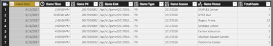
And for the scores query – I remove the game-related columns, except for the Game PK column which I can use to tie to the two queries together later in a relationship.
But first, I’m going to take another step to duplicate the scores query – because what I really want to have is a single column each for teams, wins, losses, score, etc. I filter one version of the scores query to keep only the away team data and the other version to keep only the home team data. And I add a custom column to each query to designate it as home or away, and then combine the two queries to make a single final query that is really the one I’m going to relate to the game query later.
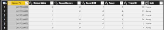
I clear the Enable Load on the scores away and scores home queries so they don’t get added to my model. I only need them as intermediate steps to build the final scores query.
After I click Close & Apply, Power BI automatically detects the relationships:
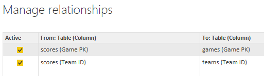
Answering the High Score Question
Now that my data is structured appropriately for my analysis, I can set up a report to view the data in different ways.
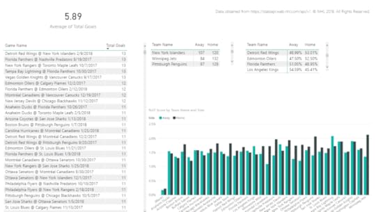
The final result contains the following visualizations:
Average of total goals. I set this up to calculate the average of total goals for all games to use as a baseline against which I can measure whether a game is relatively high-scoring or low-scoring. I also set this up to ignore any cross-filtering that might occur when I click on other visualizations in the report, because I want to see this value calculated for all games across the league for the season.
Table of games and total goals. Here I have a comprehensive list of games that I have sorted in descending order of total goals. When I click on a specific game in this list, the other visualizations on the page are filtered to show me the details for that game (except for the average of total goals).
Matrix of teams and scores by side, Away vs. Home. This matrix sums up the goals for each team based on whether the game was an away game or home game. When a game is selected in the first table, this matrix displays each team’s score for the selected game. When all games are listed, this isn’t a particularly interesting table to me, but it made me think about comparing the statistics for the season by side, which led me to create the next table.
Matrix of teams and score percentages by side, Away vs. Home. This matrix is a copy of the scores matrix, but I changed the values to display as a percentage of row total. I thought it would be interesting to see overall whether a team did better or worse at away versus home games. When a game is selected in the table, the values are 100% so it’s not interesting at that point, but it is interesting when you look at all teams even though I need to scroll through it. I don’t have a lot of space on this page. Yes, I can adjust the page size, but my primary interest at the moment is looking at high-scoring games – this was just an ancillary thought that I might pursue later in a new page of the report.
Thinking out loud—Wouldn’t it be nice to hide or show an entire visualization based on some condition?
Column chart of teams and scores by side, Away vs. Home. Here I can see how the teams compare. I can write a whole post about this visualization in particular, but not today. Stay tuned. When I select a game, I can see the scores for each time represented visually in conjunction with the matrix above it.
My report provides a lot of information about game and team scores overall. In thinking about the game that sparked my question, which had a total goal of 10, I can see that there have been a LOT of games with higher scoring. On the other hand, I can also see the game was also well above average.
When I select the Flames @ Golden Knights game in the table, I can see the game score by team in the matrix and in the column chart.

Summary
Important takeaways in this post include the use of multiple features in Power BI:
Using JSON as a data source
Getting familiar with lists and records
General steps for cleansing and transforming data in the Query Editor
Restructuring data with filters, custom columns, and the use of the append query feature
Excluding intermediate queries from the Power BI model
Creating visualizations: card, table, matrix, and column chart
Displaying an average value rather than a sum
Displaying percentage of row totals
Cross-filtering
Adjusting interactions
Whew! That’s a lot! This post covered a lot of ground, and there’s so much more I want to cover! You’ll just have to come back again to see where I go with this.
If you have any questions or suggestions about what you’d like to see in the future, please add a comment below!
You can see how I set up the report in the videos below.
February 17, 2018
Dynamic Web.Contents() and Power BI Refresh Errors
Recently, one of my clients was working with a new data source in Power BI that required multiple calls to a REST API to iterate through an unknown number of pages to retrieve JSON documents. We were able to use a combination of parameters and M code to dynamically construct the URI necessary to call a series of pages, and everything worked fine while working in the Power BI Desktop.
However, when the PBIX file was published to the Power BI service, the data set could not be refreshed because the data source was unsupported. Sad trombone…
The most promising clue to a resolution was found in a post by my friend Chris Webb (b|t), Web.Contents(), M Functions And Dataset Refresh Errors In Power BI. Chris describes how to deal with resolving the refresh error when the query parameters change. In my case, I needed the base URL to change. Our scenario was just enough different that I thought a post to document our approach might be useful to someone someday.
Background
The problem relates to the manner in which we need to dynamically build a URI to download JSON documents. Although the examples in this post refer to my client’s cloud-based applicant tracking system, JazzHR, the same scenario could apply to many other different REST APIs, so I’ll focus more on the structure of the URI and the M language in Power BI rather than JazzHR specifically.
My client wants to analyze applicant data in Power BI that can be obtained through the JazzHR API. By using a specifically structured URI, you can download data from JazzHR for the first 100 applicants. Because the information is secure, you must supply an API key to access your data as a query parameter in the URI, like this:
https://api.resumatorapi.com/v1/appli... xxxxxxxxxxxxxxxxxxxxxxxxxxxxxxxx
If you have more than 100 applicants, you need to request data by page number like this for page 1:
https://api.resumatorapi.com/v1/appli...page/1?apikey= xxxxxxxxxxxxxxxxxxxxxxxxxxxxxxxx
The URI above returns the same 100 applicants as the URI without a page number. To get applicants 101 through 199, you use this URI:
https://api.resumatorapi.com/v1/appli...page/2?apikey= xxxxxxxxxxxxxxxxxxxxxxxxxxxxxxxx
The API request returns only an array of JSON documents. There is no metadata that you can use to determine how many pages are available. You just keep trying a new page number until no more data is returned. Therefore, our solution has to be able to dynamically generate some number of URIs for which we’ll arbitrarily set a limit.
Get a Static Page First
I like to approach development incrementally to make it easier to troubleshoot. In this case, I started by setting up a hard-coded reference to the URI for page 1. I created a new Web data source using the applicable URI. The results are returned as a list, so I used the To Table transform to get a table of records, and then I expanded the records so that my table includes all the fields from the JSON documents. When finished, the M script for this operations looks like this:
let
Source = Json.Document(Web.Contents(“https://api.resumatorapi.com/v1/appli... xxxxxxxxxxxxxxxxxxxxxxxxxxxxxxxx”)),
#”Converted to Table” = Table.FromList(Source, Splitter.SplitByNothing(), null, null, ExtraValues.Error),
#”Expanded Column1″ = Table.ExpandRecordColumn(#”Converted to Table”, “Column1”, {“id”, “first_name”, “last_name”, “prospect_phone”, “apply_date”, “job_id”, “job_title”}, {“id”, “first_name”, “last_name”, “prospect_phone”, “apply_date”, “job_id”, “job_title”})
in
#”Expanded Column1″
Get a Set of Pages
Now I need to not only make this URI dynamic so that I can programmatically change page numbers, but I also need to make sure that all of the JSON documents from each page are combined into a single result set. Matt Masson (b | t) describes how to do this in his post, Iterating over multiple pages of web data using Power Query.
So I dutifully convert my query to a function (by editing in the Advanced Editor) like this:
(page as number) as table =>
let
Source = Json.Document(Web.Contents(“https://api.resumatorapi.com/v1/appli...” & Number.ToText(page) & “?apikey= xxxxxxxxxxxxxxxxxxxxxxxxxxxxxxxx”)),
#”Converted to Table” = Table.FromList(Source, Splitter.SplitByNothing(), null, null, ExtraValues.Error),
#”Expanded Column1″ = Table.ExpandRecordColumn(#”Converted to Table”, “Column1”, {“id”, “first_name”, “last_name”, “prospect_phone”, “apply_date”, “job_id”, “job_title”}, {“id”, “first_name”, “last_name”, “prospect_phone”, “apply_date”, “job_id”, “job_title”})
in
#”Expanded Column1″
In this code, I’m setting up page as my parameter and then using it in the Web.Contents argument by concatenating it (after converting it to a string) in between the static URL and the apikey query parameter. Then I rename the query to getPage.
Next, I need to use the function to loop through a series of pages. For simplicity, I’m going to set up a loop for 3 pages. (In production, we set a much higher number. There’s no way to anticipate this value, so we’ll have to periodically review the data and adjust the upper limit as needed.)
To do this, I’ll add a blank query, open the Advanced Editor, and add in the following code:
let
Source = {1..3},
#”Converted to Table” = Table.FromList(Source, Splitter.SplitByNothing(), null, null, ExtraValues.Error),
#”Renamed Columns” = Table.RenameColumns(#”Converted to Table”,{{“Column1”, “Page”}}),
#”Added Custom” = Table.AddColumn(#”Renamed Columns”, “Custom”, each getPage([Page])),
#”Expanded Custom” = Table.ExpandTableColumn(#”Added Custom”, “Custom”, {“id”, “first_name”, “last_name”, “prospect_phone”, “apply_date”, “job_id”, “job_title”}, {“id”, “first_name”, “last_name”, “prospect_phone”, “apply_date”, “job_id”, “job_title”})
in
#”Expanded Custom”
The initial line containing Source sets up a list containing 3 values: 1, 2, and 3. The next line converts this list to a table, and then the single column it contains is renamed from Column1 to Page.
Notice the line containing #”Added Custom”. Here’s where a custom column gets added that calls the getPage function and passes in the value in the Page column. In other words, on the first row, the Page column contains 1, so the 1 gets passed into the function which returns a set of rows for the converted JSON documents from page 1. These get added to the table in the new query.
Then the second row passes in a 2, the function is invoked, and gets another set of documents which are converted into rows. Now my table contains 200 rows of data. The final row of the converted-from-a-list-of-3 table gets the final 100 rows of data so that I know have a total of 300 rows in my new query.
Data Source Unsupported for Refresh
I can adjust the list to get any number of pages that I want and it just works. In Power BI Desktop, that is. When I publish to the Power BI service, and try to refresh the data, I get the following error:
“You can’t schedule refresh for this dataset because one or more sources currently don’t support refresh.”
Grr… This defeats the whole purpose of getting pages of data dynamically! And so this is where the quest for another solution began, and the adaptation of Chris Webb’s approach to dynamic URLs.
“Faking Out” Web.Contents
As Chris explains in his post, the problem is that the Power BI service wants to validate the URI before it commits to refreshing the data source. Because the URI isn’t static, there is no URI to validate.
If the page number were a query parameter, as it is in many REST APIs, then the approach that Chris describes works beautifully. I was stumped for a bit because I got hung up on the notion that the base URL should be the part that’s static – https://api.resumatorapi.com/v1. I was thinking that the applicants portion was really treated as a parameter by the JazzHR API just like page number. My thought process for the solution was influenced by another post by Chris, Using The RelativePath And Query Options with Web.Contents() In Power Query And Power BI M Code.
I decided to set up the static URI with the applicants included, and then set up my dynamic page numbering in the RelativePath argument. I changed the Source line in the getPage function to this:
Source = Json.Document(Web.Contents(“https://api.resumatorapi.com/v1/appli... xxxxxxxxxxxxxxxxxxxxxxxxxxxxxxxx”,
[RelativePath=”page/” & Number.ToText(page),
Query=[apikey=” xxxxxxxxxxxxxxxxxxxxxxxxxxxxxxxx”]]))
Success!
This technique highlights the behavior of the RelativePath and Query options. RelativePath appends to the string that appears before the ? in the URI and Query replaces whatever you have set as the query parameter in the static URI.
I published to the Power BI service and was successfully able to refresh. The only “issue” was that I had to edit the credentials – which were anonymous. But all this entailed was opening the dialog box for the data set credentials and hitting OK.
Hope this helps should you find yourself wrangling with REST APIs that require dynamic values.
Stacia Misner's Blog

- Stacia Misner's profile
- 2 followers

