Victoria Sadler's Blog, page 13
December 9, 2014
The Legacy of War Examined in New Exhibition at Tate Modern
Timed to coincide with the First World War centenary, the Tate Modern has opened a new exhibition that examines wars and conflict in photography. But this is not a simple display of photojournalism.
Conflict, Time, Photography brings together work from many photographers who have looked back at moments of conflict, from seconds after a bomb is detonated to 100 years after a war has ended. And it is this focus on the passing of time, the gap between time of conflict and time of photograph taken, which brings a different viewpoint from the more usual war reportage.
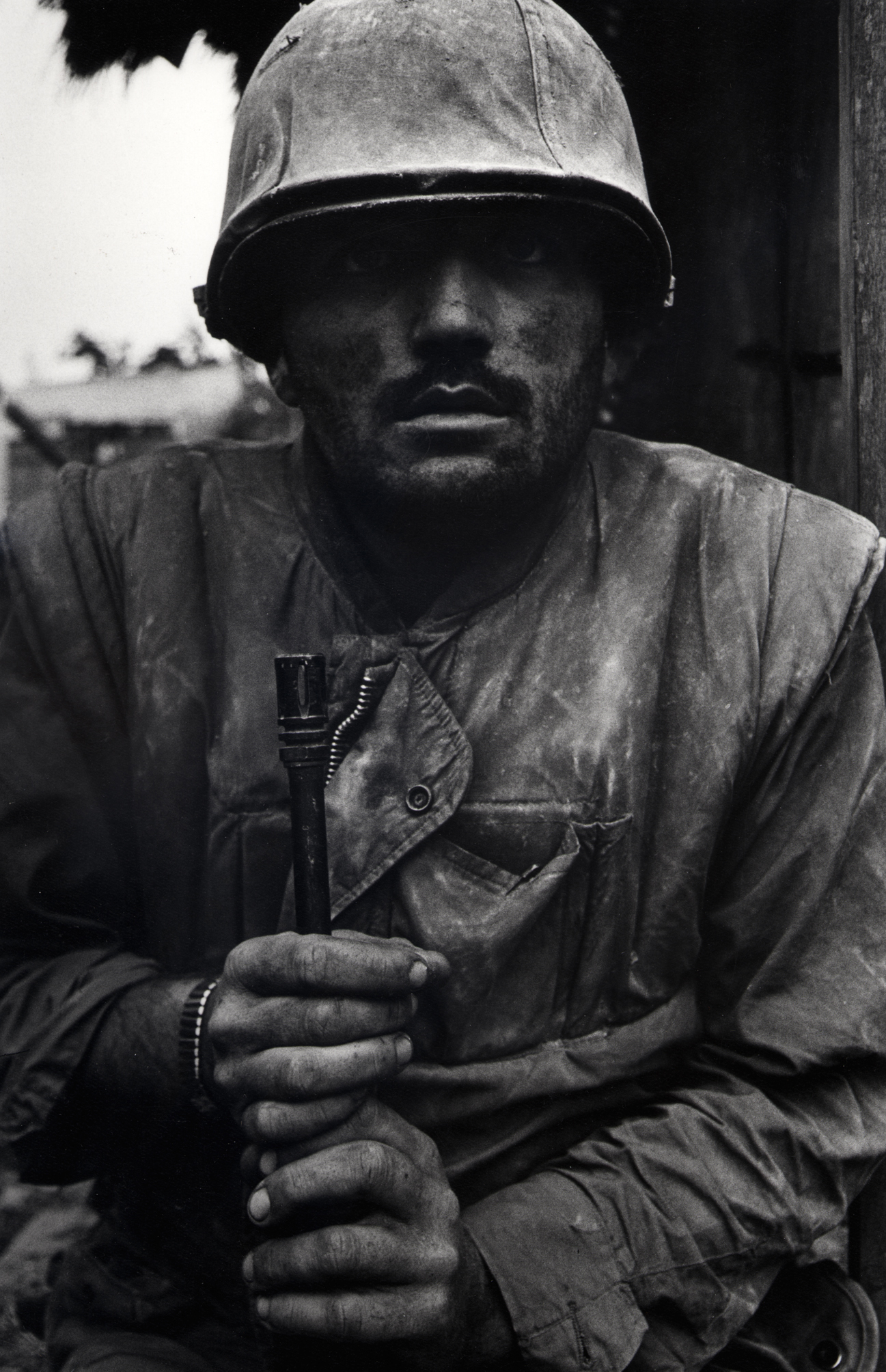
The exhibition opens with Don McCullin's iconic image of a shell-shocked US Marine involved in fighting the Tet offensive in Vietnam in 1968, and words from author Kurt Vonnegut who witnessed the bombing of Dresden in 1945 but struggled to finish his book on the experience - Slaughterhouse Five.

The Tate uses this as a starting point - those moments just after the heat of battle - when chaos and scars are immediate and visible and from here it examines how that damage fades and disappears over time, as well as taking into account Vonnegut's commentary on needing time to fully comprehend and detail that experience.
There are other iconic images in this exhibition, including Susan Meiselas' photograph of a Sandinista throwing a Molotov cocktail which, 25 years after it was taken, was adopted as the official symbol of the anniversary of the Nicaraguan revolution. And the Tate has also brought together many images of the Hiroshima and Nagasaki blasts, including many that were suppressed by the Americans for decades after the blast.
The big global conflicts are of course heavily represented but regional and local conflicts and violations are also represented, including photographs from the Republic of Congo, Lithuania and the American Civil War.

Photographers Adam Broomberg & Oliver Chanarin have a few pieces in this exhibition including a stunning roll of photographic paper that was exposed to the Afghanistan heat for The Day Nobody Died. But it was their extrapolation of images from Northern Ireland that intrigued me most.
Belfast Exposed was a local project during The Troubles (I hate that term but just go with me here) where local amateur and professional photographers preserved images of life in Northern Ireland. Broomberg and Chanarin revisited this archive in 2011 and selected fragments of these images, random parts of the photographs that had been covered by archival stickers, and collated these in a single display.
The collection is arresting in its composition - a wall covered with circular excerpts from larger images - but it's a fascinating insight into everyday life in Northern Ireland during this conflict.
Diane Mater's photographs from Libya are a stand-out collection for me. Similar to Hrair Sarkissian's Execution Squares series from Syria in the Tate's other galleries, these photographs were taken in 2012 of sites where Gaddafi had thousands of his political prisoners and opponents executed.
As Diane says in notes accompanying her images, for human rights violations "there are rarely any physical evidence of the crime, no body, no marked grave and no forensic proof." And that is evident in her photos of a town squares and abandoned buildings. Her photo of the Mediterranean Sea, where Gadaffi disposed of the ashes of 1270 political prisoners he had executed and then pulverised in cement mixers is particularly poignant.
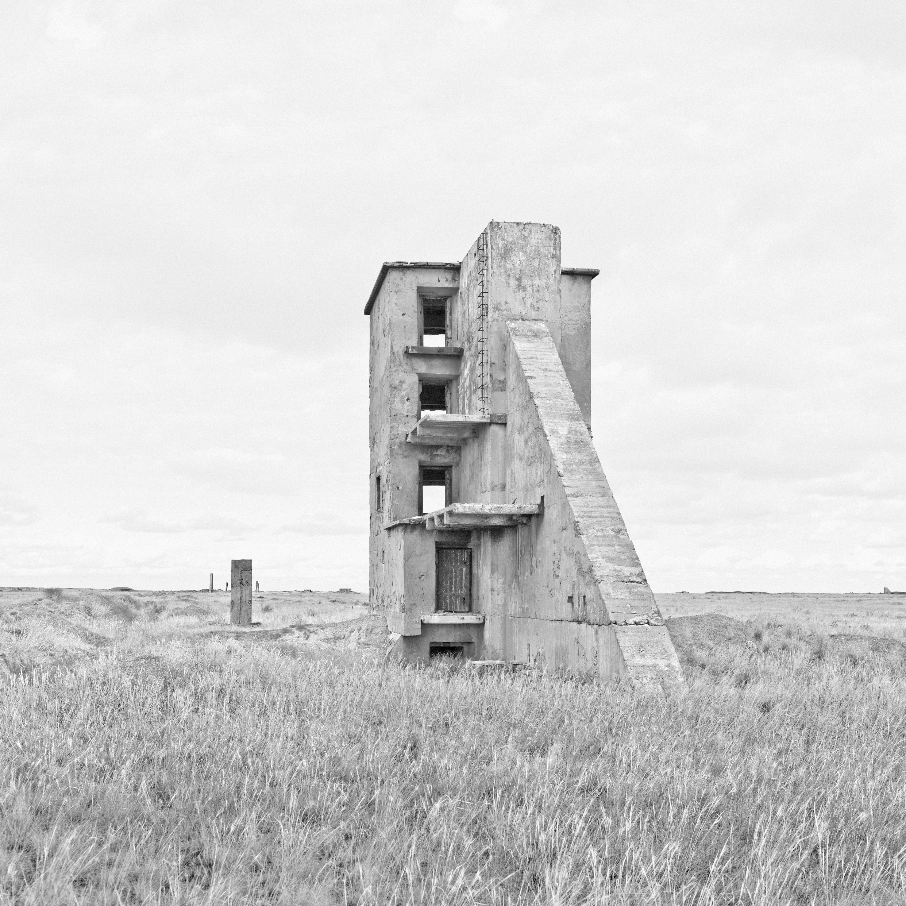
At the conclusion of the exhibition are those images where the time lapse between conflict and photograph is 100 years and more and there's an eerie sense of ghostly shadows and the weight of history in them.
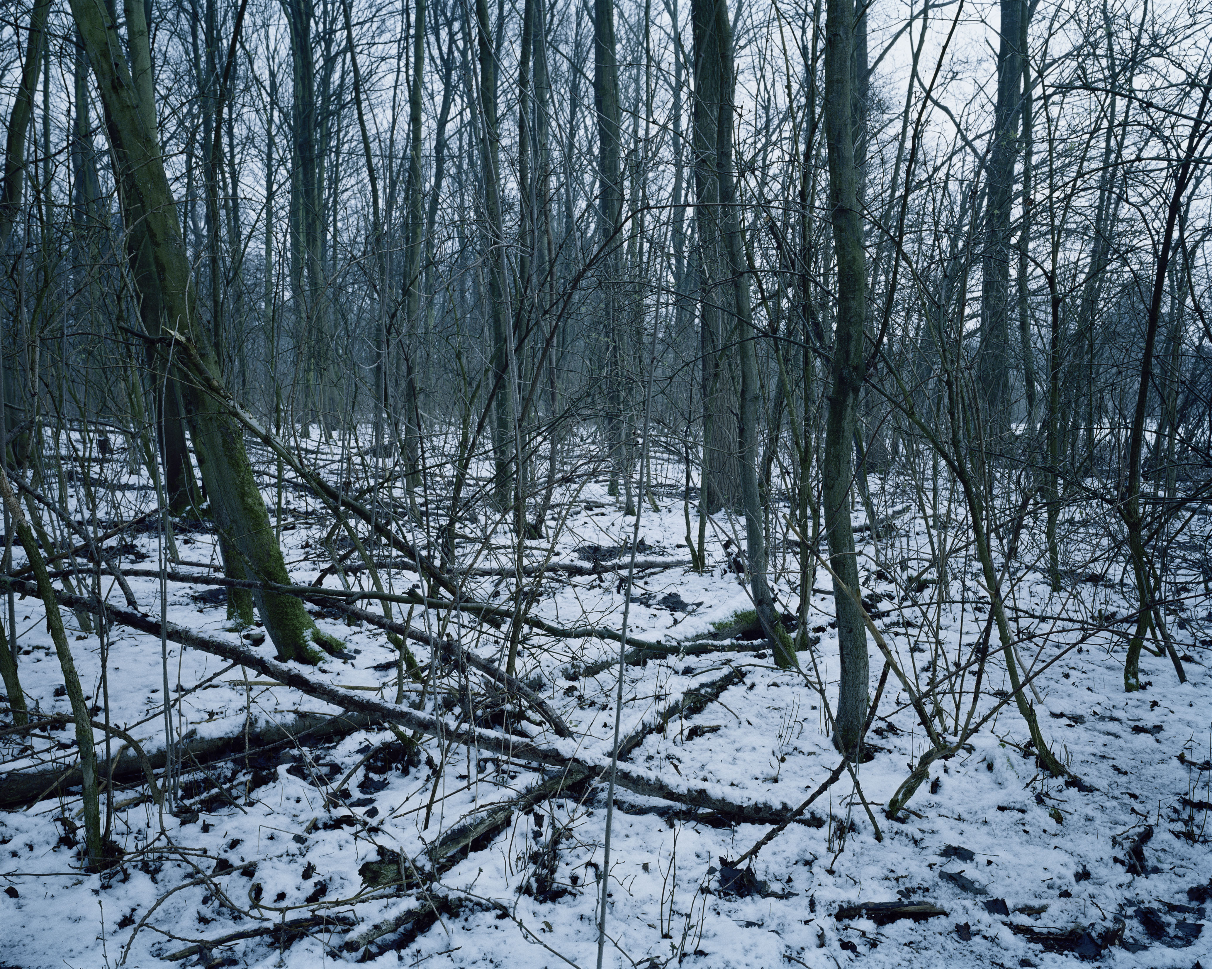
In 2013 photographer Chloe Dewe Matthews revisited sites across Western Europe where British, French and Belgian soldiers were executed for cowardice and desertion. She deliberately took her photos of woods and fields in early morning as this was the time the executions were done.
Similar to Diane Mater's photographs of Libya, these photographs are powerful in their silence and in their absence of any visible scars, as if the irrepressible passage of time is wiping away all evidence of these crimes. And I sensed something of the Anselm Kiefer in her photograph of the snow-covered woodland scene in Vebranden-Molen, West-Vlaandern.
This is certainly a very heavy exhibition. As you'd expect from the subject matter, there's no joy to be found in these photographs. And the exhibition is vast, filling many galleries. But there's such power in the weight of these images, and it's so important that as these physical scars of war heal and survivors pass on, that we remember wars and those who fought and died in them. Never forget.
Tate Modern, London to March 15, 2015
Admission: £14.50 (concessions available)
Image Credits:
1. Don McCullin, Shell Shocked US Marine, Vietnam, Hue 1968
2. Toshio Fukada, The Mushroom Cloud - Less than 20 minutes after the explosion 1945
3. Adam Broomberg & Oliver Chanarin The Press Conference, June 9, 2008, The Day Nobody Died 2008 Courtesy of the Artists © Adam Broomberg & Oliver Chanarin
4. Ursula Schulz-Dornburg, Kurchatov - Architecture of a Nuclear Test Site 2012
5. Chloe Dewe Matthews, Vebranden-Molen, West-Vlaanderen 2013


December 5, 2014
Amanda Abbington Stars in 'God Bless the Child', Royal Court Theatre
Now, this is an interesting one. It took me two trips to the Royal Court to see God Bless the Child all the way through. On my first attempt, a member of the cast fell ill backstage and the play was halted just 10 minutes from the end. Second time lucky though as I saw it all the way through.
Why does it matter that it took me two attempts? Because it really brought into focus for me how an unsatisfactory ending can transform your opinion of a show.
First time around, I thought this show was wonderful. I found it exciting, thrilling and completely unexpected. But second time around, after seeing the complete show, I came out disappointed. Such a shame as this play was shaping up to be one of the most intriguing shows the Royal Court has put on this year.
On the surface, God Bless the Child is a satire on our education system and the hoops we make our teachers, and our children, jump through. Only it's so much more than this as it's also an examination of where power truly resides in a classroom.
And intriguingly, this is not a straight-forward comedy-drama as the production, with stunning direction from Vicky Featherstone, is shot through with a dark, sinister atmosphere that, at times, makes you feel as if you're immersed in a psychological thriller.
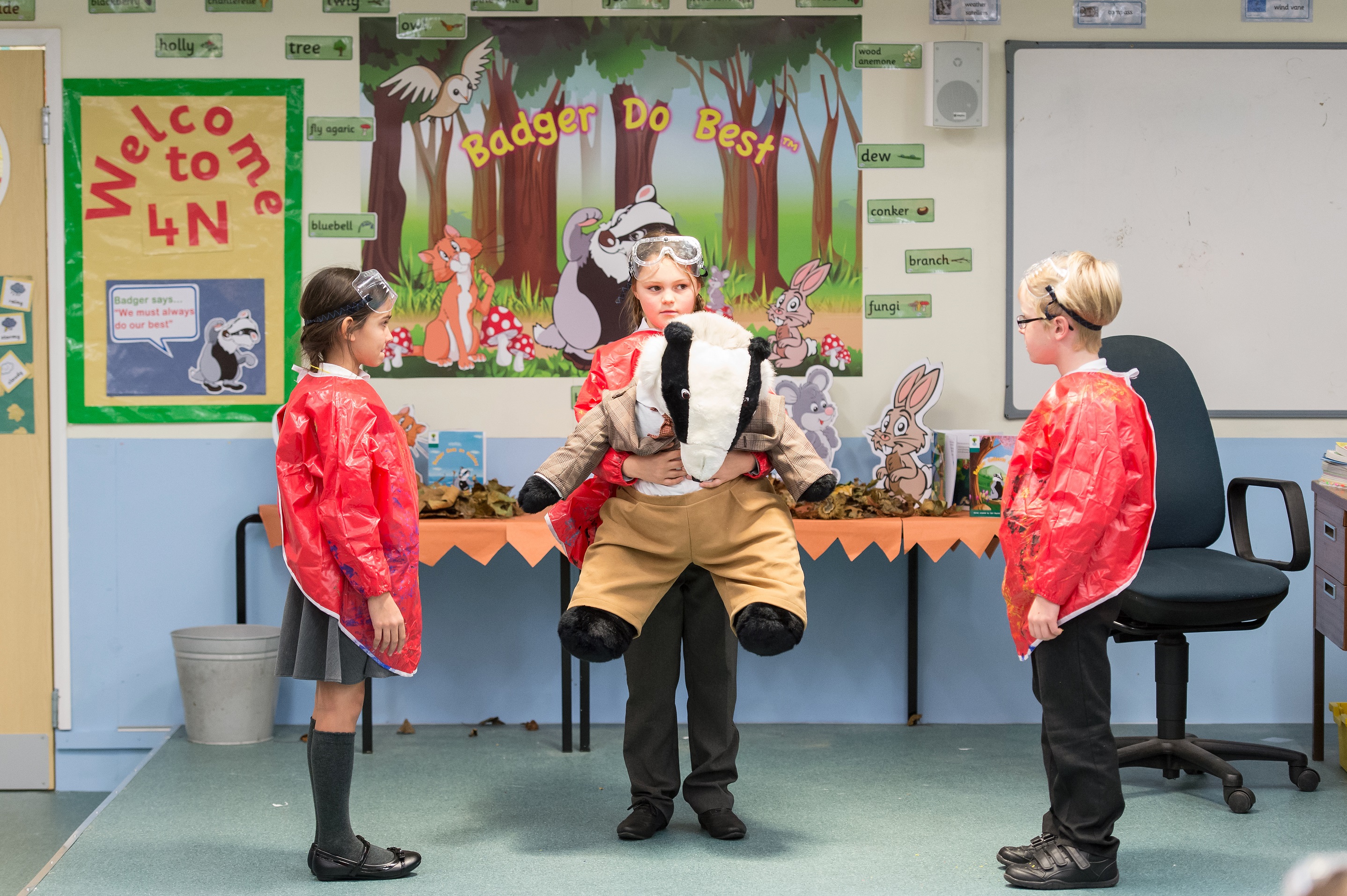
The play is set in a school almost literally as well as metaphorically as Jerwood Theatre Upstairs has been transformed into a primary school classroom, complete with teacher's desk, educational art on the walls and half a dozen 8 year olds who make up Class 4N.
And the pressure is on Class 4N and their teacher Ms Newsome (the excellent Ony Uhiara) as, in an attempt to get her hands on some desperately needed funds for her school, Headmistress Ms Evitt (a perfectly pitched performance from Nikki Amuka-Bird) has put forward this class to participate in a new government education pilot scheme, Badger Do Best.

Only this Badger Do Best scheme is, at times, ridiculous with constant daily affirmations and songs, and the use of a giant cuddly Badger as judge and jury in conflict resolution when the kids bicker and fight. It's ridiculous, yes, but it resonates because this is too close for comfort. Even the teachers know the scheme is silly but the need to appear to succeed is all that matters.
The play is written by Molly Davies, who also works as a part-time teacher, and all her wry observations on bureaucratic wrangling and constant generation of new programmes in education have been brought to bear in a sharp script that looks at a scheme where behaviour modification is more important than academic success.
However smooth progress to funding is scuppered with the rise of Louie, one of the eight year olds in the class. Louie (performed on the nights I visited by the terrifyingly brilliant Nancy Allsop) is a devious and cunning child who is obsessed with control and power.

Louie wilfully manipulates the other children in her plan to undermine the authority of the teachers, unravelling their plans for success. There is a sense of the Abigails from The Crucible in her as she gets the children bowing and chanting at the click of her fingers.
The teachers are defeated by this Machiavellian spirit in their class as the rules of the Badger Do Best scheme prevent them from any more orthodox discipline and censure. Instead Sali Rayner (a deliciously icy cool performance from Amanda Abbington), the architect of the scheme, is drafted in to tackle Louie head on.
And what unravels from here is an intriguing power struggle between the young Louie who is determined to keep control in her hands, and Sali who is adamant that her ambitions will not be thwarted by this child.
So, does Louie win? Does the school get its funding? What is Louie's final coup de grace? I was, almost literally, on the edge of my seat, desperate to see the climax of the play when it was cut short.
I was on tenterhooks for a week, wondering how on earth this play finished. But when I saw it all the way through the ending made no sense at all. It was so random, so disconnected to what went before. Characters started behaving, well, out of character, and Louie's final act was a bit of a damp squib.
There was so much I liked about this show. It would have been easier to do a straightforward satirical comedy-drama on our education system but the subversive, sinister spirit of Louie and her methods lifted this show into another place. Theatre should always take risks and I loved the risks here, but overall it was let down with a disappointing conclusion.
Royal Court Theatre, London to December 20, 2014
Image Credits:
1. The Cast of God Bless the Child at the Royal Court Theatre. Credit Manuel Harlan.
2. Amanda Abbington and Nancy Allsop in God Bless the Child at the Royal Court Theatre. Credit Manuel Harlan.
3. The Cast of God Bless the Child at the Royal Court Theatre. Credit Manuel Harlan.
4. The Cast of God Bless the Child at the Royal Court Theatre. Credit Manuel Harlan.
5. Nancy Allsop and Lahaina Asumang in God Bless the Child at the Royal Court Theatre. Credit Manuel Harlan.
December 1, 2014
Should We Be Amused by Guy Bourdin's Photographs, or Appalled?
The new exhibition of Guy Bourdin's photography at Somerset House presents us with a conundrum. There is no doubting the man's eye and talent for image creation, but these images were taken over 30 years ago and today, many of them are deeply uncomfortable, some of them arguably offensive.
Bourdin was a pioneer. He transformed fashion photography in the late 1970s. He challenged the notion that fashion photographic images should be attractive and instead proposed that fashion photography should be designed to attract. A subtle difference but a profound one.
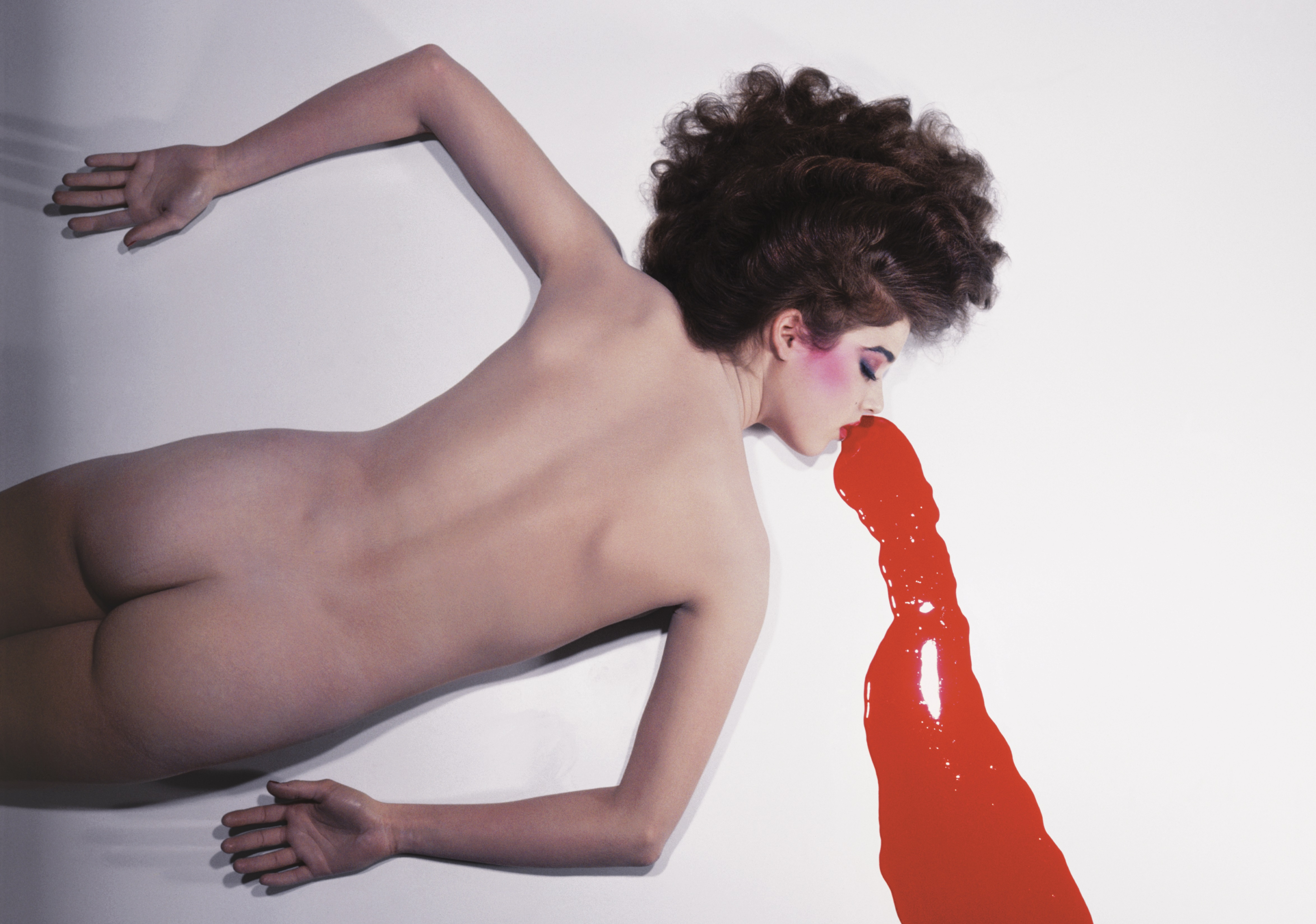
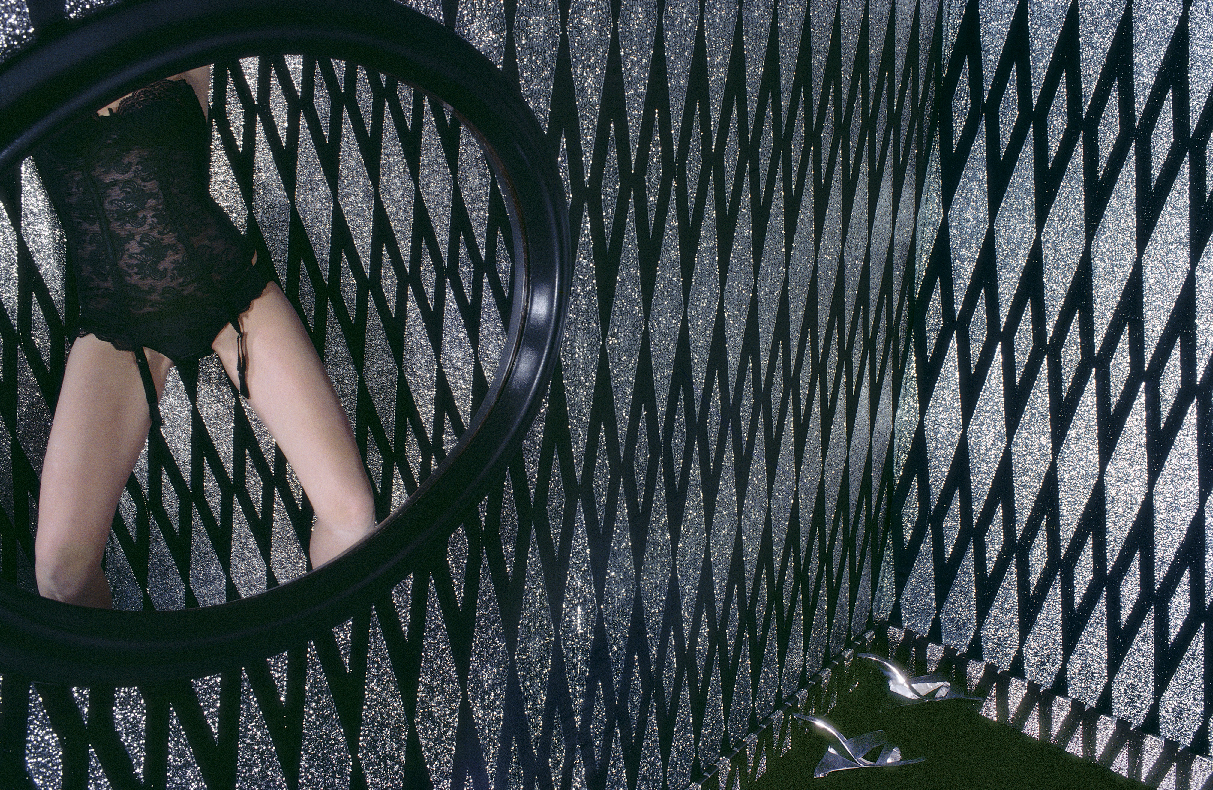
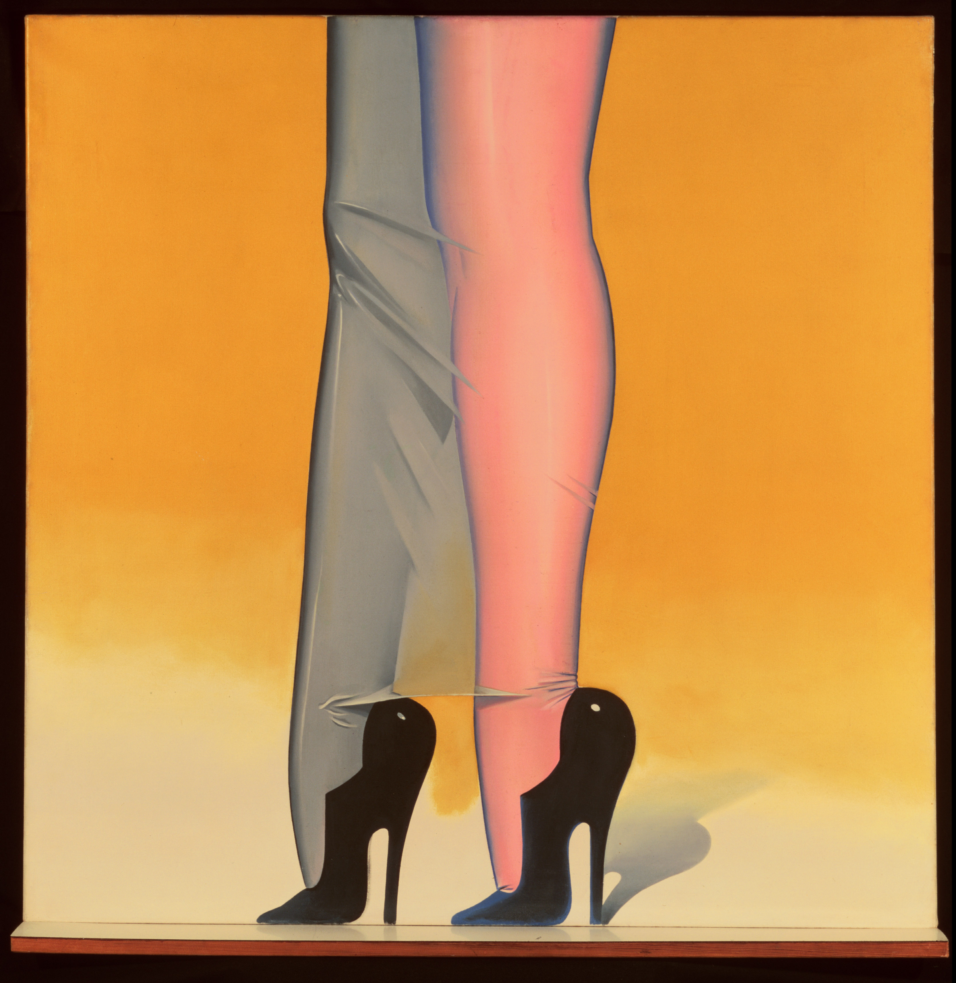
His bold, striking images of women were saturated with colour and had such fascinating, challenging compositions. Often they were cheeky, with great humour such as his famous image above of the women with seamed stockings seemingly lost over the edge of the red floor. Or the sexy image below with the perfectly heeled pair of legs up the top of a metal ladder

The influence of his mentor the surrealist Man Ray can be seen in Bourdin's incredibly clever range of adverts for Charles Jourdan shoes. A pair of disembodied mannequin legs in elegant shoes is shown in a variety of random interior and exterior settings, from sitting at a dinner table to feeding the ducks or waiting at a bus stop. There's a delicious humour to these - and they are very effective in grabbing the attention and were such a clever idea for selling pairs of shoes.
There are some who don't like even these pictures. I get that. I get the fact that some are uncomfortable with women being reduced to their body parts, where not even their complete body is necessary, let alone a soul.
Individually, we could dismiss a single photograph as anachronistic or simply part of the larger objectification of women in society that many are battling against. However, when you are faced with entire walls, whole galleries of these images, it is impossible to be so easy going.
And when you look through the body of his work, there are some deeply disturbing images. There are photos of women with picture frames smashed through their heads, highly sexualised images of a bed full of naked underage girls and one of a naked unconscious woman with, what seems to be, blood pouring out of her mouth.
Worryingly, the last image of the woman in a pool of blood was selected by Somerset House, from all the images on display, to retail as a postcard in their gift shop. It was shocking to me to see this stark image of a naked woman who, for all purposes, had been violently attacked, in the shop for someone to purchase, scribble on the reverse and post off to friends and family.
Given the focus on violence against women, this was a wholly insensitive, even reprehensible, choice. I approached Somerset House for comment on this selection. I hoped they would realise their error of judgment, but no.
Instead they responded with "it is up to the viewer to infer the meaning - not everyone will come to the same conclusion and the reading of his images are purposefully more complex than a single interpretation... It may make for uncomfortable viewing in modern times and provoke debate, but this is often the role of art and culture in society. What we may find acceptable today might not be appropriate in 30 years from now, but it shouldn't necessarily be censored for future generations. The merchandise equally represents the breadth of the show and this particular piece is one of Bourdin's most iconic images."
First, it is faintly ridiculous to suggest there are alternative interpretations of this image. But second, this isn't about censorship. This isn't about whether Somerset House can display the picture (which is a separate question) but whether it was morally right for them to sell this picture for profit. For though we should always rally against censorship, we have to have a point when we say enough is enough.
But with regards to examining Guy Bourdin's creative process, the curation of the exhibition cannot be faulted. Not only have a huge number of Bourdin's published and unpublished photos been collated together, but there are also some of his film clips, paintings and polaroids.
Unusually, Bourdin often filmed parts of his photo shoots on Super 8 and some of these film clips are projected onto the large white walls of the Somerset House galleries. And in the pre-digital age in which he worked, Bourdin often used polaroids as test shots to judge what needed to be amended in any of the compositions he was working on.
It was also interesting to see how much creative control Bourdin retained. He was loved at Paris Vogue who often allowed him to select not just the final image for production, but also how his images would be laid out on the magazine's pages.
This is a challenging time in the London arts calendar for feminists like me, uncomfortable with the objectification of women. There's Allen Jones and his questionable dead-eyed sex doll figures at the Royal Academy. We've Egon Schiele at the Courtauld with his sexualised nudes of his younger (and underage) sister and the Design Museum is hosting an exhibition on how the emancipation of women can be seen in the clothes they wear which, at times, is incredibly reductive.
But these are interesting points. How do we address this art and fashion from other times when the treatment of women like this was more or less accepted? Do we write it off? Do we contextualise it, see it as representative of the times? Or do we challenge it?
It's tricky. And I can't say that I have an answer. All I can say is that I found Bourdin's images at times witty and at other times deeply unsettling. And we are long past the point of tolerating pictures glamourizing violence against women being sold for profit.
Somerset House, London to March 15, 2015
Admission: £9 (concessions available)
Image Credits:
1. Charles Jourdan, Spring 1979 © The Guy Bourdin Estate, 2014/Courtesy A+C
2. Charles Jourdan, Fall 1977 © The Guy Bourdin Estate, 2014/Courtesy A+C
3. Charles Jourdan, Autumn 1979 © The Guy Bourdin Estate, 2014/Courtesy A+C
4. Image: Pentax Calendar, 1980 © The Guy Bourdin Estate, 2014/Courtesy A+C
5. Charles Jourdan, January 1980 © The Guy Bourdin Estate, 2014/Courtesy A+C
November 27, 2014
'Women Fashion Power' Exhibition at Design Museum Does Not Always Get Balance Right
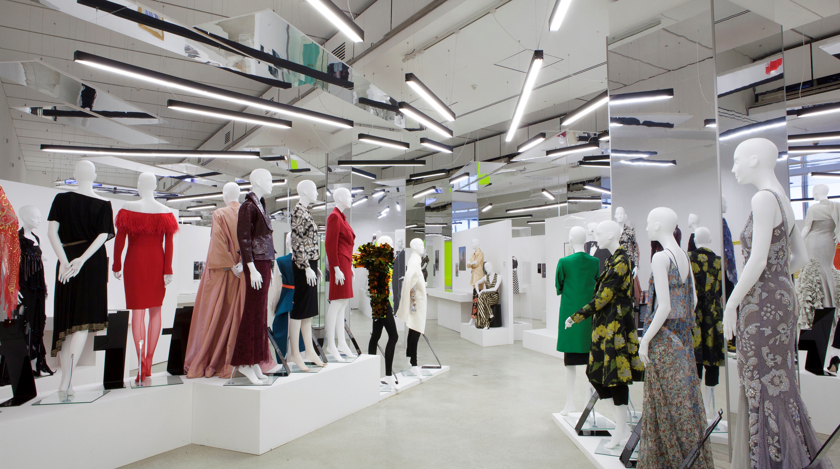
The Design Museum's new exhibition Women Fashion Power examines how female fashion has changed in line with emancipation and showcases examples of how powerful women have used fashion to define and enhance their position in the world. But by including the word 'power' in their exhibition title, I can't help but feel the Museum has set itself up for a fall.
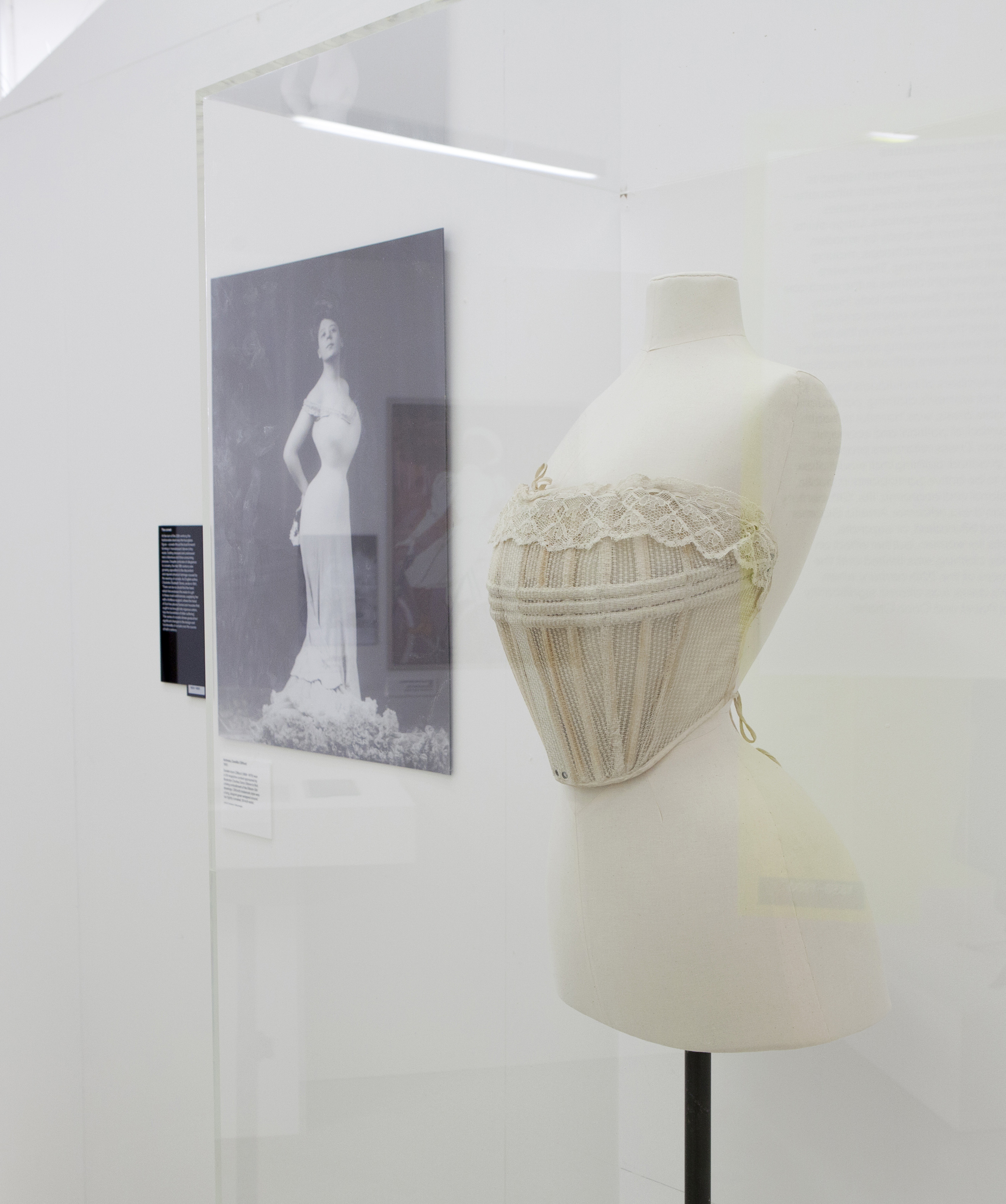
The last 150 years of women's fashion is analysed through an immersive visual timeline that explores how female fashion has transformed from the restrictive boned corsets of the nineteenth century to the statement Louboutin heels of today (though given the restricted movement in Louboutin's fetishist high heels, it's questionable how much progress has been made since the corsets! ).
Nevertheless the approach is a great success as the visitor weaves their way through the displays that include items from Vivienne Westwood's glorious back catalogue, a beautiful lace shirt belonging to a WSPU suffragette with the WSPU colours woven into the sleeves, protest t-shirts from Katherine Hamnett and a Coco Chanel designed suit from 1955.
And these are accompanied by a wonderful collection of photos, magazines, sketches and many other objects to show the development of female fashion, and the drivers for these changes.
I liked how the exhibition does acknowledge that there are challenges for women and the forensic analysis on what they wear. When looking at powerful women in the public eye, a picture of Hilary Clinton is accompanied with commentary on scrunchie-gate and there's much observation on Angela Merkel's preference for very plain trouser suits.
There's a lovely glamorous section about the rise of the strong woman archetype in Hollywood in the 1930s, with Greta Garbo, Marlene Dietrich, Jean Harlow and Joan Crawford amongst others. These women were hugely influential, as were their images, but I liked how the curators of the exhibition say how ironic this is given these women were made by the male-dominated Hollywood studio system that also exploited and profited from them. Style over substance indeed.

And even today, as the exhibition explores the link between empowerment and expression of female sexuality (with the obligatory picture of Madonna in Gaultier), this is interestingly juxtaposed with a copy of the famous "Hello Boys" Eva Herzigova advert for Wonderbra - the challenges for female expression evident in a world that wants to commoditise female sexuality for profit.
All good but sometimes the exhibition does itself get a bit confused with this tricky conundrum, inadvertently undermining women with their focus on fashion.
One of Margaret Thatcher's suits is on show and this is accompanied with a film clip of Maggie discussing which dress in her wardrobe she wore to an event at the UN at the time of the Falklands War. There was something deeply unsettling about watching the most powerful woman of her time reduced to talking about her reliable go-to navy silk dress. I wasn't impressed or interested in her rationale on why this dress, I just thought the whole thing was so patronising and insulting. No-one ever gave Reagan this line of questioning.
The curators also obtained donated outfits from high-profile women as examples of which items in their wardrobe make them feel powerful. Now, setting aside the very uncomfortable suggestion that power comes from what you're wearing, there is also the bizarre inclusion of items from HSH Princess Charlene of Monaco.
Now, I mean, where to begin? Not only is figurehead royalty not the same as actual power but she is the wife of the heir to the throne, not the actual heir. And let's be frank, with the rumours surrounding that marriage I felt this was an example of how much female power is tokenistic in today's society - attention to the pretty consorts imprisoned in their gilded cages and not enough actual power players. Couldn't they have approached Oprah instead?
As a display that examined the parallel and deeply intertwined developments between female emancipation and fashion, this exhibition is interesting. But the use of the word 'power' made me feel really uncomfortable.

Female power, like male power, should not have any link whatsoever to clothes. The constant attention and running commentary on what women in the public eye are wearing shows how far we are from equality.
However a quote from Shami Chakrabarti at the close of the exhibition was interesting. "What we wear does matter" she says. And she focuses on those with freedom to wear what they want compared with a "uniform imposed on so many people, against their will."
This is an interesting point but we shouldn't be comparing ourselves with those at the bottom of the rung, but with those at the top. So interesting as this exhibition is, I came away from the Design Museum more convinced than ever that women won't have true power until what we wear becomes completely irrelevant.
Design Museum, London to April 26, 2015
Admission: £12.40 (concessions available)
Installation images by Mirren Rosie.
November 24, 2014
Chris Stein & Blondie Photography Exhibition at Somerset House
Any photo of Debbie Harry is worth looking at. And she is very much the star draw in this wonderful series of photographs by Chris Stein, which have been brought together in this new exhibition at Somerset House to celebrate the band's 40th anniversary.
Chris Stein studied at the School of Visual Arts in New York but it was 1968 when he began deliberately taking photographs to capture the emerging downtown culture. In 1973 Chris met Debbie Harry. A year later they created Blondie and, well, we know the rest.
Blondie were right at the heart of the punk and New Wave music scene in New York and that time and city very much make up the spirit of this exhibition.
The series of photographs includes previously unseen images as well as more familiar photographs. Individually the photographs are fascinating, many of which have interesting stories accompanying them. But as a collection, they really evoke that moment, that time, when the underground scene was about to break through into the mainstream.
None of us will ever be as cool as Debbie Harry and her star quality shines through in every photo of her. Chris' photography was key in capturing her look and establishing her iconic status. And that's reflected in some of the famous photo shoots that are represented here such as Chris' photo shoot for Punk magazine of Debbie with the baby dolls.
But it's the backstage, behind the scenes images that really bring to life the world away from the sell-out tours. There's Debbie lounging on a car just outside the legendary CBGB club in New York, the band having breakfast in Germany and house parties in the East Village.
Debbie Harry is the icon, yes, but Chris Stein captures many other icons in his photos. After all, bands were often friends with each other, often touring together too. As well as the band there are photos of David Bowie, Iggy Pop, Joan Jett and The Ramones - amongst many others.
The grit of the East Village is practically tangible in the shots of Joan Jett in her run-down apartment, or the contrived shots of Debbie Harry cooking in a dress (probably) worn by Marilyn Monroe in the apartment she shared with Chris after it burnt down in a fire. This is no MTV Cribs. The financial struggles of life as an artist are obvious.

Each photograph is accompanied with a few comments from Chris Stein, usually on his relationship with the subject, how they met and his reminisces of that moment. It adds to the intimacy as well as our knowledge on the shots. However it is quite sad how many of those he photographed are no longer with us, and that does lend some of the images a bittersweet emotion.
I loved how this exhibition was showcased - the galleries are large and spacious and there's New Wave and 1970s classics blaring out from the stereo, from Blondie's own to David Bowie. There was even enough room for a mum to go round with a pushchair without hindering anyone else.
And it's all free too. Wonderful.
Chris Stein/Negative: Me, Blondie and the Advent of Punk, Somerset House to January 25, 2015
Image Credits: Chris Stein/Negative: Me, Blondie and The Advent of Punk´, Somerset House, London WC2, 5 November - 25 January; somersethouse.org.uk. The book of the same name by Chris Stein (Rizzoli £35) is available nationwide.
November 21, 2014
Review: Behind the Beautiful Forevers, National Theatre
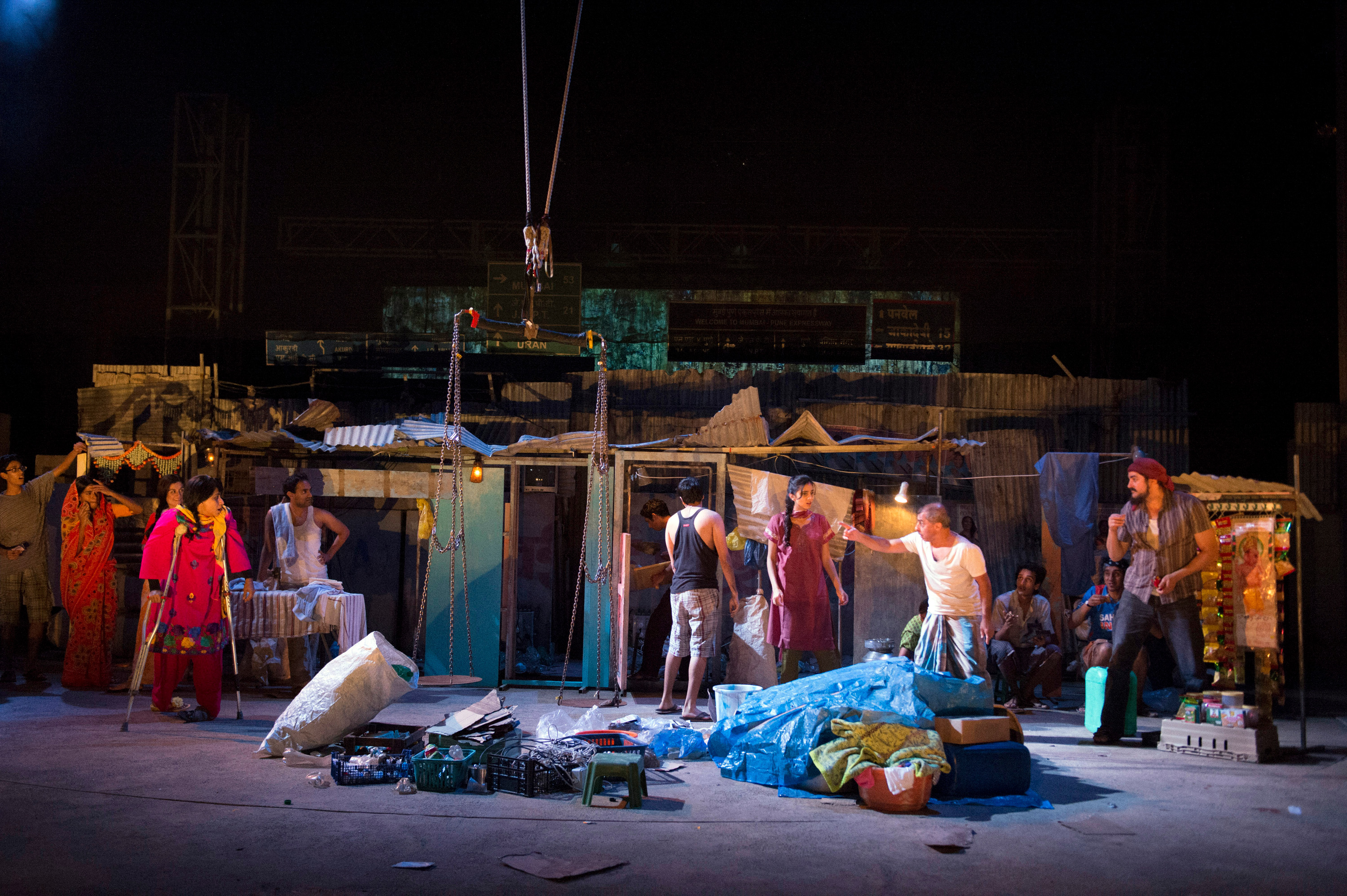
Inside Behind the Beautiful Forevers is a gripping epic tale of life and loss in the Mumbai slums just dying to burst free. All the ingredients are there in this evocative blend of sights, sounds and voices but at times it feels as if there's just too many of them.
Based on the best-selling book by Katherine Boo, Behind the Beautiful Forevers is a dynamic, vibrant depiction of the dark side of India's rapid economic success. For under the Mumbai flight-path lies a vast slum that teems with people desperate to grab some of India's riches for themselves - by any means possible.
The way Director Rufus Norris has recreated the Mumbai slums on the Olivier stage is almost breath-taking. The energy and the tumbling chaos of this world is quite something to behold.
Low-flying aircraft scream overhead, rivers of tossed away plastic bottles pour onto the stage like waterfalls and the flimsy shanty town shacks that are built as easily by the residents as quickly as they are demolished by the state fill the stage.

All of the design team deserve credit for this achievement (led by designer: Katrina Lindsay). The production budget must have been eye-watering but the result is a resounding success.
And the show just sizzles with energy, whether it's from the banging bursts of Bhangra music, the vast billboards that loom overhead revolving through their advertisements, or in the stage that positively teems with life.
There's much to be said for the chaotic way the play depicts the swirling interdependency of lives below the poverty line. The sense of characters living on top of each other in the heaving, sweaty slums is palpable. However this does have consequences in trying to grab a clear storyline to hook us.
Adapted by David Hare, the play has taken a calculated risk in not identifying a single main character to pivot and plot the play around. There are characters we get to know, such as Meera Syal's steely matriarch who binds her Muslim family together against the prejudice and jealousy from others as she pushes to enrich their lives.
Then there's her son, a principled young man trying desperately to find some honourable way out of poverty. Only what's the point in having principles when the corruption around you is so endemic?
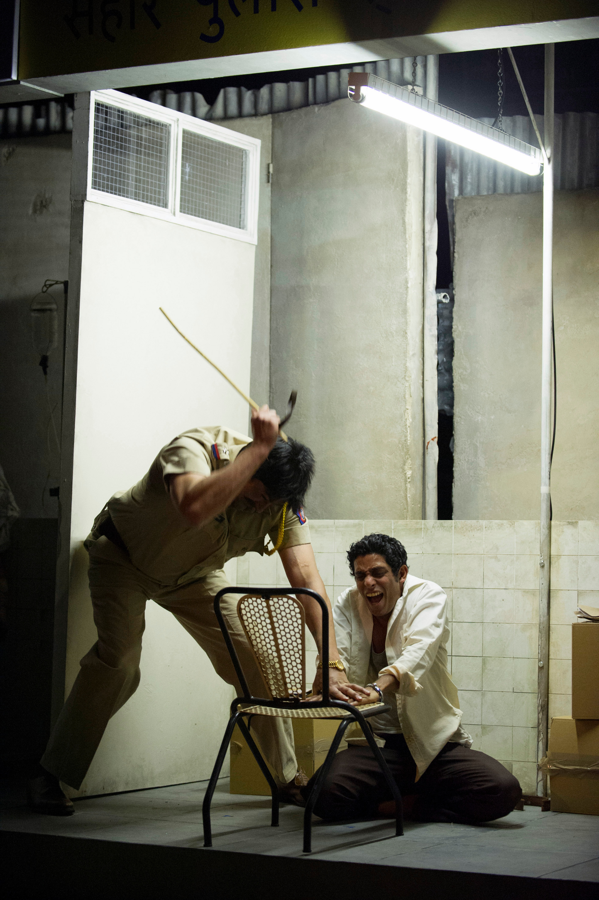
There's light relief to be found in their sharp-tongued disabled neighbour who earns the cash as a prostitute whilst her husband is away and her kids are out scrounging a living. And then there is the crafty go-to woman who will cut you a deal with the corrupt authorities - the police and the courts - but that help will come at a price.
The play confronts the injustice of life in the slums head on but also tackles globalisation - a stock market crash in Wall Street may cause a banker to lose his job in New York but the trickle-down effect in Mumbai is that the value of the recycled bottles crash and so a family starves.
The theme I most warmed to though was the challenge of this dynamic change on traditional Indian culture and custom.
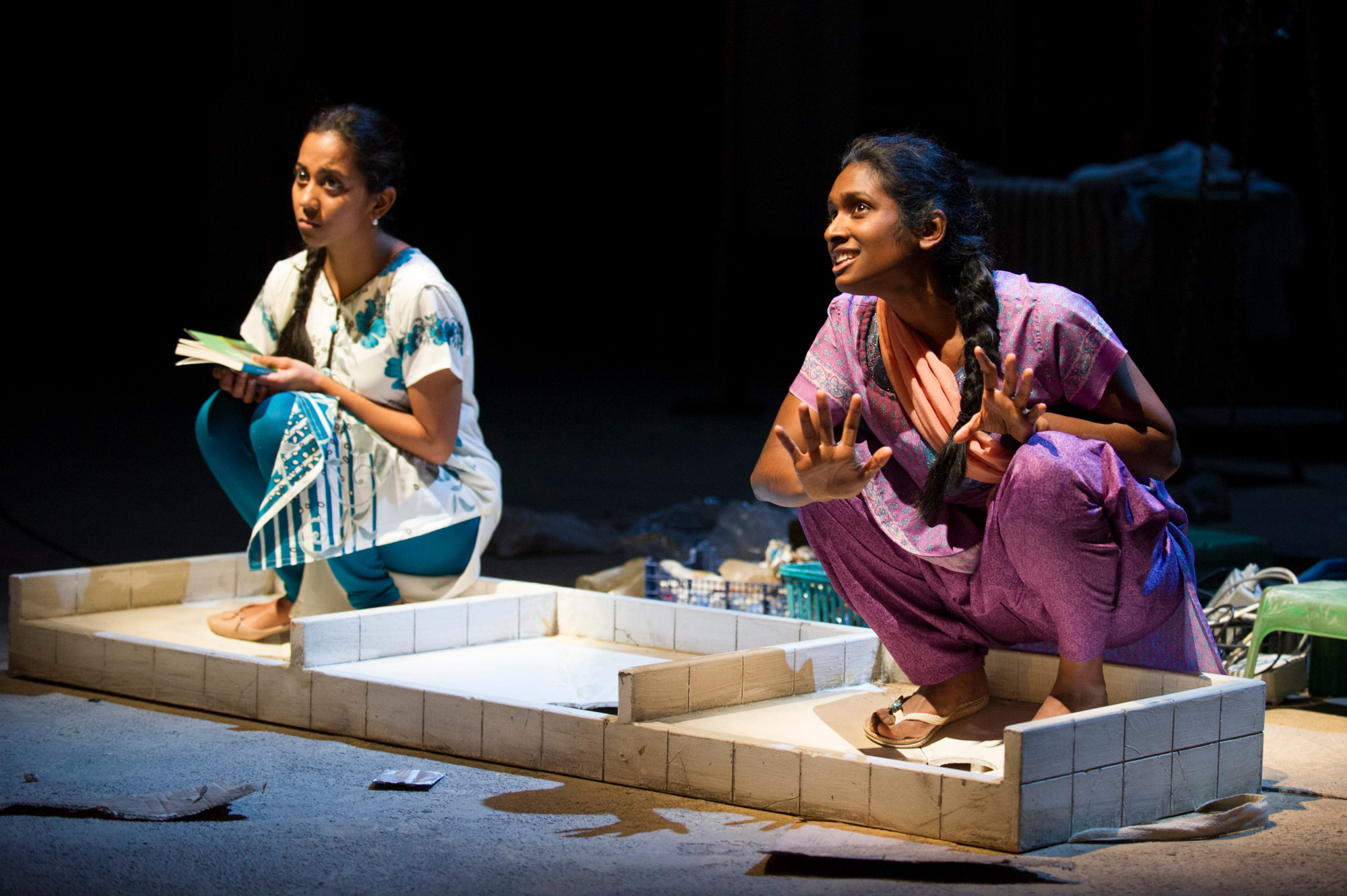
The most bittersweet storyline was that of the two young girls having secret rendezvous in the dirty communal toilets just so they can teach each other English, to educate themselves out of their dreadful lives. Their secrecy is necessary as educating girls is abhorrent in their families, their parents seeing the girls' value only in their domestic servitude and there are tragic consequences when they are discovered.
I could keep going on... There really are so many characters. It's enriching in many ways - you see so much, we learn so much - but too often some of these storylines drag and the three hour running time weighs heavy. If only 20 minutes had been trimmed and some of the story lines streamlined, this play would have had the right balance between the optimistic energy and the required pathos.
I am excited that we have a big production that isn't about white middle-class England. But I find that mitigated somewhat when that voice, that representation, has been compromised as the play is still written and directed by white middle-class men.
The play was adapted by David Hare, a writer of great repute but, much like when the National hired a man (Nick Payne) to write a play about feminism (Blurred Lines) I can't help but be a little frustrated with the choice of a white man to write a play about India, and in particular, Indian women who make up the vast majority of the principal characters on show.
Behind the Beautiful Forevers is an exciting production. There are flaws, yes, but it is important that theatre continues to take risks so I am more forgiving of the challenges in the production than perhaps others will be. But next time can we also have as much breakthrough in the creative team as well as the story being told? Thanks.
National Theatre, London to April 13, 2015
Image Credits:
1. A scene from Behind the Beautiful Forevers - image by Richard Hubert Smith
2. Meera Syal - Zehrunisa Husain, Bharti Patel - Laxmi Chinu Behind the Beautiful Forevers image by Richard Hubert Smith
3. Chook Sibtain - Sub-Inspector Shankar Yeram, Shane Zaza - Abdul Husain Behind the Beautiful Forevers image by Richard Hubert Smith
4. Anjana Vasan - Manju Waghekar, Annika Rose - Meena Chinnu Behind the Beautiful Forevers image by Richard Hubert Smith
November 18, 2014
Wildlife Photographer of the Year 2014 at Natural History Museum
The annual Wildlife Photographer of the Year competition is now in its fiftieth year. It is a global showcase of the very best nature photographs and I was absolutely blown away by the finalists on show in a stunning and moving display of their work at the Natural History Museum.
When the competition launched in 1965 it received 361 entrants. This year it received over 42,000 from across 96 countries and the photographs for the 100 finalists are showing at the Natural History Museum until next August, as part of a global tour that allows them to be seen by millions of people across six continents.

The photographs are so diverse in every way. From powerful evocative images of caged lions bred solely to be hunted to delicate images of a new frog emerging from a giant ball of spawn. There's the incredible detail in Tim Lamon's photos of rare birds-in-paradise in New Guinea to Nick Hawkins' flock of black vultures feeding off the carcass of a green turtle.
A real eye-catcher is Steve Winter's Hollywood Cougar of an urban cougar out at night, prowling in front of the famous Hollywood sign. And then in contrast, there's Jasper Doest and Lukasz Bozycki's image of a bat hanging from the roof of a hut in a sub-zero climate.

Almost inevitably there are the obligatory photos of sharks but I found the two on show amongst the most powerful. One by Rodrigo Friscione Wyssmann has a Great White caught on a fisherman's long line. Sharks need to move at speed to survive but after getting caught, the shark couldn't move and so suffocated.
The second image, Sea of Death by Paul Hilton, is of hundreds of freshly sliced shark fins drying on a rooftop in Hong Kong. Over 100 million sharks are killed each year for this delicacy. The vendors are constantly on the run from protest groups who try to disrupt this practice. This photo from Paul revealed a new secret hideout for those who de-fin the sharks.

The stories accompanying the images infuse the photos with so much power so it's great that the Natural History Museum has put up little excerpts next to each image. Many of the stories though reveal big sacrifices from the photographers.
For example, Adriano Morrett was stung repeatedly whilst trying to capture his image of jellyfish, an image he'd had in mind for 15 years. Whilst another photographer, Paul van Schalkwyk whose shot Shifting Sands is a finalist, died in March 2014 when his plane crashed in Namibia.

The photography isn't just confined to the animal kingdom though as the finalists include those who look at earth sciences - how our Earth works and how it has evolved - as well as its current ecological state.
A stand-out shot for me was Filthy Riches by Charlie Hamilton James which is a powerful shot of the Amazon landscape ravaged by illegal gold mining. Since the financial crash in 2008, the value of gold has skyrocketed, causing this illegal activity to flourish. Over 6000 hectares have been devastated by this mining since 2008, a problem worsened by the 180 tonnes of mercury poisoning of soil and rivers (mercury is used in the mining process).

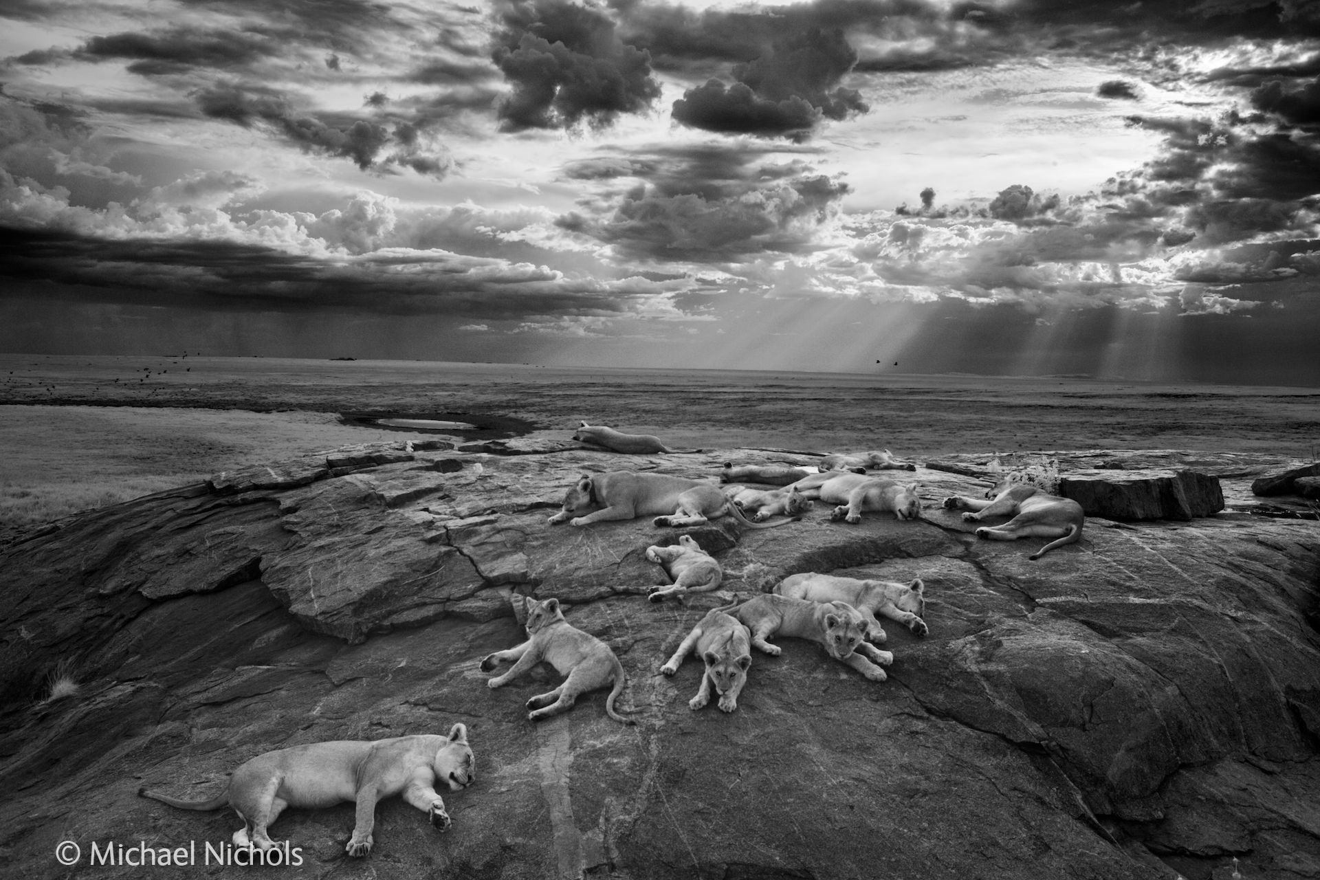
It must have been almost impossible to come to a decision on a winner such is the quality and the variety of the entrants. Yet a winner was picked and the prize went to Michael 'Nick' Nichols for his quite beautiful black and white photo of female lions resting with their cubs in Tanzania's Serengeti National Park.
And how lovely that young photographers are also encouraged with a separate category of their own. The winner was Carlos Perez Naval for his image of a scorpion soaking up the sun near his hometown in Spain. It's a stunning image - you can see all the detail in the scorpion's exoskeleton and the harsh sun situates the scorpion perfectly. Incredibly, Carlos was eight when he took his photograph. Eight. Frightening as well as amazing!

And it's not just still images in the exhibition. The competition acknowledges developments in technology and there is a category for time-lapse photography. I was initially quite sceptical over seeing these - I've always loved the power and message in single still images - but there were some interesting entrants in this category. Will and Matt Burrard-Lucas's entry on the patterns created by migrating wildebeest fascinated many visitors and there was quite a huddle around these.
This acclaimed exhibition premieres at London's Natural History Museum each year before touring more than 60 cities in the UK and across the world. It showcases the award-winning images, bringing the talent and vision of each photographer to all who visit.
The photographs are all showcased in a large, spacious setting so even though it's busy, there's plenty of room. And every single one of the images on show is worth seeing. They are all quite stunning and a timely reminder of how beautiful the world is - and how fragile.
Natural History Museum, London to August 20, 2015
Admission £14 (concessions available)
Image Credits:
Wildlife Photographer of the Year is co-owned by the Natural History Museum and BBC Worldwide
1. The last great picture WINNER - Black and White AND Overall Wildlife Photographer of the Year 2014 Michael 'Nick' Nichols USA
2. Eye of the spawn FINALIST - Amphibians and Reptiles Ewald Neffe AUSTRIA
3. Hollywood cougar FINALIST - World in Our Hands Steve Winter USA
4. Sea of death FINALIST - World in Our Hands Paul Hilton INDONESIA
5. Touch of magic FINALIST - Underwater Species Adriano Morettin ITALY
6. Filthy riches FINALIST - World in our Hands Charlie Hamilton James UNITED KINGDOM
7. Stinger in the sun WINNER: 10 Years and under AND Young Wildlife Photographer of the Year 2014, Carlos Perez Naval, SPAIN
November 14, 2014
Film Review: The Imitation Game
So The Imitation Game is a good film, yes, but I'm not going to say it's a great film. It's engaging at time but too often it's boring, drama is crowbarred in to try and make it more exciting and most of the characters are caricatures - flat and unbelievable - with little character development.
However...
The acting is absolutely superb with a stunning central performance from the internet's favourite actor, Benedict Cumberbatch, whose portrayal of the tragic hero is full of depth. He fleshes out Turing fully, bringing him to life with humour and warmth, as well as getting under the skin of Alan's more complex side and his difficulties in developing meaningful relationships with anyone.
Without this performance, The Imitation Game would not be worth watching. Because of it, it is worth the price of the admission ticket. But that is not to say that this film does not have profound flaws.
The plot consists of three storylines told in three parts of Alan Turing's life. The main story follows Alan's time at Bletchley, where he turned up a fresh-faced 27 year old maths prodigy to crack the unbreakable German code, Enigma.
This central plot is supported by flashbacks to Alan's life as a schoolboy at Sherborne and flash forwards to 1951 when Alan is investigated by a police chief for strange behaviour following an alleged break in at Alan's house in Manchester.
Interestingly, it is the story of the young Alan (an excellent performance from Alex Lawther) which has the most emotional punch as we see him slowly open up to the object of his affections, Christopher Morcom. And frustratingly this emotional heart just doesn't transfer to either of the other plot lines, robbing us of the emotional payoff of Alan's untimely death.
The main plot seems to be trying to be an action-adventure type, set-up with a few high comedy scenes thrown in for good measure. Only we all know how WW2 ended, and that Enigma was broken, so it was an odd choice as there's little suspense for us, the audience.
At times the film is interminably dull. Drama between the characters stuck at Bletchley is racked up with some artificial set-ups such as an argument between Joan (Alan's friend and to-be fiancée, played by Keira Knightley) and Alan that comes out of nowhere - and Joan slapping Alan's face is just so out of character and so out of place that it is just bewildering.
Or the film reverts to cranking up the volume in its melodramatic musical score to ramp up the drama between Alan and the supposed villain at Bletchley, Charles Dance's Commander Denniston.
The film is desperate to manipulate us emotionally, to get us to feel something for these characters and therefore to be emotionally affected by the conclusion. But that compassion isn't earned by the script or the direction. Instead it is the acting that really impacts.
Benedict Cumberbatch is superb as Alan Turing. The actor has certainly done his homework - the high pitch tone to Alan's voice is there, as is his gentle stammer. The film also looks to avoid the stereotypical socially awkward genius that these characters get typecast as, and credit must also go to scriptwriter Graham Moore for this too.
Alan was not anti-social. He actually liked going out in the evenings with the other workers at Bletchley - it's just that his social skills were so terrible when he was there. And this is beautifully reflected in many witty scenes as Alan tries to make efforts with those around him.
Mark Strong, Charles Dance and Rory Kinnear are the finest of actors and, inevitably, they make a lot from very little, lifting their characters off the page and adding real depth and colour.
The film has at times only a tenuous link to reality but that is often the challenge with turning fact into fiction. I have written about Alan Turing before, both on his pardon and his legacy, but I'm not going to get too worked up about the exaggerated role for Joan or the other issues as it is a tough enough challenge for scriptwriters to frame reality into a workable plot structure.
It's also worth mentioning that I thought Keira Knightley was quite wonderful as Joan. She has her detractors, I know, but I thought her Joan brought real spirit and was a completely believable contrast and confidante for Alan.
For me, the big problem in the film isn't in its inaccuracy, its dull parts or even in its confused narrative. Its worst offence is in its treatment of Turing's sexuality.
At no point in the film does Turing even look at a man, let alone kiss or have sex. Considering how this story ends, that is just bizarre. Instead we are meant to suffice with the repressed love of the young Turing who gazes wistfully at Christopher, the object of his affections.
This isn't on. It is unacceptable that Turing's homosexuality is tiptoed around like this. What happened to show, don't tell? Instead of demonstrating that Turing is gay, we are reduced to having characters in Bletchley say to Alan "You're homosexual aren't you?" and Turing replying "Yes."
And that's it.
And from this we are therefore meant to care when Alan kills himself because he is punished for being gay. Because no matter how much the film tries to crank up the drama on will they/won't they break the code, the true emotional heart of the film is in Alan's personal tragedy and we are not allowed any opportunity to invest in this at all.
The actor Benedict Cumberbatch I believe has responded to criticism of this by saying that the film is explicit in stating what happened between Alan and a man he has a fling with, but just because Turing says the word "penis" under cross-examination from Rory Kinnear's police chief, it doesn't ease the problem.
If Alan had been heterosexual, The Imitation Game would only have been too happy to have a passionate kiss scene between the repressed Turing and his saviour Joan. So why aren't we allowed to see Turing express his passions with a man? It's the one part of his life where Alan is true to himself and his heart so why don't we see it?
Only fleetingly do we see the man that led to Alan's arrest, through the bars of police cell. Alan's own acquaintance with Arnold Murray was not that fleeting but even if the film wanted to obliquely refer to Alan being undone by only a temporary encounter, why so shy in showing it?
This affair Alan had is pivotal to the film and to Alan's life (and death). It is this one incident that unravels everything. Considering how much investment we are forced to make in more peripheral and even fictional characters, it is bizarre that we are given no time to get caught up in the one incident that matters.
This comes back down, I think, to the plot and the film not being sure what it wants to be - is this a drama about Bletchley or a film about Alan Turing? I don't think it knows. The story set in 1951 isn't really wrapped up with any satisfaction, leaving the film to resort to posting up endless captions at the end to explain what happened to Turing. And that isn't enough to make me care.
It is perversely ironic that though Turing was unashamed of his sexuality, the film of his life seems to be. This film may not be perfect but its high profile high-calibre cast will no doubt be effective enough to spread the story of Alan Turing far and wide.
And I suppose if this leads to more people reading Andrew Hodges' biography or wanting to know more about Turing, I'll take that. But its attitude to Turing's homosexuality is a missed opportunity to fly the flag high and proud for gay rights.
November 12, 2014
So, What to Make of Allen Jones?
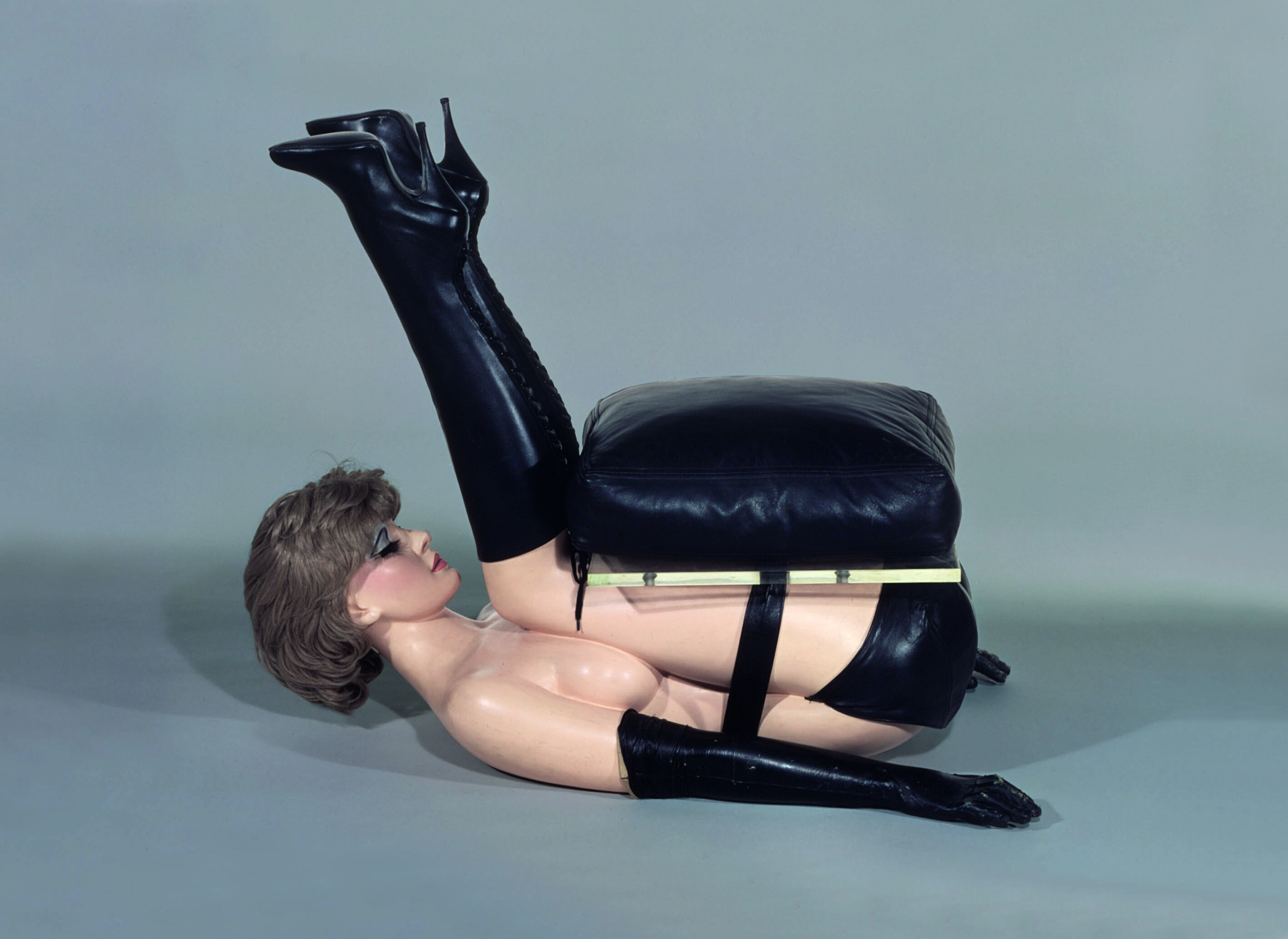
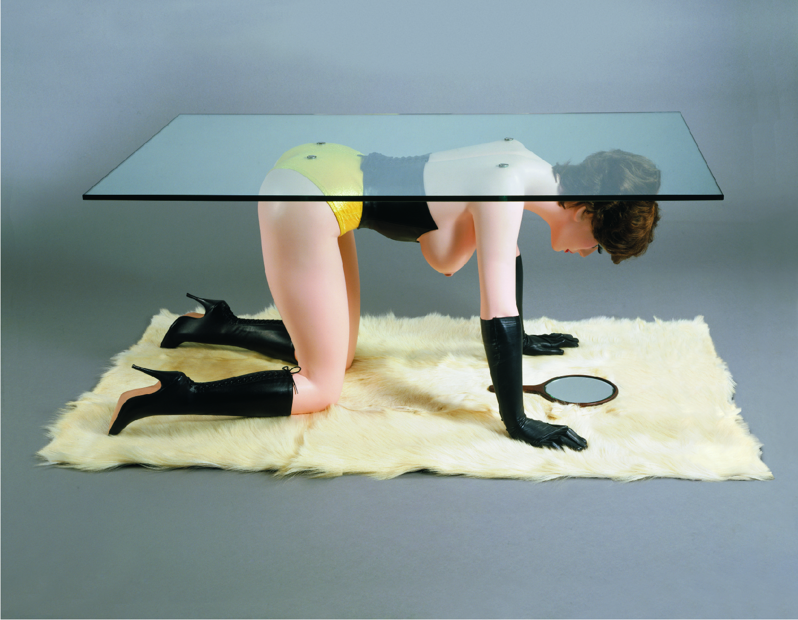
Allen Jones is considered to be one of the finest pop artists of the 1960s but as creator of pieces such as Chair and Table, where female sex doll figures are contorted into everyday pieces of furniture, have secured him a reputation as a figure of controversy.
Chair, Table, Hat Stand... they're all on show here - though not together but in separate rooms. Are they offensive? Yes, they are. Of course they are. To say that they're not is just ridiculous. The women are dead-eyed, passive and objectified.
There's no life in these figures and that's what stops them being erotic. This is nothing to do with whether women can be sexual or not. Of course they can. And they can be sexual and sensual without judgment. But these women aren't sensual - they're lifeless. And that's what makes them objects of objectionable objectification.
But there is this part of me that thinks these pieces are deliberately sensationalist, which is why I'm loathe to get too worked up by them. Allen Jones claims to be a feminist. Well, this world is full of people who claim that but who clearly have no idea what that means. Jones' figures are proof that he probably really doesn't get what female emancipation is about.
Interestingly though, the impact of these figures seems diluted in this exhibition. Maybe we are so bored with being shocked by them that they've lost their bite. I certainly felt like I was seeing a bit of a desperate attempt at provocation by a rather juvenile artist.
Only though these pieces are over 40 years old, Allen Jones never really developed his appreciation for women beyond the immature. The last room displays Jones' more recent work and not much has changed. His figures are still passive and dead-eyed and the female form is still thin, pert and white. It's all rather sad, really. Allen Jones comes across as this rather dirty old man who's as obsessed with the nubile young woman as a teenage boy.
Yet for all of this, I can't say I hated the exhibition (though I wanted to) because, rather surprisingly, I was won over by Allen Jones' bright pop art paintings with their more joyful compositions and vivid oranges, reds and yellows.
Like his figures, some of his paintings keep that preference for simple, bold images such as First Step, where the legs are restricted in a fetishized way, and the gloriously uplifting Float, where a woman launches herself off a big, buoyant, bouncy ball.
Other paintings though, such as Interval, have really dense, complex compositions where multiple characters and stories tumble over each other across huge, sprawling canvases. Yes, sex and relationships remain a recurring theme, but the women in the paintings are active, engaged and far more erotically sensual. They are alive!
In fact there is real dynamic movement in many of his paintings, whether it's in the orgies in Night Moves or the woman tentatively walking across a tightrope. There's a real sense of energy in these works.
And the high ceilinged galleries of the Burlington Gardens site are a perfect location for these large canvases, especially when the floors are filled with his elegant painted sculptures of couples fused together in dance. It all evokes an immersive experience.
Look, I know there's nothing intellectual or challenging about his paintings. Jones doesn't seem to be making any kind of social or political commentary in any of his works but there is a space in the art world for approaches such as these. Art can get exhausting when it's just one deliberate provocation after another.

There's something quite admirable in the fact that Allen Jones hasn't ever sought to shirk his Pop Art label. In fact, there is a real sense in this exhibition that he embraced it with the bright colours, contemporary scenes and inclusion of such familiar figures as Kate Moss and Darcey Bussell.
People will come for the controversial sculptures, for sure, but I wouldn't be surprised if they leave loving the paintings. Wouldn't that be a turn up?
Royal Academy of Arts, London to January 25, 2015
Admission: £11.50 (concessions available)
Image Credits:
1. Allen Jones RA Chair, 1969 Painted fibreglass, resin, Plexiglas, mixed media and tailor made accessories 78 x 96 x 57 cm Private Collection Image courtesy of the artist © Allen Jones
2. Allen Jones Table, 1969 Painted fibreglass, resin, Plexiglas, mixed media and tailor made accessories 61 x 130 x 76 cm The Gallery Mourmans Image courtesy of the artist © Allen Jones
3. Allen Jones RA Hat Stand, 1969 Mixed media, 191 x 108 x 40 cm Private collection, London Image courtesy the artist /© Allen Jones
4. Allen Jones First Step, 1966 Oil on canvas and laminated shelf, 91.5 x 93x 9.1 cm Image courtesy of the artist © Allen Jones
5. Allen Jones Interval, 2007 Oil on canvas 183 x 183 cm BANBURY, Private Collection Image courtesy the artist © Allen Jones
November 8, 2014
Grayson Perry Who Are You? At National Portrait Gallery
Celebrated artist Grayson Perry has been examining identity and how we define ourselves in his programme on Channel 4, Who Are You? The 14 works of art he created off the back of the interviews and experiences he had on this journey are now on show in a free exhibition at the National Portrait Gallery.
But rather than hive these works of art off into a separate exhibition with admission charges, the Gallery has scattered the pieces throughout its free galleries and visitors are encouraged to follow a trail that connects one piece of art to the next. It's like an extraordinary treasure hunt.
The trail starts with Grayson's self-portrait, Map of Days, an examination of his own identity. But this is no obvious literal depiction of himself. Instead Grayson shows his mind as a fortified town and inside the walls is a crazy, fluid mind map filled with concepts and contradictions. And intriguingly, Grayson has left the centre of this fort, the nucleus, blank - a clear, open space.
Each piece on display has a few comments from Grayson alongside and as he comments here, he sees identity as "a lifelong shifting performance." Our identity always evolving, always changing.
For Who Are You?, Grayson met with people from different backgrounds who were at a crossroads or crisis in their own identity to listen to them and then make works that try to capture each of them in a single, revealing image.
The variety of mediums Grayson has used is impressive with tapestries, ceramics and brass figures all on show.
Melanie, Georgina and Sarah is a collection of three ceramic figures where Grayson has taken the familiar outlines of goddesses of fertility, with their big stomachs and generous curves, and subverted these for the modern age. Back in time, these symbols of fertility were highly desirable but to modern eyes these figures seem overweight, even obese. The figures haven't changed but our opinions of them have.
Memory Jar is a very powerful piece. Christopher has Alzheimer's, an incurable disease that is destroying his memory, robbing not just him but also his partner Veronica of their shared memories, their life together. Here Grayson has Christopher's memory as shards, fragments, jagged edged images that are jumbled together. The piece is angry and chaotic and quite profound.
There is a real sense of provocation in Britain is Best, a bright tapestry that Grayson made after meeting members of the Ulster Volunteer Force (UVF) in Belfast. The tapestry is styled like a banner often used in UVF marches. Only Grayson has subverted the aggression of the UVF with his use of vivid pinks and the quite idealised, romantic image of five people on the back of a prancing blue and red horse wearing a crown.
The Ashford Hijab I found fascinating. I hadn't imagined that young white women converting to Islam was common but apparently it is. Here Grayson investigates what push and pull factors exist for a woman wanting to make such a profound move. On this screen printed silk, the young woman is leaving behind a world dominated by consumerism and binge drinking for a community of strong sisterhood.
Whatever you think about it, celebrity is deeply entrenched in our modern culture. People desire it, many see it as an ambition in itself. We are not the first generation to suffer with this but in our world of You-Tube and reality TV shows, fame can be immediate and obtained without a notable or worthy achievement.
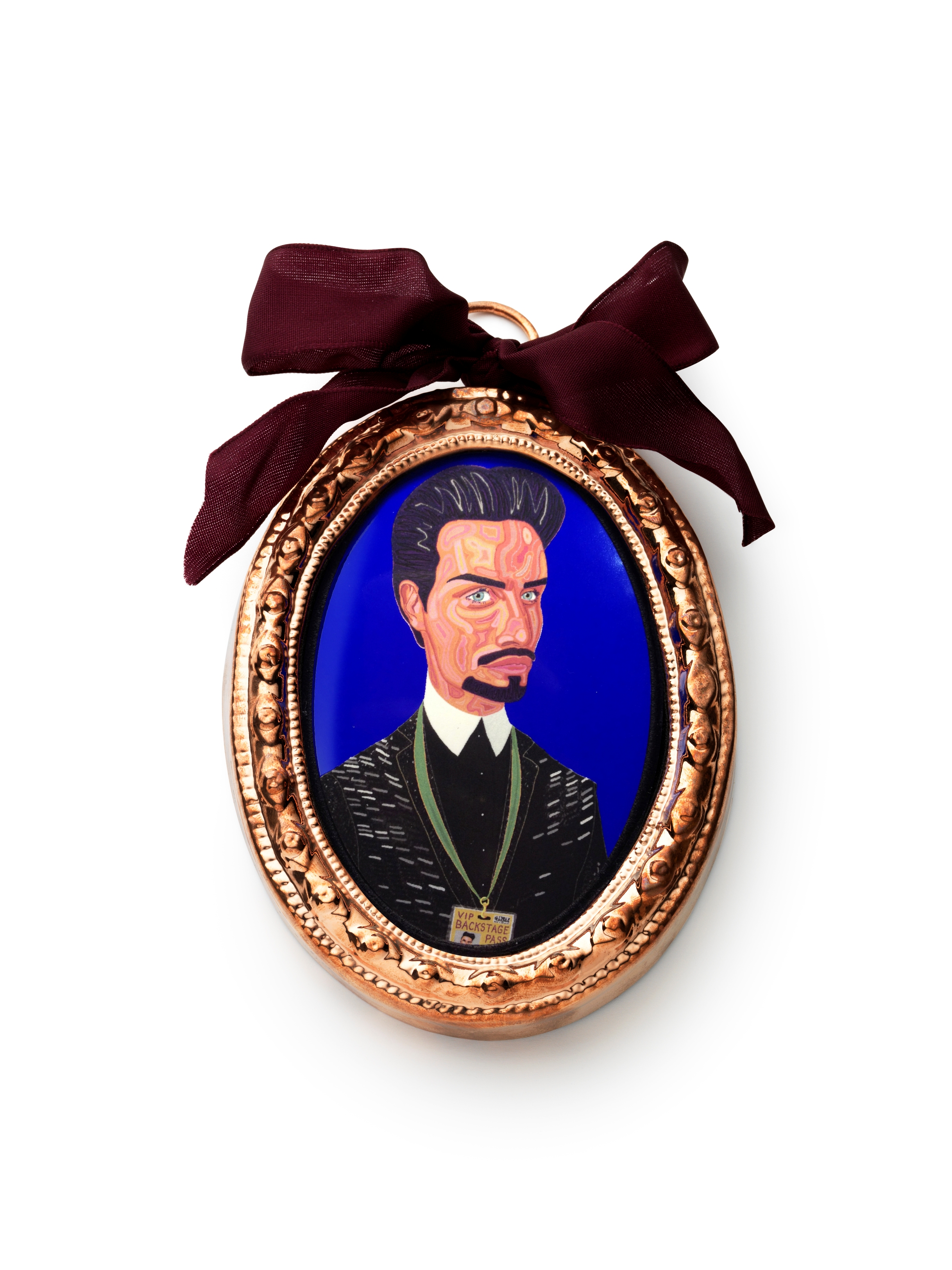
Grayson looks at this in The Earl of Essex, an Elizabethan-style mini portrait of Rylan Clark, a previous contestant of The X Factor who also won Celebrity Big Brother. Rylan has been very open about his pursuit of celebrity and it's interesting how Grayson has added a reflective surface to his portrait - a reminder of the shiny surface of our modern smartphones.
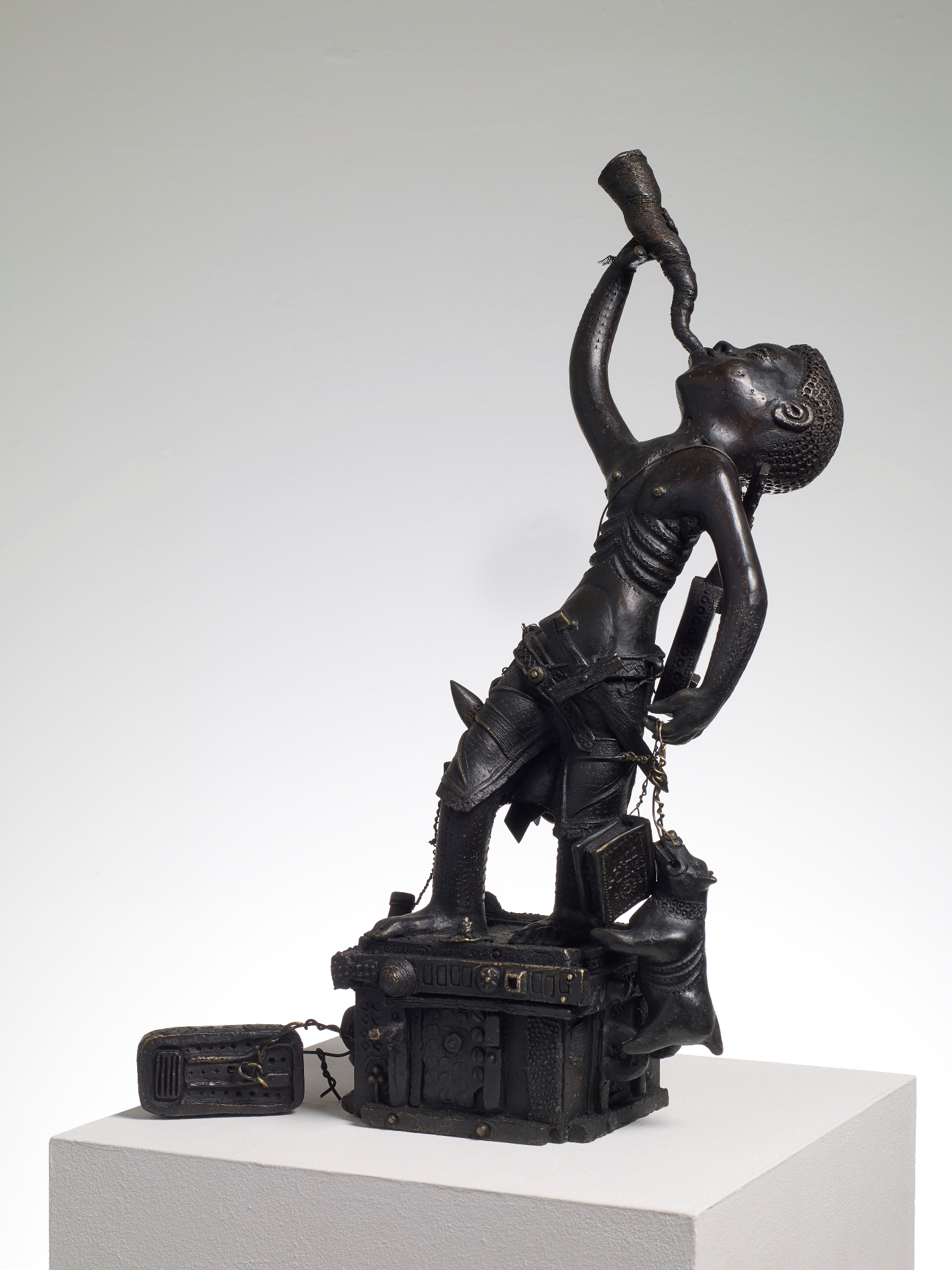
There's real tenderness in I am a Man, a small patinated brass figure of young female-to-male transsexual Alex. The piece reflects Peter Pan, Alex's favourite fictional character which, in turn, has echoes of unusual identity - the boy who never grew up and a male character that is often played by women. The style of the piece also has a nod to some of Perry's favourite sculptures, the Benin bronzes of West Africa.
This exhibition is wonderful, a brilliant collection of pieces that provoke and challenge. Given how well-known Grayson Perry has become, it's sadly easy for many to knock him so this collection is a timely reminder of how talented Grayson is. Away from the television screen you can see his artistry and the layers in his work for yourself to appreciate the artist behind the dress. Glorious and highly recommended.
National Portrait Gallery, London to March 15, 2015
Admission Free
Image Credits:
1. The Ashford Hijab, 2014Courtesy the Artist and Victoria Miro, London Copyright: Grayson Perry
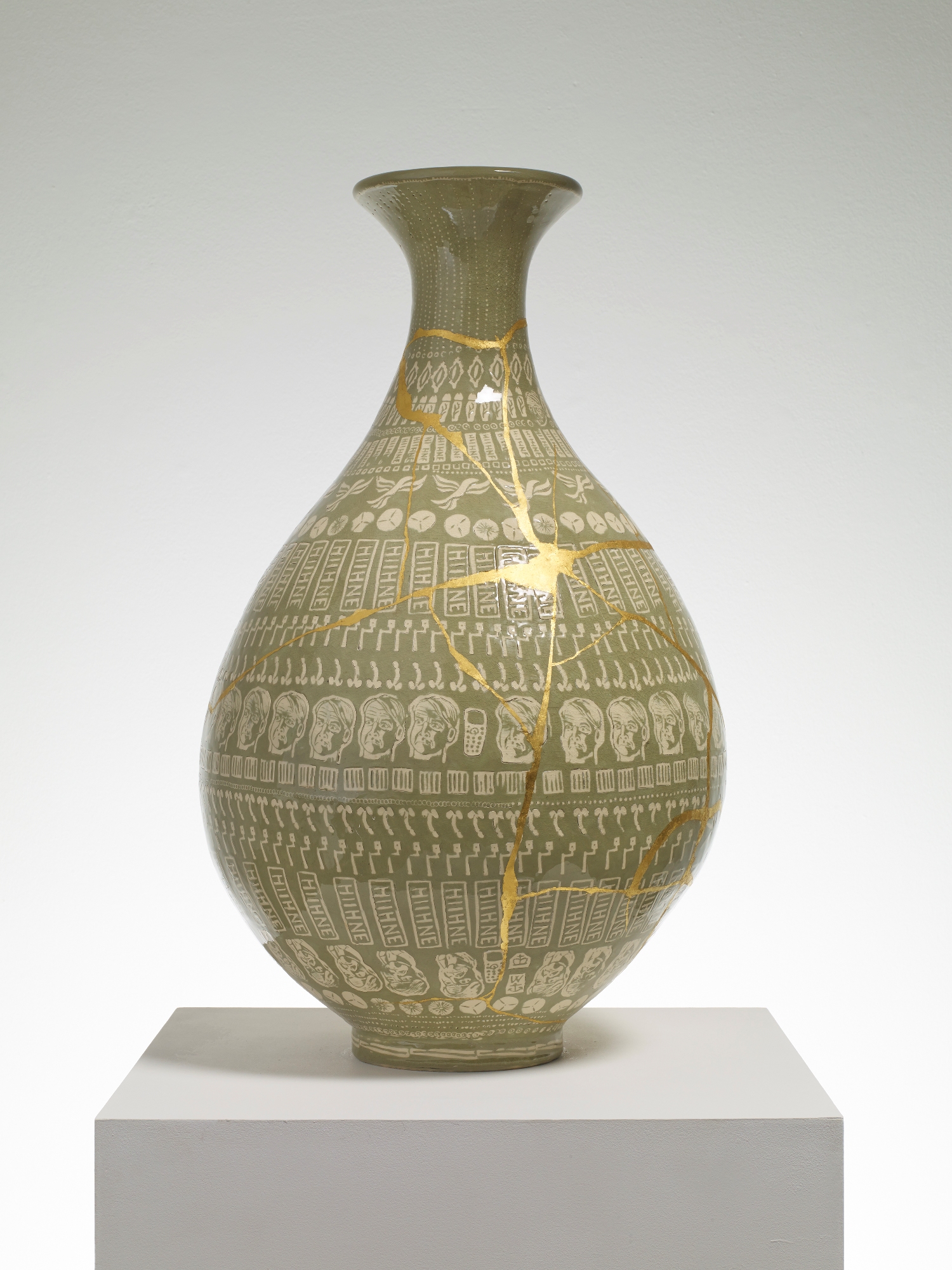
2. The Huhne Vase, 2014Courtesy the Artist and Victoria Miro, London © Grayson Perry Copyright: Grayson Perry
3. The Earl of Essex, 2014Courtesy the Artist and Victoria Miro, London Copyright: Grayson Perry
4. I am a Man, 2014Courtesy the Artist and Victoria Miro, London Copyright: Grayson Perry