Pamela Q. Fernandes's Blog, page 36
February 13, 2017
The Making of “A Raven’s Call”
As you know from my FB posts, my short story will be published in Fun Dead Publication’s “Night in New Orleans” anthology. New Orleans and ravens are both well known in folklore.
[image error]
Set for release on April 1st 2017, its all based in the spooky New Orleans, featuring some amazing authors including, Richard Pastor, Jonathan Shipley, Hillary Lyon, Klara Gomez, Ellery D. Margay, Erin Crocker, Pamela Q. Fernandez, DJ Tyrer, Corrine Phillips, Nathan Pettigrew, Cassandra Arnold, Joshua James Jordan, J. Benjamin Sanders Jr., P.L. McMillan, Brian Malachy Quinn, Jonathan D. Nichols, Bret Valdez, Brad P. Christy, and Laurie Moran
Take a look at the cover and you’ll get an idea.
[image error]
So how did I come to write this story? My story takes place on All Soul’s Day and since my own dad passed away recently, I started to look at this day with a different perspective. I was hurting and struggling. Through the pain I wrote “A Raven’s Call” with tears and heartache. It’s about a father’s love for his son.
I looked for beautiful plantation homes till I found the picture of one that I could set my story against, in St. Tammany’s Parish. I liked plenty, but this one seemed close to my imagination. The lush green of grass and trees. The river somewhere.
Once I found the house, I had the story. I did quite an extensive search on ravens and the rivers in the state. I don’t want to give away too much. What I want you to see, is that a little inspiration goes a long way.
What is your writing inspiration? What sparks your imagination?
Images: Alexa_Fotos CC0 Public Domain


February 8, 2017
QMC 2 -Should I accept referral fees?
[image error]
I received a question from a friend who is in FP (family practice) about referrals.
“The specialist is offering me a referral fee, should I accept it?”
My answer is no. And so is the AMA’s.
“Council on Ethical and Judicial Affairs of the American Medical Association (AMA)—Clinics, laboratories, hospitals, or other healthcare facilities that compensate physicians for referral of patients are engaged in fee splitting, which is unethical. . . . Offering or accepting payment for referring patients to research studies (finder’s fees) is also unethical.”
My understanding is, even if making a referral costs you time in ways of preparing a summary, discussing the referral or calling referring physicians, it’s not outside the scope of duties as a GP or FP. You’re the PCP, its part of your job description.
There are arguments on both sides of the fence. Check out this peer reviewed paper on “Paying Fees to Referring Physicians.” The article goes on to say that if you are taking fees you should tell the patient.
That in itself is a problem, because the patient is then left wondering if he’s getting referred to Dr. X for the fee?
What do I do? I usually pass on referral fees to my patient. I refer to some of the best specialists in Mumbai. As a rule I refer to doctors I’ve worked with or doctors with a solid reputation in their field. I can tell you from personal experience that these specialists are the best human beings on the planet.
Case in point, I was once referring a patient to Dr. Soonawalla in Kemp’s Corner, Mumbai. I picked the phone with trembling fingers, the script I prepared with the case history was shaking in my hands. When he finally picked up the phone, he quietly listened to me narrate the case. His answer was, “Do you want me to come to your clinic and examine or is he able to come to mine?”
It blew me away.
His first concern was the patient. We didn’t talk fees. The patient’s need came first. I never met him in person, because eventually the patient went to see him. For a very popular specialist in South Mumbai, he seemed to have his priorities right. Patient first.
As far as other referrals go, if the specialist does offer a fee, I usually pass it on to patients. So my patients can get a 10% discount or earlier appointments in exchange for the fee. No benefit is passed on to me. My patients benefit out of the referral completely. It also eliminates any niggling worry the patient may have, that I’m making a profit out of the referral. Quite contrary, but that’s what it is.
What do you think of “referral fees?”
References:
American Medical Association. Health and Ethics Policies of the AMA, http://www.ama-assn. org/ad-com/polfind/Hlth-Ethics.doc, accessed January 8, 2009.
Image: Pixabay/Valelopardo/ CC0 Public Domain


February 7, 2017
How to create a print book cover using Createspace?
I received plenty of compliments on my physical book cover. I must say it took quite a bit of trial and error, and I mean more errors than I would like, to get it to look the way it does. I used Createspace’s Cover creator, which is a free service provided by Createspace.

The cover creator is actually pretty easy to use.
There are various steps, but after a few tries you shouldn’t have a problem, and who knows after reading this you might get it in one.

From Google: Killer book Marketing
You can use this video from Killer book Marketing if you need detailed help. But above is a pic of what the template looks like.
But first things first.
1. Themes:
Go through all of the themes. Cover Creator by Createspace allows you many templates with themes. Depending on the tone and mood of your book, you may choose any.
Here are some just to give you an idea.

From Creativeindiecovers.com
So all these are templates, with themes. I chose a ‘Beginning’ theme, because I had just one picture that my book cover designer created for me. (Thanks Mark and Peter) But you could pick any depending on the picture or image that you’re using. Also different themes will have different requirements.
2. Front Cover Image:
This is the most important. You have to splash money on this because without an image, its not really going to make your book stand out. I did go through the copyright free images provided by the Createspace team. They’ve got a gallery, where a single key word can present a collection of related pictures, but I wasn’t too happy with the images. Mine was better. The front cover image has to be 300 dpi and about 4.01 x 6.24 inches in size. That’s important. The software will not accept a low resolution image.
3. Ornament:
Now my book has a design element or ornament. You can do with or without, but I felt with it, the cover looked more professional. Some themes have an ornament, some don’t.
4. Title:
You’ll have to fill the title the way you want it to be seen. The place where it will be captioned is fixed. Even the font is fixed for that particular theme. So check all these elements before you select a theme, in relation to your image. The only thing you can change is the color of your font. Test the colors, if you want a specific shade, get the RGB formula and type it in. The main thing is the font has to be seen against your image. So lighter fonts against darker images and vice versa.
5. Book cover color:
Now while you select font color, remember the same typeface color is used throughout. Keeping that in mind, you will have to select a book cover color that goes with that typeface or change everything in the previous step. Also your book color has to go with the image. Mine wasn’t looking too good, so I had to change my image to a sepia mode and then use it. Plus a red book didn’t go with my theme or tone of the book, so I switched to blue.
6. Back cover descriptions:
Its important to have this drafted and edited beforehand. It’s the same description you would probably use in the ‘about’ page on amazon or smashwords. But do spend some time on your book jacket. It’s important for physical books, because people do buy print books based on jackets, so write a compelling back cover.
7. Back over image:
This is your photo. You need to get a high quality image of yourself. I honestly wouldn’t pick a book of someone with a cat unless its a book about cats. Nothing against cats, but this picture needs to be well done. You can read about getting professional author photos here.
8. Spine
Depending on your book, the spine width will determine the font size. Since my book is a 60 page 5×8 size, the spine was absent. But if I did have a larger book, the spine would have to have words. Don’t pack it with too much information. Author name and Title is plenty.
Once you’re done adding the elements, review if it all flows well. I would say give it a few days, come back to it. Share it with someone who understands design and see what they have to say.
After you submit it, Createspace will approve or will not, until its all done. If not, then one of the steps will have a red circle at the top and you will have to review it before you can submit again.
All in all its a pretty fun process. I enjoyed it a lot.
You have more control over the way you want your book to look. So with a little homework, the whole book cover prep will come together quite easily.
It took me a week, to get it right, because I had to change the image and the dpi, cut the back cover descriptions to make it look less cluttered, etc. Still its an absolute thrill to do it yourself. I wouldn’t mind doing it for others as well, I enjoyed it that much. Createspace has really provided an inexpensive way to do print on demand book covers. And as you change the colors and design, images and descriptions, it looks very different. So despite the limited templates, I guess they have fifty or more, you can still make a fantastic cover.
Is your process different? Do you have any tips to make this simpler? Let me know.


February 5, 2017
We're Moving ... To a New Website
Yes! Thank you God for making this possible. I'm now moving to a self hosted website, thank to you, my readers and fans.
Check it out: Pamelaqfernandes.com
After years of blogging and some serious expansion as an author this year, I knew it was time. I couldn't put it off anymore.
So after much trial and error and whole bunch of mistakes, I'm unveiling the site.
For most of you, who are on social media with me, you may have noticed it a while back. But we've been live for some time now, making tweaks and adjustments.
You may be wondering why did I say we?
We because, I've realized that publishing is a business and its only through so much work getting accepted that I've realized how serious a business and how threatened it is.
Its not just me as an author behind this business, its my editors, associate editors, beta readers, first readers, critique partners, voice artists, sound engineers, cover artists, photographers, designers, illustrators and musicians and readers, all working with me to get the best products out there. I'm truly grateful to all these people, who together have worked to build the site and me as an author.
Without these hugely talented people, I'd be floundering. A big thank you to them.
What's going to happen here? I'm still on the fence about whether I should keep the blog or do away with it altogether. But I'm leaning towards deleting the blog and having it expunged from the annals of the world wide web forever and ever.
The website is still undergoing changes. Tell me what you think about it. Any suggestions would be really helpful.

January 25, 2017
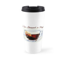
Did you see my new Note cards and Travel Mugs?
I wanted to save this for later. But I can barely sit down as I type this.
If you've read my book, Ten Reminders for the Christian Unemployed, you will know there's a chapter called, "Steeped in Prayer." It compares a teabag in hot water, to a fervent soul in prayer.
So these came about, literally. And they're ideal as gifts for Lent or Easter.
1. Note cards:
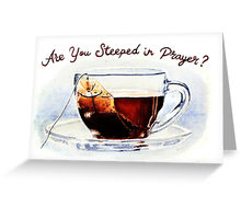
I haven't filled it with anything, you can write your own message. They come in two sizes, 4" x 6" and 5" x 7.5", depending on your choice. You can also order them as a set or pack.
2.Stickers
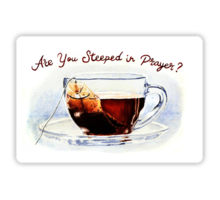 You can fix this on a journal or a cover. Anywhere you think you could use a reminder, your office soft board, a laptop, I mean anywhere. They come in two sizes small (4" x 2.6") and medium (5.5" x 3.6".)
3. Mugs
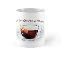
You can order any of the three sizes and it's lovely having this message on your cup, literally. So standard, tall and travel. All three are available @ Redbubble.com. So let me know what you think, of the design and the product. I'd love to hear your opinion.

January 14, 2017
Four Writing lessons I learned from Ae Dil Hai Mushkil
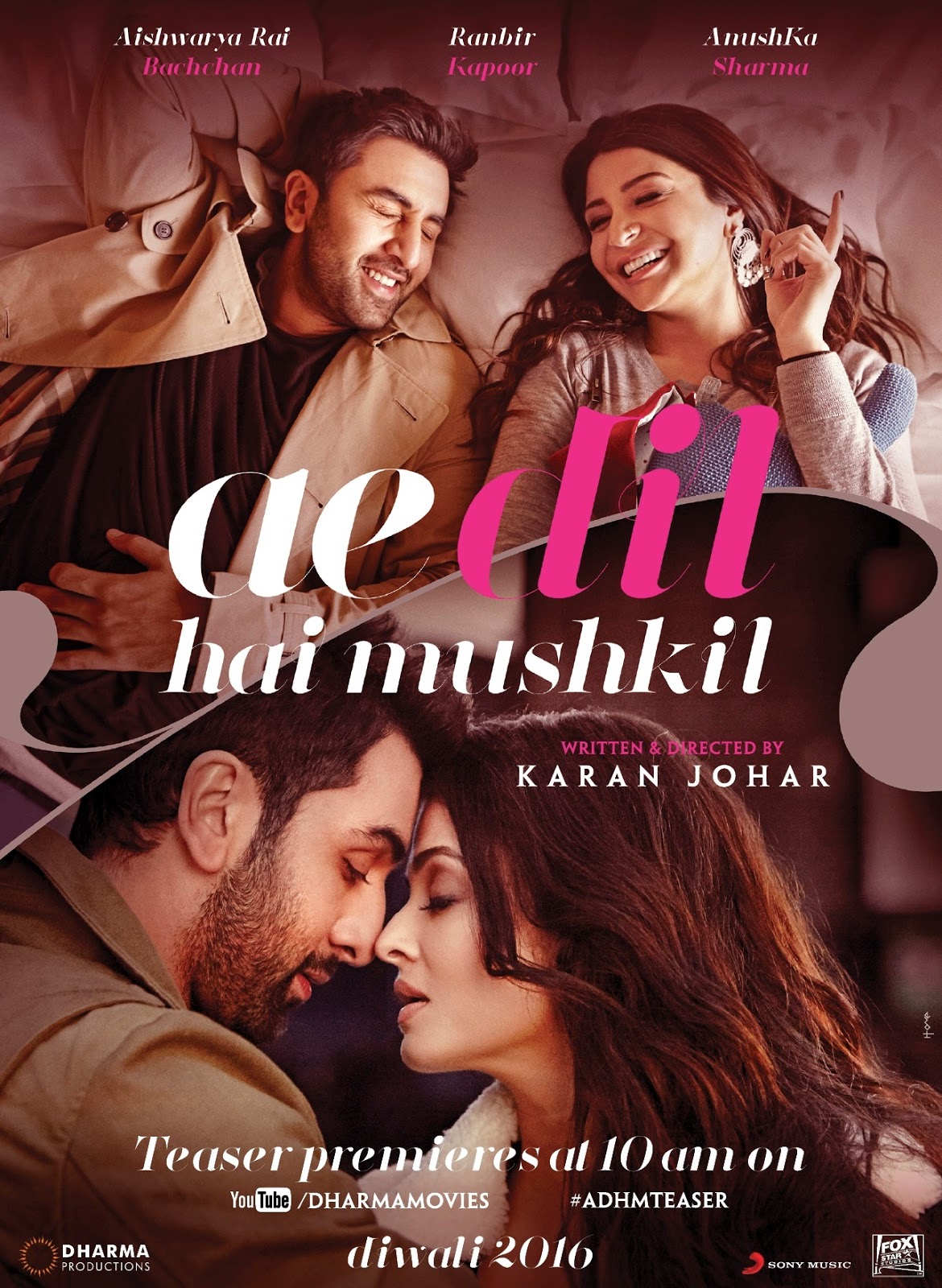 Source: Dharma ProductionsI watched this movie in December, much after the buzz settled. It was not on the top of my list. I hadn't watched a movie for a while after the loss of my father. But then I was tired of seeing Christmas joy on TV and turned to Ae Dil Hai Mushkil, since it was a movie that spoke of heartbreak.
I won't comment on the movie, but I couldn't help taking notes while I watched, like literally. There were certain things that I jotted down because, it's an amazing lesson in creative writing. So what did I learn?
The Power of Dialogue
The movie has a powerful strength in its dialogue that is very refreshing for a desi romcom. I practically re-watched all the scenes, where the dialogues were so deep and nuanced. The underplay of emotions, the double entendre and the bitter-sweetness of it all, takes your breath away. The dialogue in 'Ae Dil' really swept me.
Take for instance this scene of SRK. If you understand Hindi you would know the depth of the delivery, I'm not sure of the subtitles.
But when he says, "Ek tarfa pyar ki taqat hi kuch aur hoti hai … auron ke rishton ki tarah yeh do logon mein nahi bat’ti … sirf mera haq hai ispe"
That translates to, "One way love has a different strength, like other relationships, it doesn't get divided among two people. Only I have a right to it, only me."
The whole exchange here is wow, but the power of the lines are super. The entire movie is rich in this area. So don't underestimate the power of banter. Ae Dil is a masterclass in dialogue.
The Power of Poetry Lot's of people don't believe in writing lyrical prose, while I stand with the other half on that. The rhythm, the pace, the music of words and its language make a big difference, when you write. In this movie, you find a ton of poetry, probably because one of the protagonists is a singer and the other is a poet. Yet, the dialogue is beautifully poetic, using urdu shayari. That in itself, leads drama to the conversations.
I've heard several people comment,"People do not talk like this in real life- so the movie is crap." This tells me, the person making this comment has zero creativity. Because there's nothing to stop us from talking like this, with vocabulary that is rich and stunning. No one holds us back from expressing ourselves so creatively, baring the innermost expression of our soul, if we're capable of doing so. Poetry is nothing but a beautiful arrangement of words. I'm sure adding it to our writing, can only give it more depth and strength.
I can't find a video, but the airport scene, with Aishwarya Rai and Ranbir, explains this, where they're talking about tears.
The Power of Backstory There is very little backstory in the movie, the scantiest I would say. And it helped me realize, how important back story is. Who are the protagonists parents, why they have no support of a family? Where did they go to school, where do they work, what job do they do? Ae Dil had faint mentions of backstory, but fails to build on a character's past, so you end up having very cookie cutter characters with no layers to them. In movies, you have to cut extraneous material to focus on the story, so maybe that's allowed. But in books, where you're creating a three dimensional world, you need solid, textured backstory to keep the characters real and lifelike. Otherwise it's just another hero and heroine, going on about whatever, you owe it to your readers, to make your characters come alive.
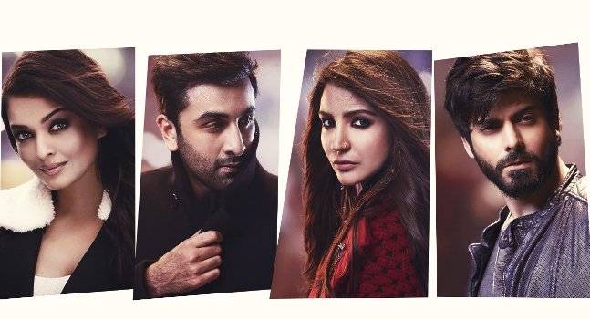 Source:India Today
The Power of Content I don't know what the end goal of the movie was. What was the central message? Because the story was heading a particular direction and then veered off course, at the end. But I couldn't help feeling, like I was reaching for something throughout. In the book world, you would be tried for bloody murder if you took the cop out that KJo did with 'Ae Dil.' Because most stories have structure, readers are looking for HEA's . They want to feel closure. And they're not going to like shortcuts. When bestselling author, Jodi Picoult's book, "My Sisters Keeper," came out, many people didn't like the fact that the sister conveniently died and all the problems were over for the family, bringing to an end the transfusions and donations. But I'm sure, not tying up loose end would upset readers even more. The content of your story is important from the first to the last page, it has to deliver on these three things.What is the story? What is the conflict? What is the resolution to this conflict?As you write, make sure the centrifugal force is turned towards these three things and not without.

January 11, 2017
Episode 3 -Three Tips for Christian Youth
In this episode, I talk to popular youth animator, Siana Dias about the youth and their approach to Christianity. Siana has been a youth animator for the last five years and is part of the Teaching team for Confirmation students at IC Church, Borivali, Mumbai. She's also completed her Bible study course and has been an active Minister of the Word, running free Bible classes in her own sector.

In this episode, she answers questions about:
1. The main problems of youth and their perspective of the faith
2. The difference in how we're passing down our faith to the next generation and the past
3. Practical advice to parents of teenagers
4. Three tips to help young people grow in their faith
5. Personal prayer that supports her own ministry and why we need to be replenished.
According to her, "The more we give, the more we need."
God bless you all and Happy 2017


Why you should Format your Short Story Manuscript?
Letters from Bidbid, Joseon Fringe and two others which I will let you know once we're closer to pub date.
Either way, I think formatting was instrumental in selling those stories. Initially, it felt like a huge time suck and was very daunting, but today when I start out with a new story, I usually set the format first, so that its not a major issue by the time I'n done drafting and editing. And I must confess it's become more of a habit now.
So, how should you format the manuscript? All short story magazines, journals and publishers seem to favor the William Shunn Style. Most of them say so explicitly in their submission guidelines and the ones that don't, I usually default to this, because it is the industry standard.

1. Name
Address
Phone Number
Left hand side, top corner.
The name here is the name that will be used to wire your money through paypal or check. So don't put your pen name here. This is your legal name.
2. Top right corner Word Count: 3500 words, Round off to the nearest 500 words
3. Name of the story: Halfway down the page, with your pen name (byline) underneath it. Title in ALL CAPS. This needs to be centered.
4. Font: Black, Times New Roman or Courier, 12 points
5. Margins: 1" on all sides
6. Spacing: Double spaced
7. Start the manuscript: Two spaces below the byline.
8. Indentation: First line of every paragraph about .5 inches from the margin
9. Header: Right hand side, top corner, except for first page. Must have Surname/Story Name/ Page number.
10. Justification: Left
11. Dialogue: "Should be in quotation marks."
12. The End: Mention this at the end of your manuscript or put # to indicate the end.
Formatting the MS makes it looks professional and gives you the credibility of a serious author. So don't ignore this step.


January 1, 2017
How to be a Top Reviewer on Goodreads?
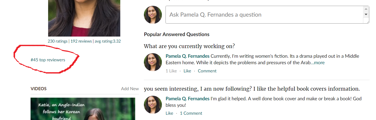
Happy New Year 2017
I received extremely good news this week from Goodreads. I'm one of the top 45 reviewers in the country. Yoohoo! And I don't do any more reading than I normally do. So what changed?
Let me share my tips.
1. Sign up on Goodreads
Every author and reader has a Goodreads account. I'll tell you why. Once you sign up, and add books to your shelves and genres you like, you may find authors and publishers contacting you to send you free books. I had five books sent to me through the site and I'm sure if I signed up for giveaways and all that number would be far more. Psst, I read 72 books this year.
2. BookBub
Sign up at Bookbub. This is a trusted source for deals and FREE books. They send you a list of books depending on the frequency you choose and you will never run out of books. It's a more cost effective way, than searching for what you like, finding the price etc. This list is sent directly to your email.
3. Dedicate Reading time
If you're not going to set aside time, you will not read. For me, it's when I'm cooking, I'll listen to an audiobook or if I'm commuting on the train I read on my Kindle. So I've allocated time in my schedule to read. Look at your schedule, where can you fit in reading, on your daily walk, listen to an audiobook, or while on the treadmill, before bed, before dinner, with a glass of wine.
4. Size does matter.
I seldom pick books over 80,000 words. All my friends know this. It's the same reason I've not read Tolkien, Gone with the Wind or other books around that length. Time is too precious and I'd rather pick award winning books that are somewhat shorter, so that I can read more. If you want to be a reviewer, quantity is important.
5. Write good reviews
I'll confess, I don't write good reviews. I write one paragraph on what I liked and didn't like about the book. I don't add lists or write my interpretation of the blurb. But I've seen many detailed reviews on Goodreads that spark conversation, debates and feedback. Most of them are long and very descriptive of what the reader liked or didn't like.
6. Review everything
Even if it's a short book, comic, anthology or a short, review everything you read. Writing a review serves two purposes. It helps the writer understand what he or she did wrong and helps them write a better book. It also helps other readers, decide whether this book is worth time spending over.
It also helps you as a reader. Publishers look at reviewers and send loads of freebies when they know you're a serious reader. This can be gift cards, book discounts, and signed copies.
So Happy Reading. May 2017 be your best year Ever!
 Source: Condesign Pixabay
December 24, 2016
Short Story, "Letters from Bidbid," Published!
 For a quiet Christmas and a heap of rejections, it was great news when the editor of Avellina Balestri said, my story had been accepted and published by The Fellowship of the King, a Catholic Literary Magazine.
"Letters from Bidbid is based on a soldier's interactions with his mother. It's a story that focuses on loss, Christmas and sacrifice.
Check it out here! Also read some of their poems and stories.
Have a blessed Christmas All!