Quinn McDonald's Blog, page 36
June 9, 2014
Bullied into a Sense of Humor (Part I)
Back in grade school, I denied my parents were immigrants. I hungered to be
“all-American.” At the time, being all-American meant having peanut-butter-and-jelly sandwiches instead of my embarrassing homemade bread and sliced brisket. Wearing white blouses with circle pins on the Peter-Pan collars instead of a handmade gingham dress. I didn’t want to stand out. Standing out meant being teased.
 I was born in America, but was called names because I didn’t speak English well, because I wore funny clothes, and not long after, because I could read (accent and all) before others and because I knew my multiplication tables early and could figure out long division. Being smart didn’t earn respect, it earned ridicule. I learned to tone it down.
But not enough. One day in second grade a boy behind me on the slide pushed me from the top. My head banged against the stairs and again on the ground and I was out cold for 10 minutes.

Mercer Street (NYC) playground, with the same slide I remember. This one was from: http://sohomemory.com/2011/04/16/promises-promises/
I was sent home, the teacher telling my mother that “he was only playing” and “your daughter must have said something he didn’t understand.” It was a small town in Texas and kids of immigrants weren’t welcomed then anymore than they are in Arizona today.
By the time second grade was over I had formed these beliefs:
1. Being smart is not a good thing unless you can do someone else’s homework and keep quiet about it. There will be no thanks, just retribution if you tell.
2. You do other people’s homework in the girl’s room or stay in from recess and do it in the coat room. If you don’t finish it, you will be tripped on your way to the blackboard. Or stabbed with a pencil in the lunch line.
3. When the teacher notices that a lot of kids seem to suddenly cross their sevens and catches on, you will be blamed by both the teacher and the kid whose homework you did. Avoiding notice is better than being found out as smart.
As I went on through school, many of the things other kids thought were hilarious were strange to me. I never understood physical humor. Cartoon figures slipping on a banana peel always made me worry that they were hurt. Pie-in-the-face didn’t look funny, it looked scary and I thought of food waste and clothes washing, not humor.
The phrase I came to associate with bullying (which I truly thought was my fault because I wasn’t American enough) was “you don’t have a sense of humor.” I believed it; in my America, other people made the rules I didn’t understand.
Over time, although I grew up in America, I came to realize that your DNA decides your humor, your esthetics and your taste in art. I tried hard to love early-American furniture, pine paneling and the desirability of going to college to find a husband while having a “safe” backup-career.
Still, every time I tried to fake it, I made a big mistake that created a tendency toward casual self-destruction.
 It took years to trust myself, to realize that getting tripped while going to the blackboard or stabbed with a pencil in the lunch line was a punishment I could survive, but denying who I was simply left me trying to be something I could not sustain. It took years to figure out who I was, make some changes to heal, and become who I was: overly sensitive to the idea of fairness, committed to social justice, and an outsider artist.
And my sense of humor reflects that. I still don’t laugh at other people’s misfortune, fiction or not. I love word humor, clever endings, the underdog doing something surprising and winning.
But every time someone says, “You don’t have a sense of humor,” I smell the whiff of intolerance cloaking the heart of a bully. There is no one sense of humor that is OK, but anything that belittles, shames, or hurts others isn’t funny. Not to me.
Tomorrow: Part II, Saturday’s incident that triggered a lot of thinking.
–-Quinn McDonald is still trying to balance her own sense of humor with a big sense of fairness. She is, not surprisingly, the author of The Inner Hero Creative Art Journal.
Filed under: Creativity, Inner Hero/Inner Critic, Links, resources, idea boosts Tagged: American culture, bullying, immigration issues


June 8, 2014
Books Remain the Same
Reading a book–in any way that thrills you–is an experience. There are books that I have read more and more slowly as I came to the end because I couldn’t bear to not have the characters in my life. Pillars of the Earth. The Cider House Rules. The Women’s Room. The Thorn Birds

There are books I forced myself to finish because I knew I should. Middlemarch. Bleak House. Portrait of an Artist as Young Man. The Red and the Black.
There are books I could not force myself to finish, even if they were short, and popular. My eyes rolled so hard I was afraid they would get stuck in the top of my skull. The Bridges of Madison County. Anything by Nicholas Sparks.

And years later, the opinion formed the first time I read the book becomes how I think of the book.
Lately, I’ve taken to re-reading books I loved or hated years ago. There have been some big surprises. Books that I thought were complex and deep suddenly seem less nuanced. Books that I thought were silly and trivial now seem to strike the heart of human experience.

Slowly it dawned on me. The books are the same. Same words. Same content. But the reader has changed. Life does that to you. And as the reader changes, so does the opinion of the book. As true as it is that one does not step into the same river twice, it is true that a reader does not read the same book twice.
And that is why every room of my house has a bookcase jammed with books. Because I keep going back to read books that have changed while sitting patiently on the shelf.
-–Quinn McDonald also reads ebooks and listens to audiobooks. She loves it all.
Filed under: Journal Pages, The Writing Life Tagged: books, critiquing books, re-reading books, reading books


June 7, 2014
Creative Hop (June 6, 2014)
Iris Scott was painting inside one hot summer day in Taiwan and was overcome with inertia–she didn’t want to go in to clean her brushes and fetch new ones.
That inertia changed her style of painting forever. She reached into her paints with her fingers and touched the fingers to the canvas, putting down multiple colors at the same time.

The Discussion © Iris Scott
Her impressionistic paintings launched fingerpainting into fine art.
 Scott is based in New York and was classically trained in Florence Italy. You can see a video of Scott discussing her art on her website.
Bob Morehead is an artist who works in Virginia Beach, VA. His medium is toothpicks. Yep, wood toothpicks. He identifies as a deviantArtist (also known as outsider artist or Raw Artist).
 His goal was to create a city made of toothpicks. This treehouse took more than 5,000 toothpicks.
 The City of Toothpicks took eight years and have more than 100,000 toothpicks.
You can see Bob Morehead’s work on Facebook and at DeviantArt.
Néle Azevedo wanted art to make a difference. So in 2009, Azevedo created 1,000 small human figures–in ice.

Minimum Monument in Belfast.
The installation (called Minimum Monument) took place outside, and the art occurred as the figures melted. It was art calling attention to climate change.
 The exhibition started in Berlin, then moved to other countries, constantly reminding people of both shrinking ice caps and who is responsible for them.
Have a creative weekend!
-–Quinn McDonald loves exploring artists who are working in new ways.
Filed under: Creativity, Links, resources, idea boosts Tagged: fingerpainting as fine art, ice sculptures, toothpick art


June 6, 2014
Adapt Like a Grackle
Grackles are not likable birds. They are pretty enough–big males, glossy black with oil-slick rainbows flashing across the feathers. A sharp yellow eye. In the case of the great-tail grackles, they have tail feathers so big that they have trouble flying in a strong wind.
 Grackles are thieves and villains. They eat the eggs of other birds, eat newly hatched bird babies, or worse, fling them out of the nest, and lay their own eggs in other birds’ nests.
They are clever mimics, making both ear-splitting screeches and the sound of water running in a brook. They thrive because they are adaptable. And I have a group of them in my neighborhood–maybe 100, to judge by the settling down noises they make at sunset. Grackles, pigeons, Mexican doves and hummingbirds are the only birds here in the summer, so I make do.
A week ago, I noticed a grackle on my neighbor’s roof, parading around the vent stack on the chimney. My office has a window overlooking the street, so the grackle became an object of observation. For whatever else they are, grackles are smart and adaptable.
The capped chimney throws a shadow, and in Phoenix in the summer, shade is valuable. So is stucco, which is much cooler than pavement or cement. The grackle began to spend time in the shade of the chimney vent.
 When the air conditioning comes on, the cool air in the house is pushed up the chimney. It takes a while (because cool air sinks), but it does rise eventually.
The grackle noticed this, and when the air cools, he presses himself against the vent, stretching his head and neck up, cooling as much of his chest as he can. As I said, they are smart.
This morning, he got smarter. Now, when the neighbor’s air conditioner starts, the grackle flies in and settles in to cuddle up to the vent and cool off. I can’t hear the neighbor’s air conditioner, but the bird was arriving and leaving regularly, so I went outside and waited. Within 30 seconds of the air conditioner starting, he flies in. It’s the same one, because he chases off any other bird. Adaptable and smart.
He knows where it’s cool. He knows how to take care of himself. A survivor in the Arizona heat of summer.
-–Quinn McDonald is a naturalist and writer who appreciates adaptation, wherever it occurs.
Filed under: Creativity, Nature, Inside and Out Tagged: adaptation of birds, Grackles, smart birds


June 5, 2014
Minimalist Collage (Crow)
I have no idea what my fascination with minimalist collage is about. And I’m not pressing myself for answers right now. My fascination with using letters and words in my art is reason enough to use letters as marks to create an image.
 The first one was a pear. It was fun, but a lot of work. I also decided to use shading on the pear, which defeated the purpose of spacing letters.
All sorts of questions came up–can I use smaller letters for light shading and bold or bigger letters for darker areas? And the most important question–where am I going to find all these typefaces and weights to make this work?
There were several other experiments, and finally, I decided to mix line drawings with using letters.
Cross-hatching for shadows matches the mark-making of the letters. No book store was safe, until I found a few typography books with letters of different sizes, shapes and heaviness.
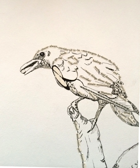 The latest collage was of a crow. Using a Pitt Pen, I first did the outline and cross hatching and then added letters. Except, the letters were not random. I found a book about ravens and crows and used entire sentences about crows in the collage.
 And yes, that is the letter “O” in his mouth. It fit so nicely. You can see more detail in the close ups (above and below). The sentence that runs along the back curves because the words are cut and bent to match the curve of the crow’s back.
I used some type from the typography book for the dark areas, cutting out bold letters and gluing them over the cross-hatching.
 In the close up, you can see that the wing feather is actually a script capital letter “R” (for raven) from the book on Corvids (scientific name for crows and ravens). The eye is actually three capital letter “O’s” in different weights. I could have inked it in, but this seemed like more fun to use letters.
There are no rules for this work. I use as much line drawing as is necessary to create the image. I add the words to give meaning and texture. It allows the viewer to look more closely at the image without getting bored. And it’s a lot of fun.
My last question is–do I put in a background? If so, should I use powdered graphite to keep it monochromatic? Scattered letters? Watercolor in gray?
—Quinn McDonald is a writer and collage artist.
Filed under: Art in Progress Tagged: collage with letters, image made of words, picture with words


June 4, 2014
Quotes for Your Journal
Some new quotes for your journal or quote book:

“A wedding day is the easiest to make happy. You just throw in a ton of money and liquor, but a marriage is hard to make happy because when you throw a ton of money and liquor at it, it often makes things worse.”
–Rabbi Jonathan E. Blake, Westchester Reform Temple, Scarsdale, NY.
“If you don’t have time to read, you don’t have the time (or the tools) to write. Simple as that.” ― Stephen King

“Fiction is the truth inside the lie.” ― Stephen King
“If you want to really hurt you parents, and you don’t have the nerve to be gay, the least you can do is go into the arts. I’m not kidding. The arts are not a way to make a living. They are a very human way of making life more bearable. Practicing an art, no matter how well or badly, is a way to make your soul grow, for heaven’s sake. Sing in the shower. Dance to the radio. Tell stories. Write a poem to a friend, even a lousy poem. Do it as well as you possible can. You will get an enormous reward. You will have created something.”
― Kurt Vonnegut, A Man Without a Country

—Quinn McDonald is a writer.
Filed under: Links, resources, idea boosts, Quotes Tagged: quotes, Stephen King, writing quotes


June 3, 2014
Checking in on The Word of the Year
The year is touching the half-gone mark. How is your word serving you? Does it seem like a touchstone? A millstone tied to your ankle? Do you remember it?

From Adena F.’s website:
http://adenaf.com/2014/01/words-year-2014-collage/
Did you have to dredge it up like a boat mooring that’s been submerged all summer?
Your word for 2014 doesn’t have to stay the same for the whole year. If it’s not surprising you, helping you, teaching you, it may be time for a switch.
I’d chosen “scatter” and it is the word that has gotten the most mileage since I started words of the year. I wanted to try out new ideas, techniques, coaching styles. I wanted to write and draw, do collage, teach, re-design my studio, find a sport I like so I can do more of it. I’m exhausted. I also wanted to start a newsletter, network, build an audience, find a niche, create a Facebook Page for Inner Hero seekers. It was overwhelming and I knew I’d do poorly on most of it. Because most of it wasn’t grounded on any one value, one idea.
I’m not sorry I chose “scatter” –I learned a huge amount, including my limits.

An old-school distilling device.
So I’m stepping up to say I’m changing my word. Halfway through the year, I have experienced the joys and perils of “scatter” as much as I needed to.
I’m choosing “distill.” Almost the opposite of scatter.
I’ve filled the pot on the left with ideas, techniques, to-do lists, explorations and experiments. Now I’m going to think things through, let them ripen in the glow of the Operating System of the Universe and see what drips out. This feels really good.
I’ve been doing minimalist collages and that feels like it needs more time and development. So do some classes–writing classes–poetry and capturing some personal Truth–what each of us know about our life, but have wasted time allowing others to define for us. And finally, I want to honor the Inner Hero.
How is your work serving you? Is it time for a Mid-Summer Change of Heart (and Word)?
-–Quinn McDonald is watching summer settle in and is emotionally estivating.
Filed under: Coaching, Creativity, In My Life, Inner Hero/Inner Critic, Links, resources, idea boosts Tagged: change, changing word of the year, distilling, Word of the Year


June 2, 2014
Art Supplies Worth Having
Super-specialized art supplies are fun and can ease the tedious part of creative work. What makes special supplies most useful is combining them with the basics you love and use every day.
Here are my four new favorites for everyday journaling use.

Open notebook showing yellow first page (others are white) and pocket insert that does NOT come with the notebook.
Notebook: Mnemosyne 183. Unlined, 70 sheets (140 pages). Now that I’ve abandoned six journals for one–the Commonplace Journal, I needed something practical. So it has to:
fit in a purse (or carry-on)
fold over on itself
have paper that’s thick enough for sketching and writing
have paper that doesn’t have severe show-through
have pages that can be removed (and leave as a note for someone)
I’ve loved the Strathmore Mixed-Media journal, but the wire binding is just too bulky, and the paper seemed a waste for client notes, which go into the Commonplace Journal most.

Showing double-truck spread of Maruman Mnemosyne notebook. Right page has been deliberately blurred.
Maruman is a Japanese company that makes notebooks for writers. Mnemosyne is the Greek goddess of memory. The notebooks are made with meticulous care. For example, the small-diameter wire binding is “short”–doesn’t go to the very top or bottom of the page. So you can easily hold the gutter side of the page when you tear out the perf’d page cleanly.
I got the notebook at JetPens, which has a huge variety of sizes, lined- graphed- and blank notebooks. Here’s what they say:
The way a paper interacts with a specific ink is as unique as a snowflake. Fountain pen users will prefer paper that produces the perfect inkblot levels, paper that absorbs too much ink would not be good. On the other hand, a ballpoint pen user might seek a paper that allows their pen to guide more smoothly across the page. Japanese paper manufacturers pay attention to these preferences by tweaking numerical values ever so slightly during the manufacturing process to create the perfect page for their customers.

Very little show-through on this book.
It’s true–the pages are thin, and have an almost smooth, fabric feel to them. It has a black plastic front cover, and a chipboard back cover, which makes writing easy, even when folded over to save space.

Pack of 5 x 8 inch Post-It Pockets. A must-have for every journal-keeper.
Post-It Pockets. There are items I like to carry in my Commonplace Journal–the gift certificate to an art store, the business card I just got, a postcard (with stamp) to send to someone on the spur of the moment, the names and phone numbers of doctors and emergency contacts.
These plastic pockets work like Post-It Notes--they attach to the inside front cover of your notebook and peel off when you need to move it. A flap is held shut with velcro, so you have easy access to the contents. These fit in a 5 x 8-inch notebook perfectly, and they do come in different sizes.
Pentel Hybrid Technica ballpoint, extra fine (size 04). I’m not a gel pen fan. I like  ballpoints. And this gel pen is perfect is you like extra fine pens. It’s crisp, black script is perfect for detail. It does what most gel pens don’t–it dries as soon as it’s on the page.
It’s a great sketching pen, too. Smooth, even, no blurring when you cross-hatch. Archival, acid free. Writes when you touch it to paper, so no “scribble start” with this pen. If you draw and write in your journal, take sketchnotes, or doodle, (and like a superfine pen), this is perfect.
Drawing in a 9 x 12-inch wire-bound notebook is a nice way to create and keep your pieces the same size and together. It’s also hard, because you work consecutively, but not emotionally sequentially.
 You also have to put the book aside to dry if you are doing something messy and wet. Patience is not always my strong suit.
Canson has solved your problem–they make a wireboound book with repositionable pages. (The link takes you to Dick Blick art supply.)
You carefully peel out a page, top to bottom, and let it dry or decide where you want to put it. Then you put it back in, carefully “clicking” the pages back into place.
 It works along the same lines as Rollabind or Circa, which uses removable disks to hold notebooks together.
This makes the book doubly useful. You can arrange the pages by date, media, technique, color, emotional content. You can rearrange them to your heart’s content, as long as you are careful.
Note: I paid for each of these products. I am not being compensated in any way by any company for the content of this blog.
–Quinn McDonald loves basic art and writing tools.
Filed under: Journal Pages, Links, resources, idea boosts, Product Review, Reviews, The Writing Life Tagged: journaling pens, Mnemosyne, Murman, removable page art journal


June 1, 2014
Favorite Tool: Eraser
Pen and ink is a great medium. I love the precision of fine lines, of cross-hatching for shading. In a journal, pen and ink looks both artistic and scholarly. Pen and ink with watercolor pencil washes make me happy.
When I draw with pen and ink, I start with pencil. Because I need to erase a lot.

My favorite eraser–clean, neat, won’t shred your paper.
Most pen and ink classes I’ve taken talk about blending in your mistakes, or keeping the drawing “loose.” With a pencil, you can move from rough sketch to inking by using a pencil and eraser first, learning as you go along. Try something, erase it, fix it, change it, re-do it. My must-have, go-to tool is an eraser.
When I teach, I see people frown and say, “I made a mistake,” which baffles me. Of course you make mistakes, you are experimenting, trying ideas until you get to what you want. That’s not a mistake, it’s working toward an goal. It’s creation. And that works if you are writing, dancing, or singing. I might add that there is so far no eraser for dancing or singing.

Old school eraser looks like modern delete key. Same function.
An eraser is handy when drawing packages with twine, vines, or anything with perspectives or that overlaps. Erasers are a tool that help you get to the final image. Stop thinking in terms of “mistake.” Erasers help us complete the work we start, to capture the image we want.
Knowing about erasers means choosing the one that works for your art.
I’m a fan of white plastic erasers that don’t chew up the page and erase cleanly.
I love kneaded erasers because they keep my hands busy and pick up large areas of graphite really well. I also hate them because you can’t put them near anything plastic, or the eraser will melt the plastic. No idea why.
I love electric erasers that work on detail and are charming for fast work in

A house brush helps clean up without smearing.
reductive drawings.
Eraser get round and you need an edge? Slice the round part off with a craft knife and you have a new edge. They are inexpensive.
Tired of eraser dust? Buy a big paintbrush–housepainting size, and sweep the dust away. Don’t blow on your artwork, particularly not if you have been eating chocolate or drinking coffee. A stray spray of spit can mark the page.
Best of all, you can also carve up an eraser and make your own rubber stamps. So indulge in that extra eraser. You won’t regret it.
—Quinn McDonald loves erasers and the freedom of creative work they encourage.
Filed under: Art in Progress, In My Life, Links, resources, idea boosts Tagged: drawing, erasers, mistakes


May 31, 2014
Creative Hop (May 31, 2014)
Note: Congratulations to Penny Arrowood who won Finding What You Didn’t Lose in the drawing! Thanks for reading my blog and thanks for sharing who you are, Penny! Send me your address [ to QuinnCreative at Yahoo dot com] and the book will be on the way.
* * * * *
MTO (tag for Mateo) is a street artist whose graffiti is realistic art. He has lived in France, but has no current address that he publicizes. MTO does have an Instagram account.
 His artwork is almost always black and white with a pop of color somewhere. I have a thing for aerosol art, and MTO’s work, which may be scrubbed off in a week, is a sign of courage and dedication to art (at least for me).
DALeast is a different kind of street artist. He creates large metal sculptures attached to buildings.

“Abscission” © DALeast, 2014. Photo: Brandon Shigeta
Originally born in China, he left to study art and to make art all over the world.

“Adrenalin” © DALeast, 2012 in Cape Town, South Africa
While the metal is in fragments, the finished piece reads easily as a whole, complete with movement and life.
Jon Shireman helps us think about flowers differently. Flowers are soft, bendable, fragile. Shireman dips flowers in liquid nitrogen, quickly freezing them.
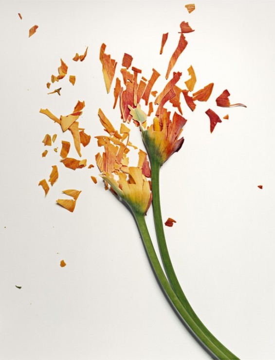
© Jon Shireman
He then throws them on a white background, where they shatter. Then he photographs them. Flowers are not new to Shireman as subjects. He’s photographed them in vases, decaying, but this is the first time he photographed them frozen and splintered.
Have a creative weekend!
–Quinn McDonald admires art where she finds it.
Filed under: Links, resources, idea boosts Tagged: aerosol art, frozen flower art, MTO, street art