DeAnna Knippling's Blog, page 83
February 27, 2012
Ebook Covers 101: More Ebook Covers, from an Indie Cover Art Poll
So back in January I entered an indie cover art poll, and didn't win (no surprise there). However, I'd like to take a minute to break down the covers there…
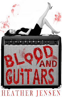
Blood and Guitars – Heather Jensen
Very designy cover, a cutout on a white background. It has good contrast, even at small sizes. Genre seems fairly obvious: paranormal romance, with guitars. However, the picture has a white background, and the cover has no border, which makes it hard to view on a light background.

Flame of Surrender – Rhiannon Paille
Full-image background. The lettering has poor contrast, especially in B&W, and the fading from the decently-readable light purple at the top of the letters gets darker toward the bottom–combined with the smaller type under the word "Flame," I had to force myself to read the whole title. The background is too busy to pull off the lettering as such. The picture is striking enough (I rather like it), but it makes me think, "This had better be tree porn," which wasn't the impression I picked up from the description on Smashwords. The genre is clearly some kind of romance + fantasy combination, but I don't really get a feel for it. YA or not? I thought it was more YA, but when I checked out the genre on Smashwords, it's in the non-YA epic paranormal fantasy categories. I'm not sure how fantasy can be both epic and paranormal.
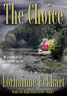
The Choice – Lorhainne Eckhart
Full-image background. The font's not all that and a bag of chips. The 3D dimensions on the font make it harder to read (and somewhat cheesy-looking), but the font's well-placed over non-busy areas of the background, and it's big enough to read the important bits, although the author name is almost too small to be readable at a smaller size. I get a sense of a fiction story with very small elements of the supernatural in it (almost, but not quite, magical realism). I also get a sense that this story might be very "cute," with a sentimental ending (the pink house is the only thing in color). The book's listed as a detective novel and as romantic suspense on Smashwords.

Image-on-colored-background. The font contrasts well, is large enough, and is easy to read. The image is striking. This strikes me as a very eb00k ebook cover, if that makes sense–something that would look cheesy as a print cover but works well as an ebook cover. I want to say this is a thriller, something like that movie with Harrison Ford among the Amish…I looked it up: this is a thriller, but a science fiction thriller. Wow. I did not pick up on that at all.

Full-image background. The font's not quite big enough–imagine what this would look like with a more solid white font without the black borders on the letters. Fat, white letters with no serifs. It would scream horror thriller. Or, alternately, if the letters were wider, still thin, but stretched longer, vertically? The font just looks too normal for the genre. Background: fantastic. I'm thinking of picking this up. Smashwords says this is a Horror/Undead book. Right up my alley. Downloaded sample for Nook…as a beginning cover designer, I would take this as a note that if you communicate the genre well, other elements that are less than ideal may pass more or less unnoticed.

Disclosure: I know the author and have read a draft of the book. Full-cover background. A good example of making tradeoffs and breaking rules. At thumbnail size, you can't really read the text, but the image is so striking (and that "K" becomes a "WHAT THE HELL IS THAT UNDER HER EYE PLEASE NOT A SPIDER" moment) that it almost sucks people into look at it despite themselves. Does this cover scream YA to you? Also, no. But it screams, "This is a book about an intense character." No demure maiden here. The cover works even though it doesn't fit the "rules": keep that in mind. If you find yourself simply having to look further at a book blurb or a sample with no other reason than the cover, it works. The cover for Twilight, for example, also doesn't really give a hint about genre–yet it's so striking that you can't help but look further (I certainly couldn't, when it came out, but didn't get past the sample. I kept picking up the book, hoping that somehow it would be a book for me–due to the cover. That's how good the cover is.) The only thing I'm utterly blah about on this cover is the series title. Every time, I read it first as "Allie's Book War One." The design isn't enough to offset 30-plus years of reading from right to left.

Full-image background. I feel the title should be the most readable thing on a cover, unless you're a big-name writer. Because the black font fades into the background, the most noticeable words on this cover are the tiny author's name. The shadowing behind the title font makes it even harder to read (to my astigmatism, it seems to vibrate). Overall, the cover is just too dark without enough bright points–having the title font in a brighter color would take care of that, though. The dark shapes in the image would be a lot more interesting if the background were a lighter color, too. What genre is this? I have no clue. None. This book has no appeal for me, because I have no idea what to expect. Smashwords reports the genre as historical fiction. Hm…I'd say, give it a font that looks somewhat historical, brighten up the picture while retaining contrast, and add a border that reflects the period on the outside, and sales would go up. IMO.

Legends of Green Isle: The Forgotton Spell – Constance Wallace
A very designy cover, with mixed elements. I don't know where to look on this cover. The title isn't the most important element, I can't read the font clearly (and the 3D stuff just makes it harder), I can't tell what the picture in the middle is at first glance, I can't tell what's in the white space, and the lack of symmetry in the block for the author (with a whole lotta white space) just makes me feel lopsided. But I can tell the genre as soon as I can figure out what the picture is, so it's not a waste of time and probably moves books relatively well. What age group is this for? Adult? Smashwords reports this as a YA fantasy, but I'm just not picking up on YA. Note: the Amazon cover is simpler and doesn't look as designy–but it communicates better.

Agents of Change – Guy Harrison
Full-background cover. This one won the contest. Dude. There is not a dang thing bad I can say about this cover. My only quibble is that this is an adult thriller, and the chick in the image to the back looks YA-ish. This isn't the book for me, because I'm not a thriller reader, but I can tell that at a glance. And if I were a thriller reader, I'd know that I'd have to at least read the sample: that's what you want from a cover, to get people to read the blurb and a sample of the book. Even the shading on the lettering is subtle and effective. This is a better thriller cover than most professional thriller covers, and would work well as a print cover, too.
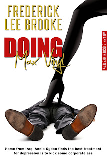
Doing Max Vinyl – Frederick Lee Brooke
Very designy cover – cutout on white background. Okay. Something about this cover took real guts. What is it? There are several ways in which the designer walked right up to the edge of "the rules" but didn't quite break them…and one way in which the designer said, "I've heard about that rule. Fuggeddahboutit." The font is almost 3D. The title is almost too hard to read. The title against the background (that skinny leg) is almost too hard to read. The image screams this story is about a chick who gets revenge. Or maybe it's a fetish book…but the contrasts seem too violent to be pure kink. No, upon reading the tagline at the bottom of the cover, I have to say this is indeed a revenge book. Okay. Got it yet? The name. This is a book for chicks written by someone who admits to a masculine pen name. I say more power to he author. However, next time put a black border around the cover, so the image doesn't fade into light backgrounds. And the Amazon print cover? Is even just slightly funnier than the ebook one.
…sadly, I ran out of time (and my book is the next one on the list, and I'm still not distanced enough to be able to talk about it). So more covers later. Dear authors and cover designers, I know our jobs are hard ones, and I don't mean to offend; these are just my impressions. Feel free to respond 


February 24, 2012
Ebook Pricing Discussion: Buy an ereader if you're considering giving out ebooks for free.
This keeps coming up. People want to know how to price their books in a situation where nobody has had enough time to test a method–the method that might work great during one five-year stretch might not work out so well during the next stretch. Who knows?
However, I'll tell you my theories at the moment so you can consider them and argue with me. I'm no economist, so there are potentially a lot of considerations that I may have missed. So be it: I plan to keep on learning and keep on experimenting, and this may not be my final word on the subject, either.
One thing I do know, though: the experience of reading ebooks is not 1:1 for reading paper books and probably affects people's purchasing habits. So if you're thinking about epublishing, even if you're dead-set against the ebook-reading experience and want to stay with print books, you should:
Get an ereader
Before you start selling ebooks, get an ereader. Heck, they're cheap–get several and write them off on your taxes. Spend at least a month reading books on your ereader. JUST on your ereader, if you can manage it. Here are your goals for that month:
Download several books from your local library, if ebooks are available.
Download a THICK book from your ereader's online store. Maybe even a boxed set.
Download 20-30 free ebooks from your ereader's online store.
Figure out how to read an ebook in the bathtub (hint: wrap the ereader in a freezer bag).
Download several books from Project Gutenberg.
Scroll through the Smashwords home page until you see at least ten books that you're tempted to buy.
Download 20-30 free ebooks from Smashwords.
Cruise through the ebook store for your ereader and find one book that you can't resist buying at $.99.
Do the same, but for a $2.99 book.
Again, do the same with an ebook $9.99 or less.
Finally, go nuts and buy a book that you've been planning to buy, regardless of the price.
(You might want to consider doing similar things on your smartphone, if you have one: try Aldiko and the Amazon and Nook apps, try the Overdrive app and set it up for your library. You should download those things from your app store, by the way, not online.)
Buying books on an ereader isn't like buying a print book. With print books, you have to consider both price and space. Generally, you have to pay for print books, and you generally have to pay more than $.99, even at Goodwill. (Mine are usually $1.) And regardless of whether or not you pay for a print book, you always have to keep in mind that a print book takes up shelf space at your home (or chair space, or floor space, or space on top of your kids' heads if they're especially flat).
With an ereader, you could go for the rest of your life, reading a book a day, and never have to pay for another book again. Don't believe me? I set up a list on Twitter with nothing but free ebooks. And you'll never have to return the books, either, unless you get them from the library. And those books don't take up space, except metaphorically on your ereader–but you can save books on your computer, too, should your ereader overfloweth.
Yet people are still selling ebooks for money. How? Logically, shouldn't readers be gravitating to free books?
The real cost of reading books, one that people don't talk about much, is that it takes time. Is a book "worth" $1 or $5 or $8.99 or $27.99? Without the distraction of a physical book and thinking, "Oh, well, it must cost a good deal of money to print and ship it, etc.," it becomes obvious that books cost hundreds of dollars to read. Just take your hourly wages times the amount of time it takes for you to read a book. I wouldn't be surprised if there are some people who've invested at least $5,000 of their time reading The Wheel of Time series, even though the cover price, in paperback or ebook, is going to be less than $150 total. Probably.
(It's about 11,000 pages for the whole series. I read quickly, at least a page a minute. That's about 184 hours, or about $27 an hour to make $5,000. I'm pretty sure there are people who make over $27 an hour who are reading that series…and people who read slower than a page a minute.)
So what's the real cost of reading The Wheel of Time? At $27 an hour & a page a minute, about $5,150. Or about 190 hours (184 hours to read, plus six hours to make enough money to pay for the books). The actual cost of the books is not the big expense here.
The more time you spend on an ereader, the more obvious it becomes that you download or don't download books (free or otherwise) based on whether you think you're getting your money's worth for the time spent.
You'll have a ton of books on your ereader that you picked up for free. Here's my prediction on most people's pattern in picking up free books:
They pick up anything that's free. "SQUEEEEE!!!!"
They start limiting themselves to things that a) look professional and b) look at least somewhat related to their usual genres. Except for that one book they just couldn't pass up.
They start limiting themselves to books from #2…except they read the sample first, to make sure it's edited and formatted decently, and that they have any interest in reading that author.
They bypass at least 99% of the free books they see and stop feeling guilty about not reading all the crap on their ereaders. They may start reading an author that they picked up for free, but only if that author hits their particular sweet spot.
Writers will probably also go through a phase of picking up all the free indie writer books they can find; this will thin out after a while, too.
In the end, free is not a panacea.
Putting up a book for free will guarantee you more downloads, especially if your book has a professional-looking cover, is formatted and edited correctly, and shows some modicum of talent. But it won't guarantee that people will ever read it. With free books, you will run into a lot of people in stages #1 & #2, to whom free books are still like crack. But they won't read your book unless it hits one of their niches.
I think there's a place for free; it's a tool that will catch lots of #1- and #2-stage readers that may fit your niche but probably won't, by a factor of hundreds if not thousands. But acquiring those #3 & #4-stage readers–the ones who are both likely to read and enjoy your book–is much harder, and free won't always cut it.
"Free" cannot be the only tool in your sales toolbox, and this quickly becomes obvious if you have an ereader. And, really, why would you want to sell something you wouldn't want to buy? Even for free?
Next (probably on next Friday): How to calculate the money you need to make on your book to break even.
February 22, 2012
Ebook Formatting 101: The Aftermath
I gave the Ebook Formatting 101 presentation last night for PPW. The first hour was the formatting side; the second hour was the slideshow (much meatier than the one in the blog post) plus questions.
Oh, man. People said it went well (aside from my learning curve with the microphone), but I saw a lot of glazed-over eyeballs. It was a lot of information. Someone (Laura Harvey?) mentioned that it might work better as a hands-on class, and I have to agree. Bring your laptop and a five-page story, and walk out with an ebook. We could do it. However, it would take a logistics person to pull it off, and I am not that person.
I think the slide show went particularly well, and I'm going to try to work that into an ebook. I might have to split it in two: Formatting 101 and Covers 101. I'm interested in picking up specific ebook covers to help flesh out the cover images slide show; contact me if you're interested in letting your cover be part of a discussion. I'm paying $5 for rights to use each cover in blogs, ebooks, and a possible print book later (much later). For the class, I used some covers I didn't have rights to, and I want to swap those out. I might have to link to some of them: the Robert Jordan covers for the Wheel of Time series in print vs. ebook are an excellent illustration of why some things work better as print covers than ebook covers.
Something that was driven home to me last night: for the most part, writers don't know how to use their word-processing programs at more than a basic level, for the most part. I had to explain what m- and n-dashes were. What curly quotes were. I've been using Word long enough at an advanced level that I forget sometimes that most people don't need to know these things. So when I put the ebook together, I may have to put in an appendix on advanced word-processing topics and link back to it as needed.
February 21, 2012
New Fiction: Alien Blue
New fiction up! I'm trying out the Kindle Direct Select program, which means I have to leave it exclusive on Amazon.com for three months (May 20th). I'll let you know how it goes…at any rate, it's only available via Amazon.com at the moment. So if you happen to buy a copy but don't have a Kindle, contact me with a screenshot of your purchase, and I'll provide an alternate version for your ereader. Being in the Select program means that I can't sell the other versions from my website, either, but I don't want to punish people who don't have a Kindle. So contact me.

Alien Blue
by DeAnna Knippling
"Only beer can save us now." –Bill Trout, Zymurgist*
Sci-Fi. Bill Trout didn't set out to get involved with aliens. He just wanted to run his damned brewery and heal up from being abandoned by his ex-wife. But that ain't the way things worked out, and now he has some bodies to bury, an alien kid who's wanted for murder—mass murder—to hide, and a planet to save. But Bill won't go down easy.
Fortunately, the aliens, who are a blue ooze that takes over your body and are real hard to kill, have no tolerance for alcohol. So now Bill has a new beer on tap: Alien Blue.
He just has to be careful who he serves it to.
Note: This the cowboy-hat-with-the-pink-band story.
For future reference, here's the eventual hat.
Just because Bill makes fun of it doesn't mean it's not fetching.
Rather than put a whole bunch of material up here, if you'd like to read a free (non-Kindle-specific) sample, click here. But here's the beginning…
Prologue
The door of Bill Trout's bar opened, and a couple of people pulled their guns out. The aliens weren't supposed to come till dawn, but hell, who trusts an alien? Then the daughter Bill never knew he had walked into the bar, and his heart just about broke.
He knew who she was, because she looked just like her mother, except for her nose, and she looked about the right age for when her ma had left him. She let go of the door, and it jingled shut, cardboard in the hole where the glass should have been. Without a second glance, she walked past the diorama of the crazy caveman dragging his woman and fighting off a saber-toothed tiger.
"We're closed," Bill said.
The young woman's jaw jutted out, and Bill had a flash of déjà vu of his ex. The bar, as any fool could plainly see, was packed.
"Er, and there's no room anyway," Bill added.
The girl spotted the empty booth he'd left at the back of the room. "I'm here to meet somebody," she said. "He's supposed to be wearing a cowboy hat with a pink band. Have you seen him?"
Bill couldn't help touching the Twins cap covering his bald spot. "Nope."
The girl pointed to a table near the bar. "Isn't that him?" Bill turned his head to look, and the girl made a break for the back booth.
He cussed at her back. "I shoulda locked the door."
The Caveman Brewery, built into an old yellow-brick warehouse, looked almost festive with its neon beer lights, upside-down canoe, and garish, handmade beer posters, but the customers looked like hell, half-asleep and mean. Guns and booze were in evidence at every table.
Bill's daughter switched her purse strap across her chest and braced her feet against the base of the table. "I'm staying," she said, when Bill followed her.
"Missy, you got to leave."
She glared at him and said, "I need to meet my dad. I don't know who he is. He has cancer and he's going to die and he didn't even know I was born."
"Missy—"
But she wasn't stopping. "Mom wrote him a letter telling him to meet me here today. He'll be wearing a cowboy hat with a pink band and carrying the letter from Mom, and some dumbass waiter isn't going to screw this up, so bring me a beer."
He sighed. "I'm sorry, miss. But this is a real bad time."
The woman shouted, "I said I want a beer!"
Then the bells over the door tinkled again, and a tall, dark-skinned man—so tall his head brushed the bells—stumbled into the room, almost falling into the diorama.
The room went dead quiet.
"Hang on, miss," Bill said, and, "God damn it, Anam." He beelined over to the man, jerking him upright. "I told you to get the hell out of my town!" Anam, whose filthy, ragged shirt and pants were smeared with either wood stain or blood, grabbed Bill's arm so hard he found smears on it, later. As Bill struggled to push Anam back out the door, his heart shuddered, and he sagged at the knees, wincing, and Anam had to wrap an arm around him to hold him steady.
Then Bill realized what Anam meant to do, and he stopped fighting. "You fool," he said. "You damned fool." He pointed Anam toward the patio. "Go. I don't want you in my sight."
Anam pulled himself along table by table, until he reached the door. He put his head on it, tried to pull it open while he was still leaning on it, jerked harder, and almost pitched himself backwards on his ass. The springs of the door creaked as it opened, then slammed the door behind him.
Bill passed a hand over his face. There was no going back now.
The folks in the bar started whispering again, and Mimi rushed up to him, twisting a towel around and around in her hands, dripping water. Her lips were almost white, her black-and-purple hair tangled like snakes.
"What's going on?" she asked.
Bill glanced up at the bar. About a hundred and fifty people were packed inside, ready for violence, and all he could think was that he had to get his daughter out of here. Out. Of all the damned times for her to come to town. Of all the damned times.
"It's all part of the plan, darlin'," he said. "That girl there, she's here to hear the tale."
"To what?" Mimi's eyes went wide.
"We're all getting erased, one way or another," Bill said. "She's been sent to get a true record, so…well, so we can get our memories back later. Only she don't know that. Later I'm going to have you take her to the bathroom and get the recorder off her…probably in her purse somewhere. Her ma would have planted it there, without her knowing."
Mimi gaped at him, her mouth open, showing her delicately-disordered teeth. She had become like a daughter to him, or even closer: like an employee. "So that's what Smart Bart was doing."
"I better get back to it." He turned around and limped back to his daughter's booth. "A cowboy hat with a pink band, huh? All right, missy. I changed my mind. You can stay till your dad shows up. But you got to promise me something."
Her eyebrows met in the middle. "What's that?" She was pretty in a in a bad-posture, ugly-duckling way, somewhere between sixteen and twenty-five. Bill hadn't seen her mother for twenty-two years, which should make her just barely legal to serve. Ah, just look at that nose. It was his nose, before it got broke. He woulda sworn on it.
"You got to try this new beer I been working on. I make most of my own beer, you know. This new one's called 'Alien Blue.' On the house."
She didn't let go of the table. "Okay."
Bill gestured toward Sam, his bartender. The party pump under the bar wheezed like an asthmatic poodle as Sam pulled most of a pint for the woman.
Bill stumped over to the bar and picked up the blue beer. His hands were shaking, but he didn't spill a drop as Sam handed it to him.
"That's the last of it," Sam said.
"Good riddance," Bill said. He brought it back to the girl. "Come on, try it."
"Thanks." The woman took a deep, thirsty gulp. Plenty. Then the taste hit her, and she put the mug down and shuddered.
Bill laughed despite himself. "What do you think? Good stuff, huh?"
She forced herself to stop gagging and gasp, "It tastes like monkey piss."
Bill flashed a big-ass grin at her. "Aw, didn't like it, did you? Well, it does have a funny aftertaste."
She swallowed her own spit a couple of times, trying to get the taste out of her mouth. "So why is it blue?"
Bill said, "It's a long story."
The woman sighed. "A long story would be good. And some water. Or something. I need to kill some time until my Dad gets here. Besides, I collect stories."
"Really? You a historian or something?"
"No, just a writer. You haven't heard of me."
Bill laughed. "A writer? Figures you'd be a liar." Before she could ask Bill what he meant, he said, "Well, I'll make sure this guy who's claiming to be your dad's on the up and up; I know most folks who live within a hundred miles of here. What's your name?"
"Nina Nesbitt."
Bill held out his hand. "Pleased to meet you. Bill Trout. I own the place."
"And I called you a waiter." Nina put down the blue beer to shake Bill's hand and winced when Bill squeezed the hell out of her fingers. "Ow!"
"Sorry." Bill let her go and grabbed the blue beer before she could pick it up again. "How about I just dump this out. Wait. I think I'll put it in a lead-lined keg and bury it with the radioactive waste out in Nevada."
"It wasn't that bad," Nina lied.
"Oh, honey, it was worse. Sorry to pull such a mean joke on you, but it was for a bet. Now, how about some wheat beer, little touch of clove in it? I call it A Hard Day's White."
"Uh," Nina paused. "I guess I could try it. If you're done playing practical jokes on me."
Bill laughed. "I'll give you the good stuff now, I promise. I'll even throw in a couple of Reubens and a basket of fried mushrooms to take the bad taste out of your mouth."
Nina smiled the kind of smile that makes men propose, with dimples. "Please?"
Bill smiled back like he couldn't help it, then turned his head and bellowed, "SAM, PAIR OF WHEATS, FAT KRAUTS, AND A BASTARD OF HATS." His voice echoed above the crowd, through the air ducts and the rafters. He confided, "Me and Sam couldn't remember any genuine diner lingo when we opened, so we made some up. More fun that way."
Bill walked into the back of the house and poured what was left of the beer in a plastic bucket, then added an equal amount of Everclear that was sitting next to it in a jug. He could hear the people out front muttering at each other, a susurrus that had gone sharp. Well, let 'em.
He came out, sat down at Nina's table, and said, "So the beer. It all started with the mayor, Jack Stout. If you knew Jack, you knew that he was full of damned good intentions unmoderated by a lick of common sense. Tonight's his wake—" Bill broke off and wiped his face.
Nina leaned forward and touched his hand.
Then Mimi showed up with two mugs and a basket of mushrooms. "You okay, Bill?"
Bill put his grin back on. "Just thinking about Jack. I'll be fine, I guess. Why don't you check the patio? You haven't been out there for a while. Somebody might need something."
Mimi glanced over at the door Anam had gone through. "Sure," she said.
As Mimi left, Bill said to Nina, "I gotta say, missy, I sure am glad you came along."
"Why's that?" she asked. "And don't call me missy."
"Fair enough," Bill said. "Thing is, everybody here knows the story except you, and I got a hankering to tell it one last time. Hell, it'd make a good novel, you ever feel like writing it up. You can use it; just change the names, okay?"
Nina said, "Maybe."
*Someone who studies the practice of fermentation, as in brewing, winemaking, or distilling.
February 20, 2012
Ebook Formatting 101 (Advanced Topics)
The ebook formatting 101 series continues. Read the rest of the posts in the series . I was going to include the handout with this post, but I changed my mind: the handout will contain less than the posts, so why post it? It's just a front-back printout to trigger people's memories and to help the visual people follow along during the talk. Anyway. I won't have the ebook for this ready by the time of the workshop, because I'll want to integrate any good questions/points from the workshop into the ebook, but it should be ready this week or next.
Let me know if there's anything else you want to know (as a beginning ebook formatter) or want to make sure that beginning ebook formatters know as they're just starting (as an advanced formatter). I will stress the necessity of editing several times, I promise.
—
So you've mastered the most basic ebook formatting techniques, and you're ready for the next step. You're tired of hand-formatting your italics, want to add bulleted lists, inline images, and produce better book covers. You're even starting to think about making a POD.
.Doc-file Formatting Tips
As always with a .doc file, Smashwords has the best tips on formatting a clean file. However, here are some additional tips and workarounds I can pass on:
Adding bullets using your word processor's automatic bulleting function may or may not work for all conversions. You can insert a symbol for the bullet with a couple of spaces instead, especially if you get Premium Catalog errors for the automatic tabs your program may insert.
The indents on .mobi/Kindle conversions may be messed up; add a .01″ indent to paragraphs that are not supposed to be indented, so the conversion engines won't automatically add full indents. Sometimes this worked for me, and sometimes it didn't.
The hanging indents on .mobi/Kindle conversions may be messed up; try a -.2″ indent to the first line to force a hanging indent. However, I had even less luck with this than I did the previous tip.
If you have studied that Smashwords style guide, know what it means to have a "clean" file, and you wrote your story is in a "clean" file, then you do not need to Paste Special/Unformatted Text, which saves a ton of time on formatting/checking italics. Just paste it in and make sure every paragraph is formatted with one of your styles.
Insert images as normal on a separate, Centered-style line, making sure the images are about 450 pixels on the longest side/100 dpi max. Your max file size is 5 MB for Smashwords, and Kindle Direct will charge you extra from your royalties on some files over 3 MB, after conversion. I'd check that your .doc file size is no more then 2 MB if possible, or offset the extra charge in your pricing.
PDF Formatting Tips
This is for PDFs that you sell via your website (or send out to reviewers), not for the Smashwords PDFs. I don't recommend trying to make PDFs via Calibre; it's a headache.
Save the PDF file as a separate file.
Don't set up headers and footers with page numbers unless it's a print-only version; this helps on printouts but looks just as bad on ereaders as ever. (Thus, consider setting up two PDF versions: print and non-print. If you set up a print-only version, consider doing research on book design before you build the file.)
At least make sure you don't have orphans, that is, single lines at the top of the page, which can be disorienting for the reader. If so, insert a page break before the preceding paragraph (or just force an extra line down).
If you don't have a full version of Adobe, install a free PDF converter of some type; I like PDFCreator, but I'm no expert on PDFs. It will let you save or print your file as a PDF with embedded fonts, both of which are important.
Adding .Epub and .Mobi File Types
To get more control over your conversions (especially at Kindle Direct Publishing), you can add XHTML formatting to your repetoire. Basically, you: 1) lay out the document as a .doc file just as you would for the Smashwords version, with some exceptions, 2) prepare the file for conversion (some things are easier to do in the .doc file), 3) dump it into an XHTML template, and 4) convert the file using Calibre. There are even more complex ways you can build those files, using all types of programs, but when I did the research, this is the one that seems to balance ease of use with control. (Some people swear by Sigil or KindleGen or some combination of those programs and more.)
I highly recommend the tutorials by Paul Salvette, who covers the whole process in a lucid, step-by-step fashion. However, some instructions may be sightly different for Mac users. especially for step 2 (or so I hear).
The Next Step in Covers
To do more advanced covers than you can pull of in PowerPoint or a similar program, you need to get into image editing software. The expensive route is a combination of Adobe Photoshop (image editing) and Adobe InDesign (layout). However, if you're not ready to commit to Photoshop, you can replicate that in a less expensive (free) fashion by using a combination of GIMP (kind of like Photoshop) and Scribus (kind of like InDesign). There are other programs you can use, but of the ones I looked at, these had the best combination of tools plus help documentation. Even so, this was the most technologically challenging part of the learning curve for me (so, really, it's the part I'm proudest of for getting as far as I have).
PODs
PODs are a different world than ebooks. You cannot use the same file, even the same .doc file, and I would be very suspicous of anyone who says you can. The issues are complex and even arcane; however, with some research, it's fairly easy to make a POD that's difficult to distinguish from a big-publisher printed book.
Above all, do not go with a POD printer who charges you thousands of dollars in setup costs without first researching low-cost alternatives: CreateSpace (tied to Amazon), Lightning Source, and Lulu.com. I have used CreateSpace and Lulu.com; I find the CreateSpace books more enjoyable as physical books, because the Lulu covers (when I did them, two years ago) had a tendency to curl quickly, and the pages seemed more like printer paper than book paper, which made the text near the gutter (in the crack near the book spine) hard to read. I can't say whether that's still the case.
For software, I build my covers using the same techniques as above, but at 300 dpi and sized for my book following the provider's guidelines (do the interior first; you need to know exactly how many pages the book has in order to calulate your spine size). I build my interior files with MSWord, then save the files as a PDF using PDFCreator. At some point, I may get sophisticated enough to need to use InDesign or Scribus to do interiors, but I'm not there yet. You can do everything from drop caps to kerning in MSWord 2007.
As far as your design research goes, start with the free Wikibook Basic Book Design, which may not tell you everything you need to know, but will at least familiarize you with what issues you should start thinking about.
…And More
Pricing: There are multiple theories on this one; I'll probably write more blog posts on it. But I did write some posts on figuring out a lowball estimate for how much your fiction is worth, if you want to check those out.
Various design books that I recommend:
Designing with Type , by James Craig et al.
The Elements of Graphic Design , by Alexander W. White
The Non-Designer's Design Book , by Robin P. Williams
Other places to find free/cheap cover images:
Dreamstime
123RF
Stockfresh
iStock Photo
Morguefile
Canstockphoto
DepositPhotos
StockedPhotos
GettyImages
ShutterStock
Fotolia
Other places to find free/cheap fonts:
Fontspace
Dafont
1001FreeFonts
1001Fonts.com
UrbanFonts
More Font Sites
Alice in Wonderland and Philosophy
I've been working more on Alice in Wonderland and Philosophy, and I got to a statement that made me shake my head:
Consider that the whole Wonderland story itself is one huge dream, since Alice's sister wakes her up for tea at the end. Alice never really visited an actual place called Wonderland; she just thought she did. –Robert Arp
Um. No.

When you are dealing with ideas rather than facts, you have to take into consideration that the rules for ideas do not match the rules for facts–and it's often useful to be aware that what we normally think of as "facts" are so moderated by ideas that the rules for facts may not apply. For example: "This sweater is red." However, if you look at a red sweater under a green light, it's black; our perception skews the color. Is the sweater "really" black or red? Color is reflected light: so it really depends on the color of light it's reflecting, doesn't it? It isn't "really" red or "really" black–it's just that most of the light we use would tend to show it as red. Practically speaking? Red. But in "reality," it's not red, because you can't define "reality" as "only in broad daylight," which is the only time it's really the red that we expect to see. Painters know this.
Is this a pipe or isn't it?
It is a pipe, and it is not a pipe. Opposite facts may not be true, but opposite ideas are often true. Love is the best…love is the worst. Bacon is good…bacon is bad. Death is tragic…death is hilarious.
Did Alice go to Wonderland, or did she dream it?
It's perfectly acceptable, when dealing with ideas, to be inconsistent. Even paradoxical. Because often the opposite "truths" of an idea are both true. Alice both did and did not go to Wonderland: it's a story. The characters in Wonderland are both logical and illogical. Words both have meaning that cannot be changed and are whatever we make of them (Humpty). We can believe six impossible things before breakfast (White Queen) and in order to reach our destinations, we often have to walk away from them (Red Queen). The Wonderland of the first book both is and is not the Wonderland of the second; the Red King both does and does not dream Alice into being. A pun is both logical and illogical; it both follows the rules and breaks them.
We think, "The opposite of something true is false," but it's very hard for an idea to be true, that is, factual. Because ideas are things we think and not facts, it's very easy for the opposite of an idea to be another idea, rather than just untrue. Yet we behave as though our ideas were facts: the opposite of me is other; the opposite of my point of view is bullshit. Yet many points of view have utility–even contradictory ones. Overall, it seems to take many different types of people (with correspondingly different points of view) in order to make things work. We can't all be pawns, after all, or deuces of spades, or even all chessmen, or even all gamesplayers–who will make the chessboards? Who will sell them? Yet we think that people who aren't like us, or who don't think like us, are liars, stupid, foolish, ignorant, and even inhuman. The pattern of thinking "the opposite of true is false" is a limitation, a hindrance–a poor tool.
The more valuable pattern, I think, would be not to teach a girl of ten or eighteen (when the books were written, relative to Alice Liddell's age) that there is one best strategy to follow through life–for example, logic–but to teach her that no matter what people say, no matter that one minute they're doing you "good" and another doing you "harm," no matter what changes you go through, there's a you there, and there are many tools (including but not limited to logic) that you can use to navigate even the most absurd of situations, including breaking rules (even logical ones). Many children find the Alice books perfectly terrifying–and they are. They poke holes in what we think of as real, right down to the level of "truth."
The fictional Alice can enter Wonderland through a rabbit-hole and exit it through a dream: it's a story, which are both real things and dreams, and something else besides.
February 17, 2012
Ebook Formatting 101 (part 4, Covers)
The ebook formatting 101 series continues. Read the rest of the posts in the series . In the previous post, I talked about finalizing your ebook…but I didn't talk about covers. How can you finalize your ebook without a cover? You can't, so here's your post. As a reminder, this series is for beginning ebook creators. More advanced creators may find some of the techniques here inelegant and inefficient, but this is as simple as I could make it.
What program, size, and resolution?
In order to make a cover, you need to start with some kind of image-formatting software that allows you to take pictures and throw some type on top of them. You know what software works great for beginners? PowerPoint. Any other kind of presentation software will work, too, as long as it lets you save your images as pictures in .jpg or .png format.
I don't use PowerPoint any more, for two reasons: 1) I like to do tricks that take more sophisticated software now, and 2) you shouldn't use PowerPoint-produced images for POD covers. See the handout for suggestions for more advanced programs.
At any rate, you need to be able to create an image of 100 dots per inch (dpi) at least 750 pixels on the short side and about 1000-1150 pixels on the long side for your ebook cover. An image of this size can be uploaded to Amazon, B&N, and Smashwords, and it won't take up too much room inside your file. This is not an image that you can use for a POD cover; print images should be at least 300 dpi.
You want the proportions of your cover to be roughly a ratio of 2:3. On a physical scale, this translates to a 6 by 9 trade paperback cover. For ebooks that are going on an ebook reader, there really isn't any point to designing a truly square, circular, or oval cover: you will be viewing the book on a rectangular device, most of the time. If you look through the covers on Smashwords, you'll see that the square covers just look odd.
Where do I get images from?
You must have the rights to the images you use for the cover. The easiest, safest way to do this (unless you've taken the picture yourself) is to obtain images from a stock photography site; I use Dreamstime (see the handout, coming Monday, for more sites). Most stock photography sites have a section with free images, too. Using images you find using a search engine, even if you have the "free for commercial use" filter on, is just as illegal as someone copying your ebook files and using them to make a profit. You can usually buy a nice cover image from a stock photography site for a few bucks; if you're planning only to make an ebook cover (and not print), then the lower-resolution images are fine.
How do I design a basic, simple cover?
First, create a background of the correct size and resolution. Note: PowerPoint, no matter what the dpi of the pictures you import, exports images at 72 dpi. This is acceptable for ebooks but not for PODs.
Next, place your cover image on top of the background and size it so that it covers part of background.
Finally, add your book's title and your author name to the area without the picture.
While this type of extremely simple cover doesn't come across as the most professional type of cover in general, they are perfectly acceptable ebook covers to start out with.
Here's an example:

I took the picture for this myself. The text and layout are easily readable, if not sophisticated. A note about the white background, though: you should add an outline to white backgrounds so they don't disappear on a white web page (unless that's what you want).
Another easy way to format a cover, one that looks more professional but is a little tricker to pull off, is to make the picture cover all of the background, and lay your fonts across the picture.
Here's an example:

The key here is to make sure your font contrasts with the background. If you select a picture that's too busy, the font will disappear into the background. If so, you can put your font in boxes over the picture to make sure the fonts are readable, as in this example:

Fonts
Generally, you want a very readable font for your cover. The font should be large enough for you to read at least the title at thumbnail size. What's thumbnail size? See the home page of Smashwords for examples; it's about the size of a postage stamp. You can find free or cheap fonts at font sites like Dafont (more sites listed in the handout); make sure you check the rights on each font and pay for them as necessary. Centering your text is a good place to start; make sure to give yourself a margin with no text near the outside of the cover, so the text doesn't look like it's going to run off the screen on an ereader (Zombie Girl Invasion has some problems with this near the top, for example).
Other Text
Besides your title and name, what text can you put on the cover?
If you have a successful book (especially one with an award) under the same name, mention that.
Put up a quote from another author or a reviewer praising your work (it doesn't even have to be the same book, unless the quote is extremely specific).
Add a short tagline: the kind of short, amusing thing you see on some movie posters, like, "In space, no one can hear you scream."
The other text doesn't have to be readable at postage-stamp size, but they do have to be readable at computer screen size.
How do I decide what to put on my cover?
I've told you the how but not the what. The most sophisticated software in the world can't tell you what to put on your cover. It's a complex subject, but I'll give you some basic tips:
If you can't read your cover at postage-stamp size in black and white (as on some ereaders), the best design is useless.
Look at a lot of other covers in your genre to get a feel for what people expect, like tramp stamps and a headless woman (urban fantasy cover), a ship and some stars or planets (deep space SF), or a man on a horse, preferably with a gun (Western). Notice fonts (and font sizes), colors, photos vs. illustration vs. basic shapes, where the title is placed, how many quotes and blurbs are used, etc. Are there people on the cover? Are they doing things or standing around? That kind of thing. Make a list of what generally appears on the covers of books of your type.
If you know of any potential cross-marketing opportunities (like selling a science fiction book that features beer to beer-lovers), you can also study books that would appeal to your other market. See the Alien Blue cover below; I pulled inspiration from a cover for a book on craft breweries in the U.S.
The most important thing to convey with your cover is your title; the second most important thing is genre. Unless you're a famous writer, in which case the most important thing is your name.
If possible, come up with a relatively consistent scheme for creating covers; the more consistent you are, the more recognizable and familiar your covers will be for your fans.
Do not in any way, shape, or form attempt to make the surface of your ebook cover look three-dimentional by using Word Art or other 3D shading. It just looks cheesy at postage-stamp size on a flat computer screen, and that's usually the first thing a potential reader will see (see the examples of Robert Jordan's Wheel of Time series; the print covers had 3D titles, but the new ebooks that Tor released have a flat font–that's why).
If you're not familiar with image-editing software, try to avoid putting one image on top of another at first; it will probably look a kid's cutout until you figure out how to do it more or less properly.
Scroll through the covers at Smashwords to see a variety of what other indies have been doing, both good and bad.
There is no shame in copying good design…as long as you don't copy it exactly and have permission for your art.
Unless you can pay for custom art, you will probably have to make some compromises between accuracy and spirit when it comes to your book cover. Readers bitch about inaccurate covers…but they don't buy books from unknown authors whose covers don't reflect the spirit of the book (or, if they do, they probably don't come back for more). This is another place where it's a good idea to surf the Smashwords covers in your genres to see the compromises that other designers have made. Make a special note of covers that make you read the blurb to see if you might want to buy the book; the things that tempt you to buy a book will probably tempt others, too.
A cover is a marketing tool–that is, it tells reader what to expect from the book. A good cover will appeal to the people you would like to read that type of book…and it should almost warn off the people who don't want to read that type of book. If you don't like zombies, you already know to stay away from Zombie Girl Invasion, even without reading the title. Don't worry about making your cover (or your book) appeal to everyone; if you do, you'll get some unreasonably bad reviews as the wrong audience picks up your book. Don't worry about being original; if you figure out how to accurately describe how your book fits in with your genre (that is, you capture the spirit of the book with your design), you will have an original cover–not too original, but just original enough, which is what readers generally want.
Always keep in mind that you can change your covers later. No matter how much you hate your first covers, like all things ebookish, they aren't permanent, and can be updated for free. POD covers can be a different story.
And finally, you can do some really fun, sophisticated-looking stuff on your own, too, as you get more experienced. Here's my latest cover–contrast it with my first one, A Fly in Amber. Both stories are about booze, by the way.

February 15, 2012
Ebook Formatting 101 (part 3, Formatting, Finalizing, Uploading, and Validating)
The ebook formatting 101 series continues. Read the rest of the posts in the series . In the previous post, I talked about formatting a template for ebooks in order to save time and reduce errors. As a reminder, this series is for beginning ebook creators. More advanced creators may find some of the techniques here inelegant and inefficient, but this is as simple as I could make it. Beginners will still need to do the homework of learning how to use their specific word processing program to do a few tricks.
Now that you have your template set up, it's time to crack open your edited, 100% complete story and turn it into a simple ebook. In order to do this, you first should get rid of problem formatting, then reformat the story with formatting less likely to cause issues. For beginners, this means wiping out all your formatting (or "nuking") and adding the formatting back in.
Nuking
Nuking is short for "using the nuclear option." When I was working as a technical writer/editor, we used this term the same way people do for ebooks, so I suspect it's been around for a while. If you think you're confused when your word processor starts to change page numbers, indents, numbering, etc., imagine how your ereader feels. People who aren't too familiar with using Word on a technical basis should nuke their work before they try to format it. More advanced users can go to the Smashwords Style Guide for other options.
To nuke your file, open your manuscript file and a new file that has no formatting in it–no page numbers, no headers or footers, no titles, nothing. Completely blank. Copy everything in the manuscript file and paste it as unformatted text in your blank file. How you paste your document as unformatted text will depend on your software; you'll have to look it up. Generally in Word, look for a "Paste Special" button and select for unformatted text in the options provided. You will end up with no bolds, no underlines, no italics, no big fonts, no hyperlinks, nothing. This is exactly what you want, if something of a pain to reformat.
Save your file under a new name.
Formatting Your Text
Now, format your nuked story with the following steps:
Remove all tabs.
Remove all spaces at the beginnings of paragraphs. Your paragraphs should start flush left at this point.
Make sure all returns are hard returns and not line breaks (a hard return will mean that your new paragraph will indent properly; a line break means it won't).
Make sure your word processor is set for curly quotes and not straight quotes (you will have to determine how to do this on your individual word processor), then do a find and replace for single and double quotes. (Inches and feet marks should be primes, or straight quotes, which you can insert as symbols.)
Remove all multiple spaces; there should be only one space after a period or colon for ebooks; if you don't, some words will not end up flush left within paragraphs.
Find all your dashes and make sure that breaks in thought are formatted with an m-dash and all spans of time/number/range are formatted with an n-dash; insert these as symbols.
Change all … to actual ellipsis characters; insert these as symbols.
Make sure all special characters are inserted into text and sub/superscripted if necessary.
Don't add page numbers, headers, or footers. If they somehow ended up in your text, remove them (the ereader will add them for the readers according to its own settings).
Finalizing your Smashwords version
Open a copy of the template and save it with your story title (with_underscores_between_words),ending with .Smashwords.1.doc (The_Best_Story_Ever.Smashwords.1.doc). Copy all of your story and paste the updated text (you do not need to format it as unformatted text a second time; you'll lose your italics/bold again if you do) exactly at the {Text} marker in the Smashwords file, which will cause the paragraphs in your story to automatically be formatted in the Text style. All your paragraphs should be indented properly.
Now scan through your story's Smashwords file and format any section breaks with the Centered style (***) and do any other formatting you like.
Do a search for { or } and make sure you have updated all {} areas marked in the template.
Insert the cover at the beginning; I recommend no larger than 750 by 1150 pixes, 100 dpi.
Finally, proofread your document and make sure you don't have any errors. Save the file!
Finalizing your non-Smashwords version
Save the file, removing .Smashwords.1 and changing it to .Other.1 (The_Best_Story_Ever.Other.1.doc).
Remove the text "Smashwords Edition" and "return to Smashwords.com and" from the front matter. Make no other changes.
Save the file. That's it.
Uploading and Validating
You can now upload your file to Smashwords (using the Smashwords version), Amazon (using the Other version), or Barnes and Noble (using the Other version).
Use these links:
Smashwords
Amazon (via Kindle Direct Publishing)
B&N (via PubIt!)
Note: don't ask anyone else to do this; you might be exposing personal information. A walkthrough is available via Novelists, Inc. (NINC), in the middle of this awesome binder they created.
Once you have the document uploaded at each site, you will need to validate the ebook by scrolling through it, looking for issues on every page. You will also need to test all links.
In Smashwords, you can't do this without putting your book up for sale, which you're just going to have to get used to; people will probably not buy your book until you announce that it's out. Note: The PDB version is almost certainly going to come out so screwed up that you can't stand to look at it; either deselect the PDB option when uploading the ebook or learn to live with it.
For Kindle, use the Enhanced Preview option.
For Nook, you have to buy a copy of the book in order to test the links. However, if the links work on the Kindle version, they should also work on the Nook version.
If you make any updates, make sure to make them to both files and update the file version!
Smashwords will tell you what position you are in their queue and usually takes less than an hour to upload. Kindle and Nook will tell you that it takes about 24 hours, but it's usually less than that–overnight.
Troubleshooting
If you are not trying to format anything more complex than the styles I gave you in the template post, then you should have no issues. If you have to format something more complex than that (bullets, poetry, drop caps, etc.), you may have issues. Most of the advice I provide here comes from the Smashwords Style Guide, which has a good troubleshooting section. The thing to remember is that you want to meet the standards for the Premium Catalog for the sake of looking professional at all three sites; if you have problems on one site, you're more than likely to have problems on all three.
However, .mobi/.azw files for Kindle have some known conversion issues. For some reason, Kindle conversions are more buggy and less likely to translate your .doc files the way you want them to. Some issues I have run into with .doc files converted to .mobi/.azw on both Kindle and Smashwords for Kindle are:
Inconsistent handling of bullets (like this list).
Inconsistent indents.
Alignment shifting to the left when links are clicked.
Workarounds for the first two are available, but won't be an issue in most fiction (although you might end up with tabs for your non-tabbed paragraphs). Workarounds for the third are not available, as far as I know. To find workarounds–because they're scattered all over the place–do a search for them, like, "Kindle ebook bullet issue."
If you get to the point where you're doing a lot of workarounds, it may be worthwhile into finding out how to submit files in .epub/.mobi format, which takes longer and has a separate learning curve but gives you more control. If you're interested, I recommend starting with Paul Salvette's tutorials, which I found clear and easy to understand. But that's a more advanced topic.
Next time: Basic tips on ebook covers.
February 13, 2012
Ebook Formatting 101 (part 2, Formatting Your Template)
The ebook formatting 101 series continues. Read the rest of the posts in the series . In the previous post, I talked about why ebook formatting is what it is, where to publish, and what file types you need (as a beginner). As a reminder, this series is for beginning ebook creators. More advanced creators may find some of the techniques here inelegant and inefficient, but this is as simple as I could make it. Beginners will still need to do the homework of learning how to use their specific word processing program to do a few tricks, mentioned below.
Formatting Your Template
To save on repeat projects and to isolate potential problems, start out by building yourself a template.
In order to format ebooks, you have to remember that ebook files tend to end up as cleverly disguised modified web pages–so you have to set up your formatting so it's as similar to the markup people use on web pages as possible. When coding for web pages, formatting tends to be applied to individual words, paragraphs, or sections. See the < and > stuff on the header of this section? That's what the codes for bold and italic look like. (I realize that most people reading this blog know this; bear with me, this is a talk and will reach an audience that includes people who don't–I may have to do a slide to show that.)
It turns out the best way to do this is to format your work by word, by paragraph, or by section using styles. On a web page, you define a style, or a set of traits for formatting (e.g., italics, margins, justification, etc.) by assigning it a name like "title" or "centered." Then you label each paragraph with that style. Most word processors are set up to do styles, too. How you do it will depend on the program you're using, so research your own program.
Here are the styles that I set up for ebooks:
Title: 14-point Times New Roman, centered, bold, 14 points extra line spacing before and after the paragraph. (When setting font size as points, don't go above 14, or an ereader may reset it for you.)
Front: 12-point Times New Roman, centered, bold, 12 points extra line spacing before and after. (For "front matter," or author name, copyright info, etc., at beginning.)
Chapter: 14-point Times New Roman, centered, bold, 14 points extra line spacing before and after, insert page break before. (Note: do not call this style "Headers"; the conversion engine may be overhelpful and override your style settings.)
Text: 12-point Times New Roman, justified, .2-inch first line indent, no extra spacing before or after. (For story text.)
Notes: 12-point Times New Roman, justified, no indent, 12 points extra line spacing after only. (For non-story stuff, like author notes.)
Centered: 12-point Times New Roman, centered, 12 points extra line spacing before and after. (For Table of Contents, dedication, and section separators, "***")
Once you have your styles set up (and you don't have to follow my choices exactly), it's time to set up a template (without your story in it). Make sure the file is a .doc file. To create a template, add your front and back matter (everything that isn't the text itself) and format it in a named style. I provided the styles that I use for each line, but you don't have to match them. Put all information that varies from book to book in curly brackets {} so, right before you finalize the ebook, you can search for { or } to make sure you updated everything.
Note: Do not actually type "(Title style)" after {Title} in your template; just format {Title} in the Title style that you set up. You won't need to add bolds; they're already in the styles that I had you set up; you will need to add some italics. You don't need to add the dashes; those just mark the beginning and end of the template.
—
{Title} (Title style)
Byline (Front style)
Copyright © {Year} by Byline (Front style)
Smashwords Edition (Front style)
This ebook is licensed for your personal enjoyment only. This ebook may not be re-sold or given away to other people. If you would like to share this book with another person, please purchase an additional copy for each recipient. If you're reading this book and did not purchase it, or it was not purchased for your use only, then please return to Smashwords.com and purchase your own copy. Thank you for respecting the hard work of this author. (Notes style)
{Dedication} (Centered style, italics)
*** (Centered style)
Table of Contents: (Front style)
{Chapter links} (Centered style)
Read More! (Centered style)
Author Information (Centered style)
Cover and Image Credits (Centered style)
Publisher Information (Centered style)
*** (Centered style)
{Blurb} (Notes style, italics)
{Text} (Text style)
*** (Centered style)
Read More! (Chapter style)
{Insert cover of promoted work; I suggest making it no larger than 500 pixels, 100 dpi per side} (Centered style)
{Title} (Front style)
Byline (Front style)
{Blurb} (Notes style, italics)
{Text–first section of text} (Text style)
*** (Centered style)
Author Information (Chapter style)
{Insert author photo, suggest no larger than 500 pixels, 100 dpi per side} (Centered style)
Author bio. (Notes style)
Website and blog: Link (Notes style)
Twitter: Link (Notes style)
Facebooks: Link (Notes style)
Buy books at: Link (Notes style)
*** (Centered style)
Cover and Image Credits (Chapter style)
Images (Centered style)
{Credits} (Centered style)
Cover Design (Centered style)
{Credits) (Centered style)
*** (Centered style)
Publisher Information (Chapter style)
Publisher information, if you are set up as a publisher (Notes style)
Website and blog: Link (Notes style)
Twitter: Link (Notes style)
Facebooks: Link (Notes style)
Buy books at: Link (Notes style)
*** (Centered style)
—
And that's the end of your template. You still need to insert the links and update the Table of Contents (TOC).
Links
To format web links: use your word processor to insert the links (using some kind of Insert Web Link tool, depending on your processor), making sure the link addresses start with http://, as in http://www.smashwords.com. Usually, if you open the web page itself and copy the link from your address bar, your word processing program will paste it with the http:// at the beginning. You must double-check this, even if the link works when you click on it.
To format email addresses: use your word processor to insert the links, making sure they start with mailto:, as in mailto:publisher@wonderlandpress.com. Again, you must double-check this, even if the link works when you click on it.
To format TOC links: At the chapter headers, insert a bookmark using your word processor (using some kind of Insert Bookmark tool). A bookmarked Chapter 1 will not seem different; no underlining or color change will appear. The bookmark itself is invisible. At this point, you will only need to format the following bookmarks: Read More!, Author Information, Cover and Image Credits, and Publisher Information headers. You will need to have at least three TOC links if you are going to have a TOC at all; otherwise, you will get errors from Smashwords when it checks your ebook for the Premium Catalog, which means Apple, Sony, Kobo, etc.
I recommend skipping bookmarks for the Chapter Headers except on short stories or on books where the header for the chapter is interesting or clever, like "Chapter 1: In Which Our Hero Saves an Unusual Kitten." Paging past ten pages of "Chapter 1," "Chapter 2,"…"Chapter 47″ is a waste of your readers' time, and yours, because your readers probably won't use the chapter links anyway (ereaders open the ebook file at the last read location).
Note: Do not format the bookmark to include the entire chapter heading: "Chapter 1: The Beginning." If you do this, the first line that appears at the top of a reader's ereader screen after clicking it will be the line after "Chapter 1: The Beginning." Instead, select one word in the middle of the chapter heading, like "The" and bookmark only that word or a few letters from that word; when someone clicks the TOC link, they will end up with "Chapter 1: The Beginning" at the top of their ereader screen. Also, label your bookmarks consistently, or you will waste time trying to remember what you called them. "C1″ should suffice.
After you have formatted all the bookmarks in the back matter (Read More!, etc.), go up to your TOC at the beginning of the ebook and insert a link to each bookmark (generally, you use the same tool as you did to insert the web links, but there will be a sub-option to Insert Bookmark or Insert Location within Document instead). Each bookmark must have a link to it, or Smashwords will give you errors at the Premium Catalog check.
Once you have your links done, your template should be done. Save it in several locations with all your information completed as much as possible.
Note: if you check your links before you use the conversion engine on MSWord (which you should do), you may need to remove some hidden links. Under your bookmarks tool, check for a box that says "sh0w hidden links" or similar. Even if it's checked, uncheck and recheck it; delete any weird-looking links that appear.
Next: Formatting, Finalizing, Uploading, and Validating
February 10, 2012
Ebook Formatting 101 (part 1)
I'm giving a talk for Pikes Peak Writers at the February Write Brain on February 21 at the Celebration Place (Citadel Mall). As usual, I'm developing my ideas as blog posts, because hey, you always gotta come up with ideas for for blog posts, and I often get good comments on stuff to add when I put up the posts first (hint hint). Although I have to admit that the handouts for the talk will probably be printed before the posts for them do. I'll just do Ebook 101 posts until I get through them, so pardon the interrupted Editing series for now.
I'm not going to talk about whether or not you should indie publish, just about how to put together ebooks, and just how to put together ebooks for beginners. More advanced users (e.g., people who know web design, graphic designers, etc.) are going to get pointers toward more advanced topics later (probably next Friday), which I'll provide as part of the handout at the talk. So when commenting–keep in mind that the best way for you might not be the easiest way to start out with. Comments welcome, but this is intended for a very new, somewhat skeptical audience. My goal is for people to go, "Okay, that I can handle. It's not what I'm used to, but it's not that complex."
—
Where to publish and what files types you'll need
I'm assuming that you know nothing about ebooks, other than that they exist. So what are ebooks? Ebooks are books that can be read electronically; they come in multiple formats. Formats are really file types. If you're going to publish ebooks, you need to make sure you are providing the formats that your readers need.
The most common formats are:
.pdf (Portable Document Format), an open document exchange format created by Adobe.
.txt (plain text format).
.epub (electronic publication), an open XHTML/CSS-based format set by the International Digital Publishing Forum.
.mobi (from Mobipocket Reader, an early ebook software provider purchased by Amazon), an XHTML/CSS-based format, can be used by Kindle.
.azw, an XHTML/CSS-based Amazon proprietary format.
.rtf (Rich Text Format), a word-processing format that is not Microsoft proprietary, although they did develop it.
.doc, the Microsoft-proprietary word-processing format and currently the only way to upload files to Smashwords.
I advise beginners to use the following formats:
.doc
I advise non-beginners (and people who know web development) to refer to the advanced users section of the handout. If you do not have Microsoft Word, you can do the equivalent actions in another program that allows you to save as .doc files (Like Open Office).
With a .doc format (in two versions, a Smashwords version and a non-Smashwords version), you can post files directly to Smashwords, Amazon, and Barnes and Noble. By posting a file to Smashwords, you can indirectly post files to Sony Reader store, the Kobo Reader store, the Apple iBookstore, and the Diesel eBook Store.
Smashwords says that you can also post to the Amazon and B&N bookstores; however, I advise against it. Amazon and Smashwords aren't actually sharing books at the moment and haven't been since last July. Amazon will probably be your biggest source of sales, so you don't want to wait until they work out the bugs; you should post directly to the Amazon store. B&N and Smashwords are sharing books, but B&N will probably be your second-biggest source of sales, and they only report sales to Smashwords every month or so, and it takes even longer to get paid. Initially, watching your sales numbers will be very addictive, and you will probably be very frustrated with the wait.
So, in short, I recommend beginners to post to the following sites:
Smashwords
Amazon (via Kindle Direct Publishing)
B&N (via PubIt!)
Note that Amazon and B&N have separate names for their ebook-publishing sides.
From manuscript to uploadable file
Your manuscript should be as perfect as it is possible to make it. The #1 complaint about independently-published ebooks is that they are not professionally edited. Personally, I think writers' collective lack of editing skills comes from being treated as precious little jewels who need to have their hands held throughout the process so their tiny little brains don't get distracted from writing…while they get screwed over financially. But I acknowledge the truth of it: most writers (not you guys, obviously) have this attitude that grammar is for prudes and commas are for lesser mortals, and even the most detail-oriented writers have difficulty stepping away from their work. At any rate, get someone knowledgeable to look at your manuscript and tell you whether you need editing help; if you do, trade fairly for that help.
The .doc file you start out with is not acceptable to use to publish your ebook. Do not upload an ebook using any old file; your readers will get a load of buggy crap that they can't read.
Why is this? Because most ebook files are not simple word processing files, but actually simplified web pages (more or less), and the conversion software at Smashwords, Amazon, and B&N will read certain things in your word processing file incorrectly as they try to make word processing files do what they were never meant to do. In fact, what looks like an ebook file is really a hidden zipped folder…but that's an advanced topic. Just take it that ebook file conversion is tricky to do from a word processor file, and you need to give it all the help you can.
What this involves are basically two stages:
Get rid of ("nuke") everything that will screw up the conversion, and
Format the text in a way the conversion engine can understand.
Next: Formatting your template.