
Khoi Vinh's Blog, page 167
December 27, 2011
Subscribing to The New York Times
My complimentary 'digital subscription' to The New York Times is coming to an end, so I just ponied up the equivalent of US$195 for a year's renewal. For obvious reasons, I'm emotionally invested in The Times' survival, and in fact would like to see it prosper for generations to come. But the process of renewing was unpleasant and left me angry, and it wasn't even about how expensive it was.
The problem is that it's so difficult for a customer to determine which of the many subscription choices really offer the best value.This is true even for a customer like me, who is dedicated to the brand, technically proficient and a former employee of the company.
Numbers Game
In the run up to my subscription expiring, the company had been sending me promotions that were urgent in their warnings but exasperating in their vagueness. They offered the first eight weeks for just 99¢, which is obviously just an introductory rate.
But when I clicked through on the offer, there was no way to know what I'd be paying after those first two months are up, unless I signed in. When I did log in, only then did I find out that the regular rate is US$3.75 per week. Who prices this stuff by the week?! In fact, even the company seemed unsure about measuring its subscription rates this way, as it occasionally referred to it as US$15 for every four weeks, which is still not the most straightforward way to calculate a subscription that you expect to run for a year. There was no true monthly rate listed, or even an annual rate. And what's more, small print warned me that 'applicable taxes' apply — even though this is a purely digital subscription — so there is literally no way to determine the true cost of the subscription using the site itself.
All of this was for the Web site-plus-smartphone app package. There was also a Web site-plus-tablet app package on offer for US$5.00 a week — why one is more expensive than the other, I have no idea. If I wanted a package that covers everything, Web site, smartphone app, and tablet app, the cost would have been US$8.75 per week. Note too that to reveal these rates, I had to hit the back button in my browser to return to the offer page and log in again each and every time.
The total customer experience here is haphazard at best, and, at worst — I hate to say this because I am still friendly with many people at the company, but in truth there's no way around it — it's insulting. It shows a certain amount of disrespect to customers for a company to choose not to present a full accounting of available offers, displayed plainly and in an easy-to-compare chart, so that anyone can fully understand all of the options and decide quickly.
Why would it be so hard to do something like this? I ask that rhetorically, but from my experience as an employee I remember exactly why: The Times as a business remains both in thrall of and a prisoner of its old print mathematics, wherein pricing for delivery of the physical newspaper was complicated and subject to frequent and fleeting special promotions. By design, print subscribers were never sure if they were getting the best deal on their subscriptions, and that mentality has transferred over to its digital business. The result is sadly hostile to those looking to subscribe, and gives the unmistakable impression that the company is gaming its customers.
Just for comparison, here's how some other digital businesses price their products: Netflix is US$8 a month. Spotify is between US$5 and US$10 per month. Evernote is US$5 per month or US$45 per year. Birchbox is US$10 per month. Hulu Plus is US$8 per month. Flickr is US$25 per year. MLB.tv is US$25 per year. And so on. There is really no good reason that pricing for The New York Times couldn't be as simple as that.
To follow me on Twitter click here.


December 26, 2011
The Annual Basic Maths Sale Is On
 Every year on the day after Christmas, my friend Allan Cole and I put Basic Maths, our theme for WordPress. This year is no different. Starting today and running until midnight 31 December, this versatile, highly customizable — and mobile-friendly — theme is available for one-third off, which brings the price down to just US$30 — a bargain, really. Get your copy now.
To follow me on Twitter click here.

December 22, 2011
MetroChange
This concept for "a charity donation platform using New York City subway cards" is a project from students at New York University's Interactive Telecommunications Program. The idea is to capture the bits of monetary value that often remain on MetroCards but that are too insubstantial for many riders to bother with. The students envision a kiosk-like device where a rider can swipe their card and the remaining value gets transferred to a centralized charity fund.
It's a nice idea. I haven't been to a senior thesis show at ITP for several years, but this concept seems more sophisticated and less superficial than many of the others I've seen from that program. However, I have my doubts as to whether the Metropolitan Transit Authority is really looking to help its consumers direct those bits of remaining value to a charity fund. Given their seemingly chronic budget shortfalls, I can't imagine the "lost" money isn't already accounted for in their spending.
Anyway, find out more at MetroChange.org. There's also lots of content about what went into the project at the accompanying blog.
To follow me on Twitter click here.

December 21, 2011
OmniFocus Feed Sponsorship
We're hoping you decided to check out the trial of OmniFocus after their sponsorship earlier this month. Here's a quick 5-step jumpstart.
Capture everything. Take 15 minutes to move things out of your head and in to OmniFocus. Anything from long-term goals (earn pilots license) to quick errands (card for mother).
Define next actions. "Earn pilots license" deserves its own project. Move it to your library and decide what to do next.
Organize actions with contexts. "Research area flight schools" might be assigned to a Mac context for googling, "card for mother" to Walgreen's.
Now we do stuff. If you're at the office, focus on work projects to get stuff done!
Review mode. Take time to consider each active project. Does it need some work?
Find out more about OmniFocus here, and don't hesitate to omnifocus@omnigroup.com.

Me Talking with Zeldman on "The Big Web Show"
 This week I was lucky enough to be invited by the venerable Jeffrey Zeldman to be a guest on his podcast "The Big Web Show." We jumped on Skype yesterday morning and recorded a ~45-minute conversation that covered such topics as my experience at art school, how I got started doing design, my career co-founding a design services business, my tenure at The New York Times, and of course my work on Mixel, the social collage app we launched last month. It was lots of fun, and many thanks to Jeffrey for the invitation.
You can get an overview of our discussion, audio of the episode itself and a link to subscribe to "The Big Web Show" over at Jeffrey's blog.
To follow me on Twitter click here.

December 20, 2011
Sir Ernest Shackleton in the Antarctic, 1915
Chris Wild's Retronaut is an amazing compilation of visual artifacts from the musty past. I came across this entry tonight: a shockingly beautiful set of photographs from Sir Ernest Shackleton's ill-fated voyage to Antarctica in 1915.

They look like they may be hand-tinted but apparently they are in fact color photographs, with an ethereal, almost ghostly quality. See the full blog post here.
To follow me on Twitter click here.

How Signage Is Made
The venerable design magazine Eye has a great blog that highlights fascinating stuff from the world of graphic design. This post looks at how an acrylic storefront sign is actually made, and includes step-by-step photographs from press to machine-tooling to hand-cutting.
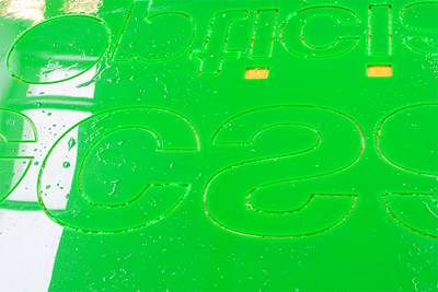
I've seen countless signs like this all over the world, but I was surprised to realize that, before reading this article, I really had no idea how they were made. In fact, I have no idea what happens inside a sign-making shop, which is pretty embarrassing for someone who claims to know a lot about typography.
To follow me on Twitter click here.

December 14, 2011
OmniFocus Feed Sponsorship
You have goals — use OmniFocus to reconstruct fragments of ideas or projects into actionable steps to complete those goals.
Move the responsibility of remembering daily tasks from your brain to OmniFocus — gather everything into the Inbox for later review, and then organize those bits into folders, projects, actions, and contexts.
OmniFocus is as simple or advanced as you decide to make it, and available on Mac, iPad, and iPhone with free cloud sync. Move past mere task management and get things done with precision.
Read more about OmniFocus here.

Kindle Fire Does Not Fire the Imagination
For obvious reasons, I'm an iPad partisan, but I do want to see the tablet market get more competitive. For that reason, I was excited about the Amazon Kindle when it was announced and so I pre-ordered it immediately.
When it arrived, I had an out-of-the-box experience that, as it turns out, would be indicative of my feeling about the device in general: good, not great. As I powered it up for the first time, the Fire spent about five or ten minutes downloading and installing a software update, leaving me unable to even use it. Not great. But it installed the update just fine, and thereafter it was mostly a glitch-free experience. Good.
Daily Usage
I've been using — trying to use — the Fire regularly since. I carry it on the subway during my commute and read books on it, rather than on Apple's iBooks, which is my preferred reading software. I also keep up with weekly issues of The New Yorker on it rather than reading it in print form, which I've always preferred for that publication. All told, I've made a concerted effort to really get to know the Kindle.
Here's what I found: it's a good reading device, which is to be expected, but what I expected was a fantastic reading device. That just seems like what the Kindle platform should be: the world's premier electronic reading experience, bar none.
Unfortunately it's not that, by any means. The 7-inch form factor is marginally easier to hold than an iPad while standing in a subway car, but the size and contours leave me continually feeling like I can't get a good grip on it. For on-the-go reading, which I do a lot, the justly lambasted positioning of the power button — on the bottom edge of the device — makes it very hard to quickly power back up after alighting trains.
The Kindle software itself is a lousy reading experience; the justified, un-hyphenated typography is an eyesore, the font selection is depressingly homely, and the line-spacing is visually erratic. The net effect is that it feels like I'm consuming a pirated version of whatever book I'm reading, a sensation which might have been fine on earlier versions of Kindle hardware, but seems lazy on a device capable of producing beautiful results. I'm not saying that iBooks is perfect, but Amazon's focus and head start on the reading experience should have put them in a much better position than this.
Imagination Deficit
Reading aside, there's little else that the Fire does that excites me, though I admit I'm probably not the target user, since I already own an iPad and am invested in that platform. Even if I weren't though, I find the Fire's focus on consumption — an even more extreme focus on that than the iPad — to be disappointing. There are so many things you can do with a portable, touch-based computing device, and the Fire hardly seems interested in any of them.
Amazon has gotten a lot of praise for not flagrantly emulating the iPad with the Kindle Fire, and I concur with that a little bit. However, it should get no praise for its utter lack of imagination. After several weeks of using it, there's almost nothing about the Kindle that inspires me in any way, whether as a user, as a consumer or as a developer.
In fact, the Fire reminds me a lot of the so-called 'electronic typewriters' that came into the market in the late 1980s and early 1990s. At a time when personal computers were getting cheaper and more capable, and word processing software looked poised to take over the typing market, typewriter manufacturers responded by producing a bizarre class of hardware that incorporated a minimal amount of silicon into a traditional typewriter form factor. These machines had a one- or two-line digital display, a marginal amount of memory, and complex modes of editing, formatting and storage. They were weird, but at the time they must have seemed like a reasonable counter-balance to the PC tidal wave: for folks not yet ready for the full power of a personal computer, these awkward beasts could be had for a noticeably reduced price — you just had to be convinced that you could make do with the reduced feature set and the utter lack of imagination. They didn't last long, of course, and eventually everyone bought a 'real' computer. To me, that's the Kindle Fire.
To follow me on Twitter click here.

December 13, 2011
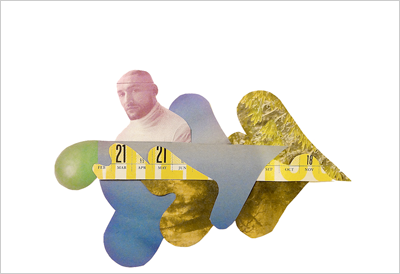
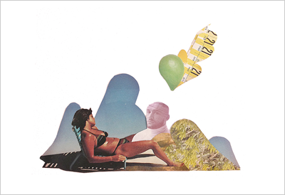
Everything's Coming up Mixel
 I promise not to turn this blog into a big long marketing campaign for Mixel, but our users continually surprise me with their ingenuity so I can't help posting at least some of what I come across. Not only are they making great stuff with the app's purposefully primitive tools, they're also starting to take some of this stuff offline in ingenious ways.
Last night, I was pleasantly surprised to find out over Twitter that a group of avid Mixel fans have come together to form a Mixel users group in Indonesia. I don't know who they are, but now I have an excuse to go to Indonesia, which is awesome.
Closer to home, several of Mixel's most active users have organized an informal meetup here in Brooklyn, which is taking place this coming Thursday at Quarterbar. This happened entirely without our provocation or intervention, so we're even more excited that people are passionate enough about the app to want to get together on their own. My co-founder Scott and I both plan on being there, and everyone's welcome. The invitation was even created with Mixel, naturally:

Maybe the most surprising offline Mixel activity of all was cooked up by a friend of mine, Keenan Cummings. He calls it Muxel and in it he's translated the digital experience of Mixel back into an analogue collage experience. The neat thing is he's using the postal service as a way to maintain something of Mixel's uniquely social dynamic.

The idea is that you use scissors and traditional collage parts — magazines, photos, colored paper, etc. — to assemble your collage in the standard way — almost. Instead of gluing things down, Muxel asks you to instead photograph the final composition. You post your completed collage, then you mail the pieces off to the next user, who does the same, and so on and so on. The project just kicked off, but the results already look terrific.
Update
One last note on Mixel: we've just released version 1.1, an update to the app that fixes some memory crashes and some rendering bugs. This latest version also now lets you save snapshots of your in-progress mixels to the Photos app on your iPad. You can download it from the App Store today.
To follow me on Twitter click here.

Khoi Vinh's Blog

- Khoi Vinh's profile
- 5 followers

