
Khoi Vinh's Blog, page 165
January 26, 2012
The New Yorker: The Man Who Owns L.A.
Writer Connie Bruck wrote this piece that ran a few weeks ago in The New Yorker about the men behind a plan to build a new NFL stadium in downtown Los Angeles. One of them, Phillip Anschutz, is a politically conservative billionaire seven times over, who made his fortune in oil and gas, real estate, railroads, telecommunications, and sports and entertainment. It's a fascinating article, even though I'm not particularly sympathetic to his agenda or that of his compatriots. But I did really like this quote from him:
"It helps to have your back against the wall. Adversity is a huge advantage — as long as you think of it as an advantage — because it helps you do things you never thought you were capable of doing."
Words to remember. You can read the full article here — but unfortunately, only if you're a subscriber.
To follow me on Twitter click here.


January 25, 2012
MindNode Feed Sponsorship
MindNode is an elegant, easy-to-use mind mapping tool for Mac and iOS. Whether you're brainstorming for your next project, organizing your life, or planning your vacation, MindNode lets you collect, structure, and expand your ideas. And thanks to built-in Dropbox and WiFi sharing, even your biggest ideas can go anywhere your iPhone does.
MindNode is easy mind mapping for your Mac, iPad, and iPhone. Try out Mindnode Pro and MindNode touch today!


January 24, 2012
Jorge Chamorro
This Madrid-based designer has a stunning portfolio that uses a contemporary, intricate take on modernism. He's also apparently a collage artist, as suggested in this poster he designed for what looks like a show of his collage works.

He seems like someone I would like to meet. Visit his site here.
To follow me on Twitter click here.

January 23, 2012
Airport Runway Screenprints
Architect and designer Jerome Daksiewicz of Nomo Design has produced these beautifully matter-of-fact poster designs that capture the runway designs of various American airports.
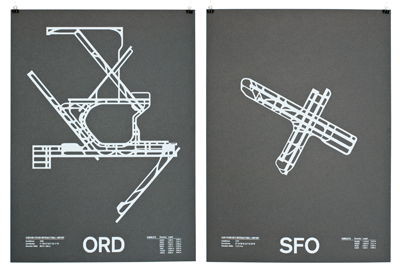
You can see them in more detail at this link, or buy prints at their shop.
To follow me on Twitter click here.

January 20, 2012
Get Thee to a Punnery
Riffing on a post I wrote a year ago called "The Sad Story of Illustration on the Web," the always-incisive Paul Carr writes in the recently launched Pando Daily that, just as illustration has suffered because of the Web, so too has the rich tradition of punning at news publications been in decline since the advent of blogging.
"Here in the blogosphere [there's] little-to-no place for editorial cleverness in headlines. Search engine optimization of headlines and a relentless drive for clickthroughs means that headlines must either be absolutely direct……or infuriatingly opaque."
While Subtraction.com is not a serious news source or a significant publication, Carr's lament has been my experience here too. I used to really enjoy writing mildly clever headlines for my posts, making frequent and at least passable use of puns. I gave up on that a while back, though, realizing that it wasn't doing me any good in terms of maximizing the reach of what I write. I changed over to the more direct approach with great reluctance; it felt a lot like giving up something meaningfully human in order to more efficiently appeal to the machines. But hey, they're going to rule us one day soon anyway, so may as well make nice sooner rather than later. Read Paul's full post here.
To follow me on Twitter click here.

January 19, 2012
See Me on TWiT Photo
It won't be long before podcasting is a whole decade old, which I find amazing because I remember sampling my first podcasts when the medium was still brand new, even before they'd been rolled into iTunes. For almost the entirety of that almost-decade, I've been listening to podcasting impresario extraordinaire Leo Laporte, whose This Week in Tech (TWiT) empire has been one of the form's biggest successes.
That's why I was so flattered when I was invited to appear on one of Leo's new shows, TWiT Photo, which he co-hosts with the amazing photographer Catherine Hall. The episode was recorded live on Tuesday and you can download it here.
Truth be told, I was a little nervous about appearing on TWiT Photo because, if you peruse the show's already deep archives, they typically feature lots of really talented professional photographers. By contrast, I regard myself as nothing more than a lucky amateur, but Catherine and Leo structured a great discussion about the intersection of design and photography, where the two disciplines overlap and how they can each complement the other. And, of course, we got a chance to talk about , too. It was loads of fun. Be sure to subscribe to the podcast here.
To follow me on Twitter click here.

January 18, 2012
Scrivener Feed Sponsorship
Writing a book or research paper is about more than hammering away at the keys until it's done. Research, shuffling index cards to find that elusive structure - most software is only fired up after much of the hard work is completed.
Enter Scrivener, a content-generation tool that lets you compose and structure long and difficult documents based on material from multiple sources. Adopted by novelists, screenwriters, journalists, lawyers and academics alike, the program allows users to split the editor and view documents, PDF files, multimedia and other research materials next to each other. A virtual corkboard and outliner help with structuring or providing an overview of the draft. Collate, read and edit related text without affecting its place in the whole using Scrivener's Collections feature. Close out the world in Full Screen mode. And when you're finished, export to e-readers or the most popular word processing programs for submission.
Available for Mac OS X and Windows at Literature and Latte.

January 13, 2012
Android Doubles Down on Design
It's probably a good idea for everybody involved in design to follow closely what happens with Android Design, a portal that Google launched yesterday as part of a new initiative to raise the mobile platform's user experience to the next level. Aimed squarely at Android developers, the site sets out a creative vision (tied closely to the awkwardly-named Ice Cream Sandwich, or Android 4.0 release); its central tenets are "enchant me," "simplify my life," and "make me amazing." Those three ideas are supported by a series of design principles and a library of design patterns and building blocks that should make it easier for developers to adhere to the vision.
All in all Android Design is a well-executed package, and it's significant in that it's the first — or at least the most cogent — articulation of what designing for Android is all about. It puts forward clearly delineated concepts that Android developers should hold in their heads when they set out to create a product on this platform, and backs those up by identifying the specific, tactical methods that Google feels are most effective at arriving at these ends. Good stuff.
Design for Everybody
What struck me the most about the site, though, is that its vision is so broad that it becomes broadly generic, too. There's nothing about "enchant me," "simplify my life," and "make me amazing" that's objectionable, but there's also nothing about those concepts that sets the platform apart from what iOS or Windows Phone are trying to do, either. The design principles are smart and illuminating, and in fact everyone should read them as they offer a lot of good advice. But again you could apply these to just about any design system, whether an OS or a suite of products. The only material that shows how Android is different lies in the lower-level patterns and building blocks; this is a little bit like saying that Android is different because its constituent parts are different, but not truly explaining why they are the way they are. This was a chance for Google to clearly state how its Android design philosophy is different from the rest of the pack, but it doesn't seem to me that they followed through on that.
However, Android UX director Matias Duarte promises that the Android Design site that launched yesterday is just an opening salvo, and that over time its resources will grow deeper and, presumably, richer. This is why I think watching this initiative will be very instructive for any designer or design professional: Google is trying to engender a design culture where, frankly, there isn't much of one at the moment.
This kind of effort is something that few companies can successfully pull off: changing the character of the platform in mid-stream, splicing in a new design-savvy gene even as the organism is growing with incredible rapidity. It's a nontrivial challenge, to say the least, and if Google can make it work — I hope they can — it will demonstrate to many kinds of organizations that design can be successfully evangelized, even in environments where it was not deeply rooted at the beginning. For my part, I have no opinion on what their chances are, only to say that the successful design platforms that we're most familiar with tend to be 'born that way,' whether it's Apple or Adobe or even Windows Phone, which had to essentially reboot the notion of Windows to properly integrate the kind of design culture that Microsoft aspired to. There's plenty of prior evidence that design can come late to a company and still succeed, of course; there's less evidence that design can come late to a platform and still win over that platform's whole ecosystem. Anyway, it's going to be fascinating to watch.
To follow me on Twitter click here.

January 11, 2012
HelpSpot & Open Source Help Desk List Feed Sponsorship
At HelpSpot we're big supporters of open source software and simply couldn't run our business without it. So, 6 years ago we created Open Source Help Desk List to assist companies looking for an open source help desk software solution. It's success has been beyond our wildest expectations; serving as an invaluable tool for thousands of companies to find the solution they need. We hope it can help you as well.
If you'd prefer a professionally developed and supported help desk application, then give us a look: HelpSpot: Help Desk Software.
Thanks!
Ian Landsman
Founder, UserScape
P.S. Checkout the newest project we're working on, the PHP framework Laravel
Film Alphabet Quizzes
Designer, illustrator and artist Stephen Wildish made these poster-like film graphics that, to my mind, are much cleverer than the standard film poster er-imaginings that designers often create these days to promote themselves. Each graphic is a visual quiz in which you try to identify a notable film title that corresponds to each letter of the alphabet. Here's the one from the 2000s:
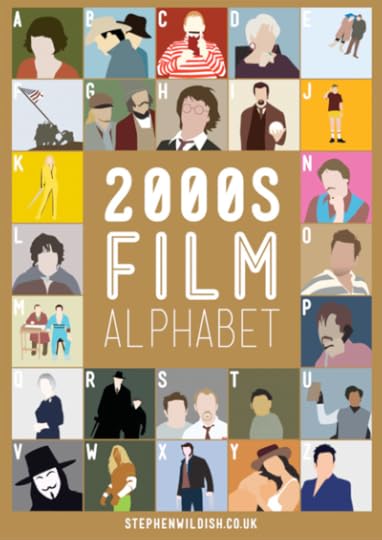
For film buffs, these are quite entertaining and surprisingly challenging (to his credit it's not the accuracy of the illustrations that makes them tough). Wildish has also created one each for the 1960s, the 1970s, the 1980s, and the 1990s. See them all at his blog and visit his portfolio site.
To follow me on Twitter click here.

Khoi Vinh's Blog

- Khoi Vinh's profile
- 5 followers

