
John Coulthart's Blog, page 9
April 14, 2025
Baurenfeind’s capitals

Six of the enigmatic capitals.
After writing about my occasional and not very diligent search for the origin of an unidentified set of calligraphic capitals, Jacob Filipp resolved the whole matter for me very quickly. The mystery dates back to 1997 when I bought a Pepin Press book, , a substantial overview of historic lettering which contains many quality reproductions but no information at all as to the origin of the alphabets. One set of calligraphic capitals were immediately attractive even though many of them had their flourishes cropped by their containing frames. I’ve since used these letters a number of times in print designs, and also used them as page backgrounds for the very first version of my website. In 2002 there was still a tendency in web design for things to look streamlined, cybernetic or futuristic, qualities I was happy to ignore. After ten years or so of using and reusing the letters the question of their origin began to nag at me, hence my recent attempts to resolve the mystery.

From Baurenfeind’s Schreib-Kunst at the Letterform Archive.
It turns out that the capitals were the work of Michael Baurenfeind (1680–1753), a German calligrapher whose exceptional work appeared on these pages just over a year ago. Had I been more observant I would have noticed that one of the pages in the 1716 edition of Baurenfeind’s Schreib-Kunst is the alphabet in question (I even posted the page here!) but the copy of the book at the Internet Archive is missing the page that shows the first half of the alphabet. Every time I’d gone searching for the capitals I’d been using the letter A as a guide, looking for the reflected flourishes at the foot of the letter in other alphabets. The obvious thing to do would have been to look for more of the letters using image searches, which is what Jacob did, eventually locating a capital D on a deleted post at Design Observer.
I’m pleased to have Michael Baurenfeind revealed as the creator of the capitals, his work stands out even among his equally talented contemporaries. The cropped flourishes mean they aren’t ideal for print purposes—in the past I’ve used them in backgrounds where the cropping goes unnoticed—but I’ve thought a few times of making a new set with the cropped sections restored. Now that I know Baurenfeind is the designer this would be easier to do. Any hesitation about how to properly complete a flourish or fill in a missing area could be resolved by consulting Baurenfeind’s other lettering designs. My thanks again to Jacob for resolving the mystery!
Previously on { feuilleton }
• Mira Calligraphiae Monumenta
• Liber Artificiosus Alphabeti Maioris
• Michael Baurenfeind’s extravagant calligraphy
• Bergling’s Art Alphabets
• Grand capitals
• Costume capitals
• Paulini’s mythological alphabet
• Joseph Balthazar Silvestre’s Alphabet-album
• Johann Theodor de Bry’s Neiw Kunstliches Alphabet
•
• Paul Franck’s calligraphy
• Gramato-graphices
• John Bickham’s Fables and other short poems
• Letters and Lettering
• Studies in Pen Art
• Flourishes


April 12, 2025
Weekend links 773

The Tower of Babel from Turris Babel (1679) by Athanasius Kircher, showing how wide the Tower would have to be at its base to reach the Moon.
• The week’s literary resurrection: Penguin announced Shadow Ticket, a new novel by Thomas Pynchon. “Hicks McTaggart, a one-time strikebreaker turned private eye, thinks he’s found job security until he gets sent out on what should be a routine case, locating and bringing back the heiress of a Wisconsin cheese fortune who’s taken a mind to go wandering…”
• The week’s musical resurrection: Stereolab announced Instant Holograms On Metal Film, their first new album since Not Music in 2010. Aerial Troubles is the new single with a video which has prompted complaints in the comments about the use of AI treatments for the visuals.
• At Public Domain Review: Modern Babylon: Ziggurat Skyscrapers and Hugh Ferriss’ Retrofuturism, a long read by Eva Miller. Previously: The Metropolis of Tomorrow by Hugh Ferriss.
• This week in the Bumper Book of Magic: Ben Wickey is selling some of the original art from his Lives of the Great Enchanters pages.
• At Wormwoodiana: The Golden Age of Second-Hand Bookshops is now. Mark Valentine explains.
• “Alvin Lucier is still making music four years after his death – thanks to an artificial brain.”
• At Colossal: Hundreds of fantastic creatures inhabit a sprawling universe by Vorja Sánchez.
• Coming soon from Radiance Films: A blu-ray disc of Essential Polish Animation.
• Pattern design and illustration by Gail Myerscough.
• Steven Heller’s font of the month is Homage Script.
• New music: Sabi by Odalie.
• RIP Max Romeo.
• Babylon (1968) by Dr John | War In A Babylon It Sipple Out Deh (1976) by Max Romeo | Babylonian Tower (1982) by Minimal Compact
April 9, 2025
Four short films by Lejf Marcussen

There’s more Surrealism inside this 34-minute collection of films by Lejf Marcussen (1936–2013), a Danish film-maker and animator whose filmography has never been easy to explore on the internet. Marcussen made an impression on a number of Britons in the late 1980s when The Public Voice was shown on TV, one of many such films broadcast during a time when British television channels still dared to screen unusual animations. I’ve written about The Public Voice before so there’s no need to repeat myself, it was a search for a better copy that led me to this compilation of four Marcussen films—The Conductor (1978), Tone Traces (1983), The Public Voice (1988), and Angeli (2002)—all of which differ so much from each other they could easily be taken for the works of four different directors.

The Conductor is the one closest to traditional animation, being a comic portrait of an orchestral conductor’s wildy exaggerated actions and facial reactions during the performance of a piece of music. It’s music that turns out to be the dominant theme in this collection, and the sole consistent element.

Where The Conductor is overtly comedic and grotesque, Tone Traces is completely abstract, an illustration of Carl Nielsen’s Symphony No. 5 whose unfolding is depicted by coloured lines on a black background. Marcussen’s approach differs from earlier musical illustrators like Oskar Fischinger in restricting his shapes to lines that follow the instrumentation and composition in great detail.

This version of The Public Voice is another one taped from a TV broadcast, it’s not necessarily better than any of the others but it does at least keep Marcussen’s remarkable film circulating. The music this time is a chaotic amalgam of pieces by Luciano Berio, Henry Cow and Gustav Mahler.

Angeli was Marcussen’s final film, another remarkable piece of work although it’s not one I like very much. Watching computerised shapes jump around in a jaunty manner isn’t how I prefer to spend my time, and the score for this one is chaos of a different kind, a collision of digital keyboard pieces with the superior music of Handel, Dvorak and Beethoven. Watch the second and third films in this set if you do nothing else.
Previously on { feuilleton }
• A Picture, a film by Lejf Marcussen
• The Public Voice by Lejf Marcussen
April 7, 2025
Minotaure, 1933–1939

Art by Diego Rivera for the Mexican supplement in Minotaure no. 13.
I was tempted to title this one Minotaure! since I’ve been searching for copies of the magazine in question for many years. I’m certain I went looking in all the usual sources last year in the run-up to the Surrealist centenary, without success. Anyway, here they all are at last, a complete run of one of the major Surrealist periodicals.
Minotaure was notable for a number of reasons, first among them the publisher, Albert Skira, whose resources enabled the production of a very desirable item, with good design, colour prints in each issue, and plenty of photos and other artwork throughout. The Surrealist publications of the 1920s had been historically important but all of them were monochrome documents with few pictures and few pages. Minotaure had the production values of a quality magazine and an impressive roster of artists and writers to fill each issue. Skira and editor E. Tériade originally intended their periodical to cover a wide range of art, past and present, but with most of the early contributors being members of André Breton’s Surrealist circle the magazine quickly became a showcase for Surrealist art and theorising. The first issue featured a cover by Pablo Picasso, with more Picasso artwork inside. Subsequent issues had covers by leading Surrealist artists–Dalí, Ernst, Magritte, Masson–which captured the movement at a time before Breton’s persistent expulsions hollowed out the original group. Breton writes in nearly all the issues but was forbidden from using Minotaure as a political platform (the previous Surrealist journal had been the very political Le Surréalisme au service de la révolution), a restriction he kept to. His manner was often dictatorial but he always had an eye for the main chance, or the bonne chance in this case.
The written contents of Minotaure are mostly in French but the pictorial matter is worth seeing even if much of it is very familiar today. Among the written highlights are two essays by Salvador Dalí, the first on the “edible” nature of Art Nouveau architecture, with an emphasis on the work of Gaudí; the second about Pre-Raphaelite painting. It’s understandable that Dalí would be attracted by the meticulous realism of early Millais and William Holman Hunt but I didn’t know his essay included an analysis of Hunt’s The Hireling Shepherd, a painting I look at every time I’m in the Manchester Art Gallery. Elsewhere there are articles about automatism, mediumship, the decalcomania technique in painting, the esoteric symbolism of the alchemists, naive or untutored art, and plenty of single-page items and visual novelties. Photography by Man Ray and Brassaï is a recurrent feature. Skira’s magazine established a template which the two American Surrealist periodicals of the 1940s, View and VVV, did their best to follow. Now that Minotaure is freely available I’ll be waiting impatiently for complete runs of its followers to turn up somewhere.
(Note: some of the copies linked below have had their colour prints removed.)
Minotaure no. 1 (1933)

Cover art by Pablo Picasso.


Minotaure no. 2 (1933)

Cover art by Gaston-Louis Roux.


Minotaure nos. 3–4 (1933)

Cover art by André Derain.


Minotaure no. 5 (1934)

Cover art by F. Bores.


Minotaure no. 6 (1935)

Cover art by Marcel Duchamp.


Minotaure no. 7 (1935)

Cover art by Joan Miró.


Minotaure no. 8 (1936)

Cover art by Salvador Dalí.


Minotaure no. 9 (1936)

Cover art by Henri Matisse.


Minotaure no. 10 (1937)

Cover art by René Magritte.


Minotaure no. 11 (1938)

Cover art by Max Ernst.


Minotaure nos. 12–13 (1939)

Cover art by André Masson.


Elsewhere on { feuilleton }
• The Surrealism archive
Previously on { feuilleton }
• Viewing View
• View: The Modern Magazine
April 5, 2025
Weekend links 772
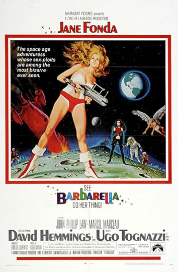
Barbarella (1968) by Robert McGinnis. Not one of his best (see below) but the film is a cult item round here.
• At the Bureau of Lost Culture: Alan Moore on Magic, a recording of the three-way talk between Alan Moore, Gary Lachman and myself for last year’s launch of the Moon and Serpent Bumper Book of Magic.
• At Colossal: “Daniel Martin Diaz encodes cosmic questions into geometric paintings and prints.” And is heavily influenced by Paul Laffoley by the looks of things.
• RIP Robert McGinnis, illustrator and poster artist. Related: The Artwork Of Robert McGinnis, Part 1 | The Artwork Of Robert McGinnis, Part 2.
• At Public Domain Review: “The Form of a Demon and the Heart of a Person”: Kitagawa Utamaro’s Prints of Yamauba and Kintaro (ca. 1800).
• Coming soon from Ten Acre Films: The Quatermass Experiment: The Making of TV’s First Sci-Fi Classic by Toby Hadoke.
• New music: Lost Communications by An-Ting; UPIC Diffusion Session #23 by Haswell & Hecker.
• Anti-Gravity Holiday Every Month by Robert Beatty.
• Barbarella (Extended Main Title) (1968) by Bob Crewe And The Glitterhouse | Barbarella (1991) by The 69 Eyes | My Name Is Barbarella (1992) by Barbarella
April 2, 2025
Antediluvian, a film by Mario Lanzas

This short animated film differs from many other dinosaur films in using outmoded representations of the creatures for its source rather than the more accurate depictions we have today. The first modellings of dinosaurs were crude and often very inaccurate, to a degree that the earliest renderings now have a naive charm of their own, like the hearsay depictions of African animals or Egyptian monuments.

Antediluvian has an additional attraction in its unintended resemblance to Roland Topor’s designs for René Laloux’s Fantastic Planet. Topor’s snapping, shrieking fauna are just as vicious as the outmoded saurians while being rendered in an equally naive style. All that Antediluvian requires is some suitably alien flora to push it into Topor-land, or at least the planet next door.
Previously on { feuilleton }
• Les Temps Morts by René Laloux
March 31, 2025
Mira Calligraphiae Monumenta

These pages turned up when I was searching for (and failing to find) a specific set of calligraphy capitals. Sixteenth-century calligraphy books commonly present their texts and alphabets in collections of engraved plates. Mira Calligraphiae Monumenta stands apart from its peers with coloured inscriptions and page after page of illuminated embellishments—fruits, flowers, insects and other animals that have nothing to at all do with the calligraphic exercises. The reason for the illustrations is explained in a note on the Getty website: the calligraphy by Georg Bocskay came first (in 1561–1562), the book being intended as a showcase of calligraphic styles which demonstrated Bocskay’s incredible skill and mastery of a wide range of lettering. The illuminations were added thirty years later (from 1591–1596) by Joris Hoefnagel at the request of Rudolf II, Holy Roman Emperor, and an art patron with a celebrated taste for the unusual. Rudolf’s court was filled with alchemists, John Dee and Edward Kelly among them; he commissioned paintings from Giuseppe Arcimboldo, had his own zoo, and his Kunstkammer was one of the largest ever assembled. Hoefnagel’s embellishments have nothing to do with penmanship but the book was only one of a vast number of exquisite or curious objects that Rudolf either commissioned or collected.

Looking through the book I wonder what Georg Bocskay would have thought about all the superfluous additions to his meticulous work. I’m also reminded of a pair of equally odd volumes: the Voynich Manuscript (which Rudolf II was reputed to have owned, although there’s no evidence for this), and Luigi Serafini’s Codex Serafinianus, both of them books which combine their pictures of plants (and many other things in Serafini’s case) with unusual scripts. Mira Calligraphiae Monumenta is available today in facsimile reprints but most people will see the pages via the Getty’s scans. The Getty website isn’t the best place to browse the pages, however. You’re better off going here where the entire book may be seen on a single page.

As for my calligraphic quest, the search continues to be a fruitless one although in this case it did turn up a quantity of painted fruit. The capitals I’ve been looking for are in a book I bought in the 1990s, a guide to alphabet design through the ages whose pages offer little information as to the source of their lettering designs. It’s not a great problem by any means but things like this often nag at me. In the past I’ve borrowed letters from the enigmatic alphabet for my own designs. I like to know the origin of a thing when I’m using it myself. The search will continue…


Previously on { feuilleton }
• Liber Artificiosus Alphabeti Maioris
• Michael Baurenfeind’s extravagant calligraphy
• Bergling’s Art Alphabets
• Grand capitals
• Costume capitals
• Paulini’s mythological alphabet
• Joseph Balthazar Silvestre’s Alphabet-album
• Johann Theodor de Bry’s Neiw Kunstliches Alphabet
•
• Paul Franck’s calligraphy
• Gramato-graphices
• John Bickham’s Fables and other short poems
• Letters and Lettering
• Studies in Pen Art
• Flourishes
March 29, 2025
Weekend links 771

A page by Philippe Druillet from Salammbo (1980).
• At the BFI: Alex Ramon suggests 10 great British films of 1975 (the Britishness of Barry Lyndon seems a little debatable), while Jonathan Romney talks to the Quay Brothers about their latest exhibition and Sanatorium Under the Sign of the Hourglass.
• At Public Domain Review: The Cameraman’s Revenge (1912), an early animated film by Wladyslaw Starewicz concerning the domestic affairs of a pair of beetles.
• Saga de Xam (previously), the science-fictional bande dessinée by Nicolas Devil and Jean Rollin, will be published in English for the first time in June.
When I first came across Ernest Berk, I assumed he was somebody’s Ursula Bogner style joke. An anti-Nazi exile turned fearless electronic pioneer, who had been a dancer in the Weimar Republic and worked both with Max Reinhardt and with Peter Zinovieff? Who nobody had ever heard of? I smelled a rat, but was wrong: Berk was very real. He was one of many dancers who fled Nazism and ended up at Dartington Hall, a school founded by wealthy hobbyists in Devon which has been slightly fancifully described as the ‘English Bauhaus’; he danced and choreographed at Glyndebourne and Covent Garden, and in the 1950s, became interested in the electronic music that was emerging out of his native Cologne. Berk gradually built a studio in Camden where he would be able to compose music for his own ballets…
Owen Hatherley on the legacy of the emigré composers who found refuge in Britain from the 1930s on
• “…distant and unrelated juxtapositions are at the very heart of Surrealism—both in France and in Japan.” Leanne Ogasawara on Surrealism in Japan.
• “What’s happening? Where are we? What about the investigation?” Mark Harris on Alan Sharp and Arthur Penn’s Night Moves.
• At Bandcamp: Dark Dreams and Bright Nightmares: Jim Allen‘s artist guide to Coil.
• At Colossal: Winners of the 2025 British Wildlife Photography Awards.
• DJ Food found more psychedelic posters from the web.
• Wildlife (1987) by Penguin Cafe Orchestra | Night Moves/Fear (1988) by Jon Hassell/Farafina | Dark Dreams (1989) by Brian Eno
March 26, 2025
Emitter: The Fluid Art Colour Machine

Roman De Giuli’s Emitter is a machine for producing and modulating paint drips whose smeared patterns are recorded with a high-definition video camera. This is another niche enthusiasm which YouTube has been encouraging of late: short videos of intense colours or patterns filmed in 4K or higher. De Giuli goes to more trouble than most when creating his vivid smears, on a technical level anyway. Beyond a certain point you have to start doing more with your colour splashes than stitching the best bits together with a house soundtrack. Looking at the YT comments reveals a horde of happy viewers so I’m evidently I’m not the ideal audience, especially when my CMYK-attuned eyes scream “Out of gamut!” whenever they encounter very intense RGB colour combinations. You can see more Emitter videos at De Giuli’s YT channel. (Via MetaFilter.)

March 24, 2025
The Population of an Old Pear-Tree; or, Stories of Insect Life

When one of the illustrations below turned up recently at Enchanted Booklet I had to go looking for its source. The Population of an Old Pear-Tree (1870) is a translated edition of a book by Ernest van Bruyssel (1827–1914), a Belgian writer whose life and work isn’t very well-documented on Anglophone websites. The back of the book does however list his other translated titles, most of which appear to be historical novels. Pear-Tree‘s illustrations are credited to one “Becker”, an even more obscure individual who turns to be Léon Becker (1826–1909), a Belgian artist.

Bruyssel’s book is an account of insect life intended to stimulate an interest in tiny creatures for a youthful readership. The narrator describes himself in the opening chapter undergoing a metamorphosis (it later becomes apparent that he’s fallen asleep in his favourite meadow) which gives him a new appreciation of the insect world. The chapters that follow explore a wide variety of insect life, accompanied by Becker’s engraved illustrations. The book isn’t a scientific study—the insects are anthropomorphised into various “tribes”—but Bruyssel avoids the cuteness that often bedevils writing about animals; the destructive habits of locusts are noted in one of the chapters. At the end of the book the narrator is roused from sleep by an entomologist, an ecnounter which leads the pair to discuss their different points of view, one scientific, the other romantic. Bruyssel’s narrative is an argument for generating sympathy in the subject by applying a degree of romance to a field of purely objective study. Léon Becker followed this with an entomological romance of his own, An Alphabet of Insects, in 1883.


Elsewhere on { feuilleton }
• The etching and engraving archive
• The illustrators archive
Previously on { feuilleton }
• The Frolie Grasshopper Circus
• Detmold’s insects
John Coulthart's Blog

- John Coulthart's profile
- 31 followers

