
John Coulthart's Blog, page 5
July 16, 2025
Albrecht Dürer’s Apocalypse

Revelation of St. John.
In Robert Shea and Robert Anton Wilson’s Illuminatus! trilogy, John of Patmos, the author of the Book of Revelation, is referred to as “Saint John the Mushroom-head”, the suggestion being that the bizarre and grotesque scenes listed at the end of the Bible were the result of hallucinogenic frenzy. Mushroom-derived or not, John’s apocalyptic visions have fuelled the imagination of artists for a very long time, and in a wide variety of media. The earlier chapters of the New Testament are the more popular ones when it comes to adaptations but only the Book of Revelation has inspired two monuments of progressive rock: the 666 album by Aphrodite’s Child, and Supper’s Ready by Genesis.

Martyrdom of Saint John the Evangelist.
Die Offenbarung St. Johannis (1900) is a recent upload at the Internet Archive which presents Albrecht Dürer’s magnificent set of Apocalypse woodcuts in a single volume. Multiple copies of the same prints may be found at Wikimedia Commons but sets of pictures there are always divided into separate pages; where possible, I prefer to have a book to leaf through. I love to pore over Dürer’s prints, they’re always crowded with tiny details rendered with great precision. The fifth plate in this series, showing the arrival of the Four Horsemen, is the one you see reproduced most often, and it’s a typically cramped composition; Dürer was an artist who often seemed to want to cram as much as possible into the available space. Some of the later plates in the series have the same powerful sense of occult strangeness that you find in the best alchemical engravings, especially plate eleven which shows John being instructed by an angel with a blazing face to eat a book. The Biblical text describes the angel as appearing suspended over columns of fire, but Dürer shows the columns as a pair of architectural limbs that happen to be burning at their terminations. It’s an example of proto-Surrealist imagery that makes me wonder what a set of Albrecht Dürer Tarot cards might have looked like.

Vision of the Seven Candlesticks.

Saint John Before God and the Elders.

Four Horsemen of the Apocalypse.

Opening of the Sixth Seal.

Four Angels Holding Back the Winds.

Hymn in Adoration of the Lamb.

Opening of the Seventh Seal.

Four Angels of Death.

Saint John Eating the Book.

Woman of the Apocalypse and the Seven-headed Dragon.

Saint Michael Fighting the Dragon.

The Beast with the Lamb’s Horns and the Beast with Seven Heads.

Whore of Babylon.

Angel with the Key of the Bottomless Pit.
Elsewhere on { feuilleton }
• The etching and engraving archive
Previously on { feuilleton }
• Dürer’s Instruction of Measurement
• Eustace details
• Melencolia details
• Albrecht Dürer’s Triumphal Arch


July 14, 2025
Tom Keating on Painters

Tom Keating (1917–1984) was a fascinating character who you don’t really hear about today, despite his brief flush of notoriety in the late 1970s. A versatile artist, Keating worked for many years as a restorer of old pictures, cleaning huge history paintings while also helping art dealers turn damaged canvases into saleable works. The ease with which he could imitate other artists and their techniques prompted some of his employers to start requesting wholesale fakes, which he produced for a while until he discovered that his paintings were being sold for substantial sums while he was still being paid a labourer’s wage. His defence of his subsequent career as an art forger hinged on this experience; he claimed that the situation turned him against the entire art market, and prompted a resolve to undermine the galleries and auction houses by flooding them with as many fake paintings as possible. Keating’s illicit activities became headline news in the late 1970s when he and his partner were prosecuted for selling a number of fake Samuel Palmers.

Episode 1: Turner.
Being a versatile artist myself I’ve always been intrigued by the forgery business. If you have any degree of skill in an artistic medium the thought soon arises that you could turn that skill to imitating the work of an artist who used similar techniques. In my case this has never gone further than doing one-off pastiches. Outright forgery raises the level of the game; it also raises the stakes since you open yourself to legal consequences if the forgery is exposed. Art forgery is an unusual combination of skill and cunning (the artists being forged must have plausible gaps in their oeuvre; provenance has to be invented), archaeology (the older the work being faked, the more important it is to use authentically aged or antique materials), and a peculiar bloody-mindedness to go to all this trouble while never being able to admit in public that you were the creator of the forgery.

Episode 2: Titian.
Tom Keating on Painters was a short TV series broadcast by Channel 4 (UK) in 1982, in which Keating demonstrated his knowledge of historical painting techniques by imitating the work of several well-known artists. If he hadn’t presented a follow-up series about Impressionist artists two years later Tom Keating on Painters would be unique in being a rare TV series about painting which isn’t a guide intended to instruct the amateur artist. Keating’s sole concern in these short films is to show how five artists—Turner, Titian, Constable, Rembrandt and Degas—created their work. In each film he describes the stages of the painting process (pastel in the case of Degas) but this is never a course of instruction. In the sixth film he talks about art restoration, something he continued to work at once his forging exploits had been exposed. Art forgery is one subject he doesn’t mention at all.

Episode 3: Constable.
The main thing I remembered about this series was that two of the demonstration paintings were reverse views of a pair of pictures that always top lists of the nation’s favourite works of art. Turner’s The Fighting Téméraire and Constable’s The Hay Wain are monuments rather than mere artworks, occupants of that rare class of painting that you see so often in reproduction it can be difficult to set aside their ubiquity and see them afresh. Keating achieves this to some degree by taking each painting back to the bare canvas then building it up again from a different point of view, showing us the stern of the old warship in Turner’s painting, and the arrival of the horse and cart at the river in the Constable. The demonstrations repeat work that Keating had already done when he painted finished versions of the reversed views for his own amusement. The films only show the early stages of the paintings but enough is demonstrated to indicate the opposed techniques of each artist. Turner and Constable were exact contemporaries but Turner’s later paintings seem to belong more to the 20th century than the 19th. So too with his technique which begins with a light canvas rather than working up light colours from a dark ground.

Episode 4: Rembrandt.
The films about Titian and Rembrandt show more of the traditional approach, with Keating copying Titian’s Tarquin and Lucretia, and inventing a self-portrait of Rembrandt with his son. The latter is the least successful of the five imitations, Keating doesn’t seem to have been very good with portraits. Much better is his variation on The Ballet Class by Degas, an oil painting which he recreates using the pastels that Degas often favoured for his other work. This last picture is the only one that really looks finished but then pastel is a simpler medium. All of these films would have benefitted by being longer and going into more detail but such is the nature of television, the most compromised medium of all.

Episode 5: Degas.

Episode 6: Restoring Pictures.
Previously on { feuilleton }
• More Aubrey fakery
• Aubrey fakery
July 12, 2025
Weekend links 786

The Skylark (1850) by Samuel Palmer.
• The latest book from A Year In The Country is Other Worlds: “Searching for far off lands via witchcraft battles, spectral streets, faded visions of the future and the secrets of the stones”.
• At Colossal: The 16th-century artist who created the first compendium of insect drawings.
• New music: Triskaidekaphobia Extd. by Pentagrams Of Discordia; Atamon by Amina Hocine.
• Old music: Cantus Orbis Collection by Cantus Orbis; Resonance by Yumiko Morioka.
• Coming soon from Top Shelf Productions: More Weight: A Salem Story by Ben Wickey.
• At the BFI: Miriam Balanescu chooses 10 great British pastoral films.
• The ZWO Astronomy Photographer of the Year 2025 Shortlist.
• Mix of the week: A mix for The Wire by Ben LaMar Gay.
• Jack Barnett’s favourite music.
• Pastoral Symphony (1960) by Richard Maxfield | Pastoral (1975) by Mahavishnu Orchestra | Pastoral Vassant (2018) by Jon Hassell
July 9, 2025
British Book Illustration – Yesterday and To-day

The “to-day” in the title is a sign that this volume dates from the years before the Second World War when the hyphenated “today” was still a common sight. British Book Illustration – Yesterday and To-day was published in 1923, one of many such books produced by The Studio magazine. Studio editor Geoffrey Holme is also credited as editor of the book which follows the history of British illustration from Thomas Bewick, in 1795, to Randolph Schwabe in 1923, with each artist being represented by one or two pieces considered to exemplify their work. (Harry Clarke, who appears near the end, was Irish but the newly-minted Irish Free State was only a year old at this time so Clarke had technically been a Briton for most of his life.) Being a Studio publication, each illustration includes a note of the medium used (pen, wood engraving, etc), something you don’t always see in books of this kind. A lengthy introductory essay by Malcolm C. Salaman examines the work of each artist in turn. Two hundred pages isn’t anything like enough to do justice to the subject, and I could quibble over many of the selections, as well as the omissions. But the book is worthwhile for some of its unusual choices as well as showing drawings by artists who weren’t as well known as Beardsley and company. Among the unusual selections is the original drawing for The Facts in the Case of M. Valdemar that Harry Clarke produced for his Poe collection. This was rejected by Harrap for being too horrible even though it accurately depicts the moments from the end of the story. The drawing is much more detailed than the one that replaced it but you don’t see the first version reproduced very often. Looking at it again it occurs to me that it really ought to be included in future editions of Clarke’s Poe illustrations.


Elsewhere on { feuilleton }
• The illustrators archive
Previously on { feuilleton }
• Painted devils
• Thomas Bodkin on Harry Clarke
• Harry Clarke and others in The Studio
• Modern book illustrators, 1914
July 7, 2025
Back in Doré’s jungle

This illustration by Gustave Doré (with engraving work by Louis Sargent) is a beautiful example of how to fill a scene with detail and texture without losing a sense of depth or control of the light and shade. Piranesi’s etchings, especially his views of Roman ruins, are often as skillfully rendered, resisting the tendency of concentrated shading to turn into a depthless field of grey. Doré’s scene is from one of his illustrated editions that seldom receives a mention in lists of his works, Atala, a novella by François-René de Chateaubriand set among the Native American peoples of Mississippi and Florida. Those vaguely Mesoamerican ruins are an invention of the artist, being barely mentioned in the text. Doré’s illustrations often exaggerate details when they have to depict the real world; he even took liberties with the views of London he published following his visit to the city in 1869. This combination of ruined architecture and verdant foliage is something I’ve always enjoyed even though I’ve never worked out why the imagery is so appealing. Doré’s illustration is as close as he usually gets to Piranesi’s views of overgrown Roman ruins, only in this case the elements have been reversed, with foliage dominating the carved stonework.

Production sketch by Mario Larrinaga from The Making of King Kong (1975).
Last week I mentioned Jean Cocteau’s enthusiasm for Doré’s illustrations, their influence being apparent in the set designs for La Belle et la Bête. Doré’s influence was even more visible in another Beauty and the Beast story filmed a decade earlier, King Kong, as described in The Making of King Kong by Orville Goldner and George Turner:
[Willis] O’Brien’s idea of emulating Doré as a basis for cinematographic lighting and atmosphere may have originated with the pioneer cameraman and special effects expert, Louis W. Physioc, who in 1930 stated that “if there is one man’s work that can be taken as the cinematographer’s text, it is that of Doré. His stories are told in our own language of ‘black and white,’ are highly imaginative and dramatic, and should stimulate anybody’s ideas.”
The Doré influence is strikingly evident in the island scenes. Aside from the lighting effects, other elements of Doré illustrations are easily discernible. The affinity of the jungle clearings to those in Doré’s “The First Approach of the Serpent” from Milton’s Paradise Lost, “Dante in the Gloomy Wood” from Dante’s The Divine Comedy, “Approach to the Enchanted Palace” from Perrault’s Fairy Tales and “Manz” from Chateaubriand’s Atala is readily apparent. The gorge and its log bridge bear more than a slight similarity to “The Two Goats” from The Fables of La Fontaine, while the lower region of the gorge may well have been designed after the pit in the Biblical illustration of “Daniel in the Lion’s Den.” The wonderful scene in which Kong surveys his domain from the “balcony” of his mountaintop home high above the claustrophobic jungle is suggestive of two superb Doré engravings, “Satan Overlooking Paradise” from Paradise Lost and “The Hermit on the Mount from Atala.

King Kong (1933).
I’m sceptical of Goldner and Turner’s suggestion that this illustration of the two goats inspired King Kong‘s tree-bridge, the only thing the two scenes share is a piece of wood spanning a chasm. The Chateaubriand illustration is much more redolent of King Kong, as is evident from some of the films’s marvellous production sketches by Byron Crabbe and Mario Larrinaga.

The Most Dangerous Game (1932).
The tree-bridge scene has another precedent in a very similar bridge that appears briefly in The Most Dangerous Game, a film made by King Kong‘s producer and director in 1932 using the same jungle sets, and featuring many of the same actors and crew. The jungle scenes in the earlier film show a similar Doré influence, with many long or medium shots framed by silhouetted vegetation. The film even includes the animated birds that are later seen flapping around the shore of Skull Island.

Atala‘s fallen tree makes at least one more notable film appearance in Ray Harryhausen’s Mysterious Island, another film about a remote island populated by oversized fauna. Harryhausen’s island doesn’t have much of a jungle but he always mentioned King Kong and Willis O’Brien as the two greatest influences on his animation career. He also picked up on O’Brien’s use of Doré’s work, something he often mentioned in interviews. If Charles Schneer’s budgets hadn’t restricted the films to Mediterranean locations I’m sure Harryhausen would have made greater use of Doré’s jungles.
Previously on { feuilleton }
• Uncharted islands and lost souls
July 5, 2025
Weekend links 785

A 1933 poster for the second of Fritz Lang’s Mabuse films.
• Good news for those who missed the original run (from 2002–2013), Arthur Magazine is now available for the first time as a complete set of free PDFs. I was laterally involved with the magazine from the outset, mostly as a remote supporter, but I also did several covers and interior illustrations for the early issues.
• Among the new titles at Standard Ebooks, the home of free, high-quality, public-domain texts: Dr. Mabuse, the Gambler by Norbert Jacques (translated by Lilian A. Clare); and two books by J. Sheridan Le Fanu: Short Fiction, and a novella, The Room in the Dragon Volant.
• New music: Spilla by Ensemble Nist-Nah; and Sea-swallowed Wands by Jolanda Moletta and Karen Vogt.
With his compulsions for systems and architecture, his command of shadows and symbolism-imbued sets and props, Lang is never less than arresting. Yet few of the films make complete statements; Lang’s art, in this period, is seemingly as much a fugitive as are his archetypal characters. That is, until the moment that his long journey to the direct subject matter and cultural framework of the 1950s United States, addressed in the terms and by the means available to him in Hollywood, abruptly comes to superb fruition with The Big Heat.
Jonathan Lethem on Fritz Lang in Hollywood and one of the greatest noir pictures of the 1950s
• This week in the Bumper Book of Magic: an enthusiastic review at The Joey Zone. My thanks to Mr Shea!
• Mixes of the week: A mix for The Wire by Nina Garcia; and Isolated Mix 133 by Pentagrams Of Discordia.
• At Colossal: David Romero’s digital recreations of Frank Lloyd Wright’s unrealised buildings.
• At Smithsonian magazine: John Last investigates the history of the Tarot.
• At Planet Paul: An interview with artist Malcolm Ashman.
• At the Daily Heller: A porno gag mag with attitude.
• Das Testaments Des Mabuse (1984) by Propaganda | (The Ninth Life Of…) Dr Mabuse (1984) by Propaganda | Abuse (Here) (1985) by Propaganda
July 2, 2025
Chronicle: The Vase

The sound on this old VHS recording is terrible, as the uploader admits, but I’ll write about the programme as a placeholder in the hopes that a better copy turns up one day. The vase in question is the Portland Vase, a vessel believed to have been made in Rome during the reign of Augustus, which has been housed in the British Museum since 1810. The vase is notable for being an exceptional example of cameo glasswork, a type of decorated glass in which an object is fashioned in one colour then dipped into a pool of glass of a second colour to create an extra coating. Once the glass has hardened, portions of the outer coat are carefully carved away, leaving a surface of relief decoration. The carving process can take years to complete. Josiah Wedgewood’s famous jasperware was a ceramic imitation of cameo glass; Wedgewood even borrowed the vase for a while to make a copy.

The Portland Vase fragments (1845) by Thomas H. Shepherd.
The other notable fact about the Portland Vase is that it was smashed to pieces in 1845 by a drunken student, and has since been pieced together on three separate occasions, the first time shortly after its destruction, the second time in 1948 when the vase was dismantled and reassembled using shellac to fill some of the gaps between the larger pieces. The most recent reconstruction in 1989 was filmed by the BBC for this episode of Chronicle, a process which once again required the careful dismantling of the vase then its rebuilding using more durable glues and filling materials. Reading about these reconstructions had me wondering about the logistics of dismantling a 2000-year-old antique, especially one fashioned from such a fragile material. Conservators Nigel Williams and Sandra Smith spent nine months working with 230 fragments. If you share my curiosity about their work, this damaged recording is worth persevering with, the film provides a rare opportunity to see in detail the restoration of one of the world’s great art treasures. It’s also a reminder to myself to go and see the vase the next time I’m near the British Museum, which I often am when I visit London. Despite having visited the museum many times, the vase is one exhibit I’ve yet to see.

June 30, 2025
Cocteau’s effects

Chez Cocteau.
“Effects” in the sense of possessions rather than aesthetic or creative effects. I’ve been reading Jean Cocteau’s The Difficulty of Being, an essay collection in which the author muses on a variety of subjects, from his own life, his work, and people he knew, to more general considerations of the human condition. In one of the chapters Cocteau describes his rooms at 36 rue de Montpensier, Paris, where he lived from 1940 to 1947, offering a list of the objects that occupied the shelves or decorated the walls of his apartment. I always enjoy accounts of this sort; the pictures (or objects) that people choose to hang on their walls tell you things about a person’s tastes and character which might not be so obvious otherwise. The same can’t always be said for published lists of favourite books or other artworks when these may be constructed with an eye to the approval of one’s peers. The pictures decorating your living space are more private and generally more honest as aesthetic choices.
I already knew what a couple of these items looked like: the Radiguet bust, for example, may be seen in documentary footage. This post is an attempt to find some of the others. If you know the identity of any of the unidentified pieces then please leave a comment.

The most engaging bits of such wreckage, thrown up on this little red beach, is without doubt the Gustave Doré group of which the Charles de Noailles gave me a plaster cast from which I had a bronze made. In it Perseus is to be seen mounted on the hippogryph, held in the air by means of a long spear planted in the gullet of the dragon, which dragon is winding its death throes round Andromeda.
“the Charles de Noailles” refers to Charles and his wife, Marie-Laure, a pair of wealthy art patrons who helped finance Buñuel’s L’Age d’Or and Cocteau’s Le Sang d’un Poète. Doré’s illustration (showing Ruggerio from Ariosto’s Orlando Furioso reenacting the heroic rescue) is very familiar to me but I was unable to find any sculptural copies of the work. In addition to decorating Cocteau’s room some of Doré’s illustrations also served as inspiration for the sets in La Belle et la Bête.

This group is on a column standing between the so-called castor window and a tall piece of slate that can be moved aside and that conceals a small room which is too cold to be used in winter. It was there that I wrote Renaud et Armide, away from everything, set free from telephone and door bells, in the summer of 1941, on an architect’s table above which one sees, saved from my room in the rue Vignon where it adorned the wall-paper, Christian Bérard’s large drawing in charcoal and red chalk representing the meeting of Oedipus and the Sphinx.
Bérard’s drawing is large indeed (see the photo at the top of this post). The artist was a theatrical designer, also the designer of La Belle et la Bête, and one of several of Cocteau’s friends who died young.

On the right of my bed are two heads, one Roman, in marble, of a faun (this belonged to my Lecomte grandfather), the other of Antinoüs, under a glass dome, a painted terracotta, so fragile that only the steadiness of its enamel eyes can have led it here from the depths of centuries like a blind man’s white stick.
A third head adorns that of my bed: the terracotta of Raymond Radiguet, done by Lipschitz, in the year of his death.
And speaking of premature deaths… Antinous was the celebrated youth beloved of the emperor Hadrian whose death by drowning in the Nile caused Hadrian to establish a cult of Antinous that spread across the Roman Empire. Many busts and full-figure statues survive as a result, but I was unable to find a photo of the one owned by Cocteau. Raymond Radiguet, meanwhile, died of typhoid fever at the age of 20. Radiguet was a precocious talent who managed to write two novels before he died, including Le Diable au corps at the age of 16.

Here is a list of the pictures hanging on the walls above the flood of disorder: Lithographs for Faust by Eugène Delacroix.

Photographs of Rimbaud by Carjat, taken on the day of the sword-stick scandal.
The “sword-stick scandal” is explained here.

Collage by Picasso in a butterfly box. Portrait of Sarah Bernhardt by Clairin (she is a sculptress).
It’s not always easy to find a minor work by the indefatiguable Picasso. Georges Clairin was an artist friend of Sarah Bernhardt who produced many portraits like the one above, showing her either as herself or in one of her theatrical roles. The portrait that Cocteau owned didn’t turn up in any searches.

Original by Bérard for the cover of Opéra. Large figure of a woman by Picasso in Indian ink.

Photograph of Mallarmé with his shawl. Picasso’s die (see the end of Potomak).

Sketch by Ingres for Tu Marcellus eris.

Profile of Baudelaire, dry point by Manet.

My portrait done in Rome by Picasso in 1917 and dated Easter Day.

Two pen drawings by Victor Hugo. One of Gavroche. Victor Hugo wrote under it: “Watching the guillotine.” The other is a finicky attempt at his monogram. A graceful watercolour of my mother by Wencker.

Previously on { feuilleton }
• Parade de Satie
• Orphée posters
• Cocteau and Lovecraft
• Cocteau drawings
• Querelle de Brest
• Halsman and Cocteau
• La Belle et la Bête posters
• The writhing on the wall
• Le livre blanc by Jean Cocteau
• Cocteau’s sword
• Cristalophonics: searching for the Cocteau sound
• Cocteau at the Louvre des Antiquaires
• La Villa Santo Sospir by Jean Cocteau
June 28, 2025
Weekend links 784
_(14753404655).jpg)
An illustration by HB Ford for The Violet Fairy Book (1906), edited by Andrew Lang.
• New music: An Aesthetic – Experiments in Tape by Hawksmoor; Leylines (2025 remaster) by Aes Dana; A Fragile Geography (10th Anniversary Reissue) by Rafael Anton Irisarri.
• “Skoda Auto designers reimagine Ferat Vampire car from cult classic 1981 Czech horror film”.
• At Colossal: Chris Ware illustrates a postwoman’s day to celebrate 250 years of USPS.
Seen today, the failure of Sorcerer looks like a grim prophecy of where the film industry would be headed in the years to come. It signaled that the creative ambitions of the New Hollywood, and its indulgence of stubborn renegade auteurs, had been cast aside for a new and dispiriting blockbuster ethos. Decades later, that ethos is still with us: a Hollywood dominated by digitally smoothed, effects-encrusted moviemaking, where every backdrop looks fake (even the real ones) and action sequences carry no physical weight. It’s a wretched landscape, and Sorcerer positively towers over it. To watch the film now, from its electric opening moments through its gaspingly bleak denouement, is to encounter something more than just a magnificent ruin or an object of cultish reclamation: a thwarted masterwork that is thwarted no longer.
Justin Chang on the bleak magic of William Friedkin’s Sorcerer.
• At the BFI: The Red Shoes wallpaper by the film’s designer Hein Heckroth.
• All This Violence by Caspar Brötzmann Massaker.
• RIP Lalo Schifrin and Rebekah del Rio.
• The Strange World of…Jon Spencer.
• In Ultra-Violet (1983) by Cinema 90 | Violet Ray Gas (2009) by Violet | Violetta (2012) by Demdike Stare
June 25, 2025
The art of Justin Todd

I was pleased to find a copy of this book recently, a slim volume published in 1978 which isn’t especially rare but which usually sells for much more than the £2 I paid for it. Justin Todd is a British illustrator whose work was a familiar sight on book covers in the 1970s, especially when his commissions weren’t restricted to a single genre. Cover artists who work on fantasy novels are often asked to do horror covers (and vice versa), or edged towards science fiction when the material suits their style; Todd worked on fantasy, horror and the occasional SF title while also providing covers for mainstream novels, offbeat non-fiction, historical fiction and children’s stories. Fully-illustrated children’s books evidently became his main line of work in the 1980s—Alice’s Adventures in Wonderland, The Wind in the Willows, a collaboration with Angela Carter—which would have left him no time for cover commissions. I was amused to find him illustrating crank titles (previously) in the early 70s when he did the paperback cover for one of the great anti-crank books, John Sladek’s The New Apocrypha, a few years later.

The Centre of the Cyclone: An Autobiography of Inner Space (1972) by John C. Lilly.
Todd’s style is easy to recognise once you’ve seen a few examples: meticulous gouache renderings that tend to be slightly naive even when they’re depicting a wholly realistic story like Treasure Island. Gouache is a water-based paint that’s useful when you want a flat, even finish, but it doesn’t give you the depth of colour or contrast provided by oils or acrylics. Todd’s paintings embrace the limitations of the medium, with gradients and shadings that are so soft and diffused they might be taken at first for pencil drawings.

The Journey to the East (1972) by Herman Hesse.
The Magical Paintings of Justin Todd isn’t a comprehensive study of Todd’s illustration work, more a snapshot of a career in progress. In addition to 64 full-page reproductions there’s a two-page interview by editor and art director Mike Dempsey which provides valuable biographical details. I was pleased to find that many of the cover paintings were ones I hadn’t seen before, including a few Arcimboldo-like faces. Todd had a flair for this kind of visual invention, constructing faces or even whole figures out of disparate objects. I’ve had a copy of The Journey to the East for many years but until this week I don’t think I’d ever looked closely at all the tiny figures making up the central figure that strides across the landscape.
Mike Dempsey maintains a blog which includes a reminiscence of working with Justin Todd.

Stories of Five Decades (1972) by Herman Hesse.
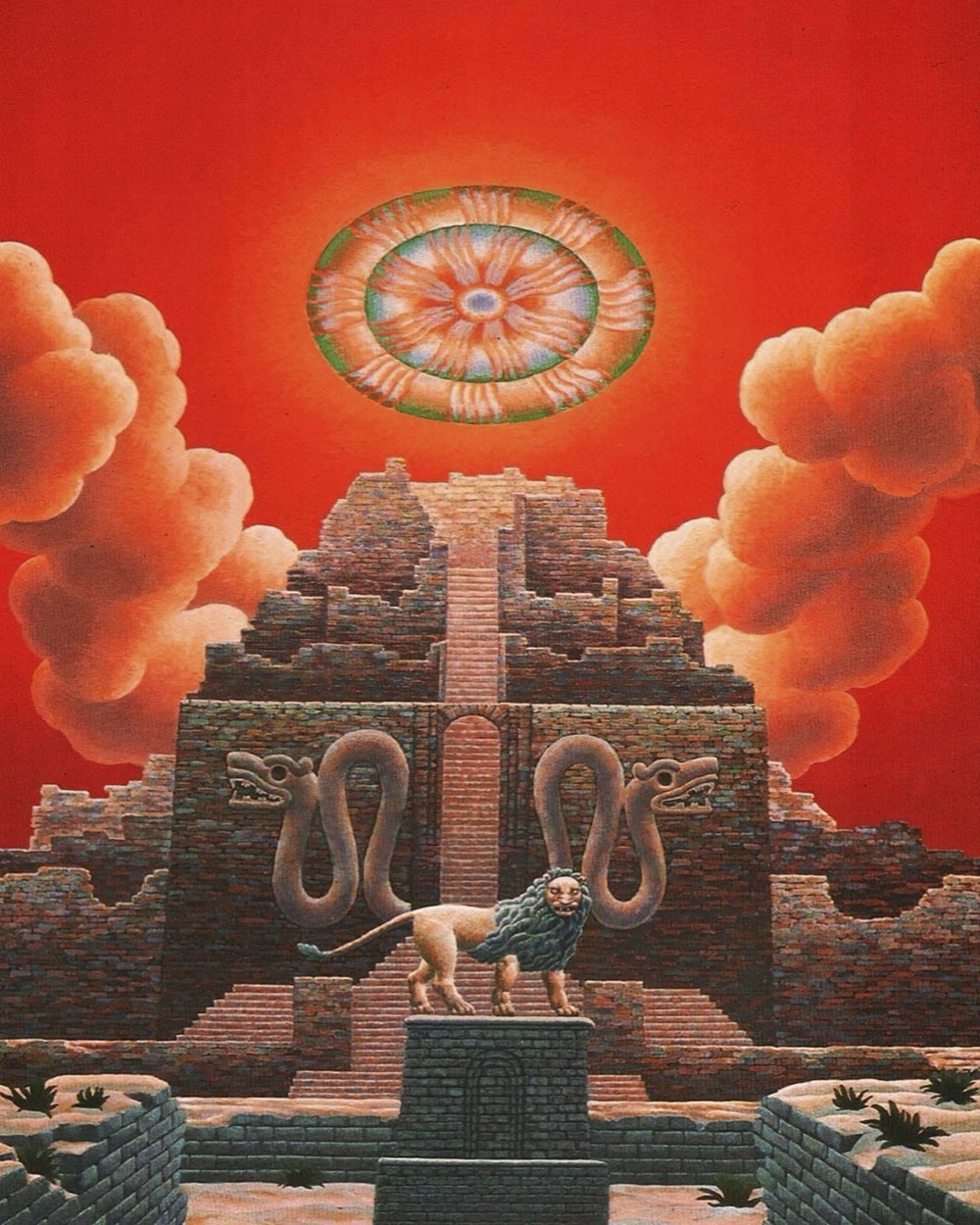
Secret Places of the Lion (1973) by George Hunt Williamson.

The Bible and Flying Saucers (1973) by Barry H. Downing.

Welsh Tales of Terror (1974) edited by R. Chetwynd-Hayes.

Mythical Beasts (1974).

The Book of the Damned (1974) by Charles Fort.

Sea Tales of Terror (1974) edited by JJ Strating.

The Supernatural Omnibus: Volume 1 (1976) edited by Montague Summers.

Seven Gothic Tales (1977) by Isak Dinesen.

Nightmare Blue (1977) by Gardner Dozois and George Alec Effinger.

The New Apocrypha (1978) by John Sladek.

Twisters (1981) edited by Steve Bowles.

Alice’s Adventures in Wonderland (1983).
Elsewhere on { feuilleton }
• The book covers archive
• The illustrators archive
Previously on { feuilleton }
• Crank book covers
John Coulthart's Blog

- John Coulthart's profile
- 31 followers


.jpg)