
John Coulthart's Blog, page 10
March 22, 2025
Weekend links 770

Abstraction #51 (1965) by Virgil Finlay.
• “I think the world venerates him as this deeply religious composer who tackles eternal themes in his music, but I think it’s also good to remember that he also has a playful experimental side.” Maria Juur discussing Estonian composer Arvo Pärt in a review by Geeta Dayal of a new recording of four Pärt compositions.
• “Rubycon feels like an epic soundtrack to a great lost film…” Jeremy Allen on the 50th anniversary of a Tangerine Dream album that’s always been a favourite of mine.
• At the Internet Archive: Browse the catalogue for a forthcoming auction of rare books and artworks from The Library of Barry Humphries.
• At Public Domain Review: Through a Glass Lushly: Michalina Janoszanka’s reverse paintings (ca. 1920s).
• At Colossal: “Vintage postcard paintings by David Opdyke demonstrate an ecological future in peril“.
• At the BFI: Michael Brooke offers suggestions for ten great Slovak New Wave films.
• DJ Food unearthed four sheets of Dave Roe wrapping paper from 1968.
• New music: Doppelgänger by Ian Boddy & Harald Grosskopf.
• Ten minutes of Sun Ra and the Arkestra on French TV in 1969.
• Depictions of Atlantis in retro science fiction art.
• Old music: Flora (1987) by Hiroshi Yoshimura has been reissued.
• Atlantis (1961) by The Blue Bells | Atlantis (1969) by Donovan | Atlantis (1971) by Deuter


March 19, 2025
Dormitorium: The Film Décors of the Quay Brothers

The Tailor’s Shop from Street of Crocodiles.
I’m back home after a whirlwind visit to London, having earlier received an invitation from the Quay Brothers to the opening night of their Dormitorium exhibition at the Swedenborg Hall in Bloomsbury. The show is the London debut of a display of sets and puppets from all the Quays’ major films. This is also a slightly expanded exhibition, previous outings such as the one at the Museum of Modern Art in New York having been staged before they made their more recent films. New additions include several cases devoted to characters from The Doll’s Breath, and one that features characters and tiny set elements from their new feature film, Sanatorium Under the Sign of the Hourglass.

Characters from The Doll’s Breath.
One of the curious things about looking at art in our mediated age is that you can become very familiar with certain paintings or drawings yet only have a vague idea as to the actual size of the originals, even when dimensions are printed along with reproductions in books. So too with the Quays’ puppets and décors. All the details are very familiar yet I wasn’t prepared to see those familiar details differing so much in size. The box that contains the puppets from This Unnamable Little Broom, for example, is very large, yet the boxes you see shortly after this, containing sets from Street of Crocodiles, are much smaller, a factor which makes everything inside those boxes seem dizzyingly concentrated. Choice of materials has obviously determined some of this. In the films where the Quays have used ceramic doll’s heads the sets have had to be constructed to the scale of the found artefacts. All of the more recent puppets have been constructed at a larger size.

The Calligrapher.
The other surprise of the exhibition was the cabinets themselves. A few of these have been built to take advantage of the exhibition setting: the box featuring ‘The Calligrapher’ has a large distorting lens set into its front glass panel, while the cabinet next to it, showing the rippled landscape from The Comb, has glass sides which allow the viewer to more easily read the anamorphic lettering stretched over the hills. Several other cabinets present their contents like peepshow exhibits, their portholes being filled with yet more distorting lenses which offer mutable views of the illuminated exhibits within.

Rehearsals for Extinct Anatomies.
All these wonders will be on display at the Swedenborg Hall until 4th April. Entry is free if you’d like to disturb the sleep of the inhabitants. In return they’ll do their best to disturb your dreams.

Elsewhere on { feuilleton }
• The Quay Brothers archive
March 17, 2025
A Grammar of Japanese Ornament and Design

Among the new uploads to the Internet Archive is A Grammar of Japanese Ornament and Design (1880) by Thomas W. Cutler. The title is an echo of Owen Jones’ landmark study, The Grammar of Ornament (1856), a much larger volume which devotes several pages to Chinese decoration but says nothing about the Japanese. Japan’s self-imposed isolation from the rest of the world only ended in the 1860s, a restriction which had limited the spread of Japanese culture for over two centuries. Cutler’s book capitalised on the new openness and a growing interest in the country which fuelled a fervour for “Japonisme” among Western artists.

Where Owen Jones condensed whole cultures and histories into a few pages, Cutler examines a wide range of Japanese art and decoration, from details of plants and animals as found in ukiyo-e prints, to the stylised kamon emblems used by Japanese families. His book is distinguished by many pages of precise line drawings, together with reproductions of whole prints. More details like these may be found in the books of waves and clouds by Yuzan Mori and Korin Furuya.


Previously on { feuilleton }
• Suggestions in Design by John Leighton
• Moderne Malereien, 1903
• Das Thier in der Decorativen Kunst
•
•
• Buchschmuck und Flächenmuster by Max Benirschke
• Christopher Dresser’s Studies in Design
• Christopher Dresser’s Art of Decorative Design
• Kunstgewerbliche Schmuckformen für die Fläche
• Album de la décoration
•
• Dekorative Vorbilder
• Combinaisons Ornementales
• Charles J Strong’s Book of Designs
•
•
March 15, 2025
Weekend links 769

Araki Street in Yotsuya (1935) by Tsuchiya Koitsu.
• “Cambridge, home of analytic philosophy, was also a hotbed of psychical research. How did this spooky subject take root?” Matyás Moravec on philosophers and precognitive dreams, Alan Turing’s interest in telepathy, and more.
• DJ Food remembers Doug Lear, founder of the Magic Lantern Narrowboat Theatre. Related: Lear’s Magical Lanterns, a TV documentary from 1983.
• New music: WEM Dominator (Live in London NW1, 2016) by Earth; and Rubber Band Music by Kate Carr.
• At Public Domain Review: Master of Claude de France’s book of flower studies (ca. 1510–1515).
• At Colossal: Landscapes, customs, and culture shape the 2025 Sony World Photography Awards.
• At the BFI: Carmen Gray offers suggestions for ten great Baltic films.
• Mix of the week: DreamScenes – March 2025 at Ambientblog.
• At Dennis Cooper’s: Room Temperature Day.
• Vinyl sleeves from Supraphon.
• Telephone And Rubber Band (1981) by Penguin Cafe Orchestra | Rubbermiro (1981) by Liquid Liquid | Onions Wrapped In Rubber (1994) by Tortoise
March 12, 2025
M-A-N-C-H-E-S-T-E-R
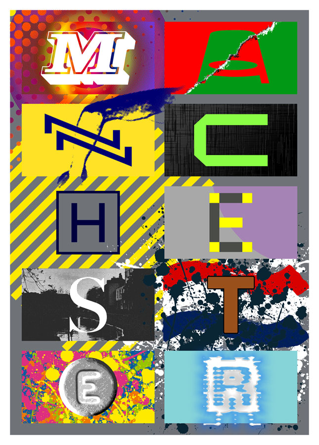
Presenting a new item for sale at Redbubble. I was intending to upload this quickly then get on with other things, but after examining the artwork it became apparent that the piece would benefit from an overhaul in order to make something that worked well at poster size. The original design dates from 2004 when I was asked by friends at the Manchester District Music Archive to contribute to a limited run of postcards they were putting together based on Manchester’s music history. Since I was working for postcard size I didn’t finesse the artwork as much as I would have done had I been working for a larger printing. What you see here is a replication of the original design at a much larger size, with a couple of details adjusted and a more substantial change in the substitution of the black-and-white photo (see below).
The original postcard set appeared two years before I began writing these posts so I’ve never had the chance to compile a list of all the references. Some of these will be familiar to Mancunians (and many Britons) of a certain age but I was trying to be allusive rather than obvious while also following three simple rules:
1) Ten panels, each one of which contains a different letter of the city’s name in a different typeface.
2) Each panel referring to a different musical trend, a notable group or venue.
3) The whole design to proceed chronologically, from the 1960s to the present day.

The music: Psychedelia.
The type design: Decorated 035.
The first two letters are rather vague attributions since the city didn’t have much of a national musical profile until the late 1970s. Popular Manchester groups of the 1960s included The Hollies, Herman’s Hermits, and The Mind Benders but there wasn’t a discernible Manchester scene the way there was with post-Beatles Liverpool. So “M” stands for the psychedelic era in general, while Decorated 035 is one of the typical mid-century sign fonts that you would have seen around the city.

The venue/music: The Apollo Theatre/Punk.
The type design: Jackson.
“A” is for the Apollo Theatre in Ardwick Green, the city’s most prominent music venue in the 1970s, although I doubt that anyone would guess the attribution. The Art Deco building is a good venue but here’s never been anything distinctive about its signage, hence the choice of Jackson, another very decade-specific font which has conveniently wide letterforms. The rip refers to torn posters and punk graphics while the opposed green/red colour scheme is borrowed from one of the Virgin label designs of the late 70s, something that might also be taken as a very tenuous reference to the Virgin Megastore in Market Street.

The music: Buzzcocks.
The type design: A pair of Zs from the cover of Orgasm Addict.
The first Buzzcocks single featured a striking sleeve by Malcolm Garrett (design) and Linder (collage) which provide the graphics here, with the “N” being formed by two letters from the band’s name which was printed vertically on the cover.

The music: Joy Division.
The type design: A letter from the cover of Substance.
Substance, the first Joy Division compilation, was released in 1988 so this is a little anachronistic but Brett Wickens’ letter is a more recognisable detail than one from the cover of Closer. The textured sleeve of the group’s debut album, Unknown Pleasures, is referred to by the panel background.

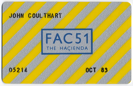
The venue: The Haçienda.
The type design: Gill Sans Regular.
The graphics here are based on the Peter Saville-designed Haçienda membership card, something you needed in the early days of the club in order to gain entry. Seeing the “H” isolated in this way always makes me think of a helicopter landing pad.

The music: New Order.
The type design: A letter from the cover of the Confusion single.
Peter Saville’s graphics signified “confusion” by overlaying the name of the single on the name of the group. The letter here has been de-confused by being isolated from the rest of the design.

The music: The Smiths.
The type design: Bodoni Regular.
All the Smiths’ albums and singles feature type designs applied to a borrowed photo. The Bodoni is a reference to the cover of The Queen Is Dead, while the photo is a view of the River Irwell, the narrow waterway that snakes through the centre of Manchester. (My original design used a photo of Chiswick in London which wasn’t appropriate at all). “S” can also stand for Salford, since the Irwell marks the division between Manchester and Salford. Manchester’s sister-city is referred to inside The Queen Is Dead with the famous photo of the group standing outside the Salford Lads’ Club.

The music: The Stone Roses.
The type design: Helvetica Black.
The letter, the paint splatter and the colour bars all refer to the sleeve of the Stone Roses’ self-titled debut album.

The music: Madchester/Dance.
The type design: An Ecstasy tablet.
“Madchester”, a kind of rock/dance reworking of psychedelic motifs, was typified by the garish graphics of Central Station Design, appalling fashion choices (bucket hats, big T-shirts, baggy jeans), and lots of drugs. Ecstasy was the dominant drug of the period, also for the burgeoning dance culture of the late 80s and early 90s.

The music: Ambient/IDM.
The type design: Unidentified font.
I dislike the term “IDM”—and a lot of the music classed as “ambient” is nothing of the sort—but the labels are used here for convenience. The background colour is a reference to the early Boards Of Canada releases on Manchester’s Skam label, while the bevelled, glowing letterform relates to the Photoshop-heavy artwork of the 1990s. Glitchy lettering to signify computers and their screens, glitch music, sound samples, and so on. Rather annoyingly, I can’t identify the font which is an obscure design whose name I’ve forgotten. If anyone recognises it, please leave a comment.
Previously on { feuilleton }
• Haçienda ephemera
• 1 Top Class Manager
March 10, 2025
De Nerée and Luisa Casati

Luisa Casati (1922) by Man Ray.
Today’s post is another in the series of irregular art essays by Sander Bink. The subject this time is Luisa Casati (1881–1957), the Italian heiress who burnt through a fortune living extravagantly while being drawn or painted by many of the most notable artists of her time. (I did my own very stylised portrait of the Marchesa for Bruce Sterling’s Pirate Utopia, a novel where Casati briefly appears among the cast of real and fictional characters.) As before with Sander’s posts, Carel de Nerée tot Babberich is one of the artists under discussion. Thanks, Sander!
* * *

Carel de Nerée around 1905.
Many artists have paid homage to the ‘living artwork’ and legendary fashion icon Luisa Casati. Artists such as Man Ray, Paul-César Helleu, Giovanni Boldini, Léon Bakst, Kees van Dongen, Alastair, Romaine Brooks and Giacomo Balla have immortalised her. Legend has it that a certain fascinating Dutch artist should also be added to this list: Carel de Nerée tot Babberich (1880–1909). (Previously: 1 & 2)

Luisa Casati with Greyhound (1908) by Giovanni Boldini. Private collection.
By 1930, Casati’s decadent and luxurious lifestyle had left her millions in debt. To escape her creditors, she moved to London. In the years before her death in 1957, she was seen scavenging for food in rubbish bins. In these final years, she naturally preferred to look to the past rather than the present, making lists of all those who had portrayed her then fading glory. Remarkably, one of these features De Nerée. Scot D. Ryersson and Michael Yaccarino, in their classic biography Infinite Variety: The Life and Legend of the Marchesa Casati, write about this period:
Whereas her evenings were absorbed by occult passions, the Marchesa spent part of her days writing lists. One was an inventory of the renowned personages she had known. There were others cataloguing the many artists, famous and lesser known, who had represented her. The difficulty of creating a comprehensive index of contributors to the ‘Casati Gallery’ is compounded both by Luisa’s incomplete and inaccurate records and by the lack of information concerning the minor portraitists, such as Mrs. Leslie Cotton and Karel de Nerée tot Babberich and those who were simply wealthy dilettantes. Boldini, John, van Dongen, and Epstein are noted alongside Hohenlohe, Nikolai Riabushinsky, theatrical designer Oliver Messel, and Eduardo Chicharro, director of the Spanish Academy of Fine Art in Rome.
The footnote to this paragraph states:
Christophe Henri Karel de Nerée tot Babberich (1880–1909) was a little-known Dutch artist whose pen and ink work is highly reminiscent of Martini and Alastair. Although there is little material documenting Casati’s association with or influence on the artist, many of the highly stylized and bizarre female subjects of his drawings share a more than coincidental resemblance to the Marchesa.
De Nerée did, indeed, draw several dark-eyed female figures in extravagant dresses, all of which could easily pass for a portrait of Casati. In the book The Marchesa Casati: Portraits of a Muse (2009), Ryersson and Yaccarino give an overview of all the works of art based on Casati. A drawing by De Nerée of a very slender figure with dark eyes is identified as a portrait of Casati and dated 1905.

Het schone beeld (The beautiful image, 1900–01) by Carel de Nerée. Private Collection. Estate of Barry Humphries.
The authors were not 100% sure of this identification, but due to the almost complete lack of documentation on De Nerée’s life and work at the time, they chose this drawing. In an email to me in 2010, the authors withdrew this identification because of this lack of documentation. It is actually a drawing dating from 1900–01, based on a story by Henri Borel. Of course, we immediately set about trying to find out which of De Nerée’s drawings could be a portrait of Casati.
In their email, Ryersson and Yaccarino give some more information:
In the papers left behind by the Marchesa, after her death in 1957, was a list she had made herself of those artists who had done her portraits. Babberich was on that list. His portrait of her, done in pencil, was from around 1905. We do not know how they met, but the Marchesa travelled frequently and extensively and was fond of the work of such symbolist artists as Alberto Martini, Gustav Mossa, and Alastair, so it is not surprising that Babberich caught her attention somehow.
De Nerée and Casati make an excellent match indeed. ‘She was only too pleased to promote artists whose aesthetic she felt an affinity with, and those whose work was so contrary to popular taste’, Ryersson and Yaccarino write in Portraits of a Muse. In 2015, I began working on what has now become the first full-length biography of De Nerée. Research showed that De Nerée actually deregistered from The Hague in October 1905 in order to settle in Rome.

Rome travel guide with De Nerées’ annotation “Roma, October 1905”. Private collection.
One reason for this was that, from 1905, De Nerée’s life was increasingly set in the aristocratic and very wealthy circles of southern Europe. In 1907, for example, he met Gabriel d’Annunzio, a lover of Casati’s, in Florence. Perhaps he had met him before. And in 1908, for example, he drew a portrait of Baroness Clementine Maria von Reuter (1855–1941), daughter of the wealthy Baron Paul von Reuter (1816–1899), founder of Reuters news agency. (Private collection, Netherlands).

Luisa Casati around 1905. Photographer unknown. From The Marchesa Casati: Portraits of a Muse, p. 36.
Casati spent most of 1905 in Rome. She hosted many parties for the European elite. By the end of the year, she had a large villa built on Via Piemonte. It was probably there that De Nerée met her and drew her portrait. De Nerée became known for Symbolist works but also drew naturalistic portraits. Several were done on the occasion of a dinner or party.
I based the research for my biography largely on the documentation collected by De Nerée expert Dick Veeze (born 1947) in the 1970s. Veeze’s documentation of De Nerée’s works is the basis for the catalogue of works appended to the biography.
Around 1970, Veeze, unaware of the possible connection with Casati, dated an untitled pencil portrait of a woman with dark eyes and short hair to 1905 on the basis of style and technique.

Luisa Casati (1905) by Carel de Nerée. Pencil drawing, 1905. Private Collection. Estate of Barry Humphries.
Now that we know that De Nerée was in Rome in 1905 and that he made a pencil portrait of Casati that year, this brooding portrait is the most likely candidate for his portrait of Luisa Casati.

John Galliano for Dior, tribute to Luisa Casati. 2007–08.
When asked, Ryersson and Casati were also in full agreement with this hypothesis. Sadly, however, Ryersson died early last year and so cannot see the actual portrait. It will be shown in the upcoming De Nerée exhibition, which I curated as guest curator for the Dordrechts Museum. There will also be forty other magnificent De Nerées, most of which have rarely or never been exhibited before. The biography will be published then. For now, only in Dutch. If enough people are interested, and if it’s possible to finance it, it will hopefully be published in English as well.
See you there!

Carine Roitfeld re-imagined as Casati by Karl Lagerfeld, 2003.
Previously on { feuilleton }
• The art of Henk Bremmer, 1871–1956
• The art of Jacob Bendien, 1890–1933
• The art of Henricus Jansen, 1867–1921
• The art of Antoon van Welie, 1866–1956
• The art of Simon Moulijn, 1866–1948
• René Gockinga revisited
• Gockinga’s Bacchanal and an unknown portrait of Fritz Klein
• More from the Decadent Dutch
March 8, 2025
Weekend links 768

The Mona Lisa as it looks run through the Random Pixelate setting in Glitch Lab.
• “We don’t have enough Dada in this world of too much data. Something is needed to break-through the over-curated simulacrum that is the online world in order to let in a bit of non-artificial light. One way to make a break is through the deliberate cultivation of the glitch.” Justin Patrick Moore on circuit-bending, glitch music and Surrealist composition.
• The seventh installment of Smoky Man’s exploration of The Bumper Book of Magic has been posted (in Italian) at (quasi). There’s an extract in English at Alan Moore World.
• New music: Remember The Clouds by Philippe Deschamp, and Requiem For The Ontario Science Centre by Tony Price.
• Michael Brooke offers suggestions for where to begin with Polish film director Wojciech Has
• At Printmag: A new book shares the artistic odyssey of Iranian designer Farshid Mesghali.
• The Letraset Graphic Materials Handbook for the year 1987.
• Steven Heller’s font of the month is Cubo.
• Yet more Polish film posters.
• RIP Roy Ayers.
• Glitch (1993) by Moody Boyz | Glitch (1994) by Autechre | Glitch (2011) by Brian Eno And The Words Of Rick Holland
March 5, 2025
Mazes, a film by István Orosz

Until last week I didn’t know Hungarian artist István Orosz had been making short animated films since the 1970s. I’ve known about Orosz’s Escher-like drawings for some time but missed the mention of the films in this interview with Steven Heller. Útvesztök (Mazes) from 2008 is one of the few Orosz films that you can see on YouTube, a short piece that seems to be a self-portrait going by the drawing tools littering one of the shots.

The film is divided into nine sections, each one of which opens with a view of a maze where a hand (or pencil) traces a route matching the number of the section. The sequences that follow are all of the animated type wherein familiar things (animals, people, objects) mutate in some way, the mutations eventually revealing a face which ages slightly from one sequence to the next. I was hoping we might also see some of Orosz’s architectural illusions but if he has animated any of these they must be in his other films.
Previously on { feuilleton }
• False perspective
March 3, 2025
Documents d’atelier: Art décoratif moderne

These collections would have been useful when I was mining my Art Nouveau reference books while working on the Bumper Book of Magic. Documents d’atelier is a two-volume overview of the Nouveau idiom as it manifested throughout the worlds of art and design, from architecture and housing interiors, to jewellery, ceramics and so on. The books were compiled in 1899 by Victor Champier, and no doubt draw on the resources of Revue des arts décoratifs, the magazine that Champier edited from 1880 to 1902. The Nouveau era didn’t last very long but it generated many guides of this kind, not all of which are useful if you’re looking for something to work from. Documents d’atelier is better than most in presenting actual works rather than speculative designs, and with more variety than you find in other guides. The colouring is also an attractive feature: black-and-white photos have been tinted in pastel shades to match the colour reproductions. The creators of each design are credited on the pages so you don’t have to go hunting through an index.

Both these volumes are hosted at Gallica where the web interface remains as inefficent as ever. If you want to see more pages I recommend downloading the PDFs rather than trying to leaf through the things online.


Previously on { feuilleton }
• Moderne Malereien, 1903
• Das Thier in der Decorativen Kunst
• Buchschmuck und Flächenmuster by Max Benirschke
• Kunstgewerbliche Schmuckformen für die Fläche
• Album de la décoration
• Dekorative Vorbilder
• Combinaisons Ornementales
March 1, 2025
Weekend links 767

East Totem West head shop poster, from DJ Food‘s latest delve into the psychedelic poster auctions.
• The week in science-fiction illustration: Joachim Boaz on Rodger B. MacGowan’s “approachable New Wave art”; and Andrew Liptak talks to Adam Rowe about Rowe’s Worlds Beyond Time: Sci-Fi Art of the 1970s.
• At The Wire: Philip Brophy sets out his intentions for the return of his long running column on film music.
• At Public Domain Review: Gustatory Wisdom: Bruegel the Elder’s Twelve Proverbs (1558).
Though the project’s genesis predated Roeg’s involvement, Cammell said that his codirector “needled” him: “He provoked me, made me focus more and more clearly on what I was trying to say.” It was Roeg’s visual sensibility, Cammell graciously admitted, that “mobilized” and “improved” his own concepts. It’s appropriate that the movie concerns two men who become fully realized only in meeting and merging with each other. Turner, said Cammell, “believes himself to be at the end of his creative life. He’s a man in despair. And then destiny brings him his mirror image, Chas, the man in whom he sees what he was and what he could be again.”
Roeg and Cammell were hardly in despair in 1968; both were novices in the foothills of their own artistry. It is not fanciful, though, to see in their collaboration something like the same lightning connection that forms between Turner and Chas. Cammell said that he set out “to make a transcendental movie.” In achieving that goal, he stretched and challenged not just himself but cinema too. Even as Performance closed the lid definitively on the sixties, it opened the door to a radical new way of making films.
Ryan Gilbey on Donald Cammell and Nicolas Roeg’s Performance
• At A Year In The Country: Broadcast and Pathways Through Otherworldly Villages.
• “Pilot is an elegant and expressive display serif,” says Kim Tidwell.
• Winners of the 2025 World Nature Photography Awards.
• New music: Forgotten Worlds by Rodrigo Passannanti.
• Janus Rose presents her Digital Packrat Manifesto.
• RIP Jamie Muir and Gene Hackman.
• Pilots Of Purple Twilight (1981) by Tangerine Dream | Pilots (2000) by Goldfrapp | I’m With The Pilots (2001) by Ladytron
John Coulthart's Blog

- John Coulthart's profile
- 31 followers

