
John Coulthart's Blog, page 18
September 16, 2024
MacKellar, Smiths & Jordan’s mortised card cuts

This one is partly intended as an aide-memoire for my future self should I need to recall where these particular illustrations are located. The Internet Archive has a good collection of specimen books created by type foundries, most of them American volumes although there are a few from Britain, France and Germany. The bulk of these books comprise typeface samples which I usually ignore, my interest being in the sections near the end which contain all manner of decorative detail: borders, ornaments and the small illustrations (“cuts”) that today would be classed as clip art. A few of these books have proved very useful when I’ve been working on a design that requires imitation of the decoration found in 19th-century print design (my cover for The Atropine Tree is a recent example) but I don’t always remember which book contains the elements I might want, hence this post.

Another of those cannibalistic advertising animals.
If you’re looking for antique print decoration then the catalogues published by the Johnson Type Foundry of Philadelphia (later MacKellar, Smiths & Jordan) are the ones to go for. I’ve copied or adapated ornaments and decorative details from this book on many occasions over the past ten years. The Internet Archive had a more substantial MSJ catalogue in their collection but it was a bad scan, one that was poor enough to receive some rare complaining comments from other Archive users. Happily another copy of the same book, The Eleventh Book of Specimens of Printing Types (1878), arrived there recently. The Johnson/MSJ catalogues are a much better source of decorative material than those created by their competitors, with a wider variety of combination ornaments (tiny details which could be pieced together to create unique borders or other peripheral decorations) and, in the eleventh volume, a larger stock of illustrations for advertising purposes. Before discovering these scanned catalogues I’d been relying on books from Dover and Pepin Press as source material for antique design. Pepin published a book/CD-ROM collection in 1999, Graphic Frames, which reproduces a number of the advertising cuts from the eleventh MSJ catalogue, including a couple of the ones shown here. The scans are seldom ideal in their raw state, I usually end up tracing the required design as a new version which I then convert to a vector shape. But they’re valuable in being the actual print decoration from the period, not modern reconstructions (or interpretations) of “Victorian” design.

The “Mortised Card Cuts” and “Mortised Comic Cuts” in the MSJ catalogue were comic illustrations intended for advertising purposes, although any “comic” quality is more likely to appear grotesque to our eyes. Shouting figures with very large, yawning mouths are popular in these kinds of drawings, as are dogs with singularly ugly faces. You can even see a forerunner of the “Kilroy” graffiti in the figure with a nose poking over the advert. I used a few of these faces for my Alice in Wonderland picture series in 2009: the top half of the smoking figure appears in “Advice from a Caterpillar” while other faces may be seen in the background of “Who Stole the Tarts?”.

Sondheim enthusiasts may recognise this particular figure as the origin of the razor-wielding character on the poster for the original Broadway run of Sweeney Todd – The Demon Barber of Fleet Street. Designer Frank Verlizzo (aka “Fraver”) shows how easily an old illustration can be made to slip from the comic to the sinister.

And from the comic to the plain bizarre… The past is often revealed to be a weirder place than you’d imagine once you start rummaging in its ephemera. The illustrations in most print catalogues are seldom this peculiar but until you go looking you don’t know what else might be out there.


Previously on { feuilleton }
• More detectives
• The Joe Phenix Detective Series


September 14, 2024
Weekend links 743

Icebergs and the aurora borealis in the Arctic. From the Illustrated London News, 13 October 1849.
• The week in award-winning photographs: Winners and finalists from the Ocean Photographer of the Year Awards; and winners and finalists from the Astronomy Photographer of the Year.
• A new layer of mystery is added to The Voynich Manuscript with the discovery of additional writings revealed by multispectral imaging. Lisa Fagin Davis explains.
• At Swan River Press: Helen Grant talks to John Kenny about her new collection of stories, Atmospheric Disturbances, a book whose cover design I discussed here.
Some in Hollywood were taken aback by Huston’s screenwriting choice to bring Melville to the big screen. After all, to adapt a profoundly complex literary novel, he had given the nod to a man known for writing science fiction. Perhaps no one was more surprised by Huston’s choice than Bradbury himself. Huston had read the most recent book Bradbury had sent him, The Golden Apples of the Sun, and the lead story was all it took.
“The Fog Horn” is a tale about two lighthouse keepers who, late one November night, are paid a visit by a beast that has surfaced from the depths after hearing the lonely call of the lighthouse’s foghorn. Bradbury’s love of dinosaurs had led him to write the story, and it was this love that led Huston to believe he was the right man to adapt Moby-Dick. In reading “The Fog Horn,” Huston stated in his 1980 autobiography An Open Book, he “saw something of Melville’s elusive quality.”
Sam Weller on how Ray Bradbury came to write the screenplay for John Huston’s adaptation of Moby-Dick
• At Public Domain Review: Kirsten Tambling on the life and art of Gottfried Mind (1768–1814), a Swiss artist known as “The Raphael of Cats”.
• At Spoon & Tamago: Tentacle-inspired leather accessories handcrafted by Cokeco.
• Mix of the week: DreamScenes – September 2024 at AmbientBlog.
• Steven Heller’s font of the month is Rig Solid.
• Solid State Survivor (1979) by Yellow Magic Orchestra | All That Was Solid (1996) by Paul Schütze | From A Solid To A Liquid (2006) by Biosphere
September 11, 2024
The History of Signboards

I confess I was initially attracted to this book by the promise of copious illustrations of unusual signboards for inns and public houses but the text is so fascinating I’ll be reading the book in full. The History of Signboards: From the Earliest Times to the Present Day (1866) is a study of the form by Jacob Larwood and John Camden Hotten which has proved popular enough to be reprinted many times to our own present day. Larwood and Hotten divide their research into chapters exploring the main classes of signboard iconography—heraldic, historical, mythological, religious, etc—together with the many varieties of flora and fauna that the signs depict. Further chapters attempt to untangle the later stages of the designs in which basic symbols were brought together to create rebuses and visual puns based on the names of proprietors.

The opening chapter describes the origin of inn signboards in the pre-literate tradition of using signs to indicate the trades being undertaken in a given building, a practice begun by the Romans:
Along with these very simple signs, at a later period, coats of arms, crests, and badges, would gradually make their appearance at the doors of shops and inns. The reasons which dictated the choice of such subjects were various. One of the principal was this. In the Middle Ages, the houses of the nobility, both in town and country, when the family was absent, were used as hostelries for travellers. The family arms always hung in front of the house, and the most conspicuous object in those arms gave a name to the establishment amongst travellers, who, unacquainted with the mysteries of heraldry, called a lion gules or azure by the vernacular name of the Red or Blue Lion. Such coats of arms gradually became a very popular intimation that there was—
“Good entertainment for all that passes,
Horses, mares, men, and asses;”
and innkeepers began to adopt them, hanging out red lions and green dragons as the best way to acquaint the public that they offered food and shelter.
Still, as long as civilisation was only at a low ebb, the so-called open-houses few, and competition trifling, signs were of but little use. A few objects, typical of the trade carried on, would suffice; a knife for the cutler, a stocking for the hosier, a hand for the glover, a pair of scissors for the tailor, a bunch of grapes for the vintner, fully answered public requirements. But as luxury increased, and the number of houses or shops dealing in the same article multiplied, something more was wanted. Particular trades continued to be confined to particular streets; the desideratum then was, to give to each shop a name or token by which it might be mentioned in conversation, so that it could be recommended and customers sent to it. Reading was still a scarce acquirement; consequently, to write up the owner’s name would have been of little use. Those that could, advertised their name by a rebus; thus, a hare and a bottle stood for Harebottle, and two cocks for Cox. Others, whose names no rebus could represent, adopted pictorial objects; and, as the quantity of these augmented, new subjects were continually required. The animal kingdom was ransacked, from the mighty elephant to the humble bee, from the eagle to the sparrow; the vegetable kingdom, from the palm-tree and cedar to the marigold and daisy; everything on the earth, and in the firmament above it, was put under contribution. Portraits of the great men of all ages, and views of towns, both painted with a great deal more of fancy than of truth; articles of dress, implements of trades, domestic utensils, things visible and invisible, ea que sunt tamquam ea que non sunt, everything was attempted in order to attract attention and to obtain publicity.
The chapter goes on to explain the evolution of some of the stranger signs—The Hog in Armour, The Goat in Boots—which can be so unpredictable they appear at first to be the products of a kind of folk surrealism. Larwood and Hotten theorise that some of the more peculiar signs were the result of misreadings by the hostelry users, errors which were then passed on once the incorrect name had stuck and a new sign was required. Others might be mistranslations of foreign (usually French) names or phrases. After this you have familiarity leading to deliberate misreading or misnaming:
Along with this practice, there is a tendency to translate a sign into a sort of jocular slang phrase; thus, in the seventeenth century, the Blackmoorshead and Woolpack, in Pimlico, was called the Devil and Bag of Nails by those that frequented that tavern, and by the last part of that name the house is still called at the present day. Thus the Elephant and Castle is vulgarly rendered as the Pig and Tinderbox; the Bear and Ragged Staff, the Angel and Flute; the Eagle and Child, the Bird and Bantling; the Hog in Armour, the Pig in Misery; the Pig in the Pound, the Gentleman in Trouble, &c.
On the subject of vulgar renderings, I’m reminded that a local pub known as The King’s Arms was commonly referred to by friends of mine as The Queen’s Legs, as in “I’ll see you tonight in The Queen’s Legs.” You can’t stop the street from finding its own use for things.


Previously on { feuilleton }
• Mazes and labyrinths
September 9, 2024
Ritual by Jon Hopkins

My music listening for the past week has comprised alternations between various Hawkwind albums and this, the latest release from Jon Hopkins. Ritual is so good I’ve been trying not to overplay it, a 40-minute composition divided into eight connected parts which is sufficiently beatless to be described as ambient, although the ambient tag usually refers to music that drifts quietly in the background. Ritual may work at low volumes but it generates an intensity that warrants immersion in its field of sound, especially on The Veil/Evocation where a slow and increasingly powerful detonation emerges from the boundless spaces. The album has been promoted with a pair of videos, a typical constituent of any high-profile release but one which in this case spoils the flow of the album where the music only fades to silence at the very end. The second video by UON Visuals does at least communicate something of Hopkins’ transcendent reach, an extension of the cover art into a glittering psychedelic vortex.

Ritual, Part II: Palace by UON Visuals.
It took me a while to get round to Hopkins’ brand of electronic music, mainly because his early releases don’t distinguish themselves very much from similar explorations of the post-techno landscape. Opalescent was his first album in 2001, a release that I now own but might not have bothered with if his work hadn’t improved a great deal over the past two decades. The discography gets really interesting with Singularity in 2018, an album whose thumping four-four rhythms continued the trend of previous releases but now with a distinct flavour of their own. The same goes for Hopkins’ use of the piano which, being classically trained, he plays with considerable skill. Music for Psychedelic Therapy followed Singularity, an unexpected swerve into ambient territory which abandoned any relation to the dancefloor for a kind of throwback to the better class of New Age albums being released in the 1980s, with natural sounds—wind, rain, bird and animal calls—mixed into the music. The New Age connection was reinforced by the final track which features a platitudinous monologue from the late Ram Dass, the American mystic formerly known as Richard Alpert who was one of the early promoters of psychedelic therapy in the 1960s along with his erstwhile colleague, Timothy Leary. I’d consider the album a perfect one if it wasn’t for this coda. With a few exceptions (William Burroughs, for one), I’ve never liked lengthy spoken-word pieces on otherwise instrumental albums, and Ram Dass seems especially out of place when he spent the latter part of his life proclaiming the virtues of meditation and Hindu-derived mysticism over psychedelic voyaging. The latest album applies the power of Singularity to the ambient spaces of Music for Psychedelic Therapy. It’s the best thing Hopkins has done to date. I can’t wait to hear what he does next.
September 7, 2024
Weekend links 742

Thunderstorm (1959) by Blair Rowlands Hughes-Stanton.
• “To create a novel or a painting, an artist makes choices that are fundamentally alien to artificial intelligence,” says SF writer Ted Chiang. A New Yorker essay which has received a fair amount of attention over the past week, with good reason. As someone who found his name on the list of artists whose work was allegedly being fed into Midjourney, I suppose I have a vested interest in the arguments. (Good luck to any machine trying to imitate my “style”. I don’t have one.) Too much of the discussion, however, has been very poor which is why this is the first time I’ve linked to such a piece here.
• “After going their own way for much of the 20th century, mathematicians are increasingly turning to the laws and patterns of the natural world for inspiration. Fields stuck for decades are being unstuck. And even philosophers have started to delve into the mystery of why physics is proving ‘unreasonably effective’ in mathematics, as one has boldly declared.” Ananyo Bhattacharya on why physics is good at creating new mathematics. Having recently finished reading Cormac McCarthy’s final novel, Stella Maris, this was all very timely.
• “…our films obey musical laws. Of course, you can never tell people how they should watch a film. But the musical element provides a narrative of its own.” Thus the Quay Brothers, in the news again with their forthcoming feature film, Sanatorium Under the Sign of the Hourglass. The quote is from a recent interview with Xan Brooks. Meanwhile, Alex Dudok de Wit posted another interview from 2019, originally published in French, now made available in English for the first time.
• At Wormwoodiana: Mark Valentine announces a new book of his essays, The Thunderstorm Collectors.
• At Dennis Cooper’s: 28 books that either faked ingesting LSD or did.
• At Public Domain Review: Antiquities of Mexico (1831–48).
• At Print mag: Kelly Thorn’s Tarot of Oxalia.
• USC Optical Sound Effects Library
• Strange Thunder (1987) by Harold Budd | Sweet Thunder (1991) by Yello | Studies For Thunder (2004) by Robert Henke
September 5, 2024
The magi have entered the building

The big book arrived, with one bumper corner bumped by the clumsy post office. It’s big and shiny. Eager neophytes will have to wait six more weeks before delving inside those covers. Patience.
Pre-order from Knockabout Comics | Top Shelf | the usual outlets.


Previously on { feuilleton }
• Moon and Serpent Rising
September 4, 2024
Atmospheric Disturbances

My latest cover for Swan River Press was made public last week so here it is. Atmospheric Disturbances is a collection of short horror stories by Helen Grant, a British writer with a finely-tuned sense of the sinister:
A glimpse of a grotesque illustration combined with the onset of fever instigate a descent into a hellish nightmare. In the wine cellar of an abandoned mansion, something alluring yet ominous is sealed inside a vintage bottle. At the end of a claustrophobically narrow alley lies a gilded façade opulent enough to tempt a thief. And forty miles out to sea, a naturalist on a lonely island hears voices through the radio telling stories of unimaginable disaster—and hope. In her second collection, award-winning author Helen Grant visits Flanders, Paris, and the remotest parts of Scotland, examining themes of transgression, repercussion, and revenge.
The design for this one breaks with the usual form for story collections where you’re often trying to find a single image or pictorial arrangement that can summarise the book as a whole. The title suggested a meteorological chart but this alone wouldn’t communicate anything of the book’s contents so the full wrap features thirteen squares, each of which contains a pictorial detail related to one of the stories. None of the squares are spoilerish, a couple of them could even refer to more than one story. Taken together they’re like a dark advent calendar mapped across a chart that shows an Atlantic storm approaching the British Isles.

On a technical level the design was a tricky one to work out. It’s easy to think “Atlantic map”, “isobar chart” but when you go looking for suitable reference material you discover that a) all the meteorological charts are very small things, you can’t simply resize a pre-existing chart to fill the space. And b) navigation maps of the North Atlantic only show small areas in the detail that I required. Once I’d accumulated all the relevant material, which included four different navigation maps extending from Nova Scotia to the Baltic Sea, I had to piece everything together then trace new vector outlines. The same with the meteorological chart which was redrawn from scratch over a very crude map of the same region. The colours in the background suggest the tones of the Aurora Borealis which is one of the atmospheric disturbances referred to by the title.

The printed paper case continues the theme with a different isobar map showing stormier conditions. The book itself will be out in mid-October, the time when the atmosphere in this part of the world grows increasingly restless.
Previously on { feuilleton }
• Now It’s Dark
September 2, 2024
Space is one trip: the Hawkwind takes off

1: The album
Back in the 1990s, when it became apparent that record companies were committed to never-ending CD reissues of their most popular albums, I suggested to a friend that this development would eventually give us releases of the unmixed recordings which the listener would then have to mix themselves: “Now you can be George Martin!” My suggestion wasn’t entirely serious, and there are many reasons why this will never happen, but the wholesale remixing of “classic” albums has been a trend now for ten years or more, and will no doubt continue. It’s easy to see endless reissues as a pernicious development—how many more copies of The Dark Side Of The Moon does the world need?—but I can think of one or two albums which would benefit from a reappraisal of their original mixes. The first two sides of Amon Düül II’s Dance Of The Lemmings, for example, have always sounded sonically inferior to the group’s other albums. The first side in particular is swamped by bass, and the drums, which are so prominent on the previous album, Yeti, are buried in the mix. Given the overtly psychedelic nature of the cover art I sometimes wonder whether anyone in the studio was drug-free during the recording.
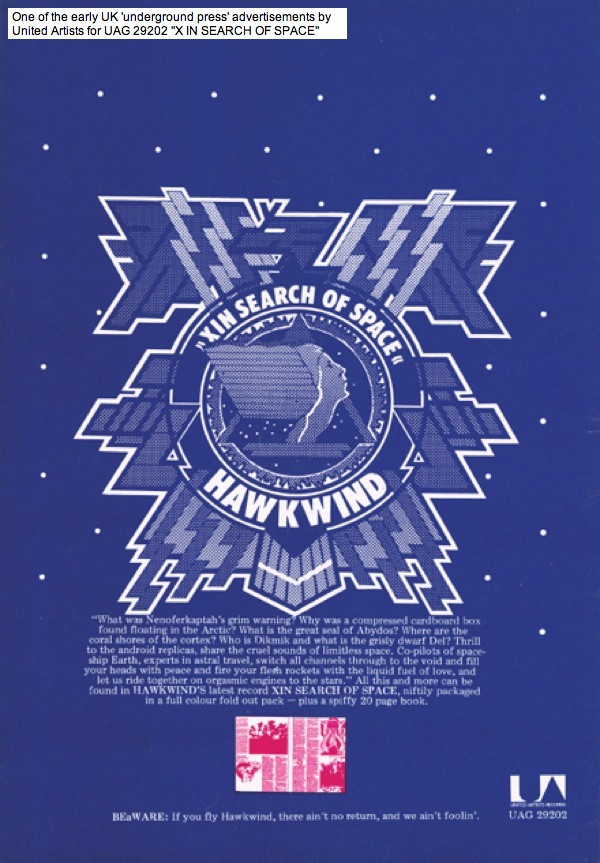
Hawkwind shared a record label with Amon Düül II for their first six albums, and the groups are further connected by bass player Dave Anderson who played on Düül’s Yeti in 1970 and Hawkwind’s In Search Of Space in 1971. The latter has just been reissued by Cherry Red in a variety of formats which include the three-disc package (2 x CD and a blu-ray disc) that arrived here at the weekend. The set features two new mixes of the entire album (one of them being the de rigueur 5-channel surround mix), a couple of outtakes, both sides of the Silver Machine single, plus the promo film for the single. The set also contains a substantial booklet which incorporates a reprint of the 24-page logbook that came with early pressings of the album. More about that below.

Hawkwind didn’t arrive as fully-fledged cosmic voyagers on their self-titled debut in 1970, it’s here on their second album that the group myth takes flight, presenting the band as travellers through time and space, or “Sonic Assassins” as they were depicted shortly before the album’s release in Codename: “Hawkwind”, a two-page promotional comic strip created by Michael Moorcock and Jim Cawthorn. Many British bands were playing with space themes in 1971 but Hawkwind were the only group to adopt the trappings of science fiction as essential elements of their persona, elements that persisted from one album to the next. In Search Of Space is loosely spacey on the musical side—You Shouldn’t Do That is the earliest example of a future Hawkwind staple, the extended mantra-like groove over which synthesizers swoop and burble—but it’s the album package created by Barney Bubbles and (in the logbook) Robert Calvert that dispels the ambiguity of songs like Master Of The Universe and Adjust Me in a science-fiction scenario where the “space” referred to by the title is dimensional as well as cosmological, with the group’s flattened spacecraft embodied by the physical album. None of this is suggested by the music, you need to read the logbook as well, but the book and the die-cut record sleeve help to frame what would otherwise be a collection of disparate rock songs into a complex artistic statement.
When it comes to the remixing of albums I’ve been sceptical of the benefits of the trend. For the past few years Steven Wilson has been the prime remixer of music from the 1970s and 80s; among other things he remixed Hawkwind’s Warrior On The Edge Of Time and the albums on last year’s Days Of The Underground set, all of which are worth hearing. Less essential have been his new mixes for King Crimson and Tangerine Dream, the latter especially where there’s little discernible difference between the old and new versions. I think the main attraction for many listeners will be the 5-channel surround mixes, especially in the case of Tangerine Dream, but I don’t have a 5-channel sound system so can’t say how effective they are. The new In Search Of Space mixes are the work of another Steve, Stephen W. Tayler, whose reworking of the album has taken me by surprise, giving it a radically different sound rather than the discreet adjusting of levels and instrumentation that I was expecting. Dave Brock has said in interviews that he always dropped acid before making the final mix of the Hawkwind albums up to Warrior On The Edge Of Time, which may explain why In Search Of Space has always sounded rather thin and dry, while the album that followed it, Doremi Fasol Latido, is a bludgeon by comparison, with everything compressed into the wall of sound which Hawkwind had developed in their live performances. Tayler’s new mix of Master Of The Universe is revelatory, bolstering the bottom end and emphasising the inverted echoes on Nik Turner’s voice, while You Shouldn’t Do That explodes into jet-propelled life. Everything sounds more substantial, and possibly more cosmic; I’ve not done a side-by-side comparison yet but I think Tayler has given greater emphasis to the effects throughout the album, especially all the swooshing and burbling electronic instruments. If you’ve ever shared my scepticism about the remixing trend then Tayler’s work here should be considered an argument in its favour.

My own fragile copy of the original logbook. For some reason that now bewilders me I decided to colour the whole thing with watercolour paints before realising that the paper is so thin the paints were soaking through the pages.
2: The Hawkwind Log
And so to the myth. The album booklet was reprinted a few times after the album’s initial release but it remains a scarce item, in part because the first run was printed on the cheapest paper. I think this new box set is only the second non-vinyl release to include the whole thing, albeit in a compromised fashion since the reprint has been shrunk to fit the size of the booklet pages to a degree that some readers may need a magnifier to read the logbook entries. The album notes also include a reprint of the Codename: “Hawkwind” comic strip which I’m both amused and a little disgruntled to find are taken from the copies I posted here in 2008. The second page of the strip has the same dirt and creases in the corner as my online copies, blemishes that I removed when I cleaned up the strip for the book of Jim Cawthorn’s artwork that I designed in 2018. These were later included as a bonus with the special edition of Joe Banks’ Days of the Underground book. Cherry Red would have been welcome to use my print-quality copies instead of swiping them from here or wherever it was they found them.

I’ve always believed that the key to Hawkwind’s success beyond their music was the sustaining myth of the group as the crew of a spacecraft wandering (and occasionally lost) in the cosmos or, as described in the logbook, between different temporal eras. The foundation of the Hawk-myth is to be found in the logbook, and in the Space Ritual tour two years later whose concert staging was planned by Barney Bubbles, and whose Bubbles-designed tour programme was a short SF story by Robert Calvert which elaborated upon Moorcock and Cawthorn’s comic-strip scenario. All of these creations were products of the London underground scene centred around Notting Hill Gate in the late 60s and early 1970s. Moorcock, Cawthorn and presumably most of Hawkwind and their associates were living in the streets around Ladbroke Grove at the time; Frendz magazine, where the Hawkwind comic strip appeared, and where Bubbles and Calvert were sporadically employed, had its offices in Portobello Road, next door to the offices of Moorcock’s New Worlds magazine. (Stickers for Frendz are visible on the amps in the Silver Machine promo film.) Just down the road from Frendz was the Mountain Grill, the greasy-spoon café where Brock and Calvert first met, and which later gave its name to Hawkwind’s fourth studio album. The In Search Of Space logbook is very much an underground publication in the Frendz/Oz manner, especially on the pictorial side. Calvert’s text, however, is a cross between a religio-mythical tract and a scientific journal:
The spacecraft Hawkwind was found by Captain RN Calvert of the Société Astronomae (an international guild of creative artists dedicated in eternity to the discovery and demonstration of extra-terrestrial intelligence) on 8 July 1971 in the vicinity of Mare Librium near the South Pole.
The discovery of the Hawkwind has led to more wild speculation than any of the mysteries of space that we have so far encountered. The facts surrounding the discovery of this drifting two-dimensional spaceship have been so distorted by guesswork and rumour that any further attempts at assessment would only increase the density of the fog.
The following extracts from the ship’s log are presented without commentary, for the reader to form his own conclusions. They would appear to be the work of a collective robo-scribe, although one or two of the entries might possibly have been made by the hand of a single unassisted crew member whose identity still remains unknown.
We hope this amazing document will stimulate scientists, mystics, occultists, policemen and all children everywhere.
Société Astronomae
Not all of the text is Calvert’s work, many of the entries are passages borrowed or paraphrased from science books, crank books, Carlos Castanada, Black Elk Speaks, the Bible, etc, between which Calvert threads the story of the Hawkwind craft and its literal search for space:
0600 hrs. 4 July 1885. Blue pinwheel of Triangulum.
We are still in grave danger of losing our space supply unless we can get the tanks repaired and refilled soon. Travelling the two dimensional continuum of the time split it is essential to carry one’s own supply of space. Otherwise you end up flattened out like a cardboard cut-out from a cornflakes packet.
Among the other entries there’s a newspaper report from 1970 (“Court cleared at hippy flower power trial”), a Calvert take on one of Brion Gysin’s permutated poems (“Space is one trip/Trip is one space/Space is trip one…”), and a taste of the real Hawkwind future in samples of Calvert poetry/lyrics which include 10 Seconds Of Forever and The Awakening two years before Calvert’s Space Ritual readings, and a prose version of the android replica scenario that would eventually end up as Spirit Of The Age. Barney Bubbles’ graphics are a typical underground melange of borrowings from comic strips and old illustrated books together with photos of ancient monuments (Stonehenge, Glastonbury Tor), astronomical diagrams and so on. Being someone who likes to know the source of images like these I still wonder where Bubbles found illustrations like this one:
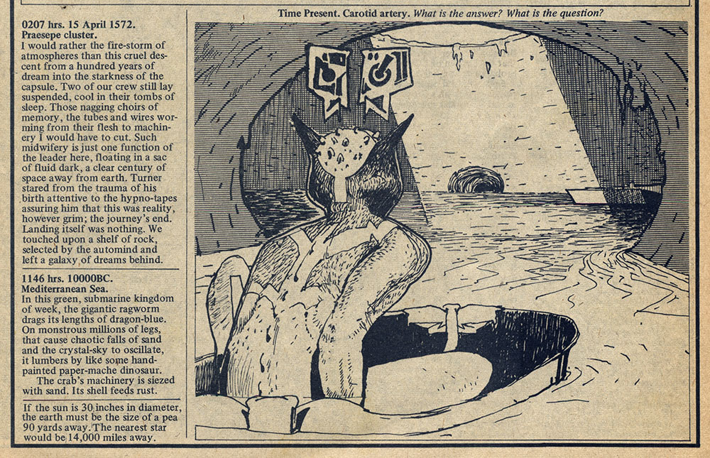
Towards the end of the logbook the predicament of the Hawkwind crew becomes severe:
1027 hrs. 5 May 1971. Ladbroke Grove.
Space/time supply indicators near to zero. Our thoughts are losing depth, soon they will fold into each other, into flatness, into nothing but surface. Our ship will fold like a cardboard file and the noises of our minds compress into a disc of shining black, spinning in eternity…
The crew survived, of course, after losing a couple of members. Dave Anderson left shortly after the recording to be replaced by Lemmy who makes his first appearance with the band in the comic strip. And drummer Terry Ollis was replaced by Simon King whose drums would power the band until the end of the decade. The next album, Doremi Fasol Latido, is full-on space-rock from start to finish, and it’s already lined up as the next remix set from Stephen Tayler. I might not have been so interested in this but hearing the changes Tayler has brought to In Search Of Space it’s starting to look irresistible.
3: An addendum with two mysteries
First mystery: You’d think after 53 years the title of the album under discussion wouldn’t be in question but the new reissue only adds to the confusion around this particular title. I’ve always referred to Hawkwind’s second album as In Search Of Space but the presence of an “X” at the front of the title on the cover has prompted endless debate as to whether the album is actually called X In Search Of Space or even Xin Search Of Space. X In… has some justification since Hawkwind were known as Group X in 1969 although there’s no mention of any X factor on the first album. There’s also no mention of an “X” of any kind inside the Hawklog, and yet the first ads for the album refer to Xin Search Of Space, as does the comic strip, even though the vinyl labels and the titles on the album spine have for years read In Search Of Space. If Xin Search Of Space is indeed the actual title then we have to ask who or what “Xin” is and what the phrase “Xin search of space” is supposed to mean. (According to Joe Banks Barney Bubbles said that “Xin” was correct. See his note at the end of this piece.) Cherry Red have now concurred with the nitpickers at Discogs.com that X In Search Of Space is the proper title, a decision which has caused them to open the space between the “X” and “In” on the front of the album booklet. Even so, when the menu page appears on the blu-ray disc the title still says In Search Of Space… Round and round we go, lost in time, lost in space, and meaning…

Xin or not? Make your mind up, man!

Second mystery: While I’m on the subject it’s worth throwing out another cultural conundrum that I one day hope to solve. British TV in the early 1970s used to show mid-afternoon repeats of some North American documentary series about life in the world of the future, specifically the year 2000. The programmes were all around 30 minutes long and covered things like fashion and product design as well as architecture and computer technology. I say this was a North American production because I have an idea it might have been Canadian rather than the more customary US import. It’s relevant here because each episode ended with a bunch of hippies sat outdoors playing music which I’ve always recalled sounding like some of the songs on In Search Of Space; the first time I heard the album in the late 70s the TV series came immediately to mind. The trouble is, I’ve never been able to remember what the series was called, and searches for suitable programmes about life in the future have all been in vain. (Another thing: I’m fairly sure it was on ITV not BBC after searching the BBC’s Genome archives without success.) If you have any idea what this might be then please leave a comment!
Update: Well that was quick… I’m very pleased to announce that the mystery of the futurist TV series has been solved thanks to a Twitter follower who suggested a Canadian series, Here Come the Seventies, as a likely candidate. This is indeed the series I was searching for, being broadcast in France and the UK as Towards the Year 2000. The series ran from 1970 to 1972, and featured music by Canadian prog-band Syrinx who provided the Moog-heavy theme tune while also appearing at the end of each episode playing on an island in a river or lake (see this clip). The title theme sounds nothing like Hawkwind, it was the end version I was reminded of when listening to In Search Of Space, mainly because of the combination of sax and synth. Hearing it again it doesn’t sound like Hawkwind either but that’s okay, I’m happy that this nagging question has been laid to rest.
• Wikipedia link | IMDB link | Opening titles
Previously on { feuilleton }
• New Wave Strangeness: Hawkwind’s Calvert years
• Twinkle, twinkle little stars
• Motorway cities
• Reality you can rely on
• Silver machines
• Notes from the Underground
• Hawkwind: Days of the Underground
• The Chronicle of the Cursed Sleeve
• Rock shirts
• The Cosmic Grill
• Void City
• Hawk things
• The Sonic Assassins
• Barney Bubbles: artist and designer
August 31, 2024
Weekend links 741

The Empty Mask (1928) by René Magritte.
• A Walk Across Northampton: Iain Sinclair and John Rogers wander the streets in search of significant historical locations before ending up at the home of the local magus, Alan Moore. I recently illustrated a new piece of writing by Iain Sinclair but can’t talk about that just now. Later.
• New music: The Invisible Road: Original Recordings, 1985–1990 by Sussan Deyhim & Richard Horowitz, and Through Other Reflections by The Soundcarriers.
• At Wormwoodiana: Mark Valentine reviews Joseph Hone’s The Book Forger: the true story of a literary crime that fooled the world.
• At Colossal: Across rural Europe, Ashley Suszczynski photographs remarkable and ancient masked traditions.
• Among the new titles at Standard Ebooks, the home of free, high-quality, public-domain texts: Poetry by WB Yeats.
• At Unquiet Things: Maggie Vandewalle’s enchanted autumns.
• Richard Norris’s favourite albums.
• Preludes For Magnetic Tape (1966–76) by Ihlan Mimaroglu | Tape Hiss Makes Me Happy (1995) by Stars Of The Lid | Those Tapes Are Dangerous (1997) by The Bug
August 28, 2024
The Idea, a film by Berthold Bartosch

Having mentioned Frans Masereel in the previous post, here’s a short animated film based on one of Masereel’s wordless novels. Masereel’s The Idea (1920) concerns the birth and progress of radical thought in an illiberal society, with the troublesome conception embodied as a naked woman. When the idea escapes into the world the authorities try to cover her nakedness, but their efforts fail to prevent her image being disseminated by the printing press…
Berthold Bartosch was a Czech animator whose 25-minute adaptation of the book was released in 1932. Frans Masereel helped with the creation of the film in its early stages but he lost his patience with the slow pace of the animation process. Bartosch’s film is significant for being one of the first animated dramas to aim self-consciously at art rather than comedy or entertainment for children. Also significant is the score by Arthur Honegger whose use of the ondes Martenot is claimed as the first use of an electronic instrument for cinematic purposes. Bartosch’s animation technique brings to life cut-out figures in nebulous, layered compositions that anticipate the films that Yuri Norstein would be making decades later. It’s a shame that all the online copies of the film are so poor, it ought to be seen in better quality. Watch it here.
Previously on { feuilleton }
• Destiny, A Novel in Pictures by Otto Nückel
• Crime and Punishment, a film by Piotr Dumala
• Walls, a film by Piotr Dumala
• The Nose, a film by Alexandre Alexeieff & Claire Parker
• Yuri Norstein animations
• Gods’ Man by Lynd Ward
• Frans Masereel’s city
John Coulthart's Blog

- John Coulthart's profile
- 31 followers

