
John Coulthart's Blog, page 17
October 9, 2024
Minotaur Ballet – Swansea Surreal

October is still Spook Month as usual but this year it’s also the 100th anniversary of the publication of André Breton’s first Surrealist Manifesto, something I wrote about back in January. Many events have been acknowledging the anniversary including Minotaur Ballet – Swansea Surreal, an exhibition curated by David Greenslade and Incunabula Media which will be running at Volcano Theatre, Swansea from now to the end of the month. I’m one of the contributors with prints of my Alice in Wonderland posters. Lewis Carroll’s books were rare examples of British culture that Breton was enthusiastic about—he made Alice the “Siren of Dreams” in the Surrealist card deck—while Salvador Dalí and Max Ernst both created illustrations for the stories. I would have preferred to have made something new for the event but other work intervened.
The exhibition…will feature mainly Welsh artists, most of them from Swansea, alongside guests from Australia, Ukraine, Romania, Czech Republic, Egypt, Ireland and other parts of the UK.
ARTISTS INCLUDE
George Ostafi, Mark Sanders, Alexandria Bryan, Neil Coombs, John Goodby, Ricardo Acevedo, Carla-Francesca Schoppel, Dagmar Stepankova, David Rees Davies, Matt Leyshon, Jennifer Allan, Ben Faircloth, Wynford Vaughan Thomas, James Green, David K Mitchell, John Coulthart, Ian Walker, Premysl Martinec, Roger Moss, Julia Lockheart, David Greenslade, Simon Evans, Syd Howells, Keith Bayliss, Anatoly Shmatok, Maria Dolorosa de la Cruz
FILMS OLD AND NEW BY
Kenji Siratori, Zac Ferguson, Jane Arden (Norah Morris), Ricardo Acevedo
And a special screening of Blue Scar (1949)

Elsewhere on { feuilleton }
• The Surrealism archive
Previously on { feuilleton }
• Scenes from a carriage
• Dalí in Wonderland
• Surrealist cartomancy


October 7, 2024
In the Mad Mountains

Cover design by Elizabeth Story. Cover art by Mike Mignola.
The subtitle tells you everything you need to know about this new collection of Joe R. Lansdale stories from Tachyon. I designed the interior of the book, less floridly than some of my previous designs for Tachyon, and a little more abstractly than I’d usually do for a title such as this. All of the stories have been published before, and since I’d illustrated one of them (for Lovecraft’s Monsters) I had vague hopes of incorporating my earlier illustration while providing new ones for the rest of the stories. This proved impossible, however; I was working on the layout while still finishing the design for The Bumper Book of Magic so didn’t have the time to do seven more drawings. I’ll post the illustration here anyway.

The Bleeding Shadow is a great story, a low-rent detective tale set in the 1920s in which the predicament from The Music of Erich Zann—violinist has to keep playing his instrument in order to keep something terrible at bay—is recast with shellac 78s and a blues guitarist. Among the other pieces there’s a story that manages to successfully contrive a meeting between Huckleberry Finn, Brer Rabbit and the Cthulhu Mythos; and the final story which gives the collection its name, wherein the setting of Lovecraft’s Antarctic epic becomes a Sargasso-like landscape of shipwrecks, lost planes and horrors great and small. I especially enjoyed The Crawling Sky, a story of the Old Weird West featuring a Solomon Kane-like itinerant preacher, the Reverend Jebidiah Mercer. Lansdale’s grotesque humour is to the fore in this one. I’d like to see the Reverend given a collection of his own someday.


Elsewhere on { feuilleton }
• The Lovecraft archive
Previously on { feuilleton }
• Things Get Ugly
• Lovecraft’s Monsters
October 5, 2024
Weekend links 746

Composition B (No.II) with Red (1935) by Piet Mondrian.
• “Red is practically faultless, save, perhaps, for one hard-to-get-excited-about foray into atmospheric free jazz (Providence), though the sprawling, epic roller coaster of emotion and dexterity that follows (Starless) surely makes up for any shortfall.” Patrick Clarke on 50 years of my favourite King Crimson album. I like Providence, the piece is part of a live performance in Rhode Island so the Lovecraft connection adds to the aura of doom that pervades the album; and the structure of the album’s second side—jazz improv followed by a multi-part, Mellotron-heavy epic—harks back to the group’s debut.
• “It’s important to challenge the common idea of an almost evolutionary procession, where modernist abstract art is somehow the climax, a new and perfectly original approach to the visual world, absolutely different from all that preceded it.” Hunter Dukes on the yellow rectangle that denotes silence in the Silos Apocalypse.
• The Art of Sidney H. Sime, Master of Fantasy, an exhibition at the Heath Robinson Museum, Pinner, London. Meanwhile, at the USC Fisher Museum of Art in Los Angeles, there’s Sci-fi, Magick, Queer L.A.: Sexual Science and the Imagi-Nation.
• “I did not realize how much I had done. I am a serial polluter.” Ralph Steadman and his daughter, Sadie Williams, talking to Steven Heller about Steadman’s latest exhibition which is touring the USA.
• New music: Come Back To Me [Demo] by Broadcast; The Last Sunset Of The Year by Marcus Fjellström; Hexa by Cleared.
• At Spoon & Tamago: Artists summon mythical creatures of the Echigo region for the 2024 Wara Art Festival.
• The Italian Art of Violence: Samm Deighan on the giallo cinema boom of the 1960s and 1970s.
• Gavin Friday’s favourite albums.
• Red (1991) by Jarboe | Red Earth (As Summertime Ends) (1991) by Rain Tree Crow | Red Sun (2012) by Anna von Hausswolff
October 2, 2024
In Carcosa

Along the shore the cloud waves break,
The twin suns sink beneath the lake,
The shadows lengthen
In Carcosa.
Strange is the night where black stars rise,
And strange moons circle through the skies
But stranger still is
Lost Carcosa.
The King in Yellow, Act i, Scene 2
It’s been a while since I posted anything here which has been created solely for myself rather than a commission. This new piece is a portrait of the King in Yellow, the sinister regent whose supernatural presence pervades the four weird tales that open Robert W. Chambers story collection of the same name. The drawing is a big one, big enough to fill an A2 sheet which I was intending to make available in print form at Etsy. Not having looked at my Etsy shops for a while I didn’t know that they’d changed the shipping section to such an extent that I’d be having to guess what the shipping rates were for different regions. The printer I use has rough guidelines for setting shipping costs on external sales sites but not in the detail that Etsy requires. Prints of this picture may still be ordered direct from me, however. A2 or A3 giclée on Hahnemühle Pearl paper; send me an email if you’re interested.

To return to the artwork… Prior to this my sole drawing of Chambers’ King was for one of the illustrations in Lovecraft’s Monsters, but that depiction is only a reflection in a pub mirror. The new piece was the result of a number of impulses which coalesced after I’d finished work on the forthcoming Bumper Book of Magic. I’d been doing a lot of drawing for the book—there’s a 20-page section, for example, which is all full-page, colour illustrations—and I wanted to keep my hand in while working on the current round of design-related projects. I’d also been wanting to try a proper depiction of the King in Yellow for some time, the previous attempt being unsatisfying even when detached from its pub scene. I’d reworked the earlier drawing a while ago after a Chinese publisher asked for a couple of illustrations for a Chinese edition of Chambers’ book. They paid me for the drawing, and for an old painting which I’d titled The King in Yellow but I still don’t know if the pictures were used anywhere.

A promotional poster by Robert W. Chambers, circa 1895.
A more general impulse has been the urge to get back to doing things for myself when I have the time. Time is always the problem when you’re engaged in commercial work. This new piece has been worked on over a series of months, chipping away at weekends and the ends of the working day. I had the idea at first of following Chambers’ own drawing of the King fairly closely, wings and all, but I’ve never been sure whether the wings are meant to be real appendages or symbolic shapes like the halo that Chambers also draws. The same goes for the guttering torch which the figure holds upside down, and which was used as a decoration on the spine of the third printing of the book.

Among the other details, the Art Nouveau border is intended to connect the drawing to the 1890s, the decade in which the stories were written, but for the architecture I wanted something more severe and less earthbound. Most of the architectural design is my own but the arches are a variation on the vestibule that Peter Behrens designed for the German pavilion at the 1902 Prima Esposizione Internazionale d’Arte Decorativa Moderna in Turin. Behrens started out working in the Jugendstil mode but soon evolved a style of his own which prefigures the stylings of Art Deco. The inscription on the steps is Cassilda’s Song, a page of verse which opens the first story in Chambers’ book, The Repairer of Reputations. The words have been set in the Lingua ignota alphabet devised by Hildegard von Bingen. In the past I might have used the alphabet from The Voynich Manuscript but I like the appearance of Hildegard’s lettering even though I doubt she’d approve of this usage.
• The King in Yellow at Standard Ebooks
Previously on { feuilleton }
• Eldritch idols
• In the Key of Yellow
• Lovecraft’s Monsters
• The Court of the Dragon
• The King in Yellow
September 30, 2024
Robert Lawson’s House of Usher

Spook Month starts tomorrow so it no longer feels too early to post this marvellous (undated) etching of the opening scene from The Fall of the House of Usher by Edgar Allan Poe. Robert Lawson (1892–1957) was an American author and illustrator whose early etchings were featured here some years ago after I turned up another wonderfully atmospheric piece depicting galleons rotting in the weed-tangled waste of the Sargasso Sea. I’m pleased that this gallery page which shows many more Lawson prints is still active over a decade later; they don’t have the Poe etching, however. A few copies may be found on the big auction sites but the best ones are blighted with a watermark.

Preparatory pencil drawing.
The title of Poe’s story refers to two separate falls, the dissolution of the Usher family line, and the physical collapse of the house in which Roderick and Madeline Usher pass their days, a calamity augured by the crack in the masonry which the narrator sees when he arrives at the shore of the black tarn. Lawson pays close attention to all the relevant details which Poe’s narrator is unable to regard as offering a sublime spectacle, something that film-makers and other illustrators (when they depict the house at all) don’t always honour:
I looked upon the scene before me—upon the mere house, and the simple landscape features of the domain—upon the bleak walls—upon the vacant eye-like windows—upon a few rank sedges—and upon a few white trunks of decayed trees—with an utter depression of soul which I can compare to no earthly sensation more properly than to the after-dream of the reveler upon opium—the bitter lapse into every-day life—the hideous dropping off of the veil. There was an iciness, a sinking, a sickening of the heart—an unredeemed dreariness of thought which no goading of the imagination could torture into aught of the sublime. What was it—I paused to think—what was it that so unnerved me in the contemplation of the House of Usher?
Unless there’s more like this from Lawson the only other print of his that approaches horror is the Sargasso one; everything else is historical scenes or the light fantasy he continued to draw in his subsequent career as an illustrator of children’s books.
Elsewhere on { feuilleton }
• The etching and engraving archive
Previously on { feuilleton }
• Edmund Dulac’s illustrated Poe
• The Fall of the House of Usher, 1928
• The Purloined Eidolon
• Martin van Maële’s illustrated Poe
• Mask of the Red Death, 1969
• Narraciones extraordinarias by Edgar Allan Poe
• Fritz Eichenberg’s illustrated Poe
• The Pendulum, the Pit and Hope
• Hugo Steiner-Prag’s illustrated Poe
• Burt Shonberg’s Poe paintings
• Illustrating Poe #5: Among the others
• Illustrating Poe #4: Wilfried Sätty
• Illustrating Poe #3: Harry Clarke
• Illustrating Poe #2: William Heath Robinson
• Illustrating Poe #1: Aubrey Beardsley
• Poe at 200
• The Tell-Tale Heart from UPA
• William Heath Robinson’s illustrated Poe
September 28, 2024
Weekend links 745

Eros (1905) by Julius Kronberg.
• At the Internet Archive (for a change): All 15 episodes (with English subs) of Návštevníci (The Visitors, 1983/84), a Czech comedy TV serial about time travellers visiting the present day. Directed by Jindrich Polák, better known for the serious science fiction of Ikarie XB-1 and another time-travelling comedy, Tomorrow I’ll Wake Up and Scald Myself with Tea. The main interest for this viewer is the involvement of Jan Svankmajer who creates collage animation for the first episode while animating food and other objects in later episodes. This was the period when Svankmajer was mainly working as an effects man at the Barrandov Studios after the Communist authorities had put a stop to his film-making. Even with Svankmajer’s involvement I’m not sure I can endure 450 minutes of Czech wackiness but it’s good to keep finding these things.
• “…for the melomaniac who wasn’t in and around Bristol in the 1980s or 90s, the term [trip hop] simply opens the door to a whole universe of music that blurs the lines between so many styles in a way that is still compelling three decades on.” Vanessa Okoth-Obbo on the 30th anniversary of Protection by Massive Attack.
• Coming soon from Strange Attractor: Moon’s Milk: Images By Jhonn Balance, compiled by Peter Christopherson & Andrew Lahman.
For some in Ireland, [The Outcasts] is a dim but impressive memory, glimpsed on late-night television during its only broadcast in 1984. The Outcasts over the decades became a piece of Irish cinema legend, less seen and more peppered into conversations revolving around obscure celluloid. The Irish Film Institute describes this film as “folk horror”, a phrase I find too liberally applied these days to just about anything featuring sticks, rocks, and goats or set in the countryside. The Outcasts does not necessarily strive for the ultimate unified effect of horror. Instead, this film is of a rarer breed, more akin to Penda’s Fen (1974) in its otherworldly ruminations. I’ve come to prefer the phrase “folk revelation” as perhaps a more accommodating description for these sorts of stories. Whatever the case, I hope you get to see this remarkable film.
Brian Showers discussing the contents of The Green Book 24, newly published by Swan River Press. The Outcasts has just been released on blu-ray by the BFI
• Still casting a spell: Broadcast’s 20 best songs – ranked!
• New music: Earthly Pleasures by Jill Fraser.
• At Dennis Cooper’s: John Carpenter‘s Day.
• RIP Maggie Smith.
• The Visitors (1981) by ABBA | Two Different Visitors (2003) by World Standard & Wechsel Garland | We Have Visitors (2010) by Pye Corner Audio
September 25, 2024
Joy Street, a film by Suzan Pitt

Joy Street (1995) is an animated short whose title is ironic at first, you have to stay with its opening scenes of grim Expressionism to see how things develop. If you’ve seen Suzan Pitt’s uniquely strange Asparagus then you’ll be primed for the unexpected turns the scenario takes. To say any more would be to spoil things, and for once I’ve avoided my usual habit of posting shots that show moments throughout the film.

Suzan Pitt only made a handful of animations, three of which—Joy Street included—are on 35mm. Joy Street is also the longest at 24 minutes. I always find it admirable when animators are given the opportunity to work with superior resources yet still insist on making something this personal. Despite her small filmography there’s a lot of her work I’ve yet to see. This is a reminder to look for more.
Previously on { feuilleton }
• Into the Midnight Underground
September 23, 2024
New Worlds 224

Illustration by Mark Reeve.
New issues of New Worlds magazine have been rare things in recent years so the announcement last week of issue number 224 was a special moment:
New Worlds Vol. 66 No. 224, ed. Michael Moorcock (to commemorate the sixtieth anniversary of his taking over editorship of the title), 09/’24, 978-0-9575764-6-9, a new full-colour A4 stapled outsized paperback/magazine, 72pp., illustrated by John Coulthart, Mal Dean, Herbert Sydney Foxwell, Allan Kausch, Mark Reeve, Julius Stafford-Baker; fiction/non-fiction anthology, contributors: John Clute, Coulthart, John Davey, Thomas M. Disch, Kausch, Roz Kaveney, Moorcock (a brand-new Cornelius story), Iain Sinclair, John Sladek, Pamela Zoline; first edition: £20.00 (for pre-ordered signed copies [while stocks last]).
N.B. This title is published on 30th September, 2024. Pre-ordered copies will be signed by Michael Moorcock and the magazine’s publisher.
See: https://jaydedesign.com/products_new.php
Copies in the U.S.A. will soon be available via www.ziesings.com @ $25 (for pre-ordered signed copies [while stocks last]).
If you’re in the mood for a spoilerish review you can see the entire issue leafed through and described here. In addition there’s also the New Worlds Annex which I’m hosting on these pages, a small repository of supplementary material.
There’s no need for me to recount the history of New Worlds, you can read about it in detail here. If you do know the history then you’ll know that the magazine under Michael Moorcock’s editorship acquired a considerable reputation in the late 1960s, upsetting politicians, the proprietors of WH Smiths, and the more conservative readers and writers of science fiction while publishing many important stories. In the 1970s New Worlds became a paperback series for a few years, managing ten numbers before resuming magazine format and increasingly sporadic publication.

Mike Moorcock’s Jerry Cornelius story is a Holiday on the Buses scenario set in the usual Cornelius landscape of geo-political chaos. Mark Reeve and Allan Kausch also illustrated this one. I think my piece may be the first time I’ve ever had reason to draw a bus despite being a regular user of public transport. In order to create a contrast with the other illustrations I opted for something in the isometric manner of George Hardie. Not as severely styled as Hardie’s drawings often are but it’s heading in that direction.
The last Moorcock-edited number prior to the present one was in 1996, an issue which included a drawing of mine from the Reverbstorm comic series. The new issue sees Moorcock returning to the editor’s chair for what he insists will be the final time so I feel fortunate to be able to contribute more substantially to this issue than I did in 1996. As well as designing the magazine I’ve illustrated four of the stories, and also wrote a page about the hundredth anniversary of Surrealism which provides a loose theme for the issue as a whole. In a reversal of the usual state of affairs the writing was commissioned first, the design having been offered to other parties earlier this year. This didn’t work out, however, so Mike asked if I could take over, something I was more than happy to do. Rather than follow any pre-existing layouts I started with a blank slate, something I prefer in these situations. The erratic nature of the magazine schedule has meant that many of the recent issues have been standalone items even though each one bears an issue and volume number. The issues that followed the paperback series in the 1970s differed widely from one another, a trend that continued up to 1996; consequently I didn’t have to worry about retaining any attributes of the previous issues.

Iain Sinclair’s story is another piece of fiction featuring his alter ego, “Norton”, which takes in Surrealism (or the British rejection of the same), poet/Surrealism advocate David Gascoyne, and JG Ballard who lurks in absentia in the issue as a whole. My illustration is a reworking of the first picture from my abandoned Atrocity Exhibition series of the 1980s.
Issue 224 may be a one-off but I tried to approach the design as though this was going to be a template for a new run of the magazine. There’s a tendency in the design of small-run publications to pull out all the stops, filling the pages with disjunctive layouts and very new, often barely legible headline fonts. This isn’t so bad if you’re creating an avant-garde art or design magazine but a literary title should aim for clarity and readability. The body text for the new issue is Open Sans, a sans-serif face that reads well at small point sizes. (It’s also a Google font but don’t hold this against it. Google are increasingly iniquitous today but their font commissions are first rate.) The title and some of the headings are variants of FF Pullman, a typeface I haven’t used before. It’s a design based on old railway lettering which stood out for being stylised and distinctive without being too eccentric. Elsewhere I’ve varied the headings in order to create variety.

The most overt reference to the magazine’s history is in the title design for John Sladek’s The Poets of Millgrove, Iowa, a story which is also the only reprint in the issue. Sladek’s near-future piece, which was published in 1966, concerns an astronaut returning to his home town for a celebration of his landing on the Moon. The title font is a contemporary variant of Deutsche Black, a type design released the year the story was published. Eduardo Paolozzi used Deutsche Black a year later for the title page of his print portfolio, Moonstrips Empire News. If you’re familiar with the New Worlds of the late 60s you may know that one of the prints from Moonstrips Empire News appeared on the cover of issue 174, while Paolozzi himself was credited there and in subsequent issues as “Aeronautics Advisor”. So the Sladek title design manages to allude simultaneously to Paolozzi, the Moon, and the magazine as it was during its influential heyday. I don’t expect a reader to make any of these connections but I’m often looking for significant associations when making design choices.
All of those influential issues are currently available as PDF downloads at The Luminist Archives, together with many other issues of the magazine going back to 1946. I’d suggest downloading anything that looks of interest, you never know how long a site like this will remain active.
Previously on { feuilleton }
• Ballard’s sextet
• Very tasty
• Eduardo Paolozzi at New Worlds
September 21, 2024
Weekend links 744
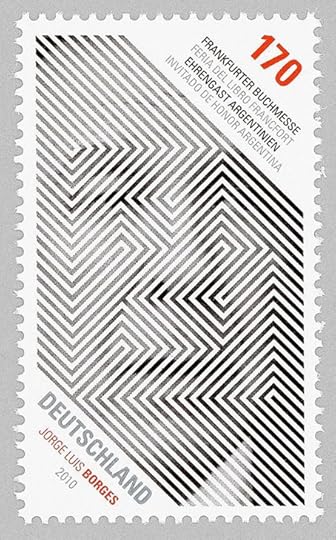
Postage stamp design by Dario Canovas celebrating Argentina as guest of honour at the 2010 Frankfurt Book Fair.
• Sideways Through Time, Joe Banks’ book of Hawkwind interviews, was initially available as an exclusive supplement with the special edition of Days of the Underground, Joe’s essential history of Hawkwind’s first decade. From the end of October both books will be available as separate editions from Strange Attractor, with the interview collection being republished in a revised and expanded edition.
• “Two heads are better than one”: Another extract from Two-Headed Doctor: Listening For Ghosts In Dr John’s Gris-Gris by David Toop.
• “Rammellzee was an electric presence”: Thurston Moore on NYC’s graffiti-writing hip-hop pioneer.
• New music: Long Tail Of The Quiet Gong by Robert Rich, and Neostalgia by Heiko Maile, Julian Demarre.
• At Colossal: Postage stamp designs by Tùng Nâm showing portraits of endangered animals.
• At Public Domain Review: Edwin D. Babbitt’s Principles of Light and Color (1878).
• At Print magazine: An interview with design anthropologist Keith Murphy.
• At Unquiet Things: Tristan Elwell’s visual spellcraft.
• Mix of the week: Bleep mix 287 by Sarah Davachi.
• Mariam Rezaei’s favourite music.
• Over Under Sideways Down (1966) by The Yardbirds | Stepping Sideways (2003) by John Foxx & Harold Budd | Trip Sideways (2010) by The Time And Space Machine
September 18, 2024
Magic Lantern: A Film about Prague

There are many documentary films about the city of Prague but Magic Lantern is the only one written and presented by playwright Michael Frayn. Very good it is too, a personal view of the city’s political and cultural history which takes in the usual names and subjects: Rabbi Loew and his Golem, Emperor Rudolf II, Rudolf’s alchemists, artists and scholars, photographer Josef Sudek, the ubiquitous Franz Kafka, puppets, automata, and so on. While Frayn discusses the Communist and post-Communist periods there’s a brief clip of Jan Svankmajer’s The Death of Stalinism in Bohemia.

Frayn’s film was directed by Dennis Marks, and broadcast in 1993 as part of the BBC’s long-running Omnibus strand. (There’s a further Svankmajer connection in the person of executive producer Keith Griffiths whose Koninck company produced this film at a time when they were also helping Svankmajer make his features.) Magic Lantern wasn’t the only film that Marks and Frayn made together, and not their first metropolitan essay either. Imagine a City Called Berlin (1974) is a portrait of the former capital of Germany during its Cold War isolation; there’s also The Mask of Gold: A Film about Vienna (1977), and Jerusalem: A Personal History (1984), all of which may be seen at The Dennis Marks Archive. My complaints about YouTube are copious enough to paper the walls of the Hradcany, but the site is at its best when it provides this kind of haven for television history that would be impossible to find elsewhere.
Previously on { feuilleton }
• Le Golem, 1967
• Gustav Meyink’s Prague
• Stone Glory, a film by Jirí Lehovec
• The Face of Prague
• Josef Sudek
• Liska’s Golem
• Das Haus zur letzten Latern
• Hugo Steiner-Prag’s Golem
• Karel Plicka’s views of Prague
John Coulthart's Blog

- John Coulthart's profile
- 31 followers

