
Todd Klein's Blog, page 358
January 12, 2011
Order from Chaos
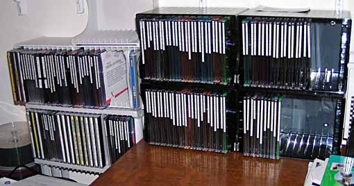
I spent much of the last two days organizing and reducing the number of my digital archive and software disks. I'm an organized person, when I archive work files I put a label on the disk and a list of contents on the case, and I have a system. Work files large enough to fill a disk get their own name, but most go into catch-all disks labeled Old Files. When I began with my first desktop Mac in 1994 I was saving things on floppy disks, then storing larger amounts on SyQuest disks, remember those? A bit later I was using Zip Disks, which I think held a whopping 100 MB. When CD burning became an option, I jumped on, happy to get 700 MB on one, it seemed a vast amount of space. But, as in all things computer, files kept getting larger, and when DVD burning began I moved to that, and again 4.3 GB seemed lots of room. This past weekend I archived about six months of work and it took up six DVDs. I know there are other options, removable hard drives for instance, but I like DVDs for now, I just have to make sure I have space for them.
The image above is "after," I wish I'd thought to take a "before," with piles of disks crammed everywhere, including the shelf above, but I'm sure you can imagine. Another thing that's hampered neatness is the change in size for disk holders from the regular jewel-case to the much thinner type, which are handy since two of them fit in the space of one jewel-case. So, in addition to combining CDs onto one DVD, I had to move many disks into thin cases, and create new thin labels for those thin edges in Illustrator. But by far the most time-consuming thing is combining the files. For instance, I had Old Files 1-14 (1994 to 2004) on four CDs, and they're now on one DVD. The process takes about an hour. I still have some things on CD, it just takes too long to do them all, but I did manage to fill an entire trash can with no longer needed disks and covers, so I think I did well, and there's now plenty of room for more. Plus I eliminated a few other piles of out-of-date software installation disks, and disks people sent me with work files on them, something which doesn't happen too often now, but used to. Oh, and I know burned disks have a shelf life, but I've yet to have one go bad on me, and the older files keep getting moved to newer media formats, so I think I'm okay. No doubt someone will come out with a new format in a few years that holds even more data, and I'll go to that.
Creating order from chaos in the studio is one of those things that gives me a lot of personal satisfaction, even if I rarely use any of the material on the disks. When I need to, I know it'll be a lot easier now.
And after typing the title of this post, I thought, "Someone in New York should have a Chinese restaurant named Chaos so all the jokers in town could order from it." Come to think of it, a Greek deli would be even better…!


January 10, 2011
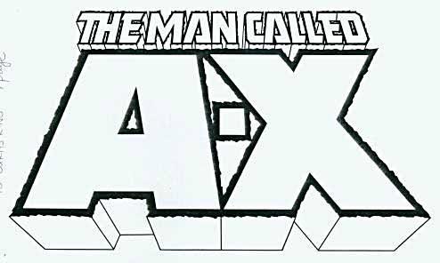
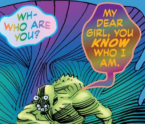
Logo Study: THE MAN CALLED A-X
Images © Marv Wolfman and Shawn McManus.
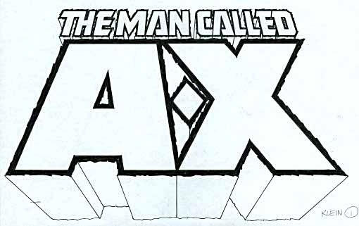
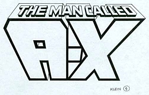
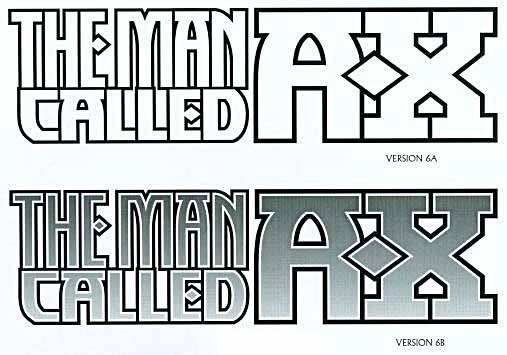
In 1994 I was contacted by writer Marv Wolfman, who was preparing a new creator-owned miniseries with artist Shawn McManus for Malibu Comics. You can read more about it HERE on Marv's website. He asked me to design a logo for the book, which I was happy to do. The title, as seen above, would have two large letters as the focus, A and X, but with a dash between: A-X, not AX. The idea was that, as readers would find out, the X stood for the number 10, the tenth in a series of deadly killers, and there was no axe involved. Those letters alone would have made an ideal logo assignment, two very large and interesting shapes. The tagline, THE MAN CALLED, which Marv wanted to run above, complicated things a bit, as it would make the logo taller than I really wanted, but that line could be much smaller at least. In my first marker sketch, above, I went for very wide strokes on A-X, outlined in a heavy, rough, energetic border. I made the dash a diamond, something I'd already done for Marvel Comics on X-Men. It seemed to fit well into the space, even if not reading particularly well as a dash. The topline was pretty standard block letters with the addition of a futuristic A shape, one I'd used before (on THE OMEGA MEN, for example) and liked. I added telescoping to the letters in two-point perspective, making it even taller, but assuming that the telescoping could be covered by art when necessary.
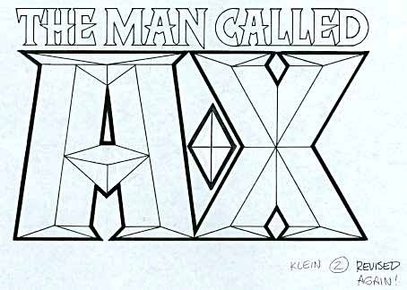
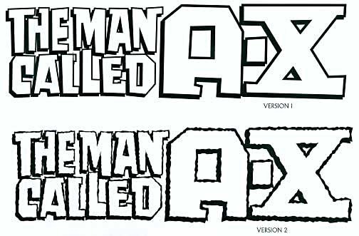
I had trouble with my second sketch. I was trying for a faceted effect on A-X, but the extended points on the top and bottom don't work well, and the result reminds me of two people standing with their toes turned inward. Even after revising it twice, I wasn't happy.
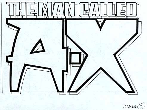
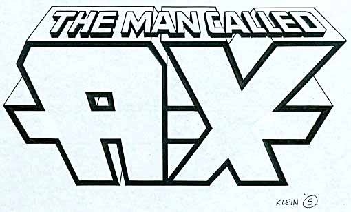
My third sketch tried a different approach, making A-X with strokes that were much wider at the top. Interesting idea, but perhaps not really right for this character, it presents a somewhat retro art deco or 1950s feel to me now.
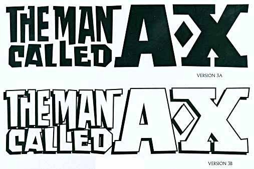
I usually begin a logo assignment with three sketches, but this time I did more, perhaps not sure myself if I was getting anywhere. This one uses the opposite slant on the letters, putting the forward thrust at the top, and laying the topline along the telescoping. The A is square this time, but both A and X came out looking top-heavy.
Version 5 tries to overcome that top-heavy look with a horizontal bar through the center. This tends to hide the dash, and makes the X look more like a giant * (star symbol on the keyboard). Not a great option.
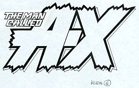
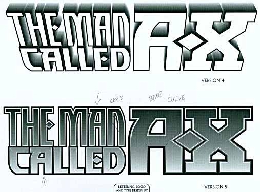
Version 6 is one I still like, with very jagged top and bottom edges, a style I used successfully a few years later for Marvel's KA-ZAR. Here the main letters are more balanced, and the intro line, while smaller, fits well into the overall design. A strong rightward slant gives a feeling of motion, and an open drop shadow is added to allow a second color in the logo. If I were choosing, I probably would have picked this one myself.
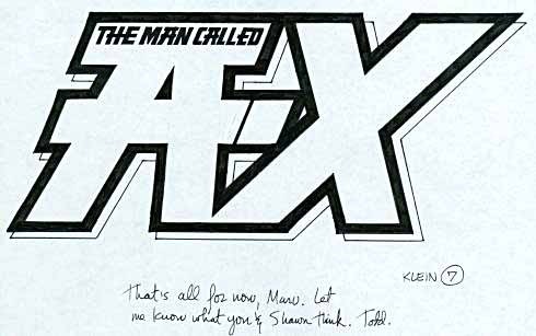
My final sktech was this one, following the general plan of 6, but less successful, I think. The very heavy outline works, but the shape of the A does not, for me, and the added top crossbar is made too important by putting the supertitle inside it.
Word came back from Marv and Shawn, and they chose the first sketch with a few changes. The diamond-shaped dash was changed to a more traditional one, and the telescoping was trimmed shorter, and given straight edges for a cleaner look. I thought the end result looked pretty good, though I was concerned that it was still much taller than most cover logos of the time.

And Malibu must have had the same concern, when they first used the logo on this ashcan cover, it was digitally compressed vertically. They might have run the art over the bottom of the logo instead, but for a first appearance it's usually not a good idea, and I'm sure no one wanted to make Shawn's incredibly menacing figure any smaller! I wish now that they had brought me into the loop, I would have suggested putting the creator credits to the left or right of the figure instead of above the logo, or could have redesigned the logo to look better in those dimensions, but no one did.

When this art appeared again on the regular series, the logo was even smaller, and the telescoping was filled in with black. The latter makes the logo stand out more, but the compression is still a problem. This is a good example of why showing the logo designer some cover art can be helpful!
In 1997 Marv and Shawn brought the character to DC Comics, and I was asked by DC's Curtis King to come up with a new logo design. This might be the only time I've ever been the sole designer on a character for two different companies! By '97 I was using my first Apple computer to do logo sketches, either beginning with hand-drawn shapes and then tracing them in Adobe Illustrator, or using existing fonts I'd created, or found elsewhere.
Curtis King wanted something quite different, and suggested this arrangement, with the first line stacked into two and on the left of A-X. The overall shape then became much more typical of a comics logo, leaving more room for the art. This approach might have been suggested by Curtis, it now reminds me of things Rian Hughes has done. Kind of quirky and reminiscent of 1950s paperbacks. The X was given top and bottom crossbars, not a bad idea as it helped to balance it with the more square shapes of the rest. These letterforms were hand drawn first, I'm sure.
 Variations on the theme, here going back to the diamond-shaped dash in A-X, and a diagonal A. And even more Rian Hughes-like in just black.
A different look, which began with a commercial font called TF Akimbo designed by Joe Treacy. The top version adds fadeaway telescoping, an effect I used in my CHALLENGERS OF THE UNKNOWN logo. The straight-on version 5 was what Curtis liked, with the letterforms tight together, and you can see some notes I made when he called to talk about it, asking for changes in the N and A's.
 These versions reflect those changes, which improve the overall design. The N is more readable, and the A is now symmetrical, a better match for the X. I also like the way the diamond-shaped dash is echoed in the E's, and the way the diamond cuts a niche into the A in A-X.
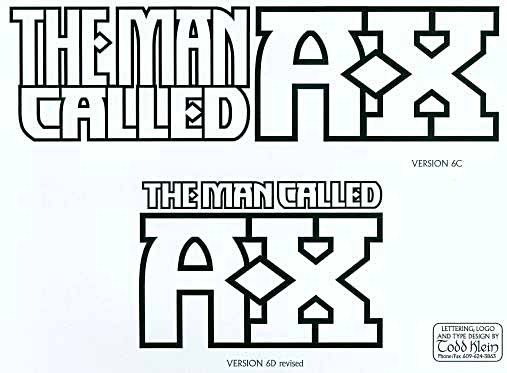
As a creator-owned property, Marv and Shawn probably had final say on the design, and while I don't have any evidence, I bet Marv wanted the supertitle back over the A-X, as shown here in version 6D, the final one. I can see his point of view, it matches the earlier logo better and puts the emphasis back on A-X, though it does once more create a very tall logo.

Cover designer Curtis King solved that problem by making the logo smaller and allowing Shawn's art to go over part of it on this and other covers. I think it works fine, still quite bold and readable at this size, and thankfully not distorted like the previous incarnation.
That's the entire history of the property and logos thus far: seven issues from Malibu, then eight from DC. It was an interesting design assignment that I enjoyed working on, hope you've enjoyed reading about it.
Lots more logo studies can be found on my LOGO LINKS page.
January 9, 2011
About Tom Ziuko
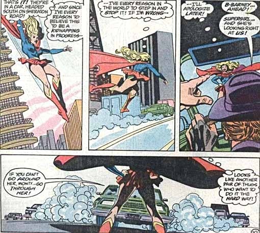
Image © DC Comics, Inc.
I worked with Tom in the DC Production Department for a few years, then we both went freelance and I haven't seen or heard from him in ages, probably more than twenty years. Tom became a fine colorist, in the era of hand-painted guides, and I believe he successfully made the transition to computer coloring, continuing to work for DC and other companies. The last credits I recall seeing for him were on covers for TwoMorrows. At DC we were sometimes working on the same books, Tom as colorist, me as letterer, as in the example from SUPERGIRL above, and he always did a fine job.
When we worked in the same office, Tom was someone I enjoyed talking to. He was highly opinionated, had a quick wit, and was always generous with his time when anyone needed help. When Tom was a fan of something he was passionate about it, and he could argue the merits of favorite music groups like Devo until he wore you down and you HAD to appreciate them even if you didn't really love them like he did. Tom was equally passionate about comics he liked. He was a firm fan of LOVE AND ROCKETS by the Hernandez brothers, published by Fantagraphics. I was doing some logo designing for them at the time, and designed a logo for the first series, and they sent me single copies of the early issues, which I enjoyed. Tom had been unable to find the first issue, and once he knew I had it he worked on me over time, gradually convincing me that I HAD to sell it to him so he could have a complete collection. A small amount of money changed hands, but mostly it was well worth it to see how happy it made him when I handed over the book. And I was pretty happy too, not having to hear any more of Tom's persuasive arguments on the subject!
Today I received word, through Richard Bensam a reader of my blog, that Tom is in need of help; in the hospital with serious medical problems and no insurance. Tom's friend Alan Kupperberg tells the story HERE, and there are covers of books Tom worked on there, too. Alan is collecting funds through PayPal that will go directly to Tom. I've made a donation, and if you'd like to, Alan's PayPal address is:
kupperberg@earthlink.net
I'm very sorry to hear about Tom's medical issues, and hope he gets through it. Sounds like there's a good chance of that, and your contribution might help.
January 8, 2011
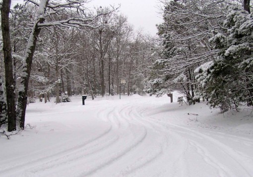
More Snow
Well, it wasn't predicted, but we're getting more today, about three inches so far. Hard to believe, based on the last three years, but since we moved here to south Jersey we've had many winters with little or no snow. The pattern seems to have changed.
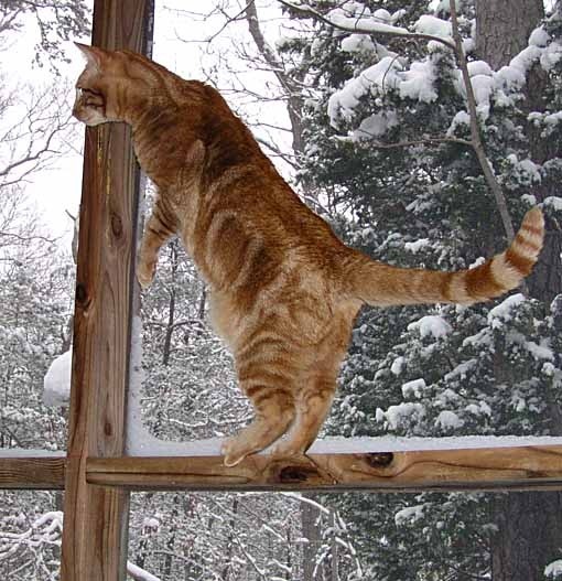
Leo, the arctic cat, is having a fine time on our screened porch, watching the birds at the feeders and licking the snow he can get to. He doesn't want to come in.

Tigger would rather be inside watching the birds at the small window feeder in my studio. I had it lower before, but it seemed too easy for the cats to reach up and scare the birds away by hitting the window with their paws, so I moved it to the upper window. Tigger's solution? Climb up on the window sill and keep up the offense! The sill is too narrow for him to stand there long, fortunately, so the birds do get a bit more feeding time.
The roads don't look too bad. I've ordered a pizza from the nearest place, and am going out now to get it, so we'll have it for dinner and can stay in the rest of the day.
January 7, 2011
And Then I Read: KNIGHT & SQUIRE 1

Images © DC Comics, Inc.
I first met this British Batman and Robin (sort of) in the pages of Grant Morrison's BATMAN & ROBIN, and found them entertaining, so giving this first issue a try was an easy decision. As a lifelong Anglophile I enjoyed it thoroughly, though some of the slang was new and indecipherable. Some references are explained on the last page for Americans if you need it. Doesn't matter, the characters are great fun, the setting in a superhero/villain pub (where they can meet in truce to chat and drink) was equally fun, and the writing and dialogue by Paul Cornell were well handled, both funny and exciting in appropriate measures. How very British it is to have such a civil arrangement, and then to have it go all barfight and chaos, but the title heroes have things well in hand by the end, and finish with a cheery sendoff. I like these characters, I like this pub, and I look forward to more.

The art by Jimmy Broxton is perfect for the series, it reminds me a bit of Dave Gibbons in the solid construction and eye-friendly clear definition of shapes, the characters act their parts well, the action jumps off the page, but the quieter moments are equally effective.
Now if they can just resist dragging this series into a vast crossover for a while, and let it develop as it began, I'll be a constant reader. Highly recommended!
January 6, 2011
And Then I Read: BATMAN & ROBIN 14-16

Images © DC Comics, Inc.
Okay, I admit it, I've lost track of this story. I read these issues over a month ago, and even then I don't think I had a good handle on it, as it's just part of a much larger Batman epic Grant Morrison has concocted that runs through a number of titles. The focus of this one was originally between the new Robin, Batman's actual son with Talia Al Ghul apparently, Damian, and the new Batman, Dick Grayson. There's still some of that here, but it's kind of buried beneath other parts of the Batman megaplot (if that's a word). Then we have the apparent return of Bruce Wayne's father, The Joker up to his usual cruel villainy, other odd villains like Pyg, and lots of other stuff. One thing you can crdit Morrison for, he's not coasting, these issues are crammed with characters and events. I suspect if I were reading all the other Bat books, it might become clearer.

Most of the art in these is by Frazier Irving, though I think this page is by Cameron Stewart, who did part of issue 16. Both artists are excellent. Irving's work is an interesting mix of black outlines and interior color with a painted look, which I suspect is achieved largely on the computer.
If you're following Morrison's epic, these will be key reading. If not, you might still enjoy them for the art, and for the snappy dialogue and a wealth of surreal characters and situations. Mildly recommended.
January 5, 2011
And Then I Read: BATMAN/CATWOMAN

Images © DC Comics, Inc.
It's been a while, I think, since Howard Chaykin did a Batman story, and this one-shot is a refreshing romp that he seems to have had a lot of fun with. In some ways it looks back to when Batman himself was more fun, even though he states in the opening captions, "Lest you get the wrong idea, let me reassure you there are no circumstances that I can imagine under which what I do could ever be described as fun." Now, what I see there is a very clever ploy by Chaykin the writer to put the idea into the reader's head that perhaps Batman DOES have fun sometimes.

Certainly the other two principals in the book seem to be having fun: Catwoman, and the costumed villain The Cavalier, a classic theatrical type that Chaykin both writes and draws well. While the pursuit of Cavalier is the main action, a back story about corruption and embezzling at Wayne Enterprises is equally entertaining, and allows Chaykin to play with corporate satire and office politics in the humorous but worldly-wise way he does so well. Of course the two stories are entangled, just as the three principals are. It's all a terrific read, and both the writing and the art are excellent. Heartily recommended!
And Then I Read: BATWOMAN/CATWOMAN
Images © DC Comics, Inc.
It's been a while, I think, since Howard Chaykin did a Batman story, and this one-shot is a refreshing romp that he seems to have had a lot of fun with. In some ways it looks back to when Batman himself was more fun, even though he states in the opening captions, "Lest you get the wrong idea, let me reassure you there are no circumstances that I can imagine under which what I do could ever be described as fun." Now, what I see there is a very clever ploy by Chaykin the writer to put the idea into the reader's head that perhaps Batman DOES have fun sometimes.
Certainly the other two principals in the book seem to be having fun: Catwoman, and the costumed villain The Cavalier, a classic theatrical type that Chaykin both writes and draws well. While the pursuit of Cavalier is the main action, a back story about corruption and embezzling at Wayne Enterprises is equally entertaining, and allows Chaykin to play with corporate satire and office politics in the humorous but worldly-wise way he does so well. Of course the two stories are entangled, just as the three principals are. It's all a terrific read, and both the writing and the art are excellent. Heartily recommended!
January 4, 2011
Lettering for Moore and O'Neill
Images and script © Alan Moore and Kevin O'Neill.
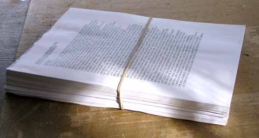
Above is a photo of the script for the second 80-page issue of THE LEAGUE OF EXTRAORDINARY GENTLEMEN: CENTURY, this one dated 1969. It's due out later this year, probably not until summer at latest report, but I've finished the first round of lettering, have sent color proofs to everyone, and am waiting for any further corrections or rewrites. Actually, this is not even the whole script, as it doesn't include the six text pages at the end, but you get the idea. A lot to read and consider for artist Kevin O'Neill, colorist Ben Dimagmaliw and myself. Fortunately, it goes to Kevin first, and he does complete art on the pages before I get them for lettering, so I don't have to study the entire script in detail, but can concentrate mainly on the dialogue and captions.
Alan doesn't usually include many notes on lettering. In fact, Kevin is the one who decides where things should be in upper and lower case, as seen above.
Kevin sends me lettering placements as well, and I work closely with him, sending batches of lettered page proofs in black and white as I finish them, which Kevin goes over and gives me any corrections or changes he wants. We also work closely on the design of the covers and inside text pages.
Mostly, Alan gives us everything he can think of that might be relevant in the script, then lets us get on with doing the rest of it. So, when Alan does include lettering notes, I try extra hard to come up with something I think he'll like. There are a couple of examples in this issue.
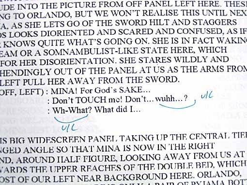
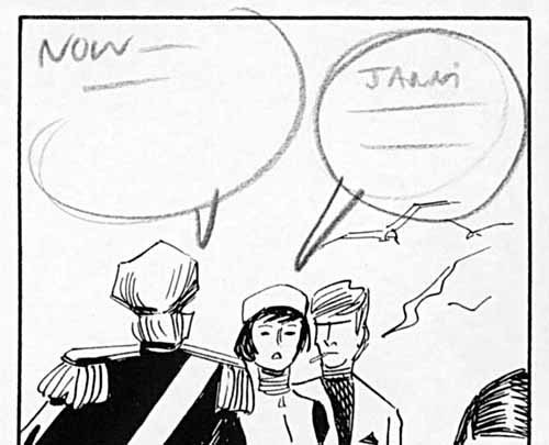
Without giving too much away, and I think one has to almost expect it, there's a psychedelic drug trip in the story, one undertaken by Mina Murray. As it first appears in the script, Alan writes:
NOW WE HAVE A SHOT THROUGH MINA'S EYES AS SHE STARTS TO MILDLY EXPERIENCE THE FIRST EFFECTS OF THE DRUG SHE HAS TAKEN. WE CANNOT SEE MINA HERSELF HERE, BUT LOOMING IN FROM OUR LEFT OF THE FOREGROUND IN A SORT OF SWOLLEN FISH-EYE DISTORTION EFFECT, WE HAVE ORLANDO, HEAD AND SHOULDERS, HIS DISTORTED FACE LOOKING SORT OF CONCERNED HERE AS HE LEANS IN CLOSE TO PEER AT MINA. FROM THE NEAR RIGHT BACKGROUND, EQUALLY DISTORTED IN THE FISH-EYE LENS OF MINA'S VISION, ALLAN ALSO LEANS FORWARD, BEING ABOUT HALF TO THREE QUARTER FIGURE HERE. HE ALSO LOOKS A BIT CONCERNED ABOUT HOW ODDLY MINA IS BEHAVING.
Okay, nothing about the lettering there, but the dialogue has a repeated word effect, and in a side note, Kevin writes: "This is deliberate spelling, see page 47 for LSD effect."
Not too hard to figure out what's needed, a tripping effect that's gradually developing. On this panel I made the repeated words in a variety of colors, and begin to introduce a rainbow gradient into the balloon colors.
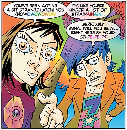
On the next page we have another panel seen from Mina's viewpoint, and as Alan writes:
BECAUSE MINA'S HALLUCINATIONS ARE GETTING STRONGER, MAYBE YOU COULD MAKE THE TWO HIPPIES LEANING IN TOWARDS MINA…IN INCREASINGLY PSYCHEDELIC AND DREAM-LIKE COLOURS.
Of course the colors are by Ben Dimagmaliw, following notes from Kevin, and I don't see them when I'm doing the lettering, but I could imagine the effect this panel shows.

Here's what I came up with, the lettering is now in full-blown rainbow gradient, with a lighter and more pastel gradient inside the balloons, and the borders in solid magenta. I also used Adobe Illustrator's Envelope Distort feature to give the lettering some wavy distortion, and the balloons are amorphously shaped as well.
The setting for Mina's trip is a rock concert in Hyde Park, London, and one of the focal points is the band's lead singer. Alan had some specific suggestions for me about his dialogue balloons:
NOW, AS TO HOW WE HANDLE TURNER'S AMPLIFIED BALLOONS HERE, I'M NOT ENTIRELY SURE. WE COULD JUST HAVE ALL OF THEM IN A CRACKLE-EDGED BALLOON, BUT SINCE I WANT THE SONG TURNER IS SINGING TO BE KIND OF PLAYING IN VOICEOVER DURING OUR CUTAWAY SCENES, A STRAIGHTFORWARD CRACKLE EDGE MIGHT BE TOO SPIKY AND OBTRUSIVE. IS THERE ANY OTHER SORT OF BALLOON EDGE THAT YOU CAN COME UP WITH, TODD, THAT SORT OF CONVEYS ELECTRICAL AMPLIFICATION WITHOUT THE SPIKES? HOW ABOUT SOME SORT OF WOBBLY, WAVERY EDGE TO SUGGEST THE DISTORTION OF AMPLIFIED VOICES OVER A TANNOY OR SOMETHING LIKE THAT? ANYWAY, I'LL LEAVE IT IN YOUR HANDS.
I felt I understood what Alan was after, and here's what I came up with:
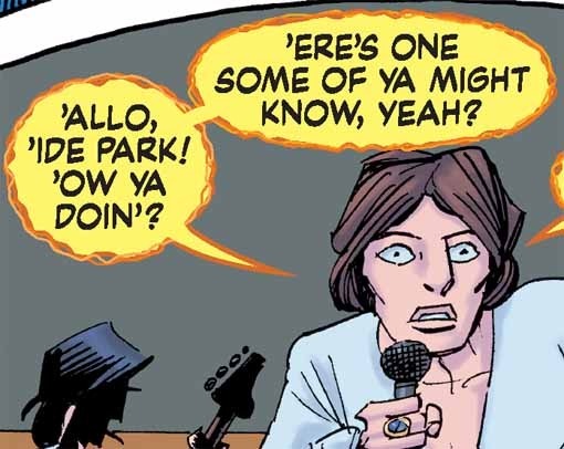
I don't know how well the details of the balloon edges will show when printed, but there are actually three layers to them. The balloons are filled with 75% yellow, to suggest electrical amplification, and have a dark orange border. I used Illustrator's Roughen filter to give them a randomly wobbly edge. Then, for each balloon oval I made a copy, pasted it in front, removed the fill color (leaving only the outline), reduced the outline width and flipped it left to right, then made the color a lighter orange. Next I copied THAT balloon shape again, pasted it in front once more, and flipped it vertically, top to bottom, then made the color of this third layer an even lighter orange. The resulting balloon borders have what I hope is a randomly energetic and electrical look without the spiky edges I'd usually use, as Alan has asked for. When this was done I added the balloon tails and connectors, placing them behind the rest, and since the borders crossed the tails I added another small section of yellow fill with no border to cover each of those overlaps. A pretty complicated process for this style, and there's a lot of it, but I think it achieves what Alan suggested.
On a later page Mina's trip has taken her spirit right out of her body, and for that we needed another style, and a different one for the evil astral spirit she encounters there, floating above the concert. Alan writes about Mina:
HER WORD BALLOONS HERE…AND INDEED THROUGHOUT THIS ASTRAL SEQUENCE…SHOULD MAYBE HAVE SOME KIND OF RAINBOW JELLY EDGE TO THEM, OR COLOURED LETTERING, OR WHATEVER ELSE TODD THINKS WOULD WORK BEST TO CONVEY THE FACT THAT THIS IS MINA'S ASTRAL VOICE THAT SHE'S USING HERE.
Small problem, I'd already used the rainbow effects for the earlier tripping panels, but I saw no reason why I couldn't use them again here, since it's all related.
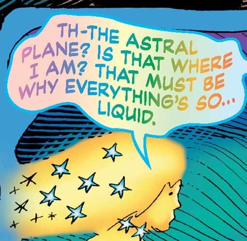
I followed the same plan, but with a medium blue border that I hoped would contrast enough from the previous magenta one to give it at least some individuality. The rainbow gradients are also slightly paler. As it turned out, Ben colored Mina's astral form in yellows, so that all worked well, I thought.
For the other spirit, Alan writes (with one name deleted to keep from from any possible plot spoiling):
AS WITH MINA, _____'S SPEECH BALLOON HERE SHOULD HAVE A SIMILAR KIND OF DIFFERENT EDGE, TO DENOTE THAT THIS IS _____'S ASTRAL VOICE TALKING. SINCE HIS SPIRIT IS MUCH DARKER AND MORE MONSTROUS THAN MINA'S, MAYBE YOU COULD MAKE _____'S SPEECH-BALLOON EDGING OR COLOURING RELECT THIS, WHILE KEEPING IT IN THE SAME BASIC STYLE AS MINA'S, TODD?
I thought the way to go was with gradients made from dark and mismatched colors for the balloon fill, and the lettering and balloon borders would be reversed out of that in a hopefully disturbing yellow-orange:
I'm not sure how successfully dark and evil it is, but at least it's a stark contrast to Mina's balloon style, sort of the antithesis of it. For this character I decided not to give the lettering a wavy distortion, thinking he's more in control of his astral state, and the lettering should reflect that.
As you'll eventually see when the book comes out, the styles for Turner, Mina and the evil spirit are used often in the climactic sequence of pages, all intertwined, and it was a lot of work getting it together, but I'm happy with the result. Hope you like it as well. Kevin and Alan both still have to give their final thumbs up, so if anything looks different in the end, that'll be why. It's always a fun and interesting challenge working with them, and I'm already looking forward the third and final issue of the CENTURY series, though I expect it will be a while before I see pages to letter.
January 3, 2011
Watching VOYAGE OF THE DAWN TREADER
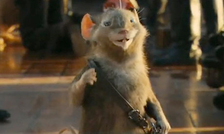
Movies of books you love are always a minefield, but the first two entries in the Narnia film series (The Lion, the Witch and the Wardrobe, Prince Caspian) worked pretty well for me. I had some minor quibbles with the length and amount of fighting, but at least there really were epic battles in each of those books, and in general I liked the way things were handled. Not so much with the third film, which we saw yesterday. The C.S. Lewis book is my favorite of the Narnia series by him, and it's not about battles, it's an episodic tale of exploration and discovery through the seas and islands east of Narnia. The filmmakers seemed to be unable to make a film out of that, so they cobbled together an evil enemy force from several elements and ran it through the entire story, made every adventure involve some kind of fighting or swordplay, inflated a dragon incident to great length and importance, and essentially tried to make the story as much like a Harry Potter movie as possible.
The best thing in the film for me is shown above, Reepicheep the proud and fearless warrior mouse, handled with quite effective CGI animation, and well acted vocally. The human actors played their parts as written well enough, with the boy playing the annoying Eustace the most entertaining, but the story kept veering off the tracks too much for me to really enjoy much of that. Here and there were a few quieter scenes—based on parts of the book—that weren't bad: the magician's house, the gold pool, The star at Aslan's table, the final scene near Aslan's country, some of the sailing. The opening and closing scenes of the children entering and exiting Narnia were fine. Mostly, though, it was monsters and battles, characters not in the book or greatly changed, story elements likewise.
Ellen, who hasn't read the book, thought it was pretty good, and if I hadn't I'd probably have enjoyed it more. As it stands, I can't recommend it.
Todd Klein's Blog

- Todd Klein's profile
- 28 followers

