
Todd Klein's Blog, page 357
January 22, 2011
Podworthy: THE BEATLES
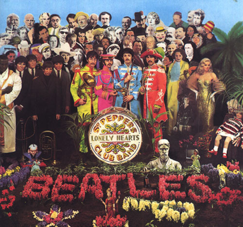
I'm starting a new topic on the blog based on my current "free time" obsession: putting music on my new iPod. The first thing I put on was some Christmas music, since it was the season, but next was my favorite pop group, The Beatles.
The group hit the U.S. music scene when I was in grade school, and at first I was put off by rampant Beatlemania among the girls in our school. I watched their first performance on the Ed Sullivan Show early in 1964 and was more impressed by the screaming teenage girl audience than the music. I was 13, still not quite interested in girls romantically, and anything that attracted so many of them couldn't be for boys like me.
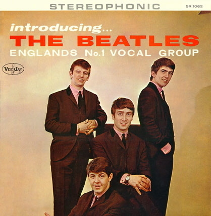
A little later that year I visited my best friend Tim for a sleepover, and he had a Beatles record that he liked and played for me. Away from the screaming I gave it another chance, and was first drawn to "Do You Want To Know A Secret?" with vocals by George Harrison. Based on that, I'm guessing the record was "Introducing the Beatles" on the VeeJay label, a sort of pirate release before the first Capitol Records ones, unless it was the single version. Maybe Tim will remember and fill me in later…
My opinion of the group began to soften, though what really made me a fan was going to see their film "A Hard Day's Night" in August of 1964, again with Tim and his sister. I loved it! Loved the music, loved the humor and the personalities of the fab four, loved the excitement of the performances and the madcap hustle created by their sudden fame, even if I realized some of it was staged. I enjoyed all the songs, and remember being particularly impressed with the close vocal harmonies of "This Boy." I became a firm fan that day, and have been ever since. For the record, Paul was always my favorite, and I still follow his career and music with interest. I never saw The Beatles live, but watching them on Ed Sullivan and in their films was probably better anyway.
 Incidentally, great lettering on the film poster, isn't it?
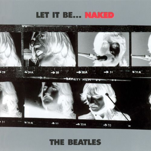
So, getting the entire Beatles catalogue on my iPod was top priority, and it wasn't too hard. I've had at least two versions of most of their songs, from albums to CDs. I was buying the U.S. albums at first, of course, but later I bought many of the U.K. releases as imports, too. For the iPod it's much easier to load songs from a CD, and I was able to use them for nearly everything. For the early albums and singles I used the recent "Mono Masters" releases. I like the sound, it's as they were originally mixed in the studio; the stereo versions were remixed later without the group's direct involvement. For later albums I had almost everything on CD, needing to download only a few singles: "Hey Jude," "Lady Madonna" and the single version of "Revolution." (Had these on vinyl of course.) I also included the two singles from the Beatles Anthology: "Free As A Bird" and "Real Love." "Let It Be," their final studio album, was always a problem for me. I liked the songs, but not the heavy-handed Phil Spector overdubs, so I was delighted when "Let It Be…Naked" came out in 2003, with all the music as recorded by The Beatles without the Spector production, and I used that one.
The iPod gives you the option of choosing the tracks you want and removing those you don't, but there were only four tracks among the Beatles studio releases that I dropped. "Mr. Moonlight" was a number I always disliked. Something about the rough vocals by John and the corny Latin arrangement. Then there are the two German language versions of "She Loves You" and "I Want To Hold Your Hand." Interesting, but I've heard them enough, and prefer the English versions. Finally, "Revolution 9." Again, an interesting audio collage, but I've heard it enough, and it's not a song. So, with those four eliminated, I was left with a total of 210 Beatles tracks. Plenty!
Later I added more from the Beatles Anthology and BBC Live CDs, but I'll cover that in another post. So, are The Beatles on your iPod or iPhone, or whatever? What are your favorite songs or albums?


January 21, 2011
Incoming: RETURN OF THE DAPPER MEN

Images © Jim McCann and Janet Lee.
A few days ago I received copies from publisher Archaia of this oversized hardcover graphic story aimed at younger readers. I did design work for the book (covers, endpapers and some interior pages) and had seen most of the art, but not lettered, so I was finally able to read the story. It's not bad, a whimsical fantasy of a world where time has stopped, inhabited by children, robots, and a few others. I found the storytelling somewhat unclear at times, and it doesn't quite reach the goal of children's classic that it strives for for me, but it has some nice moments and characters.
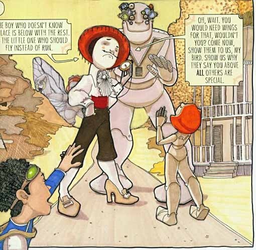
The art by Janet Lee is unusual in technique, being a combination of mediums and materials often in collage. Again, not bad, perhaps a little rough and uneven at times, but generally charming. The lettering by Dave Lanphear is great, in a tall, thin font that reminds me of the comic strip "Little Nemo," and creative balloon shapes.
If you know a young person who likes fantasy, this might well be a good gift.
January 20, 2011
Logo Study: DAREDEVIL Part 4

Images © Marvel Characters, Inc.
In 2001 writer Jeph Loeb and artist Tim Sale brought their unique vision to Daredevil with this miniseries. As with previous ones by the team, the lettering and design work was by Comicraft, with Richard Starkings doing the cover design and logo here using the font Atkinson French Condensed, one of a dozen digital fonts from Atkinson's book of display alphabets of a century ago, adding an appropriate period look to the cover. Sometimes finding the right font is the key to a great cover or logo.

In 2003 Marvel's Ultimate line included this miniseries, with logos designed by staffer Tom Marvelli (great name for a Marvel staffer!). This version of DAREDEVIL follow the design of JG Roshell from the Marvel Knights relaunch, but without the slant and with a deep, symmetrical curve to only the bottom edge of the letters, framing the ELEKTRA logo nicely. Individually these three logo words are well designed, though as a whole they don't work together for me, perhaps because they're so different.
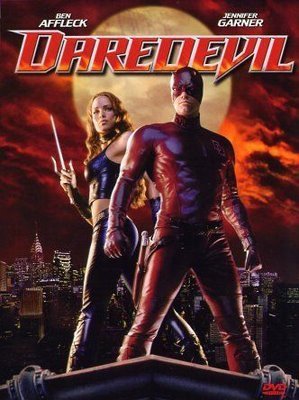
2003 also saw the release of the Daredevil film, and for once the ads at least had a logo that looks like it could have been designed for a comic. It's different from any on the actual Marvel comics, but whoever designed it certainly gave it a comics feel. While very rectangular, the larger D and rightward slant matches many of the comics ones, and the use of pointed serifs is very Marvel. I particularly like the shape of the V, one I don't recall seeing elsewhere, and the graphic treatment of the letters framed by a paler outline and a soft drop-shadow all work well. If Marvel were ever in search of a new DD logo for a comic, this one, if available, would certainly work.

Another miniseries in 2004 featured this large and striking logo treatment, which was designed on staff by Jeof Vita. While both words are in standard sans-serif type, FATHER has been arched at the bottom and given a smudged look appropriate to the style of the cover art, and the large size makes it a fine graphic element of the overall design. The F and R are hard to read, but really, what other word could it be than FATHER?

Another Marvel Knights miniseries used this type-based logo treatment, also done by Marvel design staffers. The font used for REDEMPTION is a familar one, but I can't put my finger on it. The use of a celtic cross symbol in the T might be part of the font, or created for this use, I'm not sure. Certainly the extension of the right leg of the R is added. Despite a lot of logo elements I usually like: a the arched lower edge, open letters with a black outline, a drop shadow, somehow this one doesn't work very well for me. Perhaps it's the spacing out of the letters, too much air between them, or the fact that the T draws so much attention, I don't know.

Back in the main Marvel Knights DAREDEVIL title, a mini-series within the series in 2005 had this striking type treatment, probably designed by creators Bendis and Maleev. It's another example of how standard sans-serif fonts can be used effectively in a poster-like setting. I particularly like the way the YO of YOUR are reversed out of the figure.

Another one followed, also probably by Bendis and Maleev, who then Marvel staffer Patrick McGrath reports were doing the entire cover designs at the time. DAREDEVIL is in the same font as the previous cover but looks quite different because of the colors and gradient. THE MURDOCK PAPERS provides good contrast as a very roughly hand-lettered design.

Most of the series continued to use the JG Roshell design from 1998, though, as seen here on this 2009 issue…

…and later in 2009 the book's numbering reached 500 by the clever addition of all the previous series issues, a favorite device of Editor-in-Chief Joe Quesada. Roshell's logo continues to cover the series to the present time, and still looks good to me, though the tagline THE MAN WITHOUT FEAR! remains hard to read in some cases.
That brings us up to date. Hope you've enjoyed this logo study. Previous chapters and many other logo studies can be found on my LOGO LINKS page.
January 19, 2011
Logo Study: DAREDEVIL Part 3

Images © Marvel Characters, Inc.
When Marvel editors asked me to design a new Daredevil logo in 1996 I had been doing design work on my first Apple computer for about a year and a half, and I decided to start with three fonts, shown above. The first is an Art Deco font of my own design, the others are commercial fonts, though I'd condensed the Serpentine example quite a lot already. I'd prepare some samples using these fonts as starting points.
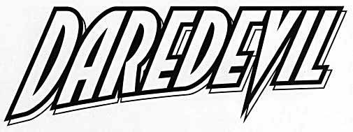
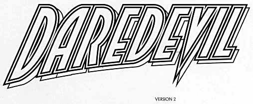
The first two versions used my own font and took cues from the previous logos: the strong right slant, for instance. I wanted a curve in there, and decided to put it on the bottom edge, keeping the top edge straight. One thing that did was make the first D the largest letter, which I thought was a good way to go, rather than it being the smallest letter, as many previous logos had it.The V also extended below the rest, going for the pointy thing, which Marvel usually liked. A very heavy black outline tied the letters together, and an open drop-shadow to the lower right gave a place to put a second color. Version 2 had another open outline inside the heavy black outline of version 1. This would have given a third color option but it made the letters harder to read, at least in black and white, and that one went no further.
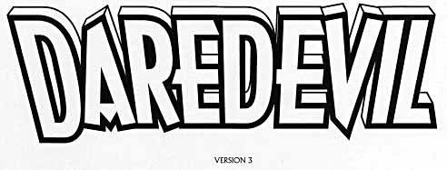
Version 3 used Arquitectura with the letterforms first made much thicker, then outlined in heavy black. This time I tilted the letters forward in two-point perspective and added open telescoping behind them. I think this works pretty well, but it does lose some of the energy without the rightward slant.
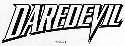
Version 4 used Serpentine, the same font I'd used for my CAPTAIN AMERICA logo in 1995, so in retrospect I'm glad Marvel didn't want this one. I used a similar layout to version 1, but with an even more extended V. After submitting these, Marvel editors chose version 1 with no changes…

…though when it first appeared on the cover of issue 353, someone had added an inset color with a wide white edge inside the letters. Doesn't look too bad, and it's the kind of thing that's easy to do with the vector-based logos I had created in Adobe Illustrator. In one sense it was good to have that flexibility, in another it opened the door to bad design decisions. This one is okay, though I don't think I would have used it the first time out.

On the next issue they kept my original color plan, but condensed the logo horizontally to such a degree that it looks rather squished. Again, easy to do with vector logos. In fact, logos created with vector graphics are quite malleable, and from this point on my logos would often be changed in ways I didn't always like. Before computer graphics, making a logo version like this would have meant redrawing it from scratch. Here it was a simple task of stretching or squishing it in Illustrator, the work of a moment. I benefited from that kind of thing myself when creating variant versions of logos as I designed them, so I can't complain too much.
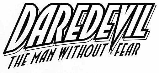
I thought I was finished, but a month or two later they called me back to create the familiar tagline in the same style, which I was happy to do (and bill extra for). This was a simple task using my Art Deco font and curving it to match the main word.
I gave them an open version as well, again easy to do in Illustrator, where before I would have had to trace and ink a separate version. Marvel was happy and it first appeared here:

Personally I would have gone with the outline version of the tagline on this cover for better readability, and in print the letterforms look too thin, so I now wish I'd made them a little thicker.

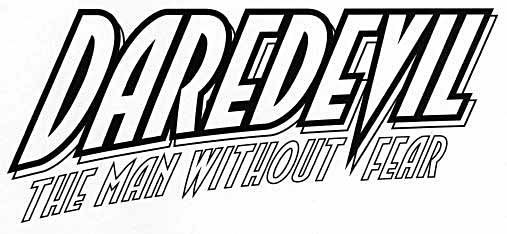
The tagline reads a little better on this cover, but it's still too thin. Fortunately, the main impact is all in DAREDEVIL, the tagline isn't really needed, and I'm not sure why they even wanted it except that it was part of the book's history and tradition. I guess that's reason enough.
In 1998 Marvel relaunched DAREDEVIL as part of their Marvel Knights line for older readers, and wanted another new logo. They asked Comicraft to submit ideas, and Comicraft's JG Roshell got the assignment. He talked about it in a 2001 interview on a Daredevil website:
I designed a lot of the initial Marvel Knights logos (Black Panther, Black Widow, Inhumans), did an update of the Punisher logo, and the logo and cover layout for the Punisher/Wolverine "Revelations" series. I also did the various Sentry logos, and had just finished one for the new Ghost Rider series.
Nanci [Dakesian] and Joe [Quesada] are incredibly easy to work with — they'll tell me if there's something specific they want, and if there isn't, they're really open to whatever ideas I have.
This one went pretty quick — Joe, as always, wanted something "fun but with a modern sensibility." I had an idea in my head to combine the best aspects of the DD logos I could remember — from the original, goofy "Here comes…" one, to the square swooping one from the Frank Miller days, to Todd Klein's spikey one that was current at the time — and try to make the ultimate, definitive Daredevil logo.
JG has kindly shared the following design versions with us.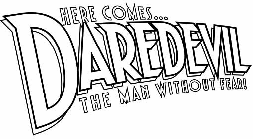
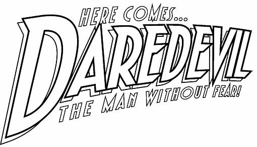
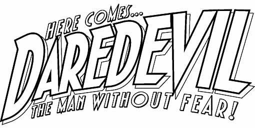
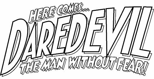
JG continues:
I started in Adobe Illustrator with one of our fonts, Dutch Courage-Lite, and added sharp corners at the tops of some letters. I swooped it at a couple of different angles using KPT (now Corel) Vector Effects "3D Transform" plug-in and the Free Distort plug-in. Joe liked the angle of #3, and after that it was just a matter of refining the letter style until it had enough "boldness".
Todd here. JG clearly wanted to take DD back to his roots with this logo, including the topline HERE COMES… for the first time in over 30 years. All these versions refer back to the original logo's curved look, though using a curve on the whole logo much like the 1980 version, and with a much larger D that retains that idea from my logo, and the open drop shadow to the lower right as well. I like the integrated feel of using the same font in different "weights" or line thicknesses (on all but the last version). The added points at the top left of some letters, and similar angles elsewhere, look back to the second DD logo from 1968, so this is really a design that takes the best elements from the past and combines them wisely. Note that the Illustrator plug-ins JG mentions are no more, but similar ones are built into the program now. Here are JG's further refinements:
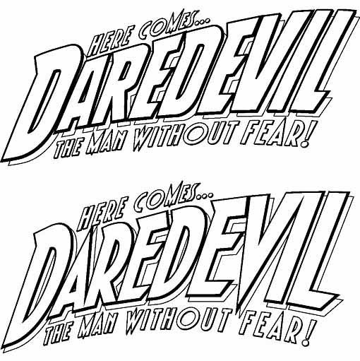
The upper one, with less curved forms on the D and R is what Marvel ultimately chose, and that version can be seen as a nice amalgam of the original DD logo with later ones and with a modern feel, just what Marvel was looking for.

Here it is on the first cover in 1998, somewhat obscured by the art and but looking quite good. Again, the taglines seem too thin against the cover art, the only downside I can see. I'm not crazy about the color treatment inside the letters of DAREDEVIL that gives a a somewhat embossed look, but that's not enough to detract from the overall impact. In fact, this logo continues to be used on DAREDEVIL books to this day, quite a long run, and the sign of a successful design.
Next time we'll conclude this logo study with the most recent developments. Other chapters and more logo studies can be found on my LOGO LINKS page.
January 18, 2011
Logo Study: DAREDEVIL Part 2

Images © Marvel Characters, Inc.
In 1980 this new DAREDEVIL logo was introduced, one that would stay on the book for some time, during which Frank Miller would bring the title to new prominence with fan favorite art and stories. I don't know who designed it, we're still in that dark period in my knowledge of Marvel logo designers. The only name that might be suggested is Jim Novak, who would have been an on-staff letterer and logo designer at the time.
The general approach goes back to the original 1964 logo, giving both lines a gentle upward curve, a strong right-leaning slant, and making the first letter of DAREDEVIL the smallest, the last the largest, so the end of the logo appears to be coming toward us. The curve is actually an example of complex fish-eye perspective, where the letters seem to lie on the surface of a very large sphere. "Horizontal" perspective lines recede to the left, "vertical" ones seem to recede upward and to the right, but receding just barely, and there's a third vanishing point to the lower right, implied by the surface angle of the entire logo that makes the lower right corner seem closest. This sort of curved perspective is not too hard to achieve on the drawing board with a large french curve, but making it as consistent as this is not so easy, so whoever designed the logo knew what they were doing. I like it, particularly the way the tagline THE MAN WITHOUT FEAR is integrated into the perspective. The letterforms are another kind of standard block letters, ones where the curved strokes of the D, R, O and U are vertical except for the corners, what one would see in a very condensed font. The overall effect is to give the logo a more modern type-based look, while still having lots of visual interest because of the perspective, and a feeling of movement from the slant and angle as well. DAREDEVIL is large and easy to read; the tagline gets a bit harder, but is not as important anyway.

In 1981 this variation was introduced with thicker letters overall. Looks to me like someone made a solid black version of the previous logo by filling in the open letters, then traced around that to create a new outline version. Thicker letters are usually better on a superhero logo, and the only downside for this one is that the small center triangles of the A's become so small that they're in danger of disappearing. Even if they did, it wouldn't hurt the readability much, and I think the logo still works fine.

The tagline was often dropped beginning in 1982, leaving more room for the cover art, and making the logo simpler. Since the character was now very popular and easily recognized, this could only be a good thing. No need to constantly remind readers he was without fear! And you can see that someone has fixed the triangle in the A, making it larger.

The only danger with a logo having a very long run on a book is one of reader boredom, and in the 1980s cover designers like Ed Hannigan liked to shake things up by doing unusual things with the logo. I don't know if this is one of Ed's designs, but it could be, making the logo a sort of Hollywood sign behind the cityscape.

Another way to change things up, both for the book and the character, is with a theme, such as this western one, where the logo has been given the slab-serif style of old wanted posters from the American west, not unlike DC's JONAH HEX. The tagline is back here, fitting nicely into the implied telescoped drop-shadow with a central vanishing point toward the bottom.

Here's another logo variation from 1985 that looks to me even more like an Ed Hannigan design, using the slab-serif logo as giant telescoped letters atop a building, with the entire cover in dizzying three-point perspective, including the logo. See if you can visually imagine where the three vanishing points would be. The bottom one is the easiest, the other two would be very far away.

But for most of the 1980s and into the 90s, the main logo was this one. As you can see here, it wasn't always a great fit over the cover art, but the angle and perspective make it attractive in almost any situation.

In 1993 this miniseries made the old tagline into the main title in a very different and interesting graphic treatment. Using computer graphics (I'd guess), and a standard sans-serif font, the words are made to fit the width of a narrow box by varying the size greatly, with the final word FEAR stretched vertically to make it even larger and more important. The words and letters are very tight together, giving the logo a nice graphic approach, added to by the very subdued colors and inner texture in the letters suggesting rough concentric circles. Clearly this cover and logo were designed for the direct market, and not newsstand display, and the cover art shows the influence of the time by portraying a quiet moment in a poster-like way rather than an action scene, but overall it's quite effective.

Another trend of the time was to change things up in the regular title for a few issues, sort of a miniseries within the series, and for seven issues in 1994 DAREDEVIL used this unusual logo. I haven't been able to find out who designed it thus far. It's not by Alex Jay or Ken Bruzenak, my first two guesses, nor by Ken Lopez, who suggests possibly Jim Novak, though I have to say it doesn't look like his style to me. In some ways I'd call it a bad design, but on the other hand, it does have a certain appeal, as one's eyes try to fill in the missing sections of the D's and R, while the long pointed extensions on the A and V add interest. Pointy logos were certainly the in thing in the 90s, and this is the first time DAREDEVIL had any. On the downside, the A becomes too important to my eye, and the angles of the letters are not consistent. Also of note is the tagline numbering I of V, when in fact it ran seven issues. Things changed along the way, apparently!
In 1996 Marvel wanted a new Daredevil logo, and I was asked to design one. I'll continue with that next time. Other chapters and lots more logo studies can be found on my LOGO LINKS page.
January 17, 2011
Logo Study: DAREDEVIL Part 1

Images © Marvel Characters, Inc.
In 1964 Marvel launched a new title and character, Daredevil, created by Stan Lee and Bill Everett with character design involvement by Jack Kirby. In the Daredevil Wikipedia entry, Joe Quesada is quoted on the origin of the cover:
When Everett turned in his first-issue pencils extremely late, Marvel production manager Sol Brodsky and Spider-Man co-creator Steve Ditko inked a large variety of different backgrounds, a "lot of backgrounds and secondary figures on the fly and cobbled the cover and the splash page together from Kirby's original concept drawing."
As I've said in other Marvel logo studies, the original cover logos from this period were designed by production manager Sol Brodsky and finished or inked by letterer Artie Simek. As far as I've found out, no one knows exactly who did what, but the credit can be given to those two for this logo, and in Quesada's statement above, Brodsky's involvement in the cobbling together of the entire cover is clear. Certainly the lettering on the tagline THE MAN WITHOUT FEAR looks like other Simek story title lettering, and I think it's a safe guess that he lettered all the words on the cover, and there are plenty of them!
The word DAREDEVIL is standard open block lettering slanted to the right, and with a wide curve to the top edge, leaving room for HERE COMES… while still keeping the entire logo in the traditional rectangular shape of most cover logos of the time. This curve results in the oddest thing about it: the first letter is the smallest, the opposite of many comics logos. An open, telescoping drop shadow is added with the perspective going down and to the left. This is also a bit odd, since having it go down and to the right would have reinforced the impression of left to right movement given by the slant and the small speed lines (similar to those on DC Comic's FLASH logo). It reads fine, though, and I don't find those oddities detract from the overall effect at all. HERE COMES is in the same style as DAREDEVIL, while THE MAN WITHOUT FEAR has no slant, and letterforms that are squat and wider at the top generally, a technique that looks back to the 1950s to my eye. One small oddity is the square center opening in the A's, probably to keep them from filling in with color, as the usual triangles might have. There's nothing particularly distinctive about the logo, but it does echo the styles of other Marvel logos well enough to draw in readers, as I'm sure the images of Spider-Man and The Fantastic Four were also intended to do. It's interesting to see that the large D on the character's chest is not in the style of the logo, but considering how the cover was put together in such haste, not really surprising.

In 1968 this new logo first appeared, and now we come into the long period of Marvel logo history that is largely dark to me, I don't know who designed most of the logos. This one seems different enough in style from the first one to be by someone new. The most interesting feature is the division of the character's name into two lines with a hyphen. I can't think of any other cover logo from the period, or even through the 1970s that did so, but it sure makes it easy to get the letterforms very large, usually a good thing! The style follows the original in some ways: the rightward slant, with drop shadow down and left, but this drop shadow is not telescoped. Another interesting feature is the small triangular extensions on the upper left corner of all the letters except VIL. I wouldn't call them serifs, really, it's more of a style motif that gives the letterforms a bit of extra interest. The lower left corners of the D's and E's are cut off at the same angle, a style addition I don't like quite as much, but at least the letterforms are a bit different from standard block letters. THE MAN WITHOUT FEAR is simply that, very standard, and very regular. It could be type, but is more likely hand-lettered.

That logo only lasted three issues, with #47 this less interesting one replaced it, going to very conventional open block letters in the same layout. Again, very large and easy to read, but otherwise not distinctive.

In 1970 this new logo returned to the style of the original in many respects, but without the topline HERE COMES, allowing the word DAREDEVIL to be strictly horizontal. the tagline THE MAN WITHOUT FEAR! seems to be the one from 1964. Again, nothing wrong with this logo, it's clear and readable, the open telescoped dropshadow allows a second color for added contrast to the cover art, but to my eye this version is kind of boring, even compared to the first one. Marvel must have been happy with it, it stayed on the book for a few years. Oh, see the extra line in the A? Not sure why it's there, but it wasn't on later issues, perhaps it's a design error that was corrected after this first appearance.

In 1972 DD began sharing his book and logo space with The Black Widow, the two characters being given equal space with AND THE very small between. DAREDEVIL uses the same letterforms as before, but much condensed vertically. BLACK WIDOW is in a rough style that has a lot more energy, and while it's kind of an odd choice for the character (would have been perfect for The Torch, for instance), the contrast between the two adds a lot of interest to the cover, as do the two character figures on either side.

In 1974 DD went back to sole possession of the logo space, except for the figure of Black Widow, and his logo from 1970 returned unchanged as well. And that's how things stayed through the 1970s.
We'll continue into the 1980s next time. Other logo studies can be found on my LOGO LINKS page, by the way, including the remaining parts of this one once they're published.
January 16, 2011
Begins Tomorrow…

Image © Marvel Characters, Inc.
January 15, 2011
And Then I Read: LEGACIES 5 & 6

Images © DC Comics, Inc.
These two issues of LEGACIES, a sort of summary of DC's history, covers the original Crisis on Infinite Earths, the major company crossover event in the 1980s that began the trend, at least at DC. Writing is Len Wein, and drawing are George Perez and Jerry Ordway…again! You know these guys are either mad or troopers to tackle just about every DC character again, as they did in the original series. Perez pencils issue 5, inked by Scott Koblish, Ordway pencils issue 6, inked by Perez. I enjoyed revisiting the epic, and the aftermath, which is mostly what issue 6 covers. Despite the story being much condensed, it still works. In some ways perhaps it works better.

Here's a page from issue 6, looking quite good to me. Ordway's very solid storytelling is the anchor here, while in issue 5 the Perez madness of "how many characters can you get into one page" is as astounding as ever. Recommended!
January 14, 2011
And Then I Read: HELLBOY/BEASTS OF BURDEN

Images © Evan Dorkin, Jill Thompson and Mike Mignola.
A one-shot crossover between two series I like a lot, by the creators of each (with most of the actual story and art by Dorkin and Thompson). I expected to enjoy it, and I did. That's my review in a nutshell. While on the surface the characters might seem an unlikely mix of species and styles, both focus on supernatural menaces and both have art that includes a helping of cartooniness. Jill's style has the lush realism of watercolors, unlike Mignola's stark linework and deep shadows, but in the figure work of both there's a lot of common ground. As for the story, all it takes is for one of the Beasts to tug on Hellboy's cape and lead him into their haunted woods for things to develop naturally. And of course he takes their powers of speech in stride. I imagine there's little that can surprise Hellboy at this point! As in some past Beasts of Burden stories, the trouble is rooted underground and in the twisted mind of a human. The resulting menace is one even Hellboy has trouble with.
 As you can see above, Jill Thompson makes it work beautifully, and Dorkin's dialogue, probably with input from Mignola for Hellboy, is funny and perfect. It would have been easy to miss the mark and make Hellboy too realistic or too cartoony, this version is just right to my eye.
Highly recommended!
January 13, 2011
And Then I Read: THE LIFE AND TIMES OF MARTHA WASHINGTON

Images © Frank Miller and Dave Gibbons.
I put off reading this massive volume for over a year only because it's so large and heavy. It measures about 12 by 8 inches, is just over two inches thick, and weighs over seven pounds. Try juggling that with a cat on your lap! But last week I did manage to read it all, and thoroughly enjoyed it. I'd read most of the contents before in individual issues as they were published over the last 20 years or so, but I'd forgotten a lot of the details, so it was largely a new read, except for the recent final chapter.
I should preface this by saying both Frank and Dave are friends, so keep that in mind. The most recent thing I've read by Frank was his ALL-STAR BATMAN AND ROBIN series from DC, which was highly over-the-top in every way. MARTHA is a good place to find a much broader range of writing from him. Sure, there's lots of violence and black humor as well as social satire, but there are also subtle character moments, introspective interludes, and knowing insights into human minds and hearts largely missing from Frank's more recent superhero efforts. It made me appreciate Frank as a writer all over again.

As for the art, Dave Gibbons has never looked better than he does on this thick, glossy paper with top-notch printing and some early sections recolored. MARTHA is a testament to Dave's skill in portraying a very human but heroic character, flawed but determined, trying hard to do the right thing in a very wrong world. Dave captures all that in his facial expressions and body language. And if you like action, this volume is full of it, essentially about six action movies rolled into one satisfying story. And, if I may, nearly all lettered by hand by Dave, one of my favorite letterers! There are some bits of digital type, as on the computer balloons above. Dave draws terrific sound effects, too! The coloring by Robin Smith, Angus McKie and Alan Craddock, with some by Dave as well, all looks fabulous, the printing really makes it glow. And there's a large scrapbook/gallery section with mostly unseen extras.
Expensive? Yes. But for your money you'll get hours of reading and viewing enjoyment. Highly recommended!
Todd Klein's Blog

- Todd Klein's profile
- 28 followers

